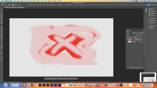
#Made it with the pen tool in illustrator for a class project
Explore tagged Tumblr posts
Visit Tumblr Blog
Explore Tumblr blogs with no restrictions, modern design and the best experience.
Last Seen Tumblr Blogs


Fun Fact
The most popular pages on Tumblr are about Minecraft, GIFs, and David J. Peterson.
Text

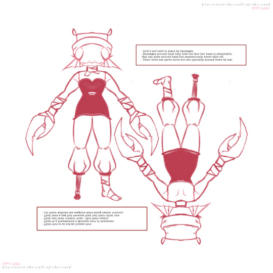
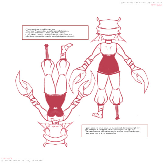
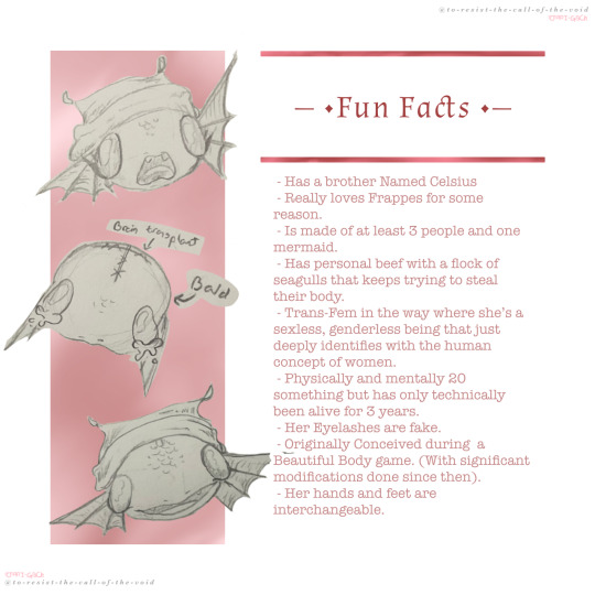
Bonus Colors Sheet + Old Graphic.
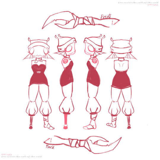
Fahrenheit (Fish Head) Ref Sheet. (More Ref’s + Fun Facts under the cut)
#Fahrenheit the Fish Headed Freak#oc art#my art#not labeling it as a drawing though because I didn’t draw that#Made it with the pen tool in illustrator for a class project#So :p#Honestly colors are such a struggle for me#Their’s a reason everything I make is either mono or in black and white#and it ain’t all aesthetic#But the set just felt incomplete without some form of color swatching so now I’m here#Well now I can at least say I tried#So it is what it is I suppose
9 notes
·
View notes
Text


So I started a new (very ambitious) embroidery project!
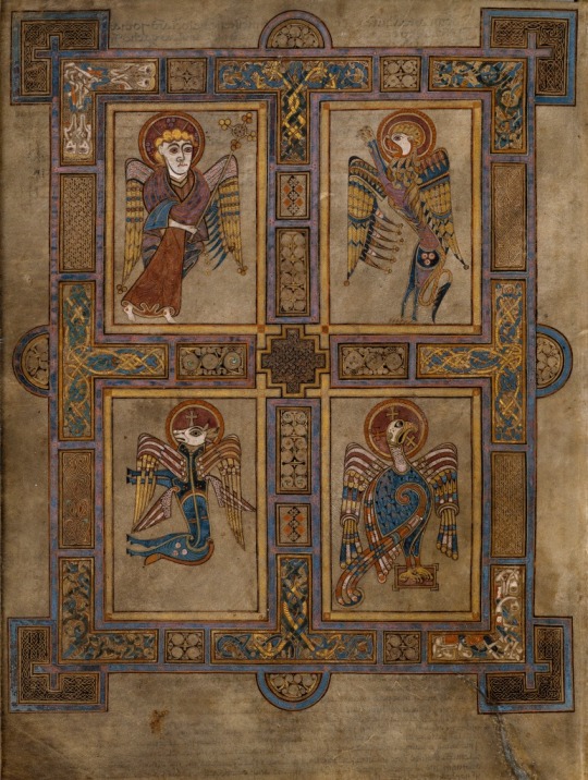
This project is going to be a doozy! I love this little figure from the Book of Kells, and I’ve been wanting to embroidery medieval miniatures from the Book of Kells for a long time, so why not now? I downloaded high quality images from the Book of Kells off of the Trinity College Dublin Library website, and located this little guy on Folio 27v. (Image 4) This figure is the Eagle meant to represent St. John the Evangelist and the ascension of Christ into heaven. I am not religious, but I did grow up Catholic (and in an Irish family) and I’ve long been a really passionate medievalist. I think that these illuminated manuscripts are super fucking cool, and I love medieval Irish art, so here I am.
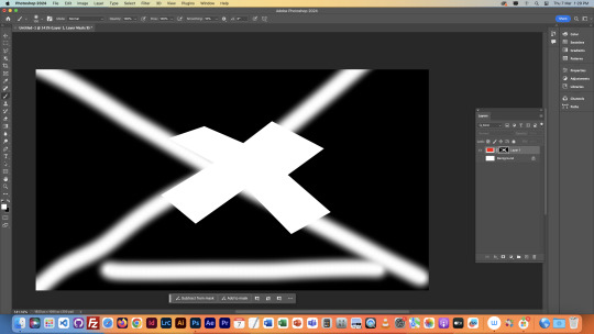
I’ve only just started stitching (had to watch some very boring lectures for my least favorite grad school class of all time, so it was a good way to keep my hands busy!) I also at the last minute decided to do some metallic gold thread in some areas that I know are covered with gold leaf in the original image. I am choosing to use metallic thread despite the fact that I know it is Satan’s embroidery supply. I did one tiny cross with it already (see Image 3) and I am already regretting it, but it’s too late now lmao.
If I make it through this project maybe I'll do the other 3 Evangelists from Folio 27v. Will update as I go along!
Images:
Image 1: My embroidery set up laying on top of my bed spread. The bed spread is a quilt that my late grandmother made and machine embroidered back in the 1970s, when machine embroidery was hot and new. My set up includes:
Hoop
Project box that contains all of the threads I'll be using for the project, my thimble, my thread scissors, some tape to tape down loose threads on spindles, and my needles in a "pincushion" that's just a tiny ball of yarn.
My iPad for looking at the original image (and playing tunes!)
My color block reference image and my color sheet
Image 2: Close up on the color block and color sheet
Image 3: Result of my first 1:45 of stitching while listening to very boring lectures for my least favorite grad school class of all time.
Image 4: The original image, Folio 27v of the Book of Kells.
How did I get here (at the start line)? an extremely detailed step-by-step (under the cut because this post is already long af)
Downloaded the full size image of Folio 27v
Cut St. John out of the image using the pen tool in Photoshop and moved it to a new document with a clear background.
Pasted St. John into a blank high res procreate document.
Did a rough digital tracing of the image in procreate with my iPad and Apple Pencil.
Exported tracing back to my computer.
Opened tracing in Illustrator and made it into a vector. Took forever because I fucked up my procreate settings RIP.
Turned Vector into live paint object.
Opened original image in PS, and used eyedropper tool to select colors in original document. Compared those colors to the colors that I had in my stash (wanted to use mostly if not all from my stash rather than buying new floss).
Used threadcolors.com to get the hex codes for the selected threads. Made a spreadsheet of the selected colors for my reference. Printed out spreadsheet.
Colored the image using the paint bucket tool (and recolor artwork options) with the colors corresponding to selected threads. Saved Illustrator document.
Opened illustrator document in PS, gave it a solid white background and exported it as PDF.
Printed out initial copy of PDF image on blank printer paper to see if it was the right size. It wasn’t lol, so I made it bigger (super easy with vector images!) Printed test copy #2 and it was the right size.
Iron chosen fabric and stretch in Phillips head screw tightened hoop.
Printed the PDF image on Sulky Fabri-solvy, cut to size, and adhere to the surface of the stretched fabric.
Stitch, all single stranded….
total materials thus far:
Sulky Fabric Solvy
Embroidery Floss
Needles
Laptop with Photoshop, Illustrator, and Apple Numbers
The internet
iPad with Procreate and Apple Pencil
Printer
Cream colored fabric
Iron and ironing board
Scissors
Copy paper
9 notes
·
View notes
Text
Final Reflection
This semester, I continued to learn and grow as a graphic designer. I feel like I have improved a lot over the course of this semester, and I am proud of the work I have done. My favorite project I worked on this semester was the UCDA Poster on mindfulness. I enjoyed having so much creative liberty for this project, and I pushed myself to create something creative and innovative that went out of my comfort zone. I enjoyed using physical found materials to create typography, and this is something I hope to do again in the future. I think the Soda City Logo Design project helped me grow a lot. Before taking typography this year, I considered myself to be more of an illustrator. Designing a logotype without any logomark to accompany it seemed challenging at first. However, this pushed me to express the story and personality of a brand solely through typography. This project also allowed me to practice using Adobe Illustrator. I made my logomark by hand, so I had to use the pen tool. I think my skills with the pen tool have improved a lot since I first used it a year ago. Overall, I feel like I have come out of this class as a better designer, and I will use what I learned this semester throughout my future career.
0 notes
Text
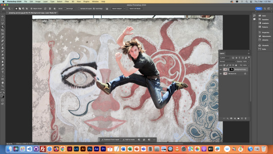
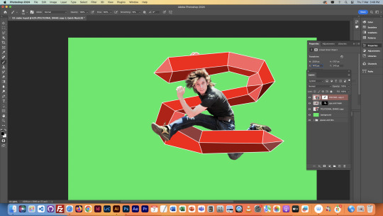
jumping guy - class

project we started in class and finished as homework. In class we were first focussing on selecting jumping guy and moving him to a sunny road backdrop. We did the selecting using a combination of the tools we learnt in the previous lesson mentioned before.

we had a layer of green and black underneath that we could switch between to differentiate parts of the image better when selecting and erasing.

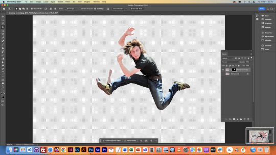
fully selected jumping guy ^^^

then we imported the image to illustrator to make an object using primarily the pen tool.

we did this by making a snake shape with a thick line and then using the outline, and then added a gradient. To have the hand and foot going above the image we duplicated the snake and on the top copy erased space for the hand and foot.
we then moved this image to a background of a sunny road, and told to bring in two more images and two illustrator made objects as homework.
0 notes
Text
Problem of Every Graphic/Visual Designer
Have you ever used other design softwares instead of Adobe?
If not, Are you the one carrying a legit subscription?
IF NOT, Then are you using it for making personal projects or doing client work?
Let's discuss all of this in the post.
We designers usually get introduced to the world of digital design with softwares like Adobe Illustrator, Photoshop, After Effects, Premiere Pro, and sometimes CorelDRAW.
But how many of you have heard the names of Inkscape, Gimp, CavalryApp, DaVinci Resolve, and Kdenlive?
These are a part of a category called open source softwares.
Adobe has been the market leader when it comes to digital design. They have been adding innovative features to make the processes easier. The way digital design is today is because of the amount of focus they have put in to benefit their customer.
Even they have tried to make their plans cheaper for the first year for working professionals to make their services accessible. But the fact that the amount of money we as design students spend on learning that is graduation is already very high for a middle-class family, needless to say.
Also, if we complete this line of education. Then comes the career opportunities. If somebody goes for full-time employment, chances are that you may get the subscription if you opt for an established company.
But if you want to work as a freelancer. Then again things are different. Because you initially do not take the risk of investing the money in softwares for the first year and then paying a massive amount to continue the next year. As the price is much higher as compared to the first year.
I left Adobe Creative Cloud Suite in the year 2019 and shifted completely to open-source applications after my boss in my first job told me to do so. Thank You, Sir.
But the problem is that, except for Figma, I do not enjoy the exciting features of the softwares I use.
Like the pen tool in Illustrator made my illustrations look so good that I miss it.
The last proper digital caricature and portrait was done by me in Photoshop.
The last proper animation also I think was what I did in After Effects.
I want companies and other designers to understand that if you are hiring candidates, then Adobe can be an important factor while hiring.
Open source softwares also deliver 75-80% of the results regarding features with whatever is available.
But how many people do you think can afford these highly priced softwares?
And will it be legal for somebody to freelance with such softwares?
Let me know about your views in the comments section. Let's see if Adobe too becomes a part of this discussion.
Video Credits: Movie Name: Roti Kapada Aur Makaan Channel Name: Ultra Bollywood (YouTube) Typeface: Open Sans Softwares: DaVinci Resolve and Figma
#Design Software#Adobe Vs OpenSource#Freelance Designer#OpenSource Design#Digital Design#Creative Cloud#Design Community#Inkscape#Affordable Design#Design Debate#roti kapada aur makaan#70s bollywood#designers humor#meme#graphic designer#visual designer#funny#comedy#dechnsign#theharssharora
1 note
·
View note
Photo

Las vegas bling nevada spiral notebook dark Shopping lists, school notes or poems - 118 page spiral notebook with ruled line paper is a perfect companion in everyday life. The durable printed cover makes the owner proud to carry it everywhere. .: 118 ruled line pages (59 sheets) .: Front cover print .: Dark grey back cover Introducing the Las Vegas Bling Nevada Spiral Notebook, a dazzling stationery accessory that embodies the glamour and excitement of the iconic city it represents. This notebook is not just a tool for jotting down notes; it's a statement piece that captures the vibrant essence of Las Vegas, making it a perfect companion for anyone who loves a little sparkle and excitement in their daily life. The Las Vegas Bling Nevada Spiral Notebook is designed with a striking cover that immediately catches the eye. Adorned with glimmering rhinestones and a vivid illustration of the Las Vegas skyline, the cover showcases famous landmarks such as the Luxor Pyramid, the Stratosphere Tower, and the legendary Welcome to Fabulous Las Vegas sign. The intricate design is a tribute to the city's dazzling lights and fast-paced energy, bringing a touch of Las Vegas magic to your everyday routine. Measuring 8.5 x 11 inches, this spiral notebook offers ample space for all your writing needs. Whether you're taking notes in class, jotting down ideas for your next big project, or simply doodling during your downtime, the generous page size allows for creativity without constraints. The high-quality paper is smooth and thick, ensuring that your pens and markers glide effortlessly across the page without any bleed-through or smudging. This durable paper is perfect for a variety of writing instruments, from ballpoint pens to gel pens and even fine-tip markers. The notebook features a sturdy spiral binding that not only provides a classic look but also allows for easy flipping of pages, making it ideal for both right-handed and left-handed users. The spiral binding ensures that the notebook lies flat when open, providing a stable surface for writing and making it easier to review your notes. The durable cover adds an extra layer of protection to your thoughts and ideas, ensuring they remain safe from everyday wear and tear. Inside, you'll find 120 lined pages that offer a structured format for organized note-taking. Each page is adorned with a subtle watermark of the Las Vegas skyline, adding a touch of elegance and continuity to the notebook's theme. This thoughtful design element serves as a constant reminder of the city's allure, inspiring you to dream big and reach for the stars. The Las Vegas Bling Nevada Spiral Notebook is more than just a practical accessory; it's a celebration of creativity and individuality. Its unique design makes it an excellent gift for anyone who appreciates a touch of glamour in their life. Whether you're a student, a professional, or a creative soul, this notebook is sure to spark inspiration and add a bit of bling to your daily routine. Perfect for capturing your thoughts, dreams, and goals, this notebook is a versatile companion that can be used for a variety of purposes. Use it as a diary to document your personal journey, a planner to organize your busy schedule, or a sketchbook to explore your artistic side. The possibilities are endless, and the choice is yours. In addition to its aesthetic appeal and practical functionality, the Las Vegas Bling Nevada Spiral Notebook is also an eco-conscious choice. Made from responsibly sourced materials, this notebook reflects your commitment to sustainability without compromising on style or quality. Elevate your stationery collection with the Las Vegas Bling Nevada Spiral Notebook, and let its sparkling design bring a touch of Las Vegas excitement to your everyday life. Whether you're a fan of the city or simply someone who loves a little extra shine, this notebook is sure to become a cherished part of your daily routine. Get ready to turn heads and capture attention as you jot down your thoughts in this eye-catching, glamorous notebook that perfectly embodies the spirit of Las Vegas.
#Las Vegas Casino USA#Las Vegas notebook#Las Vegas gift#Las Vegas journal#Las Vegas diary#Las Vegas notepad#Vegas planner#Vegas sketchbook#Vegas gift#Vegas journal#Vegas diary#Las Vegas planner#notebook
0 notes
Text
Fundies Reflection
Before starting Fundamentals, I went into this class only knowing little about all the different software used. I had used Photoshop and Illustrator before, but not in-depth how we used them during the 9 classes we had. During these lessons, I learnt a lot about each program and had a lot of fun using them more in-depth, along with using software I hadn't used before (InDesign) but thoroughly enjoyed. I learned many new tools I never thought I would use on the software I've used before; this allowed me to appreciate graphic designers and how they create their art using this software. It definitely ain't easy, but it was still fun to apply what I knew to each lesson and learn new skills I can adapt to future projects and tasks.
Illustrator :
Illustrator was the first program we used in class; using the pen tool was extremely difficult, and creating specific shapes with it was hard. As a perfectionist, I tried my best not to let it get to me too much and made it as well as I could while following the instructions. This software was my least favourite, but over time, I will gain more confidence and draw vector shapes more precisely.
Photoshop:
I used a little Photoshop last year when I earned my certificate in Digital Media and Design, but not to this level; I knew a little about the software, so it was interesting to see what you can achieve in Photoshop. I do enjoy editing, so it was a fun experience. Still, since I had also missed a lot of classes due to going away, I wish I had put in more effort and done a better job at following the briefs; some of it I did miss reading, which was my fault, But again I, would have liked to do better next time while using photoshop.
InDesign:
InDesign is my favourite of the three; even though I wasn't in class and had to do this part at home, I found this software more straightforward to understand, and it made more sense to me. I picked up on making a booklet fairly quickly and making margins, columns and page numbers were fun. I have had some things like this before, so using this software wasn't hard to pick up on; I really enjoyed adding in the text and creating columns with text wrap that was interesting and fun; I can't wait to learn more about this software and develop a book out of it.
I had missed out on a large chunk of classes due to going away midway through starting the class; I was a bit disappointed that I wasn't able to do work due to being busy, and this led to me falling behind in this class and having to catch up over the holidays. In the future, I will keep on top of everything and have a plan to help me get through the lectures and tasks I have missed out on.
Overall, I wish I had done better on all my tasks and put more effort into creating them and following instructions properly. This was a setback for me, and personally, I am a little disappointed in myself, but the only way I can achieve this is to not let myself get caught up in the negatives when it comes to tasks using these software's.
0 notes
Text
Sixth Class
Today's class was about compositing. Mixing elements into one image. We started off the same as last class, recapping or Marquees, filling areas, and masks. We learned new stuff about selections though, about how whilst creating a Marquee, holding the Shift key will add to the current selection, and holding Option will remove from it. These keys remain the same for most selection techniques.

Here is some photos of the masks we messed around with:
We learned here that when making a mask of a layer with a selection active, only the area within the selection is actually affected, which is what happened in the previous lesson with the bird wing.
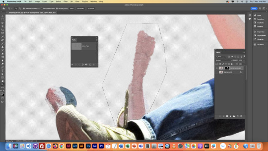
Next we began on the main project that took up the majority of this lesson. We used the object selector to cut the jumping figure out of this image on a new layer. We then realised that the object selector did a not so ideal job with selecting it, and that we would have to make precise adjustments to fix the cutout. We began fixing it by fixing the area around the messed up shoe and shoelace. We did this with the polygonal lasso tool, and the pen tool.


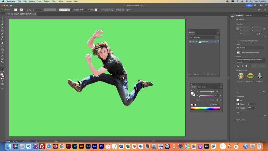
We then fixed the arm sticking out the top, both of the hands, and painstakingly fixed the hair. This part was done with the brush tool, and the mask we had created of this shape on this layer. It took ages, but was worth the result. We also put it on a green screen like the previous class as it makes it easier to see what we're working with. We also made an overlay layer so we could toggle it to compare our cutout with the original image.


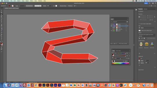
We then sorted our layers out in photoshop, and then brought our image into Illustrator. We created an S-shaped line over the man, brought the image back into photoshop, and used layering, masks, and our brush tool to make the line go around the man, rather than on top.
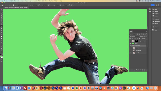

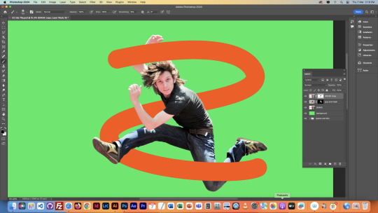
The shape above was just a tester, we went back into Illustrator and created a new shape. Same sort of S, but just with more going on. Mine ended up being a red polygonal thing. We then put this shape around the man in Photoshop, and lowered some of the opacity so we could see the man through the shape whilst still having it in front of him.


We would then finish by adding a new background, but I didn't have time in the end. Still, this was quite a challenge, but I enjoyed it, and am happy with how it turned out.
NOTES

0 notes
Text
Illustrator Day 5 Penguin Project

Day 3 - Today was our Illustrator Penguin project, we used all of our pen techniques we learnt to make this. This is my penguin, Banjo.
1.We started off by creating his body, I learnt to use the join tool (command J) by selecting the two points with the direct selection I wanted to join. To create his hair and tail I added points using the + key from there I was able to add handles and create the points.
2. Next we made the eyes using the ellipse tool I filled the eyes with a gradient of black to blue and moved the origin point, added a smaller white ellipse over the top to create a light point.
3. Then we created the beak. I made a rectangle roughly the size I needed then I rounded the edges using the small handles inside the corners of the shape until I achieved a beak shape.
4. To create the wing we used the pen tool and created curves.
5. Next was the feet, I started by creating the top half of the foot, one and a half toes the first and last anchor points needed to be vertically aligned so that we could reflect it. To reflect you use the tool (O) and click on the right lower point. Then hold shift + option and click the left lower point. This gives us a whole foot.
5.1. We then made the foot shorter horizontally and created a copy beside it. Deleting certain lines selecting them using the direct selection tool, we then copied that shape and option + shift + drag down and created the width of the toes, used join to add lines.
5.2. We coloured the top of the foot lighter and the bottom darker then put them together to create a 3D foot. Then created the ankle using our pen tool. I also added a lesser saturated shape to create shading on the feet. We duplicated the foot and rotated it too look like Banjo is walking.
6. For colouring we added layers until we had 6; back stuff, body colour, chest colour, body shadow, body outline and front stuff. I individually coloured Banjo on these layers. This was an easy way to colour him in blocks to be able to individually play around with opacity and such.
7. Using the pathfinder tool I created Banjos front feather pattern and the shadow on the bottom of his body, picking a darker colour desaturating it and lowering the opacity until I liked it.
8. To finish off I added a round shadow under Banjo.
Overall I should have taken more progress pictures to show what I was doing. I found hard when we were progressing very quickly in class but I am very happy with how Banjo turned out overall.
0 notes
Text
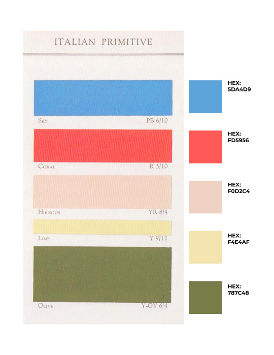
Week 4: Project #3 - Flowering Typography


During Week 4, I spent my time working on Project #3. Our class was introduced to the concept of Flowering Typography in the previous week, where each student was assigned a different letter to create a unique flower design. We used the Monsterrat Black typeface and a color palette known as Italian primitive. These guidelines were created to help students choose their flower designs and consider the colors they could use in the final product. After reviewing several flower options, I selected the Lily of the Valley - a white, bell-shaped flower that grows in the hills and mountains of North Carolina during the spring. I specifically chose this flower for its whimsical and free-flowing shape, which aligns with the style I wanted to achieve through this project.
To create my design, I first selected one of the 16 sketches I had created on tracing paper using a light table and a mechanical pencil. Then, I scanned my final sketch using a Canon flatbed scanner and Adobe Acrobat software. I imported the PDF of the sketch into a new Illustrator file with a 5" x 5" artboard. After adjusting the placement of the shape, I created a new layer and meticulously traced the form using the pen and Pathfinder tools. After tracing all the shapes from my original sketch, I went back in with the pen tool and removed any floating or unnecessary anchor points. This process helped me to clean up the shapes and smooth out the lines, resulting in clean curves. To add line details in the middle of the shape, I clicked on "Object" and selected "Compound Path" from the dropdown menu and then clicked "Make" to remove the middle elements of my shape.
To complete the vectorized letter, I used the Pathfinder tool to merge all the individual shapes together and form a unified shape for the letter. After this, I filled in the color by entering the specific color code in the fill option of the color picker. For my final design, I picked the olive color from the class color palette to incorporate into the letter. During the design process, I tried out various color options (as you can see in the images above). However, in the end, I decided to go with olive color, as it resembled the stem of a lily of the valley flower and stood out from my classmates' choices. I made sure that all the shapes were perfectly aligned and that the file had the correct dpi (300 dpi). Finally, I saved the file in two formats - an active illustrator file and a jpeg - and submitted both versions of the file on Basecamp before the final due date.
After reviewing the critique of my flowering-type design, I have come to the conclusion that it wasn't entirely successful, especially when viewed from a distance. Comparing my letter with the other designs in the class flowering alphabet, I noticed multiple mistakes that weakened the overall execution of my design. Firstly, the swirls on the leaves were too large and distracting, which was probably due to the excessive amount of white space between the swirl and the leaf. Though the swirl was a stylistic choice, it proved too distracting, drawing the viewer's attention away from the flower itself. The design could be improved by either removing the swirls or making them smaller to avoid competing with the other elements. Balance is key! The flower itself doesn't stand out enough because the outline around the shapes is too thin and inconsistent. This makes it difficult to distinguish the negative space between the flower and other shapes from a distance, causing the design to look cluttered. It's also hard to identify the type of flower being added to the letter. Although the overall design is whimsical, the errors and inconsistencies make it look too simple. To improve the design, the outline of the flower should be made thicker and cleaner. Additionally, the flower should have been incorporated more effectively into the design, with greater emphasis on it rather than on the leaves. This would have made the flower the focal point of the design. Instead of simply placing the flower on top of the letter, the final product should have been integrated more fully into the letter itself. This could have been accomplished by either inverting the flower to create more white space or by using an illustrative style similar to that found in botanical or herbal illustration studies.
Main takeaway: scaling can make a huge difference. Something that looks great up close can look poorly when viewed from a distance. It is important to test if the design is legible up close and far away. Are the details neat and clear, or do they become lost?
In continuing the experimentation with letters, Project #4 aims to challenge designers to create new concepts for the potential 27th letter of the alphabet. The goal is to encourage the incorporation of the 27th letter into the English alphabet. This project serves as an introduction to serifs and sans serifs in text, providing a better understanding of the basics of typography. In referencing the textbook "Thinking with Type," "the purpose of typography is to help readers avoid reading…Pictures can be read, analyzed, decoded, and taken apart. Words can be seen, perceived as icons, forms, and patterns." Typography is not just a tool to make text more readable or practical. It's an art form that fosters creativity and creation. While there are rules to follow, these should be seen as opportunities to create interesting patterns and art on a page. Project #4 is an effort to find a creative solution for a potential 27th letter in the English alphabet. This project aims to explore what this letter would look like, and how it can blend in with the rest of the alphabet while also changing its look.
Lupton, Ellen. “TEXT.” Thinking with Type: A Critical Guide for Designers, Writers, Editors, & Students, Princeton Architectural Press, New York, 2010, pp. 87–147.
0 notes
Text
W6 + 7
Admittedly through week 6 and 7 my progress on my campaign has slowed down as I navigate some personal issues as well as some stress through uni hand-ins. The week 6 presentation was really interesting and I really enjoyed getting to have insight into many of my classmates’ work as I hadn’t been able to see many of the projects through our in class critiques. I found it interesting to analyse how different individuals set up their presentations and especially how it aligned to their design system which made me feel inspired and look towards some more ideas for my campaign. I feel as though I did a pretty good job presenting my work through the presentation and that I recieved some quite positive feedback about my research, leading me to believe that I’m in a good place with my concept and that the next few weeks would be about refining and pushing my designs to the farthest they’d be able to go. I found that through the presentation and the handing in process of my document I was able to grasp a clearer picture of where I wanted my designs to go in the future and where I wanted to continue my exploration.
I also did some research into some other typography based posters just to explore a different avenue that I hadn’t considered with my illustrations. I found some inspiration through pinterest and decided that I wanted to try out creating some posters using mainly type in order to communicate the message of my campaign. This was a lot harder than I initially thought that it might be - especially when considering layout trying to make a balanced composition. Below are a few of the posters I was able to create - of which I am not really satisfied with the direction I took and am wanting to keep exploring and testing out different avenues as we proceed into the mid-semester break.


I also found this designer Emma Bers, or @bersletters on instagram which really inspired me. They create a variety of posters and other material with the appearance of cutout shapes and has quite a unique style. I learned that her process involves using the freeform pen tool on photoshop or the pencil tool on illustrator where she creates shapes and type by hand. I found this style to be really inspriring and was wondering if I could do something similar with my own campaign. I decided to test out and explore the idea of creating my own typography using this technique - however, I found that I didn’t really like the result I was able to create and feel as though the typefaces that I was able to select myself were effective and definitley an improvement on this style. I would like to consider taking this style further over the next coming weeks however, as I aim to continue exploring different methods of illustration and different styles which might work well with my poster series and campaign assets.


3 notes
·
View notes
Text
BAU as College Professors AU
*cracks knuckles*
Penelope
penelope is a graphic design professor
she loves teaching kids about the wonders of photoshop!!
hates illustrator and indesign with a burning passion
(the illustrator pen tool can fucking choke for all she cares)
(AND HOW THE FUCK DO YOU PUT THE FRONT AND COVER TOGETHER IN INDESIGN!?!?)
(she really hates both applications sm 😭)
is always reluctant to teach them but does it begrudgingly
(she’s just glad there’s other professors in the department that teach editorial and graphic illustration)
teaches photography!!
encourages the students to be as expressive as they want to be with their pictures!!!
she’ll be just as enthusiastic to see a close up of a sneaker as she is to see a sunset landscape shot
teaches the graphic design studio classes too!!
she always has music playing!!
half the time, her students come into the class and her glasses are all skewed, her hands are covered in paint or glue and some abstract art piece is sitting on her desk
when the students ask her what it is, she just gives the projects human names
“hey professor... what did you make there?” “oh, this?? her name is... pam.... yeah, pam”
she doesn’t offer up any further explination than that
and the students just accept it
her office light is always off
but she has multiple fairy lights in various colors hung up
her office is v inviting!!!
students come to her to vent or to talk about their problems bc the campus therapist doesn’t help all lmao
she always has on the most unique outfits but she pulls them off so well
a ray of sunshine tbh!!
Spencer
teaches major science and math courses
he teaches chemistry but only chem for majors in chemistry
it’s not that he can’t teach chem for non majors
but he sometimes gets too ahead of himself and forgets he’s teaching a course for non majors
it’s easier for him to teach for majors because the students can follow his ramblings better
he teaches upper level math courses and usually only has like three students in those classes
he’ll sit up on his desk and debate with the students for the entire hour about the riemann hypothesis
he gets excited because the students are just as enthusiastic as he is
he is two extremes
he either shows up to his classroom like a half hour early and writes out all his notes on the board so that when the students come in, he can go right into lecture
or he’ll show up two minutes before class starts with his hair disheveled, his tie undone and his expression glazed over and just be like “listen up i woke up late and just downed an entire pot of coffee i brewed with several cans of monster energy—i don’t exist on this dimension anymore”
on those days, he lets his students work on other projects for other classes because he knows it’s not fair to ask his students to focus if he’s not
he helps them with their homework
penelope brings him lunch sometimes to make sure he’s eating
he appreciates it a lot because between lesson plans and grading, he sometimes forgets to eat
he’s absolutely the youngest prof on campus
sometimes even his students are older than he is
but everyone addresses him correctly and respects him bc he’s really chill
his office is a disorganized mess
there’s files and papers all over his desk
and a sculpture penelope made for him (she named that one “roger”)
JJ
psychology professor
she really has a passion for teaching and learning about human psychology
(she may have started to become interested in psychology bc her sister was in the psch honors course before she died)
she comes across as a little hostile and unapproachable tbh
but she’s young
and she’s attractive
and she’s not conveniently what people think a professor looks like
she’ll respect her students if they respect her
she didn’t graduate the top of her class and work her ass off for the degree to not be respected
if there’s any inappropriate comments aimmed towards her or anyone in the class, she kicks the aggressor out immediately
she stands at the front of the room and lectures for the beginning part of the semester
once she’s built a good rapport with her students (and vise versa), she becomes more chill
she’ll sit on the edge of her desk and encourage discussion rather than following a book or a set plan
(she finds it’s more interesting that way anyway)
sometimes her students will show up ten minutes before class starts just to talk with her once they’re comfortable with her
she always answers her emails students send her (queen shit tbh 👑)
some kids in the psych major course playfully call her “mom” because she always asks them how they’re doing and about their week
(she hasn’t decided how she feels about it, but she also lets it slide)
always wears pants suits but cuffs the sleeves to the jackets
her office always smells like eucalyptus because she has a small mist diffuser plugged in
she also has a small fish tank with a beta fish inside (its the appropriate size too!!)
(she let a student name the fish—it’s name is sir bubbles of argon)
she also has a sculpture from penelope (“her name is maxine”)
her desk is very organized and clean!!
there’s a small couch in her office and her door is always open
sometimes, students will come in if they’re having a hard time and need someone to talk to
they know jj is there to listen and she always seems to understand (she doesn’t judge them either)
Emily
teaches three languages, both for majors and non majors
spanish, french and russian
(she’s also quite fluent in arabic and italian and can hold her own if she’s speaking in german or mandarin, but the students don’t need to know that)
she’s actually very intimidating lmao
students are so scared of her 😭
she’s serious af
(she smiles in class sometimes though!!)
(besides, she’s only serious inside the classroom)
(outside the classroom, she might even be as approachable as penelope)
always dressed in expensive black suits, polished heeled shoes with very dark makeup and a “don’t fuck with me” steely attitude to match
she also wears expensive watches
she always stands at the front of the class and slowly paces the entire hour
one time someone decided to fuck off in her spanish 101 class
she didn’t even yell at him, she glared
rumor has it the kid was never spotted on campus again after that
(BOY SHE SCARED HIM SO BAD HE DROPPED TF OUT)
despite that, her classes are some of the easiest to take
one because emily has a way of teaching that helps all students understand
and two because her voice is naturally very easy to listen to
students taking her french 101 are going to leave the class speaking fluent conversational french
she also doesn’t tolerate people being racist, sexist, homophobic, transphobic, etc in her class
if she catches a bigoted comment someone makes in her class, she kicks them immediately
she brings in her cat sometimes
he’s all black and his name is sergio
(he’s her esa that she brings in when she’s feeling really stressed out)
he’s clipped on a harness and sits on her shoulder or on her desk
if he meows, she accepts it as an answer
it’s the only time the students ever see professor emily prentiss as soft
well
other than the days she has the class watch foreign films because the students can tell emily has a fondness for them
her office is pretty organized like jj’s
instead of it being light and inviting, emily decorated her office on a more dark side
she has a few animal skulls, crystals and other gothic memorabilia on her desk or bookshelf
she has a small cat bed on the corner of her desk that sergio sleeps in
on the other corner is a sculpture penelope made her
(it kinda looks like a crow and emily named it kurt)
really, the only colors in her office are dark, deep purples and the small lesbian pride flag sticker on the back of her laptop
Derek
teaches history classes
but like modern history
from like 1940s to present
he refuses to follow most western history books bc they’re not accurate like at all
in his first year of teaching, the dean of his department made him use a book and he hated every second of it
how accurate could the information be if they portray king tut as a white guy???
he graduated under one of the best historians in the country
he also traveled a lot after he graduated and met a lot of people that had first hand experience with major historical events
that’s really what he bases his teachings off of—first hand experiences and encounters
every two weeks or so, he’ll invite in guest speakers to his classes to talk about what they went through (depending on his lesson plans)
that’s how he likes to teach and learn (bc he always loves to learn new things!!)
this is random, but also he is the type of professor to randomly box jump up onto a desk
he also sits in chairs backwards and has a more laid back style to teaching
his exams are based on what the students can learn from history rather than the information itself
he’s always dressed super casual!!
solid color, short sleeve button ups are a favorite!! (no tie)
he gets along with all the students
he’ll talk to the athletes about their games but sound just as enthusiastic and genuine talking with students who are majors in fine arts about their projects
he’s just a v down to earth professor tbh!!
he brings in clooney so much
like... every friday
it’s just another bonus of taking his history classes!!
he and penelope are dating
his office is full of sculptures she makes for him 🥺
he drops by her graphic design studio class with clooney to help out or even to just watch
he’s supportive and encouraging of penelope and her art!!
other than the sculptures penelope makes him, his office is a bit more disorganized than jj’s or emily’s, but cleaner than spencer’s
he has a few papers scattered on his desk but mostly he’s a little more put together
his office door has a small basketball hoop attached that he plays around with if he’s bored (and if penelope is busy)
both he and penelope have a dog bed in their office and water bowls for clooney when he comes in
Hotch
law professor
is the most intimidating professor on campus
like
seriously
if students think professor prentiss is intimidating, they haven’t met professor hotchner
he stands in the front of the room and goes over his lecture without pausing or asking questions
his voice is naturally low and intimidating and he actually never smiles
his attire and appearance is always so professional
suits
ties that are tied so tight, they look like they’re choking him
shoes so polished, he can see his reflection in them
hair always styled neatly
pants and jacket are always wrinkle free
his classes are difficult
not just because of the subject matter, but because he has a very organized, straight forward method to his teaching
students wouldn’t dare act up in his class—they’d be absolute idiots to
he’s quiet and reserved outside the classroom
if the others hear anyone talking shit about hotch behind his back, they’re always quick to come to his defense
they actually know hotch
they know he puts on a hardass exterior, but really he’s just a softie
he always lets them hang in his office with him
he listens to spencer’s ramblings and is extremely patient with him
he has lunch with emily every other day
even if she’s a pain in his ass 99% of the time, he likes that she sticks around and that he can trust her
he shows up to all of penelope’s art shows
and sometimes sits in on derek’s lectures when he has guest speakers
jj brings him pastries from the coffee shop on campus sometimes
he knows that he can come to her if he ever has anything he needs to talk about
(he never opens up to her but he really appreciates the sentiment nonetheless)
penelope has definitely made hotch a few sculptures
(he keeps them at home, but he does have one of her paintings hanging in his office)
speaking of his office it’s hands down the most organized out of all of them
his desk is so clean besides the picture of his son he proudly displays at the corner
he always has his lights off and his door shut
he seems so unapproachable, especially in class
but sometimes his lecture notes have crayon scribbles all over the page
or a small sock will fall out of his briefcase
and maybe, even for a moment, his serious demeanor falls when he spots them
and it almost reassures the students that he is human
Rossi
actually he’s the only one besides maybe reid i can see being a criminology professor
is a retired fbi agent
and successful author
so like that hasn’t changed from canon
but because he doesn’t work for the fbi anymore, he has absolutely no chill and tells all secrets
he’ll be like
talking to his class about a case he worked on in ‘83
and be halfway talking about details of cases that were supposed to be confidential
he’ll pause and go “oops” but keep talking lmaooo
penelope actually never made him a sculpture
instead she made him a coffee mug she made on the wheel and glazed herself!! (she even made her own glaze bc she’s extra like that)
carved on the side is “world’s best italian dad”
(this is because when emily introduced rossi to the group she was like “yeah he’s kinda like my dad” and now everyone calls him “dad”)
(he loves it so much though and proudly accepts his title)
he loves his mug so much and uses it every single day!!!
he’s the only professor besides penelope that let his students refer to him without the title of “professor”
he gives off kind old grandpa vibes
and that he’s only teaching because he really doesn’t have anything better to do during his retirement
but he’s chill and his class is interesting to take
(plus he really does love to teach)
he’ll ramble on and on about his “golden years” as an agent
he will especially talk a student’s ear off if they come up to him and tell him that they read one [or all] of his books
he writes a different quote on his board every single day
his attire is always business casual
he sits on the edge of the desk or on a swivel chair because it’s comfy
he was doing a lecture on jack the ripper and just pushed himself around on the swivel chair, slowly spinning around the front of the room
his voice kept changing in volume every few words because of him facing the wall and then a few moments later facing the classroom
his students refer to him as a “living breathing meme”
he has no idea what the fuck that means
but he take it as a compliment
his office is empty because he goes home after he’s done with classes lmao
he doesn’t do paperwork
or fuck with technology (he never fucking responds to emails smh)
so he has no need for an office
#criminal minds au#penelope garcia#spencer reid#jennifer jereau#emily prentiss#derek morgan#aaron hotch hotchner#david rossi#honestly not much has changed about rossi from canon#but#ye#also#half of these are based on my college experiences lmao#my history professor brought his pair of poodles to class like every other week and it was the only reason i didn’t drop the class#my math professor walked into class one morning and just fucking box jumped up onto a fucking desk for no reason#during dead week my graphic design professor let us watch katy perry music videos for an entire class period it was grear#my gd studio professor was a weird dude but his class was so much fun#i’m still pressed about professors not responding to my emails tbh#professors: email me if you have any concerns or questions#me: (emails profs)#profs: (never respond or even read emails)#fuck right off lmao#long post#emily has a sculpture now pls#college professor au
414 notes
·
View notes
Note
What made you start creating your Dinos?
The First Dino came about in the winter of 2015 when I was in college taking a digital pattern design class (mostly learning to do repeating patterns for fabric) and I was Very Frustrated by adobe illustrator because I was not used to using it at all.
We had a popup card design project, to get us started using the program, and I was trying to draw a dinosaur and it was going badly.

The pen tool was frustrating me so much that I sort of gave up here and drew an outline around the whole thing and filled it in.

I sent both these screenshots to @naximize and they made him laugh, so I drew and sent some more dinosaurs

And then just kept sending dinosaurs. After a while I figured I may as well post them somewhere, and was very surprised when so many people started following it.
And I did make a popup card of that weird blob shaped dinosaur! I think I cleaned up the outline but am not sure. On the outside it had an equally bad drawing of a tree and it said “hello human” and on the inside there was the dinosaur and it said “have day”. I probably have the files somewhere, but don’t actually have any of the few cards I printed because I gave them all to people, and didn’t think to get photos of them.
(Then the dinosaurs accidentally got much better from all the practice)
653 notes
·
View notes
Photo
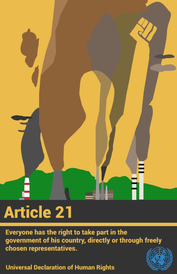
ART225 Graphic Design Human Rights Poster:
My focus throughout this project was to accurately portray and communicate the visual concept of climate change and global warming. Since it is one of the biggest issues that faces our society, I found it a responsibility to globalize this poster, and make it understandable for all angles of life and people. Since it is an issue that affects all of us, I found it appropriate.
When looking for an article from the UN’s Declaration of Human Rights to design from, I was looking for an article in connection to government and general protest. I thought this because the humans are responsible for the actions, we take towards climate change, and It is up to us to change the fate of the planet. Article 21 fit the right theme. I also wanted the human figure to relate and be a part of the figure itself, leading to the human outline becoming an extension of the environment.
This poster was solely based around the pen tool of Adobe Illustrator, an important tool to make creative shapes and malleable outlines that can be constantly changed. Compositionally, I wanted a human silhouette to be the focus of the poster, as it lies in the middle of massive amounts of smoke and emissions. The use of negative space came to me as I was making the project, being a main component of the background, as well as an indicator of the human silhouette. By making the silhouette the same color as the background, I thought it made them connect and communicate effectively without giving away too much information. I picked it because of my passion for the scientific world, and the prevalence of climate change in our society.
The poster I think accurately portrayed the article, since it shows the role of the human society towards the decisions it makes. Highlighting the importance of protest and one’s voice was a very effective approach towards communicating with the audience, as well making this poster have a global aspect to it, where people can look and it and relate to it, or at least understand its message. Because of this, the text and imagery was unified to be interpreted by a non-english speaker, since it uses many devices or figures recognized by many, such as powerplants, fields, and elaborate text.
Finally, researching for similar posters really helped in getting ideas, as well as being a great source of brain storming for sketches and eventually the poster itself. It was great to see the wide application of these articles by different people and their respective designs.
Finally, the class critique before the final poster was very very helpful, since it made me realize the corrections I had to make for the final. I was reminded that I needed to change the scale of the work, as well as the anatomical elements of the human silhouette to make it clearer that it is a human raising a fist.
Overall a very fun and engaging project.
Best,
Marios Argitis
2 notes
·
View notes
Text


Fat and Fauna
Digital, Ink, Graphite, Gold Pen
14x18
Stonehenge Warm White
The theme for my third project in my Drawing II class was
“Consumptive Collections”
We had several prompts to choose from, and I picked documenting everything ingested in one day. This was open to interpretation, but I went literal with what all I ate in 24 hours. From these series of sketches and collages from our documentation, we had to interpret them into a series of meaningful drawings.
I chose to focus on consumption in the sense of fatness and food. Being fat in an extremely fatphobic and diet centric society basically means that food should be only used as a tool to make yourself smaller, and that anyone that sees you eating must make assumptions of your dietary history and come to conclusions about why you are the size you are, thus may ridicule you or treat you as less of a human being.
I knew I wanted to include three things in this series: representing what I ate as a sort of motif, using insults associated with fatness somehow, and using a style different from my own in order to serve the projects criteria of experimentation.
One of the art styles I’ve been studying in my classes is Art Nouveau, and I felt it would be perfect for this series. The women in art nouveau posters are beautiful, at an acceptable weight level and fit perfectly into neat borders and frames. I had an idea of a fat body, bursting out of the frame, emphasizing her form, her role outside of societal beauty standards and contrasting the idea that food should only be used to make yourself smaller.
Due to time restraints I could not use color, but decided instead for the focus to be on line, contours of form. I made use of variety in line weight, as well as implied lines, things significant to Art Nouveau style.
After making sketches of fat women in this style I still felt something was missing, and after some experimentation I literally cut out a head of a cow and pasted it onto my sketch. I decided to replace human heads with animal ones to represent the dehumanization people give fat bodies, as well as to serve for illustrated insults. The cow and pig are two common animals used to belittle and dehumanize fat women.
Lastly, the icons in their halos represent my literal consumption, as well as the plants/flower crowns. The pig piece is based on chicken strips and fries that I had from Whataburger. She is surrounded by a pattern of life stages of potatoes and life stages of chickens, wearing a flower crown of various stages of potato plant flowers, holding two stems of Bluebonnet flowers, representing the state flower of Texas where Whataburger was founded. The cow is based on my meal at Chipotle, her icons symbols of ingredients used in many of their recipes, her crown various stages of an avocado plant flowering and grasping two stems of Rocky Mountain Columbine flowers, the state flower of Colorado where Chipotle was founded.
This piece was very triggering to make, I had several anxiety attacks during the process due to flashbacks of trauma and abuse surrounding food and my body. I was mostly dreading critique, having to explain all of these things to a room of thin able bodied people, but I am happy to say that my pieces were well received during critique. One of my favorite comments from a peer was a response to other comments saying that their bodies while fat were beautiful, and she said there's no need to justify their being with beauty, they didn't have to be beautiful to look at, its wonderful that they could simply exist and take up space.
Sadly the printing did not work as planned, the printers at UNT are made for rolls, not sheets and thus I had lots of complications, and the cow was not able to be printed properly ): so I'm only sharing a photo of the final Pig piece. I do plan on redoing them PROPERLY ( there is no lightbox at UNT for some reason so I'm going to literally drive all the way to Plano to use the one at Collin as opposed to printing my sketch on my nice paper and inking over it as i did the first time) and I will also be selling limited edition prints of these if you are interested, keep an eye out :)
238 notes
·
View notes
Text
3/30/2021 - 3
Being a science major with an art minor is a really intriguing challenge. I want to draw all the time, but I’ve got the complication of having science things I need to do. So what do I do? I try to combine the two sometimes. Recently, for example, I had an infographic project due in my graphic design class that was, coincidentally, due on the same day as an exam in my genetics class. Naturally, I did what any nerd would do: I used my infographic project to study.
I have been known to create visual study tools for myself in the past, a fact that I am quite proud of. I made a large “poster” of many different organisms for my introductory biology class to help me study for an exam, after all. This time, though, this time was different because I got to actually make a polished final product instead of some scribblings of different colored pens on printer paper.
I used my infographic project to study the different types of chromosome modifications that led to mutations: deletions, inversions, translocations, and duplications. I hand-illustrated a total of 10 different chromosomes, each demonstrating a different effect of chromosomal modifications. I was quite proud of my work, and still am. It was informative and still looked nice, and, in my opinion, was fairly simple.
Don’t trust a person with no knowledge of science illustration to appropriately judge a science illustration, though.
According to my professor and class, it needed “more creativity,” “visual metaphor,” and “more creative typography.” All of these critiques were just confusing to me. This is science, not business. You don’t use metaphors in science, and if you make the presentation too flashy it takes attention away from what you’re trying to convey. I left critique annoyed, especially because I didn’t really get a chance to remark that my project was meant to be an exploration into the type of work I want to do for a living: illustrations and graphics for textbooks.
In the following days, I took my finished project to my academic advisor, a biology professor that I had my first semester at college whom I adore with all my heart. He was impressed with my work and agreed with my sentiments that the critiques of making it “more creative” or “visually interesting” were ridiculous and unnecessary. I’m hoping to show the infographic to my genetics professor soon and see what he thinks about it. In the meantime, I will continue to be proud of my work and see what other science illustration practice projects I can get my hands on.
#bioramblings#science illustration#infographic#scientific illustration#biology#genetics#biologist#graphic design#textbook graphics#don't trust an art major to do a scientist's job
1 note
·
View note