#ProjectStatement
Explore tagged Tumblr posts
Visit Tumblr Blog
Explore Tumblr blogs with no restrictions, modern design and the best experience.
Last Seen Tumblr Blogs


Fun Fact
Tumblr.com rank in the US is 25.
Text


Diffrent Harley's designs in my art style
Designs belongs to:
@irisgoth
@curlyberrrry
@gorey-baby-doll
@lavenderwhirls
@harleysawyerlover
@citrusvortex
@projectstatic
@ploompkin
@alpiinee
@ajoure
@archaospetryx
@bee-boiii
@mm-slashing-boy
@d1tz
@tomwill-hzstuff
@fishymom-art
I love Harley sm

32 notes
·
View notes
Text
Here is my other AU! Project static! It’s an AU where Harley became a failed experiment and now suffers with guilt, trauma, and chronic illness!
General rundown for this AU
PLOT
The main diverging point in this AU is instead of kicking Harley out of the young geniuses program, Elliot adopted him and taught him morals (same level of snark, but significant more caring for the children)
Harley and Leith met much earlier, and started dating. This ended HORRIBLY for both of them, and caused Leith to take the path Harley originally did.
Leith is jealous of what Snow and Harley have, and tries to ruin them from the inside out
CHARACTERS
Snow (He/They) assistant scientist/ Harley’s bf AKA Bigger bodies Bright Lights Catnap
Maddie (She/They) Head of security, mother of Finn
Finn (He/They) Child of Maddie and Leith, adopted son of Harley and Snow
RELATIONSHIPS
Snow + Harley (actively dating)
Snow + Leith (very briefly dated, bitter exes)
Snow + Finn (babysitter/godparent)
Harley + Leith (very toxic relationship, unresolved trauma exes)
Harley + Finn (adopted father and son)
Harley + Maddie (coworkers and coparents)
Leith + Finn (father and son)
Leith + Maddie (one night stand that resulted in Finn)
SOURCES
SPOTIFY PLAYLIST
TIKTOK PLAYLIST
PROJECT STATIC AU
MY MAIN BLOG
#mob entertainment#poppy playtime#poppy playtime harley sawyer#harley sawyer#poppy playtime chapter 4#project static au#art
23 notes
·
View notes
Text
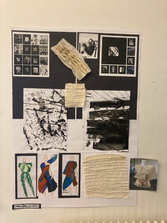
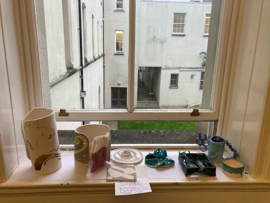
'MOVEMENT' project statement.
I am exploring MOVEMENT through water.
My 3 Electives to develop this through are
Sculpture and combined media
Ceramics
Fashion
As part of the fashion elective we first created some quick shapes on paper from these marks which represented our chosen subject of exploration of which mine was water. I created ripples, waves and undulations found when water is moved by any force. These shapes informed how I designed my fashion pieces.
From here when I continued into my sculpture elective I experimented with water and recreating movement which I did in contained spaces, I recorded the movement of water when force and other fluids and objects are introduced to it. This helped me to capture various forms and shapes which informed a continual development of play.
I brought the expression of the re-created movements into my ceramics elective which developed further and more interesting patterns as a basis to work with clay.
In the end I brought together the water element captured in my ceramic pieces which I turned into a standalone sculpture piece tying in textures from my fashion elective.
3 notes
·
View notes

Text
Project Statement - Movement
Electives: Animation, painting and graphic design
In response to movement I have been looking at how there is movement in music, as I believe that music is very energetic and I am a musician who is very interested in the topic.
Initially I began looking at how people can be moved by music emotionally.
I then started exploring the body language of musicians and how they move while playing their instruments.
I created an animation story where the main character plays an instrument which moves the plot forward.
I explored soundwaves and audio patterns which represent the movement of music.
I then created animations where I recorded myself playing the piano to show how the music I played moved simultaneously with the plot of the animations.
4 notes
·
View notes
Text
the project statement:
exploring how user immersion and interaction can benefit language learning.
1 note
·
View note
Text
Project 2 Statement
For our second project in my photography class, the topic was “Utopia vs Dystopia.” Typically I have a negative connotation with Utopias, while Dystopias present more interesting and varying concepts. This is why I went with the topic of Dystopia. I wanted to explore either a global issue that I am interested in or the idea of “opposites”. For that, I would either construct upside-down photos or photos with people whose clothes are inside out. However, after a lot of research, I decided to symbolize the global topic of trash. I wanted to show the trail of our trash once it hits the inside of a trash bin. I believe the phrase, “What you can’t see won’t hurt you,” or, “Out of sight, out of mind,” is what I wanted to focus on. Even though we might know where it goes, most people have never seen those places and therefore can remain ignorant of the situation. From our hands to the bottom of the ocean, trash is detrimental to the environment and must be addressed, It starts with awareness. I photographed my interpretation of the trail of trash.
0 notes
Text
Starting a new project in Photo Class!
The theme of this project are animals that my family raises. I have a lot of pets in my home ranging from chickens, dogs, turtles, fish, a tortoise, and some other birds. My plan is to showcase each of these animals around my home from feeding, playing, or in the case of the chickens, cooking.
0 notes
Text
Recourses
New? Start here:
https://www.hellenion.org/calendar/ (their website is great!)
https://www.theoi.com/
https://www.hellenicgods.org/projectstatement
https://www.learnreligions.com/about-hellenic-polytheism-2562548
https://www.youtube.com/@FeltheBlithe/playlists
Ritual resources:
https://spells8.com/full-moon-oil-recipe/ _______________________________
(Usually, I’ll look up what the correlating herbs, spices, symbols/objects, time and style of practice/prayer is associated with what I’m seeking to achieve with my spell work as a refresher each time I’m putting together something, be it a spell, entire ritual, a sachet, recipes, tea blend or an oil blend. I do this also to better align with the god/goddess/deity associated with the things seeking to manifest as well.)
I will keep adding and reorganizing this post as I research and re-find old resources I’ve used in my own practice/studies.
MY RITUALS: https://at.tumblr.com/shallwepagan/i-created-the-guide-to-the-ritual/sun4h57ybnlt
Egyptian:
https://www.britannica.com/topic/ancient-Egyptian-religion/The-Gods
#pagan#paganism#Hellenistic#hellenistic pagan#hellenic polytheistic#hellenic deities#hellenic witch#hellenic gods#hellenistic polytheism#witch#witchlr#baby witch#new to witchcraft#witch baby#learning#studying#practicing#practice#ritual#ritual magic#how to witch
5 notes
·
View notes
Video
tumblr
America’s Most Wanted: Fame.
In America, we crave to be like the famous. We want their talent, we want their fans, we want their glory and their lasting legacy. We are obsessed with those more famous than us because we look up to them. We perceive them to be better, stronger, happier, and more successful than us. We view them as the best.
But when you ask the famous, they will tell you that fame does not equate happiness. In fact, fame can actually ruin the lives of these artists to the point of death. We demand so much from these idols that we literally suck the life out of them. By loving the famous, we kill the famous. With no remorse or accountability.
0 notes
Text
LOOSE ENDS : Clay and Copper sculpture
ADAD 1002 Assessment 2 Project Statement
What are we if not for our thoughts? It’s been found that an average human processes 70,000 thoughts in a single day, which counts down to almost a thought per second. This is one of the reasons why the human brain is said to be the most advanced and complex structure in the universe. We grow up believing that we are who we think we are, our thoughts mold us into who we want to be. We are human because we can control out thoughts. But with a glitch in the system, what if we could lost that control?
Intrusive thoughts and anxious impules have long before been considered to be the generic traits of “OCD”, and little do most know of the nature of such thoughts, how it impacts one’s emotions, personality, and overall lifestyle. Intrusive thoughts are obsessive- ever recurring, often mostly un-realisitic, that invoke an unnecessary fear in the mind. Unless one has experienced a lap of such continuous episodes, they wouldn’t feel the extent of such inner weakness. These thoughts always dwell on the worst of life’s scenarios, and based on our mental reaction ,these thoughts tend to keep coming back every time you would try to rationalize with it. In Assessment 1, I focused on the cyclic continuity between anxious thought and mental reaction. In Assessment 2, I wanted to overview the glitch as a whole.
I continued my exploration and experimentation from assignment 1 with the intention of trying out new sculpting mediums- as I was very interested in visualizing forms creating in 3D. My key goal in this assignment period was to work with new materials like metal wire, molding clay and also to experiment 3D modeling at the Virtual Reality studio. I was mainly inspired by 3 artists: Kate McDowell, Christina Mrozik and Odani Motohiko; each of their styles resonated a beautifully eerie feel influenced by the Dark art and surrealist eras, and this is what inspired me to explore into a more ‘darker’ side of the theme.
In my first experiment, I used bendable copper wire to create a mini sculpture of a brain formed by a snake. I liked visualizing this glitch as a snake – it brought out the eerie feel I was looking for, though I wasn’t sure of my final project at the time. From there on, I went on to recreate this sculpture in Virtual Reality using ‘GravitySpace’. VR modeling was definitely a highlight for me in this assessment. I had not tried it before and I loved experimenting with the various brushes and tools available. My plan of execution at this point was to 3D print a mini sculpture which I could create in VR, by developing my idea from the copper wire sculpture I had made. Due to time constraints and having to allow a two week period to 3D print, I was unable to go ahead with that idea, so this gave me the opportunity to model my own sculpture using modeling clay.
At this point, I had to narrow my focus on concept. My final statement was based on how something we have so much control over, somehow find its way to take control over you and my final project idea was to envision the mind as an imposter – the snake being a perfect symbol of betrayal. My sculpture shows the interaction between mind and self – clay and copper, how the mind begins to gain control and take over. The gradual metallic in-growths on the face suggest this idea of ‘gaining control’. I chose black Molding clay and Copper wire for this sculpture because I felt they both contrasted very well in visual appearance and surface quality. The clay portrayed a sense of solidarity, grounding and control, whereas the copper wire brought on a sense of drama, manipulation and acted as a center of attention in contrast. Ironically, Copper is also said to facilitate mental agility. The figure heard appears to be slightly tilted to the right which creates a very interesting overall balance within the sculpture. I created the copper snake using the ‘snake weave’. If I were to re- do the sculpture, I would have chosen to replace the inner silver cable wires to be copper ones too so the colour stays pure and consistent.
Overall this Assessment was a good journey which allowed me to push past my boundaries a bit more and I’m glad I got to get some hands on experimentation done and recorded. I have never sculpted before and this was definitely a self-learning experience, and I’m pretty happy with my final result!
Bibliography
http://www.human-memory.net/brain_neurons.html
https://www.psychologytoday.com/blog/the-superhuman-mind/201303/what-is-consciousness
http://www.darkartandcraft.com/blog/2015/10/28/the-dark-arts-of-japan
https://www.artsy.net/artist/kate-macdowell
http://christinamrozik.com/
0 notes
Text
‘CamShaft’ Project Statement
In my branding design for Cameron, it captures the very essence of his dynamic personality and hobbies. Cameron is an aspiring individual who possess good leadership quality, punctuality, a strong aim for efficiency and accuracy, works hard in all situations, and lastly a warm heart filled with generous and kindness. With the influence of Mr. Chip Foose who is a car customizer and designer, the zeal for technology and cars is a significant aspect of the brand CamShaft. The name CamShaft is a combination of Cameron’s name, interests and personality. Camshaft in fact is an internal combustion engine that makes it possible for the engine's valves to open and close. Through the brand name, it exhibits Cameron’s leadership and hard working quality. ‘Like a well oiled machine’ is the tagline of CamShaft and the idea behind is the satisfaction Cameron receives when all the plans come well together and he can make things happen. Similarly in both of my design, brand poster and motion graphic, it combines all the key elements in the brand and make things shine.
The brand poster accentuates the idea of combining different elements together and create an unity in the design as mentioned above. Furthermore, the poster focuses on the dynamic vivid colours, technological style, details and realism. In the centre of the design, there is a puzzle of a car, clock, computer chip and gears with each representing one of Cameron’s personality and interest. The digital clock suggests Cameron’s punctuality and strive to be updated in the evolving digital world. The computer chip showing Cameron’s knowledgeable side and orderly personality. This is a strong central focal point which heavily employ the Gestalt principle and aims to create an image that is perceived as a whole. With the connecting and continuation lines between each element, it has able to direct viewer’s eye to move through one object and continue to another. There is also two diagonal visual force created by the orange patches in the background and the dimension sketch lines. These flow lines have successfully guided a viewer’s eyes when looking at the design. The poster has both a symmetry and asymmetry composition model to advocate a sense of mathematical, systematic and cleanliness in the brand. Red, orange and blue are the split complementary colours used in the design to express the wisdom (blue), energetic (red) and enthusiasm (orange) side of the brand.
Since young, Cameron always has a dream to be a car designer. However due to difficulties, he is unable to pursue this dream. Based on this story, the motion graphic is here to fulfill his dream and display his passion for cars to everyone. The overall concept is to narrate the car design process from blueprint to testing phase and lastly driving in public. My design focuses on action words like flash, incisive and repetition to carry out CamShaft’s personality. The principle of staging is seen throughout the motion graphic as the main object (car) is always in the centre even when the scene is constantly moving. Thus, the purpose is to establish strong clarity and focus on the car. The motion graphic pacing gradually increases to further emphasize on the climax action. Nevertheless near the end, the pace slows down to resolve the motion graphic with a black fade in. In terms of contrast, there is a duality between order and random motions. Looking at the initial scene, the crosses and car sketches follow a specific pattern while the squeekly lines are randomly moving. In addition, the contrast between swift and stagnant is demonstrated in the second scene with the yellow orange lines flashing across the screen and the car remaining in the centre. This effect creates an illusion of the car driving in high speed and also balancing the stillness and fast motion. The complementary colour blue - orange is the only colour palette appeared in the motion graphic. This combination of colour holds unity between different scenes and also create a sense of dynamic. With the motion graphic moving from left to right, this visualforce suggests the brand CamShaft’s confidence in moving forward to the future. When the brand name appears at the end, the clock face appears on the right corner which echoes with the clock on the poster thus implying CamShaft’s attention to punctuality.
Both the branding poster and motion graphic explores CamShaft’s enthusiasm for technology and car as well as his personality through the different elements of design. Mr. Chip Foose once said "I like cars. I couldn't tell you why. It's an extension of one's personality. It's personal freedom." Similar to the brand CamShaft, there is an undeniable love for cars and it has already become part of Cameron’s life. My designs speak for the brand and this inspirational quote has perfectly illustrated the sensibility and the idea that I wanted to carry out of the brand - CamShaft.
1 note
·
View note
Text
Project statement
Due to the crisis of increasing cost of housing in New Zealand, particularity Wellington (city) and other addition dominants. Regarding to New Zealand statistic, Today, 3500 - 4000 residents are living in council housing with a social subsidized rental support from government and from 1950 of established the number is increasing every year. However, “People who is living in social housing suffer from long-term mental health problem, and house construction as well as environmental.”
Revolution
A social housing is a home for families who need a dwelling supports. A healthy home in a healthy community/environment to reinforce a quality of life. A home that is supporting tenants’ identity and increasing well-being in all area.
1 note
·
View note
Text
Project Statement
From its inception in the early 1990s, reality television has always been a medium very welcoming of queers. This has done wonders for the gay community; such exposure has brought an end to various misconceptions as well as provided a voice to a social minority. Pedro Zamora, for example, was a Cuban-American AIDS educator who appeared on MTV’s The Real World: San Francisco in 1994. Through his involvement with reality television, Zamora was able to bring international awareness about HIV/AIDS and shed light on the controversial issue to the mainstream media, which, in turn, assisted in changing the public perception on the topic.
Instead of attempting to discuss the “problem” behind homosexuality or the “challenge” of not living a heteronormative lifestyle, by merely including queers as regular cast members, The Real World depicted them for exactly what they were: ordinary people. In this sense, MTV was innovative in providing the first “performative space for the unveiling of homosexual romance-based narratives…the performance of homosexual romance within the context of mainstream youth-oriented television (on MTV) became a powerful discursive tool” (Pullen, 218).
Gay men have been protagonists on a plethora of reality genres, from shows like NYC Prep, a show about privileged high school students in New York City, to The Amazing Race, a show in which two people compete with others on an adventurous race around the world.
Arguably the most prominent reality show featuring gay men was Queer Eye for the Straight Guy, which ran from 2003-2007 on the Bravo network. “The shows success is premised on the emergence of an authentic gay brand from amidst a plethora of masculinities” (Morrish 352). The show centered on the “Fab five” who, on each episode, sought to “rescue” a helpless straight man. They do this by teaching him about culture, grooming, style, design, fashion, and food. Each category comes with its own gay expert, who trains these men on their respective topic to woo their wife or girlfriend. Through the relationships, we see masculinity constructed as a helpless “manly” man who knows little else other than sports. The “fab five”, on the other hand, are the antithesis, creatures with vast knowledge of the world. They serve as fairy godmothers to the straight man. The issue here is the stereotypes perpetuated by this show. At the time of the show, there was little going on in terms of gay portrayal in the media. Therefore, there was nothing to counter balance the show, depicting gay men as all having taste, culture, and an affinity for sexual humor.
While it is admirable that gays have been included in the documentation of life since the start of reality television, these shows seem to provide the public with a selective display of homosexuality. While the breadth of shows queer males appear on may be extensive, the “type” of queerness represented is stereotypical: effeminate, overtly sexual, vain, catty, and sassy. Such reductive presentations of homosexuality are dangerous because they construct homonormativity, reinforcing stereotypes and providing the public with yet another unrealistic idea of a social group.
The portrayal of gays predominantly displayed on today’s reality television can be organized into two categories: the gay style maven and the gay best friend (GBF). The “Fab five” would fall into the gay style maven category, as well as personalities found on America’s Next Top Model and Project Runway.
Reality television has exaggerated the gay-man-as-style-maven role and its class meanings: playing up queenly insight into the consumption habits and cultural customs of the upper middle classes, and the ability to transform a dowdy, “taste challenged” man, woman, or space into a fabulous, “classy” one (Gamson, 52).
Michael Kors, famous primarily for his clothing line, became a household while a judge on the popular reality program, Project Runway, in which he offered contestants his fashion insights with snarky and sassy comments. It seems as though he almost tries to out sass himself with each episode, coming up with ridiculous critiques of garments to keep the audience entertained with his snarky wit.
Further examples of gay style mavens come from America’s Next Top Model in the form of Miss J. (J. Alexander) and Jay Manuel. The two serve on the judges’ panel as well as acting as mentors for the contestants, teaching them everything from make up to runway walking tips. Now entering its 22nd season, fans have loved the humorous commentary provided by the two. These two are the definition of “playing up queenly insight”, constantly saying things like:
“My motto is, walk like it’s for sale and the rent is due tonight.”
“Don’t blame the photographer, blame your parents for bad DNA.”
“It’s your fault, ‘cause you’re fat, bitch.”
It is advice like this that takes women from country bumpkins and “transforms” them into sophisticated, chic, supermodels. These women go from nothing to, as we are led to believe, landing international modeling contracts, all thanks to Tyra Banks and her group of gays.
The gay best friend acts as a straight woman’s sidekick. Seen on almost every branch of the Real Housewives franchise, these gay men are the “straight woman’s support, shopping companion, [and] confidant. These are secondary characters, not central ones” (Gamson, 53).
While it is impossible for any form of media to accurately portray every member of a social group, I do not think it would be difficult to implement a wider array of gay men. In my opinion, many of these reality shows draw hyper-focus on the queer man's sexuality and his "gay" habits (sass, divaness, etc.). I would love to see what scripted shows like The Fosters, which have no so much centered the plot around the character's sex life, but rather around their life in general. I think in doing this a more diverse representation of the queer male would emerge.
0 notes