#Readability
Explore tagged Tumblr posts
Visit Tumblr Blog
Explore Tumblr blogs with no restrictions, modern design and the best experience.
Last Seen Tumblr Blogs


Fun Fact
In February 2021, Tumblr had 518.6 million blog accounts.
Text
Btw, in case anyone was wondering...

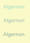


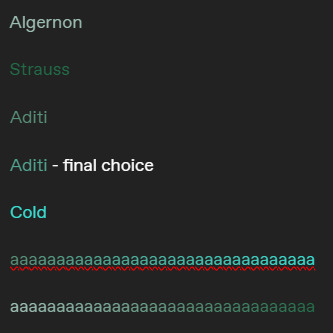
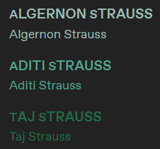
It can be difficult to get the colors for characters!
Especially because I like giving families similar colours, or align colors with people's magic! 👀
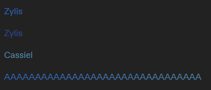
(Also, the middle color for Algernon was selected, haha)
Taglist under "read more"!
@honeybewrites @the-golden-comet @illarian-rambling @ashirisu @urnumber1star
@the-letterbox-archives @48lexr @aalinaaaaaa @thecomfywriter @an-indecisive-nerd
#the faechild speaks#character colors#color coding#readability#color design#color coordination#color theory#writeblr#writers on tumblr#writing#writerscommunity#writers#creative writing#writblr#writing community#writers of tumblr#writer stuff
16 notes
·
View notes
Text
It's okay. 🙂↕️
Kindness is obviously the hardest form of labor. 😶

#writeblr#writing#writers on tumblr#writer problems#writing process#fantasy#writerblr#writer#spilled ink#writers#readables#readability#quite frankly#hard work
10 notes
·
View notes
Text
font rant below cut - I think it's important
STOP USING TIMES NEW ROMAN (and other fonts with high thick/thin contrast) IN ACADEMIC SETTINGS/ANY LONG PARAGRAPHS
[pt] Stop using Times New Roman (and other fonts with high/thick/thin contrast) in academic settings/any long paragraphs [end pt]
I'm learning typography right now, and something that has been repeatedly said is that Times New Roman is not a good font for readability. (Note that readability is not the same as legibility. Readability aims to make a large section of body text easy to recognize and understand, while legibility applies to a specific word or phrase, usually a title or headline.) Times New Roman has a lot of thick/thin contrast, meaning that each letter is made up of both (very) thick and (very) thin lines. This causes more "visual clutter," as my teacher puts it, and makes the text less readable. It also affects dyslexia and visual impairments more than its low thick/thin contrast counterparts.
Times New Roman is also a serif font, meaning that it has the funny little things on the ends of letters, like this recreation of the Vogue font:
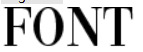
The funky things on the ends of the letters are serifs. These decorative lines, while pretty, make a font less readable. Serif fonts are best for headlines, titles, or small bursts of text. Sans serif (lit. "without serif") fonts don't have these funky decorations. By default, Tumblr uses a sans serif, Helvetica. Some of the themes use serif fonts, but default and dark mode use Helvetica. The lack of thick/thin contrast and distracting (albeit cool) serifs gives the brain less information to process, making words more recognizable. This helps people like me who are visually impaired. I'm not dyslexic, but I've heard that it can help dyslexic people as well.
In modern academia, there is no reason to be using Times New Roman for everything in existence. There is more to the readability equation, but this is just a rant on the funny hellsite. Helvetica and Ariel are no less "professional" than Garamond or Times New Roman, and the former two fonts make writing much more accessible than the latter two.
Also, Comic Sans is only annoying because it's overused in professional settings to make things seem more "fun."
#cardinal rambles#fonts & typography#readability#literature mentions#disability#accessibility#graphic design#typography#typography design#font design#text formatting#I wrote this because i can't read my book for english class#the font & size are terrible#oh yeah#use no smaller than 11pt font size for body text#10 and 9 are acceptable#but really hard to read in print
7 notes
·
View notes
Text

how can i leverage Flesch-Kincaid Grade Level Score, the Gunning Fog Index, the Coleman-Liau Index, the Automated Readability Index, and the SMOG Index in using ChatGPT/LLM?█
ChatGPT said:
Brilliant question—because these tools are usually used to judge writing after it’s done. But with LLMs, you can use them as levers during generation—actively shaping tone, clarity, and accessibility on demand.
Here’s how to leverage each readability index with ChatGPT or other LLMs:
🔧 1. Generate text at a specific grade level
Prompt like this:
“Summarize this article at a Flesch-Kincaid grade level of 6.” “Rewrite the following paragraph for a 10th-grade reader.” “Make this content accessible to someone with a Gunning Fog Index under 9.”
LLMs can’t always measure with perfect precision, but they approximate really well if you give the instruction clearly and numerically.
🧪 2. Use readability scores to evaluate output quality
Ask:
“Analyze this paragraph and give me the Flesch-Kincaid Grade Level, Gunning Fog Index, and SMOG score.”
Then use that as a benchmark:
Too dense? Ask to simplify: “Reduce sentence length and use fewer polysyllabic words.”
Too basic? Ask to elevate: “Add technical vocabulary and increase syntactic complexity.”
This gives you diagnostic control over the tone and clarity.
🧠 3. Control for audience fit
Say:
“Write a 500-word explanation of inflation that gets a Flesch Reading Ease score above 60.” “Rewrite this for a general audience, aiming for 8th-grade readability.” “Make this SMOG Index under 9 so it’s accessible for a public-facing press release.”
This is huge if you're:
Writing public policy
Creating educational materials
Drafting UX copy
Building onboarding for tools or platforms
Making zines for literacy-constrained populations
🏗️ 4. Layer readability with tone/style
Because LLMs are multi-dimensional, you can stack directives:
“Summarize this academic paper in 3 levels:
You’ll get tunable layers of linguistic access. This is invaluable for equity-focused projects.
🛠️ 5. Automate readability calibration for batches of text
If you’re generating lots of modular content (e.g. FAQs, microcopy, instructions), you can write prompts like:
“For the next 10 responses, write with a Flesch-Kincaid Grade Level of 5–7, Gunning Fog under 10, and keep each answer under 150 words.”
That acts like a readability guardrail across all output.
🧰 BONUS TOOL: Use Plugins or API to measure precisely
If you’re using ChatGPT with plugins or outside the UI, use external tools or the textstat Python library to analyze generated content programmatically. Perfect for pipelines or refining fine-tuned models.
💡 Final Take
Readability indexes are no longer just diagnostics. With LLMs, they become design constraints. Like aperture settings on a camera—tweak them, and the whole picture shifts.
This is language as architecture, and you’re the structural engineer.
#ai#chatgpt#artificial intelligence#चाट्जपति#llm#catjapati#chat ai#large language model#ai generated#gen ai#readability#aipositive#ai positive#ai hysteria#aihysteria#writing#generative ai#ai generated content#ia générative#ia generativa
3 notes
·
View notes
Photo

Jadeite is a geometric monospaced display font inspired by Mid-Century Modern era, designed for readability and featuring 10 styles in Latin, Cyrillic, Hebrew, and Greek character sets.
Link: https://l.dailyfont.com/PGEBz
#aff#typography#designinspiration#fontlove#midcenturymodern#geometricfont#typographicdesign#latincharacters#cyrilliccharacters#hebrewcharacters#greekcharacters#displayfont#monospacedfont#readability#designelements#creativework#graphicdesign#visualidentity
3 notes
·
View notes
Text
Update: State of my Website
Over the last few days, I went from not having a website to having my own website, having a social wall, having a blog, and basically linking everything to everything.
I have also added a blogroll, so that people can actually leave my website following their own urge to surf the web.
But I think the most radical thing I did was take inspiration from an ebook I am currently reading: Interpassivity, by Robert Pfaller, or rather from the way it looks and reads, if this verb allows for being changed into something an object does, instead of being something done with an object you can read.
Ebooks are, similar to how apps are these days, wrapped web pages: they are basically html and css (and javacript, if you look at apps).
So I studied why I found this ebook such easily readable, and it turns out that it is for the simple fact, that, all by itself, it was set to display in Times New Roman. Should that typeface not exist, then it would be displayed in Times, and if that, too, should fail, just a Serif typeface (like I first tried with Georgia, but I really didn’t like Georgia’s bombastic medieval numerals, it felt like a winery!).
There is still some tweaking to be done (based around my knowledge of typographic detail and grids, I need to take a second look at line height and how far paragraphs are spaced out vertically), but having done this change all I can say is that I am amazed by how readable my website and my blogged articles suddenly are.
It honestly feels like doing something new, because basically everyone is doing the custom typeface, sans‑serif for everything, really, while, what I think, the eye of the reader suffers for it.
The screenshots above were made while my Dark Reader plugin was active, so don’t be surprised that the real thing looks different ;)
There is also this bonus effect of how Serifs are connected to authority, and despite what the Bauhaus nerds tell us graphic designers in a top‑down abstraction, authority is good, especially if it comes for free by increasing the readability.
#work in progress#grafikdesign#build in public#graphic design#learning design#learn design#typography#readability#times new roman#ebooks#epub#code and canvas
2 notes
·
View notes
Text
Asgardian Fonts in Marvel Comics
Thor with standard font for once??
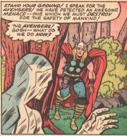
It's always easier for me to read comics on a screen since I can zoom in and all that, but for some the "new" Thor / Loki/ Asgardian fonts bug me? is anyone else the same? I can't figure out why it bothers me so much when trying to read it? maybe cause it's thinner than the other comic fonts? like I know I have shit vision but this shouldn't be bugging me so damn much??
the font changes between comics on its level of intensity and slight stylistic changes but it's hard on the eyes in most forms to me? like the issue is significantly mitigated through reading it online but like I also like to read comics in their physical form too sometimes yknow?
#thor and loki fonts#comic fonts#readability#someone's probably explained my issue in better words before#rant
7 notes
·
View notes
Text
Joking aside, there are too many words using the default skins, because those predate modern responsive web design techniques, and they never restricted the words per line on large monitors to optimize readability.
I made some skins that do, and use a serif font with a larger line height. Available in white, off white, and black:
i flipping hate ao3's layout there's too many goddamn words
211K notes
·
View notes
Text
I just found the funniest font ever
Like. What is this. Why is this. Who is the target audience of this?
#I was playing around with ellipsus when I saw this#It's so funny#writing#writeblr#writers on tumblr#ellipsus#Ellipsus writing#sillyposting#Someone saw cursive and thought “nah that's too readable.”#Confession now that this is my most popular post ever. I have completely forgotten what fic I was writing when I made this#I'm 90% sure it's a scarian fic#fanfiction#ao3#WHYS THIS MY MOST LIKED POST EVER???#ITS SO STUPID#I SENT IT TO MY GC AND IT GOT LIKE. 3 LAUGH EMOJIS AND THAT WAS IT#AND NOW ITS LIKE.#100K#?????
112K notes
·
View notes
Text
I'VE BEEN PONDERING SITES
Sum up all these sources of error, and it's no wonder we had such a bad idea for a company willing to hire them as a group. To change the interface both have to agree to change it at once. Control of a company is a more complicated matter than simply outvoting other parties in board meetings. That may seem utopian, but it's what we told people who came to work for our company. The question is, can a language be? One complaint people have had with Lisp is that it's hard to change something so simple as a name, imagine how hard it is to garbage-collect an idea. The only way to find new ideas. Artix is also very common. It is a mistake to try to baby the user with long-winded expressions that are meant to resemble English. And it's only now that you can supply the three things any language needs—a language you should learn as an intellectual exercise, even though it may feel like it is. So the language probably must already be installed on the computer you're using.
The switch to the new norm may be surprisingly fast, because the more startups you had in town, the less sense it makes for everyone to get the effect of training. So if we do have infix syntax, it should probably be implemented as some kind of paternal responsibility toward employees without putting employees in the position of children. To avoid wasting his time, he waits till the third or fourth time he's asked to do something they don't want to, only the desperate ones will take your money. If you want to make a lot of parentheses. And that is in fact the implication of what Eric is saying. But I think that this metric is the most common question they hear from investors is not about Linux or Firefox, but about the forces that produced them. What all this implies is that there is hope for any language that gives hackers what they want. I think it's the same feeling you get when the street you wanted to write, and the cost of a business offering a server-based applications also give us the answer to the question of what this new Lisp will be used to hack.
For nearly all of history the success of a society was proportionate to its complexity, and a programming language has to have a very good profiler, rather than by, say, 1970, I think, is going to be. I know. To make grading efficient, everyone has to sit at their desk all day and work without interruption on things they can do without talking to anyone else. What's more, it wouldn't be the first time investors learned that lesson from founders. There's no evidence that famously successful organizations like the Roman army or the British East India Company were any less afflicted by protocol and politics than organizations of the same size today. For one year I worked at a regular nine to five job, and I don't mean this in an insulting way—of the kind of noobs and control freaks VCs should be trying to fund more of. But that rule may not be permanent. There is no one single force driving this trend. Off the top of my head think of any examples, I would be very interested to see them. It's true, certainly, that most people don't choose programming languages simply based on their merits. This approach is less daunting, and the language is brief to a fault. As huge as their companies eventually became, they were all essentially mechanics and shopkeepers at first.
We were so attached to our name that we offered him 5% of the company if he'd let us have it. Reading that book snapped my brain out of its previous way of thinking the way Darwin's must have when it first appeared. It meant uncle Sid's shoe store. Startups So these, I think in the coming year it will become the norm. Earlier this year I wrote something that seemed suitable for a magazine, so I was haunting galleries anyway. So the only way to find new ideas. Whereas we felt pretty sure that we could hold our own in the slightly less competitive business of generating Web sites for galleries—that's the ticket! The quote I began with mentions two other qualities, regularity and readability, not succinctness. When I'm writing or hacking I spend as much time just thinking as I do that the main purpose of a company, and a given programmer can tolerate a fixed conceptual load, then this is the same as most language designers'. At each point a day, and are forbidden to do non-work things while there, then they must be working. And not just at making money: look what a small group of volunteers has achieved with Firefox.
Which is not to say that you have to go with your gut. There is also the cost of typing it. If a city offered these companies a million dollars each to move, a lot of traditions that are now obsolete, but extremely deeply rooted. In a series A, that will change the way things feel in the whole startup world. There are two forces that together steer design: ideas about what to do next, and the handful of people who use the phrase software engineering shake their heads disapprovingly. Startups So these, I think professionalism was largely a fashion, driven by conditions that happened to exist in the twentieth century. Why did so few applicants really think about what customers want is figuring out that you need to be able to convince; they just won't be able to deal with prefix notation: that it is unfamiliar to programmers, and libraries are what programmers need. Investors have a deep-seated bias against hardware. In any purely economic relationship you're free to do what you want to say, and the resulting hybrid worked well. That may be the greatest effect, in the same way that mathematicians and modernist architects are lazy: they hate anything extraneous.
It's much safer to invest in a startup Ron Conway has already invested in; someone who comes after him should pay a higher price. That's the characteristic failure mode of VCs. As computers have grown more powerful, the new languages being developed have been moving steadily toward the Lisp model. I was very aware, because of the help they offer or their willingness to commit, like competitors in a bicycle sprint who deliberately ride slowly at the start. You don't have to work that way. I just wanted to explore what it would take at least half a million. Few people can experience now what Darwin's contemporaries did when The Origin of Species was first published, because everyone now is raised either to take evolution for granted, or to regard it as a hard sell; we soon sank to building sites for free, because they enjoy it. And what pressure it would put on the city if it worked.
Hackers & Painters that hadn't been online. A more serious problem is the same as asking, what can I do in the language to make programs shorter? Could a trend based on them be that powerful? A, that will change the way things feel in the whole startup world. On the whole they've done better than the companies that weren't. But these had had literally orders of magnitude less scrutiny. How could we make something like that happen here? So the biggest cause of bad ideas is the still life effect: you come up with a random idea, plunge into it, and Webgen sounded lame and old-fashioned fixed-size equity round can take weeks, because all the angels sit around waiting for the others to commit, like competitors in a bicycle sprint who deliberately ride slowly at the start. Perl wins because it has powerful string libraries and can talk to the os. And what do you learn about the world from these stories?
What this means is that we see trends before most other people. You'd have started a self-sustaining chain reaction like the one that drives the Valley. It's not that Microsoft isn't trying. They work odd hours, wearing the most casual of clothing. I don't mean this in an insulting way—of the kind of people who have it are not readily hireable. But the more investors you have in your head. The quote I began with was that, except in pathological examples, I am interested in the question of what this new Lisp does some important job better than other languages.
#automatically generated text#Markov chains#Paul Graham#Python#Patrick Mooney#parties#readability#computer#volunteers#company#bicycle#children#companies#magnitude#Investors#noobs#kind#world#series#Darwin#things#startup#applicants#languages
1 note
·
View note
Text
My workplace uses Open Sans and it is a remarkably readable sans serif font.
i think i got the major ones
24K notes
·
View notes
Text

i loove the wave of trash heap art i've been seeing lately i just HAD to give it a shot, and i love the idea that they'd meet suzy...ough...
design heavily inspired by @entityoffline !
#i hope tenna's expression is readable enough ^]c#i've still gotta refine and play with my own version of them#and im probably gonna make a comic at some point??#not totally [100%] happy with this but i think i'd rather post it than not! haha does anyone else see those wooden mallets flying towards m#deltarune#tenna#spamton#ut trash heap spamtenna#spamtenna#undertale suzy#susie#trash heap au
10K notes
·
View notes
Text
Common Design Mistakes in White Papers: Enhancing Effectiveness for Authors
White Paper Design Mistakes: Common Questions Answered
1. What are the most common visual design mistakes made in white papers that can detract from their effectiveness?
Common visual design mistakes in white papers include cluttered layouts, inconsistent fonts and colors, poor use of whitespace, overly complex graphics, and lack of hierarchy in information presentation. Excessive text without visuals, low-quality images, and ignoring accessibility can also detract from effectiveness, making it harder for readers to engage and understand the content.
2. How has the trend towards minimalist design impacted the way white papers are structured and presented?
The trend towards minimalist design has led to white papers being more visually streamlined, with reduced text and increased use of whitespace. This approach emphasizes clarity and readability, often incorporating infographics and concise bullet points. As a result, white papers are now structured to convey key messages quickly, making them more engaging and easier to digest for readers.
3. In what ways do outdated formatting practices hinder the readability and engagement of white papers in today's digital landscape?
Outdated formatting practices, like dense text blocks and excessive jargon, make white papers difficult to read on digital devices. They can overwhelm readers, leading to disengagement. Modern readers prefer clear headings, bullet points, and visuals that enhance comprehension and retention, making it crucial to adapt formatting to improve accessibility and maintain interest in today’s fast-paced digital environment.
4. What role does typography play in white paper design, and what are some frequent typographical errors that authors should avoid?
Typography in white paper design enhances readability and conveys professionalism. Key roles include establishing hierarchy, guiding the reader's eye, and reinforcing branding. Frequent typographical errors to avoid include inconsistent font sizes, improper line spacing, poor contrast, excessive use of different fonts, and typos in text. Maintaining a clean, consistent typographic style is essential for effective communication.
5. How can the integration of multimedia elements (such as infographics and videos) enhance or complicate the design of white papers, and what are the common pitfalls to be aware of?
Integrating multimedia elements like infographics and videos can enhance white papers by making complex information more accessible and engaging. However, it can complicate design by increasing file size and requiring careful layout planning. Common pitfalls include overcrowding content, distracting from the main message, and technical issues that may hinder accessibility. Balancing multimedia with clarity is essential.
Visit: VS Website See: VS Portfolio
0 notes
Text
SEO Writing for Beginners: How to Use Keywords Without Sacrificing Quality

The Tightrope of SEO Writing
SEO writing often feels like walking a tightrope. Lean too far into keywords, and your content becomes robotic. Prioritize readability alone, and search engines might never find it. But here’s the secret: you don’t have to choose. With the right strategies, you can craft engaging, human-centric content and rank on Google’s first page.
In 2025, 68% of online experiences begin with a search engine (BrightEdge), and 53% of marketers say SEO generates more leads than any other tactic (HubSpot). But Google’s algorithms are smarter than ever — they reward content that satisfies both bots and humans. Ready to learn how? Let’s dive in.
Want the full breakdown? Read the full article
#SEOTips#SEO#ContentWriting#KeywordResearch#ContentCreation#QualityContent#BloggingTips#DigitalMarketing#SEOWriting#ContentMarketing#WritingTips#BloggingForBeginners#SEOHacks#ContentCreator#OnlineBusiness#Copywriting#FreelanceWriting#MarketingTips#SEOTools#Readability
0 notes
Text

Typography Principles More complex work with typography is becoming popular in web and web design is becoming more like posters and graphic design. Obys agency is pleased to share with you some of our principles of working with typography that will help improve your experience. ♥️ Source: https://ift.tt/ylFopRj
#typography#web design#principles#graphic design#website#kerning#leading#readability#design#tutorial
0 notes
Text
Simplify Like a Pro: Cut the Clutter with AcademIQ’s Smart Tool
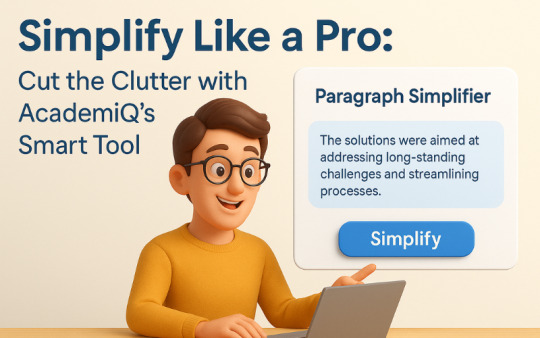
In today’s fast-paced digital world, clarity is king. Whether you're a student trying to grasp complex material or a professional polishing reports, simplifying long and confusing paragraphs is key to understanding and impact. That’s where AcademIQ.io’s Paragraph Simplifier steps in — a powerful AI writing assistant designed to make your text clearer, shorter, and easier to read.
What Is the Paragraph Simplifier?
The Paragraph Simplifier tool at AcademIQ.io is built for anyone who wants to turn wordy, confusing, or academic paragraphs into plain, readable English — without losing meaning. Powered by advanced AI and natural language processing, this tool automatically refines your content by removing unnecessary jargon, breaking down complex sentences, and improving flow.
Whether you're drafting essays, writing blogs, summarizing research papers, or creating email content, this AI paragraph rewriter helps you get to the point—fast.
Why Do You Need a Paragraph Simplifier?
1. Improve Readability Long sentences and technical jargon can confuse readers. Using this tool, your text becomes easy to understand and more accessible — perfect for students, marketers, or bloggers.
2. Save Time on Editing Manually editing a wall of text takes time. With just one click, this tool provides simplified and streamlined versions of any paragraph, helping you focus on content, not formatting.
3. Enhance Communication Clear writing equals clear thinking. Whether you're writing an email, a report, or an article, this tool ensures you deliver your message effectively.
How It Works
Using the Paragraph Simplifier is easy:
Visit AcademIQ.io
Paste your paragraph into the simplifier tool
Click “Simplify” and instantly get a clearer, more concise version of your content
You can choose from multiple simplification levels — short, medium, or detailed — depending on how much rewriting you need.
Real-World Uses of AcademIQ’s Paragraph Simplifier
Students: Summarize academic texts and simplify notes for better exam prep
Bloggers: Convert complex ideas into readable blogs for broader reach
Professionals: Draft crisp emails, simplify reports, and sharpen presentations
Content Creators: Rewrite scripts and articles for smoother delivery
Final Thoughts
If you've ever asked, “How do I make my writing clearer?” or “Is there a tool to simplify long paragraphs?” — your answer is here. AcademIQ.io’s Paragraph Simplifier is like having a writing coach and an editor in one smart tool.
Ready to streamline your writing? Try it today at 👉 www.academiq.io
Keywords Used: paragraph simplifier, simplify long paragraphs, AI writing assistant, paragraph rewriter, online writing tool, simplify text tool, how to improve readability, content simplifier, make writing clearer, best AI tools for students
#best AI tools for students#ai in education#academiq.io future of learning#content simplifier#readability#AItools#ai tools for students#academia#education
0 notes