#ShowCards
Explore tagged Tumblr posts
Photo
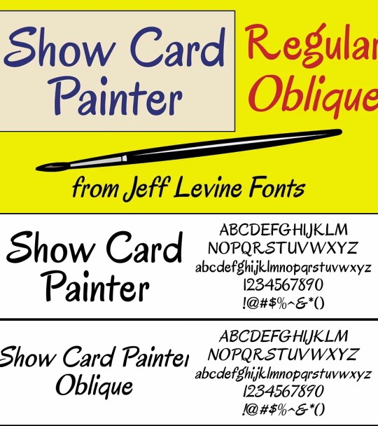
A 1949 book featured a novelty Roman cartoon face with casual brush stroke design used in ads, show cards, and signs, now digitized as Show Card Painter JNL.
Link: https://l.dailyfont.com/CsM0D
#aff#Typography#Design#Fonts#Vintage#Retro#Cartoon#Roman#BrushStroke#Novelty#AdFont#ShowCards#Signage#GraphicDesign#Typeface#CharacterFont#HandDrawn#ArtDeco#OldSchool
2 notes
·
View notes
Text
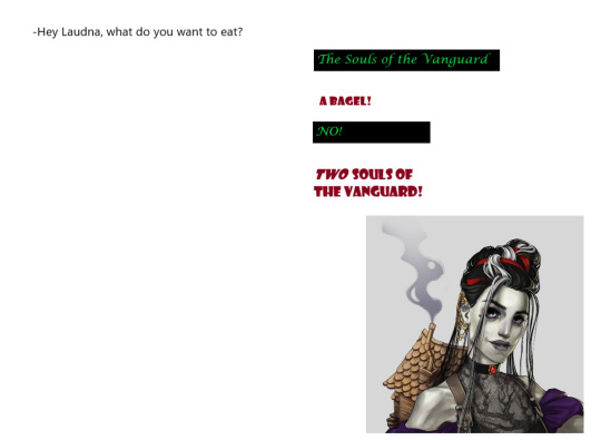
graphic design is, as ever, my passion
#critical role#laudna#delilah briarwood#description in alt text#laudna's font is called showcard gothic which i think is funny
64 notes
·
View notes
Note
sooo nick neopia's poll ended a bit ago and he lost so allow me to yell a bunch of anti-propaganda about this guy to everyone who doesn't play neopets (mostly copied from this earlier post). this is the third time i'm posting a big infodump about him, i feel like a blorbo evangelist or something.
SO BASICALLY there’s this one neopets characters. the thing that makes him unique is that he exists outside of canon sort of, in the form of april fools pranks. he’s sort of become the neopets’ april fools mascot since he’s appeared in 3 pranks so far (2003, 2020, and 2023).
nick makes his debut as a kid in april fool’s 2003, where he serves as the tour guide for the new, revamped, totally radical NEOPETZ!!
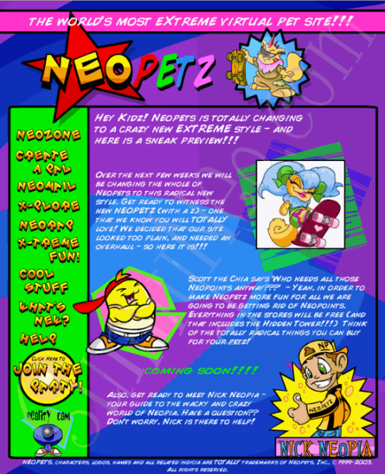
the image speaks for itself i guess. unlike in later pranks, nick is sort of just a one-off joke here, but instead of being forgotten he became a small joke within the fandom. you might find a few neopian times (neopets’ online newspaper written by users) articles mentioning how the author (jokingly) despises him.
then 2020 rolls around, and nick finally makes an actual reappearance in april fools 2020! he’s now older and apparently knows more about web design. it seems like Neopetz might’ve been his idea, because he wants to redesign the site again, only this time he wants it to be more modern and exciting. which his idea of is apparently backwards text, randomized links, and the elusive “13D.” check out his press release (ft. comic sans and showcard gothic).
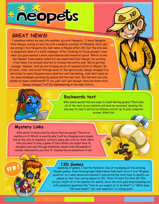
during this prank, the site would spin around, go upside down, etc. as nick redesigned it behind the scenes. could find any videos of it though </3
and finally, april fools 2023 (my favorite part!). nick has gotten pretty salty over his amazing ideas getting rejected by TNT, so he spent 3 years turning into a crazy conspiracy theorist, his main goal being to uncover whatever horrible secrets TNT has been hiding. so he launched a little “website” called the sceptic tank! you can still view it here but during april fools day, his ads would cover the site:
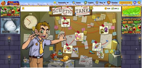
featuring a delightful always sunny reference ^_^
clicking on the sticky notes will present you with a different theory. you can read them all written out and look at his ads here.
he also guest starred on episode 3 of neopets’ podcast at the time, nosy neopians. click here to listen to him scream at two TNT members.
to sum it up he’s a crazy insufferable bastard man who thinks he’s a genius and i need him desperately despite that. he could have been a horrible sexyman if we tried hard enough. thx for reading yaayyy <3
Fascinating. And now I will know what you mean when you tag the wildest posts with "nick neopia"
30 notes
·
View notes
Text

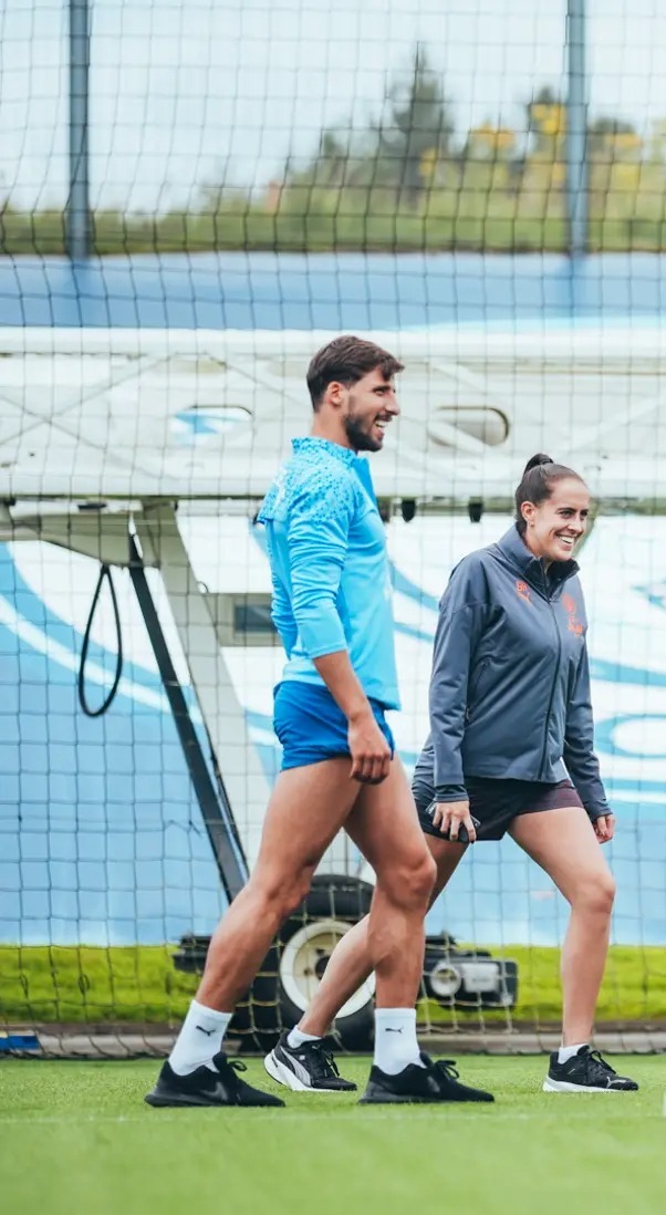
Got his showcard ready for fashion week 📸
71 notes
·
View notes
Note
What's your favorite Font?
INTERESTING QUESTION!!! IT'S GOTTA BE EITHER SHOWCARD GOTHIC OR IMPACT X^) THEY ARE BIG AND LOUD, LIKE ME! ❤️
7 notes
·
View notes
Note
the showcards are great --- whatever's easiest for you though! it was just an idea in case my plight was true of others who are casual fans :) may the best story win!
thanks for letting me know! I'll definitely implement them from round 3 onwards!!
3 notes
·
View notes
Text
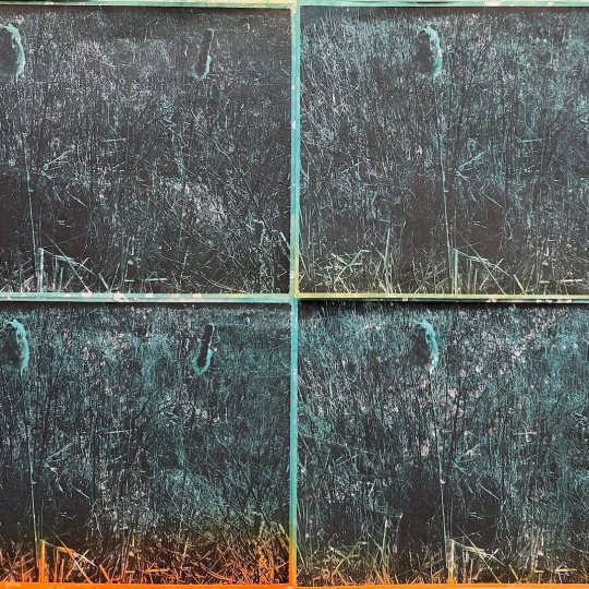
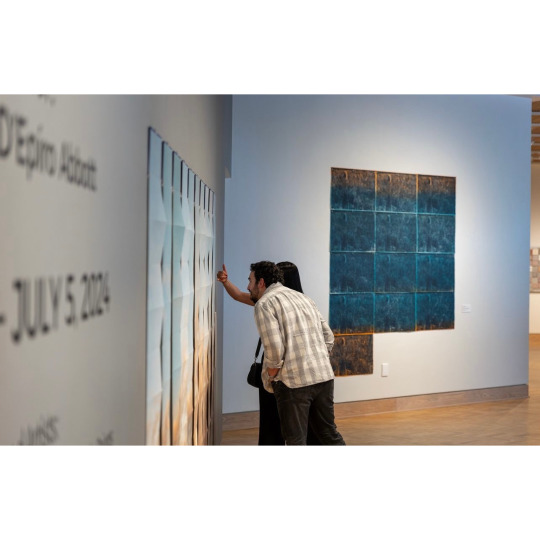
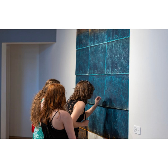
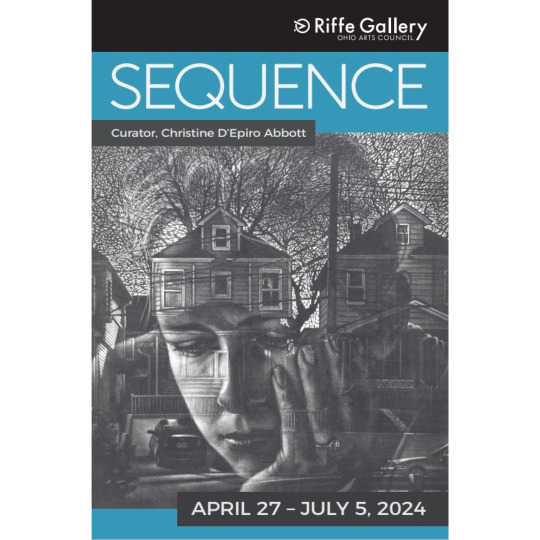
…….
A whole hearted thank you.
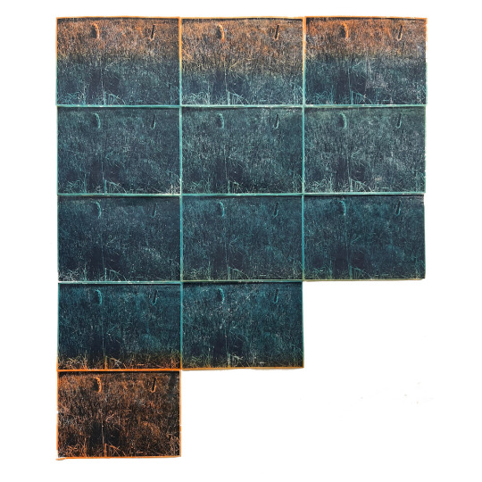
Recently, a few of my works were included in a dynamically stacked exhibition entitled “Sequence” which was curated by the artist Christine D’Epiro Abbott for @ohioartscouncil @riffegallery.
The exhibition, which includes the work of 14 amazing Ohio based artists aims to showcase and celebrate the diversity inherent to the field of contemporary printmaking.
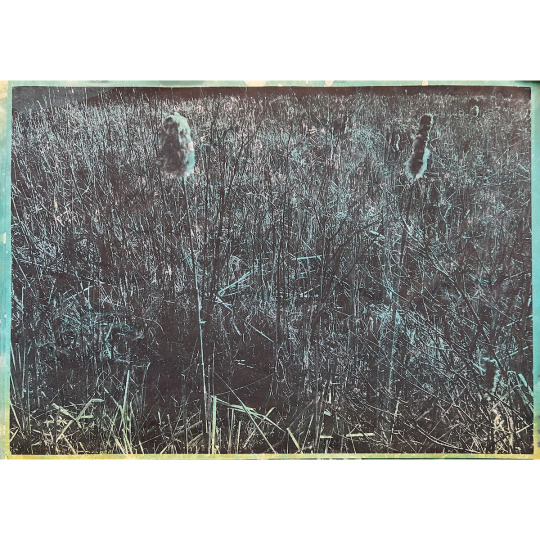
My contributions to this show included two installations and a print-based frame. animation. The installation and animation documented here were bespoke for this show and have never been shown before.
I want to very publicly thank @cdepiroabbott and @riffegallery for including me in this impressive show. It is an honor and a privilege.
Sequence is open until July 5th at the Riffe Gallery after which it will be traveling to the Medici Museum in Warren, OH.
please check it out if you are able. You will not be disappointed.
surest of sure good times!
Image 1: From the Dust, looping print based frame animation. Dimensions variable. 2024
Image 2: From the Dust, Silkscreen and monotype on kozo. 72”x85” 2024
Image 3 and 4: From the Dust (details)
Image 5 & 6 : installation views 📷 credit @riffegallery
Image 7: showcard designed by @riffegallery with print by @artwerg
#arron foster#artists on tumblr#printmaking#ohioartist#people of print#art#contemporary art#contemporary printmaking#screenprint#kent ohio#columbus ohio#ohio arts council#riffe gallery#landscape photography#landscape#animation
8 notes
·
View notes
Text
Carolee Carmello in Caricature

"Falsettos," Published April 26, 1992 - Al Hirschfeld
FALSETTOS MICHAEL RUPERT, HEATHER MAC RAE, CHIP ZIEN, CAROLEE CARMELLO, BARB WALSH, STEVE BOGARDUS, JON KAPLAN, 1992
In 1992, Carolee Carmello (tall blonde in the background) was given the Hirschfeld honor for her portrayal of Cordelia in the original Falsettos on Broadway. Hirschfeld's stylized pieces are hugely valuable today and often sell for thousands, if not tens of thousands, at the Broadway Flea each year.


Carolee Carmello's Sardis portrait, 2009 - Richard Baratz
In the past, Sardis caricatures have been defined by exaggerated features and highly stylized depictions, much like Hirschfelds. However, in more recent decades, the Sardis caricature has become, if you ask me, an exercise in inoffensiveness to the point where even a white woman like Carolee looks whitewashed. Her portrait, while far from the most egregious one I've seen (see quite literally whitewashed Norm Lewis...) robs her of her most defining features: her big curly hair, her full lips, and her toothy smile, replacing her with suburban soccer mom out to brunch.


Carolee Carmello in (L to R): Sister Act with Raven Symone (2012), Portrait (2019), Scandalous (2012) - Squigs
Just when we feared all hope was lost for the art of caricature on Broadway, Justin "Squigs" Robertson burst onto the scene with his beloved "The Lights of Broadway Showcards"(TM) that capture the essence of caricature within his subjects while excising the old offensive racial stereotypes often seen in the past. These cards can be purchased in packs much like any trading card game, or can be bought individually at the Broadway Flea. In addition to individual person cards, Squigs has a robust collection of show cards as well.
5 notes
·
View notes
Text
i love knowing fonts bc i can just make awful lettering in my sketchbook with no effort. wide latin . playbill. showcard gothic. bungee, i can take inspiration from fonts and make my own awful hybrids
#moth post#that pearl cannibalism piece just nailed in how to draw playbill so ive just been doing that. the way the E is drawn is SO GOOD
3 notes
·
View notes
Text
the most prominent effect spending a lot of time in ms paint as a kid had on me is being able to immediately recognize showcard gothic all these years later
2 notes
·
View notes
Text

Some info on Showcard Gothic (Microsoft's website)
3 notes
·
View notes
Text
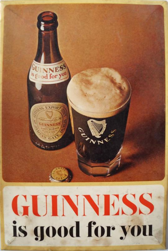
IN PRAISE OF THE "JUICE OF THE BARLEY" OF YORE -- AN EXPORT OF DUBLIN.
PIC INFO: Resolution at 1000x1499 -- Spotlight on a vintage Guinness advertising showcard titled "Guinness is Good for You." Celluloid on tin, c. 1950.
Source: www.invaluable.com/auction-lot/vintage-guinness-advertising-showcard-12-c-1bf4b7491b.
#Guinness#Guinness Draught Stout#Dry Stout#Dry Irish Stout#Stout Beer#Guinness Stout#Advertisements#Happy Saint Paddy's Day#Stout#Dublin#Beer#Irish Dry Stout#Brew#Guinness Extra Stout#Vintage Style#Retro Ads#Guinness Irish Dry Stout#Vintage Ads#Adverts#Guinness Draught#Extra Stout#Irish Stout#St. Paddy's Day#Happy Saint Patrick's Day#Guinness Dry Irish Stout#Saint Patrick's Day#Dublin Ireland#Guinness is Good for You#1950s#Irish
3 notes
·
View notes
Text
While I have a few hours to kill between shows, I'm at my work office making liberal use of the fancy laser printer for the showcards I make to hang on my wall. All these Playbills can't be just printed out on the clunky old thing I've got in my apartment, now can they?
2 notes
·
View notes
Text

The Horkey Club - Dec 2023
This year's submission for the The Horkey Club, featuring many of the smaller prints, showcards, originals and showcards in my collection.
3 notes
·
View notes
Text
What about Showcard Gothic?
font reviews based on how good :3 looks

Arial: Classic font, looks good for the most part, but a little bit bland also. 6/10

Berlin Sans FB: There's already a lot more character, but the mouth is simply too long and the lips don't curl enough which takes away from the experience. 4/10

Comic Sans MS: Now THAT'S a colon-three. There's so much silliness in that face it's hard to bear. My only real critique is that the eyes are just a smidge too narrow, but that's just a nitpick more than anything. 8/10

Courier New: Sleek. Professional. Big vertical eyes full of glee. Very solid choice for a colon-three font. 7/10

Jokerman: I feel bad for including this one. That font stood no chance against the others. This is the eldritch horror of colon-threes. These eyes are filled with nothing except murderous intent. The mouth is crooked with a sharp corner, but the most egregious part is probably the teeth-like protrustions from the bottom part of the mouth. 0/10

Goudy Stout: An interesting take on colon-three. I like the idea of having an incredibly thick mouth (even if it's a bit too thick for my liking), and the eyes being big and centered is a big positive. Much sillier than most fonts, but I think struggles to beat Comic Sans in terms of silliness. 6/10

Consolas: Worse version of Courier New. The lips just don't curl enough and it just ends up looking a little pathetic. 4/10

Fixedsys: Oh my god. Holy shit. What the fuck. 10/10
19K notes
·
View notes

