#TONE CHROMA
Explore tagged Tumblr posts
Visit Tumblr Blog
Explore Tumblr blogs with no restrictions, modern design and the best experience.
Last Seen Tumblr Blogs


Fun Fact
Mobile US users spent an average of 115.8 minutes on Tumblr app monthly.
Text

22 notes
·
View notes
Text
Synthv meme hehe

#synthv hxvoc#tone chroma#vocal synth#synthesizer v#vocaloid#synthv#synthv solaria#synthv asterian#synthv saros#kasane teto#synthv rikka#synthv nyl#synthv Genbu#synthv gumi#synthv kevin#synthv maki#synthv karin#vocaloid una#synthv tsuina#holy shit that was a lot of tags there-
19 notes
·
View notes
Text

Galenaia is so pretty!! Funnily enough, the day before her showcase dropped I was thinking about how we needed another native spanish synth aside from just Saros, so I'm glad she's here! It's gonna be fun to see how producers will use her!
#hxvoc also sounds super cool I love his screams#synthesizer v#synthv#vocal synth#galenaia#tone chroma#eclipsed sounds#Luci's art tag
9 notes
·
View notes
Text
End of February Recap!
After some recovery time, a lot of news seems to have come over the last week! While this recap will be very brief, I hope you’ll be able to get as much from it as you can! Starting with AI Voice, it was recently announced that Tsuina-chan Project’s Saki-chan will also be arriving onto AI Voice 2! Alongside that, 3 new voices are planned to be crowdfunded by Tange Kotoe Project. We have yet to…
#AI Talk#AI VOICE#AI VOICE 2#AITalk6#BigAL#Eclipsed Sounds#GALENAIA#GREE Entertainment#Hifumi inc#HXVOC#Internet#Internet Co#Kasukabe Tsumugi#Nakuru#Natsume Itsuki#Oliver#PowerFX#RUBY#Saki-chan#Soundation#ST Media#SweetAnn#SynthesizerV#SynthesizerV 2#SynthesizerV Studio 2#SynthV#SynthV 2#Tange Kotoe Project#Tone Chroma#Tsuina-chan Project
6 notes
·
View notes
Text
eclipsed sounds coming up with their next voicebank:
7 notes
·
View notes
Text
THERE'S A FLIPPING INTERSTELLAR REFERENCE IN HXVOC'S DEMO SONG???!?!? ABSBAN. SNDNDJEJ!! ! SOOOO SO EXCITED FOR SYNTHV2!!
And Galenaia,,,,oioooo....she sounds SO GOOD!! Operatic vocals in general are underrated and her TONE OF VOICE, MAN!! IT IS! PRERTY!! I love these two.....and there's lore at the end of her demo video lolol-
#ink's thinks#ramblings#synthv news#synthesizer v#vocal synth#tone chroma#eclipsed sounds#synthv hxvoc#synthv galenaia#I love you so much vocal synths...my friends forever-
8 notes
·
View notes
Note
24
'do you have a shameful art past?'
like every 10 year old (in the early 2000s on deviantart) i used to trace manga panels and colour them in lmao (so much one piece tracing LOL) and i used a lot of 'bases' on deviantart to make ref sheets for my crappy ocs. not sure if that's 'shameful' as learning to draw is SO tough that i think everyone references/traces/colour picks as a child or young teen in order to gain the vaguest foundation of 'knowledge' that they then can build on.
Colour picking (like recently...during photo studies) was literally how I made the power of mid-tone greys 'unlock' in my head despite being told countless times 'if you desaturate a colour it'll appear grey next to its more saturated chroma' it never clicked until I did some dirty colour picking and saw the pattern emerging countless times. 'hmm maybe those dang art books are right'
#asks#when i say grey i mean#if you desaturate a colour it'll appear COOL next to the more saturated chroma#which in turn is often interpreted as grey#mid tone greys are REALLY cool and powerful#its the whole is the dress yellow or blue thing
32 notes
·
View notes
Text
and dear god we need another irish vocal synth. avanna come back to us
#eclipsed sounds..... please do a celtic folk music tone chroma or something and ape avannas irish swag#we neeeeeeeed more non-american accents in english vsynth#on SV we have fucking. kinda ninezero altho its hard to hear. and cross lingual synthesis accent. and thats IT#or magnhi. maghni. mahgni. m ae g n ny. oliver will have a british accent obvs which is a nice step in the right direction#can u get in contact with zero g too pls. avanna....... avanna.....
5 notes
·
View notes
Text
@a-scary-lack-of-common-sense
Here! You wanted to see what I was talking about, so here it is! :-) Sorry about it not being good.

#the proportions make me wanna chew on a plugged in wire.#i have 14 seperate layers just for the skin.#I CAN PERFECTLY IMAGINE HIS SKIN TONE BUT I CAN NEVER GRT IT RIGHT IN ANYTHING#hands.... hard to draw :-(#i think you all know who this is supposed to be just by the outfit.#and eyes.#art#photos#seasalt speaks#MY ART#EscapingVirtuality#chroma crafts
7 notes
·
View notes
Text
I don't know why, but my brain has gotten a f*cking idea (which was probably obvious)
In "R-01" the R stands for red

And in "V-01" the V stands for Violet.

(or maybe im just stupid Idk)
I thought I share this in case someone hasn't thinked about that 😶🌫️
4 notes
·
View notes
Text
GALENAIA - Vocal Mode & English Cross-Lingual Synthesis Demonstration (Synthesizer V Studio 2)
youtube
English Universal Demonstration Song by unit.0
GALENAIA Showcase song by vanelily
#GALENAIA#eclipsed sounds#tone chroma series#synthesizer v#synthesizerv#synthv#vocal synths#vocal synth#hatsune miku#vocaloid#synthv news#synthv ai#voicepeak#Youtube
11 notes
·
View notes
Text
NAMM 2025 Recap: SynthesizerV Studio 2 & Tone Chroma
After lots of news and speculation surrounding SynthesizerV Studio 2 and Tone Chroma, we finally have some more information on what’s to come. This last weekend during NAAMShow, SynthesizerV Studio 2 and R-01 and V-01 were showcased and more information was provided on the two. Starting with a YouTube video premiere from Dreamtonics detailing more information on the engine which you can watch…
#AH-Soft#AH-Software#AHS#Dreamtonics#GALENAIA#Hiyama Kiyoteru#HXVOC#SF-A2 Miki#Starry Court#SynthesizerV#SynthesizerV Studio#SynthesizerV Studio 2#SynthV#Tone Chroma#Tone Chroma 3
5 notes
·
View notes
Text
youtube
Drawing manga the hard way
0 notes
Text
tone
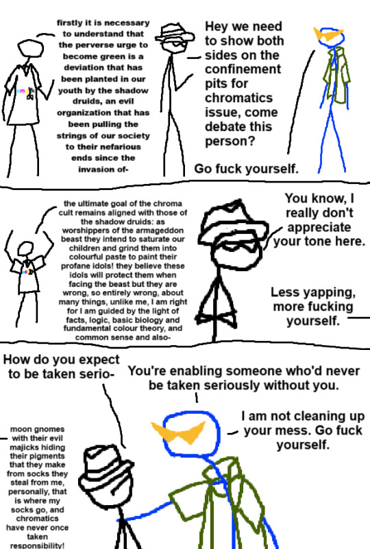
[ID: Three panel comic with crudely drawn stick people. A character whose rambles are presented in smaller text will have their dialogue shown after the navigation links, and can be skipped.
Panel 1: A blue person with a dark green jacket and bright orange anime glasses is talking to a journalist, while a person wearing a large t-shirt with the text "c m y k" and a pair of scissors cutting off the k rambles behind the journalist.
Journalist: "Hey we need to show both sides on the confinement pits for chromatics issue, come debate this person?"
Anime Glasses: "Go fuck yourself."
Panel 2: As the background character keeps rambling, the journalist condescends.
Journalist: "You know, I really don't appreciate your tone here."
Anime Glasses: "Less yapping, more fucking yourself."
Panel 3: Anime glasses holds the journalist's shoulder. There is still rambling on the side.
Journalist: "How do you expect to be taken serio-"
Anime Glasses: "You're enabling someone who'd never be taken seriously without you. I am not cleaning up your mess. Go fuck yourself."
End ID.]
Start - Previous - Next
[Conspiratorial rambling:
Panel 1: firstly it is necessary to understand that the perverse urge to become green is a deviation that has been planted in our youth by the shadow druids, an evil organization that has been pulling the strings of our society to their nefarious ends since the invasion of-
Panel 2: the ultimate goal of the chroma cult remains aligned with the shadow druids: as worshippers of the armageddon beast they intend to saturate our children and grind them into colorful paste to paint their profane idols! they believe these idols will protect them when facing the beast but they are wrong, so entirely wrong, about many things, unlike me, i am right for i am guided by the light of facts, logic, basic biology and fundamental color theory, and common sense and also-
panel 3: -moon gnomes with their evil magics [spelled as "majicks"] hiding their pigments that they make from socks they steal from me, personally, that is where my socks go, and chromatics have never once taken responsiblity!
End conspiratorial rambling.]
975 notes
·
View notes
Text
This is only half a thought so far, but maybe other people want to chime in.
I’m doing Watch Machina (currently at episode 15) and Nein Again (currently at episode 21) while I also keep up with current Critical Role content (Age of Umbra episode 4) and something that bothers me a little is Matt’s current method of narration.
In C1, Matt’s style is very informal with regard to the narration. There’s little added drama via his tone, pace, or choice of words. “Toothy maw” became a meme pretty quickly, but the point of every description was to efficiently set the scene so the players could start their RP and choose what to do. There wasn’t as much precision with his descriptions, and of course that is a talent that takes a long time to hone when you’re describing lots of different things over the course of several hours. However, the narration was far less formal and calculated than his NPC dialogue, so (in combination with voice acting) it was very easy to determine when Matt was in character or not. It wasn’t a bad thing; Matt’s very casual narration and formal dialogue leading up to the Chroma Conclave’s attack on Emon was excellent because it was so sudden, leading the players and the audience to experience the exact same shock the NPCs would have. It’s not a bad way to narrate. If anything, it made the heartfelt moments so poignant, especially at the end of the campaign. That description of snow drops would not have been nearly as impactful if Matt had narrated that way all the time.
In C2, Matt started getting more descriptive and slowed down his narration to match. As Aabria would put it, he “paints a word picture” and includes more environmental storytelling for the setting itself, not just things for the characters to expressly interact with. I think this is part of what led to the Nein interacting with the set dressing more: Matt mentioned it, so it must be important! This led to some fun hijinks as time went on, and it gave Wildemount a different feeling than Tal’dorei. I couldn’t tell you that Emon had a particular vibe to it other than it being a big city, but howdy do we know that Berleben is full of nosy, bored people in a smelly swamp, and we sure know that Zadash is a bustling city with stark class segregation while Nicodranas is a beautiful trade hub with a mixture of different cultures. I think part of that may have come from working on the source books (they have similar language for the plot hooks and location entries). However, that method of narration was mostly limited to first descriptions of a new place or events (“cutscenes” like the attack in Zadash). Within a scene, Matt was still fairly casual in his discussions with the players.
But currently in Age of Umbra, and with a good chunk of C3, Matt’s narration is far more deliberate. There is a consistently slower pace compared to earlier campaigns, usually only speeding up in combat. Part of that may be for production purposes (easier for transcriptions and closed captioning), but it also impacts the pacing of the game itself. There’s also that presence of a new character: the narrator himself has a voice, and that is now part of the story. It’s extremely noticeable when the cast gets Matt to “break character” as the narrator to only be a DM. It requires a baseline level of formality for that to happen, and Matt committed to it in nearly every scene, regardless of the context of the scene. While that doesn’t feel all that strange for Age of Umbra (it fits well with the soulsborne style of game), it does make me realize that it’s part of why C3 felt incongruous. Like, sorry about the dead horse, but I was expecting C3 to be pulpy, which very much benefits from the narration style of C1 rather than the formal narration style Matt prefers currently. Punchy, informal narration sets a player expectation of “you’re here to get something done and I’ll tell you if it works,” while the current style instead lends itself to “you’re part of my story and this is the tone.” The former is great for fast-paced roleplay and the latter is suited to unhurried storytelling—which wouldn’t feel as mismatched if C3 hadn’t been a story where the PCs needed to prevent a second calamity within the course of a few weeks.
I wouldn’t go so far as to say that this was a mistake. Matt clearly enjoys how he narrates currently, and every DM is entitled to their preference. However, I think there’s a lesson in here that varying the narration style to match the purpose of the scene and story would benefit the players and the audience.
To be fair here, Matt is not the only DM who doesn’t mix it up very often. Brennan Lee Mulligan (Dimension 20) is far closer to the C1 style of fast, informal narration with very limited, specific instances where he would slow down for drama; there is no “narrator” character in his players’ story. D20 has a far more casual tone to its seasons than CR does in its campaigns. Luis Carazo (Tales Unrolled) narrates similarly to Matt, with a focus on instilling an emotional reaction for the players to deal with, and the players collaboratively join Luis as the narrator for their own characters; it’s a back and forth where the DM and players contribute to that additional presence. Tales Unrolled is on the opposite end of the spectrum from D20, with a clear feeling that it is a storytelling experience.
Again, choosing one narration style over another isn’t necessarily a flaw. However, I think varied narration is a tool that most DMs underutilize. If used carefully, adjusting narration styles within sessions on the fly could enhance the experience of an Actual Play campaign for everyone involved. It could be used as a signal to the players for what type of scene this will be or when a scene is shifting. It could also signal to performers in a show for pacing within an episode (hijinks are over, time for some drama; time to cool down from the tension).
But, as always, it’s easier to point stuff out like this than it is to do it in practice.
#critical role#matt mercer#also#am I the only one doing all three AND d20 AND tales unrolled?#I might have a problem#PS I just realized I wrote snow caps instead of snow drops too late don’t mind me I want little candies
176 notes
·
View notes
Text
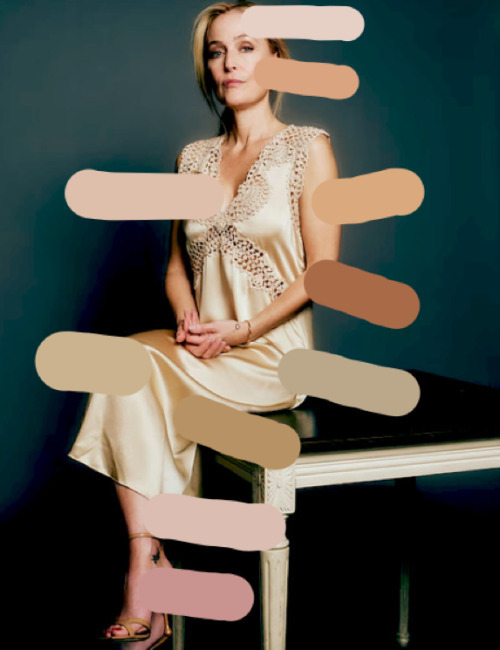
Gillian Anderson: Think Pink (with the Color Wheel)

Today, we're tackling the color wheel-- and how it relates to one Gillian Anderson.
THE CHAMELEON NATURE OF ANDERSON'S SKIN
As discussed in previous posts (here, here, and here), GA is Light Summer. Her bright, cool undertone is tempered by a heavy dose of gray, tincturing her skin with a glow that shines brightest away from darker, harsher, or intensely-saturated bright tones.
An interesting feature of Light Summer skin: it's often either a cool, neutral, or "neutral-cool undertone that feels both airy and grounded" (Gabrielle Arruda, post here.) In this case, Gillian straddles that line quite artfully. While her skin is undeniably Cool, a touch of Spring warmth slides its way in, enabling her to manipulate that balance (as long as she keeps her chromas Medium, post here.)
**Note**: Skip to THE NUANCES OF THE SEASONAL PALETTE if you want to read the results.
A GUIDE TO UNDERTONES

(Credit to: dear peachie)
Quoting directly from dear peachie's video here:
**Note**: "Mastertone" is a rough translation for skin "overtone."
People with cool mastertone skin: they often have hints of bluish, pink, or a ruddy complexion. Warm mastertone skin radiates the yellow, sallow, peachy, or golden tone. Whereas the neutral tone skin has no obvious overtones of pink or sallow skin, but rather the skin's natural color is more evident.
(To identify your skin's mastertone, you can take a picture of yourself without makeup.... It is advised to take the picture in indoor setting: make sure the lights are not too bright; and can have a mixture of both indoor light and sunlight when the picture is taken. Also, avoid wearing bright color shirt as it will affect the color of the picture, too.)
The skin shade intensity and mastertone are two different aspects. Many people mistakenly assume that people with deeper or darker shade skin are classified under the warm mastertone skin, and people with fair or light shade are those with cool mastertone. However, both light or deep shade skin can also have warm or cool mastertone.
Pink
You have rosy cheeks with a light blush across the chest and ears; you can burn easily in the sun.

Blue
Skin that radiates very cool plum undertone. Your skin tone deepens in the sun.

Green or Olive
The skin tone has a hint of bronze or green in daylight. It is also somehow on the borders or neutral, but it contains both yellow and blue hues.
You can see that the olive undertone skin can be differentiated in the warm or cool mastertone, too.

Neutral
In which the undertone is roughly similar to your actual skin color [overtone.]

Yellow
Your skin shows golden, especially in the paler areas. You achieve [a] golden glow in the sun.

Orange
Your skin will appear peachy or apricot. Your skin takes on bronze tones in the sun.

Red
Cinnamon skin hues that intensity and deepens in the sun.

Which one is Gillian?
SKIN
Using the skin tone color wheel (developed by Terri Tomlinson), we can see that GA's circle swatches slot her more on the left than right side, i.e. more cool (lower-left quadrant) and more red/red-orange/orange (upper-right quadrant.)
The green (lower-right) and yellow (upper-right) sections are "separate" from her skin (and eye) colors.

When comparing the wheel to Gillian's bare face, it becomes obvious that the red quadrant more naturally aligns with the very red/pink hues in her undertone (as depicted by her swiped and boxed swatches on the left):

Because her skin is soft pink rather than apricot or cinnamon, we can infer (quite clearly) that Ms. Anderson's undertone is (surprise) Pink.
As mentioned in the above section, Gillian's Light Summer gives her a little wiggle room, tipping her away from very gray cool hues (that of the other Summer seasons) and dipping her just enough into warm and bright tones (that of her Spring sister palette.) Due to this miracle, she can pull off warm colors quite effectively--

(L, warm hues; R, cool hues)
--often with the careful introduction of spray tan (a quick-and-easy way to tilt her cool and warm balance.)
PINK UNDERTONE, THE COLOR WHEEL, AND PRIMARY COLORS
When examining the color wheel, it becomes quickly apparent that pink is not represented as a primary or secondary color. As we know, pink is simply red tinted with white-- a diluted, cooler, lighter hue. Separate from the complexities of skin tone and seasonal palettes, we are left with a simpler consideration: that Gillian has, ultimately, a primarily red-based undertone.

(Credit to: color-hex)
Given this state of affairs, it makes sense why she is able to pull off red so magnificently: not only because of the Romantic elements of her Kitchener Essence (post here) but also because of its harmonious mirror to her dominant skin tone.

While the warm red (left) is not as cleanly native to her cool undertone, it is still as stunning on GA as the neutral and cool reds are (middle and right, respectively.)
THE NUANCES OF THE SEASONAL PALETTE
Yet, the fact remains: Gillian's skin tone is pink-- a cooler dilution of red. We can see the proof of that when exploring her wheel hues' primary, secondary, complementary, split-complementary, monochromatic, and triadic colors.
Red is lightened (tinted) with white, creating a softer, cooler pink:

The same follows with Orange,

Red-Violet,

Yellow,

Blue-Green,

and Blue.

Red's complementary color, Green, acts as a marked contrast against Gillian's skin-- one that looks striking if allowed to carry its own presence.

Still, Gillian Anderson is human; and, as any other mortal, subject to the nature of an individuated skin tone, one requiring more nuance than the primary hues and their tints.
Therefore, we have her unique Light Summer combination: gray poured into white, softening the pink into a more grounded, watercolor glow.

To quote this blog post:
This aesthetic is soft, understated, and refined, with a focus on blending tones rather than creating contrast. Light Summer embraces subtlety, using light, cool, and medium-saturated colors...
Colors include Morning Mist, Seafoam Veil, Lavender Haze, Silver Rose, Wisteria Whisper, Dusty Sky, Petal Blush, Serene Teal, Frosted Lilac, Misty Mint, Ash Blonde, Soft Heather, Pearl Gray, Morning Dew, Rose Taupe, and Cottonball White.

CONCLUSION
As a rule, Gillian looks incredible in red and green (mostly) because they act as her primary and complementary colors; and is able to wear warms as effectively as cools because of the camouflagic nature of her neutral-cool skin tone.
Thanks for reading
Enjoy!
#txf#but not#GA#fashion#Gillian Anderson#randomfashiontiger#skin tones#undertones#color wheel#colors#Gillian Anderson and the Color Wheel#seasonal color analysis
21 notes
·
View notes