#TUTO
Explore tagged Tumblr posts
Visit Tumblr Blog
Explore Tumblr blogs with no restrictions, modern design and the best experience.
Last Seen Tumblr Blogs


Fun Fact
There were a total of 171.5 billion posts on Tumblr in 2019.
Text
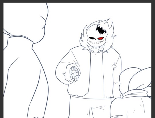
Alrighty, let's tackle the second part of this request!
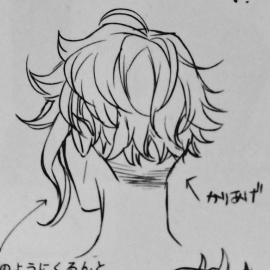
Here's a tuto on how to draw the nightmare that is Azul's hair!
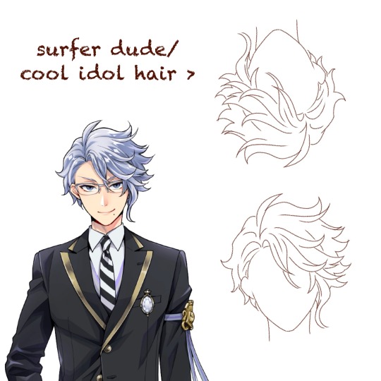
First, a few observations.
Contrary to other characters like Jamil, Riddle, or Sebek, Azul's hair doesn't immediately tell you everything about his personality. For someone as calculating and (trying to be) mature as Azul, you'd expect his hair to be slick and and each strand to be at it's proper place.
It's the contrary here. Azul has wavy, almost curly hair that is completely all over the place.
It's because that's his own struggle that is shown here. Azul has always fought against himself, being his octopus nature, his weight, or even his hair that won't stick down. That boy is just cursed to forever have something about himself that doesn't fit his aesthetic.
(Personally whenever I look at Azul upside down, I really feel like it'd be the kind of hair for a cool extroverted guy in an Idol gacha game)
Step 1. Hairline
Azul has a simple round hairline so simply draw an arch.
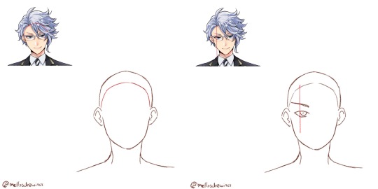
Step 2. Hair root
Azul's hair all comes from a point right above the left side of his left iris, so I would suggest you draw Azul's face (and even glasses) first.
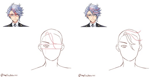
Step 3. Bangs
Azul has two strands that fall between his eyes, just a bit to the right. Start from the root point you placed earlier, and draw two wavy lines intersecting. The first will stop at the upper rim of his glasses, above his right iris area. The second will stop at the lower rim of his glasses, below his right iris area.
All of Azul's hair will be made with soft waves that fork back up, so train yourself to do that move flowingly. You're not done using it.
Step 4. Front hair 1
There are two strands that seem closer to us and frame the other bangs, so let's draw them first. In my example I drew the lower strand a bit too high, it should come right above Azul's right eye. The upper one thought will almost be horizontal. Both of those will reach the area above the right ear.
Once more, waves.
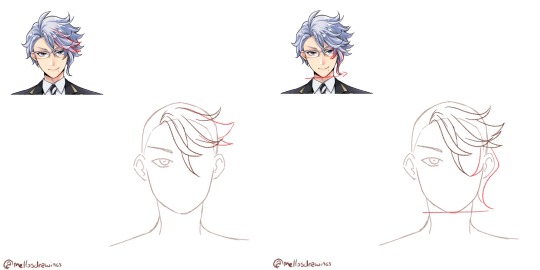
Step 5. Front hair 2
Now the two strands between the last two. They will go further than the ear.
Step 6. Side strand
Azul's tentacle-like strand. It is composed by the only strand of hair that forks towards his face, instead of outward. It goes around the eye and reaches lower than the middle strand.
The second part is the actual tentacle. It hides the ear entirely and reaches down to Azul's chin level.
Still, always a wave that forks outward.
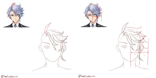
Step 7. Ahoge
Yup. "Mature" and calculating Azul has an ahoge. That might be the only part of his hair that does indeed reflect his personality. Azul can be quite immature and stupid at times. (For those who don't know, "ahoge" literally means "stupid hair" and it's usually used on stupid or immature characters)
Simply make it start at the root point. It's about the size of Azul's hairline to eyes, but globally just make it go up above where the rest of his hair would go.
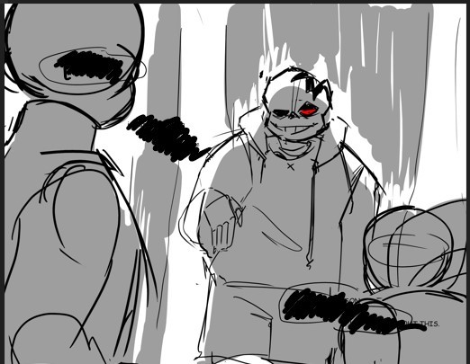
Step 8. Right side
That is the part that people (even Yana if we trust the notes she made) struggle with. There is a volume here that can't be too fluffy or not big enough. It's actually just the size of half his face. Put your mark and do your best to fill it without going further.
From there, draw about 4 or 5 waves. Connecting each tip should make an arch, with the further point being the strands at Azul's eye level.
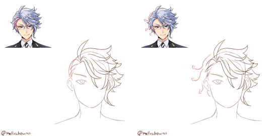
Step 9. Behind the ear
The only part of Azul's hair that is well groomed is those few strands of hair, that look like they were pushed behind his ear. This is also the only part (alongside the ahoge) that isn't made using a wave.
Step 10. Left side
And we're back to drawing waves, this time forking left. There is about 3 waves to do. These strands won't be as fluffy as the right side, sticking closer to the skull, but still add some volume. Wavy/curly hair just can't stick to the skull (I'd know it *sigh*)
Step 11. Details
Time to check your proportions, add a few lines within the strands, add more lines at the roots to show that his hair go from here.
Finished!
So. Idol!Azul when? (One day. One day I'll do that Housewarden Idol AU)
(Last note: he does have an undercut. I'll forever go crazy about Azul of all people having a fuckboi (/affectionate) haircut)
(Official pic from the Magical Archives)
#this one got long#but I spent so much time dissecting Azul's chara design#have I told you dissecting and analyzing character designs wa my fav pasttime?#mello's drawings#twisted wonderland#twst#azul ashengrotto#my art#ask me anything#analysis#art tips#step by step#tutorial#tuto#drawing tutorial
446 notes
·
View notes
Text


Quelques exemples d'association de plantes à faire au jardin illustrés pour les Petites leçons de permaculture publié sur @matin_queljournal 🌱🌿 Désormais disponible en librairies !
#mâtinqueljournal#matin#culture#permaculture#permaculturegarden#jardin#jardinage#jardinurbain#urbangardening#jardiner#pommedeterre#patate#tuto#tutojardin#diy#diyjardin#bd#bandedessinee#strip#comicstrip#drawingoftheday#illustratorsofinstagram#illustration#illustrationdaily#procreatedrawing#procreateart
83 notes
·
View notes
Text


Recent Meanderer drawings. Monk girl and Tuto.
324 notes
·
View notes
Note
May I ask what brush you use to draw in 3d?
Hehe no problem it's really easy :D 💯


I hope my explanation was clear :D🎀
41 notes
·
View notes
Note
two questions.
one, HOW DOES ONE COMIC/STORY BOARD??
IM OBSESSED WITH HOW YOU DO IT ITS SO BEAUTIFUL
two, HOW DO YOU SO IT SO FAST( that’s question is more just me being super impressed oh my goodness)
you’re very good😳
Aw, sweet, a board question *puts on serious glasses*
Ok, bring it on anon.
So, the first thing to ask yourself when starting a comic, as I see it, is what type of board are you dealing with. Webtoon? A4 pages? 4 panels? There are many ways to go about it, and each involves different processes. For example, pages will allow for more superfluous scenes, whereas the webtoon format has to be super succinct because of the reading direction. I personally think that's the main reason I do pages, among other advantages: •narrative density •variety •Tumblr-friendly format
There are quite a few disadvantages too but you have to go through the process of trials and errors to really find out what suits you best!
Then there's the ambition of the sequence you're boarding for. And it goes from 1. how used I am to boarding this kind of sequence/drawing these characters/setting and backgrounds, to 2. is it an emotional sequence? Dialogue-heavy? Or more contemplative?
It changes the way you work and how you should approach your board! For example, in TMS, the very wordy chapters (4 and 5 for ex) generally called for simple and narrow framing. Of course, you don't want to bore the reader so you can spice things up to match the characters mood and reactions once in a while, but you have to bear in mind that the sequence aims to provide dialogue and information = the text bubbles are key and WILL take a lot of place. So let them.
( then again, it's all about pacing and balance. A page full of dialogue and one with too much happening are equally hard to read and boring to do)
Only dialogue, simple squares, no compostion, the focus is on Mel's reaction
On the other hand, parts 7 and 8 are all about action and atmosphere! This makes for wider and more varied shots!
They're fighting, things are going fast so why not use a single line to show many actions! They're still basically squares and rectangles but the pacing is totally different!
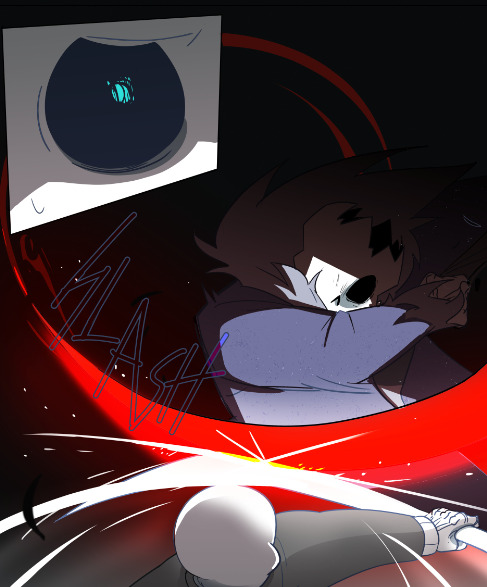
Or why not give the action a full page to really show its sheer impact
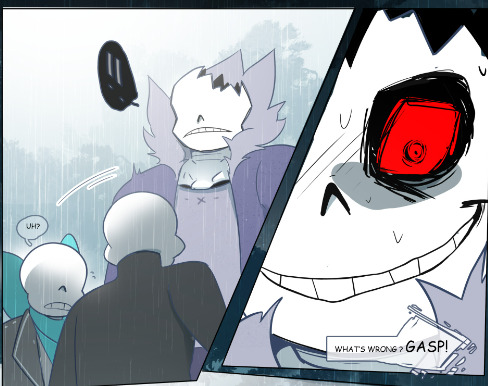
You can also split things, with a zoom or small time gap, depending on if it's a gag or if you want to put the focus on a reaction. Here, the asymmetry helps reinforce the unstable, jerky aspect of the scene. The situation is getting out of hand, and visually, the pages are affected too.
Now, these are case-by-case examples. And I never work on my pages separately.
For context, this-

-is the "first" board I did for part 8.
The drawings are very small and frankly difficult to make out, but the intention is what matters at this point lol I have the script (very important) next to my canvas, and I scribble the pages one after the ither. This allows me to see if the actions flow well, if the compositions are varied and also whether certain passages are too long or too short in regard to their importance. Which scenes can be merged? Removed? Toned down or if they deserve more bite?
This is a really fun and creative part but, I'll say it again, made a lot easier with a solid scipt. And I'm talking about a text document with clearly defined dialogues (or at least outlines) and actions.
I can't really explain how to write a script, it really depends on your work flow and how confortable you are with writing, but it's too important to just rush through it. No matter how much it changes before, during or after your finish boarding (cuz you gotta break your own rules sometimes and you'll often realize some things don't work as well once you put them on paper/sometimes art block can be resolved by writing the scene and just taking the time to imagine) but it's still your one guideline.
Aaaand, that's about it.
Other than that, I can only highly recommend reading lots of comics, Webtoon, books, watching movies, paintings, illustrations, animatics or listening to music, to inspire you and expand your own "personal library of references". Professional or not, anything your find inspiring and well executed. Boarding is at its core, telling stories. No art skill involved, just pure subjectivity. At the end of the day, it's all about squares, rectangles and bubbles so you gotta work on your creativity. The rest is gut feeling!
Constantly ask yourself how to tell this story, and how you want to tell it. How this sequence should be perceived? What do you need to show to make pages and pages of words appealing and interesting.
Be patient, be bold. Start with easy stuff to get some confidence if you need to. Accept that "boring" pages are smt necessary and that it's up to you to build up tension for a scene to really pop. Try new ideas and be ready to scrap many of them, the result will be worth all the work!
Now, concerning the "fast" part, I'm flattered but I personally think I'm super slow xD You prbly get that impression bc I finish the whole chapter before posting it, but behind the scene, I'm just working at a very regular pace.
Thank youuu anon ♡( ◡‿◡ )
#ask#ask me#forgot the tag I use for those errr#tuto#boarding is so much fun *sigh* unlike this *looking at the pile of pages waiting for lineart*#I personnaly prefer boarding for animatic but comics are fun cuz I know I'll get to actually see the final result haha#I know some artists love to do intricate shots with lots of details and pers (big flex here) but I'm more about the vibe really xD
59 notes
·
View notes
Text

bugs are just crustaceans, crustaceans are just bugs
#technically saviour is a dendrogaster type parasite so it actually suits being aquatic#imago game dev#tuto#2to#endless saviour#mermay#mermay 2025
8 notes
·
View notes
Text
Tuto : créer des lignes fluides
Version requise : Photoshop, pas besoin d'une version récente.
Durée de la video : 9.44min avec 3 techniques expliquées (vous avez les time-code dans les explications ci-dessous)
Infos : français et sous-titrée + tutoriel détaillé écrit ci-dessous. J'espère que la qualité ira, elle a été réduite quand j'ai fait le sous titrage :(
Si vous avez des questions ou si ça manque de clarté, n'hésitez pas !
Exemples de rendu (toutes les lignes) :
Aujourd’hui, je vous présente 3 techniques que j’utilise pour créer des lignes fluides, comme dessinées à la main, sur mes avatars. L’objectif est de vous montrer les différents outils utilisés - il y en a surement bien d’autres mais déjà, en voici 3 - pour que vous puissiez vous les approprier et les utiliser pour vos propres styles et graphisme !
(0 à 0.50s : introduction + je vous montre des avatars sur lesquels j'ai utilisés ces effets)
(0.50) Technique 1 : le pinceau
Avec l'outil pinceau, vous pouvez dessiner les effets et tracés que vous souhaitez ! Mais souvent, les tracés peuvent être un peu trop abrupts ou présentés des angles/cassures non voulues.
Pour les éviter, ça se joue dans les réglages :
(1.18) Créer un calque vide pour pouvoir dessiner dessus et éviter de le faire directement sur une photo/image. Ainsi, vous pourrez plus facilement supprimer l’effet si à la fin vous n’aimez pas.
(1.40) Dans le panneau ds outils, choisir l’outil pinceau et dans les caractéristiques du pinceau, opter pour “pinceau arrondi net” 1 ou 2px d’épaisseur (pour qu’il soit assez fin), 100% dureté (pour qu’il ne soit pas flou). Dans le “flux”, choisissez 100% (ou un peu moins, le flux correspond à la pression de votre pinceau). Dans le “lissage”, opter pour 80 à 100%. C’est le lissage qui va lisser (lol) votre courbe et la rende plus fluide. Si le lissage est à 0%, vous aurez des cassures dans votre courbe (voir à 3min le rendu)
(3.25) Dessiner la ligne voulue. Je vous montre plusieurs idées d'usages.
(4.40) Pour la couleur de votre ligne, vous pouvez soit la choisir dès le début soit ensuite lui appliquer un style à votre calque “incrustation de couleur” (l'icône fx dans le panneau “calques”)
Rendus exemple : la ligne fluide autour du texte ; la ligne qui contourne ; la vague ; les lignes qui entourent la photo centrale de Rachel. Mais vous pouvez aussi créer une silhouette de personnage, faire des effets “doodle” en changeant l’épaisseur du trait, entourer des mots...
(4.50) Technique 2 : le filtre “onde”
Effet plus hasardeux mais qui peut créer des rendus très cools et intéressants comme je vous montre sur l’avatar de Sydney Sweeney
(5.10) Créer une ligne avec l’outil “trait” + ou - grande - (à vous de faire vos tests) en 1 ou 2 px. Le rendu ne sera jamais pareil en fonction de la longueur, angle, l'épaisseur....
(5.24) Aller dans Filtre > Distorsion > Onde. Une fenêtre s’ouvre, choisir “convertir en objet dynamique”. Cela vous permet de revenir sur votre effet onde tant que vous le voulez alors que si vous choisissez "pixeliser", vous serez bloqué·e.
(5.32) Une fenêtre “effet onde” s’ouvre. On ne voit pas la ligne sur la prévisualisation de droite car on est sur un calque vierge (même si on peut changer ça en ajoutant avant un calque fond noir en dessus du calque ligne, puis en créant un objet dynamique en sélectionnant les 2 calques fond + ligne. Mais parfois, le hasard, c’est cool aha et j'avais du ma à expliquer à l'oral).
(5.50) S’amuser avec les différents réglages, en changeant les chiffres et appuyer sur “ok” pour voir le rendu ! Comme vous avez créé un calque dynamique, vous pouvez revenir sur votre effet en cliquant sur “Onde” où y'a un petit oeil à côté, apparu dans votre calque ;)
(6.05 à 7.00) Vous pouvez mettre les mêmes chiffres que la vidéo pour débuter (générateur : 1 ; Longueur d'onde Min 47, max 60 ; Amplitude Min 51, Max 52 : Echelle 100% les deux) et ensuite, jouer sur chacun des réglages pour voir les rendus. C’est assez hasardeux mais j’aime beaucoup ce que ça créé : des épaisseurs différentes, + ou - de courbes... Parfois ça rend rien aussi !
Rendus exemple : les lignes sur les côtés du texte ; la ligne en diagonale de cette texture
(7.11) Technique 3 : la plume
Outil que j’utilise le moins sur Photoshop mais qui a le mérite de donner plus de contrôle au tracé, si on n’est pas à l’aise avec le pinceau et le dessiné à la main de la technique 1 !
(7.30) Définir le style de votre pinceau (nous on l’a déjà fait en amont mais il faut choisir son épaisseur, son style, sa dureté...)
(7.30) Créer un calque vide pour pouvoir créer votre tracé à la plume dessus.
(7.40) Choisir l’outil plume présent dans votre barre d’outils à gauche.
(7.45) La plume va créer différents points : en appuyant une fois, vous créer un point. Puis en mettant un autre point et en tenant appuyé votre curseur, vos pouvez créer des courbes grâces aux poignets. Créer le tracé que vous souhaitez.
(8.30) Quand votre tracé est fait, clic droit dessus > Contour du tracé. Une fenêtre s’ouvre, choisir “outil = pinceau” > Ok.
(8.50) Effacer le tracé plume en appuyant sur supp du clavier ou autre. Tadam votre tracé est bien là !
Rendus exemple : la ligne diagonal
Super outil sur la plume par Geoffrey creative lab sur youtube (sous-titré fr)
208 notes
·
View notes
Text
SALVANDO CAPA EM PSD NO IBIS
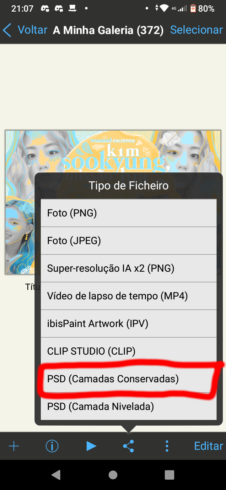
Ontem estava conversando com algumas amigas capistas e surgiu a questão: "quero editar a capa em outro aplicativo mas não consigo porque o Ibis não salva a capa em psd". Em primeiro momento fiquei confusa porque, ADIVINHA, dá sim e ensinei a elas como fazer (ainda mais porque o processo é bastante simples, aninhos de Ibis me fizeram descobrir coisas muito úteis no app). Esse tutorial não foi nada planejado, mas resolvi postar porque elas pediram e disseram que eu salvaria a vida de capistas do Ibis assim, então, cá estamos! Se você ainda quer saber, clique em "continuar lendo".
Primeiro passo: abra sua capa/edição no Ibis, mas não entre para editar. Clique no botão de "compartilhar" (vide imagem abaixo);
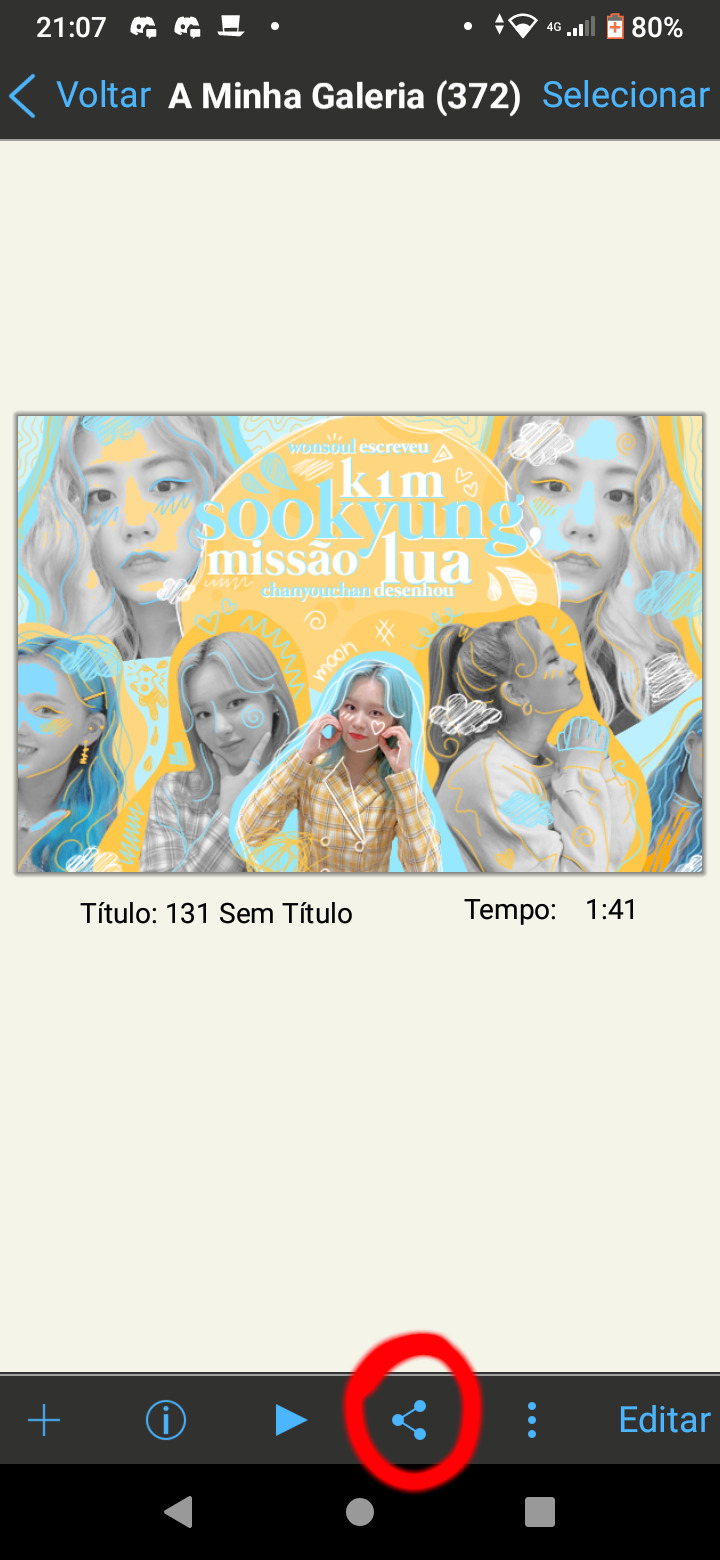
Segundo passo: aparecerão algumas opções e você escolherá a "PSD (camadas conservadas)" (vide imagem abaixo). Adendo: se você escolher a "PSD (camadas niveladas)" a capa será salva como png, com todas as camadas unidas e, portanto, você não poderá editar a camada diretamente;
Então é isso, família. Espero ter sido útil de alguma forma. Kisses kisses 💗
Terceiro (e último) passo: agora basta você escolher com o que você quer compartilhar. Eu, geralmente, compartilho com meu drive. Após isso, basta baixar o psd no pc e pimba! Você poderá abrir o psd no photoshop ou photopea e as camadas estarão separadas devidamente.
113 notes
·
View notes
Text

//You know that feeling when you draw a character once in color and that’s it… that’s probably how Idli feels. Anyway-
Here’s the first group shot of 2025, I did some updates especially for Idli and Tuto!
13 notes
·
View notes
Text
youtube
💜Lobitos aqui os dejo otro tutorial de discord, de como silenciar canales o categorías sin silenciar el discord completo en sí. Espero que os sirva💜 #tutorial #Discord
2 notes
·
View notes
Text

Comment écrire un PNJ remarquable pour votre campagne ?
Imaginons que vous soyez en train d’écrire une campagne, ou même une partie one shot, pour votre jeu de rôles. Il est bien entendu tout à fait envisageable de faire un scénario où vos PJ sont absolument seuls dans un endroit désert ou abandonné, ou alors où il s’agit de l’exploration d’un donjon peuplé de monstres non doués de parole, auquel cas vous n’aurez pas à vous poser la question de le peupler de Personnages Non Joueurs. Mais les occasions de créer des PNJ sont nombreuses, et il n’est pas toujours facile de leur donner une personnalité remarquable. Il existe de nombreuses méthodes pour donner vie à ces créatures, et je vous propose de partager celles que j’ai pu appliquer.
La première chose à faire est de déterminer l’importance de votre PNJ pour votre scénario. Vous n’allez pas utiliser les mêmes techniques s’il apparaît pendant trois phrases pour indiquer le chemin ou s’il va accompagner (ou s’opposer à) vos joueuses et joueurs pendant une campagne de 80 heures. On va donc les séparer en trois catégories : les Silhouettes, les Utilités et les Acteurs.
Les Silhouettes sont des PNJ qui n’apparaissent que parce qu’il faut que quelqu’un soit présent. Il vous faut une voix, mais vous savez que vos PJ ne la recroiseront plus. Ce sont les plus faciles à improviser, et vous n’avez besoin que de savoir quatre choses : son nom (si vous n’en avez pas préparé vous pouvez être sûrs que vos PJ vont vous le demander…), pourquoi il est présent (pas plus d’une phrase !), ce qu’il sait (uniquement sur les éléments de votre scénario), et deux ou trois adjectifs concernant le ton de sa voix.
Exemple : les PJ sont venus assister à une assemblée politique en tant que simples spectateurs ; mais aucun n’a un background leur permettant de connaître les intervenants. Ils cherchent donc dans l’assemblée « quelqu’un qui a l’air de s’y connaître ». Arrive donc la Silhouette suivante : Charles Abernatty, un étudiant journaliste qui écrit un fanzine de théories du complot, connaissant le nom des politiciens présents et leur idéologie, et qui parle de façon empressée et a peut être malencontreusement été surpris en train de stalker certains sénateurs sur son temps libre. En quelques lignes le personnage est suffisamment fourni pour qu’il puisse être utilisé pour permettre à l’histoire d’avancer.
Viennent ensuite les Utilités. Ces PNJ vont avoir des interactions plus complexes avec les PJ, et peuvent revenir à plusieurs reprises. Pour ceux-là, l'écriture va être un peu plus complète. Vous devez toujours évidemment définir son nom, mais aussi les éléments suivants : - une description physique - son background (un paragraphe suffit), pouvant vous donner à l’avance des éléments à intégrer dans les dialogues de façon à le rendre plus vivant - son rôle (ce qu’il sait et ce qu’il veut) : tout personnage veut quelque chose dans votre scénario (ça peut être simplement de vivre une petite vie tranquille, ou alors retrouver une épée magique ayant appartenu à son oncle, peu importe c’est vous qui savez). Cela vous permettra de définir sa place dans votre histoire, et justifier éventuellement que ce personnage puisse revenir dans une autre scène. - la façon de le jouer, ce qui inclut des indications de voix et de posture (ce qui vous permettra d’être cohérent entre deux apparitions du PNJ) mais aussi des réactions typiques (est-ce qu’il va être protecteur d’un PJ blessé, désapprobateur si on utilise des grossièretés, etc.)
Comme vous pouvez le voir, il s’agit grosso modo des mêmes éléments que pour la Silhouette, mais plus définis.
Enfin viennent les Acteurs. Ce sont des PNJ ayant un rôle intégral dans le scénario et revenant régulièrement. Ils s’écrivent de la même façon que les Utilités, mais avec deux éléments en plus : - le rôle va être étendu, ne contenant pas uniquement ce qu’il sait et ce qu’il veut mais aussi son implication à chaque niveau du scénario, et éventuellement son opinion sur certains sujets, permettant au MJ de le suivre au fil de l’histoire - les trois motivations : vos Acteurs vont avoir trois niveaux de motivation. Le premier est celui qui est affirmé, ce que le PNJ va ouvertement annoncer comme étant son objectif. Le second est celui qui est secret, ce que le PNJ va réellement rechercher mais ne va pas avouer. Le troisième est celui qui est enfoui, ce que le PNJ ne sait pas consciemment qu’il désire mais qui va le motiver malgré tout. Par exemple un capitaine pirate peut avoir comme objectif affirmé d’amasser une fortune pour se payer un palais, comme objectif secret de racheter grâce à son butin le domaine familial qui avait été saisi par un créancier, et comme objectif enfoui de retrouver une valeur aux yeux de sa famille qui désapprouve sa vocation de pirate. Ces trois objectifs vous permettront à la fois d’avoir un arc cohérent pour votre PNJ au fil du scénario, mais aussi de le faire se révéler, au travers de confessions ou de lapsus, auprès des joueuses et joueurs. Vous pouvez également, pour vos Acteurs, préparer certaines scènes-clefs avec des répliques pré-écrites. Ce n’est absolument pas obligatoire, et il est déconseillé de le faire trop souvent, mais cela peut être utile si par exemple vous voulez utiliser des phrases à double sens pour perturber vos joueuses et joueurs, ou si vous avez un PNJ qui utilise une façon de parler ou des tournures de phrases complexes à improviser.
Avec ces techniques, vous devriez obtenir des PNJ suffisamment profonds pour que vos PJ ne passent pas leur temps à se dire « attends, c’était qui celui-là déjà ? » tout en leur faisant passer les informations que vous souhaitez. Vous n’y échapperez pas totalement, mais toute amélioration est bonne à prendre ! Si cet article vous a intéressé j’en ferai d’autres à l’avenir, donc restez connectés !
Index
#jdr#jeu de rôles#MJ#maître de jeu#conseils#écriture#PNJ#personnage non joueur#tutoriel#tuto#contes du gris#chacaille
5 notes
·
View notes
Note
Not sure if it can be done but a tutorial on glasses (like with Azul) would be fantastic. Also one on the nightmare that is Azul's hair. Please and thank you in advance.
One tuto for glasses!
I will do Azul's hair in another post :3
Warning: I don't have the vocabulary for glasses at all. I did my best to make it understandable but don't hesitate to ask for clarifications if you need TwT

Here's our two glass boys. I looked for mostly similar glasses online to use as reference.
Azul has thin frames, rectangle glasses. Trey has heavy frames, square glasses with rounded edges.
Glasses have a LOT of different shapes. Don't hesitate to look online for references on round/oval/etc glasses to help yourself. Website that sell them tend to have pics of the glasses under several angles, which is very practical when you draw anything that isn't front facing.

Step 1: drawing zone
The most important thing to figure is where to place your glasses. Anything else can be yolo-ed and still work, but badly placed glasses will make everything look weird (though it can be used for comedic effect).
Simply put: the higher part of your glasses should reach right below your eyebrows (on realistic proportions). Otherwise, use your eyelids as ref. Place your frames a bit above your eyelids. The sides of the glasses will (usually) reach the sides of the face. That's the case for both Azul and Trey.
The bottom part is where you get to choose the size of your glasses. That's where you decide to elongate them to get square/round glasses instead of rectangle ones.

Step 2: Tracing the glasses
Within the drawing zone, simply draw the general shape of the glasses. A rectangle, a square, a circle. Keep about a finger-width size gap between your two glasses.

Step 3: Details
Draw your main shape first (rectangle, square, oval). Then remove space for your nose. The glasses will tend to leave a triangular zone free in most shapes to make space for the nose (except on round glasses). Here you can add the bridge and where the arms of your glasses connect with the actual glasses.

Step 4: Frames width
Now that you have your elements placed, you only need to draw the actual frames. In most glasses the upper side will be slightly wider than the rest. Don't hesitate to only draw one side and simply copy paste and flip it to get the other side. Glasses are symmetrical so it can be a hassle.
Once there you can decide to add the thingies that keep the glasses secured on the bridge of the nose. This step can be optional if you don't go for hyper realistic glasses.

3/4 and side view
3/4: The same steps from before can be used here. Put your drawing zone first, upper frames right under the eyebrows. The side farthest from us should reach the bridge of the eyebrow (for realistic proportions). Otherwise, leave about a finger-wide space between the face and the glasses. The side closest to us will depend on how much the character looks to the side. On regular 3/4 views you can place it right on the side of the eye. For the center part, follow your nose and place the triangular hole on top of it. Part of your glasses will be hidden by the nose.
You can decide to draw your glasses in front view on another layer first to get the symmetry right, and then to move and stretch your layer until it fit in front of the eyes. It's a perfectly valid strategy!
Side view: Here the only thing you need to draw is the side of the frames and the arm reaching to the ear. You can place the arm first, mostly parallel to the ground. The frames should be put right in front of the eyebrow bridge and at least cover the whole size of the eye. For bigger glasses, add volume on the bottom.
And that is mostly that? Glasses are mostly about where you put them and giving the illusion of symmetry.
After that you can have fun with the shapes (personally I love drawing round glasses), the size, you can decide to draw the thingies that hug the nosebridge or not, you can decide to draw the arms or not, you can add accessories, etc.
You can even decide not to draw parts of the glasses to keep a clear view on your eyes. Yana has a note for Azul and Trey that the glasses should always be full even if they hide the eyes. For me it depends on my mood and what is most important in the current art.

As you might see here, I tend to add a white edge to give actual presence to the lenses and separate the eyes (or hair) from the frames. It's your choice whether you want to erase anything to make things clearer or to keep it all as is to make it realistic.
And I guess the last thing I have to say is... look at refs online. I think that's how I finish most of my tutos lol
#hopefully that's not too messy#I haven't done tutos in a while I forgot how hard it was to explain things properly in another language#mello's drawings#twisted wonderland#twst#azul ashengrotto#trey clover#original characters#glasses#tuto#step by step#tutorial#art tips#drawing tutorial#ask me anything
336 notes
·
View notes
Text


Extraits d'un post des Petites leçons de permaculture publié sur @matin_queljournal où on apprend à jardiner sur son balcon à partir d'une palette de récup 🌱🌿 Désormais disponible en librairies !
#matin#mâtinqueljournal#permaculture#philibert#permaculturegarden#jardin#jardinage#jardinvertical#verticalgarden#garden#gardening#potager#potagerurbain#potagergarden#urbangarden#urbangardening#illustration#illo#illustrationoftheday#dailydrawing#procreatedrawing#bd#bandedessinee#comicstrip#tutorial#tuto#book#illustrated book#comicbook#comicbookartist
29 notes
·
View notes
Text

Okay, its not perfect, but I tried !
80 notes
·
View notes
Note
How do you happen to do your shading id you don't mind sharing? Its so subtle and soft that you can't tell its there but it really helps highlight the characters
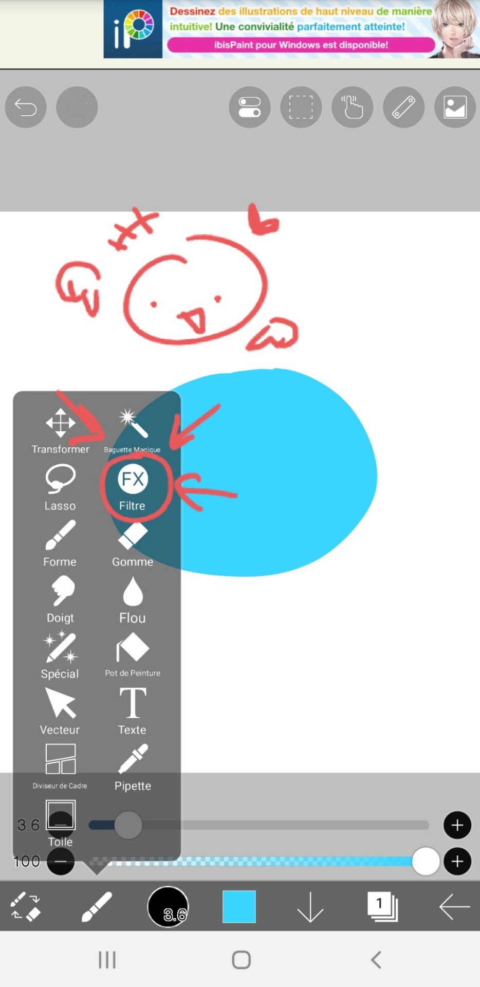
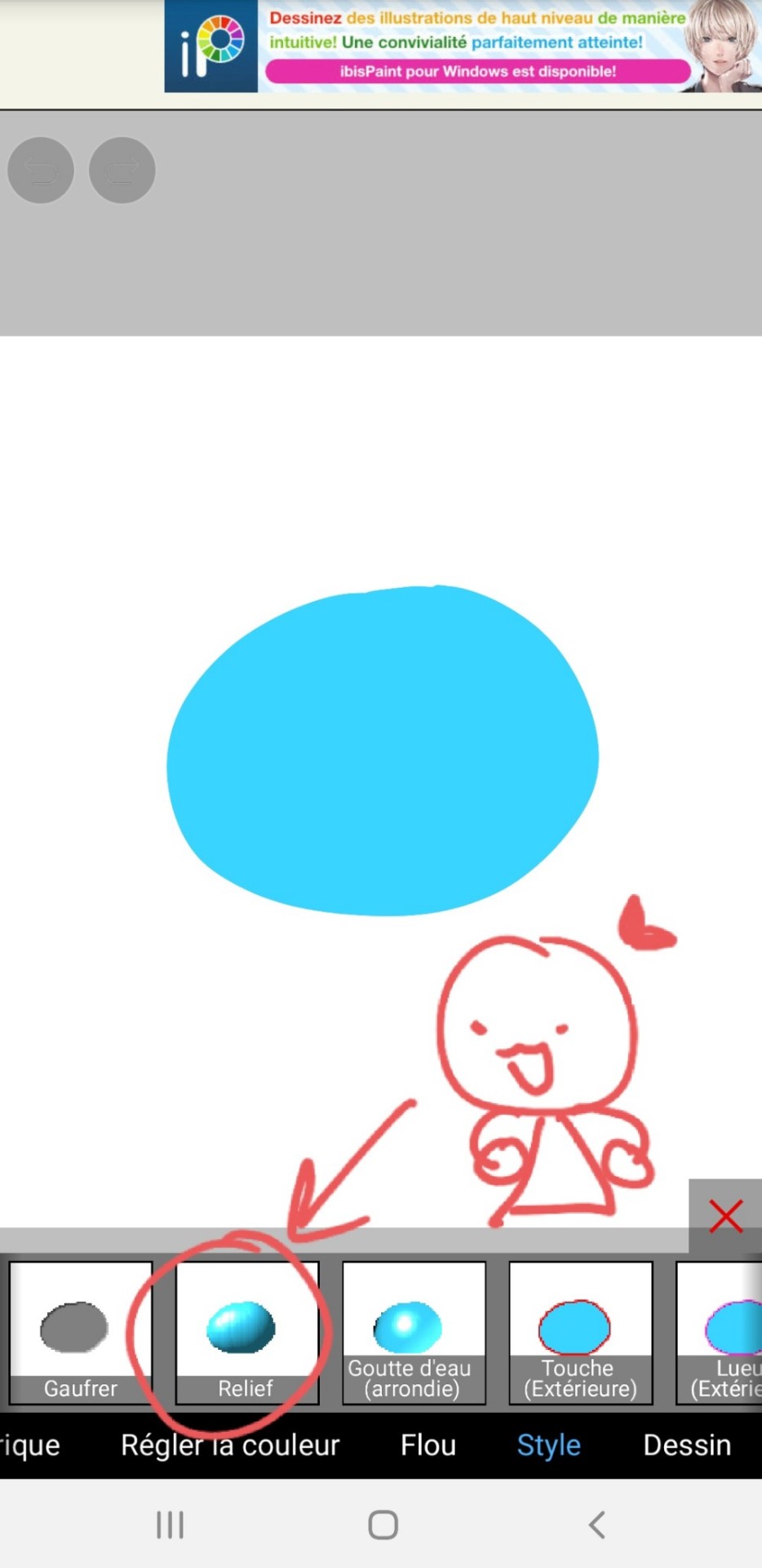
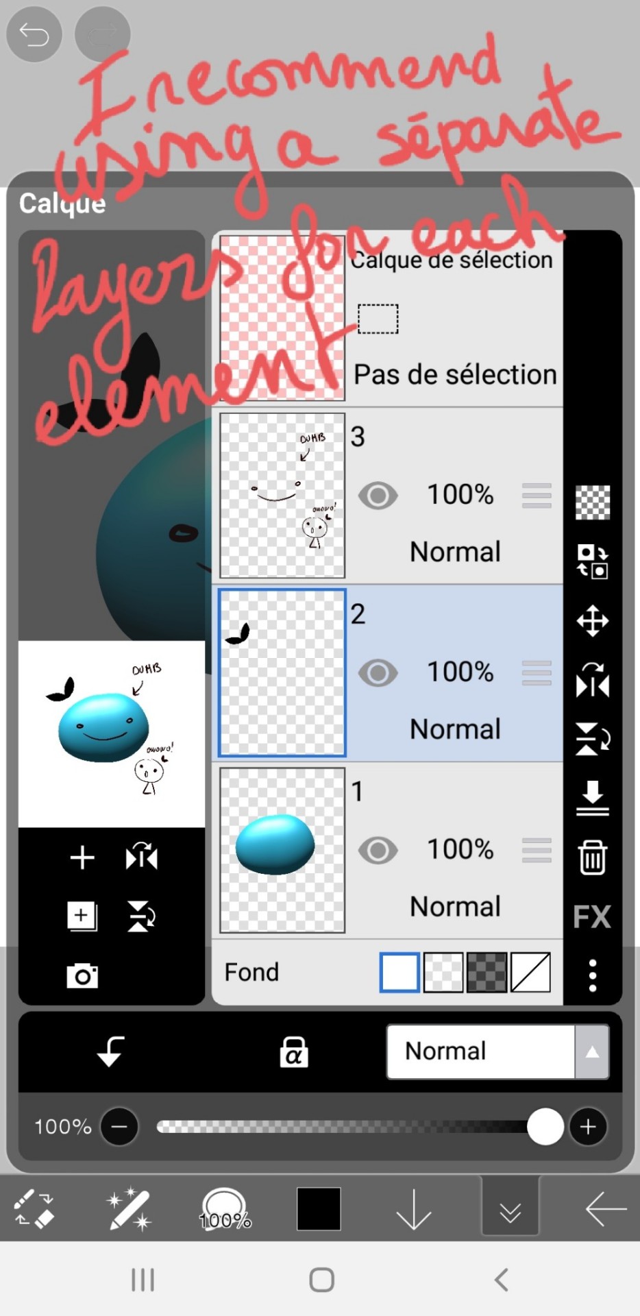
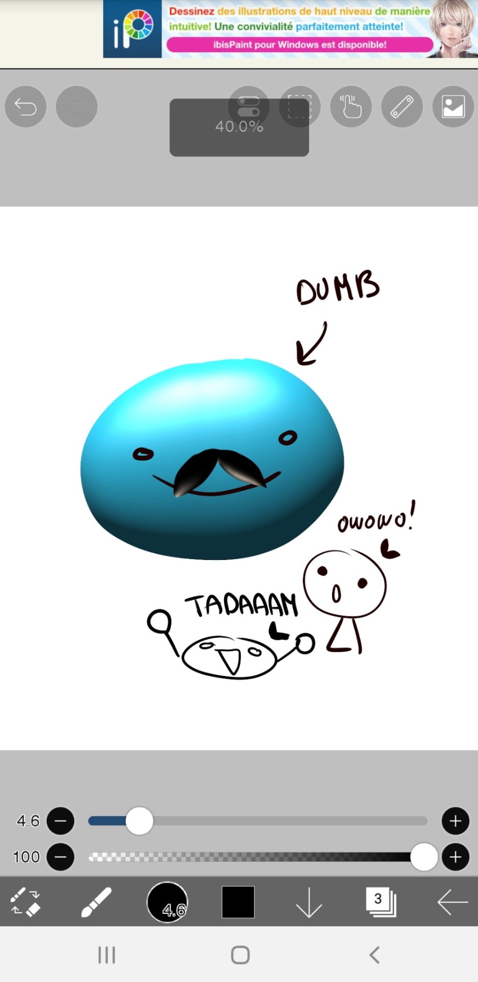
Phew, finally got some time on my hand to answer this one! It's a fairly simple/fast process so I figured I'd make a tuto once I'd get started on the shading for the next part, and here we are!
Alright so, we've got the panel (lazy screenshots cuz I'll never finish this if I have to export everytime ahah)
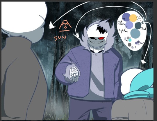
The advantage of digital art is that I don't have to think about color harmonies right from the start, I can always add filters and fiddle with the hues at any stage, so I just apply base colors at first and draw the background (it will help me build up a palette for the shadows later).

Okay, now the fun really begins. First I need to know which direction my shadows are likely to go and what atmosphere I want for the panel (which element I want to highlight? palette idea? etc). A sketch is enough to establish your intentions. Sometimes I'll mess up the lighting but it's okay to cheat if it looks coherent enough xD
(Patreons exclusive, shhh)
Now to create palette and apply the said shadows. I have a hand made one for TMS, but I had to make a special one for Ebott since there's a lot bg and kinda heavier atmosphere (I'll prbly have to make one for each part frow now on too hm). It's mostly made up of blues and greens (no black or greys here, but it can be fun to use in other styles! Purple too, so have fun!)
(My configuration - Produit=multiply?)
There, cast shadows (clothes, faces, folds, etc.) are roughly in place and looking sharp! Maybe a little bit too sharp actually... Let's smooth all that up

I use an airbrush eraser to soften a few shadows. Not necessarily all of them or the whole shape, you have to find the right balance of soft/sharp.
Now to spice things up a bit-
On a layer linked to the shadow layer, I add a lighter color that matches my light source or the environnement. Here it's a light blue, but in part VII I used a lot of orange (sun)! It makes the shadow much richer and the whole palette more vibrant!
(Again, you don't have to do it on all of them)
(not sure if you can see it lol but there's orange!)
And last but not least: Global shadow and filters (? never had to name or translate it bwahaha)
It's a lot of fiddling to achieve a result where the character looks more or less rooted in the background (=blue layers and filters to harmonize colors) and where I draw the last shadows. They're often the biggest ones (=on Axe's body+ leaf/tree shadows etc.).
You can use the techniques I've described above, or just go for it, it's completely freewheeling from here, ahem. Just make sure to step back regularly to see where you're at and stop.
(You can also add lights layers and spots if it's too dark but in this example, I use the base color as a light layer + their skulls are such a bright white already xD )
A bit of blur and ta-da~
Pretty easy, right?
#ask#undertale#The missing scarf#txt#seirin talks#tuto#spoil#I hid the dialogues but let's be careful xD#it's an efficient technique for comics !
48 notes
·
View notes
Text

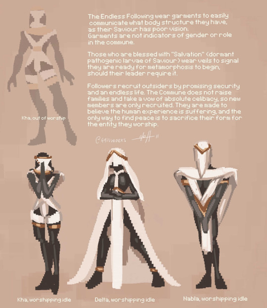
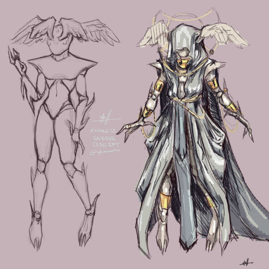
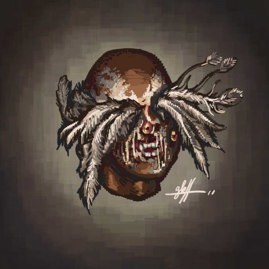

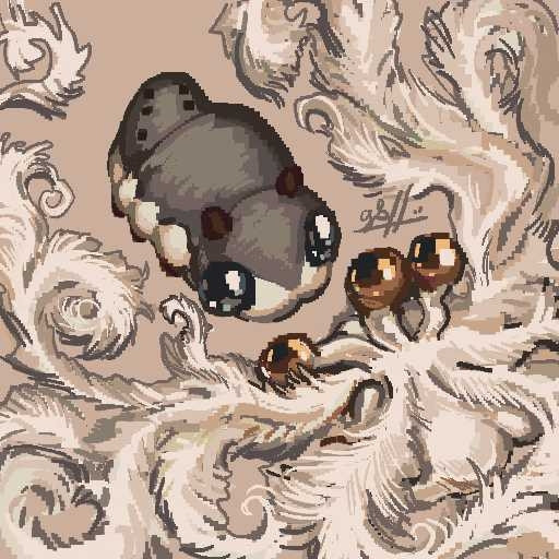
art and lore of a recent original character, an Imago named Saviour, all posted on my Bluesky!
#digital art#original character#concept art#character design#anthro#imago game dev#tuto#endless saviour#I can never remember how to spell parthenogenesis I'm a fake biology fan 😔
13 notes
·
View notes