#Then to the background without finishing lineart
Explore tagged Tumblr posts
Visit Tumblr Blog
Explore Tumblr blogs with no restrictions, modern design and the best experience.
Last Seen Tumblr Blogs


Fun Fact
Tumblr is available in 18 languages.
Text
I swear I'd give actual artists fucking heart palpatations with how I work on my art pieces
#Was watching the playback of the dragon thing I'm drawing#And holy shit maybe I do have adhd 😭#I haven't even finished the lineart#And I was working on the coloring because idk#Then back to the lineart#Then to the background without finishing lineart#Then drawing something else entirely on a separate layer#Scrap that#Back to the sketch layer to fix some positioning#Back to lineart#I don't have a process it's a mess
1 note
·
View note
Text
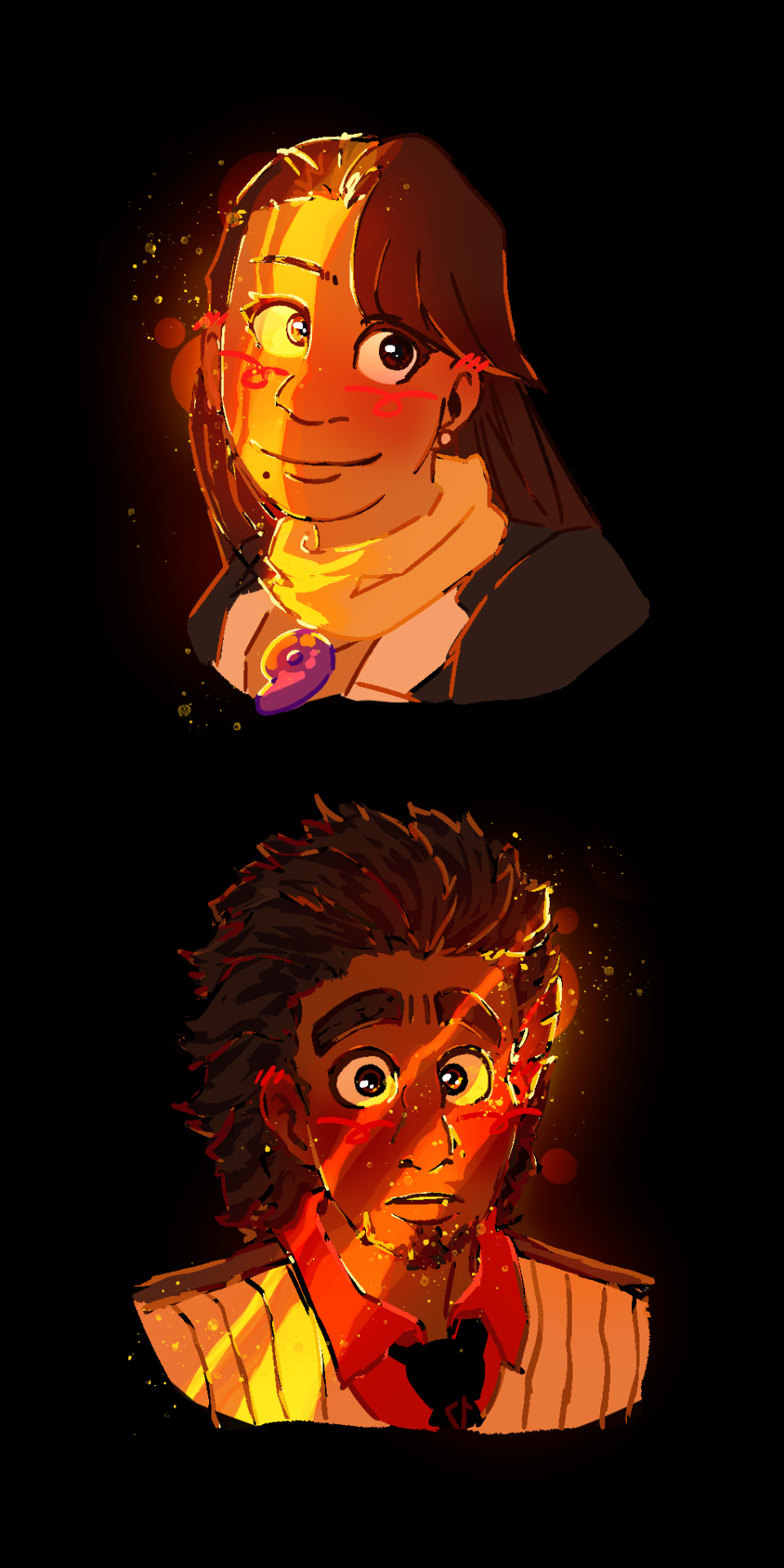
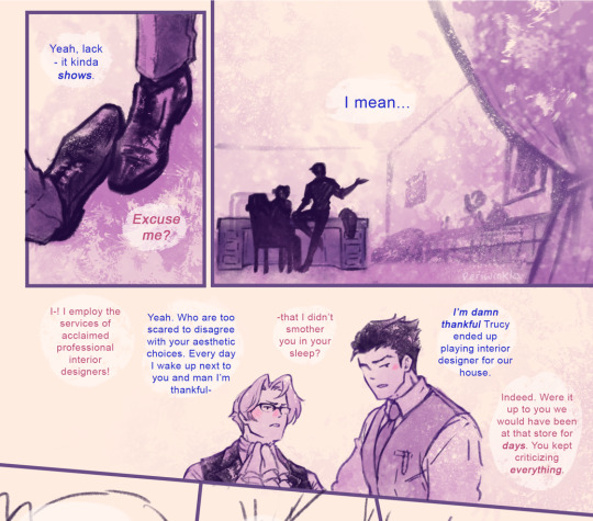
im really normal about them <- lie
#ace attorney#mia fey#diego armando#miego#lorillee.png#THATS RIGHT BABY. AFTER -um . hold on. *checks notes* - SIX MONTHS. LORILLEE IS BACK WITH PHOTOSHOP ART 💥💥💥💥💥💥💥💥💥💥💥💥💥💥💥💥#every now and again i like to put effort into something just to remind everybody that i can actually draw#well i say that but to be honest i put a lot of effort into those ms paint ''diego fey REAL'' doodles#but half of that is just because humans are a . something. to draw. and urban backgrounds are my worst nemesis#and also trying to work with ms paint to like slightly transform things is an incredible pain in the behind#anyways. yeagh 😎👍 behold the power of miego. getting me to actually finish something in photoshop for the first time in months#anyways. ive discovered the secret to getting me to draw stuff on photoshop. prepare yourselves accordingly#what i need to do is sketch & line something in ms paint. and then directly trace it over into photoshop#and then i can go ham#see because the reason i never did this before was because i would sketch things in ms paint#and try to line them in photoshop and it simply Wouldnt Work.#so i had assumed that if i wanted to draw in photoshop id have to sketch in it first. yknow. which i cannot do for some reason#something about the way the pen feels and the . its like the smoothing setting is on even when its on 0 percent. you know. anyways#but with this one i drew mia in ms paint as per usual . and i wanted to mess around with color & light#and i triedddd to do it in ms paint but unfortunately as you can probably imagine. doing stuff like this without layer filters#can get a little difficult. if you know what youre doing its obviously going to be easier but that being said i do not#when i pick colors i am literlaly just wildly guessing 😭🙏 which is fine for more straightforward coloring/shading#but not quite here. which is why i wanted to take a stab at it in the first place#so anyways i was like FINE WHATEVER and tried tracing the lineart in photoshop so i could take a stab at coloring in there#and i was . enlightened. (no pun intended). it WORKS#so anyways . you may actually be able to expect. some photoshop art from me#well ok thats a lie never expect art from me. but we can all dream together#anyways they really are the star-crossed doomed by the narrative romance ever. everything to me
188 notes
·
View notes
Text
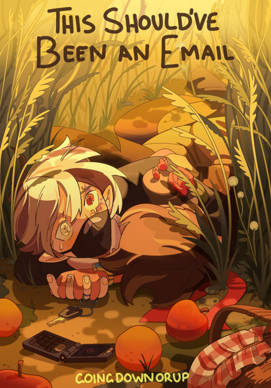
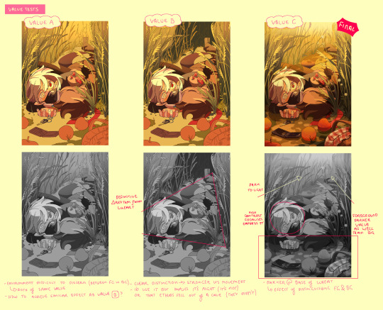
This Should've Been an Email
His mouth moved without it telling it to, then closed like whoever was possessing him didn’t know what to say either. There was something going on, something Etho could feel but didn’t understand. They were standing on the edge of the world, and Etho didn’t know how to tell Bdubs he was out of time. Was he out of time? Maybe he was just going insane again. Maybe-
“Etho, there’s a lot of void energy going on right now, can you focus-”
You can’t outsmart a god. You can only run.
-
[ READ HERE ] Latest addition to the Should've Could've Would've series and sequel to the YCAOverse byyyy incredible great @goingdownorup cinemaaaa is HERE and we are BACK IN THE BUILDING!!!
[rambling undercut]
you've fallen for my trap card, ramblings not about the actual fic yet sorry - I'm going to talk about art technicalities at you now :]
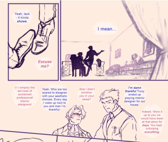
Ver without the text:

I drew this up on a whim immediately after finishing the first chapter. Other than it being fanart, this year I want to think smarter when making elaborate pieces - this being the one of the first experiments on it.

sketches have always been my starting foundation I usually go through a few iterations gradually building off the rough thumbnail all the way to lineart. Here I'm establishing perspective and rhythm (movement), using background and props to better frame the emphasis (focal) rather than overwhelm the eye with unnecessary detail.
Shirahama's Witch Hat Atelier manga panels were an inspiration for the lineart (reoccuring character. WHA changed my life)

I even started actually putting base colours instead of skipping to shading... BASE COLOURS. BASE COLOURS WITHOUT SHADING? Crazy world we live in. Above were me testing which colours worked best for the background and purpose. Ethubs look a little out of place atm - this changes in solid filters

Shading itself was a lot of back and forth in constant fumbles to maintain the rhythm instructed in the lineart, adding emphasis how values needed to carry the visual communication of this piece especially with a line heavy background because of the wheatfields. Everything uses either cel shading, filters, or gradients - I wanted to find a way to add complexity to my regular rendering style without needing to manually blend/paint (takes too long)
During this stage, Heikala's watercolour art was the study in crowd control (backgrounds with organic repetition)

Smaller misc details that couldn't fit anywhere in the previous pages. Overall while there are some things I still would change/redo, overall very pleased as a first (second) attempt ^_^
#stufffsart#character concept stufff#stufff rambles#ycao au#<- Going to be my catch all tag for everything of that tl#This Shouldve Been an Email#ethoslab#etho#bdoubleo100#bdoubleo#bdubs#ethubs#(theres a third person if you can spot them)#hermitcraft#hermitblr#mcytblr#theres still other things from the sequel i wanna draw (jizzie designs - gem and cleo etc) thatll have to wait#this cover and my other fancover are so stylistically different whwhwh
2K notes
·
View notes
Text
Palingenesis (Part 2)
<- Part 1


<- Part 1
Read full quality version without awkward cuts here <-
Phew, told you it was huge! Like mega extra elongated.
It's been super time-consuming and stressful: from doing research, writing the manuscript, drawing up the sketches and panels, to putting down the lineart, fill in the basic colour scheme, adding background and atmosphere and doing the finishing touches. BUT. It's been a blast nonetheless! I've learned a great deal, and you'll probably notice some irregularities in style, but I think it's a good sign that I'm still quite happy with it even after working on it for quite a while. (Usually by the time I'm posting I'm already way tired of the piece...)
Hope you liked it!
#batman#joker#dc comics#batman comics#batman fanart#joker fanart#batjokes#joker x batman#batjokes fanart#dc fanart#bruce wayne#my art#webtoon#webcomic#fan comic#huge ass project#Palingenesis
226 notes
·
View notes
Text
☆Hello guys :^D !
♧Noodle post of the day; I FINALLY finished my (human) Lackadaisy Rocky fanart (started at the start of the month). It was inspired by the GORGEOUS opening scene from the animated pilot!!
☆The two main versions, (saturated and slightly less saturated):


☆Version without "music smoke/sparkle" and w/ old timey coloured suit:


☆Reference pics:


☆Lineart and background art:


☆Speedpaint of the background and colouring:
♧I love this webcomic and the animation and the crew and just this whole universe so so dearly guys :")♡ @lackadaisycats 🫂.
♧This fanart was a BIG challenge for me! And I loved taking my sweet time learning to improve on backgrounds, lightning and colouring, and just step out of my comfort zone and experiment, until it felt like "me"!
This is definitely my biggest fan artwork to date.
♧Thank you for reading and looking!♧
{☆oh and a Lackadaisy animatic is in works...}
#lackadaisy cats#lackadaisy fanart#lackadaisy rocky#rocky rickaby#rocky rickaby fanart#youngartist#artist of tumblr#ibispaint#wip#ibispaint art#digital art#digital painting#digital drawing#digital illustration#artists on tumblr#artist support#human au
752 notes
·
View notes
Text
May I Have This Seat?
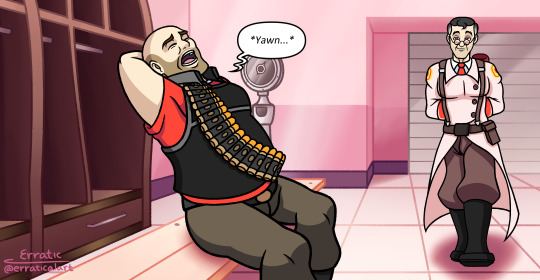


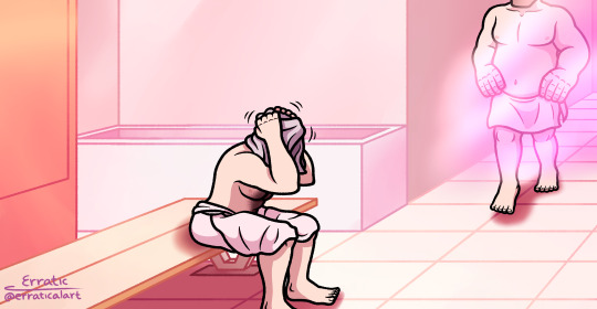


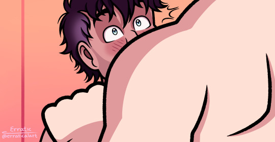


Hey, guys, I'm back again. At least for now. Would you believe me if I told you that this comic took me around half a year to finish this? Procrastination will be the death of me... I made this as an excuse to have Heavy and Medic sit on each other's laps.
(Pray for Medic's lap, though he might enjoy the sensational pressure he's experiencing.)
( ͡° ͜ʖ ͡°)( ͡° ͜ʖ ͡°)( ͡° ͜ʖ ͡°)( ͡° ͜ʖ ͡°)( ͡° ͜ʖ ͡°)( ͡° ͜ʖ ͡°)
I also made this to practice on backgrounds again, specifically indoors.
And yes, there's inconsistencies here and there like how the second scene has no lineart because I was testing if I should have my backgrounds with/without lineart (very pretty and cozy scene to look at but hell to choose and blend colors together, but hey, it was worth it), and how near the end of the last scene the atmosphere becomes more pinkish purple to get that dreamy romantic feel.
Also, I totally did not just trace the respawn room because I got lazy meanwhile, I used perspective rulers for the other scenes and making blueprints for the room and building to practice with architecture, and ironically the first scene is the last scene I worked on.
And I'd rather suffer than draw Heavy's bandolier over and over and OVER again...
And I finally gave them nails because their bare feet looked odd in the end, so I gave them toenails and it helped, but now I have to give them fingernails because that's just weird to have toenails and not fingernails. I wanted to experiment and I'm not sure if I should keep it to update my art style.
Sorry if I posted it late today because I literally just finished making this after finally working on it again for a couple of sleepless weeks.
That's what I get for being lazy while working on other art projects.
(Psst. Hey, ScoutPauling fans, I also have something for you guys as well, but you'll have to wait a bit as I'm currently finishing up some details. Also, this art I'm finishing is one of the reasons why I procrastinated with the HeavyMedic comic even though the comic is 2 months older than the pic. I was mostly focused on ScoutPauling more than this. But trust me, it looks good and cute, just wait...)
I need to make a better schedule...
Anyways, I hope you enjoy this comic and Happy Valentine's Day!
#tf2 medic#tf2 heavy#heavymedic#red oktoberfest#TF2#Team Fortress 2#TF2 Fanart#TF2 Art#TF2 Fancomic#TF2 Comic
210 notes
·
View notes
Text
Random banter from the comic that may seem nonsensical but I promise it makes sense in context. Maybe. And I promise it's actually very sappy. But you need comic relief (ha!) sometimes. And of course, I'm experimenting at painting these panels before I have even finished the 'lineart' of the other pages, why do you ask- ...Under the cut, stuff.
This is with and without color:
...Can you tell I haven't even attempted at comic-making in like, a decade? I have no clue what I'm doing. There's also the problem that I'm strangely adverse at using BW. I love using color too much... so that's why I chose light yellow for whites and purples for gray/black. (I mean there's also the fact that I get eyestrain fairly easily so I prefer not to use white backgrounds... while drawing I would need to stare at them too much) What do you think about the medium tones? I'm not sure if they're too warm, or too cold, or just right. My eyes are very confused right now. So much so they hit themselves in their confusion (I know, I have the worst humor in existence).
#ace attorney#narumitsu#miles edgeworth#phoenix wright#wrightworth#periwinkla#periwinkla wips#also I really need to fix the text formatting...
437 notes
·
View notes
Text
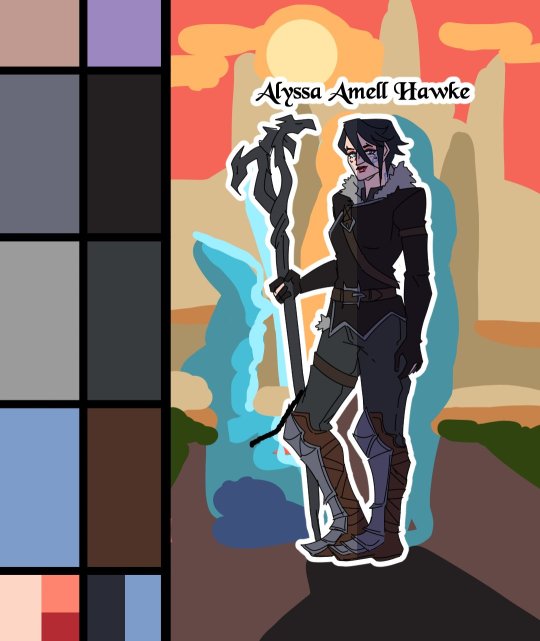
Heroes of the Dragon Age
An animation I've made for Dragon Age Day 2023, featuring my main Warden (Alyssa Cousland-Theirin), Hawke (Eleena Amell Hawke) and Inquisitor (Sulevin Lavellan)!
It's to this day one of my best artwork and I thought I should share it here too! 90+ hours between the original sketch, outfit design, the rough animation, rotoscope, inking, flat-colours, background shading and even the audio :')
Interested in the process? I detailed it below since it was my first time doing something like that:
I would like to start by saying I'm not a professional animator!Everything you've seen here is the result of experimentation and a lot of practice to learn and understand how 2D animation works.

My first idea started in May 2023. I just finished rewatching DA Absolution for the X time, and wanted to analyse why I loved the intro so much. (Even after countless rewatch, I never skipped it once.) I was inspired to study it with my main three protagonists!


Then came the first test with Alyssa Cousland-Theirin, my Hero of Ferelden! I tried to understand which part to separate for the animation. Mainly the hair and cape because it flows a lot more than the rest! If I recall, my first idea here was to make her counter flame attacks (?). Then, as the camera turns around her, I tried to add a grid to know how the camera would work around it.
I ended up making the clip longer, so she could position herself to the further left and leave space to the two other protagonists.

Now it was time to try to animate Sulevin Lavellan, my Inquisitor. I really kept that quick doodling style just to capture the vibe without putting too much time/effort into it! The background would be static to contrast with Alyssa's. I also loved the idea of a rogue sneaking!

Instead of working on Eleena Amell Hawke, my Champion of Kirkwall, I went back to Alyssa and started working with Clip Studio Paint 3D models (this entire animation has been done on the EX version of the software!) It helped for rotoscope animation and maintaining likeness! That's when I got the idea to make the background swirl around the character to let the eyes be guided by the rest of the screen!

After a couple more hours, I planned the entire animatic with 3D models and quick doodles! I finally found a cool pose for Eleena Hawke, which was honestly the hardest of the three to imagine for some reason? I tried many other poses but ended up picking an animation from the game!


This whole time, I was studying a bunch of background ideas and how studio Red Dog Culture House (who made Absolution) work! Thankfully, they have a YouTube Channel where they shared some BTS content so I could analyse it!


Then, I simplified my character and their original designs in the style of the studio! These outfits are how I imagine them after Trespasser. Alyssa as the Queen of Ferelden, looking for a cure to the Calling, Hawke following Fenris to Tevinter & Sully as a Red Jenny Inquisitor!


The idea for Sulevin's animation actually came from a piece I doodled on a live stream, when I was drawing pose studies and turning them into finished artworks haha As for Alyssa, I wanted to draw the fight that got her facial scars!

Once their designs were ready and the background ideas too, I made the rough version of the animation! Basically a sketch done on top of the 3D models to add the details, staying pretty rough just to capture the idea and movements.


Then it was time to start the lines! I decided make a folder per frame, so I could separate all he main elements and draw them one by one. It helps keeping the likeness of a character in the different frames without having big "jumps" between frames! In fact, every parts were coloured differently to recognize them, and then I used vector erasers and masks (Ah yes, the entire lineart is done in vectors of course! It's easier to adjust and save time when working on similar frames!)


At first of course, everything overlaps! But I find it easier to draw too much and erase after, just to make sure everything is coherent in each frames! The cool thing about CSP is how you can change the colour of the layers in one click! So all the coloured lines turned into black in one second, and I could reverse it just as quickly to double check!

Then I started working on Sulevin! I made a blue line to mark where her feet were, as the sketch in the background wasn't perfectly straight! (Like Sulevin's sexuality 🤭😂) The silhouettes were very quick to do, but I had fun adding more & more details as she came closer to the foreground!

I really wanted to add that little dagger trick, but I remember it required me to change the pacing of Eleena's apparition, as it was recovering her arm too quickly! I had to change the pace of multiple frames quite a lot during the project, to make sure the flow was right! For Eleena, most of her animation remained around her arms and the staff itself, as magic would be the most difficult part! That way each character has their own focus: Alyssa has a very animated background, Sulevin got the grappling hook and Eleena the ice!

Then it was time to start adding colours! Just like for the lineart, I separated every colour on it's own layer, so I could easily adjust the colours later if needed. I added one colour at the time, going through all the frames, and then another colour!
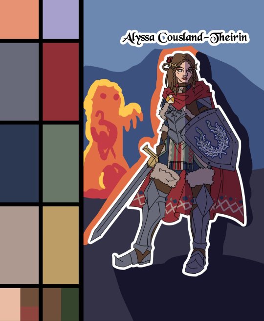
I made full palette tests with the colours I would use for their background at this point, checking if the details remained readable! Alyssa was the most challenging in terms of clothes, because I made her a very detailled armour! I had to simplify the Theirin heraldry, vectorize/redraw the Cousland, and make a brush for her cape's pattern!

Once I was done adding the flatcolours, I started the background, and oh boy it was a wild ride. For the cave, I painted multiple tests. I imagine was to use CSP panorama tools, which transform a texture into a 3D sphere, so each corners must match to look good. Sadly, it made the background very blurry, so after hours of testing, I changed ideas. Instead of the random fire balls (?) I originally imagined for Alyssa, I made three simple frames of a Rage Demon to attack her.


I ended up using the cave as a repeated pattern to make it turn 360° around the character. For Eleena, I mixed inspiration from the comics, Dreadwolf & Absolution, using warm colours matching Hawke's signature red. Just like I made the cave very grey/blue to match Grey Wardens. For Val Royeaux, it was more complex because I wanted to make it green, matching the Inquisitor's signature green. But bright green couldn't work, and the original colour during day time was blue/white/gold. So I added more leaves, played around the design a bit! After adding the rage demon, I made the shading! It was surprisingly easy and quick to do now!

I clipped a white layer on the flatcolours to not be distracted by the colours, and made thin lines to separate the light/shadows, then simply filled everything with the bucket tool! Then you set the layer to multiply and remove the white layer, and you have celshading shadows! Now the character looks out of the picture, so I added layers of blue in color burn, saturation and substract blending modes to make her look like she's in the right setting! Of course, I did the same with the other two, giving Hawke a red overlay and Sulevin green shadows!

Then I added the details, it went from white irises, to sword/staff smears to earrings and smaller finition that goes on top of these layers. To add the lights, I simply selected the shadows and reversed the selection! Using warm and cold tones to create contrast with the purple/bluish shadows! I also added more ambient light layers for Alyssa to reflect the Rage Demon fire. Now it was time to add ice magic! My first attempt had too many frames, making it look weird! Sometimes it's better to lower the frame rate to make things less bumpy!

Then I downloaded some cool ice brushes on CSP assets that made it look less like blue magical flames! But when I covered the screen in ice, I realized "Oh wait, I could make a cool transition from the ice, to blue lyrium turning red?"Red Lyrium truly links these three games and The Veilguard somehow! I spent the next hour painting over the idol and putting it in a black background, with lyrium and then the golden Dragon Age title text.
For the SFX, I used free youtube libraries sounds & "Darkspawn!" comes from the violent human female voice set (iconic for ""Can I get you a ladder? So you can get off my back!"😂🤭) After editing all that, the animation was finally done!

Here's the final math:
About 15 hours for the sketching/rough/animatic phase, 30h for the lineart, 25h for colours, 10h for backgrounds, 5h for details & 5h for music & SFX, for a total of 90 hours. Aka the same amount of time it took me to finish Baldur's Gate 3 the first time lol
If you have any question regarding the animation or the softwares etc. do not hesitate to ask, I'll do my best to answer!
#dragon age#dragon age origins#dao#dragon age 2#da2#dragon age inquisition#dai#da4#dragon age dreadwolf#dragon age the veilguard#animation 2d#original character#tutorial#warden#grey warden#warden cousland#alistair x cousland#alistair x warden#ferelden#hero of ferelden#queen of ferelden#hawke#fem hawke#eleena amell hawke#mage#warrior#rogue#lavellan#inquisitor lavellan#solavellan
320 notes
·
View notes
Text

Stalker's Tango - Autoheart
Hey guys I love the Pokémon Manga dearly!! These mfs were out here DYING!!
But no fr stalkers tango makes me think of them but pokespe, so I threw this together in 2 days. It took like 13-14 hours overall but it was so worth it. Even if I have never drawn a single tango pose in my life.
Here's some extras as a little treat: my original thumbnail, the finished rendering without the background, AND the lineart by itself <3

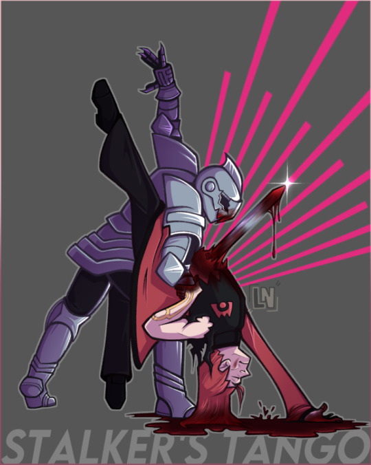

#pokemon#blood tw#hardenshipping#kinda?? one of them is like dying lmao#hardenshipping but ANGSTY#there we go#magma leader maxie#aqua leader archie#pokespe my beloved#pokespe#nugget art!!#nugget's yapping again
525 notes
·
View notes
Note
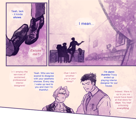
Hello! i absolutely adore your art and agree with your sonic opinions, you're overall one of the best sonic blogs out there. May i ask how do you plan out and draw your comics? How do you choose the formatting of panels themselves, the composition, the dialogue and so on? From A to Z, please! I apologize if this ask might be inconvenient, but i'm curious because i love your comics and have attempted to draw a sonic comic myself that failed miserably.
Typically the first step I will take is to just rough it out in a sketchbook, because I find it much faster and when working digitally I feel more pressure to make things look nice. This is where I start thinking about paneling and composition. It doesn't look perfect or cohesive at this stage, but at least now I have a rough idea presented with barely legible scribbles that don't make sense to anyone but me.
For paneling, large panels linger more, and small panels indicate quick succession. This is the most important rule I personally follow when making panels. It affects things like comedic/dramatic timing and how the reader will be guided through your comic.
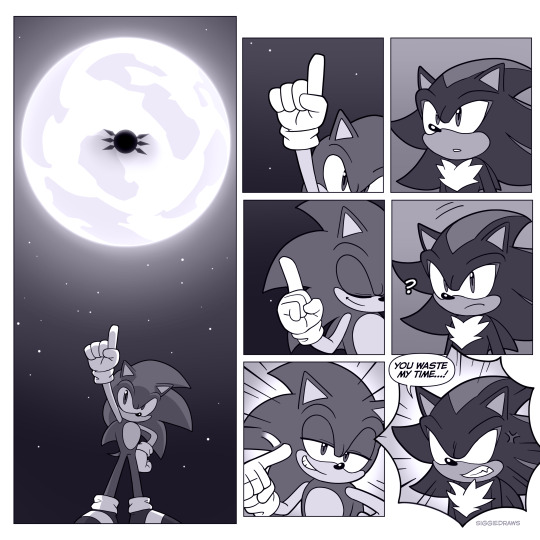
It's important to vary up the composition when it comes to dialogue scenes where not that much is happening. The shot-reverse-shot format works, but remember that once you have an establishing shot and the reader knows where the characters are, you can get creative. I like to do close-ups where not everything is shown to create a sense of vagueness around what emotion the character is feeling.
Don't do this too excessively unless you're trying to create a claustrophobic feeling - let it breathe with a medium shot or long shot after!
In film-making, there's a rule called the 180-degree rule that basically states that in a two-character interaction, there is an invisible line drawn between them. The camera does not cross this line and stays on one side. This basically keeps the characters on one respective side of the frame at all times to avoid confusing the viewer.
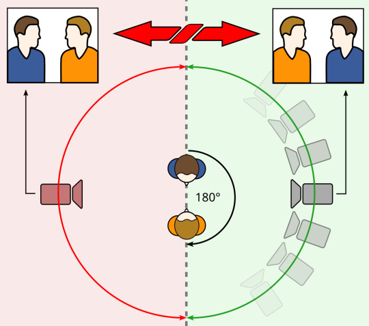
This is by no means something you have to follow for comics, but if you want to create something that is easier to follow, it's a good rule of thumb that I consider when drafting! It can also be broken depending on the effect you're going for.
Once I have a draft, I'll typically go into editing and changing things that don't work quite as well as I'd like. This can be done by yourself or you can get it revised by a friend, like I do!
After the draft is finished, I'll get to lining and colouring. To be honest, it's not something I can teach so easily, but rather something that takes a lot of time and practice to learn. I typically draw the backgrounds with thinner lineart so that the characters stand out. Same deal with colouring - the characters stand out from the background colour-wise. There are multiple ways to do this, but for example, here I made the background have less colour contrast than the characters and stick to an orange-ish tone, while the characters are different colours from the background.
For speech bubbles, generally the words should fit the shape of the bubble to the best of your ability. The line spacing should be as close and compact as possible without touching the lines above or below. This is to save space on the page so that speech bubbles don't take up a majority. The tail of the bubble should point towards the character's mouth.
Avoid tangenting! This is when the very edges of two different things touch each other. It creates a flatter effect so you want to avoid it as much as possible.
That's about all I can think of right now. Hope this helped!
#tbh i have also dropped comics before because it was too hard to get it to work#they take a lot of time and dedication#but you shouldn't give up!#ask#tutorial
85 notes
·
View notes
Text
COMMISSION OPEN
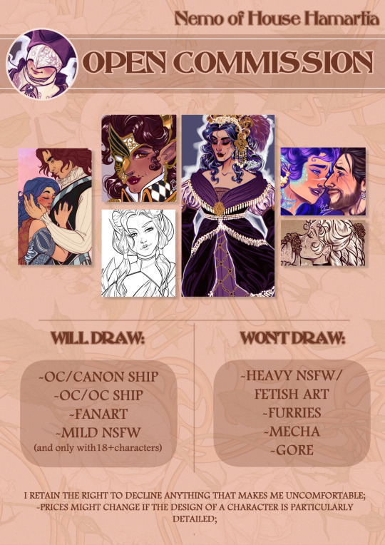


RULES:
I retain the right to turn down any commission that would make me uncomfortable;
When Commissioning me, you agree to my terms and policies;
Please be polite. Disrespectful and rude behavior will not be tolerated and your commission will be canceled if it occurs.
Your Commission is to be used for PERSONAL USE ONLY;
Payment is done in PAYPAL ONLY and in EURO (or the equivalent in AMERICAN DOLLARS);
Payment is done upfront and won't be refunded UNLESS something happens on my side that renders me unable to finish the commission. If for whatever reason I find myself unable to finish your commission, you will get a full refund, and that’s THE ONLY CASE a refund shall be issued back;
For Commissions over 100 Euros, 50% of the payment will be paid upfront and the other 50% after you receive the finalized sketch (there is to say, before I move on to do the lineart and colouring);
Any addition/changing AFTER we have agreed on the finalized sketch will entail additional costs;
When drawing your characters, I will need CLEAR VISUAL REFERENCES, for both the pose and the physical appearances, especially if the characters have a complex design (examples: mood boards of your character, other artworks of your characters, a 3d render, a face claim (tho, in that case, I will try to capture the resemblance WITHOUT copying the IRL person), etc, etc. Pinboards on Pinterest are useful to me to get an idea of what you want, but not nearly enough for me to fully understand your design). If you won’t provide ANY of these references, I will automatically assume that this falls under the category of "Character Design”, and the fees will be adjusted accordingly (Original Price + 30% of it, since I will have to craft the characters. However, while discussing your commission, I will tell you right away if the references are enough or if I need more, so you won't end up with any unexpected surprises).
Due to the fact that I am a mom, I will estimate the artwork to be ready (after the full payment) in a period of 2-3 weeks, during which I will send you constant updates. If there is any delay, I shall notify you in that regard;
Please be mindful that, at present time, I am offering only a simple background.
Once the artwork is complete, I shall send you the high-resolution PNG/JPEG format to your mail;
I will retain the right to post the finished commission on my art page unless agreed otherwise;
Do not claim the artwork as your own.
Do not edit/alter finished artwork.
Do not remove my watermark/signature.
Do not use the commissioned piece in any technology related to NFTs, cryptocurrency, or AI.
If you are interested into commissioning me, feel free to contact me at my email address [email protected] , with the Object being"Commission". Contact me only if you are interested in Commissioning.
In the Email, make sure to include:
-Commission Type;
-Character Visual References;
-References for both Pose AND expression, if you have anything in
particular in mind;
-Your Paypal email in order for me to send you your invoice;
-Your Tumblr Handler, so I know who I am talking to;
Please, consider reblogging this.
Thank you so much for your consideration!
--Nemo
#Nemo babbles#artists on tumblr#digital artist#Commissions#I decided to try and open them once again#it has been 5 years almost since I last did#so let's go and see how it goes :)#baldur's gate 3#dnd#dragon age#dungeons and dragons#assassin's creed#small artist
42 notes
·
View notes
Note
Heyy I love your DA art so much! I just want to ask if you don't mind especially on your family DA piece. Do you render first before putting the lighting/effect or do you do the opposite? I always struggle when drawing illustration like that because I just can't get the lightning right after I put the main shadow
Thank you and no problem!
My process was honestly rather sporadic because I'm not used to work on big pieces like this, especially those with warm colors (like browns, oranges, gold, etc) so it was honestly a challenge.
It's gonna be a long answer so im just gonna put the whole process below this cut
I tried doing everything in base colors first. No shadow no nothin. At this stage im trying to make sure that the base colors are all in the same, warmish tone so nothing felt out of place (left)


I was absolutely stuck on how i should do the shading, so i asked a friend for advice and she painted it over a little to give me an idea (right) (sorry the quality is ass cus its a tiny thumbnailing thing)
then i focus on the main subjects, i dont entirely shade them yet i just give some discoloration and color details like blush, dirt, subtle ones. I colored the lineart too (but i suggest you do this later after your shading)

then the shading, i carve it out from the multiply layer (as my friend suggested, lighting came from top left so i follow that suggestion)

added more contras (multiply & overlay) to add more depth and pop some more color

now that im done with the main subject, I got a good glimpse on what tone I should do for the rest of the artwork. Dark red for areas i need darker, and something of a gold/orange for the brighter spots.
i shade the background manually without using multiply, since im worried itll be muddy (easier for me to control too).

once everything is shaded, check on your artwork using a B/W layer. Everything still feel flat to me so I know i need to add more contras in the light & shadow
At this point im just throwing in Mulitply layer (reddish, green sometimes) to darken some areas outside of the focus and Overlay layer (yellow, orange, whites) to highlight the important parts and to emphasize where the light is coming from.
Check it again in the B/W layer, and it feels way better!


and there it is!
I added a few personal effects at the finishing, copying the lineart and gaussian-blur it, add speckles, add noise, color balance it a little. Poof. We're done :D
Hope that helps!
78 notes
·
View notes
Text

connorkus wishing you a very happy 2025~! my art ramblings below the cut as per usual
so my goal was to finish this drawing before the end of jan 1st in my time zone and ehehe that certainly did NOT happen. it's like 10am jan 2nd here ahahahah. but hey it's still jan 1st somewhere!!!!
i spent like 15+ hours on this piece and like 70% of that time was redrawing markus. i swear i have the hardest time drawing that guy. i miss drawing ladies. i used to them all the time. maybe that's why i got north down in one try. connor took like three tries. and then markus... i went through like 8 renditions of him. i hope he turned out okay. i've been staring at this piece for so long i've lost all objectivity.
y'all it really is a new year because i actually put my clean line art in a separate layer instead of what i normally do and spend an abnormally long time cleaning up my rough sketch. this led to veryyyyyy thin line art which it is not my usual style. i think it turned out okay??? i think in future pieces might change up the line weight cause i love my tapers but i was just too lazy to rethicken all the lines on the clean line art layer jskdfjksdjfkdsjfl.
i wasn't planning on doing a full colored piece because of the time constraints but i decided to put in some matte colors cause i wanted them to be color coordinated and i was like oh it looks a bit weird and flat maybe i'll render just a litt-- oops i rendered the whole thing ehehehe. tbh, i'm still trying to figure how i want to render and color things. i feel like i always like the plain lineart more than the colored version. i think that will be a goal for this year is figuring out how to color. right now like 50% satisfied with the how i render so hoping to get it closer to 100% by year's end.
btw, no one is allowed to compliment my fabric textures bc i literally cheated cause i just got a picture of fabric texture, set the layer to grain merge, and then added highlights. i was not gonna render out norths sparkly dress by hand that's for fucking sure lmao.
also, idk what cosmic void they're standing in. i just wanted a really soft glowy background without having to render out anything detailed. so uhm let's just pretend that they're standing in front of some sort of light display.
for listening to my ramblings enjoy these rough sketch layers~


happy new year <333
#north is buff bc we appreciate strong women on this blog uwu#let's pretend the heights are accurate cause connor is leaning forward and north is wearing tall ass heels jskjskjskj#norkus pulling connor closer for the picture makes me think of my connorkus fic and now i kinda wanna write another chapter#dbh fanart#mine#connorkus#dbh connor#connor rk800#dbh north#north wr400#dbh markus#markus rk200#detroit become human#dbh#detroit: become human#d:bh
61 notes
·
View notes
Text
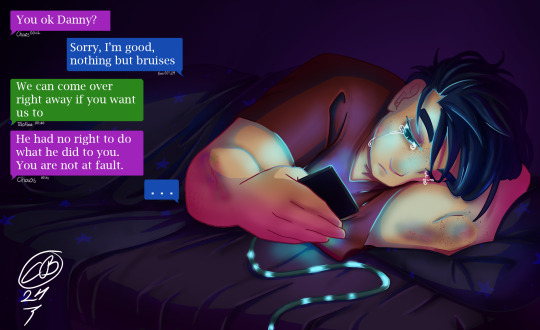
Sleepless night (colored)
It's the end of @green-with-envy-phandom-event and I'm collecting all the lovely posts where my lineart was colored (and coloring it myself because people are inspiring)
Let's start with @englandamericaitaly who made an alcohol marker version of this with blinds shadows falling over Danny, and did an absolutely amazing save adding details where the markers made a happy little accident and I can't tell where that was. Awsome.
From @nanaarchy we get this version placed in the gore category because of the bruises but that's not the only thing that packs a punch in this one. The text bubbles adds so much to the piece and brings it all together. And I just have to point out the posters in the background and the Stars on the blanket! XD
@fuyuthefoxwriter gave us this version adding a NASA phone case and really showing the bright light in Danny's face from the phone. And you are right "The sleepy insomniac trying to sleepy without a ghost ruining it" it doesn't work, but maybe turning down the light levels on his phone would make it easier. ^^
Continuing with @balshumetsbaragouin submitting this version. My thoughts are just STARS! Yes! The gentle cell-shading gives a softness to this one and the text below is so true. School starts in 3 hours and no sleep.
We have @audaciousanonj giving us this version focusing on the light source of the phone (which was my intention when making the lineart XD)
Finishing off with @jamiethebeeart who made this version that has such calm and softness to it reminding me of the early mornings when the sun is on the face and one rolled over to avoid getting it in the eyes.
173 notes
·
View notes
Text
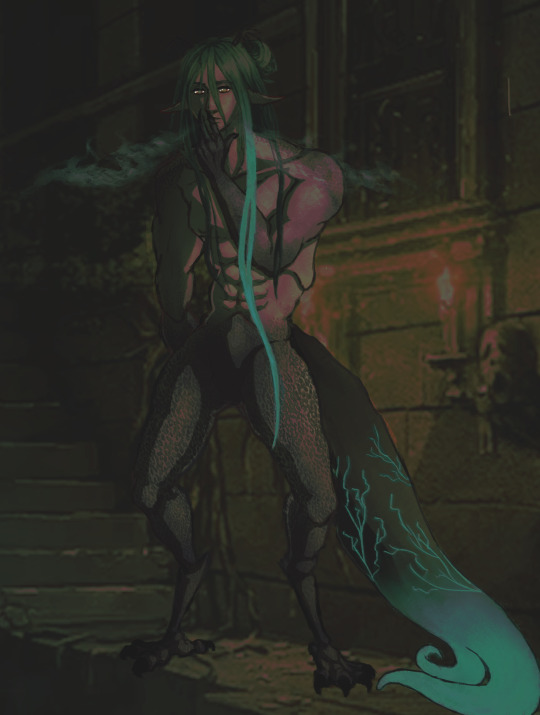
Fanart of @devildom-moss amazing fic of monster Barbatos!!!
I am really inspired by all of their work so I hope I did him justice!!! It's not finished, BUT I'm pretty proud of how it looks without redrawn lineart and other stuff!
- under read more is the art without the extra layers/more simplified in case you wanted to see that ^^ -
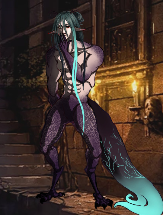
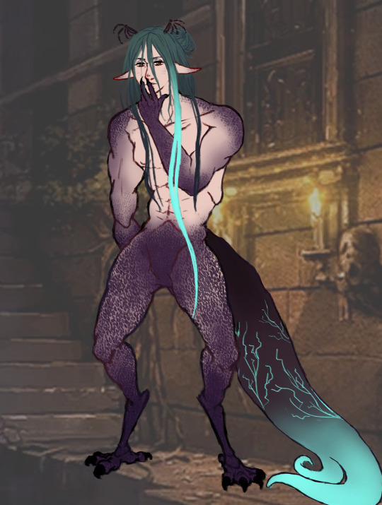
The one on the left had the gradient map, dark multiply going over everything, and a few other small things taken away. The one on the right also had no gradient map and stuff, but also no highlights, shading, soft light, etc. It's just the lineart and coloring! Plus I decreased the opacity on the background so you can see it better ^^
I think that's everything I wanted to put lol. I should go to bed now....
#obey me barbatos#om! barbatos#obey me nightbringer#obey me fanart#obey me shall we date#obey me#my art#smolsklz art .°○•☆
346 notes
·
View notes
Text
FAQ

Please read these before sending asks! It's also good to check the tags listed on the pinned post to see if it's already answered. Where can I read GS? On Comicfury or DeviantArt. Two pages ahead on both Patreon and Ko-fi.
Who works on this comic? Only me, ratt/doeprince. You can call me either, I usually refer to myself as doeprince when it's more official, otherwise ratt or some secret third thing. I'm an amateur artist and I draw these comics for fun without much ambition to gain greatness. I want to make enough money to be able to keep working on more comics, and buy trinkets.
How can I support what you do? Why thank you for asking! All my income comes from making comics, so the support on either Patreon or Ko-fi is literally making my comic endeavours possible.
Do you have other projects? I work on some secondary comics. Jet and Harley and Honey are currently updating, Corpse is finished. You can find my other art on doe-prince.
How long will Golden Shrike be? I don't know how many pages. I hope it's less than 1000.
What programs do you use? SAI for lineart, CSP for coloring and bubbles, PS for text and backgrounds. Hoooow do you draw the antlers from different perspectives? I've made 3D models for each recurring antlered character.
Is GS going to have physical merch? Will it be printed? Consider this a no, but I won't say never.
Does GS have a map, official wiki or dub or something like that? No. There's a fan wiki out there full of inaccurate information so take everything in there with tons of grains of salt. There's no map. The dub on YT is separate from me, I've had no hand in it.
Can I make a fan character? Can they interact with yours? You can absolutely make a fan character! I just ask you not to make them interact with mine, at least not in any kind of heavy way. It's a slippery slope and I've seen people treat my characters very rudely to make them suit their needs.
Can I make fanart/writing? Yes! All sfw and well-meaning works are welcome. Just tag me so I can see them! Why are the borders black and sometimes white? White borders means it's a flashback.
Deer don't do that!!!!! Or birds!! Or plants! The moon shouldn't be that shape right now. Everything in GS is fictional for this very reason. I shall not be shackled by the chains of realism when there's entire new worlds in my fingertips. I aim to make things believeable in its context, not realistic. Are other animals sentient, can they talk? Sure they are and can, but not outside their own species. A frog can't hold a conversation with a deer, but a deer and antelope could possibly make it work. There's exceptions though.
How old are main characters? They're fawns right? No they are not, they'd all be in their early 20s if they were humans.
What does sire mean? It keeps popping up in different contexts. You can liken this term to 'father', as in your dad but also something like a priest. The priest isn't your dad but "father forgive me for I've sinned". So sire is a) respected stag, b) very formal way to address your father. Dame is the female counterpart. Why are the does so small compared to stags.... are you a freak... do you just hate women..... Listen when I started GS I had been dwelling in a place where monster deer characters had insane size differences and it became some kind of norm to me and of course it found its way into my comic. Now I just have to keep drawing those tiny women to keep up the consistency. I've created bigger ladies nowadays because I too think it's a little silly now.
Please please will this character ever get a mate? Will this pairing be canon? Will you please make this pairing canon? I won't spoil any pairings, I think it'd be the most boring thing to do to my own work! I'll only confirm the ones already established in the comic.
Is this a speck of ember? Is it snow? What is that floating thing, is it relevant to the plot? IT'S JUST MY DUST BRUSH LEAVE ME ALONE.

124 notes
·
View notes