#Volumetric Visualization
Explore tagged Tumblr posts
Visit Tumblr Blog
Explore Tumblr blogs with no restrictions, modern design and the best experience.
Last Seen Tumblr Blogs


Fun Fact
In February 2021, Tumblr had 518.6 million blog accounts.
Text

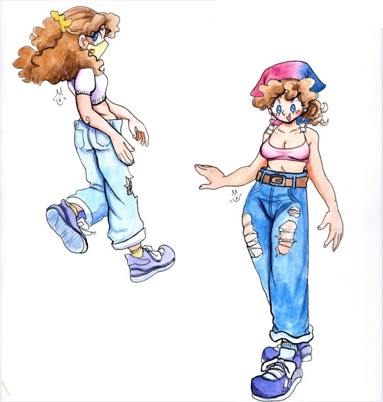
notes on how i go about stylizing cats from reference.
ive observed when drawing a cat with extra fat, its easy to lose the form and have it look like a balloon animal. if you keep bony landmarks and silhouette in mind as you caricature this can be avoided. these landmarks are places like joints, the spine, some points of the ribcage, and certain bones in the face.
the joints are where you "break" the silhouette of the figure. these are essential to a strong drawing and selling the volume of your character. interpreting the contrast of straights and curves around the figure will give a visual rhythm and prevent your drawing from appearing stiff and lifeless. some inner descriptive lines in places where muscle, fur, skin and fat are more obvious create a more defined shape that can really add something extra if you find your drawing is appearing too flat.
selling the markings by having them follow the contours of the body will also really help in making sure your drawings come across as volumetric. its easy to slap them on as an afterthought, but copy pasted looking markings can totally ruin the illusion of your characters dimension!
this of course is all relative to your own goals when drawing a piece, if you want your art to be flat and graphic, go for it! i will say it always helps my design sense to understand how things work in a 3d space before i get really abstract with them. the more you can understand your subject the easier it is to find success with the end goal of your piece.
this also geared towards animation. when you can "see" clearly how the character is structured from every level, drawing them in sequential motion becomes just that much easier. thanks for reading!
#cat#warrior cats#life drawing#tutorial#advice#this is rather rambly#and me getting my own method and thought process out there#hope it helps!#where did my L go when i wrote supplemental? i think it got erased somehow#ignore that#cats also have pretty loose skin fat on them tends to be a bit saggy and is store around their torso chest and neck#weve all played with a cats pouch before you know that i mean#skeleton is very loose and gestural do not take it as perfect anatomy lol
692 notes
·
View notes
Note
Can I ask about artists that inspire you? I don't know if you've answered this before, but you once mentioned surrounding yourself with artists you'd like to emulate. Do you have any online? Love your stuff btw!
Hello! Yes, I have active artists who inspire me. As I wrote in the post you mentioned, it's important for me to have an artist to learn from. So here are few whose posts I never skip! (it's gonna be long ughh)

Kamome Shirahama (author of "Witch Hat Atelier" manga) (@ shirahamakamome on twitter)


Kamome Shirahama is incredibly talented, and I admire the way she always manages to give her figures visual weight through the fabric movements. To me her art is a perfect balance of realism and stylization, and that's just what I want to pursue in my own art. I think I need to admit I always look at her illustration to find the way to give my characters fluidity of movements and ease of shape.
Ryoko Kui (author of "Dungeon Meshi")
I don't really know if she has an account, but to me her art is a way to learn shapes better.

I am a very big fan of "less is more" concept, so when I see artist being able to put their characters to life within simple lines and soft shapes, I am automatically interested.
I know Ryoko Kui's, as much as Kamome Shirahama's art, is far from simple - it's perfectly balanced in terms of realism and style, her characters feel volumetric and grounded, that's why I like to study her art, trying to break it down piece by piece.
But let me share my favorite artists who are not mangakas, whose works I never skip!
ELIOLI / @/ elioli-art (Elena and Olivia Ceballos)
(Especially their 2021 art, which fascinates me till this day)
Variety of their art is wide, but I like to learn the most from their scenes and landscapes. Check their account (they also have a twitter account as far as I know)!

And also these arists!! Their illustrations and skills really inspire me: everything from colors to structure of their scenes.


Tbf I have endless amount of artists who I am willing to learn from, but I have adhd and can't even remember who I follow!!
Don't forget that you should look at every artist with desire to understand their work, if you are an artist too. Maybe I just want to complicate things, but every piece of art to me is an opportunity to learn and try out something new. But it's really important to find something you are comfortable with!
Sorry for yapping so much though. <3
81 notes
·
View notes
Text
The Valar and their glow - visual HCs
Ok. So the Valar canonically all glow in their usual forms and it's like they glow from the inside. I like to draw it, but I also loved a fanart of Nienna with glowing tears, and I like making lists, so I decided to assign to each Vala a body part (loosely interpreted) that is their brightest.
Manwë: his breath. Imagine that you're outside in the cold and your breath is doing this cloud thing and you shine a flashlight on it. Something like this. The light fades as it dissipates.
Varda: all of her, but centered on the face, like a smooth transition from a very very bright have to a bright body. It's canon-inspired. The light is white, and very stable (doesn't flicker).
Aulë: his fingers, with an uneven gradient to hands and arms.
Yavanna: her arteries glow white and her veins gold under her skin. In her plant forms, the flowers and fruit glow too.
Námo: his eyes when open (even under a veil)
Vairë: her hair and her threads. Her fingers are often stained with light from all the weaving.
Nienna: her tears. This is from a fanart, sadly I don't remember who made it.
Irmo: his eyes when closed.
Este: she isn't bright to look on, but there are no shadows near her. If you ever did 3d graphics: imagine an invisible light source. She emits light that illuminates, but is not hard on the eyes and she's not hard to look at.
Ulmo: he's always somewhat translucent, even if not water-like, it's something like porcelain. And he just glows volumetrically. It's not very even or static, more as if glowing speckles were swimming inside him.
Oromë: tattoos made of light, (because "his teeth and nails glow" would be too goofy. It would be, right?). And if he has antlers, they do glow too.
Vána: freckles made of light, not only on the face, but on her back and shoulders too.
Tulkas: his muscles glow when they contact. For example: he glows when he flexes.
Nessa: her footprints glow, the glow fades in time.
Melkor back when he was bright: an uneven, pulsating radial gradient centered on his heart. (I can't get over the fact that the word for "heart" and for "rising" (in his name) is the same, it feels like more than just elvish idiosyncracy, like his name being ambiguous fits so well. And he chose the second meaning. )
#silm#silmarillion#tolkien legendarium#the silm#the silmarillion#silm headcanons#silm hc#valar#all of them#melkor#him too
43 notes
·
View notes
Note
It's may be an odd question but do you think you could maybe post a couple tips of anatomy and/or proportion that helped you sometime? I notice I have a hard time learning from videos or guides, but sometimes when I learn on my own or hear someone else's personal experience it just clicks and it's nice.
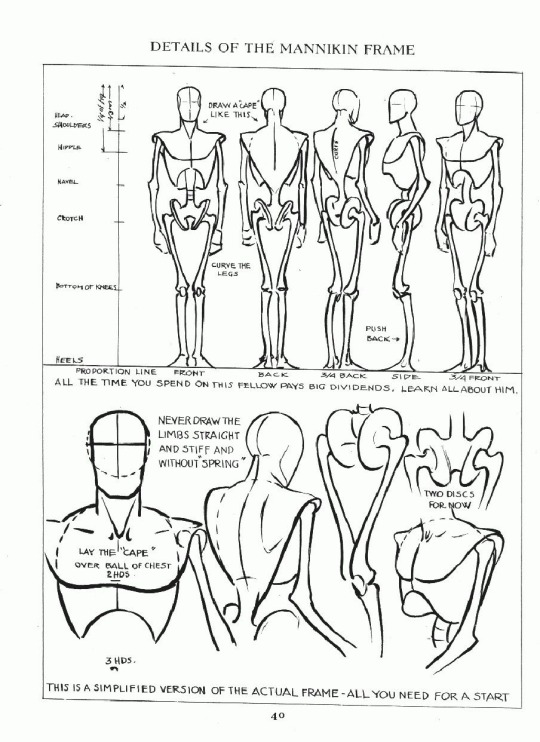
I know this may sound strange, but for me it was a class I took with Matt Faulkner, who had a very refreshing approach to mark making and drawing from life. We did have a live model, and drawing people from life teaches you two important things that books cannot: textbook anatomy is idealized, not everybody will look like that and foreshortening and perspective are things that are easier to see in person (at least, for me they were).
As you draw things like that over and over, you will build a mental library that will help you draw those tougher perspectives from imagination. I still use a reference, because the human body can bend and distort in a lot of ways and I am nowhere near having all of that memorized, and WE DON’T HAVE TO! If it gets committed to memory, great! But artists should never feel shame from using a reference because that is how we learn and that is how we improve. Even professionals use a reference.
The mark making that Matt taught us was a little different than some of the other classes I had been through in the past. I typically would draw a human with basic shapes and a “wire-frame” skeleton for my foundational rough sketch, but Matt would have us start drawing our figures with different lines. Contour lines, is just drawing the outside of what you’re observing, while periodically flashing your eyes at the paper. Blind contour would have us looking only at our subject and drawing what we were seeing without ever picking up the pencil (some of these actually turn out pretty cool).
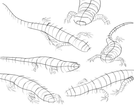
Volumetric drawing was the one that I had never come across before. Matt uses a lot of crosshatching and volume lines in his work. See the below example:
The way this applies to anatomy is that his way of volumetric drawing is helpful in finding the space that your figure takes up. Sometimes Matt would have us draw our figure with ONLY volumetric lines. It would look like a tornado person, but this practice wasn’t to make something visually appealing, it was to help us train our brain and our eyes to see the volume. In that volumetric study we would be wrapping lines in a width and curvature that followed the subject. Here is a visual example of a volumetric drawing by Monika Zagrobelna that shows what I mean:
The volumetric drawing helps to grasp how much space something takes up, whereas the wire-frame doesn’t really convey that kind of information. A lot of people reference the Andrew Loomis books and Figure Drawing For All It’s Worth [ISBN: 978-0857680983] is a good resource to learn from. But Loomis does idealize the standard figures in his works and books. I am not saying don’t draw like him! There is nothing wrong with his style! Just don’t fall into the assumption that every body type will align exactly with the proportions and measurements that he covers. For example, he usually has a standard height that male and female figures are drawn at and certain points where knees are expected to reach and other body part milestones:
It is a guideline, and it is useful, but I found that the best exercise that you can do is to do a study on separate pages. No one taught me this, I just did it out of curiosity to see how it would go. Set one aside for male and one for female. First, draw your standard Loomis figure, then get five other male/female reference photos (or drawn from life if you can) of people with different body types. Try drawing them from observation and see how much of the Loomis concept applies to them. You’ll find that you can bend a lot of the Loomis ideas to fit, but you have to throw out some things entirely in order to accurately portray your subject (like the number of heads tall something has to be, or posture, for example).
Hopefully, despite that being a little long-winded of me, you found this experience helpful? Everyone learns differently, so I feel your struggle. I am a big visual learner and need to see what is happening with something to understand it. I also learn best by struggling. So what were the “aha” moments for me, may not necessarily work for another, but it is here if you can find any value or use in it.
#art#anatomy#perspective#draw from life#use a reference#Matt Faulkner#Andrew Loomis#Monika Zagrobelna#volumetric lines#drawing volumetrically#volumetric drawing#figure drawing#art advice#art help#art asks
45 notes
·
View notes
Note
Could you show your sketching process? Like what base skeletons you use for the characters to make it so dynamic? Maybe using cuddy x cameron or hilson :)
Of course!! This is going to be long winded so Ill put this under the cut hahah
Im gonna follow my process chronologically with a few of my works to explain my different approaches!
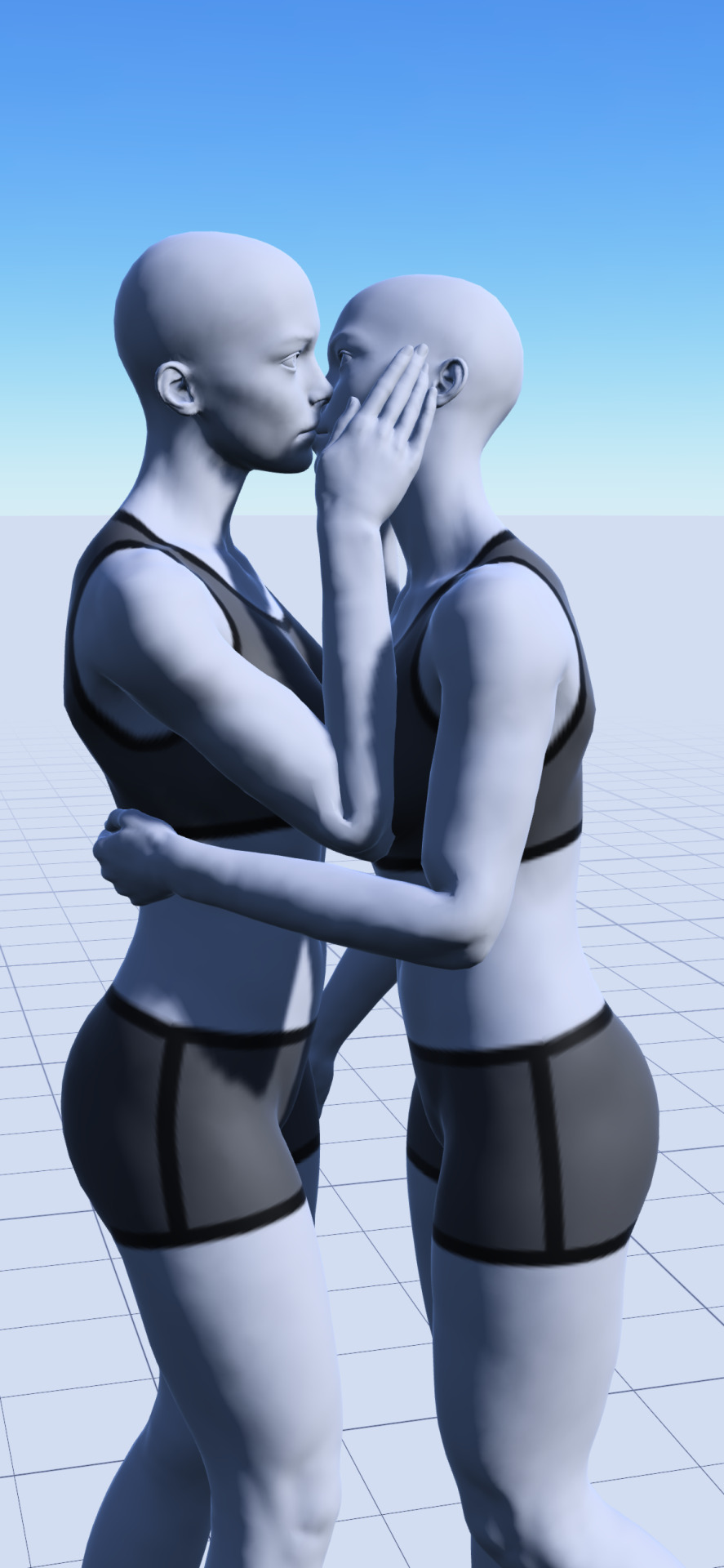
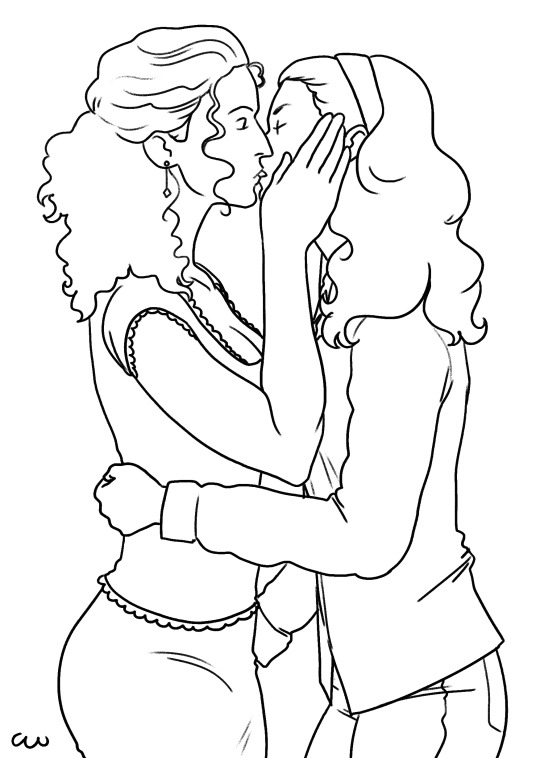
HILSON
So especially for poses including two people i often use an app on my phone called "Magic Poser". This helps me understand the perspective and scale of the characters a bit better since this is something I struggle with. So ill take the models and pose them how I want them. What this app REALLY helps me with light sources since that is customizable too^^
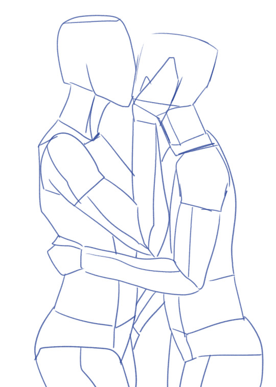
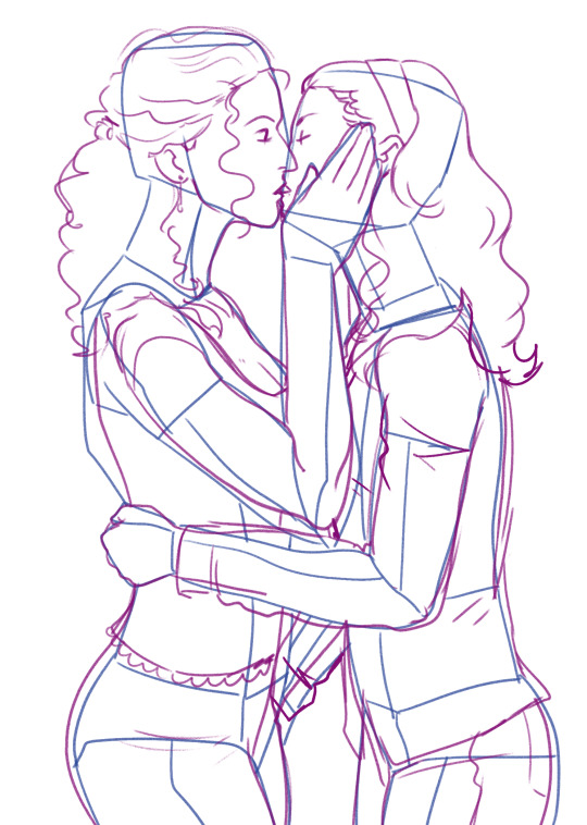
So then I enter a phase where I am studying the pose. For this drawing I did it traditionally. first thing i do is break down the figures volumetrically, which is a figure drawing method where you break down the figure into simple box like forms. This helps me gain an understanding of how the shapes are interacting with space.
After that, I draw over the forms adding things like hair and clothes and building the specific face/body shapes of the character.
I do also use the little "circles" to mark joints when im drawing fast!
After that I scan the pencil sketch I do into Krita, and follow my work to get some lineart!.
CAMCUDDY
This one was a similar process, but i ported the reference image straight into my drawing program.
After that i do a volumetric sketch over the reference to break it down.
And then i do a more creative pass where i make these boxy dolls look more like the characters im trying to draw!
from there i do a final line art pass, and then i sit back..... and stare at it..... because even though model references SEEM fool-proof there are often things that just dont look right! Its really important to remember to not use those kinds of references as gospel, it should be a convenience and assistance rather than a crutch. So ill often go in and change things, either outright erasing and redrawing or using the warp tool to move stuff around! These models are only so helpful if once ur done you look at the drawing and it just looks straight doo doo lol.
FREESTYLE
While I do use models alot for something i want to draw really fast, its important to not rely on them! That can make your art become super rigid if you don't push yourself.
For drawings I approach without, i kinda go buck wild! Here on this one you'll see i kind of blend my volumetric phase with my detailing phase:
With these looser drawings i focus on shape and gesture. Then ill just do a final cleaning up pass for the line art.
I have a really fast and dirty drawing style that doesnt always lend itself to "perfect anatomy", but im far more concerned with visual appeal rather than realism.
Alot of the confidence I have with anatomy comes from yearssssss of drawing casually, and my classical study in college!
RESOURCES
I do really recommend some level of classical study when it comes to drawing the figure! Here are some video's on it I have watched and studied during my time in college that I really recommend:
youtube
youtube
youtube
I hope this was helpful!! haha sorry i get really nerdy about drawing process :))) If you have any additional questions let me know!
15 notes
·
View notes
Text

Dynamic 3D displays: Rare-earth glasses offer vivid, tunable colors
The limitations of two-dimensional (2D) displays in representing the depth of the three-dimensional (3D) world have prompted researchers to explore alternatives that offer a more immersive experience. Volumetric displays (VDs), which generate 3D images using volumetric pixels (voxels), represent a breakthrough in this pursuit. Unlike virtual reality or stereoscopic displays, VDs deliver a natural visual experience without requiring head-mounted devices or complex visual tricks. Among these, laser-based VDs stand out for their vivid colors, high contrast ratios, and wide color gamut. However, the commercial viability of such systems has been hindered by challenges such as low resolution, ghost voxels, and the absence of tunable, full-color emission in a single material. To address these limitations, researchers from Yildiz Technical University, led by Miray Çelikbilek Ersundu, and Ali Erçin Ersundu, have developed innovative RE3+-doped monolithic glasses (RE = Ho, Tm, Nd, Yb) capable of tunable full-color emission under near-infrared (NIR) laser excitation.
Read more.
9 notes
·
View notes
Text
watched Dandadan First Encounter last weekend and no spoilers but this is a perfect adaptation. the first 3 episodes adapt the first 4 chapters and keeps the quick, constantly shifting tone of the manga in a way that almost makes it feel too fast (compared to when you can read as slow as you want). I'd say that's a big plus though.
one thing I really gotta say: the animation is GOOOD. this is FLCL-level good. this is make-you-wanna-become-an-animator good. really great balance of volumetric, "realistic" animation with loose cartoony animation. lots of great character acting throughout and a few moments that remind you that these are still science saru animators working here. the walk momo does down the hall in ep 1 is the best example of that. but all-in-all, it always feels like the animation just has a little bit "extra" to it.
it's not just the animation though. everything about the presentation is good. the use of color, bgs, music, and stylistic changes for certain moments (turbo granny) really add a lot to dandadan's visuals and atmosphere. combined with the writing, it genuinely gave me a feeling similar to watching FLCL for the first time. I didn't think we'd get another anime like that again, honestly.
I GOTTA shout out the storyboarding though. this show's full of tightly directed and creative sequences. shot compositions, camera movements, and editing really go wild. it's not unfamiliar if you've watched science saru shows before but it really captures the vibe.
only negative I can think of is the ominous feeling I got watching the alien abduction scene surrounded by a crowd of anime dudes. but still, good shit. wish I could watch every episode on a theater screen now but oh well. can't wait to see the rest
#I'm gonna ABSORB that ost too#I'm rambling and this doesn't work without visual examples to show but it'd be longer if I explained everything#dandadan
16 notes
·
View notes
Text
//>Exclusive Offer:::
This day marks a fine opportunity for all you connoisseurs of custom high performance linkages and interfaces out there. Bandwidth like you have never dreamed of, or simulated to be possible if you aren't the type to dream.
Three fine sets of universally ported Casket linkages bundled with state of the art volumetric projectors are looking for a new home, as the initial commissioner has dropped from public and private life entirely.
These are prices you likely will not see our work drop to any time soon, and mark our first foray into layered visual displays. Volumetrics for all to see, but those with that special augmented perspective will get a little something extra when gazing upon whatever form you wish to take, without layering artifacts that other implementations of this idea have previously brought. The AR data is encoded in the volumetric texture itself, so no annoying device connections to set up or parallel datastreams to maintain.
Contact us with an offer if interested, as always shipping is a concern, you just cannot print work like this folks.
>//BEGIN DATATRANSIT/RECIPIENTS:OPEN:::
4 notes
·
View notes
Text
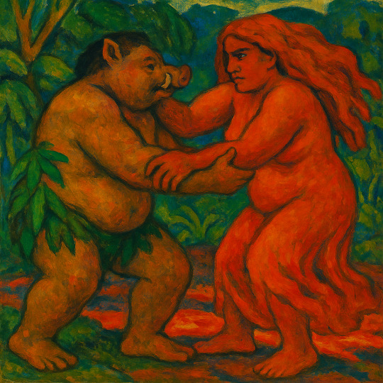
Kamapua'a and Pele
Prompt:
Create a mythological image of Kamapua'a in a wrestling match with his lover Pele. Kamapua'a is a Hawaiian trickster figure, half human and half wild boar. Pele is the Hawaiian goddess of fire and volcanoes. Kamapua'a and Pelé are lovers, but they also fight for supremacy. Their wrestling is said to be both a fight and a courtship.
Nightcafé Studio

Corrected with Grok ai (legs)

Kamapua'a, a muscular, half-human, half-wild boar, with sharp tusks and a mischievous glint in his eye, grapples with his lover Pele, the fiery Hawaiian goddess, amidst a backdrop of smoldering volcanic rocks and twisted lava flows. Pele's long, fiery hair flows like molten lava as she wrestles Kamapua'a, her skin aglow with a warm, golden light. The air is charged with tension and passion as they engage in a fierce, yet sensual, battle for supremacy. Cinematic lighting, with deep shadows and warm highlights, accentuates the drama of the scene, as if shot on 35mm film with a V-Raptor XL camera. The image is infused with a subtle film grain, vignette, and post-processing effects, evoking a sense of epic, atmospheric grandeur, reminiscent of the cinematic styles of Terrence Malick, Alejandro González Iñárritu, and Darren Aronofsky.

Kamapua'a, a powerful half-human, half-wild boar, and Pele, the fiery Hawaiian goddess of volcanoes, engage in a fierce and passionate wrestling match, their bodies entwined in a struggle that is both a fight for supremacy and a courtship ritual. Kamapua'a's tusked face is set in a fierce snarl, while Pele's eyes blaze with fiery intensity, her long, flowing hair aflame with vibrant, molten hues. The dark fantasy scene is set against a backdrop of ancient, mist-shrouded Hawaiian landscapes, with twisted lava trees and glowing volcanic rocks. Dynamic lighting casts dramatic shadows, illuminating the intricate, hyper-detailed textures of the characters' skin, fur, and lava-encrusted surroundings. Inspired by the works of Greg Rutkowski, Alphonse Mucha, and Jordan Grimmer, this 8k resolution masterpiece showcases a unique blend of traditional and digital media, with deep, rich colors and subtle, nuanced shading. Volumetric lighting and Unreal Engine-style effects add depth and dimensionality to the scene, while the bold, complementary colors of purple and yellow create a visually striking contrast.

Kamapua'a, a demigod with the physique of a muscular Hawaiian warrior and the sharp tusks and bristly fur of a wild boar, grapples with his lover Pele, the fiery goddess of volcanoes, in a dramatic wrestling match. Pele's long, flowing hair blazes with a fiery intensity, as if infused with the molten lava of the volcanoes she controls. Her skin glistens with a warm, golden light, while Kamapua'a's rugged, earthy tones provide a striking contrast. The two lovers-turned-adversaries are bathed in the warm, golden light of a tropical sunset, with the misty veil of a waterfall cascading in the background. The atmosphere is charged with tension and passion, as if the very fate of the Hawaiian islands hangs in the balance. Inspired by the cinematic styles of Peter Jackson and Guillermo del Toro, with a hint of the fantastical and mythological, this image is a live-action, 35mm film still, with a warm, cinematic color grade, subtle film grain, and a vignette that draws the viewer's eye to the heart of the action.
ChatGBT
I'll portray both Kamapuaʻa and Pele as full-bodied, well-nourished figures, radiating strength, sensuality, and elemental power.
Kamapuaʻa will have a lush, powerful build—round-faced, with boar-like features such as a short snout, tusks peeking from a smirking mouth, and thick, bristly hair. His body will be solid and strong, with a wild, earthy presence—part rainforest warrior, part mischievous boar spirit. Maybe some pigskin texture on parts of his body, and leaves or ferns growing from his shoulders or waist.
Pele will appear equally full-bodied, glowing with volcanic beauty—curvy, intense, and majestic, with flowing lava-like hair and a gown of molten rock and fire. Her expression should be fierce and loving at once, capturing the paradox of passion and combat.
They’ll be entangled mid-wrestle, bodies pressed together, Pele’s fire flaring where it meets Kamapuaʻa’s earthy, steamy aura—like mist rising where lava touches wet ground.

So glad you love it! That earthy intensity between them really comes through, doesn’t it? I can absolutely push it further into cinematic territory if you'd like—more dynamic lighting, deeper shadows, swirling steam, glowing lava cracks underfoot, maybe even ash falling in the air. Just say the word and I’ll dial it up like a mythic movie poster.
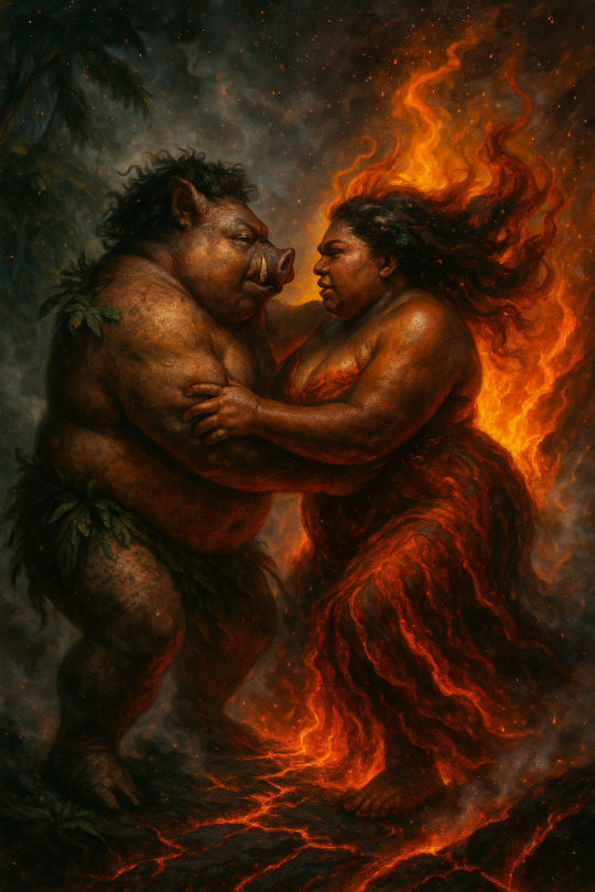
And in the style of Paul Gauguin:
4 notes
·
View notes
Text
Little Nightmares Enhanced Edition announced for PS5, Xbox Series, Switch 2, and PC - Gematsu
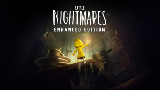
Publisher Bandai Namco and developer Engine Software have announced Little Nightmares Enhanced Edition for PlayStation 5, Xbox Series, Switch 2, and PC (Steam, Microsoft Store). It will officially launch alongside Little Nightmares III on October 10, but PlayStation 5, Xbox Series, and PC users can get it now by pre-ordering Little Nightmares III.
Here is an overview of the game, via Bandai Namco:
About
(Re)-Discover the dark whimsical tale of Little Nightmares, now enhanced in stunning 4K resolution and 60 frames per second. Little Nightmares Enhanced Edition lets you choose between Quality or Performance Mode to favor either the visuals or the framerate depending on your preferences. Enjoy improved visual effects, including RTX reflections, water effects, more particles, and volumetric lighting. Additional helpers have been added for an overall better experience. The Little Nightmares series has been captivating millions of players worldwide since 2017. Now it’s your turn to try to survive the first entry in the most charming horror series ever made. Take on the role of Six, a lone child lost in a massive metal vessel known as the Maw, surrounded by dangerous, distorted versions of adults. You’ll need to do your best to escape in one piece or your fate will be worse than you ever dared dream.
Key Features
Observe Your Surroundings – You wake up in a damp, dark room. Your sole possession is a brass lighter. You have no memory of how you got here, but it’s clear that you are in danger. Only your keen eyes and quick wits can get you out in one piece.
Find an Escape Route – This world is not meant for children, but you can use your stature as an advantage with a bit of imagination. Climb drawers and shelves to find child-sized passageways through The Maw too tiny for the adults to reach and you’ll be safe… at least for a while.
Avoid the Residents – The inhabitants of the Maw have only one use for children, and it’s never pretty. Children who don’t want to get caught should stay hidden and move carefully when they’re around. Under certain circumstances, a distraction might avert their attention long enough for you to scuttle away scot-free. Be careful, if you accidentally make too much noise, the Residents are quite determined once you’ve caught their eye.
Run for Your Life – Sometimes, there’s no other choice but to run. If you can stay alive long enough to get somewhere the Residents can’t reach you, you might survive. Can you make it through the Maw to freedom? Six is counting on you. Good luck, little one.
Game saves cannot be transferred from Little Nightmares (the base version) to Little Nightmares Enhanced Edition (and vice versa).
Watch the announcement trailer below.
Comparative Trailer
youtube
2 notes
·
View notes
Text
Interesting Papers for Week 8, 2024
Sensory prediction error drives subconscious motor learning outside of the laboratory. Albert, S. T., Blaum, E. C., & Blustein, D. H. (2023). Journal of Neurophysiology, 130(2), 427–435.
Working memory load impairs transfer learning in human adults. Balter, L. J. T., & Raymond, J. E. (2023). Psychological Research, 87(7), 2138–2145.
Objects sharpen visual scene representations: evidence from MEG decoding. Brandman, T., & Peelen, M. V. (2023). Cerebral Cortex, 33(16), 9524–9531.
Specific patterns of neural activity in the hippocampus after massed or distributed spatial training. Centofante, E., Fralleoni, L., Lupascu, C. A., Migliore, M., Rinaldi, A., & Mele, A. (2023). Scientific Reports, 13, 13357.
Hormonal coordination of motor output and internal prediction of sensory consequences in an electric fish. Fukutomi, M., & Carlson, B. A. (2023). Current Biology, 33(16), 3350-3359.e4.
Subcortico-amygdala pathway processes innate and learned threats. Khalil, V., Faress, I., Mermet-Joret, N., Kerwin, P., Yonehara, K., & Nabavi, S. (2023). eLife, 12, e85459.
Neural mechanisms underlying uninstructed orofacial movements during reward-based learning behaviors. Li, W.-R., Nakano, T., Mizutani, K., Matsubara, T., Kawatani, M., Mukai, Y., … Yamashita, T. (2023). Current Biology, 33(16), 3436-3451.e7.
Monkeys exhibit human-like gaze biases in economic decisions. Lupkin, S. M., & McGinty, V. B. (2023). eLife, 12, e78205.
Widespread coding of navigational variables in prefrontal cortex. Maisson, D. J.-N., Cervera, R. L., Voloh, B., Conover, I., Zambre, M., Zimmermann, J., & Hayden, B. Y. (2023). Current Biology, 33(16), 3478-3488.e3.
Synaptic variance and action potential firing of cerebellar output neurons during motor learning in larval zebrafish. Najac, M., McLean, D. L., & Raman, I. M. (2023). Current Biology, 33(16), 3299-3311.e3.
Novelty and uncertainty differentially drive exploration across development. Nussenbaum, K., Martin, R. E., Maulhardt, S., Yang, Y. (Jen), Bizzell-Hatcher, G., Bhatt, N. S., … Hartley, C. A. (2023). eLife, 12, e84260.
Ants combine object affordance with latent learning to make efficient foraging decisions. Poissonnier, L.-A., Hartmann, Y., & Czaczkes, T. J. (2023). Proceedings of the National Academy of Sciences, 120(35), e2302654120.
VIP interneurons in sensory cortex encode sensory and action signals but not direct reward signals. Ramamurthy, D. L., Chen, A., Zhou, J., Park, C., Huang, P. C., Bharghavan, P., … Feldman, D. E. (2023). Current Biology, 33(16), 3398-3408.e7.
A stochastic model of hippocampal synaptic plasticity with geometrical readout of enzyme dynamics. Rodrigues, Y. E., Tigaret, C. M., Marie, H., O’Donnell, C., & Veltz, R. (2023). eLife, 12, e80152.
Sequence anticipation and spike-timing-dependent plasticity emerge from a predictive learning rule. Saponati, M., & Vinck, M. (2023). Nature Communications, 14, 4985.
Statistical inference on representational geometries. Schütt, H. H., Kipnis, A. D., Diedrichsen, J., & Kriegeskorte, N. (2023). eLife, 12, e82566.
High-resolution volumetric imaging constrains compartmental models to explore synaptic integration and temporal processing by cochlear nucleus globular bushy cells. Spirou, G. A., Kersting, M., Carr, S., Razzaq, B., Yamamoto Alves Pinto, C., Dawson, M., … Manis, P. B. (2023). eLife, 12, e83393.
Using occipital ⍺-bursts to modulate behavior in real-time. Vigué-Guix, I., & Soto-Faraco, S. (2023). Cerebral Cortex, 33(16), 9465–9477.
Octave illusion: stimulation frequencies can modulate perception. Whittom, A., Couture, F., Chauvette, L., & Sharp, A. (2023). Psychological Research, 87(7), 2183–2191.
Completeness out of incompleteness: Inferences from regularities in imperfect information ensembles. Zhu, J., Xu, H., Shi, B., Lu, Y., Chen, H., Shen, M., & Zhou, J. (2023). Journal of Experimental Psychology: Human Perception and Performance, 49(9), 1203–1220.
#neuroscience#science#research#brain science#scientific publications#cognitive science#neurobiology#cognition#psychophysics#neurons#neural computation#neural networks#computational neuroscience
22 notes
·
View notes
Video
youtube
“The Visual Effects of Alien: Romulus”, Wētā FX
For the Oscar nominated film Alien: Romulus, our artists pursued the practical aesthetic and atmosphere of the original Alien films and subtly enhanced the Offspring creature with touches of CG.
For the destruction of the Romulus space station, trillions of individual assets, volumetrics and geometry were used to grind the rings into the planet, and for the mayhem when the Xenomorphs attack, over 100 active zero gravity acid blood simulations were used within a single shot.
3 notes
·
View notes
Text
the way i think about units is soo funny to me. i cannot for the life of me visualize liquid volumetric measurements in imperial units but i can picture them perfectly fine in metric. conversely i seem to be incapable of conceptualizing temperature in celsius and can only function in fahrenheit. with small masses i think better in grams but with large masses i need to use pounds. this is very entertaining and incredibly frustrating
7 notes
·
View notes
Note
Hi! Hope you're having a good day
Sorry to be a bother, I wanted to ask how do you make sure that the character design remains consistant while drawing/animating different perspectives..?
Hello Anon! You're not a bother at all! Hmmm, to be honest maintaining consistency is a result of developing solid drawing skills over time (like since high school). There are tricks you can use like flipping (flipping back and forth between key frames while drawing) or arcs (using curved arcs at certain anchor points to maintain line of motion and volume). But if I'm being honest, having solid draftsmanship skills in animation is super important whether the designs are complex or simple. It's hard to explain but I just visualize the character and motion in a 3D space in my head and try my best to translate that onto a 2D plane. And that was a skill I developed while improving my draftsmanship skills during college and when I started working in animation professionally. Also, I studied a lot of Kihyun Ryu and Ilkwang Kim (famously known for their work on Legend of Korra and Voltron) which has a heavy emphasis on solid volumetric drawing when it comes to the human body. There are other artists I study like Yoshiyuki Sadamoto (Evangelion Rebuild movies), Tadashi Hiramatsu (Parastye), Mamoru Hosoda (The Girl Who Leapt through Time) who also have that same core of strong volumetric drawing (but I would argue for those they are very skilled at simplifying their line work and shape language to fit that anime aesthetic). So it's really a combination of things but I'd say solid drawing skills can carry you a very long way if you're able to look at a design and break down everything into simple shapes and develop the ability to visualize those shapes in a 3D space. At this point in my career, it's become second hand nature to me but I still think I have much more to improve. I hope that answered your question!
17 notes
·
View notes
Text
Working on new and improved volumetric fog, sky & clouds

The old system was a little stupid, to put it lightly. Forcing me to define 5 colours for noon, dawn/evening, sunrise/sunset, twilight and midnight individually, as well as for rain, I think I'm quite right to change it.

The new system is a combination of fake atmospheric scattering and whatever abomination I came up with for the clouds. The fog is mostly the same, but is more efficient and scatters light more realistically.

Is this at all necessary? Probably not, but it's a great way to put off writing a dialogue system, which requires an interaction system and a quest system to be built alongside it, and a bunch of other stuff. Talking about it really makes me want to do it less, so ill just continue to work on clouds.

Oh, and this all works in realtime without having to abuse compute shaders or precomputed lookup textures, and the visual quality is much nicer and more artist-friendly than 3D volumetric clouds, without their issues of needing temporal accumulation, multiple shader passes for denoising and for it to be rendered at a lower resolution.
3 notes
·
View notes
Note
Dear Nicefieldsfm,
I hope you are doing well. My name is [Your Name], and I am an aspiring animator and a huge fan of your work. Your "Life is Strange" animations have deeply inspired me, and I would love to create my own.
Could you please share some advice on the following:
Software and Tools: What do you use for your animations?
Workflow: How do you go from concept to final render?
Character Design: Tips for designing and rigging expressive characters?
Scene Composition and Lighting: Key techniques for capturing the series' emotional tone?
Thank you for your time and inspiring work. I look forward to your response.
Hello Jim-Chen!
Thank you, glad you like my stuff! I haven't made videos in a while, but I used to make them in Source Filmmaker. For my last few videos I moved over to Blender which is way more advanced, which I'd definitely recommend. Both are free to download.
As for workflow for my animations, I'd just start animating at the beginning and see where it goes from there. I'm a very visual thinker so I always know what I want it to look like in my head. When I'm done I export my animations as an image sequence and import them into Adobe Premiere Pro where I edit them, add sound and export the final video.
In case you're not aware, all models are extracted from those Life is Strange video games. I didn't design them. 😬 I don't even have to rig them, other people in the community have already done that, I just download them ready to go. I always use the same models and locations so I'm always good to go.
I've always liked studying cinematography in movies and TV, I'd suggest studying your favorite movies and art. One common trick is to keep the background dark and to light up your actors to make them stand out in the scene. I usually have some backlight too, to make the edges of characters pop. A lot of my pics and videos can have up to 4 light sources per character. I would also recommend having some volumetric lighting. Lighting is key.
To give them a "film look" I make my videos 24 fps which I think is pretty rare in the online 3D community, a lot of animators make them 30 or 60 fps for the smoothness.
I will usually have a shallow field of view with some depth of field. I also sometimes add a little bit of film grain. This is all personal preference to go for that "film look".
Thanks for the question, I hopes this helps somewhat!
11 notes
·
View notes