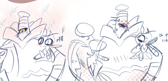
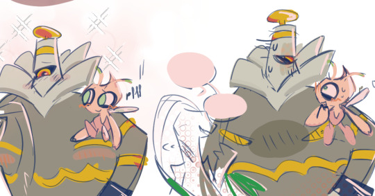
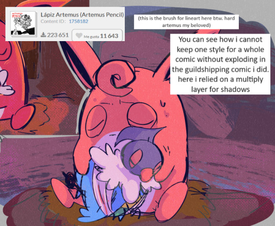
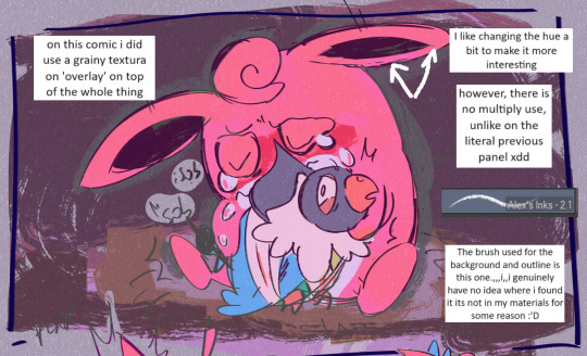
#and again tried experimenting with color and lineart :]
Explore tagged Tumblr posts
Visit Tumblr Blog
Explore Tumblr blogs with no restrictions, modern design and the best experience.
Last Seen Tumblr Blogs


Fun Fact
Tumblr has been banned in Indonesia for providing people with access to pornographic content.
Text


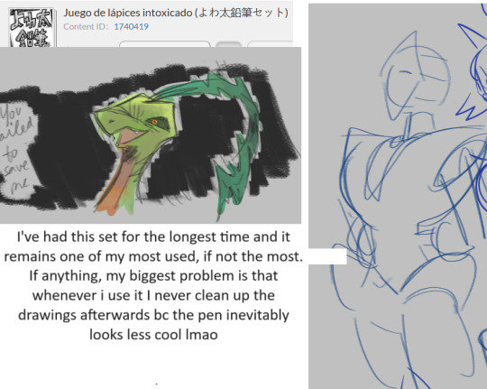
I've been on a roll lately lemme tell ya
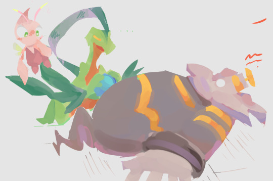
#dhmis#dhmis duck#dhmis red guy#dhmis yellow guy#fluffybird#i think a kiss between them would either be a quick painful crash between beak or teeth . hitting each other head against head#OR a weird cartoony beaky looney tunes kiss on some teeth but i doubt getting kissed on your teeth is a pleasant feeling#and i doubt kissing OR EVEN EMBRACING EACH OTHER FOR THAT MATTER is easy when one guy is like half the size of the other#i really gotta draw them being more romantic with each other (or at least trying to)#also some doodles of mostly my favorite little guy because im predictable BUT persistent#the doodle of duck in a cowboy hat made me realize the duck in a cowboy hat shaped hole i have in my heart#i NEED fix that and draw him in his two cowboy fits one day.#and again tried experimenting with color and lineart :]#dhmis fanart#don't hug me i'm scared fanart#dont hug me im scared#don't hug me i'm scared#duck guy#yellow guy#red guy
64 notes
·
View notes
Note
Your artworks looks like AI
To be honest I'm guessing this is a bot because I don't think my art is really a style that is mistakeable as AI. BUT just in case this is someone who genuinely doesn't know how to differentiate AI art versus human art, I'm gonna make a post on it rq!
One of the ways you can tell my art is not AI is because you can see all the individual strokes that I made. My style in particular makes this easier to distinguish than others because as an artist I really embrace this, while others prefer a very clean lineart and coloring process.
Here are some examples from mine:

This is from one I made of Nico underwater. If you look at the water you can see all the places I drew each line. By contrast, zooming in on AI art doesn't show any brush strokes at all. Often, there's also a weird "fuzz" I've noticed? Like rather than a human artist who simply makes a, say, yellow banana, and if you zoom in you just see yellow, for an AI if you zoom in it weirdly looks like the AI is struggling to make every pixel yellow so each pixel is slightly different. That's what I think of as the art being slightly fuzzy.
I tried searching google for some AI art to use as examples of this but I'm currently in a different country for an internship and they're still getting my WiFi set up, so my connection isn't loading any of the Google images with enough clarity to be able to zoom in a bunch so I can show you. But it's something I've noticed for a lottt of AI art--and so this coupled with lack of brush strokes can be a sign of AI.
Another thing that, in my opinion, is a way to determine something is human-made is the shape of the canvas! In my experience, when I see AI art online, it tends to be a very similar canvas shape each time. I don't think most AI creations have the ability to be creative with canvas shape. Meanwhile, a human might choose to make their canvas super wide or long or whatever. Since I created each piece of my art individually for the purpose of eventually combining it all into a comic-ish thing, each canvas I made was very very wide which would have been unusual for an AI. Such as:

From what I've seen, an AI would have created somewhat more even dimensions.
And finally, one of the dead giveaways for AI versus human art is simply what mistakes are made in the piece. Neither AI art nor human art is usually absolutely perfect, but the mistakes that an AI makes are not usually the same ones that a human makes! For example here, I didn't actually make lineart or sketches for the background because I had figured "eh, how hard is it to make a background like this?" However you can tell this didn't work out perfectly for me because my "sun" did not end up perfectly round hahaha. Look above Nico's head. It's like sort of lopsided. Getting a perfect circle without any sort of lineart or tool is very hard as an artist, at least for me! However an AI would not struggle with making a perfect circle. It would have been much cleaner. However, an AI would have probably struggled more with things like color and style consistency in the wings (there are a lot of feathers that could trip it up), body proportions, etc etc.
And, overall, these three things together are very consistent with everything I post. AI would struggle to recreate a style like this over and over again, and it also tends to struggle to make the same face over and over. I'm not sure if you've ever seen one of those videos where people ask AI to duplicate an image without making any changes, but it really cannot do it. For this reason it would have been difficult for an AI to make the same face so many different times for a consistent comic.
I realize this ask was most likely a bot tbh since I think my art is pretty obviously human, but as a hater of AI art, I will never turn down an opportunity to talk about ways to differentiate human versus AI art. I hope this was helpful to anyone who struggles with identifying things like this!
#artificial intelligence#identifying ai art#ai discourse#honestly#i have no idea how to tag this#i generally keep things on this account fandom-only so at some point I might make a second blog for non-fandom stuff#and this can go there#but for now#it is here#thank you for coming to my ted talk#art#artwork
35 notes
·
View notes
Note
how do you decide the colors of your art? color theory is so hard and your art is always so vibrant and cute! 🥲
Non are you on the right page? 😅 jkjk
uh I've put off answering this ask (this was from March 2nd aksjdhk) because Idk what I'm doing most of the time and go with the vibe BUT I tried my best with this, sorry if it's messy af akjshdkjasd
again like the previous tutorial-ish ask I answered, I am not a professional artist by any means so all of these are just stuff I learned on my own and heavily simplified for me to digest and implement it easily, you'll have to take these with a grain of salt. With that said-
Okay first off, yeah color theory is hard and I don't know everything about it xD I think the most I've used are these ones:

There's a lot of tutorial, advice and like, art out there that explains the entire color theory thing, some are complicated and some are easy. My advice is pick only 1 thing to focus on, try to understand it and then use that one advice, then only moving on to other concepts, because there's so much going on with color theory it's very easy to get overwhelmed and to give up on it!
here are some recommendations if you want to learn color theory:
bluebiscuits
nouconcept has a lot of post of all kind explaining her process and colors in a cutesy, bright and colorful manner, so feel free to scroll through her page! I recommend [basic knowledge with colors, color theory, color palettes (more on this later)]
Btw if you're on Procreate, I like to use the square more than the triangle. Also, if you click on "Harmony", there are modes of color theories (the complementary, tetradic color thingy) that you can pick to create colors easily.


Like when I set it to "Split Complementary" and when I pick this bright pink as my main colors, there are 2 more circle to indicate the complementary colors (green and blue)

Okay in terms of picking my colors like the how and why, the easiest way is to find color palettes to work with, you can find them in abundance in pinterest for starters, but if you want more specific or control you can try colorhunt, sometimes you'll see me reblogging palettes from @/color-palettes too (here's an example on the result of using a set of colors, pretty cool!)
If you're using Procreate, you can also convert images to palette easily. You know how sometimes when you see really aesthetically pleasing screenshots whether it's from games or anything and you go, "huh, I wanna color something like that but I don't know how and I don't feel like color picking every pixel"? yeah just plop it into procreate and you'll get an array of colors to work with. Here's how to do it.


Uhhh next is about shading I guess? xD here's my simplified way to do it. If you want me to go in depth or more about "Layers" you can send me another ask, but I'm not the greatest at it I just like to use a few of it.
On the alpha lock lineart thing, red is usually nice to work with on skins, orange is good for like a glowy/warm/AYO LIGHT IS RIGHT HERE ON HIS HAIR situation, blue is for reflective lights or like in the darker zone (don't take my words for it cuz I rarely use blue correctly)

I think when it comes with shading there's a lot that can go wrong, and very quickly too, so what I would suggest is try out the cel shading technique first, in my opinion it's cleaner and much easier to handle. Marc Brunet does an excellent tutorial on this. If you want to know the differences between cel shading and the usual soft shading you can watch this video by Winged Canvas.
Why I think cel shading is easier? because there's not a lot of blending that needs to be done. From my experience, I feel like blending can sometimes lead to badly smudged, blurry, undefined look on a painting, it comes with experience from understanding different aspects like lighting, face planes, color coherency etc. If you want to learn more about the details, I can suggest:
How to learn digital painting (beginners) by Sinix Design (highly recommend them for the basics and foundations)
Better Shadows by Sinix Design again, this is still something I'm learning and struggling with but this video talks in detail about hard lines and soft lines, planes and etc, essentially the things that make up a good color piece
While we're at it, actually I think before you even tackle color you probably wanna take a look at greyscale first xD but okay then that's a whole new thing to learn so, this post is more like a simplified way of how I color stuff. I will rec Ariabba and Lucas Peinador's videos if you're interested tho.
RIGHT okay so the next few are just more like things I do. When it comes to colored doodle, once I've picked a palette I want to work with, I stick to it. Idk what to call this except color group consistency. You can look at this example below.

You can see how all the colors are primarily from the ones on the side, the only difference I would make are saturation and hue but only very minimal for shadows. (This is also why I recommended finding a color palette in the beginning) I feel like whenever we do colors we're quick to jump into the big fiasco of "oh I want to make everything really bright and really colorful!" and there is nothing wrong with that thinking, it's good! But if you're new to coloring in general, that kind of approach can make a painting feel...uh...disconnected? I think? it's like the colors aren't matching well together if you don't know how to blend and make all the colors work xD If we stick to a set of colors, it's much easier to maintain the tone of the art.
Okay, another tip when it comes to shading is this.

Let me preface this by saying, there is nothing wrong with the "Dull" method, it all depends on the mood/setting of the piece you're working with. Say if you're drawing something that is moody, in the shadow, in the rain, just basically in a darker surrounding, then it works well. But in other cases, if you feel like your colors looked dull then maybe you can try the 2nd method. Basically you shift your hue (the outer circle, the ones with different colors like green blue purple and all) a tiny bit then increase the saturation to the level you want. This would make the shadows/shades much brighter and nicer to look at.
Another tip is understones! they help tremendously in terms of adding just that extra oomph to your art. Take a look at this example.

Adjust your brush opacity (make it lower) to color a base (in this case, orange), then only shade in the color you wanted (red), you can see how it's a little bit more interesting to look at. Again, this is just a preference thing, if you prefer to make it red then go red.
Here's another example, I think this is more so of combining undertones and color stacking. If I just color Laswell's shirt with pure dark purple, it wouldn't be as interesting and eye-catching, ya know? So I actually used a mix of blue and pink as undertone, then I shade dark purple over it, then adjust in some places with a lighter purple as accents.

This is another thing that I do sometimes, not often because idk what I'm doing with this LMFAO but I'm basically trying to add more variation and some pop to a painting by dotting in really bright, almost neon like colors to well, make it interesting looking. I think I always use the blue, purple, orange, yellow category.

Lastly (and I like to say this a lot), when all else fail, just use a gradient. It doesn't matter if you don't know how just know to use a (light color) (base color) (darker base color) combo and instantly your art already looks more interesting. Hell, why not take it a step further and add some texture to the piece? It doesn't have to be complicated, you could put random lines, dots, hearts, whichever works as long as it creates a subtle contrast to the whole piece. Very small detail but it can make a big change! Let's take Alexander the IV as example:

Once we added a green to it, it looks good on itself already, like hey now we know the lil buddy is green. But it's boring, okay then smack on some gradient, make the top lighter and the bottom darker. Hm but it's missing something, okay random bullshit go! Add lines, hearts or use a noise brush over the green and boom, now Alexander the IV looks cuter.
Hope these help!
#gomz scuff advice#man idk if i even make sense aksjhdkjghsk#like i do monochrome doodles like 80% of the time....so...idk shi about colors...DKSJZHLSKGJ#and most of my color doodles usually have shittier engagement/numbers/reach so that says a lot LMAO#i almost didnt want to answer this....but fuck it lmao i didnt feel like removing your ask either so here#maybe it can help a tiny bit#hopefully#waiting for another artist who knows what they're doing - sees this and go wtf is this panda on about kajhsfdkjh#sorry HASKD uhm anyways#ask response#idk how to tag this#color#art#i guess???? yeah sure why not
20 notes
·
View notes
Text

Summer vacation ☀️ (It’s winter time where I live… a warm one, though)
tips and process below the cut!!
I’m experimenting with a new style… AGAIN. Since some people ask what I use, I thought I’d include it this time!
- App: Procreate
- Background: I chose a triadic color scheme (I’m juuuust learning how to use color theory recently). I blocked out the basic colors first, then went in with more gradual details. I only used the Nikko Rull brush.
- Lando: see images below. I used multiple to study the color areas on his face and to trace for the outline (YES, it is okay to trace an IMAGE for YOUR OWN outline and body position).
- Lineart: Technical pen
- Coloring/Shading/Lighting: The brushes I used were Round Brush, Nikko Rull, Medium Hard Airbrush, and Lightpen.
TIP: If you struggle with shading and lighting, try Head Model Studio (IOS only)!! I tried it for the first time with this drawing and it was super helpful.


#hope this helps#art tips#lando norris#lando norris fanart#ln4 fanart#ln4#summer vacation#vacation photos#summer photography#vacation#digital artist#procreate art#procreate app#tips and advice#art advice#f1 fanart#f1#procreate#color study#color theory#color scheme#lighting#shading#learn to draw#learning#formula 1#formula one fanart#art refs#my art <3
24 notes
·
View notes
Text
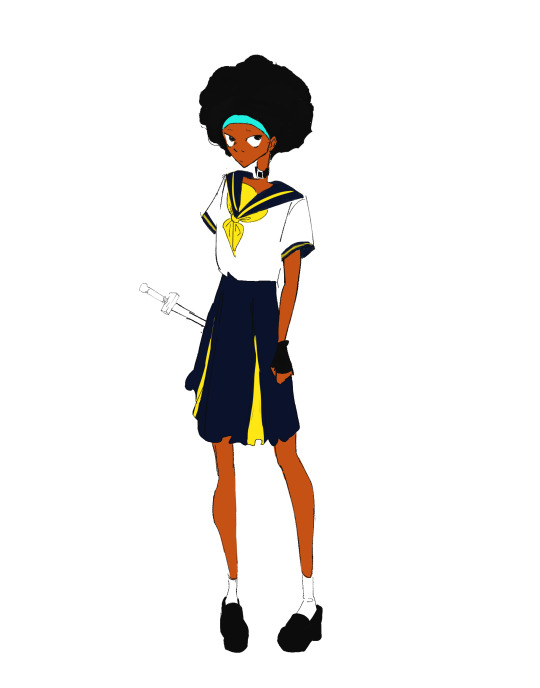
[ID. A simple drawing of Espa wearing a bright yellow and marine blue sailor school uniform. There is a small, uncolored sword on her waist. End ID.]
Testing those new brushes
Ok, so the one I picked for lineart is indeed very awesome and I'm pretty happy with it. It's the sort of brush that's hard, and when you lessen pressure it doesn't judt get thinner but lowers opacity as well. Ive wanted one like this for ages!
The first one I tried to use to sketch was more of a pain. It's good for doodles I'm but it's...pretty awkward to use. Not sure why I even picked it for it lmao, it's one of those more crispy and texturized hard brushes. So I started this second drawing. For the sketch I got a soft and low opacity one that looks like a thick pencil and it was delightful 10/10 sketch brush 👍 experience aquired
NOW onto coloring. I miss my old brush here XD all the ones i have now are either low opacity with low pressure (which makes me have to press hard to get any color out of them, but then the brush size also goes up and i need to keep adjusting the size to get to smaller areas) or sorta soft like cps's standard g-pen, and lemme tell you, I Did Not Like Coloring With Them. I ended up using the sketch brush and some rectangular rendering brushes and managed to do my thing so it moreso works, but I want to find something else. A hard retagular brush like my old one ;) hard brushes are easier to color because with them i can apply the bucket tool and it makes my job soo much easier. Speaking of which i might have to configurate it again coz my bucket tool is being a hassle lmao
art taglist || @inhurtandincomfort @seastarblue @for-the-love-of-angst
11 notes
·
View notes
Text

LOOK AT THEMM!!!
This one didn’t take me too long to finish surprisingly I had the sketch done a long time ago all I needed was the lineart and colors which I tried experimenting with again :3
Gee and frnk.. he was supposed to be caring a mallet
#gerard way#my chemical romance#frank iero#three cheers for sweet revenge#gerard way fanart#im not okay#im not ok (i promise)#frank iero fanart#frankenstein#mcr gerard#my chemical gerard#my chemical frank
27 notes
·
View notes
Text

Yes, I drew this lovely couple again — John and Nan 🥺🫶🏻
And this time I worked in a completely unusual technique for me! The idea to experiment some came up spontaneously. Initially, it was just a sketch on paper without any particular idea (just cute Mr. and Mrs. Silver, nothing too special), but suddenly I decided to cover it with color right on top in digital. It turned out nice and I decided to go on and experiment also with the light. I chose the backlight from the sunset (it's a romantic picture, after all 😉💞)
And yeah, the most important thing: I certainly based on the original sketch, but still painted the whole artwork with color splashes! And the lineart was the final stage. Usually, it's exactly the opposite. It was a super interesting experience and, so to speak, challenging. I am very happy with the result ❤️🔥
P.S. I LOVE this song. While I was drawing this art, I was listening to it on repeat, because, in my opinion, it PERFECTLY suits John Silver both in the meaning of the lyrics, and in the general vibe, and even in the marine theme. So, you can consider this drawing with my beloved pirate and his wonderful wife my full-fledged illustration for this awesome track 🥹❤️
(Too bad I didn't find the translation of the lyrics into English... So, I guess I will be translating it myself. When I'll be done, I'll update the post!)
Upd: Translation done! Though I'm totally not a pro in poetic translation, I tried my best to make it sound in the same rhythm and have rhymes too. And plus the lyrics are almost word-for-word accurate to the original. So, it turned out quite good imo, I managed to find the balance. Enjoy!~
Invited you out — already good
All places are closed, nowhere to stay
I don't really care, I am here in this crowd
All by myself and I look very proud
I'm going to you by the water
I'm filling the bottle, replacing with wine
I'm going to you by the water
I'm bitting bread loaf up, washing down with the wine
I'm going to you by the water
Invite you in — well, it is so...
Scary, of course, but for me so important
Where a kiss turns into a sign
At The Last Supper, on the Bridge, on he Cross
I'm going to you by the water
I'm filling the bottle, replacing a little
I'm going to you by the water
I'm bitting bread loaf up, washing down with the wine
I am now married to a wave
And as long ago I'm again little worried
I'm going to see my wife
I'm bitting my lips up, washing down with the wine
I am now married to a wave
I am going to you by the water
#long john silver#john silver#john silver's wife#nancy silver#treasure island#soviet treasure island#treasure island 1988#остров сокровищ#остров сокровищ 1988#kievnauchfilm#киевнаучфильм#роберт льюис стивенсон#robert louis stevenson#married couple#i love them#treasure island fanart#fanart#cheramore
46 notes
·
View notes
Text
Another collab coloring!


Another artist in twitter shared their lineart drawing to people, so I tried my hands on coloring it again c: I'm quite proud with this one! I also experiment a bit with new method of eyes rendering and I'm pretty satisfied with it 👍
Here's the source of the drawing in twitter!

I also got a thank you doodle from them as well 😭💕

42 notes
·
View notes
Text

HAPPY 6TH ANNIVERSARY TO DOKI DOKI LITERATURE CLUB!!!
Hard to believe it's been already 6 years-- i remember getting into this game back in 7th or 8th grade and being absolutely obsessed with it. I've met so many nice people in the fandom and I think the game was a huge part of my art process. Having the motivation to draw the characters over and over again made me improve quite a bit.
. .
I recently got procreate for my Ipad and have been experimenting with new brushes so i tried a different coloring style and thinner lineart. Not sure if i'll stick to it though-
#ddlc#my art#fanart#art#drawing#digital art#doki doki literature club#sayori#yuri#monika#ddlc monika#ddlc fanart
104 notes
·
View notes
Note
When i first started digital i would make a layer for everything basically for the face clipping make several layers to it and same for the hair/ background/ every piece of clothing...etc
I did take it down a notch recently and all but i just saw a video from samdoesart and noticed he LITERALLY JUST USES ONE LAYER FOR THE WHOLE PAINTING!!!??
sorry was wondering if you'd recommend a certain number of layers
the amount of layers you use is highly dependent on the style you're going for, the complexity of a piece, your personal drawing style and preference etc so i really don't believe there should be a certain amount of layers you should use. I myself fluctuate between using many layers or just painting everything on one so there really isn't a correct way or number to go for.
Howeverrrr, i think there is a certain threshold where layers become too excessive and turn into more of a burden than an aid, something that you probably noticed as well. If you find yourself becoming frustrated with the constant switching between layers for every single part you've singled out, then it's better to take notice of that and just tone down the number a bit. Samdoesarts, despite his guynextdoor vibes, is a professional and so of course he doesn't feel the need for many layers because he knows what he's doing and has a very clear workflow and style in mind. To some extent, i believe that using a minimal amount of layers does also stem from a place of confidence in your skills and/or process.
Me personally, I tone down the layer amount moreso out of laziness and because i don't like to have my flow interrupted by some "technical" errors as in "whoopsie i painted on the wrong layer again" so i just., really try to keep it as low as possible; sometimes it works sometimes it doesn't and i suffer
I add new layers every time i want to " try something new" or fix something whenever i'm still unsure of how it will turn out. New layers are for experimentation. I treat them like some sort of backup or checkpoint of some kind- that's their primary function for me. If the new thing i tried painting over doesn't work out i can just hide the layer i painted on and either try again or give up on that idea as i concluded it doesn't look good. A safety net, if u will.
One rule i do follow however no matter what is to always always have a separate layer for the hair- both color and lineart. that is the only thing i make a conscious decision to keep separate (because of previous struggles and failed attempts) For everything else, I just paint it on one layer with those aforementioned experimentation layers on top. Same for rendering. And i always merge them together once i think it looks good
I really don't like having too many layers cause it becomes annoying and messy. The only time I deliberately use a shiton of layers is for commissions, really.
i know i didn't really answer your question, but i really don't think i can recommend a certain number, so i just shared my experience with layers instead. Bottom line is, as long as you find them helpful, use as many layers as you want but don't overdo it
#i have a lot of pieces that i gave up on exactly bc there were too many layers and it was too overwhelming#so yeah less is more#tbh i have more hidden layers than active ones#my so-called “backups”#that i never refer to and refuse to delete “just in case”#i have maybe 2 or 3 active layers so to speak#i'd recommend being very loose with drawing and not very strict#but what do i know it's just personal preference#ask iztea
27 notes
·
View notes
Note
Your art is very beautiful! May I ask what brushes you use? I'd love to get the same effect with my art! (Oh, and I use Clip Studio Paint! Not sure which you use, but hopefully I can still find the same or similar brushes. Lol)
thank you very much!! Yeah for sure, here's pretty much all of the main brushes I use. I also use clip studio paint!
lineart/sketch brushes:


firstly, most of my stuff uses cy's grease pencil from this pack. it's funny bc i downloaded it years ago and didnt really like it at first. but when i tried it again a couple years ago i was like wait... this is SO good. i use it for sketching and lineart (first image). there's also csp's default "flat marker" which im apparently obsessed with (second image here). it's good for shading too! lastly (third image) i'll use the stumpy pencil pack here, this one i pretty much just use for lineart but it's by far my favorite clean lineart brush. i'll be honest i had to do weird conversion to get it to work in csp and i have no idea what i did at this point BUT ! if u search up how to convert it im sure The Internet can aid you as well. i think
Coloring:


when it comes to coloring i mainly use this water color pack and then this gouache pack (which doubles as what i use for my semi-lineless painting style- the second row here). if you see any coloring that looks more painter-like and textured it's most likely me using the gouache pack. sometimes i like to do the solid/base colors with an opaque brush and then use the water color to shade bc i like the textured look :P
side note: when i shade using another layer set to multiply, i'll either use the flat marker or cy's watercolor brush (both in the entry above this one)
Additional Stuff:
both of these for certain background help
this set of overlays (not a brush, but i figured i'd add it since it definitely helps adding texture to my work)
these textures (again, not a brush. i use these so that my backgrounds arent just Blinding White- mostly for myself bc plain white is hard on my eyes lol)
-
As You Can See I'm like. constantly messing around with new brushes. I actually have well over a hundred that I've downloaded LMAO. If you ever see a piece by me and want to know what I used, please let me know!! I'm usually able to remember the brushes I used, at least some of them :P especially more recent stuff, I've been experimenting a lot with painting methods and various new brushes
7 notes
·
View notes
Note
I hope today is going well. I was wondering what art tools do you use? I am trying to research coloring and line art in Disney styles but I am having a bit of a hard time. I have tried drawing with pencils, pens, and brushes. Though they do not create this loose and flowing style.
Also I had another question this one being a bit funny. You mentioned that Cohozuna has an abandoned shipwreck where he does bargains and other business. Is the shipwreck a reference to how in All Dogs Go to Heaven where Charlie has a casino that is a boat? Also what is Cohozuna’s other business?🤣
Thanks a lot once again. I wanted to lighten the mood with this one. Has anyone else guess that about the boat?
Hello, my day's been going great!
Since I draw all my art digitally (using Paint Tool Sai as the art software) I use a custom pencil brush for my lineart and coloring! There's no one-and-true perfect pencil brush to replicate the disney style, so I say experimenting with different brush tools until you believe it "looks and feels" like disney is highly recommended!
If you want to capture that disney-esque flowing feel in your lineart, you can try (using any brush/tool) making quick, smooth motions with your brush strokes! Here's a visual example of what I mean:

Like in the GIF above, I like to make quick, sweeping motions with my brush strokes- so that way I have more emphasis on flow and shape rather than the details!!
And also:
YESSS YOU'VE GUESS IT, THAT SHIP IS THE REFERENCE FOR COHO'S SHIPWRECK!!! 🎉🎉🎉 I haven't seen anyone mention about it yet (unless someone did and I missed a comment about it!)
In case anyone seeing this doesn't know what we're talking about, this is the casino shipwreck from All Dogs Go to Heaven that Cohozuna's is based off of:
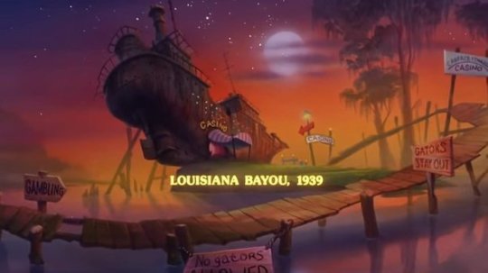
I've always loved the concept and when I thought of the shipwreck from the Marooner's Bay stage in Salmon Run, I knew right away I had to do something with that concept for A Salmon Good Time!
34 notes
·
View notes
Text
Ein's Art Log #1
@lixenn!! Here's the timelapse I recorded for my rarepair week submission! I'm just gonna start this log series because I wanna study art more and take notes of it here in this blog. And maybe it will help people with their drawings? I'm putting my notes below ↓↓↓
Draft & Lineart
First, for this art, I used a base made by Ging (깅). Using bases like these are always useful for a lot of things and it also forces me to draw things (like poses, hands, etc) I wouldn't normally draw by myself (if its up to just my hand with zero braincell input, I would just draw the characters facing 3/4 to the left over and over). Also a lot of them are just so *chef kiss*, god bless Korean artists. They're so good, especially with how they do the figures and anatomy!
I just adjusted the base a bit to match the characters' heights, since Kurumi is taller than Chrome by like 6cm.
Then when making the drawing a draft layer over the base, I usually use bright colors like green, red or blue (most often green). I usually don't think about the draft too much even if it turns out ugly, I think it's actually better that it turns out ugly and messy.
Otherwise, if the draft looks slightly more decent than expected, then I'd become too lazy to draw a more proper lineart. Whenever I remember to do so, I also use a gray-colored background so it's easier on my eyes, especially since I drew this after work.
For the "lineart", I used a brush called 촉펜 (MTL says it's "Touch Pen" in English; Content ID: 2050169). I recently started using this for doodles/sketches, it feels nice. It was free when I downloaded it, but it costs 10 Clippy now.

Anyway, I used a little bit more braincells for the "lineart" now after the draft, but then I didn't really try that hard to make it look clean, since I'm rushing to finish it as fast as I can. I just made sure that the outside lines are connected just enough for easier selection & coloring later.
Coloring & Shading
The coloring is where my experiment actually started! I usually go ahead and color them one-by-one per each color and part, but to be quicker, I used the Magic Wand selection tool to select the area outside the background, then inverting it so now the selection is at the characters *except* the background.

I then used the the bucket tool to fill the selection with the color I use as the base skin color. I still keep the selection there for further coloring purposes.

Just from here, I added another layer on top for the shading of the skin! For the shading, I used a brush called Yuri Watercolor (Content ID: 1889385). This one's really a paid brush, but I liked it a lot so I got it hahaha.

I do plan on replicating on doing this on IbisPaint one of these days! My plan so far is to use the free watercolor brush there, lower the brush opacity to around 60-70% and then draw the shading on a clipping layer set to the Multiply layer effect.

After shading, it looks like this now! I didn't mind the colors bleeding through the non-skin parts (except for two parts: the neck shading that would bleed to the face and thigh shading that would bleed to the skirt). I also used this brush to color Chrome's eye. Huhu I can't remember how I did it, helpskjfbjsbf
Then for the coloring of the hair and clothes, I just used the soft airbrush! I tried using the Yuri Watercolor brush for it too, but I couldn't quite grasp it yet on how to use it for coloring/shading those parts. I guess I know what to study next hahaha
When coloring the hair (and clothes), I did color the middle parts but didn't really full-on color till the edges to make that fading effect at the edge.


For the shading, I added clipping layers above and used the watercolor brush again!
For the hair highlights, I used the soft airbrush again. I just used a white color on a Soft Light layer effect to add a faint highlight on their hair (showed on picture on the left). Afterwards, I added another layer above with the Add/Glow effect and turned down the opacity to around 50%, to put more shine to it (showed on picture on the right).


Additionally, I also added a paper texture layer at the bottom! I also grouped up all the lineart and color layers into one folder and set the layer effect to Linear Burn.
Finally, after a bit color corrections/adjustments, blur filters (post-processing stuff, maybe for a different post?) and adding some decorations, the drawing is finally done! KuruKuro my beloved 💖

That's the process I'm playing around with so far, but I think I can still improve on it. I'm also planning on making a page on my wiki to compile my resources, references and such (maybe some free to use assets too). But anyway, that's all for now!
7 notes
·
View notes
Note
Do you have a set process for coloring and rendering / adding texture to your art? If so, would it be alright for me to ask what goes into that process? I'd love to learn how an artist I admire goes about their work!
Omg I'm so flattered, I'll try my best to explain it!! ^^
Tho, okayyy, I apologize beforehand for how incoherent this might be, since I don't really have a set process at all and mostly I fake it 'til i make it haha. I'm the first to admit that I don't have a ver consistent method and that shows in how irregular in quality my art can look, even inside the general sketchy look.
(Btw sorry if some of the fanart i use for example doesn't make you comfortable but I've tried to find the best examples for each type of coloring haha)
I'll start with the brushes I rely on the most, tho I admit i made the mistake of downloading too many brushes and textures so I might use others on rare occassions xddd
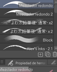
These are basically the brushes I use the most. The "mezclador redondo" is just CSP's default paintbrush and I only tweaked it to find sth I liked and felt comfortable with for both lining and painting
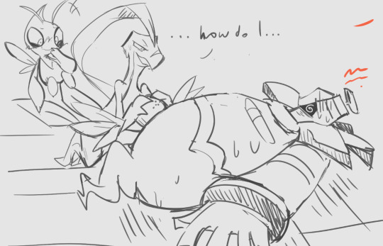
As you can see here I only used one layer for lines and other three for each of the guys' colors. I colored it all with the default brush (tho unfortunately I lost the settings I used for this drawing in particular and haven't found them again rip). In drawings like this I just do a sketch, clean the lines (no lineart) and then paint it. After the base color I start laying out different hues to make the coloring more interesting.
This one was the same. One layer for coloring, manually adding lighter hues (see the more light and yellowish color on grovyle's left leg compared to the shadow) or darker tones. I try to add color to the shadows as well to make them feel less flat, and an airbrush in overlay tends to help with that (tho here I just used a brush).
Here you can see that I often paint over the lines on another layer to correct mistakes in the "lineart" lol. I also applied an airbrush (layer mode overlay) over celebi to make her more bright. I wanted to put this one to show that coloring doesn't have to be detailed to look nice enough. Here Celebi basically has no shadows at all but the tone of the drawing makes her look cute anyways imo ^^
In these two you can see adjustements over the full image again (yellow layer), but I also wanted to show that I don't have a set number of layers either, it depends on how many I feel like using. Again, sorry for the lack of consistency but im too lazy to have a proper method lmao
I will also use harder brushes and tone changes sometimes, instead of blending them with less dense brushes. I am also fond of adding hard lighting in some drawings. You can experiments with it on a top layer and delete it if it doesn't fit, so it's always worth a try.
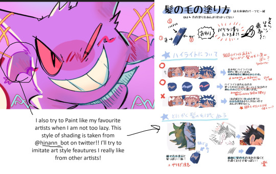
Another thing I recommend is studying and copying artists you admire or like. Add things from their styles into yours, see how they work with proportions and try to use that in your own art. It has helped me a lot and, without looking to fully copy anyone's style, it does give you some ideas of how you wish your drawing would look, which motivates me (when it doesn't depress me lol)
Finally, the texturing isn't consistent either. I use one of CSP's/Downloaded texture packs, put a grainy texture on the canvas, set it to overlay and adjust the opacity until I'm satisfied. In these two images you can see I am not consistent in coloring even in the same comic lmao. But we are doing this for fun, so I think experimentation is always sth worth exploring ^^
And I think that's all I have to say. I don't control color theory at all, so I can't really explain how I choose colors. I look up some tutorials on youtube and pretend I understand lol. Ig the one thing I tend to do a lot is changing hues in a base color to make it look less flat, the same as with shadows.
Anyways I hope this was helpful or that it at least waas what you asked for haha. Thank you for the interest!! :DD
#ask#art process#i guess???#anyways thank you for the ask sofie i hope this was helpful <333#I am KIND OF A BIG MESS IN ORGANIZATION#but hey we have fun hahaha
10 notes
·
View notes
Text

summary for this year !
A WHOLE YEAR OF VARGAS ! so proud of myself ( wiping tears
i'll talk and talk and talk under the cut
JANUARY
oh , i still love that piece . it was my pfp on a bunch of social media sites for like , 6 months because i didn't think i made art good enough to be icons . you know that thing where you're an artist and feel like you NEED to have your art as a pfp ? yeah well .
i really REALLY liked this set of brushes . i changed to csp after may , and i haven't been able to find a brush that pretty for csp . im actually heartbroken , i made like TWO drawings with them . tried to make my colors prettier , too . experimenting a bit . really like this piece .
FEBRUARY
oh god , i was so stressed about getting a colored piece for november because i wanted all of these to be colored pieces . then looking through my files i realized i have almost NOTHING from february to march . TRAGIC .
i didn't even finish that drawing . i was struggling to get some stuff right so i just gave up , lolz . I HAVE NOTHING DECENT FOR THIS MONTH .
MARCH
a drawing of brusk's bird . even if it's an au , still counts as vargas hehee . that day i was just looking through pinterest , and i saw some pretty drawings of harpies that gave me some inspiration . brusk really liked it , too ! she spent a while drawing the guy with those clothes hehee . la bata cagada , como la llamó ella .
APRIL
i think it wasn't until april that i started to really take art seriously . a pretty piece of edgar and scri as kids interacting with todd for another one of brusk's aus , actors au ! i had so much fun working with this one , and god that brush was GORGEOUS even if it was kinda difficult to use . i still miss it .
MAY
now , i know what i just said , but this month i started taking art seriously FOR REAL . tried to make my colors prettier once again . switched to csp ! got a bunch of new brushes and that drawing sucks mostly because of that : i had no idea what i was doing lol . that isn't a good brush for lineart , sunny .
JUNE
locked in . as i already said , i had no idea what i was doing on that last drawing , and i realized i don't really know how to color stuff properly . my art just looked boring . so i told myself i would color every single piece i made to practice ! i started to work with more elaborate pieces , had a thing on pinterest full of stuff i wanted to draw , started to take a lot of references . . .
i don't really like this piece . but i put it there because it looked pretty and because it has a background . yaaeey
JULY
icon for the askblog ! i had a really , REALLY specific style to paint . . . changed pretty much every brush i used . just trying some stuff , experimenting with colors . . . i don't have a lot to say about july . just that . big change . hehee
AUGUST
art for the askblog ! remember how i told myself i would color every piece i made ? well . it made working on the askblog a living hell . I'M PHYSICALLY UNABLE OF NOT PUTTING FULL EFFORT INTO SOMETHING . ah , well . at least zarla said she liked it . i really liked this coloring style ! and i feel that as soon as i go back to work on the askblog i'll keep using it . because it's been a while .
SEPTEMBER
i honestly didn't like this drawing LOOOL . oh god , if i got a dollar every time i ruined a nice drawing with my inability to make backgrounds , i'd have like three dollars . this was like , kind of the first time i succeeded . but i still think it looks a bit weird . ALSO IT DOESN'T MAKE ANY SENSE , WHY IS THERE WARM LIGHT HITTING THEIR FACES fireflies are supposed to glow GREEN !!! i knew this from the start but ngl i ignored it LOL
also , um . . . discovered yaelokre around this month . it made me want to make my art more detailed . i put a bunch of effort into this one ! their shoes took me ages aaaah .
OCTOBER
choosing a piece for october was like , SO HARD AND ALMOST UNFAIR . vargastober made me work in so many great pieces ! i still chose this one because it's my favorite and probably my best piece ever . i have a whole entry talking about this one so i won't talk too much about this one here . . . but , it took a long time . that's enough information .
NOVEMBER
i don't know . seems like i accidentally caused myself a burnt out thanks to vargastober . because november was all about not doing anything . the piece i used was for vargastober , but i remember finishing it after october was over because i was too lazy to finish it . i didn't want to add this one . . . i still have some colored mouthwashing pieces i made on this month but i wanted this to be all vargas . i also considered cheating and saying that i finished december's piece on november instead , because i actually did start it before december , but meh . oh , also . i don't like that piece lol . it just looks bad
DECEMBER
i'm still in love with that piece and edgar's TRIED A BUNCH OF NEW STUFF , changed brushes again , blah blah blah . took me a bunch of time because getting myself to draw became difficult again ( and still is . uuugghh
i honestly have no idea what's going to happen this year . i told myself i would fix my life because if i keep just doing my own stuff my family will kill me . ( for those who don't know , i graduated from highschool but didn't go to college because stress was driving me crazy and i guess i have to take care of that now . . . ) so um . . . i will probably not have as much time to work on stuff anymore . i mean , thinking about it . . . i did make more pieces on 2023 haha but most of them were sketches anyway . . . i'll have to learn how to manage my time properly . mmm
a full year of vargas and i don't plan to stop soon . i do wonder how long the vargas juice will last . . . i know that if i lose my hyperfix again i can just . re-activate it by rereading , so i'm not worried .
anyway , happy new year ! :D
6 notes
·
View notes
Note
ash (and mechanic if yr feeling up to both) with 5, 6, and 23? :D
RUNNIGN AROUND AND DOING BACKFLIPS YES YES YES WOOHOO I LOVE GETTING TO TALK ABOUT MY SILLIES
5. What's the first song that comes to mind when you think about them? 6. What's something you have in common with this character? 23. Favorite picture of this character?
ask game
5.
ash's theme song is Gilded Lily, by Cults!! i think it really matches with the overarching themes that i've tried to show in ash's story, particularly perseverance and writing your own destiny. i actually have a joint playlist for them and 13 fireflies... here if you're interested :)))
and honestly the first song that comes to mind when i think of mechanic is furret walk. silly derpy little dude. it walk.
6.
a lot. me and ash have a lot in common. for starters, we have very similar traumatic experiences!! all of their trauma is based off of my own.. i just made theirs slightly worse lol i think the main thing we share is that we are both people who've been through a ton of shit, and are currently going through a ton of shit, and will continue to go through a ton of shit. but the world has hurt us enough already, and we're not going to let it break us-- or any of the people we love-- ever again.
as for me and mech? we're both really smart idiots. we do the stupidest shit and are completely clueless but then turn around and solve complex physics equations like it's nothing.
23.

this drawing that @kakyogay did of them a bit ago!! it's from back before ash had a poncho, but something about the way the lineart is done the colors and mech's little FACE!! aughhhh such a cutie... my babies i love them so much
#if anyone wants to hear more i am ALWAYS looking for character asks#i love talking about these guys. they're in my head they wont leave#rain world oc#ashes from above#the mechanic#ask game#ask#oc
8 notes
·
View notes