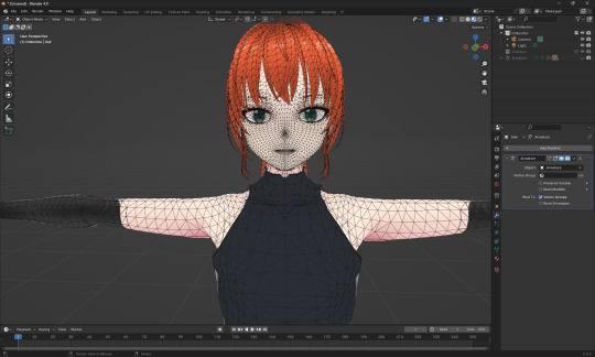
#and first time actually using a 2d animation software for it
Explore tagged Tumblr posts
Visit Tumblr Blog
Explore Tumblr blogs with no restrictions, modern design and the best experience.
Last Seen Tumblr Blogs


Fun Fact
Post activity is at the highest at 4:00 pm EDT; notes peak at 10:00 pm EDT.
Text

a sunday afternoon 🏛️🌱
#genshin impact#haikaveh#alhaitham#kaveh#first time doing animation in years#and first time actually using a 2d animation software for it#btw this is actually going to be a standee#i just decided it'd be fun to try making it an animation as well
874 notes
·
View notes
Text
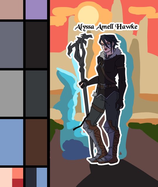
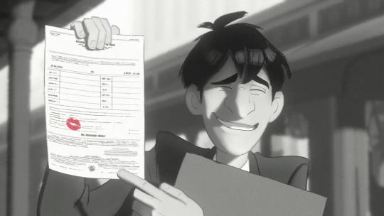
Heroes of the Dragon Age
An animation I've made for Dragon Age Day 2023, featuring my main Warden (Alyssa Cousland-Theirin), Hawke (Eleena Amell Hawke) and Inquisitor (Sulevin Lavellan)!
It's to this day one of my best artwork and I thought I should share it here too! 90+ hours between the original sketch, outfit design, the rough animation, rotoscope, inking, flat-colours, background shading and even the audio :')
Interested in the process? I detailed it below since it was my first time doing something like that:
I would like to start by saying I'm not a professional animator!Everything you've seen here is the result of experimentation and a lot of practice to learn and understand how 2D animation works.

My first idea started in May 2023. I just finished rewatching DA Absolution for the X time, and wanted to analyse why I loved the intro so much. (Even after countless rewatch, I never skipped it once.) I was inspired to study it with my main three protagonists!


Then came the first test with Alyssa Cousland-Theirin, my Hero of Ferelden! I tried to understand which part to separate for the animation. Mainly the hair and cape because it flows a lot more than the rest! If I recall, my first idea here was to make her counter flame attacks (?). Then, as the camera turns around her, I tried to add a grid to know how the camera would work around it.
I ended up making the clip longer, so she could position herself to the further left and leave space to the two other protagonists.

Now it was time to try to animate Sulevin Lavellan, my Inquisitor. I really kept that quick doodling style just to capture the vibe without putting too much time/effort into it! The background would be static to contrast with Alyssa's. I also loved the idea of a rogue sneaking!

Instead of working on Eleena Amell Hawke, my Champion of Kirkwall, I went back to Alyssa and started working with Clip Studio Paint 3D models (this entire animation has been done on the EX version of the software!) It helped for rotoscope animation and maintaining likeness! That's when I got the idea to make the background swirl around the character to let the eyes be guided by the rest of the screen!

After a couple more hours, I planned the entire animatic with 3D models and quick doodles! I finally found a cool pose for Eleena Hawke, which was honestly the hardest of the three to imagine for some reason? I tried many other poses but ended up picking an animation from the game!


This whole time, I was studying a bunch of background ideas and how studio Red Dog Culture House (who made Absolution) work! Thankfully, they have a YouTube Channel where they shared some BTS content so I could analyse it!


Then, I simplified my character and their original designs in the style of the studio! These outfits are how I imagine them after Trespasser. Alyssa as the Queen of Ferelden, looking for a cure to the Calling, Hawke following Fenris to Tevinter & Sully as a Red Jenny Inquisitor!


The idea for Sulevin's animation actually came from a piece I doodled on a live stream, when I was drawing pose studies and turning them into finished artworks haha As for Alyssa, I wanted to draw the fight that got her facial scars!

Once their designs were ready and the background ideas too, I made the rough version of the animation! Basically a sketch done on top of the 3D models to add the details, staying pretty rough just to capture the idea and movements.


Then it was time to start the lines! I decided make a folder per frame, so I could separate all he main elements and draw them one by one. It helps keeping the likeness of a character in the different frames without having big "jumps" between frames! In fact, every parts were coloured differently to recognize them, and then I used vector erasers and masks (Ah yes, the entire lineart is done in vectors of course! It's easier to adjust and save time when working on similar frames!)


At first of course, everything overlaps! But I find it easier to draw too much and erase after, just to make sure everything is coherent in each frames! The cool thing about CSP is how you can change the colour of the layers in one click! So all the coloured lines turned into black in one second, and I could reverse it just as quickly to double check!

Then I started working on Sulevin! I made a blue line to mark where her feet were, as the sketch in the background wasn't perfectly straight! (Like Sulevin's sexuality 🤭😂) The silhouettes were very quick to do, but I had fun adding more & more details as she came closer to the foreground!

I really wanted to add that little dagger trick, but I remember it required me to change the pacing of Eleena's apparition, as it was recovering her arm too quickly! I had to change the pace of multiple frames quite a lot during the project, to make sure the flow was right! For Eleena, most of her animation remained around her arms and the staff itself, as magic would be the most difficult part! That way each character has their own focus: Alyssa has a very animated background, Sulevin got the grappling hook and Eleena the ice!

Then it was time to start adding colours! Just like for the lineart, I separated every colour on it's own layer, so I could easily adjust the colours later if needed. I added one colour at the time, going through all the frames, and then another colour!
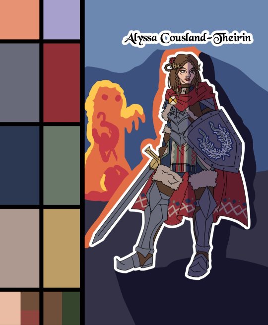
I made full palette tests with the colours I would use for their background at this point, checking if the details remained readable! Alyssa was the most challenging in terms of clothes, because I made her a very detailled armour! I had to simplify the Theirin heraldry, vectorize/redraw the Cousland, and make a brush for her cape's pattern!

Once I was done adding the flatcolours, I started the background, and oh boy it was a wild ride. For the cave, I painted multiple tests. I imagine was to use CSP panorama tools, which transform a texture into a 3D sphere, so each corners must match to look good. Sadly, it made the background very blurry, so after hours of testing, I changed ideas. Instead of the random fire balls (?) I originally imagined for Alyssa, I made three simple frames of a Rage Demon to attack her.


I ended up using the cave as a repeated pattern to make it turn 360° around the character. For Eleena, I mixed inspiration from the comics, Dreadwolf & Absolution, using warm colours matching Hawke's signature red. Just like I made the cave very grey/blue to match Grey Wardens. For Val Royeaux, it was more complex because I wanted to make it green, matching the Inquisitor's signature green. But bright green couldn't work, and the original colour during day time was blue/white/gold. So I added more leaves, played around the design a bit! After adding the rage demon, I made the shading! It was surprisingly easy and quick to do now!

I clipped a white layer on the flatcolours to not be distracted by the colours, and made thin lines to separate the light/shadows, then simply filled everything with the bucket tool! Then you set the layer to multiply and remove the white layer, and you have celshading shadows! Now the character looks out of the picture, so I added layers of blue in color burn, saturation and substract blending modes to make her look like she's in the right setting! Of course, I did the same with the other two, giving Hawke a red overlay and Sulevin green shadows!

Then I added the details, it went from white irises, to sword/staff smears to earrings and smaller finition that goes on top of these layers. To add the lights, I simply selected the shadows and reversed the selection! Using warm and cold tones to create contrast with the purple/bluish shadows! I also added more ambient light layers for Alyssa to reflect the Rage Demon fire. Now it was time to add ice magic! My first attempt had too many frames, making it look weird! Sometimes it's better to lower the frame rate to make things less bumpy!

Then I downloaded some cool ice brushes on CSP assets that made it look less like blue magical flames! But when I covered the screen in ice, I realized "Oh wait, I could make a cool transition from the ice, to blue lyrium turning red?"Red Lyrium truly links these three games and The Veilguard somehow! I spent the next hour painting over the idol and putting it in a black background, with lyrium and then the golden Dragon Age title text.
For the SFX, I used free youtube libraries sounds & "Darkspawn!" comes from the violent human female voice set (iconic for ""Can I get you a ladder? So you can get off my back!"😂🤭) After editing all that, the animation was finally done!

Here's the final math:
About 15 hours for the sketching/rough/animatic phase, 30h for the lineart, 25h for colours, 10h for backgrounds, 5h for details & 5h for music & SFX, for a total of 90 hours. Aka the same amount of time it took me to finish Baldur's Gate 3 the first time lol
If you have any question regarding the animation or the softwares etc. do not hesitate to ask, I'll do my best to answer!
#dragon age#dragon age origins#dao#dragon age 2#da2#dragon age inquisition#dai#da4#dragon age dreadwolf#dragon age the veilguard#animation 2d#original character#tutorial#warden#grey warden#warden cousland#alistair x cousland#alistair x warden#ferelden#hero of ferelden#queen of ferelden#hawke#fem hawke#eleena amell hawke#mage#warrior#rogue#lavellan#inquisitor lavellan#solavellan
320 notes
·
View notes
Text
It's funny how WISH was criticized for having "bad animation." The claims made by faux critics is that it's copying Spider-verse.
Anyone who's actually known about animation other than being a "fan" knows that Spider-verse does not own the "hybrid 3D-2D" style. Hell, The Last Wish was literally praised for "imitating it."
This is interesting because in the late 2000's, Disney had originally made Tangled, back then as "Rapunzel Unbraided" to look like a moving painting.
youtube
They scrapped this idea because they don't have the technology for a software at the time, but still kept the hand drawn vibes on the character design.
Heck, Disney even made short films to test if they can make a full film in this hybrid style. WISH just happens to be the perfect film for them to make a full feature in this style of animation.
They even use the style in some of their movies in brief scenes like in Raya and Strange World.
Other criticisms about WISH's animation that it looks like Sofia the First or that it's colorless are just goat crap complaints mostly because "it's different".
The "rumor" that WISH was originally going to be animated in 2D is just false. Disney had numerous made statements that most of their newer original films were intended to be animated in hand drawn, but don't have the time and budget to do so. "Oh, they're a billion dollar company, why can't they just hire hand drawn animators?" Simple reason, either they are retired, working on other projects, teaching at art schools or are still working at Disney, doing character animation for the 3D artists to follow. So, making a film purely for the sake of "bringing back 2D animation" is not worth getting these animators back.
2D animation was DYING during the 2000's. The reason why Princess and the Frog failed to bring 2D animation back was because of its writing, being released alongside Live Action Pocahontas Blue Edition, and that its mostly tied to the Disney staples that were criticized at the time.
Even if WISH was 2D animated, people will still criticize it. Which just shows that the animation alone, regardless of style cannot carry a movie.
Dismissing a work and calling it A.I garbage all because you hate the company behind it is just apathetically insulting the artists and animators who are just doing their job. A job that they are at risk losing to the things you are comparing them to.
#disney wish#wish 2023#wish movie#wish#paperman#raya and the last dragon#tangled#rapunzel unbraided#strange world#Youtube
76 notes
·
View notes
Text

TW: VIDEO LINKS PUT LATER IN THE POST CONTAIN IMAGERY OF SUICIDE AND LOUD SOUNDS! THIS POST CAN BE UNDERSTOOD WITHOUT THEM.
((Post submitted, yet again, by my friend @tanookireviews!))
Transcript: Heya! Tanooki here once again to give you a ted talk and critique the style of Miraculous once again! This time, it's in regards to its animation and how I feel about it.
To put it simply...the animation could be a whole lot better in my opinion. Why is that?
Miraculous's animation tries to hard to combine both 3D and 2D together. Combining those styles is not a problem! In fact, in certain circumstances, it can look amazing when put in the right hands!
Miraculous was never given that treatment.


First and most obvious point here, what the actual fuck are those facial expressions? No really what are they? I'm all for really weird facial expressions but...I dunno. They didn't think the facial expressions through at all.
It's obvious that the facial expressions were made for a more 2D look and from the looks of it, they weren't translated over well. The models do not line up with what they're trying to do. They slapped on the face and called it a day
Another point I have to make is that there are a lot of animation errors. I understand that animation errors are inevitable as we are all human and we all make mistakes...but...
Why are there so goddamn many!?


These are the 4 examples I have. While they're not much, there's a clear thing going on. There's either
Parts of their design completely gone (e.g. eyebrows)
Parts of their design they did not have (e.g. the green bangs)
Parts of their design changed slightly (e.g. hair and eyes)
There's so many of these mistakes here. I don't even know why. Was their animation software bugging out? Were they short for time or budget? Or were they lazy and cutting corners?
I'm not entirely sure...but these bits here prove that this show was better in 2D...


Which brings me to this...Ladybug PV. The early pilot of Miraculous Ladybug that had surfaced online not long ago!
There are expressions that while exaggerated look much better here. Characters designs look so much more interesting and there's a general sense of polish and detail put into this.
So why wasn't this used? Budgeting and keeping track of Ladybug's spots...
Those are some of the worst excuses I've ever heard. You can have 2D animation on low budgets and I can prove it.
I can definitely prove it.
youtube
youtube
youtube
youtube
Ladies and gentlemen. Persona 3. A game released in the year of 2006. This game was created by Atlus, around the time they were on the verge of bankruptcy.
I understand that the animation isn't perfect. Some parts are off-model and there's a general lack of shading in some areas however the rest of the animation looks amazing in terms of expressions, tone and designs throughout.
There's clearly a lot of work put into the animation despite everything happening. It goes to show that even on the tightest of budgets, you can give it your all and make something really good out of it.
However, those days are long gone and miraculous went the way of 3D. However, I've come prepared and now have 3 examples of games that combine both 2D and 3D.
Let's begin with
1. Klonoa 2 Lunetea's Veil


Klonoa 2 Lunetea's Veil's character expression, designs and look fit perfectly with the vibe of the game.
Facial expressions are sometimes goofy looking however they fit with the style of the game while also being funny. Even some of the more serious ones look good too!
The game uses a technique called 'cel-shading' or 'toon-shading' if you prefer to call it that. This makes the characters pop a bit more and separates them from background elements that could interfere with their designs.
It also looks good from a 2D/3D mix as well as the style gives off an anime/cartoon style look that helps make the game look a lot better.
This was in 2001 btw.
2. Persona 5/Persona 5 Royal


Persona 5 is an artistically beautiful game along with having a great story all about rebellion and fighting back against societal issues.
Like Klonoa 2, this game also uses cel shading and very much leans into the anime-like style it wants to go for while combining it with the vibes of manga and comic books.
The style not only works but looks beautiful no matter what system the game is played on (even the switch). It also incorporates 2D elements such as character sprites for expressions and other elements to help balance it out just a bit more and make things clearer to the player.
3. Guilty Gear Strive


Oh Guilty Gear Strive...not only are you a brilliant fighting game that has one of the best trans reps ever...but you also have excellent animation and designs.
Like holy shit any screenshots from Guilty Gear Strive looks brilliant and that's because while the characters are rendered in 3D, it does clever tricks with the camera to try and hide that fact and make it look 2D.
It also like the other 2 games uses cel-shading to add even more of a 2D anime vibe to it all. It just works so well because the animators know what the hell they're doing. It's also getting a show soon so that's even more of a testament (get it? Lol) to how good the game actually looks.
So overall, Ladybug's animation is not the worst but could be better.
Thanks once again for coming to my ted talk.
#ask#confession#confession box#ask blog#miraculous#miraculous ladybug#ladybug and chat noir#ml ladybug#miraculoustalesofladybugandcatnoir#miraculous lb#pv#ladybug pv#pv ladybug#pv miraculous#miraculous pv#guilty gear strive#persona#animation#2d animation#3d animation#cartoon#Youtube
15 notes
·
View notes
Note
Haii, Sosaaa! Okay, so i wanna get into animation BUT I'm really new. Lucky for me I know someone who's awesome at animating (that's you btw) so I need your expertise. What program do you use, and also do you have any tips for a newbie?
Aww Jay, you flatter me~✨but before answering I must put the disclaimer that I'm just a hobbyst animator with no formal training, that during quarintine thought "Oh woah, these Multiple Animation Projects that people do in YT are so cool! I want to join them!" and started learning by herself. Take everything I say with a grain of salt.
First things first: I mainly use TV Paint. However I'm not letting you spent money on paid stuff you don't even know you'll like, so here are some free alternatives that I've used as well:
Krita is mostly a drawing program, but it also has a animation interface. The red and black parts of the Helena AMV were made with this.
Flipaclip is kinda neat phone/tablet app for when you want to animate on the go, but it can also feel more limiting since various features have to be unlocked by watching ads or getting the premuim version (in typical app fashion, I guess...)
Blender, while mainly meant for 3D animation, also has been developing Grease Pencil, that allows 2d animation in both 2D or 3D spaces. And the lines are vectors, so you can edit them after drawing them and such.
You can even use normal drawing programs. I've animated with Paint Tool Sai and Medibang by drawing all the frames, saving each frame as a image in sequence (001, 002, 003...) and putting them together in some editing program or gif maker. It's possible, but it's more work.
There's also OpenToonz, which is an open source version of the software used by Studio Ghibli in some movies?? I haven't used this one, but I'll leave it here in case you want to give it a try.
For editing (In the rare scenarios where I do fancy editing) I use After Effects. I can't personally recommend any free substitute, but as far as I've read, DaVinci Resolve seems like a good replacement.
Now, regarding actual animation advise, I won't explain the principles or terminology because:
It's very overwhelming since it's A LOT of information, specially for a beginner
I work mostly by vibes, so there are concepts I don't undertand well enough to explain to others
Instead I'll foward you this whole book that goes in detail about all that technical stuff.
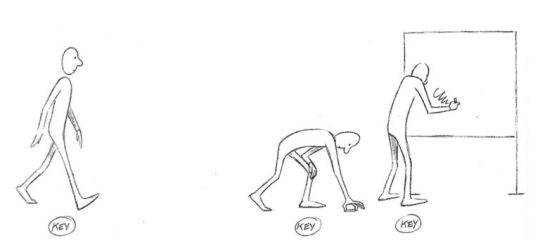
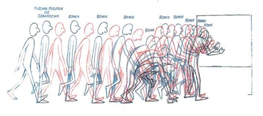
That being said, at the end of the day, hand-drawn animation is drawing main poses (aka key poses) and then drawing a bunch of more drawings in between until the drawings together look like they move.
So yeah, it's a lot of work,
....but it doesn't have to be tedious work~ 👀✨
As a hobbyst I live for the philosophy of vibing during the process instead of chasing perfect results, and I'm assuming that you just want to try for funsies and not that you're trying to become a pro industry animator anyways. Here are my personal tips to make the animation process more bearable:
1- Pick something you love! Seriously, any long task becomes more bearable when it's about a theme or character you enjoy. There's a reason why most of my animations have been about HnK or Signalis,
2- SIMPLIFY THAT DESIGN! Before you even pick the pencil, I want you to really look at the design of whatever you're going to animate and ask yourself "Are all the details in this design really necessary?" Every extra detail really starts to add when you have to draw the same thing multiple times for a single second of animation. You don't need to add all the robotic details on replika bodies, or draw every single stripe a tiger has, to put an example.
3- Keep it simple! At some point you might have a cool idea of an anime style epic battle with looks of cool explosions, camera angles, awesome fighting choreograpies and whatnot; but you first have to start small or else you'll get overwhelmed and not finish anything (been there, done that). Start with something simple like a bouncing ball, or if you're feeling brave, a walk cycle or a character turning their head. In that same sense, remember the book I linked? Don't try to learn all of it at once, go one step at a time.
4-Use references! On google images there are multiples breakdowns of things like run, flight or walk cycles, for example, and you can even use youtube videos! (tip: pause the video and use "," and "." to move back and forth between frames). In case you need help with a very specific pose or movement, you can use yourself or a friend recreating the pose irl (yes, the process is very embarrasing, and yes, the results are worth it)
4- You don't have to animate/redraw everything everytime. We aren't going for Oscar winning levels of animation here anyways. It's ok to copy and paste across different frames, only animate certain parts of the body and leave the rest static, panning the camera to simulate movement... Listen, if actual standars profesionals cut corners, why can't we? We aren't even getting paid for this!
6- It's ok to suck at first. My first animation was this kitty back in 2016,

and here's this Elster from last year doing similar movements.

It's not perfect by any means, but I feel like both art and animation-wise there has been some improvement. And I guess that right now I could remake it and make it even better, but that's because I got more experience and a better eye at finding mistakes and how to solve them, and you get that with practice.
...So yeah, there's that, have fun in your animation endeavors 👍✨
#OH MY GOD THIS IS A TESTAMENT#I'm so sorry Jay for making you read all of this#I know less that you think#but the little I know I try to share to the best of my habilities#animation#ask#the yappening
13 notes
·
View notes
Text
this is going to be a long one and probably have mistakes so yeah be warned.
If you already know me i‘m glad to see you again! And I'm sure you know what my intentions are behind my opinions and know what awaits you, what I'm intending with this post is not to bash on anyone, fandom wise or studio wise so you can skip to the part 0 bellow if you want.
Hi, if you are new here let me give you a little explanation over what I'm presenting in this post (or prehab's video or even document who knows) no this is not a salt complain, and this is not a sugar-coating work either, this is a critical analysis of the new animation and design of the characters from the French animated children's show miraculous the adventures of ladybug and chat noir season 6 that just started airing as I'm am speaking with you.
part 0
To start in a good foot will say my biased opinion right here at the start, I simply do not like the new designs or animation but as someone that is studying graphic design, animation, character design, 3D animation and more I can’t just live with my nose stuck up high and refuse to acknowledge what I don’t like can be good and that is exactly what i will do bellow so let's start with the animation rumors and how studios work.
PART 1: ANIMATION RUMORS AND HOW STUDIOS WORKS
Miraculous was first aired day 1 of September of 2015 in South Korea and since when we came a long ride till now, the studio responsible for season one was also located in South Korea being a 3D animation studio called SAMG Entertaiment; but why I'm speaking about it? Well, I heard some rumors going around saying the reason we got a new animation was because of the said examples.
The old models where too flawed;
For that rumor I can probably agree with the choice of making new models since it makes sense models almost 10 years old are not something you want to keep using.
The 3D models where lost;
I truly don’t know where that idea came from and I hope it was not from the people that work in the show because that excuse is simply a lie, either ZAG has such poor control over what happens within the studio and such flaw can happen on a blink of an eye and not have any backup of the work or someone is just messing around and spreading lies. ZAG is not an indie team; they are a big studio with a big franchise and they can’t in this day and age loose so many stuffs in a go, this isn't an “Opps! I deleted the files so now we need to redo everything from ground up!” that takes money, that takes time and not months' time oh no I mean that takes TIME! A year or even more to make the executive choice, then it goes to the character designer to review the ideas they are given and what the new season will be about to then be able to work on the designs that are send to someone that will review them and come back with fixes, discarded and accepted ones and once again and again and again till they like the final product, and is it over then Crizztel? Nope! Now is the 3D modeling and rigging team part and like before someone reviews it sends it back and yada yada you know the drill by now, and that is not the finish either! You have more! Model testing, lighting and shadow testing, clipping testing, map design (2D), map reviewer, map design again(2D), map designer(3D), map reviewer, testing and you know I better stop here before I lose my mind explaining it.
The software is old and does not work well anymore;
Well, that’s something I can’t tell for sure because I do not know which software they actually use but many said for years it was desktop maya and yes is old but it has been improving itself since the start even now (the day I'm creating this document day 01/02/2025) the software is still being used by big studios and works just fine.
I am not going to talk about other rumors because you already got my verdict and if you don’t will resume; is impossible for any mistake to be the reason the new season has a different animation, the models where old and since it has been such a long running show it makes sense to have a new animation to catch the eyes of new watchers and to rebrand the mark. And that is not wrong to do, is normal! Take Scooby doo for example or other shows that have been airing for a long time, is natural!
Now we can like it or not that is a personal choice for each of us and we need to live with the idea that other people have different opinions than ours but that does not make them your enemy if their opinion is not harmful to anyone. Let's be nice to each other please.
2- THE ANIMATION OF SEASON 6
Now to start on a good foot, I need to say the lighting and shadow is pleasant, but that is probably a build in software work and not something they had to add in themselves which is not a bad thing; now the animation on the other hand has many issues that make me wonder how they are even made, the animation is fluid! Thats a good thing and the bad thing is that yes, the animation is fluid.
“What the heck do you mean? Is not fluid good? Did you not say it yourself that it was good?”
Yes! Yes, I said it, and that is something you need to learn once you study animation, on one side you have fluid animation and in the other you have realistic animation and styled animation.
Fluid animation makes things slower, is like if you were waving good bye slowly, you can see each position the hand is in and for a sad, slow or boring (in purpose) etc scene that is great! But what if you want for example a character like Marinette to wave at someone? Is she sad? Then fluid animation it is, is she nervous? Then fluid animation and seeing each position of her hand makes things look bad.
Thats where the new animation fails, it has no style of its own and is what people call Disney syndrome, go ahead and check Disney movies and tell me this new season is not inspired by them.
Marinette is not a Disney character, yes you have Disney characters that are similar to her and use non fluid animation to express their personality but they still don’t get close to how cartoony Marinette is supposed to be, for Adrien, Alya, Luka and others it works just fine, they are not fully cartoon. But for her the animators of the new French studio should take matters into their own hands and animate her properly in a cartoony high energy style, Marinette won't just wave at you she will shake her arm so hard she can take flight! But the new Marinette is so fluid that any action she takes to show her cartoony side comes off putting like is made by people that did not want to study her character and decided to let the animation software do the rest for them.
And again, is not WRONG, there is not right or wrong way to animate but there is character to how you animate things and how it expresses the character personality, mood, culture, style etc a heavy box with sand will fall different than a heavy box filled with rocks, you cannot apply the same frames and animation to one another you need to FEEL how different they are.
And talking about feeling let's talk about texture, and if there's something that can make me sigh on the new animation is the texture; yes, I like the old latex uniform style, the new soft almost velvet like texture to them makes me wonder where their skin start and where their clothes begin. It lacks personality, it lacks individualism on a large scale of hero media, it lacks understanding of debt over the character silhouette and last but not least it lacks dept world wise.
Where ladybug stands? Is the floor concrete? Well, it looks too soft to be so it looks from the same material her clothes are made of, why everything blurs together? Why would you want characters or objects that need attention blurred out by the texture and lighting? That makes things dizzy and uninteresting to follow and the old animation had those issues sometimes, the backgrounds weren't so good but the main characters stood out! Why? Because their texture was different, their skin had a texture and the uniform another and the background another one too that's how debt works.
Background (should I play attention to it?) yes? Then put less focus on the texture of characters that are not the focus or objects too; no? Then give less focus on the texture of the said background.
That makes it easier for the viewer to not feel a weird dizzy or confused while watching the scenes.
Everything blends in within the background, objects and characters and is an easier fix than you think.
And I could go on forever but let's give attention to for me the biggest elephant in the room.
The character design.
CHARACTER DESIGNS
To not waste more time like I did above I am not going to explain in detail every little thing and will keep the review most to the characters we know since new characters would require me to watch at least 3 to 5 eps with them to get the full idea of them right (and yeah, I can do it with only one ep but hey I’m a slow person!)
So, to start let's open with no one other than our protagonist and hero of the show! Marinette Dupain Cheng aka ladybug!
Her older design is familiar to any fan that catches even a glimpse of her pigtails, her design although many in the fandom seem to disagree over many reasons which I won't get in at the moment since I'm either not qualified to talk about and because this is an overall focus of the NEW model.
At first glance you cannot see any problems with the new model, sure in a personal opinion I do in fact am not a fan of the new design I can see why many accept the changes with no problem and that is totally fine but I could not help in noticing details that were changed over the old to the new; first of all Marinette reactions and main resting face changed drastic once you notice it, her old design is heavily inspired by anime but not fully, she is a good mixture of older cartoon logic which was one of the core basis in anime funny reactions. She is quirky, she is weird and she is cute that's the main idea for an awkward teen girl which can be seen by her choice of clothes and accessories.
While past Marinette had a simple design great for producing toys and modeling at the time (in 2015 bellow you did not want to make a 3D model for a tv show too difficult to sculpt) a white shirt with her iconic cherry blossom mark, a black coat (or Blauser sorry fashion names are not my strength) pink jeans pants fitting nicely with her softer pink flats with a small but predominant of attention black bow making a clear break from the more vibrant pink from the pants and making her pallet color all fit nicely especially with her blue eyes and dark “blue” hair.
The newer version though went to a different direction even if at first you do not see it; her white shirt loses her signature which for me as an artist feels a bit odd especially since her shirt now makes it feel like her design lacks something, that could be me just being used to the mark there but I do believe once your customer used with something changing it ends up not being a good idea, sure you can do it in a nice way but the brain will still recall the existence of it, the black bow with such a bold black line at the collar of her shirt feels oddly too bold but I can’t say it is a flaw, if it was put on the end of the shirt without the bow it could balance instead of the blue with the white it would be the white with the pink; her black coat is now adorned with flowers (cherry flowers like her previous design) and with a pink strip bringing the focus of the viewer i am in no way a fan of that i must be true and i cannot imagine what was their idea behind it, it is pointless crowded to then be met with emptiness at the white shirt and head, if something was but in her hair or neck like a necklace or a little bow to call the attention back to her face it would be more pleasing.
She also now wears shorts in a soft pink color and those do please me if it was not for the black semitransparent pantyhose, I would find it a good choice, black and pink now are equals and that could be a hint of she becoming more mature but I do not see it as the case right now, she still acts and thinks like the old Marinette so the change of clothes is nothing more than a choice of rebranding, the black feels forced, i cannot think Marinette the ever so loving of pink simply adding more black (which looks grey because of the transparency) to her clothes, and if you take those pantyhose it would feel much better. And now to her shoes well the black is once again my issue, it cuts the pink out making it not have a clear cut from her feet to her pantyhose. The black that once helped to control the pink now seems to take over it killing it down.
And sure, you can say I'm filled with crap with my analysis, “why is black such a bad thing? You don’t like black?” oh I love black, and I like the visual of her clothes but what I LIKE is not what should be put into perspective, i can’t go to a client and do what I like since is not a matter of my tastes but yes what is asked to represent, Marinette is a protagonist who is supposed to call the attention of young more energetic girls, i wish i could ask young kids especially girls to see if my theory is correct but i do not have the time and courage to do that research.
She feels more mature yet the focus of her character still the same as her past self.
I almost forgot about her model and expressions, the Disney look is quite generic, old Marinette was expressive and weird but in a funny and cute way, the new one does not seem to capture her weird features in a good way, perhaps is the lack of actual exaggeration in her features because when her face is resting it is good but once she tries to be funny it looks.... uncanny to say the least, that is the only part of her design which i stomp my feet down on saying it is a down grade from the original and she being the main character that reloaded a LOT on those expressions made me leave many scenes because of that in the middle.
Her new model is not that bad and her old model had flaws too I could point out but not as much as the new and personally I do not like it and in a professional way I'm fine with it.
As for ladybug yes yes you probably thought i had forgotten about her but worry not im here to also expresses my analysis over her too.
I do not like it either, yes the same issues as above and simply because i dont think it was or is important to add more black to her suit, i am sorry but that trend on the fandom never interested me and never will as it seems is just additional stuff that is useless, does not bring debt, does not highlight something or make a clear distinction from one part to another and before you say im being only salty here because of my preferences i think shadoybug evil form is the best example ever over how to add the black to the suit, they did an incredible job with shadybug and it worked well to highlight her more villain and complex character and it does not have the blue dark hair crashing with the suit instead they made her hair black with glowing red which was perfect for a villain look, she is on the shadows but also not that interested in hiding so much and i think that's the best thing ever also an older adult ladybug would need the black to highlight her grown body and her more mature character.
But the black with the blue dark hair mixed with red at the tips is just not a nice combo.
She now fades deeper when side by side with her fellow team mates and that kills any importance she ever had as a leader, she is just another hero inside the team.
And oh, talking about it we need to focus on the delta protagonist and hero Adrien and chat noir which did not change much.
I can’t even point out this in an actual helpful manner, Adrien changed nothing other than his face and hair and it was enough to receive my thumbs down the moment i saw him, his hair looks overly grown as if they gave him chat noir hair and hey would that not be cool? Well not with such a dull color scheme that makes him look like 12 years old and if you think I'm salting on his design then i wish i could look at him through your eyes because no way his design went through the studio without anyone saying “this boy looks like he is trapped by Gabriel again” he looks depressing which with the end of past season that would be great if not by his literally chill attitude, hate on his orange shoes all you want but those where the only alive part of him that was not physically his (ex his eyes, rich blonde hair and more tanned skin) and if what the narrative wants to pass on is that Adrien is not on a good time then will clap for them but if not do not expect me to be sweet towards the Karen haircut.
Now to be less critical we have chat noir new design, his suit looks really nice, although some details are odd like the one on the sides of his chest bellow the arm, they are just there to add more volume and trick the brain into thinking his design is even more complex than his previous suit. The issue is the face, is small, way too small, and way too sharp for a character that has long left that personality in proll to work well with his partner. He looks like he will crack a joke from season 1 but he won’t because he has moved on from that, overall, my issues with him are not fully design wise but yes modeling ones, his torso is too big for his head, his body is out of proportions and his expression had killed any sweetness his old model had.
And this all makes me sound like i do not like his new design but i do think he was one of the better ones of the new rebrand, i just think they should not let him go to the gym so much and skip let day because he is too buff in his chest, maybe is the sadness from past seasons lol.
I was going to review other characters but look at the size of this thing, I'm writing a bible and i hope it was not as boring as my catholic bible studies where XD but for my final opinion im going to say that personally i do not like the new season at all and im sorry for you that do like to hear once more someone complaining but is the truth; but on a professional (well student to be more honest) it is a good animation, modeling, design and rendering, not perfect and even now i do not think professional wise they did a better job than SAMG has did but since people working on the show are new to the industry i wish they evolve their skills and fix some animation issues they commited.
now bye i talked too much.
#ml critical#mlb#miraculous#chat noir#ladybug#crizztel rambling#ml fandom#mlb fandom#ml season 6#ml s6#miraculous ladybug#oh well here it is#sorry i might do the rest of the characters after i figure out how to not write a fucking bible#miraculous season 6#miraculous season six#ml analysis
6 notes
·
View notes
Text
Zenless Zone Zero Version 1.4 "A Storm of Falling Stars" Special Issue | Hoshimi Miyabi: Behind the Scenes with the Dev Team (2/2)
Special Effects
When designing the special effects for the Frost attribute, we wanted them to feel uncanny, intricate, and mysterious to match its fantastical background.
In terms of color, as Frost is characterized by flowing Ether turbulence, it couldn't simply be an ordinary blue. Thus, we started with an ice-blue base and incorporated various tones of magenta and indigo to create an unusual and eerie blue that is rarely seen in nature.
In terms of form, we didn't want to just mimic the usual flame-like effects. After several rounds of preliminary development on its style, we made the edges of the Frost effect more stylized and comic-like. The addition of black-and-white stars not only reflects the meaning of "star" (Hoshi) in Hoshimi Miyabi's name but also shows the unique, original style of her attacks, avoiding the impression of being merely a recolored flame or appearing flat and paper-like.
▼Tiny Tailless's Special Effects: Before and After
For the special effects of Tiny Tailless, we've taken a technical leap from the original released version by combining film industry software with game engines for the first time. Typically, flame-like effects are limited to extending along an object's path of motion. However, our specially designed "gaseous flame" effect simulates the chaotic dispersion of gas in multiple directions, making the "gaseous flame" of Frost and the eerie aura of Tailless more delicate and ethereal.
▼Early-Stage Concept Art for Miyabi's Hair Strand Effects

For the special effects on the strands of Miyabi's hair, the effects generated by the system alone lacked fluidity, while purely 2D effects couldn't achieve a 360-degree, flawless performance during actual gameplay. After several rounds of preliminary development, we decided to combine the advantages of both approaches by manually sculpting key Frost effect models using 2D design principles. You can think of it as ice sculpting — but animated.
After several months of work, we created a total of 150 hand-sculpted Frost models for Miyabi using 3D effect software to ensure smooth, dynamic performance. In the end, we integrated nearly 200 special effects files to portray Miyabi's unique Frost attribute, making it look as if every strand of her hair is "ignited" with Frost when she uses her skills.
▼Miyabi Hand-Sculpted Hair Strand Effects Demo

The visuals shown are still in development and are not representative of the post-release version.
>> Official Hoyolab post <<
9 notes
·
View notes
Text
Alright gang. We’re gonna talk about the project of mine that’s least likely to come to fruition because of how complicated it would be to make it. And that my friends is ‘(V)Flower the Punk Magical girl’.
First comes the Licensing. First I have to have permission from Crypton, Yamaha, twindrill, the guys who made CeVIO, the guys who made Synthesizer V, and various Utau creators. It’s not the actual getting permission part I’m worried about it’s the way I believe some characters I’m afraid could strait up not be used in the way I need them to be used. Example: Hatsune Miku. I don’t think Crypton would let me depict her as a villain if I’m going to use her. Even though she would be a miss guided character.
Second issue: music. Very simple. Some artists are less likely to work on a project like this than others and won’t be likely to let me use their music.
Third issue: language and making the characters talk. Most of the characters I plan on using for this project don’t have talk voicebanks(Oliver, Yohio, The Kagamines, Solaria, Kevin, Sweet Ann, Kasane Teto, Gumi, Utane Uta(Defoko), Momone Momo, Etc). Not only that I have to either make this in Japanese or English and because a lot of the voicebanks don’t normally have the capacity to do both languages in an understandable way it would be incredibly expensive and time consuming to do the tuning and actually talking.
Forth issue: Animation. It would be animated with 2D for the characters and 3D for the Setting. I hope why everyone knows why that’s really hard right.
Fifth: The audience. Out of all the vocaloid characters to get a potential movie VFlower is among the least likely because she’s not Miku. Anything but The Crypton Loids and Otomachi Una. It’s simply wouldn’t sell enough in either of its demographics to make up for the cost of making it. And considering that the western vocaloid market is smaller than the eastern market I’m not hopeful that a vocaloid movie would sell well here.
Sixth issue: Budget. Let’s be real a project like this wouldn’t be given a working budget and lots of people would have to work overtime to make this a functional product. I really don’t want that to happen to my projects even if the animation is being done by a different studio.
Seventh issue: The AI debate. Vocaloid and other vocal synthesizer softwares are often confused for Ai products instead of instruments. Many people would boycott the project because there’s a lot of people who don’t know this is voiced by Vocal synths(an instrument that’s made pretty ethically) and not AI generated voices(unethical and lifeless). Which would add to the possibility of it not making any money at all.
I’ll reblog this again tomorrow with the plot of the plot so yall can make fanfic based off the premise.
#vocaloid#cevio#synthesizer v#synthv#Utau#vocal synthesizers#hatune miku#kagamine rin#kagamine Len#Kasane Teto#Megapoid Gumi#Solaria#kevin synthv#utane uta#defoko#momone momo#vflower#writing#scrapped writing
9 notes
·
View notes
Note
My first time in here, but lurked for a while. Had to chime in about Viv's spiel about rigged animation. Rigged animation IS beautiful, but what has been shown in Hazbin doesn't look great, nor is it really "rigged" in the same sense as other shows. It's a hybrid. It has tweening for some parts, but overall it is frame-by-frame 2D animation. This is also the case for Helluva Boss, but actually done well. For Hazbin, either the animators/boarders are inexperienced with the software or this medium specifically, maybe both, but some shots just really don't flow well. Especially considering this show is using Toon Boom Harmony, I don't feel like this show is being handled by an experienced animation studio who can use this program to its full potential. I know for a fact, this program has the potential to handle the complicated and pattern-heavy designs that Viv creates with relative ease if approached with planning and structure, yet there are so many instances where shortcuts, cheats, and time-savers possible in the software could have been clearly used, but just aren't for some reason.
Rigged animation is some of my favorite and can really look beautiful if you know what you are doing with it. Think of shows like Hilda, My Little Pony, Dead End, Bluey, even Bob's Burgers which is also by Bento, have beautiful smooth rigged animation. But so many shots of Hazbin Hotel just look choppy by comparison, and not in a good or intentional way. I'm sure the animators themselves are great. But the overall product shown so far just doesn't look smooth, no matter how you excuse it. There are mistakes that are consistent with what I was doing as a new learner of animation and its software, or under heavy stress and very little time to correct mistakes. These just should not be present in an Amazon funded show. Helluva Boss evidently has more time and care put into it due to it having less strict deadlines, and the animation quality is even more consistent with Season 2, but the fact the Hazbin Hotel budget clearly went more towards the replaced voice talent and not on the animation is infuriating. Not to mention disappointing.
It's incredibly disappointing, and even moreso with this insight. Thank you for explaining it.
33 notes
·
View notes
Text
Sega Saturn - Fatal Fury 3: Road to the Final Victory
Title: Fatal Fury 3: Road to the Final Victory / 餓狼伝説3 ~遥かなる闘い~
Developer: SIMS Co. Ltd.
Publisher: SNK
Release date: 28 June 1996
Catalogue No.: T-3102G
Genre: 2D Fighting


The first of the 3 Fatal Fury games for the Sega Saturn by SNK but how is it? Well after the excellent King of Fighters '96 also by SNK I was expecting something special from this one. Now I know that expecting something to be good is a bad idea. Garou Densetsu 3 or Fatal Fury 3 as it's known in English is probably one of the worst 2D fighters on the Saturn. Now while you may think this isn't such a big deal it actually is. You see 2D fighters programmed by far lesser talented software houses are miles better than this and considering that KOF '96 was excellent what the hell went wrong? Well, could it be because SIMS had a hand in the development of this game? Most likely to tell the truth.
Fatal Fury 3 does have a bit less animation than the Neo Geo original which is expected since the Saturn has less memory plus Fatal Fury 3 doesn't use any memory expansion carts. The speech samples are also muffled which again is down to memory restrictions and again is excusable. What's not excusable however is the poor frame rate that this game runs at. It's as if this was purposely made crap to please the NEO GEO fanboys. This probably isn't true but it sure looks that way. The whole game has a terrible jerky look to it. Not only the character animation and movement of the characters but also the menu screens scroll in a jerky fashion. All this leads to a pretty poor conversion but wait, it gets far worse!! The loading times are a joke! We're talking PlayStation speed here!! We all know that the Saturn is capable of fast loading times as Capcom's 2D fighters that don't support the RAM carts have shown but this game is a joke. It loads EVERYTHING! Yes, even the messages after a battle have to load making you wait about 7 seconds. The loading wouldn't be so bad if it was just between rounds but as it is it becomes rather annoying. At least it's quicker than the Neo Geo CD but still very bad for a Saturn.
Overall Garou Densetsu 3 (Fatal Fury 3) on the Saturn is a poor conversion indeed.


youtube
3 notes
·
View notes
Note
Oh, by the way! Here are some shorts that can be viewed alongside the series.
Wu's Teas (you've heard of)
Tales from the Monastery of Spinjitzu
Prime Empire Original Shorts
Ninjago: Reimagined
Virtues of Spinjitzu
Theres also the (I think) non-canon crossover with the Dreamzzz series titled Dream Team
And the could-be-canon novels like Way of the Departed (I mentioned in an earlier ask) and The Splinter in the Blind Man's Eye!!
And as to provide further explanation, the Season 8 redesigns are because of the non-canon movie that released after season 7, but seasons 8-15 and Dragons Rising still exist in the same timeline.
After Season 10, Seasons 11-15 are categorized as another "show" even though it's still counted as Seasons 11-15 and not a reboot. They take on an 11-minute format and have longer seasons (11 and 15 are 30 episodes, 12-14 have 16 I think. And don't bother searching for the Island special because it's categorized as another season in the correct chronological order under the 11-15 title.
Another thing to note are the stylistic changes after S10, and S15. After S10, the studio that produced the series (WilFilm) gave the production to another studio, (WildBrain) thus resulting in more textures on clothes, different lightings, 2D animated episodes, effects, etc.
After the original show's finale, (S15 - Crystalized, which is widely disliked by fans,) it picks back up in the sequel series, Ninjago: Dragons Rising. Along with using a new software to render details, giving GORGEOUS lighting and effects, it introduces a whole new world, and new main characters as well. (Though the old cast doesn't go away either.) It also reintroduces the 22 episode format, although having 20 episodes in the first season.
In chronological order I guess all of the above info would be placed accordingly (after Skybound, which you just finished)
Day of the Departed
Season 7 - Hands of Time
Way of the Departed (non-finished but readable online)
Golden Hour (Ninjago - Reimagined Short)
Season 8 - Sons of Garmadon
Season 9 - Hunted
Tales from the Monastery of Spinjitzu
Season 10 - March of the Oni
The Splinter in the Blind Man's Eye (non-finished but readable online)
Season 11 - Secrets of the Forbidden Spinjitzu
Prime Empire Original Shorts
Season 12 - Prime Empire
Season 13 - Master of the Mountain
The Island
Virtues of Spinjitzu
Season 14 - Seabound
Season 15 - Crystalized
Ninjago - Dragons Rising Season 1
Sorry for another long ask, but happy watching!! It's nice seeing someone new react to the series without spoiling themselves first!
Wow! Thank you for the list!
That is... a lot of information to take in lol. But all good. I really do appreciate this. 💜
I'm actually going to update the list I have with all this.
12 notes
·
View notes
Text
「viRtua canm0m」 Project :: 002 - driving a vtuber
That about wraps up my series on the technical details on uploading my brain. Get a good clean scan and you won't need to do much work. As for the rest, well, you know, everyone's been talking about uploads since the MMAcevedo experiment, but honestly so much is still a black box right now it's hard to say anything definitive. Nobody wants to hear more upload qualia discourse, do they?
On the other hand, vtubing is a lot easier to get to grips with! And more importantly, actually real. So let's talk details!
Vtubing is, at the most abstract level, a kind of puppetry using video tracking software and livestreaming. Alternatively, you could compare it to realtime mocap animation. Someone at Polygon did a surprisingly decent overview of the scene if you're unfamiliar.
Generally speaking: you need a model, and you need tracking of some sort, and a program that takes the tracking data and applies it to a skeleton to render a skinned mesh in real time.
Remarkably, there are a lot of quite high-quality vtubing tools available as open source. And I'm lucky enough to know a vtuber who is very generous in pointing me in the right direction (shoutout to Yuri Heart, she's about to embark on something very special for her end of year streams so I highly encourage you to tune in tonight!).
For anime-style vtubing, there are two main types, termed '2D' and 3D'. 2D vtubing involves taking a static illustration and cutting it up to pieces which can be animated through warping and replacement - the results can look pretty '3D', but they're not using 3D graphics techniques, it's closer to the kind of cutout animation used in gacha games. The main tool used is Live2D, which is proprietary with a limited free version. Other alternatives with free/paid models include PrPrLive and VTube studio. FaceRig (no longer available) and Animaze (proprietary) also support Live2D models. I have a very cute 2D vtuber avatar created by @xrafstar for use in PrPrLive, and I definitely want to include some aspects of her design in the new 3D character I'm working on.

For 3D anime-style vtubing, the most commonly used software is probably VSeeFace, which is built on Unity and renders the VRM format. VRM is an open standard that extends the GLTF file format for 3D models, adding support for a cel shading material and defining a specific skeleton format.
It's incredibly easy to get a pretty decent looking VRM model using the software VRoid Studio, essentially a videogame character creator whose anime-styled models can be customised using lots of sliders, hair pieces, etc., which appears to be owned by Pixiv. The program includes basic texture-painting tools, and the facility to load in new models, but ultimately the way to go for a more custom model is to use the VRM import/export plugin in Blender.
But first, let's have a look at the software which will display our model.
meet viRtua canm0m v0.0.5, a very basic design. her clothes don't match very well at all.
VSeeFace offers a decent set of parameters and honestly got quite nice tracking out of the box. You can also receive face tracking data from the ARKit protocol from a connected iPhone, get hand tracking data from a Leap Motion, or disable its internal tracking and pipe in another application using the VMC protocol.
If you want more control, another Unity-based program called VNyan offers more fine-grained adjustment, as well as a kind of node-graph based programming system for doing things like spawning physics objects or modifying the model when triggered by Twitch etc. They've also implemented experimental hand tracking for webcams, although it doesn't work very well so far. This pointing shot took forever to get:
<kayfabe>Obviously I'll be hooking it up to use the output of the simulated brain upload rather than a webcam.</kayfabe>
To get good hand tracking you basically need some kit - most likely a Leap Motion (1 or 2), which costs about £120 new. It's essentially a small pair of IR cameras designed to measure depth, which can be placed on a necklace, on your desk or on your monitor. I assume from there they use some kind of neural network to estimate your hand positions. I got to have a go on one of these recently and the tracking was generally very clean - better than what the Quest 2/3 can do. So I'm planning to get one of those, more on that when I have one.
Essentially, the tracker feeds a bunch of floating point numbers in to the display software at every tick, and the display software is responsible for blending all these different influences and applying it to the skinned mesh. For example, a parameter might be something like eyeLookInLeft. VNyan uses the Apple ARKit parameters internally, and you can see the full list of ARKit blendshapes here.
To apply tracking data, the software needs a model whose rig it can understand. This is defined in the VRM spec, which tells you exactly which bones must be present in the rig and how they should be oriented in a T-pose. The skeleton is generally speaking pretty simple: you have shoulder bones but no roll bones in the arm; individual finger joint bones; 2-3 chest bones; no separate toes; 5 head bones (including neck). Except for the hands, it's on the low end of game rig complexity.
Expressions are handled using GLTF morph targets, also known as blend shapes or (in Blender) shape keys. Each one essentially a set of displacement values for the mesh vertices. The spec defines five default expressions (happy, angry, sad, relaxed, surprised), five vowel mouth shapes for lip sync, blinks, and shapes for pointing the eyes in different directions (if you wanna do it this way rather than with bones). You can also define custom expressions.
This viRtua canm0m's teeth are clipping through her jaw...
By default, the face-tracking generally tries to estimate whether you qualify as meeting one of these expressions. For example, if I open my mouth wide it triggers the 'surprised' expression where the character opens her mouth super wide and her pupils get tiny.
You can calibrate the expressions that trigger this effect in VSeeFace by pulling funny faces at the computer to demonstrate each expression (it's kinda black-box); in VNyan, you can set it to trigger the expressions based on certain combinations of ARKit inputs.
For more complex expressions in VNyan, you need to sculpt blendshapes for the various ARKit blendshapes. These are not generated by default in VRoid Studio so that will be a bit of work.
You can apply various kinds of post-processing to the tracking data, e.g. adjusting blending weights based on input values or applying moving-average smoothing (though this noticeably increases the lag between your movements and the model), restricting the model's range of movement in various ways, applying IK to plant the feet, and similar.
On top of the skeleton bones, you can add any number of 'spring bones' which are given a physics simulation. These are used to, for example, have hair swing naturally when you move, or, yes, make your boobs jiggle. Spring bones give you a natural overshoot and settle, and they're going to be quite important to creating a model that feels alive, I think.
Next up we are gonna crack open the VRoid Studio model in Blender and look into its topology, weight painting, and shaders. GLTF defines standard PBR metallicity-roughness-normals shaders in its spec, but leaves the actual shader up to the application. VRM adds a custom toon shader, which blends between two colour maps based on the Lambertian shading, and this is going to be quite interesting to take apart.
The MToon shader is pretty solid, but ultimately I think I want to create custom shaders for my character. Shaders are something I specialise in at work, and I think it would be a great way to give her more of a unique identity. This will mean going beyond the VRM format, and I'll be looking into using the VNyan SDK to build on top of that.
More soon, watch this space!
9 notes
·
View notes
Text
Looking Forward (and Back)
I'm feeling a little better mentally about the whole project; I've cleared up my bibliography and also altered my project proposal a little. This time I did attempt to make it more open-ended, and that's because I've thought about some potential renovations to the idea.
A lot of this has been inspired by Doom - the originals, not the remakes. They're really good games, and the art and level design are very intriguing. I watched a very interesting video by GermanPeter about what the levels could be as real-life places, and it made me think about the abstract, surreal nature of the visuals. It's something that could be quite interesting to replicate. For example, in the video, Peter suggests that MAP02, The Underhalls, is not a sewer system as it first appears, but actually a network of flooded subway tunnels, with various stops where you can scavenge for loot and fight demons.
I've also gotten quite hung up on the Sinister Workshop vs Dark Tomb debacle, and I think the best way to get around this is to combine the ideas into one cohesion, called "Sinister". It'll be chunky, mechanical and industrial, while also appearing fantastical and almost Gothic. This style has been proven to work - once again, look at Doom.

Some of the Doom maps do still carry a sense of dread and unease, as you creep through darkened corridors, expecting an ambush at any moment. But they also have the more adrenaline-fuelled segments you'd expect from a shooter, running circles around a hungry horde and blasting them into mincemeat. Doom does attempt full-on horror in some segments, too. There's a map in the cartoonishly malicious Plutonia Experiment called Hunted, where you're trapped in a maze filled with Archviles (particularly resilient demons who can revive the dead for extra fun), not enough ammo to kill them all, and all the while, as if to mock you, it plays the bunny song from the end of Doom 2.
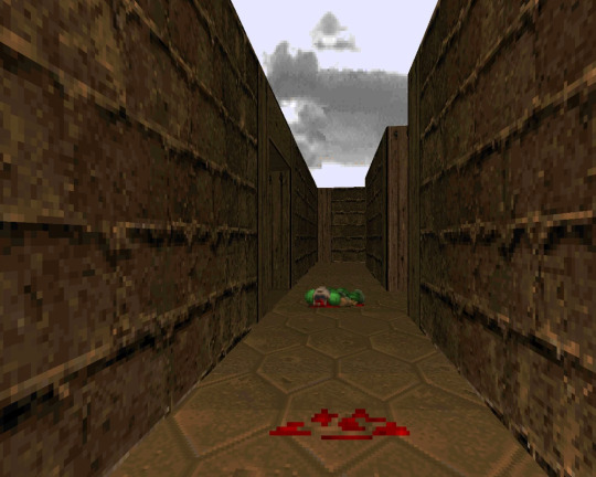
A lot of Doom 1 maps had this more horror focus, actually. Obviously nowadays, it's not scary, but back then, when you were confined to keyboard controls, a crap resolution, and the old-school software renderer that made dark areas DARK, it was probably pretty spooky. With this ethos, I can have my cake and eat it - I can keep making the slower horror-atmosphere game, and also make it more active.
This is what I want to do. This is the vibe I want to replicate. Here's my idea for more fleshing-out. Essentially, you're in the afterlife - the god of death has entered a deep sleep, and the world is being subverted by his altered consciousness. Since nobody can properly die anymore, only existing as malformed ghosts in the warped remnants of the afterlife, you've been sent to wake the god up from his slumber and banish these spirits back to the ethereal realm. The surrealism still works here - it's all in a dream-like world, but it's also the afterlife. Think of some of the music videos for TOOL songs, where strange visuals are used to signify the dying process, or passing in and out of consciousness. This helps to explain the inevitable weirdness of the environment, and also relates to many of the interesting themes that people have extrapolated from the original Midas myth: dreams, surrealism, illusion, conspiracy, myth.
And, a final note, enemies. Also inspired by Doom (what can I say, I love boomer shooters) I think I'll have enemies that are 2D sprites. They'll be fun to draw, easier to animate, and help to make the world seem off. If the world is 3D and they're not, it'll give everything an optical illusion vibe, which is what I want.
A final final note: I think I might call it Sinister Afterlife. But it's just Sinister for now.
#devlog#gamedev#indiedev#indiegamedev#indie game dev#indie games#indie game#nitrosodium#indie dev#boomer shooter
2 notes
·
View notes
Text
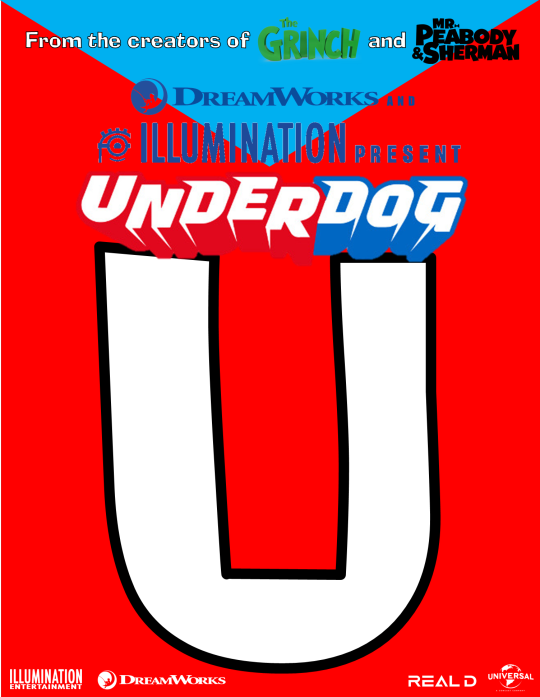
Underdog is one of those popular characters who fell into obscurity in recent years. Now that "Underdog" is owned by Universal, I think there should be a CG reboot movie. Unlike the live action Disney film released in 2007, I would want Underdog's CG reboot to be more faithful to the cartoon (even though I never saw it). This film would be released in theaters in 2D, 3D, IMAX (2D and 3D), and 4DX (2D and 3D)
Up above is how I would envision an "Underdog" movie poster. I have a blank one for those who want to try better than what I have done. You can view the older versions of my movie poster concept art on this page.
PRODUCTION COMPANIES
Illumination
DreamWorks Animation
DISTRIBUTOR
Universal Pictures
RATING
Obviously, PG, moving on.
ANIMATION
In terms of the animation, I wasn't sure if the CG should be fluent or stop-motion like, similar to some scenes in "Puss in Boots 2: The Last Wish", but I was thinking that the same people who worked on "Mr. Peabody and Sherman" could try animating the characters. It could even be the first time Underdog, Sweet Polly Purebred, and other animal characters have actual fur. "How the Grinch Stole Christmas (2018)" also showed us how good hair and fur could work on CG characters.
OPENING LOGO VARIANTS
For the Universal Pictures logo, have Underdog fly around the earth as the letters spelling "UNIVERSAL" follow him (Assuming Underdog can breathe in Space).
The Illumination logo would feature the minions jumping off the Illumination logo and trying to fly, only for them to just plummet to the ground.
And for the DreamWorks Animation logo, I was thinking make Underdog 2D animated (with either traditional or flash animation). And after Underdog fishes on the moon, he would jump off the moon and fly through the clouds transitioning from 2D to his 3D design we see in the movie.
The title for the film itself would appear at the beginning and end of the movie. The end credits themselves would be 2D animated.
STORY CONCEPT
What I had in mind was if Dr. Simon Bar Sinister teamed up with Underdog's nemeses and formed a legion too powerful for Underdog to take on by himself. In fact, Underdog himself could get a team of his own consisting of other animal superheroes like him. And after putting Dr. Simon Bar Sinister and his legion behind bars, the movie would end with Underdog starting his new job at a superhero headquarters, which serves as the backdoor pilot for a TV show based on my movie idea.
CLOSING LOGO VARIANTS
After the credits (and post-credits scenes depending on if we'll get any) and the closing Universal and Illumination logos, Underdog would fly back onto the moon of the DreamWorks Animation logo and continue fishing until the screen fades to black.
TELEVISION SERIES BASED ON THE MOVIE
The TV series based on the movie would continue from the ending of the movie, and in addition to seeing more of Underdog in action, some episodes focus on Underdog's new superhero friends. This show, I was thinking would return to its original 2D routes, but this time through flash-animated software like Toon Boom Harmony, or something similar to that.
#321SPONGEBOLT's Ideas#Underdog#underdog cartoon#movie concept#movie idea#movie poster#movie posters#movie poster concept#fanmade poster#fanmade movie poster#fanmade movie posters
3 notes
·
View notes
Text
What No One Tells You About Your First Animation Internship

Landing your first internship or job in animation is a milestone worth celebrating—but it also opens the door to a learning curve filled with both excitement and challenges. Whether you’ve been studying 2D animation, 3D modeling, or visual effects, the transition from student to studio can be a bit overwhelming at first. What do studios really expect? What does a day at work look like? And most importantly, how do you grow from this experience without burning out?
If you’re on the verge of starting your first animation role, this guide walks you through what to expect, what to embrace, and what to avoid—backed by industry insights and the latest shifts happening in the animation world in 2025.
The First-Day Reality Check
Don’t expect to start animating high-profile scenes or designing hero characters on your first day. Most internships or entry-level jobs begin with basic, repetitive tasks—think file organization, clean-up animation, or assisting in asset libraries. It’s less glamorous than you imagined, but it’s a crucial part of the production pipeline.
Why? Because studios want to see if you can follow instructions, maintain quality, work collaboratively, and understand the tools before moving on to complex work. This is the moment where your technical discipline, rather than raw creativity, will be tested.
You’re Not Just an Artist—You’re Part of a Pipeline
One of the biggest surprises for beginners is realizing that animation isn’t a solo act—it’s a team sport. Every project moves through a pipeline: concept, storyboard, layout, animation, lighting, compositing, and post-production. You’ll interact with riggers, texture artists, compositors, sound designers, and even producers.
You’ll need to communicate clearly, manage files properly, follow naming conventions, and deliver on tight deadlines. Mastering collaboration is as valuable as animating itself.
Constructive Criticism Is Constant—And That’s a Good Thing
If you’re used to working on personal projects, brace yourself: professional animation involves constant review and critique. Supervisors and senior animators will go frame by frame through your work and point out everything from spacing issues to unclear silhouettes.
Don’t take it personally—this feedback isn’t to tear you down but to help you grow fast. Animators in top studios swear by the "notes culture" as the only way to improve. One former Disney animator even joked in a podcast that receiving daily feedback is like “going to the gym for your animation muscles.”
Expect to Learn More in 3 Months Than in 3 Years of School
Even if you’ve taken the best Animation course in Chennai, nothing prepares you for the studio pace like actual experience. Software shortcuts, real-world workflows, client expectations, and version control systems like ShotGrid or ftrack are things you rarely learn deeply in classrooms.
Internships expose you to real-time problem-solving, like adjusting your scene to match another animator’s style or fixing bugs before a render deadline. You learn how to think like a professional, not just like a student.
Deadlines, Crunch, and Pacing Yourself
While many studios are now working toward healthier work cultures, animation deadlines can still get intense—especially in post-production houses and ad agencies. Sometimes, you'll need to pull long hours, especially before client deliveries.
The key is pacing yourself. Don’t wait until the last minute to animate your shot. Always leave buffer time for revisions. Burnout is real, and in your first job, it’s tempting to say “yes” to everything. Learn to ask for help when you’re overloaded.
Building Professional Relationships
Animation is a close-knit industry. Your peers today might be your future employers, collaborators, or co-founders. Don’t isolate yourself—get to know your team, ask questions, join creative meetings even if you’re just observing. These small interactions build trust and show initiative.
Keep in mind, professionalism isn’t just about meeting deadlines. It’s about how well you handle pressure, receive feedback, support others, and contribute to the team’s morale.
Keep Learning On the Side
The best junior animators are those who keep refining their craft outside of work. Whether it’s attending webinars, participating in monthly animation challenges, or watching behind-the-scenes breakdowns from top studios, staying inspired is essential.
In 2025, learning resources are more accessible than ever. Platforms like AnimSquad, The Animation Collaborative, and CG Spectrum offer advanced workshops taught by working professionals. Staying current with new plugins, rendering techniques, and animation styles will give you an edge, especially when applying for your next role.
Industry Buzz: What’s New in 2025?
The animation industry is evolving quickly, and staying aware of new developments can help you better position yourself:
Netflix and Unity Collaboration: In early 2025, Netflix partnered with Unity to create interactive animated content using real-time rendering. This has pushed studios to hire animators familiar with Unity workflows.
AI-Enhanced Animation Tools: Studios like Framestore and DreamWorks have started integrating AI-assisted tools for inbetweening and lip-sync automation. However, these tools aren’t replacing animators—they’re accelerating production while keeping human creativity at the core.
Remote Internships Are the New Normal: Many studios, especially post-COVID, continue to offer remote internships. This makes internships more accessible, but it also requires better self-discipline, time management, and communication skills.
Focus on Inclusive Storytelling: There’s a conscious effort across global studios to tell more diverse and culturally rooted stories. Interns are now part of ideation processes, especially if they bring unique perspectives.
Mistakes You’ll Probably Make (And That’s Okay)
Let’s be honest—your first job will be full of hiccups. Maybe you’ll forget to save your work in the right folder. Maybe you’ll miss a review deadline. Maybe your animation will be completely off-model. It happens.
What matters is how you handle it. Own your mistakes, learn quickly, and never repeat them. Senior animators don’t expect perfection from beginners—but they do expect curiosity, accountability, and effort.
Conclusion: It’s Just the Beginning
Your first animation job isn’t about creating masterpieces—it’s about becoming a professional. It’s where you discover what part of the animation pipeline excites you most, whether it’s character animation, layout, rigging, or compositing. It’s where you learn how to think visually, communicate effectively, and adapt to studio life.
With animation gaining momentum across industries—from entertainment to education to AR/VR—cities across India are stepping up to meet this demand. The ecosystem is especially buzzing with training programs, internships, and studio collaborations tailored for aspiring artists. For instance, a 2D visualization course in Chennai can provide hands-on learning aligned with the latest industry expectations, offering students an early taste of production life and a pathway to break into the field.
So take that first step with humility, openness, and passion. Your first animation role won’t define your career—but it will shape the animator you’re about to become.
0 notes
Text
Dream Big, Animate Bigger – Learn with Reliance Animation Academy’s Animation Course in Andheri!
In today's visually driven world, Reliance Animation Academy stands out as a creative powerhouse offering the most comprehensive animation course in Andheri. Whether you're a 12th-passed student, a college dropout, or a creative enthusiast looking for a career switch, this is your launchpad to the world of digital design and storytelling. With a dynamic curriculum tailored for real-world success, we ensure every student becomes industry-ready.
From the first day of class, you are not just taught theory—you’re immersed in a hands-on creative environment. We bridge the gap between academic learning and actual industry work, ensuring our students have the creative mindset and technical skill set required to succeed.
Why Choose Animation & Graphic Courses in Andheri?
The Rise of Design & Animation in Mumbai
Mumbai has always been the creative capital of India, and Andheri has become a buzzing hub for animation and design aspirants. With the entertainment industry, digital marketing agencies, and gaming companies booming, the need for skilled professionals is at an all-time high. Choosing an animation course in Andheri or graphic course in Andheri allows you to be close to where real opportunities are being created every day.
Affordable & Accessible Education
Our institute offers top-tier animation and graphic courses at affordable fees. With EMI options, weekend batches, and a central location in Andheri West, Reliance Animation Academy is accessible for students and working professionals alike.
Learning That Aligns With Industry Evolution
The animation and graphic design industry evolves quickly. Tools, techniques, and visual trends shift fast. That’s why our curriculum is updated every six months, keeping pace with what employers demand. We teach with a “future-first” approach—equipping you for trends like:
Augmented Reality (AR) & Virtual Reality (VR)
Interactive Storytelling
Artificial Intelligence in Design Tools
UI/UX Microinteractions
3D Motion Graphics
Graphic Course in Andheri: What You Will Learn at Reliance Animation Academy
Our graphic course in Andheri covers everything from the basics of design principles to mastering tools like Adobe Photoshop, Illustrator, and InDesign. Whether you're designing logos, building social media creatives, or creating a brand identity, this course will set the foundation and help you build a standout portfolio.
Key Highlights:
Typography & Layout Design
Color Theory & Branding Basics
Print & Digital Media Design
Packaging & Mockups
Website Banner and UI Concepts
Social Media Creatives
Live Projects & Assignments with Agencies
Hands-on Tools Covered:
Adobe Photoshop
Adobe Illustrator
Adobe InDesign
Canva Pro (Branding Templates)
Figma (UI/UX Design Basics)
Midjourney for AI-Generated Designs
Adobe XD & Procreate (for Illustrators)
Animation Course in Andheri: A Step-by-Step Path to Become a Pro Animator
At Reliance Animation Academy, our animation course in Andheri is more than just software training. We blend storytelling, creativity, and technology to give you the full experience of working in a professional animation studio.
Course Structure Includes:
2D Animation Principles (Squash & Stretch, Timing, etc.)
3D Animation using Maya, Blender & Cinema 4D
Character Modeling and Rigging
Background & Prop Design
Storyboarding & Concept Art
Motion Graphics using After Effects
VFX Compositing with Nuke and Adobe Premiere Pro
Clay Animation & Stop-Motion Fundamentals
Lip Sync & Facial Expressions
Industry-Relevant Curriculum Taught by Experts
Our faculty isn’t just academically strong—they are working professionals from the animation and graphic design industry. From advertising agencies to film production houses, our mentors bring real-world experience directly into the classroom. This means you're not just learning theory; you're preparing for what the job demands.
Our Trainers Have Worked With:
Netflix Animation Projects
Red Chillies VFX
Prime Focus India
Byju’s & Whitehat Jr.
YRF Studios
Technicolor India
DNEG
Zee5 & Amazon Prime Studios
Build a Portfolio That Gets You Hired
Every course at Reliance Animation Academy is designed with a portfolio-first mindset. We know what hiring managers and studios want to see. That’s why we focus heavily on:
Real Client Brief Simulations
Mentorship-Based Critiques
Live Presentations & Peer Reviews
Weekly Project Submissions
Brand-Based Case Studies
Visual Storytelling Projects
Web Portfolio Creation (with Behance Optimization)
Who Should Enroll in Our Animation & Graphic Course in Andheri?
Students after 10th/12th or Graduates
Aspiring Graphic Designers & Animators
Freelancers or Career Switchers
YouTubers, Influencers & Content Creators
Interior Designers & Architects Exploring 3D Visualization
Entrepreneurs & Small Business Owners Creating Their Own Designs
Marketing Professionals Wanting to Upskill in Visual Content
Whether you dream of joining a VFX studio, launching your own design agency, or becoming a freelancer, we help shape your future.
Career Opportunities After Completing Our Animation or Graphic Course
After completing your animation course in Andheri or graphic course in Andheri, you can explore a range of creative roles:
Animator (2D/3D)
Graphic Designer
Motion Graphic Artist
VFX Compositor
UI/UX Designer
Storyboard Artist
Brand Visualizer
Content Creator
Character Designer
Art Director (Mid-Career)
Creative Director (Long-Term Career)
We also help you build your freelancing presence on platforms like:
Fiverr
Upwork
Freelancer.in
Behance & Dribbble (for Portfolios)
LinkedIn & Instagram Branding for Creatives
Alumni Success Stories
Our students have gone on to work with:
Red Chillies VFX
Disney India
Prime Focus
Phantom FX
Culture Machine
Glitch
FilterCopy
Netflix Creative Team
And many have launched their own design studios, freelancing businesses, or successful YouTube animation channels.
We proudly showcase alumni work in:
International Design Festivals
Student Film Awards
Amazon & YouTube Shorts
Brand Campaigns in EdTech & Fashion
Facilities at Reliance Animation Academy in Andheri
Centrally located institute opposite Andheri Railway Station
MAC Lab and Industry Software
Audio-Visual Labs & Green Screen Studio
Library with design and animation books
Wi-Fi-enabled Smart Classrooms
Interview Room & Resume Building Workshops
Podcasting Room & Video Voiceover Station
Dedicated Feedback Pods for Individual Critiques
Why Reliance Animation Academy is the Best Institute in Andheri
Personalized Attention & Small Batch Size
AIO-optimized Curriculum with SEO Knowledge
Real-Time Project Exposure
Weekend Batches for Working Professionals
Certificate Recognized by Top Studios
Career Mentoring Sessions
Lifetime Access to Portfolio Hosting Portal
Guest Lectures from Bollywood Designers & Animators
Events, Internships & Industry Connect
We regularly organize:
Live Webinars with Industry Experts
Studio Visits to Animation & Advertising Companies
Internship Drives
Annual Showcase Event
Animation Film Contests
Behance Portfolio Reviews
“Design Hackathons” with Corporate Brands
Our Commitment to Lifelong Learning
Our support doesn’t end after your course. We offer:
Lifetime career guidance
Discounted advanced workshops
Alumni networking groups
Mentoring hours with your favorite faculty
Start Your Creative Journey Today!
Reliance Animation Academy in Andheri is more than just a training institute. It's a place where stories come alive, ideas get wings, and your passion becomes your paycheck.
Visit Us or Call Now:
Address: Unit No. 14, Shri Alankar CHS, NADCO Shopping Centre, SV Road, Opp. Railway Station, Andheri West, Mumbai – 400058 Phone: 9326591557 / 074004 00795 Website: relianceacademyandheri.com
0 notes