#and then another ad when you try to export the image
Explore tagged Tumblr posts
Visit Tumblr Blog
Explore Tumblr blogs with no restrictions, modern design and the best experience.
Last Seen Tumblr Blogs


Fun Fact
12.7% of mobile users access Tumblr.
Text
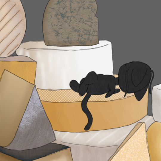
I blame my buddy @panpumapaints21
I also blame them for getting me into this show lmao, how dare.
full disclosure, I heavily referenced a pic of a pile of cheese from Google. And I only used a plushie I got today as reference for Plagg lol
#my art#miraculous ladybug#miraculous plagg#hipaint#i think medibang was holding me back i mean i have access to all these different tools with hipaint that medibang would never have#why cant i put in hex codes on medibang???#thats such a basic feature yet they decide “no lets make the app even more unusable with constant ads”#like ad 1 opening the canvas ad 2 fills the screen a few seconds after the canvas opens ad 3 through 59 whenever you save#an additional ad when you try to wxit the canvas and sometimes it dosent even exit and i have to sit through two fucking ads to exit#and then another ad when you try to export the image#with hipaint i get maybe one ad opening the app and then its chill#i was so hesitant to find another app to use for drawing because i didnt want to learn a whole new program and id rather suffer than change#but hipaint is so easy to learn imo?? and its so fun to just fuck around with brushes and tools and stuff#i sound like an ad lmao
7 notes
·
View notes
Text
on the topic of writing software
I want to ramble at you about some writing software options. 98% of the time I'm perfectly content with LibreOffice Writer (and previously I used Word, back when Microsoft products were less shitty). But every now and then when I have a new project (like now - more on that later) I start looking for something shiny and new to try. And I fell down into another research rabbit hole lol
I usually don't talk a lot about this bc my needs are very simple, and not sure how useful my opinion is to others, but I enjoy the topic. It's an intersection of creative writing and tech nerdiness and I like both of those things. Also what writing software you prefer really depends on the type of writer that you are, and everyone has a slightly different writing process and I find that fascinating.
Now, as I said, I'm coming at it from a slightly tech-nerd angle. I don't care if the installation is clunky, I'm happy to see the words open-source, and the need to create an account will already mildly piss me off (:
Don't worry, I'm not as intense as the guy writing his novel in Vim. Though fucking respect. And I can't say I'm not tempted to try it even with the steep learning curve lmao (Seriously, if you don't know Vim is notorious among software developers.)
Anyway, things I've tried so far:
Manuskript: this was listed as an open-source Scrivener alternative (though I haven't tried Scrivener. so.). I gave it a go when I was writing heart worth the trouble and it was pretty nice. It helped me when I had to move scenes and chapters around. But overall I think it was made with plotters in mind bc it wants you to enter a lot of information upfront. I'm not a planner/architect type of writer so this type of software is a bit overwhelming for me. Still, the fact that it's open source and works on Linux gets kudos from me.
Wavemaker: I recently played around with this, and I actually surprisingly like the features it has. You can put multiple books in a project, which is very nice if you like to work on different things, like fanfic, novels, etc. The mindmap is a feature I liked, though it's a bit clunky bc it collapses the text fields when you exit, and once I added an image field by accident that I could never remove lol I do like a bit of a snowflake method, so that feature is cool, and the cards are pretty straightforward too. Usually, my problem with these apps is that I don't even want to touch half of the features so they are pointless to me, but the features of Wavemaker were kind of nice. It's a web app that you can download and use offline but it's still working from your browser if that makes sense. That was what I didn't really appreciate. Also, it doesn't give you a lot of options to back it up. You either save the wavemaker file, export it into a document (which is fine, but it adds an extra step to the backup process) or you sync with Google Drive *shudders*
Things I want to try out:
Calmly Writer: now this is just purely a text editor that focuses on being very zen, streamlined, distraction-free, etc. It's pretty and it has typewriter sounds. (Yeah, I'm not immune to a pretty UI and harmless fun features alright? I can contain multitudes :P) It has an online version, but you can also download it, and works on Windows, Mac, and Linux. On paper, the desktop app requires a license, but the way they put it is that you can evaluate it for free and the evaluation doesn't have an enforced time limit... So. As good as free. (Though if I really like it, I would totally consider buying a license for 20usd that I can use on 3 computers, that seems fair. I appreciate a license over a subscription model for sure.) Honestly, I think this is the one I'm going to try next bc it just integrates perfectly into my writing process. That being: a multitude of messy, hand-written notes and notebooks + a document editor + backups on hard drive and GitHub (yes, really) ^^"
Shaxpir: This is on the opposite end of the spectrum basically, but out of the "fancy" ones, I kind of like the look of this the most. I like the statistics part in particular. But honestly, I probably won't try it bc it doesn't have a Linux version which would be a pain in the ass for me, and is cloud-based. I kind of don't really trust them, which is my biggest issue with these companies. (Although the creator's heart seems to be in the right place when it comes to AI. Basically, some of their features are based on machine learning and language models. For example, it will recognize passive voice, if it's an adverb with "-ly" or the emotion of a word. Which I think is all cool and fine and shouldn't be lumped in with generative AI. But he also had a website that did this analysis for already published works, and when people pointed out that it was sketchy, he took that down and I can respect that. I'm not sure how much it influenced the actual features of the app, maybe I'll just take a peek out of curiosity. The whole thing does make me have trust issues though lmao) If anyone has experience with it though, I'm interested to hear about it.
Obsidian: not a dedicated writing software, but rather an elaborate note-taking app. I heard good things about it from smart people lol If I really wanted to access my writing on my phone, I would probably use this bc it works on every platform and has end-to-end encrypted sync with version control. I heard you can also integrate it with GitHub which is always music to my ears lol But the setup probably takes a bit of time and I'm not particularly motivated to do that right now.
So yeah, those are the options that appeal to me right now. If anyone used these and has opinions, I'm all ears :D
137 notes
·
View notes
Text


Basic Reduxe Kitchen
CC Set of 14 BGC Items
A combination of my Back to Basics and Basic Luxe kitchens, because I really liked my mesh for the Luxe ones, but I will always love butcher-block tops more than any other kitchen surface. It's a pretty standard kitchen and I think the file names are self-explanatory, so here are some bullet-points-of-interest:
Like my Basic Luxe kitchen, the counter's end pieces have been changed to an alternate full-tile model and a half-tile model for more customization.
The cabinet also contains half-tile end pieces
This color palette draws a few swatches from the Basic Luxe palette, but I changed the hardware color slightly, and grabbed a bunch of colors from sforz's various palettes
The dining set packages come in two standalone versions: one set that matches the rest of the kitchen's swatches, and another set of 18 solid wood tones (bottom two rows of palette image)
Disclaimer: I re-mapped the UVs for the island tops and some counter tops, so the dirt overlays may be funky-looking. Since you're supposed to clean them when they're dirty anyway I decided it wasn't worth the effort to figure out a seamless texture for them (if you saw the uv map you would understand)
Download link below the cut!
There isn't really much to say about this one! I thought it was going to be an easy project (when will I learn?) but I found some mistakes in the original meshes (nothing big but I'm a perfectionist) and fixed them along the way, which took extra time. And then I spent forever trying to decide on colors, and then trying to trim down the count (I cut 2 whole wood tones which helped decrease the number by about 30%).
I also decided to do custom thumbnails for these, because I liked the way they came out in my Basic Luxe set. I spent about three days manually generating, exporting, editing, and importing thumbnails (and even set up an auto-clicker program to help me!)... only to find out that S4S added a "catalogue thumbnail underlay" option in one of their updates. I'm still mentally recovering from that (read patch notes!!) 😔
Anyway, at least I got to play with ReShade a bunch! I've been mostly using it for screenshots in ESO, which is an online game that I can't pause, so being able to take my time and play with shaders and get juuuuust the right look was a real treat!
I use Peacemaker's No Occluder mod to prevent weird shadows from appliances/cabinets.
Credit: Kitchen Clutter | Solid Wood Texture by @myshunosun
Download (Patreon) Always free, no ads.
780 notes
·
View notes
Text
Inbox Status: OPEN
How to Search Blog For Specific Sprites
This blog is dedicated to exporting the in-game artwork and archiving development updates for Fear and Hunger and it's sequel, Fear and Hunger: Termina. Please see below the cut for details on how I run this account, as well as the tagging system I use to make finding certain images easier.
Pinned last updated on: June 26th, 2025
Reason: Added a new tag, "artwork and graphics".
Blog Guidelines:
I post rips/archive works up to once a day, aside from answering asks or blog updates. I run on a queue usually. I may post less frequently depending on how busy I am.
I will not answer requests directly, but I DO read every request and try to get to them in order. It's just me here, a one-man band. So please be patient if I do not get to your ask/request soon.
There is a 30 image limit per post, so I will space out requests and similar content across posts if needed. I will leave links on each post that has another post that directly connects to it.
I try to answer and post requests as precisely as possible, but please note that an unclear or overly broad request will have to be taken with a grain of salt. It helps if you specify the game, and request something small or very specific. A general request for more of a certain character is acceptable.
I am open to revisions if I am incorrect about anything I state on this blog. I try my best to research where sprites may or may not be used, but I do not know every little thing about the series. If I make major revisions, I will state it in the post after editing.
I do not require credit. I don't really care, it's not like I made the art. If anything, credit Miro. However, if you wish to credit this blog or link to it, be my guest. No yums shall be yucked.
I am not the original owner of this blog or the idea of archiving in-game content. This blog, "funger-rips", was owned by someone prior before it was deleted. I am only mentioning this because all of the content they ripped was deleted. So if you think, "I swore I saw this ripped before," that's maybe why. I do not know the original owner.
Please no joke asks/requests! Unrelated questions about me, the blog, miscellaneous stuff, etc. are acceptable. Just no joke content that's rhetorical that I can't really give a reply to.
Q&A:
"Who runs this blog?"
Just me, a lone fella, no one in particular ₍^. .^₎⟆
"Are DM requests acceptable?"
Yes, though I say that hesitantly- it's harder to keep track of what I need to work on if I have multiple sources of requests to check on. I prefer the inbox.
Blog Tags (I will update as I make new ones):
#sprite rips: The bulk of this blog. I go into the game's files directly and convert the artwork into usable png's.
#devblog content: Archive of any "third party" content Miro posts. Includes dev screenshots, YouTube videos, teasers, old scrapped content, etc. posted on his various socials. Sources will be given. I will NOT archive something unless I have definitive proof Miro posted it.
#mod talks: Blog updates and maintenance content. Mundane stuff that aren't rips or archives.
#askbox: For when I answer asks directly. I only answer asks if they aren't requests, just actual questions about the blog or what have you.
#battle backgrounds: The background art used as set pieces in combat in-game.
#inventory items: Full and mini sprites of any item you will find in your inventory.
#ui and related: Anything constructing the game's UI and menus.
#overworld sprites: Sprites found on the overworld, outside of combat.
#maps and tilesets: Any in-game maps and items that function as the game's overworld.
#battle sprites: Sprites found exclusively in combat. Excludes any battle backgrounds.
#artwork and graphics: Any still images used for events, cutscenes, etc. that do not belong to any other tag. Also includes standalone artworks by Miro himself, in-game or not.
#moonscorched: Any moonscorched content.
#unused content: Any content that is found in the files, but not used in-game. Includes things like "beta" versions of designs.
#sprite edits: Whenever I post a sprite that I actively modified outside of cropping. I only modify content for informative reasons- such as comparing canon and non-canon content, or stuff between games.
#videos, #gifs, and the characters' names are all self explanatory.
64 notes
·
View notes
Note
Hi! I was wondering if you’d be up to share how you made the before and after slider on this post:
https://www.tumblr.com/freckleslikestars/780305824654540800/before-after-gif-colouring-challenge
It’s really cool! Thank you!
Aww thank you so much! I literally had a dream about doing this two weeks ago, and when @sophsun1 tagged me I was like "oh my gosh lets try it!"

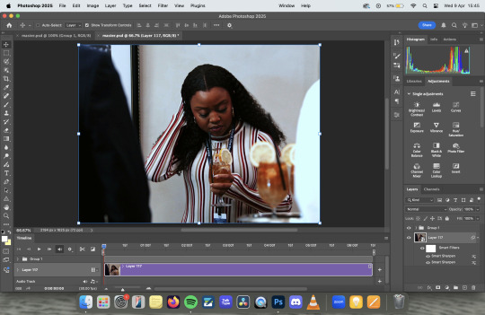
Now, before we start, I'm going to assume basic knowledge of gif making, colouring, etc. I'm using Adobe Photoshop 2025, but you should be able to adapt the steps for pretty much any software that has a timeline and allows for vector masks.
Once you understand key frames and vector masks, it's super easy to do!
First, we're going to open our gif in video timeline view, with our colouring already done. (My colouring is all in "Group 1")

Next, I converted the footage to a smart object, leaving the colouring as it's own independant group. This isn't technically necessary, but I do this to a) apply sharpening and b) so my layers tab is less cluttered. This is normally also where I'd make sure my image size is correct (I do 540X400 pixels) but I forgot so I did that later on this one.
At this point, I turned some guides on and, using the rectangle tool, drew a rectangle that was around the size of the canvas, clicked to the last column on the right hand side.

The next step is to turn it into a vector mask. With command held down on a mac (I think it's alt on windows, but don't quote me on that) drag the rectangle layer onto the colouring group layer. It will fill in the whole canvas with colour.

Delete the rectangle layer, so that you're just left with the gif itself and the colouring layer with the rectangle vector mask over the top.

Next we're going to animate it, so you need to open the dropdown for the colouring layer on the timeline, and you'll want to scroll down to where it says Vector Mask Position

Making sure your playhead is at the very beginning of the gif, click on Vector Mask Position and drop a keyframe. Then, move your playhead to the very end of your gif and drop another keyframe - at this point you don't need to move the vector mask at all.


The next thing you need to do is find the middle of your gif - this doesn't need to be overly precise, particularly with longer gifs, but the precision means that the vector mask moves at the same spead both ways. Drop another keyframe there.
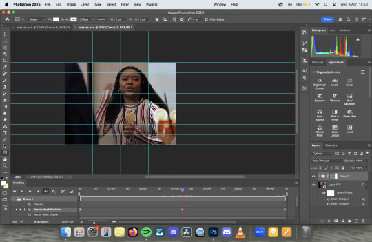
With the playhead over the keyframe, select the vector mask on the layers panel and using the move tool, move it across to the first column on the left. I personally prefer to use my arrow keys to just nudge it left, rather than faffing about with clicking and dragging.

If you were to export it at this point, it would be perfectly fine, you'd get the moving vector mask to show the before and after, which has a pretty cool aesthetic all of it's own. But lets add some details to make it look like a before and after sample image.

I started by adding the BEFORE and AFTER - I used Adobe Clean as my font, but font choice is really personal preference. I just centred them in the bottom left and right squares of my guidelines. I then drew a white line, using the line tool, down where the divide is, added a couple of rounded arrows (and lowered their opacity), and merged the three of them together (keeping the text separate).
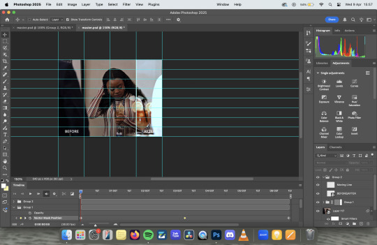
Then I simply followed the same steps to add key frames to the line in the same places as I did with the vector mask, making sure that the centre one was nudged to the location for the vector mask on the centre key frame.
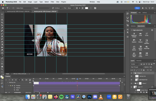
Export as usual and et voila!
Something to note is that this effect works better with longer gifs. As you'll see, this X Files gif was a touch too short, and so the slider feels a little too rushed:
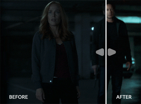
Also, if you're wanting all of the sliders to move at the same time/speed, you're going to want to make sure all of your gifs are the same length, which I didn't do because I'd had a long day and I was procrastinating from postgrad work for an assessment I have tomorrow. Which is incidentally what I'm also doing right now.
Anyway, there you have it! Super simple when you know how! If you have any further questions, don't hesitate to ask! :)
#my gifs#gif tutorial#I genuinely love the colouring of that Abbott gif. The X Files one pisses me off because it started off so dark#that when you don't see the comparison it looks like i did absolutely nothing. but the comparison makes it slightly better
25 notes
·
View notes
Note
Hihi! I'm the anon from the MN talk sprite ask I'd love to hear about your sprite genius science haha :-D
Ps to say that I'm a huge fan of your work just in general
first of all THANK U SO MUCH WAAH....... im so glad you like our stuff TvT !!
second !! ill hop to the sprite explanation right here! i'll put it under the cut bc it might get long eheh
and a note: im using csp but this should work with any program! i previously used ibis for my talksprites before remaking them ^^
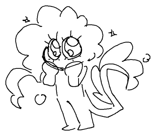
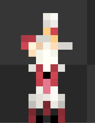
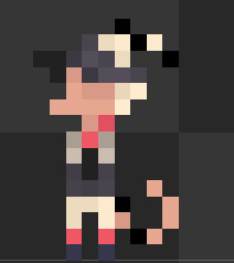
for my example subject, i'll be using ace! they'll be my best example since theyve gotten more use so far!

quick notes about the background; i always export my canvas as transparent to give the image that they're just a Part of the post/environment. the nametags and gradients are optional, but i feel the gradients help fill dead space and add a bit more to it- the nametags help in emulating the feel of video game dialog too (i dont tend to have the patience to actually make pokemon textboxes because i have to do it manually, so putting this over post text is my next best option.. makes it easier for chattier people, and gives screen reader accessibility as well!)
ANYWAYS, now for the actual Building of the Sprite!

where i usually start is with a base sketch of their neutral expression. i have two for All of the modern/updated talksprites, because i had initially wanted to put them at an angle to add a bit more flavor to them.. ultimately though, i stuck with the symmetrical style for my personal quality of life. i find it easier to work with and add to- i just have to be very meticulous about getting the proportions right is the main thing ^^'
now, from the sketch is the natural next step of Lining shit! and heres where the method of madness starts, because a big part of this entire thing is...

this . im so sorry about this image.
if you look at the layers, you'll see the general order of operations! basically i try to look at it as different Pieces, or Assets. its like a paper doll that you're assembling- the pieces that go behind need to go all the way in the back, then you build up. the back of someone's hair goes behind everything, then their body. then their clothes, then head, face, face accessories, bangs, and finally cartoony emotes on the very top if that's your style.
generally, i try to set my layers up for maximum customization- mixing and matching it the key for making my talksprites as versatile as possible. so stuff like having a base body that you can add changes of clothes too, using clipping layers to add shadows that would go over everything, that kinda thing.
but overall, having layer stacks worked out like this is the MOST important part, imo, for doing these talksprites. when it all comes together, the result is a clean basis for mixing and matching however you might need for both expressions and appearance. i keep everything in folders of Lineart, Shading, and Color as well, just in case i need to revisit or add to something premade later.
speaking of adding- this also allows for you to easily make any future assets for changing appearance and expression! i personally do it case-by-case, as i can't ever anticipate every expression or article of clothing i'd Ever Need. when something new is needed, i'll just make the new thing, and then it's just another piece to have in the mix! it's pretty nice! :D
tip: god remember to name your layers/folders. i used to Not and it made finding the pieces i need so hard. doing this method will result in a LOT of layers. be nice to yourself and name things accordingly!

now focusing in on the most important part of an expressive talksprite, heres the face, and the best way ive found to stack the layers so far. within all of these layers are the pieces of expressions that can make countless matches if you add enough to them. fun!


now the Eyes. the eyes . the eyebrows and mouth are pretty straightforward you just Draw and Color them and boom theyre done. but i want to draw special attention to the Eyes because figuring out how to do these were probably the thing i struggled with the MOST. its a system thats a bit more in depth than just. Doing it. here's what we got though.

the optimal stack for maximum eye expression that ive found? do lines and the coloring for those lines. SEPARATELY.
the idea is to make irises fully round so you can move them around or have wide eyed expressions without any weird cutoff in parts you failed to draw (looking at my old sprites. sighs). but to avoid having to delete or erase anything, the iris folder needs to clip onto the eye whites folder so you dont get stuff like

this . yeah.
and another thing i had to learn the hard way is that if your character has stuff like eyebags or makeup, and this is the reason my "lineart layer" has folders, if that if you put that stuff on the white layer, the irises will sit over THAT as well as the whites, resulting in some annoying little things.

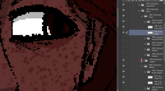
see: ace's eyebags in the whites layer, VS ace's eyebags in the lines layer.
ofc this is unnecessary if you dont add that kind of detail to your own characters- in that case, the lines layers can be as simple as just being lines!
with all that, the eyes more than anything are layers i recommend having properly named. you'll need to have the right whites with the right lines, so being able to find the two pieces with the same names is important! else you could get fun bits like this:

i dont think eyes are supposed to do that.
and generally, that's the most important parts of making these that i'd say! i have a few more tips, but theyre mostly little things that are moreso optional that i'll rattle off real quick-
for shading, i just use solid black shading with a lower opacity (i know, booooo). it's the quickest and easiest way to ensure they're both consistent, and covering everything in the same way. tbh i dont every see shading as necessary for these- but it adds just that bit more of depth and extra visual appeal to it imo
a general rule i use for characters with facial hair, which is Several in missing numbers; beards go with the head base, mustaches should be redrawn with every mouth. when someone with a mustache or stubble is talking, its usually gonna be moving and contorting with the shape of the mouth:


having it be static can range from a little off, to just Weird with more extreme expressions. but thats mostly because my style leans more realistic- if you've got a more toony style, i dont think having a mouth overlapping a mustache a little will be too bad!
this is just because i put a lot of detail into stuff and is SUPER optional, but one thing i do is have two different head bases for whether a mouth is open or closed. the jaw is opening is gonna result in the chin going a bit farther down, as opposed to it being closed! all i did to make it was take the original head base, grab the jaw area, and lower it a few pixels, then filled in the gaps. work smarter not harder
when moving the irises around, i prefer to duplicate the base layer. usually to get things to look right, you'll need to move the irises independently, so its good to just have the original stay as it is because getting it back EXACTLY how it was might be difficult. plus, you can keep the moved ones for reuse later! ^-^
if your art program allows for a universal symmetry ruler, awesome! make sure you know exactly where to put it later to add to your character! and if you use a program like clip studio (like me) where the ruler only applies to one layer; at least for csp, i can put it on a folder and it applies to everything inside that folder, so i just put all the assets in one Big folder and put the ruler there. i dont know every art program, but hopefully that still helps??
if your character has strands of hair that rests in front of their shoulders like ace's wisps or leafs big old strands, draw them as a part of the bangs or put them in the same folder so they properly sit atop everything else!
ace doesnt have any hands yet, but those would go at the very top of the layer stack. heres our lovely assistant for an example!

and for now, thats all i can really think of!
these talksprites aren't ideal for a lot of bodily motion, but for stuff like that, i figure thats where hand-drawn pieces come in. generally, i have these setup to make work on updates a bit easier, as it takes me a while to draw entire original pieces (and i struggle to focus. this is in fact why the blog suddenly went quiet again), but i still want my posts to have that visual flair to them! doing an entire visual of a character from the ground up is a fair bit more work than just. drawing a symmetrical mouth onto a guy, so i've found this whole mix-n-match type of talksprite thing a godsend ^^
anyways !! i hope i explained that well enough- good luck with ur endeavors, and i hope i get to see it!! :O
and please feel free to shoot any other questions my way if you need anything else!! im always happy to explain and help :D
and as a blog teaser for whoever gets all the way down here, a little something for your time... ive hired these three trainers to stare at you


#mn diary#hoping this is comprehensible TuT thank u again anon ur so sweeet auhjndkfdklssnkksldjn#i hope this helps anyone who sees it n wants to try!#hell did something similar for green but exported his assets into some picrew-adjacent site for his own ease of use#so thats also a thing but idk how that works.. i like my methodical madness lol
9 notes
·
View notes
Photo

Hinge presents an anthology of love stories almost never told. Read more on https://no-ordinary-love.co
2K notes
·
View notes
Text
updated stage settings: (that literally no one asked for!)
assumes knowledge of photoshop and a working vapoursynth. if you don't use vs, you can replicate with mpv - though sharpening will most likely need to be stronger, since i use finesharp in vs.
when using mpv/screencaps, i recommend importing as a dicom file! it loads faster and is a little clearer in my opinion. when using screencaps, only crop once. if you need to change the dimensions, zoom, etc., i would undo to the full size you imported at or it will lower your quality.
examples: an ending fairy of cravity's seongmin, and a typical stage set gif (using a close-up) of tripleS's kaede. shows the steps, effects, and goals of sharpening and coloring, but does not share psds or actions since i recommend using your own unique sharpening and coloring style. psds cannot be provided (i didn't save them) but i will share my actions if asked to! the actions i used are the two i almost always use (with a few exceptions) on stage gifs.
no keep reading because it ruins formatting (2 images side by side), so apologies for the incredibly long post!
ending fairy:
run through vapoursynth, resized (540 x 420) and sharpened with finesharp set to 0.7 (the last # in the fs code). not preprocessed, as i wanted the normal speed and exported it with a .04 frame delay!
sharpened using my stage sharpening action (4 diff smart sharpens)

colored using levels (using the eyedropper on what i want to be pure black), and curves (done to add contrast, using only the rgb channel)
colored (prev step still visible) using exposure, with the exposure upped and gamma around .90. also used brightness and contrast to get the look i wanted, while also keeping highlights in a range that i can edit (going too bright or too high contrast makes my later adjustments less effective)
colored (prev steps visible) using hue/saturation (adjusting the hue, saturation, and lightness (to the negatives) of reds and yellows), and selective color (fine-tuning tone of reds and adjusting whites)
colored (prev steps visible) using selective color (adding back some white and adding cyan to it), and hue/saturation to further fine-tune (red + yellow), and brightness and contrast to get the final brightness and contrast/clarity i wanted.
the original (resized and with vs finesharp) masked over the finished
close-up:
run through vs, resized (268 x 490), preprocessed 60fps slow, and sharpened with a finesharp of 0.7

sharpened using my master mv sharpening (i changed the gaussian blur 500 from .04 to .03, + the unsharp mask is set to 50% opacity)
colored using levels (on what i want to be pure black, her hair by her ear in this case), and curves (unlike seongmin's which just adjusted rgb, i also changed the blue and green channels! i do this when it is not an ending fairy but several close-ups to try to make the coloring more consistent across lighting changes (i also do it on more challenging lighting from other sources))
colored with exposure (prev steps visible), with exposure upped (+) and gamma adjusted (~.90), and brightness and contrast to get the look i want (same highlight forethought as before)
colored (prev steps visible) with hue/saturation (adjusting hue, saturation, and lightness of reds and yellows), selective color (fine-tuning tone of reds and adjusting whites)

colored with selective color (adding back whites and adding cyan to them), hue/saturation to further fine-tune, and brightness and contrast to get the final look and clarity
optional, but nice for multi-shot sets: another hue/sat above your last brightness contrast, only adjusting background colors for cohesion when paired with the other gifs of the set

also optional: change speed to be faster, depending on the look you want. i tend to use ezgif.com/speed and do 105% speed
the original (resized, vs finesharp, preprocessed to 60fps slow) masked over the finished gif. the one on the right has been adjusted with ezgif at 105% speed

14 notes
·
View notes
Text
Tiny cc making tips
Over the years of making cc i've picked up some tricks along the way. These are just some of them in a tiny format. So not a tutorial of any kind, just some tips and tricks! I'm sure many are already doing some of these things and some might require you to Know things already. This is NOT the only one way to do things, it's just how I do things. I wont go in to super detail since it's not a tutorial but i'll try to add as much info as possible and then let you figure it out. Or send an ask.
When naming things, images, packages, blends, whatever files in relation to cc making, create a naming system! Trust me when i tell you it will make your cc making process a lot more streamlined. My system is as follows: "BG maxi dress flower on shoulder pink fem". What we learn here is that it's a base game maxi dress with a flower on the shoulder, and it's the pink swatch. This way, if it's a blender file, i know i can export the diffuse map directly inside blender if i need it later without having to locate the dress in s4s. Fem is there to show what frame the mesh is from without having to open it. Same goes for "masc" items. For example "CL open jacket long sleeves turtleneck camo blue". This tells us it's city living and an open jacket with long sleeves in camo blue and has a turtleneck. Note: sometimes a pack name will have a similar abbreviation, like Cottage Living. My way is just adding another letter or two, COL. Or if the pack only has one word like Toddlers or Strangerville, you could then call it TOD and SV for example.
Make folders! One thing i find that makes things a little easier is that i make folders separating things. So first i have the project folder inside my cc making folder. Let's say i'm making a short satin dress, i'll make a folder "Short satin dress". Inside there i'll make a folder for blender files and one for image files. Inside blender folder i make a folder for lods and inside image folder i make folders for swatches and one for maps. If you're making a fem and masc framed version of the same thing, separate folders by frame as well, so you have a main folder inside "Short satin dress" for fem and one for masc etc and so on. This is so you don't mix textures and blend files up, because for example, sometimes the diffuse map sits differently on a masc frame mesh compared to a female framed mesh.
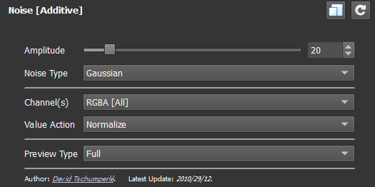
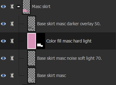
One thing i hate about making cc (other than MAKING cc.........) is making textures. I'm not good at it and this d.o.a game eats textures like it's the last can of catfood in the world, compressing it to hell and back. One thing i've learned and my friend @faaeish told me about is that adding a bit of noise helps! What i like to do, once i have finished my base layer i know i will recolor later, i make a noise layer out of it using "Noise [Additive] with this plugin and i do Output mode: New layer(s) at the bottom. I use gimp but this plugin can also be used with nearly every program under the sun, including ps. It's also online based. You can play around with the settings but i like to use something like below. One thing i realized well, just the other day is that, if you use RGBA noise instead of gray noise, it adds a bit more depth and texture. But not too much! Just a smidgen, to give the texture and the color fill layer more pixels to cling to and it will minimize the risk of artifacts. Ugly blobs, essentially. Once i have that noise layer i alpha to selection on my base layer, invert and sharpen and click the noise layer to remove the access around that the filter adds. I'll also clean up any alpha channels, filling them with white if i need to. Then i play around with layer modes on the noise layer, add a color fill above that and maybe i'll duplicate the base layer and put above the color fill layer. Like below is an example.
Next is a thing for blender, tiny miniature tip but that i find helps me. And that's this little plus sign button when you "Save as.." in blender. So what you need to do when you FIRST save some edits on your mesh, say you swapped the sleeves out. You "File-Save as..-bg no pockets tshirt rolled up sleeves blue fem LOD0_edit0. 0. Zero is important. You need to save the very first save as 0. Next time you make any changes you Save As and click the plus and it will just change 0 to 1. Next time 1 to 2 etc etc. To me this makes it easier to go back in case i mess up. Which i sometimes do. Like the other day i noticed fingers were messed up and i had to go back to nearly the beginning of my edits to pull original fingers and sleeves from. And i always save right before i make any major edits.

That's all i can think of right now. I'll put a read more in case i think of more later. Hope this helps!
ooo 👻 welcome to under the cut aaaa 👻. But look at this photo i took of a photo i found among my grandmas old stuff. I guess the crops were hung that year.
30 notes
·
View notes
Text
DQ Project Update
I am still working on my Minecraft DQ1 Overworld Remake. I just lost motivation for it mostly for the past few months. Here's my current progress on the terrain with worldpainter though:

Just finished up making Charlock Isle yesterday. The forests, and biomes didn't show up when i exported this image though (Open this image in another tab, it's larger than you think!). This world's chronologically takes place in-between dq3 and dq1, so certain things will be changed accordingly. Here's a small list of changes, and new locations so far:
Damdara:
The town has just been laid to ruin so there's still burning bits and loot from the shops left. Based off the dq3 version.
Mercado ruins:
These ruins are located a little to the north of Cantlin. Uses Cantlin's other localized name.
Tower of Rubiss:
Hasn't deteriorated into the shrine of rain yet, but still has the shrine in its basement.
The Tallest Tower:
A dungeon from DQ7 that i added because i wanted to. An elytra will be found at the top.
Tomb of Erdrick:
Added a small ruined village above it.
Galenholm, and Tomb of Galen:
Tomb of Galen now has it's own separate shrine above ground. Just being some stairs hidden in the back looked silly to me.
Radatome:
The town portion of Tantagel. Again, named after the other localized name.
Tantagel Castle:
Still need to build it.
Ideas for other builds, or additions are greatly appreciated. I want to try to add lots of stuff to explore to this world, and currently don't have very much to show for it. Recreating this overworld at this scale will take a lot of time, and my motivation to do so fluctuates with my adhd. Patience with my lack of updates will be greatly appreciated.
5 notes
·
View notes
Note
i know you make a lot of ur cc and i wanted to ask you something. if you can help me i’d appreciate or if you could direct me to someone who can.
i’m trying to make a custom outfit using another cc mesh. Don’t worry i’m not uploading it or anything, I just want to put it on my sim. all i wanted to do was add another swatch that just had another color of the shirt. I downloaded the texture and added what i wanted on it. When I go back to my projects in TS4 studio and click on the original mesh and try to add the new swatch. the sim turns into these white and gray pixels instead of the regular plain sim. The new mesh is there and looks good but when I went to put it on my sim he turned white. How can I get it to look normal?
Oh yeah I can help! You just gotta export it with a transparent background after you edit it. Idk what you're using to edit it, so idk what settings you have to change to make the background transparent. I just did an edit so I'll show you an example. When you save the image it should look like the image on the right, not the one on the left. Otherwise the white background will overlay the rest of the sim map which turns everything on them white. Oh and make sure you export it as a png with the same dimensions of the original texture.


#text post#asks#i hope this helps!!!#i hope it's what you meant its hard for me to know for sure without seeing it
3 notes
·
View notes
Photo

Hinge presents an anthology of love stories almost never told. Read more on https://no-ordinary-love.co
553 notes
·
View notes
Text
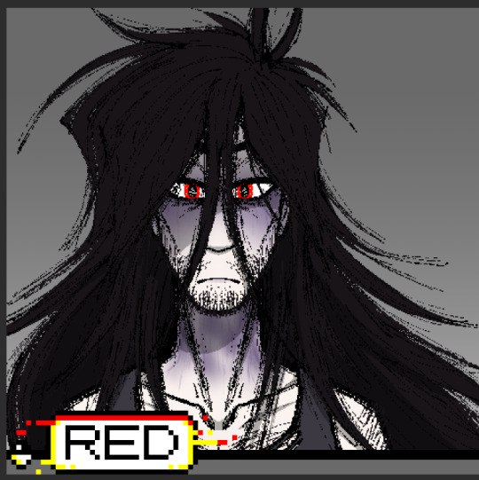
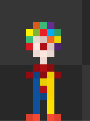
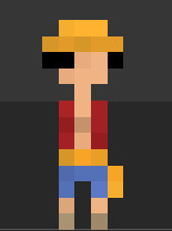
alright, so you guys have been way too fast with these!!! anyway, as i said, here are some sprites and info about the game, as well as a few extra tidbit sprites i made in another project. (also, you may notice that these are all screenshots from the editor and not actually the full exported sprites. this is because i am but a sludge and make my sprites wayy too small to appear satisfyingly)
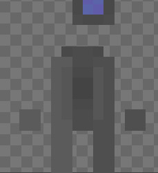
This is the player character, though I've yet to name it. first person to suggest a name gets an image of an egg. they're meant to be a robot with a screen head, but it may be a bit difficult to tell from a 22x22 sprite. there's not much (like. at all) story to them yet, but I'm hoping to do something fun with them. maybe a nuclear bomb. they also do this fun arm swing when they walk which i find adorable. if i ever find a way to record that, im sure someone would enjoy that.
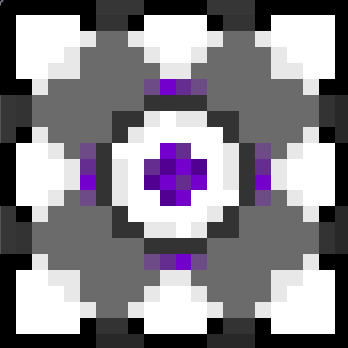
this is the temporary block sprite that I'm using as a standin before i get a solid sprite down or even make the mechanic!! as you can see there's a heavy inspiration from portal, lol. the purple middle part rolls around in a point (aswell as i can show in 3 frames of animation) and the outer purple lines fade in and out.
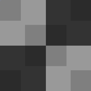
these three images are the tile system i've set (as in drawn and thought about lol) to be in the game! the leftmost tile (black and gray) is ones that the player will mostly walk on, but the block cannot be moved onto. the middle one (gray) is the ones that the block can be moved on, and the rightmost tile (red and black) is a button that the block would need to be pushed onto! when added together, they look pretty matching, but it creates a weird and sort of annoying effect when you're trying to watch yourself move, so I might change it later on.
this is the wall sprite! there's really nothing to say about this one. it's a wall.
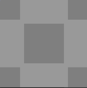
When added all together, the room looks something like below:
as for the main plan? literally none. im going to do these things as they come. im going to catch the hat when it hits me. im hoping i stick to a puzzle game game, and maybe add some witty dialogue or story, but until then, nada. zilch. third word meaning nothing.
and that's about it for the game so far!!! what follows is just some sprites i made for fun in a previous (now very canceled) project that i might use as easter eggs later on. you get an egg if you can name each of them.
Note Post!!!! note post!!!! note post post notes!!!
so for the one, two mutuals that have actually seen my art share posts I have mentioned that I have been trying to get into game design and development as I want it to be my future career!! i do really enjoy it but unfortunately I'm having a bit of issues getting motivation to do that. so!!! notes.
5 notes - I open Gamemaker Studios to check over my code, all about 15 lines [Completed!
15 - I share sprites and general story/plans for game (do NOT expect much, I am but baby and this is basically meant to be an exercise!!) [In progress
30 notes - start trying to code a planned push block puzzle mechanic which the game will center around [In progress
50 - try get a second and more levels to work, somehow [In progress
100 - add sound to my game, again somehow because I have no idea
200 - add new mechanic for each new level (max of like. 5)
300 - add some semblance of dialogue, little and bad as it may be!!!
500 - set up an itch.io (probably won't be final platform) and release first drafts or play tests on it for free!!!
700 - uh I don't know. I'll add a 2 minute long video of Wheatley from Portal 2 somewhere
RULES RULES RULES!!!! max of *10* reblogs!!! maybe 30 comments. tag whoever.
tagging @enemylv1 because I know you'd kill for a chance to reach post limit for a goal. @k1m4r4 @liv-log @spongebob-ssnail
#gamemaker#gamemaker studio 2#also if there are any suggestions or criticism please let me know!!!!#im trying to learn as much as i can in both coding and pixel art#so anything is appreciated!!! except salmon.
279 notes
·
View notes
Text
Drawing my character

My most successful sprite was heavily inspired by the below sheet as I liked the look of it. However, stealing the sprite would be plagairism so I iterated on it until I was happy with what I had and felt it was original enough. My first try was a pinstripe suit - this wasn't great on the torso and became absolutely unreadable on the arms. My next attempt was via adding accessories, and this looked a lot better. I looked at typical mobster hats and noted the wide brims and bands around the base. This served as the inspiration for my second hat [the first looked like a WWII helmet which is weird because I can't draw them] - I planned on a darker spot at the centre top for the indent, but didn't have space. A shadow underneath was added for effect, but I later removed this. Trousers, a belt and suspenders were added because they were popular at the time the game is set, and wouldn't obscure the skelton's silhouette like a suit jacket did.

Other designs included the following, and each one looked bad.


My first shot at making him look like he's running gave him a galloping animation unfortunately. Not ideal
I evetually remade this animation at home using the below guide and, although I found it good enough, I really liked it once implemented in-game. I also offset the movement of gun/arms with the hat to make the character feel more dynamic which was a problem with the old animation


After using the outline normal map script, I created normal maps for my sprite animations. However, implementing them was difficult. I couldn't apply the normal of one sprite to another, nor could I apply the normal flipbook to the animation flipbook. Eventually, after following the below guide, I realised I could apply the entire normal map sprites texture to each frame, which worked. Below is the effect.


skeleton pride flag jumpscare

Initially my windup jump animation was comprised of 4 frames with anticipation and recoil, however although I was really happy with it, it took too long to play in game. As a result, I reduced it to this frame.
I had also forgotten to set the gun and arms to be visibile when I exported it - I didn't even notice why it felt weird until the day after. The normal was created by flattening the image and creating an edge normal and this was ok, but I felt I could do better

I tried running the script on every layer and it looked pretty much how I'd expected it to.


However, once implmented, I loved the amount of lighting detail I had. It wasn't perfect, but it made me realise that lighting per layers looked a lot better.

This was [eventually] recreated with my run animation. I tried using the sprite sheet but that had no layers so I had to manually copy every layer of every frame which sucked, but I'm fairly happy with the result.
0 notes
Text
TREES
20/11/2024
Okay so I was thinking about this a lot in terms of the time frame thats left for this project. I could either spend a load of time in Blender making a bunch of custom trees or use this free open source program that will make trees much faster (TreeIt). I'd found various tutorials online for Blender that seemed Lengthy at most, but then stumbled across this video PrismaticaDev for the process of creating trees and folliage in TreeIt then importing it into Unreal Engine.
youtube
I think I am going to try this tutorial first to see if I am happy with the visual outcome of the trees and then post the results below. I terms of tree colours and types I think the main ones I want to make are circled in the image below:

I looked at some images of stylized trees to gather colours I think I will need a variety such as Green (obviously), Pink, Orange, Yellow, Brown, Blue, Red. Here are some of these images:


While looking at these images I also came across another video which combines the Treeit and Blender workflow together. I think this could be a good backup if I dont get the results I intend for out of the first video.
youtube
21/11/2024
Tree Modelling:
I've spent the last 20 minutes customising my first trees base, Ive got a rough shape which I think will work very nicely for our game. Here is what I have so far:

After adding some branches:

Adding Leaves:

After export it into Unreal engine I was met with this:

Clearly I was missing something here so I decided to have a look through the videos comment section as it was 3 years old now. I couldnt find much on the matter and as I'm not too familiar with this program I thought it was best to look elsewhere for solutions.
After a bit of digging I came across this video which explained what I needed to do. Pretty much the issue was that the textures in Treeit do not cross over to Unreal Engine. So you have to make them yourself. Luckily this video walked me through it
youtube
Here is what my first tree looks like, for a first attempt I think its pretty good!:
22/11/2024

So this morning I used what I had learnt yesterday to generate a tree nice and fast in Treeit. I made an Oval Tree which I think is pretty decent looking. This time though I made sure to include a higher amount of leaves as I found my first tree was a bit 'gappy' in engine.

Here you can already see a nice big improvement with a lot more leave density. An Issue I also had to look up was how to make the leaves double sided as they were acting like planes because when you moved around the tree and viewed them from behind they became invisible. To solve this inside the material for the leaves I just had to enable the 'Two Sided' option in the details panel.
27/11/2024
I started work on the Spreading Tree inside Treeit:

Inside of Unreal:

28/11/2024
For today after the performance optimizations I have decided against making anymore trees I think having 4 is a good amount which I can resize and shape to my liking throughout the world. I think it is best now to focus my time on other aspects like the Boat or Landscape materials.
0 notes
Text


Third process journal entry (2/2)
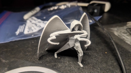
Then came the fun part: actually trying to print the darn thing. (When I say this caused me and my dad such a headache…)
First off, we stuck it in the splicer to see if anything was odd or out of place. Immediately there was a problem—the legs had holes in them (image 1). This was why the torso fell out when I tried to print it before. In Blender the model looks fine, however we discovered that the faces connecting the legs together did not have solid objects beneath them.
My dad tried to help me research how to fix this issue. There were some forums that suggested changing the normals (that is, the directions) of the faces. That didn’t work. There was a plug-in that showed where the holes in the process of 3D printing would occur. That was helpful, but it didn’t actually solve the problem. In the end, I resorted to the simplest solution: manually adding in cubes, shaping and overlaying them with the legs to fill in the gaps. (I had to do so many…)
There were other issues as well. The hood was originally too thin to print, so I had to somehow make it thicker. Searching online, I found that alt+s allowed me to scale an object, not along a single axis, but from each of its faces, expanding the shape as a whole and making it thicker. This was a total lifesaver because I didn’t know how else I was going to make the hood printable.
Another issue was the sickles. For some reason, the splicer wasn’t connecting the blades to their handles. After much finagling—altering the model, exporting the .stl file, emailing it to my dad, going back and forth to his computer in the other room to use the splicer (why didn’t I just bring my laptop with me?)—I used the same trick of filling the gaps with cubes, and it finally worked. (Although, the internet went out before I could check the final design, which I took as a sign that it was time to quit for the night and go to bed.)
My dad spent the next day helping me with the printing. We used the super fine quality setting—better for detailed designs, and a tighter fit would make it less likely to fall apart. This thing tested our patience—we had to do multiple prints, stopping them when it was clear they weren’t coming out right. Mainly it was figuring out the supports. Technically, the wings could be printed without any… except that the angle they were at caused them to fall over halfway through. The answer? Supports. Manual rod-shaped supports for the wings and legs, automatic tree-like ones for the arms and sickles (image 2).
After much bashing of heads against walls, the print was finally coming out all right. I checked on it periodically, becoming more and more excited as I saw it wasn’t falling apart or devolving into a spiderwebby mess. When it was done, I couldn’t believe my eyes. It was real. The design I’d crafted on a computer screen was right in front of me in all its solid, plastic glory. Dad helped me remove the supports (image 3), a process that made me a bit nervous as the figure could easily snap and break if we weren’t careful. But the surgery went well, and my angel was free to stand on his own two feet (image 4-7). There’s some warping on his left leg (the problem one), but as far as I’m concerned all that matters is that he’s in one piece.
Next is to clean him up a bit and attempt to paint him (with the help of my artsy younger sister). I’ll also fill you in on who this character is, since I realize I haven’t actually done that yet. Too bogged down in the details, I guess. 😅
1 note
·
View note
Photo

Hinge presents an anthology of love stories almost never told. Read more on https://no-ordinary-love.co
320 notes
·
View notes
Text
Blender - Animation
I have used alot of tutorials to try and create the animation that I was looking for. It has been really difficult and time intensive as I don't really have any experience with animation.
Hopefully I pass.
Animated Flower in blender

Initially this was what I was going to try and construct. It took hours to try and construct each of the leaves as I had to get used to the keys in the program. I then had difficulty with the verticle add and didn't realise I would need them to create the tendrils. I progressed on and thought I would just be able to illuminate the flower. This tutorial included nodes and textures and using the clouds texture to have the leaves moving. I attempted to follow the tutorial but ended up not being able to complete as I had changed some of the constructs of the flower extruding and bevelling and changed the shape therefore wasn't able to select the outside. I did write some instruction down and tried to animate the leaves with empty to diplace the textures but I was unable to set up the keyframes or change it too linear. I gave up!
Grass
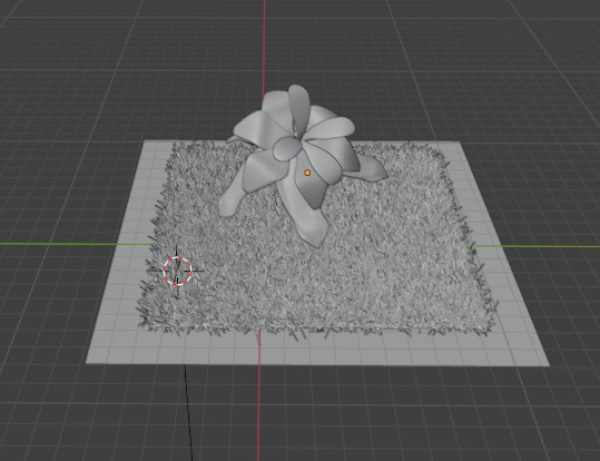
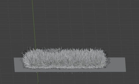
I thought it would be great to add some real looking grass to the animation. I again followed a tutorial using particles. The first tutorial I did with the grass ended up looking like someone had just painted clumpy brush strokes everywhere. Even though I had changed the seed, and how many strands the lengths of the hair. The parent child combo I don't think worked they way I had intended.
So the next time I did it I used the advanced settings and changed the hair length, number of strands, changed the brownian and left it at the. It ended up a much better image of grass than what I initially had.
I tried to animate parts but again I have found it really difficult.
Beehive and animated Bees
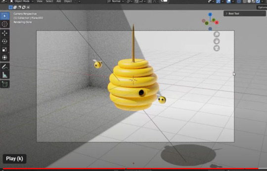
This initially has taken be about 7 hours to complete. I am much more familiar with how the commands and how they now work in blender. I have been able to create this stylised beehive however again the struggle is real to try and capture and render the animation. Even adding the keyframes to have the bees moving has been no short of difficult. Sometimes it works sometimes it doesn't. I did have a look at the nodes but it was so complex and above my understanding of blender I had to stop and just attempt to do the basics.
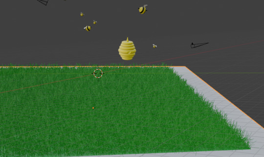
I am attempting to add the sun in there and another animal. But l we will see how it goes.
I was able to put in a background and add constraints.... to my little bees. in the constraints by changing the influence allows the bee to be located close to the bezier curve. The higher the influence the further away it is.
Touch Designer
One of the mistakes I think will touch designer is not really understanding what you are actually doing. I have repeated tutorials multiple times and then realised that I hadn't connected a node properly or something else would not display. Very frustrating when you actually don't understand the concept of the whole node system anyway.
Created a geometry instancing with tubes in a grid. The tubes are rotating in the grid in a sort of snake like fashion with multiple colours. Attempted to change it too a circle and the whole effect was gone. Quickly changed it back.
The second option if tried was using the particle system to create an amazing animation. I thought I was struggling to export the video but I eventually got it working. I did attempt to
Krita
2D animation - I watch so many 2d animation videos watching toddler TV I was really inspired by the Bluey cartoon. Quite simple but really easy to follow. I have got a little bit lost along the way whilst trying to do my animation. I have found the process really difficult .
Stop Motion
Watching the stop Motion on instagram inspired me to get all creative. I initially created clay pieces and separately created a litte stop motion video of the body parts coming together. Although I was okay it probably wasn't at the level we needed. I attempted to do another animation with a rabbit and some wire armature. The model kept breaking and was just to pliable. I made another rabbit and flowers and give it another go with more wire and a thicker armarture but again it wasn't as robust as it needed to be. Although the stop motion was okay just wasn't as flowing and blending as I liked. Having the characters walk in an upright position is extremely difficult without ways to hold them up.
1 note
·
View note
Text
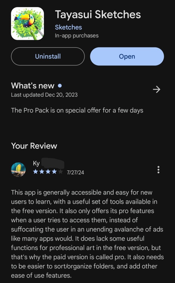
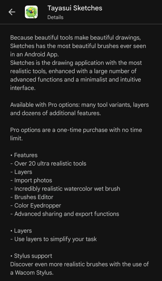
Tayasui Sketches, Digital Drawing App
I've been calling the app I use to draw all of my digital art "the free Sketches app on Android" because I use it on an Android phone, and the homepage icon looks like this.
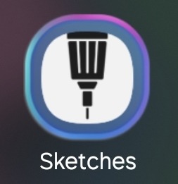
All it says under the simple pen against a white background is "Sketches" without any other names or identifiers.
However, when I opened it the other day I paid enough attention to see that it actually says its full name the first time you run it after having it closed for awhile.
I didn't want to keep being vague about the name, because I know there are other people like me who (for whatever reasons, we all have different situations) can't justify buying and/or subscribing to a digital drawing program or app and are always looking for a free one to allow them to draw. I know I always pay close attention to the exact name and features when another artist or writer mentions a free program they use and get frustrated when they just say "that one, I'm sure you all know it" or "the thing with the icon," so I'd like to share the same details I seek out with anyone who wants them.
If you're one of those people, Tayasui Sketches is available on at least Android and may or may not be available on other mobile platforms. Here's my relevant knowledge and thoughts about Tayasui Sketches.
This program is largely free of fees, subscriptions, and/or ads. It has the one-time cost for its pro upgrade, still image ads you have to scroll past in your sketch library, and the occasional prompt to buy its pro version if you try to use pro features. It may have other ads that play here and there, but they're so rare that they're not memorable to be and I can't be sure what -- if anything -- triggers them to happen.
It's also fairly easy to intuit what goes where and which buttons do what in areas where the initial tutorial/help menu falls short. Developing my own tricks for it and ways of using it has felt natural, for the most part, and it's a big part of why I stick with this app even when I can't use the pro version.
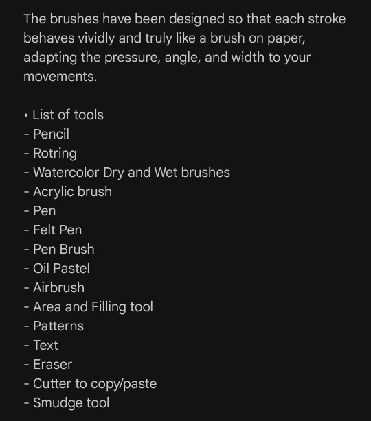
Another reason is the array of tools it gives free users. Not being able to use layers has been frustrating sometimes, and I sometimes look longingly at the small "more tools available in pro" banner in the tool table, but what I can and do use is great for my style of art. Being able to use painterly brushes has helped me refine my art style a lot, the pen brush makes my handwriting and lineart look much more legible than when I draw or write notes on paper, and the text, smudge, and lasso tools have seen more use than I'd expected when I started.
I especially love the options to change the texture and color of the canvas itself, and how the size and opacity sliders for almost all the brushes/tools are so easy to adjust. Being able to save and export my sketches has made sharing my art a lot easier, too.
It's not a perfect program, those most likely don't exist and I'm sure this one has flaws I haven't even noticed, but overall it's great for beginners and good for people who can't get/use a paid app. I like Tayasui Sketches a lot.
#art#art app#digital art app#tayasui sketches#amateur artist#sketches app#app analysis#app review#kind of#sonder speaks
0 notes