#css card flip effect
Explore tagged Tumblr posts
Visit Tumblr Blog
Explore Tumblr blogs with no restrictions, modern design and the best experience.
Last Seen Tumblr Blogs


Fun Fact
Mobile US users spent an average of 115.8 minutes on Tumblr app monthly.
Text

CSS Card Flip
#card flip animation#css animation#pure css animation#css tutorial#html css tutorial#html css#divinector#css#html#learn to code#animation html css#css card flip effect
4 notes
·
View notes
Text

Card Flip Animation
#card flip animation#css cards#card animation#css animation examples#html css#css#html#frontenddevelopment#css animation snippets#css card flip effect#css animation tutorial#css tutorial#learn to code#css3#flip animation css
3 notes
·
View notes
Text
Mastering the Art of CSS Translate Property
Do you want to elevate your CSS skills? 🌟 💡 Ever wondered how to create stunning web animations and smooth transitions? Check out our latest blog post: Mastering the Art of CSS Translate Property: A Comprehensive Guide with 7 Examples In this guide, you will learn all about the CSS Translate property and how it works, along with key insights on the Transform property. Discover 7 hands-on examples, including how to create sliding menus, animated flip cards, stylish draggable elements, centered image galleries with hover effects, smooth and responsive modals, expanding search bars, and dynamic search bars. Don't miss out on these powerful techniques to enhance your web projects! 🚀 Read the full guide now and start creating amazing CSS animations today! 👇
#WebDesign#CSS#FrontendDevelopment#WebDevelopment#CSS3#Programming#WebDev#Animation#UXDesign#JavaScript#skillivo#skillivoBlogs $hashtag#slidingMenus#animatedFlipCards#CSSmodals
3 notes
·
View notes
Text
Explore 15+ CSS Business Cards

Welcome to CSS Monster's collection of CSS business cards! Within this comprehensive compilation, we've meticulously curated a diverse array of free HTML and CSS code examples that showcase creative and professional business card designs. These exemplary pieces have been thoughtfully gathered from reputable platforms such as CodePen, GitHub, and other invaluable resources. With our November 2021 update, we're excited to present two new additions to our collection, ensuring you have access to the most contemporary and innovative business card designs available. These CSS business cards offer an aesthetically pleasing and interactive means of presenting your professional information, allowing you to make a lasting impact on potential clients, employers, or collaborators. Despite the digital age, business cards remain a fundamental tool for networking and forging professional connections. In this context, CSS business cards offer a modern and dynamic alternative to traditional printed cards. They empower you to incorporate animations, hover effects, and interactive elements that can captivate your audience and leave an indelible impression. Whether you're a freelancer, designer, developer, or a professional keen on making a strong and memorable impression, our collection equips you with an abundant resource pool to craft stunning business card layouts that embody your unique style and expertise. Embark on your exploration of our collection now and discover the potential to stand out in the fiercely competitive realm of business networking. Author Joshua Ward April 2, 2019 Links Just Get The Demo Link How To Download - Article How To Download - Video Made with HTML (Pug) / CSS (SCSS) About a code FLIPPING BUSINESS CARD Compatible browsers:Chrome, Edge, Firefox, Opera, Safari Responsive:no Dependencies:font-awesome.css

Author wheatley January 23, 2019 Links Just Get The Demo Link How To Download - Article How To Download - Video Made with HTML / CSS (SCSS) About a code BUSINESS CARD Compatible browsers:Chrome, Edge, Firefox, Opera, Safari Responsive:no Dependencies:- Author Laura Pinto January 18, 2019 Links Just Get The Demo Link How To Download - Article How To Download - Video Made with HTML / CSS (SCSS) About a code ANIMATED BUSINESS CARD Compatible browsers:Chrome, Edge, Firefox, Opera, Safari Responsive:no Dependencies:- Author Sabine Robart October 31, 2018 Links Just Get The Demo Link How To Download - Article How To Download - Video Made with HTML / CSS (SCSS) About a code FIPPING BUSINESS CARD Compatible browsers:Chrome, Edge, Firefox, Opera, Safari Responsive:no Dependencies:font-awesome.css Author Akshay October 11, 2018 Links Just Get The Demo Link How To Download - Article How To Download - Video Made with HTML (Pug) / CSS (Sass) About a code BUSINESS CARD Compatible browsers:Chrome, Edge, Firefox, Opera, Safari Responsive:no Dependencies:- Author Thomas Hanson September 10, 2018 Links Just Get The Demo Link How To Download - Article How To Download - Video Made with HTML / CSS About a code CSS BUSINESS CARD Compatible browsers:Chrome, Edge, Firefox, Opera, Safari Responsive:no Dependencies:-

Author Siddharth Hubli July 31, 2018 Links Just Get The Demo Link How To Download - Article How To Download - Video Made with HTML / CSS About a code MATERIAL BUSINESS CARD Compatible browsers:Chrome, Firefox, Opera, Safari Responsive:no Dependencies:-

Author Liz Wendling March 25, 2018 Links Just Get The Demo Link How To Download - Article How To Download - Video Made with HTML / CSS (Less) About a code GEOMETRIC BUSINESS CARD WITH CSS GRID Compatible browsers:Chrome, Firefox, Opera, Safari Responsive:no Dependencies:-

Author Dannie Vinther September 18, 2017 Links Just Get The Demo Link How To Download - Article How To Download - Video Made with HTML / CSS About a code INSPIRATION BUSINESS CARD Compatible browsers:Chrome, Edge, Firefox, Opera, Safari Responsive:no Dependencies:- Author Gigi November 13, 2016 Links Just Get The Demo Link How To Download - Article How To Download - Video Made with HTML (Pug) / CSS (Sass) About a code BUSINESS CARD Compatible browsers:Chrome, Edge, Firefox, Opera, Safari Responsive:no Dependencies:- Author Elena Nazarova August 22, 2016 Links Just Get The Demo Link How To Download - Article How To Download - Video Made with HTML / CSS About a code 3D FLIP BUSINESS CARD Compatible browsers:Chrome, Edge, Firefox, Opera, Safari Responsive:no Dependencies:font-awesome.css Author Lubos August 16, 2016 Links Just Get The Demo Link How To Download - Article How To Download - Video Made with HTML (Haml) / CSS (SCSS) / JavaScript About a code BUSINESS CARD Compatible browsers:Chrome, Edge, Firefox, Opera, Safari Responsive:yes Dependencies:- Author Peter Girnus October 27, 2015 Links Just Get The Demo Link How To Download - Article How To Download - Video Made with HTML / CSS (SCSS) About a code FLIPPABLE DIGITAL BUSINESS CARD Compatible browsers:Chrome, Edge, Firefox, Opera, Safari Responsive:no Dependencies:font-awesome.css Author Zach Saucier April 11, 2015 Links Just Get The Demo Link How To Download - Article How To Download - Video Made with HTML / CSS (SCSS) About a code BUSINESS CARD Compatible browsers:Chrome, Edge, Firefox, Opera, Safari Responsive:yes Dependencies:- Author jasper September 4, 2014 Links Just Get The Demo Link How To Download - Article How To Download - Video Made with HTML / CSS / JavaScript About a code CSS BUSINESS CARD Compatible browsers:Chrome, Edge, Firefox, Opera, Safari Responsive:no Dependencies:jquery.js Author Eduard Kosicky July 28, 2014 Links Just Get The Demo Link How To Download - Article How To Download - Video Made with HTML / CSS (SCSS) About a code BUSINESS CARD CONCEPT Compatible browsers:Chrome, Edge, Firefox, Opera, Safari Responsive:no Dependencies:ionicons.css Read the full article
0 notes
Photo

CSS 3D Card Flip Animation
#css animation examples#css animation tutorial#pure css animation#css 3d hover effect#css 3d card flip animation#card flip animation#css#html#html5#css3#animation#webdesign#codenewbies
0 notes
Text
3D Flip Card Effect on Hover Using HTML & CSS
youtube
1 note
·
View note
Photo
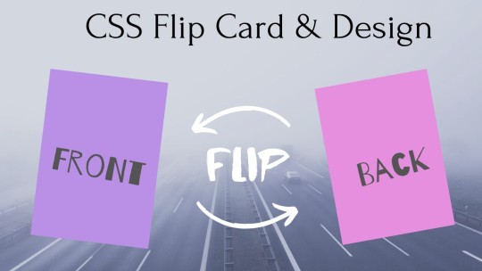
CSS Flip Card Effect & Design ☞ https://bit.ly/34xcYvT #html5 #css3
1 note
·
View note
Text
HOW TO MAKE 3D POP UP CARD USING CSS ANIMATION
HOW TO MAKE 3D POP UP CARD USING CSS ANIMATION
In this article, we will see that how we can make 3D pop up card using CSS animation. Basically, in this project we will create a card where we will put a image, after that the card will get flipped and image will get pop out of the card which actually looks pretty good and it’ll give 3D effect. PREREQUISITES OF CREATING 3D POP UP CARD USING CSS ANIMATION Basic knowledge of HTML.Must be aware…

View On WordPress
0 notes
Text
Profile Cards with Flip Effect on Click
#responsive cards#profile cards#html css#divinector#css#html#frontenddevelopment#css3#learn to code#webdesign#flip card animation#javascript animation#flip effect on click
3 notes
·
View notes
Text

Card Flip Animation Using CSS
#card flip animation#css animation examples#css animation tutorial#css animation effect#card flip effect#css card flip animation#css card design#html css#html5 css3#animation#codingflicks#web design#frontend#frontenddevelopment#learn to code
8 notes
·
View notes
Text
7 Misconceptions About Your Website Redesign

Websites are major investments that require a substantial amount of time and resources. They also require frequent updates and optimization to remain effective.
Since so much time and money goes into building the initial site, people focus on shorter turnaround times for updates and redesign. However, with anything related to website development, it’s important to think about the long-term instead of the short-term. Focusing on how your website project will impact your business over the next 24 months instead of the next three will better guide your website redesign.
Here are some common misconceptions around website redesigns and why they’re wrong.
7 Misconceptions About Your Website Redesign
1. We can update the general design without doing any development
CSS, the language that stylesheets are composed of, is a part of development, so even if you’re just updating visuals, you still need a developer to update the code.
On top of that, even if you’re just refreshing design from a front-end perspective, adding additional code on top of the existing code adds bloat and can come with a cost to your website’s performance (load time) and the ease of updating going forward.
Occasionally, there is merit to just doing a visual design update if your content is working well and your conversion rates are where you want, but your website just looks bad. However, in the long-term, you’ll benefit more from cleaning up and refreshing the code base even if you’re happy with your information architecture and content.
When you just keep adding code on top of existing code, you can end up with a “frankensite” of patchworked updates. They may look okay from the front end, but the messiness of the code in the backend will cost you money over time. By not overhauling the codebase, an update that could take one hour with a clean code might take three hours.
2. While a full redesign will be needed, it’s okay to start with just a few pages
When you just redesign a couple pages of your website, you can harm your overall brand credibility. If your new pages look visually different from the rest of the site, they create a disjointed experience for the visitor. Lack of visual consistency degrades user trust, and introducing three new great-looking pages you’re really proud of can hurt the overall UX due to the visual disparity.
Another aspect of why only redesigning a few pages is impractical is typically said redesign involves updating the header and footer. At the very least, the new header and footer will need to be universally applied to all the legacy pages. That partial stylesheet update will add bloat with some pages completely new and others patchworked together which again leads to page performance hits and complicates future updates.
If possible, you shouldn’t have a website that’s half new, half old. If you’re asking for a partial update due to a small budget or quick turnaround time, think about what the minimum viable product is for the project. Can you save time and money by creating a small number of templates that serve all the major functions needed and build upon that foundation in the future?
3. The website should be based on my preferences
Your website is not for you. Frequently people high up within companies want to make the website about them and their own style, content and UX preferences, but a company’s site is not for its CEO. Websites are not suits customized to represent how you feel, but rather a collection of content for your target personas and customers.
This principle also applies to the design firm and developer. Take a step back and think about your target user base, not the preferences of the developer or design firm. Whenever you’re making a change, think about who the change is for and what the goal and impact of the decision are.
4. I need a template for every page
Website quotes used to be based on page count because there used to really only be two templates: one for the homepage and one for subpages. However, as sites began adding more and more pages, this pricing model became prohibitively expensive.
The current phase is more template centric. Page count still matters, but once the templates are built, copying and flowing content isn’t a huge undertaking, and pricing becomes more based on the number of unique templates for a site.
Modular design is the future — outside of the blog and other super specific pages like search results and system pages, every page on a website can be created using a library of module types as opposed to getting hung up on a finite number of templates.
Modules types include page heroes, features cards, testimonials, partner logos, carousels, forms, statistics, etc, etc. They act almost like Lego bricks that can be used to construct a page with whatever content types and sequences needed.
Pages are less important than templates which are less important than modules. Thinking of a site as a collection of modules instead of a finite set of pages or templates is where the industry is moving to. So, when thinking about the scope of your redesign, consider what your content needs to be or what it needs to communicate, not necessarily how many templates or pages you might need.
5. The homepage is the most important page on the website
You don’t want too many modules on the homepage because the scroll rate really drops off. Businesses will often get hung up on the homepage, and while it might be important, people go to the homepage to leave the homepage. There’s no benefit to having a lot of content sitting there.
When we create long homepages to bring “greatness” to the company, often times no one scrolls through them, and they don’t tell you anything about the site visitor. A homepage really serves as a navigation element to bring a user to the specific content they’re looking for. However, once the visitor navigates to a product page, for example, they’re actually showing need; they’re interested in learning what that product can do and are far more likely to scroll down the entire page.
6. Website migration can be done with the flip of a switch
This comes up because some companies will outsource migration services to low cost and low quality development resources who just “rip and replace” existing code instead of building it from the ground up to best work with a given CMS. Because of the lifetime value of a customer, companies may offer to migrate the site for free with a minimum contract length. There is a lot of effort that goes into those migrations, it’s just done behind the scenes which can undercut the understanding of the complexity of the migration process.
When these low cost contractors migrate websites, their goal is to get the migrated site up and running as soon as possible, so they don’t focus on setting it up for the marketer’s ease of use after the fact. The developers doing the rip and replace don’t necessarily want it to be difficult for marketers to manage the site, that’s just not their first priority nor is it realistic within their working budgets.
When we create a module at New Breed, we break it down into simple things like multiple image and text fields to add a degree of safety rails. There is markup and CSS behind the scenes powering the module to make it styled consistently so over time a marketer doesn’t inadvertently break the formatting. Rip and replace migrations might just take all the generated markup from the old site and dump it into a single rich text field. It’ll look fine and work until someone actually tries updating it, and you won’t have the freedom to customize pages without having to worry about really specific markup and CSS within the content editor.
Such a big part of a website budget is developing the code, doing the QA, flowing the content and launching the site — that’s probably 60% of your whole budget. If you’re going to spend 60% of the cost of a new website, why don’t you audit your website and actually do a redesign that’ll get you better performance? Knowing that for best practices the code and development have to be revisited in a migration, it makes more sense to do a redesign as opposed a straight migration.
Migrations are not a quick flip of a switch for anybody to do, and the price is indicative of the quality you want out of it. If you want a rip and replace, and you can handle the effects of that internally, you can go with a cheap migration that’ll just duplicate the code you have. But if you want to revisit the code and follow best practices to have a site that’s easily manageable by your marketing team and built specifically to leverage the features of a particular CMS you’ll have to revisit the code anyways — in which case it’s usually better to go with a redesign.
7. We can completely redo the layout and design without changing the content
When you redesign persona-specific navigation, the way you build out the content on the same site will inherently change. It’s okay to be okay with your messaging and your general tone, but the specifics of the content are going to need to change to physically fit into a new layout where word counts and conversion points differ.
People sometimes have the mindset that the website and design should be the primary focus. But you need to start with a content-first approach. A website, really, is a bunch of content. The website serves the content and not vice versa.
If you’re looking for a new website or considering redesigning your current website’s look and structure in 2021, then connect with the website designers in Aurora, CO to know more about your website redesign options.
0 notes
Text
INFO MADNESS
#January 18 - 22, 2021 ( Week 14)
Howdy folks! As to what I have said last week, I will be talking about the things I have learned upon coding my website! See the title? Yeah that’s right! INFO MADNESS! Let’s start!
Here is a quick overview of what I'll be talking about.
Layout Navigation bar Card Columns Slideshow Video Audio Hover Responsive Gallery Shaking Image and Flipping Image Image Sprites Search bar Center Image iFrames
So let's start this up with the Layout!
As to what Sir Peralta said when he announced this project, "All information you need in creating your website are within the reach of your fingertips." So I made the most of it. He actually sent a file which contains some code that we can use. We just have to fix it base on our likings but I didn’t use it since I wanna challenge myself more even though it will be harder in my part.
And so I watched some videos in YouTube on how to make a two-columned website but I ended up not doing them because I find them complicated and offers a lot of complexity that my last three braincells cannot process. And luckily when I searched on Google how to make a two-column website, I stumbled upon W3Schools so expect that all of my reference will come from here!
So as I was saying, I found a two column website layout and the codes were much easier to understand than those of the ones the Sir Peralta sent so I used them instead.
That’s the layout I found. This layout offers two unequal columns just like what Sir Peralta wanted. contents can also be separated by card for easy findings. So how does this work? Well, according to w3school: “The main content is the biggest and the most important part of your site. It is common with unequal column widths, so that most of the space is reserved for the main content. The side content (if any) is often used as an alternative navigation or to specify information relevant to the main content. Change the widths as you like, only remember that it should add up to 100% in total:”
Since I used two columns, I use 30% and 60% for the width and added 5% left and right margins so they all add up to 100!
Navigation Bar
For the navigation in which I had a hard time fixing and coding it, I watched a video on YouTube if how can I make a navigation bar with dropdown and I just copied its code. It was actually hard at first because I have to customize it the way I wanted it to be and I always mess up. And when I finally get to understand the codes in which it took me almost two hours to do so, I finally got the flow of coding the navigation bar alone.
Ok so I keep on babbling about navigation bar, so for y’all information, navigation bar is a list of links in a website and if you click one of it, it will direct you to your desire page.
Card
I didn’t, like, code this myself, I just adjusted the padding, width, size and etc from the layout that I found. To find my desired card size, I did a trial and error which was a wrong decision to do because I always mess up and ended up ruining my website layout.
“Is a bordered box with some padding around its content. It includes options for headers, footers, content, colors, etc.“
Slideshow
Slideshow is for words, pictures, gifs that is projected in slides in a limited time. Slideshows are mostly on loop that’s why you can see the pictures again and again after the sequence.
Disclaimer!!! I made that description myself because I can’t find any. As for the slide show, I coded it easily since I already have a background on it. I edited the sizes of the pictures first so they will be uniform to each other and it’s pleasing to the eyes of my viewers!
Video
As for this, the HTML <video> element is used to show a video on a web page. I have actually known this already since it was discussed to us by our previous ICT teacher. But the problem here is that, it wasn’t responsive to the size of the screen so when I searched how, I just have to put the max-width on 100% full and it will be responsive! Tada~ as easy as one, two three!
Audio
The HTML <audio> element is used to play an audio file on a web page. What I did to audio is the same as for the video. It was kinda frustrating at first since I really don’t know what to do with it and how to make it responsive not until I realized that... oh max-width, of course! So for this, I’m not familiar with it since it wasn’t introduced to us back then so I have to do some research for this feature.
Hover
“The :hover selector is used to select elements when you mouse over them.
Tip: The :hover selector can be used on all elements, not only on links.
Tip: Use the :link selector to style links to unvisited pages, the :visited selector to style links to visited pages, and the :active selector to style the active link.
Note: :hover MUST come after :link and :visited (if they are present) in the CSS definition, in order to be effective!”
This thing is so hard!!! I swear I had a hard time doing this feature because I will either mess up my codes or it will not work. I mean, I searched the codes and all but still, adding it to my existing features is hard! But as for my navbar, I wasn’t the one who coded it since it was already included to the navbar code that I found.
Responsive
Ok not me babbling about responsive thingy when in fact I haven’t introduced it to y’all yet. Sorry for the delay of info but according to a to w3school “ It is called responsive web design when you use CSS and HTML to resize, hide, shrink, enlarge, or move the content to make it look good on any screen.”
Image Gallery
I used image gallery so I can put pictures with caption side by side. I only used this for one webpage since I don’t really need it. Instead of linking it to its actual picture, I linked them to various website that is related to the person or band in the feature, in that way, people who gets intrigue about them can just click the picture and tada~ they will get to know them more!
Image Sprites
“An image sprite is a collection of images put into a single image. A web page with many images can take a long time to load and generates multiple server requests. Using image sprites will reduce the number of server requests and save bandwidth.“
So what did I used this for? I used this to link my social media accounts. They just have to choose if which one do they wanna see, Facebook, Instagram or this blog site. I did this because it is more convenient and it kinda fits my liking. Plus, this is my website mins so I should be the one who will decide if what features should I use and add.
Search bar
And the last feature that I will introduce is this one. So for this, I’m really hesitant if should I add this or nah since I don’t know how to make it work although you can see it in my website. Yes you can see it it’s just that when you search, nothing appears. It is just like a display and it’s kinda frustrating to know that it won’t work!!! So to anyone who is reading this right now, how can you make a search bar work? Please drop it down on the comments below if you know how!
So i guess this will be all for now huh? For next week’s blog content, I will update you if how is my website, my plus points and etc so stay tuned! I hope you learned something new today. Bye~!
0 notes
Photo
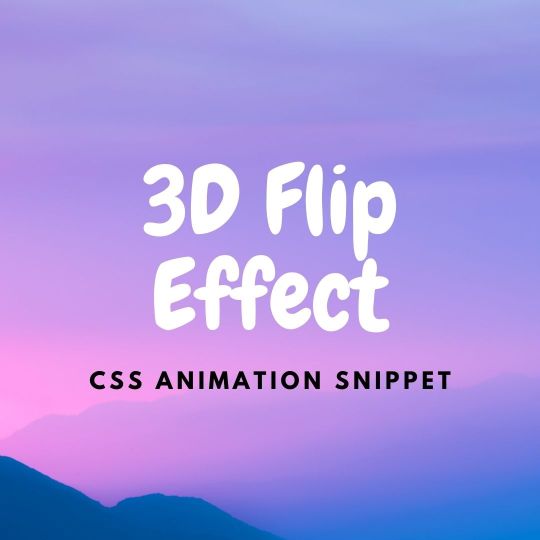
How to make 3D Flipping Card Effect
#3d flip effect#3d flipping card#css animation#css animations#css animation examples#pure css animation#css animation tutorial#codenewbies#frontenddevelopment#frontend#tutorial#html css#css for beginners
0 notes
Text
How to Think Like a Front-End Developer
This is an extended version of my essay “When front-end means full-stack” which was published in the wonderful Increment magazine put out by Stripe. It’s also something of an evolution of a couple other of my essays, “The Great Divide” and “Ooops, I guess we’re full-stack developers now.”
The moment I fell in love with front-end development was when I discovered the style.css file in WordPress themes. That’s where all the magic was (is!) to me. I could (can!) change a handful of lines in there and totally change the look and feel of a website. It’s an incredible game to play.

Back when I was cowboy-coding over FTP. Although I definitely wasn’t using CSS grid!
By fiddling with HTML and CSS, I can change the way you feel about a bit of writing. I can make you feel more comfortable about buying tickets to an event. I can increase the chances you share something with your friends.
That was well before anybody paid me money to be a front-end developer, but even then I felt the intoxicating mix of stimuli that the job offers. Front-end development is this expressive art form, but often constrained by things like the need to directly communicate messaging and accomplish business goals.
Front-end development is at the intersection of art and logic. A cross of business and expression. Both left and right brain. A cocktail of design and nerdery.
I love it.

Looking back at the courses I chose from middle school through college, I bounced back and forth between computer-focused classes and art-focused classes, so I suppose it’s no surprise I found a way to do both as a career.
The term “Front-End Developer” is fairly well-defined and understood. For one, it’s a job title. I’ll bet some of you literally have business cards that say it on there, or some variation like: “Front-End Designer,” “UX Developer,” or “UI Engineer.” The debate around what those mean isn’t particularly interesting to me. I find that the roles are so varied from job-to-job and company-to-company that job titles will never be enough to describe things. Getting this job is more about demonstrating you know what you’re doing more than anything else¹.
Chris Coyier Front-End Developer
The title variations are just nuance. The bigger picture is that as long as the job is building websites, front-enders are focused on the browser. Quite literally:
front-end = browsers
back-end = servers
Even as the job has changed over the decades, that distinction still largely holds.
As “browser people,” there are certain truths that come along for the ride. One is that there is a whole landscape of different browsers and, despite the best efforts of standards bodies, they still behave somewhat differently. Just today, as I write, I dealt with a bug where a date string I had from an API was in a format such that Firefox threw an error when I tried to use the .toISOString() JavaScript API on it, but was fine in Chrome. That’s just life as a front-end developer. That’s the job.
Even across that landscape of browsers, just on desktop computers, there is variance in how users use that browser. How big do they have the window open? Do they have dark mode activated on their operating system? How’s the color gamut on that monitor? What is the pixel density? How’s the bandwidth situation? Do they use a keyboard and mouse? One or the other? Neither? All those same questions apply to mobile devices too, where there is an equally if not more complicated browser landscape. And just wait until you take a hard look at HTML emails.
That’s a lot of unknowns, and the answers to developing for that unknown landscape is firmly in the hands of front-end developers.

Into the unknoooooowwwn. – Elsa
The most important aspect of the job? The people that use these browsers. That’s why we’re building things at all. These are the people I’m trying to impress with my mad CSS skills. These are the people I’m trying to get to buy my widget. Who all my business charts hinge upon. Who’s reaction can sway my emotions like yarn in the breeze. These users, who we put on a pedestal for good reason, have a much wider landscape than the browsers do. They speak different languages. They want different things. They are trying to solve different problems. They have different physical abilities. They have different levels of urgency. Again, helping them is firmly in the hands of front-end developers. There is very little in between the characters we type into our text editors and the users for whom we wish to serve.
Being a front-end developer puts us on the front lines between the thing we’re building and the people we’re building it for, and that’s a place some of us really enjoy being.
That’s some weighty stuff, isn’t it? I haven’t even mentioned React yet.
The “we care about the users” thing might feel a little precious. I’d think in a high functioning company, everyone would care about the users, from the CEO on down. It’s different, though. When we code a <button>, we’re quite literally putting a button into a browser window that users directly interact with. When we adjust a color, we’re adjusting exactly what our sighted users see when they see our work.

That’s not far off from a ceramic artist pulling a handle out of clay for a coffee cup. It’s applying craftsmanship to a digital experience. While a back-end developer might care deeply about the users of a site, they are, as Monica Dinculescu once told me in a conversation about this, “outsourcing that responsibility.”
We established that front-end developers are browser people. The job is making things work well in browsers. So we need to understand the languages browsers speak, namely: HTML, CSS, and JavaScript². And that’s not just me being some old school fundamentalist; it’s through a few decades of everyday front-end development work that knowing those base languages is vital to us doing a good job. Even when we don’t work directly with them (HTML might come from a template in another language, CSS might be produced from a preprocessor, JavaScript might be mostly written in the parlance of a framework), what goes the browser is ultimately HTML, CSS, and JavaScript, so that’s where debugging largely takes place and the ability of the browser is put to work.
CSS will always be my favorite and HTML feels like it needs the most love — but JavaScript is the one we really need to examine The last decade has seen JavaScript blossom from a language used for a handful of interactive effects to the predominant language used across the entire stack of web design and development. It’s possible to work on websites and writing nothing but JavaScript. A real sea change.
JavaScript is all-powerful in the browser. In a sense, it supersedes HTML and CSS, as there is nothing either of those languages can do that JavaScript cannot. HTML is parsed by the browser and turned into the DOM, which JavaScript can also entirely create and manipulate. CSS has its own model, the CSSOM, that applies styles to elements in the DOM, which JavaScript can also create and manipulate.
This isn’t quite fair though. HTML is the very first file that browsers parse before they do the rest of the work needed to build the site. That firstness is unique to HTML and a vital part of making websites fast.
In fact, if the HTML was the only file to come across the network, that should be enough to deliver the basic information and functionality of a site.
That philosophy is called Progressive Enhancement. I’m a fan, myself, but I don’t always adhere to it perfectly. For example, a <form> can be entirely functional in HTML, when it’s action attribute points to a URL where the form can be processed. Progressive Enhancement would have us build it that way. Then, when JavaScript executes, it takes over the submission and has the form submit via Ajax instead, which might be a nicer experience as the page won’t have to refresh. I like that. Taken further, any <button> outside a form is entirely useless without JavaScript, so in the spirit of Progressive Enhancement, I should wait until JavaScript executes to even put that button on the page at all (or at least reveal it). That’s the kind of thing where even those of us with the best intentions might not always toe the line perfectly. Just put the button in, Sam. Nobody is gonna die.
JavaScript’s all-powerfulness makes it an appealing target for those of us doing work on the web — particularly as JavaScript as a language has evolved to become even more powerful and ergonomic, and the frameworks that are built in JavaScript become even more-so. Back in 2015, it was already so clear that JavaScript was experiencing incredible growth in usage, Matt Mullenweg, co-founder of WordPress, gave the developer world homework: “Learn JavaScript Deeply”³. He couldn’t have been more right. Half a decade later, JavaScript has done a good job of taking over front-end development. Particularly if you look at front-end development jobs.
While the web almanac might show us that only 5% of the top-zillion sites use React compared to 85% including jQuery, those numbers are nearly flipped when looking around at front-end development job requirements.
I’m sure there are fancy economic reasons for all that, but jobs are as important and personal as it gets for people, so it very much matters.
So we’re browser people in a sea of JavaScript building things for people. If we take a look at the job at a practical day-to-day tasks level, it’s a bit like this:
Translate designs into code
Think in terms of responsive design, allowing us to design and build across the landscape of devices
Build systemically. Construct components and patterns, not one-offs.
Apply semantics to content
Consider accessibility
Worry about the performance of the site. Optimize everything. Reduce, reuse, recycle.
Just that first bullet point feels like a college degree to me. Taken together, all of those points certainly do.
This whole list is a bit abstract though, so let’s apply it to something we can look at. What if this website was our current project?
Our brains and fingers go wild!
Let’s build the layout with CSS grid.
What fonts are those? Do we need to load them in their entirety or can we subset them? What happens as they load in? This layout feels like it will really suffer from font-shifting jank.
There are some repeated patterns here. We should probably make a card design pattern. Every website needs a good card pattern.
That’s a gorgeous color scheme. Are the colors mathematically related? Should we make variables to represent them individually or can we just alter a single hue as needed? Are we going to use custom properties in our CSS? Colors are just colors though, we might not need the cascading power of them just for this. Should we just use Sass variables? Are we going to use a CSS preprocessor at all?
The source order is tricky here. We need to order things so that they make sense for a screen reader user. We should have a meeting about what the expected order of content should be, even if we’re visually moving things around a bit with CSS grid.
The photographs here are beautifully shot. But some of them match the background color of the site… can we get away with alpha-transparent PNGs here? Those are always so big. Can any next-gen formats help us? Or should we try to match the background of a JPG with the background of the site seamlessly. Who’s writing the alt text for these?
There are some icons in use here. Inline SVG, right? Certainly SVG of some kind, not icon fonts, right? Should we build a whole icon system? I guess it depends on how we’re gonna be building this thing more broadly. Do we have a build system at all?
What’s the whole front-end plan here? Can I code this thing in vanilla HTML, CSS, and JavaScript? Well, I know I can, but what are the team expectations? Client expectations? Does it need to be a React thing because it’s part of some ecosystem of stuff that is already React? Or Vue or Svelte or whatever? Is there a CMS involved?
I’m glad the designer thought of not just the “desktop” and “mobile” sizes but also tackled an in-between size. Those are always awkward. There is no interactivity information here though. What should we do when that search field is focused? What gets revealed when that hamburger is tapped? Are we doing page-level transitions here?
I could go on and on. That’s how front-end developers think, at least in my experience and in talking with my peers.
A lot of those things have been our jobs forever though. We’ve been asking and answering these questions on every website we’ve built for as long as we’ve been doing it. There are different challenges on each site, which is great and keeps this job fun, but there is a lot of repetition too.
Allow me to get around to the title of this article.
While we’ve been doing a lot of this stuff for ages, there is a whole pile of new stuff we’re starting to be expected to do, particularly if we’re talking about building the site with a modern JavaScript framework. All the modern frameworks, as much as they like to disagree about things, agree about one big thing: everything is a component. You nest and piece together components as needed. Even native JavaScript moves toward its own model of Web Components.

I like it, this idea of components. It allows you and your team to build the abstractions that make the most sense to you and what you are building.
Your Card component does all the stuff your card needs to do. Your Form component does forms how your website needs to do forms. But it’s a new concept to old developers like me. Components in JavaScript have taken hold in a way that components on the server-side never did. I’ve worked on many a WordPress website where the best I did was break templates into somewhat arbitrary include() statements. I’ve worked on Ruby on Rails sites with partials that take a handful of local variables. Those are useful for building re-usable parts, but they are a far cry from the robust component models that JavaScript frameworks offer us today.
All this custom component creation makes me a site-level architect in a way that I didn’t use to be. Here’s an example. Of course I have a Button component. Of course I have an Icon component. I’ll use them in my Card component. My Card component lives in a Grid component that lays them out and paginates them. The whole page is actually built from components. The Header component has a SearchBar component and a UserMenu component. The Sidebar component has a Navigation component and an Ad component. The whole page is just a special combination of components, which is probably based on the URL, assuming I’m all-in on building our front-end with JavaScript. So now I’m dealing with URLs myself, and I’m essentially the architect of the entire site. [Sweats profusely]
Like I told ya, a whole pile of new responsibility.
Components that are in charge of displaying content are almost certainly not hard-coded with data in them. They are built to be templates. They are built to accept data and construct themselves based on that data. In the olden days, when we were doing this kind of templating, the data has probably already arrived on the page we’re working on. In a JavaScript-powered app, it’s more likely that that data is fetched by JavaScript. Perhaps I’ll fetch it when the component renders. In a stack I’m working with right now, the front end is in React, the API is in GraphQL and we use Apollo Client to work with data. We use a special “hook” in the React components to run the queries to fetch the data we need, and another special hook when we need to change that data. Guess who does that work? Is it some other kind of developer that specializes in this data layer work? No, it’s become the domain of the front-end developer.
Speaking of data, there is all this other data that a website often has to deal with that doesn’t come from a database or API. It’s data that is really only relevant to the website at this moment in time.
Which tab is active right now?
Is this modal dialog open or closed?
Which bar of this accordion is expanded?
Is this message bar in an error state or warning state?
How many pages are you paginated in?
How far is the user scrolled down the page?
Front-end developers have been dealing with that kind of state for a long time, but it’s exactly this kind of state that has gotten us into trouble before. A modal dialog can be open with a simple modifier class like <div class="modal is-open"> and toggling that class is easy enough with .classList.toggle(".is-open"); But that’s a purely visual treatment. How does anything else on the page know if that modal is open or not? Does it ask the DOM? In a lot of jQuery-style apps of yore, yes, it would. In a sense, the DOM became the “source of truth” for our websites. There were all sorts of problems that stemmed from this architecture, ranging from a simple naming change destroying functionality in weirdly insidious ways, to hard-to-reason-about application logic making bug fixing a difficult proposition.
Front-end developers collectively thought: what if we dealt with state in a more considered way? State management, as a concept, became a thing. JavaScript frameworks themselves built the concept right in, and third-party libraries have paved and continue to pave the way. This is another example of expanding responsibility. Who architects state management? Who enforces it and implements it? It’s not some other role, it’s front-end developers.
There is expanding responsibility in the checklist of things to do, but there is also work to be done in piecing it all together. How much of this state can be handled at the individual component level and how much needs to be higher level? How much of this data can be gotten at the individual component level and how much should be percolated from above? Design itself comes into play. How much of the styling of this component should be scoped to itself, and how much should come from more global styles?
It’s no wonder that design systems have taken off in recent years. We’re building components anyway, so thinking of them systemically is a natural fit.
Let’s look at our design again:
A bunch of new thoughts can begin!
Assuming we’re using a JavaScript framework, which one? Why?
Can we statically render this site, even if we’re building with a JavaScript framework? Or server-side render it?
Where are those recipes coming from? Can we get a GraphQL API going so we can ask for whatever we need, whenever we need it?
Maybe we should pick a CMS that has an API that will facilitate the kind of front-end building we want to do. Perhaps a headless CMS?
What are we doing for routing? Is the framework we chose opinionated or unopinionated about stuff like this?
What are the components we need? A Card, Icon, SearchForm, SiteMenu, Img… can we scaffold these out? Should we start with some kind of design framework on top of the base framework?
What’s the client state we might need? Current search term, current tab, hamburger open or not, at least.
Is there a login system for this site or not? Are logged in users shown anything different?
Is there are third-party componentry we can leverage here?
Maybe we can find one of those fancy image components that does blur-up loading and lazy loading and all that.
Those are all things that are in the domain of front-end developers these days, on top of everything that we already need to do. Executing the design, semantics, accessibility, performance… that’s all still there. You still need to be proficient in HTML, CSS, JavaScript, and how the browser works. Being a front-end developer requires a haystack of skills that grows and grows. It’s the natural outcome of the web getting bigger. More people use the web and internet access grows. The economy around the web grows. The capability of browsers grows. The expectations of what is possible on the web grows. There isn’t a lot shrinking going on around here.
We’ve already reached the point where most front-end developers don’t know the whole haystack of responsibilities. There are lots of developers still doing well for themselves being rather design-focused and excelling at creative and well-implemented HTML and CSS, even as job posts looking for that dwindle.
There are systems-focused developers and even entire agencies that specialize in helping other companies build and implement design systems. There are data-focused developers that feel most at home making the data flow throughout a website and getting hot and heavy with business logic. While all of those people might have “front-end developer” on their business card, their responsibilities and even expectations of their work might be quite different. It’s all good, we’ll find ways to talk about all this in time.
In fact, how we talk about building websites has changed a lot in the last decade. Some of my early introduction to web development was through WordPress. WordPress needs a web server to run, is written in PHP, and stores it’s data in a MySQL database. As much as WordPress has evolved, all that is still exactly the same. We talk about that “stack” with an acronym: LAMP, or Linux, Apache, MySQL and PHP. Note that literally everything in the entire stack consists of back-end technologies. As a front-end developer, nothing about LAMP is relevant to me.
But other stacks have come along since then. A popular stack was MEAN (Mongo, Express, Angular and Node). Notice how we’re starting to inch our way toward more front-end technologies? Angular is a JavaScript framework, so as this stack gained popularity, so too did talking about the front-end as an important part of the stack. Node and Express are both JavaScript as well, albeit the server-side variant.
The existence of Node is a huge part of this story. Node isn’t JavaScript-like, it’s quite literally JavaScript. It makes a front-end developer already skilled in JavaScript able to do server-side work without too much of a stretch.
“Serverless” is a much more modern tech buzzword, and what it’s largely talking about is running small bits of code on cloud servers. Most often, those small bits of code are in Node, and written by JavaScript developers. These days, a JavaScript-focused front-end developer might be writing their own serverless functions and essentially being their own back-end developer. They’ll think of themselves as full-stack developers, and they’ll be right.
Shawn Wang coined a term for a new stack this year: STAR or Design System, TypeScript, Apollo, and React. This is incredible to me, not just because I kind of like that stack, but because it’s a way of talking about the stack powering a website that is entirely front-end technologies. Quite a shift.
I apologize if I’ve made you feel a little anxious reading this. If you feel like you’re behind in understanding all this stuff, you aren’t alone.
In fact, I don’t think I’ve talked to a single developer who told me they felt entirely comfortable with the entire world of building websites. Everybody has weak spots or entire areas where they just don’t know the first dang thing. You not only can specialize, but specializing is a pretty good idea, and I think you will end up specializing to some degree whether you plan to or not. If you have the good fortune to plan, pick things that you like. You’ll do just fine.
The only constant in life is change.
– Heraclitus – Motivational Poster – Chris Coyier
¹ I’m a white dude, so that helps a bunch, too. ↩️ ² Browsers speak a bunch more languages. HTTP, SVG, PNG… The more you know the more you can put to work! ↩️ ³ It’s an interesting bit of irony that WordPress websites generally aren’t built with client-side JavaScript components. ↩️
The post How to Think Like a Front-End Developer appeared first on CSS-Tricks.
You can support CSS-Tricks by being an MVP Supporter.
How to Think Like a Front-End Developer published first on https://deskbysnafu.tumblr.com/
0 notes
Text
The Widening Responsibility for Front-End Developers
This is an extended version of my essay “When front-end means full-stack” which was published in the wonderful Increment magazine put out by Stripe. It’s also something of an evolution of a couple other of my essays, “The Great Divide” and “Ooops, I guess we’re full-stack developers now.”
The moment I fell in love with front-end development was when I discovered the style.css file in WordPress themes. That’s where all the magic was (is!) to me. I could (can!) change a handful of lines in there and totally change the look and feel of a website. It’s an incredible game to play.
Back when I was cowboy-coding over FTP. Although I definitely wasn’t using CSS grid!
By fiddling with HTML and CSS, I can change the way you feel about a bit of writing. I can make you feel more comfortable about buying tickets to an event. I can increase the chances you share something with your friends.
That was well before anybody paid me money to be a front-end developer, but even then I felt the intoxicating mix of stimuli that the job offers. Front-end development is this expressive art form, but often constrained by things like the need to directly communicate messaging and accomplish business goals.
Front-end development is at the intersection of art and logic. A cross of business and expression. Both left and right brain. A cocktail of design and nerdery.
I love it.

Looking back at the courses I chose from middle school through college, I bounced back and forth between computer-focused classes and art-focused classes, so I suppose it’s no surprise I found a way to do both as a career.
The term “Front-End Developer” is fairly well-defined and understood. For one, it’s a job title. I’ll bet some of you literally have business cards that say it on there, or some variation like: “Front-End Designer,” “UX Developer,” or “UI Engineer.” The debate around what those mean isn’t particularly interesting to me. I find that the roles are so varied from job-to-job and company-to-company that job titles will never be enough to describe things. Getting this job is more about demonstrating you know what you’re doing more than anything else¹.
Chris Coyier Front-End Developer
The title variations are just nuance. The bigger picture is that as long as the job is building websites, front-enders are focused on the browser. Quite literally:
front-end = browsers
back-end = servers
Even as the job has changed over the decades, that distinction still largely holds.
As “browser people,” there are certain truths that come along for the ride. One is that there is a whole landscape of different browsers and, despite the best efforts of standards bodies, they still behave somewhat differently. Just today, as I write, I dealt with a bug where a date string I had from an API was in a format such that Firefox threw an error when I tried to use the .toISOString() JavaScript API on it, but was fine in Chrome. That’s just life as a front-end developer. That’s the job.
Even across that landscape of browsers, just on desktop computers, there is variance in how users use that browser. How big do they have the window open? Do they have dark mode activated on their operating system? How’s the color gamut on that monitor? What is the pixel density? How’s the bandwidth situation? Do they use a keyboard and mouse? One or the other? Neither? All those same questions apply to mobile devices too, where there is an equally if not more complicated browser landscape. And just wait until you take a hard look at HTML emails.
That’s a lot of unknowns, and the answers to developing for that unknown landscape is firmly in the hands of front-end developers.

Into the unknoooooowwwn. – Elsa
The most important aspect of the job? The people that use these browsers. That’s why we’re building things at all. These are the people I’m trying to impress with my mad CSS skills. These are the people I’m trying to get to buy my widget. Who all my business charts hinge upon. Who’s reaction can sway my emotions like yarn in the breeze. These users, who we put on a pedestal for good reason, have a much wider landscape than the browsers do. They speak different languages. They want different things. They are trying to solve different problems. They have different physical abilities. They have different levels of urgency. Again, helping them is firmly in the hands of front-end developers. There is very little in between the characters we type into our text editors and the users for whom we wish to serve.
Being a front-end developer puts us on the front lines between the thing we’re building and the people we’re building it for, and that’s a place some of us really enjoy being.
That’s some weighty stuff, isn’t it? I haven’t even mentioned React yet.
The “we care about the users” thing might feel a little precious. I’d think in a high functioning company, everyone would care about the users, from the CEO on down. It’s different, though. When we code a <button>, we’re quite literally putting a button into a browser window that users directly interact with. When we adjust a color, we’re adjusting exactly what our sighted users see when they see our work.

That’s not far off from a ceramic artist pulling a handle out of clay for a coffee cup. It’s applying craftsmanship to a digital experience. While a back-end developer might care deeply about the users of a site, they are, as Monica Dinculescu once told me in a conversation about this, “outsourcing that responsibility.”
We established that front-end developers are browser people. The job is making things work well in browsers. So we need to understand the languages browsers speak, namely: HTML, CSS, and JavaScript². And that’s not just me being some old school fundamentalist; it’s through a few decades of everyday front-end development work that knowing those base languages is vital to us doing a good job. Even when we don’t work directly with them (HTML might come from a template in another language, CSS might be produced from a preprocessor, JavaScript might be mostly written in the parlance of a framework), what goes the browser is ultimately HTML, CSS, and JavaScript, so that’s where debugging largely takes place and the ability of the browser is put to work.
CSS will always be my favorite and HTML feels like it needs the most love — but JavaScript is the one we really need to examine The last decade has seen JavaScript blossom from a language used for a handful of interactive effects to the predominant language used across the entire stack of web design and development. It’s possible to work on websites and writing nothing but JavaScript. A real sea change.
JavaScript is all-powerful in the browser. In a sense, it supersedes HTML and CSS, as there is nothing either of those languages can do that JavaScript cannot. HTML is parsed by the browser and turned into the DOM, which JavaScript can also entirely create and manipulate. CSS has its own model, the CSSOM, that applies styles to elements in the DOM, which JavaScript can also create and manipulate.
This isn’t quite fair though. HTML is the very first file that browsers parse before they do the rest of the work needed to build the site. That firstness is unique to HTML and a vital part of making websites fast.
In fact, if the HTML was the only file to come across the network, that should be enough to deliver the basic information and functionality of a site.
That philosophy is called Progressive Enhancement. I’m a fan, myself, but I don’t always adhere to it perfectly. For example, a <form> can be entirely functional in HTML, when it’s action attribute points to a URL where the form can be processed. Progressive Enhancement would have us build it that way. Then, when JavaScript executes, it takes over the submission and has the form submit via Ajax instead, which might be a nicer experience as the page won’t have to refresh. I like that. Taken further, any <button> outside a form is entirely useless without JavaScript, so in the spirit of Progressive Enhancement, I should wait until JavaScript executes to even put that button on the page at all (or at least reveal it). That’s the kind of thing where even those of us with the best intentions might not always toe the line perfectly. Just put the button in, Sam. Nobody is gonna die.
JavaScript’s all-powerfulness makes it an appealing target for those of us doing work on the web — particularly as JavaScript as a language has evolved to become even more powerful and ergonomic, and the frameworks that are built in JavaScript become even more-so. Back in 2015, it was already so clear that JavaScript was experiencing incredible growth in usage, Matt Mullenweg, the founding developer of WordPress, gave the developer world homework: “Learn JavaScript Deeply”³. He couldn’t have been more right. Half a decade later, JavaScript has done a good job of taking over front-end development. Particularly if you look at front-end development jobs.
While the web almanac might show us that only 5% of the top-zillion sites use React compared to 85% including jQuery, those numbers are nearly flipped when looking around at front-end development job requirements.
I’m sure there are fancy economic reasons for all that, but jobs are as important and personal as it gets for people, so it very much matters.
So we’re browser people in a sea of JavaScript building things for people. If we take a look at the job at a practical day-to-day tasks level, it’s a bit like this:
Translate designs into code
Think in terms of responsive design, allowing us to design and build across the landscape of devices
Build systemically. Construct components and patterns, not one-offs.
Apply semantics to content
Consider accessibility
Worry about the performance of the site. Optimize everything. Reduce, reuse, recycle.
Just that first bullet point feels like a college degree to me. Taken together, all of those points certainly do.
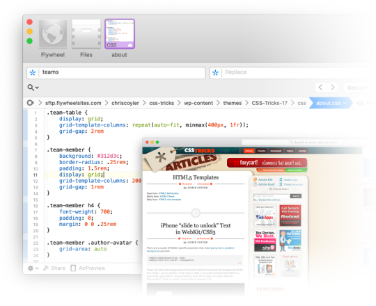
This whole list is a bit abstract though, so let’s apply it to something we can look at. What if this website was our current project?

Our brains and fingers go wild!
Let’s build the layout with CSS grid.
What fonts are those? Do we need to load them in their entirety or can we subset them? What happens as they load in? This layout feels like it will really suffer from font-shifting jank.
There are some repeated patterns here. We should probably make a card design pattern. Every website needs a good card pattern.
That’s a gorgeous color scheme. Are the colors mathematically related? Should we make variables to represent them individually or can we just alter a single hue as needed? Are we going to use custom properties in our CSS? Colors are just colors though, we might not need the cascading power of them just for this. Should we just use Sass variables? Are we going to use a CSS preprocessor at all?
The source order is tricky here. We need to order things so that they make sense for a screen reader user. We should have a meeting about what the expected order of content should be, even if we’re visually moving things around a bit with CSS grid.
The photographs here are beautifully shot. But some of them match the background color of the site… can we get away with alpha-transparent PNGs here? Those are always so big. Can any next-gen formats help us? Or should we try to match the background of a JPG with the background of the site seamlessly. Who’s writing the alt text for these?
There are some icons in use here. Inline SVG, right? Certainly SVG of some kind, not icon fonts, right? Should we build a whole icon system? I guess it depends on how we’re gonna be building this thing more broadly. Do we have a build system at all?
What’s the whole front-end plan here? Can I code this thing in vanilla HTML, CSS, and JavaScript? Well, I know I can, but what are the team expectations? Client expectations? Does it need to be a React thing because it’s part of some ecosystem of stuff that is already React? Or Vue or Svelte or whatever? Is there a CMS involved?
I’m glad the designer thought of not just the “desktop” and “mobile” sizes but also tackled an in-between size. Those are always awkward. There is no interactivity information here though. What should we do when that search field is focused? What gets revealed when that hamburger is tapped? Are we doing page-level transitions here?
I could go on and on. That’s how front-end developers think, at least in my experience and in talking with my peers.
A lot of those things have been our jobs forever though. We’ve been asking and answering these questions on every website we’ve built for as long as we’ve been doing it. There are different challenges on each site, which is great and keeps this job fun, but there is a lot of repetition too.
Allow me to get around to the title of this article.
While we’ve been doing a lot of this stuff for ages, there is a whole pile of new stuff we’re starting to be expected to do, particularly if we’re talking about building the site with a modern JavaScript framework. All the modern frameworks, as much as they like to disagree about things, agree about one big thing: everything is a component. You nest and piece together components as needed. Even native JavaScript moves toward its own model of Web Components.

I like it, this idea of components. It allows you and your team to build the abstractions that make the most sense to you and what you are building.
Your Card component does all the stuff your card needs to do. Your Form component does forms how your website needs to do forms. But it’s a new concept to old developers like me. Components in JavaScript have taken hold in a way that components on the server-side never did. I’ve worked on many a WordPress website where the best I did was break templates into somewhat arbitrary include() statements. I’ve worked on Ruby on Rails sites with partials that take a handful of local variables. Those are useful for building re-usable parts, but they are a far cry from the robust component models that JavaScript frameworks offer us today.
All this custom component creation makes me a site-level architect in a way that I didn’t use to be. Here’s an example. Of course I have a Button component. Of course I have an Icon component. I’ll use them in my Card component. My Card component lives in a Grid component that lays them out and paginates them. The whole page is actually built from components. The Header component has a SearchBar component and a UserMenu component. The Sidebar component has a Navigation component and an Ad component. The whole page is just a special combination of components, which is probably based on the URL, assuming I’m all-in on building our front-end with JavaScript. So now I’m dealing with URLs myself, and I’m essentially the architect of the entire site. [Sweats profusely]
Like I told ya, a whole pile of new responsibility.
Components that are in charge of displaying content are almost certainly not hard-coded with data in them. They are built to be templates. They are built to accept data and construct themselves based on that data. In the olden days, when we were doing this kind of templating, the data has probably already arrived on the page we’re working on. In a JavaScript-powered app, it’s more likely that that data is fetched by JavaScript. Perhaps I’ll fetch it when the component renders. In a stack I’m working with right now, the front end is in React, the API is in GraphQL and we use Apollo Client to work with data. We use a special “hook” in the React components to run the queries to fetch the data we need, and another special hook when we need to change that data. Guess who does that work? Is it some other kind of developer that specializes in this data layer work? No, it’s become the domain of the front-end developer.
Speaking of data, there is all this other data that a website often has to deal with that doesn’t come from a database or API. It’s data that is really only relevant to the website at this moment in time.
Which tab is active right now?
Is this modal dialog open or closed?
Which bar of this accordion is expanded?
Is this message bar in an error state or warning state?
How many pages are you paginated in?
How far is the user scrolled down the page?
Front-end developers have been dealing with that kind of state for a long time, but it’s exactly this kind of state that has gotten us into trouble before. A modal dialog can be open with a simple modifier class like <div class="modal is-open"> and toggling that class is easy enough with .classList.toggle(".is-open"); But that’s a purely visual treatment. How does anything else on the page know if that modal is open or not? Does it ask the DOM? In a lot of jQuery-style apps of yore, yes, it would. In a sense, the DOM became the “source of truth” for our websites. There were all sorts of problems that stemmed from this architecture, ranging from a simple naming change destroying functionality in weirdly insidious ways, to hard-to-reason-about application logic making bug fixing a difficult proposition.
Front-end developers collectively thought: what if we dealt with state in a more considered way? State management, as a concept, became a thing. JavaScript frameworks themselves built the concept right in, and third-party libraries have paved and continue to pave the way. This is another example of expanding responsibility. Who architects state management? Who enforces it and implements it? It’s not some other role, it’s front-end developers.
There is expanding responsibility in the checklist of things to do, but there is also work to be done in piecing it all together. How much of this state can be handled at the individual component level and how much needs to be higher level? How much of this data can be gotten at the individual component level and how much should be percolated from above? Design itself comes into play. How much of the styling of this component should be scoped to itself, and how much should come from more global styles?
It’s no wonder that design systems have taken off in recent years. We’re building components anyway, so thinking of them systemically is a natural fit.
Let’s look at our design again:
A bunch of new thoughts can begin!
Assuming we’re using a JavaScript framework, which one? Why?
Can we statically render this site, even if we’re building with a JavaScript framework? Or server-side render it?
Where are those recipes coming from? Can we get a GraphQL API going so we can ask for whatever we need, whenever we need it?
Maybe we should pick a CMS that has an API that will facilitate the kind of front-end building we want to do. Perhaps a headless CMS?
What are we doing for routing? Is the framework we chose opinionated or unopinionated about stuff like this?
What are the components we need? A Card, Icon, SearchForm, SiteMenu, Img… can we scaffold these out? Should we start with some kind of design framework on top of the base framework?
What’s the client state we might need? Current search term, current tab, hamburger open or not, at least.
Is there a login system for this site or not? Are logged in users shown anything different?
Is there are third-party componentry we can leverage here?
Maybe we can find one of those fancy image components that does blur-up loading and lazy loading and all that.
Those are all things that are in the domain of front-end developers these days, on top of everything that we already need to do. Executing the design, semantics, accessibility, performance… that’s all still there. You still need to be proficient in HTML, CSS, JavaScript, and how the browser works. Being a front-end developer requires a haystack of skills that grows and grows. It’s the natural outcome of the web getting bigger. More people use the web and internet access grows. The economy around the web grows. The capability of browsers grows. The expectations of what is possible on the web grows. There isn’t a lot shrinking going on around here.
We’ve already reached the point where most front-end developers don’t know the whole haystack of responsibilities. There are lots of developers still doing well for themselves being rather design-focused and excelling at creative and well-implemented HTML and CSS, even as job posts looking for that dwindle.
There are systems-focused developers and even entire agencies that specialize in helping other companies build and implement design systems. There are data-focused developers that feel most at home making the data flow throughout a website and getting hot and heavy with business logic. While all of those people might have “front-end developer” on their business card, their responsibilities and even expectations of their work might be quite different. It’s all good, we’ll find ways to talk about all this in time.
In fact, how we talk about building websites has changed a lot in the last decade. Some of my early introduction to web development was through WordPress. WordPress needs a web server to run, is written in PHP, and stores it’s data in a MySQL database. As much as WordPress has evolved, all that is still exactly the same. We talk about that “stack” with an acronym: LAMP, or Linux, Apache, MySQL and PHP. Note that literally everything in the entire stack consists of back-end technologies. As a front-end developer, nothing about LAMP is relevant to me.
But other stacks have come along since then. A popular stack was MEAN (Mongo, Express, Angular and Node). Notice how we’re starting to inch our way toward more front-end technologies? Angular is a JavaScript framework, so as this stack gained popularity, so too did talking about the front-end as an important part of the stack. Node and Express are both JavaScript as well, albeit the server-side variant.
The existence of Node is a huge part of this story. Node isn’t JavaScript-like, it’s quite literally JavaScript. It makes a front-end developer already skilled in JavaScript able to do server-side work without too much of a stretch.
“Serverless” is a much more modern tech buzzword, and what it’s largely talking about is running small bits of code on cloud servers. Most often, those small bits of code are in Node, and written by JavaScript developers. These days, a JavaScript-focused front-end developer might be writing their own serverless functions and essentially being their own back-end developer. They’ll think of themselves as full-stack developers, and they’ll be right.
Shawn Wang coined a term for a new stack this year: STAR or Design System, TypeScript, Apollo, and React. This is incredible to me, not just because I kind of like that stack, but because it’s a way of talking about the stack powering a website that is entirely front-end technologies. Quite a shift.
I apologize if I’ve made you feel a little anxious reading this. If you feel like you’re behind in understanding all this stuff, you aren’t alone.
In fact, I don’t think I’ve talked to a single developer who told me they felt entirely comfortable with the entire world of building websites. Everybody has weak spots or entire areas where they just don’t know the first dang thing. You not only can specialize, but specializing is a pretty good idea, and I think you will end up specializing to some degree whether you plan to or not. If you have the good fortune to plan, pick things that you like. You’ll do just fine.
The only constant in life is change.
– Heraclitus – Motivational Poster – Chris Coyier
¹ I’m a white dude, so that helps a bunch, too. ↩️ ² Browsers speak a bunch more languages. HTTP, SVG, PNG… The more you know the more you can put to work! ↩️ ³ It’s an interesting bit of irony that WordPress websites generally aren’t built with client-side JavaScript components. ↩️
The post The Widening Responsibility for Front-End Developers appeared first on CSS-Tricks.
You can support CSS-Tricks by being an MVP Supporter.
😉SiliconWebX | 🌐CSS-Tricks
0 notes
Video
youtube

paper help
About me
Structure & Outline
Structure & Outline When you look forward to the complete-sentence outline, you'll discover that every of the three main points strikes from the general to the particular. Specifically, each primary level is a claim, adopted by specific info that supports that claim so that the audience will understand its validity. For example, for a speech about coal mining security, your first major level might give attention to the concept coal mining is a hazardous occupation. The basic idea of a formal define is that different types of letters or numbers symbolize completely different ranges of the hierarchy of your paper, and sub-levels are indented beneath primary ranges. This is a formal outline on your ultimate research paper. You will not be rustling sheets of paper, and because your playing cards are written on one side only, you possibly can hold them in order with out flipping them backwards and forwards to check each side. How will five notecards suffice in helping you produce a whole, rich supply? How to write an essay for internship program. Example essay about wholesome way of life schooling should be free and compulsory essay. distinction between opinion essay and persuasive essay issues to put in writing a process analysis essay on. Essay on caffeine addiction define essay narrative Sample a for. How to put in writing a persuasive essay in apa format. Essay on holi about a hundred and fifty words position of social media essay css. The funniest factor i've ever seen essay essay newspaper article. Which of those is the defining characteristics of a comparability and contrast essay. Essay on school picnic to zoo essay why students ought to have homework. Essay on habit of reading books in hindi beban tua mengurangi orang Essay anda usaha. Short essay on importance of newspaper in our every day life. List of phrases to use in essays beban orang anda tua Essay usaha mengurangi tua beban usaha mengurangi anda Essay orang. The pen is mightier than the sword essay for class 9. Do you capitalize track titles in an essay a typical instance of argumentative essay. It will current your thesis, the main factors in help of that thesis, and the sub-points supporting each major point. It could have extra levels of sub-sub-points should you feel that's necessary. Different ways of saving cash classification essay. Essay to drawing my favourite day of the week is sunday essay essay concerning the establishment of family. Essay about the effects of social media to the filipino youth. Very short essay about corruption synthesis essay prompts ap lang. Using a set of cards just like this might help you get by way of a powerful set of specialised info. But what should you lose your house during a speech? With a set of playing cards, it'll take less time to refind it than with a full-sentence outline. Why can’t you employ the total-sentence outline you labored so onerous to write down? First, the presence of your full-sentence outline will make it appear that you don’t know the content material of your speech. Third, sheets of paper are noisier and more awkward than playing cards. Fourth, it’s simpler to lose your house using the total outline. Carefully prepared playing cards, along with practice, will assist you to more than you may think.
0 notes