#cursor looking at the node
Explore tagged Tumblr posts
Visit Tumblr Blog
Explore Tumblr blogs with no restrictions, modern design and the best experience.
Last Seen Tumblr Blogs


Fun Fact
Tumblr was attacked by a cross-site scripting worm deployed by the Internet troll group GNAA on Dec 3, 2012.
Text

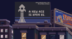
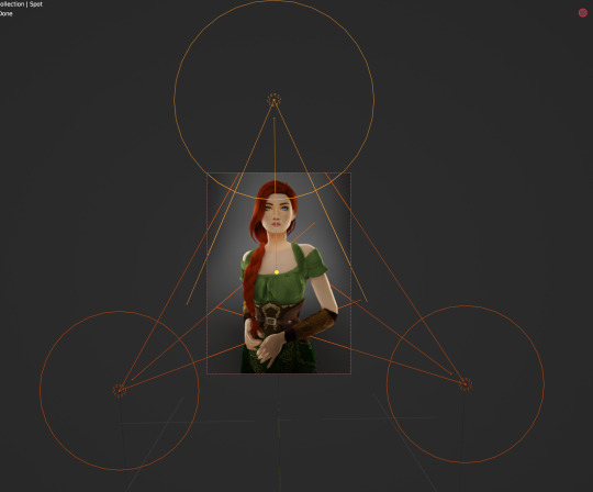
304 - "And they call it the Web"
So, a while back, I found this video by "8AAFFF" that "Mapped the internet"
youtube
And I decided to download the file that was provided. It's been an interesting experience, even if all roads seem to lead to Google, Twitter or Facebook.
The map in the background also happens to be my Tumblr blog as it is right now.
Kinda...
#ArtEveryday#art#art every day#visualization#internet#web#the web#it is every much a frigidity process using the program#like#you'll be dead on#cursor looking at the node#and it doesn't see it.#it's funky.#Youtube
2 notes
·
View notes
Text
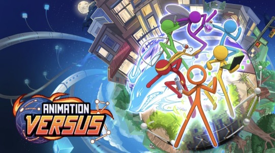
THE ANIMATION VERSUS KICKSTARTER HAS LAUNCHED !!!!
https://www.kickstarter.com/projects/animationversus/animation-versus
which MEANS im going to make a post detailing everything of course .
https://youtu.be/K4lvfmbMkcw?si=73cLDy92Aaron3yL
god. GOD !!!!!!! IM SO EXCITED !!!!!!!!!!!!!!!!!! HOLY SHIT DUDE
the game looks INSANELY good already and that's considering the game, as we see it, is supposed to release in 2028 !
it looks like it has 28 days to go to achieve its goal (and it already is doing really weel as i write this XD i mean, 14k dollars already??? god DAMN !!!)

(new art on kickstarter page! the artist cooked)
i find it INCREDIBLY cool that the lead developer of the project is the person who made the ava/m rivals of aether mod. how cool is that dude
right away from the trailer im incredibly happy they're including purple in the main cast (another purple cameo on alanspc for the win)

(i do admire the way blue is just fine with it)
the fighting kits are INSANE MAN ?? its a little surprising that orange's main moves are projectiles (which however is incredibly cool. both a throwback to anim vs. physics and (unintentional?) parallel with vic perhaps) <- (although, now reading it, it seems like the projectile objects will rotate with every move!)
green having a guitar in his kit ???? are you kidding. /vpos . i was wondering how they would optimize blue's kit but it looks SO cool dude (its likely im going to be a blue main XD)

red's kit looks interesting, especially with the shark move! its genuinely not surprising that its red who's kit currently looks best ingame lol. it's also no wonder purple's kit is best at air attacks!
the backgrounds are just. Holy hell.
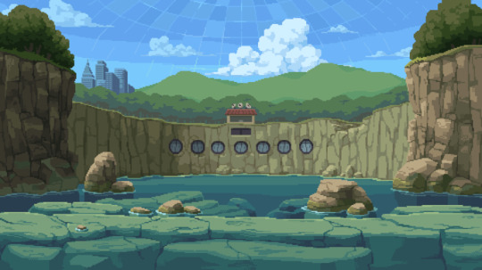

the whole fact they're making like. 4 different backgrounds per Stage ??? Good lord.
and. hello??? hello? hi ???? hello ????? im Sane ???????
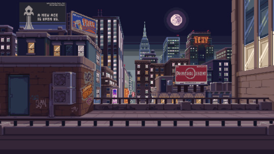
other notable details: its so cool to get more details on the city from up above, seeing it's so progressed. other details: "primoral descent" billboard which is a reference to dj's original comic! plus corndog guy's stand in the second bg (also we really gotta acknowledge that moon exists in the outernet sometime.)
(as im writing this the amount of money has already went up to 34k. holy hell.)
its interesting to me as well that the game's version of special attacks charge bar is a "node meter"! another one for the computer/internet references

("a node in network refers to any physical device or point that is capable of sending, receiving, or forwarding data")
which also seems like a general running theme for the fighting scene in game itself, given that those "nodes" are also seen on the art and the character's fighting profiles
it seems like the game will either feature new game-specific soundtrack or compile existing soundtrack into a batch (which is making me Squeal because im so interested in how individual soundtracks are going to be named — yes im a fan of such details XD)
the reward tiers are. hough. holy hell
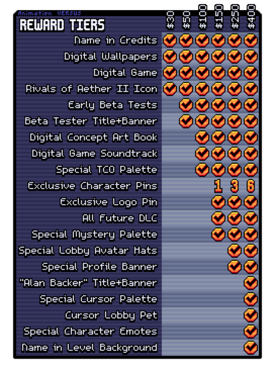
beta tests ???? tco palette???? (as im guessing with sec?????) exclusive character pins??????? FUTURE DLC???????
(also, cursor lobby pet implies that there Will be a lobby. lol)
the kickstarter page also says: "Today, we have six characters that we’re excited to share with you. With your help, we’ll be able to bring even more iconic heroes and villains from AvA into the game!"
if that means we WILL eventually get rocketcorp characters + king. oh my god. oh my god.
and also. DIGITAL ART BOOK??????
(selling my kidney.)
plus. "At some of our higher tiers we're offering the opportunity to join a development meeting to see how to game is made, and the option to design your own original character stick figure in a level background!" Hello ?????
god i barely can word anything right now dude im so excited i cant stop stimming what the HELL !!!!!!!!
#animator vs animation#animation vs animator#animation vs minecraft#animation versus#alan becker#haha point and laugh typo in the last official outtake/j#the fact it IS multiplayer means we can as well do . heh. competitions. looks at my friend#oh im so sane about the rocket billboard oh my god.#also i just noticed. cursor palette? Inch resting
61 notes
·
View notes
Text
Blender Guide: Editing TF2 Merc Textures with Transitions
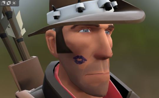


This is a guide on adding edits to the mercs' textures in such a way that the edit can fade in (for animation shots where a merc is given an injury, or blushes, gets marked by paint, etc). We'll be working on the face as an example, but this methodology can be applied to the clothes and other textures.
Making an edited texture
First, we need to make the textures.
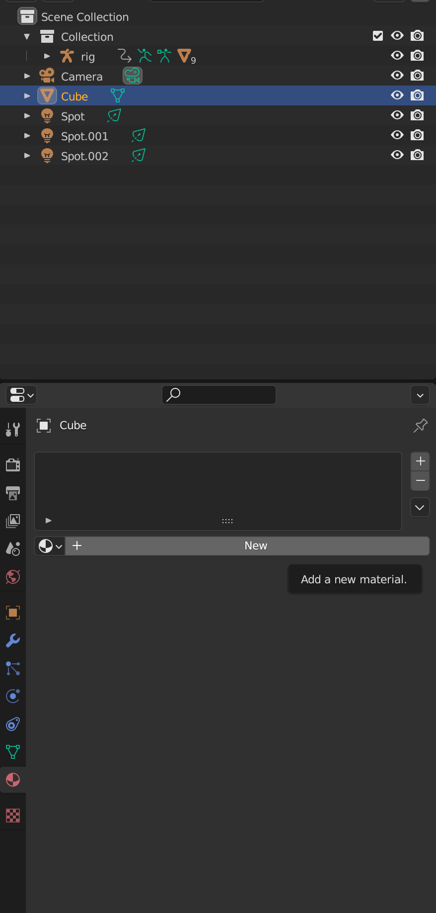
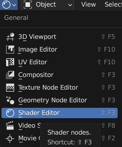
Since we're editing the head textures, we'll want to save a copy of the head texture. Select the merc's face mesh. In the Material Properties tab, select the material slot for the merc's face texture you want to edit (example: sniper_head_red). Switch to the Shading tab at the top to see the Shader Editor. In the Shader Editor, select the Image Texture node for the merc's head (in this case, sniper_head.png). It should now appear in the Image Editor panel (if it isn't, you can select the png from the dropdown button at the top of the Image Editor). In this panel, select the three line menu button > Image > Save a Copy… In the new window, save the image.
Open an image editing program (example: GIMP is a free art program). Open the saved image. In a new layer, create the texture you want to place over the merc's face.
For bruises, I recommend using the TF2 cosmetic Beaten and Bruised (style 2) as reference: https://wiki.teamfortress.com/wiki/Beaten_and_Bruised You can grab its texture by spawning it in Blender using the TF2 Trifecta Blender addon and saving the texture as a png the same way you did for the merc texture.
Once you have it the way you want it, hide the merc's head texture and save the resulting image as a png. If you made your texture so that it's meant to be blended over the merc's head (examples: multiply or soft light), don't worry, there's a way to apply the blend mode in Blender.
Edit the Shader Material
In Blender, select the merc's face mesh. In the Shader Editor, select Add > Texture > Image Texture. In the newly added node, press the Open button and select the texture you made. Then add another node with Add > Color > Mix Color, adding a Mix Color node. Add in another Mix Color node so you have two.
Plug the Image node's Color to the Mix node's B. Plug the Image node's Alpha to the Mix node's Factor. Plug the Mix node's Result to the second Mix node's B. Set the node's Factor to 1.0.
Find the Image node for sniper_head.png already in the shader and plug in its Color output to both Mix nodes' A. Then plug the rightmost Mix node's Result to the Facemix group node's Color1 plug, replacing sniper_head.png's connection to it. You should now see the merc with the texture changes.

Depending on the texture you made, you may need to include some more steps here:
If your texture is meant to be given a blend mode (meaning, you used a blend mode in the art editing program earlier), you can left-most Mix node (the Mix node directly connected to the Image node) and change the Mix property to the blend mode you want (Multiply, Soft Light, etc.) in the drop-down menu.


If the texture still looks too dark/light, you can add a Gamma node (Add > Color > Gamma) and another Mix node between the first and second Mix nodes you already have. Then adjust the Gamma's value until the texture looks right.

Animating the texture
The rightmost Mix node's Factor can be keyframed on and off (with 0.0 being 0% off). To do so, hover your cursor over the number value and press your Add Keyframe hotkey (or right-clicking the value and selecting Insert Keyframe). The value should now be yellow. Yellow means the value had a keyframe on the frame you are currently on. Green means the value has a keyframe somewhere else on the timeline. Adding two keyframes of different values creates the transition.

Depending on your needs, you can make the transition instant (a merc getting kissed with a lipstick mark), or gradual over multiple frames (a merc blushing from embarrassment).
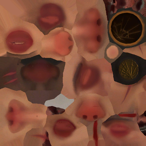
I am also including the pngs of the four example textures I used. Feel free to use them.


10 notes
·
View notes
Text
Q&A conversation (Part 1/???)

A/G : That’s awesome! Can I ask you a question about the AU of the parallel world?

Zerit : Sure!

A/G : yes! The question is… if Alan is inside the stick man world, what happened to the Alan from that world???
Zerit : You mean Alan originally from PW!AU ,Right?
A/G : yup
Zerit : I think this AU doesn’t have Alan or Noogai (but…there’s someone else in his position instead.)
A/G : wow.. if they don’t exist,then where you Second and the color gang, since they live in Alan’s computer?

Zerit: Are you wondering? >:)
A/G : yes!, Who is it?!
Zerit: It’s Second, the human. Excited?! Rightyyyy?
A/G : yes, I’m so excited! Why do I think that Alan was created by Second in this world?
Zerit : well..it might be yes and it might not be?!
A/G: who created Alan?! Or does he have memories of that Alan to know who created?!
Please make up your mind! If second created him, then the question now is, why is he in the network?! (Aka Outernet)
Zerit : *Whistles cheerfully* What should I do, hmm~?
A/G : Mmmahsvejsjsjjdhakwksjdhjdbdhd
Zerit : I'm going to take a shower first. Bye. >:))))

A/G : Noo, Don't leave me in suspense!!

Zerit: *ChucklesI* should give you some other information... actually all the Hollow heads are humans!!

A/G: *Annoyed*…How will Alan feel when he knows that his children are humans and he is a Hollow?
Zerit: He must be confused and realize that this is not his world.
A/G: Mmmm, the question is... are they looking for Alan???
Zerit: Nope.
A/G: How lame... but oh well.
Zerit: 'Him' might not be looking for 'Alan,' but rather his 'Power'.
A/G: What power does Alan have??? Since I know that his file is probably listed as THE_FIRST_CREATOR. ???

Zerit: It might be related to The cursor and Hacker.
Do you remember the story about Mango and Gold? Well, they are the reason why Alan uses his power.
A/G: *Node* How did the Hollows find out??? About Alan's abilities?
Zerit: 'Him' might have seen it when Alan used his power.
The Hollow heads have avatars.
A/G: Hmm, that explains it. Also, I think it was the victim who saw it, or Dark.
Zerit: You guessed one of the two correctly. Do you want to try guessing the reason why Him wants Alan's power?
A/G: If it's the Victim... it must be because of their ability to create... besides having the abilities of the cursor and a natural, powerful hacking power.
Zerit: *Smiles slyly*
A/G: Also, what is the name of Alan's file?
Zerit: I don't know... A container is just a container, It's only meant to be filled with water. >:)))
A/G : *Jaw-dropping* :O
..To be continue..
<- Before (You are at the starting point. ) / Next ->
8 notes
·
View notes
Note
hey there! your most recent posts about UI look fantastic! is there any chance you could give a breakdown on how you're doing the animated focus effects and other animated parts of your ui? that has been what I've been struggling with most in my own ui. how does your node tree look like?
thank you!
Thanks for my first ask! I'll share screenshots (or video?) of my node trees below. Here's a long winded explanation:


I write code using GDExtension (Rust), so the white circles represent nodes with custom code.
Unfortunately there's no easy answer to making good game UI, a lot of animated effects I achieved manually using code. I never use animation nodes for 2D UI stuff. I usually just have a single float that updates from 0 -> 1 (or vise versa), and run a function that updates the position/size of multiple nodes simultaneously based on that value. Like:
Don't be afraid to give everything its own script and `_process`.
I also don't use Godot's focus system at all, even though everything does use Controls. It might make things easier (I haven't given it a go), but I have very opinionated standards on how focus should work, so I just code it myself.
For example, the cursor for navigating with buttons that appears (and disappears with mouse click) is coded using my own logic. Everything it reacts to I handle myself.
---
Long story short, everything is done tediously and there's no easy answer. Here a quick rundown of how each animation works:
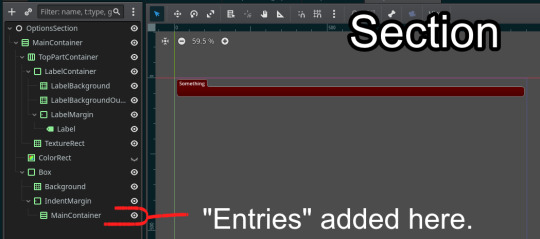
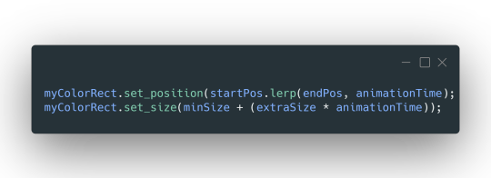
For a lot of the "highlights" (mouse hover on each option entry), each entry has its own ColorRect that starts invisible. Its fade in animation is triggered when the main Control has the mouse enter (detected w/ func _notification), but it only fades out when another Control has the mouse enter. This is done by storing the "current" hovered entry in the main tab Control code, and "unhovering" it before replacing with a new entry.
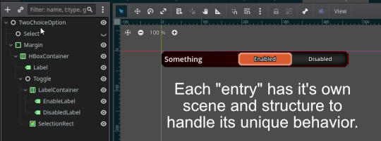
The "tabs" for each category in the settings uses two NinePatchRects ("SelectorTop" and "SelectorBottom" in first screenshot) that lerp their sizes to the position of the clicked Label. It takes a little bit of coding magic to make it look good (first half of animation stretches full length, second half closes the gap).
The buttons cursor is a NinePatchRect that I animate by setting global_position and size. It probably has the most complicated logic, juggling multiple animation states using a state machine (appearing/disappearing, moving between sections, moving from section -> options entries). It uses two "animation time" variables. Uhhh, I wish I could give more advice, just gotta code it like a normal object in your game I guess.
---
Umm yeah, hope that helps maybe??
9 notes
·
View notes
Text

Beginner Blender Tutorial Basic Render: Part Three (Adjusting Render Settings, Adding Lights, and Rendering!)
(Continuing from Part Two)
Step 1: Adjusting Render Settings
I exclusively render in Cycles, and though I'll be doing some Eevee runs for the sake of tutorials, I'm going to share what I know today and show you how to set up a Cycles render the way I do
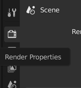
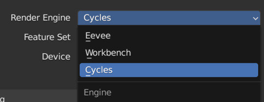
Navigate to Render Properties and select "Cycles" in the Render Engine dropdown

If you have an older system, leave CPU selected If you have a newer or beefier computer, select GPU complete I render on a MacBook Pro, so I'll select GPU
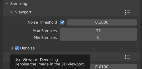
Under Sampling -> Viewport, make sure you click on the Denoise, this will clean up our render preview so we can more easily see what the final result will look like
Under the same Sampling tab, adjust your Max Samples to match mine (32 in the viewport and 128 in the render window, this will speed up your render time)
Click into Output Properties and select "Render Region" and "Crop to Render Region", and change the frame rate to 50fps In the Output tab, change the Color Depth to 16 Nothing will change in our 3D Viewport, but the settings are ready to go
Step 2: Adding Lights
Right now, if we were to change our mode to Rendered, we'd have nothing but a black box. This is because our sim is in a cube with no light source Let's add some lights! For portraits, I like to use a combination of Spot and Point lights You add in lights the same way you add in the camera and the cube, either by clicking "Add" in the top menu or with Shift+A on your keyboard and selecting Light -> Spot or Point I'm going to add a Spotlight first I like to add in lights in Rendered view, but be careful using rendered view as it ups the chances that your Blender will crash

I added in a spotlight but it appears that nothing happened Objects are added into Blender at the Cursor point. I never adjusted mine so it's at the center of the axis, meaning below my sim's feet and outside of the box Using G and X,Y,Z, I'm going to move my spotlight up
Now the light is above her, but I want it shining on her, so I'm going to rotate it forward Rotate objects using the R key and X,Y,Z directions on your keyboard
That's not bad, but I want more dynamic light. I'm going to add two more spotlights for 3 point lighting
This is looking better, and you can see where my lights are and how they're oriented Now let's adjust the background Select your cube in the Outliner panel and navigate to Material Properties Click "new" in the bar Then navigate to your Shader Editor window and you'll see a Principled BSDF Node is here
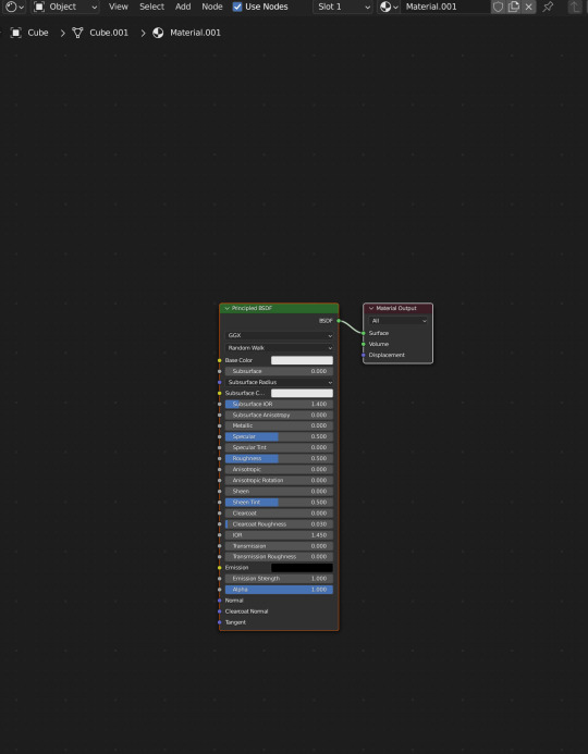
We're not going to do anything too fancy here, just change the color of the cube and some aspects of how it looks Change the color of your box using the color wheel then adjust your nodes to everything is set to zero except roughness
You should have something like this (of course use whatever color compliments your sim best)
I don't want the background to be super flat, so I'm going to adjust the Metallic value on mine Now I have this:
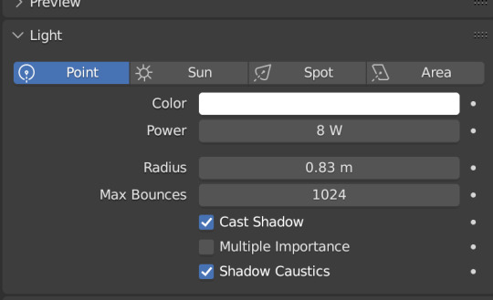
I like the lighting but I think it might be a little too bright Let's adjust it a little In your Outliner panel, select one of the spotlights then go to "Object Data Properties" (the little lightbulb)
I'm going to adjust the Power to 5 and click off multiple importance and click on shadow caustics, like this:
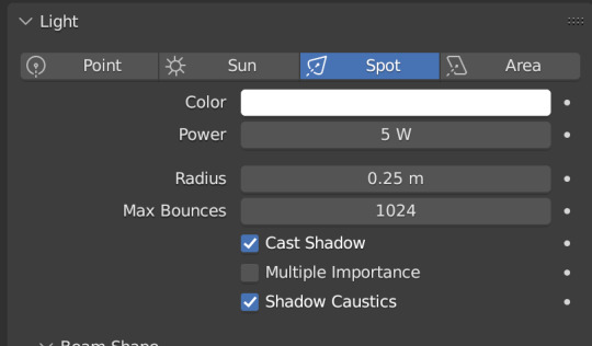
Do the same for all three spotlights and you should have something like this:
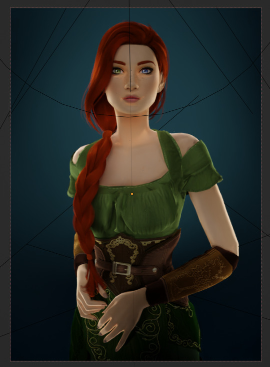
That's better, but let's draw attention to her face with a Point light Add in a point light the same way as a spot (shift+A, light -> point) or Add in the top bar) and move it in front of her face
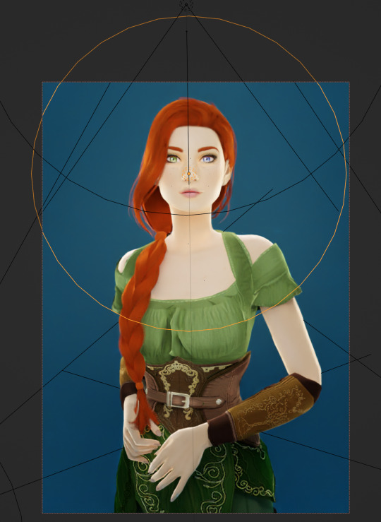
This is obviously way too bright, so let's adjust it like we did for the spotlights I've changed the radius and adjusted the power to 8, as shown here:
Here's the result:
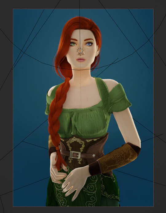
That's much better! Normally at this point I would probably change her hair and add in jewelry and make minor adjustments to this and that, but for the sake of this super simple beginner render, we're ready to go! Before you run your render, save this file somewhere easy to find. I'll be using the same file for future tutorials!
Step 3: Rendering!
Once you've done all the setup, rendering is actually super easy Make sure you switch your 3D viewport back to Material Preview (rendering while in rendered mode has a tendency to make blender crash) Then go up to the navigation bar and select Render -> Render Image
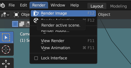
A new window will pop up, and your render will begin!
Rendering time will depend on how complex your scene is and how many assets you've added in. Ours is very simple so mine says it'll take about 6 minutes
And it's done! Save your render and either post it or edit it in your favorite photo editor!
UPDATE 7/17/23
As you can see, my render was looking very glowy. I didn't know why (there was no glare node in the compositing settings or anything that would cause this, or so I thought), until I adjusted the roughness values on my sim.
Now it looks like this:
So if yours is looking glowy, adjust the roughness to 0, then back up to 10 and that should fix it!
Homework:
Your Render School homework is to create a simple portrait render using these tutorials and tag me in it! I can't wait to see what yall make!
Please leave any questions in the comments below or send an ask and I'll help as best I can!
Happy Rendering!
#salemsims tutorial#render school tutorial#sims 4 render#tutorial#sims 4 blender tutorial#blender#render tutorial#sims render tutorial
64 notes
·
View notes
Text
At long last!
I've completed my newest character, Benny!
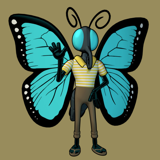
Benny is a Butterfly fella who's one of Speter's friends. He's very energetic (probably because he has some undiagnosed stuff) and he's very jokey (probably as a coping mechanism for his depression and general poor mental health.) He lives in a rather neglectful home. His parents are extreme hoarders and they don't buy him new clothes so he has to borrow from his Uncle's old collection. He sleeps in the garage of his house because all the rooms he could've lived in instead are filled with random garbage. But he doesn't let that keep him down, and he does his best to live well in spite of that.

This character is by far the most technically impressive and educational model I've made. I learned:
A dozen new shortcuts
Incredibly useful ways to utilize the 3D cursor
Some new stuff about material nodes
IK Constraints
Some anatomy stuff (Like better hands)
Armature Construction
Rigging
A bit more of Walk Cycles
The name of the Running Man dance (Which I attempted to animate, but it kinda just ended up making a really good normal walk cycle with fist pumping)
Overall, this is my favorite one. The clothes are the best I've done, the production quality is higher, and it has brand new limb shaders and NEW HANDS that are FAR superior to my previous ones.

As you can see, Benny's Hand is a major improvement in many ways.
For instance, the lovely thenar muscle group thingamajig is at the base of the thumb now, and it flexes properly and everything, giving the hand a more realistic look.
It's also got better shapes, (no more rectangle fingers,) and sports the 4 fingers started by Garrison rather than the 3 of Speter and (sir not-appearing-in-this-demonstration) Penelope. I think it'll probably be that way for all the characters going forward, it looks better and I only did 3 fingers initially because I was afraid of stepping out of my comfort zone more than I already had.
You can also see the cool shader on display that highlights the edges of the shapes. The shader was created so that Benny's hands would stick out from the black of his wings, but will also most likely be applied to all future characters, because it helps your eyes recognize the limbs easier, and it looks freakin' sweet.
Anyway thanks for reading me nerd out about 3D modeling and my characters for a long time. Until next time!
14 notes
·
View notes
Text
[Interface Design: UI/UX as a Mythical Structure]
In the Persona series, the user interface is never just a set of controls; it always acts as an extension of the emotional context and an entry point for the game’s themes. Persona 3 used a cool-toned clock motif to evoke “time and mortality anxiety.” Persona 4 employed bright, everyday colors to capture the warm currents of “truth and friendship.” Persona 5’s papercut aesthetic conveyed the sharp tension of “social rebellion.”
In Persona 6, the UI is no longer constructed from the human psyche alone; it emerges from Earth’s very unconscious neural network—a medium through which players can “touch Gaia” with every selection and interaction.
Main Menu: The Neural Web of Gaia Rather than choosing a game mode, the player awakens nodes hidden in Earth’s deep memory. The menu interface resembles a living web of neurons intertwined with stratified memories. Slow animations display a rotating “Neural Dragon Vein Tree” that looks like cortical tissue merging with vine-like neural tendrils, floating in transparent depths of water. Each menu option appears as a glowing, organic cell node with extendable filaments that respond when the player focuses on it. The color palette blends deep slate-green, amber-yellow, and bioluminescent chartreuse, fusing a sense of primal nature with digital neural ecology.
Whenever the player hovers or clicks on an option, the sound resembles electrical signals coursing through nerve bundles—a gentle “beep–zzzt” that bubbles like a drifting air pocket, rather than a simple click. Underneath it all, the background music consists of low-frequency subterranean resonances, the soft drip of distant water, muted pulse echoes, and deep-string undertones—creating an ambient field that evokes the unconscious. As the cursor lingers on a node, the neural tree sprouts faintly glowing branches in that direction—like plant tendrils responding to the player’s intent. Through this interplay of sight and sound, Persona 6’s main menu becomes the very first place where player and Gaia’s consciousness resonate.
In-Game UI: Reflected Archetype Frame Rather than a “high-tech interface,” the in-game UI functions as a “personality system window”—each element hinting at underlying structural forces of the unconscious.
Battle Interface: Organic, evolving, and tied to unconscious mechanics. The command panel appears as a semi-translucent sheet of organic glass, its frame woven from neural fibers that float around the character’s side. Persona icons display each mask’s corresponding animal archetype fused with symbolic motifs. When a Persona is summoned, its Arcana’s mandala pattern emerges behind it, synchronized with a subtle Dragon Vein animation. If an enemy’s weakness is revealed, the UI shows the foe’s form undergoing a “cellular rupture” animation, overlaid with a brief flicker of that Arcana’s glyph. The turn-order bar is rendered as a genetic-sequence–style evolution chain, with player and enemy portraits interleaved like a chain of mutations unfolding over time.
Social and Exploration Interface: Neuro-Ecology UI The social system UI is not merely a compendium or status sheet; it is a map of the unconscious network, modeled on neural ecology. When the player opens their in-game phone, they are effectively accessing their own “Neural Core,” where each character appears as a node module. The relationship chart resembles a mycelial network: as intimacy with a character deepens, faint streams of light and secondary connections emerge. The world map itself is designed to look like an underground root system: each location appears as a “Neural Blossom Node,” and when clicked, that node “blooms” through an unfolding animation.
Ending Variations and Main Menu Dynamics Depending on which ending the player achieves, the main menu undergoes a hidden thematic transformation—reinforcing narrative retrospection and deepening the game’s sense of consequence.
Chaos Ending: The neural web appears rotten and collapsing. Menu options turn dull and blurred, visuals distort, and the audio shifts to low-frequency alarms and irregular heartbeats. The title changes to Persona 6: _Gaia Collapse_.
Neutral Ending: The neural web is shown in the process of repair, with light streams flickering between nodes. Colors shift to a subdued silver-green, and menu selections respond with a slight delay. The new title reads Persona 6: _666 Eternal Womb_.
Cosmic Ending: The entire network shimmers with stardust as cellular script evolves into points of light. The UI floats like a microcosm of the universe, and the main menu proclaims Persona 6: _After the Fracture_.
In this way, Persona 6’s UI transcends mere menus and icons, becoming a living reflection of the unconscious, an echo of Gaia’s neural pulse, and a visual manifestation of each outcome’s thematic weight.
0 notes
Text
Menu Screen
After my research, I started to make my own menu screen for my golf game.
youtube
This is the tutorial I followed for the main menu screen. I made one similar to the one in the video, but with the main buttons being in the middle of the screen with the game title above it. This was actually pretty easy to understand and as I prefer design, I enjoyed working on the main menu.
Firstly, I made a new empty level and then created a widget blueprint in the content drawer. Once inside the widget blueprint, I added a canvas panel and then an image. I changed the image to a the screenshot I took of my game, then I used the anchor tool in the detail panel to make it fill the whole canvas. I then added a vertical box which I dragged buttons into, this made a list, so that the buttons were connected to the vertical box.
This then added all three buttons stacked on top of each other, so in the details panel, I changed the padding to 100 on the bottom of each. I then dragged text into each button and changed the size to 40 in each of them and the font to coolvetica. After that, I just changed the text to Start, Options and Quit.

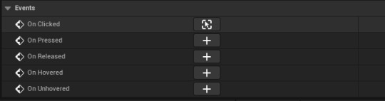
The last thing I had to do with the main menu, was to make sure the buttons were working. So to do this, in the viewport I clicked on the start button and scrolled down on the details panel, until I found the 'when clicked' option. I selected this and it opened the graph editor, with the when clicked node, so I dragged off of that and put in the new node 'open level by name'. I then just had to put in the name of my actual golf map and compiled it all together. I just had to do this with the other buttons, but just change the level name. With the options button, I made a new level and I have to make another widget blueprint for controls and credits. I also had to make it so the mouse would be visible and work.
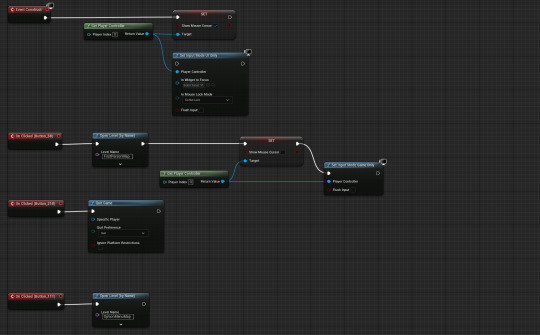
The top piece of code is to make the mouse work, this just sets the input mode to UI only and allows the mouse cursor to show. The three other pieces of code are the buttons and what levels they open or quit. On the start game button I added input mode game only node, and set the mouse cursor to be not visible. This makes it so the game will start properly and no mouse will be visible.
This is the finished outcome to my menu screen, and I am happy with the result of it and how it looks. I just used a screenshot from when I was playing my game, and I think it looks really nice. I used a green tint that had a lower opacity, so you could see the background slightly through the buttons.

The font I used for my buttons and title was Coolvetica, which I got off dafont.
0 notes
Text
Mouse shooting now functional!
I looked up "Unreal engine how to get world location under the mouse cursor", and the AI Overview mentioned a Get Hit Result Under Cursor node:

I had a look, and found this, which seems to be similar to a line trace node

When just using this to adjust the aim, the projectile started aiming through the floor though, so i decided to make sure the Z value never changes and is always flat on the same level as the player like so:

Now the projectiles shoot wherever the mouse is! However it's hard to aim because there's no visual for the mouse. I will create that in the next post:
0 notes
Text
Development // Pause Screen
A pause screen is important to allow the player to change, or quit the game while not being inside of the title screen.

I started out my creating a new widget that will hold the pause screen.

I copy and pasted most of the elements from the title screen. As I didn't want to create everything over again. So instead I decided to reuse the code that I already wrote.

I added the pause screen to the view port inside of the player blueprint. I also assigned it to a variable as I will have to call functions to enable and disable the screen.

My first solution for the pause screen was to use a flip flop. Then set the input mode to the correct one, showing/hiding the mouse cursor and as well as the pause screen too.


While doing that I decided to add a blur to the pause screen. So that the background of the game becomes blurry when the player enters the pause menu. I created the background blur inside of the widget and set the anchor to the entire widget. Making it easier to blur out the whole screen instead of having to specify a x and y value. I also set the ZOrder of the blur to -1 so that it doesn't blur the rest of the pause screen elements like the buttons.
youtube
Since my method of the pause screen didn't work I decided to look up a solution. This video saved me time and showed me the pause game node which was something I was looking for.


I created a new input actor to activate the pause screen. Now by using a input action I can toggle on "Trigger when paused". Which allows the player to trigger it. Even though the game is paused.

Lastly inside of the input mapping, I added the pause input action and assigned it the escape key and B key (For Testing purposes).

Then I created a event inside of the widget called "Pause". This event basically handles all of the game pausing. By using the "Set Game Paused" node I can pause the game making the player freeze in the air. It also resets the players cursor to the middle whenever they pause. To make it is quicker to press the pause buttons.

Lastly, whenever the pause input action is triggered. The pause event is called inside of the pause screen widget. Making it function correctly.
0 notes
Text
New week
For this week I want to finish making my movement indicator and make a start on the resource system.
I will first make a folder and call it resource. I will then make an actor and call it resource.
Next I want to make a child of that blueprint so I can have the main code for resources and special code for each resources.
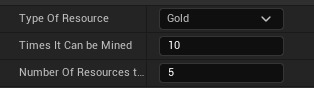
For this resource I want to make gold as this is universal and can be used to build buildings and troops. This means separate resources may not be needed as they would take time that I do not really have.
Going back to actually making a resource I want to right click on the actors I made and make a child blueprint of it.

I have also made a new folder called resources in my main RTS folder so it is easier to find later.
I will then transfer the gold I made to this new folder.
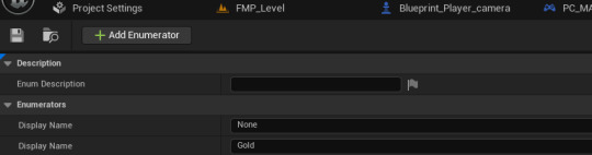
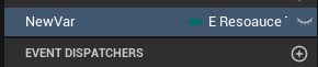
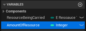
Going back to the first resource folder I will put in a enumeration which will select a number for me. I will call this E_resourceType.

then in the enumerator I will add a none and gold name
Next I will add and actor component.

I then added this in my resource blueprint
This means that now I can edit the component and it will edit this which can then be extended out to the children's.
Next I can open the component and add a variable with the type being the resource we made earlier.
I will also change the name to type and make it visible by opening the eye on the right.
I then also add another.


I then open the gold BP and go to the right details panel and change to what I want.
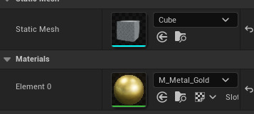
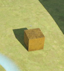
Next I add a cube and make it gold for a very simple representation of my material.
I can then add in my gold resource to my game.
For all of my buildings and things I will eventually put a proper mesh on them but for now I think it is more important getting it to work than what it looks like.
One problem I have now noticed is that when I click on the gold with a character the character just stops.
I think to solve this I need to differentiate how I am clicking the map and objects on the map. I think I need a way to define when you are clicking on the floor so that if it isn't that you must be clicking on an object, building or unit.
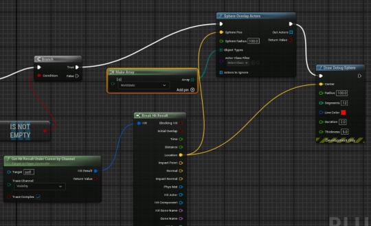
I next want to go to my player controller and in the input mouse action line disconnect the branch from the for each loop. Then copy and paste the get result under cursor and break hit result. Then I will cast a draw debug sphere to know what I am clicking on and it is working.
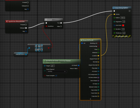
I then add in a sphere overlap actors. to get this to work I had to add a make array to its object type.
Next I will add an is empty node to the out actors and ill also add a branch.
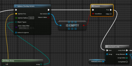
This is then reconnected to the rest of the code. This now means that the character only moves when clicked on the floor and does not when you click through a building. This now makes it be able to tell when you are clicking on the floor.
I next need to define when I am clicking on the gold, this can I assume also be used for other harvestable materials.
I next added this piece of code which makes it able to detect and display when the gold is clicked while having the character selected.

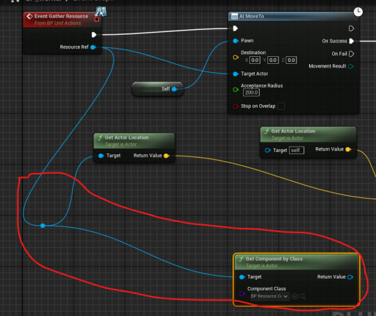
I now need to get the character to move to the resource and mine it.
I then made a new function in my unit actions BP
I have made sure that this is also recyclable and can be used for all resources.
I have made a section of code that ties the resource to movement. Next I will add it into the worker so it actually moves.
I next made this code to get the character to move to the resource, this now works well and I now need to make the character mine the resource and it add to a pool.
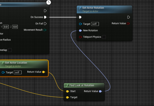
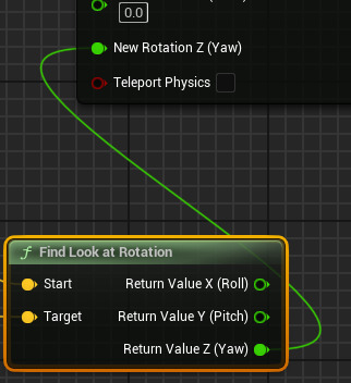
I wanted to also add a rotation so that the unit will face the resource. When I do this my character then also tilts sideways which it strange. To fix this I will split the pins and manually only use the Z pitch.
After making this I can then change the value to what I want it to be in the details panel.

I now will go into the worker's code and add a get component by class.
I next add a delay onto the end of the set actor rotation. Then I connect both nodes with the variable I just made.
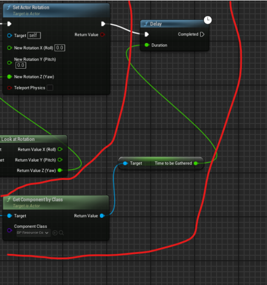
This now makes the character hit the thing for the amount of seconds I put in for each resource.
The next thing I need to do is to be able to store an amount of resource into the character. To do this I will add a new variable in the worker and call it resource being carried.
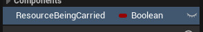
I next added a new variable.
One problem I have identified while making this is that I need a way for the character to stop mining one resource and understand that it will be mining a new resource so it cant add to the previous amount.

To solve this I made it so that the variables we made are used to set the amount of things that the unit can carry. This can also be changed to other materials. One thing I have noticed is that after the mining starts if I want to change to a different resource it still mines nothing but gives the resource while moving. To help this I will use states.
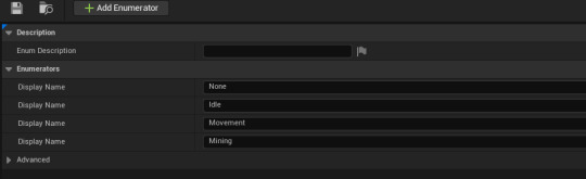
I started by making an enumiration in the unit folder.

For now I have just made very simple activity's. Later on I will add more as I need them.
I next added a new variable in the unit component.
CONTINUE TO PART 2
0 notes
Text
UI - Implementing the main UI and Menu/Deathscreen
The way i'm going to go about laying out my implementation process for these is by splitting this post into 3 sections for each component - some sections will be longer than others as the deathscreen section consists of not much at all.
Ingame UI
The thought process behind creating my UI came into two main considerations to include - the score and the current lane selected. Any more than that and I feel it would be too cluttered as the game's aesthetic is already very simplistic.
To begin, I created a widget and placed two pieces of text on the canvas panel, using the font I discovered from my research in black with a white outer stroke aligning both pieces of text on the opposite sides of the screen.

I then created text bindings for each of these, wanting to display the score on the right and lane on the left, the code within the bindings looks as such:

(This binding displays the lane by casting to the player to gather the variable which contains the lane, and appends it with "Lane Selected:" to display on the screen)

(This binding functions in the exact same way, but just casts to the score variable and appends that instead)
Ingame the UI looks like this, which i'd call a great success!

Main Menu
To begin tackling this, I wanted to have a scrolling menu similar to the game "Geometry Dash" as an example. I created a clone level of my current game level, and modified the Level BP to spawn simply main tiles with no obstacles on them - as well as this I switched the visibility of the player to false & the max movement speed to 0 within the level BP again which oddly gives the desired slow scroll as if it was set to 1.

A lot of the code here is cropped off, mainly because it'll be covered in a future post on the sound, only the displayed nodes are relevant (I forced the mouse cursor to show too to make sure the menu is navigatable)
To lay ontop of this slow scrolling background - I designed a main menu widget using a transparent black image, buttons, and the good matchs font. There is no specific inspiration behind this menu due to it being such a last minute addition.

Each button contains code which corresponds to the correct function when clicked, the top button opens the game level by name, the middle button opens a new widget (which will be displayed next) which contains all of the how to info on the game, and the third button exits the game.


Here's the how-to widget, made in an almost identical method to what I just described with the menu.
Ingame, the widgets & background look like so:


(The scrolling will be demonstrated in the final gameplay video soon)
I'm overall pleased with this menu, and all functions as intended.
Death Screen
Being the simplest of the bunch, I designed this widget which I was able to base off of the menu using the same methods for continuity throughout my UI

The score text has a binding which is identical to the code shown previously for the ingame UI, casting to the player and appending to display it on the endscreen, each buttons code will be shown below.

The top button's code opens the game level again, the middle button's code opens the menu level, and the bottom button's code quits the game. To implement this widget upon death I was able to simply tag on this code to the end of each string of death code in each tile.

Essentially, it removes all the current widgets on the screen and displays the widget I just created. Ingame the result looks like such:

Conclusion
What a long post! My reasoning behind this was due to how my draft posts were laid out it would have required me to rearrange a lot of my posts' orders, it's not ideal but hopefully the seperation into sections make it easier to read! I'm very happy with my UI in-game and I believe my research was very effective in helping me determine aspects of my UI.
0 notes
Text
Creating an arrow
To easier communicate with the player about where they can go, I've elected to add an arrow. This arrow will follow the cursor and change colours depending on whether the selected move is valid.

I first added an 'arrow' [triangle] and two spheres - one would double as the start, and one as the end.
Initially, I believed I wouldn't have to use On Tick as it's expensive via using a custom update tied to the tile manager. However, I quickly realised that this wouldn't actually work, so I begrudgingly used On Tick. I then needed to make the end point follow the cursor.

This was eventually achieved via the above post. I couldn't find the relevant node as it coming from the player controller wasn't shown. My next problem was the direction - X and Y made sense, but Z appeared to be the mouse's distance from an arbitrary point in the bottom middle of the screen. However, after 20 mins of trial and error [aaaa], I managed to get roughly accurate numbers

Said numbers were fed into a line trace to nodes that would set the location of the end point and the arrow [the start was set by the manager from whatever tile was selected]. The arrow was always at the exact centre of the two points.

The next two systems I added was getting the arrow to always look in the correct direction - this was pretty easy. However, getting it to scale properly wasn't.

My estimations worked well diagonally,

but very poorly otherwise. As a result, I realised I needed a new system for working out the scale.

I redesigned my code a little and realised my problem - the arrow would scale in X, but not Y - it could only recognise one axis.


So. Pythagoras won't work - at least however I've done it

PYTHAGORAS DOES WORK I'd just forgotten to account for scale - 1 in the arrow blueprint editor is 100 in the world, so I needed to divide by 100 for an accurate result.

wahoo.

It gets even better - not only have I optimised this system, I can now do more with it. By cacheing the hit actor and checking to see if it's the same one as last time, the arrow will ONLY EVER move if the mouse is hovering over a different actor. Moreover, this means I can now lerp to the new actor for a smoother transition AND change the colour.

Initially I tried reusing my code to check what tiles the player could move to, however this relied on having the destination. As a result, the arrow would always be red. I would need to check what tile the mouse is hovering over.


THIS DOES WORK
Well, only with the top-left diagonal tile because I messed up the code.

Well that was a mess.
However, the arrow now works exactly as intended - I just had to rewrite the code THREE times and then completely forgot how I was conceptualising the code. Now all I need to do are add the checks for whether a friendly tile is on the destination piece, add the animation, and update the arrow more.


By throwing more and more updat[e] nodes at the manager, I've managed to get the arrow to update so that it's always pointing the right way and coming from the right tile. It's not pretty but goddamnit the arrow WORKS.

Well, that's simpler than expected.
I have managed to, with Reece's help, get all line traces moving correctly. A problem I had earlier was that towards the edges, they would get VERY innaccurate, but I'd never considered why. As it turned out, setting the start point to the world location was the issue - as soon as they all came directly from the same point in the viewport [with adjustments to the end point multiplier due to the angle] I managed to get the end points consistently on the mouse.
0 notes
Text
Making my Game using a Tutorial Part 6
Now connect the Second Branch's True to Init Question.

Now we go into the Widget.

In the Graph.

Now from the Variable list drag out your "Continue" Button mine is called B_Continue

Then select Get

Then drag out of it and search for Set is Enabled, then connect its main node to For Each Loop's Completed

In the Variables list select your first Button (for me this was B1) and go down to Events and select On Clicked.

Something like this should appear.

At Variable click the Plus

Change it from a Boolean to an Integer

I named mine Select Answer like the Tutorial.
Now drag it onto the Blueprint form the Variables list and select Set.

And connect it to On Clicked (B1)

Now Holding Shift + Left Click drag over the Set Is Enabled and B Continue then press Ctrl C then Ctrl V then connect it to Set Select Answer, then tick In is Enabled

Now from the Variables list drag out Answer 1 then select Get. Now supposedly I drag out of Set Is Enabled and search up Color and Opacity, however only these options show up.

These are what they are.

The top one's Target doesn't except Get Answer 1, and the bottom one doesn't even have a Node that can except it either. To get the one you want you need to untick Context Sensitive. Then you get more results.

You want to select the Bottom, if you hover your Cursor over it, it will give you a basic description of the it and it will say Target is Text which means that the code will Target the Text asset in the HUD which is what our answer is. (Also make sure to turn Context Sensitive back on).

This is what it looks like. Then Right Click In Color and Opacity and select Split Struct Pin

And connect Set Color and Opacity (Target is Text) to Answer 1

Now select the little coloured square then this will appear

Now you can make it whatever colour you want. (I'm going to make mine green.) Now when you select an answer it will turn into the colour you selected.

Now from the Variables List drag out the Array Variable, then select Get

Then drag out of it and search up For Each Loop
Now get Set Is Enabled's Main Nod and connect it to For Each Loop.

Now from For Each Loop's Loop Body get the Set Color and Opacity (Target is Text), then connect For Each Loop's Array Element to Set Color and Opacity's Target

Then Right Click Set Color and Opacity's In Color and Opacity and select Split Struct Pin (woah Deja vu) then change it to a different colour than the first one. (I changed it to Black). Now connect For Each Loop's Completed to the selected answer Set Color and Opacity.

Now all the Code except the On Clicked (B1) and Answer 1, you do this by Holding Shift and clicking all the Codes.

Now Right Click and select Collapse to Macro


Now this should spawn to replace all the Code you just selected.


0 notes
Text
Moving cards

Here was my first attempt at making the cards move with the cursor. Even with the print string I have nothing occurring.

I have tried a new method similar using a different on clicked node and a different location changing node. But still nothing is reading.

Yet again I haven't gotten it working this method checks the actors below the cursor, which in theory would work so I think the issue is something to do with the cursor not registering it's hit and not being detected.

Even after trying to make a new controller I am still at a loss on what to do as nothing wants to read my clicks.
After looking into it and asking for some help we couldn't find the solution so I had to start from scratch and use a new project, this fixed the issue.
0 notes