#deckle edge sheet
Explore tagged Tumblr posts
Visit Tumblr Blog
Explore Tumblr blogs with no restrictions, modern design and the best experience.
Last Seen Tumblr Blogs


Fun Fact
Tumblr Inc. is funded by 13 investors.
Text

Artisan's Choice: Premium Handmade Deckle Edge Paper by Kalpana Handmade Paper
#Handmade Deckle Edge Paper#Deckle Edge Paper#traditional papermaking#The Art of Papermaking#Papermaking#Kalpana Handmade Paper#handcrafted paper#paper products#recycled fibers#Handmade paper#watercolor painting#Wedding Invitations#Bookbinding#creating paper flowers#fabric of the paper#deckle edge sheet#traditional crafts
1 note
·
View note
Text
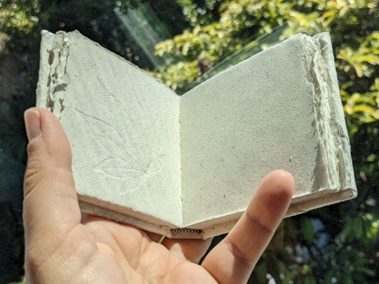
the fic i'm working on binding now is the biggest one i've done to date, and it's going suspiciously well??
#noahbinds#like there were a couple hiccups#like one set of pages didn't print front and back so there's a couple blank sheets that i didn't notice until i was sewing them together#but i decided i can live with that#and it's too big to go in my guillotine#so i think the edges are just going to be deckled#but i found the perfect end papers for the vibes#and they're glued in and just waiting for the head and endbangs and mole on the spine#i'm really excited to have this one finished. all 754 pages of it
4 notes
·
View notes
Text
Endangered crafts list I: Extinct & Critically Endangered
Drawing on the conservation status system used by the International Union for Conservation of Nature Red List and the Rare Breeds Survival Trust Watchlist, Heritage Crafts uses a system of four categories of risk to assess the viability of heritage crafts. A heritage craft is considered to be viable if there are sufficient craftspeople to transmit the craft skills to the next generation.
Extinct in the UK
Crafts classified as ‘extirpated’ or ‘locally extinct’ are those which are no longer practised in the UK. For the purposes of this research, this category only includes crafts which have become extinct in the past generation.
Cricket ball making (hand stitched)
Gold beating
Lacrosse stick making
Mould and deckle making
Mouth blown sheet glass making
Critically Endangered
Crafts classified as ‘critically endangered’ are those at serious risk of no longer being practised in the UK. They may include crafts with a shrinking base of craftspeople, crafts with limited training opportunities, crafts with low financial viability, or crafts where there is no mechanism to pass on the skills and knowledge.
Arrowsmithing
Basketwork furniture making
Bell founding
Bow making (musical)
Bowed felt hat making
Chain making
Clay pipe making
Clog making
Coiled straw basket making
Copper wheel glass engraving
Coppersmithing (objects)
Currach making
Damask weaving (linen)
Devon stave basket making
Diamond cutting
Encaustic tile making
Engine turned engraving
Fabric pleating
Fair Isle straw back chair making
Fan making
Flute making (concert)
Fore edge painting
Frame knitting
Glass eye making
Hat block making
Hat plaiting
Hazel basket making
Highlands and Islands thatching
Horse collar making
Horsehair weaving
Industrial pottery
Maille making
Metal thread making
Millwrighting
Northern Isles basket making
Orrery making
Paper making (commercial handmade)
Parchment and vellum making
Piano making
Plane making
Plume making
Pointe shoe making
Saw making
Scientific & optical instrument making
Scissor making
Sieve and riddle making
Silk ribbon making
Silver spinning
Spade making (forged heads)
Spinning wheel making
Sporran making
Straw hat making
Sussex trug making
Swill basket making
Tanning (oak bark)
Tinsmithing
Wainwrighting
Watch dial enamelling
Watch making
Whip making (horse)
Withy pot making
Wooden fishing net making
25 notes
·
View notes
Text

“From my rotting body, flowers shall grow, and I am in them, and that is eternity.”
Edvard Munch Madonna (Schiefler 33; Woll 39) lithograph with woodcut in black, rust red, blue and pale grey-green, 1895-1902, on tissue-thin Japon, a superb, strongly printed impression, the colors rich, Woll's fourth state (of seven) before the additional strands of hair across the torso, signed in pencil, with wide margins, deckle along the upper and right sheet edges, the lower and left sheet edges trimmed at time of printing, in excellent condition, framed L. 21 7/8 x 13¾ in. (556 x 349 mm.) S. 25¾ x 17¾ in. (654 x 451 mm.) Price realised USD 650,500
#Edvard Munch#art#Art#Painting#Drawing#ContemporaryArt#ModernArt#FigureDrawing#PortraitPainting#FigurativeArt#AnatomyStudy#ArtQuotes#ArtInspiration#ArtProcess#CreativeProcess#ArtistOnTumblr#FigurativePainting#PortraitArt#FineArt#ArtLover#VisualArt#Symbolism#impressionism#expressionism
20 notes
·
View notes
Note
hi there! I was checking out your google drive for your incredible looking typesets for ATYD (My bestfriend's birthday is coming up and I want to gift her a personal ATYD collection, even though I'm not really into typesetting, hence looking for one) and I was wondering about some specifics you used, like what page size and whether or not you trimmed the textblocks? I tried printing out some test pages set to A4 but the negative space at the bottom was massive, but normal looking at the sides and top, so I'm a bit confused. Thank you so much! :D
(Also, I love your typeset for dripping fingers, it fits the feeling of the story so incredibly well and I love it)
hey! thank you so much, and i’m so glad you’re looking to use my typesets!! those are good questions, and i should probably make a fact sheet to drop in the drive. But i print on regular 8.5x11 letter sized paper, flipped on the short edge. For ATYD specifically, because they’re quarto’s, you’ll get 8 “pages” on one sheet on paper. I used bookbinder.js to create the signatures, so I can’t remember the specifics of how many sheets of paper are in one signature, but it should be in the 4-6 range.
and yes, i do trim my bookblocks! for a quarto in particular, you need to trim them as the top seam is attached. idk if going to be able to explain it well, so plz let me know if this is confusing, but when you print a quarto you first fold your page in half from top to bottom (all the typesets have dotted lines that indicate where to fold!). this is now the “top” of your page. after you fold in half the first time, you then fold in half from left to right, giving you 8 pages. so to be able to open the pages, you need to cut off the top seam at the least.
If trimming is something you aren’t able to do, I think there are some free typesets of standard sized atyd floating around out there that you would be able to bind and leave with the deckled edge.
but that’s such a cool present for your friend, and I hope you enjoy binding it!! atyd is a monster hahaha and such a good fic. Thank you for your compliments too (i think dripping fingers is my favorite i’ve ever done) and plz let me know if there’s anything else I can help you with:)
3 notes
·
View notes
Text
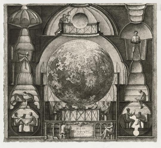
"La Lune en Ses Quartiers" ("The Moon in Its Quarters") by Érik Desmazières. Aquatint and etching on wove BFK Rives paper, printed to the deckled sheet's edge (as issued), 2011.
Fitch-Febvrel Gallery:
"Érik Desmazières has been described as a "contemporary printmaker of breathtaking virtuosity" (The Independent, London, Dec. 1993), and "arguably the finest French printmaker of his generation" (Robert Flynn Johnson, Curator, Achenbach Foundation for the Graphic Arts), rendering with masterly draughtsmanship subjects ranging from workshop interiors to fantasies in the tradition of Bosch and Goya."
2 notes
·
View notes
Text
birds eye view
torn between land and sea these landscapes, with deckled edges showcase a delicate tapestry made of various textured sheets only ever appreciated from the sky - not satellite imagery
take pause, if you will spare a moment in time for all them perceived from up here; down there small grains of sand, making waves getting pulled by the rip of the day-to-day
it seems simpler up here in this metal tube indulgent, finding space alone in this back row of empty seats to escape the little complexities that await me jotting down more appointments in the diary
so I enjoy this brief reprieve before feeling the wheels extend to remind me to take one deep breath before facing this vast never ending terrain of being again
15 notes
·
View notes
Text
Catalog Essay: Yoonshin Park at Zolla/Lieberman Gallery

Yoonshin Park is a bookmaker, and it comes as no surprise that the blank page would hold a particular kind of significance for her. So when Park found herself in the midst of a paralyzing creative block, the page --that unmarred sheet, that metaphorical emptiness abounding with potential, that empty space waiting to absorb and record creative output as evidence of one's identity as an artist-- was an ever-present specter. Park's "Tied" series is a product of that period in her life. However anxious she might have felt then, this practice instead embodies the assuaging of that frustration, the uphill climb towards re-establishing a creative rhythm. Catalyzing this return to making was the simple folding of paper. For Park, the repetition, the accumulation of rote handiwork, is its own kind of antidote to the discontent surrounding her lack of production. Via this self-soothing practice, the basis of "Tied" was formed.
In the dozens of pieces that make up Park’s “Tied” series, handmade papers are sewn (or 'tied') to fabric substrates through their folds, the subsequent feathered fibrousness resembling the deckling of a book’s fore-edge. There is so much volume among these soft leaves that Park’s works call to mind the textures of a filled sketchbook, or a well-loved paperback novel, with their collective sheets swollen well beyond the thickness of their spines with inks and paints, and the oils and dirt from hands that repeatedly turn their pages. An early piece, Arborescent from 2016, remains one of the only works in “Tied” in which the artist’s papers run vertically, as though standing in a book shelf. As for all the others, their papers appear stacked, like so many volumes at hand, picked up, opened, read, written or drawn upon, and set back down in the course of use. In a more recent piece, Absent Whispers from 2021, sheafs of paper bloom out into space, hanging over the other horizontal bands like the protuberances of signatures from a fallen spine, or the triangular flag of a dog-eared corner. In the eyes of a bookish person, the tactility of Park's papers is proof of progress: the transformation of crisp, uniform pages to ones irregular and tattered through touch.
Park’s palettes of browns, reds, and grays, too, recall the experience of having and holding books. The earthy suggestions of tea and coffee stains in Encounter; reddish hues, like corrective pencils, in Altered Arrangement; and graphite-colored smudges of Calibration, are actually made by saturating the handmade paper with various inks --an inversion of the impulse to fill up pages, doing so without even making a mark. Most prominent in “Tied,” however, are the blues. The various shades in Indigo, Notations, Morning, and Submerged evoke the marks and notes of a blue fountain pen and the notion of the revisited page: the sentence, the phrase, the idea to be highlighted and returned to. So too do these tones drive home the play on words by which the artist has named her series. The undulating blues are also clearly representative of the series moniker’s homophone, “tide.” The rising and receding of water, that rhythmic, unceasing return, has so much to do with Park’s creative impulses here so as to be practically aspirational. It is a testament to the artist’s thorough understanding of books and what books can do that she can pack each artwork with so much content by way of such nuanced gestures. Through Park’s work in “Tied,” it is possible to recognize that the book --or indeed, the art object-- need not be simply a vehicle onto which meaning is applied, but a thing that embodies meaning intrinsically.
Robin Dluzen, 2023
Artist & Art Critic
0 notes
Text
#Handmade Deckle Edge Paper#Deckle Edge Paper#traditional papermaking#The Art of Papermaking#Papermaking#Kalpana Handmade Paper#handcrafted paper#paper products#recycled fibers#Handmade paper#watercolor painting#Wedding Invitations#Bookbinding#creating paper flowers#fabric of the paper#deckle edge sheet#traditional crafts
0 notes
Text
1 Sheet Wonder Slimline Glow-in-the-Dark Cards [Them Bones Series #4]
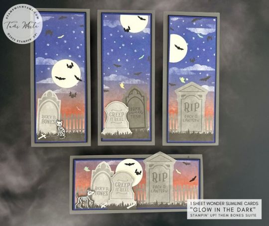
GLOW-IN-THE-DARK 1 SHEET WONDER SLIMLINE CARDS 🎃🎃🎃Oh, my gourd! Do I have a spook-tacular treat for you today. 😱 Not one...💀 Not two...💀 But FOUR...or FIVE bone-chilling Halloween card masterpieces from just ONE sheet! 👻 Yes, you heard it right! Let's dig deeper into this graveside wonder... I've unleashed the magic of Stampin' Up! 'Them Bones' Designer Series Paper.🦴✨ Just one piece, folks! Now, let's get down to the BOO-siness.👻 Designer paper cutting- it's not rocket science, it's witchcraft! 🧙♀️ With the right incantations (or instructions below), you can conjure up 4 or maybe even 5 bewitching cards. This tall, dark, and slimline Halloween card set is ready... Are you? 😈 Let’s put the “eek” in unique! 🦇 Grab your capes, witches, and wizards, it’s time to craft some Halloween magic! 🕸️ INSTRUCTIONS NSTRUCTIONS THEM BONES VIDEO VIEW VIDEO & CLASS PROJECT PHOTOS Want to save these ideas for later? Pin them to your favorite Pinterest board. Have you tried these designs? I love to see your creations! Be sure to share them on #shareyourcrafts post every Saturday on my Facebook Page Here's how: 1. Grab your 1-sheet wonder, be it the Them Bones Designer Series Paper or any other design that tickles your Halloween fancy. 📄2. Cut the paper according to the measurements. Remember, the number of cards you can create depends on how you cut the sheet. So plot wisely. 🪓3. Embellish your card using glow-in-the-dark moons and other spooky accents. Be sure to let your creativity run wild, because after all, it's Halloween! 🎃4. Prepare yourself for gasps of awe when your cards literally glow in the dark bringing your Halloween greetings to life! 💀 Turn off the lights and this set of card glows with full moons, bones, bats and ghosts. Here are some of the individual designs. For the card on top I cut the top of a tombstone off some scrap DSP and added it to the top of the tombstone.The cat was cut from another patter in the designer paper, but if you wanted her to glow you could stamp her on Glow-in-the-Dark paper instead. Don't miss the rest of my Glow-in-the-Dark Them Bones Series. THEM BONES SERIES STAMPIN UP SUPPLIES I USED *I used products from the All About Autumn Suite & Deckled Edge Dies from the upcoming 2023 September - December Mini Catalog. Click here for details. Read the full article
0 notes
Text
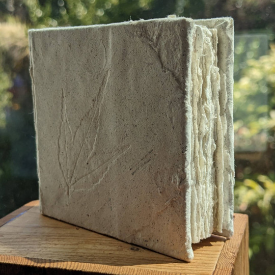
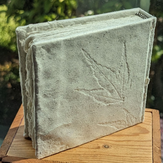
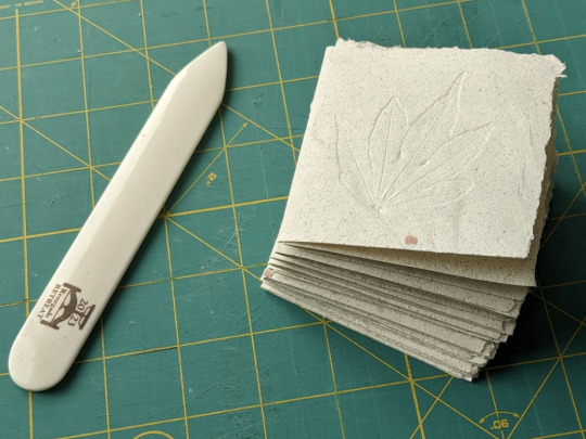
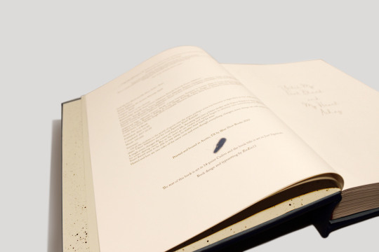
Pages of Pages - a book I entered into the county fair this year. Finally pulped another batch of missprints, this time working with Hammermill 20lb Cream (off-white in color). Tucked some leaves under the sheets when I dried them for a nice debossing effect.
This paper gave up its toner a little more easily than others I've worked with, resulting in a batch with strong "cookies 'n cream" vibes- lightly speckled everywhere. The spots of text that are still visible are infrequent but still charming. Will have a macro post of them later. Has an actual deckled fore-edge and a very tidy black and white sewn headband. Cover's a bit lumpy because the paper I make isn't large enough to fully span it, thus there's some layering going on.
Always pleasing to reclaim squandered pages and then to immediately use up all the freshly made supplies- I tend to get ~20 sheets per batch and this needed all but a couple of them.
#only problem now is I've yet another blank to add to the shelf...#bookbinding#book arts#paper making#really do love how self contained the project was#only point of suffering was trying to trim the damn thing (post on that later)
63 notes
·
View notes
Text

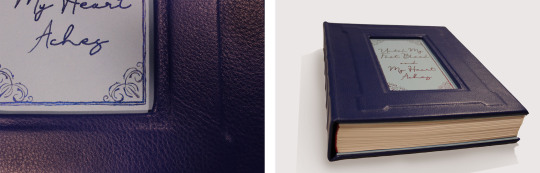


My first completed fanbinding! There were so many fun typesetting elements I had trouble narrowing the photos down but I didn't include everything. My favorites are definitely the music QR codes and the meta AO3 fics.
Until My Feet Bleed and My Heart Aches by @kazliin
‘…Of all the rivalries in the world of sports over the years, perhaps none has become so legendary as that of Russian figure skater Viktor Nikiforov and his rival, Japanese Yuuri Katsuki…’
A single event changes the course of Yuuri’s life, throwing him into a bitter rivalry with Viktor Nikiforov that spans across his entire skating career. But as the years go on, rivalry and hatred begin to develop into something very different and Yuuri doesn’t seem to be able to stay away, no matter how hard he tries.
Hatred and love are two sides of the same coin and even though everything changes, some things are still meant to be.
Technical stuff and bonus photos below the cut.
General
197,692 Words / 11 x 8.5 Paper / 500 pgs
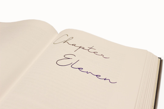
Title Font & Chapter Number Font: Just Signature
Chapter Title & Body Font: Adobe Caslon Pro
Misc Fonts: Georgia, Lucida Sans, Zilla Slab, PT Serif, Segoe UI
Designed, typeset, and bound by me.
Programs used: InDesign and BookletCreator.
Anyone who knows me knows I am a sucker for enemies to lovers and this fic executes the trope beautifully. It was one of my very first fics on AO3 and since then I have read it countless times. The fic diverges from canon in a single moment and what proceeds is one of the best Victuuri fics of all time.
Materials
This was the first ficbinding project that made it off of my computer. The original plan was to keep the book thinner by scaling the page size up to 11 x 8.5, but obviously that didn't work. I ordered short grain 11 x 17 sheets from Nicole Nikolas Modern Paper Goods and printed with my large-format inkjet printer (which used more cyan and magenta than I would have expected).
Once my signatures were printed I realized just how massive this thing was, and in that moment I decided the casing was going to be leather. I ordered Royal Blue leathers from Peggy Sue Also Leather's Dutchess Collection. And while I waited for that to come in I hand-painted the chapter numbers using Dreamland Watercolor's Beta and a fluid writer. The color changing effect wasn't as dramatic as I hoped but it still turned out gorgeous.
I decided not to complicate things too much and left the spine flat and the edges deckled. I used the basic method of sewing tapes and spaced five of them out across the spine. The headbands are actually Vintage Petersham Grosgrain Magenta ribbons from Fini Ribbon that I folded over some string I had laying around. I also made my own endpapers from Strathmore drawing sheets and more of the Beta watercolor which I sprayed over the sheets using a cheap paintbrush.
I created an embossed frame on the cover by layering chipboard on top of the 0.098" Davey Binder's Board I ordered from Talas. Then I cut out a window so that I could do the title out of watercolor. I didn't have a pairing knife for the leather so I tried sanding down the edges to help minimize the thickness of the folds. I am actually not sure if this helped or not but the leather turned out better than I thought. The only issue was that I didn't have enough of an overlap at the top and bottom on the inside of the book board, and the endpapers couldn't cover the seam properly. I came up with the solution of adding a second layer of chipboard that I covered in light blue construction paper. I made it to the same dimensions as the Davey Board and then glued everything together with pva. I really like the effect it has and it also worked out as a base to paint the title onto.
Typesetting
Typesetting this fic was a lot of fun because of all the social media aspects included in the fic. This included articles, Reddit threads, Twitter posts, Instagram posts, Youtube videos, Tumblr posts, and even meta AO3 fic summaries. I did my best to match the real-life counterparts as best as I could. I ended up using Segoe UI for most of the social media typesetting. The articles used Zilla Slab for the title and PT Serif for the body. The AO3 summaries were the most complicated as they used Georgia and Lucida Sans fonts and jpeg graphics.
The other really exciting element I incorporated was the music. Kaz used music throughout the fic as a very imporvictant part of the storytelling. Yuuri and Victor communicate through their skating and their routines and the music is what brings those routines to life. I placed QR codes in the margins at the start of each routine. It is so cool to hold your camera up and suddenly have the music playing from your phone as you read! I also included an appendix of the music so that when QR codes become obsolete the music is still accessible.

281 notes
·
View notes
Text


Did some tests with dipped edges. These ones on a test book turned out pretty well but a couple things I've found:
1. if you dip a text block, put a sheet of printer paper around the covers and hold tight. The ink will draw up the edges of the first and last sheet, so the printer paper should act like a sacrificial sheet and protect the text-block below.
2. make sure the edges are smoooooooth, deckled edges just won't work.
#bookbinding#book tumblr#bindery#bookmaking#late night crafting#bookworm#suminagashi#crafting#books#bookstore
6 notes
·
View notes
Text
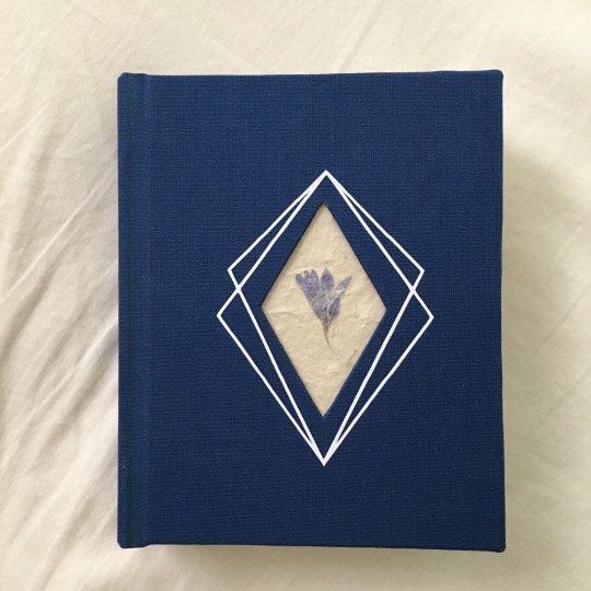

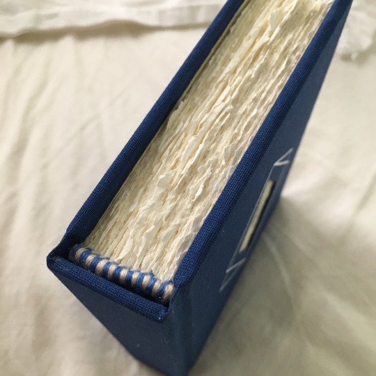
Latest journal! I decided to deckle the pages (68 sheets of ‘em) and if you’re thinking that would take forever you’d be correct. But I love their soft, ruffled edges so I’ll be doing this again in the future.
I loved the insert @clovenhoofbindery did for Away Childish Things and wanted to give it a try. After many mistakes, I got there.
The spine turned out a little funky, but I’m pleased.
42 notes
·
View notes
Photo
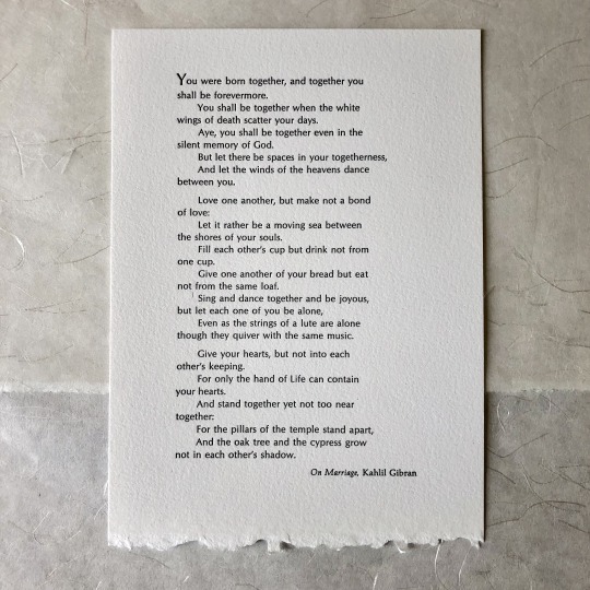
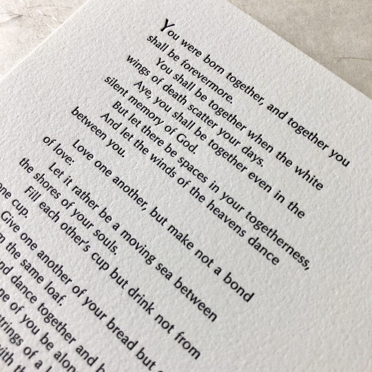
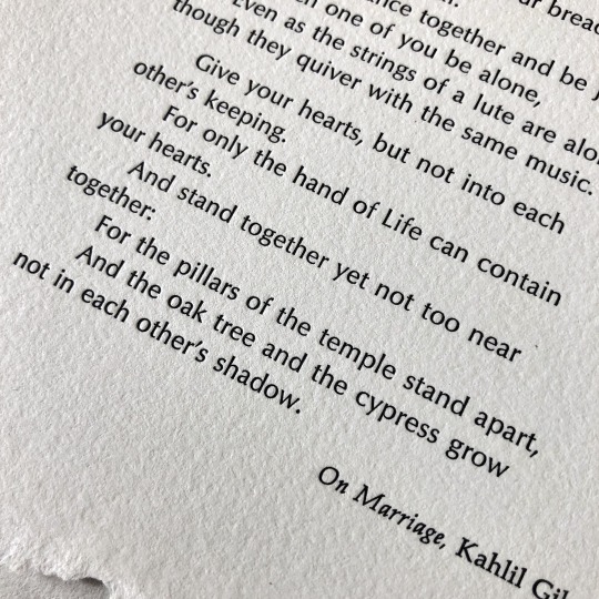

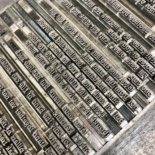
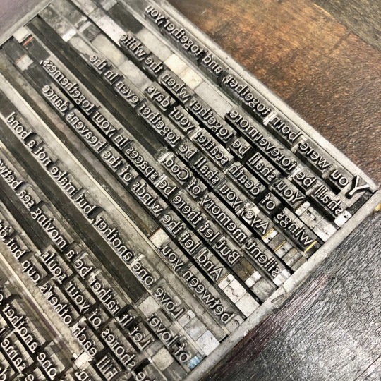
[image description: 6 photos of a 5x7 inch letterpress printed broadside, and the formes of handset lead type used to print it. The broadside is an excerpt from Kahlil Gibran’s The Prophet, “On Marriage,” printed in black on a white sheet with a deckle edge at the bottom. In the forme of type, each letter and space is an individual piece that is assembled for the printing, then distributed back into its case of letters and ready to re-set to print a different forme. full text under cut. end description.]
LOVE setting poetry :)) i don’t know a dang thing about writing it but i love to put my hands on it, physically, and this was an extremely sweet & good paper anniversary gift to get to put together. interesting discrepancy between Ay and Aye in some versions of the passage, I do not know where that entered into things—but Aye is how it is in my grandmother’s 1944 printing of The Prophet, and the customer preferred it that way so that’s what i did.
set in Optima & Palatino
“You were born together, and together you shall be forevermore. You shall be together when the white wings of death scatter your days. Ay, you shall be together even in the silent memory of God. But let there be spaces in your togetherness, And let the winds of the heavens dance between you.
Love one another, but make not a bond of love: Let it rather be a moving sea between the shores of your souls. Fill each other’s cup but drink not from one cup. Give one another of your bread but eat not from the same loaf. Sing and dance together and be joyous, but let each one of your be alone, Even as the strings of the lute are alone though they quiver with the same music.
Give your hearts, but not into each other’s keeping. For only the hand of Life can contain your hearts. And stand together yet not too near together: For the pillars of the temple stand apart, And the oak tree and the cypress grow not in each other’s shadow.”
#letterpress#letterpress printing#handset type#lead type#finished works#formes#once again hermann zapf is propping me up#he's like a box to stand on the makes me seem a foot Taller.
14 notes
·
View notes
Photo
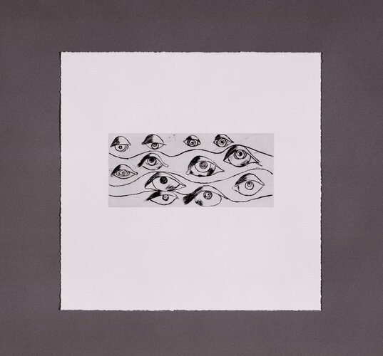
Eyes, Louise Bourgeois, 1996, Brooklyn Museum: Contemporary Art
Size: Image: 3 15/16 x 9 in. (10 x 22.9 cm) Sheet: 14 1/16 x 14 in. (35.7 x 35.6 cm) Medium: Drypoint on Somerset textured white paper with hand torn deckle edges
https://www.brooklynmuseum.org/opencollection/objects/159212
22 notes
·
View notes