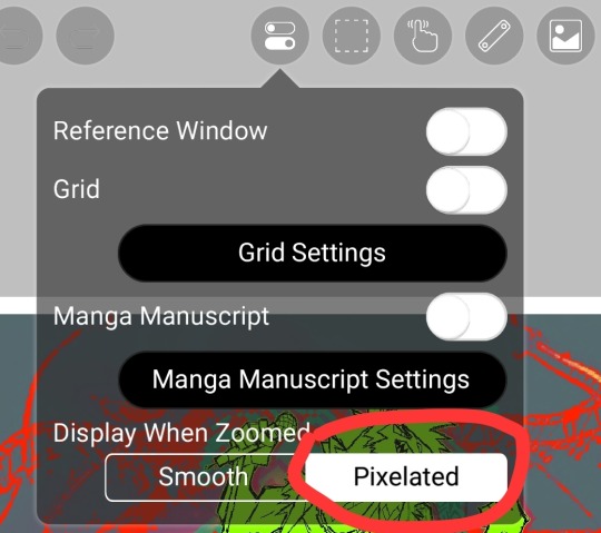
#doing a sketch then cleaning it up and then making it pixelated > doing a sketch and then redoing lineart on top of it
Explore tagged Tumblr posts
Visit Tumblr Blog
Explore Tumblr blogs with no restrictions, modern design and the best experience.
Last Seen Tumblr Blogs


Fun Fact
The Tumblr office adopted Tommy, an 11-year-old Pomeranian.
Text

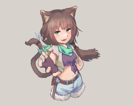
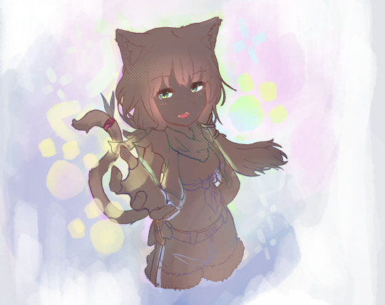
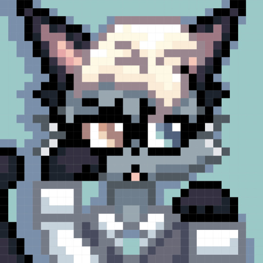
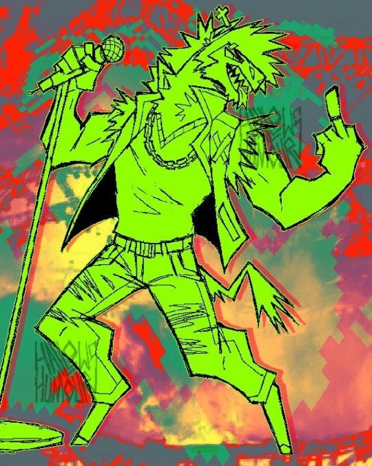
GRRR I LOVE PERIDOT RAGHhhh
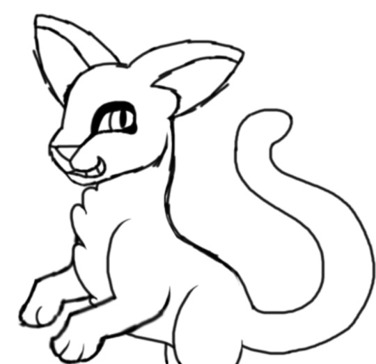
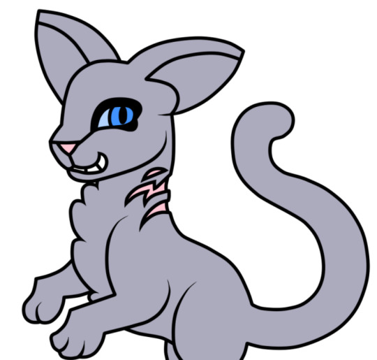
#doing a sketch then cleaning it up and then making it pixelated > doing a sketch and then redoing lineart on top of it#steven universe#peridot#i was messing around with the screen overlays it kinda looks like ds flipnote coloring 😭
243 notes
·
View notes
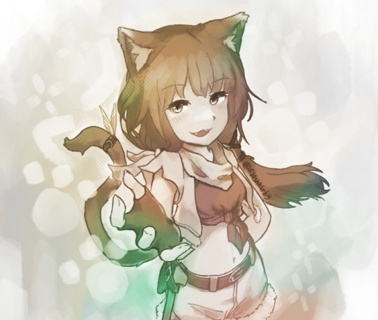
Text


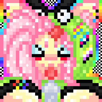
My Stardew Valley farmer (and part-time druid) Niku Natsume! (no relation)
#my art#video games#stardew valley#niku natsume#a VERY modded game lol#the sketch feels neater to me than the end result#if only because of the number of brute force adjustments i did to the sketch layer to make it clearer#resulting in pixellation#but i still really like the colored version too!#the colors were eydropped from my farmer's in-game sprite#except they are made greyer by the sketch layer lol#cleaning up is for people whose art program is not lagging and who arent doing it with a mouse#i did a lot of messing with colors that i havent before#foreground vs background stuff#imho it worked quite well#featured mods:#grandpa's tools#(the watering can appearance)#lost in the mountains#(the farm landscape)#stardew druid#(the lightning)#fashion sense#(the base game doesnt exactly let you go barefoot)#also all the fashion sense packs the actual outfit is from#goblinhours' elf ears and hxw sweetheart hair and i dont remember the rest lol
10 notes
·
View notes
Text


The Scout RED v. BLU sketch pages were fun, I might keep doing that until I run out of steam. Take some Snipers.
Like the Scout ones, some brief related headcanons below.
RED:
-Likes bugs a lot. Will go out of his way to pick up and play with even the 'ugliest' or most dangerous ones. Fond of roaches and beetles. If he could wake up tomorrow and be a beetle, he'd finally be content with life.
-Smokes, both tobacco and weed. He tries to not smoke too much weed though, because if he smells like it he would be easy to track down during battle. Tobacco really helps his nerves and paranoid thinking.
-Sewed animal teeth onto his own hat. He likes his hat a lot, it was a gift from his father. Hunting also reminds him of spending time with his dad & mum, and he likes to go hunt birds to cook, or to go fishing to pass the time off work.
-Enjoys a GNC look sometimes. Considers himself a bit of a girl too, but doesn't really know how to express that to the people around him. "I'm probably nonbinary but I've got a job so idrc about that rn."
-Pierced his ears himself. Has longer, unruly hair that he contains with ponytails and braids. Is very tan because of spending so much of his time outside. Generally dresses in darker clothes during work, as it makes him feel like he blends into the shadows (even though it really makes him stand out a bit more). Always has a slight smile, like he's making fun of you in his head.
-Rarely seen without a weapon of some sort on his person. Also pretty much never seen without his sunglasses on.
BLU:
-Peeked through the brain-scooping-induced veil once and realized he had the same face as someone on the other team. So they scooped his brain even more til it got muddled up. Now he gets frequent, intense migraines and struggles with his balance, and with limb control on his left side. It mostly affects his legs, meaning he can still snipe with good accuracy. He sometimes uses a cane if he feels particularly weak that day.
-Hates his face but can't remember why without his head pounding. He can barely even see it, it feels like. Like a big pixelated mass where it should be. So he covers it a lot, especially during battles and missions.
-Hats make him feel more anonymous. Ranges from very cool ones to the dorkiest bucket hats you've ever seen.
-Likes fishing and nature walks to look for birds. Also goes hunting in the tundra around the BLU base pretty much daily. It's good stress relief.
-Plays guitar, pretty decently too. Also good for stress relief.
-Uses a bow and arrows about as much as he uses his rifle. He hand carves his arrows, wood carving is a very satisfying hobby for him.
-Always seems a little pallid and grey in the face. Especially compared to the deep tan RED Sniper has.
-Cuts or shaves down his hair regularly, only lets it grow back a little. Clean-shaven unless he's doing terribly that week. Has a couple scars that stick around even after respawning. Wears bracelets and necklaces often, though less so during work. Only smiles when he's alone, and in general behaves coldly towards his team.
-Doesn't smoke or drink. Hates the feeling of an altered consciousness.
-Paid his own money for a gun he thought looked better. He's getting tired of being on the losing team all the time.
Bonus

#i think abt the snipers so often man i need it the way ailing victorian children needed seaside air#tf2#tf2 sniper#tf2 blu team#tf2 blu sniper#tf2 red sniper#red sniper#blu sniper#team fortress 2#sniper tf2#tf2 fanart#tf2 headcanons#team fortress 2 sniper
169 notes
·
View notes
Note
what steps do you go through to draw in your current style? do you have any pointers about it? its absolutely one of my favorites
i'm not sure if i think of my process in steps. in my head, i'm just straightforwardly drawing the shapes the characters are made of at angles that look right and building on that... luckily, i stream when i draw every day, so i have a ton of videos of myself drawing. example:
youtube
i haven't bothered to upload a lot of the modern streams to youtube because my video editor can't handle editing 4-8 hour files even if i'm speeding them up and technically making them shorter because of the way video editors interact with files, and the freeware i use isn't able to make proxy files. the act of downloading and editing and combing through all the footage is a ton of time and memory space and it's just not what people are usually looking for from me, so it's not where i wanna put my time.
but that's neither here nor there. what i mean to say is these vods are really long. so you don't want to rawdog those. but you can just download a video speed controller extension to your browser and it's extremely easy to cruise through the backlog of vods at ~15x speed.
i've gone ahead and highlighted some of the recent videos to separate the chaff from the wheat. i tend to take long breaks to eat or walk my dog so there are big periods of Nothing Happening. i'll try to skim some more and do the same. unfortunately, i don't have any good videos of me coloring, since twitch deletes vods after like a month, and i've just been focusing on sketching.
but yeah, in general, it really depends on how good i'm feeling on a given day -- sometimes i will sketch multiple times for just one panel and sometimes i won't sketch at all. i use paint tool sai 2 and a pixel brush usually 2 pixels wide with no pen pressure. for comics, i have 1 layer for the panel borders, 1 layer for the sketch, 1 layer for the lines, 1 layer for the colors, 1 layer for the text, and 1 layer speech bubbles. sometimes there are special effects that overlap borders and need their own special layers. when i start sketching a new panel, i will usually put it on its own new layer, and sometimes for multiple characters i will put them on another new layer at a different opacity. this is mostly to move them around without constant cleanup. once i've gotten a sketch pretty finished, i merge all of the layers into the sketch layer. the line layer is usually just the sketch layer cleaned up and paint bucket tooled black. but basically, the vast majority of my time working on art is spent trying to fix small things like tangents, fitting speech bubbles into panels, thinking about how to lay out a page, checking continuity interaction with other pages, that kind of stuff. the complex technical parts of the process are to save time on those in ways i can without compromising quality. the other portion of working on the art is like "step 1: draw head circle (or jessie head diamond). step 2: draw the rest of the owl." i don't know if this was helpful at all y_y if you want more pointers i might be able to offer clarity on more specific questions!
142 notes
·
View notes
Text

Who Will Save You Now? / Bad Machine
There it is ladies and gentlethems. Bit of a personal piece if I gotta be honest, what started out as a random sketch I wasn't thinking too much on while making ended up transforming into a 4 day emotional rollercoaster for me.
I can only do so much on traditional and I'm still not satisfied 💔 maybe I'll make a digital version of this someday.
Sappy rambling on the creative process, as well as close-ups on details & songs' lyrics below!


I've been experimenting with coloring techniques here, other than just drawing Turbo with intense expressions as well as videogame-pixelated equivalent of body horror. This was a deliberate attempt to stop gatekeeping myself in regards to my art, clean or messy- doesn't matter, as long as it's something that I've created with unrestricted love. There's SO MUCH more I would've liked to add but if I sat there thinking up more things to add or details to include, I'd never truly finish. The lyrics was an impulsive choice, looking at it now I'm not too happy with how busy I made the background come across, and another reason why I'd like to maybe redraw this digitally in the future; I wanted to leave a loud and clear ¨this is what inspired me!!¨ lol.
Wish I could put into words (or hell, I wish there were ENOUGH words cuz there aren't!) how much this character means to me, how much he's meant to me for the past decade. There just isn't enough for me to express how much love I hold for him, what I've been through with him and how many times I've tried to suppress him over foolish insecurities. That I was 'too passionate', too much of this, too much of that. When in reality that was my greatest strenght, I feel free when I draw him, and I feel alive when I'm able to express myself through him.
84 notes
·
View notes
Note
I have a question, out of curiosity, have you ever thought about creating a story with some of your characters? Do you usually draw and paint them on paper and sometimes with computer editing/art programs?
P.S.: Your drawings and presentations look amazing
i've thought about it occasionally in a very vague way but that's about it. i'm not much of a lore or worldbuilding kind of guy so besides trungo & friends and a couple others, most of my characters are one-offs--though i am not fully immune to popular pressure which is why brother gregor has been getting multiple appearances after his unexpected popularity on here. i also don't really enjoy fiction writing and very much don't have the discipline to draw comics so realistically the best you're probably gonna get from me is multiple disconnected vignettes of the same character or characters. my most recent fixation is evidentially some sort of redwall-adjacent setting full of shrews and other critters in monk robes but there's not a ton of connective tissue there so far.
ON THE OTHER HAND my partner is my opposite in all of the above respects and does like working on narrative projects and has been on and off building up the lore of the critter monk setting. the two of us (and maybe some other artists??) might even try and make a zine or two about it later this year.
as far as my art process goes, almost all of it is drawn traditionally and then scanned and lightly fussed with in photoshop. lately i have been doing a lot of sketches digitally and then transferring them to real pen and paper, but sometimes i like the digital sketch enough to clean it up and post as well. it's pretty easy to distinguish my digital vs ink line-art since the lines are a lot chunkier and pixel-y, e.g.:

74 notes
·
View notes
Note
Your artworks looks like AI
To be honest I'm guessing this is a bot because I don't think my art is really a style that is mistakeable as AI. BUT just in case this is someone who genuinely doesn't know how to differentiate AI art versus human art, I'm gonna make a post on it rq!
One of the ways you can tell my art is not AI is because you can see all the individual strokes that I made. My style in particular makes this easier to distinguish than others because as an artist I really embrace this, while others prefer a very clean lineart and coloring process.
Here are some examples from mine:

This is from one I made of Nico underwater. If you look at the water you can see all the places I drew each line. By contrast, zooming in on AI art doesn't show any brush strokes at all. Often, there's also a weird "fuzz" I've noticed? Like rather than a human artist who simply makes a, say, yellow banana, and if you zoom in you just see yellow, for an AI if you zoom in it weirdly looks like the AI is struggling to make every pixel yellow so each pixel is slightly different. That's what I think of as the art being slightly fuzzy.
I tried searching google for some AI art to use as examples of this but I'm currently in a different country for an internship and they're still getting my WiFi set up, so my connection isn't loading any of the Google images with enough clarity to be able to zoom in a bunch so I can show you. But it's something I've noticed for a lottt of AI art--and so this coupled with lack of brush strokes can be a sign of AI.
Another thing that, in my opinion, is a way to determine something is human-made is the shape of the canvas! In my experience, when I see AI art online, it tends to be a very similar canvas shape each time. I don't think most AI creations have the ability to be creative with canvas shape. Meanwhile, a human might choose to make their canvas super wide or long or whatever. Since I created each piece of my art individually for the purpose of eventually combining it all into a comic-ish thing, each canvas I made was very very wide which would have been unusual for an AI. Such as:

From what I've seen, an AI would have created somewhat more even dimensions.
And finally, one of the dead giveaways for AI versus human art is simply what mistakes are made in the piece. Neither AI art nor human art is usually absolutely perfect, but the mistakes that an AI makes are not usually the same ones that a human makes! For example here, I didn't actually make lineart or sketches for the background because I had figured "eh, how hard is it to make a background like this?" However you can tell this didn't work out perfectly for me because my "sun" did not end up perfectly round hahaha. Look above Nico's head. It's like sort of lopsided. Getting a perfect circle without any sort of lineart or tool is very hard as an artist, at least for me! However an AI would not struggle with making a perfect circle. It would have been much cleaner. However, an AI would have probably struggled more with things like color and style consistency in the wings (there are a lot of feathers that could trip it up), body proportions, etc etc.
And, overall, these three things together are very consistent with everything I post. AI would struggle to recreate a style like this over and over again, and it also tends to struggle to make the same face over and over. I'm not sure if you've ever seen one of those videos where people ask AI to duplicate an image without making any changes, but it really cannot do it. For this reason it would have been difficult for an AI to make the same face so many different times for a consistent comic.
I realize this ask was most likely a bot tbh since I think my art is pretty obviously human, but as a hater of AI art, I will never turn down an opportunity to talk about ways to differentiate human versus AI art. I hope this was helpful to anyone who struggles with identifying things like this!
#artificial intelligence#identifying ai art#ai discourse#honestly#i have no idea how to tag this#i generally keep things on this account fandom-only so at some point I might make a second blog for non-fandom stuff#and this can go there#but for now#it is here#thank you for coming to my ted talk#art#artwork
35 notes
·
View notes
Note
How do you draw this comic?? I'm realy curious because its just so good!

That might need a little more explaining. It's a long read, so please proceed under the cut.
Basically, since I like to plan things way in advance, these comics follow a strict script (that is already finished). Only on occasion do I add an additional comic inbetween, but only in order to make things a little more clear if I notice there is some confusion going around and stuff. I work in Clip Studio Paint for all my comics and art in general.
Naturally I start out with the sketch. The script is written in such a way that I can easily put together the overall panel layout. This right here is how the sketch of the latest comic looks like:
Typically I like to keep my sketches super clean that they almost count as lineart. This one ended up a bit messier than my usual ones. It might've been the second draft, since I always go over my sketches three times. They typically start out looking like this (oh hey a sneak peek!)

2. I add the dialoge and organize the text boxes in the earliest sketching phase. That way it's easiest to figure out the best text flow.
3. Next is foreground lineart. I like using a pixelated brush for crispy lines and ink the whole characters once using different brush sizes for details and such. And at the end I go over them one final time for the outside lines to make each character pop a little more.

4. The flat colors speak for themself I guess.
5. Same procedure for the background.
6. Most of the heavy lifting is done by the shading and coloring the inked lines. It adds to the ambiance and makes the foreground characters pop.
7. Last step is the rendering phase. This is basically where I do the shading on the characters, add highlights and color the inside lines. It's what ties everything together.

8. (Optional) I do this for specific lighting to set a certain mood, where I put a gradient mask over the colors for added effect. Notice the difference?
So yeah. That's how I do these comics. Hope this was a comprehensive enough read haha...
398 notes
·
View notes
Text
Texting it out down here cause in video would go by to fast. Also the video for the sketch layer didn't save so it picks up at me starting on Cross's face. Not too much missed, I only rough out some shapes and copy/paste them where I want them from frame to frame.
It takes me about 2 hours or so to make one of these. I'm using a mouse rather than a tablet so you'll notice my style is more like carving with lines rather than drawing.
I fill my background and put down a very rough sketch. I keep it rough mostly do to impatience. The line work does turn out better if I do a more detailed sketch but that doesn't matter. None of this matters.
Things I always do that I know to correct in my line work as I go: "That head too big! Always too big! Eyes too! Shrink erything."
I do the line art in a free program called ProMotion. It's for animation but I don't care, I'm looking for clean sharp lines and tools that let me copy/paste and instantly make brushes of pieces that I highlight. Its a pixel based program and I would normally use it to make sprites for my RPG maker games.
IMPORTANT STEP: ZOOM IN AND OUT OVER AND OVER AND OVER TILL YOU DONT CARE IF IT LOOKS RIGHT ANYMORE.
Then we take that line art and shove it into Photopea for coloring. This is another free program that's a clone of Adobe because I like photoshop tools but hate Adobe as a company with a fiery passion.
Yes I just kind of choose whatever color. I could make a reference sheet with saved colors but TRUST ME. I wont use it. I almost never use references, i forget, okay. Mostly drawing from memory.
Each color gets a layer essentially and then I "paint" them with the burn tool. (Midtones 20%) Cross's armor gets highlights on the ridges with the dodge tool. (Also Midtones 20%)
Add Blush to the skin! Thin points like face, shoulders, finger tips. Blur Blur Blur till it looks right.
Also, remember how I said I was looking for clean clean lines with no blur? That's cause I just clean up the "paint" by selecting with the magic wand and deleting it.
I make my backgrounds out of stock textures mostly. Though this usually takes a little bit more collage work this strip is simple so I just used the gritty/tech wall texture. Blur that bitch. (Gaussian Blur under the filter tab, whatever looks right but the default 7 pixels is usually good for the BG)
To add motion I copy the bits I want to seem like they're moving and use the "Motion Blur" filter, then I put that copied color over the background line art.
Add shadows! Under the coloring layers, that handy gaussian blur again.
Add Lighting! I usually have the overlayer set to "Soft Light" and then I use the gradient tool to filter everything to look cohesive. (You might notice I keep their skin tone pretty dark but it might look different when I change the lighting.)
Warp the action words... just...whatever feels appropriate at the time and set that layer to "Color Burn"
I just use the Oval select tool with the feather set between 3-5 pixels to make word bubbles. Paint it in voila. Add Text. All done!
Cross x Tahny: +A Summary+

My philosophy : Style matters more than skill and you should cheat and cut corners as much as possible. Peace and Love.
-++-++-++-++-++-++-++-++-++-++-++-++-++-++-++-++-++-++-++-
Tags:
@feral-ferrule @eobe @ghostymarni
#Time lapse#drawing time lapse#art time lapse#the bad batch#sw oc: tah'nyem ra#sw oc#tbb#crosshair x f!oc#drawing comics
34 notes
·
View notes
Note
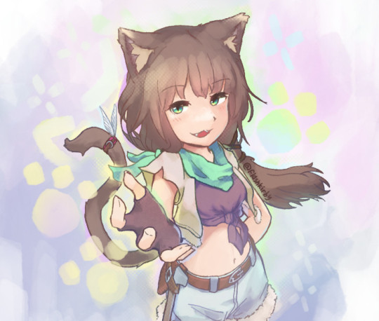
Sorry to come out of nowhere but I just wanted to say that your art is so warm and so colorful and so ROUND in all the best ways and your style really captures my favorite things about Kirby! I've always found it really inspirational!
Also, I love the way your line art looks?! I have to ask (you don't have to answer though) is there a specific brush or technique you use to get that soft, multi-layered effect?
Either way, wishing you a wonderful day!
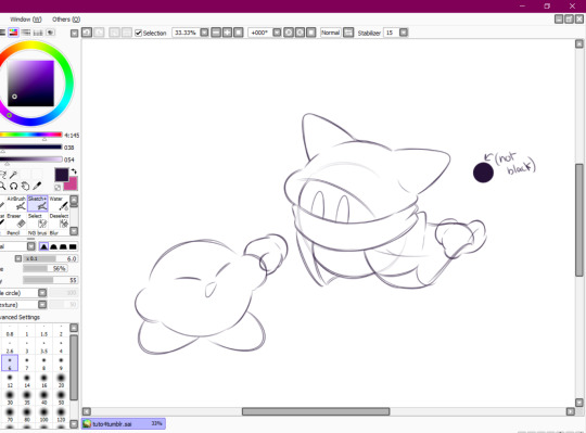
Thank you so much for your nice message, it means a lot!! I've been wanting to make a small tutorial about how I make my Kirby art, so I guess your question came right on time hehe ^^ As I'll be explaining all of my process, I'll also answer your question about my line art! Btw my art program is Paint Tool SAI and I'll also be showing the brushes I use as well as their settings (i made up most of them a long time tho).
So first here's the brush that I use for basically anything, whether sketch or lineart!
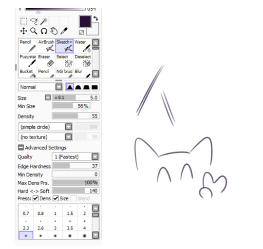
It took me a while to understand what you meant by multi-layered effect, but no the brush doesn't do that, that's actually my way of doing "lineart" (ig it's not really lineart cus I just do sketches that I clean later on).
I then clean up everything, add the details and block by using a grey color.
Afterwards I add the flat colors! I already have my own made up color palette, but otherwise I always use a purple color as overlay.
And I also use that same shade to color the lineart!

Next comes the fun part, shading! Here's THE brush that gives that soft effect to all of my drawings ^^ It's the same setting as my eraser too!
And yeah I also shade with light purple lol
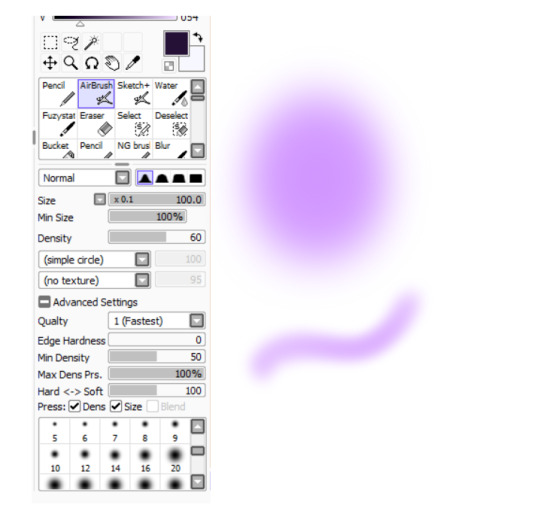
There's also some other brushes that I use for more effects, like the airbrush! (I don't think I've touched the settings that much) I mostly use this one for lighting effects.
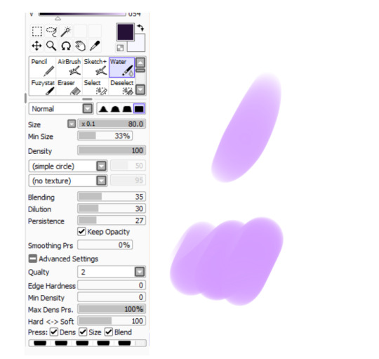
And finally the water brush! I sometimes use it for blending or for quick backgrounds,
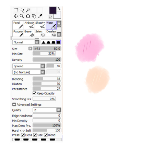
but you can also see that when put it to "Spread" it also becomes the one that I use for my blushes hehe
Aaand I believe that's all of the brushes I use for my art! I do have more, but I only use those for other specific stuff like animation or pixel art.
Adding some details AND VOILÀ!!

Now you know how I make my Kirby art! (but this also applies for all of my art) I sometimes redraw on the contours to give that "pop up effect" a bit like what they did in rtdldx lol ^^
I really hope it was easy for everyone to understand cus this is my first time making a tutorial! And to Desultory Novice, I hope I managed to answer your question too!!
Thanks again and have a great day :D
266 notes
·
View notes
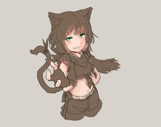
Text
Accept trade request?
praxie about to dump your trade window with vendor trash. i still find it very cool that the merchant class in RO exists and is tied very heavily with server economy - the realest support class
Process breakdown for my own benefit + anyone interested:
Line Art
This piece was mainly meant to be rendering practice, and as part of that, stop spending so much time fussing over line art (which i am still very guilty of doing)
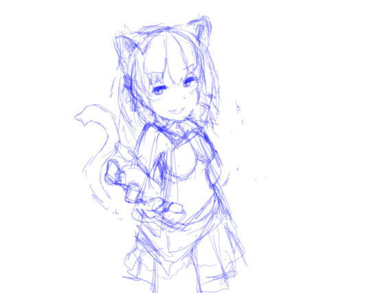
Initial sketch (left) to get the general composition down, and then some additional guidelines to help with hair and clothes (right).
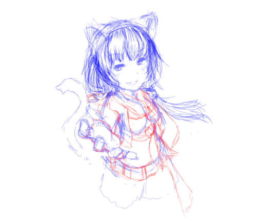
Line art (left), normally I spend a lot more time polishing and refining this, or straight up doing yet another line layer on top, but I've recently just started leaving it in its sketch-y state, and doing some erasing to clean up over extended or messy lines.
Then using a fill tool to block out the character (right), and fill in any gaps with a brush. The main purpose of this is so I can use Alpha Lock to avoid going over the lines during painting.
Some really interesting resources (and interesting art channels) that I've been using as a reference point:
youtube
youtube
youtube
(that last one has english subtitles btw, bless you based naoki saito dragalia artist)

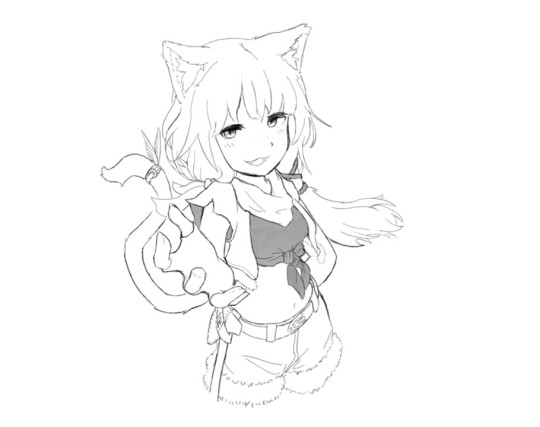
(left) Changing the base colour to brown helps with gaps while painting skin, and changing the background colour to a neutral tone helps with balancing contrast. (right) Afterwards, I start blocking out the individual pieces with various colours so its easy to tell what I have or haven't missed.
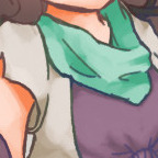
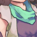
Once colours are down, slap some shading in with hue shifting to spice up the colour variety. I don't know what the non-pixel art term for this is, but basically it's when you make the colour change hue and saturation as it darkens. Here's an example of the scarf, without hue shifting on the left, and with on the right:
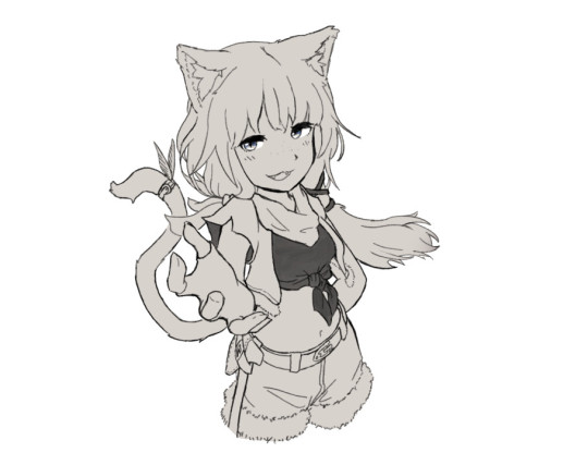
Since each section of the image is its own layer, the colours can be adjusted until everything looks good. This is usually where I do that technique where you put a grey layer over the image and setting the Blend Mode to Color. This makes the image greyscale, so luminosity/contrast can be adjusted for readability (combined with eye squinting to see how easy it is to distinguish important image elements).
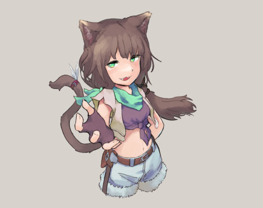

After that's done, the real change that makes the piece less harsh is to alpha lock the line layer, then start painting over it with colours that match the surroundings.
Here's also where I make small touch ups, like remembering to colour the rest of the hair and shorts, and doing that thing where the face has a soft skin glow that affects the surrounding hair.


Here's the fun part where I put a bacground in, otherwise known as throwing random colours around and seeing what sticks. I wanted try my hand at the cool brush stroke outline effect, which basically involved painting outlines between layers that sit on top of each other, such as between the palm of the hand and arm, or the back shoulder and the hair. Also random cat paws and sparkles for good measure.
Some cheeky Ben Day (aka comic book / manga) dots over areas where light might shine and create bloom. Into the spider-verse does this and it looks awesome.
Finally, air brushing some colours over the top on a layer with Soft Light blend mode. It's not readily apparent when isolated, but if I greyscale the image and then apply the layer it gives a dream-like effect
youtube
This video by OyunOrka quite succinctly goes over a bunch of things that can be done here, but obv don't have to do all of them.
Anyway, happy catgirl wednesday
10 notes
·
View notes
Text
EMERGENCY COMMISSIONS
good morning tumblr! i am in hell.
my family received a foreclosure notice this morning and we are now at a high risk of losing our house. i want to try and help them out as much as i possibly can so that we don't lose this, so i am opening emergency commissions to make what money i can to help them pay for everything.
it's going to make a small dent in what we owe, but i'm still willing to do whatever i can. below is the primary commissions that i am offering. there are n/s/f/w variants of these comms but i'm not open to doing those right now.
please do bear in mind that some of these feature an old artstyle.
all the prices are in USD. i only accept payments through paypal or cashapp, and they are paid half up-front and half during the second half of the process.
please view my TOS before send in a commission form.
HALFBODY


30$ Sketch - 40$ Coloured Sketch - 50$ Flat Colour - 80$+ Shaded
1000x1000 up to 3000x3000 px.
5$-10$ extra for multiple characters
Transparent or flat colour backgrounds available
15$ fee for landscape backgrounds
Can have messy or clean lineart, up to the client
FULLBODY


50$ Sketch - 60$ Coloured Sketch - 80$ Flat Colour - 100$+ Shaded
3000x3000 px.+ guaranteed for highest quality
5$-15$ fee for multiple characters (Price is character complexity dependent)
Transparent or flat colour backgrounds available (15$ fee for landscape backgrounds)
Can have messy or clean lineart, up to the client
Capped at 5 characters per 1 image
HEADSHOT / BUST


20$ Sketch - 25$ Coloured Sketch - 40$ Flat Colour - 50$+ Shaded
Single Character
Mid-torso and up or above shoulders ONLY, may include hands/paws
2000x2000 px.+
Can have messy or clean lineart, up to the client
Can make square or circular backgrounds (or both)
Background must be flat colour or pattern, landscape not available
SOCIAL MEDIA ICONS
15$ Pixel Art - 20$ Sketch - 30$ Coloured Sketch - 40$ Flat Colour - 50$ Shaded
Single Character ONLY
Mid-torso and up or above shoulders ONLY, may include hands/paws
2000x2000 px.+, resized to 500x500 px. for display purposes
Pixel art typically 32x32 px. resized to 635x635 px.
Pixel art limited to SIMPLE CHARACTERS ONLY due to canvas size
Can have messy or clean lineart, up to the client
Can make square or circular backgrounds (or both)
Background must be flat colour or pattern, landscape not available
MLP BASE CUSTOM REF SHEET


50$ Flat Colour
Fullbody Single Character
2500x2500 - 3000x3000+ px guaranteed
Transparent background with circular PNG Backdrop
Accessories Optional (Glasses, piercings, legwear, jewelry, clothing, etc.)
Base is picked by client or up to artist (I can make a custom made base for the commission on request)
Easy pick colour palette & showcase of cutie mark + identities (+ Magic for Unicorns/Alicorns)
Will come with a separate PNG file for a high quality Cutie Mark vector (3000+ pixels)
Custom bases (if requested) will be given as a separate file to the client as well
HALFBODY VEADOTUBE PNGTUBER
60$ Flat Colour - 80$ Shaded
Fullbody can be requested with a 20$ fee
Fullbody PNGtuber upwards of 8000x8000 px.
Regular Halfbody 3000x3000+ px. up to 4000x4000+ px.
Neutral expression (Can be decided by client)
Extra expressions come with 10$ fee each
Extra expressions capped at 9 (For a total of 10)
Front facing or 3/4 angle (Can be decided by client)
Multiple outfits come with 15$ fee per outfit (25$ for Fullbody PNGTubers)
WRITTEN STORIES / BOOKS

7.50$ per 500 words
Minimum of 3.5k words (52.50$), Maximum of 80k words (1200$)
Stories will be provided as .docx files for E-Book uploads
WIPs will be sent halfway through, or in quarters (if the story is longer than 20k words)
Can ghostwrite for an extra 50$ licensing fee
See ToS for genres I write stories in (will not write outside them)
Will write under 3.5k words in special situations (will require more information)
View my AO3 & Fimfiction for more story examples
anything at all is going to help us in the long run, even if it's a small amount, so i'd really appreciate even a consideration. just boosting this alone will help ease some of the stress for me, so even if you can't/don't want to buy my commissions, spreading the world will help me a lot.
ART PROGRESS EXAMPLES


#emergency#please boost#art commissions#commissions open#open commissions#art#commissions#emergency commissions#emergency comms open#emergency comms
23 notes
·
View notes
Note
What brush do you use? Your arts sooo fucking cool.

Square :]
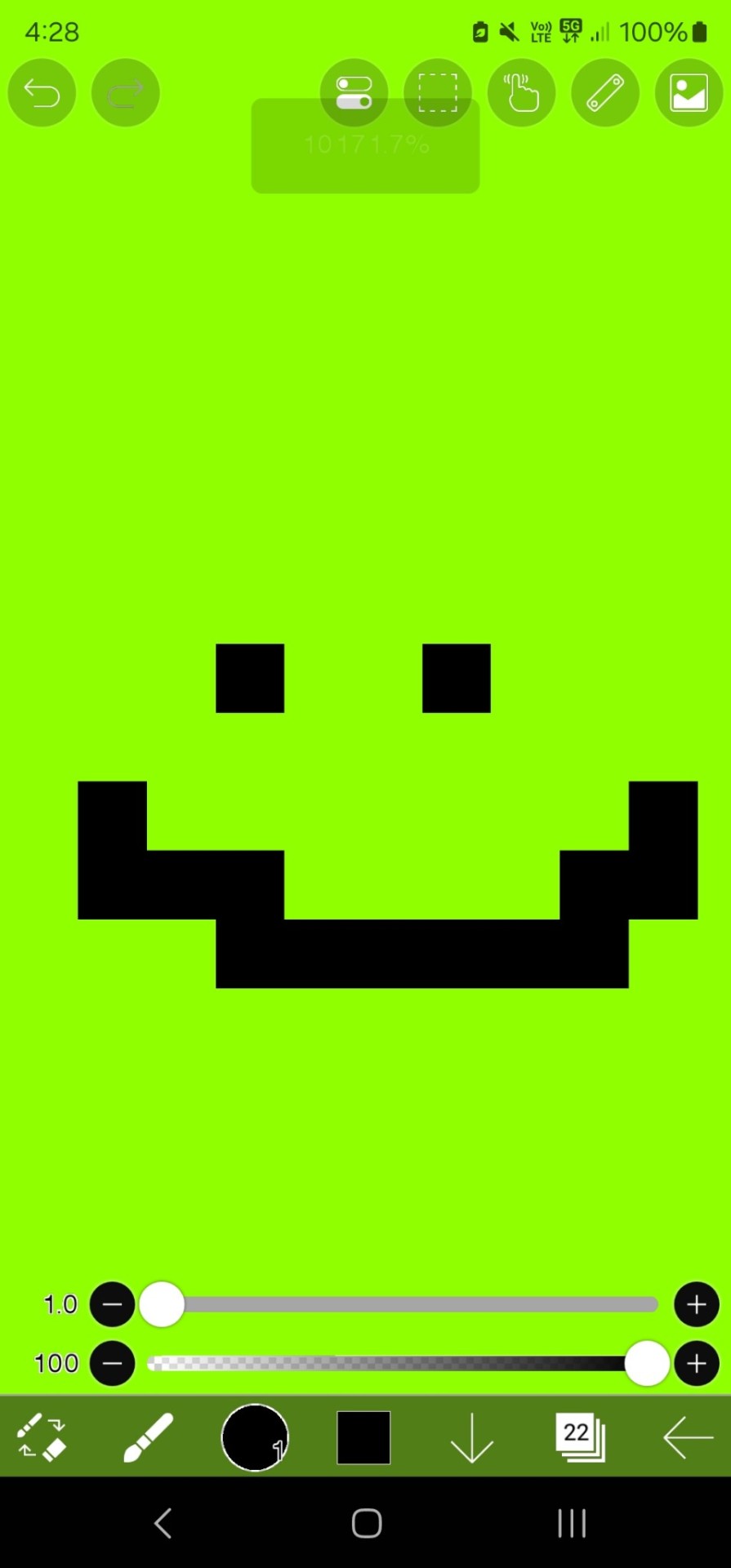
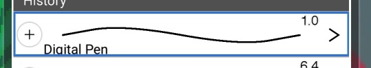
[it's just a single pixel brush on a small canvas.]
If you wanna know how I make square. I use the plain digital pen on the lowest size. On IBIS Paint on the phone, like i use, you need to make sure its set to pixilated when you zoom. But im sure theres many tutorials and ways to do it on every program. I used to draw exclusively on aggie/magma and it was very similar, just the smallest size no nonsense brush.
But really it's nothing special, just a single pixel brush and I go over my sketch a couple times and clean and erase stuff to slowly build up the line thickness, then i colour it.

Here's like, before and after the lines are all cleaned up.
I have several old speedraws on my yt channel that show the process slightly more in depth [make sure to click my shorts tab]. I might make a speeddraw of this and some other recent ones soon, I've been meaning to.
Thanks so much for the compliment haha i super appreciate it 🖤‼️ but yeah, unfortunately my brush is as basic as it gets haha.
#talky#hallows speaks#askbox#art info#info#help#advice#i guess?#my setup#behind the scenes#bonus#brush#pixel
36 notes
·
View notes
Text
Hello!
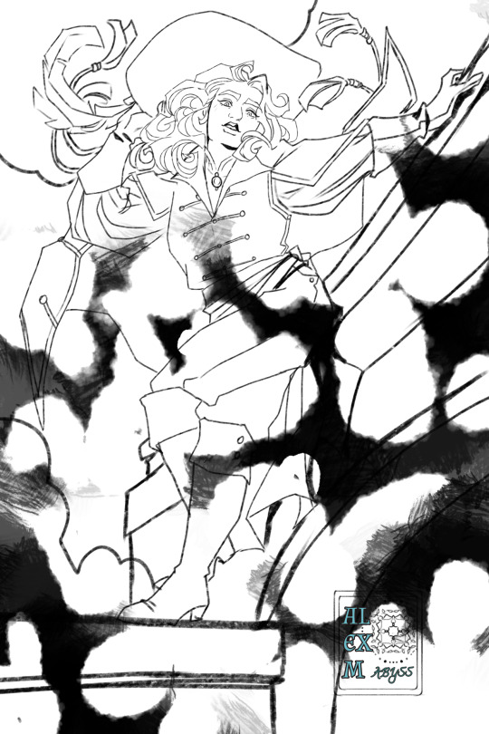
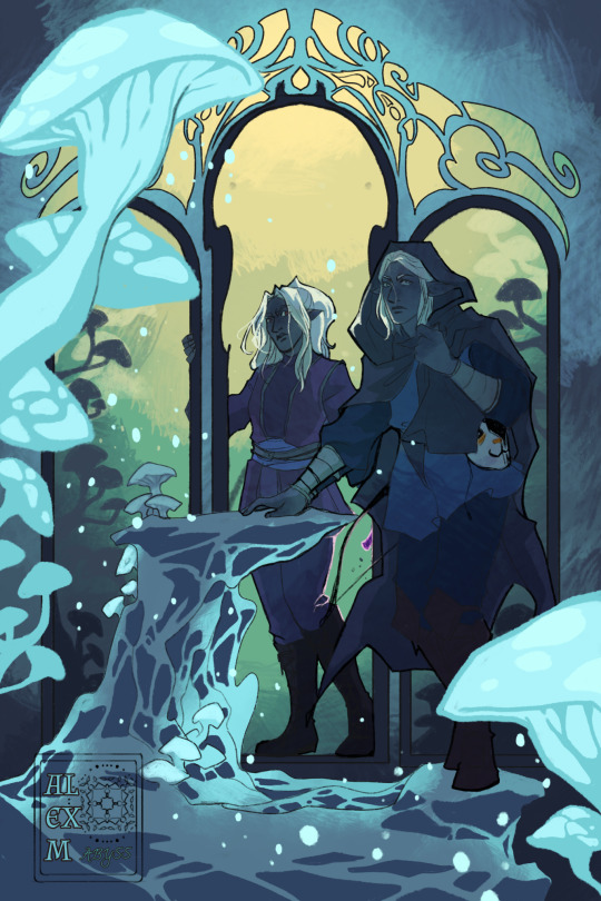
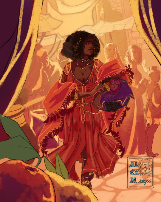
I'm Alex, or Abyss/Ace or M (any pronouns) and am open for comissions!
Pricing
Lineart only:
Portrait: 15$
Half body: 25$
Full body: 35$
Any additional character in lineart: 20$
Some samples
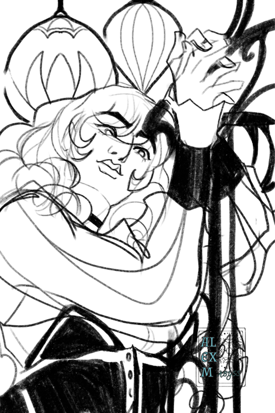
Color:
Portrait 20$
Half body 30$
Full body 60$
Every additional character for colored pieces 40$
Backgrounds with some detail:
30$ extra
Some samples
Pixel Color
Fullbody: 30$
Additional character 20$
Samples
The Process:
Hit me up with a message for a comission with request and references.
I hit you up with a rough sketch, and if you ok it, half of payment should be sent to the kofi (which will be linked to you at this point)
Next step entails clean lineart here you can request changes in details.
Afterwards I will send in flat color where we can change up general palette. No drastic changes will be made unless we renegotiate the terms of comision.
Finally, finished rendered illustration will be sent with warermark. Second half of payment will be made at this point after which you will recieve image without warermark (signature will still be there)
Due to my phones restrictions with processing capacity, image resolution will not be much bigger than 2000x3000 pixels.
Time estimate is 1-2 weeks unless life happens (but i will let you know if thats so)
I won't do:
Mecha
Vehicles
Extreme nsfw (not sure? Ask. No judgement in DMs)
Terms of use:
The art is personal use only. Print it for yourself, make a phone mask etc. Comercial use is strictly not allowed unless we discuss it.
I reserve right to decline a request.
#comissions#artists on tumblr#dnd comission#sadly my meds changed and they went from 30$ per month to 120$ and it helps brain not spiral into dread of existance
101 notes
·
View notes
Note
howw do you get that crona portrait to get such crunch. i would love to see a process breakdown bc your little shaded yet pixelated busts give me sooooo much life i love them
im very glad you like it!!! i drew it in magma studio, i just do it all with already pixelated brushes aswell as a pixelated eraser and often a small canvas that makes the pixels easier to see (the bigger the canvas the less pixelated it looks <-also depends on the size of the brush itself)

these brushes can be easily replicated in CSP too, idk about other apps this portrait in special is a render made fully with these brushes, mainly the one in the middle, all under a rough cleaned up sketch/lineart on a lower opacity, made with the brush on the left

the fisheye effect from the final version i made using Clip Studio Paint's fish-eye lens, but it uses a nearest neighboor distortion on the pixels that messes up the shapes and lines alot for such a small and pixelated drawing so i also had to clean it up after adding that effect. the whole drawing was made on a black background but i kept it in a separated layer and saved a backroundless alt just in case the brushes are the same i used in several other paintings and drawings i did in magma studio they just have different drawing methods


generally, just draw anything using these brushes in a small canvas and it will have a cool pixelated look
8 notes
·
View notes
Text
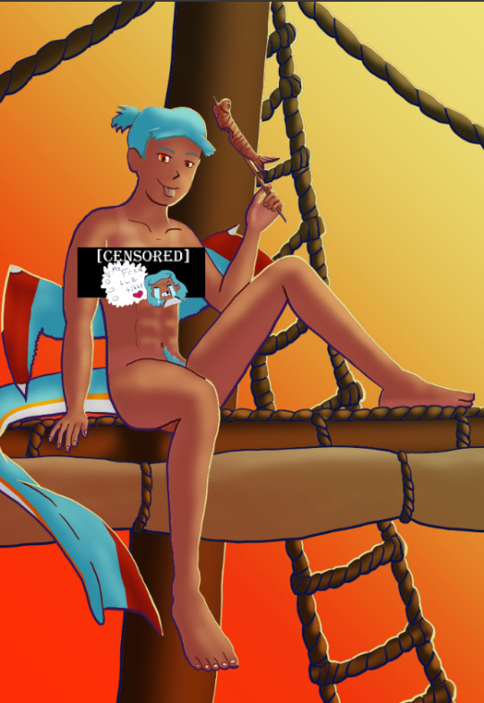
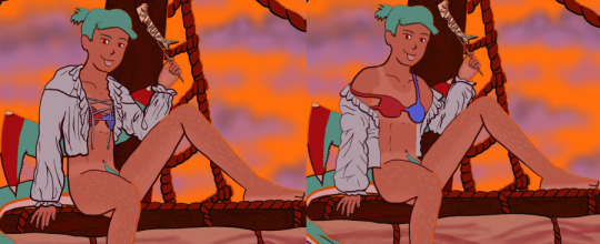
The Harriet Pinup Art Project
Session 2- Process till completion? But where're the other sessions?? Well that escalated both quickly and slowly
The last report was Early September 2024…. Dear god it’s been almost 7 months since last report. I would’ve like to have split what comes next into 2 more sessions but- it is what it is. This is gonna go all over the place so apologies.

Finding some dissatisfaction with my end result in last-session I tweaked the fish-holding arm and the dangling leg a little bit more to my liking and sketched again.
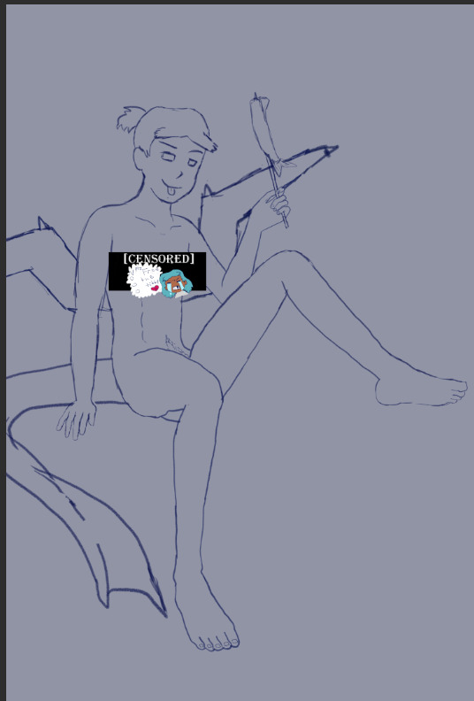
The nips got finally drawn and with it- the censor will now have to drop to keep tumblr-compliant and also to keep this blog sfw, hope you enjoy the humor (Harriet doesn’t).

The wings kept feeling wrong (looking more stretched and unnaturally tacked on vs being naturally relaxing from her backside) so between struggling wing csp assets to reference (not super great when there are no flipper-esque wings) and some more direct input from a friend I ended up landing on a more natural look.
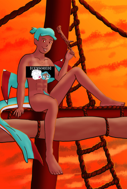
Linearting
Now for my nemesis- linearting.
Despite my disdain for the process I did not want to half ass it by just cleaning up the sketchwork like I normally do. While I struggle to grasp its use, I really wanted to implement lineweight in my lineart. From what I’ve seen lineweight can be used in a lot of different ways; purely randomly, to emphasize mass, or to emphasize the light source of the piece. Of all the choices I tried to stick to the last option since I felt I could best understand it enough to attempt it.
I also decided to try a feature I’ve never used before; linearting with vector lines instead of rasterized ones. For those who don’t know what the difference is I’ll do the extremely dumbed down explanation; rasterized lineart is more common (I think) and is less memory intensive, vector lines are more common in graphic design (since they can be resized w/o the pixel distortion you can encounter with raster lines). I wanted to try this method in an attempt to make the process of linearting a little less painful; with vectors I can adjust the lineart without having to redraw said line if it’s a small tweak, and changing colours is a lot quicker too.
Sadly during this phase my tablet pen's nib broke in a way that was unfixable (leaving the broken part of the nib DEEP in the pen), and due to pricing (tldr- the pen was more expensive than just replacing the entire tablet, in which case it's better to upgrade altogether if possible) had to wait for a new tablet after researching my best choice for a replacement; definitely was a great upgrade but GOD I did not like that happening when it did. Upon a friend’s suggestion I adjusted pen sensitivity so I could try to avoid putting so much force on the pen when doing the thicker lines.

I think I’ve grown a little more confidence on linearting, but it’s still far from my favourite step. I both enjoyed and hated the process of using vectors for the lineart. I felt like there’s probably a lot more I could’ve done with the vectors than what I was doing, but in my opinion it is not that bad for someone jumping in with very minimal knowledge/understanding.
Colouring/Shading

Being colouring is one of my favourite steps I couldn’t resist I rushed right into it. Though I actually ended up doing the shading before the colouring this time. I did the method I’ve heard/seen for digital artists where you block the subject with just black/dark, and then erase it off where the lighting/highlights would be. I’ll say I definitely found this method put more strength into my shading from usual.
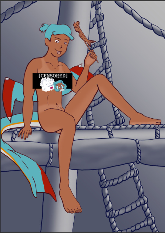
Then I rushed to colouring Harriet herself. Just did the ol-colour picker from her refsheet to throw her colours on, then did some adjustments to colour her nipples and tanlines (cause I WANTED DEM TANLINES!!!!!) though I tried to not make the latter too bold of a contrast since she imo has darker skin and not just tanned.
Then from there there was colouring the background and mast and just wrestling the colour balance and blends, there was a lot of it so I’m just gonna share one of the ones I went through.
At one point I even took a sunset from google and maxed its size on the background (and crashed CSP as a consequence due to the large image resolution- which lead to me shrinking the canvas/image during this process) to try to help me get an idea of what I MIGHT want to do for the background.
Clouds 💢
After a point I started trying to make my own clouds- the first attempt wasn’t too bad save for the tiny little problem that was the brush made the clouds look wayyy too sharp and grainy on closer inspection so had to scrap them and try again, even going as far as looking at irl clouds to try to get an idea of how to emulate them.

I ended up using a generic soft brush and tried my best to do clouds again. It was okay, but not great and kept getting adjusted between other steps. fortunately we’ll better revisit/redux on these clouds far later in the chain-of-events.
Like the clouds I has having problems getting the nice folds look for the sails, grabbed some refs and kept trying to get it right. The results are far from perfection but they are sufficient. Folds on this sort gonna be a pain in general.
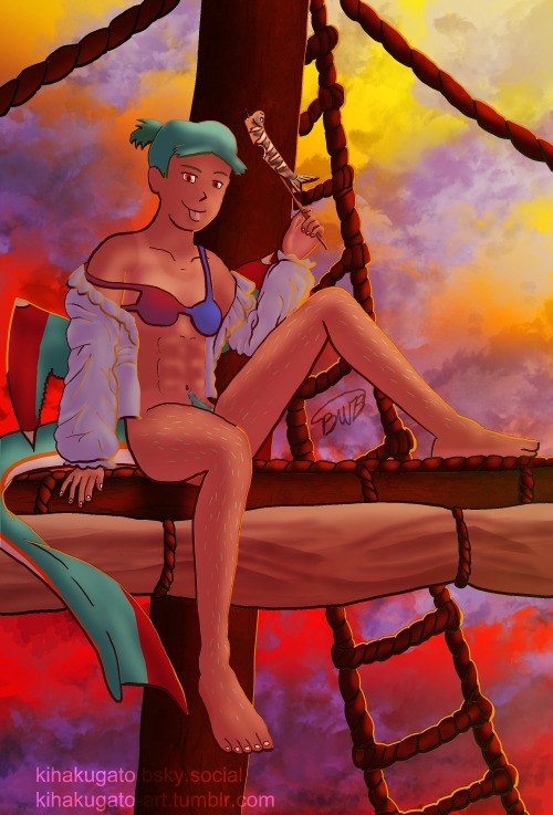
Clothes roughs
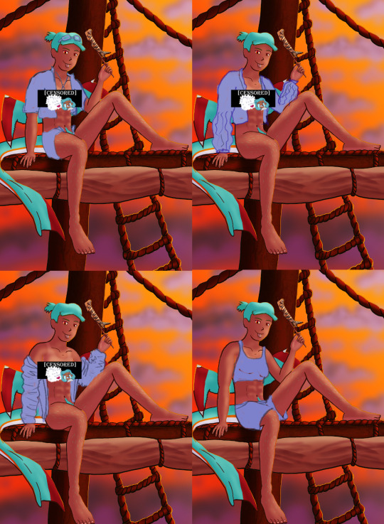
I did some rough draw-ups of different alternative outfits for her to wear. After a lot of wrestling I settled on her just wearing an opened poet’s shirt and the other two ideas got discarded.
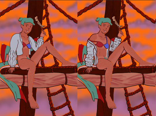
Added a bi-colour bra to make it that I don't have there's a variant that I can share in sfw spaces, and then I lined and coloured the rest of it up, only to stumble into an unfortunate realization-
Ew that went wrong for clothes- reference and redo

[image source 1, 2, and sadly 3 only leads to a pinterest result or a malicious site so 🤷]
With extreme dissatisfaction I ended up trying to tackle them again; I learned the term for the kind of shirt I was after (poet’s shirt, that way it also reduced the amount of AI messing with my results), got several reference photos then tried again while trying to mimic what I was seeing.
MUCH better.
Clouds redo
With that, let’s get the clouds looking better. I checked this tutorial to try to get a better idea, and found some cloud brushes that are in Official CSP but weren’t downloaded thanks to another tutorial and used them, used them then used the tutorial to help further elevate them a little bit. To further elevate said clouds I hilariously used my previous crummy clouds as a overlay to help the new clouds pop. Much better, and with that it’s done, slap dat signature and watermarks! Ready to throw onto the internets
Personal Evaluation on this project
This project ended up taking much longer than I wanted; Some of it was due to real life kicking my butt, and some of it was from clumsy planning and impulsiveness to get to certain steps quicker.
I liked it taking longer cause it gave me more time to think about certain steps and chisel away at parts when I had time, like working on a super large puzzle. On the opposite end it ended up making me much more intimate with the flaws with the piece/project than I’d like to be during the process, since most artists nowadays including myself tend to hit that stage after they’ve completed and posted a work online.
This lead to a lot of times asking “am I gonna shrug off this flaw or go through the time/trouble to redo a part to make it better?” For the case of the clouds and clothes, yes I felt the redo was necessary and it helped strengthen the overall piece, but there were many other flaws I chose to ignore cause I was too far into it to be worth the backtrack.
The biggest example flaw is ironically the anatomy/perspective when sketching Harriet’s body; while using the 3D tool was very helpful, I feel I should’ve did more perspective exaggeration for certain parts of her body (the biggest case being her hands; they imo would’ve looked much better if I made them and her fingers a little bit bigger and chonkier). Another case were the folded sails of the ship that I feel could’ve been better shaped and the folds could’ve been more sensible, ironic for me to say considering I had done several references and do-overs for that part of the piece. Conversely there are probably still various flaws in the lineart itself; despite the convenience of being able to edit the lineart via the vector points it is still a lot of nitpicking if you don’t decide that it’d be better to just move on so long as the idea is brought across via the art, flaws be damned.
When it came to the clothes stage, in my opinion I should’ve done that LONG before colouring/shading Harriet’s body and back when I had just finished the lineart, as it would’ve lead to less visual confusion for my eyes when I had to sketch the clothes out. Some ofher steps were out of order enough to cause confusion to myself, but I won’t bash myself about it since this is probably the first piece I’ve worked on that’s taken this long, plus this winter alone has been very mentally taxing so dumb decisions are bound to happen thanks to that.
That being said, I’m glad I did this project. I got to experiment and test out strategies and tools I’ve never even considered delving into before, and I may even end up using some of them again. There were even some points in this project where said tools I just thought “well this could be handy for [this group of drawing ideas]”. It’s also lead to beautiful results and is probably my biggest high effort piece I’ve done in a long time, probably rivaling if not outclassing some of my bigger pieces that I still admire today from back in my highschool days.
Hearing from one friend talk about the flow of the piece made me happy since, despite never mentioning it during the journaling of this project, that it was something in the back of my mind on/off while working on this piece; the flow of the ladder and clouds all intentionally despite to try to point the eyes of the audience towards Harriet who’s meant to be the main feature of the piece. It really proves that considering flow is a vital element when you want to make a piece work.
I may actually try to print one of the several variants as a print to put on my wall. Not that I will hold my breath on the results as my track record of digital-to-print for my artworks has always been a hard hit/miss for results.
Thank you for those who decided to follow along on the journaling of this art project.
[Session 0] [Session 1]
#The Harriet Pinup Project#artists of tumblr#artists on tumblr#art process journal#wip art#wall of text#long post
6 notes
·
View notes