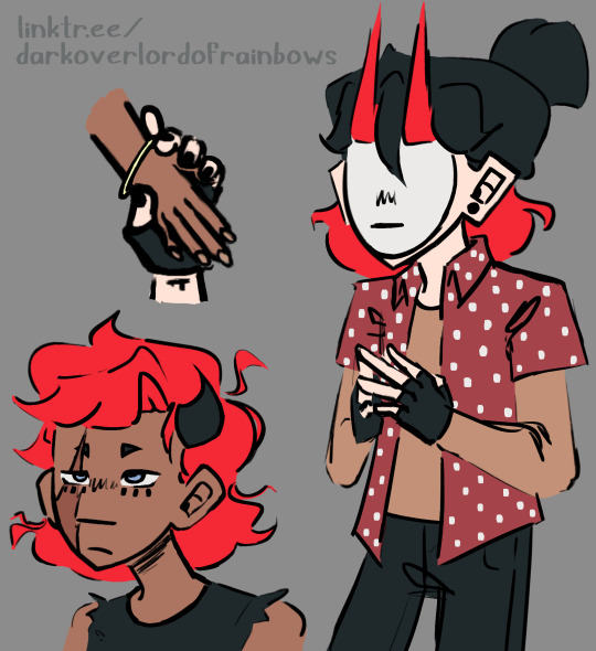
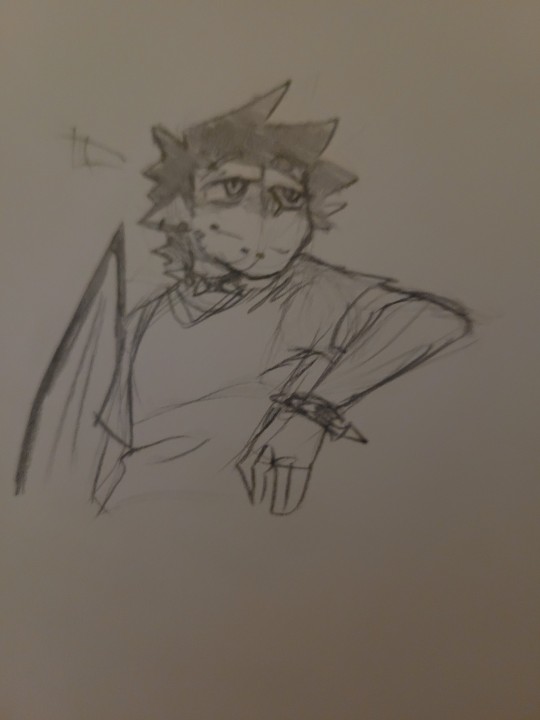
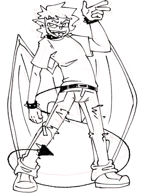
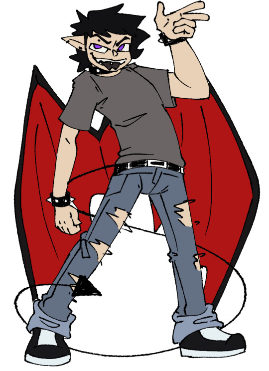
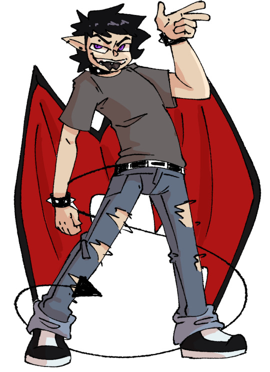
#drawn with pencils and highlighters and stuff
Explore tagged Tumblr posts
Visit Tumblr Blog
Explore Tumblr blogs with no restrictions, modern design and the best experience.
Last Seen Tumblr Blogs


Fun Fact
Mobile Tumblr US users spend an average of 4.04 minutes per session on the app.
Text
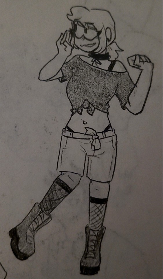
Arcane High School AU Headcannons-Ship Edition!!
Timebomb
-Jinx drags Ekko out of the school to skip class with her
-Jinx will randomly jump onto his back in the hallways when he’s talking to other people and just expects him to carry her around like that (he does because he’s down bad)
-Jinx almost never brings a bag to school so Ekko will go out of his way to carry things he knows she’ll need in his bag (such as hair ties, little contraptions for her to play with, extra pens and pencils, etc.
-When they’re bored they draw on each other, more so Jinx than Ekko, but he walks around with little monkeys and her name drawn on him in bright pink paint marker half the time with no complaints
-They got together in their freshman year but hid their relationship until they got caught
-Ekko liked her since they were kids but was too afraid to say anything, Jinx started liking him around middle school and had to make the first move
-One time they pulled the fire alarm and got the whole school evacuated but somehow never got caught
-When they’re not around each other their teachers will ask “where’s the other one”
-Whenever Ekko accidentally blows something up in chemistry he blames it on Jinx and everyone believes him because she always does stuff like that
-Silco absolutely HATES Ekko and likewise so whenever Jinx invites him over they just glare at each other but don’t say anything for her sake
-Vander however LOVES that Ekko and Jinx are dating and always claims he knew it would happen eventually (also I hc that Silco is Jinx’s full time guardian but she also stays with Vi and Vander a lot since he raised her)
Violyn/Caitvi
-When Caitlyn and Vi first met, Vi was so nervous to talk to her that she accidentally insulted her
-Consequently, Caitlyn hated her for a full year until Vi found out why and apologized
-They started to get closer because Vi would make excuses to talk to Caitlyn
-Their first date was at an amusement park and Vi pretended to be tough but she and Caitlyn were both screaming on the biggest ride and ended up holding hands, they just didn’t let go afterwards
-Before they dated, nobody knew Caitlyn was even into girls (or anyone at all)
-Vi constantly copies off of Caitlyn’s work when she isn’t looking and thinks she doesn’t know about it (she does)
-Vi started calling Caitlyn cupcake because she sold cupcakes at their schools bake sale to raise money for student activities as part of the school council
-Vi bought ten of said cupcakes claiming it was for her family
-The one time Vi convinced Caitlyn to skip class with her they ran into Ekko and Jinx and they all ended up getting caught because Jinx tried to fight Caitlyn
-Vi spams Caitlyn with messages and memes 24/7 but Caitlyn texts like a grandma and replies every 3 hours
Jayvik
-They met in elementary and have been inseparable ever since
-These idiots didn’t start dating until the end of high school because it took Jayce that long to get his head out of his ass and realize Viktor was his soulmate
-Jayce constantly worries about Viktor and asks him if he needs help which Viktor always denies but is secretly giddy about it
-Viktor has to get Jayce out of trouble all the time and it only works because the teachers love him
-It’s Viktor who gets them into those situations in the first place but he doesn’t get caught
-For their first official date they went back to the playground near their old elementary school after getting ice cream
-Viktor is a Mastermind ™ and Jayce is a Mastermind but Stupider ™
-Viktor became really close with Jayce’s mom through the years and she was always gunning for their relationship
Meljay
-Have insta story highlights of each other and Mel’s is photos of them together and on dates while Jayce’s are all just photos of her (as it should be)
-Power couple
-They had everyone drooling over them (but secretly everyone is wondering how he pulled her)
-They would fight over the stupidest things and then get over it five minutes later
-Jayce tried a million different ways to hit on Mel in middle school but didn’t actually catch her attention until freshman year of high school
-Mel is a humanities queen and Jayce is a STEM king so they help each other w the subjects they’re not as good at
-JILY VARIANTS
-Jayce is terrified of Mel’s mom and avoids going to their house as much as possible but Mel and Ximena are BEST friends
If you liked this, check out my original post->
#arcane#timebomb#jinx#ekko#caitvi#jayvik#jaymel#jayce talis#viktor arcane#viktor#mel medarda#vi arcane#caitlyn kiramman#lmk if yall want more i have a ton#hopefully I didn’t miss any ships#ship headcanons#high school au#headcannons
238 notes
·
View notes
Text

Fandom Problem #5268:
It's weird how online anti-porn activists have zeroed in on drawn or written smut instead of actual filmed pornography, since there ARE actual issues of exploitation in the porn industry that are worthy of being highlighted and discussed, whereas drawn or written porn involves literally no one but paper, a pencil, and the person writing it. I also think the logic of "ohh but soon the fake stuff won't be ENOUGH and they'll want to move on to the REAL THING!" is a really silly line of thought that doesn't really understand why or what people like about stuff. I think drawn or written stuff is more appealing because it's more likely there's some actual feeling to it, whereas filmed porn is just two bored looking "hot" people pretending badly that they didn't just meet 5 minutes before the camera started rolling, and then a dick sliding in and out of a hole for 20 minutes. "People will want to move on to the REAL THING!!" yeah like soon filet mignon "won't be enough" and people will start to crave Burger King.
129 notes
·
View notes
Text


Saint Catherine - My Metalocalypse Yumesona/Self-Instert/(OC? Not sure how to classify this)
Okay, drumroll please, she’s finally here! My full Metalocalypse Self-Insert/Yumesona (OC?)! She’s Dethklok’s executive assisstant/sometimes assisstant manager (pretty much the shenanigan wrangler…) This was months in the making and being able to actually pull something like this off was monumental, especially when I’ve been barely able to function lately. I’m extremely passionate and weirdly detailed about character design, so this post includes turn arounds, multiple outfits, and tattoo details. This was drawn traditionally with sketching, ink, copic markers, pencil crayons, and acrylic paint for highlights and corrections. I added some digital in post for her profile information.
This is actually a study of my real life body proportions, and I feel confident enough after drawing skinny/fit self-inserts/ocs my whole life in various stuff I like.
I’d also like to give a shoutout and appreciation to the fact that ‘yumeshipping’ is a more normalized and community supported concept on the internet. When I was younger and would wish I could marry a fictional character, I felt it was only acceptable to jokingly say “he’s my husbando!!1!” then log off the internet, obsessively draw pictures of his face in my room and think I was insane. But it’s cool to see that I’m not alone OR (too) weird!
I may be cringe, but I am happy 🤘🏻
Her details in normal text with bonus information is below the cut!
Name: Catherine Ironheart
She/her, cis woman, bisexual
Nationality: [Redacted]
Birthday: January 7th (capricorn)
Height: 5’2”/158 cm, 5’6”/168 cm in her boots
Features: Very Pale skin, blue eyes, dyed white and ice blue hair (naturally dark brown), 13 piercings, 3 tattoos and a gear brand.
Languages: English, Swedish, some Latin
Professions: Administrative Expert, former small Metal Vocalist
Married to Nathan Explosion (very private about it to prevent fanbase outrage)
Works as Dethklok’s Executive Assistant/Assistant Manager (Works alongside Charles as a secretary/shenanigan wrangler)
Composes in free time, plays Flute
Music taste: Various Metal, Classical, Disco/Future Funk
Loves: FPS/Racing Video games, Birds, Slasher movies
Drink of choice: Martini (extra olives)
Favourite food: Black Forest Cake
Weapons of choice: Taser + shock baton (Like Charles, she will defend Dethklok with her life)
Ship name: Natherine/Heartsplosion
-Enjoys being referred to as “Mrs. Explosion” casually by the few who know her relationship status, even though she didn’t legally change her name.
-Nathan is the only person on earth allowed to call her the nickname “Cat”.
#metalocalypse#mtl#mtl fandom#mtl oc#self insert#yumeship#yumesona#dethklok#traditional art#i love character design charlie I LOVE CHARACTER DESIGN!!!!!#natherine 4ever
12 notes
·
View notes
Text
Drawn May 16 2025
I've been looking at some older art a lot recently and it's reminded me of some things about my old process/internal rules that are different now. Because of that I've gone back to some things I used to do every once in a while, but y'know. I like to do a bunch of different stuff now.
One thing was, I never used pure blacks, whites, or grays. That was a hard rule. I'm not including the backgrounds obviously, but uh, you might note the obvious black lineart here?
So uh. It kinda went from a thing I never did to a very specific character breaking that rule (Émile's hair in his current design is a pure black, but before it was a completely different character with that same quirk. But at this time Émile's the only one like that)
Another part was that my sketch/lineart changed (I never know whether to call what I do lineart or sketch now. I think it was similar back then. whatever). The no-blacks was something that extended to how I did the sketch as well.
Back then I also didn't use inking brushes (for a while it was one specific pencil, but I eventually branched out) and I usually did my linework in pinkish-red that I'd set to multiply. This would also mean I'd need my colouring clean and hand-done under those lines too (well. I'm sure a lot of it I didn't need and it was more perfectionism than anything. But another thing worth noting is I work at huge canvas sizes now and I don't think I did back when I started with that process…? so that would affect how easy it was to fill those lines and also how visible small mistakes were)
Because of the time it took and I wanted to experiment with my art more, sometime during artfight I adopted a different method to lineart - but it didn't stick for a while. For a couple years it was something I only did during AF, iirc
I don't remember the in-between, but obviously I change up my inking style a lot and I gravitate more towards the inking-style brushes rather than the pencils nowadays. I don't remember why I did start using black for lineart, but I think some of it was just. using middling colours on a middle-gray background is hard to distinguish and I didn't like using light ones. and I wanted to do art faster so I stopped doing that whole'zooming in and cleaning up colour that, at a certain point, didn't need more futzing- I was just wasting time' thing. That and I might've just started forgetting to change the colour since there was one point, or just certain drawings, I would change the lineart colour after I finished drawing it.
There's things I do in the lineart I wouldn't have done before too. Sometimes I do the dark undereye circles in the lineart instead of colouring. Here, the dark part of Lake's eyes, as well as Suchai's gauges and nailpolish are just filled in. Before I would not fill these things in lineart, but this is faster.
If I were using a multiply layer here though, I would not do that, as it's be faster in that case to leave empty and colour in with that 'not-really-black' I had used for everywhere else. I just changed because it suited my new method better
There used to be one exception to the no-whites though. it was for some highlights, and I think almost exclusively got used on the eyes. I don't do that as much now.
Something you might notice in some drawings with a lot of characters is that some or all of them have slightly (or not-that-slightly) different sclera colours. That's kinda related. I try to make the off-whites, off-blacks, and off-grays fit the palette, but when they weren't done together (or were, but if it's an older drawing, probably not well) things like that would pop up. I don't think it's inherently bad, but it hasn't always been good.
Something else I used to do were shapes instead of actual noses (I mean. Not that I always draw "actual noses," These two are generally with a line and a scribble to indicate it) I had trouble with them, so I just never bothered.
At some point though I just started hating my art so I was just like "okay I think something needs to change" so I changed a few things. I was worried going back to trying to draw not-just-shapes would be difficult, but from what I remember it was fine. I think doing just-shapes in 3D space helped me get a better grasp on how noses should look (plus whatever skills I had developed elsewhere I could now apply there)
I've thought about going back to that for a long time, maybe not in my usual style (how I normally do anatomy & proportions) but something a little simpler or cartoonier, but I've done one, maybe two things in that time? Whatever. At least I can now better express what was in my head when I drew various sizes of triangles, squares/rectangles, and circles/ovals. And do more shapes too!
#art#artwork#my art#artists on tumblr#drawing#my drawing#digital drawing#krita#made in krita#made with krita#krita art#digital art#digital artwork#sketch#digital sketch#sketchpage#original character#original characters#oc#ocs#my oc#lake#suchai#pitchaya
9 notes
·
View notes
Note
sorry, i really don’t get you because you say you draw tsumugi with the body you do because she ‘seems like the type of girl who would have a good body (weird that you call that kind of ‘no fat but on the boobs sex doll body’ good but okay?) but covers it up’ and then don’t draw her covered up.
like you draw her in tiny skirts with her ass hanging out and shit constantly, in every one of your drawings is her body emphasised and on show and i just want to know what your fucking deal is? not only does it feel really mischaracterising for tsumugi, but it’s just really weird and gross. also you’ve literally never drawn a single fat character, all your characters are stick thin with different boob and hip sizes.
are we seriously doing this again. its ok to not like my art. its ok to not have it be to your tastes. its ok to disagree with my portrayals. it doesnt need to be much deeper than that
your rephrasing of my quotes is misleading though. ive re-emphasized the point more clearly before, but my points are based on societal standards and expectations, not my own personal preferences. big boobs small waist is the body type that gets ogled at the most, stereotypically speaking, so it makes it fun for her to have that body as her personality and the way she carries herself isnt whats commonly associated with it. with my depictions i try to take context into question. i dont just give the character a body or appearance that i like, i try to think how i can translate their character along with changing their figure (if at all). of course, i am not perfect, my stuff will not appeal to everyone and my takes might be disagreeable, and thats ok.
as for my tsumugi depiction; i dont know what you want me to say. tsumugi wears a button-up shirt with pants and a belt in canon. in my femstars version i simply change the pants into a pencil skirt. the belt is synched around the waist. its gonna make her waist look smaller than it is, as the belt is highlighting that area and creating contrast. this is a common way to dress and i honestly dont think i draw her in revealing clothes too often? like yea it happens. duh. and ive drawn some horny and suggestive art with her to add. but i do not think i go out of my way to flaunt her body or have her wear as little as humanly possible (which i dont even think would be an issue. an artist having fun is not the end of the world). i mainly do it when its, again, a suggestive drawing, or when its been for a joke. its not really meant to be anything deep sure, maybe she has her cleavage out every once in a while, but thats just. Her having boobs. i give natsume revealing clothes just as, if not more often than i do tsumugi, but people dont seem to care/notice as shes rather curveless. and idol clothes are separate from personal clothes that theyd casually wear because its what they enjoy, and its the idol clothes that tend to have that more "attractive" tinge to them her body isnt the focal point of my art very often either?? like if ur just staring at her boobs in every single one of my drawings atp thats on u
#if you dont like me and/or what i draw you honest to god do not need to be here#i wont be mad its ok#arguing further is just a waste of both of our times#i hope i made myself clear at least#as id like to put a rest to it#but again. youre free to block and ignore me if you dont like my stuff#focus on what you do like and send those artists some appreciation instead#ask
44 notes
·
View notes
Text

Ok. Sorry. I’m in my ”make ref sheets” phase, I’m doing commissions and planning bigger stuff, but sometimes I just wanna show off my dudes with updated ref sheets.
This is Miralle. Yes. It’s embarrassing. I have two elf characters (out of four elf characters total) who are hot blonde women with green eyes (well, Val has heterochromia, so only one of her eyes is green, but), beauty spots on their face and who are into men at least three times their size. Leave me alone. In my defense, Miralle (as a character) is a lot older, so they aren’t like back to back characters with designs that can be sorta shortened to being really similar.
(And you didn’t ask, but the two remaining elves are a lanky redhead who is into shorter men, and a rugged rogue dude, who might be getting a ref sheet at some point. So it’s not all blondes!!!)
Anyway, this is Miralle. Used to be a fandom OC, but like with Evelyn, I’m fully moving her into original story verse (and also giving her a design that can work more as a generic elf). More under cut!
In my fantasy ‘verse, Miralle is an elf from Avalonia (though her family is originally from somewhere near the region of Serenzia.) She is technically a trained Mage, having studied magic (and being able to still use magic) but never pursued the title of Archmage. Instead of pursuing a career with magic, she completely changed course and these days she actually works as a journalist.
Her personality is… not great, if we’re being honest. She can pretend to be sweet if it’s useful, but her actual personality is kinda… prickly. She doesn’t really believe in mincing words, and in many ways, she is a contradiction. She likes looking good and is careful about appearances, but is often foul-mouthed and disrespectful. She likes to be seen as competent but hates it when people rely on her too much. It’s possible to work through her spiky exterior and find out there is a softer person inside. She has troubles articulating her feelings, however, and often expects people to just "know" what she means when she gives gifts or performs actions, without actually telling people what's actually in her mind.
No one quite seems to know what her exact backstory is. She sometimes mentions a brother she can't stand, and never seems to be miss any of her relatives, nor does she seem to have a like a hometown she wishes to visit.
Miralle likes expensive wine and tobacco. She's not above over-indulging, especially when it comes to drinking, and she's not as light-weight as you'd think from her size.
Extra notes: > She is a pencil skirt enjoyer but would wear pants in a situation where it’s appropriate, such as when traveling or hiking or exploring. > Her eyebrows are darker in color than her hair. Not black or dark brown, but they should never be as light as her hair is. > Smokes cigarettes. Can also be drawn with a cigarette holder, especially in fancy situations. > Her eyes are a very intense, bright green. Base color should NOT be neon green, but the intensity should rather come from highlights. > Eyes should be somewhat narrow. > Earrings can be changed and mixed around. Main color should be gold, but green or blue gemstones can also be included. She can also be given other jewelry (rings, necklaces) that matches her earring style.
3 notes
·
View notes
Text
Bridgewater main characters!!
I wanted to try out stuff so here are Anne Becker and Olivia Hoskins, Jeremy and Thomas Bradshaw, + Vipin Khurana, all drawn in a rainbow coloured pencil with some highlighter to “circle” them 🥰
I realised I had never really drawn Anne and Liv together or present time Jeremy with Thomas so here you go for that!
Here’s a close up of the drawings 🫶


#bridgewater podcast fanart#jeremy bradshaw fanart#olivia hoskins fanart#vipin khurana fanart#thomas bradshaw fanart#anne becker fanart#bridgewater#bridgewater podcast#fanart#bridgies#bridgewater fanart#jeremy bradshaw#brainrot is brainrotting#Anne becker#olivia hoskins#vipin khurana#thomas bradshaw#living in my head rent free#rainbow color pencil#traditional drawing#I miss them so much
9 notes
·
View notes
Text

Alpha Briton (Earth-33)
Fandom: X-Men (comics) Series: More Captains Britain Characters: Elizabeth Braddock Credits: Alan Davis & others. — [ Reblogs > Likes | No AI involved ] —
Earth-33 native version of Betsy Braddock, also the Captain Britain of his reality.
Edited art related to the fanfic More Captains Britain (and their Warren), ch2.
———————————————————————————————
Since I can't post here on Tumblr the full formatted fics, I decided to share as a stand-alone the full-size version of edited pics I include in the fics galleries.
———————————————————————————————
Tec stuffs (aka Behind The Art) I merely changed colors (which isn't as quick and easy as it might sounds – it took me hours to properly have everything fixed). My intention was to turn the hair from Brian's blond to black, but how the hair in this specific art are drawn, is impossible (there are no highlights, so it would be just a block of black). To make it work I would need to hand-repaint them (which I wouldn't know where to start from, especially to fit the rest of the coloring). So I instead decided to color them purple and retroactively return to the fic to make the story work with the image. Crazy, isn't it?
Originally I wanted to use the art of James Braddock with the original Captain Britain costume as seen in Excalibur (2001) #3, and merely switch head with the one of the pic from the trade paperback (I needed the masked face). Changed my mind, but kept the color scheme.
Credits The original image is the art cover for Captain Britain: Legacy of a Legend trade paperback from 2016. Artists: Alan Davis (pencils), Mark Farmer (additional pencils and/or inks) and Robert Schwager (colors).
———————————————————————————————
Crossposted: Livejournal: prue84.livejournal.com/105377.html Dreamwidth: prue84.dreamwidth.org/96433.html Deviantart: deviantart.com/prue84/art/More-Captains-Britain-ch2-Betsy-1102523813
#X-Men#Captain Britain#Elizabeth Braddock#Series: Captains Britain Headcanons#Colorize#||#Excalibur#Uncanny X-Men#X-Comics#Betsy Braddock
3 notes
·
View notes
Text
2025 Journal Setup Guide Pt.2
This month I’m back with the promised Part 2 of the 2025 Journal Setup Guide! If you haven’t checked out part 1 yet, here is the link:
Now that we have the prep done, it’s time to actually jump into your journal with all the fun stuff. It’s time to focus on the decoration and aesthetic elements!
Step 1: Decorations/Color Palette/Themes
A lot of people have themed journal setups and there are countless inspiration images out there for the different types of themes you can use. I personally don’t have a specific theme for my year setup (though I will do themed monthly setups).
However, I do have a defined color palette, which is basically my “theme.” My color palette is based on the stickers and washi tape I bought. But you can choose your color palette based on your theme, or other decoration items you have.
You don’t need to be super fancy with your decoration. Just choose one thing that will be at the center of your color story.
Then based on that one thing (theme or sticker or decoration idea) choose 3-4 colors to be your main color palette.
Preferably you should have 2 dark colors and 2 light colors so your headers and boxes can be the darker colors and you can use the lighter colors as second line highlights or background decoration that can be written on top of.
Let me share some examples to illustrate what I mean.
Example: My Theme is 90s school notebook
black, blue, red pens
doodle type decorations in the margins (hearts, stars, smiley faces)
highlighter/bright pink and blue
Example: I have night sky related washi tape and star stickers
dark blue, light blue, yellow/gold colored markers
washi tape and sticker decorations
draw moons/stars for bigger spaces
Example: I’m great at drawing cats
orange, brown, and cream colors (for different types of cats)
main decoration is hand drawn art
light colors to create patterns on cats in the background (splotches in a light gray color)
Each of these examples chooses one thing that will be the center of the color story/other decorations.
In my case, I got the Sunlight Mystery washi tape and stickers which have a gold and maroon color scheme. So my color palette was deep orange, marron, light pink and light beige.
I used the Tombow dual-brush pens (Cottage pack) to outline my boxes and for the headers. It was my first time using them but they are worth the hype the journaling community has about them. The light colors were perfect for second-line highlights and since the ink is water based you can layer the colors to get different shades.
The pens I use for journaling are the Papermate Inkjoy Gel Pens. I’ve been using them for about two years now and they are my favorite to write with. (I will say that with the Notebook Therapy 160gsm notebook paper they take longer to dry than on normal printer paper.)
But you really don’t need to buy fancy things. My first journals were set up with colored pens from the dollar store. As long as you have a few colored pens or markers (can just be the Crayola thin tips) you are set!
Step 2: Outlining
Once you have your decorations and color palette decided then it’s time to crack open your journal and get into it.
Now, if you’re confident, feel free to skip this step and just start with your markers and pens. I, however, do not have that courage so I started with pencil.
Penciling everything in first allows me to visually see the layouts I’ve designed on the actual page and gives me a sense of how much space I have to add decorations.
You can also pencil in any elements you plan to draw before you lock it in with color.
Here are some of the spreads I have penciled out to give you an idea of what I mean:

Step 3: Pen to Paper!
It’s finally time, after all the preparations, to go in and start adding color to your spreads!
Grab your pens and markers and start decorating your page.
I don’t fill everything out right away, I just create the spreads first and then fill them out later.
Below are all the spreads I have in my start of year journal setup (in order):


Step 4: Journaling
With your journal ready, you can actually start journaling now! Which means writing in your goals and trackers and finally start using all the spreads you have in your journal.
I plan on doing that next week, going through all my spreads and filling them out before the start of the year. I also need to do my monthly setup (maybe I’ll include that in a different blog post!)
-.-
I hope this helped with your journal setup process and thank you so much for reading! Please feel free to share any tips or tricks you might have for doing a journal setup too!
As we close out 2024, I am so happy that I managed to successfully post once a month for this whole year! It’s been a great goal to reach and I can’t wait to keep the momentum going for next year.
Thank you again and see you in 2025!
6 notes
·
View notes
Note
Hey idk if you've answered this but what is your art process and what do you use for traditional and digital art?
Honestly I don't even know but at the same time I know the processes are very similar. I'll try and do my best HSNFKAH
Digitally I like to just Do Whatever Feels Good so it's a very "trust the process" kind of thing. Mainly when I draw digitally though I'll start with this.

Basically just making rough shapes and then the details on different layers while changing the opacity.
In the case of traditional it's a LOT more casual and I really don't have a good explanation for it? Basically skipping the rough detail layer and instead going to a sort of rough sketchy look (which is what I've been doing traditionally mostly these days.)
Digital linework is where I correct my mistakes (most of the time, if it's something Not Serious like this it'll be a lot looser looking!) And most of the time that's actually kind of where it ends lol, most of the digital stuff you see from me nowadays is only finished stuff I put effort into.
But when I finish lineart I tend to delete the sketch layer entirely so I don't mistake it for something else, and then color under the lineart layer.
And in this case I decided to give you a rough idea of how I do my shadows+highlights? I don't do it All The Time but I put them on separate layers and play with the layer settings !!! Genuinely cannot advise this enough it's really nice and fun to just see what looks best. In this case though I used a basic multiply layer for the shadows and then on a layer above it placed a few highlights where a general light source would be coming from.
Something I highly suggest is doing what feels right to you in the moment. If you're itching for something that you haven't drawn before, look at photos of what you want and then try and memorize as much of the look as you can! It's a neat little exercise for stylization I've found out, but it's also super useful for when you need references too. Don't ever be afraid of them.
Going back to trad. art though. When I'm not working with very quick sketches with pen/pencil it can come in two ways: clean pencil drawing or something made with pen+marker.
I use mainly Sharpies for colored traditional pieces, and my secret is that if you're limited on colors, LAYER IT ON!!! One shade of a green can give you a decent shadow!!! I use Micron pens for lineart and a white gel pen to sneak in a few little highlights here and there. On paper I don't put much emphasis on light and instead focus on the shadow part (mainly because it's hard for me to figure out a good lighter color for things HAHSHSJAH)
But genuinely whatever you do I don't think having a "style" is perfectly fine. It's a fluid thing that's ever-changing for some and if you fall under that category it doesn't mean that you're not skilled! Play around, have fun, generally just see what looks cool and cooler :)
#ask/answer#I hope this makes sense#I'm not good at explaining things and unfortunately i can't record myself for like an hour explaining it while also drawing in real time 😭
12 notes
·
View notes
Text


Drew on paper for the first time in possibly over a year yesterday
I’m pretty proud of the purple coneflower, I hardly draw botanical stuff and yet it came out great!
I even had some guy ask if I would sign it and give it to him, got good natured laughter when I said he’d have to pay for that
Drawn after the flower, concept art of an oc of mine. Her name is Ainya! She’s a cool fluffy dragon gal.
Made with pencil, fine liner, ball point pens, and highlighters.
#art#traditional art#sketch vs final#sketch vs finished#pen and paper#illustration#flower#flower drawing#purple coneflower#oc art#concept art#dragon oc#oc concept art
3 notes
·
View notes
Text
Patreon Tier Highlight:
Rubber Pencil!
Hey, do you like the doodles I make, but wish it was Something More Specific? Maybe even something I haven’t drawn before? How does a $15 doodle commission sound in that case, plus all the previous features?
For a mid $$ tier, you get one traditional doodle a month with up to three characters, not counting studies to get the characters correct if needed haha. But if you want more of the stuff I’m used to, that’s easy! Only too happy to go off Requestober rules on the reg ♪
(Patreon) (ko-fi)
#Patreon#Self promo#At current the only Official way to get a comm from me but hey if you ask we can hash out the details outside of a membership fee lol#It would cost a bit more 'cause y'know - membership perks lol - but not by much!#But anyway speaking of membership perks you get to see all the previous stuff as well as getting a doodle from me - win win win#This one's a limited tier so I don't overextend myself so keep an eye out#If you have a preference for unlined/lined specifically I can work with different paper as well :)#Y'only get my traditional tools tho >:3c Red ink available and my mini-rainbow of coloured pencils haha#Onion really suits this tier :) She's a very chaotic artistic type lol#You'd think they'd all be but no - her especially
9 notes
·
View notes
Text
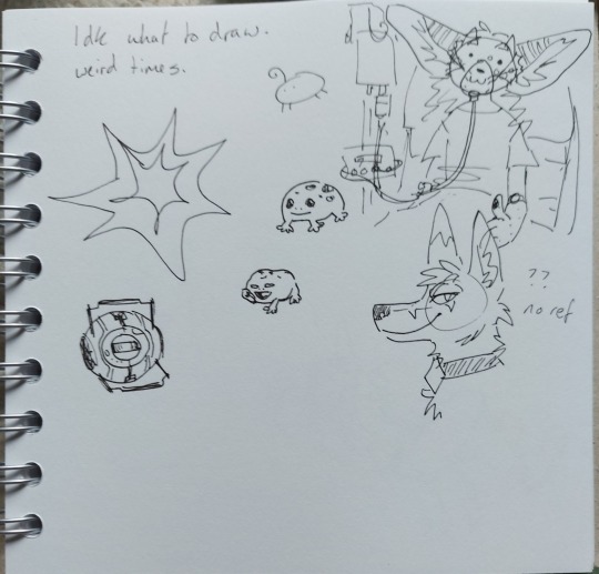


I have escaped from the hospital after my first round of chemo for my lymphoma! Very glad to be back in the peace and quiet of my own home, with my family and pets around me. But the cancer ward I'm being treated on is a really nice one for teens and young adults that has great support resources and also a common area for patients where they have a little kitchen area, craft area, tv and games. So it's not been too bad all things considered and I've still been able to do some creative stuff while being in hospital. Here's all the stuff I've drawn and made while in hospital! Despite some treatment side effects, I've overall been feeling better than I did before i went to hospital, so I've been feeling more creative again. So I might actually end up being more active here for a bit at least!
[ID: Image 1 - A sketchbook page of little fine liner doodles. At the top is written "Idk what to draw. Weird times." The doodles are as follows: A spikey cartoon explosion shape. A simple oval creature with four little stick legs, dot eyes, and a little curl on its head. Two little smiling rain frogs. Wheatley from portal squinting. A smiling furry wolf wearing a collar. My fursona sitting in a hospital bed, wearing a hospital gown and oxygen mask, hooked up to an IV drip, giving a thumbs up. My fursona has a round cat-like face with freckle-like spots, big long stripey ears sticking out the sides of their head, little horns and long hair with the sides short.
Image 2 - a sketchbook page with two pencil doodles of my fursona. In both drawings they are wearing a nose cannula and pyjamas with a fluffy hoodie. The first drawing is a bust with them looking up and to the side, and the second is of them reclining with their hands behind their head and legs crossed, eyes closed with a little smile, looking relaxed.
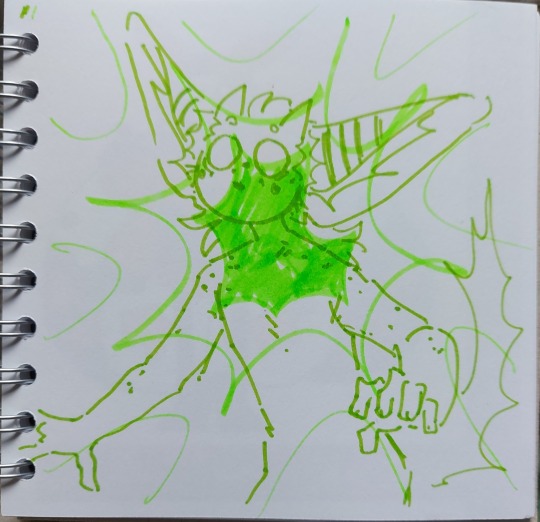
Image 3 - a sketchbook page with a drawing of my fursona. My fursona is drawn in green felt tip from the hips up without clothes, with raised eyebrows, wide blank round eyes and no mouth, posed as though startled. Over the whole page, centred around their face and chest is a spikey cartoon explosion shape drawn in bright green highlighter.
Image 4 - a sketchbook page with a drawing of a cartoon moth person. They have a round white face with big shiny eyes, pink blush, big yellow feather-like antenna, and lots of purple fluff around their neck like a mane. They have four arms and two legs and are wearing a chunky pink and purple cardigan with a patch on one elbow, a short yellow skirt and purple boots. Their wings are white with purple cloud-like shapes and yellow spots and stars. At the bottom of the page is pink washi tape with clouds and hearts, and at the side is purple washi tape with silver moon and stars.
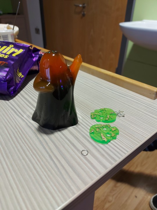
Image 5 - A cast resin ghost and pair of skull earrings. The ghost is orange at the top and black at the bottom, with a little bit of green glitter visible in it. The skull earrings are toxic sludge green with bits of gold leaf in them.
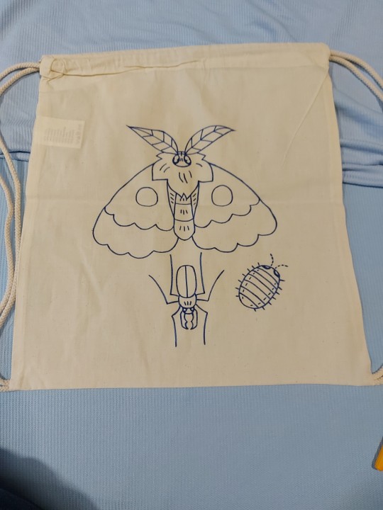
Image 6 - A work in progress beige drawstring bag with a moth, a beetle and an isopod drawn on it in dark blue. It would be symmetrical if the isopod was mirrored on the other side. End ID]
5 notes
·
View notes
Text
୨୧Chapter VI • Familiarity
୨୧Masterlist
↫Previous Chapter | Next Chapter ↬
Word count: 0.6k


“Oh it’s so good to see you, Leon!” his grandmother says, her voice warm as she goes in for a hug. He embraces her back just as tightly, taking a moment to savour the familiar scent that clings to her skin. The comforting feeling of the embrace takes him right back to his childhood.
They sit at the small dining table and start eating the butter chicken Leon bought.
“Is everything alright dear?”
Leon shrugs and looks down at his meal, “Nothing you should be worried about” He gives her a weak smile.
His grandmother told him that the nice neighbour was helping her from time to time. Never in a million years could have he guessed it was you. You really did have a heart of gold.
He’s noticed it around the office. You mostly just went out to brew coffee for the others or go buy it from the local coffee shop. When people stopped to talk to you, you always listened. You even listened to him.
You two barely interacted. It’s not like you had a reason to anyway.
He glanced at you when you were walking by, or at your desk working away. He noticed how focused you are when doing your tasks; how your face gets all serious like you’re almost frowning. It’s cute.
On your first day, he saw you. You were nervous, glancing at everything that surrounded you, not really paying attention to what Ingrid was saying. He remembers how stunning you looked in that suit. Then at the end of the day, he offered to take you home and you refused.
Over the course of this month you two have talked, mostly about work-related stuff, but you talked nonetheless.
He thinks back to when you wore that pencil skirt to work, the one that accentuated your curves and highlighted your tight figure. He remembers the way it showed off your legs, how its hemline grazed just above your knees. No matter how hard he tried to look away, his gaze was drawn back to you.
His gaze lingered on you as admiration ran through him; he couldn't help but be taken in by your beauty.
“If something is bothering you, you can tell me” The voice of his grandmother pulls Leon out of his thoughts.
He picks up a fork, moving around the contents on the plate.
“I said nothing is wrong, you don’t have to worry,” He pauses, deciding whether opening up the subject of you to his grandmother is worth it.
“The girl that was here...” he says and already starts to regret it, “Um—Does she come here often?”
“Why do you ask?” The woman asks. He knew she knew why he asked, she just wanted to hear him say it.
“We work together,” he says plainly.
“Well, she comes by to help me when I ask her to. She’s a very nice girl.” His grandmother replies with a warm smile.
“I didn’t see any man visit her” She winks.
Leon nods and looks away, feeling ashamed for being so transparent. He embarrassedly takes another bite of his food, hoping to distract himself from his thoughts about you. He wasn’t curious about the last part—maybe just a bit.
Little does he know you will continue to linger in his mind no matter what he does or doesn't do...

After dinner, Leon didn’t hang out much longer. He helped his grandmother to bed and left quietly.
He pauses as he passes your door, feeling a sudden urge that tells him to knock. His hand is already halfway to the door; he takes another breath and wills himself on. Curiosity fills his veins.
He glances at the door and then checks his watch. It’s late, you’re probably asleep.
୨୧Masterlist
↫Previous Chapter | Next Chapter ↬
6 notes
·
View notes
Text
Crafty Quotes: Making DIY Wall Art with Typography Flair”
Wall art is where interior design meets self-expression. And guess what? You don’t need to be Picasso or a poet to create something striking and meaningful. Today, we dive into making your own DIY wall art with a typographic twist—yes, fonts, lettering, and layouts will take center stage. This is a fantastic project to explore your personality, your favorite quotes, or simply your aesthetic vibes.
📌 Why DIY Wall Art?
Besides the obvious cost-saving benefits, creating your own wall art lets you express your identity. Think of it as personality wallpaper—without the lifetime commitment. Want to hang a bold “Get Stuff Done” in your workspace? Or how about a gentle “Breathe” in your meditation nook? Typography-based wall art lets you convey that message your way.
✂️ Materials You’ll Need:
Blank canvas or heavy art paper
Acrylic paint or watercolor
Paintbrushes or markers (paint pens are magical here)
Pencil and eraser
Ruler and stencil (if you want clean lines)
Optional: vinyl letters, washi tape, or Mod Podge for a layered look
🧠 Design First: Words Matter
Pick a phrase or word that actually means something to you. It could be funny (“Alexa, clean the house”), motivational (“You’ve got this”), or romantic (“Love lives here”). The words will be the focal point—so think about:
Tone: bold vs. elegant vs. playful
Length: shorter phrases tend to pop
Style: all caps, script fonts, or hand lettering?
Here’s where typography kicks in. Choose a font that fits the message. A quote about relaxation? Use a soft brush script. Something inspiring and fierce? Go with a bold sans-serif in all caps. Use online tools like Canva, FontPair, or Google Fonts for typography inspo.
✍️ Layout 101
Once you’ve got your quote, sketch it lightly with pencil. Decide on your alignment: centered, justified, diagonal, circular, etc. Want to go a little rebellious? Try wrapping the text around a shape, or use a mix of font sizes to create contrast and rhythm.
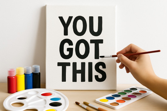
Pro tip: Use a ruler and light guidelines to keep your spacing even. Nothing kills the vibe like a crooked “YOU GOT THIS.”
🎨 Time to Paint (or Ink!)
Whether you’re painting or using paint pens, start slow and steady. Trace your letters before filling them in. Don’t rush—uneven strokes are fine, but smudges? Not so fun. You can also:
Add shadows for a 3D effect
Highlight a word with a contrasting color
Use a dry-brush technique for a rustic look
Fun Fact of the Day 🧠 The first known use of a motivational poster with typography was during World War II. Ever seen that “Keep Calm and Carry On” poster? It was designed in 1939 by the British government to raise morale in case of invasion. It didn’t get popular until the 2000s—talk about a late bloomer!
🪄 Advanced Twist: Mixed Media
For a cool layered effect, try:
Adding printed paper cutouts behind or over your letters
Using washi tape to mask out sections before painting
Adding hand-drawn flourishes or illustrations around the text
And if you're digitally inclined, design it on a tablet, print it out, and mount it with a wood frame for that "designer-on-a-budget" vibe.
🖼️ Show It Off
Frame it. Hang it. Gift it. Post it. Your DIY wall art is now ready for its grand entrance. Whether you go minimal or maximal, modern or vintage, your wall now speaks your language.
https://letterhanna.com/crafty-quotes-making-diy-wall-art-with-typography-flair/
0 notes
Text
Place of Words - Artist Research
Zoe Birrell
Vegan Portuguese artist Zoe Birrell gained worldwide attention with her art installation featuring 420 dairy cow sculptures made from vegan fair-trade chocolate, equalling her body weight of 53 kg. Zoe's inspiration came from the harsh realities faced by modern dairy cows, who endure constant pregnancy, hormonal imbalance, and the emotional trauma of losing their calves. Her work aimed to explore the connections between these farmed animals and human femininity, as well as the broader impact of consumer habits on the planet.

Gale Hart
Sacramento-based artist Gale Hart works in a variety of mediums. including paint, pencil, steel, aluminium, bronze and wood. Gale Hart has built an impressive 40-year career by continually experimenting with new techniques and materials. Her work often incorporates sarcasm and humour to highlight the absurdities of contemporary life. Through her art, Hart offers a witty and critical perspective on social issues, making her work both engaging and thought-provoking.
I was particularly drawn to these abstract paintings and stencil pieces highlighting various aspects of animal cruelty.
When describing her work she says, "In everything I do, I try to make the background a really inviting kind of pastel, sweet, soft colour. And the movement in the abstract is all dark, dreary, or bloody-looking. It’s the dichotomy and hypocrisy of us as humans. That’s what some of that intention is with using soft pastel colours with stuff that’s really brutal."


Dazed (2015) The artists pushing animal rights further, Dazed. Available at: https://www.dazeddigital.com/artsandculture/article/23203/1/the-artists-pushing-animal-rights-further (Accessed: 23 May 2024).
Katlynn (no date) Gale Hart. Available at: https://creaturecruelties.blogspot.com/2015/05/4.html (Accessed: 23 May 2024).
Gale Hart: Contemporary Painter & Sculptor (no date) Voss Gallery. Available at: https://vossgallery.art/collections/gale-hart?page=2 (Accessed: 23 May 2024).
Barone (2016) Gale Hart Summons the Animal Within, Submerge Magazine | Music + Art + Lifestyle. Available at: https://submergemag.com/art/gale-hart/ (Accessed: 24 May 2024).
0 notes