#eh: tutorial
Explore tagged Tumblr posts
Visit Tumblr Blog
Explore Tumblr blogs with no restrictions, modern design and the best experience.
Last Seen Tumblr Blogs


Fun Fact
1,644 Tumblr posts in 1 second.
Text
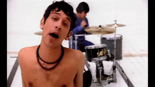
ENA TREND IS REALL FOR SUNNY!! >0< 💥💥/pos
Anyway please enjoy my ENA Oswald/Mickey trend animation?? Yeah something along those lines haha! (ENA Oswald/Mickey (my vers) inspired by @rockhousejai of her ENA Mickey/Oswald version , she drew them so beautifully and definitely should check out (along with her art too :DD) teehee :3)
#my art#mickey mouse#oswald the lucky rabbit#epic Mickey#epic Mickey 2#epic mickey rebrushed#ena dream bbq#ENA#ena oc trend#(?) yeah I’ll tag it why not#holy moly how did I do this?? even with a tutorial I used..#usually I quit at the beginning but hm. I didn’t :0#eh I’m not gonna question it lol#anyway ima go disappear now bye bye-#thank you again jai for letting me have permission to get inspo on your design again!! deeply appreciated it :>>#the lip syncing isn’t the greatest but it’s a good enough for me
149 notes
·
View notes
Note
I'd love if you'd do a breakdown for Cyclonus! He's one of my favorite characters and I think his design is really cool.
I actually think it’s the first time I’m drawing him haha
Enjoy my highly elaborate and very precise research


#maccadam#transformers#should I make a separate tag for these cursed tutorials?#eh maybe#mtmte#Cyclonus#me breaking down my brain and your blorbo
877 notes
·
View notes
Note
Your art is so good and I really like your style! I was wondering, how do you draw backgrounds so well?
You probably mean that one background in the most recent part of the 3 months au comic which the making of was quite of a journey so im gonna explain it step by step
step 1. Pretend that you know what you're doing and practice (for example this background that I drew over a year ago for RinRee's comic "Broken Bonds" (the characters were drawn by her)), gain some experience
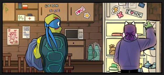
step 2. Get a minecraft reference (if you suck at perspective like me)
step 3. fail miserably
step 4. get more references
step 5. figure out what you did wrong, study (for ex. your references), practice some more (i cant show because my practice were other backgrounds for the 3 months au comic)
in my case what i did wrong was lack of warm up (the last time i drew an actual background was few months ago which is WAY TOO LONG), making it not look like an actual train and in general making the room look too organized and empty. Mikey is a chaotic and artistic soul so it's obvious that he'd have a mess in his room (it's important to think about what a character would have in their room, ex. art supplies, sticky notes/stickers, junk, posters etc)
step 6. try again
BONUS: I genuinely enjoy making backgrounds, so it's easier for me to stay patient and pay the attention to them that they need! :]
#ask#i have no idea how to tag this#art advice???#tutorial...#tuTORIEL#eh eh eh eh eh#why was the skeleton sad? because he was feeling BONELY or something i dont remember
338 notes
·
View notes
Text

@dudelymantits Fir!
#I love trans replikas#i just know he and devon would be pals i know it#dudely lemme know if i did him justice one word and this post is GONE#even though i threw the doodle at you eh#his hair was very hard i shan't lie#but he was really fun to draw i got to learn how to very badly draw welding streaks#there are NO tutorials for that btw#buuut I think i did okay? i love fir#ara#arar#ara signalis#arar signalis#signalis#signalis fanart#signalis oc#transgender#fir#jay art
26 notes
·
View notes
Text

valentine💉🩵
speed art/commentary
#valentine vuong#deadpool#mustasekittens#marvel#marvel comics#fanart#mutant#xmen#my art#needles#this is a VERY over rendered sketch#like i hardly cleaned it up before i started rendering#eh this “tutorial” was a good excuse to finish this val drawing that's been sitting in my wips for months
276 notes
·
View notes
Text

yay yay tutorial!! remember, this is a milk tutorial.
#cw suggestive#suggestive#tutorial#art tips#art tutorial#originally I made this for my friends but I was like eh why not post it
118 notes
·
View notes
Text
how obvious is it that i have never in my life rendered water
#i needed to look up tutorials on pinterest so im like eh good enough#crk fanart#cr kingdom#shadow milk cookie#pure vanilla cookie#shadowvanilla#speyeraling art
21 notes
·
View notes
Text
Yay my new friend hobie <33
#watched the movie yesterday finally <333#this is. my first time drawing him and I did this in half an hour and I don’t typically draw Crazily but now I did and I Get It#like. genuinely for half an hour this ain’t bad eh?#gotta learn how to draw wicks properly though which. hmmm I need to find a good tutorial#anyway. I’ll draw him better soon <33#across the spiderverse#hobie brown#spider punk#atsv fanart
371 notes
·
View notes
Text
rough art tips to learn and then break at your leisure.
the distance between your eyes is roughly one eye. the corners of your mouth dont extend past the middle of each eye. ears are roughly in the middle of the tip of the nose and the eyebrow. the eyes are in the very centre of the head. the neck is just a Little slimmer than the width of the head (varies with fat distribution, but fat tends to build up under the chin). hair is easier to draw when you plot out the hairline and then where it parts. leaving appropriate distance on the side of the face (cheekbone area and back to ear) contributes to making characters look more realistic/hot as hell. i dont know specific tips for that so use reference. an amazing reference/study site is lineofaction.com . if you think of the face in planes it makes it easier to construct (look up tutorials). if you draw a spiral like a tornado it can help you figure out awkward perspective for extended limbs (look up foreshortening coil technique). tangent lines are when two lines intersect and cause visual confusion (when it looks like a line that defines an arm is part of the line that defines a building, for example) and avoiding them makes your art way easier to comprehend. quick trick to good composition: choose a focal point (where you want your viewer to focus), detail that area the most, and make sure various elements of the piece are pointing to that focal point. you can use colours to contrast hue, saturation, and brightness and make certain elements of your drawing stand out. drawing in greyscale can help you figure out values. using black in a piece isn't illegal but you should know what you're doing when you do use it- it desaturates a piece and if used as a shading colour can desaturate and dull whatever youre shading too. if you use almost-black lineart and then add black to darken the very darkest areas it will do a lot to add some nice depth. the tip of your thumb ends just above the start of your index finger- your thumb also has two knuckles and all your other fingers have three. if you see an artist doing something you like (the way they draw noses or eyes or hair or anything else) you can try to copy that and see if you want to incorporate it in your style <- this is ENCOURAGED and how a lot of us learned and developed our styles. there are ways to add wrinkles to faces and bodies without making the character look a million years old, you just have to keep experimenting with it. The smile wrinkles around your muzzle dont connect to your mouth or to your nose; there should be a small space in between smile or nose and the wrinkle line. eyes when viewed in profile are like < aka a little triangle shape. think of the pupil like a disk and apply foreshortening to it (it looks like a line when seen from the side instead of a full round dot). subtle gradients can add a LOT to a piece. texture can also add a LOT. look up Tommy Arnold's work (his murderbot pieces are some of my FAVOURITE) and zoom in. find those random little circles he added and try to figure out why he added them there. light bounces. there's lots of way light bounces. sometimes it even spreads through the skin. i do not know these light tricks yet but i want you to know that they exist. draw a circle to indicate hand placement, draw a straight line between that circle and the shoulder, and then (normally at a right angle) draw a straight line on top of that line to find the placement of the elbow. elbows are normally placed Just above the hip when standing and your arm is at rest. there are no bad colour combos if you're brave enough about it, just fuck with the saturation and brightness until it works. keep playing. try new things. add your own tips to this post if you want or even expand on some ive mentioned here. good luck go ham etc
#look at this post#the sum of almost all of my art knowledge#all that i can remember rn anyway lmaooo#shit i didn't mention the tips for backgrounds that i know#eh that's environment most of this deals with character work anyway#i learned most of this from tutorials and kind artists who like to talk about their work#i would not know NEARLY as much about creative shit as i do if it weren't for the people who were willing to talk about their skills#and their tricks and their observations. id be nothing without them i dont remember most of them but i am so so grateful for that kindness#so ig here ill spread that a little further#if you have any questions go ahead and ask i am a NERD about art okay i do not know everything but i am always willing to talk about what i#do know#art tips#one of the most important things for you to do as an experienced or beginner artist tho#is to PLAY#experiment#figure out what's fun and what looks nice and what looks nice faster and just. whatever the fuck you want to learn#it is SUCH a joy
289 notes
·
View notes
Text
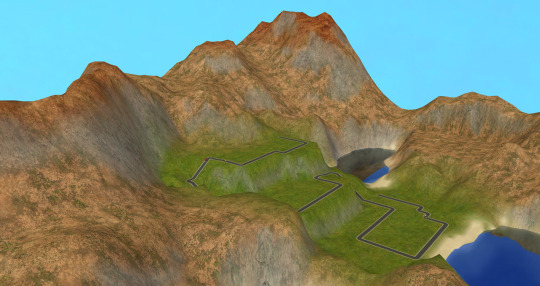
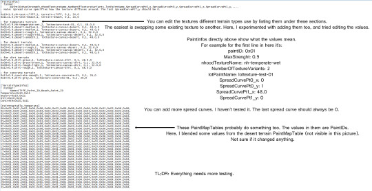
The previous ask made me remember that it's possible to sort of mix different terrain types by editing the NeighborhoodTerrain.ini in the game files, too. Doing this instantly affects all the neighborhoods using the edited terrain type.
The lot view still shows just one terrain type at a time, though. But when done like this, I assume the lot terrain type will automatically change based on what terrain the lot is mostly placed on.
I've never found a way to utilize this well for my own use, but that's probably due to the lack of patience to fiddle with it lol.
Underneath are the settings I used for the preview above, along with my notes. Just click on the pic for the bigger version (or open the picture in a new tab if you're reading this from the blog).
115 notes
·
View notes
Text
also fun design tidbit yall cant see in that piece: (at least as of rn) my cleo design has one paralyzed droopy eyelid, always half-lidded! she doesnt usually open the other eye super wide, though, so its usually a bit more subtle to notice

#may change in future but eh. im having fun w it for now!#but like. shes a half lidded kinda person anyway To Me so thats how she'd probably have it 70% of the time anyway#and i wanted to work more like. disability rep in? kinda inspired by a tutorial i saw forever ago abt drawing ppl w strabismus aka lazy eye#so cleo can have that. as little a treat <3
3 notes
·
View notes
Text
First time posting a crochet project here.
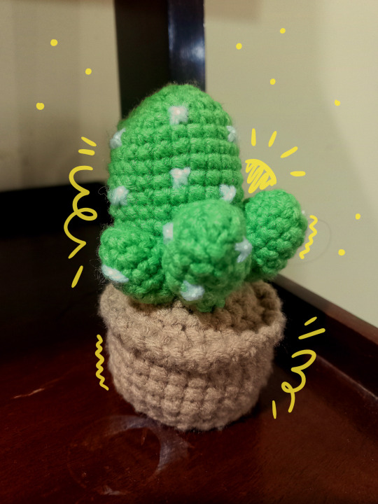
Ta-da! 'Tis a little cactus.
#yes i know i said prickly pear#but i changed my mind during assembly#i know the colours look weird but my room has hospital lighting#attempted to adjust colours but eh#watched a tutorial from Avocado Handmade on yt#crochet stuff#crochet#amigurumi#cactus
19 notes
·
View notes
Text

won't you please say that again?
#shed seven#tried my hand at some gifs#probably a bit shit but eh. i followed a tutorial so hopefully they're somewhat ok#tw flashing lights#cw flashing lights#<- for the third one. just in case
10 notes
·
View notes
Text
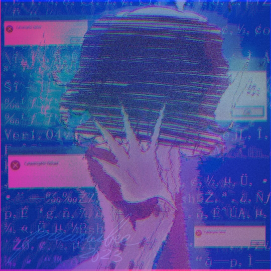
idk what to caption this one tbh
#my art lol#vocaloid#vocaloid fanart#utatane piko#piko utatane#piko vocaloid#eyestrain tw#blue#glitchy#pink#this was all mostly a test and i'm not superrrrr proud of it? wasn't gonna post it either but eh why not#made this w/ the desktop vers of ibispaint and maybe thats why it seems a little rushed cause the. time limits#congrats buddy you overlayed so many effects on this i cant see shit. SKHDJGHSKJGH. this is a little too overboard i think yeah#based off those ideas a while back abt a particularly glitchy piko. blingus tutorial helped but i mightve also fucked it up 😅#i need to test out more stuff w/ the synths themselves but im lazyyy and not very good... but i really wanna see to what extents i can brea#the voices. its fun. even if it blasts out my ears in audacity for final edits but shhh.#chromatic aberration
41 notes
·
View notes
Text
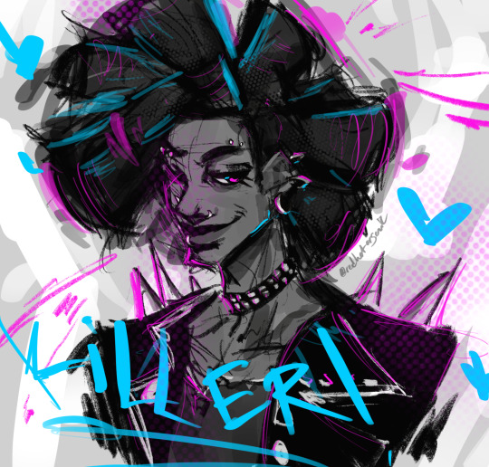
OC-tober day 15 prompt: meme
Featuring K.A., Kali, Adam, Kaylyn and Eri from Universe Building Tutorial (first just one of those draw your ocs prompts and then just normal meme edits)


Sixteen teenagers are tasked with the creation of a universe, problem is three of them are control freaks and half of the others don't get along well. Plus there is no tutorial out there for how to achieve such a thing. Who let a bunch of teens handle such an important task-
For this prompt I only chose five of the characters. The afformentioned control freaks are K.A. and Kali (Denis is not present here), while the other 3 are chosen because: Adam is K.A.'s unfortunate guyfailure punching bag, Kaylyn (gay intent), and I really really love Eri's design (plus despite her overall foul behaviour she s one of the few people that can get along with K.A. so i thought it would make sense for her to be here)
I could go on for days for the complicated dynamics between all sixteen members of the cast but this is not the relationship prompt entry.
From bweirdart's OC-tober prompt:
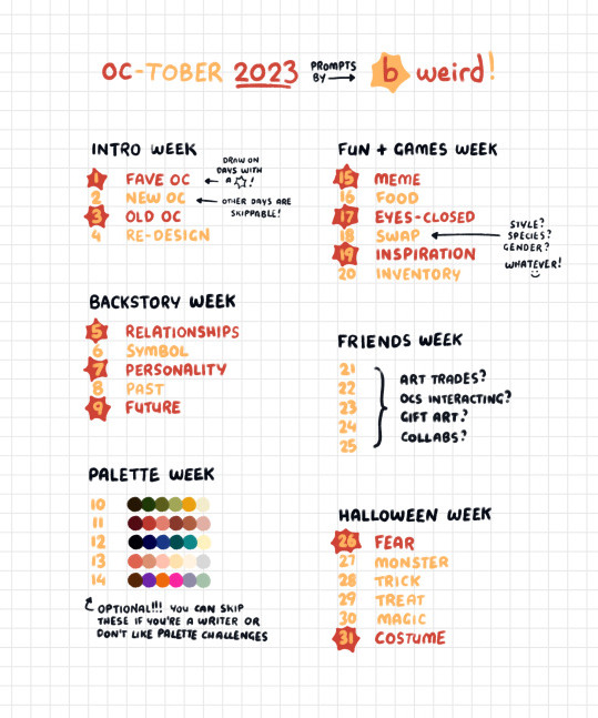
While I am doing this challenge mostly to keep an archive of my characters on tumblr (and to incentivise myself to draw them), if you, person stumbling upon this post, are curious and wanna learn more, my askbox is open >:3c
#oc-tober#bweirdOCtober#kyeterna oc#Universe Building Tutorial#unibtut: K.A.#unibtut: Kali#unibtut: Adam#unibtut: Kaylyn#unibtut: Eri#they dont know these used to be au ocs........#not telling what series tho ehe#unlike most of my other stories I will not be publishing anything about this one#it serves more of a purpose in the meta story if anything#i do like outting them in situations though#they are like little dolls i play with heeheh#K.A. Kali and Denis are all horrible horrible people. Then again teenagers- they are all scary#I love them nonetheless though I love you my dysfunctional little kids#Adam deserves better treatment tho
10 notes
·
View notes
Text
okay, my plotting
#just me hi#'my plotting' i'm thinking of my independent to dos outloud bfsvh#anyWho so i've got those two revenges i've gotta finish.. and then there was one big one i wanted to do..#and then uhhh.. i Do need to get around to watching that tutorial on synfig lol#13 minute video is Nothing to me but ohhh man is it SoDaunting hhfbshh#well let me not say daunting i think i am thinking of a grueling hour-long tutorial when it's really 13 min long and i really wanna learn#this thing so hhhhhmm :^#i gotta respond to my messages..#mm i also have- oh i've gotta eat at some point let's not forget that lmao :3#gotta go through my askbox..#n really clean up my email... i love cleaning up my email :>#finish that story i was reading...#explode 4000 times bc i vaguely thought of something neat...#i think i should get into woodcarving...#no wait that's not a to-do.. maybe organize my clothes box. she is Not lookin good hhfbhsfhv#i hate doing that though so fingers crossed that ever gets done lmao#/mm yea i think i'm gonna finish up this attack rn ehe :3#there is something so nice abt already having something you like working on ready when you wake up. hellooo drawing hfbsh#okay on my way now :) gotta clean my things up#//ouh i Need to go skating at some point this month....... so bad#//okay i'm going Now hgfbshv ; toodles :3
3 notes
·
View notes