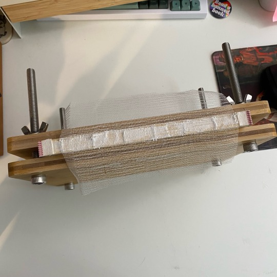
#endband tutorial
Explore tagged Tumblr posts
Visit Tumblr Blog
Explore Tumblr blogs with no restrictions, modern design and the best experience.
Last Seen Tumblr Blogs


Fun Fact
The total number of visits Tumblr.com received during January 2021 is 327 million.
Text
youtube
I just realized I can put my YouTube videos on here. I made a tutorial! Check out my channel too cause there's edge decoration tutorials on there as well :)
57 notes
·
View notes
Text
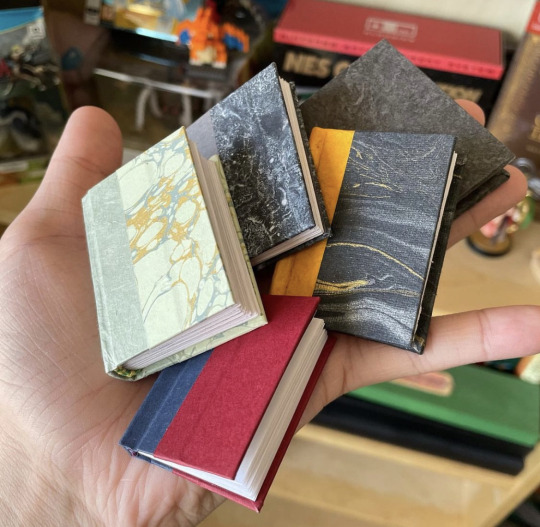
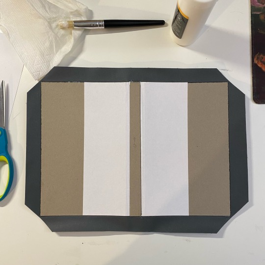
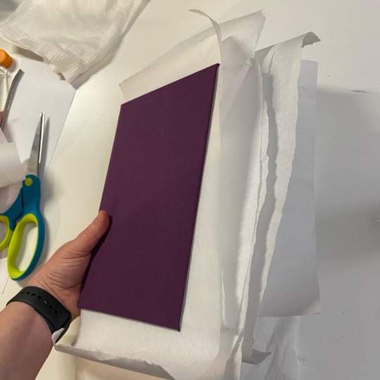
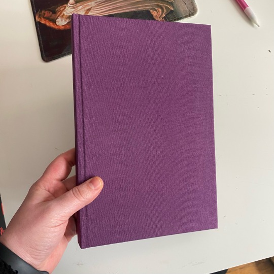
so, you wanted to start bookbinding?
so @princetofbone mentioned on my post for "factory settings" about wanting to know more about the binding style that i used for it. so i thought i might make a post about it.
i was as terrible as i always am for taking in progress shots, but i can link you to the resources i used in order to make my book. i would also like to point out that "factory settings" is my 120th bind, and i have been doing bookbinding as a hobby for just over 3 years now. unfortunately this means some of the methods that i used for that bind aren't particularly beginner friendly, just in terms of the tools and methods i have used, but i would love to point you in the right direction when it comes to resources. i dont say this to sound pretentious which i fear i might come across, just so that youre fully informed. getting into this hobby is fun and rewarding, but it can definitely be intimidating.
with that caveat, heres a list of links and resources that i have used for bookbinding in general, with additional links to methods i used specifically in regards to this bind.
ASH's how to make a book document. it gives you a great introduction into typesetting fics (where you format the text of fics to look like a traditionally published books) and then turning them into a case-bound book (the style i used for "factory settings"). it is comprehensive, and explains how to use microsoft word to do your bidding. it was invaluable to me when i was just starting out! currently i use affinity publisher to typeset/format my fics for printing, but i only bought and learned how to use that after i had been binding books for a year and a half. i made some beautiful typesets with word, and some of my close friends use it still and design stuff that i never would be able to in my wildest dreams (basically anything by @no-name-publishing)
DAS Bookbinding's Square Back Bradel Binding. a great style to do your first bind in! this method requires, when making the case, to attach the cover board and the spine board to a connecting piece of paper, which makes it so much easier to match the size of the case to the size of the text block (your printed out and sewn fic). using this method is what allowed me to get much more accurately fitting cases, and made me much more confident with the construction of the books i was making. a well-made book is something that is so wonderful to hold in your hands!
DAS Bookbinding's Rounded and Backed Cased Book. This is the specific method that i used to create my bind for "factory settings"! even before i could back my books, i found that watching DAS's videos in particular helped me see how books were traditionally made, and i was able to see different tips and tricks about how to make nicer books.
Book Edge Trimming Without... i trim the edges of my text block using my finishing press and a chisel i have sharpened using a whetstone and leather strop with buffing compound on it. i follow the method for trimming shown in this video!
Made Endpapers. i follow this method for my endpapers, as i used handmade lokta endpapers, and they can be quite thin, but they look beautiful! i used "tipped on" endpapers (where you have your endpaper and then put a thin strip of glue on the edge and attach it to your text block) i used for a very long time before this, but these feel like they are much more stable, as they are sewn with your text block.
Edge Sprinkling. this is the method that i used for decorating the edges of my text block. but the principle is basically clamping your text block tight and then sprinkling the edges. i do not believe you need to trim the edges in order to do sprinkles on the edges, and that's what makes it accessible! i personally just use really cheap acrylic paint that i water down and then flick it onto the edges with my thumb and a paint brush.
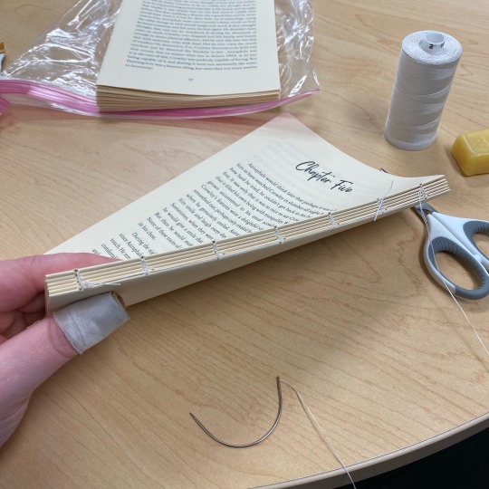
Double-Core Endbands. i sew my own endbands, which i followed this tutorial for. that being said, it's kind of confusing, and this video is a bit easier to follow, but it is a slightly different type of endband.
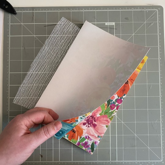
Case decoration. i used my silhouette cameo 4 to cut out my design for "factory settings" in htv (heat transfer vinyl). i also used my cameo 4 to cut out the oval of marbled paper on the front, as i honestly didn't want to try my hand at cutting an oval lol. i also glued some 300 gsm card with an oval cut out of the centre of it onto the cover before covering it with bookcloth, to get a kind of recess on the cover. i then glued the oval of marbled paper onto the top of the recessed area once it was covered with bookcloth, so that it was protected. the images i used were sourced from a mix of rawpixel, canva and pixabay. a more accessible way to get into cover decoration is by painting on a design for your cover as described in @a-gay-old-time's tutorial just here. or even doing paper labels, which look classy imo.
physical materials. sourcing these will depend on your country. i am located in australia, and have compiled a list with some other aussie bookbinders of places to buy from. here is a great post describing beginning materials for getting started binding.
@renegadepublishing. this tumblr is great! its what got me started bookbinding, and being in the discord has been inspiring, motivating, and honestly just one of the best online experiences i have ever had. it is full of resources, and most people in there are amateur bookbinders, with a couple of professionals thrown in. the discord is 18+, and anyone can join!
i'm sorry this post got so long, but i hope that this has a lot of information for you if you would like to get started bookbinding. its one of the best hobbies ive ever had, and i genuinely believe i will have it for the rest of my life.
4K notes
·
View notes
Text


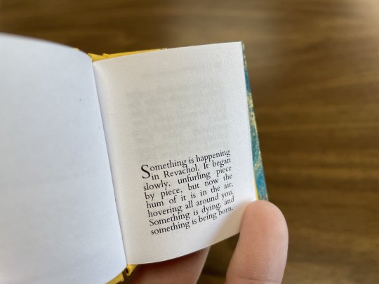
Fanbinding of Salvage by @muffinlance
This story has been on my binding list since I started learning how to bind books. It was probably the inspiration to learn even, after seeing all the really cool copies people had made already.
I've been working on this book on and off for the past month, and I've learned a lot of different things during the process. Mainly that it helps to look up tutorials for things before you actually start doing them.
It's an A4 folio (A5 sized book), is 528 pages long and about 3.5cm thick, so it's got quite a bit of weight to it. This was my first a5 book so it was very fun to make, it really feels like a real book and it lays open really nicely. It's also my first time doing a 3 piece bradel using an actual tutorial rather than just loking at a picture and going "I'm sure I can recreate that", turns out it's a lot easier following someone elses instructions, who knew lol.
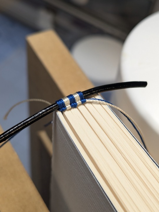
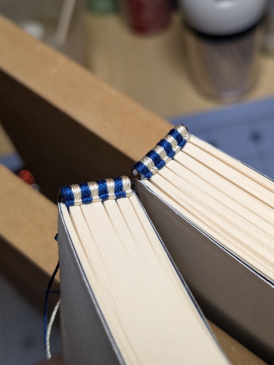
Printed on sugarcane paper, hand sewn double core endbands, cover material is dubletta purple blue bookcloth, and the cover is decorated using a wrmk foil quill and silver foil.
The endbands were my second attempt at the double core style, I've done a few of a different type before but I found this method a lot easier, albeit it still took me 2hrs for each end :') I tried to match the colours to parts of the books, so the purple and turqoise(?) are from the bookcloth and the black and light blue from the endpaper.
For the title page and cover is used page borders from this shop, the title and chapter font is blackadder ITC, text font is EB garamond, drop caps are Aristokrat Zierbuchstaben and the paragraph dividers are just these emojis I found somewhere 𓆝 𓆟 𓆞 𓆝.
Thanks to @muffinlance for the amazing story, it really is a work of art, and I shall enjoy having a copy on my shelf next to all my other favourite stories <3
231 notes
·
View notes
Text
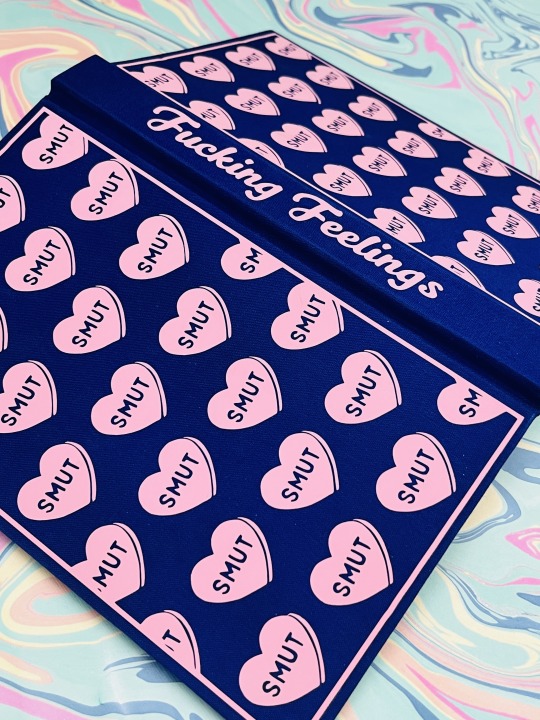
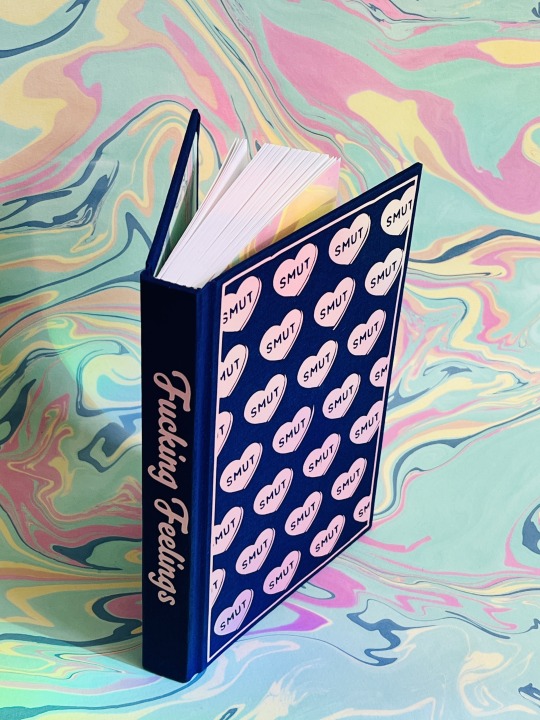
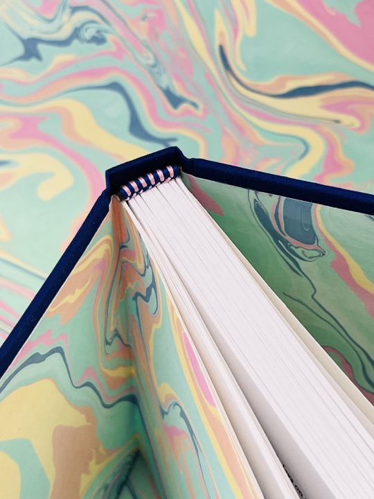
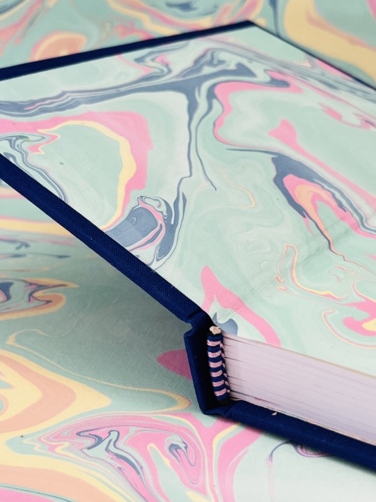
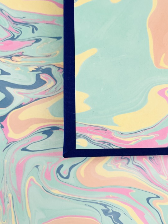
Bound: Fucking Feelings — an anthology of works by @its-the-allure
Typeset by: @sits-bound (stay tuned for typeset details from sits)
Bound by: me, @phoenixortheflame
What can I say about this bind except it was made for a beautiful human for whom I owe a lot to.
I met @its-the-allure on Reddit of all places. One post led to another and she ended up beta-reading my WIP. This is notable not only because I was new to Drarry and didn't have any fandom friends, but also because I'd never written fiction before in my life. Like truly, not a word of it.
If you've had the pleasure of Allure reading your work, you know she is a generous and delightful beta, and her enthusiasm gave me the confidence to start posting my work.

Not long after I started writing, Allure did too, and I had the immense privilege of beta-reading for her, too. In less than a year she published tens of thousands of words, including the 90s chatroom epistolary Come As You Are, which I see rec'd literally ALL THE TIME (seriously, it's amazing and if you haven't already read it, you definitely should).
A few months into binding I told Allure I'd bind her an anthology of her works for her birthday. Well, that day came and went a couple months ago, but — in my defense! — I was making four copies of 22 Cards, OUR FAVOURITE FUCKING SERIES, so I know she forgives me.
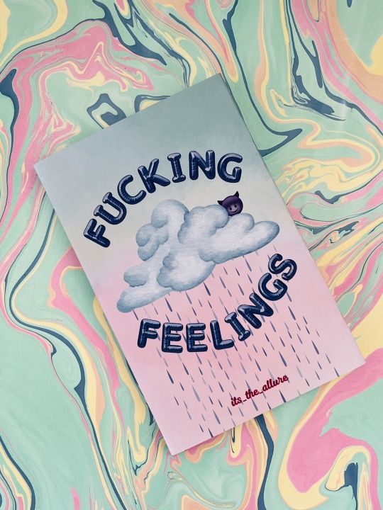
The anthology is called Fucking Feelings because this is the tagline we came up for Allure's work. There are feelings — and there's fucking.
The dust jacket is inspired by Melanie Martinez's album cover for Cry Baby. And the back table of contents is supposed to imitate a chatroom, with each work represented by a DM from the person whose POV the story is from. (If you look closely you'll even see a forwarded message, because that one is actually a Pansmione fic).
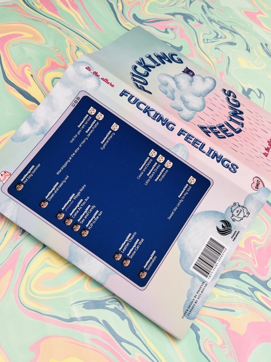
Throughout the cover design and also the typeset (all credit to @sits-bound for that part of it) are fun little nods to everyone's favourite messaging app, Discord.
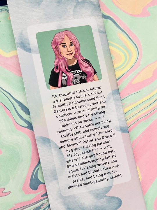
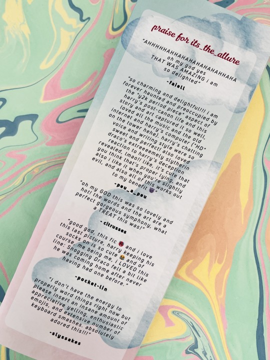
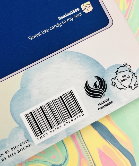
As always, Allure gets her own bio and a Praise For section with comments from some of her favourite people (shout out @faiell, @citrusses, @pocket-lin, @slyssnakes, and of course peu).
Happy birthday, Allure — I hope you love it, babe!
Materials and bind details
Book cloth is Verona in Amped Indigo
HTV is Cricut brand Everyday Iron-On in Blush
Endbands are Trebizond is a 3-ply silk filament thread using DAS's Two Colour Front Bead Headband tutorial here
Marbled paper from The Paper Place
Dust jacket is printed on 48-lb glossy photo paper (13" x 19") and covered with soft-touch laminate
HTV and dust jacket designs all done in Canva
215 notes
·
View notes
Text


Last @fandomtrumpshate book is done! This is Solar Flare, by @heliopauseentertainments. Made as a gift for pretzelbaron's generous donation to the Transgender Education Network of Texas <3
Crafty details! pretzelbaron requested reds/yellows/oranges and a marbled endpaper, and I said "I have JUST the paper in my stash," heh :3 They also described one of the themes of the fic as "dazzling light set against the darkness," which was so evocative I just had to incorporate it into the design of the title page!
Bookcloth is Brillianta in the color black. Title is Siser iron-on HTV. Endbands are double-core French endbands in Trebizond silk thread (I always follow @no-name-publishing's tutorial for these. Thank you Kam I owe you my life). Sun inset is a really gorgeous textured paper I bought in 2021 with members of @renegadeguild <3
This was also my first time trying this style of bradel bind! I really enjoyed it and found it much simpler than the three-piece bradel bind, haha. As always I owe my life to Mr. DAS Bookbinding on YouTube for the wonderful tutorial.
A million thanks to pretzelbaron again for their generous donation! I can't wait for you to receive your book :D
#fanbinding#Solar Flare#Transformers#heliopauseentertainments#Fandom Trumps Hate#Fandom Trumps Hate 2025#fth#fth 2025
162 notes
·
View notes
Note
what kind/style of endbands do you usually do? they look so good 👀
hi!! sorry for taking a while to answer, I wanted to make sure I could give you my best answer.
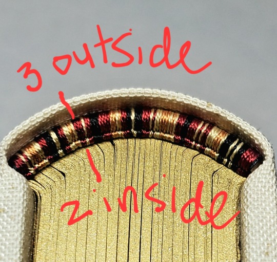
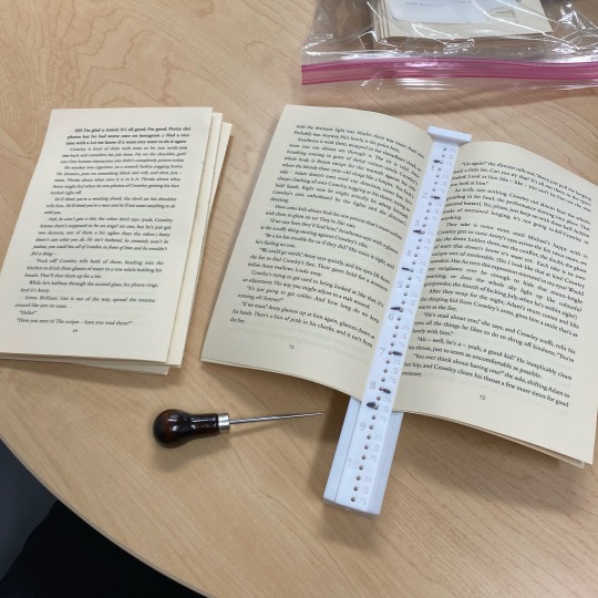
I usually do what's called a "double core" endband. I use double core endbands over the "bead on front" method because bead on front style is not great for uneven distributions of color, irregular patterns, or using more than three colors. Functionally it works by having your extra threads wrapped up inside the thread that is showing, forming the smaller secondary core. Ultimately you are doing figure 8s around the main core & then your secondary core of thread. This keeps things pretty neat & tidy. The tutorial I first used was this one by DAS Bookbinding, though I don't think his endband tutorials are his best ones. Another binder I've spoken with endbands about a lot is maleeka, who recently did an endband tutorial herself.
maybe I should do one... but it takes a lot for me to get enough motivation to make videos. I'll take this opportunity to write up some tips I've shared when people ask instead:
1. Endband core material is the MOST IMPORTANT component. You need a core that is stiff but flexible - it should NOT be floppy because it wiggles everywhere under the tension of the thread, but still needs to flex with the opening & closing of the book. You want something that doesn't compress, to reduce tension shifts in thread creating a lumpy endband. Have a smooth core is less critical but helps to avoid snagging threads & allows you some leeway on sliding threads around for adjustments. My personal choice is smooth leather jewelers cord (link is just an example, I get mine from a local craft store).
2. Thread size. All your threads need to be the same size; it will be visible if you are using two different sizes, and mess with your front core. Additionally, I know lots of people will use larger twists of multiple strands of embroidery thread, which can work, but is more likely to compress & alter its size in unexpected ways. A single strand is preferable. If you want something thicker you can find some thread weights that are heavier twists intended to be used in a single strand, not pulled apart. I prefer smaller sizes because it works better for the gradient designs I like.
3. Silk thread is your friend (if you can spend the money on it). It reduces fuzz (no fuzz like you get with cotton/DMC embroidery thread), it's usually easier to manage, has a more compact twist, and a higher shine. I use Japanese silk hand sewing thread in size #9 (9号). There's multiple brands (Tire, Daruma, KNK/kanagawa, etc). Here's a wholesale listing (minimum 20,000¥ for international). A non-Japanese brand is Guterman silk (German brand). Both the Japanese & German threads come in a heavier weight (Japanese is #16, Guterman is buttonhole).
4. Thread tension is the most important part of the actual technique. You need to ensure the threads currently wrapped in the secondary core keep tension when you are working the thread around them.
5. Working on a curve. This is only really relevant if you're doing an endband on a rounded book, but the circumference of the curve means there's more real estate on the outside vs inside of the curve. Sometimes this can cause bunching on the secondary core. My own solution to this is that sometimes I wrap the primary core but drop a wrap here or there around the secondary core (only between two wraps of the same color I'm dropping). I uh... don't know of anyone currently recommending this besides myself so I can't point to any pro endorsement for this method, it's just what works for me. Forgive my terrible writing:
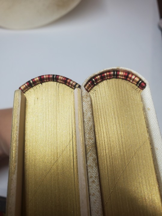
6. Pattern management. I... don't really plan much how my patterns sit on the spine, which is not very helpful. HOWEVER you can do some pattern management on the fly, if you really want your pattern to end at a certain place. Thread can be packed more or less densely on the core, resulting in some pattern compression; you could also strategically drop wraps in less noticeable locations. An unintended example: I was replicating the pattern on this endband (left) when I realize I wasn't packing the thread as densely as I had the first time around (right), which resulted in the overall pattern taking up more space. You can do this on purpose, if you need to.
this was way more than you asked but it gave me a chance to put all this in one spot. Best of luck in vanquishing the dreaded EndWyrms.
#fanbinding#bookbinding#celestial sphere press#in progress review#ask des#i tend to shock ppl a big when i say i don't actually enjoy sewing endbands#i merely Tolerate it#all of this knowledge is 100% spite driven to reduce my own frustration
385 notes
·
View notes
Text
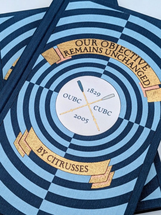
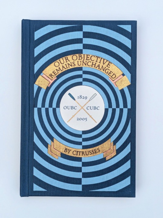
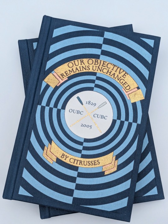
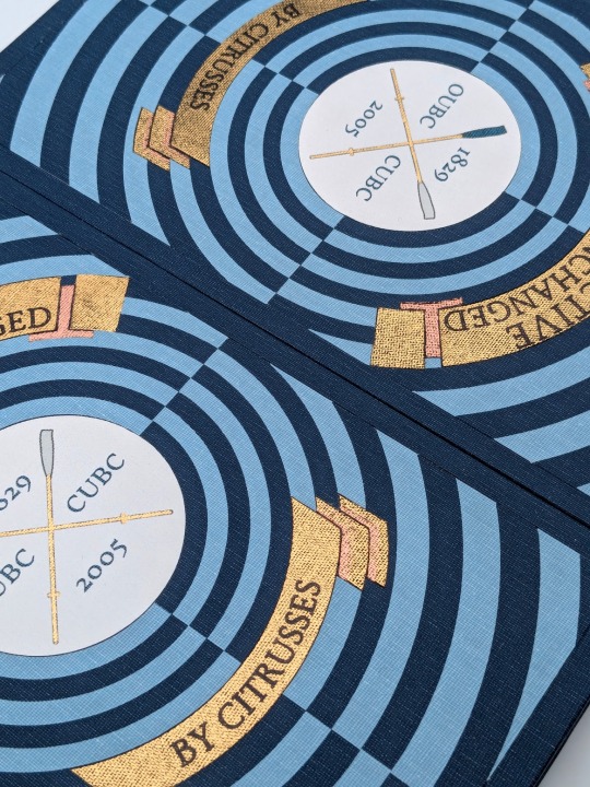
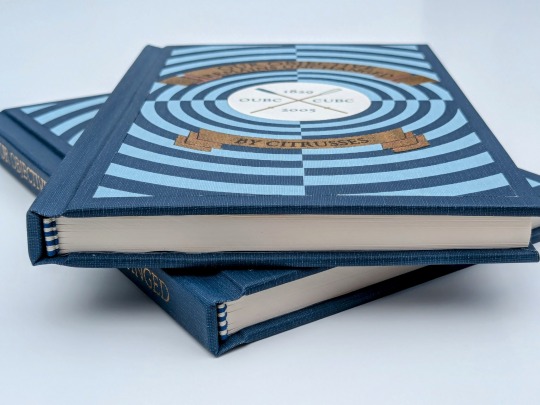
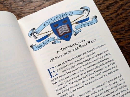
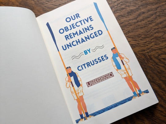
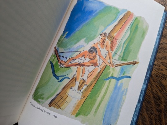
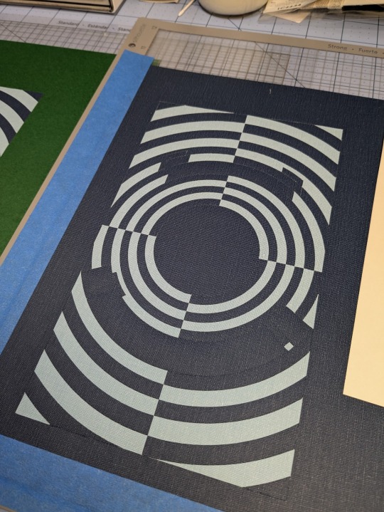
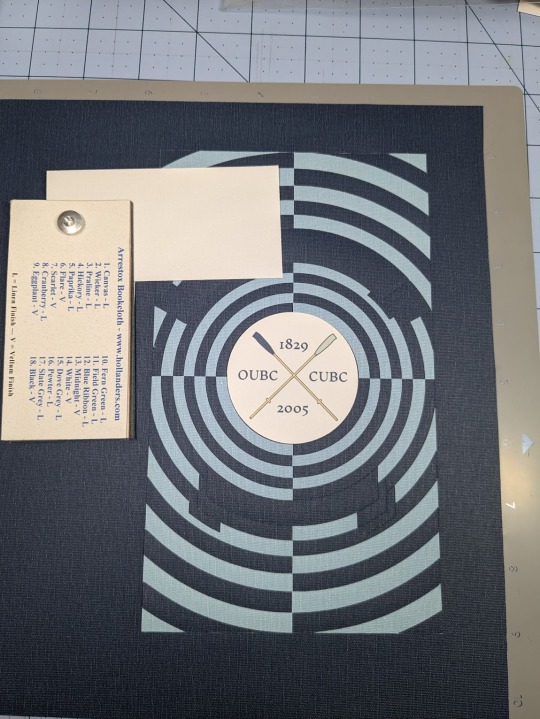
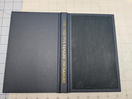
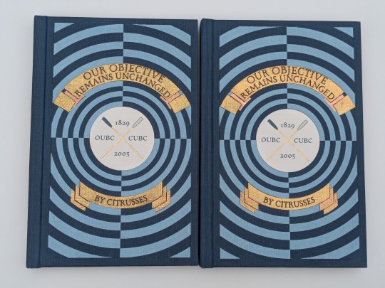
Our Objective Remains Unchanged by @citrusses
"Harry Potter, returning member of the Oxford University Boat Club, has two goals for the spring of 2005: beat Cambridge, and beat Draco Malfoy. Perhaps not in that order."
This has to be one of the most creative and meticulously researched fics I have ever had the pleasure of reading. If you haven't read it yet, don't walk— run! Citrusses is an absolute genius, and kindly gave me permission to bind her masterpiece.
The cover of this bind is made out four different shades of Allure bookcloth cut by my Cameo 4, and the centerpiece is printed and hand foiled. The banners were machine foiled in gold and black with hand foiled rose gold shading. The endbands were hand sewn with Gutermann silk thread.
You can find more pictures and information about my process under the cut.
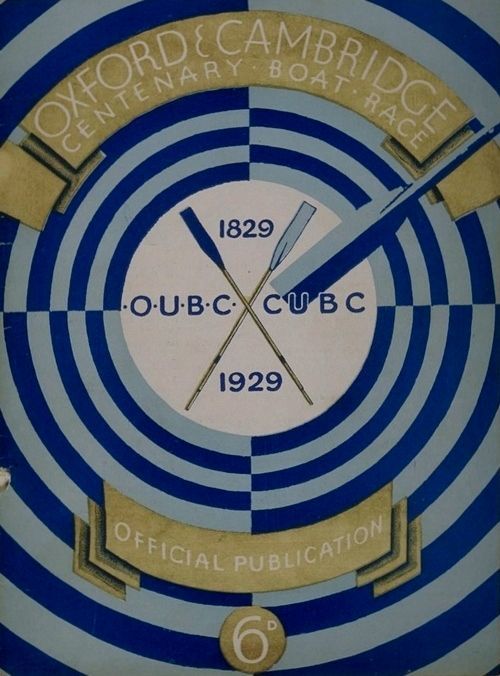
The amount of inspiration this fic gave me was overwhelming, and Citrusses' writing fully immersed me in the world of competitive rowing. While designing this bind, I was struck by the sheer wealth of Oxford rowing memorabilia available to me. I settled on this 1929 illustration from an official publication on the Oxford and Cambridge Centenary Boat Race for the cover.
"How hard could it possibly be?" I thought, foolishly. The answer was HARD, but I'll get into that later.
Due to the wealth of design options, I believe that this may be the best typeset I have created to date. Thanks to the help of my friend @tsurashi-bindery, I was able to learn the basics of InDesign (kicking and screaming all the way). There will be spoilers in the text of these photos, so try not to read them if you haven't finished the fic!
For the title page, I modified To See the Crews in Training by Charles Pears (1930). I believe that this was part of a series of advertisements for the race in the London Underground.
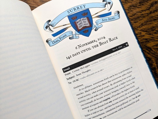
For the chapter headers, I redrew the crest from an Oxford Oars, Flags, and Arms postcard, presumably pre 1914. I also had some fun creating a mock email using La_Temperanza's How to Mimic Email Windows on Ao3. Cormac's email makes me laugh every time I read it, and Citrusses provided an appropriately pompous subject.

I also had lots of fun editing the oars from the official OUBC logo to serve as dividers and decorations for the page numbers.
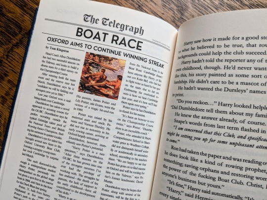
Additionally, I got to edit a full newspaper page for the fic! I was very excited find an opportunity to slip Leyendecker's The Finish (1908) in.
The fic ended beautifully, so I wanted to include one last element at the end to capture the atmosphere. I settled on L'aviron (1932) by Milivoj Uzelac. It makes me feel as though Harry and Draco will continue rowing together long after I've closed the book.
I of course had lots of fun sewing the headbands, and got to do it with not one but TWO copies!
Things got tricky when I had to recreate the cover. I had a poor understanding of how vector images worked, and ended up having to redraw it three times. Once I finally cracked and taught myself how to use Illustrator, the program crashed...and I had to redraw it a fourth time!
I set the vector to cut on my Cameo 4, and I assembled the pieces together like a puzzle on my Silhouette mat. I used Allure's indigo, skylight, white, and black bookcloth in the process. I will be making a tutorial video on this method, so I will keep it brief here.
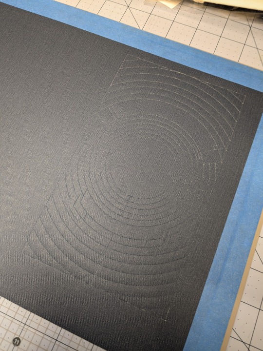
I also cut a piece of bookcloth to 8.5"x 11" and fed it through my inktank printer to print the center design. I then cut it out using the print and cut feature on my Cameo 4. Both of these methods were a first for me, and they were very scary!!
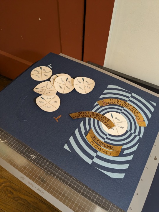
To be perfectly frank, the foiling was a nightmare and I don't want to get into it. I machine foiled the gold, and then foiled black lettering on top of it. I foiled the rose gold shading by hand, and then foiled a thin black outline along the edge of the banners to make them stand out more.
I hand foiled the spines (because I'm scared of measuring), painted the exposed board (to hide any gaps in the inlays), and used transfer tape to lift my design from the Silhouette mat and onto the cover.
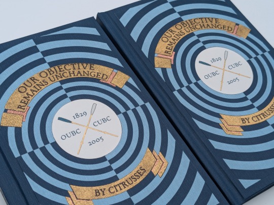
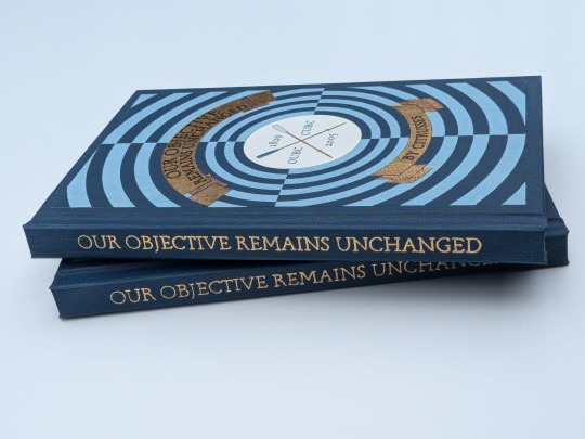
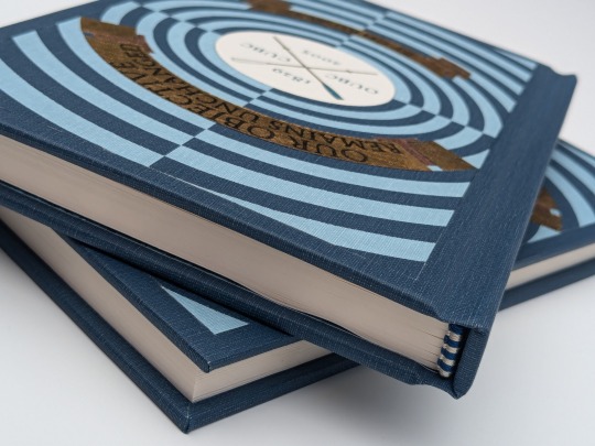
One more fun detail— my copy and the author's copy are sisters! The dark blue and the light blue are inverted on the author's copy, making it distinguishable from mine. This is the first time I have made an author's copy for a fic, and I was admittedly incredibly nervous. I always worry about what authors will think of my work, but Citrusses gave me an incredible amount of encouragement and support throughout the process! Thank you for trusting me with your precious fic!
This story is a work of fanfiction and can be read on Ao3 for free. My bind and typeset are for personal use only and not for sale or profit. Keep fandom free!
#book binding#fic binding#fanbinding#fanfic binding#drarry#our objective remains unchanged#harry x draco#my binds
343 notes
·
View notes
Text
Bound: The Twenty-Two Cards Series (Rookie Moves + 6 more) by peu_a_peu

I am pretty insane about this fic right now. Between this bind and the podfic I'm making of it, I am happily living in the world of these two dumb cops.
I made this for the @renegadeguild's Renegade Loves Fic(writers) event for Fanfiction Writer's Appreciation Day (which is today!), and sent it to the author earlier this month.
This bind has a couple of firsts:
First hand-sewn endbands


I am very very proud of the endbands - it has taken me many, many, many attempts to get them right. Huge props to maleeka_mols for this fantastic tutorial!
First dust jacket


I made a dust jacket because I felt like the design of the case didn't do this series justice. It just needed MORE.
Making it was fun but also very stressful. I had one chance to get the printing right (since I don't have a large format printer and so I had to get it printed as a poster, which is pricey) and thank god it all worked out perfectly.
So let's talk about the details…(other than the end bands and dust jacket.)
The 22 cards of the title reference the 22 cards of the major arcana. I am not familiar with the tarot, so I hope I didn't do anything "wrong" by choosing cards to use based on aesthetics. But it is such a fun aesthetic to use!

Weeding the HTV on the front was a lot. And then the gold of the title got a little wonky (another reason for the dust jacket, if I'm being honest) but I love the way it looks.


There's a lot of gold foiling on the inside. Each story has its own tarot card (again, chosen based on looks because I am shallow). I also made a table of contents! Just a lot of stuff. The typeset itself is fairly simple. (Would I love to have made a maximalist version like the one @slbindery made for me? Yes, but I have to accept that that is not the style I excel at.)


HAPPY (FAN) FIC WRITERS APPRECIATION DAY!
240 notes
·
View notes
Text
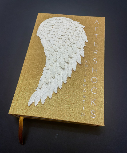
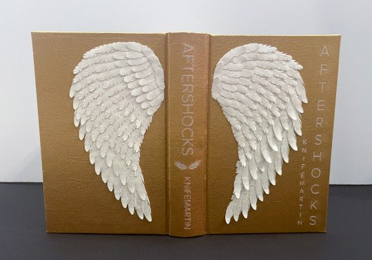
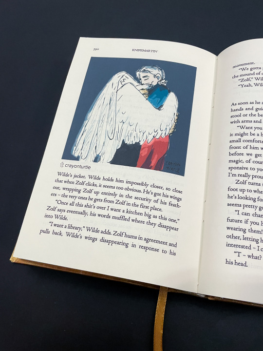
Aftershocks | knifemartin

(IDs in alt text)
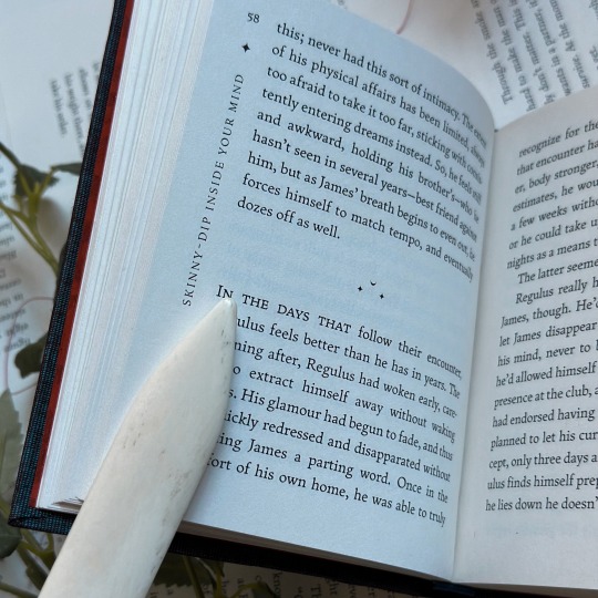
Another favorite Rusty Quill Gaming fic of mine--Aftershocks by @knifemartin! I was absolutely blown away by the worldbuilding, the varying relationships and their different forms of love and intimacy, and the clear and vivid visuals throughout. I have been craving Zolf, Wilde, and Sasha living together as a happy little family ever since I finished it, and I think often about the scene where Zolf discovers that Wilde is an angel. The various visuals in the story definitely inspired this bind--in particular, the gold and white of Wilde's former and current wings and the wings themselves.
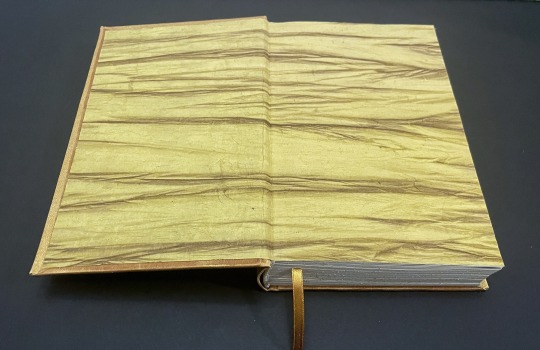
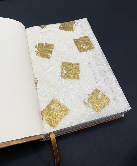
This is another book that makes use of the new things I learned during Renegade's February binderary event. It also uses double-core endbands, has trimmed (and splattered) edges, and uses a chapter header motif that I've seen floating around in bookbinding spaces occasionally and that I've been wanting to implement in some of my own binds! I was also able to finally make use of the white fibrous paper with gold squares stamped onto it (for the half-title page) and the gold fabric-like paper (for the endpapers), both of which I've had in my paper horde for ages.
And, of course, my favorite part of this bind--the wings on the covers! I found a tutorial online for an angel wing wall decoration, scaled it down, and cut out all the feathers using my Silhouette and a white fabric/paper roll I picked up at a used craft store (I think it's wallpaper, but I'm not quite sure!). Then, I glued all the feathers down to a base before gluing the wings themselves to the covers. I really like the 3D effect I got by not gluing down the tips of the feathers, and I think they feel really nice to the touch! I had a very strong vision for this book, and being able to realize it so cleanly was so so much fun.
264 notes
·
View notes
Text
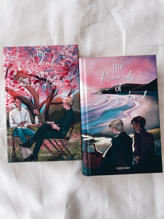
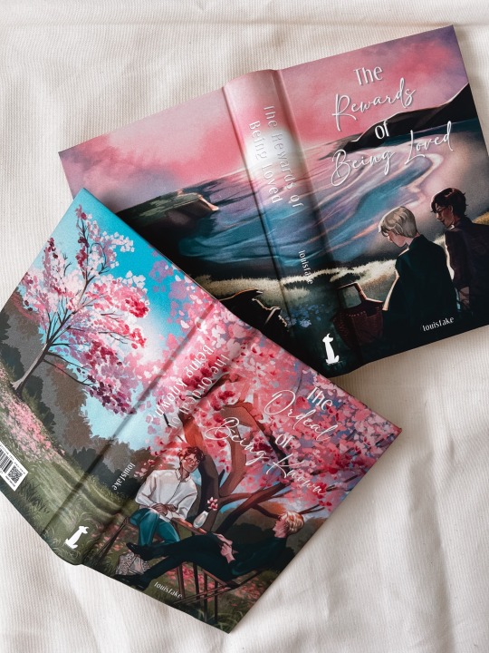
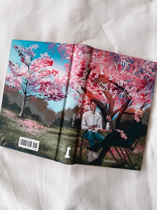


the ordeal of being known series by @lou-isfake
ft. my fav draco, where he learns about harry’s childhood and gets mad on his behalf. also harry, the oblivious idiot, makes the most diabolical mixed tape for draco and everyone should listen to it.
tried some new things with this bind. i think i’m a rounded spine convert. also big thanks to maleeka for her amazing endband tutorial
dreamy artwork by talitasami, she really caught the vibes and it’s just stunning.
cover materials: 48lbs glossy photo paper with soft touch laminate
98 notes
·
View notes
Text
──────── · · ─ ·𖥸· ─ · · ────────
I bound the scripts from The Walking Dead: Dead City season 1
──────── · · ─ ·𖥸· ─ · · ────────


──────── · · ─ ·𖥸· ─ · · ────────
I may or may not have gotten a tiny bit obsessed with this show and now that we finally have a release date for the second season (May 4th) I thought why not kill some time and bind the scripts of the episodes?
Now, formatting was a bit of a pain because I only had access to the transcripts of the episodes which meant I had to rewatch the whole show, pause every few seconds and manually note down who was speaking. And don’t even get me started on scene descriptions (which I kept to an absolute minimum) and flashbacks. Took me a few evenings.
──────── · · ─ ·𖥸· ─ · · ────────


──────── · · ─ ·𖥸· ─ · · ────────
I’ve stitched together the signatures using a French link stitch, which has steadily become one of my absolute favorites to use. And because I endeavor to improve with every project I thought I might as well try out sewing my own endbands. Thankfully DAS Bookbinding has a tutorial for everything.
──────── · · ─ ·𖥸· ─ · · ────────


──────── · · ─ ·𖥸· ─ · · ────────
I’ve once again used Dead Kansas as a font and because of the show’s rough aesthetic I thought I would keep the font as is scratches and all. And while I do like the look, this took my cricut 4 hours to do. So. Yeah.
──────── · · ─ ·𖥸· ─ · · ────────


──────── · · ─ ·𖥸· ─ · · ────────
And last but not least I knew I wanted Maggie and Negan on the cover, so I found this promo pic of them and half removed the background so they’d be sticking out. Ngl, I saw this bind and others like it and I’ve wanted to try my hand at it for quite a while. Just absolutely gorgeous.
I’m really happy with how it turned out, though I wouldn’t recommend using the printable iron on paper I used in combination with the suede book cloth. Sadly I’m an absolute sucker for the velvety feel of it. Oh well.
──────── · · ─ ·𖥸· ─ · · ────────
#the walking dead#the walking dead negan#twd dead city#dead city#maggie#twd maggie#twd negan#negan#negan smith#twd amc#twd comics#book binding#bookbinding#book cover#book#diy ideas#diy#diy projects#diy craft#cricut
29 notes
·
View notes
Text
Tiny Book? Tiny Book. Pt1.
Idk yall I just felt like writing a little how-to of how-I-do my tiny A9 books! So if you've ever been interested, I hope this will be helpful. This will be neither a beginner typesetting nor beginner bookbinding tutorial; as I go through my process I will only be showing my process and providing a few tips, assuming you already have the basics understood. We can worry about the rougher technical skills in another post.
Also keep in mind that this guide includes images of fic I've bound, and you're zooming into these fics at your own discretion. I am not responsible if you read something yucky. I know you have a lot of options out there but thank you for flying No-Name Publishing.
Tiny books part 2; Tiny books part 3

Just like with regular ficbinding, there are layers, and they are:
1 - Typesetting and Imposing 2 - Printing 3 - Cutting, Folding, and Sewing 4 - Gluing, Rounding/Backing, Endbands 5 - Building the Case and casing in 6 - BOOK
In this part we will be focusing on steps 1 and 2. Please feel free to skip to the area you're interested in most.
1 - Typesetting and Imposing
Okay, so this area has some nuances that you don't have to consider so closely with typesetting for more traditionally sized books. To me, these tiny books are not about readability, they are about novelty. As such, I do not prioritize readability. Instead, I try to achieve something that is closer to scale. That said, neither do I want these illegible. But we'll begin from the top.
You want to make a tiny book, but you're wondering, what would be an appropriate word count for a tiny book? Tiny books are the perfect medium for the ficlettes, the shorties, the one-shots. They are also perfect for the mid-sized, 10-15-20k fics, in my opinion. Here we can see,

On the left we have a fic that is exactly 12,771 words, typeset on a 1.5" x 2" (37 × 52 mm) document, with .3" margins, 6pt Garamond font, and 5pt line spacing. This book is only approaching 1/2" (13mm) wide, and only took 5 sheets of Letter paper to print. On the right we have a fic that is exactly 1,939 words, typeset to the same specifications. This book is only 4-5mm wide, and took only 1 sheet of Letter paper.
In my opinion this format of book begins getting unruly around the 300-page mark. However, making any combination of margins, fonts size, and line spacing will yield different page results for different word counts. For example:
Like the above, in each of these examples I typeset in Garamond font @ 6pt size and 5pt line spacing. Typesetting on an A9 page, this is about as small as I felt comfortable sizing my font while still being legible. But notice the rivers between the words--the rivers of white space bisecting the lines, due to the Justified alignment battling the admittedly tiny work surface. At this scale, with the font at this size and alignment, those will be unavoidable. Over time I began disliking this in my own work, so I pursued a different method, which was typesetting on a quarter letter page (4.25" x 5.5" / 108mm x 140mm), and allowing my imposer to scale the PDF down.
Have you ever seen anything sexier. THIS looks like a tiny book. Little to no rivers, still legible (hand-wobble), and preserves the novelty feel that I desire from a tiny book. This method of scaling down (specifically from quarter letter to A9) does change the final shape of the book, from A9 to A9-ish in this case. Specifically, from 1.5"X2" (37 × 52 mm) to 1.625"X2" (41.3mmX52mm). You're achieving something closer to a square shape, which is delightful to hold. All this to say, you have some freedom with word count, with font size, with page size. I've done as many pages as 376 and as few as 17. The fantastic thing about tiny books--their structure will not be load-bearing, meaning--the only thing stopping you are your tastes.
Quickly, some more examples of features in a regularly sized typeset and their tiny counterpart after the imposer has scaled them down. First, scaling half-letter down to A9, a little-over 4X shrinkage:
And from B6 to B9, smaller by 3x:

You notice the compression of every element, and too how entirely unparcable the text in the first example is, sometimes not horrible, sometimes very. Make your decisions dependent on your tastes!
You have decided on the fic you'd like to bind into a tiny book. I will be using my own fic as the typesetting example, and I will be using Word 365 for PC. I'm sure many of my pointers during this process might not apply 1-to-1 if you are using a different word processing software, but hopefully you can adapt the concepts to your program of your choosing.
Kay, next you will do your typesetting. Since this is not a typesetting guide I'm trusting that you have your preferred methods, but I will go through my key steps for setting up a tiny typeset:
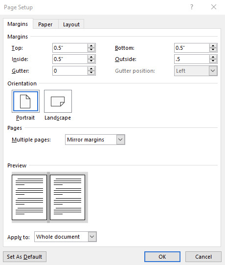
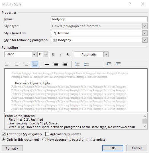
First, for every typeset I delete each default Style, create mine own, and dictate the document size. For this example I will be doing my preferred quarter letter method, setting the custom page size to 4.25" wide and 5.5" tall, and .5" page margins all around (except Gutter; leave 0"). On the Multiple pages dropdown I will select Mirror margins (however, as all my margins are the same size, this is redundant, though may not be the case for you). My body text style will be Cardo font @ 11pt size and Exactly 15pt line spacing, with a .2" first line indent and Justified alignment.
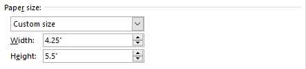
You can use whatever body font you like, I only encourage you to do many many test prints to refine your preferences. Your favorite font for half-letter books might not translate to tiny books. After ~30 tiny books I've found I like Cardo at this size and spacing. And if you're using A-paper sizes, consider doing quarter A4 instead of quarter letter, which is technically A6--4.1"X5.8", or 105mmX148mm. Follow your heart~~nyah 🐱♥
Now I will go to my fic and download the HTML file. I hugely prefer copying from the HTML file rather than the browser itself. It kind of standardizes any goofy formatting that might try to make its way over otherwise, while still preserving the italics and bolds, etc, and makes for an easier editing process. It was important I made my body Style in Word first, so that once I paste the text into my document that Style is automatically applied in one fell swoop (if not, you can change that in your Word settings. Advanced -> Cut, copy and paste -> Merge Formatting. It is a huge time saver.)
Now you've gone through your typesetting process, you have a liddle quarter letter Word document that you're happy with. Gets real close to you. Listen to me--listen, you're going to Export as PDF. Not Save As PDF. Not Print to PDF. Export. It's in--listen--it's in File, then Export, then Create PDF/XPS. You need to Export. Especially if you selected Bookfold instead of Mirror margins in your page settings because we need an unimposed PDF in order for this to work right and exporting to PDF is going to solve 99% of your pdf formatting woes with Word. Okay, I love you 👨❤️💋👨
Now, your EXPORTED pdf should look something like mine. Straight, unimposed.
Now what we're going to do is take this PDF back to my penthouse and freak it. Go to this link for the Renegade Bindery-created and -curated imposition tool. This has been will be is such an incredible FREE asset to you, maintained by a crew of intelligent, skilled Renegade Bindery members who understand the importance of community and accessibility. If you find someone hiding this link behind a paywall of any kind it is not with the creators' permission, so shame on them.
Anyway I will be assuming that you know what imposing your document means. If you've never used this site before, it's very straight forward, and here are my settings for making Tiny Books.
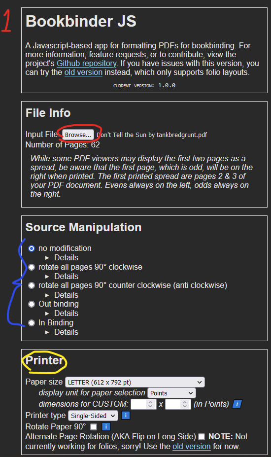
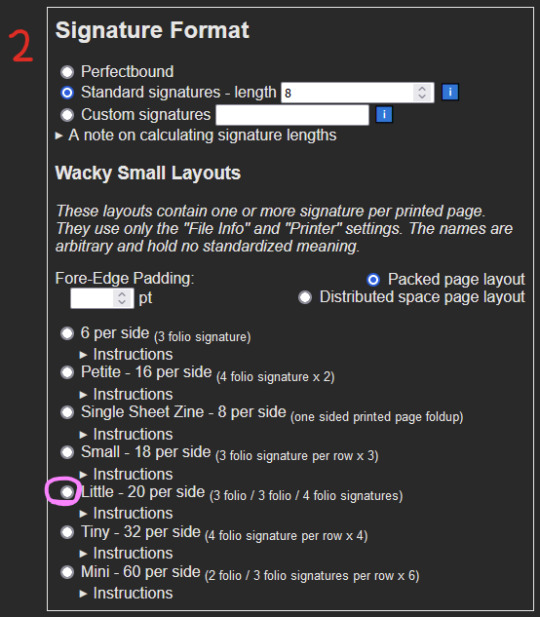
1 - Upload your unimposed exported pdf. 2 - ignore 3 - Select the paper size you will be printing on. This is not the FINAL size of the book, this is what paper you are printing on. These instructions are for Letter sized paper. Don't change any of the other settings right now, I will explain more about the Single-sided vs Duplex option in a bit. 4 - Skip aaalllll the way down to Signature Format. Under Wacky Small Layouts, click on the bubble next to Little. You'll notice there are a lot of options here. I encourage you to play with these settings later on as well, there are so many things you can make with this tool.
Once that's done, scroll down to the very bottom. You'll see the Signature Info area, telling you the results of your imposition. In the case of using the Little option we've selected, 1 sheet of our paper will make 40 book pages. 3-signature-sets of 3/3/4 folio configuration. That's a lot of pages per page.

Anyway for our document today it will cost us 2 sheets of Letter paper, and will make 6 signatures. Math says that's 80 pages. Now, you may be concerned because your typeset PDF is not formatted in a number equally divisible by 40. And why would it be. The imposer is doing that math for you in the background, organizing your pages regardless. In my case, my finished typeset is 62 pages, which means that from my second page, I will only be using my 3 folio segments, and discarding the 4 folio segment. This will make more sense later. Click the Generate button, and save the zipped folder wherever you want. Don't change the name of it.
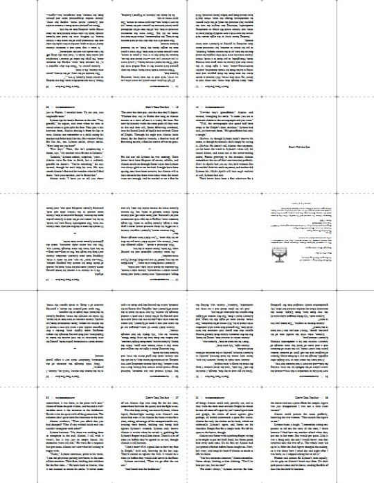
Unzip that baby, and inside you'll notice 2 files--(filename).pdf_little_packed_backs, and .pdf_little_packed_fronts. Appropriately named as one file contains one side of the sheet that will be printed, and the other file the other side.
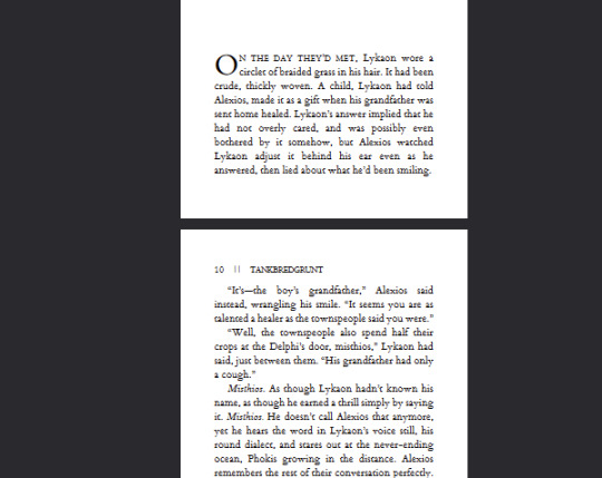
And when you open them up, they will look like:
2 - Printing
We are manually duplexing this bad boy, because working at this scale amplifies and compounds every millimeter of difference. Manual duplexing will keep printer skew to a minimum, as the printer will not have to perform gymnastics in order to print on the reverse side of your page. Here are some examples:

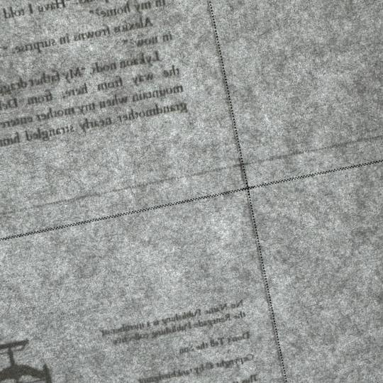
Two auto-duplexing examples of skew, one horizontal and one vertical, dependent on which direction my paper was loaded into the feeder. There is significant skew. Not a horrible issue on full-sized books but these will matter much more on our tiny books, the key issue being that we do not have much to work with in the margins department. Trimming 5-6-7mm of margins of your half-letter sized textblocks might not be much of an issue; however, here, in order to remove all the trim lines during the cutting process, you will be significantly impacting the margins of your tiny textblock.
Now here is an example of the skew from manual duplexing:
MUCH subtler. Your skew with manual duplexing will range from this--less than .5mm--to no skew at all, and you will have to cut off far less of each page to remove the trim lines, maintaining the consistency of appearance of your tiny, beautiful pages. This is why during step 3 of the imposing process we selected Single-sided (which is MANUAL duplexing), and not Duplex (which is AUTO duplexing) appropriately. This will result in you either getting two files for manual duplexing, or one auto duplexing file.
Your next consideration when it comes to printing your liddle book will be whether you want to use an inkjet printer or a laser printer. I've until recently only had a laser printer available to me. I can say after about 6 or 7 little books on an inkjet printer that I prefer the laser printing on tiny books. Here is an example of why:

On the left you have a tiny book printed from an inkjet printer printed on the highest quality setting, and on the right is a tiny book printed from a laser printer. These were both printed at the same scaling, same font size, same line spacing, everything. The inkjet printer, printing at this scale, introduces pretty glaring feathering on the letters, whereas the laser printer is crisp as can be. I've said before that to me tiny books are more for novelty rather than readability, however I do still want to make out the word I'm looking at, you know what I mean? For this reason I prefer printing my tiny books from a laser printer. Use what you got though, you'll get a tiny book regardless. Make sure you're flipping on the short edge with these tiny books too, and double check to make sure your page numbers line up. And when you're done you got...
BOOK(-adjacent).
Continue on to part duex.
246 notes
·
View notes
Text
Okay, this is gonna be a long one, so I’m putting it under a cut. Folks on Reddit have asked for a walkthrough of my bookbinding process, so I’m going to detail it. A few steps I forgot to take pictures of, but I’ll keep them in the list so that the workflow hopefully makes sense.
🌟 This is not meant to be an in-depth tutorial! For bookbinding/fanbinding tutorials with guided steps I recommend LadyBobbitt on TikTok or DASBookbinding on YouTube. 🌟
Fic pictured in every step after Step 3 is “Pretend for Me” by @obsessivelollipoplalala because I was working on an author’s copy! 🌝
Step 1 - Typesetting (not pictured)
Step 2 - Printing and folding the signatures (not pictured)
Step 3 - Punching the signatures. This is a 3D printed punch cradle from Etsy. I don’t recommend the Memory Keepers brand one on Amazon—it’s really shallow and hard to get centered punches.
Step 4 - Sewing the signatures, aka my least favorite part. Everything is downhill after you get it sewn. My preferred method for sewing signatures is called the kettle stitch.
Step 5 - Clamping the text block, reinforcing the spine with mull, and adding fake endbands
Step 6 - Gluing endpapers onto the text block after the spine reinforcement has dried
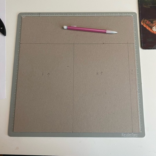
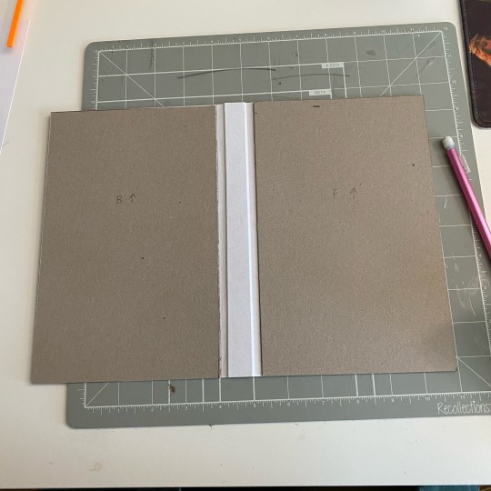
Step 7 - Measuring and cutting the cover chipboard
Step 8 - Forming the cover. I glue the chipboard to a central piece of cardstock. Some people find that this makes your creases less sharp, but I like the extra reinforcement.
Step 9 - Dry fit the text block to make sure everything is sized properly (not pictured)
Step 10 - Gluing the cover onto the bookcloth (this is the underside—the edges also get glued and folded over onto the chipboard)
Step 11 - Casing in the text block (not pictured). I add glue to the outsides of the endpapers and stick them to the inside of the cover. Once everything is placed correctly, I wipe off any excess glue and make sure there are no air bubbles anywhere.
Step 12 - Placing parchment paper between all wet/glued areas to prevent moisture transfer to the pages.
Step 13 - Press! (Not pictured)
Step 14 - Let dry overnight, then you have a book!
Not including the dust jacket making process here because it would require me to take screenshots from my computer and I’m sick rn so who has the energy?
Anyway thanks for looking if you scrolled this far :)
#bookbinding#fanbinding#ficbinding#book binding#book binder#bookbinders of tumblr#fic binding#my bookbinding
138 notes
·
View notes
Text

Bound: I Am Not Who I Became by mab_di
Typeset, bind, and illustrations by: me, @phoenixortheflame.
Draco left England after the trials and has travelled the world meeting wizards and Muggles from different cultures and with vastly different relationships to magic, each other, and the natural world. Now he's a fisherman in Finland on commercial vessels. Harry has been struggling since the war and has become a recluse while trying to write his autobiography. An invitation to the Hogwarts class of 1998's 15th reunion isn't welcomed by either of them, but neither could predict how the night, and their reunion, will upend their lives.


I made this bind for a friend who wanted me to surprise her with a Drarry bind of my choice. I'd had I Am Not Who I Became on my list for a while, because I just knew it would lend itself to some really beautiful imagery.
In the fic, Draco teaches Harry to fly fish, and so I instantly had the idea to draw a unique fly for each chapter head (there are 15 total), which I also included on the dust jacket.
I've been wanting to push myself to include more original art in my designs, and this was the perfect opportunity to practice my drawing on something low-stakes. It took me just under a month to draw all the flies, in between binding and writing and watching Severance.

I've been really loving the printable canvas for wrap covers, and I found this piece of public domain art titled "Cleaning Fish" by George Bellows which, in my opinion, fits the theme perfectly. I was going to do gold HTV on the spine, but decided against it since the art is so beautiful.


I think I'm finally getting better at endbands, but I still hate doing them just the same. @sits-bound introduced me to a new technique, which you'll see in my upcoming bind. In the meantime, this is a faux double-core endband, which I achieved using @maleekamolscreates amazing tutorial.
I had to gild the edges, because gold. I used Liquitex Iridescent Bright Gold acrylic ink and I highly suggest doing at least a bit of a sand before you apply to keep it from flaking too much, even if you do have a guillotine.


The endpapers are chiyogami paper, which might be my favourite paper to work with. The colours are so rich, and the patterns are so striking. This one in particular was made for this book.

I kept the typeset simple so as to show off the flies. Though I really like the vertical chapter titles, which I think add a modern touch to an otherwise pretty classic overall aesthetic.


As always, I made a copy of this fic for the author. And one for me, too.
All copies were gifts and no money was exchanged.
If you have any questions and want to learn how to bind fic for yourself, feel free to get in touch!
#drarry#draco malfoy#harry potter#fanbinding#ficbinding#typesetting#bookbinding#i am not who i became#mab_di#phoenix binds
180 notes
·
View notes
Text
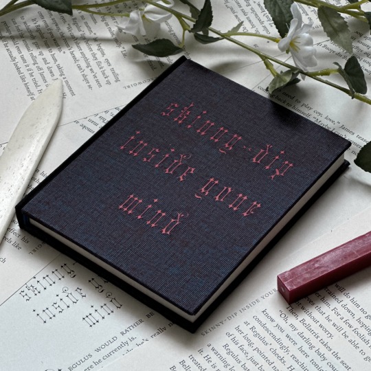
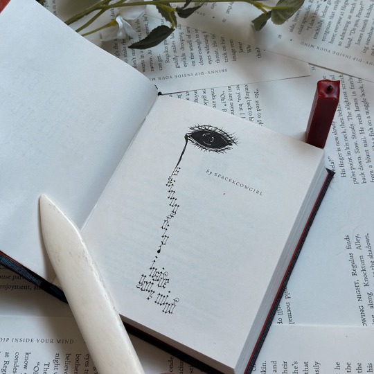
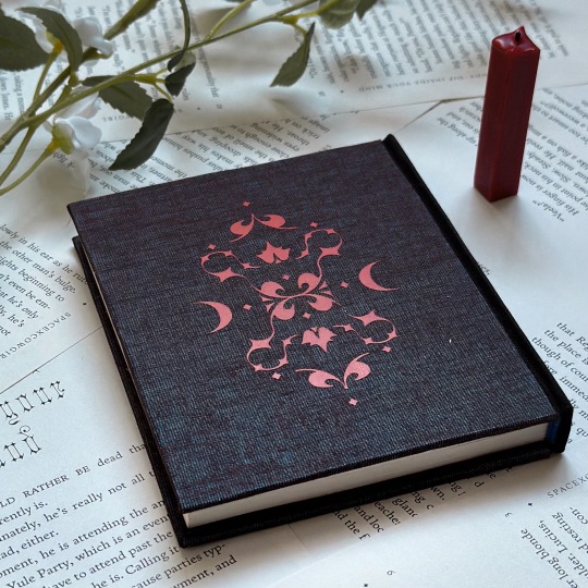
skinny-dip inside your mind by spacexcowgirl (@spacexcowgirl)
Through the smoke and dark lighting, it’s hard to make the man out, but his looks really don’t matter. This isn’t about what Regulus wants in a partner, it’s about what he needs to survive. At the moment, he’ll take whatever he can get.
Pairing: Regulus Black/James Potter Fandom: Harry Potter
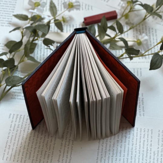
I'm so excited to share this bind that I made for Rose, who wrote one of my favorite jegulus fics over the span of a single weekend, and messaged me about it incessantly the entire time.
Turning this story into a bind was so fun, and I'm incredibly proud of the way it turned out. Hopefully, I managed to do this masterpiece justice.
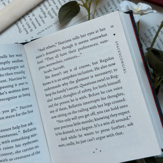
Quarter-Letter | 23,433 words | 157 pages
Title Font: Clavichord Body: Fern
Typset and bound by me in InDesign for @spacexcowgirl.
Making the typeset for this bind was a bit of a process I wasn't prepared for. Previously, I made all my typesets on Word, and the switch over to InDesign was not an easy one. That said, I have officially been converted, and I am so proud of the way this one turned out.
Rose said that she imagined this story as a bit dreamy, though given that it's an incubus fic, I did got in a bit of a gothic direction. All the design details, excluding the eye on the cover page, is done using the Fern and Clavichord fonts, including the motif on the back of the bind.
This was also my first quarto, which was a fun challenge that I wasn't expecting to enjoy so much. I can confidently say there will be many quarto binds in my future—this one was quick, easy, and addicting.
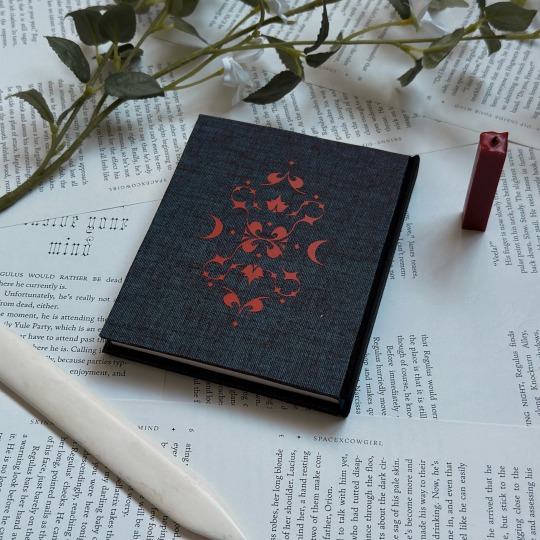
Materials and Techniques
Cover Bookcloth: Duo in Mudbath Spine Bookcloth: Iris in Black HTV: Siser Brand in Red Endbands: Mettler Silk Finish Thread
The only new technique I used in this bind was the double-core french endband, which I learned from @no-name-publishing as a part of the @renegadeguild binderary tutorials.
The binding itself is a three-piece bradel bind that I used before on my Choices bind. It's slightly adapted from the DAS tutorial to accomodate a flat spine, as this book was a bit too small for my comfort to round, but otherwise used all the same steps.
I recently acquired a few yards of Duo in various colors, and I absolutely fell in love with the mudbath color for this bind—the contrast of the blue and the red gives it a very dreamy look. The spine is Iris bookcloth, which is a favorite of mine because of how well it foils. This bind is photographed on misprints, of which I had quite a few, given that this was my first quarto.
skinny-dip inside your mind is free to read on ao3, here.

129 notes
·
View notes
Note
Can you recommend any full-scope resources for getting in to bookbinding, especially rebinding books and the different methods of stitching signatures/folios? I've had a really hard time finding comprehensive resources that kind of have all the information collected in one easy to read/watch place, but I really want to start binding my own books! Any resources for supply shops (I'm not in the USA so online might have to do) would be great too!
Ty 🩷
Full-scope in one place is unfortunately not exactly a thing in this hobby, given the very wide range of techniques & training styles. This is why I've found it helpful to be part of a community (even one that is mostly amatuers). @renegadeguild (the discord especially, but here is the website resource page too) is a great group of people that are always finding new tutorials, books, techniques, & material shops to share with each other - or creating them outright when none seem to exist. The discord hosts the bulk of the resources & is open to anyone 18+. Renegade also has regional servers you can join from the main, including outside the US (there are Renegade Europe, Australia, & Asia servers - I'm one of the Renegade Asia mods), which collect more region specific shops, online listings, & classes.
For traditional bookbinding (case bindings & some in-boards styles, plus explanations of adhesives & other basics), I recommend DAS Bookbinding. He has a lot of videos and focuses on technique. I recommend going through his videos by playlist, but he also has a guide to his video listings in his bio description on YouTube. This playlist talks about different sewing styles. Of the people putting out tutorials I would say he is the most comprehensive.
For exposed sewing styles, I'd recommend Bittermelon Bindery, who has a book called Handmade Books At Home that covers several different sewing styles.
r/bookbinding on reddit has a long list of links under the description's "see more."
There are of course other people out there, but there are also whole books on just endband styles or marbling, so to avoid sending you all over the place...
For rebinding, I probably have less useful information for you, as it's not something I do often, but here's a few notes. "Rebinding" in the colloquial sense currently refers to either of two different things: 1) taking a glued together paperback & recovering it to make it a prettier hardcover, or 2) completely taking apart a book (usually one that was sewn; if not sewn, gluing individual pages to "stubs" which are then sewn together), sewing the pages back together ("rebinding"), often with increased structural support, and either restoring the original cover or creating a new one.
#1 is debatable on whether it increases the longevity of the book (mostly because of paper quality & the glue binding), but it's nice for renovating your shelves. DAS also has a few videos on this type of rebinding, plus another here by Nik the Booksmith that I referenced the one time I've done this. Keep in mind they are using different techniques from each other, so you may need to do a little parsing between what different steps they are using. What a lot of people do too is use the square back bradel cover and act like the paperback is just a regular textblock, which does work for type #1 rebinding.
Type #2 rebinding requires some care in removing the glue & taking apart the original binding, because you want it off but not so much you damage the paper below. I have very little experience with this type of rebinding, but it results in a book that will last longer if you do it right. If you aren't concerned with keeping any of the original cover, once you've got the signatures clean & separated it seems pretty similar to starting from scratch.
I know there are a bunch of other rebinding resources out there, I just generally don't know what they are, so my knowledge is a bit lacking here! My ficbinding to-do list is too long for many rebinds to make it into the mix, lol.
Happy binding & best of luck in your future efforts!
44 notes
·
View notes