#flexbox container
Explore tagged Tumblr posts
Visit Tumblr Blog
Explore Tumblr blogs with no restrictions, modern design and the best experience.
Last Seen Tumblr Blogs


Fun Fact
Tumblr Inc. is funded by 13 investors.
Text
i would like to formally inform the developers of html/css: i hate you forever and ever and ever and ever and you are NOT invited to my birthday party. i hope your pet rock dies
#cs50web why... why would you do this to me...#i was but a little fawn and you set me out to die in the stalking woods when i had barely learned to stand on my own flimsy legs...#<-he has to make a google.com clone for his project 0 in cs50web and is Struggling to Center The Damn Divs Relative To Each Other#🌙rambling#wait. why don't i just put the stupid heading inside of the div that contains the form#allow me one moment#will report#// update: no.#// update: i love flexbox
22 notes
·
View notes
Text
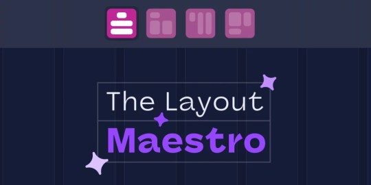
The Layout Maestro Course
New Post has been published on https://thedigitalinsider.com/the-layout-maestro-course/
The Layout Maestro Course
Layout. It’s one of those easy-to-learn, difficult-to-master things, like they say about playing bass. Not because it’s innately difficult to, say, place two elements next to each other, but because there are many, many ways to tackle it. And layout is one area of CSS that seems to evolve more than others, as we’ve seen in the past 10-ish years with the Flexbox, CSS Grid, Subgrid, and now Masonry to name but a few. May as well toss in Container Queries while we’re at it. And reading flow. And…
That’s a good way to start talking about a new online course that Ahmad Shadeed is planning to release called The Layout Maestro. I love that name, by the way. It captures exactly how I think about working with layouts: orchestrating how and where things are arranged on a page. Layouts are rarely static these days. They are expected to adapt to the user’s context, not totally unlike a song changing keys.
Ahmad is the perfect maestro to lead a course on layout, as he does more than most when it comes to experimenting with layout features and demonstrating practical use cases, as you may have already seen in his thorough and wildly popular interactive guides on Container Queries, grid areas, box alignment, and positioning (just to name a few).
The course is still in development, but you can get a leg up and sign up to be notified by email when it’s ready. That’s literally all of the information I have at this point, but I still feel compelled to share it and encourage you to sign up for updates because I know few people more qualified to wax on about CSS layout than Ahmad and am nothing but confident that it will be great, worth the time, and worth the investment.
I’m also learning that I have a really hard time typing “maestro” correctly. 🤓
Direct Link →
#bass#box#container#course#CSS#CSS Grid#development#easy#education#email#Features#flexbox#grid#Guides#how#investment#it#layout#Learn#learning#Link#links#masonry#One#online course#Other#Planning#positioning#reading#time
0 notes
Text
youtube
elementor tutorial,elementor pro tutorial,elementor wordpress tutorial,elementor tutorial for beginners,wordpress elementor tutorial,elementor,wordpress tutorial,elementor tutorial 2023,elementor wordpress,elementor pro,elementor flexbox tutorial,wordpress tutorial for beginners,wordpress elementor,elementor flexbox container tutorial,elementor wordpress tutorial 2023,elementor pro header tutorial,elementor page builder tutorialelementor tutorial,elementor pro tutorial,elementor wordpress tutorial,elementor tutorial for beginners,wordpress elementor tutorial,elementor,wordpress tutorial,elementor tutorial 2023,elementor wordpress,elementor pro,elementor flexbox tutorial,wordpress tutorial for beginners,wordpress elementor,elementor flexbox container tutorial,elementor wordpress tutorial 2023,elementor pro header tutorial,elementor page builder tutorial
#elementor tutorial#elementor pro tutorial#elementor wordpress tutorial#elementor tutorial for beginners#wordpress elementor tutorial#elementor#wordpress tutorial#elementor tutorial 2023#elementor wordpress#elementor pro#elementor flexbox tutorial#wordpress tutorial for beginners#wordpress elementor#elementor flexbox container tutorial#elementor wordpress tutorial 2023#elementor pro header tutorial#elementor page builder tutorial#Youtube
0 notes
Text
If anyone is proper good at html/css can you please help me understand how to organise containers in complex grids 😭 everytime i try to do it, they do NOT go where I want them to. (Am I nesting divs wrong? Am I not using flexbox attributes correctly? WHO KNOWS!!! I am God's experiment)
#I'll draw out what im trying to achieve later#i have a lot of questions honestly id appreciate it if someone was super kind and took the time to answer them through Discord 😭#cal.txt
7 notes
·
View notes
Text
flex-direction: row; & flex-direction: column;
Flexbox has a property called flex-direction and this determines the direction that the flex items are displayed.
flex-direction: row; - this is the default and aligns the items across the page, making the main axis, left to right and the cross axis, top to bottom.

When this property is applied with this value, and if you use the flex-basis property on the flex items within this container, it would affect the width of the items:

if we apply a flex-basis of 500px to the first child div, it would change the width of the div.
flex-direction: column; - this aligns the items down the page, making the main axis from top to bottom and the cross axis from left to right.

When this property is applied with this value, and if you use the flex-basis property on the flex items within this container, it would affect the height of the items:

if we apply a flex-basis of 300px to the first child div, it would change the height of the div.
The flex-basis property interacts with the main axis, and depending on the direction of the main axis, determines whether the flex-basis will change the items' width or height.
#codeblr#coding#studyblr#studying#programmer#coder#study#progblr#programming#random notes#css#flexbox
89 notes
·
View notes
Text

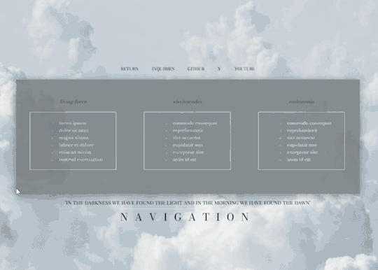
VISVIVA PRESENTS: PIRR a simplistic, elegant free theme
what's up everybody! this is visvivacodes, back to share another theme with all you lovely people! this is a simple navigation page for you to store your links and keep your blog organized. I used this one as some more practice with flexbox and transitions, so you'll see it's got a responsive design and the main container changes on hover. I hope you all love it and thanks so much for your support! pirr: noun. a gentle wind
NAVIGATION I: PIRR — join my discord!
PREVIEW: TUMBLR / CODEPEN DOWNLOAD: GITHUB / PASTEBIN / CODEPEN
FEATURES
no coding knowledge needed! fully customize from the comfort of an easily comprehensible root element (tutorial available on my discord)
responsive design that changes dimensions as your screen gets smaller - I am still learning so it doesn't look perfect on phones but it is functional! as time goes on and I learn more about flexbox, I will return to this code to make it more responsive :)
a choice of 16 FONTS for you to change the look of your navigation's written content, including your title, subtitle, and links!
link sections with inner scroll — all link sections will automatically gain a scrollbar if they get long, though I do recommend sticking to the original 18 links as it keeps the tidiness
clean and easy to read code!
if you download this pagee theme, please give this post a like or reblog!
I just had surgery yesterday so I might not be around much to answer any qustions. if you run into any problems at all, please do not hesitate to message me! I am aware of an issue inherent to flexbox where margins and padding do not work as intended in different browsers, so please let me know if this page is looking very strange in your browser!
PRICE & DONATIONS
This theme is a FREE theme! I love to code so my themes will be free for now. If you would like to support me and my work, please consider leaving a tip or buying me a coffee via cashapp ( $visviva ) :)
#rph#rpc#rpt#free page theme#free page#page theme#nav page#navigation page#indie theme#rp theme#free rp theme#free theme#coding cabin#theme hunter#theme network#supportcontentcreators#dearindies#visvivathms#recovering from top surgery so i may not be around much to answer questions!
75 notes
·
View notes
Note
how did you go about doing the navigation links on your neocities? it's really neat!
MY NEOCITIES... i really need to add more to that. every so often i remember it exists. anyway
the sidebar and main text, first of all, are two containers in the simplest possible flexbox container (the css for it just has 'display: flex' and nothing else). very useful, i love flexbox. if you haven't used it before, i'd recommend looking into it! loads of examples and guides out there. (there's also css grid, but i've never used it)
the navigation itself in the html is very simple, basically a list of links.. not actually a list, just separate 'paragraphs'. (which i have to update on every page every time i add/rename/remove another page..) additional thought: i think mayyybe if i used a flexbox container for the links themselves it'd be easier to make it so the navigation turns horizontal (and along the top) instead of vertical when the screen is small enough? or something with inline blocks maybe. i haven't gotten around to trying any of that though
back on topic, the symbol before each link and the translucent 'label' on hover is from the css, like this

so basically the 'label' sticking out is, like, an offset background? and also the current page link gets a custom class that gives it the same formatting as the hover text
i think that's everything, i'm not great at actually explaining how i did stuff so i hope this is helpful haha
#honestly when i was making it i... mostly just looked through the mdn web docs#and clicked on whatever interesting selectors/attributes/etc. i thought i might use#that's pretty much the main way i learn html/css.. trying out whatever might look good and learning how to use it lol
5 notes
·
View notes
Text
Learn HTML and CSS: A Comprehensive Guide for Beginners
Introduction to HTML and CSS
HTML (HyperText Markup Language) and CSS (Cascading Style Sheets) are the core technologies for creating web pages. HTML provides the structure of the page, while CSS defines its style and layout. This guide aims to equip beginners with the essential knowledge to start building and designing web pages.
Why Learn HTML and CSS?
HTML and CSS are fundamental skills for web development. Whether you're looking to create personal websites, start a career in web development, or enhance your current skill set, understanding these technologies is crucial. They form the basis for more advanced languages and frameworks like JavaScript, React, and Angular.
Getting Started with HTML and CSS
To get started, you need a text editor and a web browser. Popular text editors include Visual Studio Code, Sublime Text, and Atom. Browsers like Google Chrome, Firefox, and Safari are excellent for viewing and testing your web pages.
Basic HTML Structure
HTML documents have a basic structure composed of various elements and tags. Here’s a simple example:
html
Copy code
<!DOCTYPE html>
<html>
<head>
<title>My First Web Page</title>
<link rel="stylesheet" type="text/css" href="styles.css">
</head>
<body>
<h1>Welcome to My Web Page</h1>
<p>This is a paragraph of text on my web page.</p>
</body>
</html>
: Declares the document type and HTML version.
: The root element of an HTML page.
: Contains meta-information about the document.
: Connects the HTML to an external CSS file.
: Contains the content of the web page.
Essential HTML Tags
HTML uses various tags to define different parts of a web page:
to : Headings of different levels.
: Paragraph of text.
: Anchor tag for hyperlinks.
: Embeds images.
: Defines divisions or sections.
: Inline container for text.
Creating Your First HTML Page
Follow these steps to create a simple HTML page:
Open your text editor.
Write the basic HTML structure as shown above.
Add a heading with the tag.
Add a paragraph with the tag.
Save the file with a .html extension (e.g., index.html).
Open the file in your web browser to view your web page.
Introduction to CSS
CSS is used to style and layout HTML elements. It can be included within the HTML file using the <style> tag or in a separate .css file linked with the <link> tag.
Basic CSS Syntax
CSS consists of selectors and declarations. Here’s an example:
css
Copy code
h1 {
color: blue;
font-size: 24px;
}
Selector (h1): Specifies the HTML element to be styled.
Declaration Block: Contains one or more declarations, each consisting of a property and a value.
Styling HTML with CSS
To style your HTML elements, you can use different selectors:
Element Selector: Styles all instances of an element.
Class Selector: Styles elements with a specific class.
ID Selector: Styles a single element with a specific ID.
Example:
html
Copy code
<!DOCTYPE html>
<html>
<head>
<title>Styled Page</title>
<link rel="stylesheet" type="text/css" href="styles.css">
</head>
<body>
<h1 class="main-heading">Hello, World!</h1>
<p id="intro">This is an introduction paragraph.</p>
</body>
</html>
In the styles.css file:
css
Copy code
.main-heading {
color: green;
text-align: center;
}
#intro {
font-size: 18px;
color: grey;
}
CSS Layout Techniques
CSS provides several layout techniques to design complex web pages:
Box Model: Defines the structure of an element’s content, padding, border, and margin.
Flexbox: A layout model for arranging items within a container, making it easier to design flexible responsive layouts.
Grid Layout: A two-dimensional layout system for more complex layouts.
Example of Flexbox:
css
Copy code
.container {
display: flex;
justify-content: space-around;
}
.item {
width: 100px;
height: 100px;
background-color: lightblue;
}
Best Practices for Writing HTML and CSS
Semantic HTML: Use HTML tags that describe their meaning clearly (e.g., , , ).
Clean Code: Indent nested elements and use comments for better readability.
Validation: Use tools like the W3C Markup Validation Service to ensure your HTML and CSS are error-free and standards-compliant.
Accessibility: Make sure your website is accessible to all users, including those with disabilities, by using proper HTML tags and attributes.
Free Resources to Learn HTML and CSS
W3Schools: Comprehensive tutorials and references.
MDN Web Docs: Detailed documentation and guides for HTML, CSS, and JavaScript.
Codecademy: Interactive courses on web development.
FreeCodeCamp: Extensive curriculum covering HTML, CSS, and more.
Khan Academy: Lessons on computer programming and web development.
FAQs about Learning HTML and CSS
Q: What is HTML and CSS? A: HTML (HyperText Markup Language) structures web pages, while CSS (Cascading Style Sheets) styles and layouts the web pages.
Q: Why should I learn HTML and CSS? A: Learning HTML and CSS is essential for creating websites, understanding web development frameworks, and progressing to more advanced programming languages.
Q: Do I need prior experience to learn HTML and CSS? A: No prior experience is required. HTML and CSS are beginner-friendly and easy to learn.
Q: How long does it take to learn HTML and CSS? A: The time varies depending on your learning pace. With consistent practice, you can grasp the basics in a few weeks.
Q: Can I create a website using only HTML and CSS? A: Yes, you can create a basic website. For more complex functionality, you'll need to learn JavaScript.
Q: What tools do I need to start learning HTML and CSS? A: You need a text editor (e.g., Visual Studio Code, Sublime Text) and a web browser (e.g., Google Chrome, Firefox).
Q: Are there free resources available to learn HTML and CSS? A: Yes, there are many free resources available online, including W3Schools, MDN Web Docs, Codecademy, FreeCodeCamp, and Khan Academy.
#how to learn html and css#html & css course#html & css tutorial#html and css#html course#html css tutorial#html learn#html learn website#learn html#learn html and css#html and css course#html and css full course#html and css online course#how to learn html and css for beginners
4 notes
·
View notes
Note
Hi! I love your neocities page! I'm so sorry to bother but I was curious how you got the two boxes/div right next to each other on your hatchetfield shrine. I for the life of me can not figure it out 😭 TYSM
thank you so much!!
here's one way to get two divs to sit side-by-side. there are other methods, but this one is simple and easy to slap together when i don't want to deal with containers and flexboxes and all that jazz.
each div has two classes, a generic "box" and then either "boxleft" or "boxright" depending on which side it's on. like this:
<div class="box boxleft"> the stuff in the left box goes here! </div> <div class="box boxright"> the stuff in the right box goes here! </div>
then, in my css, i have this code:
.box { width: 50%; margin: 0; box-sizing: border-box; } .boxleft { float: left; } .boxright { float: right; }
width and margin are pretty self-explanatory, keeping each box 50% of the page's (or its container's) width and making sure there's no space around them.
box-sizing: border-box makes sure that even if you add padding or a border to the div, the div won't go over 50%. if you don't have this, adding 5px of padding will grow the boxes a little bigger and they won't be next to each other anymore.
the float on each separate box just tells them what side to be on. if a box is smaller than 50%, or if you only have one box, it will hug the left/right side.
and then of course, you can add any colors or styles that you want to any of the box classes, like if you want them to have unique backgrounds. but i'm a simple guy, so my boxes use the plain ol' style i have everywhere else.
i hope that makes sense!! feel free to ask any more questions about my site, coding is fun and i like talking about it :]
2 notes
·
View notes
Text
java full stack
A Java Full Stack Developer is proficient in both front-end and back-end development, using Java for server-side (backend) programming. Here's a comprehensive guide to becoming a Java Full Stack Developer:
1. Core Java
Fundamentals: Object-Oriented Programming, Data Types, Variables, Arrays, Operators, Control Statements.
Advanced Topics: Exception Handling, Collections Framework, Streams, Lambda Expressions, Multithreading.
2. Front-End Development
HTML: Structure of web pages, Semantic HTML.
CSS: Styling, Flexbox, Grid, Responsive Design.
JavaScript: ES6+, DOM Manipulation, Fetch API, Event Handling.
Frameworks/Libraries:
React: Components, State, Props, Hooks, Context API, Router.
Angular: Modules, Components, Services, Directives, Dependency Injection.
Vue.js: Directives, Components, Vue Router, Vuex for state management.
3. Back-End Development
Java Frameworks:
Spring: Core, Boot, MVC, Data JPA, Security, Rest.
Hibernate: ORM (Object-Relational Mapping) framework.
Building REST APIs: Using Spring Boot to build scalable and maintainable REST APIs.
4. Database Management
SQL Databases: MySQL, PostgreSQL (CRUD operations, Joins, Indexing).
NoSQL Databases: MongoDB (CRUD operations, Aggregation).
5. Version Control/Git
Basic Git commands: clone, pull, push, commit, branch, merge.
Platforms: GitHub, GitLab, Bitbucket.
6. Build Tools
Maven: Dependency management, Project building.
Gradle: Advanced build tool with Groovy-based DSL.
7. Testing
Unit Testing: JUnit, Mockito.
Integration Testing: Using Spring Test.
8. DevOps (Optional but beneficial)
Containerization: Docker (Creating, managing containers).
CI/CD: Jenkins, GitHub Actions.
Cloud Services: AWS, Azure (Basics of deployment).
9. Soft Skills
Problem-Solving: Algorithms and Data Structures.
Communication: Working in teams, Agile/Scrum methodologies.
Project Management: Basic understanding of managing projects and tasks.
Learning Path
Start with Core Java: Master the basics before moving to advanced concepts.
Learn Front-End Basics: HTML, CSS, JavaScript.
Move to Frameworks: Choose one front-end framework (React/Angular/Vue.js).
Back-End Development: Dive into Spring and Hibernate.
Database Knowledge: Learn both SQL and NoSQL databases.
Version Control: Get comfortable with Git.
Testing and DevOps: Understand the basics of testing and deployment.
Resources
Books:
Effective Java by Joshua Bloch.
Java: The Complete Reference by Herbert Schildt.
Head First Java by Kathy Sierra & Bert Bates.
Online Courses:
Coursera, Udemy, Pluralsight (Java, Spring, React/Angular/Vue.js).
FreeCodeCamp, Codecademy (HTML, CSS, JavaScript).
Documentation:
Official documentation for Java, Spring, React, Angular, and Vue.js.
Community and Practice
GitHub: Explore open-source projects.
Stack Overflow: Participate in discussions and problem-solving.
Coding Challenges: LeetCode, HackerRank, CodeWars for practice.
By mastering these areas, you'll be well-equipped to handle the diverse responsibilities of a Java Full Stack Developer.
visit https://www.izeoninnovative.com/izeon/
2 notes
·
View notes
Text
Choosing Between Flexbox and Grid for Your Basic Layout Structure

Introduction
Beyond the aesthetics of web design, the choice of layout structure forms the backbone of a project's responsiveness and adaptability. At the heart of this decision lie two powerful CSS tools: Flexbox and Grid. These elements are more than mere design choices; they dictate how a webpage responds to different screen sizes and user interactions, impacting usability and visual appeal.
Understanding the Basics

Flexbox: Flexbox is a one-dimensional layout model best suited for organizing items within a container, offering flexibility in managing space distribution, alignment, and order. Its strength lies in its ability to handle complex layouts while maintaining simplicity in code structure. Grid: Grid is a two-dimensional layout system that creates a grid-based design, allowing precise placement and alignment of elements in rows and columns. Its advantages include fine control over both the rows and columns, making it ideal for overall page structure and layout alignment. Both Flexbox and Grid can be effectively utilized for basic layouts by structuring a header, main content area, and footer with distinct approaches tailored to their strengths.
Comparative Analysis

Flexbox Pros: - Efficient for arranging elements in a single direction, vertically or horizontally. - Great for small-scale layouts like navigation menus or individual components within a page. - Simplified syntax and intuitive approach make it easier to learn and use. Cons: - Complex layouts might require nested flex containers, leading to potential complications. - Challenges in controlling the alignment of both rows and columns simultaneously. Suitable Scenarios: Ideal for smaller, simpler layouts or for organizing elements in one direction, such as in menus or single-axis content layouts. Grid Pros: - Perfect for managing both rows and columns simultaneously, enabling more precise layouts. - Best for complex and multi-dimensional layouts, especially entire page structures. - Offers fine control over placement, making it suitable for responsive designs. Cons: - Complexity in understanding and implementing for beginners due to its comprehensive grid structure. - Not as effective for single-axis layouts compared to Flexbox. Suitable Scenarios: Best suited for larger-scale layouts or designs that demand strict control over both rows and columns, like entire webpage structures or responsive grid systems.
Usage Scenarios

Flexbox Scenarios Where Flexbox Shines: - Small-Scale Components: Flexbox excels in organizing smaller elements within a webpage, like menus, buttons, or individual sections. - Single-Direction Layouts: It's perfect for arranging elements in a single direction, simplifying the structure for one-dimensional layouts. - Mobile-First Designs: Ideal for mobile-responsive designs where content needs to adapt to smaller screens with straightforward layout adjustments. Grid Scenarios Distinct Advantages of Grid: - Full-Page Layouts: Grid is optimal for structuring entire pages, managing complex alignments in multiple directions (rows and columns). - Multi-Dimensional Layouts: Perfect for designs that require precision in both row and column placement, ensuring a cohesive and responsive layout. - Responsive Grid Systems: Offers extensive control for building responsive grid systems that adapt seamlessly across various screen sizes.
Responsiveness and Adaptability
Flexbox and Responsiveness Catering to Responsive Design: Flexbox simplifies responsiveness by allowing elements to adjust based on available space and container size. It facilitates flexible resizing of components within a single direction, aiding in responsive designs. Adaptability in Viewport Sizes: Flexbox is particularly suitable for smaller devices where elements need to flexibly adjust in a single axis, making it easier to adapt content to varying viewport sizes. Grid and Responsiveness Catering to Responsive Design: Grid systems provide a more comprehensive approach to responsiveness by allowing precise control over both rows and columns, enabling intricate adjustments for various screen sizes. Adaptability in Viewport Sizes: Grid excels in handling complex layouts across different viewport sizes, ensuring elements maintain their specified placement and alignment in both axes, enhancing adaptability in various screen sizes.
Best Practices and Recommendations
Choosing Between Flexbox and Grid When to Choose Flexbox: Opt for Flexbox when dealing with simpler, single-direction layouts or smaller components within a webpage. It's ideal for basic layouts requiring flexibility in one axis. When to Choose Grid: Prefer Grid for more complex, multi-dimensional layouts or when structuring entire pages. Choose it when precise control over both rows and columns is necessary. Combining Flexbox and Grid Effective Combination: Consider using Flexbox within specific sections or components within a grid-based layout. For instance, employing Flexbox to organize elements within grid-defined areas can harness the strengths of both techniques. Hybrid Approach: Experiment with combining both Flexbox and Grid to achieve optimal results. For instance, using Flexbox for header and footer elements while implementing Grid for the main content area can leverage the strengths of each method within a single layout.
Real-world Application
Flexbox in Real Projects Project Example: Portfolio Website In a portfolio website, Flexbox was utilized to arrange sections within the main content area. Each project section was organized in a single direction, allowing for easy adaptation to various screen sizes. This choice enhanced responsiveness, especially for mobile devices, providing a seamless browsing experience. Grid in Real Projects Project Example: E-commerce Platform An e-commerce platform used Grid to structure its product listings and category sections. The complex layout demanded precise alignment in both rows and columns, ensuring scalability across different viewport sizes. This choice significantly improved the scalability and responsiveness of the platform, offering a consistent and visually appealing layout.
Conclusion
Flexbox and Grid stand as powerful tools in the realm of web design, each offering distinct advantages based on the nature of the layout and design requirements. Distinguishing Factors: Flexbox excels in simpler, single-direction layouts and smaller components, offering flexibility and ease of use. On the other hand, Grid shines in complex, multi-dimensional layouts, providing precise control over both rows and columns. Significance of Choosing the Right Layout: The choice of layout structure forms the foundation of a project's scalability and responsiveness. A well-thought-out decision between Flexbox and Grid, or a strategic combination of both, is pivotal in ensuring a website's adaptability across various devices and screen sizes. Read the full article
2 notes
·
View notes
Note
line-height anon! sorry for disturbing, but could you explain (if you don’t mind) why i couldn’t add “line-height” under the CSS class(? identifier??) “.tags”? it already has some properties like height above the tag and font-weight, so it boggles my mind a little when adding line-height did nothing but break the code.
I use flexbox to "hold the tags" and a "gap: 20px;" to keep spacing/margins between the tags. it would only affect the tags container itself. You need to target the links inside the tag container 😊
1 note
·
View note
Text
The Layout Maestro Course
New Post has been published on https://thedigitalinsider.com/the-layout-maestro-course/
The Layout Maestro Course

Layout. It’s one of those easy-to-learn, difficult-to-master things, like they say about playing bass. Not because it’s innately difficult to, say, place two elements next to each other, but because there are many, many ways to tackle it. And layout is one area of CSS that seems to evolve more than others, as we’ve seen in the past 10-ish years with the Flexbox, CSS Grid, Subgrid, and now Masonry to name but a few. May as well toss in Container Queries while we’re at it. And reading flow. And…
That’s a good way to start talking about a new online course that Ahmad Shadeed is planning to release called The Layout Maestro. I love that name, by the way. It captures exactly how I think about working with layouts: orchestrating how and where things are arranged on a page. Layouts are rarely static these days. They are expected to adapt to the user’s context, not totally unlike a song changing keys.
Ahmad is the perfect maestro to lead a course on layout, as he does more than most when it comes to experimenting with layout features and demonstrating practical use cases, as you may have already seen in his thorough and wildly popular interactive guides on Container Queries, grid areas, box alignment, and positioning (just to name a few).
The course is still in development, but you can get a leg up and sign up to be notified by email when it’s ready. That’s literally all of the information I have at this point, but I still feel compelled to share it and encourage you to sign up for updates because I know few people more qualified to wax on about CSS layout than Ahmad and am nothing but confident that it will be great, worth the time, and worth the investment.
I’m also learning that I have a really hard time typing “maestro” correctly. 🤓
Direct Link →
#bass#box#container#course#CSS#CSS Grid#development#easy#education#email#Features#flexbox#grid#Guides#how#investment#it#layout#Learn#learning#Link#links#masonry#One#online course#Other#Planning#positioning#reading#time
0 notes
Text
youtube
Wordpress tutorial for beginners with Elementor - YouTube
youtube
youtube
youtube
youtube
youtube
youtube
#wordpress tutorial for beginners#wordpress tutorial 2023#Elementor Wordpress Tutorial 2023#elementor flexbox container tutoriall#create a wordpress website#wordpress tutorial#make a website#create a website#how to build a website#how to make a website#how to create a website#how to make a website for free#build a website#how to make a website using wordpress#wordpress website tutorial#wordpress for beginners#Free Domain#Free Hosting#make a wordpress website#Ferdy Korpershoek#Wordpress#Elementor Pro#Elementor Pro Tutorial 2021#Elementor Pro Tutorial 2020#elementor pro header#Elementor Pro Tutorial#How To Make A Website#make a website with wordpress#How To Create A Website#How to make a website
1 note
·
View note
Text
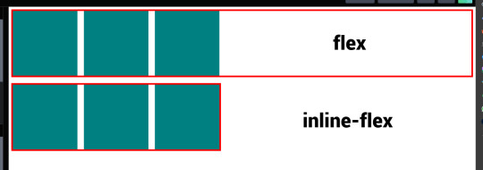
flex vs inline-flex
These two are properties that are used when you want to apply flexbox to a website layout you're building. When these are applied to the container the items within becomes flex items, but each one displays differently, somewhat.
display: flex; - the container becomes a block element of sorts and takes up 100% full width.
display: inline-flex; - it allows the container to occupy as much space that it needs allowing other things to occupy that same line.
4 notes
·
View notes
Text


VISVIVA PRESENTS: PIRR a simplistic, elegant free theme
what's up everybody! this is visvivacodes, back to share another theme with all you lovely people! this is a simple navigation page for you to store your links and keep your blog organized. I used this one as some more practice with flexbox and transitions, so you'll see it's got a responsive design and the main container changes on hover. I hope you all love it and thanks so much for your support! pirr: noun. a gentle wind
NAVIGATION I: PIRR — join my discord!
PREVIEW: TUMBLR / CODEPEN DOWNLOAD: GITHUB / PASTEBIN / CODEPEN
FEATURES
no coding knowledge needed! fully customize from the comfort of an easily comprehensible root element (tutorial available on my discord)
responsive design that changes dimensions as your screen gets smaller - I am still learning so it doesn't look perfect on phones but it is functional! as time goes on and I learn more about flexbox, I will return to this code to make it more responsive :)
a choice of 16 FONTS for you to change the look of your navigation's written content, including your title, subtitle, and links!
link sections with inner scroll — all link sections will automatically gain a scrollbar if they get long, though I do recommend sticking to the original 18 links as it keeps the tidiness
clean and easy to read code!
if you download this pagee theme, please give this post a like or reblog!
if you run into any problems at all, please do not hesitate to message me! I am aware of an issue inherent to flexbox where margins and padding do not work as intended in different browsers, so please let me know if this page is looking very strange in your browser!
PRICE & DONATIONS
This theme is a FREE theme! I love to code mostly just for the art and therapeutic nature of it, so for now all of my themes will be free. However, if you would like to support me and my work, please consider leaving a tip or buying me a coffee via cashapp ( $visviva ) :)
#rpc#rph#rpt#rp theme#page theme#nav theme#navigation theme#themehunter#dearindies#supportcontentcreators#visvivathms#visvivacodes#theme network#coding cabin#navigation page#nav page#free theme#free page#free page theme
34 notes
·
View notes