#flexbox
Explore tagged Tumblr posts
Visit Tumblr Blog
Explore Tumblr blogs with no restrictions, modern design and the best experience.
Last Seen Tumblr Blogs


Fun Fact
Users from the US are the majority of Tumblr visitors.
Text
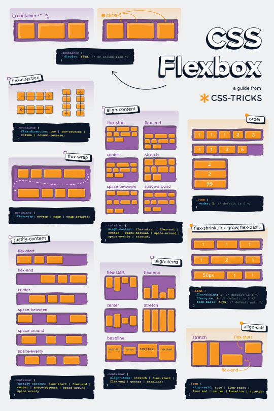
Helpful Poster Guide from CSS-Tricks for CSS Flexbox
#codeblr#coding#studyblr#studying#programmer#coder#programming#progblr#study#code blog#code#css#flexbox
314 notes
·
View notes
Text
she flex on my box till I overflow
23 notes
·
View notes
Text

Simple website template (html / css / flexbox / div)
Buy here : https://ko-fi.com/s/ded091abe9 (3€)
Valid HTML / CSS
Responsive (works on mobile devices)
Fully customizable
Better preview at my website: https://itinerae.blogspot.com
You must have basic knowledge of html, css (and flexbox) to use this template.
#website template#website layout#layouts#templates#html#css#flexbox#premium template#neocities#nekoweb#oldweb#indieweb#website resources#web development#web design
5 notes
·
View notes
Text
CSS Positioning...
Today is the day I try my absolute best to focus on CSS flexbox.
Positioning in CSS is a complete guessing game to me currently, so today I'm going to specifically take the time to deep delve and try to fully understand what does what.
If you have any handy tips, I'd be grateful to hear them! Otherwise, I'll end up trying to make something that will hopefully make it easier to others too.
Wish me luck!
#css#flexbox#learning to code#web design#coding#codeblr#studybrl#study blog#learning#web development#programming#career change#career switch#motivated
17 notes
·
View notes
Text
Flexbox Landing Page
#css flexbox examples#flexbox css#flexbox tutorial#html css#css#frontenddevelopment#webdesign#html#css3#divinectorweb#flexbox#landing page website#website design#create a website
4 notes
·
View notes
Text
Curious about when to use display: flex or display: inline-flex?
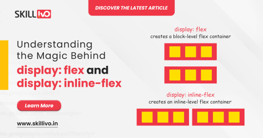
display: flex turns your element into a block-level flex container, giving you full control over its child elements' alignment and spacing. Perfect for structuring complex layouts! 🏗️
On the other hand, display: inline-flex gives you the same flex properties but maintains the container as an inline element. Ideal for inline-level layouts where you need the magic of flex without breaking the flow! 💫
Read Article- Click Here
Follow-
LinkedIn- Skillivo
#WebDevelopment#CSS#Flexbox#Coding#Frontend#WebDesign#Programming#CodeNewbie#LearnToCode#TechTips#Skillivo#ProgrammingTips#InlineFlex
3 notes
·
View notes
Text
No Streaming Today
As a reminder, there's no streaming today! Instead, we're doing a small workshop on Astro + GitHub (testing the FujoGuide Issue 2 content) for $upporters only.
To dry your tears, a PSA: you can now use "flexbox" to create layouts on AO3. If you don't know how to use flexbox, let "flexbox froggy" be your guide!
3 notes
·
View notes
Text
3 notes
·
View notes
Text
Guía Paso a Paso: Crea tu Menú de Navegación con Efecto Hover en HTML y CSS
Dale un toque profesional y funcional a tus webs en Alicante ¡Hola, amantes del desarrollo web en Alicante! Una de las primeras cosas que vemos al visitar cualquier sitio es su menú de navegación. No solo es vital para la usabilidad, sino que también es una oportunidad para mejorar la estética de tu página. Hoy vamos a construir juntos un menú nav esencial, con enlaces estilo botón y un sutil…
#Botones CSS#CSS#desarrollo web#Diseño web#Efecto Hover#Estilos Web#Flexbox#Fronten#gap#HTML#menú de navegación#nav#paso a paso#tutorial#usabilidad
0 notes
Text
CSS Basics: How to Style Your First Web Page Like a Pro
Creating visually appealing web pages is an essential skill for web developers and designers. CSS, short for Cascading Style Sheets, is the language used to describe the presentation of a web page written in HTML. By learning CSS, you can transform a plain HTML document into a visually stunning and user-friendly web page.
Understanding CSS
Understanding CSS
CSS is a stylesheet language that enables you to control the layout and appearance of HTML elements. It allows you to separate the content of a web page (HTML) from its design and aesthetics (CSS). This separation of concerns makes it easier to maintain and update web pages over time.
What CSS Can Do
CSS is incredibly versatile, offering a wide range of styling options:
Layout Control: Arrange elements on a page using grid and flexbox.
Color and Backgrounds: Apply colors, gradients, and background images.
Typography: Change fonts, sizes, and text styles.
Spacing: Control margins, padding, and element positioning.
Borders and Effects: Add borders, shadows, and more.
Linking Stylesheets
Before you can begin styling, you need to link your CSS to your HTML document. There are three main ways to include CSS:
1. External Stylesheet
An external stylesheet is a separate file with a .css extension. It is the most efficient way to apply styles across multiple web pages. To link an external stylesheet, use the <link> tag inside the <head> section of your HTML document:
<!DOCTYPE html> <html lang="en"> <head> <meta charset="UTF-8"> <meta http-equiv="X-UA-Compatible" content="IE=edge"> <meta name="viewport" content="width=device-width, initial-scale=1.0"> <link rel="stylesheet" href="styles.css"> <title>My Web Page</title> </head> <body> <!-- HTML content goes here --> </body> </html>
2. Internal Stylesheet
An internal stylesheet is written directly within the <style> tags in the <head> section of your HTML document. This method is useful for single-page applications or when you need to apply styles to only one page:
<!DOCTYPE html> <html lang="en"> <head> <meta charset="UTF-8"> <meta http-equiv="X-UA-Compatible" content="IE=edge"> <meta name="viewport" content="width=device-width, initial-scale=1.0"> <style> body { background-color: lightblue; } </style> <title>My Web Page</title> </head> <body> <!-- HTML content goes here --> </body> </html>
3. Inline Styles
Inline styles are applied directly to HTML elements using the style attribute. This method is generally discouraged as it mixes content with presentation, making the code harder to maintain:
<p style="color: red;">This is a red paragraph.</p>
Applying Basic Styles
Once you've linked your CSS, you can start applying styles to your HTML elements. CSS styles are defined using a combination of selectors, properties, and values.
Selectors
Selectors are used to target HTML elements for styling. Common selectors include:
Element Selector: Targets all elements of a specific type.
p { color: blue; }
Class Selector: Targets elements with a specific class attribute. Classes are prefixed with a period (.).
.highlight { font-weight: bold; }
ID Selector: Targets a specific element with an ID attribute. IDs are prefixed with a hash (#).
#main-header { font-size: 24px; }
Properties and Values
CSS properties define what aspect of the element will be styled, such as color, font-size, or margin. Each property is assigned a value:
h1 { color: darkgreen; font-size: 32px; text-align: center; }
Example: Styling a Simple Web Page
Let's walk through a simple example of how CSS can be used to style a basic HTML page.
HTML Structure
<!DOCTYPE html> <html lang="en"> <head> <meta charset="UTF-8"> <meta http-equiv="X-UA-Compatible" content="IE=edge"> <meta name="viewport" content="width=device-width, initial-scale=1.0"> <link rel="stylesheet" href="styles.css"> <title>Simple Web Page</title> </head> <body> <header id="main-header"> <h1>Welcome to My Web Page</h1> </header> <nav> <ul class="navigation"> <li><a href="#">Home</a></li> <li><a href="#">About</a></li> <li><a href="#">Contact</a></li> </ul> </nav> <main> <section> <h2>About Me</h2> <p class="intro">Hello! I'm a web developer passionate about creating beautiful and functional web pages.</p> </section> </main> <footer> <p>© 2023 My Web Page</p> </footer> </body> </html>
CSS Styles (styles.css)
/* Basic styles */ body { font-family: Arial, sans-serif; line-height: 1.6; margin: 0; padding: 0; } header { background-color: #333; color: white; padding: 10px 0; text-align: center; } .navigation { list-style-type: none; padding: 0; } .navigation li { display: inline; margin-right: 10px; } .navigation a { color: #333; text-decoration: none; } .intro { font-style: italic; color: #555; } footer { background-color: #333; color: white; text-align: center; padding: 10px 0; position: fixed; width: 100%; bottom: 0; }
Explanation of CSS Code
Body Styles: Sets the default font family, line height, and removes default margin and padding.
Header Styles: Applies a dark background color, white text, and centers the content.
Navigation Styles: Defines styles for the navigation list, including removing bullet points and styling links.
Intro Paragraph: Applies italic styling and a custom color.
Footer Styles: Similar styling to the header, plus fixed positioning at the bottom of the page.
Advanced CSS
Advanced CSS Techniques
As you become more comfortable with CSS, you can explore more advanced techniques to enhance your web designs.
Responsive Design
Responsive design ensures that your web page looks great on all devices, from desktop computers to mobile phones. CSS media queries allow you to apply different styles based on the screen size:
@media (max-width: 600px) { body { font-size: 14px; } .navigation li { display: block; margin: 5px 0; } }
CSS Flexbox and Grid
CSS Flexbox and Grid are powerful layout models that provide flexibility in designing complex layouts:
Flexbox: Ideal for one-dimensional layouts, such as rows or columns.
Grid: Perfect for two-dimensional layouts, allowing you to define both rows and columns.
Example of Flexbox:
.container { display: flex; justify-content: space-between; align-items: center; }
Example of Grid:
.grid-container { display: grid; grid-template-columns: repeat(3, 1fr); gap: 10px; }
Tips for Writing Clean CSS
Organize Your Styles: Group related styles together and use comments to separate sections.
Use Descriptive Names: Choose meaningful class and ID names for easier understanding.
Minimize Inline Styles: Keep your styles in external or internal stylesheets.
Consistent Formatting: Follow consistent indentation and spacing for readability.
Test Across Browsers: Ensure your styles work in all major browsers.
Tips for Writing
Conclusion
CSS is an essential tool for web development, allowing you to create visually appealing and user-friendly web pages. By understanding how to link stylesheets, apply basic styles, and utilize advanced techniques, you'll be well-equipped to design modern, responsive websites. Remember to continually practice and experiment with CSS to enhance your skills and creativity.
Frequently Asked Questions
What is the difference between CSS and HTML?
HTML is used to structure content on a web page, while CSS is used to style and layout that content.
How do I choose between internal and external stylesheets?
Use external stylesheets for larger projects to keep styles separate from HTML, and internal stylesheets for small, single-page applications.
Can I use multiple stylesheets on a single page?
Yes, you can link multiple external stylesheets, and they will be applied in the order they are linked.
What are CSS frameworks, and should I use them?
CSS frameworks like Bootstrap provide pre-designed styles and components to speed up development. They are useful for beginners and for rapid prototyping.
How can I learn more about advanced CSS techniques?
Explore online resources, tutorials, and courses that cover topics like responsive design, CSS animations, and preprocessors like SASS.
#CSSBasics#LearnCSS#CSSTutorial#CSSForBeginners#WebDevelopment#FrontendDevelopment#FrontendTips#ResponsiveDesign#WebDesign#UIUXDesign#CSSLayout#CSSStyling#ModernCSS#WebCoding#WebDesignTips#CodingStandards#CleanCode#CSSColors#CSSFonts#LearnToCode#CodeNewbie#FrontendMasters#WebPerformance#WebDevTips#CSSGrid#Flexbox#CSSResponsive#CSSBestPractices#WebDesignBasics#HTMLCSS
0 notes
Text
Making a Masonry Layout That Works Today
New Post has been published on https://thedigitalinsider.com/making-a-masonry-layout-that-works-today/
Making a Masonry Layout That Works Today
Many CSS experts have weighed heavily on possible syntaxes for a new masonry layout feature last year. There were two main camps and a third camp that strikes a balance between the two:
Use display: masonry
Use grid-template-rows: masonry
Use item-pack: collapse
I don’t think they’ve came up with a resolution yet. But you might want to know that Firefox already supports the masonry layout with the second syntax. And Chrome is testing it with the first syntax. While it’s cool to see native support for CSS Masonry evolving, we can’t really use it in production if other browsers don’t support the same implementation…
So, instead of adding my voice to one of those camps, I went on to figure out how make masonry work today with other browsers. I’m happy to report I’ve found a way — and, bonus! — that support can be provided with only 66 lines of JavaScript.
In this article, I’m gonna show you how it works. But first, here’s a demo for you to play with, just to prove that I’m not spewing nonsense. Note that there’s gonna be a slight delay since we’re waiting for an image to load first. If you’re placing a masonry at the top fold, consider skipping including images because of this!
Anyway, here’s the demo:
What in the magic is this?!
Now, there are a ton of things I’ve included in this demo, even though there are only 66 lines of JavaScript:
You can define the masonry with any number of columns.
Each item can span multiple columns.
We wait for media to load before calculating the size of each item.
We made it responsive by listening to changes with the ResizeObserver.
These make my implementation incredibly robust and ready for production use, while also way more flexible than many Flexbox masonry knockoffs out there on the interwebs.
Now, a hot tip. If you combine this with Tailwind’s responsive variants and arbitrary values, you can include even more flexibility into this masonry grid without writing more CSS.
Okay, before you get hyped up any further, let’s come back to the main question: How the heck does this work?
Let’s start with a polyfill
Firefox already supports masonry layouts via the second camp’s syntax. Here’s the CSS you need to create a CSS masonry grid layout in Firefox.
.masonry display: grid; grid-template-columns: repeat( auto-fit, minmax(min(var(--item-width, 200px), 100%), 1fr) ); grid-template-rows: masonry; grid-auto-flow: dense; /* Optional, but recommended */
Since Firefox already has native masonry support, naturally we shouldn’t mess around with it. The best way to check if masonry is supported by default is to check if grid-template-rows can hold the masonry value.
function isMasonrySupported(container) return getComputedStyle(container).gridTemplateRows === 'masonry'
If masonry is supported, we’ll skip our implementation. Otherwise, we’ll do something about it.
const containers = document.querySelectorAll('.masonry') containers.forEach(async container => if (isMasonrySupported(container)) return )
Masonry layout made simple
Now, I want to preface this segment that I’m not the one who invented this technique.
I figured out this technique when I was digging through the web, searching for possible ways to implement a masonry grid today. So kudos goes to the unknown developer who developed the idea first — and perhaps me for understanding, converting, and using it.
The technique goes like this:
We set grid-auto-rows to 0px.
Then we set row-gap to 1px.
Then we get the item’s height through getBoundingClientRect.
We then size the item’s “row allocation” by adding the height the column-gap value together.
This is really unintuitive if you’ve been using CSS Grid the standard way. But once you get this, you can also grasp how this works!
Now, because this is so unintuitive, we’re gonna take things step-by-step so you see how this whole thing evolves into the final output.
Step by step
First, we set grid-auto-rows to 0px. This is whacky because every grid item will effectively have “zero height”. Yet, at the same time, CSS Grid maintains the order of the columns and rows!
containers.forEach(async container => // ... container.style.gridAutoRows = '0px' )
Second, we set row-gap to 1px. Once we do this, you begin to notice an initial stacking of the rows, each one one pixel below the previous one.
containers.forEach(async container => // ... container.style.gridAutoRows = '0px' container.style.setProperty('row-gap', '1px', 'important') )
Third, assuming there are no images or other media elements in the grid items, we can easily get the height of each grid item with getBoundingClientRect.
We can then restore the “height” of the grid item in CSS Grid by substituting grow-row-end with the height value. This works because each row-gap is now 1px tall.
When we do this, you can see the grid beginning to take shape. Each item is now (kinda) back at their respective positions:
containers.forEach(async container => // ... let items = container.children layout( items ) ) function layout( items ) items.forEach(item => const ib = item.getBoundingClientRect() item.style.gridRowEnd = `span $Math.round(ib.height)` )
We now need to restore the row gap between items. Thankfully, since masonry grids usually have the same column-gap and row-gap values, we can grab the desired row gap by reading column-gap values.
Once we do that, we add it to grid-row-end to expand the number of rows (the “height”) taken up by the item in the grid:
containers.forEach(async container => // ... const items = container.children const colGap = parseFloat(getComputedStyle(container).columnGap) layout( items, colGap ) ) function layout( items, colGap ) items.forEach(item => const ib = item.getBoundingClientRect() item.style.gridRowEnd = `span $Math.round(ib.height + colGap)` )
And, just like that, we’ve made the masonry grid! Everything from here on is simply to make this ready for production.
Waiting for media to load
Try adding an image to any grid item and you’ll notice that the grid breaks. That’s because the item’s height will be “wrong”.
It’s wrong because we took the height value before the image was properly loaded. The DOM doesn’t know the dimensions of the image yet. To fix this, we need to wait for the media to load before running the layout function.
We can do this with the following code (which I shall not explain since this is not much of a CSS trick 😅):
containers.forEach(async container => // ... try await Promise.all([areImagesLoaded(container), areVideosLoaded(container)]) catch(e) // Run the layout function after images are loaded layout( items, colGap ) ) // Checks if images are loaded async function areImagesLoaded(container) const images = Array.from(container.querySelectorAll('img')) const promises = images.map(img => return new Promise((resolve, reject) => if (img.complete) return resolve() img.onload = resolve img.onerror = reject ) ) return Promise.all(promises) // Checks if videos are loaded function areVideosLoaded(container) const videos = Array.from(container.querySelectorAll('video')) const promises = videos.map(video => return new Promise((resolve, reject) => if (video.readyState === 4) return resolve() video.onloadedmetadata = resolve video.onerror = reject ) ) return Promise.all(promises)
Voilà, we have a CSS masnory grid that works with images and videos!
Making it responsive
This is a simple step. We only need to use the ResizeObserver API to listen for any change in dimensions of the masonry grid container.
When there’s a change, we run the layout function again:
containers.forEach(async container => // ... const observer = new ResizeObserver(observerFn) observer.observe(container) function observerFn(entries) for (const entry of entries) layout(colGap, items) )
This demo uses the standard Resize Observer API. But you can make it simpler by using the refined resizeObserver function we built the other day.
containers.forEach(async container => // ... const observer = resizeObserver(container, callback () layout(colGap, items) ) )
That’s pretty much it! You now have a robust masonry grid that you can use in every working browser that supports CSS Grid!
Exciting, isn’t it? This implementation is so simple to use!
Masonry grid with Splendid Labz
If you’re not adverse to using code built by others, maybe you might want to consider grabbing the one I’ve built for you in Splendid Labz.
To do that, install the helper library and add the necessary code:
# Installing the library npm install @splendidlabz/styles
/* Import all layouts code */ @import '@splendidlabz/layouts';
// Use the masonry script import masonry from '@splendidlabz/styles/scripts' masonry()
One last thing: I’ve been building a ton of tools to help make web development much easier for you and me. I’ve parked them all under the Splendid Labz brand — and one of these examples is this masonry grid I showed you today.
If you love this, you might be interested in other layout utilities that makes layout super simple to build.
Now, I hope you have enjoyed this article today. Go unleash your new CSS masonry grid if you wish to, and all the best!
#ADD#API#Article#Articles#browser#Building#change#Children#chrome#code#columns#container#Containers#CSS#CSS Grid#Delay#Developer#development#dimensions#display#firefox#flexbox#gap#grid#grid-auto-flow#grid-template-columns#grid-template-rows#grids#how#images
0 notes
Text
flex-direction: row; & flex-direction: column;
Flexbox has a property called flex-direction and this determines the direction that the flex items are displayed.
flex-direction: row; - this is the default and aligns the items across the page, making the main axis, left to right and the cross axis, top to bottom.

When this property is applied with this value, and if you use the flex-basis property on the flex items within this container, it would affect the width of the items:

if we apply a flex-basis of 500px to the first child div, it would change the width of the div.
flex-direction: column; - this aligns the items down the page, making the main axis from top to bottom and the cross axis from left to right.

When this property is applied with this value, and if you use the flex-basis property on the flex items within this container, it would affect the height of the items:

if we apply a flex-basis of 300px to the first child div, it would change the height of the div.
The flex-basis property interacts with the main axis, and depending on the direction of the main axis, determines whether the flex-basis will change the items' width or height.
#codeblr#coding#studyblr#studying#programmer#coder#study#progblr#programming#random notes#css#flexbox
89 notes
·
View notes

Text


0 notes
Text

🌟 Webflow Tip of the Day 🌟 Master Flexbox for Responsive Layouts
Want more control over how your elements align and wrap across screen sizes? Learn to use Flexbox in Webflow. It’s one of the most powerful layout tools for responsive design.
🔧 With Flexbox, you can:
Align items horizontally or vertically
Easily center content in both directions
Let items wrap on smaller screens
Space elements evenly
✅ Pro Tip: Set a parent element (like a div block) to display: flex, and then use justify and align options to control how its children behave.
This small step can drastically improve your layout control without writing a single line of code!
💼 Grow your business with custom Webflow builds: 🌐 Portfolio: www.webflowwork.com 🎯 Upwork: https://bit.ly/4iu6AKd 🎯 Fiverr: https://bit.ly/3EzQxNd
#WebflowTips #Flexbox #WebDesign #NoCode #WebflowExpert #UIDesign #FreelanceWebflowDeveloper
#webflow#freelancewebdeveloper#web design#web development#webflowdesign#webflowexperts#webflowlandingpage#website#nocode#flexbox#uidesign#ui ux design#ux#ui
0 notes
Text
Learn how to design and build websites for any screen size. We cover mobile-first design, CSS flex-box, and how to use Figma's auto-layout to design user interfaces.
0 notes