#gaussian noise
Explore tagged Tumblr posts
Visit Tumblr Blog
Explore Tumblr blogs with no restrictions, modern design and the best experience.
Last Seen Tumblr Blogs


Fun Fact
There are dozens of funny blogs to kill time on Tumblr.
Text
wilson is great bc he's like the "mom" everyone goes to during conflicts expecting him to be on their side (the side of reason) but he's nearly always on house's side but in a more insane way than expected .
#every time cameron goes to him expecting support.#and he's like eh#just wait it out girl youll see#fucking crazy i love this man#house md#wilson#gaussian noise
151 notes
·
View notes
Text
i just think she would make a really great yugioh villan

#lowkey put too much definition in the bangs but its all goo#also spent too much time on this in general#im sure someone will appreciate this#miraculous#miraculous ladybug#lila rossi#i gaussian blurred her but idk if it was too mych#was trying to get that classic yugioh look but might need a small noise filter or something#my art
87 notes
·
View notes
Text

arkayne in a nutshell. To me.
anyways I’m gonna go draw kayne’s toothy pseudo-top-surgery-scars now. No one look at me bye
(Insp below)

#I keep drawing arkayne. I’m being possessed by Kayne chat#actually we have a Kayne fictive and I’m more concerned abt the fact that this is probably 100 % me just being a freak over them rather tha#him fronting to make these. This is all me baby. Anyways IM SORRY ANOUT FUJOING OUT OVER THEM! It will happen again <3#unrelated but I’ve been putting noise static layers and Gaussian blurring everything I make and it looks so scrumptious to me#It’s EASY! I’m SORRY! and I’m TIRED#arkayne#bloodied keys#arthur lester#kayne malevolent#kayne fanart#fanart#malevolent#malevolent fanart#arthur malevolent#my art
203 notes
·
View notes
Text
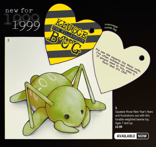
before developing into a full oc, kludge began as a one-off drawing idea I never got around to making of a beanie baby-type critter. maybe something that'd be released as a cute collectible cash-in on the hype, or a desk toy for coders to rubber duck with in the office.
#I tried to restrain myself w/ the filters this time I swear#just a little noise and gaussian blur that's all#art attag#kludge oc#very very proto kludge
23 notes
·
View notes
Text

MIZOOKI AKIYAMAAAAAA the number 1 silly evar. For Day9 of sekaitober : “prettiest character”. I still don’t know how to make the colours appear the same on all devices… I hope they appear vibrant to you all… 😔🫶
#sekaitober#mizuki akiyama#pjsk#project sekai#prsk fa#my art#played around with gaussian blur and chromatic aberration for once hehe#I hope I didn’t overdo it..#also added a noise effect hehe it really adds texture.. I should do this more#fun fact the og background of this was their skin tone- where I just added blush/shading on top#so if you hid the bg their face would be see-through HAHAHA#I also drew them from memory/didn’t colour drop… but at least it’s recognisable#sorry queen I didn’t give you your pretty pastel peach coloured hair… I made it too saturated 💔
23 notes
·
View notes
Text

novembstract day 5: extrude
#my art#novembstract#abstract art#abstract#i went on a foggy walk in the dark#very gaussian blur + add noise type vibes. strongly recommend
2 notes
·
View notes
Text
There is no such thing as AI.
How to help the non technical and less online people in your life navigate the latest techbro grift.
I've seen other people say stuff to this effect but it's worth reiterating. Today in class, my professor was talking about a news article where a celebrity's likeness was used in an ai image without their permission. Then she mentioned a guest lecture about how AI is going to help finance professionals. Then I pointed out, those two things aren't really related.
The term AI is being used to obfuscate details about multiple semi-related technologies.
Traditionally in sci-fi, AI means artificial general intelligence like Data from star trek, or the terminator. This, I shouldn't need to say, doesn't exist. Techbros use the term AI to trick investors into funding their projects. It's largely a grift.
What is the term AI being used to obfuscate?
If you want to help the less online and less tech literate people in your life navigate the hype around AI, the best way to do it is to encourage them to change their language around AI topics.
By calling these technologies what they really are, and encouraging the people around us to know the real names, we can help lift the veil, kill the hype, and keep people safe from scams. Here are some starting points, which I am just pulling from Wikipedia. I'd highly encourage you to do your own research.
Machine learning (ML): is an umbrella term for solving problems for which development of algorithms by human programmers would be cost-prohibitive, and instead the problems are solved by helping machines "discover" their "own" algorithms, without needing to be explicitly told what to do by any human-developed algorithms. (This is the basis of most technologically people call AI)
Language model: (LM or LLM) is a probabilistic model of a natural language that can generate probabilities of a series of words, based on text corpora in one or multiple languages it was trained on. (This would be your ChatGPT.)
Generative adversarial network (GAN): is a class of machine learning framework and a prominent framework for approaching generative AI. In a GAN, two neural networks contest with each other in the form of a zero-sum game, where one agent's gain is another agent's loss. (This is the source of some AI images and deepfakes.)
Diffusion Models: Models that generate the probability distribution of a given dataset. In image generation, a neural network is trained to denoise images with added gaussian noise by learning to remove the noise. After the training is complete, it can then be used for image generation by starting with a random noise image and denoise that. (This is the more common technology behind AI images, including Dall-E and Stable Diffusion. I added this one to the post after as it was brought to my attention it is now more common than GANs.)
I know these terms are more technical, but they are also more accurate, and they can easily be explained in a way non-technical people can understand. The grifters are using language to give this technology its power, so we can use language to take it's power away and let people see it for what it really is.
12K notes
·
View notes
Text
Edit this screenie with me!


This is an unused screenie of Penny Pizzazz and Marcus Flex. Feel free to save the screenshot (Dropbox link below) and follow along with the instructions, or play around with it and do your own thing! I’m going to keep the instructions as simple as possible; hopefully they make sense.
Note: My process is kinda involved, but it’s a relaxing hobby for me. You do not need to do all of these steps! If the process doesn’t bring you joy, don’t bother!
I’m using procreate, but I’m also a photoshop user. You can use any software that has layers and blend modes :)
Instructions and downloads under the cut!
Dropbox link to the screenshot, and overlays!
1. Let’s start with shadows. The first step is to create a new layer. Put the blend mode to “multiply” (this darkens anything you draw on the layer). Then select a soft brush. We’ll start with Penny’s face. Use the eyedropper tool to choose a shadowy color of her skin (hold your finger on the color you want).

2. Decide where the light will be coming from (we’ll be placing it behind them on the top left). Deepen the shadows already made by the game, and add some shadows opposite to where the light will be. Choose a darker color to match each area you’re drawing on (Penny’s hair, her shirt, Marcus’ skin, his sweater).
When you’re finished drawing the shadows, go into your layer and lower the opacity. Less is more!

3. Choose the eraser (set it to soft brush). With a light hand, soften any shaded areas that are too harsh. Basically you want to blend the shadow with the skin using the eraser. You can also use Gaussian blur!

4. Let’s add some background lighting. This will also be our guide as we add bolder highlights in the next steps. Make a new layer and set the blend mode to “add.” Take your soft brush and a yellowy-orange color, and draw some glowy light coming from the top left.
Lower the opacity and take the eraser and erase much of the light on the right side of Marcus, and erase a bit of the light on their skin/ hair/ etc (like we did with the shadows). You can use Gaussian blur here too!
Note about lighting and highlights: experiment with the color of light, because some will look better depending on the environment and the sims skin tones. Because Penny and Marcus have dark skin, a bolder or darker yellow/orange will look much better than a pale yellow.

5. Let’s start adding more highlights! Make another new layer and change the blend mode to “add.” Choose a yellow-orange and paint some highlights on Penny’s hair, her left shoulder, her chest, cheekbone, and the left side of Marcus’ face. I made the image on the left a different color so you can see where I put the highlights.
Lower the opacity, and use the eraser or Gaussian blur to blend.

6. More highlights! Make a new layer and set the blend mode to “overlay.” Overlay lightens while adding color. I use “light pen” for any outlined highlights (the outer left of Penny’s hair, Penny’s shoulder, the left side of Marcus’ face), and I use a soft brush for the rest. Lower with the opacity, and use the eraser to blend.
This is a great time to play around with other highlight colors! I’m sticking with yellows, so I chose a peach color. Note: the red is to show what I drew.

7. We’re going to import a light leak overlay, and set the layer to “screen.” Then take your eraser, and erase any areas where you don’t want there to be too much light (red areas).

Finally, I’ll merge the layers together and bump up the highlights by going to adjustments > curves. Then I’ll add noise, and a vintage dust overlay. Sometimes I do more than this, sometimes less. I also like to draw hair strands and stuff, but that’s a whole second tutorial.
266 notes
·
View notes
Text

^ iterator projection tutorial!! ^
this post follows on from this one made by @prismsoup, intended to cover my slightly more extended process (including post-processing)
step -1 : pre-requisites
this tutorial is designed around clip studio paint for PC because its what i work with. its probable that whatever other program / platform you're using has these features but under different names
i use a rainworld typography font for text. find it here (or do it yourself)
i use scanline textures as a part of this. find them here
step 0 : select a base image

maps, blueprints and diagrams are favourable due to lots of detail without it derailing into noise. get experimental though, my favourite one came out from a picture of a nebula, and another from a friends factorio screenshot
step 1 : binarise & flip
this command can be found under edit > tonal correction (D) > binarization. this forces every pixel in the image to be either black or white. adjust its sensitivity to your liking
step 2 : remove background

add in a black layer below (not just paper layer, as will become important later). wand select the background colour and delete it. if the remaining colour is black, CTRL+I to invert it to white
step 3 : add details

replace any text with rainworld font or simply remove it. add in blueprints or other complex decals (drawingdatabase is a decent source). during importing remember to binarise (after resizing). for "lower layer" elements such as contour lines create outlines for higher layers to retain clarity
step 4 : add multiply layer(s)
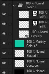
if you want to have multiple colours, put everything in the "higher" layer into a folder and set the top multiply to clipping above it
step 6 : post processing setup

copy all existing layers, create a new folder on top, and paste into that folder. right click the folder and "merge selected layers" set the resultant layer to add(glow). copy+paste and hide duplicate for now. from filters > blur apply a guassian blur with a strength of 130-170 (this creates the base bloom layer). set opacity to ~50%
step 7 : chromatic abberation
unhide not-blurred layer. guassian blur with a strength of 2. duplicate again. select top layer and move 1px up and 1px left (with arrow keys). CTRL+U then change the hue by 30. select bottom layer and move 1px down and 1px right, CTRL+U then change hue by -30.
stronger chromatic abberation can come from stronger gaussian blur and more change in hue
step 8 : scanlines
add the scan lines on top, invert so that they're white and set to add(glow). copy a multiply layer over it and make sure clipping is on. decrease layer opacity to ~10%. if it does not cover the whole image initially, paste more in and merge them together into one layer
tada! you now have one iterator projection. if you want to give it an extra affect, re-import the final PNG and filter > distort > convert to panorama. set distortion to 10 and scale to 101 (note that this drastically blurs the image)
298 notes
·
View notes
Text


SHARPENING TUTORIAL — requested by anon
Edit: Here is the action, after anon requested it. First and foremost, I apologize ahead of time because this is not going to be an action. At the end of the tutorial, I'm going to include a link to a PSD with the smart filters plugged in. So you don't have to go through the trouble of loading an action and then playing it. Before we get started, this will only be compatible with photoshop. Also, you must have a basic knowledge of giffing and photoshop and how to convert all your layers for smart filters. If you cannot do that, this tutorial might not be for you.

Go to Filter > Smart Sharpen. Amount should be set to 500%, then your radius amount must be set to 0.4px. Make sure you remove the Gaussian Blur, and don't touch any of the other settings.

Go to Filter > Smart Sharpen. Amount should be set to 20% - 40% (play around with it, see what looks good). Radius should be set to 20px (again, play around with it, see what looks good).

Go to Filter > Camera Raw Filter. Find the Effects tab. Texture should be anywhere from +25 to +45 (sometimes, depending on the movie, I have it in the high 60s or 80s). Then set Clarity anywhere from 10 to 25 (again, it all depends on the movie, play around with the sliders). Find the Detail Tab next. Set the Sharpening anywhere from 5 - 15. Set Noise Reduction anywhere from 10 - 20.

Go to Filter > Other > High Pass. The radius should be .4px, then go to the blending options and set it to soft light, or screen. I usually set mine to soft light.

The last step is the blurring. It subtracts a little bit of the grain that the denoise didn't cancel out. Set the radius to 1px, and then go to blending options and set it anywhere from 10% to 25%. Click here to download the psd with the coloring included. It will load as one screencap and the smart filters will be there. You're going to window the psd and then drag the smart filter settings to the caps of your choosing.
#psd#sharpening tutorial#gif sharpening#by tana#usergif#gif psd#dailyresources#allresources#completeresources#gifmakerresource#usertj#userlera#userclara#tuserbailey#useraashna#userzo#tuserhan#useraurore#nessa007#usersugar#i hope you guys dont mind me tagging#*#resource
97 notes
·
View notes
Note
Can I ask, how do you get that speckled texture on your art pieces? (Example: the visual texture you see on John’s shoulder in you most recent vampire piece.)
I’ve seen it in various online works for year—I really just wish I knew if it was a layer effect or a certain type of brush?!
I like it because it adds texture to pieces that would otherwise be kind of flat and it is just driving me damn crazy not knowing what it’s called/where it originates in programs (effects vs brushes vs some kind of other visual texture).
(Another popular effect I *just* learned the name for after years is chromatic aberration! It was such a relief to have a theme for it—because knowing what they’re called if the first step to me figuring out how they work!)
Hi! I believe it's called grain / noise. I’m on Photoshop and here are two methods I typically use to add that grainy texture: 1. Using a noise layer - Make a new layer on top of everything (fill with 50% grey, set to Overlay) > Add noise filter (3%) > Add gaussian blur (0.2px). Check this out for more detailed steps. I used this method for that piece!
2. Using texture images - Find a texture image you like > set the image to Multiply, Overlay, Soft light or Hard light (depends on your image) > Adjust opacity and brightness accordingly.

#nice catch I don't usually add this#just thought it fits the piece#hope this helps!#vampire wick#my art#art tips#ask
227 notes
·
View notes
Text
the amount of times that wilson is climbing in/out of windows during cuddy and house’s relationship is not a lot, but it’s weird that it happened twice etc etc
20 notes
·
View notes
Text
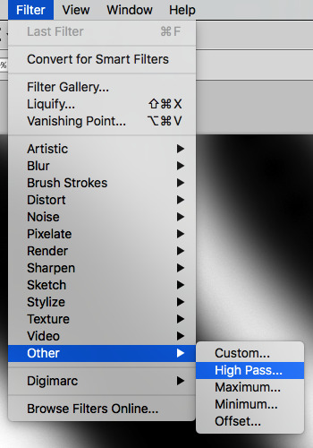
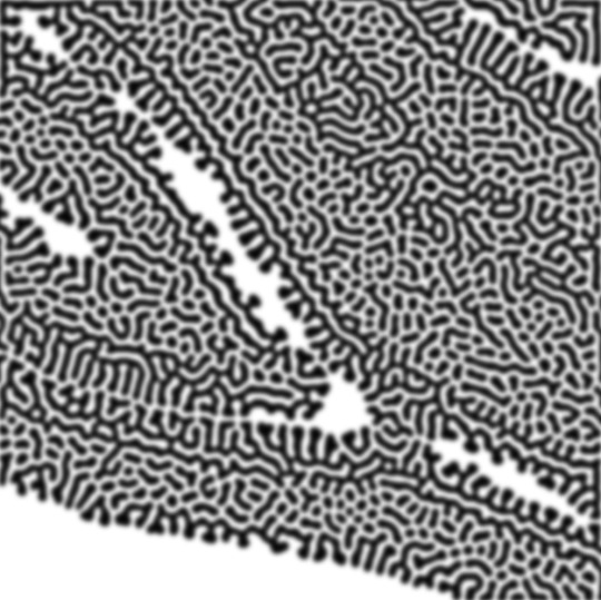
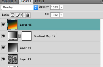
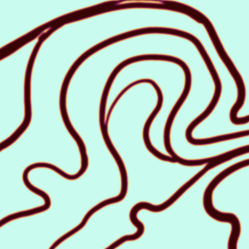
how to make cool blobby turing patterns in photoshop
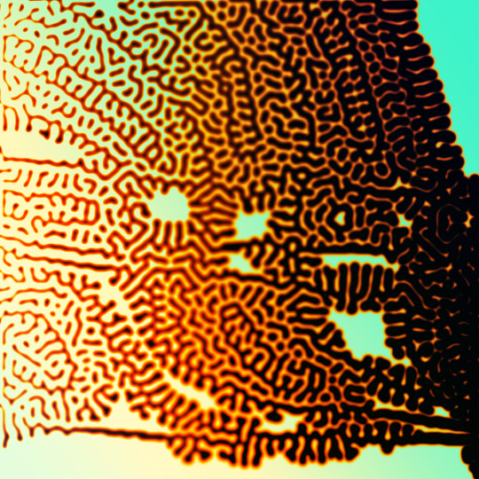
i'll preface with i learned the basic loop from skimming a tutorial on youtube, but as someone who prefers written tutorials i'm sure many would appreciate one! also, the second part of this is some of the visual effects i figured out on my own using blending modes and stuff.
i'm using photoshop CS4 on a mac so some buttons and stuff might be in different places on windows and newer photoshop versions but all the actions are the same. my canvas is 1000x1000 pixels.
UPDATES (i'm hoping these'll show up whenever you open the readmore?)
it's possible to do something similar in krita using this plugin, made by the love @arcaedex
it's also possible to do this in photopea, a free browser alternative to photoshop! the results are pretty much identical.
FIRST off you wanna get or make a black and white image of some kind. it has to be one layer. can be noise, a photo, a bunch of lines, whatever. here's mine, just some quick airbrush lines:

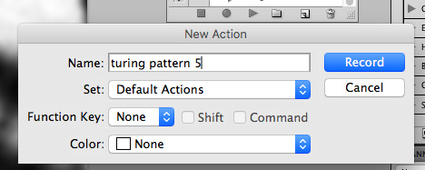
now find the actions tab. idk what it looks like in newer versions of photoshop but you probably won't need to dig!
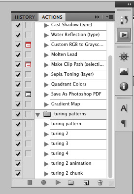
hit the little page thingy to make a new pattern. once you hit 'record', it'll record everything you do. the little square 'stop' icon will end it.
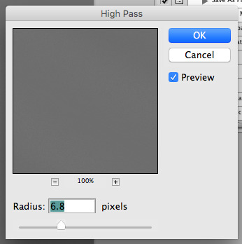
now you want to do a high pass filter. you can mess around with the radius to change the size of your squiggles, but the tutorial had it set to 6. experiment!
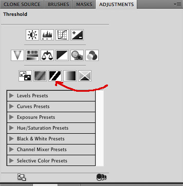
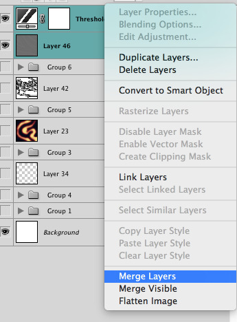
now add the 'threshold' adjustment layer. i use the adjustments tab but i think there's also a dropdown menu somewhere. keep it at the default, 128. merge it down. (control or command + E or you can right click it like some kind of weirdo)
and finally, the gaussian blur! the radius of this affects the shape and size of your squiggles as well. i like to keep it around 4.5 but you can mess around with that too.
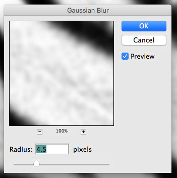
after that, hit 'stop' on the action you're recording, and then repeat it a bunch of times using the 'play' button, until you have something you like, like this:
WOW!! that was fun!! and only a little tedious thanks to the power of macros. anyway, here's some fun layer blending stuff i like to do. it's with a different pattern cause i made this bit first.
anyway, using a black and white gradient (or a grey base that you do black and white airbrush on), make a layer with the vivid light. this will make the blobs look thicker or thinner.
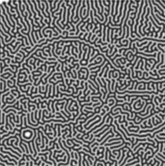

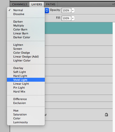

then, for cool colors, do a gradient map adjustment layer over that:

and finally, my best friend, the overlay layer. just using a gradient here bc i'm lazy, but feel free to experiment with brushes, colors, and blending modes!

NOW GO. MAKE COOL SHIT WITH THE POWER OF MATH. AND SEND IT TO ME
also these are not hard and fast rules PLEASE mess around with them to see what kind of weird shit you can make. here's a gif. as you can see i added some random airblush blobs in the middle of it, for fun.
934 notes
·
View notes
Text


PROMO TEMPLATE 012: RB9, by KAISERSCOMMS.
price: $0 (pay what you want)
SIZE 650X850. FONTS USED: Heraldic Shadows
BASIC BLUR GAUSSIAN AND ADD NOISE
DO NOT CLAIM AS YOUR OWN / REDISTRIBUTE IT. CREDIT TO KAISERSCOMMS. COMMISSION OPEN IN tumblr.com/KAISERSCOMMS
DOWNLOAD IN KO-FI / PAYHIP.
#* templates.#* promo templates.#rp template#psd template#rp psd template#promo templates#promos templates#promo psd#rp resources#roleplay resources#roleplay template#roleplay psd#graphics commissions#rpc graphics#rp commissions#rp commission#rp graphics commissions#graphic commissions#psd download#psd#red psd.#template psd#free psd#free template#free template psd#character psd#character template#rp psd#rp templates#roleplay templates
38 notes
·
View notes
Text

Hi ^^
It’s me, the creator of some gifs you like and the creator of many gifs you could’ve probably lived without. A few people have asked me for a giffing tutorial recently so I have made one documenting my normal process! I’m going to gif this Aespa stage in this tutorial because I am still pretty bad at coloring stages. So come struggle along with me 🫶!
Step 1. Getting Sources & Vapoursynth
The worst enemy of the tumblr gifmaker is tumblr itself. You will spend your time making the clearest gif imagineable only for the blue site to reduce it to pixels. But alas, we must gif on. The best way to get good results is have a good source and to precompress your gif with vapoursynth.
As far as downloading from Youtube the best app to use is 4k Video Downloader. 4kVD let's you get download your file as a .mkv which is how youtube stores their 4k quality vids. Only limitation is on the free tier you get only 10 downloads. There are other more technically dubious methods to get 4kvids but I've literally never hit this limit.
10 out of 10 gifmakers agree if you want those good good crystal clear gifs you gotta stick with 4k or 1080p sources. Although if you are a complete sicko like me you can gif 720p and still get pretty good (not great) results.
So now you got your source video but you won't actually be able to open that bad boy up in PS yet. This is where the Vapoursynth step comes in. Vapoursynth will blast that footage into a nice denoised, sharpened and resized little baddie of a video clip for us.

To download VS and get a more in depth explanation of the exact steps on how to use it please reference this post. The basic steps of Vapooursynth are:
Drop your source video on the "vapourscript (drop a video file on me).bat" icon and type in the timestamps
Crop your gif to your liking (I do a lot of 540 x405 or 540x335 for horizontal gifs. 268x480 for vertical.)
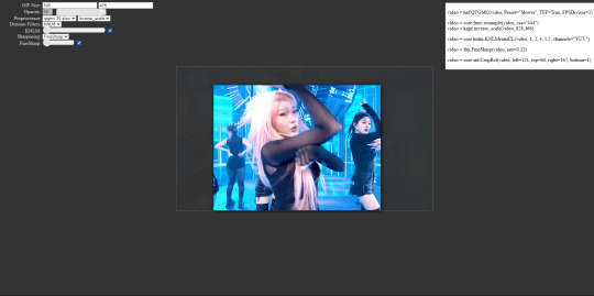
Apply the sharpness and denoise (these are the options I use):

copy the code from the white box and paste it into the script like below
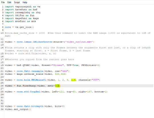
I set my denoiser to 1.5 and my sharpening to .5. (I stole this from @hyeongseo lol)
Go to Script > Encode Video. Make sure on this screen to name your file and set the header option to 'Y4M'. (Sometimes this is the step where it crashes and all your dreams are ruined because it can't convert it unfortunately. But 99% of videos are good lol)
You will find your Photoshop ready clip in gifs/output
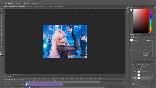
Step 2. Photoshop
You are now good to open up your clip in Photoshop.

if we export our gif at this moment it will look like this:

Which isn't too bad. They just are pretty washed out and a lot of times at this step you'll see a lot of grain.
Sharpening (again lol) and Noise:
This might sound weird cause we just denoised lmao but stick with me.
We are going to convert our clip to a smart object. If you want to slow down or speed up your clip make sure to do so before converting.
(Often times if i have 60fps clip I put it at half speed, but if the action of the gif is really jerky or flashy at 30fps a lot of times I'll set it to 85% speed)
Convert your video to a smart object by right clicking it in the layers panel and selecting the "Convert to Smart Object" option
Create a copy of layer 1 and arrange it so it is aligned perfectly on top of the first video in the timeline. You have to drag it outside of the video group to do this. It should look like this once you are done:

On the bottom clip (layer 1), select filters -> sharpen -> smart sharpen. Apply the filter with these settings:

Then on the same clip (layer 1) apply the same smart sharpen filter with these settings

Setting up the Sharpness like this makes sure the finer details with stand out with crisp lines in the final product. (Look at how the mesh on her arms is in finer detail now)

Your video might look a little crispy at this point and that is ok cause we are going to soften that.
Now on our top video layer (layer 1 copy) select filters -> Blur -> Gaussian Blur. Use this setting:

Finally apply filters-> Noise -> Add Noise to layer 1 copy with these settings

"Vacancy what the hell? It looks like shit now."
Yeah... But now we'll put layer 1 copy at 25% opacity and it will look less like the shit that it does look like right now I prommy. Here is the current output:

The idea behind all this blurring and adding noise is that it will help create smoother transitions between the colors of the gif and reduce large blotchy bands of pixels that can sometimes show up
PLEASE!!! Save your current step as a PSD file. You can skip having to apply all those filters and just drag the filter groups on to the layers after the smart object conversion step.
Step 3. Coloring
Now to the fun part! There is a lot of trial and error in this step since we only have 256 colors to play with.
Typically my goals for this step are:
Raise the black point (Make Giselle's outfit in this gif black so more color can be used on her hair, skin and the background.)
Reduce the overall contrast of the gif. (Darken the lightest lights if possible)
Saturate the colors enough so they stand out but not so much that everything looks gross.
Depending on how we do these steps we may need to subtract frames from the gif. (Which I hope not cause there is exactly 69 frames in the current version lol)
Here is an example of what my coloring difference can look like:


In this case the colored gif is actually smaller because I elminated a lot of the dark greys in the background.
Vacancy's Dumbass Original Recipe thing
This is probably the only thing different that I do from most creators
My first adjustment layer is usually a gradient map. The green and red one to be more specific.

I then change the blend mode to luminosity and set the opacity somewhere between 12 and 20% (Usually 15%).
This step brings all our shades closer together so we have more freedom with coloring later. Also when idols are very white wash this seems to bring out the shadows and skin tone better in later steps as well. If you overdo it though the person in the gif can wind up looking very orange or yellow so less is sometimes more here.
There's also probably a better way to achieve this but you know... oh well
My Other adjusment layers usually consist of:
Levels: With the gradient map applied you can darken the blackpoint of your gif pretty significantly.
Selective Color: This is the most useful adjustment layer. Make sure to expirement with adding to the black slider on the blacks and neutrals color options. Often times kpop vids are over exposed and darkening this can bring out a lot of unseen color.
Hue/Saturation: I use this layer to darken the blues of the background with the lightness slider as well. You can adjust individual colors with this layer and with selective color and that is a very powerful tool for coloring.
Start:
Finish:
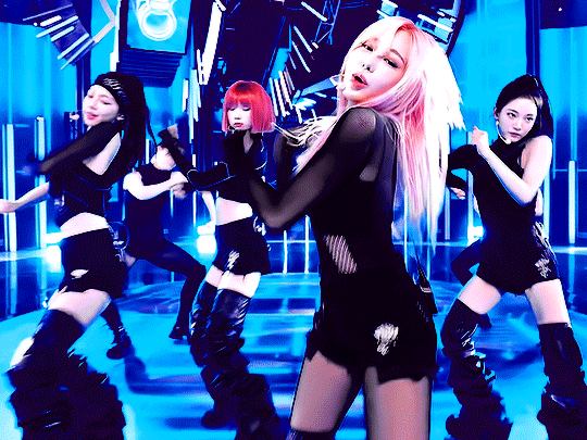
Because I darkened the gif so much I was able to add around 6 frames!
Though I’m not 100% satisfied with this gif, this would be my process from the start. You can put those adjustment layers all in a group and save it to the psd as well to skip all the steps to apply them. I used all the same adjustment layers for the header gif of this post as well which saved me a lot of time ^^!
Since every video is different you usually have to play around with the sliders a lot between clips.
Step 4. It Flops…
Jk jk but it does happen a lot tho on this site so don’t get discouraged ☺️
Parting Notes
If you want a really nicely colored fancam to practice on I would see if MIRAI on YouTube has a fancam of your fave idol. Their videos are really nicely color balanced from the start where stages like this tend to be very bright.
I’ll probably make a follow up post with more coloring tips and my thought processes while making gifs but this is the very basics to making hq gifs hope you learned a lot.
You can always hit my dms or inbox with questions if you have them ^^!
#hope this helps#tagging a few people#tuserflora#userdoyeons#forparker#useranusia#rhitag#usercherry#<- these are all creators I try to learn from#flashing tw#flashing cw#tutorials
98 notes
·
View notes
Note
What’s your art process, if you don’t mind sharing? I adore your style!
YEAH OFC!! 🩷🩷😼
So basically, I just do a rough sketch of what I want. I always use a more simplistic shapes for it, like planning how I want the drawing to look! Then I do lineart (I don’t do the under parts for Marinette’s eyes since in my style she doesn’t have those) then I color, and do the bold outline!!
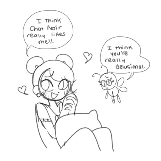


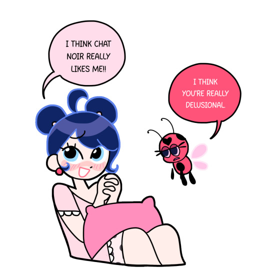
As you can see, I added some changes to the drawing, like Tikki’s mouth and Marinette’s lil hair cowlick. My process isn’t all that impressive,, but hopefully it’s p clear!!
And for the cartoony effect, I go to Gaussian Blur, and I apply it to the drawing. Then I set the opacity I want (I just did a quick 30%), and also added the Chromatic Abberation (Moving) Filter! I also add “Noise” for screenshots specifically, but I didn’t for this one.


AND TA-DA!! MY SECRETS HAVE BEEN REVEALED!🌈
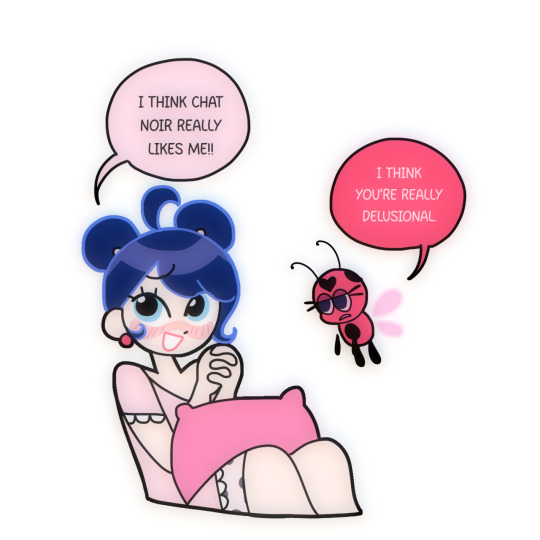
#thank you for the ask!! <3#this particular drawing is SUCH a bad example#but I was in the process of drawing it and I thought it would be great to record for this ask
229 notes
·
View notes