#gif tutorials
Explore tagged Tumblr posts
Visit Tumblr Blog
Explore Tumblr blogs with no restrictions, modern design and the best experience.
Last Seen Tumblr Blogs


Fun Fact
Tumblr Inc. is funded by 13 investors.
Text
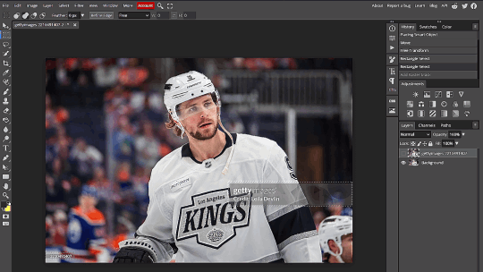
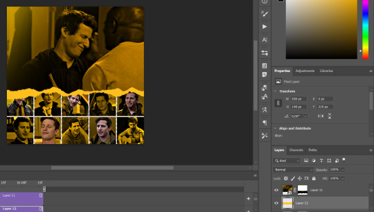
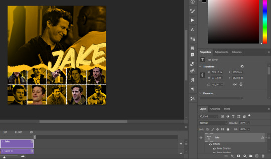
Quick GIF tutorial (Photoshop)


#holy shit this is perfection!!#i am so jealous of this set!#the coloring op THE COLORING!!! (original post)
alright @dontyouknowemma-itsyou and anyone interested, this was really easy to colour so I'm gonna give you a quick breakdown. (i didn't save the psd file?? so i'm redoing this i guess, but i did it on autopilot in the first place. i've been making gifs for over 15 years.)
GONNA INCLUDE A VIDEO AT THE END SHOWING OFF THE SETTINGS!!
General GIF stuff
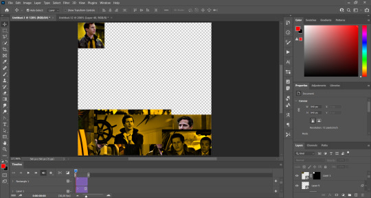
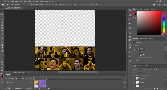
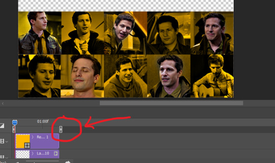
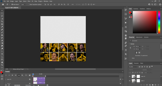
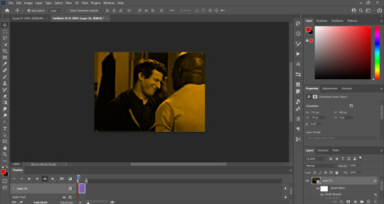
This is in Photoshop CC. I extract a clip from a video as an MP4 file, which photoshop can open. (I use AviDemux for this, which is free, because it lets you save clips using 'copy' encoding for video output and still change from MKV to MP4 format - without losing any video quality, cause you're not re-encoding.)
Open that shit directly in photoshop as a video layer (just drag and drop), that lets you scan through it to check the colouring works overall. Convert the video layer to Smart Object, that lets you resize and edit it. (Do NOT open a full movie in Photoshop, it'll probably die and it has a max length anyway.)
Also all the colour adjustments are gonna be adjustment layers you can tweak and turn on/off whenever. There's a lil button at the bottom of the Layers window to add them quickly.
When we're done we're choosing a section of the video in the Timeline window and we're doing File->Export->Save For Web. 'Adaptive' (or selective) palette selection, 'pattern' style dithering.
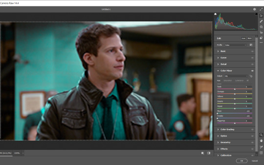
Colouring
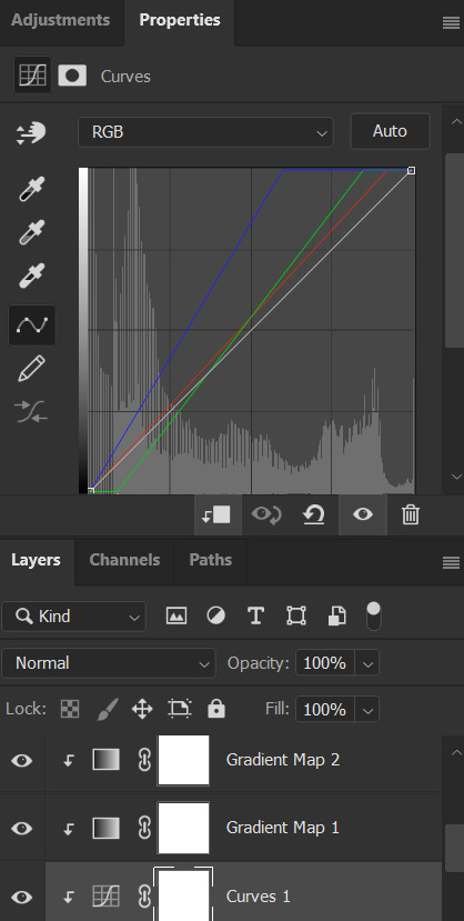
Curves layer to lighten. Just pull the curve up. Curves seem to give a much smoother lightening, since it mostly affects the middle, leaving the brights and the darks where they are.
Levels to make the darkest darks pure black, and the lightest lights pure white. Good for limiting GIF size. Don't overdo it though.
Colour balance!! My beloved, most important. So for the Shadows and Highlights, you're gonna move the sliders towards Cyan and Blue, but for the Midtones you're gonna do the opposite - towards Red and Yellow. This means you don't shift the overall colour of the picture, but trust me it does SO MUCH for the contrast and colour. I swear I do this for almost any edit, and also my art tbh. Also if the original clip is like very green or whatever, you can correct that here.
Selective colour. For this I did one thing. For 'Black' dropdown, I upped 'black' and 'yellow' sliders (the latter to counteract the blue in the darks). This in combination with:
Levels again. Bring in those darks, turn them pure black. Basically this does a couple things. It preserves GIF file size, by making sure the dark areas are static (file sizes mostly depends on pixels that are CHANGING). It ALSO makes the palette much more optimized, meaning you don't waste palette on the darks no one sees anyway, and instead uses them in the mid range colour variation, giving much smoother gradients. That's it!! That's all the colouring!!
EDIT: Uh I probably also had a Vibrance layer?? Idk. This just ups the saturation, but it's softer than upping Saturation. Makes the colours pop without overdoing it.
Other tips and tricks
Often I'll put a Smart Sharpen (50% amount, 0,5px radius) filter on the video layer, just to make it a bit crisper. Subtle but effective.
You can manually edit the palette when you save as a GIF, either to reduce file size, or because some colour areas look pixelly. See the video for how.
If your file size is huge but you don't want to shorten or resize, you can reduce the frame rate manually. To do this, FIRST save the GIF, then open the GIF you just saved. Go through in the Timeline window (which is now a Frame Animation rather than a Video Timeline), select every other frame, and delete them. When you do this, remember to select the rest of the frames and double their Frame Delay so you don't end up with a super speedy GIF. (You can also make a GIF slow-mo like this.)
Since the video is a smart object, I literally just resized it in between saving the different GIFs, to change composition between the different shots.
Selective Colour layer can be used for a lot of image tweaking. For example, if something is overly yellow or green, I may go to the Yellow and Green in dropdown and just reduce the yellow slider. (I usually then go to Red in dropdown and ADD some yellow to that, to balance out the reds to be less pink.) Or maybe the overall colours are nice but the blues are dull, so I'll just go to Blue/Cyan and tweak those specifically.
If you have a colouring you like that you want to use on lots of things, remember you can drag-and-drop layers between different images. You can also save a photoshop file with nothing but those layers, to use on later gifs and just tweak as needed. (You can also make Actions to automate stuff, but I won't go into that.)
How easy or hard something is to colour HUGELY depends on the original video, both lighting/colouring and video quality.
Finally the video showing settings!
This is like 5 minutes long and has no commentary or anything. This is mostly to show off where you find each individual thing, and what difference it makes in the colouring.
ANYWAY hope someone found this useful!!! ♥
#next to normal#gif making#photoshop#gif tutorial#photoshop tutorial#my posts#my gifs#art things#tutorials#PS if you can't afford Photoshop then just you know.... yo ho ho and all that
137 notes
·
View notes
Text
Hiding the Getty Watermark
Plenty of people have talked about this one before but I can't find anything rn. Have had a few people dm/ask about this since I mentioned it offhand in a post. Took a bit of time but have written a tutorial. Includes gifs of what I'm doing.
No generative AI, just old-fashioned image editing.
This trick is not intended for stealing from Getty or the photographer who owns the rights to the image. This is meant for non-profit, transformative fan content such as sports web weaving.
The "hiding" part isn't magic and isn't going to give you a perfect, full resolution image. Someone looking closely, who knows what to look for, will be able to see where the work was done.
Good news!! Most people aren't looking that close, they're reading the poetry you pasted to the image and weeping about your web weave.
You will need
Two copies of the image you want from Getty -> (1) the high resolution version with the watermark, and (2) the low resolution preview without the watermark.
Any image editing software that allows for the use of layers and a simple rectangle select tool. If you don't have one, Photopea is a free, browser-based editor. I will be using this one :)
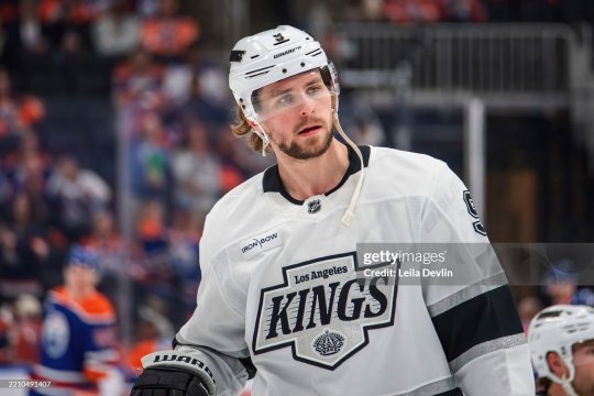
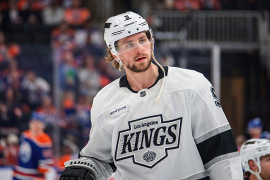
For this tutorial we will be enlisting the services of the beautiful Adrian Kempe:

Method
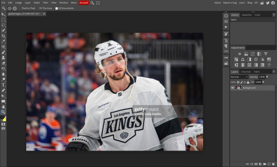
Open your copy with the watermark:
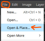
2. File -> Open & Place... the copy without the watermark. It will appear much smaller on a new layer on top of your original image:
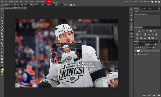
3. Transform (Scale) this to lay exactly on top of the original image. Very important that it is the exact same. Photopea and other image editors will have snapping, this feature is your friend:
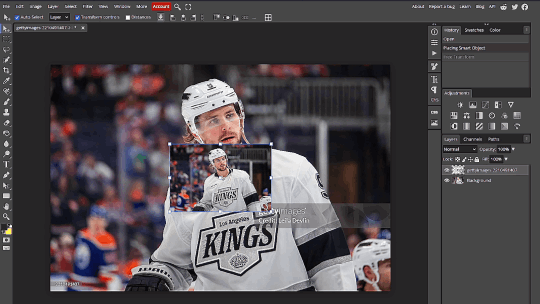
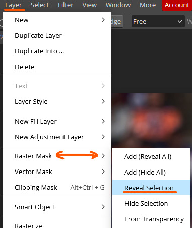
4. Hide the low res layer for now. With the watermarked layer visible, use the rectangle select tool and select the two watermarks. The little one is in the bottom left. In this case, an exact selection is not required.
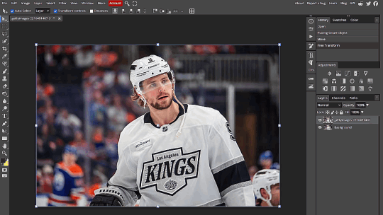
5. While on the low res layer, go to Layer -> Raster Mask -> Reveal Selection. Un-hide the low res layer. You have now gotten rid of the watermark:
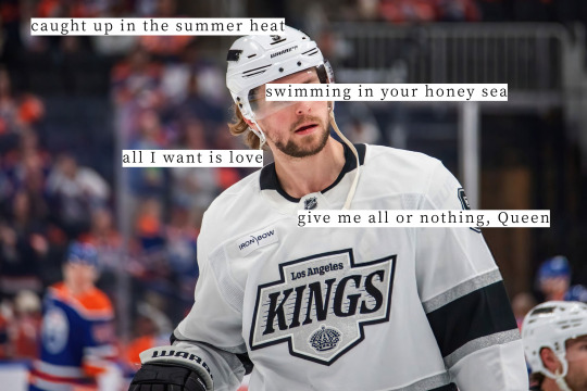
6. Final product looks like this:
Add your lyrics or poetry or do whatever edits you like as normal. For fun I chose Queen by Magic City Hippies:
Final Notes
If you look closely you will be able to see the "seams" where the mask was applied and the low res image was spliced in. I prommmyyy nobody is looking that closely on tumblr dot com.
Live examples where I used this method in my AGAIN web weave - photos of the players are all sourced from Getty, some light cropping was applied for the desired aspect ratio and the colours were edited.
If you hate drop-down menus you can create a macro i guess ? Also the same effect is achieved if you click the little layer mask icon at the bottom of the layer panel instead of menus. I just wanted to be thorough.
If you can’t find those exact menu options in your image editing software you can use the “Search” tool which is usually found in the “Help” section.
You can also invert the selection and use the Erase tool on the low res layer if your editing software somehow doesn’t have a masking tool??
Have fun making your web weaves <3
#GO MY TUTORIAL!!!!!!!!!!!!!!!!!#made the gifs in an hour but took 3 days to write the alt text for everything bc i was agonising over economy of phrase <3 lol#idek what to tag this#puck!research#tutorials
529 notes
·
View notes
Text
Hello! I've decided to make an updated tutorial on how I gif, since some of my giffing methods have changed since I made my first one (and this one is still valid, by the way! I've just changed a few things and I thought the update would be good.)
In this tutorial you'll find:
A download link for Photoshop CC 2020;
Step-by-step instructions on how to make gifs and color them;
A sharpening action for your gifs;
A base psd for gifs.
Get the tutorial here (just type 0 to get it for free, and if you'd like to support me, any amount is extremely appreciated).
I accept commissions for tutorials + support me on ko-fi?
#tuserdee#dailyresources#completeresources#userbecca#gif tutorial#gif resources#mine#resources#*#my tutorials#tutorials#my resources#gif#my psds#my actions#psds#actions#reposting it on main bc fucking sideblog is shadowbanned LOL!!!!!!!!!!!
443 notes
·
View notes
Note
Hello there! this isn't a request, But I was wondering how you make your graphics Is there any specific sites you use or stuff like that?
Hey! I already made a vague tutorial on my blinkie making process.
For userbars and shiny buttons, I have a .kra template and simply edit the text and colors and whatever to whatever is requested. The shiny button template was mostly original but the userbar template was made with the help of this tutorial.
EASY PEASY STAMP MAKING TUTORIAL BELOW VVVV
For stamps, I use an edited version of this template.
While for most of my original stamps I use a method similar to my blinkie-making method, I also like to convert GIFs I find online into stamp format! This is a really easy streamlined process and I wanna show it off.
1. Import your GIF of choice into Ezgif, whatever selection works.
MAKE SURE IT IS .GIF AND NOT .WEBP OR OTHER, AS THEN IT WILL NOT WORK!

2. Depending on what size your image is, you will either want to crop first or go to Resize immediately. If your image is 4:3/16:9 and focused the way you want, go to step 3.
Crop your image in the editor the way you want it to display. Try to leave a little room for the focus of the image so it isn't cropped out later.

Once you're done with that, you can proceed to the Resize menu from the bottom selector.
3. Resize your GIF to 99 by 56 pixels. That is 99 in width, 56 in height. Try not to tweak with any of the other settings.

Once you're done with that, go into the overlay option from the bottom selector:

3. Overlay
Upload one of these as your overlay, or make your own with the same format. Make sure it has a greenscreen/removable background around the parts you want to be transparent. The 1st one is newer and the one I typically use.


It's the same resolution so you don't have to move anything around. Once you generate that, go into the effects menu from the bottom selector.

4. Remove the greenscreen and you're done!

In the "Replace color with transparency" tab, set it to custom (HEX) with the value #00ff00 or whatever color you chose to replace transparency. This part is the reason you can't use webps, for some reason this part doesn't work very well with those.

YOU JUST MADE A STAMP CONGRATULATIONS! You can also do this manually but this method is easier if you're just compressing down a gif.
93 notes
·
View notes
Text
Digital Stamp Making Tutorial
Hello, and welcome to the long-awaited(at least on my part) digital stamp-making tutorial from neosprites! I’d like to preface that I learned what I was doing from this tutorial so it may be a bit redundant, but if anything I get a bit more specific. Thank you so much to @graphic--horde for your work, it changed me as a graphic maker. This is gunna be a long post so feel free to bookmark it for later. Now, onto the show!

The frame I will be using for this tutorial (which is the frame I use on 99.9% of my stamps) I found from the above linked post, which I believe is from a creator that OP lost track of. Its inner dimensions are 94x50 pixels and its outer dimensions are 99x56 pixels. Here it is!

Find your material! - I recommend using websites like Tumblr and searching with the “GIF” filter only on, or alternatives such as Giphy or Tenor. Your browser may let you directly save the .gif file; if not and you are noticing it restricts you to save it as a .webp file you can try an extension like “Save webp as PNG or JPEG” (for Firefox but I image other browsers have similar functions, but I really recommend you switch to Firefox). To use this you will right click on your source .gif like normal but instead of clicking on “Save image as…” click “Save webP as…” and then click “GIF”. You should be redirected to the website ezgif.com where we will actually be doing all of our editing! Here’s the .gif we’ll be working with.

Convert to GIF (optional) - if you used the extension from the above step you should already be ready to click the blue “Convert to GIF” button. If not, go ahead and open ezgif.com and click on “webP” and then “WebP to GIF”; then convert to a gif with the blue button.

Resize the GIF - now that we have a gif ready to edit, let’s make it the right size. The easiest method I have found is to change it directly to the frame’s inner dimensions, 94x50 pixels. [EDIT: Make sure in the aspect ratio drop drop menu you select "stretch to fit" and not "center and crop to fit" like I did in the photo example.] Click “resize” and then type [94] in for the width and [50] for the height. Next press the blue “resize image” button.


Add the frame - next click “overlay” then click the thin blue button that says “Extend canvas size(use if overlay exceeds GIF sizes)”. This will give us some extra room to add the frame onto the design. Next click “Browse…” and find the frame you have saved onto your device, then click the blue “Upload image” button.


After that it’s going to be misaligned, that’s normal! It will say you have the option to drag it into place, but don’t bother. That’s one of the reasons my old stamps look wack, it’s just harder to do. Instead type [44] in for the Left box and [22] in for the Right box. It took me a while to figure out these dimensions to be honest, and I’ve only tested it with this frame so I don't know if it works with others. Then click the blue “Generate image” button.


Crop the transparent edges - click on “crop”. You will have the option to check a box that says “trim transparent pixels around the image” however, I don’t recommend this as it tends to crop a few of the frame’s pixels with it sometimes. Next, set the Left position to [44] and the Right position to [22]. For the other dimensions we will use the outer dimensions of the frame which are 99x56 pixels, this will trim everything except the tiny spaces in between the stamp frame’s spikes. Type the width as [99] and the height as [56] and click the tiny blue button that says “set”. After that click the blue “Crop image” button.


Save and use! - all that's left is to click “save” and upload the graphic to your liking. (best seen on dark mode obviously)

If you’d like to tag me in stamps you’ve made using my tutorial I would love to see them, but it’s not required!! Make sure to always give credit for pictures/gifs when you can and try not to make stuff out of personal/fan art. Thank you to the person in my inbox who requested this tutorial, I had been meaning to for a while but it was just the kick I needed. :)
#carrd graphics#carrd resources#carrd stuff#rentry graphics#rentry resources#rentry decor#rentry pixels#rentry stuff#rentry inspo#deviantart#neocities#mine#my graphics#my tutorials#resources#tutorials#tutorial#how to#stamps#blinkies#graphics#web graphic#old internet#early internet#spacehey#da stamps#page decor#custom#old web#frames
559 notes
·
View notes
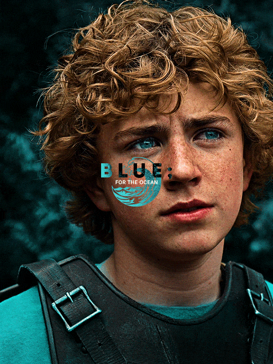
Text
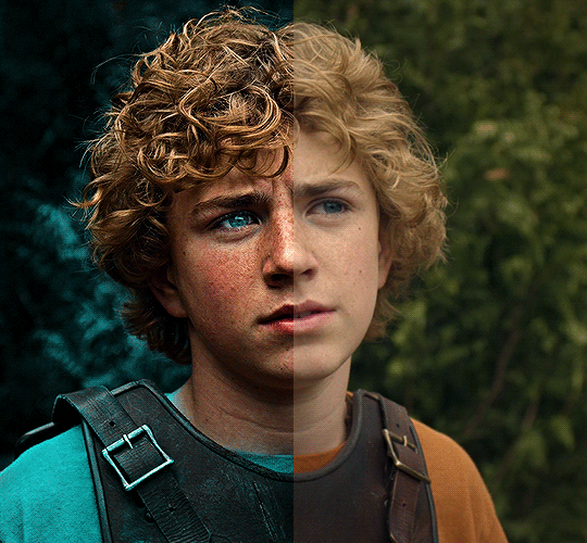
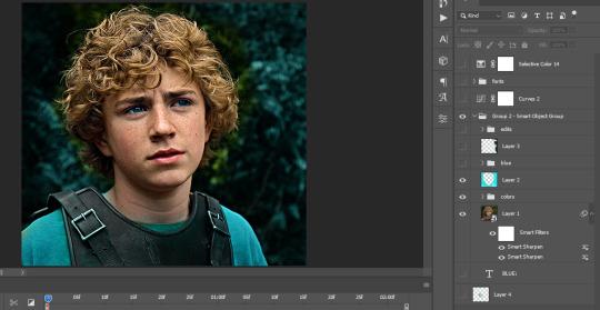
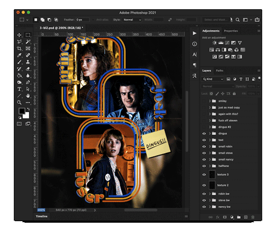
The silent art of gif making
The gif above has 32 layers plus 6 that aren't shown because this is part of a larger edit. I wanted to share it to give everyone a glimpse of the art of gif making and how long it usually takes for me to make something like this. This one took me about an hour and a half but only because I couldn't get the shade of blue right.
I use Adobe Photoshop 2021 and my computer doesn't have a large memory space (I don't know what to call it) so usually most of psds get deleted because I'm too lazy to get a hard drive. It doesn't really bother me that much because I like the art so when it's done, it's done. Off to somewhere else it goes.
Here are the layers:

Everything is neat and organized in folders because I like it that way. I prefer to edit it in timeline but others edit each frame. There's a layer not shown (Layer 4 is not visible) and it's the vector art. Here it is:
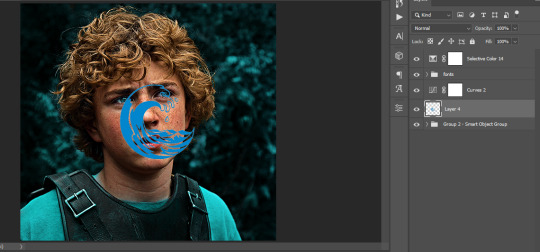
Now it is visible. I don't plan to make this a tutorial, but if you're interested I'd love to share a few tricks about it. I'm pretty new to the colors in gifmaking but the rest is simple to understand. Here, I just want to show how much work it takes to make it.
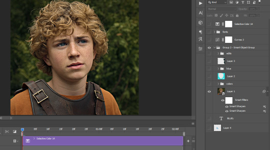
I opened Group 2 and here's the base gif. I already sharpened and sized it correctly but that's about it. Let's open the base coloring next.
Yay! Now it looks pretty! The edits are in Portuguese but it doesn't matter. There's a silent art of adding layers depending on how you want the gif to look but you get used to it. The order matters and you can add multiple layers of the same thing (for eg. multiple layers of levels or curves or exposure).
This was pretty much my first experiment with coloring so I don't know what I'm doing (this happens a lot with any art form but gifmaking exceeds in DIYing your way to the finished product) but I didn't want to mess up his hair, that's why the blue color is like that. Blue is easy to work with because there's little on the skin (different from red and yellow but that's color theory). I painted the layers like that and put it on screen, now let's correct how the rest looks.
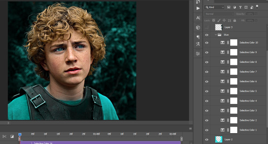
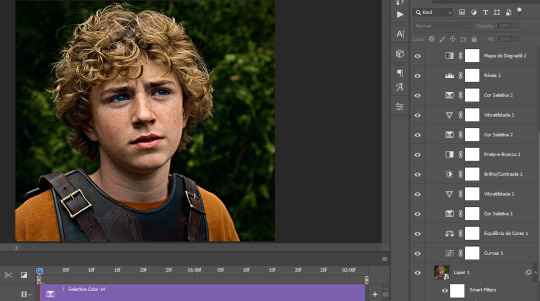
I was stuck trying to get the right teal shade of blue so yes, those are 10 layers of selective color mostly on cyan blue. We fixed his hair (yay!) we could've probably fixed the blue on his neck too but I was lazy. This is close to what I wanted so let's roll with that.
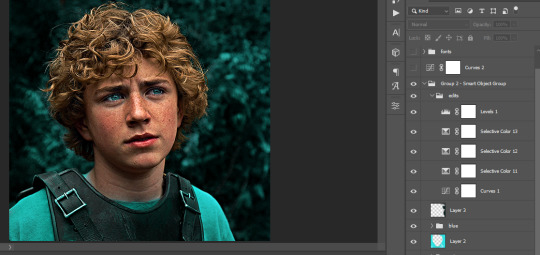
BUT I wanted his freckles to show, so let's edit a little bit more. Now his hair is more vibrant and his skin has red tones, which accentuates the blues and his eyes (exactly what I wanted!). That lost Layer 2 was me trying to fix some shadows in the background but in the end, it didn't make such a difference.
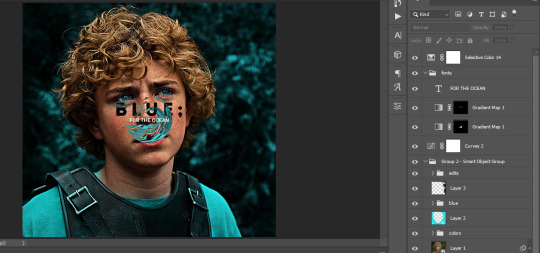
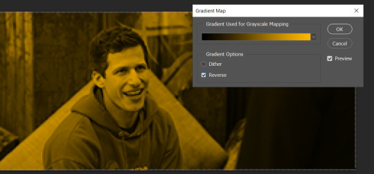
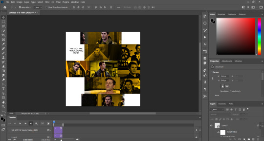
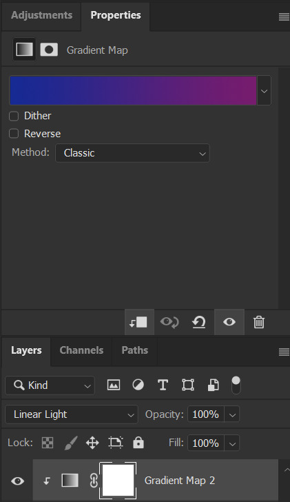
This was part of an edit, so let's add the graphics and also edit them so they're the right shade of blue and the correct size. A few gradient maps and a dozen font tests later, it appears to be done! Here it is:
Please reblog gifsets on tumblr. We gifmakers really enjoy doing what we do (otherwise we wouldn't be here) but it takes so long, you wouldn't imagine. Tumblr is the main website used for gif making and honestly, we have nowhere to go but share our art here. This was only to show how long it takes but if you're new and want to get into the art of gif making, there are a lot of really cool resource blogs in here. And my ask box is always open! Sending gifmakers all my love.
#gif making#gif tutorial#resources#completeresources#y'know what that post yesterday got me into this#i love creativity so i send all my love to gifmakers#this is HARD#my tutorials#tutorials
931 notes
·
View notes
Text
Transferring animations between rigs (e.g. adult to child)
The steps below describe how to transfer an animation from an adult rig to a child rig but the method should be applicable for any transfer between human rigs.
However, I haven't tested other constellations. Let me know if you have any other tips, suggestions, corrections or run into any issues.
Many thanks to thepancake1 for helping figuring out the details that are not obvious at all 💛
I posted this little guide in Creator Musings for someone wondering about it but sharing it here as well.

Step 1)
Export the adult sim animation you want to transfer (=your source) to Blender.
Open a blend file with a child rig (=your target).
Append the adult rig with the animation to the child rig in Blender (File > Append > Select the blend file > folder "Object" > select rig and mesh there)
Select the animation from the adult rig for the child rig (select the child rig in the Outliner menu > select the scene tab in the properties panel below > in "S4S AnimationTools" select the adult animation as the "active animation")
This will get the job mostly done, but the animation will be offset and jumping around, as you see below. To correct for that you will need to set up several constraints as described in step 2.


Step 2)
As you see below the height of the ROOT_bind of the adult sim and child sim differ by about a factor of 0,7:

You can check the exact location in Edit mode:
The ROOT_bind of the child rig is located at 0.6920, the ROOT_bind of the adult rig at 1.0112 on the Z axis, which gives a factor of 0.6920/1.0112=0.6843354430379747

With that information you now need to do the following:
In the Dope Sheet menu, select "Action Editor" and press "New Action" there to make a copy of the selected animation for the child rig.
In the Dope Sheet Summary open the ROOT_bind and disable the location channels but keep the rotation channels enabled (the latter matters if the ROOT_bind is also rotated in an animation). The setting should look like this:

In the Transform menu (now in Pose mode) type in -0,6920 on the X axis for ROOT_bind (thus resetting its position to 0 in the animation; can't properly explain why X axis is chosen here instead of Y but it has something to do with how local rotations of a bone are determined according to pancake).

Create a "Copy Location" constraint for ROOT_bind of the child rig targetting it to the ROOT_bind of the adult rig (this is done in the Properties panel > Bone Constraints), set Influence to 0.6843354430379747 (factor calculated above). (Edit/Correction: Previously I recommended to create another "Copy Location" constraint separately for the "Z" axis and to check "Offset" there. However, upon further testing, this doesn't seem to be necessary. Leaving info here just in case.)
You might then also need to add a "Copy Rotation" constraint for ROOT_bind of the child rig targetting it to the ROOT_bind of the default rig (Influence can stay at 1 here).

The animation should now play as expected:

Step 3)
All you need to do now is bake the animation (thus applying all the constraints you set up). Select Pose > Animation > "Bake Action...", then check "Visual Keying" and "Clear Constraints" in the pop up. The animation will now work stand alone and you can delete the adult rig.
Alternatively, if you use Pancakes animation tools, you just need to export the clips, the constraints will be applied automatically.
294 notes
·
View notes
Note
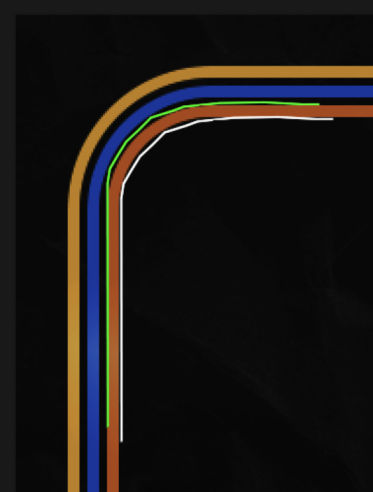
hi! would it be possible to post a tutorial of how you created the shapes in this set /post/753222419295158272 thank you :)
sure I made the gifset a while ago so don't have the psds saved but i decided to make a new gifset with a similar shape effect and show you how i made that :)
tutorial below the banner/cut

first start by making and colouring your base gif as you'd like. for the example i'm making today i'd like a pink gif.
for simplicity i'll put all the colouring layers in a group so it is easier to see what's going on with the shapes, but this is not a step i usually take.

once you've got your base gif ready search for the image/shape you would like to appear on your gif. in this case i searched for glinda's crown :)
make sure the image has no background and save it. if needed go to https://www.remove.bg/ and remove the background from the image then save it.
open your saved image in photoshop and drag it onto your gif. typically i drag it on the gray area outside the image canvas so it will land in the centre of the canvas.


if the image is too big resize it by using the transform function (ctrl +t)

right click the image layer and go to "Blending Options" (you can also do this by double clicking the layer (but not on the layer name as this will prompt renaming the layer)


go to color overlay and change the colour to white with blend mode normal and click ok

convert the new image layer to a smart object by right clicking and selecting the relevant option

change the blending mode of the new smart object to 'difference'

go back into blending options now and change the color overlay to the desired colour with the blending mode set to 'color'

at this point you can also add a stroke and drop shadow


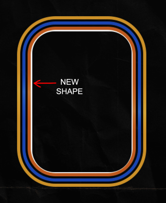
this results in the below result

i noticed a bit of background missed from remove.bg

so i now add a layer mask and mask over the errant mark


and that's the basics of how to make a shape like the one in the gifset you linked. you can now add any text or other embellishments you may like.
a few other tips:
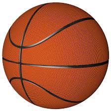
play around with your stroke settings, i did this a lot when making the so highschool gifset (e.g. i think the basketball one used the centre option)
the stroke option will outline what doesn't have a solid fill. to get each part of the basketball outlined like it is in the gifset i used an image like the first one below where the lines on the ball were also transparent to get the strokes i wanted (if that makes sense). if the whole image was solid, like the second image the outline would just be a circle basically.

in most cases the method i showed here is the best method, but for the so highschool book image i did something slightly different where instead of doing a straight smart object i also duplicated the shape on top with all the details left in. i applied the same effects to the bottom layer as above and on the duplicated layer also set that to difference and added a color overlay like the above


gives a result like this:

you can tweak how this looks a bit by using a selective colour layer clipped to the top layer. i wanted a bit more definition on the hat so i ended up with this after tweaking the neutral and blacks channels

overall my advice is to experiment and see what you like as that is what i basically do :)
#asks#resources#ps help#usergif#allresources#yeahps#completeresources#resourcemarket#dailyresources#tutorials#photoshop tutorial#*mine#i hope this helps/makes sense
147 notes
·
View notes
Text

GRID + TORN PAPER + RAINBOW LAYOUT TUTORIAL (yeah, i'm sorry, but that is the title i came up with)
Hi everyone! This tutorial was requested by an anon, and we're going to make a gifset like this. You need, as usual, basic gifmaking skills and basic photoshop knowledge, but i'll try to explain this as easily as possible!
You'll also need a torn paper brush, which you can download here.
And here are the links to download the fonts used in my gifset: x, x
Okay let's start!
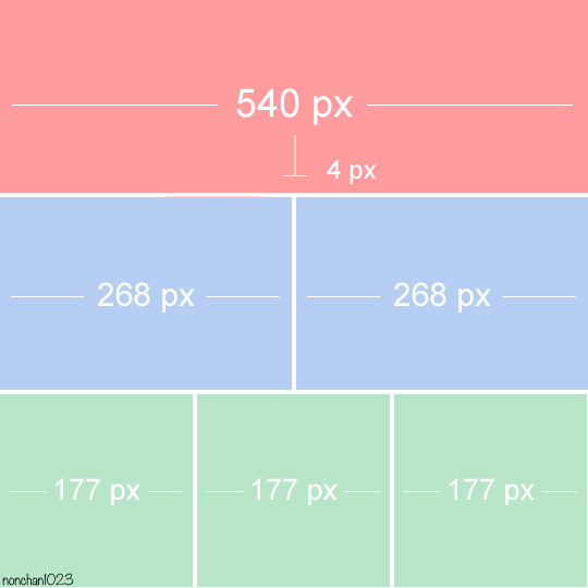
→ First you're going to create a new canvas, and it will be 540x540 px. Make sure to click on create video timeline (if you dont have a timeline, go to window > timeline. We'll leave this canvas there waiting for us :)

Then, onto our first gif. We're going to make the small square gifs first. All i do is resize the image and make it 120 px high, and you'll see why in a moment.
Make sure to remember the number of frames of this gif!! All the gifs we're going to put in the same canvas should have the same amount of frames.
Okay, so we have our first small gif:
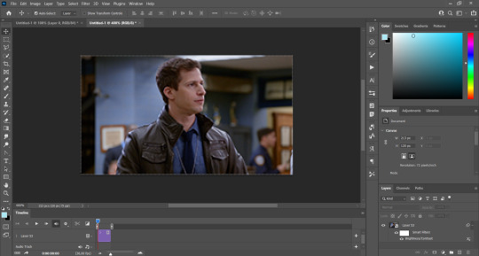
As you can see it's a smart object, and I added some brightness, but so far that's all. You can sharpen it, but i like to sharpen until i've colored it. Now onto the important part:
Most of the gifs i worked with were mostly blue (aside from the skin color), which is recommendable, because you can create lots of colors starting from blue, using the hue/saturation adjustment, or camera raw filter. I also recommend you to use a gif that doesn't move a lot, so it'll be easier to color the background:
For the tutorial, we have our predominantly blue gif, but we are going to make it yellow, which is the opposite color, so it's the hardest to get. I hope you can see how i manipulate colors, and do it yourself :)
Here, you can use camera raw filter (filter > camera raw filter) to turn the blues and purples greener, like this:
And click ok to exit the camera raw filter. Then, we're going to use hue/saturation (image > adjustments > hue/saturation) to turn it yellow:

Since it was cyan, i changed the cyans, but if you got a much greener result you'll have to use green (duh, right? i dont know i just dont want anyone to get confused akjsdhs)
And you can also add a selective color adjustment to make those yellows more yellow:

The reason i don't directly use hue/saturation is cause it might look ugly and lose quality, or it wont pick up all the colors i want it to but they're also very small gifs so if you wanna do that, do it :)
I sharpen it until this point, but if you already have that's okay.
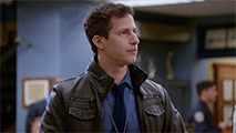
Now we're going to color the background! For that, you just add a new layer, and set the blending mode to color.
Then you'll use your brush, set it to 20px and 0% hardness, and pick the color you're using for this gif, you can use the eyedropper tool. This is why it's important that the gif doesn't move a lot, so you can color the bg like this:
I colored carefully around the edges, and that's the result. In some gifs from my gif set I colored Jake's jacket too because i was too lazy, but this looks cleaner :)
You might want to select the color layer and the gif layer to convert them both to a smart object, just to make everything easier. So, be careful, because after that you won't be able to change anything!
But let's say you have a scene that you want to include, and it moves too much and has no blue and it's going to be a nightmare to color it.
Well, don't worry, you can! Simply, instead of manually coloring everything, you can just choose to add a gradient map to it (image > adjustments > gradient map), like this:
And this is the result:

Just remember, it has to be the same amount of frames as the other ones!
You repeat the process, until you have 10 small gifs. I made around 5 manually colored gifs, and 5 gifs with gradient for each gif. That's a confusing sentence but i hope you get it.
We are going to start pasting the small gifs on our first canvas.
(You can paste them one by one but i did this so you can see my 10 gifs)
You're going to create a square that has to be 108x108 px, using the rectangle tool. You can remove the default white background.

And you may be wondering, why did we not just crop the small gifs into those dimensions? Well, you can do that, but to me it's much easier this way, because sometimes cropping isn't accurate, or it's tedious.
Place the small square on top the gif you're going to crop, right where the face of the character is (or whatever objects you're giffing), and while holding ctrl, click on the square. It will select it:

You're going to create a layer mask:

And then drag that layer mask to the gif:

And voila! It's now the same size as the small square. Once that's done, right click on the layer and convert it to a smart object, because we have to remove that mask. Make the square layer invisible, and start placing your gifs where you want them:
You're going to repeat that process with the rest of the gifs, and then place them all together. Don't forget that if you're making the first gif, they will all be at the bottom of the canvas, if it's one of the middle gifs, one row should be at the top and the other one at the bottom, and when you're making the last gif, they should all be at the top. Here we're making the first one, so they will all be at the bottom:
If you forgot to check that all the gifs had the same amount of frames, you can fix it here, just make sure no gif is past this little guy:
Okay! Now, to create the gutter, we're going to add a layer mask to each small gif, so that we can cut some of it.
The gutter has to be 4 pixels, (i recommend you to REALLY zoom in). What i do is make sure the width of the gutter takes 2 pixels from the edges of the gifs, since they are all together. As you can see in the image above, there's no a single empty pixel between the gifs.

This is a close-up of what i'm talking about. I select two pixels from each gif, and go all the way down to create the gutter:
(I hope I'm not over or underexplaining)
I usually use this tool when i have to make so many selections:
But that was just an example :)
(Another way you can do this, is by changing the size of the small square from the beginning and make it be 104x104 px, but i don't know why that seems more complicated to me ajsdks)
Anyway, this is what we have so far:
Now we're going to create the big gif. Its normal dimensions are usually around 1920x1080, unless you have different dimensions and have to crop it, but whatever it is, we're going to resize it and crop it to be around 550 px wide, and 400 px high:

We'll do the same thing of adding an adjustment of gradient to it to make it the color we're using. For this, i usually add a brightness layer before, because sometimes the gradient is a bit dark.
And using a 600px brush with 0% hardness, you can add some "light" on a new layer, like this:

Selecting all the layers, right-click on them and convert them to a smart object. Again, be careful, because once its a smart object, you wont be able to change any of it!
Then we paste our big gif on the canvas with small gifs, and add a layer mask to it. Using the torn paper brush at 600px, remove some of the gif to shape it like the torn paper. Make sure you're using black, otherwise it won't work correctly:
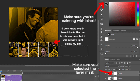
To make the effect better, add a layer UNDER the big gif, and using the torn paper brush, with the same size, you can paint under it:
Yeah, I covered some of jake's face, but that's how it supposed to look so the effect works!
And finally for the text! I used Granesta, at 150 px, and at -10.00º to make it a bit askew.
We're going to double click on it and give it a color overlay, set to normal, and give it a solid shadow if you want, then place it right here on the corner:
But as you can see, it's too big for the gif. So we're going to add a layer mask to it, and again, shape it the same way that we did with the gif. Make sure they're exactly the same shape, like this:

And that's it! This is our final result:

As always I'm sure there are easier ways to do many of these things, this is just how i do it but if you know an easier way to do it, go ahead. I hope this was at least understandable enough so you can apply the logic of it any way you want :)
If you have any questions you can send me an ask and i'll clarify!
If you found this helpful i'd really appreciate it if you left a tip on my ko-fi!
Happy giffing!
#will i ever learn how to properly explain things 😭#tutorials#uservivaldi#userraffa#userbuckleys#userhallie#tuserheidi#usertina#userfern#usersole#usercera#userzaynab#userisaiah#usernik#userpriyas#usertj
413 notes
·
View notes
Text
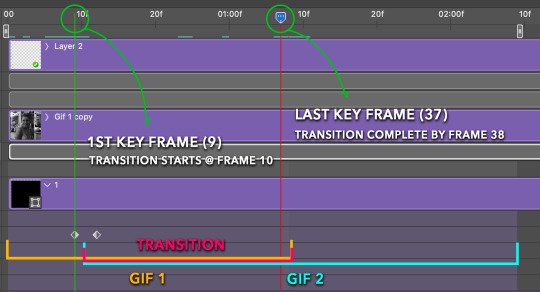
Someone asked me how I created the fade transition in this gifset which I’ll try to explain in the most comprehensive way that I can. If you've never done something like this before, I suggest reading through the full tutorial before attempting it so you know what you'll need to plan for.
To follow, you should have:
basic knowledge of how to make gifs in photoshop
some familiarity with the concept of how keyframes work
patience
Difficulty level: Moderate/advanced
Prep + overview
First and foremost, make the two gifs you'll be using. Both will need to have about the same amount of frames.
For ref the gif in my example is 540x540.
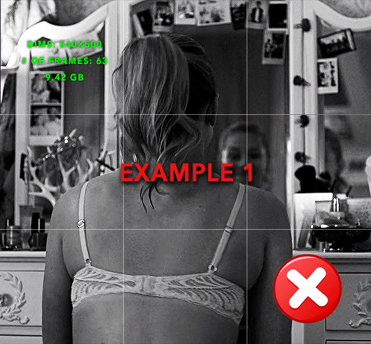
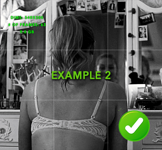
I recommend around 60-70 frames max total for a big gif, which can be pushing it if both are in color, then I would aim for 50-60. My gif has a total of 74 frames which I finessed using lossy and this will be explained in Part 4.
⚠️ IMPORTANT: when overlaying two or more gifs and when using key frames, you MUST set your frame delay to 0.03 fps for each gif, which can be changed to 0.05 fps or anything else that you want after converting the combined canvas back into frames. But both gifs have to be set to 0.03 before you convert them to timeline to avoid duplicated frames that don't match up, resulting in an unpleasantly choppy finish.
Part 1: Getting Started
Drag one of your gifs onto the other so they're both on the same canvas.
The gif that your canvas is fading FROM (Gif 1) should be on top of the gif it is fading INTO (Gif 2).
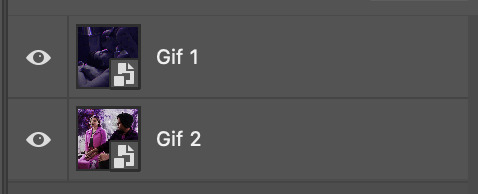
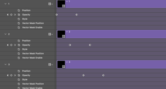
And here's a visual of the order in which your layers should appear by the end of this tutorial, so you know what you're working toward achieving:

Part 2: Creating the grid
Go to: View > Guides > New guide layout
I chose 5 columns and 5 rows to get the result of 25 squares.
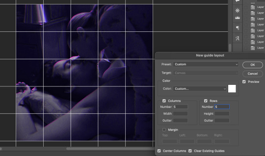
The more rows and columns you choose, the more work you'll have to do, and the faster your squares will have to fade out so keep that in mind. I wouldn't recommend any more than 25 squares for this type of transition.

To save time, duplicate the line you've created 3 more times, or as many times as needed (key shortcut: CMD +J) and move each one to align with the guides both horizontally and vertically. You won't need to recreate the lines on the edges of the canvas, only the ones that will show.
After you complete this step, you will no longer need the guides so you can go back in and clear them.

Follow the same duplicating process for the squares with the rectangle tool using the lines you've created.
Align the squares inside the grid lines. The squares should not overlap the lines but fit precisely inside them.
This might take a few tries for each because although to the eye, the squares look all exactly the same size, you'll notice that if you try to use the same duplicated square for every single one without alterations, many of them will be a few pixels off and you'll have to transform the paths to fit.
To do this go to edit > transform path and hold down the command key with the control key as you move one edge to fill the space.
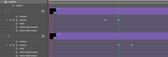
Once you're done, put all the squares in their separate group, which needs to be sandwiched between Gif 1 and Gif 2.

Right click Gif 1 and choose "create clipping mask" from the drop down to mask it to the squares group. This step is super important.
After this point, I also took the opacity of the line groups down to about 40% so the lines wouldn't be so bold. Doing this revealed some squares that needed fixing so even if you aren't going dim the lines, I recommend clicking off the visibility of the lines for a moment to make sure everything is covered properly.

Part 3A: Prep For Key framing
I wanted my squares to fade out in a random-like fashion and if you want the same effect, you will have to decide which squares you want to fade out first, or reversely, which parts of Gif 2 you want to be revealed first.
In order to see what's going on underneath, I made Gif 1 invisible and turned down the opacity of the squares group.

If you want text underneath to be revealed when the squares fade away, I would add that now, and place the text group above Gif 2, but under the squares group.

Make a mental note that where your text is placed and the order in which it will be revealed is also something you will have to plan for.
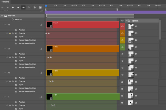
With the move tool, click on the first square you want to fade out. Every time you click on a square, it will reveal itself in your layers.
I chose A3 to be the first square to fade and I'm gonna move this one to the very top of all the other square layers.
So if I click on D2 next, that layer would need to be moved under the A3 layer and so on. You'll go back and forth between doing this and adding key frames to each one. As you go along, it's crucial that you put them in order from top to bottom and highly suggested that you rename the layers (numerically for example) which will make it easier to see where you've left off as your dragging the layers into place.

Part 3B: Adding the Keyframes
This is where we enter the gates of hell things become tedious.
Open up the squares group in the timeline panel so you can see all the clips.
Here is my example of the general pattern that's followed and its corresponding layers of what you want to achieve when you're finished:
So let’s try it!
Expand the control time magnification all the way to the right so you can see every frame per second.

As shown in Part 3A, select your first chosen square.
Where you place the time-indicator on the panel will indicate the placement of the keyframe. Click on the clock next to opacity to place your first keyframe.

Move the time-indicator over 3 frames and place the next key frame.

Things to consider before moving forward:
Where you place your very first keyframe will be detrimental. If you're using a lot of squares like I did, you may have to start the transition sooner than preferred.
If you're doing 25 squares, the key frames will have to be more condensed which means more overlapping because more frames are required to finish the transition, verses if you're only using a 9-squared grid. See Part 4 for more detailed examples of this.
The opacity will remain at 100% for every initial key frame, and the second one will be at 0%.
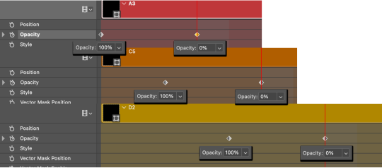
Instead of creating two keyframes like this and changing the opacities for every single clip, you can copy the keyframes and paste them onto the other clips by click-dragging your mouse over both of them and they'll both turn yellow. Then right click one of the keyframes and hit copy.
Now drop down to your next clip, move your time-indicator if necessary to the spot where the first keyframe will start and click the clock to create one. Then right click it and hit "paste".

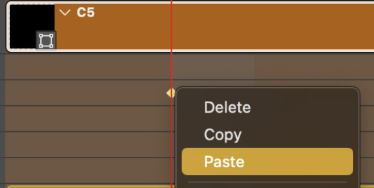
Tip: When you have both keyframes selected, you can also move them side to side by click-dragging one of them while both are highlighted.
Your full repetitive process in steps will go as follows:
click on square of choice on the canvas
drag that square layer to the top under the last renamed
in timeline panel: drop down to next clip, move time-indicator tick to your chosen spot for the next keyframe
create new keyframe
right click new keyframe & paste copied keyframes
repeat until you've done this with every square in the group
Now you can change the opacity of your squares layer group back to 100% and turn on the visibility of Gif 1. Then hit play to see the magic happen.
PART 4: Finished examples
Example 1
the transition starts too soon Cause: initial keyframe was placed at frame 0
the squares fade away too quickly Cause: overlapping keyframes, seen below. (this may be the ideal way to go with more squares, but for only 9, it's too fast)
Example 2
more frame time for first gif
transition wraps up at a good point Cause: in this instance, the first keyframe was placed 9 frames in, and the keyframes are not overlapping. The sequential pair starts where the last pair ended, creating a slower fade of each square.
Part 5: Final Tips and Saving
You can dl my save action here which will convert everything back into frames, change the frame rate to 0.05 and open the export window so you can see the size of the gif immediately.
If it's over 10gb, one way to finesse this is by use of lossy. By definition, lossy “compresses by removing background data” and therefore quality can be lost when pushed too far. But for most gifs, I have not noticed a deterioration in quality at all when saving with lossy until you start getting into 15-20 or higher, then it will start eating away at your gif so keep it minimal.

If you've done this and your gif is losing a noticeable amount of quality and you still haven’t gotten it below 10mb, you will have no choice but to start deleting frames.
When it comes to transitions like this one, sometimes you can't spare a single frame and if this is the case, you will have to return to the timeline state in your history and condense the key frames to fade out quicker so you can shorten the gif. You should always save a history point before converting so you have a bookmark to go back to in case this happens.
That's pretty much it, free to shoot me an ask on here or on @jugheadjones with any questions.
#gif tutorial#photoshop tutorial#transition tutorial#grid tutorial#usergif#ps help#tutorials#tutorials*#resources*#requested
470 notes
·
View notes
Text

A quick method to deal with blurry action shots that have Hannibal's quintessential dim lighting + green color grading combo.
Here's the example I'll be using:

Don't get me wrong, I love the look of Hannibal, but the average person doesn't scroll tumblr with their screen brightness on max. Plus, night light filters and blue light glasses add even more yellow to an already heavily filtered show. If you want people to see your gif clearly, you have to edit it at least a little. Especially for extreme shots like this lol.
What I use: macOS 15.1.1 Elmedia Player 8.18 dupeGuru 4.3.1 Topaz Photo AI 3.2.0 Photoshop 25.11.0 LuLu 2.6.3 (optional, but it's nice to block outgoing connections from pirated programs)
Step One: Take Screenshots
Open your video file (1080p preferred) in Elmedia Player and navigate to the first frame of your gif. Hit "Playback > Record a Series of Screenshots" and let it run until you have all the frames you want. Unfortunately for mac users, we have a problem where a lot of duplicate screenshots are taken (like every third screenshot is a duplicate... it's so annoying). To save time later, I use dupeGuru to clean out as many duplicates as I can.
Open dupeGuru and add whatever folder you saved your screenshots to.

Scan the folder, then hit "Mark > Mark All" (you can see here that the program only caught one duplicate, which means more work later. it's not a perfect program -_-)

Hit "Actions > Send Marked to Recycle Bin..." to remove the duplicates from the folder

Step Two: Denoise
At this stage the screenshots are so dark that the noise isn't obvious, but it'll be more noticeable after brightening and sharpening. Here's the difference this step makes later:

Upload all your screenshots to Topaz Photo AI and add a Denoise layer. I normally go with the automatic settings.

Hit "Select All," "Apply > Current Settings," then export all your images. This can take a while depending on how many images you have.

Step Three: Create Frame Animation in Photoshop
If you've read any other gif-making tutorials this part should be familiar, so I'm gonna skim over it.
"File > Scripts > Load Files into Stack"
"Browse..." and select your Topaz output files
"Sort by Name" so they load in the correct order
"Ok"
Once all the layers have loaded, hit "Create Frame Animation" in the Timeline window
Under the Timeline window options menu, hit "Make Frames from Layers," then "Reverse Frames"
This is probably when you want to go through frame-by-frame and delete any remaining duplicates. It's very annoying to have to redo this step if you want to go back and edit your crop size later. (Not that I would know... 🤡)
Step Four: Crop + Resize
Crop, then "Image > Image Size" to adjust the width of your gif. You'll most likely want to use one of the common tumblr image dimensions:
Keep in mind that tumblr's gif size limit is 10 MB. But it's honestly best to keep it under 9.5 MB if you want the gif to load smoothly. A 540x540 px gif can have 40-60 frames while a smaller gif can be longer.
Make sure to add +2 px to whichever width you choose (so 542 px, 270 px, etc), since we'll be adjusting the canvas size later to get rid of transparent border anomalies.
Step Five: Color
The more common order of operations is to sharpen before coloring, but for dark scenes like this, it's kinda silly to sharpen when you can barely see what you're doing, so I like to color first.
Select all your frame layers and make a new group, just to keep them separate from your adjustment layers.
I always start by testing out the Auto Color Correction Options in a Curves adjustment layer. To access them, opt + click on the Auto button. This opens a window with four options.
I like to use a combination of "Enhance Per Channel Contrast" and "Find Dark & Light Colors," though either option can be used to adjust color balance. The important part is selecting "Snap Neutral Midtones" and picking a midtone that brings your gif as close as possible to the desired color balance.

If changing the midtone doesn't affect the color balance, brighten the gif first and try again.
For this gif, "Enhance Per Channel Contrast" removed the bulk of the green filter:

It's still pretty dark, so I brightened up the gif with some more Curves layers:

There's still a lot of purple/blue in Dolarhyde's black leather jacket, so I added another Curves layer and used "Find Dark & Light Colors" to improve the blackpoint:

Now we can up the contrast a little:

Nice! Good enough to move onto sharpening!
SIDE NOTE: The reason I use these Color Correction Options is because simply brightening leaves you with purple/blue shadows and sickly green over-exposed highlights that take ages to color correct. You can see the difference here:

(If you've ever wondered why so many Hannibal gifs have blue shadows, this is why.)
Step Six: Sharpen
This is where you'll want to start implementing actions, which are pre-recorded series of adjustments that you can perform with the click of a button. I mainly use three actions (download here, open the Actions window in PS, open the Action options menu, and click "Load Actions...").
The "frame animation to smart object" action converts the gif to a video timeline so we can apply smart filters.
The "legacy sharpening + high pass" action applies my standard sharpening filters. Not every gif will need the high pass filter, so feel free to change its opacity or delete it altogether. You can also tweak the smart sharpen filters by right clicking them and selecting "Edit Smart Filter..."

3. Once you're happy with the sharpness, the "convert to frame timeline" action turns the gif back into a frame animation. I use a 0.05 s frame delay for most gifs (equivalent to 20 fps; 24 fps is standard for tv/movies). I normally use 0.07-0.08 seconds for action shots, so the gif doesn't whip around so fast. Over 0.1 seconds, it starts to look like stop motion, so I try to avoid that.
Step Seven: Final Adjustments
This is where I fine-tune the colors, mostly using Hue/Saturation layers.
If I use a Color Balance layer, I only make very small adjustments and try to counterbalance them in the other tonal ranges (e.i. adjustments to the Highlights spill over to the Midtones, so I make the opposite adjustments to the Midtones to fix it). But most of the time, I'd rather play around with Curves or Hue/Saturation to fix stuff like that.
Hue/Saturation gives you more control by allowing you to select the exact color range you want to affect. For this gif, I used Hue/Saturation to get rid of the purple introduced around the highlights in Will's hair by the high pass filter.
The eyedropper tool allows you to select the exact color you want to include in the range. Then you can move the bars around until all the colors you don't want to affect are excluded.

Once you have your range selected, you can bring the saturation all the way down and set it to whatever lightness you prefer:

I also reduced cyan's saturation so that Will's shirt wouldn't look quite so blue.

[You could do a lot more to make the colors prettier... but there are other tutorials online for that. 😅]
Step Eight: Export
Once you're happy with your final product, go to "File > Export > Save for Web (Legacy)..."
These are my settings:

You can use Diffusion instead of Pattern if you want. Diffusion is probably better for mobile gif compression, but I like the way Pattern looks on desktop, especially for gifs with smooth gradients. It's a personal preference thing.
Hit "Save..." and you're all done!

This isn't gonna win any gif-making awards, but at least you can see what's happening and the colors don't look wonky. And for Hannibal, I call that a win! 🥲👍
75 notes
·
View notes
Note
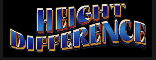
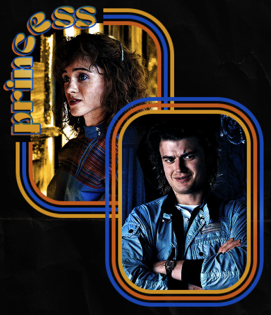
hello! I love your edits and I wanted to know, for the "Steve Robin and Nancy" Gif you posted.. How would I go about doing something like that? More specificly, the bottom two where it says "Height Difference" and where it labels them as "Princess, Jock and Loser"
Thank you! Sorry this took a while to answer. I finally had time to sit down and write this. Link to original post.
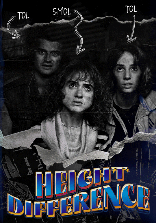

Quick notes: I'm using Photoshop 2021 on Mac and working in video timeline. Must have basic gifmaking skills and know how to use layer masks. This is primarily a gif layout and text tutorial.
Fonts used in first gif:
Pea Wolfe Tracks — link here
King & Queen — link here
Fonts used in second gif:
Kiera — link here
Post — link here
Ellianarelle's Path — link here
Heina's hurry — link here
I used a light leaks/film texture, ripped paper textures, folded paper textures, and transparent pngs (arrows + post-it notes + smiley face).
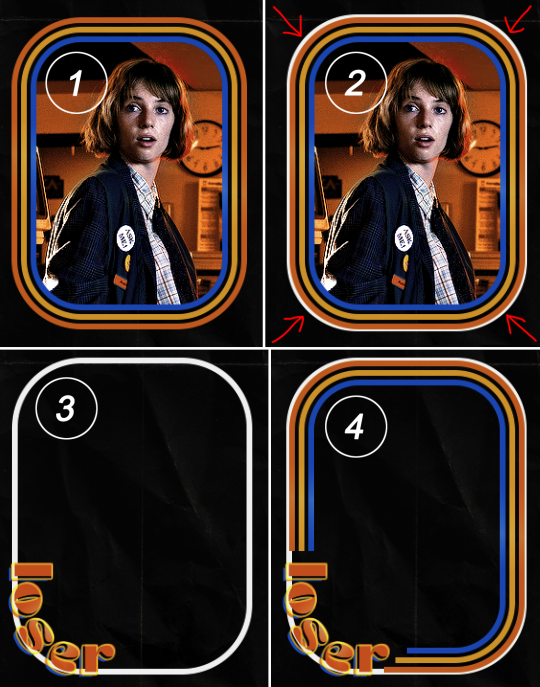
We'll start with this gif.
Make your gif! The gif here is 540x600px. I color and sharpen it to my liking. Go to image > canvas size > change height from 600 to 770px. I left the anchor in the middle, though it doesn't really matter.
I drag and drop my folded paper texture and change the layer order so it's under my gif. Then I change the blending mode on my gif to Screen so the texture shows through the gif, but I keep the texture at 100% Opacity and Fill.
Now I move my gif around and add my ripped paper textures. I wanted to give it a sort of poster-like feel to it, so I made more room on the bottom for my main text and ended up with something like this. Blending mode is set to Lighten for the ripped paper textures.
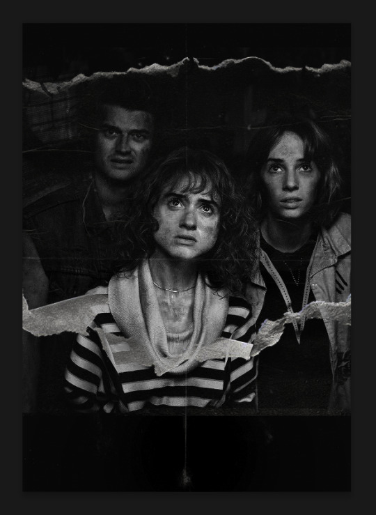
I then use layer masks to hide what I don't want shown and add my light leaks/film texture. Blending mode on light leaks/film texture set to Pin Light, Opacity: 50%, Fill: 70%.
I use Levels and Brightness/Contrast adjustment layers to darken the gif up a bit more, then I add a patterned paper texture. Blending mode for patterned paper texture set to Lighten, Opacity: 100%, Fill: 75%. Result:
Now on to the text!
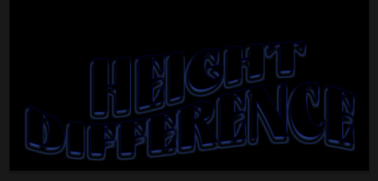
I'm going to be honest here, a lot of this was clicking around until I settled on something I liked. There's three layers to create this text effect. The font used here is King & Queen.
For the first text layer, the font color is set to black (#000000), font size: 87 pt, leading: 80 pt, tracking: 25.
Layer styles used here are stroke and drop shadow.
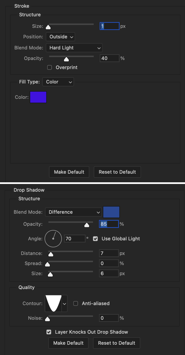
Text Layer 1
Stroke settings:
Size: 1px
Position: Outside
Blend Mode: Hard Light
Opacity: 40%
Overprint: unchecked
Fill Type: Color
Color: #5911ed
Drop Shadow settings:
Blend Mode: Difference
Color: #2d5ba8
Opacity: 85%
Angle: 70°
Use Global Light: checked
Distance: 7px
Spread: 0%
Size: 6px
Contour: Cone - Inverted
Anti-aliased: unchecked
Noise: 0%
Layer Knocks Out Drop Shadow: checked
Blending mode for text layer set to Overlay, Opacity: 100%, Fill: 85%.
Warp text settings:
Style: Wave
Horizontal: checked
Bend: +60%
Horizontal Distortion: +10%
Vertical Distortion: 0%
With all those settings applied, the first text layer looks like this:
Duplicate the layer, clear all layer styles, and change the color for the second text layer to white (#ffffff). All other text settings (including warp settings) should stay the same. The only layer style then applied to this text layer is stroke.
Text Layer 2
Stroke settings:
Size: 1px
Position: Outside
Blend Mode: Difference
Opacity: 100%
Overprint: unchecked
Fill Type: Color
Color: #d48f16

Blending mode for the second text layer is set to Difference, Opacity: 90%, Fill: 100%. Nudge the second text layer a bit so the first text layer is a little more visible or move to your liking.
With both those layers active, it looks like this:
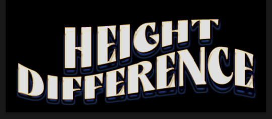
Duplicate the second text layer, clear layer styles, and change the color of this third text layer to a dark grey (#1a1919). Again, all other text (and warp) settings should stay the same.
Layer styles applied to this layer are stroke and gradient overlay.
Text Layer 3
Stroke settings:
Size: 1px
Position: Outside
Blend Mode: Difference
Opacity: 100%
Overprint: unchecked
Fill Type: Color
Color: #d48f16
Gradient Overlay settings:
Blend Mode: Difference
Dither: unchecked
Opacity: 100%
Gradient: #cd3f00 > #ffdb5d
Reverse: unchecked
Style: Reflected
Align with Layer: checked
Angle: 90°
Scale: 100%

Blending mode for the third text layer set to Exclusion, Opacity: 100%, Fill: 100%. I also moved the third text layer around, down and to the right a few pixels to give it that 3-D Word Art effect.
With all three text layers active:
Next are the arrows.
Take your transparent pngs and place them to your liking. Blending mode for these is set to Difference, Opacity: 100%, Fill: 100%.
Command + click on an arrow thumbnail to select all the pixels in that layer. This is why the image must be transparent!
With that selection made and on a new blank layer, right click the selection and click on stroke. Settings for that are width: 2px, color: white, location: center. Move that a couple of pixels over.
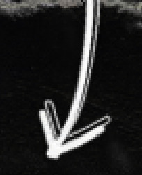
Do this for all arrows for a total of 6 layers for arrows. I group them together to keep my workspace clean, then I duplicate my arrows group with no further changes made to the second group to get what you see in the final gif.
Next is the smaller text. It's three separate text layers for each word, so I can move each of them around to my liking.
Font used is Pea Wolfe Tracks, font color: white (#ffffff), font size: 24 pt, leading: 6 pt, tracking: 25. Bold and italic options checked. I set the blending mode to Difference, Opacity: 100%, Fill: 100%.
And that's it! That concludes the tutorial for this gif!
Now on to this gif.
We'll start with the background gif. There are three separate gifs. You could make them one gif, but I wanted the option to order them differently if I needed to.
All gifs in the background are the size of the canvas: 540x770px. Color and sharpen to your liking, but keep them all black and white. To get the blurry effect go to filter > blur > guassian blur. Set radius to 7.0 pixels. Add this to all three gifs.
Then I add two folded paper textures. Blending mode for one set to Lighten, Opacity: 60%, Fill: 100%. The other set to Screen, Opacity: 70%, Fill: 90%.
I found this tutorial a while back for a halftone effect. They include links to the halftone pattern used here as well as textures and gradient maps not used here.
I'm only using the halftone pattern here.
Pattern fill settings:
Angle: 66°
Scale: 8%
Link with Layer: checked
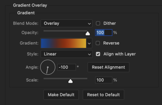
I also added a gradient overlay layer style to the halftone pattern which gives the gifs the color you see above.
Gradient Overlay settings:
Blend Mode: Overlay
Dither: unchecked
Opacity: 100%
Gradient: #0059ac > #a33600 > #e6b801
Reverse: unchecked
Style: Linear
Align with Layer: checked
Angle: -100°
Scale: 100%
Now on to the square shapes with rounded corners. In the interest of keeping this tutorial short(er), I found this tutorial on youtube that explains how to make squares with rounded corners.
I set my stroke size to 6px, stroke color to white (#ffffff), and fill to no color. I don't use the stroke layer style to make the borders of the shape like in the video! I'm only linking the video to show how to curve corners with square shapes.
Note: Be sure you know how big or small you want these to be and how they're going to fit on your canvas in order to make all the shapes and edit them. It can be tedious to change the settings.
Duplicate and resize to your liking.
In this instance, I wanted to make three squares total, so I had to duplicate twice and resize until I had something I liked.
Settings for the shapes used here are:
Innermost shape: W: 200px, H: 280px, corners: 50px
Middle shape: W: 220px, H: 300px, corners: 60px
Outer shape: W: 240px, H: 320px, corners: 70px
Once I have the size I want for all three shapes, I group them together to make a set and duplicate that group twice, then adjust each set on the canvas for my layout.
What the sets look like all together:
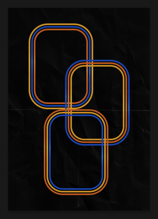
Colors used: orange #e47100, blue #0062d1, yellow #ecac00
To add color to the shapes, either change the color of the shape itself or use layer styles. I used layer styles.
Note: I didn't add the colors until the end after I knew what gifs went where and what color scheme I wanted, but I don't want to add more images than I need to here.
To keep this short, I found this tutorial on youtube that explains how to wrap text around a shape. However, I wanted the text to align on the outside where the white line is and not the green line (left image):
So I created another shape just inside the innermost square and used that as a path for my text (right image). Adjust the text to your liking until you have your text where you want it. Refer to the video tutorial if you need help moving the text along the path!
You don't need the shape path once you have your text where you want it, so use the layer visibility tool to hide it. You can hide your other shapes too so you can work with your text.
Do not delete your shape path!
I duplicate it once I start working with my "jock" text since all the sets are the same size. The "loser" text has to be worked a little differently, but we'll get to that later.
For the princess, jock, and loser text, there are two text layers to create the overall effect. For both layers, font used is Kiera, font color set to white (#ffffff), font size: 60 pt, blending mode set to Normal.
I added a gradient overlay layer style to the first text layer which I'll call the base layer. Opacity for this layer is 100%, Fill: 100%.
Base Layer
Gradient Overlay settings:
Blend Mode: Normal
Dither: unchecked
Opacity: 100%
Gradient: #f0b002 > #e7f0fd
Reverse: checked
Style: Diamond
Align with Layer: checked
Angle: 90°
Scale: 100%
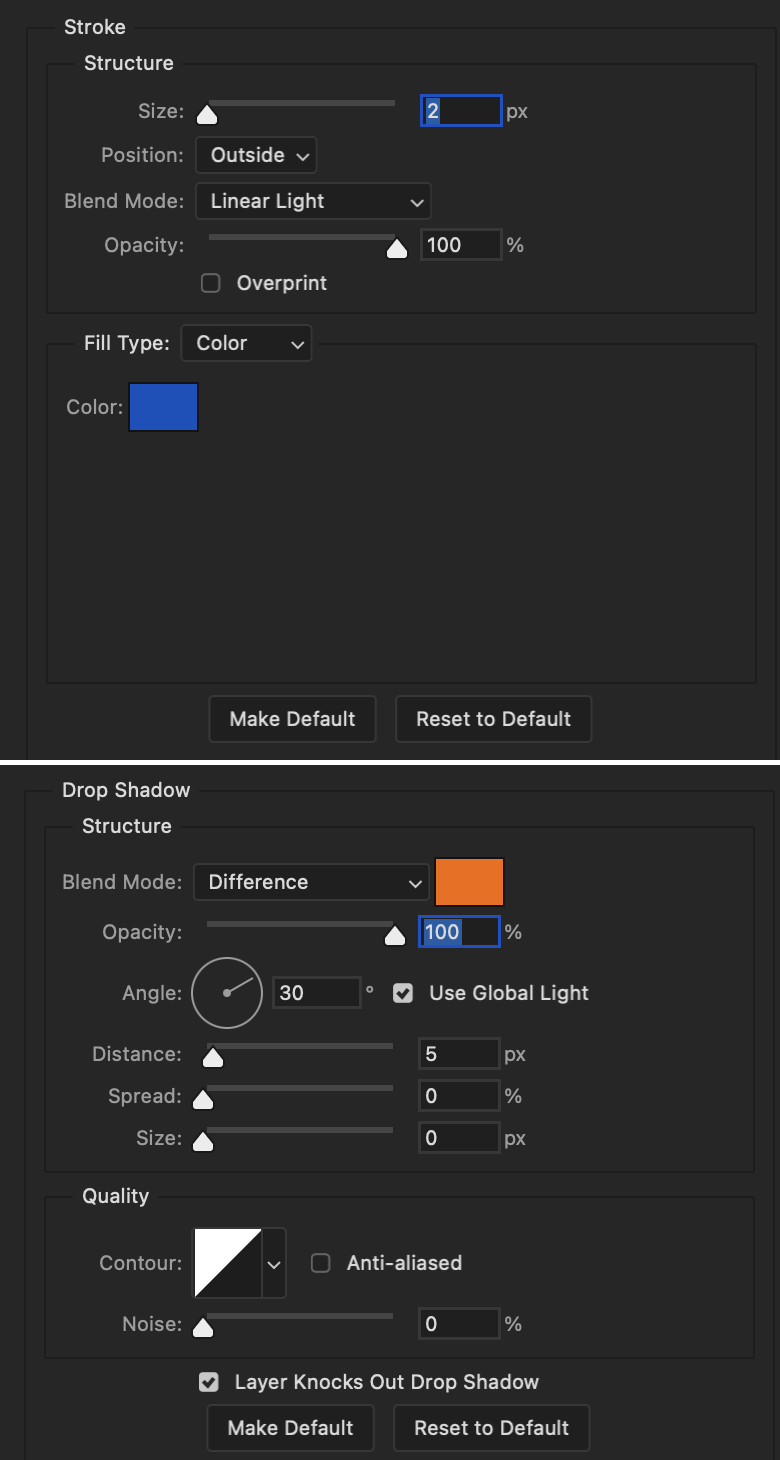
The second text layer is your stroke and drop shadow layer. For this layer, opacity is set to 100%, Fill: 0%.
Stroke and Drop Shadow Layer
Stroke settings:
Size: 2px
Position: Outside
Blend Mode: Linear Light
Opacity: 100%
Overprint: unchecked
Fill Type: Color
Color: #0064cb
Drop Shadow settings:
Blend Mode: Difference
Color: #fb7c00
Opacity: 100%
Angle: 30°
Use Global Light: checked
Distance: 5px
Spread: 0%
Size: 0px
Contour: Linear
Anti-aliased: unchecked
Noise: 0%
Layer Knocks Out Drop Shadow: checked
End result looks like this:

When I make my shapes visible again (minus the one I used as a path), I get this:
The shapes are clearly in the way of the text, whether they're above my shapes layer or under it. I use layer masks to hide what I want, so the text is legible. It looks cleaner this way and I wanted the text to be a part of the shape itself. I do that for each rounded square.
Now on to my smaller gifs. I like to crop, resize, sharpen, and color separately because my laptop and Photoshop would kill me if I tried to do it all on one canvas. I use the size of the middle shape for my gifs (220x300px), so I can have a little wiggle room when adjusting. I then use a layer mask to hide the parts of the gif that are outside of the shape.
A quick way to do this is to command + click on the thumbnail of the innermost square. With that selection made, I got to my gif layer and add a layer mask. Sometimes you need to invert it. Use command + i with the layer mask selected (not the gif) to invert the layer mask.
I repeat this process with my Steve and Robin gifs. I have to go back and forth with all the layer masks to hide parts of the gif/shapes I don't want for each set. It's kind of a long process, but not all that difficult. I label and group my layers together as I work to keep things clean and it helps me keep track of what I edited and what needs to be edited when it comes to things like this.
The picture below shows where I hid the bottom right corner of Nancy as well as the shapes that make up her set using layer masks. I also did this with the Steve and Robin sets, hiding the bottom left corner of Steve.

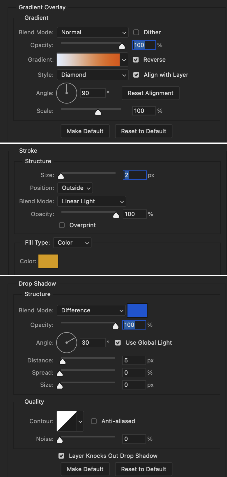
Similar text settings used for jock. The gradient overlay layer style for this base layer is different than that of princess because of the positioning of the text. Again, same as princess, two text layers are used here. Blending mode, opacity, and fill for both are the same as the princess text layers as mentioned before.
Base Layer
Gradient Overlay settings:
Blend Mode: Normal
Dither: unchecked
Opacity: 100%
Gradient: #007aec > move bottom middle dot to 80% > #e7f0fd
Reverse: checked
Style: Diamond
Align with Layer: checked
Angle: -140°
Scale: 100%
Stroke and Drop Shadow Layer
Stroke settings:
Size: 2px
Position: Outside
Blend Mode: Linear Light
Opacity: 100%
Overprint: unchecked
Fill Type: Color
Color: #a05700
Drop Shadow settings:
Blend Mode: Difference
Color: #ffba00
Opacity: 100%
Angle: 30°
Use Global Light: checked
Distance: 5px
Spread: 0%
Size: 0px
Contour: Linear
Anti-aliased: unchecked
Noise: 0%
Layer Knocks Out Drop Shadow: checked
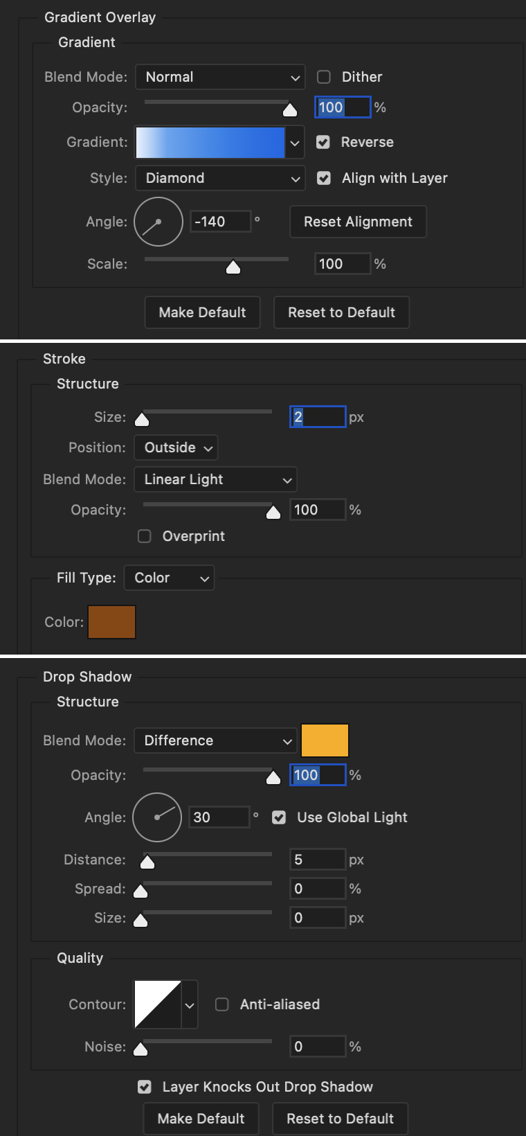
Image 1: We start with Robin.
Image 2: To make the loser text, I had to create a new path.
Image 3: I make it so the text is on the inside of the path instead of the outside. (Hint: Refer to video tutorial if you don't know how to do that.) I then adjusted the tracking between the letters in the word "loser" so they didn't look so squished together.
Image 4: Then I use layer masks to hide the parts of the shape I don't want shown.
You can then hide the path or delete it. You only need it if you want to adjust the placement of the text. I keep it (hidden) just in case.
Text settings for loser are just like those for princess. Blending mode, opacity, and fill are also the same.
Base Layer
Gradient Overlay settings:
Blend Mode: Normal
Dither: unchecked
Opacity: 100%
Gradient: #eb6400 > #e7f0fd
Reverse: checked
Style: Diamond
Align with Layer: checked
Angle: 90°
Scale: 100%
Stroke and Drop Shadow Layer
Stroke settings:
Size: 2px
Position: Outside
Blend Mode: Linear Light
Opacity: 100%
Overprint: unchecked
Fill Type: Color
Color: #e1a900
Drop Shadow settings:
Blend Mode: Difference
Color: #0068de
Opacity: 100%
Angle: 30°
Use Global Light: checked
Distance: 5px
Spread: 0%
Size: 0px
Contour: Linear
Anti-aliased: unchecked
Noise: 0%
Layer Knocks Out Drop Shadow: checked
Next are the post-it notes! This is probably the easiest part of making this gif. You just have to repeat this process for however many post-it notes you're making.
Image 1: To start, place your transparent post-it note where you want it. You can also rotate it if you'd like.
Image 2: Then create a text layer and write what you want. Font used here is Post. I wanted this text underlined to give emphasis, so I click on the underline option. I also adjusted the leading because I wanted more space between the word and the line. Rotate the text so it looks like it's written on the post-it note. Note: It looks better if you choose a font that looks handwritten.
Image 3: I wanted another line to give emphasis to the "Dingus!!" text and make it seem more handwritten. I use the line tool to create another line.
Image 4: Then I adjust that line to my liking.

Fonts used for notes: Post, Ellianarelle's Path, and Heina's hurry
Repeat this process for all post-it notes!
That finishes the tutorial! (And I hit the 30 image limit lol.) I hope this helps. If you have any further questions, feel free to send an ask or IM and I'll try to answer to the best of my ability.
Happy photoshopping!
#ask#pcocana#photoshop#photoshop tutorial#tutorials#*tutorials#userchibi#userbunneis#uservivaldi#userriel#userabs#usertiny#useralien#useraljoscha#userfanni#userraffa#tusermona#userbess#userrobin#userroza#quicklings#janielook#usernaureen#userrlorelei#tsusermels#tusermimi#userelio#usertj#userbarrow#usernolan
294 notes
·
View notes
Note
hello, those gifset for ready or not is great!!
https://www.tumblr.com/billysjoel/781204370023972864/sleeping-inside-a-hearse-kizzyedgelll-requested?source=share
i was wondering if you could explain how made this second and fourth gif, splitting the gif into two with each a different colouring
hi, first of all, thank you so much!! i ended up pretty proud of this set! below the cut, i'll walk you through how to do the ripped paper effect with different coloring for both gifs!

first, i made both gifs separately. when i'm combining multiple gifs into one canvas, i typically do not crop them beforehand and instead leave them at their original dimensions so i can move them where necessary on the final canvas. this is totally personal preference.
in this case, my final canvas was 540px by 540px. i create this canvas separately and then bring both gifs over to it. i've sharpened them, but left them uncolored and uncropped.
once both gifs are on the same canvas, i add the ripped paper texture/brush. now, you can do this effect with any sort of texture or brush, not just one that looks like ripped paper, but that's what i used for this set. you can find all sorts of brushes on my resource blog or you can search for them on google or other PS resource websites. you can do the same with textures as well -- here's that tag on my resource blog.
the most important parts are the order of your layers and using clipping masks. for this effect to work, you need the brush/texture layer to go IN BETWEEN your two gif layers. if you're using a texture, you don't really need to do anything other than using either the transform tool (ctrl+t) or move tool (v) to position your texture where you'd like it. it depends on the look you're going for, but with both of the gifs in this set that use this technique, they're divided approximately in half.
if using a brush instead of a texture, you need to create a new layer in between both of your gifs first before stamping the brush in the desired location.
without any clipping masks, your canvas will just show the topmost layer, which we'll call gif #2. gif #1 is your bottom/lowest layer with the brush/texture layer above it and gif #2 at the very top. this is what my canvas looks like with gif #2 hidden so you can see the positioning of my ripped paper brush:

to create a clipping mask, right-click on the gif #2 layer and select "create clipping mask." now you should see both gifs with gif #2 only appearing where your brush/texture appears:
you can see that depending on your texture/brush and its positioning, you can end up with a lot of cool and dynamic arrangements! clipping masks and the order of our layers are going to continue to be very important in order to keep the coloring separate. if it gets hard to keep track of what is where, you can always rename your layers by double-clicking on them!
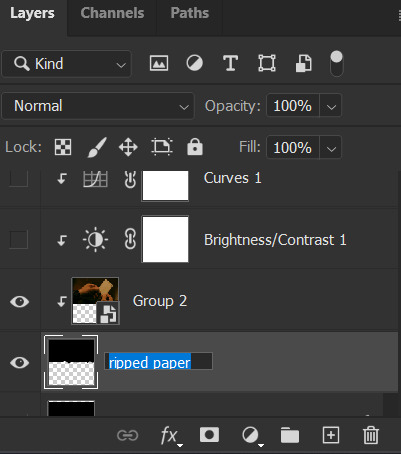
let's color gif #1 first. before adding your first adjustment layer, make sure you have gif #1 selected as any coloring layers need to be above gif #1 but BELOW your texture/brush layer. because gif #2 and the texture/brush layer are above gif #1 and whatever coloring layers, they will only apply to gif #1. you do NOT need to use clipping masks for gif #1. here are my coloring/adjustment layers and their settings (click to enlarge):

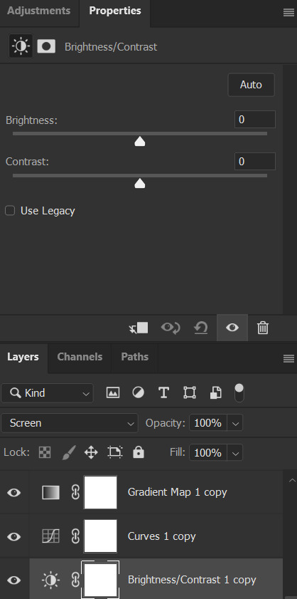


the coloring layers for gif #2 need to be above gif #2 and all of them must utilize clipping masks! with adjustment layers, there are a couple ways to do this. you can right-click on each of them and select "create clipping mask" like we did before or you can click this button underneath the properties tab of each layer:

here are these coloring layers and their settings:

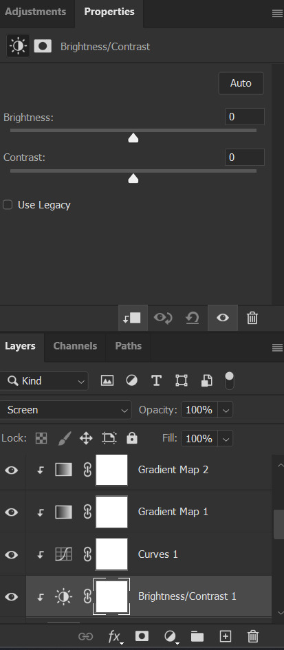

the last thing i did was add the drop shadow part of the texture/brush. to do this, i duplicated that layer and moved it down a handful of pixels using the transform tool (ctrl+t).
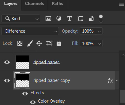
to add the color overlay effect (making it pink), double click the layer, select color overlay, and choose your color and applicable blending mode. i just chose a pink color and left its blending mode at normal and 100% opacity.
and that's pretty much it! as usual, please let me know if you have any additional questions -- about this tutorial or any of my other sets! (and so sorry this one took me so long!)
#answered#Anonymous#gif tutorial#coloring tutorial#overlay tutorial#gifmakerresource#completeresources#dailyresources#tutorials#my tutorials
47 notes
·
View notes
Text
It's midnight but fuck it manual blinkies tutorial!!!
@fae-vixen this one is for u >:3
STEP ONE:
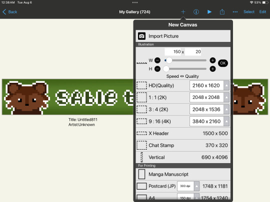
Open the art program of your choice. (Use one that can support small canvas sizes - I'm using Ibispaint on an ipad)
STEP TWO:
Create a new canvas. The dimensions of a blinkie are 150 pixels wide and 20 pixels tall.
STEP THREE:
For an easier time seeing the pixels, make sure 'interpolation on zoom in' is turned off (on ibispaint you can access this through the settings function). You can use the 'digital pen' set to size 1 to create individual pixels.

Interpolation on zoom in is directly beneath the black/white bars
STEP FOUR:
Draw something, whatever you want! Remember that you're going to be animating this, though, so keep the animated parts on a separate layer - in my case I want my fairies to move so they're on their own layer!
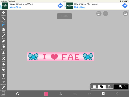
STEP FIVE:
duplicate the layers of the things you want to animate, and then move them a little bit! save the entire canvas as a png - making sure to save each frame separately.

STEP SIX:
Upload both frames into a gif making software - I'm using ezgif. (Open the website, hit the 'gif maker' button (not the video to gif one), then upload both of your pngs, and you can adjust the settings (speed, etc) from there!)


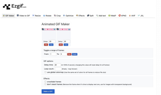
STEP SEVEN:
Download the gif you made, and now you've got your very own homemade blinkie!! :D
150 notes
·
View notes
Text


maziekeen’s 2 gif sharpening + 2 coloring psd base actions
hi there! well, i'm lazy... so i created a few actions to do the simple tasks such as creating base psd layers to edit my gifs. feel free to ask about how to use and customize them to your edits!
my coloring tutorials:
gif + coloring tutorial (yellow-ish scene)
two parts tutorial (neutral and dark)
hthaigtct tutorials, small ones from scratch no base psd
useful links:
download action (for photoshop CS5) includes: + 2 sharpenings + 1 colorful-ish base psd action + 1 neutral-ish base psd action
download psds (created from base action) + text settings: + psd 820 colorful-ish + psd 821 neutral-ish
crop sizes (new dimensions)
save for web & devices (gif settings)
my ko-fi <3
notes:
the adjustments layers used for the base psd action are:
1 curves with auto setting
1 curves with blending mode on screen and opacity 35% (adjustable to use)
1 levels
1 exposure
1 color balance
1 selective color with blending mode on color colorful-ish action: the values are focused on fixing the colors, especially cyan and blue, and making the red, yellow, green, and magenta more colorful neutral-ish action: the values are at the minimal, it's more like a base coloring and need to adjust the first and second curves
1 selective color with blending mode on luminosity where the values changed are white and black only
important:
the layers created are just a start, you'll need to adjust to use, add and remove them if necessary
#dearindies#gif tutorial#coloring tutorials#tutorials#psds#actions#gif sharpen action#my tutorials#my coloring tutorial#twedit#text settings#base psd
33 notes
·
View notes