#coloring tutorials
Explore tagged Tumblr posts
Visit Tumblr Blog
Explore Tumblr blogs with no restrictions, modern design and the best experience.
Last Seen Tumblr Blogs


Fun Fact
70% of Tumblr users say the Dashboard is their favorite place to spend time online.
Photo
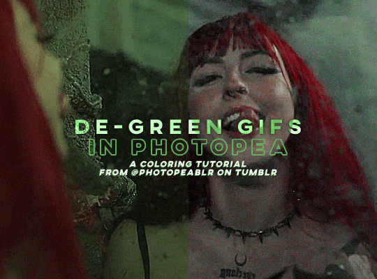
DE-GREEN GIFS in photopea — a coloring tutorial by kai at @photopeablr
howdy everyone! i come bearing another gift of a tutorial, as i’ve seen people run into this problem many times of giffing subjects being... incredibly difficult to de-green.
this tutorial requires:
photopea (free online photoshop)
basic giffing knowledge (check out our gif tutorials tag if you need to!)
with all that out of the way, let’s begin!
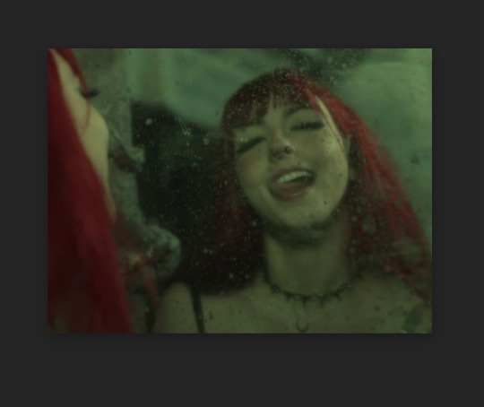
so first thing’s first, we need to get our gif loaded into photopea for us to start with. here’s a screenshot of my gif after i loaded in all the frames and cropped it to the size i wanted (540x400):
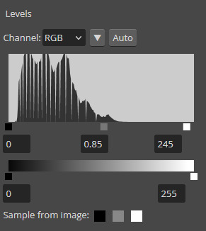
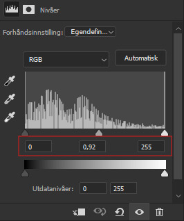
from here, we can start coloring! for those of you who haven’t read my coloring tutorial from a couple years ago, my method is more or less very similar to how it was back then. i still do the layer > adjustment layer > brightening/contrast step (though for this gif, i changed the opacity of the layer to 30%) and the layer > adjustment layer > levels, which i have set to these numbers in the pop up:
and doing all of that leaves us with our gif looking like this:
(i know the difference is very minimal but this tutorial is an entire process, give it a minute lol)
but now we get to the fun part: getting rid of that damn green filter.
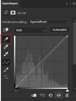
in my original coloring tutorial, i used a channel mixer layer because i was following a method similar to this tutorial. while that tutorial is great for yellow-tinted scenes (i still use that method to this day), over the years, i realized that it wasn’t as great for green-tinted gifs. this is how i started to play around with another adjustment layer known as color balance.
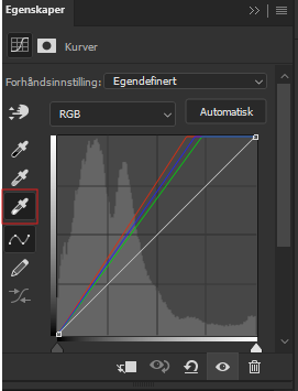
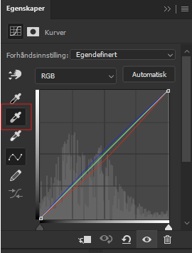
color balance does exactly what it sounds like it does: it balances the colors of your gif. since we’re trying to balance out all the green that’s happening in this gif, it makes sense to use this adjustment layer. go to layer > adjustment layer > color balance (visual below):
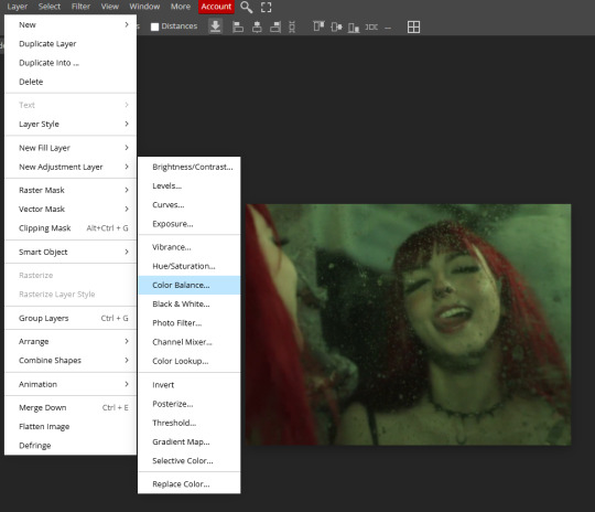
and you’ll get a pop up similar to the channel mixer adjustment layer, but just a bit different. this part of the tutorial requires for you to play around with this adjustment layer—the settings that you are going to use for any gif you make are gonna be different no matter what you’re giffing, so play around with the different settings to see how they mess with the colors of your gif until you get something that neutralizes the green for the gif you’re working with. for my gif here, these are the settings i used for the shadows, midtones, and highlights:

and in doing so, now my gif looks like this (with a before/after):

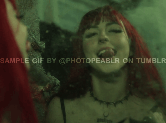
we’re only three adjustment layers in and it’s already MUCH better than what we had. color balance tends to do most of the work for us in getting the green filter out, so now we can do the rest of our coloring process (whatever that looks like for you) to finish the gif. here is the fully colored + sharpened gif:

and that’s it! a simple tutorial, but it’s immensely useful when giffing with weird green-toned scenes.
a couple things before i stop this tutorial: in some cases, sometimes you’ll need to combine a color balance layer with a channel mixer layer, but (at least in my gif experience) that’s few and far between. color balance is more or less the only layer i really need to use when trying to get rid of green tones, but sometimes scenes need a little extra touches with the channel mixer layer to help neutralize the gif a bit more so it’s easier to color later on in your coloring process. but, again, those are few and far between.
no matter what you’re giffing, color balance is a great base layer that you can build off of with other adjustment layers and should really help out in making that gross green filter go away!
#photopea#photopea tutorial#photopea gif tutorial#photopea tutorials#coloring tutorial#coloring tutorials#gif tutorials#gif tutorial#*#*kai#*tutorials#resources#usergoose#userheartbreak
52 notes
·
View notes
Text


maziekeen’s 2 gif sharpening + 2 coloring psd base actions
hi there! well, i'm lazy... so i created a few actions to do the simple tasks such as creating base psd layers to edit my gifs. feel free to ask about how to use and customize them to your edits!
my coloring tutorials:
gif + coloring tutorial (yellow-ish scene)
two parts tutorial (neutral and dark)
hthaigtct tutorials, small ones from scratch no base psd
useful links:
download action (for photoshop CS5) includes: + 2 sharpenings + 1 colorful-ish base psd action + 1 neutral-ish base psd action
download psds (created from base action) + text settings: + psd 820 colorful-ish + psd 821 neutral-ish
crop sizes (new dimensions)
save for web & devices (gif settings)
my ko-fi <3
notes:
the adjustments layers used for the base psd action are:
1 curves with auto setting
1 curves with blending mode on screen and opacity 35% (adjustable to use)
1 levels
1 exposure
1 color balance
1 selective color with blending mode on color colorful-ish action: the values are focused on fixing the colors, especially cyan and blue, and making the red, yellow, green, and magenta more colorful neutral-ish action: the values are at the minimal, it's more like a base coloring and need to adjust the first and second curves
1 selective color with blending mode on luminosity where the values changed are white and black only
important:
the layers created are just a start, you'll need to adjust to use, add and remove them if necessary
#dearindies#gif tutorial#coloring tutorials#tutorials#psds#actions#gif sharpen action#my tutorials#my coloring tutorial#twedit#text settings
30 notes
·
View notes
Text

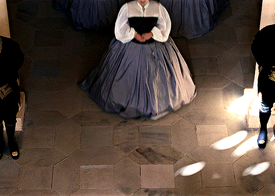
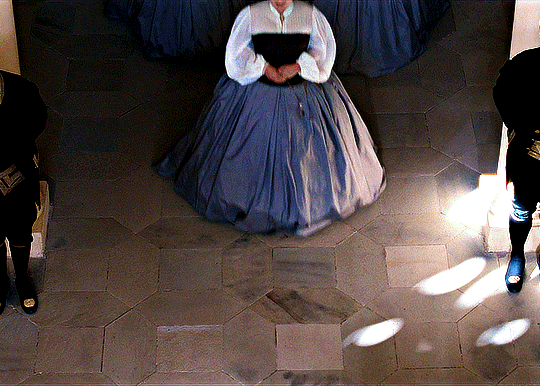
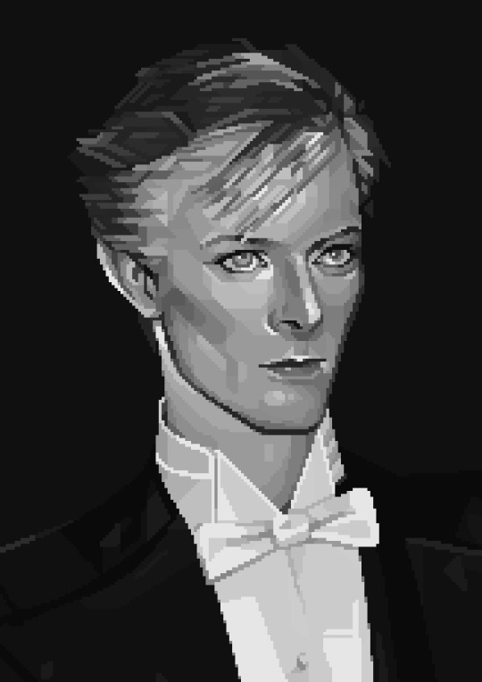
A curious anon kindly asked me to do a wee coloring tutorial of my gifs from The Empress (Die Kaiserin), specifially season two. So here goes!
Before we start, it's worth to note you will need photoshop to replicate this. Or some other similar software/web app. Idk. I use photoshop myself, so that's what I know.
(also pardon my norwegian. still haven't figured out how to turn it into english, so all screenshots will be with norwegian words on them)
I'll be using the gif in the header of this post, and this is how it looks with no filter/coloring (only sharpening):

I used the coloring for this on all the gifs I have made of season two of the The Empress, with some small adjustments when needed.
CURVES
I like to start of my coloring base with a few curves layers and build from there. One for light colors, one for mid/greys (??) and one for dark/shadows. I use the pipette tool to select what colors to balance in each layer.
Light:
Mid/grey:
Dark/shadows:
NOTE: There is no "one size fits all" kind of thing with curves. You have to adjust it a little to every single show or movie, or sometimes every single gif you make to make it look as good as possible. And the way to do that is to activate the pipette in the curves layer and click on different areas on your gif until you get the contrast/balance you like.
You can also do it all (light/mid/dark) in one layer, but i prefer to do them seperately. In case i fuck up.
Now our gif looks like this:

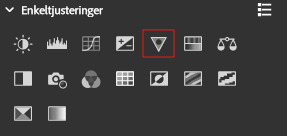
2. LEVELS
We could of course stop there.... but we won't. We need some finishing touches. The devil's in the details, or whatever they say.
Therefore, on to levels!

These were the settings I used. They can of course be adjusted if they're to heavy or light or whatever, depending on the gif at hand.
Now it looks like this:

Not the biggest difference, but trust the process, mkay?
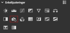
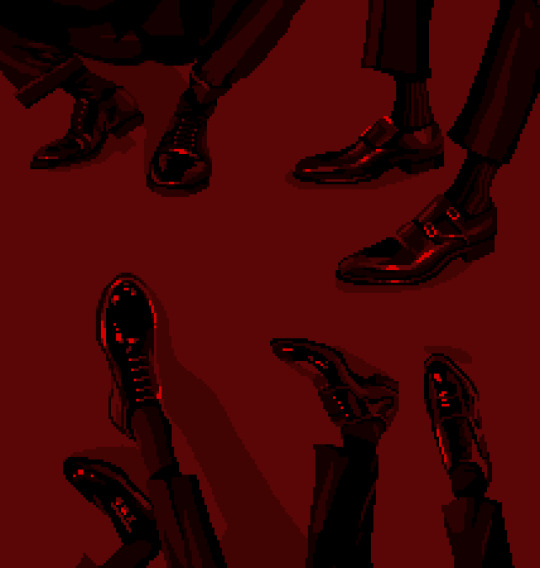
3. COLOR BALANCE
Settings:

Gif:
4. PHOTO FILTER
Settings:
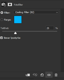
Gif:

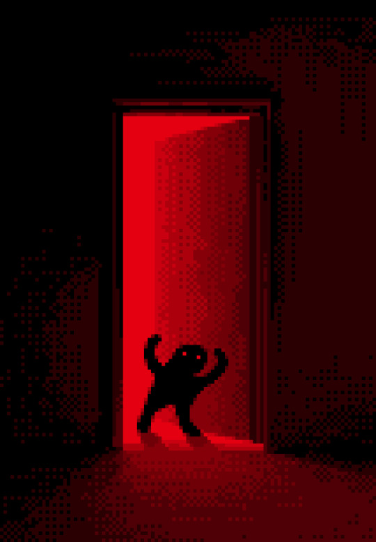
5. GLOW
Setting:

Gif:
And now for the final step.
6. BLACK-WHITE

Settings:
NOTE: The opcity of this layer is set to 36%.
Gif:

Et voilà, as they say. I hope this was helpful 🥰
And, like already mentioned, these layers are all adjusted a little to every single gif. The type of layers I use varies from show to show, so this is a mere suggestion. But I always use the curves layers as my base. I love them, most ardently.
19 notes
·
View notes
Text
🎨color study note
19K notes
·
View notes
Text
for all the artists out there, here are my favorite resources i use to learn!
Files
The Complete Famous Artist Course
Art Books and Resources
Art, Anatomy, and Color Books
PDF Files of Art Books
Morpho and Other Art Books
Mega Folder
Internet Archive
YouTube
My YouTube Playlist of Tutorials
How to Draw Facial Features
Drawing and Art Advice
Drawing Lessons
Art Fundamentals
Anatomy of the Human Body
2D Animation
Perspective Drawing
Websites
Pinterest Board for Poses
Another Pinterest Board for Poses
Pinterest Boards for References
Reference Angle
AdorkaStock
Figurosity
Line of Action
Human Anatomy
Posemaniacs
Animal Photo References
Humanae - Angélica Dass
Fine Art - Jimmy Nelson
Fashion History References
Fashion Museum
The Met Collection
Character Design References
CDR's Twitter Account
iamagco's Twitter Account
taco1704's Twitter Account
takuya_kakikata's Twitter Account
EtheringtonBro's Twitter Account
Drawabox
Color Wheel
Color Palette Cinema
Free Images and Pictures
Free Stock Photos
FILMGRAB
Screen Musings
William Nguyen Light Reference Tool
SketchFab - 3D Skeleton Model
Animation References - sakugabooru
Animation Screen Caps
Animation References - Bodies in Motion
#art#art resources#art books#anatomy#composition#painting#art tips#art help#art tutorial#perspective#color theory#art reference
41K notes
·
View notes
Text


Patreon Practices July
You can now purchase my brush set on my Patreon: https://www.patreon.com/c/ramonn90 Along with access to my process videos, files, and art insights.
.
Also! You can now pre-order my book Life in Every Sketch on the 3DTotal shop
#illustration#ramonn90#art#painting#photoshop#patreon#digital art#portrait#sketch#character design#cat#anime#digital painting#tutorial#coloring#art tips#art tutorial
1K notes
·
View notes
Text
⭐ Pixel Art Fundamentals - Hue Shifting
This technique is not uniquely specific to pixel art, but it's a very common term to hear when starting out watching those "dos and don'ts" videos. So what is hue shifting?
Hue shifting basically means to change the hue when making your shade darker or lighter. In this context, 'hue' = colour!
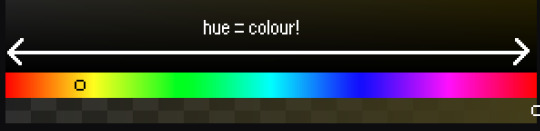
You may hear 'you need to hue shift more' when getting feedback on your art, but what does that mean really? Here are some examples:
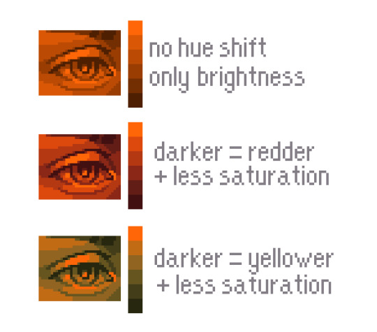
We can see even with just a bit of hue shifting, we have quite a different vibe for each drawing. In warm / daylight settings, no hue shifting can sometimes look a bit muddy or grey.
If we swap the image to grayscale, you can see that they look much the same:
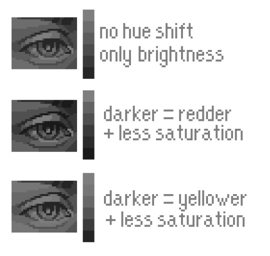
As long as the hue shifted colours have a brightness that makes sense, they usually will work. You can get quite wacky with it.

But is hue shifting always good? Not necessarily.
Below is some of my art where I intentionally didn't hue-shift at all. You can see it gives them an uncanny, digital, or photographic kind of look. As always, techniques are about your intention, or personal style.
I recommend trying different hue shifting methods! I especially love to use a cool blue or teal for the lighter shades.
Thanks for reading and I hope this helped a little! Have fun with it!!
⭐ Read my full pixel art guide here!
#pixel#pixelart#pixel art#pixel art tutorial#tutorial#art tutorial#colour theory#color theory#hue shifting#art#illustration#pixel illustration
6K notes
·
View notes
Text
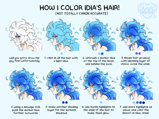
my hyperfix on twst is quickly coming back, so i'm trying to relearn how to draw idia's hair. i made this short coloring tutorial for myself, feel free to use it too if it helps!
#twst#twisted wonderland#idia shroud#twst idia#ignihyde#disney#disney twisted wonderland#art tutorial#coloring tutorial#digital art#fanart#twst fanart#ftr the blending modes are linear burn for shading and add for highlights#anyway i've been drawing him a lot for a very specific reason which will be revealed later. bc i'm shy
2K notes
·
View notes
Text
i had a dream...
#my art#ibispaint art#twisted wonderland#twst#ruggie bucchi#riddle rosehearts#uhhh idk whats the proper ship name..#i just think they be cute together#somebody please be a victim to my obsession to this ship#oh and this was a desperate plea to get ruggie card after 70 pulls#i got him on my 80th pull...#oh and drop coloring tutorials because colors hate me
574 notes
·
View notes
Text
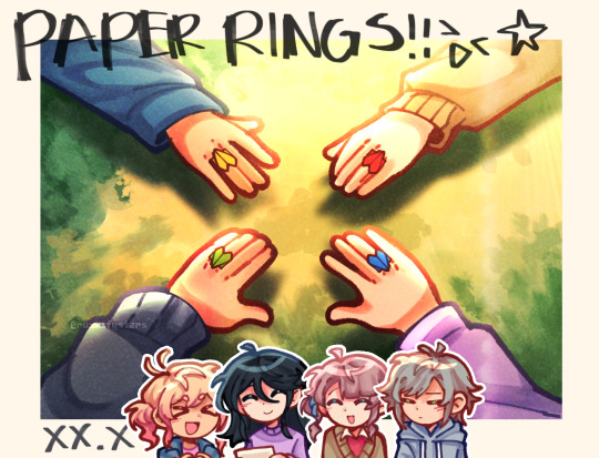
rings made out of papers.
#project sekai#prosekai#prsk fa#fanart#hatsune miku colorful stage#pjsk#leo need#leoneed#l/n#ichika hoshino#saki tenma#honami mochizuki#shiho hinomori#my art#ruxxifyart#a headcanon of mine where childhood leoni would make paper rings together#small ichika found a video tutorial on how to make paper rings at the ipad and she immediately uhhh thought of her dear friends
721 notes
·
View notes

Note
how does one make graphics (i need to . improve)

Well, the Princess' methods are very simple! She would be glad to teach you.
A bit long graphic tutorial under cut ^_^ (all art by Iinquint on twitter)

First, we import the frame or mask you will use. You can find these by searching "rentry frame".

Then, we will import our picture and erase any excess outside of the frame.

Then we usually add a chibi, You can do this by finding chibi art and erasing the background.

And now we will add any PNGs to the graphic. We chose circle laces for this.

Now we will duplicate the layer of our chibi.

We then use the Stroke Outer filter to find dots that weren't erased, we will go to the top original later and erase where all the exposed dots are.

After that, we delete the layer & reduplicate it. Then we use stroke outer for a white outline, and then a black one. If the chibi or whatever you are using is white or very light already, feel free to reverse the white & black.

Then we add glow outer (usually around 1-2px)

Continue this process for everything

Save it

And then we will import it into a new canvas through 'import picture' & then use the grayscale.

Now, We do not always use a gradient map. But feel free to try out gradients to see if it looks nice on the graphic. Either of the 2 top sites work.

Find a gradient that looks nice. If none fit your vision, feel free to skip it.


Now, import the new image and then add textures. Play around with blending modes & opacity until it looks right.

Boom! You've made your very own graphic.
Now for animated graphics...
(No visuals) If you'd like one where the small chibi moves, move it to be angle -5, save it, and then angle 5 and save it. (Also adjust angles if the 5 looks weird.)
Import the images into ezgif gif maker and turn on "Don't stack frames" and adjust delay time. (I usually use 80ish)
--
Animated graphics 2

Import your graphic into capcut. Add a green background or whatever color is not present on your graphic at all. Add the gif you want on the graphic. Adjust for all the images to go on for equal times so it works.


Ezgif > Mp4 to gif > Remove Background > Select hex code of background > "Replace hex with transparency" > Adjust Fuzz > Optimize

And voila, your graphic is completed! Feel free to adjust in ezgif effects if needed.

#ᛝ a chat with the lady spawn .ᐟ#rentry decor#rentry inspo#rentry resources#rentry#rentry stuff#rentry graphics#rentry banner#rentry coloring#ibis paint colorings#graphic tutorial#rentry tutorial#editblr#pr3typriincess#pr3ttypriincess forsaken#pretty princess forsaken#forsaken roblox#roblox forsaken#roblox#forsaken rentry
745 notes
·
View notes
Text


Hi guys, exciting new stuff has been added to my Patreon!
A color and light tutorial (with a speedpaint, art breakdown/analyses, step-by-step tutorials, and more) has been dropped. I've included previews of some of the many assets included in the tutorial. Check it out today!
497 notes
·
View notes
Text
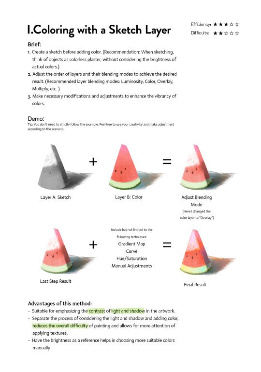
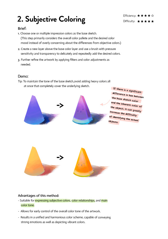
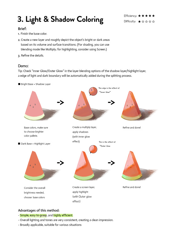
Art Tutorial| 3 coloring methods
If you're frustrated at coloring or don't know how to do the color, please check and try them. They may inspire you to find a new way. Any feedback and suggestions are welcome!
3K notes
·
View notes
Text

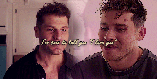


God, I'm jumping in the deep end It's more fun to swim in Heard the risk is drownin', but I'm gonna take it I'm gonna take it 💕
#bucktommy#bucktommyedit#bucktommy gif#vicki's gifs#911edit#adventures in gifmaking#baby's first lyric gifset! lol#dailykinley#loafrunners#911 spoilers#my gifs#911 abc#buck x tommy#bucktommy kiss#evan buckley#tommy kinard#tevan#*gifs#the 20 tommy fans#lyric edit#lyric gifset#lyric gif#911 7x04#911 8x11#911 8x06#911 8x15#gracie abrams lyrics#huge shoutout to abi (tommykinard) and her gif tutorials <3#the coloring is not exactly matching but this is the best I can do rn lol im new to this haha
483 notes
·
View notes
Text

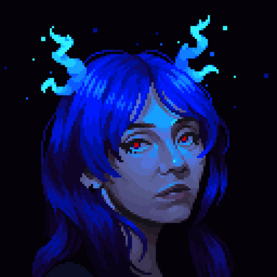
How to Win a Fist Fight
#the full version of the coloring ''tutorial'' illustration 💙#other two versions I posted on Patreon#c: Erol#by @artist-rat#story: Heartland#ttrpg
656 notes
·
View notes