#gray and white color scheme
Explore tagged Tumblr posts
Visit Tumblr Blog
Explore Tumblr blogs with no restrictions, modern design and the best experience.
Last Seen Tumblr Blogs


Fun Fact
130K people were victims of a chain letter scam that affected Tumblr in May 2011.
Photo

Dining - Kitchen Remodeling ideas for a medium-sized eclectic l-shaped light wood floor eat-in kitchen with a farmhouse sink, shaker cabinets, white cabinets, soapstone countertops, gray backsplash, glass backsplash, stainless steel appliances, and no island.
#kitchen remodel#gray and white color scheme#gray backsplash tile#country kitchen#light wood dining table#soapstone countertops
0 notes
Text
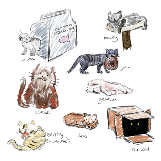
the new cat-vengers
(+ bob)
#why does tumblr insist on destroying image quality#careful observers may notice that alexei looks like a strange dog-cat hybrid#this is because I am bad at drawing cats#bucky and ava are both gray because unfortunately their color schemes are very similar#yelena got to be white-red for white widow#thunderbolts#thunderbolts*#thunderbolts spoilers#sort of: taskmaster's not in it...#mcu#marvel#bob reynolds#robert reynolds#sentry#the void#ava starr#mcu ghost#bucky barnes#winter soldier#alexei shostakov#red guardian#john walker#us agent#yelena belova#art#fanart#cats#cat au
429 notes
·
View notes
Text
catch me looking up nightingale symbolisms for tales of the passerine. if danny's using the name of a songbird for a hero name, regardless of familial connections, i will utilize the symbolism tied to the bird. Anyways general gist of the nightingale symbolism i've seen, other than what wikipedia told me, is that nightingales were frequently symbolisms of spring renewal, loss/death, love, etc. catch me about to incorporate music into Danny's character
#dpxdc#danny fenton is not the ghost king#tales of the passerine au#musician danny ftw. as someone who loves music i am more than happy to make this boy a frequent singer. this au is still baby#i can squeeze singer/musician danny in pr easily.#some favorite lines i saw while looking for symbolisms is that nightingales in roman culture were associated with venus and were also said#to provide comfort in the hours of darkness. eh eh? i saw a summary that in chinese folklore they were seen as symbols of hope#it didn't specify which dynasty but it did say it was a famous tale. cite also mentioned that in John Keats' “Ode to a Nightingale”#the bird’s enchanting song transports the poet to a world of transcendent beauty providing a temporary escape from the suffering and imperm#anyways looks like nightingales in gist symbolize comfort in dark times among other things#while robins in gist symbolize renewal. celebration of life. good luck. rebirth.#nightingale's color scheme in my mind is very much a dark purple-blue and black. maybe some gray too.#he'll probably try and ditch the black and white just out of paranoia. argh i need to come up with a suit design nooooo. superhero suit#design is my weakkkest design skill. have to balance between practical and a unique silhouette thats in line with their character.#esp since danny's not using his ghost half to be nightingale -- way too risky. also not using his powers/using them very little.#maybe i can work in an ocarina batman reference lmaoo. i can lean into comic/cartoon realism and have fun with that. as a treat
89 notes
·
View notes
Text
zombie with brains

#Vibrant#Dark fantasy#Illustration#Zombie#Eerie twist#Skull#Purple skulls#Pink tentacles#Gruesome#Brains#Dark blue#Light gray#Color scheme#Contrast#Solid white background#Striking visual impact#Graffiti-inspired#Print-ready#Quality#Applications#Fantasy art#Horror#Spooky#Macabre#Surreal#Creepy#Gothic#Urban#Street art#Disturbing
24 notes
·
View notes
Text
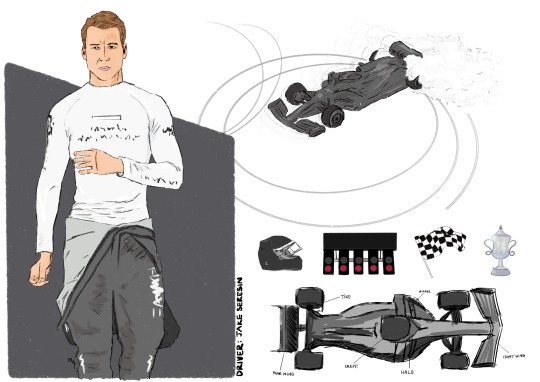
F1 driver Jake Seresin! 🏎️
#my art#back on my f1 shit#top gun maverick#top gun fanart#fanart#top gun fandom#top gun#jake seresin#hangman#f1 Jake Seresin#f1 au#jake hangman seresin#I know I’ve drawn driver jake before but he needed his own card and I wanted a gray/black/white color scheme
65 notes
·
View notes
Text
i made a silly belt chain thing a while back w my beads an I love it it's very silly
6 notes
·
View notes
Text
So, he’s a prison warden, titled as The Duke of the Fortress of Meropide, addressed as “your grace”, has the symbol of a wolf, fights like a boxer with gauntlets, has that design
And you expect me not to be obsessed with him?
#All Genshin designs are good but I am especially in love with Wriothesley's#I cannot resist white/gray streaks in black hair#Also red and black color scheme#Tripping and falling into the Genshin hole#I still haven't gotten the game though#genshin impact#wriothesley
17 notes
·
View notes
Text
Everybody shut up I found the Arceus gemstone ever

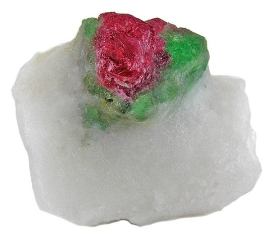
Like look me in the eyes and say that these are different pictures (the rock is called Pargasite, btw)
#primarily white. Check. Green eye.. shadow? IDK what the green stuff around arc's eyes is meant to be. Check.#Red spot (or eye) in middle of green spot. Check.#IT WOULD BE LITERALLY IDENTICAL TO ARCEUS COLOR SCHEME IF IT HAD GOLD AND GRAY ACCENTS.#I just need to check on its symbolism brb. Update: it kept auto correcting to parasite. Sad day symbolism enjoyers. 😞#arceus
3 notes
·
View notes
Photo

Tropical Exterior - Stucco Example of a large island style beige three-story stucco house exterior design with a hip roof and a tile roof
#black white gray color scheme#black cabinetry#debra ackerbloom interiors#transitional#tampa interior designer
0 notes
Text
We Got The Answer!!

Whites, Grays, Blacks
I know this is too soon to ask but entertain me
What do you think the color scheme of the Underworld Saga album cover will be?
Troy Saga - Blues, blacks, reds, yellows
Cyclops Saga - Reds, blacks, oranges
Ocean Saga - Blues, whites, blacks
Circe Saga - Pinks, yellows, purples, blacks
Underwood Saga - ???
#I think the gray is on the green/blue side of things#As well as the white#the ocean saga#epic the musical#the underworld saga#color scheme#color theory#jorge rivera herrans
49 notes
·
View notes
Text
Gabias and Lighting Design
I graduate with my BA in theatre in a few weeks and this is apparently how I'm using my new degree. But I am so so normal about how the lighting in Tobias' dances reflects his relationship with creation
In Piece 1, the main color scheme is just dark, blue and moody. You can barely make out any individual dancer and they all blend into one larger, moving body. All of the dancers are stuck in isolated spotlights and lit only by profile lights - the lights on the sides of the stage. This casts dramatic shadows over everyone's faces, so despite them dancing together, they can barely see each other. Tobias is lacking personal connection to the people around him, and his inspiration isn't clear yet.
The opposite happens in Off Rhythm, where the dancers are overexposed in a cool wash lights on a white set, making everything just brutally intense. Tobias is trying to make sense of too many things at once, in this sudden shift of his career and relationships. While the people around him understand his vision, to anyone on the outside (e.g., the critics), it looks disjointed and chaotic.
Piece 2 starts like Piece 1, still very blue but with a bit more clarity this time.
But in Whatever This Is, everything is much more complimentary and clear. Specifically, it revolves around Gabin, both his presence on stage and the development of their relationship. We get the most variety in this piece, especially in color lighting the cyclorama (the white sheet hanging at the back of the stage). Pink for budding feelings, purple for uncertainty, blue for sorrow, and yellow/orange for love. At the beginning of the number, when Gabin begins, the lights are pink, edging out a dreary gray, before rotating through purple and blue, as Tobias and Gabin struggled to maintain a healthy relationship in their first few weeks together. When Gabin leaves briefly, the lights transition to purple, then a deep blue. Over the men specifically, like in Piece 1, deep blue wash lights completely envelope the male dancers, making them virtually indistinguishable from each other. Tobias is still struggling over the reviews of his last piece and losing his étoile. Nothing is working, and he’s more depressed than we’ve ever seen him. But when Gabin returns (both to the stage and to Tobias’ life), the overhead wash lights gradually shift back into more flattering, joyful colors. The wash lights are brighter and warmer, bringing out the life in the dancers, not just the dance. Pink and purple start to push the blue out of the cyc lights, reflecting Gabin and Tobias' healing relationship. When Gabin is finally alone for the end of the song, the lights are peachy yellow, as they move past the ways they've hurt each other into a stronger connection. As if to put the nail in the coffin, right before Tobias takes the stage to kiss Gabin, there's a final pop of fiery orange, overtaking the last moment of doubtful blue. Tobias was always a great choreographer, but Gabin is what truly inspired him and reignited his love for creating.
Honestly, the real hero of Whatever This Is is the stage manager and/or lighting designer who managed to busk through the entire new number.
#DON'T EVEN GET ME STARTED ON THE TRANSLATION OF THE SONG IN 108#graduating with honors and this is how I use that experience#I’m probably reading way too far into this#sorry if this sounds insane it’s because I am insane#gabias#tobias x gabin#tobias bell#gabin roux#etoile#étoile#lighting design#text post
253 notes
·
View notes
Text

'Everything in this room is tongue-in-cheek.' The laminate fireplace contains a video of a burning log. The tiles on the floor, reminiscent of hopscotch squares, actually represent the elements of nature in their color scheme: white for air, red and yellow for fire, blue for water, and gray for earth. Celia (Vogel) and Mario (Mulea) wanted to create an emotional dissonance by using unexpected textures and patterns to generate tactile and visual excitement, hence this bath functions as a living area. Celia says 'It's a sybaritic environment imbued with contemporary pleasures.'
Interior Visions: Great American Designers and the Showcase House, 1988
#vintage#interior design#home#vintage interior#architecture#home decor#style#1980s#living room#bathroom#fireplace#laminate#modern#artwork#tube TV#Venetian mirror#contemporary
540 notes
·
View notes
Text
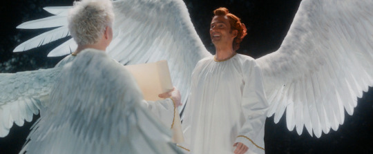
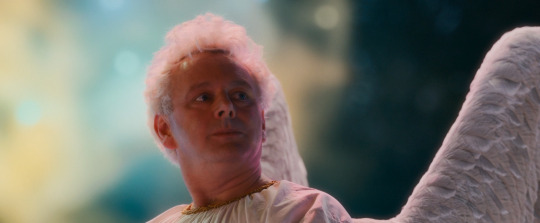
Alright, not to be too predictable, but I wanna talk about space and color as it's used in the intro to episode 1 for a minute. And you know, show some gorgeous space shots.
So we open in the dark. There's distant lights and the occasional flare from them moving through space but for the most part we get the angel that would eventually become Crowley alone in enough darkness that he himself isn't even giving off particularly significant amounts of light.

But then, enter Aziraphale. He arrives in a big ball of blue light shining above him that really emphasizes Crowley's red hair. They get tied to the colors we most often see them attached to, especially in promotional materials.

From here the entire scene gets slightly brighter, even once Aziraphale's light dims down. They're both lit up once they're together, even it the middle of literal nothingness.
They start the universe next, using Crowley's hand crank, which gives off a magic that's a combination of their two colors - purple.
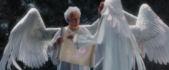
A very similar color to this shows up in heaven as a signal flare for their accidentally too powerful half a miracle. It's a color tied to a miracle so big it could've revived someone 25 times and also a miracle that got the engine of the universe running.
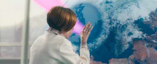
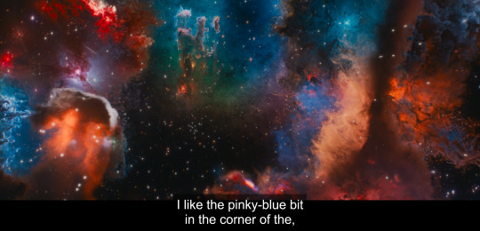
And then. Creation starts. Our first image is a very Heavenly aesthetic. It's a blueish light cutting through the clouds much like Az just cut through the dark.
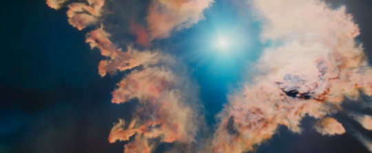
And what explodes from that is the thing that set me down this little rabbit hole in the first place: it's purple scattered through with red and blue lights.
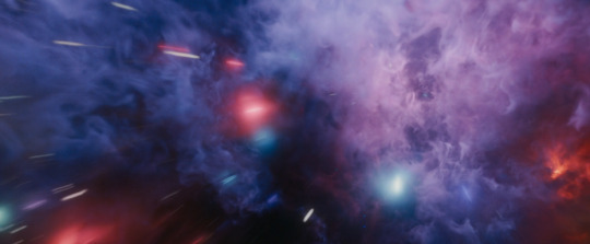
As the initial burst fades, the blue and the red separate, the color fading except for this tiny blue dot and this growing red zone on the right.
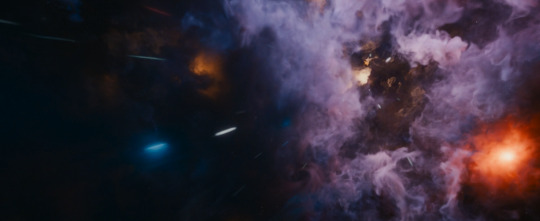
The blue then fades, leaving us with an extremely Crowley coded palette here and a very orangeish red. There's shades of gray, a little bit of light, but not nearly as much color. As the sequence moves the darkness grows but does start slowly filling with small points of light.

We then end up with shades of gray both light and dark. There's balance here, even if it's not particularly colorful.

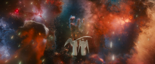
And then all at once a pinkish red bursts forth with these intense clawing tendrils. At the core of it, from the heart of it, is a bright blue ball of light.

It fades into a blue heart surrounded by darkness with whisps of white resembling a certain someone's hair. Or, as some friends pointed out two people embracing.

As the nebula settles a few other colors set in but the primary scheme is still red and blue. An almost violent plume of red emerges on the left side of the image.
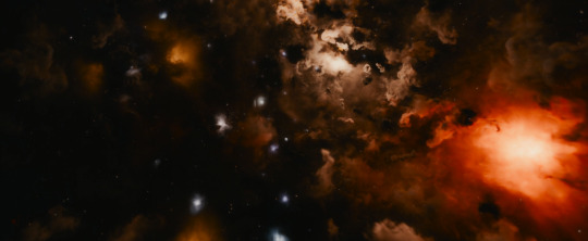
And from this moment on most shots of the two of them back them with their respective color schemes.


They chat and Aziraphale gets anxious. He looks for a distraction and is immediately drawn to the space where the colors mix.
And as we fade out the other colors in the picture fade. We get the most balanced blue and red get. And on the far corners fairly clear dark and light.
So what does this mean? The purple speaks to them being very powerful together. And, the rest is arguably just representative of the plot. We have Aziraphale as a beacon in the dark - a signal flare we know Crowley has throughout history been aware of and drawn to. We have them brightening each other. We have Az's color breaking out of heaven to mix with Crowley's to create something new and wonderful and powerful. Aziraphale's color fades, leaving Crowley alone. We then get a burst of a red closer to Crowley's current hair, with Aziraphale's blue in the core of it that eventually becomes a blue heart surrounded by darkness. That too fades, replaced by the pillars becoming their familiar hand shape and slightly more colors seeping in. As they talk together and move closer together their own colors settle back in and come to balance.
#good omens#good omens spoilers#good omens season 2#gos2 spoilers#Aziraphale#Crowley#space#good omens meta
3K notes
·
View notes
Text

BUILD YOUR OWN VAMPIRE (a cas challenge by hauntedtrait)
I looove cas challenges, and I've been particularly enamored with these where you roll or pick attributes based on something about yourself, I also love vampires so I combined the two! The only rule is to have fun! Also, you don't HAVE to pick attributes based on yourself, you're entirely welcome to randomly roll for those too! Use the tag #ht: vampcas to showcase your creations!
The same list that is on the image is under the cut for accessibility.
birth month = color scheme
1-2: bloody red
3-4: demure pastels
5-6: earth tones
7-8: dark and moody
9-10: black & white
11-12: bright and colorful
favorite mythical creature = hair color
dragon: ginger
sphynx: brown
phoenix: blonde
unicorn: white
chimera: multicolored
hydra: fantasy colors
hellhound: black
favorite animal = eye color
snake: blue
spider: black
bear: brown
wolf: purple/pink
tiger: yellow/orange
shark: white/gray
hawk: hazel
fox: red
alligator: green
favorite hobby/ies = extras
cooking: scars
fiber arts: piercings
gaming: prosthetics
painting/drawing: tattoos
sculpting: body horror
programming: glasses
outdoor activities: freckles/beauty marks
playing an instrument: weird eyes
randomly generate a theme
romantic
gothic
emo/scene
victorian
1920s
1950s
1960s
1970s
1980s
1990s
y2k
modern day
historical
rockstar
dark academia
futuristic
urban
punk
hippie
minimalist
maximalist
out of this world
western
animalistic
#sims 4 cas challenge#sims 4 cas game#s4 cas challenge#s4 cas game#sims cas challenge#sims cas game#sims 4 cas#ts4 cas#s4 cas#ts4 cas challenge#ts4 cas game#the sims cas challenge#the sims cas game#buildavampire#ht: vampcas
983 notes
·
View notes
Text


Such a lovely, welcoming estate that they call a textile villa. I don't know what that is, except that the owner worked in textiles. The home was built in 1906 in the Netherlands, as a country home, but the family loved it so much that they decided to stay permanently, so the owner built an office wing and worked from home in 1916. 3bds, 3ba, 6,404.53 sq ft, Price On Request (Must be staggering.)

The house is just as lovely as ever. I don't think I've seen a wallpapered sun porch before. The flooring is orignal.

Isn't this a beautiful sitting room? Look at the unusual fireplace. The mirror is set into the actual hooded mantle and the bricks make a red & black striped pattern.


That light fixture! It doesn't come furnished, but those soft green velvet chairs just make you want to settle in.

Muraled wallpaper in this room is so inviting. And, look at the chandelier.


Spacious kitchen in soothing green tones. Look at that stove and matching hood.


The dining room has built-in storage with a fireplace on one wall. I love the soft pink and how the wallpaper ties in with the furnishings.

They chose to ignore the orange tile on the fireplace, keeping it original rather than replacing it. My mother was a designer and it's not unusual to simply ignore certain elements like carpet color, etc. and proceed with the chosen color scheme. But, note how the flames and a few orange glass bottles pull those colors in.

This rustic lounge is amazing. The plants complement the colors of the velvet fabrics.

The wonderful wallpaper extends out to the hall.


A surprise at the top of the stairs- I didn't expect a library. What a great idea.

Very spacious primary bedroom with an original built-in cabinet. How cozy. Love the fireplace and how they closed it off with decorative tile.


Big, beautiful remodeled bath.

The stylized vintage/modern soaker tub was the perfect choice.


Love this spacious rosy room with a door to a pretty porch.

This home is so beautiful. (And, it's not gray or white.) Look at this wonderful little retreat-for-one to sit, read, and relax beneath a gorgeous chandelier.

They kept the original tile in the back hall off the kitchen and prettied it up with beautiful wallpaper.

And, we're back at the sun room/conservatory with the doors open to the patio.

Beautiful patio and gardens.


The approx. 12.9 acre grounds are partially open to the public to enjoy, with boundaries. A number of places are private, fenced off, and expressly closed to visitors. The fen, for example, they kept to themselves, to swim and relax at the water's edge (well, it is their home, so is there an electrified fence or what?). The current owners are on good terms with the residents of the town: “They have seen how the metamorphosis of the estate and the villa took place and appreciate that they are allowed to walk and cycle here.”
Would you, as the new owner, allow them to continue? (They damned well better throw me a welcoming party first.)
https://www.funda.nl/detail/koop/enschede/huis-welnalaan-5/43617486/
#estates#historic homes#textile villas#houses#homes the netherlands#houses the netherlands#house tours#home tour
324 notes
·
View notes
Text
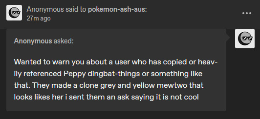
Yeah, We are NOT doing this. No one should ever do this, and no one should feel like this is okay.
Please, please, PLEASE, do NOT white knight on my behalf. Pepper and the Dingbat's new Mewtwo have a similar color scheme, and that's where the similarities end. Besides I KNOW about the new Two, even before they posted it on Tumblr.
If you feel like a design is heavily referencing mine and want it to be known, come to ME. Send ME that DM first and foremost. 9/10 it was a coincidence, and the other 1 could have been resolved quietly.
Also, you didn't say "It's not cool."
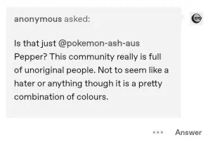
You outright called them Unoriginal, you are the ONLY one who called to the fact that Ding's new Mewtwo had a color scheme similar to Pepper's. You weren't nice about it, and you sure as hell had no reason to stick your nose in the way you did.
If you had even looked through mine or their blog, you'd have seen that we have done collabs before, I draw their characters on occasion!
Look with recent drama and all that good jazz, I get it. But no one should EVER handle a situation like this.
To anyone else out there, creating Mewtwo's is a dime a dozen. Most of my OCs have very simple but easy-to-follow designs, and that's okay. it's okay to take inspiration, it's okay to want a Yellow and Gray Two, and it's okay to want an Alpha Mew. I draw the line when you copy/paste and adjust the color slightly. I draw the line when there is no difference other than a small little color change.
This?
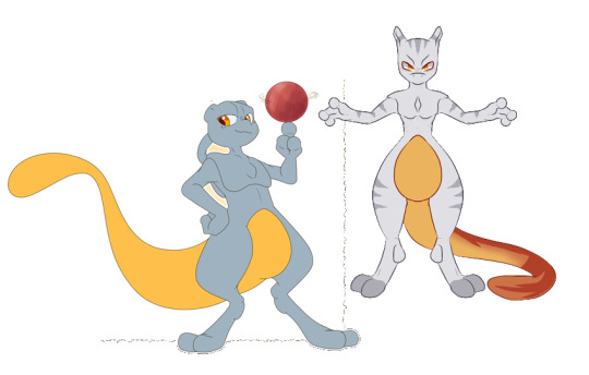
These are NOT the same Mewtwo, not even CLOSE.
Anyways, rant over, I'm off to block that anon, and for the rest of you
Check out @dingbat-things, they are a silly goober and their art is cute.
Spread love to them, especially after this disaster of a take.
#Don't do this#i am 100% serious#DM me if you think it's an ACTUAL offense#otherwise don't you DARE attack any artists for it#DM THEM before you make such baseless accusations#what a shitty way to end my night lol!
440 notes
·
View notes