#had a lot of fun experimenting with texture and effects
Explore tagged Tumblr posts
Visit Tumblr Blog
Explore Tumblr blogs with no restrictions, modern design and the best experience.
Last Seen Tumblr Blogs


Fun Fact
70% of Tumblr users say the Dashboard is their favorite place to spend time online.
Text

Finals basically over :]
time to get back into the swing of things
#had a lot of fun experimenting with texture and effects#layer effects are you best friend to make your colors and brushes pop#monkey wrench#mw oc#monkey wrench oc#shrike sanchez#mw beebs#zahari#vivek leboye#doodles
141 notes
·
View notes
Text
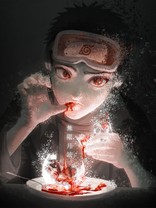
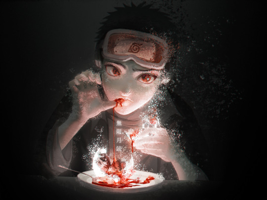
Please zoom in to see small Kakashi! 😭 He kinda disappeared 😭😭😭
Text translation: "Infinite Tsukuyomi" (無限月読)
Drew these in mid-July - when I started doing digital again actually 🤔
Took inspo from the Balut - a street food in my country; I hear a lot of people are grossed out by it?? Don't know if this is controversial, but I personally love the dish. Essentially grew up with it after all!
Wanted to draw something that feels a bit creepy but still has a sense of mysticality to it???
Meh, don't know if the feeling got across or not
I thought since Halloween is coming up, might as well post this haha
About the process of drawing these!
These were very fun to draw! I messed around a lot with photoshop to achieve this glowy dusty effect?? From the brushes to the blending options, and maaan the filter gallery 😭😭 Such fun tools to play with.
The main brush I used to achieve the dusty effect is called "KYLE Bonus Chunky Charcoal", in the Kyle Dry Media brush set. If you can, I recommend checking it out! There are definitely other ways to achieve this sort of effect, though. You can probably just use some sort of scatter texture brush and it'd work just fine. Studying is all about trying things out, right? This is like my first experiment with this type of effect, and I was happy at the time. Now looking back, these could most definitely turn out better, no? I really went overboard with just the effect and forgot everything else. The blood and the plate looks horrible man. If you look closely, you can see the sketch lines haha! I got lazy!
Also, for Obito's pose, I relied heavily on a reference I found on pinterest 😭 I wish I'd changed the pose more tbh, it looks really boring.
And I gotta say, these just look underwhelming in this smaller size. Like reaaaaaally underwhelming. Would love to show you the big version, but oh well! 😭😭😭
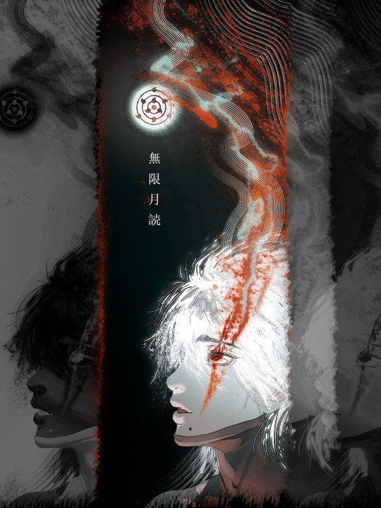
Brain vomit time!
I love the prospect (??? is that the right word) of Obito being all god-like and powerful after Tsukuyomi, having control over everybody's dream worlds?? And like he jumps from dream to dream, but stops at Kakashi's and picks it apart???? Observing and tormenting Kakashi with his childhood form that has both sharingan???????
Kakashi would probably be confused with Obito's appearance at first, asking questions like "What are you up to this time, Obito?", but then wouldn't receive any answers??? Like little man would just stare at him creepily, and Kakashi would push this to the back of his mind for a while???
Umm below is the technical stuff, I guess??
My headcanon is that the time span in the dream world is the same as the real world. Meaning, 30 years in the dream world feel incredibly real, with no gap of memories. It's essentially a different timeline. Whether this makes sense or not, who knows haha!
Let's talk about the dream events and how they affect Kakashi! Due to Sakumo and team Minato still living, this Kakashi probably wouldn't be as lax nor sad as in canon?? The relationships and personalities would be different huh???? I'm having a headache thinking about this, so let's just say that: 1. Sakumo lived because the villagers weren't as harsh, but the animosity still remained. Kakashi still developed this obsession with rules, but he doesn't blame his dad as much. 2. Kannabi happened, Kakashi was given the sharingan, along with Obito's ninja way. Team Minato thought that Obito died for a while, but Obito is 'rescued' by Madara, same as canon. 3. Rin would still be targeted by Madara, but Obito came in time to help with the situation, blocking Kakashi's chidori from connecting with Rin's chest, but also knocking Kakashi away. Then, a Mist enemy took advantage of the situation to attack Kakashi, injuring him gravely, to the point where everybody thought he died. With this, Obito activated his Mangekyou and exploded on the Mist enemies, killing them all. Meanwhile, Rin tried to heal Kakashi, just barely saving him. As Obito had dealt with the enemies, there was no need to rush back to the village, and the Sanbi wouldn't be released till then. And so, they waited for Minato to come and help with Rin's seal. (About Obito's Mangekyou activating with Kakashi's death - would that be too far-fetched? My reasoning is that Obito would think that it was his fault Kakashi died, because it was Obito who knocked Kakashi away into the enemy, no?) 4. Because there's no one to become 'Madara' now that Obito came back to the village, Naruto is born, Minato and Kushina live.
5. The Uchiha massacre doesn't happen.
(Everything is incredibly convenient, because I don't have the brain power to make it otherwise, please help 😭😭) -> In conclusion, this Kakashi resembles the Kakashi of the real world, but less depressed and self-destructive??? He loves his living comrades. My man still has a massive obsession (more like crush lol) with Obito by the way, just like in canon. He just doesn't show it.
-> About Obito of the dream world (I'mma call him Dreambito), he is all sunshine and brightness, but he exhibits some dark thoughts and deep rage from time to time due to the residual effects of Madara's seal on his heart. The seal has been removed though. And he has this obsession with Kakashi's safety, as he almost pushed him to his death once, albeit accidentally.
-> I was debating whether to just start this dream world at the point where Obito got crushed, or to start it at the beginning of Kakashi's life. In the end, I went with the latter, cuz ya know, I like the idea of Kakashi living through a whole life all over again, just to finally come to the realization that it's all a dream. Does that make any sense at all??
Obito (child form - 13) first appears in front of Kakashi at the start of the Naruto series, when Kakashi has officially become the teacher of team 7. (Let's not change this okay, my brain would fry haha I'm not gonna deny that the idea of Obito and Kakashi becoming co-teachers of team 7 isn't incredibly fun though)
After the first encounter with this child Obito, Kakashi begins to have flashes of memories from the real world, and he hallucinates about people's deaths - mostly about the members of team Minato. This young Obito is always in the corner of his vision, most of the time silent, sometimes saying things like "You trash" to Kakashi whenever he encounters Rin, who is whole and grown up in this world.
Kakashi exhibits more destructive behaviors as this goes on, the line between the dream events and the real events slowly blurring. He takes more dangerous solo missions out of the village, and shows strong signs of PTSD, just like in canon.
The two Obitos would contrast each other?? Like Dreambito would be all concerned with Kakashi's decline in health (both mental and physical) and goes to confront and comfort him, many times over because that's how it is with them??? Dreambito might even move in with Kakashi, being the obsessive and protective Uchiha that he is. Meanwhile young Obito would be an absolute asshole, saying all these horrible things to poison Kakashi's mind haha
At this point, Dreambito'd be in the last stage on the journey of becoming Hokage, gaining the all the trust from the Uchiha clan, the village elders and the villagers as a whole. I don't know about Rin, though? Should she be romantically involved with Dreambito or no? Would Kakashi dream that??
I think Kakashi's dream would somewhat focus more on Dreambito being happy and satisfied, to be honest. I know there's Sakumo and team Minato as a whole, but as a degenerate shipper, I love the obsession between them🥺
I don't think Obito would directly interfere with what Kakashi is dreaming about, i.e. changing Dreambito's behavior, or like the political situation of the villages (?). But he would most definitely insert himself in Kakashi's psyche, no? Mess it up real good.
Kakashi would slowly realize that he is living a dream world, after all the flashes of memories that Obito generates in his mind. He would most definitely deny it at first though, I think? And then it would reach a point where Kakashi remembers everything from the real world, but he has also lived through 30 something years of the dream world, meaning he'd be in his 60s?? Does that make sense or no?
And so, while Kakashi now knows that everything is a dream, his feelings for everybody in the dream are real. If that's the case, is it really that important anymore that he escapes the Tsukuyomi? Can this dream world really be called fake at this point? Is there even anything in the real world for him to return to?
What's to say 'the real world' isn't a dream at this point?
-> Kakashi would completely close in on himself after this. He still does things that he would normally do, but it'd be all an act. He would feel completely isolated.
-> Dreambito would notice and confront him again, now that they live in the same house??? Kakashi would like say everything is fine and try to act more convincingly, but Dreambito would still know something's wrong????
-> Obito is observing from afar, who knows what his motivation is at this point.
Because this is Kakashi's dream world, I suppose he would have the power to change this world to his will, now that he's aware? This is like a lucid dream situation???
The people in the dream have their own will up until this point, but Kakashi can somewhat change their behavior if he really wants to, whether it's subconsciously or not??? Example: He can probably will Dreambito to kiss him or something lol
So on and so forth!
Man, I'm having waaay too much fun imagining the pain. There are probably like a thousand things that doesn't make sense haha! I do wonder how this sort of storyline should end though, does anybody have any ideas? Personally, I prefer slow burn with a (sort of) happy ending, but ya know, angst all the way is good too! I can't write, but I love thinking about all the things that could happen 😭😭 English isn't my first language, so this might have felt weird to read at some point haha
If anybody wants to develop this, please feel free to do so! And if you've read this far, thank you for reading this absolute brain vomit of mine! I love to yap, as you can tell haha Have a good day!
#naruto#naruto fanart#obito uchiha#kakashi hatake#オビト#カカシ#obito x kakashi#obkk#obikaka#man i am gonna cringe so hard reading this back#but hey i had lots of fun getting all of this out#so it's all good!#don't have a proper halloween here but#meh whatever#happy halloween!#even though it's like way too soon!
403 notes
·
View notes
Note
Heyo! Do you have any tips for making comics? :)
I've been meaning to get back into the swing of it, but concentrating on such a commitment that takes so much time is tough sometimes haha.
How do you make it work? Are there things you avoid/make easier for yourself just to make the process more fun and do-able?
First of all, I’m very happy for you! I think it’s very exciting whenever we return to a craft we were once passionate about. I wish you the best of luck!
This is a big question and I don’t think there’s really one simple answer since all artists are different and have their own strengths and weaknesses.
One of the biggest issues I face is that I have a million ideas but I simply don’t have the time to do them all. I want to share all these ideas but if I gave each and every idea the same amount of attention and detail, I’d hardly get anything done. So here are some things I've learned through my own comic-making experience, but keep in mind it may not be what you're looking for. Also remember this is NOT career advice. I make comics for fun, not for a living. If you’re looking for professional advice I would suggest looking elsewhere ����
1 - A comic doesn't have to be fully rendered to be entertaining. Although I love to draw and line and color my work, it’s not always necessary. If I feel a punchline is strong enough to stand on its own, I’ll just make it into a doodle comic. In fact, I’ve found that some of my doodle comics perform better than the fully rendered ones! The doodle comics are still very fun for me to draw and they also serve as gestural drawing practice, so in the end it doesn’t feel like I'm making a sacrifice. I'm still getting my ideas out there and I'm still drawing, I'm just prioritizing what gets more attention so I can better manage my time.
2 - Not every panel needs an illustrated background. You definitely need to show backgrounds for establishing shots and when characters are interacting with the scene. But sometimes the focus needs to be entirely on the character and/or what they’re saying. You can choose to have a solid color background and maybe add a few textures to keep it visually interesting. You're still putting in the effort to make your art pop, but you aren’t losing a ton of time by drawing dozens of backgrounds. Color is also a good way to convey mood. I do that a lot in my comics, like this bit from “My Gal”:

^ I was trying to show a progression in excitement here, so having the colors change from cool to warm does a better job portraying that than if I just had a standard, scenic forest background for all the panels.
3 - Use resources: That's what they're there for! Because I make all these comics by myself, I have had to find resources to help me get through some of the steps faster so I can focus more on the story writing and the artwork. For example, to help me save time on lettering, I use the Onomatopedia font and the Manero Panels, SFX and Bubbles brush set for Procreate. I’m still selecting the sound effects and choosing the appropriate bubbles and tails to suit the mood and scale of the text, but this has saved me a ton of time because I’m not drawing each individual element by hand over and over again. Personally, I purchased these resources but I'm sure there are plenty of free tools out there that you can use.
As far as making it more fun... Honestly, I just love comics as an art form so much that learning about all the 'rules' and techniques and 'SOP's behind comics makes it more fun for me to make them. I recommend checking out tutorials and tips (even if you think you already know it all) and you might be surprised at how much it might ignite more of your comic-making passion. For example, I've spent hours on Blambot's "How-To" page and on ComicDevices.com just to try and soak up as much as I can. They're full of fascinating reads that make me want to try out different things!
I hope this helps! Good luck with your comics!
102 notes
·
View notes
Text
Link's Fun Commentary - Prologue!
+ sailor design commentary. link's fun extra

Twilight Field, War of Eras...
Sailor starting in Hyrule Warriors and being dropped immediately into Shepherd's era is actually the second pitch for the beginning of the comic, the very First pitch being the first two pages of chapter 1.
More than anything we just wanted to get it done, but we didn't really know what we were doing . We cobbled together a custom font and got right to it. My Fun Facts: All the grass is the same image reused over and over except for when it isn't . Literally all of the smoke was just repeated/moved around. We didn't even really know how to use gradients effectively...

... Which can be seen in these next two panels. LOL.
The work split on this batch set a precedent for sure. @islandlobster took up lining and flat colors, and had the Hard Job of harmonizing our styles, processes, and experiments. Do you see a lot of small, long-form comics with grainy, textured line-art? Maybe no? Well we found out why.

These panels also feature the Only Two Triforces we remembered to draw !!! Oh My God!!!

As much as we struggled, things moved pretty quick from the get-go. Since the prologue is only a handful of pages we didn't really run into the issues we would with chapter 1, especially regarding our complete and utter lack of script. This went straight from thumbnailing to the final result!! (NOT A SUSTAINABLE WAY TO DO A GROUP PROJECT...!)
I wanted to mention though that when I wrote the line above, I wasn't sure if this was how you would spell it for like . a Soldier Troop or a Performance Troupe. Which I just looked up now and found out I Absolutely got them mixed up. so umm. Sorry. Sailor is not in the circus yet.

Cia was just defeated in the main campaign! I felt like such a smart cookie for this one.

She doesn't even know she wont be going home yet‼️ laughing and pointing ‼️

It was an Early idea that Sailor would conveniently miss the time portal transporting the field (with her in it!) back to its era. This was supposed to be a reoccurring bit, but we didn't commit to it too hard going forward, so who's to say if that'll be realized.

The pirate charm plays a big role in the prologue. A little funny because we were absolutely sick to death of drawing it by the end, as well as the fact that it is there in lieu of her red-gem necklace that we forgot to draw. it is Welcome and Unfortunate that it doesn't work anymore, especially because having the chance to name drop like this was very indulgent.

The era of twilight ! Including the locations and times was in the original sketches, but when we found out that our inexperience with backgrounds wasn't lending itself to establishing Where we were, it came in handy. We Agonized over placing the castle and argued* for like a week about how forested the area should be. Luckily we use noclip now, so things have improved as we've moved into chapter 2 :]
Either way, hopefully it wasn't too confusing, and as we introduce new characters the picture will be clearer. We've talked a little bit about returning to the prologue to spiff it up a bit, but we feel we aren't far enough into the comic to make it worthwhile.
and now over to Pea with the weather:
my name is pea islandlobster and you can't tell that it's me because we are writing on the same post but trust okay 🤞 I am here to talk about SAILOR!!!
Sailor has been my baby brainchild before LFRT was even a blip in our minds eye (my proof) and it has been a beautiful indulgence for me to both put her in AND have her be the first Link we meet. YAY!
I have two designs for her, for which I have helpfully made a diagram just for you..! Labeled and everything..!

A: pheww my big one that I have been sitting on forever. Sailor's necklace was constructed over the course of her adventure, initially only having her red gem (given to her by King Daphnes, from his own crown). Four pearls were later added, parting gifts from Oshus and the three spirits. Also intended to mirror the three Goddess pearls from Wind Waker..! and an extra yellow one i guess. triforce? idk
B: Sailor's chipped tooth is a funny one that I will have to make a small comic about at some point. It's not even anything from her adventure. A couple years before WW, Aryll was pretty upset about losing her first tooth, and in typical Link fashion she thought the best way of comforting her was to ALSO lose a tooth. Grandma was not happy.
C: Most Links have a triforce mark, and each one we are giving a reason towards ^.^ Sailor's mark is entirely scar tissue, specifically it is hypertrophic. She held her triforce for only a few days and got it (maybe quite literally) ripped from her by Ganondorf, so take that as you will. Tetra and her are matching yayyy..!
D: Giving her hero outfit it's own section so I can tuck it out of the way lol. A modified version of her original hero outfit, courtesy of shipmate Nudge (guy in the top left). She was a little upset over having to alter Grandma's hard work, but she preserved it where she could. Like her seashell belt! ^_^
E: SIDEBURNS! Not present in the prologue because it has been a recent development but I figured it was worth bringing up. During WoE, as she grows her hair, her sideburns resemble little lobster claws. Cute! In LFRT as grown out as it is, I thought making them swirly as a reference to pretty much every cloud/wind effect used in WW lol.
From a combination of outgrowing stuff and missing home, Sailor was christened with Lobster Shirt 2.0 as we know and love today. Who made it for her? I dunnooo..... let's sit and think about this one.
Phewww. This was a long one - and no doubt the next will be longer - but this is all for now! Feel free to send any questions you might have ^.^ Thank you for all the support! Chapter 2 part 2 soon!
66 notes
·
View notes
Note
Your art feels, for lack of a better term, dirty and grungy in a really good way. Effortlessly messy but still careful and intentional. I really love it. I was wondering, do you have any tips for how you achieve this, and who/what are your inspirations? Thank you, and keep doing what you're doing man, it's really cool. <3
thank you, that means a lot to me, that's really kind
I think i started my process simply from being aggravated that i couldnt draw as neatly as i liked, so i lean into that inability. i dont think its laziness, i think you have to work with how your brain works and the kind of art you enjoy. i think i had to learn what the difference was between "i was avoiding learning this because its hard" vs "this is how my brain works + making difficult art that works with how i visualize the world"
as for what i do to get digital art look nasty and grimy (through a lot of blood, sweat, and tears trying to learn how), i have a few things ive found helpful.
for one, i dont make a seperate layer for my lines vs pencils. the inks go right on top of the pencils and i just erase and carve away as i go.
another thing is working really loose, and a) tightening up your work as you go, erasing stray lines and making clearer forms and b) working with mistakes. also good to not overwork like, effects.
textures are your friend. scan papers and trash and junk. its fun and also you'll see potiental in trash
spattery brushes, rough brushes, scratch and scribble. i recommend collecting as many as possible LMAO, use any and all resources.
dirty up your canvas as you work, not AFTER youre done drawing, at least in my experience
draw a lot. it's gonna look bad a lot of the time but that's how you end up making good bad good art
as for inspirations, i think i have a lot of things i love and it changes often. as for now, i really love the art of robert weaver, brian sanders, bernie fuchs, austin briggs...artists in the late 50s and 60s KNEW how to work seemingly wild lines into a picture. its fascinating.
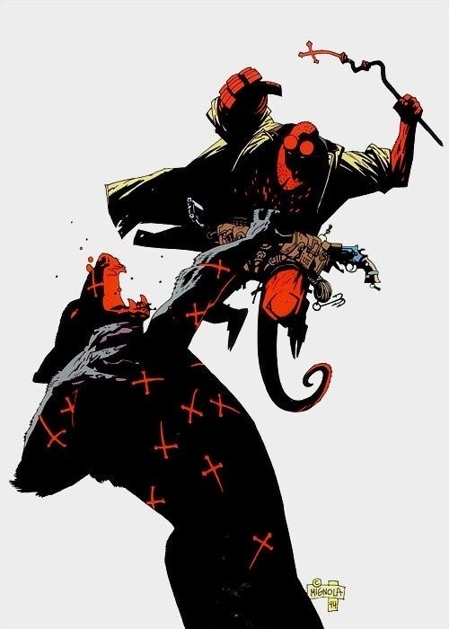
i really like dark black shadows like mike mignola, ayami kojima, and q hayashida. typically dark shadows make stuff take on an edge
i look at a lot of 90s graphic design. they knew how to make actually interesting graphics back then and it rules, its great to study just to learn how to put together interesting objects into a cohesive artwork
as for general inspo, i watch a lot of movies and listen to a lot of music. movies that mix industral and natural themes together are my groove (the texas chainsaw massacre 1974 and stalker 1979 really hit the mark.) i like metal, goth, industrial, grunge, hip-hop, and country. i just gotta say, like what you like and DONT stick to aesthetics. aesthetic culture is the worst (despite tagging stuff that appeals to my own tastes as aes on my personal blog). 60s art and skater magazines are really different but you gotta like what you like, thats how youre a unique person. i like to pick out any and all pictures that appeal to me. i hoard pictures, sounds, whatever looks cool. its fun. did I mention animal encyclopedias?
overall though, dont stress it ✌️ slap some paint here and there and remember its ok to make art just for the sake of it looking cool
44 notes
·
View notes
Text
Complaining about the final boss in Shadow of the Erdtree, both in terms of lore and mechanics. Spoilers for the end of Shadow of the Erdtree:
Part 1: The Lore
I think the ending is really good and foreshadowed well in it's own story. I think it is fitting and well told. But it isn't living in its own bubble. It exists in context to a previous story directly connected to it. In the context of the entirety of Elden Ring, it sucks.
If we were just dropped in the Shadow Realm and the main game didn't exist, it would be really, REALLY good. The problem arises when also having the context of who Miquella was in the base game. His motivations in the DLC retcon the motivations from the lore of the base game. And the retcon is worse. The thing that made him fascinating was that he was the only compassionate character among Marika's children, the only one who didn't care about petty power plays because he was focused on helping people and helping his sister. That it is revealed he is just as shallow and self-centered as the rest, so much as to be willing to endanger his sister in exchange for a consort after all the lore surrounding how he wanted to help her, takes away the facets that made him unique.
This may also contribute to why there are two general camps of people who like or don't like how Miquella is portrayed. There have been a couple of years between the original game and now. Memories of the original game's lore--if people even read those particular bits of item descriptions in the first place--have had time to fade.
However, I acknowledge that item descriptions in Elden Ring intentionally have author biases. It could be said that every Miquella-related item description was told from the perspective of someone bewitched. That would make a lot of sense.
So in the end, this also is a personal preference. I think that Miquella turning out to be a brat who will sacrifice his sister for his consort is much less interesting than him being motivated to do bad things for his sister.
This leads into the overlap between pure lore discussion and mechanics.
Part 2: I CAN'T FUCKING SEE
The last boss fight is shit. Part of what convinced people that the leaks were fake, not considering lore implications, is that many people looked at the attacks that were happening and judged them to be bad.
As someone with a passing understanding of editing animations and moves in a game, something that can be done with little modding skill to create a new enemy is to use existing animations and add new effects to them. People were convinced the fight was fake because of how many moves looked similar to ones from previous FromSoft bosses with lightning effects glued on. I cannot speak to the alleged copied animations in this fight, since I don't have experience with every FromSoft game, but I don't actually think reusing old bosses and animations is inherently a bad thing. The real complaint was that it looked to be both reused animations and extra effects.
Stretch new textures over existing enemies, increase the speed of their attacks, and then add events to those attacks that spawn a bunch of effects like explosions, or lightning bolts. These are all things I could do with my limited knowledge. These are the things that some mods have done, and have gotten ridiculed for. The ridicule is because doing that demonstrates a shallow understanding of what makes a fight not just hard, but fun.
I'm no master of boss design myself, but I can say with confidence that spamming incredibly long attack chains containing effects that blind the player and prevent them from seeing the next move in the chain is bad game design. Something that has been established as an unspoken but understood rule in souls-genre games is that you should be able to dodge an attack while standing point blank in front of the enemy. Whether this is by rolling, jumping, or running away, you know what's happening from seeing the start of the enemy's animation, and you should be able to escape being hit by the attack. I also argue that by this metric, Waterfowl Dance is a badly designed move, but I digress.
Waterfowl Dance is one move in an otherwise stellar boss fight.
In the DLC final fight, I. can't. see.
The screen is covered in lightning for at least 1/3rd of the battle, often making dodging a game of guess and hope. I 100% acknowledge that I was not good at that fight, and that many of the attacks that hit me were dodge-able if I'd learned them more. But some of them were chains of attacks that demanded I blindly learn a random rhythm of button presses. On account of all the lightning from the previous attack hiding the next swing.
One of the things I actually did like about the fight was the grab being a guaranteed 2HKO regardless of health values. It would have been a great gimmick on a better fight. Where I had a better probability of seeing it so I could dodge it.
I also liked the warp-in speed effects of the boss jumping in, although such warps felt very buggy.
Were the lightning effects transparent or otherwise did not obscure the battle so terribly, I wonder what kind of fight it would actually be. Maybe the attack chains only feel unreasonable to dodge to me because I cannot see what is happening in them. It is possible that the fight itself is just bad, and the lightning is, just like in a bad mod, being used as a crutch to hide a very boring, simple moveset.
But it is impossible for me, in the game's current state, to imagine how that fight might play.
Because I can't see shit.
Part 3: The Remembrance
Turning in the remembrance and a duplicate of it just to end up with a total of 3 Radahn swords I think really shows the lack of creativity under the lightning. That is what the essence of the DLC final boss distills down to: 2 variations of a sword we already have.
If the fight had been something COMPLETELY different, perhaps we would have gotten something interesting from Miquella's side of the pair. Something that bewitches a struck enemy? I don't know.
The last fight was a spectacle, but only due to all the fancy effects that it vomited everywhere. Remove them, and I suspect there exists an uninspired base.
87 notes
·
View notes
Text
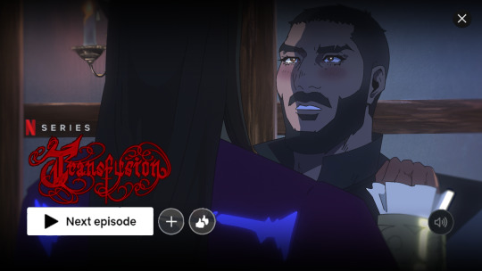
ANIMATION BREAKDOWN PROCESS OF THIS LETS GO (Sorry for any grammatical errors!)
SCRIPT/STORYBOARD: (you can watch here)
Now THIS. The script was very weak because I wanted to board immediately, so it started strong then fell off at the end (also generally I'm not a stronger writer, which haha fics my beloved). Now I know this, spending more time simmering with the script will genuinely only 1) stronger compositions for storyboards 2) it will be so much faster to board. Like I can board fast, but I can board fast AND well if I sit with the idea a bit longer. This will be a massive running theme how I like my shots earlier rather than further in.
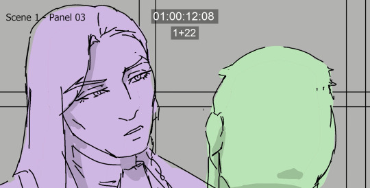
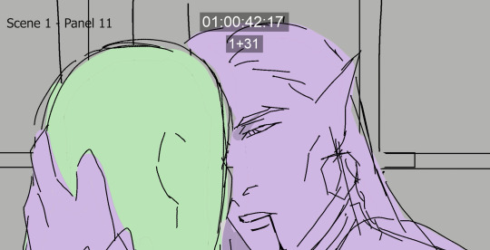
side note I LIKE PANEL 11 A LOT, I just feeI didn't translate it well enough into animation which sucks because its a pretty panel and you get a softer moment from Olrox which I found was important to get across.
Also at some point, the 180 rule (which keeps characters on like one line behind the camera... not sure if I worded that right) gets broken and it bugged me for AGES but decided I had to just move on LOL.

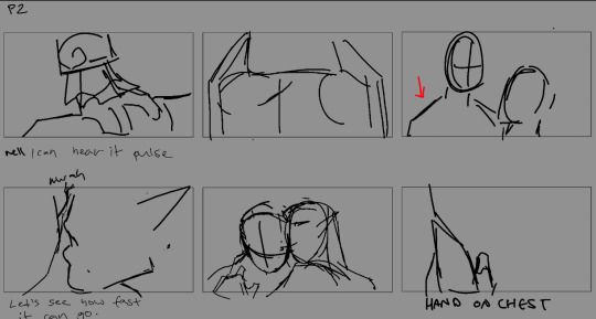
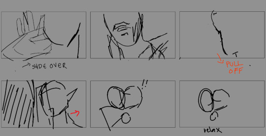
These are my thumbnails b4 I go to animatic/cleaned storyboards which are SO MESSY (I'm a lot better at annotating my thumbs now LOL). The original prompt was top service blood bag x powerbottom vampire and i don't think i portrayed that well enough throughout BUT i think the intro did a good establishment. Which fun fact, this was scrapped but there was actually 20 seconds of Mizrak eyeing Olrox "What is it like? Blood?" Then Olrox leans down and commences the thigh glide.

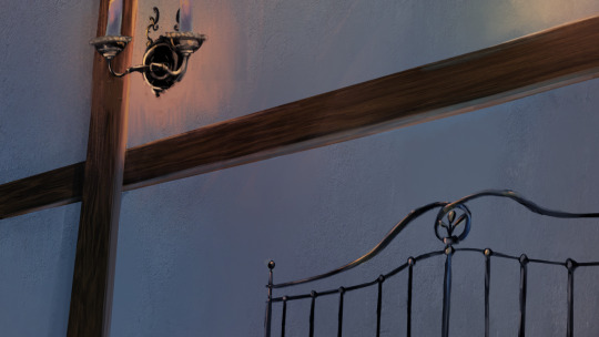


These backgrounds are a mix of texture-bashing (walls/floors) along with some good ol' painting materials from scratch. Also, these are olddd and I can do a lot better yay, but was a good test to see how to make a consistent-ish scene.
ANIMATION: (You can watch the rough anim here)
I'll be super upfront how I don't like most of it AHHA. From starting this in July to posting this in September, I've improved a lot since then.

Since this was a bit ago, I don't remember too much but I remember going ham onto learning material from Dong Chang and animation servers. However in all honesty I think this was only really applied to the earlier shots. I got super frustrated with my "slow speed" so I tried to jump ship and do cleans super early on, which like lets be honest- pumping out two rough anims a day with uni on top is not slow idk what I was on about. This ended up giving me MORE work during the line/colour stage PFFT because I would end up correcting my mistakes in my roughs. Like Myst stop, this is for fun and you're learning, please take it easy LOLOL.
COMPOSITING:
Working on compositing this time around was slightly different, and I'll also admit it is not my favorite composite I've done (and again, I like my earlier shots then my later shots). My after-effects layers looked insane keeping track of the highlight glows on their clothes BUT it definitely paid off. Skin tones however were SO DIFFICULT (mostly in part to the fact I decided to experiment with how I approached it, so it definitely skewed how I worked with this)
I also definitely struggled between the dreamy look and keeping it clean and crisp, and while the dreamy blurred aesthetic does work in some cases, I opted out for the sake of clarity.
Beloved edge light my friend. It's making me learn SUPER late into it how I probably should have planned out a third shadow pass since edge light at the point is a crutch and I think planning it out ahead would get nicer more precise shadows LOL.
Because I brain rotted so hard for this animation I actually commissioned two people to help me work on this! I'll briefly talk about their stuff but please check out their work!
MUSIC: Astralbardkeep
Due the fact I don't have voiceactors, and I had a very specific vision in mind, I decided to go "you know what, let me be super self-indulgent". I had a lot of notes and inspirations for the music, BUT i wanted to have Olrox's theme from the original games peek through, which you will notice happens at the bite AND at the end.
TITLE CARD: Hataui0
This might've seemed overkill, but this friend of mine is very talented at making graphics/typography to suit the requirements of each individual project. (Also a secret ploy to make him make nocturne fanart /lh). So that entire end bit, he illustrated it along with that title, in which the themes I bestowed him were Mucha and Gothic art.

Thank you for reading if you got this far! Suffice to say this was supposed to be a compare and contrast between the animation I did in February, and while I may not quite find this body of work up to my normal standards, it substantial amount of improvement, which is the most important thing here! With the ten billion other things in my life going on, I can only be happy with the progress thus far :D
February on the left/September on the right
#mystery talks#castlevania#mizrak#olrox#animation#castlevania nocturne#i didnt realise how many ppl enjoyed reading this stuff which is so nice wtf I'm just a guy LOL
51 notes
·
View notes
Text


Don't Lose Me In Your Memory
A gift for the amazingly talented @lost-in-thought-20 of their amazingly angst-ridden anxceit fic (which I have linked above).
This was suuuuch a treat to work on, I had a lot of fun playing around with textures and brushes and has just been a great learning experience.
Go check out the fic! (after checking the tags of course)
Image ID under the cut
[ID: A two page black and white comic with a brainlicking.tumblr signature at the bottom of each page. The art is black and white and scratchy, creating a grungy effect.
Page 01, panel 01 depicts Virgil Sanders, silhouetted and standing at the mouth of a darkened alleyway . The walls are bricked, with a gaping black archway on either side. At the top of the panel is a speech bubble with a black background and white text that reads, “LOOK AT YOU NOW”.
Page 01, panel 02 is a close-up shot of Virgil’s eye, looking behind him in terror. He is heavily shadowed, almost blending into the black background, emphasising the white of his eyes.
Page 01, panel 03 depicts Virgil on the far left of the alleyway, recoiling away from the figure on the far right. The figure is a shadow version of Virgil, floating slightly off of the ground with a slumped posture. The gaping black archway of the alley wall between them. The speech bubble with a black background and white text above Virgil that reads, “LOOK AT WHAT HAS BECOME OF YOU”. The speech bubble with a black background and white text below the Shadow-Virgil reads, “I AM AS REAL AS YOUR FEELINGS ARE”.
Page 02, panel 01 is a shoulders-up depiction of Virgil, he is looking slightly upward with his expression frozen in fear. The whites of his eyes continue to be the only source of brightness. The background is dark grey with black, scratchy textures.
Page 02, panel 02 is Shadow-Virgil mirroring the previous panel. The background is completely black with a scratchy white outlining the silhouette, with a pair of unnaturally wide, blinding white eyes.
Page 02, panel 03 is a cell-phone dropped on the ground. The screen is badly cracked and depicts a desaturated, coloured photograph of Virgil and Janus cuddled together on a couch. Janus has long blond hair with a port-wine stain birthmark on the left side of his face, with his arm around Virgil’s shoulders. Virgil is looking at Janus, both have smiles on their faces.
In the center of the page, in the middle of the three panels is a speech bubble with black background with white text that reads, “I AM THE DEATH OF YOUR HOPE”.
End ID]
#Virgil Sanders#Sanders Sides#Fanart#Janus Sanders#I know I say this a lot with my art but MAN I am so fucking happy with how this turned out#anxceit
118 notes
·
View notes
Text

my final for my intaglio style printmaking class! It took a lot out of me, but I’m really satisfied with the end product :-)
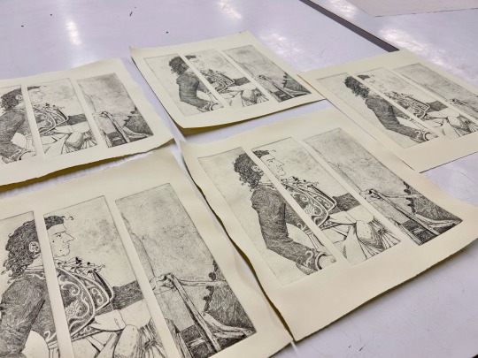
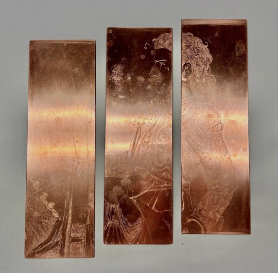
I had to make 5 prints for the finale, each page was about 12 x 13 inches, and printed from 3 separate copper panels.
I was in the studio for 10 hours on the last possible day (work kept my weekends busy) and left at 2am…If I had to guess 1 print would take a good 15-20 minutes to ink. Professor was picky about alignment, so I spent probably 30 minutes going delirious on making a template. I was also paranoid about having clean edges, and even ink distribution, so I was working slow.
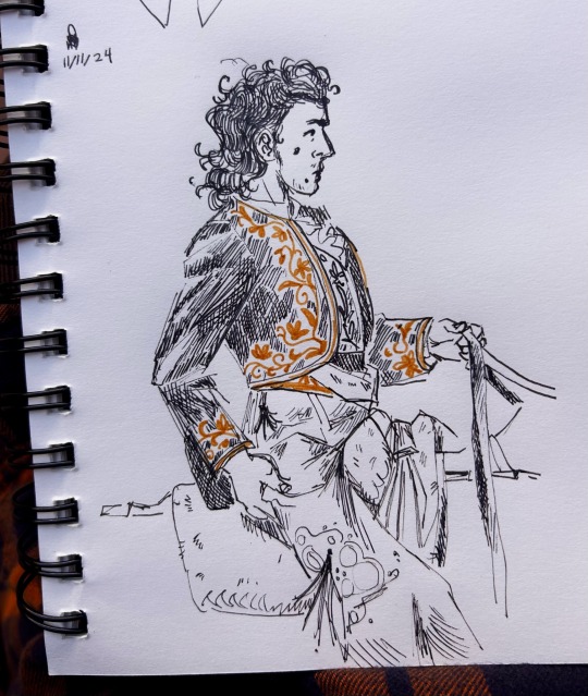
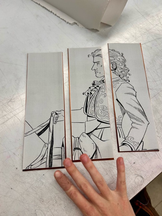
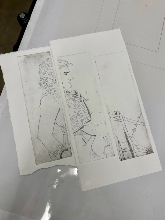
here is the original sketch/concept, I cleaned it up digitally, flipped, and sectioned it off to print. the class ran out of tracing paper so the teacher made me some, forgot what it was called, but it was just a highly pigmented loose powder. then we had the first pass of printing where i just did the basic line work.

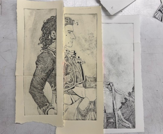
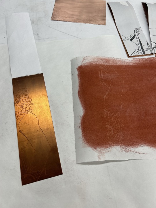
I had the most fun with the arm panel because of all the line textures, slowly chipping away at all the implied shapes. there’s a second pass, for most of my test prints i just taped scraps of paper together because i didn’t wanna waste big sections. so i had a good idea of the final product, but never saw it all together until the very end.
the class ended up having a problem with the hot plate and ground. the rollers were dirty which got debris imbedded in the wax, and thus etched away in the acid. the carnage is most noticeable with the last panel on the right. it was frustrating in the moment, it always sucks to spend hours on something just to etch imperfections you never noticed. but i learned to love it… especially with the off white paper i printed on, I feel the texture adds a nice weathered effect. happy accidents.
I highly suggest taking a printmaking class if you have access to one! it’s time consuming, and may drive you just a little up the walls, but it’s a very rewarding experience. I kinda miss it 🍁
#artists on tumblr#oc artist#oc artwork#oc art#printmaking#intaglio printmaking#intaglio print#art print#print#ink print#my art
25 notes
·
View notes
Note
hey!! i Love the way you draw cats!! i've been trying to get into digital art myself and trying to capture all the colours a cat can have can be so difficult without making it look kinda sloppy and patchworky. Do you have any tips and tricks how you manage to portray to actually look like fur or do you have a good point to start to find info on that so I can practice drawing my little menace without her looking like patches of colour rather than fur?
Hmm, a lot of it is an unconscious collective of my years of digital painting experience, so it's a bit difficult to put into words but if I had to say,
1.) Get a good reference image. I do all of my paintings from photo reference so I don't usually invent light sources, just reinterpret what's already in the photo. I find the most effective ones to be pictures with strong directional lighting with distinct shadow shapes
2.) Learn the underlying anatomy of cats. Understanding the actual shapes that make up a cat allows you to recognize the how and why the shadows and highlights in the reference image work the way they do. 3.) The way I do fur is I get all of my colors and shading down and as final step go over certain areas with a textured blending brush, following the contour of the fur. (I use my own custom brushes in Rebelle 7 but I believe other programs have similar 'mixer brush'-like tools)


I also recommend petting your cat to get a tactile feeling of the planes of her face, what direction the fur goes in where. What kind of movements would disrupt the direction?
As for color-picking I usually go into photoshop and mess with the lighting and color adjustments until I get something similar that I'd like in the final painting. Then I filter > noise > median to get rid of a lot of the details so I'm left with mostly blocks of color and color pick from there. idk if other programs have this specific blur type, but your standard gaussian blur works just as well

In my experience, when you do a lot of painting you eventually are able to see colors in areas of photos that aren't technically captured by the camera but could be perceived by the eye in real life. For starters you can focus on adding more saturated colors in areas of shadow or plane changes.
If you add a color in one part of the fur try and have it, or a similar color, in at least another part of the fur so it looks like more of a cohesive image.
As for other resources I never really did any specific studying for drawing cats in-particular, it was just something I started for fun and honestly haven't really been able to find many resources on it I found super useful.
This video on reflected light did completely rewire my brain when it came to coloring though
If you (or anyone!) has any pieces they'd like me to look over and give direct feedback on I'd be happy to help! Might be a bit more useful then trying to verbalize the specific painting neurons that possess me whenever I'm working on a piece. :)
43 notes
·
View notes
Note
hi! no idea if you take asks like this but thought i'd try. i'm writing a transfem character in a fanfic (in canon they are a cis guy, i just headcanon her as trans), specifically about effects of estrogen. i'm doing a lot of research but i was wondering if there's anything specific you think would be important to know? ty in advance if you do answer! <3
oooh what a fun ask!
having recently taken a stab at writing some fanfic myself, i think the things that would be the most helpful are the things that are more anecdotal because i’d imagine those would be the things that would help get inside her head.
first, there’s a lot of stuff about some of the physical changes out there like softer skin, thinner body hair (but not necessarily less) boob growth, fat redistribution, changes to color perception, eyes and lips appearing bigger because of skin changes and fat redistribution etc. but also really important to writing a trans character is the pacing of the those changes.
the changes are slow. much much slower than most people want. there’s a specific frustration in the slowness because while some changes happen quickly, other take years. and also frustration in comparison. some people see changes within weeks or even days. some people don’t see anything for months or years.
in my own personal experience, everything happened FAST. within a few DAYS i had the beginnings of breast buds. within a few weeks skin had visibly softened and changed texture, especially on my face. but other things took more time. i didn’t really have real boobs until 2.5-3 years in, even though i saw other people with the same timeframe or shorter have much more breast development. the patience required can be excruciating but also the joy is overwhelming and it’s a constant cycle.
and another thing i don’t see talked about too much bc it’s hard to qualify and sometimes hard for some people to notice are the way i process emotions and the way i think about things. now HUGE caveat, some people will use this as a way to justify bio-essentialism and transmedicalism and so it’s very important to note that this is MY experience and uniquely interacts with my own journey.
when i started hrt, within a few hours of taking the first dose, i felt different. not physically, but almost as if there was a peace in my soul because my mind became less cloudy and i could differentiate my emotions more clearly. and i used to think this is because t-blockers means no t and no t means less angry but trans mascs would tell me that their experience with t is the same and not the opposite. i’ve now realized that kind of thinking was actually invalidating to trans mascs on t. and ive realized that its actually because testosterone didn’t feel right in my body and removing it from the equation helped me understand myself better. i had always experienced emotions in this way and my discomfort with my body had stopped me from understanding the complexity and nuance with how i was feeling.
and it took me YEARS to understand what had happened. and it happened alongside of being in therapy and a lot of personal growth. hrt was the catalyst but it was the effort i put into growth that made the difference.
if you have any more questions, i’d love to share more cause i think it would be fantastic if more people who were not trans fem would be able to write trans fem characters with substance, nuance, and complexity! it’s difficult but important and thank you for attempting to do so and approaching this with respect!
96 notes
·
View notes
Text
Things I love about Outer Worlds:
Story mode!!!! Oh my god, story mode.
Absolutely no romance between the PC and the companions.
The whole game is just so pretty.
AND it has nighttime that is STILL VISIBLE.
No audio lines from the PC!!
Companions have perks that make them stealthier, so stealth players actually have incentive to bring them along.
It's honestly just really fucking funny.
My gun has a 6x scope. I have never been happier.
The fun little chats between companions; very similar to DA2 except not just constant bigotry and insults.
I'm sure a lot of people hate the UI but I actually love how easy it is to use and it makes the gameplay a lot more focused than other open-world games.
Companions automatically teleport to you when there's no combat so they never get lost or stuck.
It's just generally a really great game for people who just aren't good at video games but still want the experience.
Things I love less about Outer Worlds:
I wish the companion chats had more event triggers; I had brand new companions talk about our experiences off-world when we hadn't even left their planet.
The rocks almost never have real textures, which makes it very difficult for mountain goat stealth players (me). I have fallen from and gotten stuck in a lot of rocks that don't really exist.
I don't like the blurry effect. It makes me a bit nauseous.
No romance means I can't seduce the vicar :(
Its name is very very similar to Outer Wilds, another space exploration game, and fhat's very confusing for me.
I don't like killing animals :'(
96 notes
·
View notes
Text
So as of 2025, I've been regularly doing digital art for five years! I started in 2020, after around four years of an art drought caused by GCSE Art killing all the joy I ever got out of art. So this has been five years of rebuilding skills I'd forgotten, learning what I enjoy, experimenting, and above all prioritising fun over any sort of feeling of obligation to prevent burning out again.
That's why I post only every once in a blue moon and have no consistent style to speak of; I draw only when and what I want, and avoid it becoming a chore at all costs. And it's been working! I've made some pieces I'm really proud of, so I thought I'd make this lil post to reflect on the last five years, picking out some pieces and fondly critiquing some and giving myself permission to brag about others. Thank you lovely lovely people who follow this blog, even though I post so infrequently. <3
So! Starting with 2020, this was the first piece I ever did digitally:

TMA fanart, because TMA was the whole reason I started drawing again in the first place! I had trouble focusing on podcasts when I first started listening, so I needed something to do with my hands and there was only so much Mahjong I could play before I got bored. So I bought myself a tiny tiny drawing tablet (SO small, I didn't realise how much of a difference it made until I got a bigger one and suddenly everything was so much easier), and drew this.
It's cute! I remember having so much fun drawing all the little details - the books on the shelves all representing a fear each, the post-it notes (the phone number is for the Domino's nearest the Institute, haha), the little tape recorders - and I'm still quite fond of Jon's appearance. You can tell I had NO idea how lighting worked, or how to use lighting to create mood. But it's cute, and it's the one that started it all, haha.
Onto 2021, with a couple of my favourite pieces from that year:


I experimented a bunch that year!! The first image was for a Big Bang, and I think that's the piece I learned I really adore texture and I want it EVERYWHERE. A lot of my pieces that year were done entirely with the scratchiest brush I had, just for that lovely texture. That piece stretched me a lot, drawing two people's full bodies with a full background and so many different materials... woof! But I ended up so so happy with it, and I'm still very fond.
The other one was an experimental style which I ended up really liking. That year I'd challenged myself to draw at least one thing per month (with the caveat that I could quit at any time if it became too much like a chore) and I managed it! And it lead to a lot of very fun experiments and styles and outcomes that I probably wouldn't have done otherwise.


2022 was a very light year for art, but I still made something around once every two months. This was the year I was writing my dissertation though, so that's totally fine. But these two pieces, oohh I really love them. This year was a big year for learning how to use light and shadow effectively.


2023 was a great year for art. I learned a TON that year, and created pieces I'm still so damn proud of. That first image was the first real study sort of thing I'd ever done, and it was so much fun. It's based off Germanic Warrior Looking at a Roman Helmet by Osmar Schindler, and studying that painting triggered my hyperfocus sooo fast. I think I blinked like three times in the what, four months it took me to draw that. It was intoxicating and so much fun and I was sooo relieved when I finished and it was exactly how I wanted it to look. Still so proud of it, just unfortunate now what fandom it's in and what piece of shit author it's associated with.
The second piece I drew like, the day after I finished the first one. I needed something super chill and fun so it's just a screenshot study, but that sorta comic book-esque style with all the heavy black shadows just came out of nowhere and I haven't been able to recreate it since. But I looooove how this piece turned out. Also the rocks!!! The rocks turned out so good guys, they look so realistic and I have no idea how I did that.


2024 was also a pretty light year for art, but I made some of my favourite pieces ever. The first one was an art fight attack for my bestie @ninneko19 of his wonderful character I'm obsessed with, and I really like how it turned out. It was suuuuuch fun expression practice, and I love that guy. The hearts behind him are bc of ME, bc I'M obsessed w him. Mwah mwah.
The second piece is my beloved OC Juno. He's so sad all the time </3 so I got his permanent depressed face down p well, bless his heart. But I looove this piece, it's exactly what I picture Juno actually looking like. It took a billion years bc I tend to agonise over every single thing until it's perfect, but I love how it came out. Kissing him on the mouth and also crying abt him.

Finally 2025!! This is the only thing I've drawn so far this year, but I looooove it. Another study, this time of Fallen Angel by Alexandre Cabanel, featuring my dear boy Bash who suffers so much every day of his life. His hair, horns, eyes, etc etc are made of gold and silver and copper, so the metallic textures made me a little insane but in a good way. I LOVE rendering metal, which is good bc I give so many of my ocs random metallic body parts and features, lol. The background on this one is a little iffy, but hey. I'm not here for perfectionism I'm here for fun, and I gotta freaking remember that.
Hopefully I keep going another five years!! Planning to do art fight again this year and maybe try push myself a little with it (I usually draw one (1) singular piece during AF lol). Was also toying with the idea of opening commissions, maybe if I push myself during art fight and see how I actually fare when drawing multiple things under pressure for other people. We'll see! Thank you for reading this far if you did <33
#art#artists on tumblr#my art#art journey#i guess!!#if you read all this I'm kissing you on the mouth with tongue#but I'm mainly making this as an exercise in reflecting AND also to look back on in another five years hehe
7 notes
·
View notes
Note
hiii !!! love ur art lots, so i've been wondering, what program/app and brushes you use? i love the paper effect you give to your drawings, makes me want to eat em /pos
thank you so much!!!! i appreciate that a lot :D!!!!
(accidentally rambled a lot abt this HAHA)
i use medibang!! ive been using it forrrr maybe like 7ish years now... ive been meaning to one day get clip studio or something but i havent had the chance to buy it and im also a little intimidated at the idea of having to readjust to a new program HAHA
i use a few different brushes!! it depends on what im drawing and what i feel like using at the time (i should probably plan them out more often, actually)

oil paint, g pen, fluffy watercolor, and round brush (wet) are all brushes that come with medibang!!! i know i made Another Marker myself, and im pretttttty sure i made the first marker one too? my favorites are round brush and g pen though!!! i tend to use fluffy watercolor more for colors rather than lineart
(i also keep correction at around 12, i would use it more since my hands arent the steadiest but i find high correction to be kinda confusing so i just keep it low)
the paper effect is smth i learned liiiike maybe two years ago ish? and i have simply KEPT doing it ever since HAHA i do wanna mess around with more textures cus i dont want to be too reliant on just one texture for my art but it IS very fun and i like it...
medibang has a feature that makes it REALLY easy to do!!
custom noise is my BEST friend. the sand, watercolor paper (specifically 2), and marker paper (specifically 2) are the ones i use most often!!!
i also will copy n paste color layers and lineart layer, add gaussian blur and do like 200 layer effects (i most often do this to lineart, then set it to hard light and somewhere between 30-60% opacity to mimic bleeding from ink!!). i DO often experiment w messing w colors wo layer effects cus its fun but sometimes its just more fun to use layer effects instead!!
medibang also has materials!!
i dont use them as often but i like this one :D ive used it on a handful of things
and just for fun!!! things look suuuper different without this stuff. like the thing i just posted used a LOT of this (to be honest its cus i really really didnt wanna do shading for it LOL but it still felt too flat and i feel like these effects are a nice middle ground- but i will still often use this stuff when i AM shading things)

sometimes i will also use similar custom noise textures but for different parts of the image!!! like in this one i had a waatercolor texture for the bg but a seperate one for the foreground

i DIIID a while back post a pic of kinger (its an older post on this acc- not old by most standards but it was during the first little while after i made this blog while i was still finding my footing w the characters) that used a bunch of different textures which i got from freestocktextures.com!! but i havent used them since. i keep thinking i should again
ANYWAY thats basically it!!!! i looove medibang theres a bunch of little things ive figured out abt using it over the yrs that im so fond of it. and THANK U again!!!!!! :']
#ask#i mentioned it but i DO wanna experiment more so i dont just do this and never anything else#but at the same time i DO genuinely rly enjoy imitating watercolor!!!#i try not to be too strict abt it and can and will add details that are not watercolor-y though#i just follow my heart <3#i have a screencap redraw i started the other day w the express purpose of maybe making it look a little like an illustration#i should return to that...#ALSO. oil paint brush is fun. but Be Careful....#THATS the one ive been using for the butch gangle image and its made it a bit unreasonably hard...#bc the brush is sorta like a lot of parallel lines theres like. a dip in the center of the brush with lower transparency#meaning when youre doing shading or lighting or even just coloring smth in youll end up w weird empty spots and its ANNOYING#otherwise a very fun brush though!!!#anyway!!! i love to ramble abt art HAHA this is all way longer than intended#dont even get me started on like. panel layouts or when i add small symbols or allusions or framing etc etc#i looove art. its so painful but i enjoy it so much#<- person who spent most of its life wanting to pursue an art degree then got scared midway thru hs and shifted gears to a bio field#but still sometimes laments what thing left behind...... i think about making comics like Properly sometimes....#gestures at a post i made a while back out of nowhere abt connecting w gangle. this was related HAHA#anyway i need to stop rambling i have another ask to answer!!!! i will be here forever if i tlak about art
9 notes
·
View notes
Text
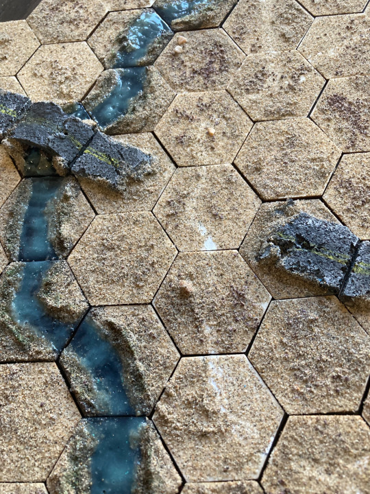
Out in the desert, no one can find you... (Hex Tiles 1)
A sharp wind whistles through the desert dunes, bringing no reprieve to the travelers following the thin paths left out in the sand. Don't drink from the river — the plants that grow along its shores contain toxins that could leave a grown man coughing up blood, and chemical spills float through the current. A faraway road carries the rare drone-tank, long abandoned from any sort of human use.
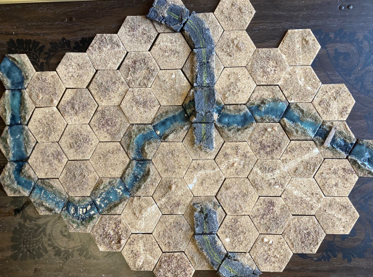
My newest hobby, to distract myself on months when the purse is a bit too tight to be buying plastic crack from Games Workshop, is to build modular hex tiles! It's super easy — I pick up a hundred of these wooden MDF tiles from Amazon for $10 (they're advertised as 2", but they're 1.75" from tip to tip, and each side is 1"), grab any spare craft supplies I have lying around, and get to work! They're super quick (this first batch of one hundred took me around a week) and they open the door to a lot of cool experimentation. A lot of this is inspired by the work of u/Marcus_Machiavelli over on Reddit, who makes these fantastic modular hive city components that I hope to someday be able to emulate.
I'm making these for two purposes, neither of which I've put in practice yet but I'm hoping to get to do at some point. They're for:
Any mass-battle games played at 6mm. This could also work for Adeptus Titanicus or the upcoming Epic reboot that Games Workshop is working on.
Tactical TTRPGs like Lancer that are played with large beings, who can operate on a 6mm scale.
Once I get some games in with them, I'm sure I'll encounter future problems and reassess how I approach them. But for now, this is what I've got!
I Hate Sand
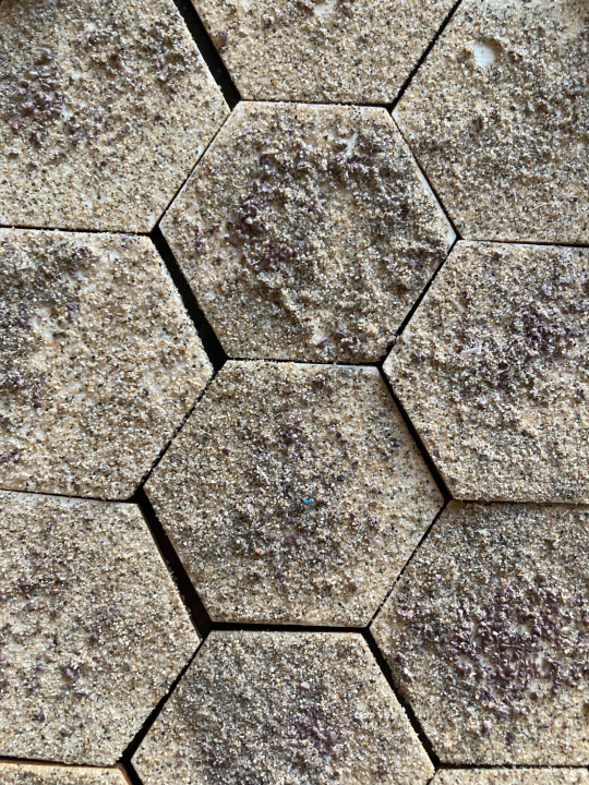
The first set of tiles I made, to serve as the backdrop for the rest of them, are these sand tiles. I chose to make this a desert (and thus make a bunch of sand tiles) because I already had some sand lying around, and because it's really cheap and easy to work with. Be careful though! Anakin was right; sand sucks. Try and pick up a finer grain than what I went with, apply the sand in a more-controlled location than I did, and secure it better than I did too. But here's how I did them:
Coat the surface of the hex with a mix of PVA glue and water.
Sprinkle on a light dusting of gravel or small rocks.
Apply a thick coat of sand on top of the gravel.
Knock off excess sand and recycle it for next time.
Spray with 1-2 layers of varnish. (I would recommend a sealant instead, but I didn't have any at the time)
For the ones with little paths on them, I painted the path on with White before applying the gravel or sand, and it shows through well enough! The paths are unnecessary — they're a fun experiment, but I don't think I'll be making more of them in the future.
The Gurgling Creek
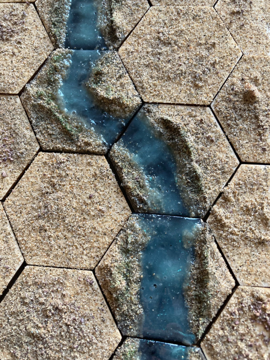
Making the river tiles was a bit more involved, but still pretty easy. The method I came up with I think looks a lot better than just painting on water, and is a lot easier to work with than resin or water effects.
Use some kind of texture gel to build up the riverbanks, trying to have them end around 1/4" on the sides of the tiles where you want your river to connect.
Paint a strip Black where you want the river to flow, running from one edge to another.
Apply sand as before, everywhere except where you painted the black. (If you're worried about fucking this up, you can swap the order)
Varnish (or use sealant) as before.
Take some gloss mod podge and mix it with a light blue paint, and apply in large goopy quantities everywhere you want water to be. Leave overnight to dry. (If you want the river to be less cloudy, apply many thin coats of mod podge instead, letting each layer dry before applying the next)
As an extra, stipple green along the edges of the water and use a dark green wash to create patches of vegetation.
The river pieces are my favorites, and I'm the most proud of them. The tiny bridge was a thin strip of balsa wood, painted white and then washed black. It turned out fine.
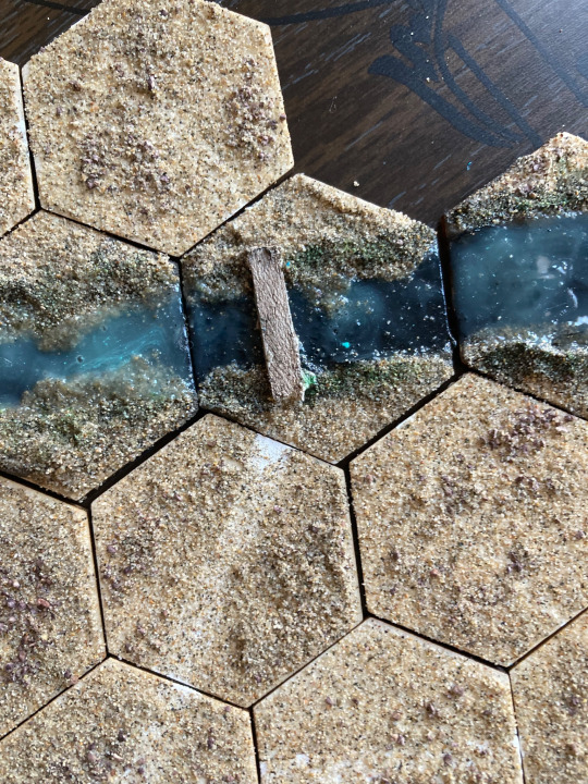
I did a solid mix of straight river pieces and curving river pieces. If I was going to do it again I'd make more curving pieces than straight river pieces, because the curving ones make more sense for how rivers work.
The Road To Nowhere

These road tiles turned out really well, perfect for a run-down highway in the middle of nowhere. Here's how I made them:
Take a piece of corkboard and cut it down to be 1.75" long and 1" wide.
Glue it on a hex with the two edges of the corkboard touching two sides of the hex.
Go at the edges with a knife, making it all worn down and busted up.
In some of these spots, I fucked up and glued the corkboard on wrong. To fix that, break off a chunk and reposition it so it'll connect correctly. This will look like a big fat crack in the middle of the road, which is perfect.
Coat in a layer of mod podge or PVA glue. Leave to dry.
Once dry, paint the cork entirely Gray.
Drybrush White onto the corkboard, focusing on the edges and exposed spots.
Paint two thin yellow lines along the middle of the road. (These are optional, but they do a lot to make the 6mm scale convincing)
Apply sand, as before, onto the ground and up the sides of the road, so it looks like the road is emerging from the sand. Maybe apply some sand in a couple spots in the cracks to make it look like the sand has gotten in there.
Varnish and/or sealant, as before.
Apply a Black wash to the road. (There's a lot of tricks here! If you want the yellow stripes to be more vibrant, you can only paint them on after the first black wash. You can also target spots of sand on the road to make it look like it's asphalt runoff, soaking black into the cracks.)
Apply a second Black wash to the road.
The bridge was a bit more complicated, and took some finicky positioning and a trip to Kung-Fu Tea.
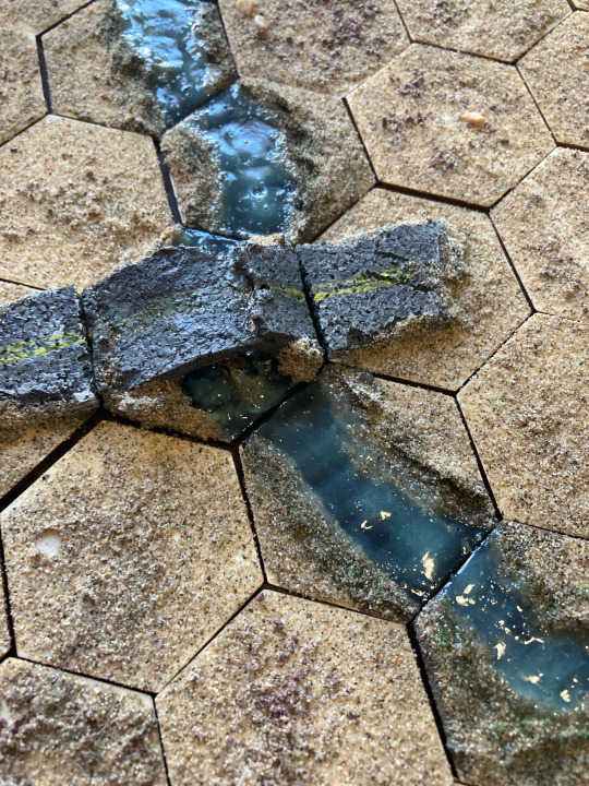
Take a boba tea straw and cut it into 1" segments, then cut them in half, gluing them to the middle of the hex as culverts.
Take corkboard and glue it over the culverts, bending it so it meets the two edges you want the bridge to run along. If it breaks, that's okay — this is a crumbling, middle-of-nowhere bridge.
Use texture gel and spare corkboard to fill in the gaps.
Use texture gel to define the steep edges of the river. Apply a little bit in between the culverts.
Do all the road steps to the road part of the bridge, and all the river steps to the river part of the bridge.
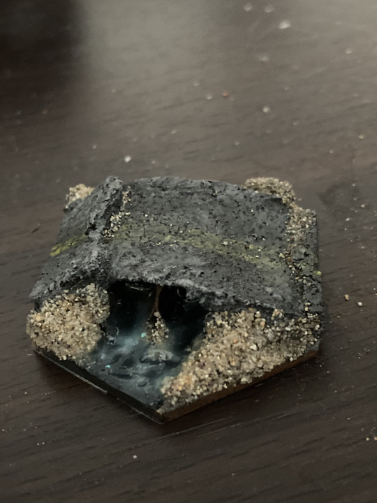
I'm exceedingly proud of the bridge hex. It turned out perfectly, and feels very emblematic of what I want this project to be like.
Why You, Too, Should Make 6mm Terrain
6mm terrain is amazing to make. Mistakes look like part of the landscape or the brain smudges them over due to the small size, and small changes look like fascinating little details. It really opens the imaginative space and I absolutely adore working at this scale. Plus I'm developing a ton of experience with various materials I've never worked with before, so I get to enjoy the triumph of carving foam or corkboard. It rules! I might even try to make a 28mm bridge after the success I had making a 6mm one.
My future plans for this project include cliffs, craters, 3D-printed shantytowns, and overpasses. But all that is for a later date — for now I'm gonna rest on my laurels, and spend the rest of the evening reconfiguring various tile combinations and cackling like a mad scientist.
169 notes
·
View notes
Note
So hi, reporting back - I’ve been working my way through your MOTA fics as well as a bunch of the authors you recommended and I’m having a fantastic time so thank you very much for that! I stand by everything I said last about your writing (re: good brain textures and incredible work with voices and characters etc.) and I’m going to add a new praise: reading your stuff has rekindled my own dwindling energy to write my stuff, and now I’m not only back to writing at a furious pace I’m also doing it while making a conscious effort to change up how I do things and how I see writing (even just as a hobby) as a craft that I’d really like to practice and hone, or at least do fun things with beyond just delivering a narrative. That’s been missing for me for a while even though I kind of always write bits and bobs here and there, so I just wanted to say thank you very very much for that and for everything you’re doing!
First off, yayyyyy I'm so stoked that you're enjoying the recs! I really admire the work of everyone I put on that list, and lots of others in this fandom too, so I'm very very very happy that you sought them out and read their stuff and had a good time! I know it would be so appreciated if you showed them some love as well <3
Secondly,

I don't know if there's any better feeling as a writer than being told that your work inspired someone else to create something. It's about like sharing your joy and this thing which means so much to you, and igniting that same joy in someone else. I think that creative hobbies, especially ones that we share within communities, often get distilled down to these quantifiable measures of success which are just not at all fit for purpose. It's easy to fall into the trap of being focused on the stats and wondering why the stats aren't higher etc. etc. But what I try to remind myself of (and I fail at sometimes, we all do) is that the success of a piece is much more about whether I executed what I intended to, and whether it had the impact on the reader that I was hoping to cultivate. That can't be shown in numbers, really.
I'm just musing about this and in a positive place about it, I think, because I've been writing quite a bit recently (literally just the past few days lol) and I'm trying to load up this bank of good thoughts to help me when things are harder. Which is all to say that like... I'd much rather play with words and experiment with language and try stuff out, and be like "I want to have this effect... how do I get it?" and "I want to portray this emotion/experience/tone... how do I get there?", and enjoy what I'm doing on that level, because it's like so much more enriching to test myself in those ways and truly have fun with it. And like. It's just so incredible to me that you're feeling all that too, and enjoying the process of writing itself, because honestly that's the best part. And I'm just really happy for you. And really humbled that you saw me enjoying writing and wanted to enjoy it too. Thanks so much for sending this I'm a giddy wreck xxxxx
#asks#i don't even know how to thank you enough for saying this honestly#there has been a lot of. weird stuff going on about copying vs. inspiration with some mutuals of mine#which is making some people feel really (rightfully) shit#and idk it's just really really lovely that you wanted to write because of my writing and you told me about it#i changed all my writing tags on the weekend and maybe i need one for just. waffling about writing#phlegmatic writes#<<< it's this now
7 notes
·
View notes