#houzz architecture
Explore tagged Tumblr posts
Visit Tumblr Blog
Explore Tumblr blogs with no restrictions, modern design and the best experience.
Last Seen Tumblr Blogs


Fun Fact
Tumblr posted its first advertisements in May 2012 and subsequently earned $13M in revenue.
Text
Checkmate Debbie!
I'm officially squashing my beef with Hauzz. Why?
🗣BECAUSE I DUN FOUND ALL OF YOUR SHIT DEBORAH!
All of your in-game stuff PLUS the blender rooms!
Where? It's all over the internet hun! It's not just in one place, it's in several.

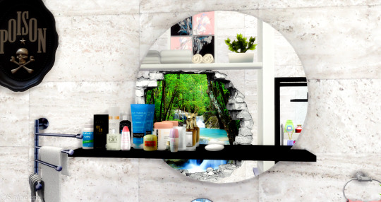


I got your bathroom set (sink, shower, mirror, tub)
Tbh, the bathroom set is nice! I'm loving the mirror with shelves! We need creators to do more stuff like this!
I found a lot of bedroom stuff too!


The bedframe and the bear belongs to Hauzz. Her bedframe pairs really well with platinumluxsims' mirror furniture.
Found a sofa recolor, some paintings, and an orchid too!


I got your Houzz AND your Hauzz stuff!
And I just know it had to have been one of your so-called friends that shared it too! This stuff dates waaayy back to 2020, so it's been here awhile!
#BeMad and #StayMad
And before you catch a case, Debbie is this you?


#hauzz#Hauzz Architecture#houzz architecture#sims houzz#sims 4#simblr#ts4#sims#patreon#sims 4 community#sims tea#sims drama#and that's the tea
2 notes
·
View notes
Text

Virtual Railwayz
#indoor-outdoor#modern landscape#outdoor spaces#landscape design#houzz pros#modern#landscape architecture
0 notes
Text
Home Bar Galley in London

A large, contemporary galley design with gray flooring and ceramic tiles, an undermount sink, flat-panel cabinets, white cabinets, solid surface countertops, and travertine backsplash is an example.
1 note
·
View note
Photo
Living Room Library Paris An illustration of a large, modern, open-concept living room library with beige walls and a medium-tone wood floor.
0 notes
Text

Organisational bliss meets stunning design!
Check out our latest project in Northmead featuring this appliance pantry with captivating two-toned joinery in Perugian Walnut and Prime Oak Woodmatt. Who else is in love with this beautiful blend of colours?
Design & Joinery Broker: @improva_au Builder: @capstoneprojects Photography: @inwardoutward
#architecture#blakesofsydney#renovationbrokers#australiandesign#australianhomes#bespokejoinery#dreamkitchen#homebeautiful#homedesignideas#houzz#improva_au's profile picture#joinery#interiorsaddict#interiorachitecture#kitchenremodel#kitcheninspo#instakitchen#sydneydesigner#sydneyhomes#sydneyinteriordesign#sydney#sydneyhome#sydneyrenovations#voguelivingaustralia#thedesignory#renovationhelp#renovationadvice#sydneyconstruction#sydneyhomeowners#sydneyrenovators
0 notes
Photo

San Diego Front Yard An example of a small mid-century modern drought-tolerant and full sun front yard concrete paver landscaping.
1 note
·
View note
Text
How to Select a Reliable Door Company for Your Home Renovation

A successful home renovation isn’t just about paint colors or new flooring—your doors play a major role in the look, feel, and security of your space. Whether you’re upgrading your front entryway, replacing interior doors, or installing patio sliders, partnering with the right door company is essential for quality results. But with so many options available, how do you know which company to trust?
In this article, we’ll break down the key factors homeowners should consider when choosing a door company, and what to look for to ensure a smooth and satisfying renovation experience.
Why Choosing the Right Door Company Matters
Doors are more than just passageways—they contribute to your home’s:
Security
Energy efficiency
Sound insulation
Aesthetic appeal
Resale value
A professional door company will offer the right blend of quality products, expert installation, and reliable customer service—ensuring your renovation is an investment, not a gamble.
1. Look for Experience and Specialization
Start by researching door companies with a strong track record in residential projects. An experienced door company understands the nuances of installation, material selection, and regional building codes. Ask questions like:
How long have they been in business?
Do they specialize in exterior doors, interior doors, or both?
Can they handle custom door solutions?
Companies that focus specifically on doors—as opposed to general contractors—are more likely to deliver superior craftsmanship.
2. Review Product Options and Brands
A reputable door company should offer a wide range of options to suit your budget and design preferences. Common door types include:
Fiberglass entry doors for durability and energy efficiency
Wood doors for classic aesthetics
Steel doors for security
Sliding and French patio doors
Interior panel or flush doors
Ask whether the company partners with well-known brands and if their products are ENERGY STAR® rated, especially for exterior installations.
3. Check Customer Reviews and References
Online reviews can reveal a lot about how a door company operates. Look at platforms like Google, Yelp, Houzz, and the Better Business Bureau to get a sense of:
Workmanship quality
Timeliness
Customer service
Warranty honoring
You can also ask the company for references from recent clients or request photos of past projects.
4. Ask About Installation and Warranty
Even the best door won’t perform well if installed incorrectly. That’s why it’s crucial to choose a door company with trained, certified installers. A proper installation ensures:
Tight seals to reduce drafts
Smooth functionality
Long-term durability
Don’t forget to ask about warranties on both the product and the labor. A reliable company stands behind its work and will clearly explain your coverage.
5. Request a Detailed Quote
A trustworthy door company will provide a clear, written estimate that outlines:
Cost of the door(s)
Labor and installation fees
Hardware or customization
Removal and disposal of old doors
Project timeline
Avoid companies that give vague pricing or high-pressure sales tactics. Transparency is a key indicator of professionalism.
6. Consider Local Expertise
Local door companies often have better insight into regional climate challenges and architectural styles. They may also be more responsive when it comes to service calls or warranty claims.
Supporting a local door business can also be beneficial for your community and may help you qualify for regional rebates or incentives on energy-efficient products.
Final Thoughts: Finding a Door Company You Can Trust
The right window and door company will make your renovation process smoother, more enjoyable, and ultimately more successful. By focusing on experience, transparency, product quality, and installation expertise, you can confidently select a partner who brings your vision to life—one door at a time.
Whether you’re installing a statement front door or upgrading your interior with sleek, modern styles, don’t settle for anything less than a door company that values quality, service, and customer satisfaction.
0 notes
Text

How to Choose the Right General Contractor for Your Construction Project
Whether you're building a new home, renovating a commercial space, or undertaking a major addition, hiring the right general contractor (GC) is arguably the most important decision you'll make. A skilled and reliable GC ensures your project is completed safely, on time, and within budget. On the other hand, the wrong choice can lead to cost overruns, delays, subpar workmanship, and legal complications.
This comprehensive guide is designed to help homeowners and small business owners navigate the selection process with confidence, clarity, and due diligence.
What Does a General Contractor Do?
A general contractor is the lead professional responsible for managing a construction project from start to finish. Their role typically includes:
Hiring and supervising subcontractors (e.g., electricians, plumbers, framers)
Scheduling work and coordinating logistics
Ordering and receiving materials
Securing permits and inspections
Communicating with the client throughout the process
Ensuring compliance with local building codes
In short, the GC is your project’s quarterback, ensuring all moving parts align smoothly.
Step 1: Define Your Project Scope
Before you start searching for a contractor, clarify the scope of your project:
What is the size and type of the project (residential or commercial)?
Are you doing a remodel, new construction, or tenant improvement?
What are your timeline expectations?
Do you need design-build services, or do you already have architectural plans?
Clear expectations allow you to find contractors who specialize in your type of work and are available within your desired timeframe.
Step 2: Gather a List of Qualified Contractors
Use multiple resources to build a candidate list:
Referrals: Ask friends, family, neighbors, or business peers who have had positive experiences.
Online directories: Platforms like Diamond Certified, Houzz, Angie’s List, and HomeAdvisor vet professionals.
Trade associations: Local builders’ groups or chambers of commerce can provide recommendations.
Job site signs: Take note of contractor names on local construction projects.
Step 3: Verify Credentials and Experience
Once you’ve identified a few prospects, vet their qualifications carefully:
Licensing: Make sure they are licensed in your state. You can usually check this through a state contractor licensing board.
Insurance: Confirm they carry general liability and workers’ compensation insurance.
Bonding: Some states require contractors to be bonded to protect clients from incomplete or substandard work.
Experience: Ask how many years they’ve been in business and whether they have experience with your project type.
Look for contractors with a track record of delivering projects similar in scope, complexity, and style.
Step 4: Review Portfolios and References
Reputable contractors should be able to share examples of completed projects and offer references from recent clients.
What to ask previous clients:
Were you satisfied with the finished work?
Was the project completed on time and within budget?
How was communication throughout the project?
Were there any unexpected issues, and how were they handled?
Photos, testimonials, and case studies can help you gauge consistency and quality.
Step 5: Interview Contractors In-Person or Virtually
Interviewing at least three candidates allows you to compare approaches and personalities. Treat it like a professional job interview.
Questions to ask during the interview:
What is your current project load and availability?
Who will be the day-to-day contact on-site?
How do you manage subcontractors?
What’s your typical payment schedule?
Do you offer a warranty on your work?
A good contractor will ask you questions too—about your goals, lifestyle, budget, and priorities. This shows they’re invested in the outcome.
Step 6: Request Detailed Bids and Compare Apples to Apples
Ask for written proposals that break down the scope of work, material allowances, labor costs, timeline, and payment terms.
Watch for these red flags:
Vague descriptions or lump-sum pricing
Missing line items
Extremely high or low bids compared to others
Price matters, but the lowest bid isn’t always the best value. Consider the level of detail, clarity, and professionalism in each estimate.
Step 7: Check Reviews and Dispute History
Do a quick background check by reviewing:
Online reviews (Google, Yelp, BBB)
Better Business Bureau complaints and ratings
State contractor licensing board records for past violations or disciplinary actions
While one or two negative reviews may not be disqualifying, recurring complaints about reliability or quality are cause for concern.
Step 8: Understand the Contract
Once you've chosen a contractor, insist on a written agreement that covers:
Scope of work
Total project cost and payment schedule
Start and completion dates
Change order policy
Insurance and license details
Warranty terms
Never sign a vague or incomplete contract. Review it with an attorney if the project is high-value or involves complex terms.
Step 9: Establish a Communication Plan
Successful projects rely on transparency and collaboration. Before work begins, establish a communication protocol:
Who will be your main point of contact?
Will updates be weekly, daily, or as needed?
What tools will be used (email, project management software, site visits)?
Clear expectations reduce misunderstandings and help resolve issues quickly.
Bonus Tips for Small Business Owners
If your construction project involves commercial space:
Make sure the GC has experience with local permitting for commercial builds.
Understand ADA (Americans with Disabilities Act) compliance requirements.
Inquire about working after hours to minimize business disruption.
Confirm whether the GC is familiar with fire code, zoning, and safety regulations.
Red Flags to Watch For
No proof of license or insurance
Pressures you to make quick decisions
Requests large upfront payments
Won’t provide references
Poor communication or professionalism
Final Thoughts
Choosing the right general contractor is more than a financial decision—it’s a partnership. With thorough research, clear expectations, and transparent communication, you can find a professional who delivers high-quality results and a stress-free experience.
By investing the time upfront to properly vet and select your GC, you’re setting the foundation for a successful construction project that adds long-term value to your home or business.
0 notes
Text
Choosing the Best Remodeling Company in Massachusetts: What to Look For (LKS Construction Inc)
Remodeling your home is a big investment, and choosing the right contractor can make all the difference between a dream renovation and a stressful experience. If you’re searching for the Best Remodeling Company in Massachusetts, it’s important to know what qualities set the top contenders apart.
Why Hire a Professional Remodeling Company?
Whether you’re updating a kitchen, revamping a bathroom, or planning a whole-house renovation, professional remodelers bring expertise, efficiency, and peace of mind. They handle everything — from design and permits to construction and final touches — ensuring your project stays on time and within budget.
Key Qualities of the Best Remodeling Companies in Massachusetts
Local Experience and Reputation The best remodeling companies are deeply familiar with Massachusetts building codes, weather conditions, and architectural styles. Look for firms with a strong local presence and proven track record of successful projects across towns like Newton, Wellesley, Sudbury, and Brookline.
Licensed and Insured A top-rated remodeler will be fully licensed and insured. This not only protects you from liability but also ensures the contractor meets state standards for professionalism and safety.
Skilled Design and Construction Teams The best companies offer in-house designers and skilled craftsmen who work together to bring your vision to life. From initial sketches to final finishes, their teams prioritize both aesthetics and functionality.
Transparent Estimates and Contracts Clear, honest communication is a hallmark of a great remodeling company. They’ll provide detailed estimates, realistic timelines, and written contracts that outline every aspect of the job.
Customization and Creativity Massachusetts homes are full of character, from classic Colonials to modern townhouses. The best remodelers will help you preserve what you love about your home while upgrading it to meet your lifestyle needs with custom solutions.
Stellar Customer Reviews Positive reviews and referrals speak volumes. Look for companies with consistently high ratings on platforms like Google, Yelp, Houzz, and the Better Business Bureau. Don’t hesitate to ask for references or visit completed projects if possible.
Services Offered by Top Remodeling Companies
The best remodeling firms in Massachusetts typically offer:
Kitchen and bathroom remodeling
Basement finishing and home additions
Custom cabinetry and built-ins
Whole-house renovations
Energy-efficient upgrades
Aging-in-place solutions
Final Thoughts
Massachusetts is home to many talented remodelers, but finding the best one for your project takes a bit of research. Focus on reputation, communication, and experience, and choose a company that listens to your needs and treats your home with respect.
When you partner with the best remodeling company in Massachusetts, you’re not just upgrading your space — you’re investing in your comfort, your property value, and your future.
0 notes
Photo

From the softest sage to the deepest forest hue, green is having a big moment in design these days. “Green is a great color for a room because it evokes a sense of calm, balance and renewal,” says Susan McBarnet, a designer in Charlotte, North Carolina. “It’s often associated with nature, which can help us feel more grounded and less overstimulated.” Take a look at 10 scrumptious green hues Houzz professionals have used on a wide variety of projects and see if any of them are a good match for your home. haywoodmade interiorsSave Photo1. Suffield Green by Farrow & BallDesigner Kelsey Haywood of Haywoodmade Interiors had so much confidence in Suffield Green by Farrow & Ball that she drenched this Chicago sunroom in it. The color covers the walls, the trim and the ceiling.“The way this color plays with the light throughout the day makes it a cheerful and yet very sophisticated green,” Haywood says. “It plays well with neutrals and brass.” The bold move of color drenching paid off. “This is one of my favorite sunrooms that we have done,” Haywood says.Find a local interior designer on HouzzDANIELLA VILLAMIL INTERIORSSave Photo2. Forest Green by Benjamin MooreInterior designer Daniella Villamil used a range of beautiful green paint colors throughout this art-filled Las Vegas condo. The luxe deep green on the kitchen cabinets seen here was one to which she’d given the ultimate testing and endorsement — she’d used it in her own home. “My clients had fallen in love with this color green when they saw photos of my own kitchen,” Villamil says. “They knew they wanted something similar in their own kitchen.” The color complements the palm fronds seen outside the kitchen’s large windows and glass balcony door.Craftsman Design and RenovationSave Photo3. Flora by Benjamin MooreDuring an extensive remodel completed by Craftsman Design and Renovation, homeowners Claudia Thornton and Brian Halpin chose their own paint colors. A wall of north-facing windows in their Portland, Oregon, kitchen floods the room with indirect natural light and inspired the choice of Benjamin Moore’s Flora for the cabinetry. “This color reflects the north light that pours into the kitchen and offers such a calm welcome to the space,” Thornton says. “And the kitchen has a big wall of windows facing north, so the colors never have sunshine on them, but lots of light reflected.” Flora also works beautifully with the original architectural details of the 1916 Craftsman home. “The kitchen is the heart of our home,” Thornton says.Shop for your kitchenJL Caccamo DesignSave Photo4. Saybrook Sage by Benjamin MooreThese Boston-area homeowners wanted to bring historic character and visual interest into their cookie-cutter 1990s Colonial-style home. Designer Jessica Caccamo of JL Caccamo Design set the tone for the kitchen’s palette with Benjamin Moore’s Saybrook Sage. “Saybrook Sage is a color we come back to frequently,” she says. “It’s a warm, soft green that can be a chameleon in any room. Here, we paired it with a neutral backsplash that featured natural variation in color and subtle texture for visual interest. We also love the contrast with the dark countertops.”Konrady & Son Construction, LLCSave PhotoSaybrook Sage also looks great on walls. In this French country bedroom remodeled by Konrady & Son Construction, the color provides soothing comfort. The sage tone plays beautifully off the wood door and mantel.5. Olympic Range by Sherwin-WilliamsThis Seattle remodel incorporated two wide glass walls, so consideration of the light was an important part in choosing the right shade of green for the kitchen. Other factors in the decision were cohesion with the Victorian-era architecture and the rosy glow of the polished fir floors.“That light reflecting off of bright-colored cabinets might have made the room uncomfortably bright, leading us to explore darker color options,” says Malcom Richardson of Board & Vellum. “That hint of rose [from the flooring] is complemented by greens. With this in mind, we selected a rich jewel green that strengthens the home’s Victorian aesthetic and evokes a natural, serene feeling, linking the kitchen to the garden just outside.”Find a local architect6. Green Hydrangea by Benjamin MooreIn the same Victorian-era house seen in the previous photo, interior designer Abbas Rachaman of Board & Vellum knew that continuing the color green into the powder room would help connect the two spaces. However, he was looking to rev it up, and his clients were on board. “We called this powder room ‘The Jewelbox,’ and we wanted to do something special,” the designer says. “It was all up to what would go with the wallpaper. Because we wanted to do something that was a pop and a surprise, we really leaned into the chartreuse. This color truly makes it such a nice surprise.”Shop for your bathroom7. Peale Green by Benjamin MooreMadison Jackson, lead designer at Lee Kimball, knew her Boston-area clients were excited to do something fun and bold in their game room. A saturated color was just the thing to kick it off. “Benjamin Moore’s Peale Green felt like it hit the mark of giving the space a presence that drew you in but still felt cozy and not over the top,” Jackson says. “It paired really well with the contrasting saddle leather tones and the more analogous blue-greens in the rug and pillows.”New to home remodeling? Learn the basicsJL Caccamo DesignSave Photo8. Mediterranean Teal by Benjamin Moore Caccamo selected Benjamin Moore’s Mediterranean Teal for this Tucson, Arizona, reading nook. “We were so happy that our client took the leap of faith to paint the entire primary living space this deep blue-green,” she says. “People often think that a darker or saturated color will make the room dark, but it is rarely the case.” The room gets lots of bright natural Sonoran Desert light. “This color takes a big, cavernous room and makes it feel cozy,” Caccamo says. “It serves as a great backdrop for art, plants and decor.” 9. Yeabridge Green by Farrow & BallMcBarnet, of Wild Child, specializes in playrooms. When she chose Yeabridge Green by Farrow & Ball for this room, she was thinking of the qualities it would offer not only to the young children who live here, but also to their parents. “We loved this fresh, clean, midtone green for our clients’ playroom because it brings a sense of calm to the space,” she says. “It helps the whole family feel more grounded without taking away from the energy and fun of the room. In a space that’s all about creativity, movement and play, green provides a soothing backdrop that supports focus and emotional regulation while still feeling fresh and fun.”See why you should hire a professional who uses Houzz Pro softwareAnn Lowengart InteriorsSave Photo Source link
0 notes
Text

Hello from our Dover Heights project!
Watch this space as we bring together an incredible transformation of this home for our lovely clients.
#architecture#design#furniture#home & lifestyle#product design#joinery#interiorsaddict#bespokejoinery#interiorachitecture#houzz#homedesignideas#kitchenremodel#kitcheninspo#dreamkitchen#instakitchen#australiandesign#sydneydesigner#australianhomes#sydneyhomes#sydnevinteriordesign#sydney#sydneyhome#sydneyrenovations#voguelivingaustralia#thedesignory#homebeautiful#renovationbrokers#renovationhelp#renovationadvice#blakesofsydney
1 note
·
View note
Photo

From the softest sage to the deepest forest hue, green is having a big moment in design these days. “Green is a great color for a room because it evokes a sense of calm, balance and renewal,” says Susan McBarnet, a designer in Charlotte, North Carolina. “It’s often associated with nature, which can help us feel more grounded and less overstimulated.” Take a look at 10 scrumptious green hues Houzz professionals have used on a wide variety of projects and see if any of them are a good match for your home. haywoodmade interiorsSave Photo1. Suffield Green by Farrow & BallDesigner Kelsey Haywood of Haywoodmade Interiors had so much confidence in Suffield Green by Farrow & Ball that she drenched this Chicago sunroom in it. The color covers the walls, the trim and the ceiling.“The way this color plays with the light throughout the day makes it a cheerful and yet very sophisticated green,” Haywood says. “It plays well with neutrals and brass.” The bold move of color drenching paid off. “This is one of my favorite sunrooms that we have done,” Haywood says.Find a local interior designer on HouzzDANIELLA VILLAMIL INTERIORSSave Photo2. Forest Green by Benjamin MooreInterior designer Daniella Villamil used a range of beautiful green paint colors throughout this art-filled Las Vegas condo. The luxe deep green on the kitchen cabinets seen here was one to which she’d given the ultimate testing and endorsement — she’d used it in her own home. “My clients had fallen in love with this color green when they saw photos of my own kitchen,” Villamil says. “They knew they wanted something similar in their own kitchen.” The color complements the palm fronds seen outside the kitchen’s large windows and glass balcony door.Craftsman Design and RenovationSave Photo3. Flora by Benjamin MooreDuring an extensive remodel completed by Craftsman Design and Renovation, homeowners Claudia Thornton and Brian Halpin chose their own paint colors. A wall of north-facing windows in their Portland, Oregon, kitchen floods the room with indirect natural light and inspired the choice of Benjamin Moore’s Flora for the cabinetry. “This color reflects the north light that pours into the kitchen and offers such a calm welcome to the space,” Thornton says. “And the kitchen has a big wall of windows facing north, so the colors never have sunshine on them, but lots of light reflected.” Flora also works beautifully with the original architectural details of the 1916 Craftsman home. “The kitchen is the heart of our home,” Thornton says.Shop for your kitchenJL Caccamo DesignSave Photo4. Saybrook Sage by Benjamin MooreThese Boston-area homeowners wanted to bring historic character and visual interest into their cookie-cutter 1990s Colonial-style home. Designer Jessica Caccamo of JL Caccamo Design set the tone for the kitchen’s palette with Benjamin Moore’s Saybrook Sage. “Saybrook Sage is a color we come back to frequently,” she says. “It’s a warm, soft green that can be a chameleon in any room. Here, we paired it with a neutral backsplash that featured natural variation in color and subtle texture for visual interest. We also love the contrast with the dark countertops.”Konrady & Son Construction, LLCSave PhotoSaybrook Sage also looks great on walls. In this French country bedroom remodeled by Konrady & Son Construction, the color provides soothing comfort. The sage tone plays beautifully off the wood door and mantel.5. Olympic Range by Sherwin-WilliamsThis Seattle remodel incorporated two wide glass walls, so consideration of the light was an important part in choosing the right shade of green for the kitchen. Other factors in the decision were cohesion with the Victorian-era architecture and the rosy glow of the polished fir floors.“That light reflecting off of bright-colored cabinets might have made the room uncomfortably bright, leading us to explore darker color options,” says Malcom Richardson of Board & Vellum. “That hint of rose [from the flooring] is complemented by greens. With this in mind, we selected a rich jewel green that strengthens the home’s Victorian aesthetic and evokes a natural, serene feeling, linking the kitchen to the garden just outside.”Find a local architect6. Green Hydrangea by Benjamin MooreIn the same Victorian-era house seen in the previous photo, interior designer Abbas Rachaman of Board & Vellum knew that continuing the color green into the powder room would help connect the two spaces. However, he was looking to rev it up, and his clients were on board. “We called this powder room ‘The Jewelbox,’ and we wanted to do something special,” the designer says. “It was all up to what would go with the wallpaper. Because we wanted to do something that was a pop and a surprise, we really leaned into the chartreuse. This color truly makes it such a nice surprise.”Shop for your bathroom7. Peale Green by Benjamin MooreMadison Jackson, lead designer at Lee Kimball, knew her Boston-area clients were excited to do something fun and bold in their game room. A saturated color was just the thing to kick it off. “Benjamin Moore’s Peale Green felt like it hit the mark of giving the space a presence that drew you in but still felt cozy and not over the top,” Jackson says. “It paired really well with the contrasting saddle leather tones and the more analogous blue-greens in the rug and pillows.”New to home remodeling? Learn the basicsJL Caccamo DesignSave Photo8. Mediterranean Teal by Benjamin Moore Caccamo selected Benjamin Moore’s Mediterranean Teal for this Tucson, Arizona, reading nook. “We were so happy that our client took the leap of faith to paint the entire primary living space this deep blue-green,” she says. “People often think that a darker or saturated color will make the room dark, but it is rarely the case.” The room gets lots of bright natural Sonoran Desert light. “This color takes a big, cavernous room and makes it feel cozy,” Caccamo says. “It serves as a great backdrop for art, plants and decor.” 9. Yeabridge Green by Farrow & BallMcBarnet, of Wild Child, specializes in playrooms. When she chose Yeabridge Green by Farrow & Ball for this room, she was thinking of the qualities it would offer not only to the young children who live here, but also to their parents. “We loved this fresh, clean, midtone green for our clients’ playroom because it brings a sense of calm to the space,” she says. “It helps the whole family feel more grounded without taking away from the energy and fun of the room. In a space that’s all about creativity, movement and play, green provides a soothing backdrop that supports focus and emotional regulation while still feeling fresh and fun.”See why you should hire a professional who uses Houzz Pro softwareAnn Lowengart InteriorsSave Photo Source link
0 notes