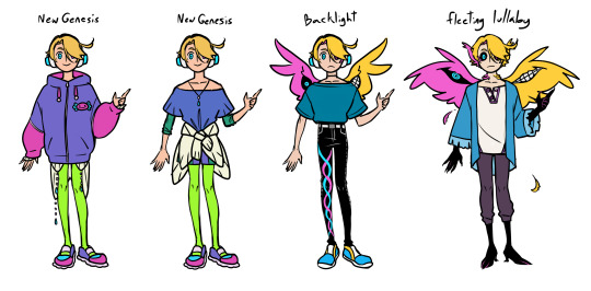
#i'm trying to do more things without lineart
Explore tagged Tumblr posts
Visit Tumblr Blog
Explore Tumblr blogs with no restrictions, modern design and the best experience.
Last Seen Tumblr Blogs


Fun Fact
130K people were victims of a chain letter scam that affected Tumblr in May 2011.
Text
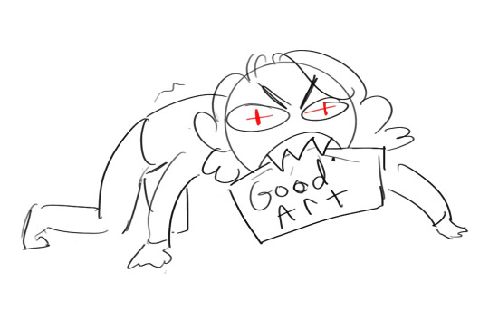
Ok here's a little thing i thought would fun for any artists to show off their progress at learning art (plus I'm nosey🤭).
Show off the oldest drawings you did (or the oldest that you can still find), the first things you were confident enough to upload online, and your most recent drawings and talk about them and show off how much you've progressed :)

Probably gonna end up missing some people, but I'm tagging a bunch of cool artists I follow/am mutuals with and am nosey to see how they started out, but no pressure :)
@fantasticalleigh, @thlayli-ra, @heelhausen, @stupidmarkzone, @2ndcitynightmare, @punk-o-ween, @normallypassingby, @tvheit, @seasonal-depression-of-punk
And if you wanna have a look at my old stuff, I've got it below =)
Oldest Drawings I Can Find
Of course, the first is an OC. Never did anything with her tho. Notice the lack of forehead and elbows, the arms that barely reach the hips, how indishtinguishable each part of the body is from one another. They're a perfectly smooth pole. and of course those wings. This is the first thing in my first proper sketchbook when I decided I was gonna start taking art more seriously. This would have been when i started secondary in 2014 at 11 years old. And I can't find anything from before that, since I never kept anything in a proper book/folder.
Second image is another of the first drawings in the book. It was my first closeup of a face, and also my first time drawing anime. I know I'm not the only artist who was desperate to learn to draw an anime-style as a kid. I remember doing this while on holiday, trying to follow an online tutorial, taking about 4 hours to get the outcome I did, and getting so frustrated that I couldn't get it to look right, that I was almost brought to tears. I'm pretty sure this was one of those "I'm never drawing again! >:(" moments, lol. Looking back, it was a pretty good first attempt. But I guess I was always a bit of a perfectionist, lol. Funnily enough, while I carried the anime eyes forward in my art style for years, to this day, I still can't draw a proper full anime style character.


First Drawings I Uploaded Online
I put these on insta to show my mates from school. The first picture was an attempt at a close up face with the new brush markers i'd got for christmas. This was 2017 just before i turned 14. Pretty sure I copied the design from an art tutorial book, that was supposed to be hyper-realistic (another christmas present). But I just couldn't bring that to life so just did what I could. Also, first time I used a signature. My signature's very different nowadays cos it's based on my tumblr username and not me actual name. But yeah. I was tryna get more professional I guess.
Second pic is the first full body piece I uploaded a few days later. Again, used the drawing books trying to learn how to draw flowy clothes. Think it was a book about drawing anime clothes that I used for this (another christmas present). By this point, each body part could move seperately and had joints. Also note the anime eyes, cos my simpler-but-still-anime-inspired eyes were something I stuck with a long ass time. This was the style I drew most often, and could usually do without having references (but obviously for this drawing specifically, I had the reference for the clothes). Had a lot of trouble with perspective, so all my characters faced forward, and later they would always face a 3/4 angle. And they could never lean or reach forwards cos I just couldn't get that to look right.


Most Recent Pieces
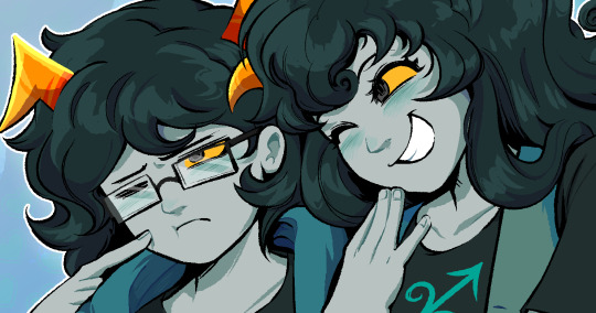
The most most recent is on the left, being my most recent closeup of a face. Still has a cartoonish edge with the lineart but much more realistic. And I'm fucking with this semi-realistic look atm. Tbh I dunno if i'd have the patience for the tiny details in hyperrealism. Also, fun story, in 2021 when I was doing my a-levels, I did an art piece that we were free to do in any style we wanted, and my teacher saw mine and was like “I wish you’d done it as realism instead of a cartoon style :(“ but it was actually my best attempt at realism and she hadn’t even realised. So I dunno, maybe I’m not cut out for realism 😂😂 I like my style rn tho so who cares
Then I got my most recent drawing of a (almost) full body. I got joints and decent hands and proportions and more body details.
Also this last year is the first time I've really got into digital. I always used to just do pen and paper. I even got a cheap drawing tablet, but couldn't get used to drawing on one surface and the image being up on a seperate screen. So I could never get the lines right. I did draw on my old ipad for a while which was easier, but the stylus was one of those with the thick rubber ball on the end, rather than a fine nib. Again, I had trouble cos I couldn't tell where it would register the contact with the screen and draw the line, which made it hard to do details. I got a new ipad a little while back that supports apple pencil, so I got one for it. And it's so much easier now that I've got a fine nib and can see where I'm drawing. I'm in love with drawing digital atm.

But yeah. That's how i've drawn over the years. Mental to see how much my style has changed and improved :) makes me feel better when I get frustrated with a drawnig and think I'm shit. Cos I know I'm getting better with each new drawing, even if it's only baby steps.
First: Now:


#figured this would be a good bit of fun#plus i'm really nosey to see how other people started out drawing#cos just out of the people I follow/am mutuals with. there's a lot of variety in art styles#it's always cool seeing where people began :)#my art
44 notes
·
View notes
Text

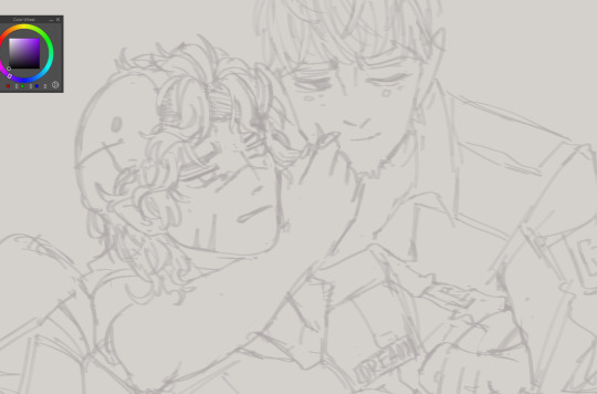
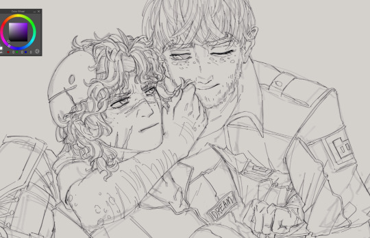
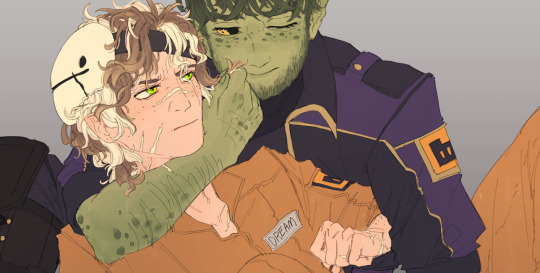
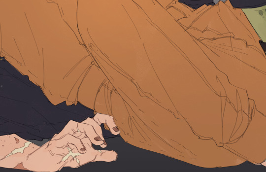
it's almost summer
#ANYWAY#i am not immune to the peterstakh propaganda#also this is so out of my comfort zone#i'm trying to do more things without lineart#and i rarely do landskapes#если тут будет одна заметка то когда я избавлюсь от курсовых я попробую сделать многогранник из бумаги и бутербродных шпажек#pathologic#мор утопия#peter stamatin#stakh rubin#peterstakh
25 notes
·
View notes
Text

waiting for the Great Pumpkin
Snoopy #30
31/10/2024
Happy Halloween everyone!
#peanuts#snoopy#art#linus van pelt#the great pumpkin#30#since it is halloween i have decided to confront two of my greatest fears: not using my usual fluffy pixel brush and drawing linus#specifically drawing his weird transparent hair that i have struggled to draw my entire life#his hair being fully lineart without the brown colouring in it just looked wayyyy too weird so i filled it in a bit#i think i accidentally gave him the most terrifying face as possible as well#but that is also just on theme for halloween if you really think about it#i was trying to preserve the little curves around his eyes that you see in the original character design#but i fear here he just looks like he's wearing some sort of horrible flesh goggles#one thing i do really like about this piece is the colour layering on the pumpkin patch for depth#like damn these two really are in a pumpkin patch in the middle of nowhere with nothing else for miles around#i wanna start drawing more of the other characters in these as well so i'm currently trying out different ways to draw them all#while still maintaining a resemblance to the original#so far i love drawing lucy and peppermint patty the most. the lines just jump out of my pen for those two <3
20 notes
·
View notes
Text
SUPER URGENT. BIG MAJOR URGENCE. DON'T SCROLL PLEASE. DON'T TAG AS IDENTIFIERS EITHER PLEASE
BALOO JUMPSCARES

hello everyone. callisto a.k.a. mars. this is a matter of my security with a soft deadline of july 20 and a hard deadline of august 1.
tl;dr is i'm disabled (undiagnosed chronic pain + dislocating knee, long covid, severely mentally ill) and need to VERY URGENTLY get from edmonton to oklahoma before mid august, otherwise u'm houseless because my parents are leaving and i have no job to be able to support myself (i've been looking for a year and am STILL looking) or the ability to work more than 20 hours a week. will be doing pokémon sketches $1 lineart $2 coloured and i will also be selling things (separate post will be made when this starts)
plane ticket comes to anywhere between $330 and $450 + pet fees. a suitcase here is about $60-$70 and i need a carry-on and a big guy. shipping things... depends on the weight but that is something i need to update the post with later. the goal i'm putting loosely at $700 CAD ($511 USD) for now
as always, dm me for my e-transfer if you're canadien. my girlfriend's ch1me is $plaguespoken and here is my paying pal and her paying pal.
0/700 CAD (0/511 USD)
more detail under the cut:
i am disabled and struggling with long covid and extremely high stress - all of these things cost me my job last summer. i need to get out of alberta - the weather, the lack of employment or care of others' wellbeing, and the cruelty i faced in the work force here are just... bad. and alberta is becoming more and more right-wing and frankly i'm scared, especially to be alone without family as a young lesbian.
my parents are leaving - my mom in a few weeks, and my dad until august or september. it could be as early as august 1. the current plan is for me to go to oklahoma with my girlfriend and his mother for a bit (politically not much better than alberta, but i will have support and be able to rest and recover my health and help around the house), and from there, back up to canada. for now, i only need help with getting me down there.
we need help covering a plane ticket and shipping some of my belongings down. i still don't have my passport but the money is still tucked away for it. for that, i'm just waiting for a new ID card since mine apparently expired back in february.
i can do pokémon sketches ($1 lineart, $2 coloured), they won't be fantastic because i'm very out of practice, and i also might try to sell some of my belongings if anyone is interested. i'll make posts with things up for sale - it *will* be a first come, first serve thing.
690 notes
·
View notes
Note
Hiii I really love your art and was wondering if you wouldnt mind showing what kind of brushes you use for your recent drawings thank you so much and i look forward to your future arts!
Of course! I've answered this a few times before but have never really tagged it properly, and I also realised that I've never actually explained what I use each brush for so I'll do that now!:
I'm gonna go through each of these brushes in order (and if i remember correctly, I'll link the top two since they arent default CSP brushes). (NOTE: almost all of these brushes have anti-aliasing turned off so that it can look more crispy and pixely!!! there is one exception to this that I will get into)
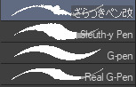
For this brush, I exclusively use it for sketching, it's advertised for inking digital manga panels, but with how the pen pressure is I feel like it adds form to my sketches
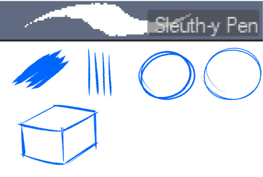

This brush, Sleuth-y Pen, is what I use mostly for MSPFA panels, mostly for lining, but sometimes for sketching too if I'm having a hard time with my usual sketching pen. It's really good if you want to replicate the homestuck style, and good for broad strokes on smaller canvases. The only issue is that the brush isn't great for that style if you use it on a larger canvas (ideally you would want 650 x 450) and can be especially messy if you're trying to get smaller details, such as open mouths, and certain facial details. I use another brush for that, which I will get into soon.
My second use for the sleuthy pen is for lineart on larger canvases in my usual artstyle! It has a texture to it that I like, as I like having my art appear a little rough around the edges, and the issue regarding small details isn't nearly as prominent of a problem
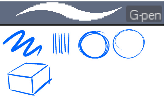
Almost done! Now we have the G-pen, a default CSP brush! This used to be one of my top 2 pens, along with its counterpart "Real G-pen" but nowadays I use it for two things: clean-up during rendering (usually getting those smaller details done that the sleuthy pen has difficulty with) and for doing SOME MSPFA panels (Vast Error, for example)
As you can see here, Liaaam's face is a little smoother than the rest of him, that's because I use the G-pen for those details, to keep things a lot cleaner! As for my other use, Vast Error's style from my understanding is a lot more "smooth" and "clean" which is why I exclusively use the G-pen for it, you can also make a lot of thick, juicy brush strokes with it which I feel works really well for the hair and folds in the clothes!
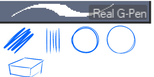
Finally, the Real G-pen, another default. This one is very similar to the last, its only differences are that it's slightly sharper and ever so slightly more messy. It's almost like a medium between the sleuth-y pen, and the g-pen.
I'll be honest, I don't use this pen much anymore, BUT, I still consistently use it for one thing and one thing only: Friendsim sprites. If you want to make friendsim sprites I highly suggest this pen, and making sure it's set to "weak" antialiasing. If you want to go the extra mile, I like to use a lasso-fill tool to block out shadows in all of my art, although if I'm using a rougher brush I'll usually do that manually. There's also other brushes I've been using more for rendering full pieces, such as a "rake brush" and a "design pencil" with low pressure to get details like blush down without making it too intense. That's basically it! I'll link the brushes below if I can find them: sleuth-y pen textured pen rake brush
201 notes
·
View notes
Note
Don't wanna be a bother but I bumped into ur touchstarved oc stuff and do you have any pointers for drawing in the touchstarved style? I can't really nail it down 100% but you do so... pretty please?
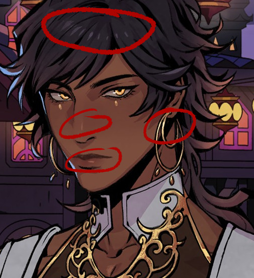
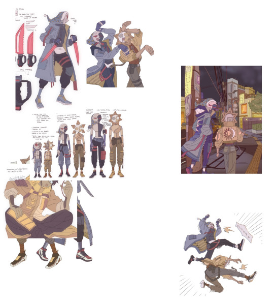
Hii yeah ofc, it's no bother at all no worries! You sent me this at the right time actually jsdhksd I'm in the middle of redesigning Emma right now and I've been taking a close look at the art style again, so it's all fresh in my mind!
Assuming you already have your design ready and have found a pose or composition you like, replicating the art style will probably come down to getting the lineart and shading to look similar.
About the lineart:
Probably goes without saying, but you'll need a pen with the opacity turned off to get the clean, ink-like lines. If you use CSP I recommend the default textured pen, which I think has a similar look, but honestly any pen will do.
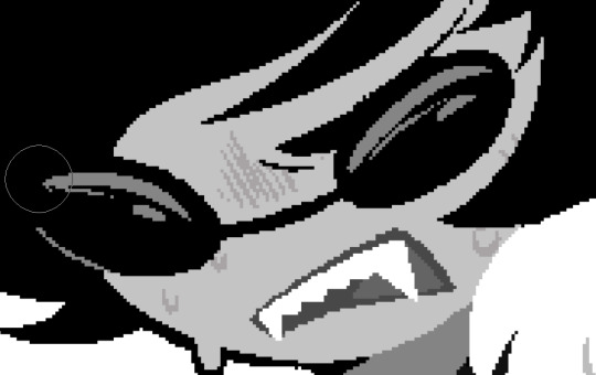
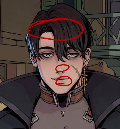
The thing you have to look out for the most when doing the lines is the darkest shadows. It's a bit tricky to explain, and I think a lot of it comes with practice, but you have to look for the places where the darkest shadows would be, or where the light could barely reach. Once you spot them, instead of shading them you create a sharp shape and paint them black, like so:
I also recommend varying the thickness of your lines, but not at random. Instead, try to keep lighting in mind while you draw them. You could draw one continuous thin line for something, and then only thicken it where it falls away from the light, or where it'd create an occlusion, or wherever you want a shape to stand out from another. A thick line will essentially either "push back" or separate things in space, while a thin line will pull it forward or make things look like they're closer together.
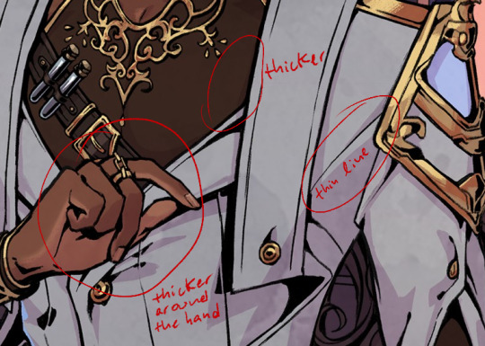

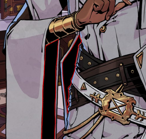
You can also exaggerate the shadows in order to create more contrast. Like in the case of Kuras' sleeves and coat, for example- you could argue that some bounce light could still get in there, but with the shadows exaggerated it creates a really nice, clean shape. You can also separate these shapes from other lines by leaving a small space between them and the lines.

The metal might look a bit different, but it follows the same logic as everything else- your darkest shadows will be pure black. It might look like it has more shadows but that's just because it's more reflective, so the light is usually concentrated on highlight and bounce light areas, so the tones around those areas will be darker.
About the shading:
From what I've noticed, it's all about keeping it subtle and simple. If you color pick the characters, you can see the variation between light and shadow is subtle and not all that contrasting. Most of the contrast is done with colors, not values.


The light source is usually from the top right, characters are pretty well lit, and there's a little bit of a blue backlight from the left that helps them stand out against the backgrounds.
The shading is mostly sharp, cel shading, rarely blended. Wherever there's blending, it's usually subtle or a gradient
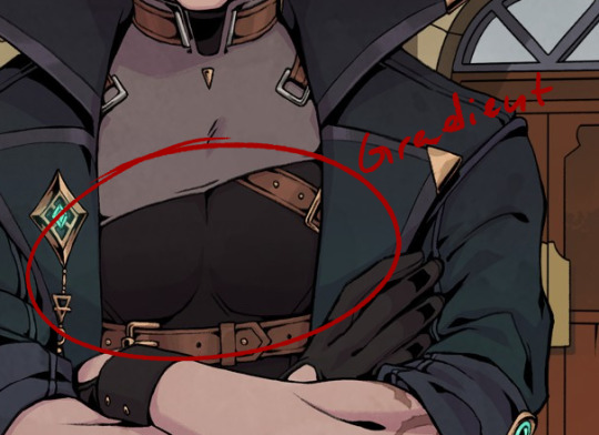
They also use gradations to indicate color shifts, like the colors in Leander's coat. You can do this with the gradient tool or an airbrush.
I recommend picking 1 color for light, 1 color for shadow, and maybe 1 inbetween midtone to use sparingly in places where you want a very subtle shadow. You can go more fancy if you're trying to create something that looks more like the game's CGs, but if you're going for the same look as the sprites, it's better to keep it simple.
You can shade manually each part of the character, or you can try using a multiply layer. For multiply, I like shifting the color towards a warm or pinkish tone and keeping it light and desaturated to get a similar look as the sprites.
Highlights are used very sparingly, only on a few places like the nose, mouth, eyes, and a few on the hair. Maybe occasionally somewhere else, but only if necessary, like in the case of very reflective materials like metal, gold, glass and leather.
The characters also usually have subtle textures on their clothes, and you can quickly create something similar by using a textured brush and an overlay or multiply mode. Like so:
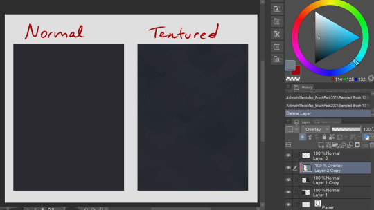
It's subtle, but makes a difference in my opinion! You can try this with a lot of different textured brushes to get the exact look you're going for.
That's all I could think of right now! If you have any questions or wanna know anything specific I didn't mention here, let me know!
132 notes
·
View notes
Note
hi!! i just wanted to say, i LOVE your art!! i started drawing my kris design with braces after seeing dubs of your comic on yt, and when i found you on tumblr i was beyond excited to see all of it in context. i’m a comic artist as well, and i was wondering— how do you choose your color palettes ?? besides obviously picking colors from the characters themselves, that’s a given— but your comics are bright and colorful and just a real pleasure to read because they’re so visually appealing. hope this question hasn’t been asked before!!
Thank you so very much!
So I really went into your question under the cut. So feel free to proceed if that is something that interests you.
The answer is honestly not that exciting. For the characters I really only do pick colors off the original sprites. Which is why they look so bright and colorful. If you try to do that yourself, you will quickly notice how SATURATED the sprites are. And not only the sprites, but also the backgrounds.
A little trick I use is that for pre-existing backgrounds I take all the colors and brighten + desaturate them just a teeeensy tiny bit. That way the characters in the foreground pop way more.
Another way to make the colors pop even more is to use colored shading AND colored lineart! That really IS what ties everything together. Let me show you..

This is a panel without the colored shading and lineart.

And this is it again WITH all that good stuff. Quite the difference, no?
But you're asking about color palettes, so I guess you also mean for the characters/outfits I designed? A lot of it boils down to color theory. I am by NO means an expert on that subject, but when looking at the Dark World designs specifically, you will notice how I did it.
For example: Frisk's Dark World color scheme is mainly analogous. That means the colors are right next to each other on the color wheel. But there is a little bit of complimentary in there.
Here, lemme visualize it...

Frisk's color scheme is a light green, darkish blue green, light yellow and a splash of pink. The red is there mostly just for lore reasons.
One thing I noticed when looking at the sprites of all the Dark World versions is that they are EXTREMELY bright and saturated.

That is something I tried to capture as well, but I think it didn't neccessarily nail it a lot of the time. Especially for Frisk's color scheme. If I stuck closer to what the game is doing, then in theory they would look more like this (using Kris' colors as a reference)

Looking back, I WOULD tweak their colors slightly more nowadays. Just so that the contrast between the colors is a little stronger and they don't blend together as much. This improves the readability of your design. Not all people are able to perceive every color of the rainbow, so readability is EXTREMELY important. Best way to see that is by desaturating them and checking the grayscale. Like so (left is the one closer to the game's colors)

Man, this REALLY makes me wanna fix their color scheme. This has been bugging me for a while now. (Though I'm kinda afraid that people point out that they look different.)
169 notes
·
View notes
Note
Oh uh forgot to ask in the previous ask (the one with the digital piece of candy and scurrying and stuff)
How do you draw art so good
Like
Is there a method you use or is that just the style you've gotten over time?
you've activated my trap card
I'm just gonna preface that this tutorial is from someone who was not professionally trained and didn't have a lot of free time for art, so a lot of the tips I have is short cuts I use to get the best results quickly
If you genuinely want to get better at art then please look at references and practice that is always the best
However if you are like me and only really do art for fun but want to go faster then these are for you pfppt
Overall I'd say my style is influenced by speedpaints I would watch when I was younger, I like analyzing how people do things and what makes something look "good" to me
I always recommend watching them because they will often have techniques you've never seen before or do things a certain way that you can try out yourself
I consume good art, it feeds me
but seriously it can be super helpful when developing your own methodology, or just generally trying something new
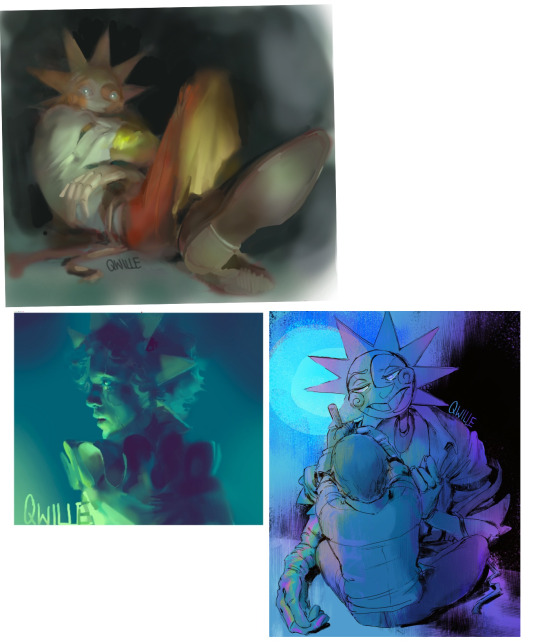
Usually it starts with me pulling some references from artists I really admire and sort of sketching out how they do the things I like
For example 8um8le has like super good anatomy and poses so I focused on trying to replicate how they do that
venemous-qwille is super good at color and pulling focus so that's what I focused on in my study of them
In general I'd say my process is sketch -> silhouette -> color -> shading -> render
I really don't like doing lineart lol

I'd say for the sketch the most important part is using references and just kind of fudging it until it looks correct anatomically/physically
General rule of thumb is spend time on areas of interest, and keep non important areas light (like the stitching on his pants)
I don't do lineart because I think its unnecessary for most paintings I do
I naturally tend to put more time and focus on areas of interest (like hands and feet) and if you use a brush with opacity for the sketch, those areas are naturally going to be darker in the final sketch
Of course this is gonna be different for everyone but it's what works for me
Sometimes I do a really really sketchy layer underneath my sketch/lineart, just so I know where everything is going
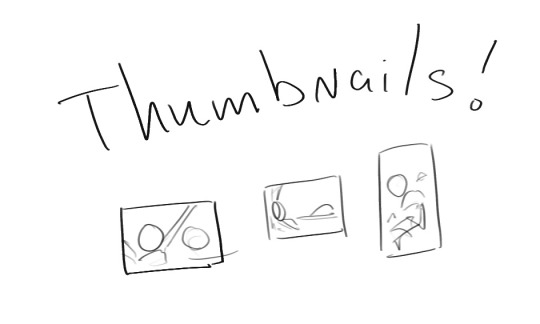
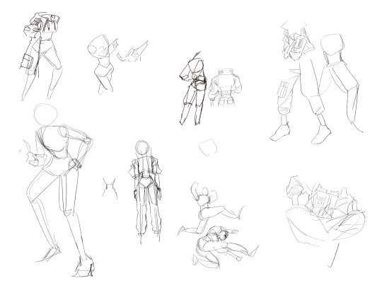
Use thumbnails! They are great to help figure out the general layout of things and what pose I wanna do
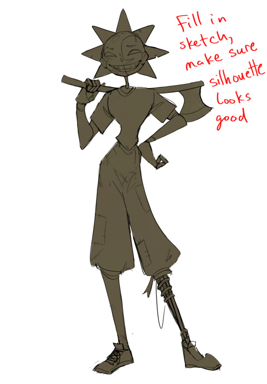
Next is what I call the "silhouette" layer
This is super important for me cause it helps me refine the figure and make sure the pose/anatomy looks correct, also depending on what color I choose for the silhouette helps guide what colors I'm going to use on top
This piece is a good example of how it works. The silhouette shows me how the figure interacts with the background, how the pose looks and if its any good
The silhouette layer doesn't have to be super clean, as long as it follows the sketch decently well and shows where the figure is then its fine
I also sometimes make the silhouette layer multiple colors to help guide shading and vibe
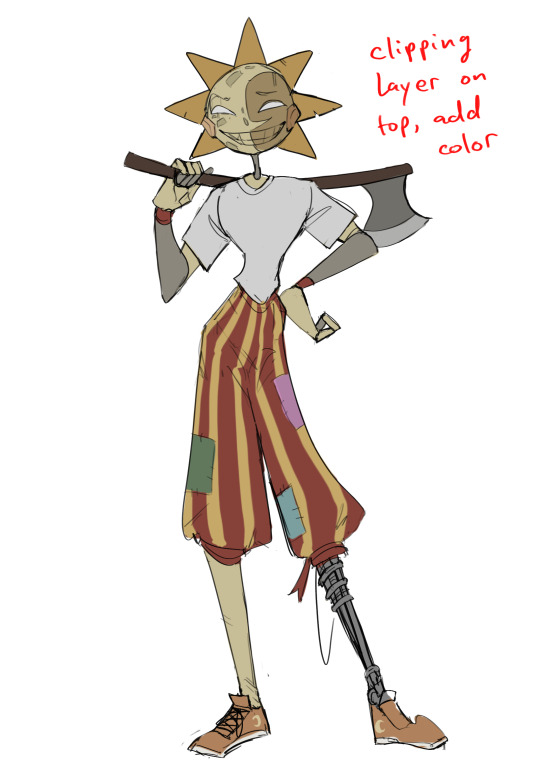
Next is the coloring layer. I usually make this a clipping layer on top of the silhouette layer, or I change the silhouette layer to alpha lock, either way it saves me time on coloring everything in

Sometimes I am super rough with the coloring too, using like an airbrush or my fav watercolor brush just to generically block in color where I want it
Works out cause most objects have like a bounce light to them from surrounding objects, so this is sort of a cheat I use to get that effect without all the work lol
Also don't be afraid to have the lower silhouette layer shining through, having multiple colors sort of subtly shining through the piece helps lots
Next is the shading layer, this is usually another clipping layer, usually set to "multiply"
The colors I pick here is usually within this range, any color works, just depends on the piece and vibes.
Since this piece is set in a sunset forest I choose a more desaturated orange for the shading layer
I know there's a whole thing about multiply layer being a crutch (and it kind of it) but it is a useful tool when you just want some darker values across the piece but don't want to go through the process of color picking every single darker shade
Also in my opinion it looks better than picking a darker color and setting it to a lower opacity, idk I just think the color has more "depth"
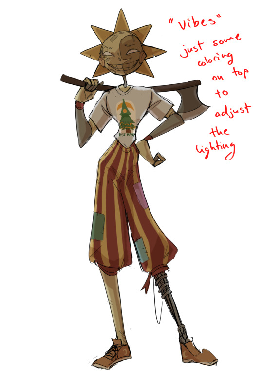
Next is the hardest to explain, sort of the vibes layer
Usually its just a layer of more concentrated color on top of the normal color and I fudge with the settings and values until I get a result I like
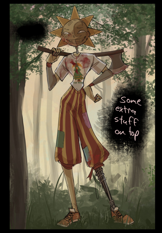
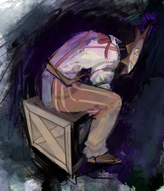
Next is the longest step, is the "extra" or the render stage.
Usually I add a background before this step so that if I need to merge the figure better with the background I can
If I render with a white background but he's supposed to be in a dark forest, its going to mess with the lighting severely
Also this is when I add more "vibe" layers on top to get the figure to match the background better
Backgrounds in general I recommend checking out @/derekdomnicdsouza on instagram he's got lots of great tutorials for breaking down backgrounds simply

I'd say general rule for the rendering layer is to focus on the areas of interest and spend less time on areas you don't care about
I even blur stuff out on the edges I don't want people to see, partially to save time on fixing mistakes in areas I dont care about (oop), but mainly to help draw the eye to the areas I do want people to focus on

Theoretically parts of the background should like mesh with the characters, parrallel lines are a no no unless they are directing a viewer to look somewhere, things that are perpendicular help bring things together
tbh I'm still not the best at layout and probably need more practice, but overall this is what I like doing
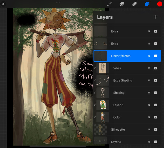
Overall this is what my layer set up ends up being
Sort of a sandwich with the lineart/sketch as the "meat" lol
Color and basic shading below the sketch, clean-up and rendering on top
I like this method cause it's super flexible if I ever want to try something different or try to replicate someone's style
I can make each step less or more messy depending on the end result and can add a lineart layer if need be. Also if there's a part that is straight up not working or needs to be removed its super easy to do cause I can just paint over it on the "extras" layer, color picking from the surrounding area to get the same vibe
Generally rule of thumb for my style is: get the initial layout of colors, form and shading to look good, then the rendering should be smooth sailing
Really the best advice I can give to get better at art is to enjoy what you're doing and become very very obsessed with drawing a silly little guy
You'll eventually get very good at drawing them pfptpf
#sundrop#moondrop#long post#art tutorial#fnaf sun#fnaf moon#I draw them way too much holy guac#ask#this is for you asker#idk if anyone else is interested in this kind of stuff#i apologize for ranting lol#also me struggling to spell silhouette like 15 times
120 notes
·
View notes
Note
Hello! i absolutely adore your art and agree with your sonic opinions, you're overall one of the best sonic blogs out there. May i ask how do you plan out and draw your comics? How do you choose the formatting of panels themselves, the composition, the dialogue and so on? From A to Z, please! I apologize if this ask might be inconvenient, but i'm curious because i love your comics and have attempted to draw a sonic comic myself that failed miserably.
Typically the first step I will take is to just rough it out in a sketchbook, because I find it much faster and when working digitally I feel more pressure to make things look nice. This is where I start thinking about paneling and composition. It doesn't look perfect or cohesive at this stage, but at least now I have a rough idea presented with barely legible scribbles that don't make sense to anyone but me.
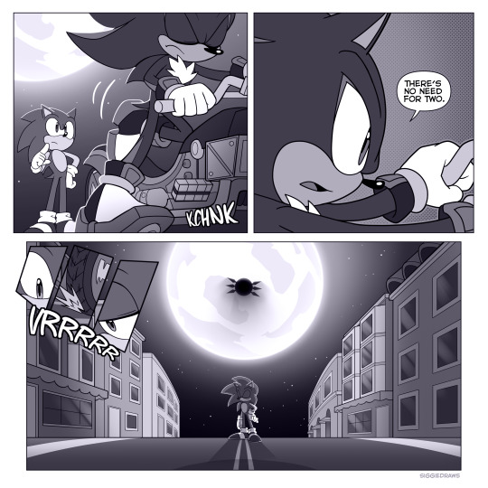
For paneling, large panels linger more, and small panels indicate quick succession. This is the most important rule I personally follow when making panels. It affects things like comedic/dramatic timing and how the reader will be guided through your comic.
It's important to vary up the composition when it comes to dialogue scenes where not that much is happening. The shot-reverse-shot format works, but remember that once you have an establishing shot and the reader knows where the characters are, you can get creative. I like to do close-ups where not everything is shown to create a sense of vagueness around what emotion the character is feeling.
Don't do this too excessively unless you're trying to create a claustrophobic feeling - let it breathe with a medium shot or long shot after!
In film-making, there's a rule called the 180-degree rule that basically states that in a two-character interaction, there is an invisible line drawn between them. The camera does not cross this line and stays on one side. This basically keeps the characters on one respective side of the frame at all times to avoid confusing the viewer.
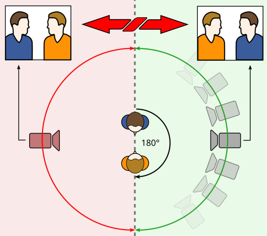
This is by no means something you have to follow for comics, but if you want to create something that is easier to follow, it's a good rule of thumb that I consider when drafting! It can also be broken depending on the effect you're going for.
Once I have a draft, I'll typically go into editing and changing things that don't work quite as well as I'd like. This can be done by yourself or you can get it revised by a friend, like I do!
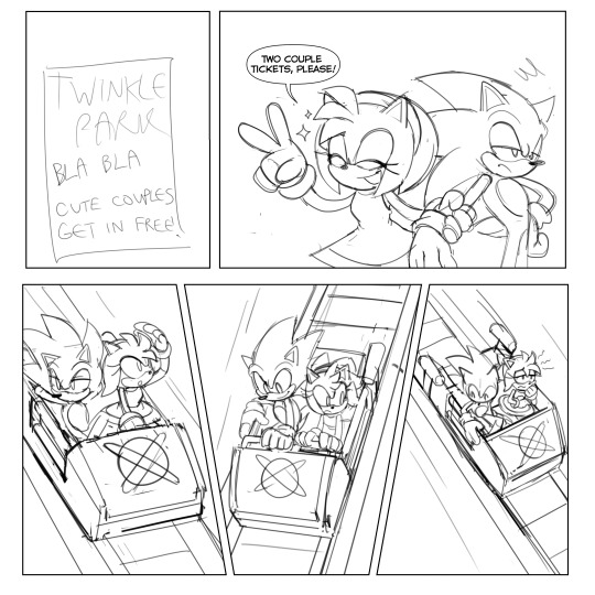
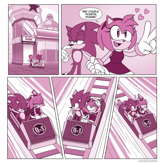
After the draft is finished, I'll get to lining and colouring. To be honest, it's not something I can teach so easily, but rather something that takes a lot of time and practice to learn. I typically draw the backgrounds with thinner lineart so that the characters stand out. Same deal with colouring - the characters stand out from the background colour-wise. There are multiple ways to do this, but for example, here I made the background have less colour contrast than the characters and stick to an orange-ish tone, while the characters are different colours from the background.
For speech bubbles, generally the words should fit the shape of the bubble to the best of your ability. The line spacing should be as close and compact as possible without touching the lines above or below. This is to save space on the page so that speech bubbles don't take up a majority. The tail of the bubble should point towards the character's mouth.
Avoid tangenting! This is when the very edges of two different things touch each other. It creates a flatter effect so you want to avoid it as much as possible.
That's about all I can think of right now. Hope this helped!
#tbh i have also dropped comics before because it was too hard to get it to work#they take a lot of time and dedication#but you shouldn't give up!#ask#tutorial
84 notes
·
View notes
Note
Don't know if you've answered this before but how do you pick your colors? They always look so well together!
Have a lovely day!
Long term you wanna study Muse Dash's artwork. I have a folder full of it to study and reference. It's THE inspo for my coloring. My words can only explain so much. I rely a lot on the sheer intuition i've developed by study.
Limit the hues. 2-3 to start, add more if you can justify it. Have them be close together on the color wheel but spread them further apart as needed. Good character design uses their colors very deliberately, and breaking down those choices gives you a decent starting point.
2. Define color relationships. Pink and blue do generally look nice together, but without a clear direction your colors end up aimless. Breaking down char designs will also give you ideas on this.
a. In my Mikus, blue is a main color, with pink as secondary/accent to the blue. So her blues take up higher saturation, more space, and double as any 'black' hues (like her sleeves or thigh boot things) drawing the most attention. Pinks, as secondary, has lower saturation (her skin) and accent the blues through smaller and more subtle shapes (like hair strands or eye shines).
3. Start off with high brightness/ mid saturation flats. Lineart is darker, more saturated, and hue shifted a bit from the flat color it's resting against. The exact difference will vary. You can get a lot of the 'look' just by doing this tbh. Shading has a very similar idea, its just a middle ground between the two.
4. Trial and Error. Secret Technique. I try to keep all of one color on a single layer and lock transparency so I can cycle through different options. Clip Studio has a command that lets you jump to whatever layer you are tapping on. It's nice. I never get my colors right first try unless I'm color picking an old piece. It just be like that.
Do proper studies of course but I find limiting hues to be the most essential thing here. I did it even before studying Muse Dash, and the limited tools really forced me to be creative with how I portray lighting, form, depth, while not letting my 2-3 hues stumble over each other.
65 notes
·
View notes
Note
I just want to say I love how you do your lineart, it looks so good! ahhhhhhhh!!
I'm gathering a lot of advice about the topic of lineart and I just wanna know how you get it to look like that? My line weight is getting better but the drawing itself just comes out a bit.. weird.
Thank you so much! Lineart is probably the thing I've been working hardest on as I am not a lineartist (and still struggle a lot) but it's something I really need to get better at for my job. UM there's honestly so much that could be said on the topic of lineart. Big things for me are:
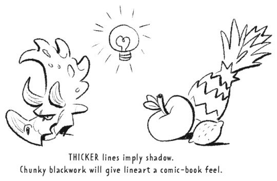
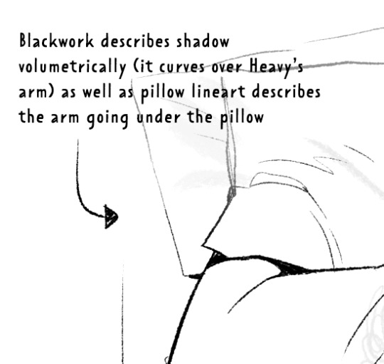
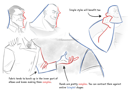
Weight -> Use line weight (aka thickness) to describe form, lighting, contact and scale. Thick lines imply shadow, contact and nearness-to-camera. Thin lines imply tension, recession and light.
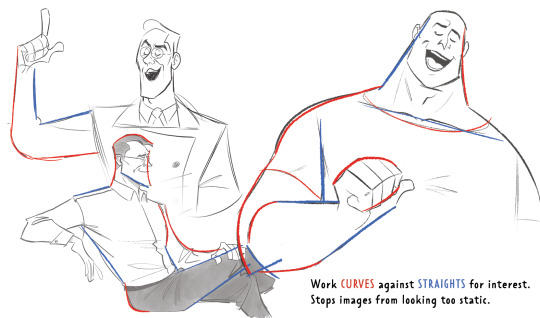
Straights vs Curves -> Use straight lines against curved ones for maximum interest. This is partly a character design thing but as we're using lines to describe our characters it's worth mentioning :)
Complex vx Simple -> Use complex lines against simple. Faces are always complex so therefore the backs of heads should always be simple. Chests are quite complex so backs should be simple. Dorsal sides of the arms are complex (Delt, tricep, bicep) whilst the ventral side is more simple (tricep...mainly) etc.
'Think in Ink' -> Lower your sketch layer almost to 0% opacity so you're not getting hung up on how nice/energetic your sketch look and instead are approaching the piece from an ink mindset. BUT it's digital! So if there's something in your sketch that you like just bring it forward (copy and paste) into your ink layer. I sketch and ink with the same brush so I can use this workflow
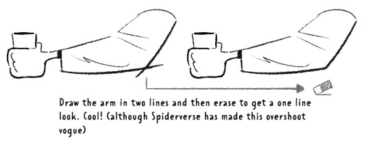
'Confidence' -> small hesitant feathery lines will look nervous compared to big swooping lines. Less is always more. I'll redraw arms/limbs until I can get the appearance that it was done in one brush stroke. Again it's digital so you can erase to cheat this look : )

MISC 01: I always hear 'draw from the shoulder'........meh............it's digital so draw from your wrist...it's fine honestly. If we were working at A1 in a life drawing class then we could get some shoulder action going but most of us are hunched over 16inch tablets. I think this advice aims to pull people away from feathery-nervous lineart honestly which you can improve on without relearning how to draw from your shoulder.
MISC 02: For a 'smoother' look do your lineart at a larger canvas size than you need. Once I'm happy with a sketch I usually double the canvas size and do my lineart then.
MISC 03: In PS (at least) anti-aliasing goes funny at any zoom level that isn't in the 5 times table. So try not to look at your canvas when you're zoomed in to 87% or 71.39% or something crazy. Just stick to 25%, 50%, 75% and 100% if possible.
UNFORTUNATE TRUTH: Lineart is incredibly based on raw draughtmanship I've discovered. When you're working with colour you can hide a lot in rendering (shadows, highlights) or post-processing (depth of field) but in lineart all your mistakes are just...there for people to see. There's ways round this...which I use A LOT. 'Flourishes' (I use 'flourishes' to mean over-confident lineart where it veers particuarly thick or particuarly thin in contrast to your approach in the rest of the image) can sort of trick people into thinking you're more confident about an area than you actually are.

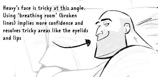
As well as leaving 'breathing room' within your lineart instead of actually...resolving the area. I do this the most around the face and hands.
Hopefully some of this helps? Honestly there's a lot of deep dives that could be done into indivudal things and there's also the massive caveat that all of these are 'guidelines' and not strict rules. I also favour a more...concept-arty? animation-y? storyboard-y? look to my lineart which favours flourishes and breathing room for a incomplete/work-in-progress feel which would make methodical colouring (ie: for a comic or something) a pain.
Keep up pratice is the main thing and doing studies of artists who you like that have great lineart - you'll pick up draughtmanship skills along with the lineart studies. Here's some of my lineart from a year or two ago...it varies between very 'standardised' (which makes it difficult to read volumes and to be honest, it's boring) and 'TOO EXCITING' (which...also makes it difficult to read volumes and for the eye to rest).
I'd like to share my brushes at some point as I've found 3 that I really like and use for everything more or less. I discovered that a shocking low amount of people use PS on tumblr (shocking to me I guess as i'm so used to PS being the standard) and everyone seems to use Procreate or Clip Studio Pro...so I want to check that the brushes are Procreate compatible at least before I share!
#sorry if none of this makes sense. im on day TWO of a hangover...kill me now#asks#art tutorial#tutorial
782 notes
·
View notes
Note
Your AweSamDream art has given me so many brain worms how do you make your lines so thin and smooth??? Any time I try ultra thin lineart it always looks very... first time digital artist.
For me it was first i found a brush i liked and then I slowly just kept making it smaller or the canvas bigger. It's a gradual thing and I honestly don't really know what I do or don't do to make the lineart look good. I think maybe part of it is me doing alot of detailing?
I'll put some examples under the cut!
I don't know if these examples will help because I have no idea what im actually doing and can only guess based on what i think i might be doing æsldkjfælksd I colour my lineart which kinda hides(?) the mess a bit sometimes, smooths it out.
I think its important to note that my lineart isn't actually that smooth, it's kinda messy and sketchy alot because i don't put alot of details on my sketches (comparatively) and i dont follow the sketch perfectly when i line. my lineart would probably count as a detailed sketch for many. (the colouring helps alot!)
For an example c!dreams leather armour! in sketches or older arts its more flat where i draw more dimension to it now which also lets me add damage to the leather which i like doing because otherwise i end up feeling the lineart is "empty?" if theres too much space with no lines

I also paint on top of lineart when i don't like how it looked! (link to timelapse of this art)

In the second example i used a round brush for a new way i like with drawing hair! which is why as i wanted to use my favourite brush in this art, i made the lines so small so i could have more lines in the hair! as my favourite bush is fixed in a flat 20 degrees!
My sketches are generally pretty thick lined compared to what i end up lining so many times one line in the sketch becomes two lines in the lineart! i also draw pretty quickly which I'm happy with for the loser energy it gives the lineart (even tho colouring in the lineart can be a pain when i cant just select it all because of so many goddamn holes) But ultimately when you zoom in you can tell its not that smooth, its just smooth-sketchy but throughout it all which makes it conhesive! (i think) (maybe)
the fact c!dream is my own design i know basically on the back of my hand also helps! it means i can just slap it out without really thinking that hard about it because im so practiced ! (which is why i draw him alot lmaoooo) when i dont know a character as well i stuggle more with thinner lineart because i keep refrencing back instead of just doing what i want. when i draw new characters i usually start thicker and then slowly get thinner lines as i figure out how i want them to be drawn.
58 notes
·
View notes
Note
Heyy I love your DA art so much! I just want to ask if you don't mind especially on your family DA piece. Do you render first before putting the lighting/effect or do you do the opposite? I always struggle when drawing illustration like that because I just can't get the lightning right after I put the main shadow
Thank you and no problem!
My process was honestly rather sporadic because I'm not used to work on big pieces like this, especially those with warm colors (like browns, oranges, gold, etc) so it was honestly a challenge.
It's gonna be a long answer so im just gonna put the whole process below this cut
I tried doing everything in base colors first. No shadow no nothin. At this stage im trying to make sure that the base colors are all in the same, warmish tone so nothing felt out of place (left)


I was absolutely stuck on how i should do the shading, so i asked a friend for advice and she painted it over a little to give me an idea (right) (sorry the quality is ass cus its a tiny thumbnailing thing)
then i focus on the main subjects, i dont entirely shade them yet i just give some discoloration and color details like blush, dirt, subtle ones. I colored the lineart too (but i suggest you do this later after your shading)

then the shading, i carve it out from the multiply layer (as my friend suggested, lighting came from top left so i follow that suggestion)

added more contras (multiply & overlay) to add more depth and pop some more color

now that im done with the main subject, I got a good glimpse on what tone I should do for the rest of the artwork. Dark red for areas i need darker, and something of a gold/orange for the brighter spots.
i shade the background manually without using multiply, since im worried itll be muddy (easier for me to control too).
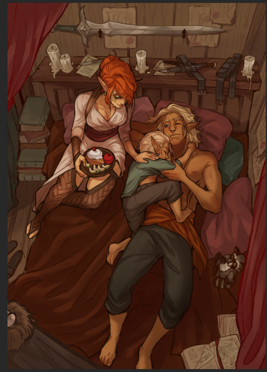

once everything is shaded, check on your artwork using a B/W layer. Everything still feel flat to me so I know i need to add more contras in the light & shadow
At this point im just throwing in Mulitply layer (reddish, green sometimes) to darken some areas outside of the focus and Overlay layer (yellow, orange, whites) to highlight the important parts and to emphasize where the light is coming from.
Check it again in the B/W layer, and it feels way better!


and there it is!
I added a few personal effects at the finishing, copying the lineart and gaussian-blur it, add speckles, add noise, color balance it a little. Poof. We're done :D
Hope that helps!
78 notes
·
View notes
Note
This is perhaps a strange question, but do you have the sketch/lineart/framework/whatever the heck it's called that you use when you draw Tango? I decided I want to learn to draw, and my thought process was, "Ah yes, the easiest way is to try and copy my favourite Tangos cause I know how they look," and it is going... poorly xD.
Alternatively, do you have any advice on how to learn and develop a style, or how to get/keep going?
A reference sheet? I have a couple various ones, though at this point i don't really use a reference unless I need to sample colours, and I'm currently working on a colour reference for myself. Besides the point I suppose... I'll put them at the very bottom of the cut so scroll right past my ramblings if you want to.
As for advice. My advice is do not try developing a style if you are just starting out. style is the last thing that should be on your mind if you're just starting out. Style is something that happens naturally as you grow and learn what you like and get used to your tools, and being able to intentionally create a style is an advanced skill that requires the skill to draw in various styles, strong basics, self-awareness, and proper self-critique.
The rest of this is going to be very incoherent and long winded and backwards so I apologize.
The most important thing to improving is to get over yourself. You need to look at someone else's art and be able to admit it's better than yours or has a quality you wish yours had without that being a statement of self-deprecation. You need to be able to look at your own art and pick out what it is you don't like about it without using it to beat yourself up. You can't improve if you get demotivated by the information required to adjust your course.
If you must, find something in each drawing that you like and focus on learning how to recreate that. If you find yourself with a drawing that you genuinely find nothing you like about it you stop drawing and restart, because that drawing is worthless to you once you recognize that. Analyze why you don't like it, figure out what's causing you to draw that way, ask what you might prefer instead and what the difference between them is, and figure out how to draw what you want instead. The important thing is that when you examine your art and other's art you're using as inspiration you don't instead use it as a tool to put yourself down.
My shadows are flat and poorly angled, and I draw everything lopsides, and I can say those things as simple facts of my art. These are things I still do, and I use tools to fix them, like turning my tablet or using editing tools, or looking up references. If I want to know a certain technique I reach out to other artists I see using said technique and asking, or I research it myself. In the meantime I experiment and accept this flaw in my art. There's other things to like. The important thing is you don't allow your lack of knowledge to demotivate you from correcting that lack of knowledge.
The best thing you can do is ask yourself what you like about art, and what you want to do. It's a bit difficult for me to help with this sort of thing because I've literally always drawn my whole life, so helping someone who is actively choosing to take up drawing isn't my realm of expertise. But art is communication and connection and self-expression. What do you want to express through your art and what medium is that expression best done in, what do you want to convey, what do you want to share that you simply cannot without art.
It's a bit daunting, those sound like profound questions, but honestly they're not. When I draw fanart usually what I wanna communicate is "I like these characters when they do this", and more often than not it's "I really liked this line/palette".
These incomplete character sketches have sat in my main D&D folder and I think about him at least once a month entirely because I was so happy with his proportions and the concept of a dewclaw heel. I ended up reusing the heel in these Jimmy designs.
It can be anything and changes with each piece. Drawing let's me express what I love and emphasize what I love about it or show it from my perspective. I'll use this raau page as an example.
This is actually based on a shop that I've gone to since I was a child, so it's a space that I've seen and thought about many times. Though it's changed, for ease of drawing and to fit into the setting of raau and for the sake of composition, but the things that are important to me are still here. The ceiling that feels slightly claustrophobically low, the rainbow coordinated shirts, the club covers shaped like animals, every inch of the shop being utilized for merchandise until you can barely see the walls, the nook shape of the section, the fluorescent lights with this specific covering that's very "soulless office job" but to me is also the playroom at my grandma's house and how both have no windows.
I wanted to preserve particular qualities of the atmosphere of the place, in order to express that in this image. That vibe that I could not describe in words to anyone who hasn't experienced it themselves so the best I could normally do is describe it and hope it sparks a similar enough memory. But with visual art I can use lightning, context, and composition to simply express it better. I can create the experience for someone else.
Sometimes writing is better at it than words, and sometimes both are needed, so I learned both. Sometimes music is better than either and I'm screwed because I can't do music. That's besides the point though.
When you're starting out you can have a hard time grasping what about a piece compels you. That's why you need to learn to critique art as you learn to draw, and that's also why tracing and copying is good.
Here's an example of me trying out @lunarcrown's art style. I made a collage and traced my favourite frame's shapes to "get my hands on it", if you will, before trying it out on my own, starting with similar poses usually. What I learned from this is I really like how Lunar does hair, actually even though this was a study of Tango I took notes on how she does Jimmy's hair and applied it to my Scar, Impulse, and Skizz, because I'm awful at short men's hairstyles.
I also cemented one of the reasons I love her art is because it does have some qualities that I already incorporate into mine, like the streamlining between flushed materials such as her Tango's skin and skin-tight shirt, or my Tango's sleeves and gloves.
If you know what you like about something it's easier to work towards incorporating it into your own art without simply copying someone else's. And starting out by copying as a way to play around with someone's art the same way an engineer pulls something apart is helpful in doing so.
Which leads me further back into simply go somewhere and draw what you see. The drawing does not have to be good, but being able to just take a sketchbook and see something that scratches your brain and mimic it is important to developing the above skills. Being able to translate reality into an image is important to developing your skills and understanding the fundamentals of breaking things down. Being able to look at something moving or possibly far away and look down and draw it anyways by breaking down its shapes is important in developing your ability to use references.
Drawing is also mostly muscle memory. So it's important to draw things over and over again. You can do this how you want, you're always going to hit a wall where you end up having to sit there and draw circles 50 times on a page to remember how to draw circles like you're trying to get a dry pen to work. You will do this before almost every serious picture. Find a way for you to enjoy this process.
The biggest most important rule about art, though, is that there is not rules. Go about things however you want for whatever reason you want. If you enjoy doing something a certain way do it that way, if you hate a particular process eliminate it. Sometimes the result outweighs a miserable process, if having something look a certain way is more important then suck it up and do so. If you care more about enjoying a motion than what the end result is then do so. You have to ask yourself what you care about in art.
For now, though, if you're just starting out. The best thing you can do is draw a lot of circles and cubes and fruit. It's an unfortunate truth that the best foundation is learning realism, because it's just going to teach your the fundamentals the best, and all abstraction is... well, an abstraction.
Of course, as just said, there is no rules, and if you genuinely do not enjoy drawing those things like me, then you can simply not. It helps improvement the fastest but if it makes you miserable in a way that isn't backed by passion then that's counterproductive. Forcing yourself only really works if you're passionate enough about what you're doing to overcome the temporary discomfort of learning, so if you're satisfied with just being able to mimic something more abstract in the beginning do exactly that and explore what would make you passionate enough to be willing to draw things you aren't stoked about for an end result. You might never be, but that's also fine, you don't have to strive to be the world's greatest artist to justify drawing.
Also accept that you're absolutely going to change your mind on things. What felt like a great line to draw you're going to hate the next day. It's up to you if you leave it be or fix it, neither's the right answer. I tend to lean towards leaving it personally, even when it drive some up a wall, simply because I have very momentary inspiration and don't like returning to old pieces once I'm done with them. Some people will return to a picture over and over again fixing it every time they think of something. Whatever floats your boat.
tl;dr figure out what you enjoy doing with art and just do that as much as you like. Improve by finding new things you want to do with art. Combine as you see fit to create art.
...
okay time for references:
I try to keep my designs simple because the style I developed for mcyt art was intended for animations. I've drifted a bit but in general I keep to simple shape-defined designs with long lines, flat colours, and minimal wrinkles. It's intentionally flat in many ways in order to create more satisfying lines, like the collar of his shirt or the way his hands ' gradient is done with the line art.
Tango is both round and angular, basically he's an almond. His shape is ambiguous in much of his clothing, with very understated joints. This gives him a move cartoony elastic sort of vibe, like he's just a pipe cleaner that can bend any which way, or a piece of rubber that might stretch.
I avoid bogging him down with logic for that reason, his hair is styled like hair but it has the appearance and moves like fire. Which is it? Who knows. Where are his organs? I haven't drawn them so they don't exist.
73 notes
·
View notes
Text

connorkus wishing you a very happy 2025~! my art ramblings below the cut as per usual
so my goal was to finish this drawing before the end of jan 1st in my time zone and ehehe that certainly did NOT happen. it's like 10am jan 2nd here ahahahah. but hey it's still jan 1st somewhere!!!!
i spent like 15+ hours on this piece and like 70% of that time was redrawing markus. i swear i have the hardest time drawing that guy. i miss drawing ladies. i used to them all the time. maybe that's why i got north down in one try. connor took like three tries. and then markus... i went through like 8 renditions of him. i hope he turned out okay. i've been staring at this piece for so long i've lost all objectivity.
y'all it really is a new year because i actually put my clean line art in a separate layer instead of what i normally do and spend an abnormally long time cleaning up my rough sketch. this led to veryyyyyy thin line art which it is not my usual style. i think it turned out okay??? i think in future pieces might change up the line weight cause i love my tapers but i was just too lazy to rethicken all the lines on the clean line art layer jskdfjksdjfkdsjfl.
i wasn't planning on doing a full colored piece because of the time constraints but i decided to put in some matte colors cause i wanted them to be color coordinated and i was like oh it looks a bit weird and flat maybe i'll render just a litt-- oops i rendered the whole thing ehehehe. tbh, i'm still trying to figure how i want to render and color things. i feel like i always like the plain lineart more than the colored version. i think that will be a goal for this year is figuring out how to color. right now like 50% satisfied with the how i render so hoping to get it closer to 100% by year's end.
btw, no one is allowed to compliment my fabric textures bc i literally cheated cause i just got a picture of fabric texture, set the layer to grain merge, and then added highlights. i was not gonna render out norths sparkly dress by hand that's for fucking sure lmao.
also, idk what cosmic void they're standing in. i just wanted a really soft glowy background without having to render out anything detailed. so uhm let's just pretend that they're standing in front of some sort of light display.
for listening to my ramblings enjoy these rough sketch layers~


happy new year <333
#north is buff bc we appreciate strong women on this blog uwu#let's pretend the heights are accurate cause connor is leaning forward and north is wearing tall ass heels jskjskjskj#norkus pulling connor closer for the picture makes me think of my connorkus fic and now i kinda wanna write another chapter#dbh fanart#mine#connorkus#dbh connor#connor rk800#dbh north#north wr400#dbh markus#markus rk200#detroit become human#dbh#detroit: become human#d:bh
61 notes
·
View notes
Note
Whats your process like for making the pages/script/comic in general? any advice you could give?
Hii:D
I'm gonna ramble about this a lot, so I'm adding this read more <3
That way this post won't be super long on the main page
If you DO want to see everything go ahead!
So! Right now I work on the pages from monday to saturday :]
I divide work like this:
Monday-Tuesday: Script, storyboard and dialogue bubbles!
Wednesday-Thursday: Lineart for the 4 pages! 2 pages each day
Friday-Saturday: Color the 4 pages! 2 pages each day
Talking about writing
I don't have the full script ready yet because I realized
I SUCK AT WRITING, NOT IN A "My writing is so bad way" BUT IN A "I can't write words without getting confused" WAY
That's one of the reasons why it took me SO long to start this thing! Because I wanted the script to be fully ready! And I couldn't do that because whenever I'm writing I get super confused😭😭I don't know how to explain it but I NEED visuals ??? I need to see how the dialogue I'm writing is gonna look???
So now, whenever I'm writing, I'm also drawing at the same time! AND FOR SOME REASON THAT WORKS, AND SUDDENLY I CAN WRITE
I REALLY DON'T KNOW WHY THAT IS BUT, UH, IT WORKS FOR ME!!! THAT'S ALL I NEED!!
This does NOT mean I'm improvising the story! I do have the full story ready and outlined! I'm following that outline :]
I realized having everything ready might work for some people, but it wasn't working for me D:
So, uh, my advice for writing is to trust yourself and to try different methods! You'll find something that works for you :]
I DO recommend having an outline of the story before beginning!! You don't need to know everything from the beginning but you need to know what NEEDS to happen and a basic idea of how it should end :]
Now about the making of the comic pages
Pls look for references constantly!! Very important!!
There's many different ways to make comics!
I always look in pinterest for panel layout/color pallete inspiration
I use clip studio paint to make everything, it's super useful cause it has a LOT of features that make the process MUCH easier (vector layers, a paint bucket that actually works, special comic configurations, a panel tool, 3d viewing which is super fun, predetermined speech bubbles, the story editor, etc.)
It takes me like?? Approximately 2 and half hours to make one page?? Some more and some less
But I'm also an easily distracted person so sometimes 2 hours turn into 3 because I spent 1 hour getting distracted with other stuff 😭
Uhhm, so yeah!! I think the layout is my favorite part, my least favorite part is adding the speech bubbles...ESPECIALLY if I have to add Wingdings
Andd I think that covers most of it? If you all have more specific questions let me know because there's a LOT of stuff that goes into making these😭😭but I get better and faster each time! My first pages took me like 4 hours on average...some would take me 6 hours...THAT WENT DOWN A LOT :D
#i don't know what to add here in tags hehe#answered ask#making a comic is great but oh my god does it take time to get used to it ....and to build a schedule that actually works....
74 notes
·
View notes