#identityproject
Explore tagged Tumblr posts
Visit Tumblr Blog
Explore Tumblr blogs with no restrictions, modern design and the best experience.
Last Seen Tumblr Blogs


Fun Fact
Tumblr.com rank in the US is 25.
Photo

For this last one, it is more personal. It is a lot like the idea with the word “woman" in the background. First, I plan on taking a photo of myself. Then, I will place this into photo shop and fix it up. Then, I will use InDesign to put many words around my photo to describe who I am. The message behind this is that a person can more than just a certain thing and can be described in many ways.
0 notes
Text
Identity Project/ Artist Statement


Identity Artist Statement
My Identity project is a video. In the early planning stages of the project I was super unsure about what images I wanted to include and what can help portray the idea of identity. I went with stock footage for the entire project and my own voice is used for the voice-over of the poem. Although my own images were not used I still believe for it to be a reflection of my identity and it being my own voice adds to that as well. In the beginning stages of my poetry writing I was looking for my poems to cover themes such as race, my placement in the world and society/ How I feel in the world and society, and gender. That wasn’t what came from my writing, it does sort of touch on ‘How I feel’ and ‘My placement in the world’. The poem itself although vague is in direct correlation of my placement. I had a strong sense of self entering into college but, as time went on I began to notice that I lost certain parts of myself. The materials I used were free stock footage that I accessed through Youtube and my own poetry. I used Hitfilm express for the video editing software and Ocean audio and Voice Memos on my Iphone.I decided against shooting my surroundings and using the lighting studio in Sherzer. I used just aroco footage that I found on the internet. Once I have collected all the footage I deem necessary I loaded it in Hitfilm express and cut and edit the clips. My intended meaning is to express my exploration and hopefully discovery of myself through my poetry aided with a visual.
0 notes
Text
Identity Post-Critique Response
Coming up with the idea of a full sized silhouette of myself was the easy part. The hard part was tying in themes and ideas that I wanted to express about myself. At first they were very literal, but after some discussions the direction to go more abstract became the focus. I’ve never delved into abstract artwork before, so I was very excited to create this piece about myself.
I knew I wanted it life size, or close to it. Eventually the idea to create this art as a three piece vertical triptych came to me. Breaking the artwork into three sections would help create an interesting visual experience as the artboards would be separated, but at the same time joined by the art. This also had the benefit of making this large piece much more portable.
Starting off I had many ideas of objects and visuals I wanted to include. Finding out what was needed, and what could be dropped was quite the exercise in cutting down excess concepts and ideas. Changing all my ideas and concepts into abstract forms was challenging, but once I stopped overthinking it it became a rewarding exercise and I enjoyed creating interesting colors, shapes, and creatures for this piece.
To create this artwork I needed an idea of what I would be building it on. I knew I wanted to use foam core board, and to create a sense of depth. I went to the store and found what I needed, and this helped me set up and create my artboards in illustrator. Each foam core board is 30” wide x 20” high. I bought nine of them, but ultimately only used six. The original idea was to create a deeper depth with the use of three layers. However with time constraints I opted to only do two layers of depth which in the end I am happy with the results.
I set up an illustrator file with three artboards stacked on top of eachother, so I could see how the art would look in the real world. I even made sure to create a 1” gap between the artboards to mimic the 1” gap the foam core boards would have in real life.
Finding the correct image of myself to alter took a long time, but once I settled on one I was able to start creating my layout, and design. The image I chose I had a shirt on, but I edited myself to be shirtless to add a sense of vulnerability. I built one panel at a time, starting with the top, then the middle, and then the bottom. My concept was to depict myself and how the outside world has a large influence in shaping, not only me, but who we are.
The external forces of the outside world bombard my senses in this piece. They enter my mouth, and my eyes. My eyes are covered by literal coke bottles. Poking fun at the idea of coke bottle glasses - thick lensed glasses that one would wear when they can not see well. I myself wear glasses, so putting these on my face in the art was to both be humorous, but also tell a story of how we don’t always see the outside world clearly. It is distorted by many outside factors.
The exposed bones of the jaw and the arm represent past events. The arm I broke with a compound fracture when I was a young child; it’s oddly a happy memory I have with my father, and not the traumatic experience of falling off the monkey bars that I remember most from that ordeal. The jaw is a surgery I had to correct my under-bite. It was an eight hour surgery, and took months to recover from, and I lived off of liquid food for most of that recovery. I really wanted to include these as parts of my identity, that only myself or people really close to me know about.
The artwork was done in black and white because I wanted the bits of color that show in this piece to really stand out. The idea behind the black and white is that the world really is pretty awful out there. On a global scale we have wars, diseases, deaths; and on a personal level we have our own wars we deal with everyday, and our own losses. However, despite all this there is still beauty in the world, and a reason to love, and live. That is where the color is coming from. The light enters the coke bottle glasses and diffuses out like a light prism, showing all the beautiful colors. These were represented with the squares and circles of color spilling out of the coke bottle glasses. I carried these throughout all three panels. Sprinkling the beauty into every panel.
Finally, I put in little creatures that were inspired by mythological creatures like fairies, goblins, and spirits. The idea behind these is that the creatures are not necessarily evil, but they are mischievous -- it’s in their nature. In my artwork the little creatures I created are hindering my path through the world, ripping my skin open to expose past injuries -- that they most likely caused themselves. Now, I’m not saying these creatures are real or that they caused these injuries in real life, but they are an abstract idea of outside forces in the world that we can not control.
After printing the artwork. I placed the art on the foam core boards, and cut out the top layer, and then glued the images to the board with rubber cement. Then I glued the background images to the uncut foam core boards. After these were assembled I glued the background foam core to the foreground foam core with a hot glue gun. I then poked tiny holes into the artwork and bound them together with a thin wire.
I will be replacing the wire that holds the panels together with clear fishing line, and the paper that the creatures are pulling back will be replaced with a colorful velum, and I’ll make it more stretched out looking like the creatures are really pulling on it.
It was exciting to hear everyone’s interpretations of my artwork in class as it is mostly abstract. The meanings everyone came up with are both relatable, and enjoyable, and I accept them as alternative truths to this artwork.
I really enjoyed working with abstract concepts and imagery, I plan on taking this further in the future.
0 notes
Text
Project 3: Research Journal #1
The Last Supper
Nataliya P.
2011-2012

Form - A blank Moleskin notebook ( 240 Pages 120 Sheets ), using ink and sometimes paint and graphite on others.
Content - Each page is consistent with a person or anthropomorphic type humanoid eating a dish. She shows 17 pages of The Last Supper. Ironically, the actual The Last Supper, by Leonardo Da Vinci only has Jesus’s twelve Disciples, but this showcases various animals and various different meals in 17 different pages, and 29 different characters. Some are similar to each other, it just depends on the page. What is even more disturbing about this is it showcases cannibalism in some of the pieces. Like with the Frog, when you look at his sandwich, you can see a frog inside of it. Possibly dead, but it’s quite morbid when you think about it. Even some of the other pieces have blood inside them. When you look at the other pieces, some even have political figures within the pieces; possibly problems with the political government in Moscow?
Process - Would draw with graphite first, then ink over it. Sometimes even going so far as to paint some of the pages, while leaving some of the pages blank black and white, like above.
0 notes
Text
Research Journal #3

Artwork: Paper Thumbprints
Artist: Luke Bugbee
Weblink:https://www.behance.net/gallery/30819061/Paper-Thumbprints
Form: It seems Bugbee use a lot of different color paper to form a thumbprint.
Content: The meaning of this piece is someone’s physical identity, hints the thumbprint.
Process: First, I think he drew out the plans for the thumbprint. Lastly, he glued the paper together into layers then he started to form a thumbprint.
I chose this piece because it is a unique piece, colorful, great form, and it gave me an idea to use my thumb as a paintbrush.
0 notes
Text
Project Three Research Journal
Mauricio Paz Viola, Identity series, mixed media on paper, 2019 https://www.mauriciopazviola.com/identity-series-2018-2019/portraits-of-women-from-new-york/
Form: This is made with mixed materials on paper. Content: The artist took pictures of people from New York City and created works that showed the diversity of people and the expansion of the self outside of the body. Process: The artist went to New York City to take pictures of civilians, and then proceeded to make abstract portrait of them using mixed media.

Jabbar Muhammed, Eve 3.6, acrylic on canvas, 150 x 150, 2017 https://indoartnow.com/artists/jabbar-muhammad
Form: This is a painting made with acrylics on stretched canvas. Content: This is a portrait of a person who seems to be in motion, but is still at the same time. It shows two different facial expressions, and therefore different feelings and moods, or identities, as well. Process: Muhammed either used a live model, painted from a reference, or painted from memory to paint this image using acrylic paints on a canvas.
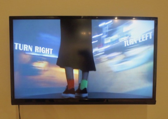
Minji Sohn, Turn Right, Turn Left, 2017 https://mirkaart.com/exploringtheheartofit/2017/9/20/expressing-identity-through-art
Form: This piece is a four-channel video installation. Content: Sohn intended to make the viewer of this piece feel connected to her intense identity. The piece is situated in the small room to cause the viewer to feel this sort of discomfort and disorientation that she felt during parts of her life. Process: The artist filmed the subject who is trying to choose which way to go, and then used a video editing software to add in text and flashing lights. Sohn then displayed this on a television screen in a small room.
0 notes
Photo

"Turning into liquid gold under the sunset.."- #Nymphaea 🌺 . . . . . . . . . #IdentityProject #AfricanAncestry #Ancestry #DNA #Genealogy #Roots #Monrovia #Liberia #AtlanticOcean #UROP #NVC #NewVentureChallenge #BuffsAbroad #july26th #independenceday #Liberia #buffsabroad #koloqua (at Cooper's Beach)
#newventurechallenge#dna#buffsabroad#july26th#independenceday#koloqua#nvc#identityproject#monrovia#liberia#atlanticocean#nymphaea#urop#roots#genealogy#ancestry#africanancestry
1 note
·
View note
Photo
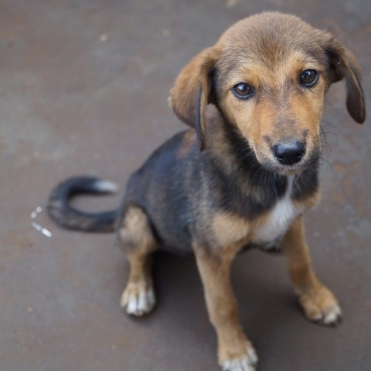
Candid of this cute "puppy dog", as the locals call him, at a neighborhood birthday party #Monrovia #Liberia #DogLovers #IdentityProject #DNA #AfricanAncestry #Roots #Ancestry (at Monrovia, Liberia)
1 note
·
View note
Photo


An example from a more recent project based on 'Identity' my development of bold line drawings, coloured using oil pastel, edited over the photocopier and progressed into collages of relatives faces. Inspired by artist, Princess Hijab, I developed these illustrations to become screen-prints and pressed a series of statement images onto Islamic facial covers.
1 note
·
View note
Photo

In this sketch, it has the word, “woman,” in the background, and all these other words in front of it that can describe a woman. I plan on doing this using either InDesign or Illustrator. “Woman” will be faded in the background. In society, we see so often that some people take advantage of women. I know that not all people do that though. The point that I trying to make in this idea is that a woman is a human being, among other amazing things.
0 notes
Photo
Studio courses provide plenty of playtime & you also create strong ties to your project partners. #4christian #IndigoPaper background #originalart #identityproject #CollegeKnowledge #digitalart #notreeswereharmed #recycled or #digital material (at Oahu)
#digital#originalart#recycled#identityproject#notreeswereharmed#4christian#digitalart#collegeknowledge#indigopaper
0 notes
Text
Identity Research Journal
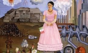
Frida Kahlo, Self-Potrait on the border between Mexico and the United States is America https://artuk.org/discover/stories/frida-kahlo-embracing-her-masculinity#
Form: This work is a painting done by the artist, of the artist.
Content: I think the message of Kahlo’s piece has to do with her coming to America. A reminder of her roots but, her looking forward into another chapter of her life in a new place. A best of both worlds kind of concept.
Process: Kahlo could have had this sketched out or had multiple sketches to determine what she wanted the overall finished work to look like. If this was painted on the canvas the only other process would have to be putting together the wood frame to place the painting on top.
0 notes
Text
Project 3 — Proposal
FORM:
This is to be a 67” shillouette of myself placed on three pieces of layered white foam core board. Using black foam core, I will build the silhouette. This will also be layered enough that when nooks are cut out exposing images below you will see depth. The main materials will be foam core to build depth and layers, and printed digital artwork. It will be displayed as an always open vertical triptych.
PROCESS:
This will be created by cutting a silhouette of myself out of black foam core board and attaching it to white foam core board, and this will be layered to create depth. There will be strategic cut outs exposing different elements — most will be digital prints, but there may be other materials introduced. The artwork itself will be assembled in three panels, a bottom, a middle, and a top — these will be assembled vertically.
CONTENT:
My intended meaning is to convey what it feels like to be me, what I think it is to be myself, how do I think others view me, and what are the elements that make up myself; that may, or may not be known to the external world. The form is to be a life-size silhouette of myself; this is to impose a presence of human proportions that will draw you to the piece, and hopefully create a sense of interest, and wanting to know who, or why? The materials are to create depth, so you can explore the external — the raised, the surface, and what lies beneath. This is as much for the viewer as it is for me. The process of creating this piece is to explore, learn, and know myself. The majority of images will be digital prints attached to the foam core boards. The digital prints will be a series of miniature artworks in themselves, all tied to what it is to be myself, and abstracted to various degrees — conveying the known and unknown when encountering, or experiencing me; and when I experience myself.
0 notes
Text
Identity: Post-Critique Response
When everyone approached my tiny little page, it made me happy. 100% of the class interacted with it and actually read it. I don’t think there was a single person who didn’t read it. Not to mention, I found myself smiling through the whole thing.
When everyone had interesting reactions to it, I didn’t know how to feel at first. People were giggling at it. Possibly they’re uncomfortable, I assumed, which I was validated later on. Just the questions were so “shocking” as one of my classmates had said.
My biggest concern was if everyone was going to complain about size, which thankfully became a small debate. Some were happy and content about its size, while a few others, including the teacher, were not happy about the size. I preferred it to be small. It was meant to be almost like a magazine page. Or a smaller journal that a child would run into, with just more..adult-based questions. I could say that this was one of its weaknesses, but I considered its size a strength.
Nobody really had any other complaints, except maybe making it even more annoying than what it already was. Like once again, size was mentioned, but I’m fine with its size. If it were placed in a gallery, I want people to get up close and personal. If I had thought about it more, I probably would have placed a marker and a sheet of paper allowing people to mark what they got. There was also one recommendation of making a series. Like doing at least a minimum of four and making it into a small booklet.
Doing the project allowed me to have further insight on my classmates. I’m extremely emphatic, which is why I had no problems understanding some artworks, while others left me feeling a little lost.
0 notes
Text
Research Journal #2 (Identity)

Artwork: The History of Her Life was Written on Her Face
Artist: Margo Humphrey
Weblink: https://www.artsy.net/artwork/margo-humphrey-the-history-of-her-life-was-written-on-her-face
Form: It looks like a self-portrait with two crosses on her shoulders. From the neck to the face, they are things that she did in her life like dates, her first kiss, travel to different places, and etc. Also, she has a letter in her hair.
Content: The meaning of the piece is the ups and downs of her life and how everyone's life is not perfect.
Process: I think Humphrey’s process is she drew it out on the canvas then she started to paint on the drawing.
I chose this piece because I like the forms on the body, I love the meaning of the piece, and it’s not a regular self-portrait.
0 notes
Text
Project Three Proposal
For the identity project, I’m showing a sort of portrait of myself, but in an abstracted and augmented way. To start this project off, I took a 3D scan of myself from the shoulders up. I then put this scan into Meshmixer and started editing my form. I cut the top of my head off, trimmed some of the sides of my shoulders, and put a hole in the top of my head to act as a planter. I then printed a small prototype, and will continue to edit and tweak the image until I am ready to print. After printing, I’ll paint my piece with blue, pink, and purple acrylic paints, symbolizing the bisexual flag since that is a huge part of myself that I often struggle with accepting.
This project is communicating the need for self love as well as tying in my vegetarian/plant-based lifestyle. The idea started off with possibly planting a flower in my head, but then evolved into a succulent, not only because they are low maintenance and “aesthetically pleasing”, but also because succulents are a symbol of endurance and endless love. This symbolism ties in to the meaning of self love. The things that I have endured over the course of my life, especially the internal struggles coming to light in the past few weeks are the main inspiration of this piece. I wanted to show that I can make it through all of these rough patches and come out stronger on the other side, eventually learning to love myself.
0 notes