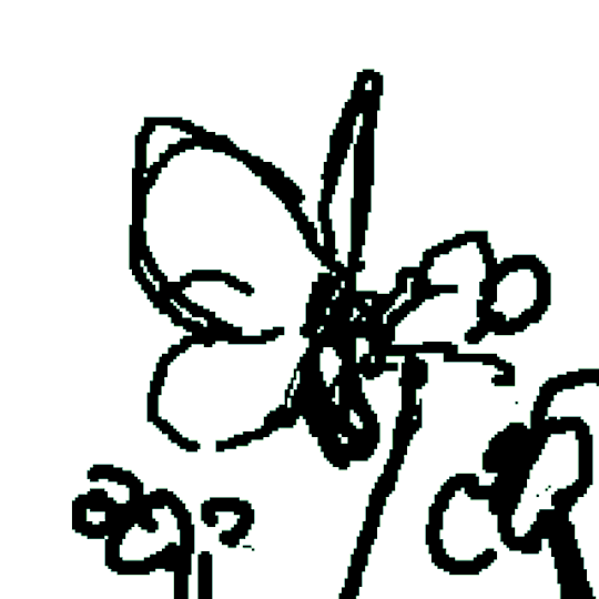
#in this case i sketched with light colour on a dark background
Explore tagged Tumblr posts
Visit Tumblr Blog
Explore Tumblr blogs with no restrictions, modern design and the best experience.
Last Seen Tumblr Blogs


Fun Fact
The total number of visits Tumblr.com received during January 2021 is 327 million.
Text
someone
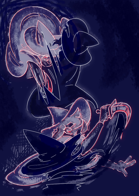
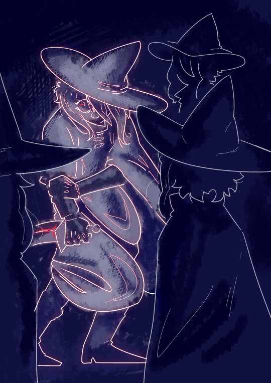
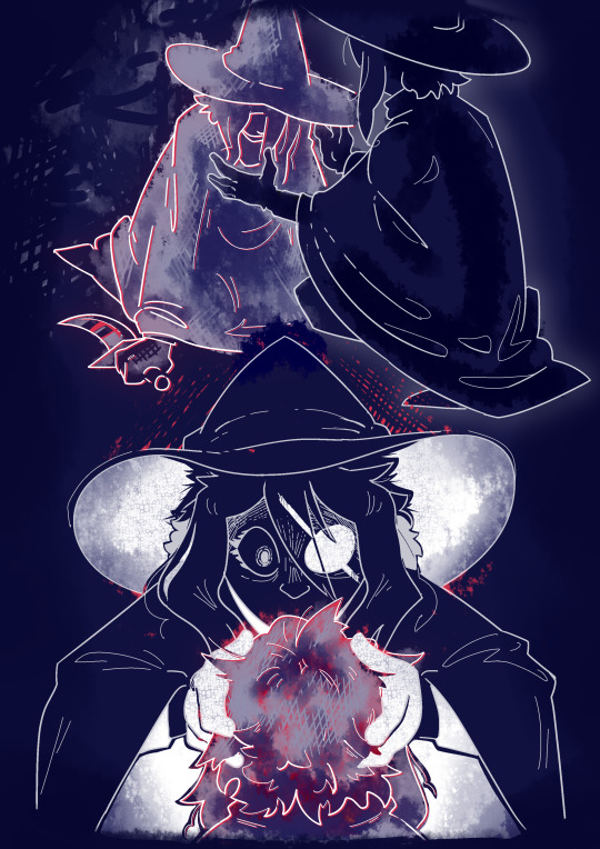
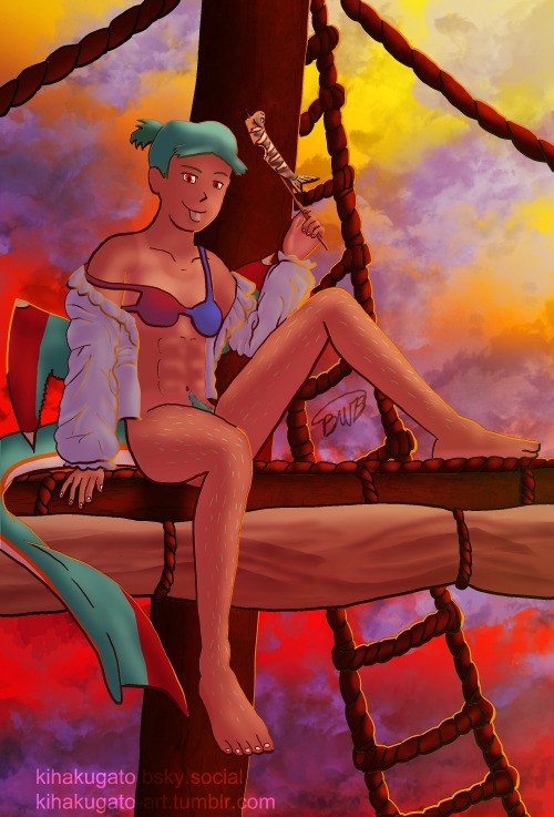
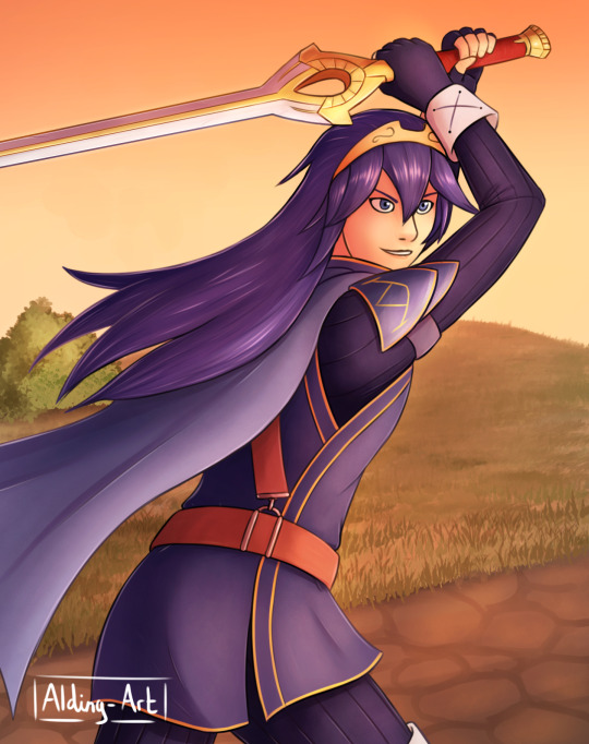
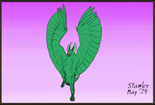
#act 5 my beloved my beloathed#at this point in the game i think my brain was a bit fried cos i legit forgot how stories happen and was like yep this is how i die#made it so i straight up exploded afterwards lol just inconsolable#mal du pays#is me when i fucking gets you#cracking open a boy with the cold ones#oh to have your head grabbed in a vice grip by your inner demons <3#isat spoilers#like kinda big ones#isat siffrin#isat mal du pays#in stars and time#some pose practice kinda got away from me#turns out if you change up how you sketch it can make you a bit looser with it which was nice c:#in this case i sketched with light colour on a dark background#my art
1K notes
·
View notes
Text
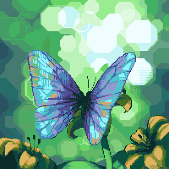
Process breakdown #1
Here is a breakdown of the butterfly animation. This was originally posted as a twitter thread, but a real blog post seems to be a much better format for it.
Step 1: Static Drawing
I've long wanted to experiment with Bokeh effect in pixel art as a way to avoid drawing background. It ended up being a lot more challenging than just a normal background 😂. Still an interesting experiment nonetheless and I might use it for some other stuff in the future.
Step 2: Rough Animation
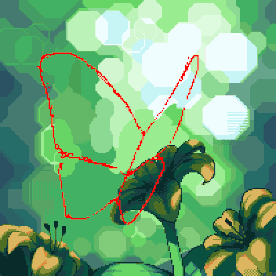
I traced the static drawing with a contrasting colour, then roughly sketched the other frames. Seeing it in motion made it clear to me that the form was very obviously incorrect, but I thought I'd adjust as I go.
Step 3: Refined Animation
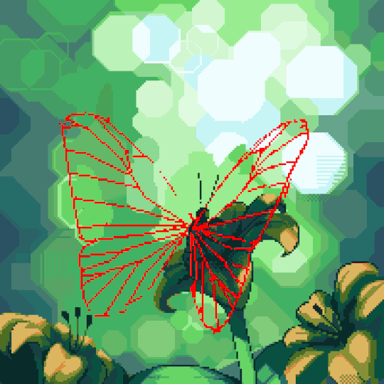
Before I got to this point, I naively tried to put in the colour. I quickly realized making the "veins" look consistent would be very hard without guides. So I looked up pictures of actual Morpho butterflies to study the wings in detail. Also made the shapes (mostly) correct and doubled the frame count once I was happy with the shapes.
Step 4: Colours
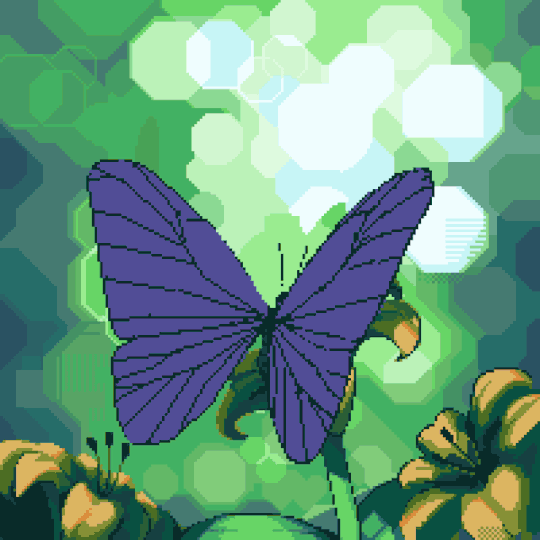
This was the most fun part. I conceptualized the wings as two blue tinted, matte, textured mirrors rotating in 3D space. When two mirrors come together, they start reflecting each other. The closer they get, the less the lighting from the surrounding world contribute to the colours you see. Eventually, nearly no light from the outside world make into the gap and all you see is dark blue/black.
It started looking almost like mirrors as I figured out the rough movements of the reflections; then a shimmering mess of colours as I threw in more details from the static drawing. The key trick to making the complex colours look consistent was to pay attention to every "partition" of the wings to make sure the dark colours creep in and out smoothly.
I also gradually filled in the eye spots and details on the backside of the wings, not sure if many people noticed them but I was pretty happy with how they looked.
Step 5: Shadow
A big part of realism comes from how a moving object affects the lighting around it. In this case: the shadow on the flower. This is a rough version of the shadows as I worked on it. Wasn't too concerned about making it look 100% correct, since the wings probably catch all the attention anyway.
Step 6: Final Touches
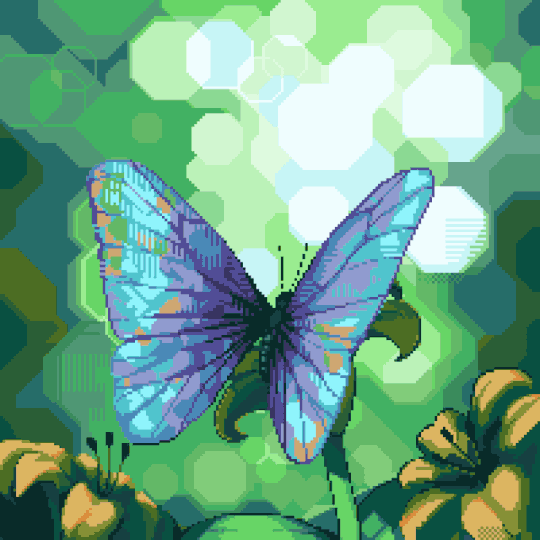
I spaced out the movements so it didn't feel quite so frantic. Instead of using the last frame as the resting frame, I used the second last, and only briefly showed the last frame at the begging and end of the motion to add a bit of realism (although in reality, butterfly wings probably don't have enough mass for that to happen, but hey, 🤷♀️).
Also spent some time to reduce the palette down by merging similar looking colours. Also reused the darker, subtler yellow in the background to create the illusion of more flowers out of focus.
276 notes
·
View notes
Text
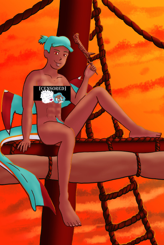
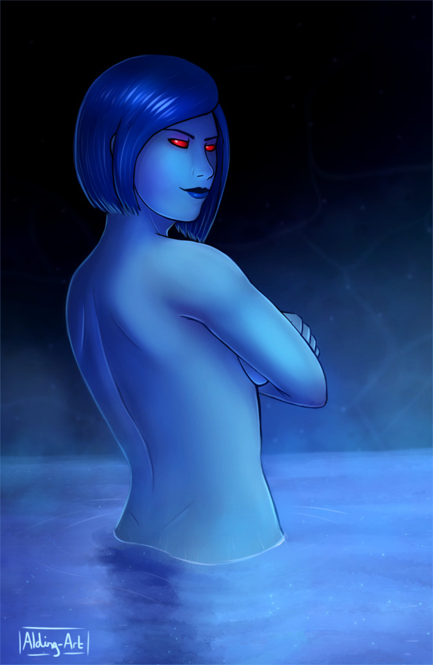
What do you guys think Two’s dimension looks like?
Some more context: so you know how both One and Four have these pocket dimensions?


I was thinking, since these dimensions are meant to be symbolic of their personality and preferences, what would Two’s look like?
For starters, Two’s room would definitely have a lighter colour pallet compared to Four and One’s, since theirs is meant to feel intimidating. I wouldn’t go for straight up pastel, but it’d definitely be on the brighter side. Both rooms have its respective algebralien’s colour somewhere, in Four’s case it’s everywhere (self absobed-ness?), so therefore Two’s would primarily have their green, but other colours dotted around (pinks and light beiges?)
What is actually in these pocket dimensions is representative of the algebralien as a whole. For example, Four’s is vast (making it feel cold and confusing) with a somewhat fantasy vibe to it (represents his desire for escapism?) and One’s is much smaller (making it cosy but intimate, like there’s no escape) and features a space theme (making her feel even more alien) also the accents of orange-red serve as visual storytelling of the fact that there’s something going on behind.
anyways, back to Two. Personality wise, Two’s more casual but bubbly than the others, so I think their dimension would be open and fresh, but having a lot of decorations dotted around so it doesn’t feel empty. Two seems to be quite proud of their powers, so there’d probably be some floating islands, or some unnaturally shaped natural structures (but not like the fourest). But what would actually be in it? Well, Two’s main passion (other than hosting) potentially is baking, so I think the main part would be a sort of cottage/bakery. Something about Two strikes me as secretly wanting a quiet life, and what’s more “quiet life” than baking in a cottage? As for everything else, I think the rest of the dimension would be an endless grassy field with occasional lakes and trees dotted around. I also think the entire dimension would be in eternal sunset, this would be to represent those evenings that you wished would last forever (symbolic of how Two holds their friends just a little too close (imo)). Oh, and there’d be lots of flowers uhhh because I said so.
Here’s a sketch to get an idea of what I mean

(it would be lighter I just preferred working with a dark background)
18 notes
·
View notes
Text
Drawn May 16 2025
I've been looking at some older art a lot recently and it's reminded me of some things about my old process/internal rules that are different now. Because of that I've gone back to some things I used to do every once in a while, but y'know. I like to do a bunch of different stuff now.
One thing was, I never used pure blacks, whites, or grays. That was a hard rule. I'm not including the backgrounds obviously, but uh, you might note the obvious black lineart here?
So uh. It kinda went from a thing I never did to a very specific character breaking that rule (Émile's hair in his current design is a pure black, but before it was a completely different character with that same quirk. But at this time Émile's the only one like that)
Another part was that my sketch/lineart changed (I never know whether to call what I do lineart or sketch now. I think it was similar back then. whatever). The no-blacks was something that extended to how I did the sketch as well.
Back then I also didn't use inking brushes (for a while it was one specific pencil, but I eventually branched out) and I usually did my linework in pinkish-red that I'd set to multiply. This would also mean I'd need my colouring clean and hand-done under those lines too (well. I'm sure a lot of it I didn't need and it was more perfectionism than anything. But another thing worth noting is I work at huge canvas sizes now and I don't think I did back when I started with that process…? so that would affect how easy it was to fill those lines and also how visible small mistakes were)
Because of the time it took and I wanted to experiment with my art more, sometime during artfight I adopted a different method to lineart - but it didn't stick for a while. For a couple years it was something I only did during AF, iirc
I don't remember the in-between, but obviously I change up my inking style a lot and I gravitate more towards the inking-style brushes rather than the pencils nowadays. I don't remember why I did start using black for lineart, but I think some of it was just. using middling colours on a middle-gray background is hard to distinguish and I didn't like using light ones. and I wanted to do art faster so I stopped doing that whole'zooming in and cleaning up colour that, at a certain point, didn't need more futzing- I was just wasting time' thing. That and I might've just started forgetting to change the colour since there was one point, or just certain drawings, I would change the lineart colour after I finished drawing it.
There's things I do in the lineart I wouldn't have done before too. Sometimes I do the dark undereye circles in the lineart instead of colouring. Here, the dark part of Lake's eyes, as well as Suchai's gauges and nailpolish are just filled in. Before I would not fill these things in lineart, but this is faster.
If I were using a multiply layer here though, I would not do that, as it's be faster in that case to leave empty and colour in with that 'not-really-black' I had used for everywhere else. I just changed because it suited my new method better
There used to be one exception to the no-whites though. it was for some highlights, and I think almost exclusively got used on the eyes. I don't do that as much now.
Something you might notice in some drawings with a lot of characters is that some or all of them have slightly (or not-that-slightly) different sclera colours. That's kinda related. I try to make the off-whites, off-blacks, and off-grays fit the palette, but when they weren't done together (or were, but if it's an older drawing, probably not well) things like that would pop up. I don't think it's inherently bad, but it hasn't always been good.
Something else I used to do were shapes instead of actual noses (I mean. Not that I always draw "actual noses," These two are generally with a line and a scribble to indicate it) I had trouble with them, so I just never bothered.
At some point though I just started hating my art so I was just like "okay I think something needs to change" so I changed a few things. I was worried going back to trying to draw not-just-shapes would be difficult, but from what I remember it was fine. I think doing just-shapes in 3D space helped me get a better grasp on how noses should look (plus whatever skills I had developed elsewhere I could now apply there)
I've thought about going back to that for a long time, maybe not in my usual style (how I normally do anatomy & proportions) but something a little simpler or cartoonier, but I've done one, maybe two things in that time? Whatever. At least I can now better express what was in my head when I drew various sizes of triangles, squares/rectangles, and circles/ovals. And do more shapes too!
#art#artwork#my art#artists on tumblr#drawing#my drawing#digital drawing#krita#made in krita#made with krita#krita art#digital art#digital artwork#sketch#digital sketch#sketchpage#original character#original characters#oc#ocs#my oc#lake#suchai#pitchaya
9 notes
·
View notes
Text
quite literally NOBODY asked but long post about the mental illness I gained drawing mattress car door and attic (process and references sort of... id post a timelapse but i don't have one because storage :/) this is more just to look back on because i forget my own thought processes 😔 this sounds pretentious i promise i don't think im that guy i just like to Talk


it is legitimately just taiji taomote's marble statue "death visceration" . like i STOLE IT that was my main reference AND HIS OTHER WORK IS SO COOL you can read a bit more about it here . i actually saw this BEFORE i made my karmor and it made me want to make a karmor just so i could draw mahatma and atilla like this.

i think the meaning??? in my drawing is pretty bog standard basic nothing special there like he's trying to stop his mate from dying innit . the moment was only a couple seconds but i wanted him to have like an anime moment in his head so i guess this was it lol
ummm and karmors pose was partially referenced from these spiderman sketches by j scott campbell (?) hehe so neat i love spiderman karmors pose sucks tho but what can U do lol

ummm started with a sketch and added some colours to see if i actually wanted to draw it realised what the hell sure . gradient maps did not help in this case cause i didn't have a lot of different values so i just did
regular colours
dark blue multiply layer to darken the colours
radial gradient on linear light mode going from blue in the centre to yellow/orange to brown/red on the outsides. radial just means circular i think. like radius circle yea did not know that before i found it on my program lol
blue gradient from the top and red background for some contrast yass
teal blue radial gradient in the centre with ... soft light layer mode??? idk (added after i don't think it's in the picture)


cleaned up my lines (lucario helped) and added my flats and started rendering before i realised layers are annoying and i needed to merge them and paint like a REAL WOMAN!!#(# (joking). when i had some shadows down i merged the layers together and PRAYED (U can see in 2nd img below i painted ontop of the lineart which is sooooo useful)


main shadows for me go like a shade that's hue shifted one way, then another shade that's a bit darker than that one and then a lighter shadow shade that's hue shifted the opposite direction to the first shade to fill in blank spaces i guess idk it just looks a bit more interesting
blending used brush with some pressure opacity and colour picker is amazeballs bc my program's blending tool sucks bruh. i put down a colour with slight pressure and picked the resulting colour and painted with that on hard pressure. doing that just gets you a mix of the two colours and more control over what you put down because you don't have to worry about maintaining a light pressure or anything it's just all paint no opacity
hue and saturation sliders my fave cause u can see what shading colours look good but obviously do that before u merge ur layers... highlights mostly reddish from the background
used a gradient map on black and white to check values (deleted after) and see if the highlights are actually highlights (i should've gone darker with the shadows and had more of a stronger red but it doesn't matter who cares 💔) oh and some super basic hatching in some areas that look a little bit flat
karmors lightning power thingy was a last minute decision honestly it doesn't make any sense considering the lighting but idc . who gaf. maybe using my pencil brush would've been better but i was lazy so just don't zoom in and pretend the random ribbon brush looks in place
export + a little cleanup on a new canvas (barely any cause im lazy) . check how it looks on phone add a cool toned filter to it (using my phone gallery app 😭) and . yeah . also Instagram story crash out is mandatory unskippable step
i also just stole karmors entire outfit from Pinterest you see nothing i do is original IM A FRAUD i just steal and look the other way 😭😭😭😭 AND I STOLE HIS FACE i based him off of the model akeem osborne he is very pretty if only i took the time to practice other hair textures instead of being a bum and karmors hair wouldnt look like POPCORN in the final image GOD
I also just cannot paint and. can't draw faces from weird angles . but im glad i drew a full illustration i don't think i really have like this since 2021 😞


okay ya that's it bye
8 notes
·
View notes
Text
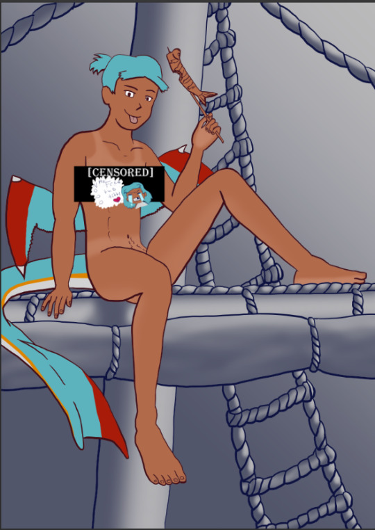
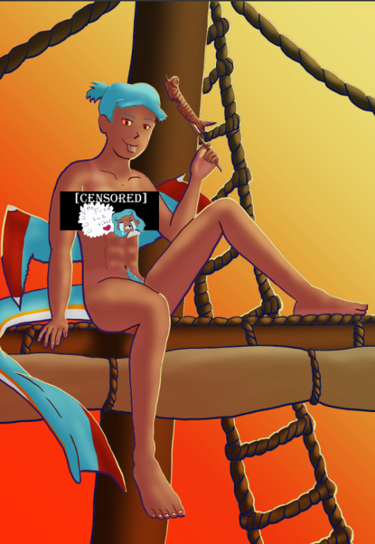
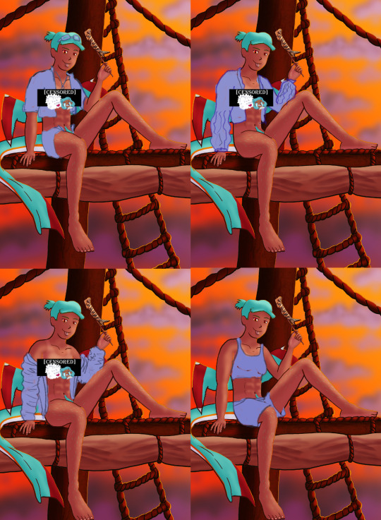
The Harriet Pinup Art Project
Session 2- Process till completion? But where're the other sessions?? Well that escalated both quickly and slowly
The last report was Early September 2024…. Dear god it’s been almost 7 months since last report. I would’ve like to have split what comes next into 2 more sessions but- it is what it is. This is gonna go all over the place so apologies.

Finding some dissatisfaction with my end result in last-session I tweaked the fish-holding arm and the dangling leg a little bit more to my liking and sketched again.
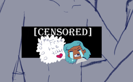
The nips got finally drawn and with it- the censor will now have to drop to keep tumblr-compliant and also to keep this blog sfw, hope you enjoy the humor (Harriet doesn’t).

The wings kept feeling wrong (looking more stretched and unnaturally tacked on vs being naturally relaxing from her backside) so between struggling wing csp assets to reference (not super great when there are no flipper-esque wings) and some more direct input from a friend I ended up landing on a more natural look.
Linearting
Now for my nemesis- linearting.
Despite my disdain for the process I did not want to half ass it by just cleaning up the sketchwork like I normally do. While I struggle to grasp its use, I really wanted to implement lineweight in my lineart. From what I’ve seen lineweight can be used in a lot of different ways; purely randomly, to emphasize mass, or to emphasize the light source of the piece. Of all the choices I tried to stick to the last option since I felt I could best understand it enough to attempt it.
I also decided to try a feature I’ve never used before; linearting with vector lines instead of rasterized ones. For those who don’t know what the difference is I’ll do the extremely dumbed down explanation; rasterized lineart is more common (I think) and is less memory intensive, vector lines are more common in graphic design (since they can be resized w/o the pixel distortion you can encounter with raster lines). I wanted to try this method in an attempt to make the process of linearting a little less painful; with vectors I can adjust the lineart without having to redraw said line if it’s a small tweak, and changing colours is a lot quicker too.
Sadly during this phase my tablet pen's nib broke in a way that was unfixable (leaving the broken part of the nib DEEP in the pen), and due to pricing (tldr- the pen was more expensive than just replacing the entire tablet, in which case it's better to upgrade altogether if possible) had to wait for a new tablet after researching my best choice for a replacement; definitely was a great upgrade but GOD I did not like that happening when it did. Upon a friend’s suggestion I adjusted pen sensitivity so I could try to avoid putting so much force on the pen when doing the thicker lines.

I think I’ve grown a little more confidence on linearting, but it’s still far from my favourite step. I both enjoyed and hated the process of using vectors for the lineart. I felt like there’s probably a lot more I could’ve done with the vectors than what I was doing, but in my opinion it is not that bad for someone jumping in with very minimal knowledge/understanding.
Colouring/Shading

Being colouring is one of my favourite steps I couldn’t resist I rushed right into it. Though I actually ended up doing the shading before the colouring this time. I did the method I’ve heard/seen for digital artists where you block the subject with just black/dark, and then erase it off where the lighting/highlights would be. I’ll say I definitely found this method put more strength into my shading from usual.
Then I rushed to colouring Harriet herself. Just did the ol-colour picker from her refsheet to throw her colours on, then did some adjustments to colour her nipples and tanlines (cause I WANTED DEM TANLINES!!!!!) though I tried to not make the latter too bold of a contrast since she imo has darker skin and not just tanned.
Then from there there was colouring the background and mast and just wrestling the colour balance and blends, there was a lot of it so I’m just gonna share one of the ones I went through.
At one point I even took a sunset from google and maxed its size on the background (and crashed CSP as a consequence due to the large image resolution- which lead to me shrinking the canvas/image during this process) to try to help me get an idea of what I MIGHT want to do for the background.
Clouds 💢
After a point I started trying to make my own clouds- the first attempt wasn’t too bad save for the tiny little problem that was the brush made the clouds look wayyy too sharp and grainy on closer inspection so had to scrap them and try again, even going as far as looking at irl clouds to try to get an idea of how to emulate them.

I ended up using a generic soft brush and tried my best to do clouds again. It was okay, but not great and kept getting adjusted between other steps. fortunately we’ll better revisit/redux on these clouds far later in the chain-of-events.
Like the clouds I has having problems getting the nice folds look for the sails, grabbed some refs and kept trying to get it right. The results are far from perfection but they are sufficient. Folds on this sort gonna be a pain in general.
Clothes roughs
I did some rough draw-ups of different alternative outfits for her to wear. After a lot of wrestling I settled on her just wearing an opened poet’s shirt and the other two ideas got discarded.
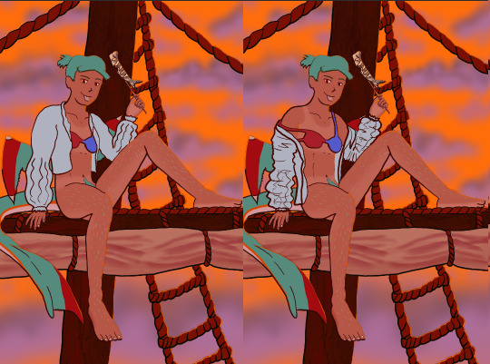
Added a bi-colour bra to make it that I don't have there's a variant that I can share in sfw spaces, and then I lined and coloured the rest of it up, only to stumble into an unfortunate realization-
Ew that went wrong for clothes- reference and redo

[image source 1, 2, and sadly 3 only leads to a pinterest result or a malicious site so 🤷]
With extreme dissatisfaction I ended up trying to tackle them again; I learned the term for the kind of shirt I was after (poet’s shirt, that way it also reduced the amount of AI messing with my results), got several reference photos then tried again while trying to mimic what I was seeing.
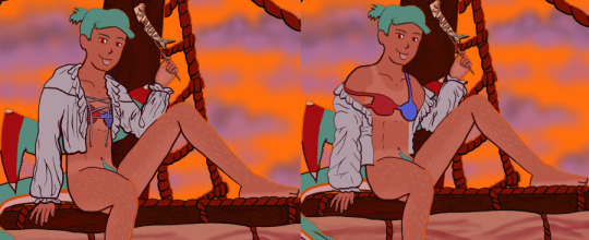
MUCH better.
Clouds redo
With that, let’s get the clouds looking better. I checked this tutorial to try to get a better idea, and found some cloud brushes that are in Official CSP but weren’t downloaded thanks to another tutorial and used them, used them then used the tutorial to help further elevate them a little bit. To further elevate said clouds I hilariously used my previous crummy clouds as a overlay to help the new clouds pop. Much better, and with that it’s done, slap dat signature and watermarks! Ready to throw onto the internets
Personal Evaluation on this project
This project ended up taking much longer than I wanted; Some of it was due to real life kicking my butt, and some of it was from clumsy planning and impulsiveness to get to certain steps quicker.
I liked it taking longer cause it gave me more time to think about certain steps and chisel away at parts when I had time, like working on a super large puzzle. On the opposite end it ended up making me much more intimate with the flaws with the piece/project than I’d like to be during the process, since most artists nowadays including myself tend to hit that stage after they’ve completed and posted a work online.
This lead to a lot of times asking “am I gonna shrug off this flaw or go through the time/trouble to redo a part to make it better?” For the case of the clouds and clothes, yes I felt the redo was necessary and it helped strengthen the overall piece, but there were many other flaws I chose to ignore cause I was too far into it to be worth the backtrack.
The biggest example flaw is ironically the anatomy/perspective when sketching Harriet’s body; while using the 3D tool was very helpful, I feel I should’ve did more perspective exaggeration for certain parts of her body (the biggest case being her hands; they imo would’ve looked much better if I made them and her fingers a little bit bigger and chonkier). Another case were the folded sails of the ship that I feel could’ve been better shaped and the folds could’ve been more sensible, ironic for me to say considering I had done several references and do-overs for that part of the piece. Conversely there are probably still various flaws in the lineart itself; despite the convenience of being able to edit the lineart via the vector points it is still a lot of nitpicking if you don’t decide that it’d be better to just move on so long as the idea is brought across via the art, flaws be damned.
When it came to the clothes stage, in my opinion I should’ve done that LONG before colouring/shading Harriet’s body and back when I had just finished the lineart, as it would’ve lead to less visual confusion for my eyes when I had to sketch the clothes out. Some ofher steps were out of order enough to cause confusion to myself, but I won’t bash myself about it since this is probably the first piece I’ve worked on that’s taken this long, plus this winter alone has been very mentally taxing so dumb decisions are bound to happen thanks to that.
That being said, I’m glad I did this project. I got to experiment and test out strategies and tools I’ve never even considered delving into before, and I may even end up using some of them again. There were even some points in this project where said tools I just thought “well this could be handy for [this group of drawing ideas]”. It’s also lead to beautiful results and is probably my biggest high effort piece I’ve done in a long time, probably rivaling if not outclassing some of my bigger pieces that I still admire today from back in my highschool days.
Hearing from one friend talk about the flow of the piece made me happy since, despite never mentioning it during the journaling of this project, that it was something in the back of my mind on/off while working on this piece; the flow of the ladder and clouds all intentionally despite to try to point the eyes of the audience towards Harriet who’s meant to be the main feature of the piece. It really proves that considering flow is a vital element when you want to make a piece work.
I may actually try to print one of the several variants as a print to put on my wall. Not that I will hold my breath on the results as my track record of digital-to-print for my artworks has always been a hard hit/miss for results.
Thank you for those who decided to follow along on the journaling of this art project.
[Session 0] [Session 1]
#The Harriet Pinup Project#artists of tumblr#artists on tumblr#art process journal#wip art#wall of text#long post
6 notes
·
View notes
Text

(late) painting for day 7 of dr. carmilla week. prompt was death, but she's more of an un-dead type gal, so i tried to draw her alive(ish) in an empty grave.
@drcarmillaappreciationweek
[Image ID: A watercolour painting of Maki Yamazaki as Dr. Carmilla lying in an open grave from a bird's eye view, only showing mid-chest and upwards. She is a slim, tan, Japanese woman who has chin-length dark blue hair that has hints of teal, pointy ears, brown eyes, a sharp nose, and has makeup around her left eye that looks a bit like an upside-down lowercase T, with swirls as well as two dots right underneath her lashes. Carmilla's right eye is entirely closed, but her left eye is cracked slightly open as she looks at the camera, eyebrows furrowed as she tries to focus. She has a small smirk on her face. Carmilla's hands are crossed over her chest, loosely clasped together near her neck, with fingernails that are painted a dark brown. She wears a high collared white shirt, that looks purple in the lighting, which has small purple flower print on it, as well as a dark red vest. The background is a rough body shape of brown colours, meant to show the upturned dirt from a fresh grave. The linework of the painting is thick, and several parts are shaded with markers applied on top of the paint. Some of the paint is still wet, especially the background. Some of the linework runs, and the entire drawing has a pinkish tint, presumably from the pink lighting that can be seen in the paint's reflection. End ID]
original attempt below cut because i got a bit too ambitious with the posing i think

i had a vision for this piece. unfortunately i am not that good at perspective
[Image ID: A photograph of Kae's, the OP's, desk. On the left of the photo, there is a sketchbook, which has a half-finished painting of Doctor Carmilla in a grave, similar to the one above. Her hair is bluer than the previous painting, and the perspective is as if one was looking from the crown of her head down the rest of her body. She is winking at the camera, but her features are not as recognizable as being Dr. Carmilla as the first painting. She is wearing a dark brown shirt, with a longer-sleeved red shirt underneath, and blue pants. Below the drawing is a sketched nameplate/grave that says "Carmilla XX12-XX24". To the right of the drawing is an open case of watercolors. They are a bit messy, with the colour blue specifically splattered across much of the pallette. Near the top of the photograph, there is the partial view of several book spines as well as a cup of murky paint water and the edge of a mug. Several pens and highlighters are scattered across the desk, which is wood painted turquoise, with the grain visible. End ID]
#organisation tags:#their esteemed creator#exhumed unplugged and dangerous#the crew of the starship aurora#drawn in the light of the tube sun#reach tags:#dr. carmilla and the mechanisms#doctor carmilla#traditional art#watercolor and markers#described#notes: anyway i had a super rad time this week! thank you so much for hosting such a fun event! 💗💗 much love
16 notes
·
View notes
Note
Could you make a tutorial on how you go about making your vhs screenshots? They look awesome and I want to try to implement that style in some of my own art. Thanks so much!!!
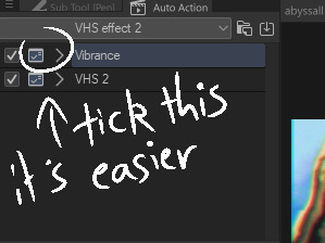
So i use clip studio and the settings i always see on other tutorials are only on photoshop (vibrance) so i baso made my own auto actions copying them and i've uploaded them. This will also be long becoz i always try make tutotials that I would want to see when looking up a tutorial.
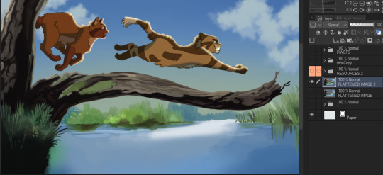
Sketch ur scene. I don't worry about sticking to 1980s (or whatever era) framing or style choices usually. For backgrounds i can do a bigger tutorial but i basically use clips gouache or some watercolour brushes for blending. Ghibli and 1942 Bambi for the textures and don bluth etc for the colours as a rough guide. I use this blog for some references but also just searching '[film name] backgrounds' or something like 'ghibli snow/roads/grass'
So i draw the scene. Use a dark brown for inks. Duplicate that, fill with yellow, blur 5 and 30% opacity underneath. I copy the base layer/character layer, fill with same brown and blur so its a “drop shadow”
I also duplicate the shadows, blur one about 12-18 and set both to half opacity. Same with lighting. Any rim light is the Ink layer duplicated, filled white, overlay or glow it depends on what fits best, and the bits i dont want white erased.

All text is Arial yellow with a black border. My style of drawing varies a lot by i try for a fuzzy 80s fur look- like kosperry or don bluth i guess. thats what the 'cats' layer looks like ^^^.
Okay onto edits. Flatten image and duplicate in case u fuck up. Auto actions are linked above (i have the box ticked/the action closed to speed things up and only adjust the important bits)
Blur - gaussian, start mild and u can build up from there.
Fake vibrance- you can use saturation ig but this (to my knowledge) targets the light and shadow differently. I literally copied how the photoshop vibrance works. I use anywhere from 25-85 strength (mainly 40), it looks less saturated once u click okay so just experiment.
Chromatic abberation - I use this one. Move to liking and merge
Vhs 2 - this is the other auto action i made, it’s basically another blur, motion blur and some image adjustments.
Final additions - 1 is a noise layer (clip studio perlin noise), 2 is a free VHS overlay set to hue (find one with colours u like!), 3 is a new layer filled with a bright colour/colour that fits the vibe you are going for (here i used blue for the blue background + sunny vibes) set to lighten and adjust
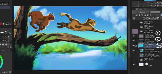
and thats it for me!
Happy VHSing!
#please let me know if these autoactions work! there shud be two in the download!!!#warrior cats#vhs#ghibli aesthetic#retro aesthetic#art tutorial#vhs tutorial
130 notes
·
View notes
Text
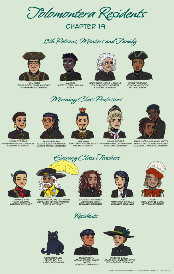
Pale Lights, Book 2 chapter 19 - Scholomance Residents that doesn’t count as students
So many. This took two weeks. And I’m not even done. I also implemented “must have been in at least two chapters” for some of the categories. In case you’re wondering about the lack of cute blonde urchins.
Descriptions under cut
13th Associates:
Wen: I probably should add a hand with the food he’s eating. Maybe if I need to edit something about him at a later date.
Mandisa: We’re slowly learning a little more about her. A lot of her is still very defined by her being unreasonably pretty, though. Including her emotional reactions, it seems.
Nerei: She’s fun to draw. Honestly, though, “maroon eyes”. That’s EE sneakily introducing a character with dark red eyes in a way easily overlooked.
Osian: We know he’s Malani. Have a guess about his age. And got his height from the Pale Lights AMA. That’s it.
Morning Class Professors:
Kavita: The ever-friendly Discord help me place her most likely ethnicity within the ethnicity. Also, so much text. I need something shorter to refer to her as.
Tenoch: He looks way too cute. The oversized coat was a fun challenge. Makes you wonder if he used to be that size. Or is wearing one of Wen’s old coats. With the stubble, there might be a chance for Tenoch to have some mixed background. Rather than being all Aztlan.
Yun: How to draw a character you kinda want to punch just by looking at him.
Malba: I based her hair on the fontange hairstyles from the late 17th century. Minutes before posting her to the Discord, EE then posted a response to me commenting on hair research, with a picture of much more Renaissance appropriate Tudor hair. There will be a redesign. Once I get time. Hey, her hair is at least as period accurate as the tricornes. :P
Rhys and Nandi: So cute together. So totally ruining my layout. So I got creative fitting two more characters into one character’s space. And yeah, Nandi is more than a head taller than Rhys.
Evening Class Teachers:
Chunhua: For a normal row her scarf would be absolutely eye-burning bright in all the black. For a normal row…
Hermegildo: I ever thought I’d actually use up all the room above the characters. This guy proved me wrong. Then EE confirmed on the Patreon Discord that it is the correct feather size.
Balthasar; I’m starting to use all the Lierganen cast to have just a touch of colour other than dark brown and black for hair.
Yue: Both Yue and Hermegildo can’t be bothered to properly put on their coats, and wear them as odd cloaks. Hard to tell just from portraits, though.
Hage: Are you really smiling if you don’t do so with two sets of teeth?
Residents:
Mephistofeline: Prince of Hell, felonious claimant to the throne of Pandemonium. And naturally with a title way too long to fit into the picture.
Itzcuin: I had to rework his sketch so he didn’t end up looking like Tenoch’s twin. At which point I realized I might have a default for Aztlan characters.
Dionara: Her cloak for rose ornaments. Because I felt like drawing a pair of cute roses.
#pale lights#cast overview#character design#fanart#gwennafran art#renaissance fashion#baroque fashion
14 notes
·
View notes
Note
Very random and out of pocket but!! A few weeks ago I followed some classes on designing book covers based on themes and what you want possible readers to feel when seeing the book for the first time.
So it's been a while since I did that, and I got to thinking, what if I make some little cover sketches for otwd to practise? After some thinking and rereading some of the earlier chapters, I put down a little concept;

The most important part, for me, was showing one of two main things that really jumped out to me when reading; the ocean/freedom and betrayal. So, I jotted down some things for either idea.
For the ocean/freedom, I decided to go with a bit more of a traditional cover, very balanced, very light, as Nuffink's story isn't dark from the very start. I'd combine it with lighter shades of blue (to connect it to Nuff's main colours as well) with the colours darkening in ITPN and book three (see the colour palette in the top! Would also help the cold of itpn stand out)
In the first option, I also thought it would be really cool if the ocean was parting slightly as a way to invite nuffink to its waters, real "child of the ocean" vibes (and also to keep the image more balanced). The mist in the background would be a nod back to HTTYD and RTTE, where the mists to both the Dragon Island and into the Great Beyond was a symbol for mystery and adventure. And that's what Nuff's doing! He's going on an adventure that's gonna scar him for life! I'm still contemplating if the Chicken should be drifting on the ocean in the bg, but I think it would be a very good nod to Nuffink being invited onto the open waters. This cover would be leaning towards a light blue!
The second cover I based on the theme of betrayal and, more literally translated into the image, backstabbing. This would be much darker and colder immediately, which I'm not certain is the best decision considering the first chapters of otwd aren't outright dark, but it would display the idea of betrayal very well! As for colours, again, it would be darker, but still keeping the idea of blue to connect it back to Nuff and his ocean. The knife would be hanging just above his back (which would also be pretty significant as for the most part in otwd, he's not actively being betrayed, it's more hanging above his head and hits him at the end and thus it hanging above his back instead of already being in his back would make this more clear)
Anyways, that was a bit of my thought process behind these cover ideas! I'm not entirely certain if I'll work them out (it really depends on time lmao) but just in case I won't, here are the sketches and the ideas!
Again, this might be very out of pocket but I just love thinking about these kind of things haha
That class sounds really cool omg. I love these ideas! I've brainstormed otwd covers in the past but very generic ideas like just a picture of the kids flying on their dragons lol not so much theme based like a real book cover.
The composition of the first idea reminds me of the painting Wanderer above the Sea of Fog which is soo fitting! I like the idea of ocean/freedom/betrayal as the fundamental themes for the first one and it's interesting to think how the themes would change over time through itpn and totg. Do you know the book series Red Queen? They're sitting on my shelf rn and the covers have a similar shade of blue and each book is darker as the story becomes darker, I love the effect.
My dream would be to eventually commission a set of matching covers like these (maybe after I finish all 3 fics or at least start posting totg) and also make my own set of covers. If I ever make my own set I'd probably give each character their own cover- maybe Nuffink for otwd, Baldur for the downed dragon, Bjorn for itpn, Eret for the dancing and the dreaming, and Zephyr for totg? Gustav's prequel would be tricky lol
8 notes
·
View notes
Text
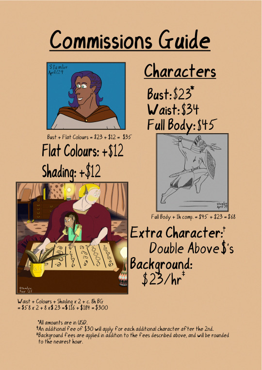
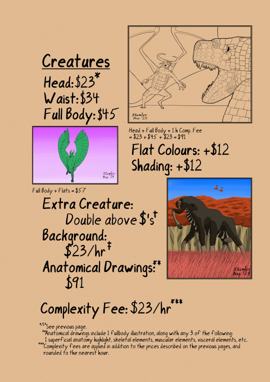
Commissions Price List
Status: Closed --- (check with me first in case I forget to update the post)
Occasionally I get asked about commissions but was lacking a price list. I've put this on DA here but have made a tumblr version too. I recommend checking my DA for more art examples. I would prefer to keep things simple with my offerings at the moment but if you are curious about more detailed scenes I may be able to work out a quote.
Busts: $22 per character
A lined portrait with parts of the upper body visible, depending on the design. May consider discounts for more than 1.
More stuff below the cut!
3/4 Body Picture: $40
A picture showing the body going down to the thighs or hips. The character will be in neutral/slightly warm light unless one of the extra options is chosen. You can give me a pose, or I can come up with something myself.


This option has some extras:
-Basic background: free (A single colour, or abstract shapes to frame it)
-Fancy lighting: +$5 (e.g. back-lit, sunset, spells in the dark, or strong coloured light source)
-Basic or screenshot background: +$5 (A simple loosely painted outdoor backdrop or edited image, with the character shaded to fit appropriately)
Other Ideas?
If there's anything you have in mind that isn't listed, don't be afraid to ask! Other things I could do are:
-Scenes with multiple characters
-More elaborate single poses
-Pin-ups
-Couple pics
-Reference sheets

I'll do my best to provide quotes for things like this, providing I think it is feasible for me to do. For example I'm not good at interiors or poses with elaborate perspective. The rule of thumb is each character will cost $30-50 depending on how much is drawn. Estimates for reference sheets are about $100 for 2-3 fullbody variants.
Read Me:
I can be contacted via chat or I can give you my Discord upon request.
Will Do:
-OCs, fan characters and canon characters
-Armoured designs (within reason)
-Some non-humanoid face designs (ask)
-Light/Moderate NSFW (artistic nudity, covered or reference poses; ask for more details)
Won't Do:
-Heavy NSFW (sex and explicit poses)
-Anything fetishy or hateful
-Heavy violence (damage and some blood is ok)
-Anthro character designs (but things like cat ears, tails and horns are ok)
-Very complex armour or clothing
Terms:
-Prices are in USD and are to be dealt with via PayPal, or donation via Kofi.
-Payment is up front but I will send sketches and versions for feedback. Keep in good contact to avoid delays.
-References must be provided! I won't design a character from scratch. Existing art is the best option, though screenshots may be ok too.
-I reserve the right to refuse work I'm not comfortable with or don't think I can do a good job of.
-I will provide a sketch version for review, then the final version when completed. You can offer feedback and changes at these stages.
-Art isn't my main job so due to my work demands or family visits I may not be available all the time so it's best to ask me first. But if I have a clear run, I will usually get the work done in 1-2 weeks depending on how fast you respond.
6 notes
·
View notes
Text
BIG LIFE UPDATE!!!
Hello all and sundry! I am happy to announce that, in a few short weeks, I will be leaving my job as a massage therapist, and pursuing a career as a full-time writer and digital artist.
If you've seen and liked my work up on here and my instagram, I have good news: you're going to be seeing a lot more of it! Part of that is because, once I'm doing this full-time, I'll have a lot more time for my own work, but also because, at least for the foreseeable future, I will be taking art commissions, starting now!
I'm in the process of starting up a Patreon, as well as my own independent website where you can look over all of my collected work, but for now this is the main way to help me out, so if you like what I do, and want to support me, this is a great way for you to do that.
My Terms of Service regarding said commissions are below the cut, for anyone who's interested. Please read them before commissioning.
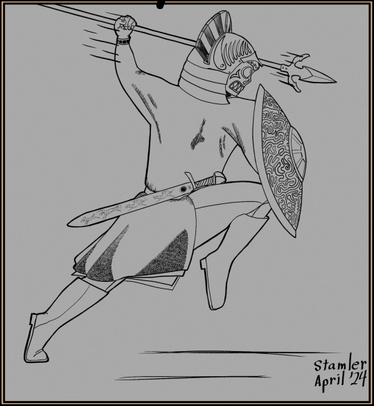
But first, in case anyone wanted to see close-ups of these. Here's one of my oc's, Lanthialdn of Leaning Boughs; you won't meet her (and sometimes him) for a while.
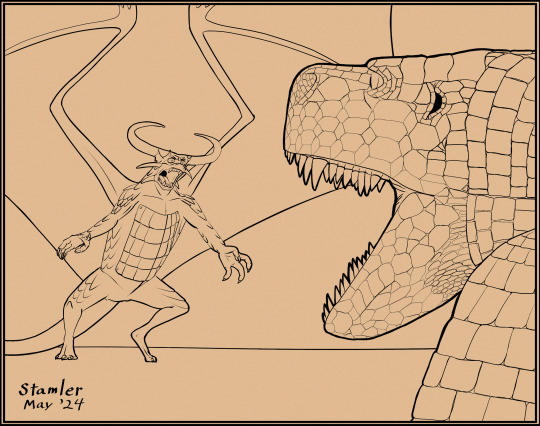
Has anyone else ever wondered what would happen if a dragon and a fasolasuchus got into a scrap? Just me?
A wyvern. That isn't fur or feathers, in case anyone was curious; just scales like a pangolin.
And this guy (girl?) is a bit of fanart, a Behemotherium maxwelli from Biblaridion's Alien Biospheres speculative biology series on youtube. I forgot to include the calculation for something similar on the page above, so I'll throw it in here:
Full Body + Flats + Shading + 2h BG fee = $45 + $12 + $12 + $46 = $115
Anyway, here's the ToS!
Terms of Service
Service Description.
Will Draw: characters, creatures, and light nsfw (i.e. revealing outfits [no nips, no clits, no butts, no nuts], suggestive poses, PDA)
WON'T Draw: porn, graphic violence/gore, hatemongery (racist/sexist/homophobic/transphobic, etc.)
---
Characters: Bust $23USD; Waist $34USD; Full Body $45USD
Creatures: Head & Neck $23USD; 'Waist' $34USD; Full Body $45USD
Flat Colours: +$12USD
Shading: +$12USD
Extra Character/Creature: Double above $$$ amounts (each character/creature beyond 2 will be an additional $30USD)
Background: A blank background/simple pattern is free. Complex backgrounds are $23USD per hour of work I spend on them.
Complexity Fees: If you ask me to draw something extremely complicated/time-consuming (an intricate pattern on an outfit, for instance), I will apply a complexity fee of $23USD per hour spent drawing said thing. Again, I will notify you as soon as I think something you commission me for will entail a complexity fee.
Anatomical Drawings: $91USD. Think like a 19th-century naturalist's journal sketches of creatures new to Western science. I will draw a full-body illustration of your creature, along with any 3 of the following: 1 superficial anatomy highlight (your cave monster has some glow-in-the-dark antennae? I draw them specifically [and, as an option, include a short blurb, which you write, talking about them]), skeletal elements (hollow bones? unusual jaws? I draw [you blurb]), muscular elements (powerful digger? unusual tongue?), visceral elements (gas bladder? metal-digesting GI tract?). Anatomical highlights beyond 3 will entail a complexity fee.
-I reserve the right to refuse commission requests for any reason.
-Reference pictures are extremely helpful. Please include some with your commission request. The more specific your commission, the more helpful the pics are. -Each commission includes two revisionary periods: one after the sketch phase, and one when the commission is complete. -major changes can be made during the first period, only minor changes after the second. -3 edits maximum per period (ex. you can ask for 2 posing changes and 1 perspective change) -I will not make the above changes after these periods have passed. -I will send your commission to you upon completion, assuming said commission has been paid for in full, according to our most recent agreement regarding same, in a file form of your choosing (.png, .jpeg, etc.).
Payment.
-all monetary quantities above are in USD. -Payment is through Paypal only. No chargebacks. -Payment is to be made upfront before I will start working on your commission. -If a commission is anticipated to be greater than 200USD, you can make one payment of 100USD upfront, and pay the rest upon completion. If a commission is anticipated to be greater than 500USD, you can make one payment of 200USD upfront, a second upon the beginning of the first revisionary period, and the remainder upon completion of the piece.
-I reserve the right to apply complexity fees if I deem them appropriate. I will notify you if I make this decision, I will stop work on your commission until you reply to said notification, and I will provide you with an invoice detailing the time spent on your project.
Communication Termination. -If I contact you at any point in this process, and receive no reply within 14 days, your commission spot will be forfeit, i.e. I will move on to other work. -I will contact you when this happens. -If I receive no reply after an additional 14 days, any funds you have paid will be considered forfeit.
Illustration Rights. -I retain the rights to use your commission for personal promotion, and as a commission example. -I retain the original .csp image. -Neither you nor I can use your commission to sell merchandise. -You cannot use your commission for purposes including but not limited to: AI training, reselling, relicensing, or NFT usage.
-You may not alter or repurpose your commission without my consent.
2 notes
·
View notes
Text
Movement Project 25/02/25 - Painting
Inspired by the geometric style of Torres-Garcia, I'm moving on to my next portrait, this time, of my mother. In the picture, she's looking upwards, to our left. This justifies the direction of the radial lines, which converge in the bottom-right hand corner. Since I was using radial lines (which look like spokes, but also rays), I decided to play into both the imagery of the bike wheel (obviosuly), and the sun.
I sketched in my mother's face first, then, using india ink, broke it down into geometric shapes. I was to work in two colours, blue and orange (not redlike last time: I wanted something more autumnal, less gaudy, and besides, orange and blue are opposites on the colour wheel), and in three tones, dark-, mid-, and light-tone (with smattertings of white and black).

Breaking down the features was tricky: I had to straddle remaining true to the features and making it recognisable, while not overdoing it with too much detail, particularly with two distinct colour schemes, which might tend to muddy overall clarity. Around the hair this is very much the case. I could have included much more change in tone, but I wanted to remain true to the style.

For the background, I adopted a brick-step pattern and a gradient. Afterwards, I applied a black outline in acrylic- handdrawn, no rulers - over the ink. I'm not so sure this was the right decision: it began to resemble more a cartoon for stained glass, rather than a painting.

1 note
·
View note
Text
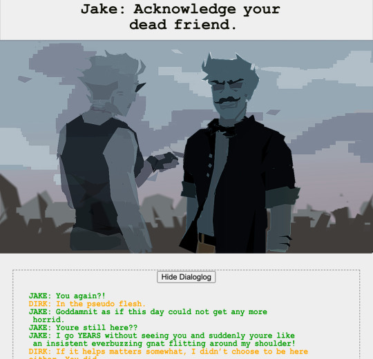
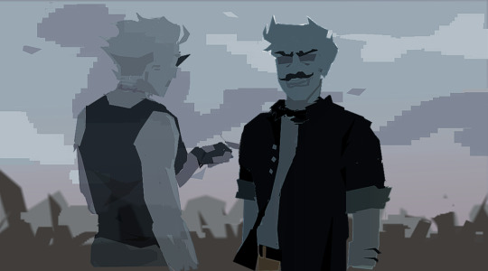
Some process stuff because once again managed to do this all with just a mouse and some polygon tool and im kind of proud of it. Start off with the initial sketch, which yeah, it isnt accurate i just wanted the vibe.


i found references for the poses i wanted which looks godawfully funny in retrospect. But thats the point!! Sometimes you just have to trust your process!! Your sketch just might look mid af doesnt mean the end product is going to be bad if you got a good idea in mind!! Anyways just set those bad boys to transparent and start tracing their forms because shocking.. using references of people like this isnt a crime..


Next up on the menu, i did some rough mood lighting. Its hard to explain what my thought process but i wanted a feeling of desolation and emptiness. The first one was too bright, too action packed lighting for a scene with so little happening. The second one was too dark and miserable, too depressing.. the third showed potential. I didnt want it too grey, because it wasnt complete desolation, and the blues in the background help contribute to the somberness of the scene.

Oh yeah, in case anyone is wondering how to do the mood lighting like i am, matching the character to the background, just make a copy of the character, colour it all in one colour (or use a gradient) and set it to multiply and lower the opacity until it matches the mood of the background! I hope this helps.

With some fiddling with colour balance and graphs i got a more blue coded one.. and then i had to figure out how to draw another pose using my mouse. For dirks, i just erased his face features and redrew it so hes facing the other way. Protip: you should do that if you struggle with drawing the back of a characters head. Draw them facing forward or whatever, and then erase all the inner features and use the outline to pose them in another direction. For Jakes i just copy pasted his hairstyle to face the other way and then roughly used the polygon tool to block in his features..
Personally for the sort of granular look that you might notice around the edges of my art, i tend to hit what i want the art to focus on with a sharpen filter.. and then yeah! Thats it! Done.

Those eyes light a fire / In my stomach / Fall apart / From the inside out
Some panels from my upcoming webcomic, hs2:oot

i looped mystery of love and inside out by duster too much making this tbh.. only way i could get through the pain of heartbreak and pain of using a mouse and polygon tool. sweet beautiful tablet come back to me soon <3. I also considered titling it
Like Hephaestion, who died Alexander's lover Now my riverbed has dried Shall I find no other?
Cus erm.. well.. erm.. ERM... *considers killing myself wdym hephaestion was alexanders best friend isince childhood and was implied to be his lover and alexander died before hephaestion and and *gunshots*
747 notes
·
View notes
Text
Drawing the "Justice" card
I started this card like I've done any other, by tracing my original pencil sketch (or in this case pen). There wasn't much to change in this design as I had already went in a changed the cards composition early on.

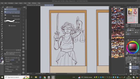
Instead of going straight into the flat colours I decided to play around with how I would do the background as I didn't have any idea on what I could do. I started by filling the whole thing in a dark blue and adding a oval in the centre then adding a spotlight type thing to give her a sense of importance. I then tried to give the oval some colour but it ended up not going with the spotlight idea so I scraped the idea of doing them together and just did one of the ideas.
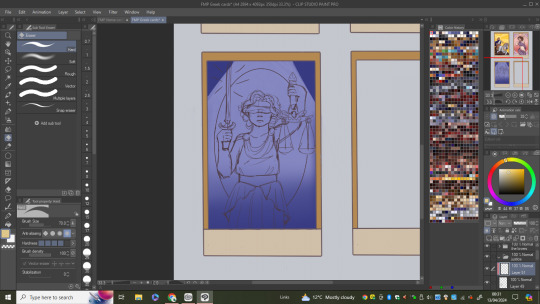
(flat colours)

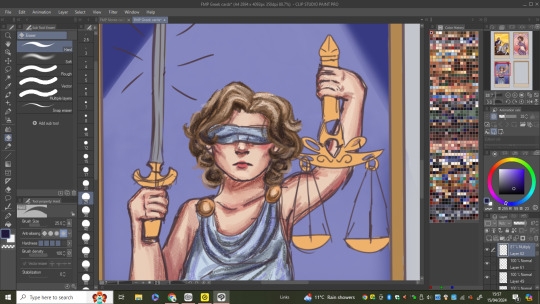
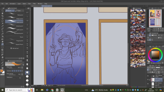
Went on to shading each section of her making sure to continue using the colouring style/ methods I have previously used in this card set. One change I made during this was the colours of her outfit as I just thought pink wan't the best colour to use as Iv'e already used it in one of the cards already so I changed it to a light blue.
When working on Themis's hair I made sure to shade it with the light source in mind making sure it'll look right when I get around to adding it properly


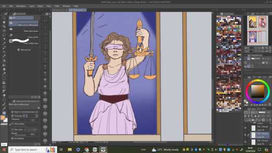
I finally moved onto the last bits of the cards which included colouring the sword and scales as well as adding two olive branches just to add a little more interest into the design (olive branches are a symbol of piece and often are seen with symbols of justice). With that being done I added the lighting working on her being sure to highlight the aspects of the design that are getting hit by the light source.
0 notes
Text
Case Study Rough
The Project
Dyslexia BC is a grass roots movement focused on resources and advocacy for people with dyslexia in classrooms, workplaces and communities. Cathy McMillian, the founder and my client, is located in Victoria BC. Dyslexia BC’s previous logo wasn’t helping the organization reach their ideal target audience or help their brand awareness. As a freelance graphic designer, I wore many hats creating contracts, timelines, negotiated budgets, hosting meetings and designing for each project. We determined the organization needed a logo, brand standards and a business card. Stickers and buttons were created as promotional items for an advocacy event. An infographic was created for presentations.
The Process
For the logo and business card projects, I did research, sketching, digital drafts and the final deliverables. Once these elements and the branding standards were created, the infographic, stickers and buttons could go right into the sketching phase and followed same pattern as the others. The information for the infographic was provided to me. During the research for the logo, I learned reading and writing are the main activities people with dyslexia struggle with. I created an icon to visually represent these two tasks.
While researching about dyslexia, I learned people discovered dyslexia because people with dyslexia's brains activate different neural pathways while they were reading or writing. These brain scans were an overhead view of the brain. I used this concept to create a wave illustration brain-like graphic on the business cards.
The logo and branding needed to be accessible, empowering and educational. The organizations main target audience is parents with children with dyslexia and people with dyslexia themselves. The stickers and buttons were for event attendees and politicians coming to watch the speeches outside the legislature building in Victoria BC. The infographic was for presentations to parents and teachers.
I sketch a lot of concepts for both the logo and the business card before showing cleaned up sketches to Cathy. Cathy and I had weekly meetings to check in for each project draft.
A Key Learning
When creating the second draft of the logo, My client pointed out that the icon looked like a person reading with a dunce cap on. The dunce cap is a negative symbol for older generations in the dyslexic community. To mitigate this issue, I added a rougher edge to the cone’s bottom which removed the cone shape from the logo.
Once I have finalized the digital draft, I send her a zip folder clearly labelled with files to be used for web and print. We do a project wrap up meeting to see what we can improve for the process next time to make the process more efficient.
Dyslexia BC has a logo with variations and brand standards to use across multiple print and web media with light or dark coloured backgrounds. They have a business cards, stickers and buttons use at events. For presentations they have an infographic for explaining how reading and writing looks different in the dyslexic brain. I also exported the graphic elements for them to use in social media posts and Canva projects. When I attended the advocacy event in October, people who came to support Dyslexia BC enjoyed the new logo. I went to one of the presentations my client did for a school in Nanaimo and she mentioned how great working with me was and recommended my services if anyone needs a graphic designer.
Dyslexia BC has a a visual identity to represent an organization that someone will remember.
0 notes