#lightroom texture
Explore tagged Tumblr posts
Visit Tumblr Blog
Explore Tumblr blogs with no restrictions, modern design and the best experience.
Last Seen Tumblr Blogs


Fun Fact
If you dial 1-866-584-6757, you can leave an audio post for your followers.
Text
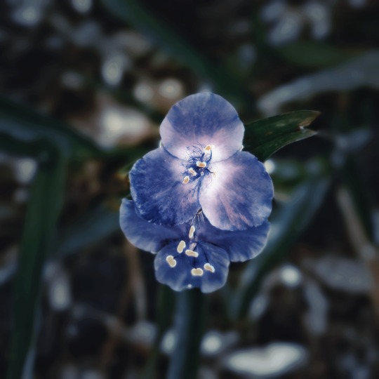
Nature macro photography, Commelina coelestis, May 2025.
#macro photography#dark academia#photography#macro#spring flowers#flower photography#aesthetic#nature aesthetic#nature photography#dark aesthetic#purple aesthetic#purple flowers#blue flowers#blue#nature patterns#nature textures#plants#garden#botanical art#botanical photography#botanicalbeauty#botanical garden#botanical illustration#s24 ultra#samsung photography#hypic#lightroom#nostalgic#dark photography
25 notes
·
View notes
Text
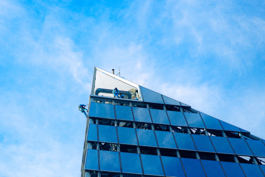
Climbers at Hudson Yards
#photography#city photography#digital photography#urban photography#lightroom#ricohgriiix#ricohgriii#ricohgr3#ricoh#urban life#urban landscape#urban#urban exploration#street photography#city#street#cityscape#skyscraper#town#building#buildings#tower#facade#glass#texture#new york city#manhattan#new york#nyc photography#nyc
4 notes
·
View notes
Text
Collage by @david_espel
The photo I took it from an unkown artist in Pinterest.
#art#artists on tumblr#photography#film photography#analog#analog photography#analog film#texture#artwork#contemporary art#my art#photoshop#photoshoot#my photos#lightroom#collage artist#collage art#digital collage#collage#expressive#expressionism#abstract art#abstract#surreal#surrealism
8 notes
·
View notes
Text

#lightroom#canon photography#lightroom edit#photoshot#photoshop#photoshop edit#glitchy#glitchy art#thermal art#thermal#gradient#textured art#album cover#poster art#poster design#graphic design#graphic art#album cover art#album art#burtalisum#futuristic#futuristic art#selfportaitphotography#self portrait
4 notes
·
View notes
Text

#photography#mobilephotoediting#photographers on tumblr#original photographers#aesthetic#photo edit#adobe lightroom#texture#Spotify
3 notes
·
View notes
Text
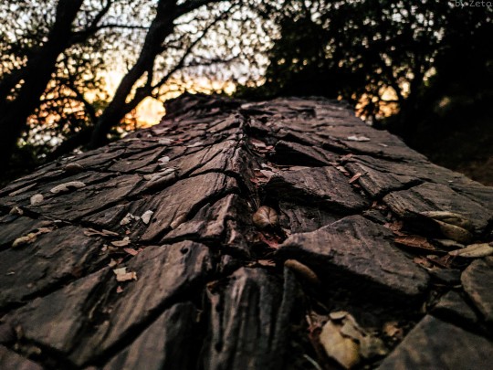
Textures of a fallen tree 🌳
0 notes
Text
finally messed with those cause I was thinking abt Chat Pile again today. seriously one of my fav shows this year maybe second only to Thursday. couldnt find a way to I liked to mesh the b&w and the color so. two separate posts 🤷♀️
#speaking#lightroom is crazy that red and orange textured one looks more like a drawing than a photo to mee#**red and Green I was distracted
1 note
·
View note
Note
queen of ai art <3


I genuinely have no idea what the fuck is in the tap water right now considering these all came in the last ten days from what I suppose are different people considering I blocked the first two… either that or it is one very persistent person or the collective actions of what I assume is probably the world’s most depressing groupchat. Incest anon, come back, I miss you on hindsight.
I don't normally answer mean-spirited questions but these pissed me off recently because of the nature of the accusations. So, let’s get into a long, illustrated lesson including a WIP gallery as to why you shouldn’t rely on “gotcha” AI logic and/or be a little twat, with tips on manual digital scaling, presented in classic Balls style.
Now, the vast majority of my art is traditional, many are quick ‘challenge’ sketches—they are drawn or painted on paper. With many of them, there are progress shots. Sometimes multiple, including fucking gemwork. Sometimes I do silly sketches. I have also been quite open that I’m really focusing on exploring varying styles of portraiture at the moment after an artistic background in watercolour landscapes. A number of you follow my traditional art blog where said landscapes were posted, and you know they’re banging.
Now, I’ve posted *checks notes* like five digital pieces last year from the time I owned a tablet (after which all my work has been trad due to being indefinitely parted from said tablet), and none of them are what you’d call professional quality, considering most of my work is traditional/realist and I am still not very good at stylised or digital drawing. I’ll choose my “best”/most detailed one for the purposes of this impromptu demonstration using the files I do have on me at the moment.
Due to my background in traditional art 👆🏻I always and without fail do my initial sketching by hand, because I find it difficult to get perspective and proportions correct digitally, because I learnt various pencil angling tricks etc… so anything I have drawn digitally that includes people/buildings, I’d do a sketch on paper and scan it, and do the lineart from there.
Here is the sketch, the sketch cleaned up into lineart, shaded values, and a portion of the colour-blocking stage, where I checked to make sure the major colours don’t clash at the borders, thanks to Thingol’s bright orange outfit from hell.

I assume what has been done here is that you or whatever program you’re using has picked up on the below little noisy bits, threads and spirals and decided they’re AI. Let me introduce you to the magic of textural overlays, aka texture stamps/brushes, which I get so impatient with that it becomes quite obvious they’re on there… which works in my favour right now lmao.
Here is me sliding the opacity on and off sections, so you can see what exactly is going on (pillar with marbled effect, thingol skin texture, elrond jacket texture, elrond's remarkable forehead, and the marbled archway):


These aren’t overlaid by my mystery robot sex toy, they are done by hand and there’s around 20-30 different ones in any given piece, some of them (eg skin texture or leaves) are repeated 10-15 times. Using texture brushes or stamps is not a cardinal sin, they are literally sold on this website by the artists who make them. Here is a clip of me just selecting them all in one go, if you’d like that proven for your face eyes as well.
I have no excuses for overblending my colours or leaving sections choppy, I’m just lazy to do painterly detail on stylised digital pieces, and usually just stop after a couple rounds of blending. But if laziness was a crime then most nation-states in this world would not have a functioning government.
Now, the final two stages—because the base for these images are usually scans or photos of my sketches and thus not exactly at the best of resolutions, I upscale in Lightroom. Amusingly, image upscaling is actually normally done by AI either built into Photoshop or plugins—this isn’t exactly generative AI, it’s more an algorithm that breaks down your existing photo and “reconstructs” it at a higher resolution. Hence, many upscaled images are flagged as AI regardless of the manner of upscaling.
I am too stingy to purchase Photoshop, the above plugins can/do use your art to train generative AI even if it doesn’t use it for your image, and I have Lightroom Classic already—upscaling is relatively easy to do here and does not train AI. Here’s a walkthrough:
Open Image > Denoise > Play with Slider > Save as TIFF > Open TIFF > Develop Module > Enhance > Save DNG. Then, work on DNG image re: adding noise/brightness/contrast whatever.
Just a note that the ‘Super Resolution’ feature does actually use (algorithmic, not generative) AI so don’t click on that, just do the normal Enhance. This will increase your image size and resolution without sacrificing detail. However, the file itself would be fucking enormous by this point so you can either compress it yourself or use Canva or whatever.
If you don’t mean those and instead mean these fucking things, jesus fucking christ they’re free graphic design templates with free Illustrator vectors, get a fucking grip, ten days in a charity comms job and you can make these in your sleep while moving the mouse with your pussy.
Here is a collage of some of my other digital works at various stages as well, including pencil/pen sketches, to help you sleep at night:

Please remember that I stopped posting digital art except one charcoal+digital work after I was parted from my tablet in December. If I was really iBalls, I would have continued churning them out surely 😇
Writing
I am not going to even take this seriously because there is clearly no way to explain the concept of writing something in advance to people who clearly type out and immediately send every half-dusted thought the moment it farts itself into their brain.
However, if you are actually sitting in your home in the year 2025, when there is almost definitely litter in your neighbourhood that needs picking and dogs on the Rover app that go unwalked, feeding my fucking writing into whatever fucking AI detector you have that is, in turn, training whatever fucking AI generator it is linked to, simply because of whatever robot you have created in your brain that somehow knows very niche facts about the lifestyle, dialect, speech patterns, culture and politics of a frankly irrelevant town in 1970s Kerala, I genuinely do not wish you a single moment of joy in your life
I have already or will soon be privating some of my artwork considering there are people cheerfully sat there feeding my work to Musk’s field of cows in order to get yourself a good old gotcha against some random Elrondfucker on the Internet — I’m obviously not going to do that to my writing at the moment but please stop letting your actions be driven by your asshole instead of your brain.
As for this one, I initially thought of not being so cocky in my response but considering I either get a version of this like once a month or some fucker goes to another person’s blog to ask them if I’m not tired of people kissing my ass, let me tell you something:
I am not whatever hockey-playing girlboss it was that was a bitch to you in high school and you are now afraid is intruding into your fandom space. She must have sucked I am certain. I am very sorry you had to deal with her. But I am not her. She is not me. I can assure you of this. If you must know, I was a netball girl. In fact, I was netball team captain. If it actually was me, I sincerely apologise for accidentally on purpose fouling you in 2014 because I wanted to win the intra-school friendly and I promise I won’t ever do it again.
And just in general, let me please remind you that I did not curate this audience through purposeful posting of art and literature and tasteful selfies, I did it via the 'Lindircident' post, aka accidentally holding my asshole wide open for the light to shine through two weeks after I made this account and remaining in the same doubled-up position for the six months since.
Tschüss! 🖕
51 notes
·
View notes
Text
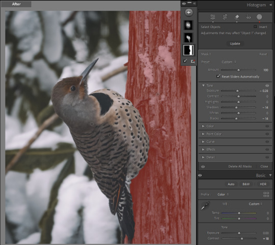
quick & easy lightroom walkthrough or: shooting through dirty double-paned glass, and other hardships.
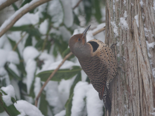
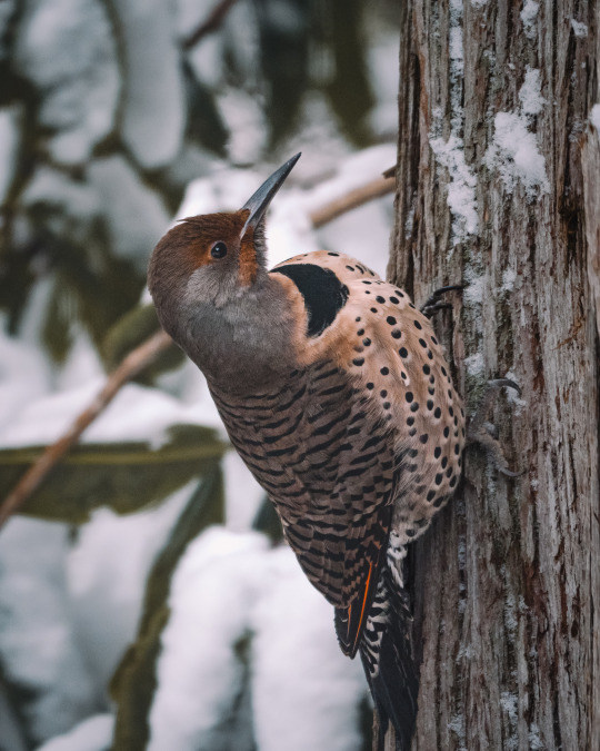
I'll tell you! (Original post here.)
✱ KIT Panasonic GH5 + LEICA DG 100-400 with rubber hood for shooting through windows.* ✱ SHUTTER 1/125 sec ✱ APERTURE f/6.3 ✱ ISO 1600
*I use this one. It works for me, but it's a little tricky. It was a gift, and I think if choosing for myself I'd find something easier to get on and off.
WHAT'S ALL THIS, THEN? It was cold outside, obviously. And the flickers bolt if I try to open the back door, so sometimes I'll post up in front of my dining room window and just get the best shot I can. I do this less and less these days, now that my arthritic hands and I have heated gloves. The 'after' photo is a brand new re-edit using better tools than were available when this was shot. I was never happy with how it looked, before now.
under the cut: EDITS
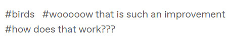
✱ Detail: Sharpness & Noise Reduction My main problem here is sharpness. The photo is in focus, but because I'm shooting through a thick storm window, I've lost that tack-sharpness I really want, and I have a whole bunch of noise to contend with. This would always be the case, but worse depending on the camera you're using, and in my case this was two generations ago - the GH5. I have tested window shots with the GH7, and they're a lot cleaner.
That being said, the trick is to always, always, always use masking along with sharpening. Like, a lot of masking, just so much masking, so that you avoid sharpening an already-noisy background. In Lightroom, you can hold down down the ALT key while using the masking slider to visualize exactly what is being sharpened.
I'm choosing to leave the background noisier than I prefer, because even if I mask out the background, as I increase noise reduction, I lose detail in the edges. Leaving some noise in the feathers also preserves that sense of sharpness, generally.
This is a matter of personal preference and priority in your edits. I've had students absolutely hammer their photos with denoise and like it that way, and that is totally their call. I like it sharp.
Note: you could also do the sharpening/noise reduction at the end, after all your other edits, so that you have a better sense of how much you still need after toning. That's often my preference. I probably went backwards here only because I've edited this image before and had it pre-loaded in my brain.
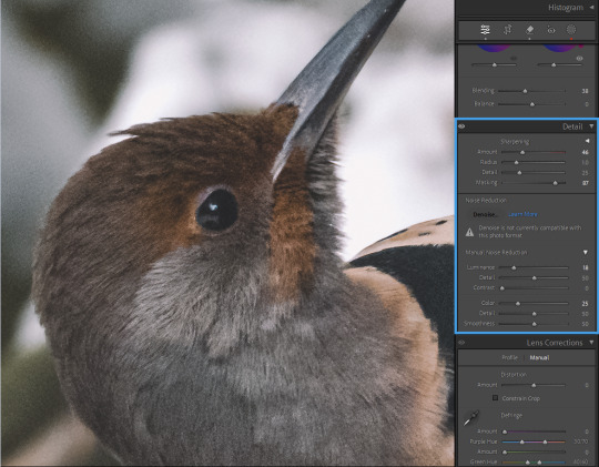
✱ Tone Dehaze is the real MVP here. You could go even harder than I have on -blacks/+clarity/+dehaze, for a dramatic, crushed look. I decided to strike a balance between the soft darks I prefer but the clarity absolutely needed to make this look less smooshy. And my curve is pretty gentle.
Before toning and after:
(You can see that I've also done some color grading. But because that part is entirely personal preference, I'm skipping it here.)
✱ Selective Adjustments With a photo as flattened as this one, I always want to add some depth to it with masking. I have just three masks in this case:
1. The tree was blown out, detracting from my subject and looking, frankly, unrealistic. So I've darkened this on its own, so that my subject will stand out.
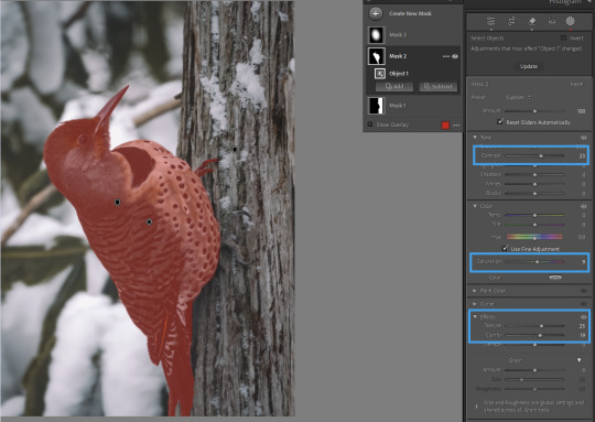
2. Contrast, texture, and clarity to bring out the detail in the feathers; a touch of saturation because the global color grading I wanted took away slightly from the bird's natural coloring. I want this on a mask, and not globally, because I do not want to exacerbate the noise in the background, or the texture of the leaves and snow.
And 3., to make the flicker really pop, I've got a 'spotlight' mask
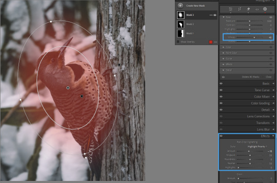
...which is working together with a light vignette to draw the eye to the subject. You could also create an asymmetrical vignette with an inverted -exposure mask, if you needed to.
All together now...
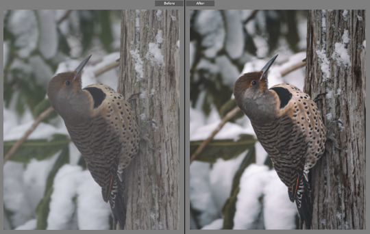
And that's it!
As always, please feel absolutely free to send any questions to my ask box. I try to watch for comments and questions in the tags, but sometimes they get missed. And if there are any other edits you'd like to see, let me know!
Find my other walkthrough here.
#on photography#photography#pnwander edits#lightroom classic#editing tips#photography tips#pacific northwest#pnw#nature photography#wildlife photography#photographers on tumblr#lensblr#how to#lightroom#original photographers#naturecore#photoshop#mine: photos
50 notes
·
View notes
Text

Sharing my composite render of my version of Severus Snape (as seen in my fic Ink & Alchemy). This is a labor of love—a little Alan Rickman, a little Adam Driver, my husband’s nose (used with permission), and a few random guys from Getty Images for the hair and stubble. I might have obsessed over the skin texture a bit. About 8-9 hours in Procreate, maybe 15 min in Lightroom for post-processing. More to come!
#severus snape#sevmione#snamione#snanger#snape x granger#sshg#sshg fanfiction#read on ao3#severus x hermione#snape x hermione#ink & alchemy#procreate#lightroom#composite render#digital art#do not reupload#pro severus#pro severus snape#severus#no voldemort au#what he should have been#man bun severus snape#man bun#man bun Snape#man bun Severus
52 notes
·
View notes
Text
Updated: How I edit my sims 4 screenshots (night-time edition)
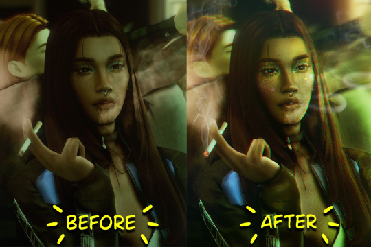
A more detailed editing tut so you can understand my process as it may help you, i edited this relatively quickly and usually spend about 1-2hrs editing something...so let's goo.....
Before taking screenshots:
Help yourself as much as you can in-game, I always make sure there is some sort of light source in my pictures or something interesting that I can add to enhance something already there
Understand good/bad composition and add variety by using different angles
I take LOTS of photos just to end up with 1 or 2 good ones

I'll just be using photoshop for this, but i also like to use the procreate app as i'm more confident w it.
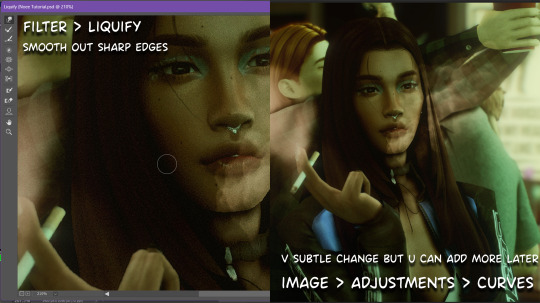
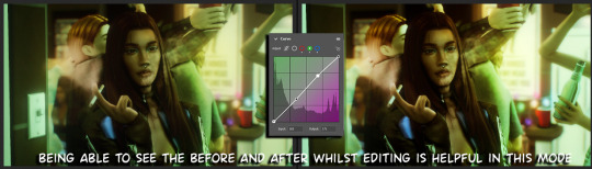
step1: I check if there are any major glitches or hard areas e.g, fingers elbows etc.. that have sharp points and pull them in liquify so they are smooth. Then use curves to change the contrast.
step2: *duplicates image* using the dodge and burn tools (keyboard shortcut: o ) i'll add emphasis to highlights and shadows (be careful with these as the dodge tool can ruin the image if used in excess) *merges image* (i duplicate and merge as i go, utilise using lots of layers so you can go back if you mess up/ want to change the opacity of an effect.)
step3: making light sources POP. *new layer* change blending mode to overlay or soft light and choose a colour you like.
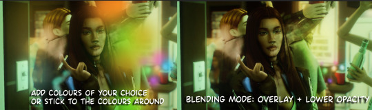
step4: *new layer* draw hair strands. i just use a basic round brush in photoshop and change the hardness or i'll use a sharp caligraphy type brush depending on my sims hair type. (i try not to overdo it as i like maxis hair and don't want it to look too realistic)
step5: i would then add a new layer and set the blending mode to multiply to add more shadows, but i don't feel like i need to at this point.
step6: *duplicates image* go to filter > camera raw filter, i change the "light" and "curve" panels, i like green tints in my screenshots especially the night ones. (this is where all the magic happens really so just adjust all the channels to your liking, lightroom is also really good to use)
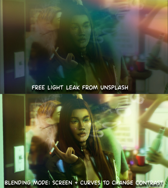
step7: *create new layer* blending mode: screen or linear dodge (add) / makeup and finishing touches! - for this look i'll get stars and glitter pngs off google or unsplash same for the smoke, though if i'm using procreate they have free brushes for that :')

step8: add light leaks as they add some fun dynamic lighting and textures to your screenshots. (i also flip my image horizantally [image > image rotation > flip canvas horizontally] whilst editing as it's like a "fresh pair of eyes" when you've been editing for a while so you can see what looks off)
final step: merge all the layers (though i do merge along the way once i'm happy with something) go to filter > sharpen > smart sharpen. I leave it as the default setting.
extra step if u want: for party pics i might add chromic abberation here is a 60 second tutorial on youtube it makes the pic look cool and trippy.
And you're done!! congrats on surviving. if you have any questions please send them in my ask box so others can see and get help too.
264 notes
·
View notes
Text

rustic country
Rediscover the quiet beauty of the countryside with rustic country. This vibrant digital nature photograph captures a raw, untouched hillside brimming with natural textures and earthy tones. The winding barbed-wire fence, weathered over time, stands as a symbol of strength and history, while the vivid greens of the wild landscape breathe fresh life into the scene.
Every detail has been thoughtfully composed and edited to evoke both nostalgia and a fresh perspective—making this piece as much about storytelling as it is about visual impact.
Perfect for elevating any room, this artwork thrives as a grounding element in dynamic spaces. Whether it’s framed for a contemporary office, printed on canvas for a cozy living room, or added to a gallery wall for that eclectic touch, Rustic Resilience effortlessly bridges the gap between nature’s calm and your space’s character.
EQUIPMENT: Canon Rebel T series DSLR edited in Lightroom
like what you see?? available as an instant digital high-res download here OR support small creatives & buy me a coffee ☕️🧡
IG nikrayphotography
#photography#nature#nature photography#fine art photography#landscape#landscape photography#nature landscape#artists on tumblr#photographers on tumblr#female photographers#art on tumblr#support small creators#support small business#canon#canon photography#digital art#downloadableart#downloadable prints#artforhome#wall art prints#instant download#photography for sale#california#california love#southern california#orange county
29 notes
·
View notes
Text


You, me, rain and the fireflies...
uncensored version - twitter
~~~~
~rain reshade ~ Lightroom/Photoshop ~ rain texture number 4 ~ fog texture number 6 and 10 ~ texture of fireflies is made by me, you can use it for your works if you want 💜- link
#Aristen x Astarion#astarion x dark urge#astarion#astarion bg3#bg3 astarion#astarion x female oc#baldurs gate astarion#baldur's gate 3#bg3#baldur's gate#astarion ancunin#baldurs gate 3#astarion x tav#dark urge#baldurs gate tav#virtual photography#baldurs gate dark urge#astarion x f!oc#dark urge x astarion#astarion romance#dark urge bg3#tav#tav x astarion#elf tav#astarion x durge#astarion x female tav#astarion x oc#astarion x f!durge#spawn astarion#astarion x f!tav
54 notes
·
View notes
Text
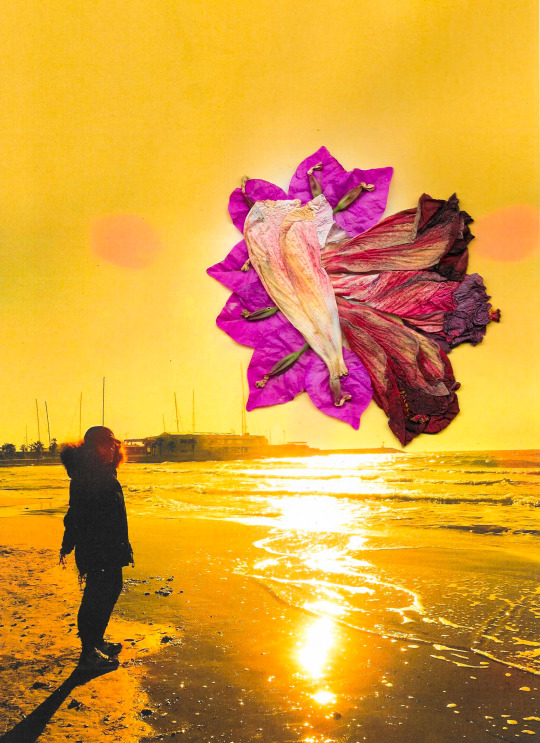
Photo and collage by @david_espel
#art#artists on tumblr#photography#film photography#analog#analog photography#analog film#texture#artwork#contemporary art#surreal#surrealism#collage art#collage artist#digital collage#collage#expressive#expressionism#lightroom#photoshoot#my photos#photoshop
7 notes
·
View notes
Text
Let's talk photo editing!
How I took this photo to this photo:


First step is cropping. III is blurry and the mic stand & the Espera are distracting, so we'll crop them out. One of the biggest tips I’ve ever received as a concert photographer is to never be afraid of cropping!


Next, we edit. For this picture, I want to darken the background, add saturation to Vess's mask to make it pop, and generally increase the contrast while making the photo crisp and clear.
Overall edits: Exposure -0.49; Contrast +13; Highlights -1; Shadows +29; Whites +6; Blacks -15; Texture +16; Clarity +1; Sharpening +89.
I personally don't like to keep background tech in the photos if I can help it, so I use a combination of Lightroom and Photoshop to patch/clone/fill/heal (and/or paint over) the lights, IV's mic stand, and white lines on the stage:
Now that Vess looks like he's in some mysterious bathypelagic ocean depth, I need to add some interest back to the background. I love dust overlays, so here I add one of my favorites and play with the blend modes - for this one I used Pin Light.

It adds a weird texture to his mask and cloak, so I select Vess and copy him onto a new layer above the overlay.
And that's it! You can see the final photo posted here in all its glory.
#hecetasphoto#concert photography#editing#photoshop#photoshop process#editing process#metal photography#sleep token#vessel#vessel sleep token
67 notes
·
View notes
Text
A Scam... Tutorial?
I was watching Photoshop tutorials and YouTube recommended this video to me.

And I was already skeptical. Clarity is an extremely powerful and useful adjustment in Lightroom and Photoshop and I could not think of a reason why anyone would recommend *not* using it to the extent they were using ALL CAPS.
But I was curious if there was a new technique I was unaware of. It's impossible to know everything regarding Photoshop and I learn new stuff all the time.
So I gave the video a chance.
youtube
To quote my late father... what a crock of shit.
I have seen a few scam videos in my time, but I cannot think of ever seeing a digital art tutorial scam. I found myself angry and a strongly worded comment just flew out of my brain.

I continued...
"First, no one should use clarity and texture at 100%. And I think showing the effects at 100%, as if that is a normal workflow, is highly misleading. You are creating a problem that does not exist and then offering a solution to it. And then you are using a provocative title to attract clicks. Not to mention you may be convincing beginners to abandon clarity and texture altogether when it is one of Camera Raw/Lightroom's most powerful tools. People should absolutely use clarity and texture. That is a crazy thing to tell people.
Second, high pass sharpening is… old school. It works but it can create a lot of nasty artifacts if overdone. (Personally I find it too crunchy and prefer smart sharpen on a smart object so it is non destructive). Clarity and texture are much more modern approaches to help bring out detail and I find they actually produce *fewer* artifacts than typical sharpening filters/techniques. And if you have trouble with clarity or texture adjustments in the bokeh areas, then use a local adjustment that doesn't affect those areas. You can even do a separate clarity and texture layer and use the opacity slider and the blend if and masking just like you did with the high pass. Why are you acting like you can only make a global clarity adjustment?
Essentially you are giving a worst case scenario of a clarity/texture adjustment just so you can make your technique seem like it is orders of magnitude better.
And what is even more infuriating is that you can do clarity/texture AND you can do high pass sharpening *together*. Why are you acting like it is one or the other?
I'm so confused by your motivations. Did you invent this clarity problem just so you could make a click bait-y title so you can then sell your little panel thing? And then you used an old school sharpening technique that many have abandoned so it seems like you have secret knowledge that was lost? And I could argue it isn't even a better solution. It's just a different way to achieve similar, if not worse results.
This is like if you put a pound of sugar in lemonade and then said, "Wow, this is way too sweet! You should try my superior lemonade that has a normal amount of high fructose corn syrup."
Lastly, if clarity and texture (set at a reasonable amount) aren't enough to produce sharp, detailed results, then it might be worth considering your actual photography techniques. Modern photography with modern sensors and lenses should be able to produce extremely sharp results without having to juice the hell out of sharpening filters in software. 20% clarity and texture (if that) plus a little bit of smart sharpen is usually more than enough to bring out detail in almost all of my photos and I have never been accused of having soft images.
So, if you are getting soft results, you might need to adjust how you are capturing your images. Are you using a very small aperture like f/22 on that macro image? That could be a diffraction issue. Perhaps it would be better to use a larger aperture at the lens's sweet spot and then do a focus stack.
I mean, I can't think of any other reason a person would need to do 100% clarity and texture unless they completely bungled the actual photography or were still using a kit lens.
I'm sorry but this video is a mess."
Let's look a little closer at what he did to his example.
He started with this.

Then he applied clarity & texture to MAXIMUM. Which, again, is like adding a pound of sugar to lemonade.
And by golly, it looks pretty bad!
Then he used his secret ancient high pass technique to get this.
Which looks a hell of a lot like the unsharpened image to me. And the high pass sharpening is probably only visible when zoomed in to 100% on the full resolution image.
Which is one of the issues with this technique. It isn't even noticeable on social media—the place where the majority of photos are viewed these days.
And then after showing you this groundbreaking effect that does almost nothing, he tries to sell you his Photoshop panel.

Yes, that' looks intuitive. Just hit the blue checkmark to do... something?
And what is this green eyeball with a crescent moon inside?

Only $50!

And if you want to know what the purple X button does, you need to pay another $15 for the tutorial on how to use it.

Neat.
Just to prove this is all a scam I'd like to show you an example of my own.
Here is a picture of Otis with no clarity, texture, or sharpening applied.
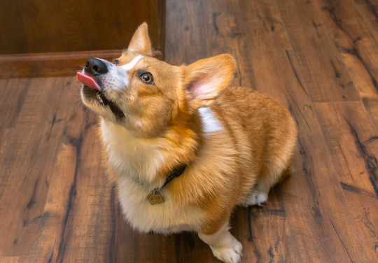
And here is a reasonable amount of sugar. I set the clarity and texture to where I felt they looked best.
Wow, that looks better. Not only that, you can actually see the difference at social media resolutions!
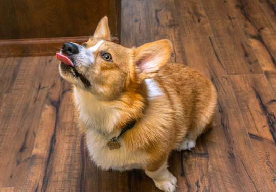
Now let's add a pound of sugar. MAXIMUM CLARITY GO!
Yep, that looks a bit rough. Because no one does this ever.
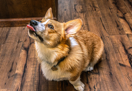
And now let's see his high pass sharpening technique.
Barely a difference on social media.
Okay, let's try zooming in 200%. Maybe that will give the high pass sharpening the victory.
Normal...

Reasonable clarity & texture...
FULL BEANS CLARITY & TEXTURE!
High pass...

Just as I said, the high pass introduces crunchy sharpening artifacts.
I can't speak for anyone else, but I much prefer the subtle clarity and texture. Perhaps the details in the eyeballs aren't quite as crispy, but in the version that isn't zoomed in, I don't think you feel like the image is soft and the normal clarity and texture adjustment added contrast and actually noticeable detail to the image.
In the end, except for the pound of sugar, these are all subtle adjustments and other photographers might be the only ones who would ever notice. The original Otis picture was probably fine to most people. So disparaging the clarity slider was even more unnecessary.
Why does this matter?
Being a beginner at photography is frustrating. There are so many resources to choose from and it's very difficult to know who is competent and who you can trust. If someone just starting out was recommended this video they could be easily be convinced it is legit. And it could set them back in their progress because they think useful tools will actually make their photos worse. They will waste a lot of time doing a time consuming old school technique in Photoshop when they probably never needed to even leave Lightroom in the first place. They could move two sliders to get similar or better results and it would only take literal seconds.
Time is valuable to a lot of people. And he seems intent on wasting everyone's time. And what sucks is that I have no real way of exposing this dude on a scale that would do anything.
I also just really hate the idea that educational content is being used to scam people.
This is some PragerU shit right here.
68 notes
·
View notes