#like they have matching palettes and linked with time powers
Explore tagged Tumblr posts
Visit Tumblr Blog
Explore Tumblr blogs with no restrictions, modern design and the best experience.
Last Seen Tumblr Blogs


Fun Fact
Tumblr is used by 21% of adults online aged 18-29 years.
Text

Hisui-chan reminds me of Shiny Dialga 💚✨
#precure#pokemon#mahou tsukai pretty cure mirai days#mirai days#dialga#legendary pokemon#jade#turquoise#shiny pokemon#hisui#witchy precure#mahopre#mahou tsukai precure#maho girls precure#maho tsukai precure#mahou girls precure#witchy pretty cure mirai days#time travel#sinnoh#illustration#atompalace art#like they have matching palettes and linked with time powers#please tell me someone sees the vision#been loving mahopre 2 btwwww
292 notes
·
View notes
Note
You're big on Zelda, so I'm curious. How would you rewrite TOTK, if given the writer's room?
Fun question! *cracks knuckles* Let's answer it.
I've answered about the disconnect between BotW and TotK before, so I'm going to take some of those ideas and run with them here.
I'm taking the intended route, for the sake of keeping coherence rather than just making up an entirely new Hyrule from scratch. Link and Zelda are the same as they are in BotW.
To start off, I like the Zonai.

I like that they're an entirely new race of people in Hyrule. I love how weird-looking they are. I love that they're not human race #87.
I also love their bastard not-Zonai lovechild thing. If we saw more examples of Zonai, I would love for this funky lil dude to be part of them, kind of like how the Zora have a ton of variation between them.
So why don't we do that? Why don't we give them a kingdom?
And why don't we put some meat on the bones of what was already built?
There are Zonai-esque ruins all over the Depths, mostly in mines for Zonaite.
Their color palette matches. Rauru's braids and Sonia's earrings match brightblooms.

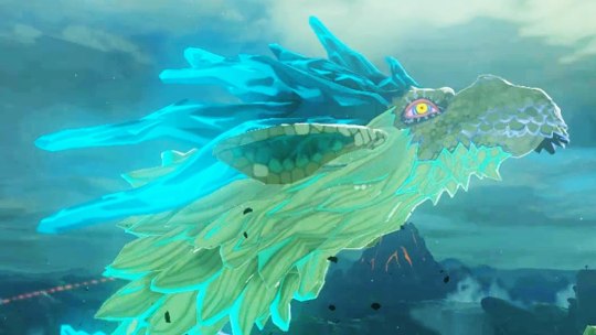
And the three dragons, who have Zonai features (segmented, color-edged hair, long ears, blunt muzzles, scale beard mouths), could have been a catalyst.

A catalyst for what, though?
It starts with the Depths themselves, and the dragons breaking free.
See, in TotK, the three elemental dragons all dive in and out of the Depths chasms. There's no explanation as to why, and the only explanation we have for the chasms forming is that it was like...geysers of Gloom.
However, the dragons in BotW are confirmed to have carved these canyons:

So let's go back in time a little.
The Zonai live in the Depths. They're underground, away from all the chaos that Hyrule has ever had to endure. They worship the bargainer statues as gods, they collect the souls of those above that drip down into the world below.

They have a rich mining industry, and coliseums for their greatest warriors to test their mettle against captured monsters.

They have their Secret Stones, and the one who's allowed to hang onto those is their leader.
That'd be young Prince Rauru.
The elemental dragons, Dinraal, Naydra, and Farosh, are testaments to why no one can be allowed to have the Secret Stones. They were consumed by their power, literally.
One day, they break free, as if summoned by an unknown force. They tunnel through the ground and into the sky, connecting the world below to the one above.

The Hylians cautiously venture below, or the Zonai above. Prince Rauru, keeper of the Secret Stones, and Sonia, High Priestess of Hylia, meet.
They fall in love.
They marry.
Their marriage marks a unity between the Surface and the Depths.
(Maybe throw in a lil Skyward Sword continuity, mention that while Hylia sent the humans to the sky, the Zonai fled underground to avoid Demise, to keep the Secret Stones out of his grasp. You don't even have to name drop him, just say they went down to avoid destruction.)
Suddenly, Hyrule (the center part of the map, based around the Great Plateau, not the whole sub-kingdom conglomerate it exists as in BotW) undergoes a technological boom. Ganondorf, neighboring leader of the Gerudo, is interested. He talks trade with now-king Rauru, but there's the sub-plot of trying to get his secrets, which he steadily grows obsessed with.
Meanwhile, the Gerudo make their own expedition into the Depths.

There. The stage is set.
Now Zelda falls into the past.

She's found by Rauru and Sonia. Adopted as their daughter, more or less.
Also, the two of them have a small child. Nintendo, you CAN'T set them up as "they're her ancestors" and then kill them childless, descendants don't work like that. Zelda's immediately endeared to the kid, who reminds her of Link. Lil half-Zonai girl with a wooden sword who swings it at anything that moves. There are memories, it's cute.
In the past, Zelda witnesses, real time, Ganondorf going mad with power. They get along well at first, he's cordial, polite, a model diplomat. But she finds his troops in places they shouldn't be, confronts him about it and gets brushed off.
She tells Rauru, he's unwilling to throw suspicion onto Ganondorf. They're semi-friends and diplomacy is important! He's got to run this kingdom right. He can't fail, this is the biggest thing he's ever done!
(Sprinkle in a parallel to BotW Zel's fear of failure)
Some of the memories fill in gaps about Rauru's power, also. He's got what Link can do, minus Recall. Ultrahand and Fuse mainly, but Rauru's been experimenting with Ascend, excited because it'll make passage between the Depths and the Surface so much easier, and we see where Zel gets her scientific excitement from. Regardless of how different they look, they ARE family.
Ganondorf and Rauru get into a fight one day. A BAD fight. Maybe because Zelda tipped Rauru off, and despite telling her no, Rauru looked into it anyways. Regardless, they march out in opposite directions, and Zelda overheard it in the hallway. As Ganondorf leaves, he gives her the most SCATHING glare.
He then declares war on Hyrule.
Rauru makes a bid for allies, trying to get enough manpower to fight Ganondorf's impressive military. It's a struggle at first, but Zelda steps in, being the leader she's skilled at being and telling the others how crucial it is that they help. Ganondorf, meanwhile, turns to forbidden arts in his rage against Rauru, gets infected by Gloom/Malice, becomes scarily powerful. First Blood Moon. The Gerudo are kind of unnerved by him.
We see Zelda and Sonia helping with the war. Sonia's got light powers, Zelda's are stronger, together they can destroy entire ARMIES of monsters, saving their warriors on the battlefield. A few instances of Little Princess trying to be involved like the grown-ups are, getting huffy when she's told no.
In the aftermath of each fight, Rauru runs around, sealing away the monsters' latent energy with green spirals. That's where the Shrines come from, though in the past, they're Luminous Stones—it's all faded by present day, the light bled out of them.
Sonia is on the battlefield against Ganondorf one fateful night, Little Princess wanders onto the field, both the girls panic about it, and Sonia tries to run away with her while Zelda affords them cover. THAT'S when Ganondorf strikes her—he's fast like a ninja, rushes past Zelda, strikes Sonia.
She falls. Little Princess tumbles.
Zelda races to Little Princess's side, picks her up to run away with her as Ganondorf gets Sonia's stone, and he transforms into the Demon King. He raises his army. Little Princess screams, and we see an uncontrolled blast of Hylia's power, like an erratic attempt at what Zelda did at the end of BotW.

It fritzes, Zelda hugs her tight and ducks down to shield her, and the power cascades across the battlefield, affecting monsters AND people alike. The war is in shambles. Ganondorf stares at the child and her guardian, and retreats in a hurry.
Cue Rauru running to their side.
He grieves his wife. Little Princess is kept safe by Zelda. The Gerudo shun Ganondorf and join Rauru's side, and everyone involved in the war dedicates everything to one final assault against Ganondorf, one trap to finally END him, to force him into the Depths and fight him on the Zonai's own turf. The Secret Stones are distributed. Rauru knows what he has to do, and at the climax of the final battle, he uses his Secret Stone to amplify his sealing magic, knowing it'll kill him in the process and locking Ganondorf away in the Depths.
Except, it's not that simple.

Gloom bursts out of the newly trapped Ganondorf's chest, flooding the Depths, eliminating everyone in its path. That includes the Sages, the assaulting army, and the VAST majority of the Zonai. Its sole purpose is to gather enough strength over time for Ganondorf to break his shackles, because the Gloom wants OUT.
(Subtly implied that the Gloom is the first iteration of Demise's curse of hatred, maybe.)
And Zelda is alone. Trapped in the past, stuck with Little Princess, her Secret Stone, and the last of Mineru's notes.
Gloom continues to fume out of the Depths, so they're sealed off. The Blood Moon keeps spawning new monsters, so Little Princess and the remainders of the construct caretakers are sent up to the sky, for her protection. Zelda's the one that orchestrates it. Her people once hailed from the sky, and it's always been known as a place of safety for them.
Is this self-referential to the history she's building, or a Skyward Sword reference? Who knows.
They go skyward.
Then the Master Sword appears, and Zelda knows what she has to do. It's compounded, of course, by crushing guilt over the fact that Sonia's death happened on her watch. She tells Little Princess to look out for the world ahead, tells her to be strong, and brave, and everything she wishes her dad had told her. Then ends it with a final message.
"I'm leaving you something very important. Take good care of it."
Then she goes off alone to become a dragon.

Present day.
Link's not guided by Rauru, he's guided by a strange, beautiful woman who looks kind of like Zelda (albeit with Zonai hair, eyes, and long claws), who has a deep regret for the world below and who knows the lonely world above like the back of her hand. She teaches him the basics of his powers as he visits the shrines.
The Great Sky Island is otherwise normal.
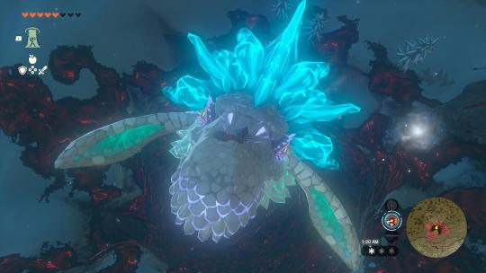
You go to Hyrule. The Light Dragon's the one that breaks the cloud barrier, and as she does so, she sheds a single tear. By the time you get to the tear's location, it's spread a mural of the memory it contains around it.
Whenever you Recall a tear, the Light Dragon sheds a new one somewhere else, and it's up to you to follow.
You're chasing Zelda, twice over.
Besides that, Hyrule's Surface is...largely unchanged. I'm still upset that the pirates assaulting Lurelin weren't ACTUAL pirates, so guess what, they are now. Splinter faction of Yiga. Also, River Zora take over Lake Hylia, there's a spat between them and the Sea Zora, and Yona is the princess of the Rivers.
Then you've got the Depths.
That's where you find the ruins of the Zonai civilization, and you start piecing together the world it contains on your own. You aren't told, you're SHOWN.
Rauru's ghost finds and guides you here. He has a moment of "hey, isn't that MY arm?", upgrades your abilities or shows you how to use them more efficiently (ups your build limit, shows you how to un-Fuse, teaches you DEscend, gives you Autobuild, things like that), then DIES-dies. You escort his poe soul to a Bargainer statue.
The biggest change to the Depths, though, is that under the Gerudo Desert, you find PEOPLE.
So remember how the Gerudo launched their own expedition into the Depths in the past? How the Gloom killed almost everyone and the world below was sealed off?
There were a sparse few survivors of the Zonai, and some unfortunate Gerudo researchers that also got trapped. The people down there now are descendants of both. They're not Zonai anymore, though.

They're Lomei. They evolved like how the Rito evolved from the Zora in Wind Waker. Their tribe name comes from the Zonai word for "loneliness."
Regardless, they're initially inhospitable to Surfacers, because Surfacers are how they ended up how they did. If you sneak into their city, you're captured, like a few unfortunate Zonai Survey Team members that have wandered in, only YOU can escape via Ascend. OoT Gerudo parallel.
You can earn the Lomei's trust by doing things for them (maybe beating all three labyrinths as a rite of passage?), and then they let you into their cities. They've got their own brand of tech based off of old Zonai designs. One of the Lomei scientists is working on a mechsuit—that'll be the sage that Mineru passes her stone down to. And it fits doubly, both because the Lomei ARE the descendants of the Zonai and because the Lomei technician and Mineru are both scientists.
The Lomei people give you more pieces to the complicated Zonai-Hylian puzzle, and they're the ones that first tell you the legend of the dragons-from-Secret-Stones. So you can either learn it from them OR get it revealed in Zel's later memories.
Besides that, the present plot is pretty much as normal. Still the same bosses. Still the same sages-help-with-everything, though each sage you rescue gives you another piece of what really happened at the final fight (rather than the same cutscene over and over), telling you about how Rauru sacrificed himself and the effect it had on the rest of the Depths.
I will change where the Ganondorf's Army fight takes place, though. It's ACTUALLY very hidden, like the game was trying to imply it to be when you chase around Kohga. You do still have to do that, but he accidentally directs you to a place that's hidden in the tiniest crevice near Hyrule Castle, one that's very easy to miss and sitting in a veritable sea of Gloom. Once you finish the Kohga quest, a poe hovers outside of the crevice, which leads into an even deeper chasm that leads to the Underdepths.
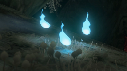
The poe's your help to get through the maze there, and wherever it goes, Sundelions bloom at the corners. If you go early, before getting everything done, you have to navigate that place yourself, and it's a nightmare.
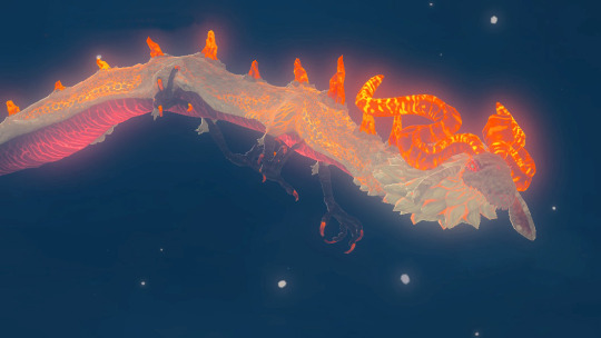
But you do it. You get to where everything started, and you beat the army, then Ganondorf, then he shoves his fist down his throat and goes dragon.
As he breaks through the ground and curls around Hyrule Castle, he SHATTERS it. The building crumbles to smithereens, crashing into the Depths below.
You beat Demon Dragon, Zelda catches you on her nose, it's over. You're in the spirit realm over sleeping Zelda.
The poe appears over your shoulder, drifts away from you, then materializes into Sonia. She says nothing, just activates Recall, turns Zelda back to normal, then cradles her in her arms. She gives her a kiss on the forehead, looks at you, then says the same line Zelda said to Little Princess ages ago, with the single change of one word.
"I'm leaving you something very important. Take good care of her."
She fades, as does the Spirit World.
You're falling.
Zelda's falling.
You catch her.
She wakes up, sees you, then hugs you and sobs into your shoulder.
The Legend of Zelda: Tears of the Kingdom.
Roll credits.
Bonus for the memory completionists, the True Ending has Zelda meeting the grown Little Princess up at the Great Sky Island, reconciling with her, both of them saying how proud they are of each other. Then Little Princess turns into a poe, and Zelda promises to take her to the Depths so she can be with her parents again. As they walk away, Sonia's poe tails after them.
And THAT is a way longer post than I expected to write. Whew.
#loz#zelda#totk#long post#obscenely long post#ask bee#totk rewrite#i want this game now. do you see what you've done to me?
509 notes
·
View notes
Text
Land of Heat, Clockwork and the Worst Puppet Imaginable
(page 1641-1644; ‘[S] Dave: Accelerate.’)

GC: 4R3 YOU R34DY TO FUCK UP TH3 T1M3L1N3??? (p.1580)
Well, mission accomplished, gallowsCalibrator. I think we can consider this timeline officially Fucked Up.
This update, where we skip forward to Dave’s fifth gate without seeing any of his in between steps, was intentionally released on April Fools’, but it’s not a joke update or something that’ll get retconned out of universe. I think it’s an effective way to introduce Dave’s land, grist types and enemies (Amber Imp, Rust Imp, Sulfur Ogre, Ruby Giclops) all at once, which are all questions people want answers to, but not exciting enough to be Big Reveals. But more than that, I LOVE the implication that Dave, Knight of Time, can not only time travel but can accelerate and rewind the narrative itself, displacing himself from a chronological story structure. Can he be trusted with this power? Probably not.
The Land of Heat and Clockwork is SICK AS HELL. I mean obviously, because all the kids’ lands have incredible designs. It’s interesting to me that while Rose’s land is visually the opposite of the aesthetics and interests she’s expressed, Dave’s matches his aesthetic, with a red palette like his shirt and a lot of gears and technology that feel like a more steampunk version of the wires and gadgets he has scattered around his room. It also perfectly matches the gear-shaped planet with a red center from WV’s drawings (p.703), leaving the volcano planet for Jade.
‘Clockwork’ in Dave’s land is to ‘time’, his domain, just as ‘wind’ is to ‘breath’ for John. It also looks like there’s a tiny record in his sword and a set of turntables he’s using to time travel, keeping time by keeping the beat. @sincerelywasserious noted that the track in this animation, ‘Atomyk Ebonpyre’ by Toby Fox, is in 6/8 time – slightly more complex than a standard 4/4. To me, this indicates that Dave is getting more proficient with his time powers and able to master a more complex beat. I'd love to see the time signatures for his tracks get even weirder when he eventually levels up further.
It makes sense for Dave’s quest to relate to his instrument, just as Rose’s involves playing the violin strings of the waterfalls (p.1626) and John’s denizen’s palace looks like an organ (p.1605 - @tenaciouschronicler originally made this link!) Their quests also link to what I’ve been calling their title cards; John’s on page 82 and Rose’s on page 307, which are the first pages for each character that delve into their mental state and hint at elemental associations. As a sidenote, Jade never got one of these pages, meaning we have NO hints to her planet or quest besides her eclectic bass’ abilities to manipulate plant life, and the likelihood that her element is earth.
‘You don't even know what's up with this sick heat. The sun threatens to set but won't step off. It's staring you down, like the big red eye of a hot needle skipping on a groove its tracing 'round the earth. While lingering in midair its heat seems to suspend time itself, stretching it like warped vinyl.’ (p.444)
Here’s Dave’s title card. My guess is that Dave’s denizen has somehow suspended his planet in time, its inhabitants no longer aging, its weather and seasons unchanging, its gears no longer turning, stuck in eternal 110 degree midday heat. (hell!!) It’ll be his job to both cool the planet down and get its timeline back on track in a way that doesn’t mess with the overall timeline of the kids’ Sburb game. I can’t help but wonder if some creatures like the Felt might be his planet’s inhabitants, or perhaps even Lord English his denizen – these guys surely have some link to Sburb, and definitely have links to time, so perhaps they always appear for the player with the Time domain.
So far, there have been six [S] pages that are also commands addressed to Dave. One is his title card (p.444), one is him preparing for a fight (p.665), and the final four are Dave directly in combat (p.836, 871, 1070, 1641). Dave’s big moments are overwhelmingly focused on violence, which isn’t true of the other kids, but does reflect the toxically masculine, constantly on edge and ready for attack way that he’s been raised. My hope is that Dave’s quest will be something he can’t solve through violence – and that Rose’s quest is something she has to be open and vulnerable to solve, and that John’s quest is one he has to be decisive and independent to solve.
Dave’s also got a cool new look – a suit and computer glasses to match John’s. Maybe a tribute to his best friend, but there’s also something here about how putting on a suit (or maybe changing outfits in general?) indicates a transitional moment for these characters, or a deeper understanding of themselves.
Calsprite is BAD. He is so much worse than regular Cal who was already extremely bad. His beam of puppets and his turning into a smuppet with his ‘bulbous bottom being like kind of jutting out and impudent’ (p.522)? REALLY BAD. Dave is right, this is true evidence of the darkest timeline. And I’m certain he could talk if he wanted to, but Dave has prototyped with a malicious entity that has no interest in helping him, so he’s just an asshole. Dave might not even know his quest if Cal won’t tell him. And Dave has suffered this for FOUR MONTHS!! I am guessing he can only rewind time within the Incipisphere otherwise he could travel back to when Bro first got Cal and unmake that entire doll.
The Dave and Rose pesterlog (p.1643) is pretty rough to read. They still feel like themselves, but there’s no jokes or affectionate ribbing between friends. They’re just tired, sad and only talking strategy. And both of their perspectives make total sense. Dave is a lonely and neglected extrovert who loves his friends more than life itself. He’s had to cope with two of them dying, and he has time travel powers that make him capable of going back and seeing them again and changing things for the better, so of course he wants to do that. Rose has always been interested in understanding Sburb so she wants to give the kids the best chance of survival when they do rewind time, and as she wouldn’t personally be the one going back, she’s scared about what will happen to her when she’s left alone in this timeline. Even though she’s having a bad time, she wants to hold onto the one friend she has left, and the last pieces of certainty.
My heart honestly breaks for both of them. I can’t imagine the pain they’ve been through over the last four months. Even after their planet was destroyed and it seemed like they had nothing left to lose, they lost even more, and they still had to keep going, keep working, keep fighting. All they’ve had for company is each other, a cat, and a horrible puppet. And for this version of Rose, it might all be for nothing, as she might stop existing when Dave rewinds.
Dave theorizes that ‘dream selves kind of operate outside the normal time continuum’ (p.1643) which is a theory, but probably a much more informed one than any of the ‘main timeline’ kids have. This pesterlog suggests that in this future timeline, Dave woke up on Derse by realizing he was ‘already awake’, and went to help Rose wake up as she’d been struggling for a while. Since then, they’ve been exploring Derse together in person. This is a clear message to us as readers: if, in the ‘main timeline’, Rose is able to wake up quickly and go help Dave, this means her ‘alternate timeline’ self was able to persist via her dream self. If she still struggles and Dave wakes first, that version of her is trapped or has ceased to exist, like she fears.
Finally, there’s a newspost from Hussie which is pretty exhausting to read due to its many layers of Dave-style irony. The main takeaway is that Homestuck will not end on 4/13, but there will likely be a big Flash animation on that date, possibly with additional Flash pages between now and then.
#homestuck#reaction#hey in other news a molecular biology paper i cowrote got published in a journal! which is pretty sick!#chrono
35 notes
·
View notes
Text
Judging. | Vox &. Sibling!Reader.
Content: more silly interactions. Mentions of Velvette, Valentino, Alastor and Rosie.
• Imagine sibling!Reader staring at Alastor's picture, the one that Vox has on his desk, and they just squint their eyes because huh, uhm, what? Who is this? This deer-looking demon with way too much red on his palette color — only for Vox to zap into the room, snatch the picture to stuff it in his pocket and try to change the subject. Followed by S.Reader asking if Vox has a crush on him.
• Velvette saying "yes" without even looking up from her phone, and Valentino saying that "at the very least, el amiguito de Vox stands up whenever the Radio Demon is injured" followed by a low, mocking chuckle as he exhales that pink smoke from his cig.
• S.Reader looking even more disgusted because why is their brother this fucked up, ewww. S.Reader themselves teleporting away (I like to think the effect of teleporting is different like, leaving behind lingering hologram-rectangles or sth).
BONUS POINTS.
(Y/N) found themselves wearing a different attire to the one they'd usually wear to, you know, match the Cannibal Town's aesthetic and to avoid getting attacked (or worst, eaten. Although being practically an android-like demon... They doubt they'd be of much interest — provided by the lack of meat to chew on) since they planned to have fun investigate what this town had to offer — this lead to them crossing paths with Alastor spending time with Rosie, arms linked because the deer-demon is a gentleman. This making (Y/N) to arch an eyebrow in surprise, perhaps, even amusement as they hum and turn to leave.
Probably one of the few times Vox had a good taste on something that his sibling approved of... But despite (Y/N) being late to the party (dying) they know best than to like a sinner or try to approach them. After all, there ought to be a reason they all ended here, right? The Radio Demon is quite famous and despite (Y/N) being somewhat late on their studies in regards to powerful overlords or even powerful demons, even they know in their ignorance to avoid him whenever possible or even gamble their soul as last survivial resort.
#hazbin hotel#hazbin hotel x reader#🧍 he speaks#hazbin hotel imagine#vox x reader#vox x male reader#vox x gn reader
63 notes
·
View notes
Text
A Link to the Past Zelda
Design

I think Zelda here has a good design, capes are always cool, and I like that from the start they’ve included metal in Zelda’s dress; even if she’s not a fighter the hint of an armour gives her a badass vibe. The “apron”, which I’m sure has a more dignified name, is also a good and memorable and iconic design element, and I like that it’s a recurring thing in the designs of most of the Zeldas. The sleeves make me think of a t-shirt, but I think it’s ok for a younger Zelda design.
However I’m not a big fan of this shade of magenta overall, and the orange and red details totally disappear in it, which makes them a little pointless. Also I’d prefer if the blue stripes were more similar, now the sleeves have two thin stripes but the dress has one thick striped stripe (which looks strange on its own already).
The casual dress is cute, it looks soft and has a nice harmonious colour palette, and believably looks like a princess’ casual outfit. It's also cute how she has the little hair tufts in this look, and gives her a more unique look. She doesn't have a separate sprite for it, but it's still nice that it exists as a concept.
Her sprite situation is considerably better than with the first two Zeldas in that there's at least some connection between the sprite and the promo art. The colours don't match and her hair is totally different, but at least both have a cape and there's some similarities in the cut of the dress.
Character
This time Zelda has some actual presence in the game and more than one line, but unfortunately it doesn't lead to any interesting characterisation when all she talks about is strictly plot. So we're left with a pretty generic nice and polite princess character who requests help from the dashing hero.
Role in the story
Zelda doesn't get to do a lot in this game besides be resqued twice and sit around at the church for a bit, but you do get to form some sort of relationship with her. Or at least I'm more motivated for the obligatory save-the-princess plot since you get to spend non-zero amount of time with her in the beginning, so that's a huge improvement from the first two games even if it doesn't amount to much compared to the more recent titles.
Later in the franchise Zelda's magical powers tend to be more related to sealing darkness, but in this game she and the other maidens break the barrier around the last dungeon instead. Which is pretty lame, you spend hours saving all the girls and all you get a very short and unceremonius cutscene where they act as a glorified key for like two seconds.
Relationships
Unfortunately nothing. She has a king for a dad who died before the story and came back to life in the end credits, and she's a part of a seven-girl team with magical powers, but nothing meaningful comes out of these relationships. At best you get to imagine what Link and Zelda talk about during the section where you lead her to safety after the prison escape.
23 notes
·
View notes
Note
Hi,
Firstly thank you for being here. I feel like you really take ur time to give genuine answers and really appreciate it 🥰.
I was wondering if you had any guesses on what color the cover is gonna be for Elain's book? Pink could have been a possibility if not already being used and so is blue
Maybe a darker color since it might be linked to the phrase "death and the lovely fawn"?
Have a great day/night 💖
Hey anon 🫶
Awe, Thank you for the kind words 💕
Honestly, im leaning more towards a purple - lilac book cover. I think that can be very beautiful,

this was by: Elainseva on TT if not purple then I can see it being Green to go with Elains earthy aesthetic. Something from the colour palette below. Maybe some brown accents to match to the fawn elain is often called.
I definitely do think there will be vines with Roses & Jasmines. Its likely the cauldron will be on the cover as its linked to elains powers and bond which we know will be explored in the book.
7 notes
·
View notes
Note
i like the classpect icons you use! i was wondering how you came up with them
ooo, good question! i had a lot of fun with them :]c
it took a decent amount of time for me to come up with some of them! a few were easy, like heir, witch, and knight- those two are derived from their cultural interpretations; heirs are royalty, so they wear crowns. knights have shields (which enable them to protect). witches have that sick as fuck hat. i mean like look at this

damn cool hat.
others like the prince and bard came a little easier after establishing those three. since the prince is destructive, they don't *get* the power behind the crown, even if they have one on their costume. it's a participation trophy. hence why it's broken.

some later inspiration came down the road for seer and mage. seer was originally designed to have 2 Xs and a dotted line, like a map, but i think the current design works better- it's a map full of aspect. and mage is a compass!


rogue is derived directly from the rogue costume (though i came up with the idea before remembering that it existed LOL) and thief is like. well. you know how in cartoons bandits are always running away with huge bags of cash. its like that

lord and muse differ from the other designs in that they're very much linked in a specific way! this is due to their association with eachother as master classes- lord and muse are THE paired classes. for lord, my first thought was somewhere between lord english's cane and doc scratch's head, so that's where that came from. as for muse, i chose a pencil because it represents a more literal definition of a muse; someone's inspiration, someone they write about or for.

the initial design process was finding symbols that are commonly recognizable (or at least recognizable enough), dumbing them down, and making them good to overlay symbols on. i think in terms of purely slapping aspects onto classes, my favorites are thief and page. just look at this shit man.


fuck yes.


hell yes.
this was a process that definitely took a lot of time and iterations. i started this offline, so even after i designed all the symbols i still had to figure out how the hell to work krita. i did it, eventually, but MAN my little brain was overclocked trying to figure it out.
once the symbols themselves were designed, i spent a solid 2 days just slapping aspects down, putting the classes behind them, coloring the classes to match the aspect palettes, and then repeating the process. my first 2 sets were rage and light, and then i did the rest all in one day. (pro tip uhhh DON'T DO THAT if you value your free time. it took a while)
i think my favorite aspect to do was blood. it was my last one, so i had fun arranging the aspects and classes in a way that made sense and also looked cool as shit. i already showed you page of blood so i'll show you different examples

tysm for the ask! this was a lot of fun to answer. i might open a q&a now that i'm thinking about it... ;]c
15 notes
·
View notes
Text
Abbotsford Canucks 2025 AHL Champions Blue T-shirt

Link Product: https://inspirdg.com/product/abbotsford-canucks-2025-ahl-champions-blue-t-shirt/
Abbotsford Canucks 2025 AHL Champions Blue T-Shirt: A Historic Victory Woven Into Every Thread
Championships aren’t merely won—they are earned through perseverance, unity, and heart. And few moments in hockey history have resonated with such magnitude as the Abbotsford Canucks' triumphant 2025 AHL Championship victory. To commemorate this milestone, a garment has emerged that transforms triumph into style: the Abbotsford Canucks 2025 AHL Champions Blue T-Shirt. This is more than just a fan tee. It is a symbol of excellence, a badge of loyalty, and a wearable legacy for every Canucks supporter.
Front Design: Proclaiming Championship Glory
The front of the shirt wastes no time declaring its victorious tone. A bold and striking “CHAMPIONS” headline spans the chest in crisp white and silver, backed by the imposing silhouette of the Calder Cup trophy. This isn't subtle—it's deliberate, it’s proud, and it radiates the victorious energy of a team that has conquered the AHL.
Above this iconic display, the words “AMERICAN HOCKEY LEAGUE” and “Abbotsford Canucks” arch confidently over the design, while the powerful “2025” flanks the trophy’s base on either side. These elements ground the shirt in history—visually stamping the wearer as a part of this unforgettable moment.
This front design is masterfully balanced. It doesn’t scream; it roars with honor, letting the world know that the Canucks not only showed up—but rose to the very top.
Back Design: Embodying the Spirit of the Team
Flip the shirt around, and the back artwork continues to stun. The circular championship crest boldly reads: “Abbotsford Canucks - American Hockey League Champions 2025”, framing the now-iconic graphic of a hockey stick-wielding orca, charging forward with focus and ferocity. This visual is more than just a team logo—it’s a living embodiment of tenacity, team pride, and West Coast power.
The word “CHAMPIONS”, stylized in icy gradients and silvery highlights, glows beneath the graphic like a badge of honor. Together, these back graphics serve as a reminder of the collective strength that carried the team from early puck drops to the finals’ last whistle.
Color Palette: Blue Ice for Blue-Collar Grit
The base color—a deep, powerful blue—was chosen not by chance but by symbolism. Blue represents depth, loyalty, and confidence, all traits the Canucks carried through their 2025 season. It pays homage to the ice itself, the frozen battlefield where history was written. It’s bold without being loud, intense without being aggressive—a perfect match for the team’s identity.
This shirt is not only emotionally resonant; it is visually stunning. The contrast between the blue background and the white/silver elements makes each design detail pop with clarity, while maintaining harmony across the entire piece.
Fabric and Fit: Designed for Champions of All Kinds
Crafted from a high-performance cotton-poly blend, the shirt delivers a soft, breathable feel while maintaining a strong structure. Whether you’re jumping out of your seat in the arena, celebrating at home, or wearing it during your morning jog, this shirt performs as impressively as the team it honors.
The athletic cut gives it a sharp, fitted look without sacrificing comfort—making it ideal for game day and everyday. The stitching, fabric weight, and print quality reflect a commitment to durability and authenticity, just like the Canucks’ style of play.
Sleeve Details: Commemorative Heritage
The sleeve patches—featuring the AHL Finals insignia—provide an added layer of championship celebration. These are more than logos—they’re proof of participation in history, a quiet yet unmistakable way to say, “I was there. I believed.”
These details elevate the shirt from casual to collectible, making it a must-have for fans who value both style and heritage.
From the Locker Room to the Streets
What truly sets the Abbotsford Canucks 2025 AHL Champions Blue T-Shirt apart is its seamless balance of celebration and sophistication. It’s a shirt that looks just as appropriate in a bar with friends as it does framed on a wall or worn under your jersey at the next home opener.
This isn’t just a souvenir—it’s a living keepsake, a conversation starter, and a point of pride for anyone who stood by the Canucks on their path to greatness. It tells a story. It builds community. And it represents the kind of relentless spirit that defines hockey fans everywhere.
Final Thoughts: Champions Worn Proudly
There are championship shirts, and then there are legacy shirts. The Abbotsford Canucks 2025 AHL Champions Blue T-Shirt is firmly in the latter category. It reflects a team’s victory, a city’s heartbeat, and a fanbase’s unwavering belief. In its fabric lives not just the celebration of the Calder Cup—but the beginning of a new golden era for Abbotsford hockey.
This is your invitation to be part of that era. To wear the title. To honor the moment. And to do it all in championship blue.
0 notes
Text

In today’s fast-moving digital world, small businesses have to do more than just sell good products or services. They need to stand out, look professional, and connect with their audience in the blink of an eye. And guess what? Graphic design is the key.
Whether it's your logo, social media posts, website banners, brochures, or product packaging—great design speaks volumes, even before someone reads a single word. In this blog, we’ll explore how graphic design can boost your small business, make your brand look trustworthy, and help you compete with the big players.
💡 First Impressions Matter (A Lot!)
Let’s be honest—people judge brands by their look. If your business doesn’t look appealing, chances are customers won’t even give it a try.Your visual identity, which includes your logo, business card, and even Instagram postings, conveys your identity and values to others.
📌 A clean, modern design builds trust.
📌 A unique style grabs attention.
📌 A consistent look across platforms builds recognition.
Small businesses that invest in quality graphic design tend to be remembered more—and that’s the first step toward success.
🎯 Design Makes Your Brand Memorable
Consider Apple Inc.'s bitten apple or McDonald's golden arches. These are simple but powerful graphic elements that instantly pop into your mind. While your business might be small today, your brand can still be memorable with the right design.
A professional designer helps you create:
A logo that reflects your business identity
A color palette that matches your vibe
A consistent visual language across all platforms
With these in place, your audience starts recognizing your brand whenever they see it. Over time, this builds loyalty and familiarity, both crucial for growth.
💬 Communicate Without Words
Graphic design is more than just making things seem good. It’s a powerful communication tool. A well-designed flyer, infographic, or Instagram post can tell your story without using a single sentence.
Design helps you:
Highlight offers or discounts visually
Explain complex information in a simple way
Grab attention in a crowded digital world
Connect emotionally with your audience
When people understand your message quickly, they are more likely to take action, whether that’s clicking a link, buying a product, or visiting your shop.
📱 Social Media is a Visual Game
Scrolls, legends, and reels are all part of our era.
And what makes someone stop while scrolling? Stunning visuals. If you’re a small business owner trying to grow on Instagram, Facebook, or LinkedIn, graphic design should be your best friend.
Professionally designed posts help you:
Increase engagement (likes, shares, comments)
Create a consistent feed and brand identity
Showcase your products or services better
Tell your story visually and build a loyal community
Purchasing excellent, consistent designs for social media is now a must rather than a choice.
🛍️ Packaging Design Can Drive Sales
If you’re selling a product—whether it’s handmade candles, gourmet snacks, or skincare—how it looks on the shelf or online matters. Your packaging isn’t just for protection, it’s a marketing tool.
Good graphic design can make your packaging:
Stand out among competitors
Clearly explain what the product is
Reflect your brand’s story and values
Appeal emotionally to your target customers
Eye-catching design often leads to impulse purchases, and for small businesses, that can be a game changer.
📈 Design Builds Credibility & Trust
In a competitive market, trust is everything. A legitimate-looking firm has a higher chance of being trusted.Amateur designs can make your business appear unprofessional, even if your services or products are top-notch.
Here’s what professional design does:
Shows that you take your business seriously
Helps you appear more established and reliable
Makes customers feel safe purchasing from you
Encourages word-of-mouth and referrals
Customers remember businesses that look trustworthy—and they keep coming back.
💼 Save Time, Energy & Money in the Long Run
Many small business owners try to DIY their designs using free apps. While that can work temporarily, it’s not a long-term solution.
Here’s why hiring a professional designer or agency like Web Era Solutions makes sense:
✅ You get customized, on-brand designs
✅ You avoid messy rebranding later
✅ Your materials are consistent and error-free
✅ You save time to focus on running your business
Consider it an investment rather than a cost. When done right, good design pays for itself many times over.
👨💼 Real-Life Example: A Delhi Bakery That Blew Up on Instagram
Let’s take a quick real story—A home-based bakery in Janakpuri, Delhi, approached a graphic design agency (just like Web Era Solutions) for help. They had a great product but very low visibility.
After rebranding their logo, getting new packaging, and creating eye-catching Instagram posts, their followers shot up by 300%. Orders doubled in just 2 months.
This is the power of design—when your visuals look tempting, people notice, trust, and buy.
🎨 Why Choose Web Era Solutions?
At Web Era Solutions, we specialize in creative, business-focused graphic design that speaks directly to your audience. Whether you need a logo, brochure, website banner, or a full social media design strategy, we’ve got your back.
We collaborate closely with Delhi NCR's small enterprises to:
✅ Understand your brand voice
✅ Design materials that truly connect
✅ Ensure consistency across all platforms
✅ Help you stand out from the crowd
You bring the passion, we bring the visuals that convert.
🚀 Final Thoughts: Don’t Just Survive—Thrive with Design
In today’s digital-first world, graphic design is not a luxury—it’s a necessity for small businesses. Whether you're just starting out or trying to scale, investing in strong visuals can help you attract customers, build credibility, and grow faster than you imagined.
Remember: Good design doesn’t just look good. It works.
Need help with professional, impactful graphic design?
Let Web Era Solutions turn your vision into visuals that convert.
0 notes
Text
Houston Cougars Uniform HC 2025 Special Hoodie

Link Product: https://flavorhauted.com/product/houston-cougars-uniform-hc-2025-special-hoodie/
A Statement of Power and Pride: The Houston Cougars Uniform HC 2025 Special Hoodie
In the heart of American college athletics, few teams inspire as much fierce loyalty and dynamic energy as the Houston Cougars. Their relentless drive, explosive performances, and unwavering team spirit have not only earned them a respected place in NCAA history but have also built a powerful brand that resonates far beyond the field. In 2025, that brand identity gets a bold upgrade in the form of the Houston Cougars HC 2025 Special Hoodie — an apparel piece that flawlessly bridges the gap between style, legacy, and athletic excellence.
Unleashing a Bold Visual Identity
The first thing that strikes any observer about the HC 2025 Special Hoodie is its vibrant powder blue color, a refreshing yet commanding departure from the more traditional red-centric designs of the past. This shade exudes both confidence and freshness, making a statement without saying a word. It pays homage to Houston’s dynamic cityscape and youthful energy while still tying back to the rich legacy of the Cougars.
The front features the iconic “Houston” script in bold red, outlined in white — a crisp and clean typographic choice that signals both athletic prestige and modern design savvy. The incorporation of the Big 12 conference logo reinforces the team’s elite standing while giving the hoodie added gravitas and authenticity.
On the back, the Cougar mascot logo roars with intensity, rendered in a striking red and black palette. Its aggressive yet sleek illustration channels the fiery spirit of the team, sending a clear message of competitive dominance. The subtle placement of the interlocking “UH” beneath the cougar adds balance and depth without overwhelming the overall composition.

Function Meets Fashion
While the aesthetic impact of the HC 2025 hoodie is undeniable, what makes it a standout piece is how it successfully merges functional sportswear with lifestyle fashion. Designed by Nike, it’s made of premium, fleece-lined material that guarantees both comfort and durability. Whether you're braving a chilly Houston evening at the TDECU Stadium or simply running errands around town, this hoodie keeps you warm without sacrificing breathability.
The tailored fit is a perfect balance between athletic form and relaxed streetwear style, making it an ideal choice for both fans and athletes alike. The kangaroo pocket adds both utility and style, while the adjustable drawstring hood ensures optimal coverage on windy or rainy days.
A Cultural Touchstone for the Cougar Faithful
This hoodie is more than just a garment — it’s a symbol of community, pride, and resilience. Every element of the HC 2025 Special Edition seems purpose-built to stir emotions among students, alumni, and die-hard fans. By drawing from Houston’s evolving identity — both as a city and as a football powerhouse — the hoodie captures a narrative of evolution, ambition, and hometown loyalty.
It’s also worth noting that this hoodie arrives at a pivotal moment in Houston Cougars history. As the team continues to make waves in the Big 12 Conference, the need for fan gear that reflects their elevated status becomes more pressing. This hoodie delivers exactly that — a piece that matches the team’s rising star while allowing fans to showcase their support with pride and swagger.

Limited Edition Appeal: A Must-Have for Collectors
What truly elevates the Houston Cougars HC 2025 Special Hoodie into a league of its own is its limited-edition status. Apparel like this isn’t just about fashion or fandom — it becomes a piece of sports history. For collectors, university supporters, and fashion-forward individuals, this hoodie is a treasure. It's a wearable time capsule, representing a defining era of Cougar football and the stylistic innovations that came with it.
Whether you're on campus, attending a tailgate, or streaming the game from afar, wearing this hoodie is a declaration: you are part of something bigger. You belong to the proud lineage of Houston Cougars faithful who bleed red, roar loud, and always rise.
Final Verdict: The Apex of Collegiate Apparel
In conclusion, the Houston Cougars Uniform HC 2025 Special Hoodie isn’t just another piece of fanwear — it’s a testament to what happens when design, tradition, and athletic ambition converge. It celebrates the relentless energy of Houston's football culture, the forward-thinking aesthetic of 2025’s apparel trends, and the enduring passion of Cougar Nation.
From its striking visuals to its premium construction, this hoodie ticks every box — style, comfort, performance, and pride. Whether you’re a longtime supporter or a newcomer to the Cougar family, this hoodie is your ticket to representing with authenticity and swagger.
0 notes
Text
Create a Cohesive Interior with Custom Features That Elevate Every Room

Interior design is more than just choosing a color palette or arranging furniture — it’s about bringing together personalized elements that create harmony, functionality, and visual appeal throughout your space. From wardrobes that maximize storage to wallcoverings that tell a design story, and even the smallest architectural accents like skirting boards, every detail matters.
If you’re in the process of renovating or building a new home or commercial space, now is the perfect time to consider how tailored features can completely transform the feel and flow of your interiors. Let’s explore some of the most impactful custom additions that make a real difference in both look and practicality.
The Power of Built-In Storage: Form Meets Function
One of the most sought-after features in any modern home is ample, intelligently designed storage. While ready-made options exist in abundance, nothing compares to the efficiency and elegance of a custom wardrobe Dubai residents increasingly prefer. Custom wardrobes are designed to make the most of your available space — whether that’s floor-to-ceiling storage in a master bedroom, a sleek wardrobe tucked under a staircase, or a modular setup that blends into the walls of a studio apartment.
More than just a place to store your clothes, a custom wardrobe enhances the design of your room. With endless choices in finishes, handle styles, internal configurations, and lighting, these pieces become functional works of art. Whether your style is modern minimalism, classic elegance, or contemporary luxe, a custom wardrobe helps maintain a clutter-free, organized space without compromising on design.
Accent Walls Reimagined: Wallcoverings That Tell Your Story
Your walls are the largest surface in any room — and they present the biggest opportunity for creative expression. Paint has long been the go-to, but in recent years, wallcoverings have made a major comeback. From textured finishes to bold prints, a high-quality wallcovering can dramatically change the mood of a room. And when it comes to precision and longevity, hiring a custom wallcovering installer makes all the difference.
A professional wallcovering installer ensures perfect alignment, bubble-free application, and the correct treatment of corners and edges — something that’s difficult to achieve with DIY attempts. Whether you’re using a delicate fabric wallcovering, vinyl wallpaper, or a mural-style print, customization ensures it fits your space exactly as you envision it. Wallcoverings aren’t just for living rooms or bedrooms either — they’re ideal for office reception areas, restaurants, and hospitality spaces where first impressions matter.
Elevate the Details: The Subtle Impact of Stylish Room Skirting
Often overlooked, skirting boards (also known as baseboards) serve both a practical and aesthetic function in any room. They protect your walls from knocks and scuffs, hide uneven flooring edges, and provide a clean, finished transition between wall and floor. But beyond that, the right design can tie a room together with understated elegance. Adding stylish room skirting is a subtle yet impactful upgrade that gives your space a polished look.
Today’s skirting designs come in a variety of materials and profiles — from simple, flat MDF strips for minimalist homes to decorative, multi-layered profiles for classic or traditional settings. You can paint them to match your walls for a seamless effect or contrast them with darker or lighter tones to create visual interest. When matched with flooring and wall treatments, stylish skirting becomes a cohesive thread that links all design elements in a room.
Why Customization is the Future of Interior Design
Customization is no longer just a luxury; it’s become an expectation for those who want their homes and commercial spaces to reflect their personality, lifestyle, and needs. Off-the-shelf solutions may be faster or cheaper initially, but custom-built features offer far greater value in the long run. They make the most of every square inch, last longer, and give you complete control over the final look and feel of your interiors.
By incorporating custom wardrobes, wallcoverings, and thoughtful detailing like skirting boards, you’re not just decorating a space — you’re defining it. You’re curating an environment that serves you, impresses guests, and enhances your everyday experience.
Start With the Right Team
A successful interior transformation starts with a skilled team that understands your vision. From carpenters and wardrobe fabricators to wallcovering specialists and flooring experts, working with experienced professionals ensures every element comes together seamlessly. Clear communication, quality materials, and precise workmanship are key to achieving an interior you’ll love for years to come.
Whether you’re outfitting a single room or taking on a full home renovation, be sure to collaborate with designers and installers who prioritize customization and attention to detail. After all, the most beautiful interiors are the ones that are thoughtfully built from the inside out.
Conclusion: Small Touches, Big Impact
Every room tells a story — and every design choice contributes to that narrative. While big items like sofas or chandeliers draw attention, it’s often the subtle, well-crafted details that create lasting impressions. Investing in tailored solutions like a custom wardrobe, professionally applied wallcoverings, or stylish room skirting adds refinement, functionality, and personality to your space.
By embracing these custom elements, you not only create a home or workspace that reflects your unique style but also one that stands the test of time — both in design and durability.
0 notes
Text
alright here it is: my “sage of truth is canon” theory 😼 putting it under a cut because it’s really long
so i’ve seen a pattern with the legendary costumes: we’ve got powered up versions of some characters, corrupted versions of some characters, etc etc. and these are never shown to be from alternate universes. (more on this later: i can prove this)
so why is sage of truth the only exception?
my take is that it’s not, and we just haven’t seen it in the story yet.
so we know this isn’t past!shadow milk cookie, since he was the fount of knowledge back then. there was nothing ever said about a sage of truth until now. this is a brand new form of his.
when pure vanilla got his awakened form, there were elements from shadow milk’s design incorporated, like how golden cheese got reds in her colour palette to reference burning spice & dark cacao got white from mystic flour.

here’s a screenshot of my own awakened!pure vanilla. note the design under his robes there, a clear shadow milk reference; same with the symbol on his hat, which closely resembles shadow milk’s soul jam.
like how PV takes elements from shadow milk’s design, sage of truth takes elements from PV’s.

the yellow is brand new, the eyes on his coat-thing (don’t know the actual name 💀 sorry) are closed, like how they are on pure vanillas, the sleeves on his coat resemble base!pure vanilla’s cape (again not sure what the actual name is), the symbol on his hat is literally half of pure vanilla’s soul jam. like how they have two halves of the same soul jam in canon!! i’m pretty sure this is meant to show a connection greater than just “shadow milk in a swap AU”.
coming back to my “all legendary costumes are canon” thing, yes there’s a few that seem like AUs…at first. so the next part of my theory involves me proving every legendary outfit is canon!
Midsummer Night’s Tragicomedy
first, the PV and white lily matching costumes. hear me out: it’s canon but not in the way we expect. so among all of PV’s appearances, the symbol on his forehead only changed colour when he went deceit mode right? and it went blue…so this means the only other time it changed colour was with this legendary costume - ALSO TO BLUE (albeit a darker shade). so next, looking at the costume’s description, there’s two things that stick out to me: him being called the king of faeries, and that the faeries played a trick on him by giving him a love potion so he’d fall for white lily. in the story, the faeries we meet aren’t tricksters at all.
except for one: apple faerie cookie, AKA candy apple cookie, AKA SHADOW MILK’S MINION.
and the final part of the description: “until he wakes from this sweet daydream, his time with the Queen will last forever and ever”. so this could mean a daydream in the literal sense…but hear me out. who’s known to mess with pure vanilla’s dreams?
shadow milk.
coming back to the king of faeries part: in episode 8, he and shadow milk combine their powers. seeing as how the faeries in the costume’s short story are tricksters, he’d be considered the king of tricksters. and what do tricksters do? they deceive. in other words, this is linked to him doing the whole “let’s both be cookies of deceit” thing with shadow milk, as combined they’re so powerful it scared black sapphire, so if you understand what i’m saying it’s like he’s the king of deceit.
my final conclusion for the two outfits is that this takes place in pure vanilla’s dreams while he’s in his truthless recluse era, and he winds up dreaming about white lily. shadow milk knows that PV cares a lot about white lily (platonic or romantic, your choice), so when the faeries are laughing about how they sneakily gave him a love potion, i think it’s kinda alluding to shadow milk manipulating his dream to make him act in a way he normally wouldn’t. pure vanilla in his king of faeries outfit wakes up in the story feeling happy the next day - but would he feel happy when he wakes up for real as truthless recluse, knowing that the days with white lily are long gone? like i’d compare it to having a dream about being in the perfect relationship, only to wake up and find out it was a dream, and left feeling upset, if this makes sense.
Celestial Messenger
this is technically part of a duo too but black pearl’s i think we can safely say is a power-up like fire spirit’s, wind archer’s, etc. so anyways, this one seems like exclusively aesthetics at first, but there’s one phrase that stands out to me: “…mesmerizing like the vivid spring sky”. sherbet is obviously associated with the winter, so my theory for this one is that at some point, sherbet kinda graduates from working for frost queen and gets a new job as a messenger, like how winter turns to spring.
The Sea and the Dark Side of the Moon
okay this one stumped me for a bit but i think ive finally got something: like sherbet’s and shadow milk’s, we’re looking at moonlight and sea fairy’s futures. their costume story speaks of their present selves that we know in the past tense, so i think this is showing that at some point, sea fairy will reunite with moonlight, and they’ll get their golden outfits as seen here.
(also maybe their ship will be confirmed as canon 👀)
Sweetness Shall Fade at Twilight
this one i’m fairly certain is way way off in the future, like “end of the cookie run universe”-type future, so while they won’t assume these forms for a while yet, this is kind of a look at what will happen when time eventually stops, if that makes sense.
and there you have it: my reasoning as to how the legendary costumes all take place in the same timeline! and there’s no way shadow milk’s is gonna be the only one to be from a different universe, so in conclusion: i’m pretty confident sage of truth shadow milk is gonna appear in a later beast yeast episode.
1 note
·
View note
Text
ANSWERING THESE
1. what color is scourge’s collar?
canon compliant answer: purple, but became dark maroon after being stained by constant blood and grime.
personal hc answer: every color, including various styles (bows, bandanas, harnesses, etc) due to having collected an impressive array from the strays and dogs he has defeated. he needs the substantial amount due to having a near constant stream of various claw and fang offerings from his warriors and past victories. he’ll award these collars to cats as medals and it’s an extremely high honor, one of the highest a bloodclanner can receive.
2. top 5 prophecies begin characters
scourge, tigerstar, bone, redtail, spottedleaf. major note that this is definitely not who i think the best/actually good characters are lmao merely my favorites from that arc.
3. should hollyleaf have had a power?
NAH holly’s arc had become so intrinsically linked to the fallout of not having powers and lacking starclan’s blessings that if she had them it would ruin everything interesting about her. also dovewing’s arc and character struggle centered around pressure from having powers via how it affects her life is awesome. basically both my favs would become boring as hell so thank you erins for being too lazy to think of a power for her 🦭 godspeed.
4. silverstream or millie?
silverstream clears it aint even close
5. favorite forbidden romance
tigersasha made me think a ton, moves me, and gives a lot of mixed emotions regarding it so probably that. tigerdove is good too but specifically during tigerheart’s shadow and onwards.
6. favorite sss warriors design
TIGERCLAW oh my god theres so many fantastic designs of him out there but this one will always rule them all in my eyes. i can only strive towards making something so fitting yet distinctive for a character. an all timer.
7. realistic or sparkle designs for roleplay?
halfway between the best for me! love it when creative freedom is given, especially for markings/palettes/accessories and suspension of disbelief is encouraged for the sake of a cool looking character fs. but i do personally stop at neon rainbow colors or things like wings/horns/major fantasy elements in a canon based setting.
8. first deviantart username
never really used deviantart… quotev and google+ my dark origin story
9. favorite crack ship
redtail x scourge to the point where it’s not crack i’m dead serious just hear me out
10. describe your first warriors oc
a young bloodclan warrior named wolf who was a silver tabby tom with glowing blue eyes, a matching blue bear tooth lined collar, and bear teeth studded claws. he had a bunch of siblings that he competed with for leadership of bloodclan since they were all kin of scourge. really have not left this era tbh i should redraw him.
11. favorite amv prior to 2014?
butterfly culture by silverwolfnyght or literally any of the amvs by ryulovestsute GOD they were so far ahead of their time
12. is brambleclaw a good main character?
LMFAO
13. rank the clans
BLOODCLAN >>>> riverclan = shadowclan > windclan > thunderclan
14. dovewing or ivypool
dovewing masterclass
15. daisy: yay or nay?
WOOOOYAYAYAYAY
16. did you ever use fanart as your pc wallpaper?
yes but ipad wallpaper, i didn’t have a pc for the longest time
17. what would your warrior name be and what clan would you belong to?
i’d be a kittypet called tiger part timing for bloodclan (bloodclan name: tigerblood cause hes REALLY uncreative and corny but simultaneously. the shaved ice syrup flavor), a large toyger tom with brownish amber eyes wearing a spiked black harness
18. favorite medicine cat? (cutoff being oots)
spottedleaf but an incredibly extremely close second is mothwing
19. did you ever name/want to name a pet after a character?
yes very badly but wasn’t allowed to have a cat so i gave the local strays warrior names instead
20. swiftpaw, gorsepaw, or shrewpaw?
gorsepaw by a LOT it isn’t even close
Old School Warriors Ask Game
I haven’t made one of these before but I thought it would be fun >:3c I couldn’t ask obvious ones like “who do u think the 4th cat is” but I tried to keep these centered on heated discussions around 2009ish
1. what color is scourge’s collar?
2. top 5 the prophecies begin characters
3. should hollyleaf have had a power?
4. millie or silverstream?
5. favorite forbidden romance
6. favorite sss warriors design
7. realistic or sparkle designs for roleplay?
8. first deviantart username
9. favorite crack ship (ex. revengeshipping)
10. describe your first warriors oc
11. favorite amv prior to 2014?
12. is brambleclaw a good main character?
13. rank the clans (excluding skyclan, including bloodclan)
14. dovewing or ivypool?
15. daisy: yay or nay?
16. did you ever use fanart as your pc wallpaper?
17. what would your warrior name be and what clan would you belong to?
18. favorite medicine cat? (cutoff being oots)
19. did you name/want to name a pet after a character?
20. swiftpaw, gorsepaw, or shrewpaw?
1K notes
·
View notes
Text
anyway forgot to do this but silver playlist 👍 havent got around to making cover art yet so heres a picture from sims 2 that weirdly fits his colour palette👍
as always here's the explanations (youll notice that the songs become less and less accurate):
1. Fine Lemon Demon
soooo much of this song feels like silver. an optimistic take on a crumbling world ruined by human corruption. ok yeah tbf the narrator's optimism is so intense it's counter productive while silver is meant to be a bit more realism. but they're allowed a bit of toxic positivity. as a treat ❤️
2. Birdhouse in Your Soul They Might Be Giants
this song is about a nightlight and i think that is such a good metaphor for silver. a comforting little glow in the middle of the darkness. something to reassure you there's nothing to be afraid of. plus something about this song always fills me with hope and joy
3. Time Machine Miracle Musical
i dont think i need to explain this one like even just the title makes it obvious why id put this here
4. LEASE Takeshi Abo
kinda just fits his whole vibe yk. plus people associate it with frutiger aero (despite it not technically having anything to do with it) which also just fits his whole vibe
5. BITTEN TWICE Machine Girl
so far most of these songs have been linked to silver's hope and optimism but this one reflects the opposite. their aggression and strong sense of justice is part of what i find so relatable to silver and i think if any aggressive machine girl song deserves to be on this playlist, it's bitten twice
6. Title/Main Menu SEGA SOUND TEAM, Richard Jacques
ive already expressed how much i love the sonic all stars racing transformed music and how i think the instrumentation fits silver so well despite him not being in the insane roster. ive also expressed how i actually dont like dreams of an absolution that much. take what you will from that information.
7. World Tour/Loading SEGA SOUND TEAM, Richard Jacques
see above lol. also i love the loading theme its so :D cute :D
8. Peaceful Moment SEGA SOUND TEAM
☹️💔
i love NiGHTS so much silver deserves to meet NiGHTS oughhhh 💔💔💔💔 and this song in particular is so 💔💔💔💔💔
9. Pale Machine bo en
ive heard this song is about being a mother or some kind of parental figure but i think it (mostly) fits silver as well, with him being a guardian and whatnot. but also this destroys him and makes him miserable and lonely. yes.
10. Spring Yard Zone (Sonic 1) Masato Nakamura
i can do what i want forever 💔
11. Buttercup Jack Stauber
JACK STAUBER I LOVE YOUUUUUUU JACK JACK STAUBER IM NOT EVEN KIDDING YOUR MUSIC SAVED ME FROM SUICIDE JAAAAAAAAAAAAACK 💔💔💔 uh and buttercup is uh kinda optimistic and uh silver uhhhh
12. 13 Tally Hall
CRAP
13. Ruler of Everything Tally Hall
its about time 👍👍👍
14. Taswell C418
minecraft creative mode music all has this weird ethereal mood that i think really matches that god-like feeling of creative. in a sense that feeling extends to silver, considering how powerful he is. taswell is a particularly cheerful song but not very intense, which i think reflects the control he has over his abilities and. once again. his optimism
also: as someone who would always have to run into another room when they so much as saw a creeper i was always playing peaceful creative when i was younger and this was my favourite song so i find this deeply nostalgic
15. Load/Save Game Kawai Sprite
just fits him yk
16. Flake C418
ok so similar rant as before. i find minecraft console edition to also be very nostalgic as that's the version i'd always play. i never bought it but id play the christmas texture pack world loads because. idk i just did. its honestly kinda mysterious and eerie while also being cheerful and charming. i think this song reflects that really well and both are traits i associate with silver
17. Rusty's Theme zKevin
:D
18. When The Night Falls SEGA SOUND TEAM
something about this song sounds so purple idk what it is. anyway JoD soundtrack is generally ass however i do think this one is alright. it fits silver because i say so
19. Al-Di-La - Sandal Wood Ver. SEGA SOUND TEAM
i just like nightopians. also there's beep boop so it counts.
20. Water Island My Singing Monsters, Werdos, Dipsters
💔💔💔💔💔💔💔💔💔💔💔💔💔💔💔💔💔💔💔💔💔💔💔💔💔💔💔💔💔💔💔💔💔💔💔💔💔💔💔💔💔💔💔💔
while we do kinda see this in general sonic media, sonic idw specifcally has a real focus on silver healing and learning to literally just. live. water island has this super sweet message of healing and someone take me away before i start ranting about msm
21. Dinner Is Not Over Jack Stauber's Micropop
yk all that stuff i said about jack stauber saving me from suicide earlier? well. well. well. well. well. well. well. wel.
this song is anti-suicide but not as in "killing yourself is a bad thing think of how bad that is" and instead as in "it's really hard to live sometimes but youve got to wait it out for the good parts" and. god isnt that such a wonderful message. anyway silver hemgehog.
22. We're Only Human Graham Kartna
beep beep boop boop ^^
23. Get It Together The Go! Team
little big planet you did not deserve all that i miss you baby come back. anyway the general eclectic happy vibe of this song is something so unique and ive only really heard similar music in TAWOG. i should probably start listening to the go! team. anyway uh hes happy whatever yay
24. microchip Oliver Buckland
honestly i kinda just added this in because this song makes me laugh
0 notes
Text
Unlocking Branding Potential: The Rise of Wholesale Custom Keyrings

Enter the unassuming yet remarkably effective custom keyring. From promotional giveaways to personal keepsakes, keyrings have carved out a niche in both marketing and retail. When bought wholesale and tailored with creativity, these tiny tools unlock major branding potential and customer engagement.
Why Custom Keyrings?
At first glance, keyrings may seem like simple accessories meant to hold keys together. However, their constant visibility and portability make them a powerful tool for brand recall. A keyring is used multiple times a day—whether to unlock a car, secure a home, or open a drawer—meaning any message or logo on it gets frequent exposure.
The brilliance of custom keyrings lies in their versatility. They can be designed in virtually any shape, made from a variety of materials, and enhanced with features like bottle openers, LED lights, or multifunctional tools. Whether made from durable metal, sustainable wood, or eye-catching acrylic, keyrings adapt to any aesthetic or branding strategy.
The Wholesale Advantage
Purchasing custom keyrings wholesale brings significant cost advantages, especially for businesses planning large-scale distribution. Whether you’re outfitting an event, launching a marketing campaign, or stocking retail shelves, ordering in bulk ensures lower per-unit costs without compromising on quality.
Suppliers often offer a range of customization options even at wholesale prices, including:
Logo engraving or printing
Die-cut shapes for brand icons
Color matching to brand palettes
QR code integration
Packaging customization
Moreover, buying wholesale allows for better inventory control. Businesses can stockpile seasonal designs, maintain consistency in their promotional campaigns, and cater to large audiences without last-minute stress.

Ideal Uses for Wholesale Custom Keyrings
1. Corporate Promotions
Custom keyrings are a staple at trade shows, conferences, and expos. A sleek keyring with a company’s logo makes for an affordable, practical giveaway that keeps the brand front and center long after the event ends.
2. Retail Merchandise
For lifestyle brands, novelty shops, or souvenir vendors, custom keyrings serve as attractive point-of-sale items. Personalized designs featuring city skylines, landmarks, mascots, or pop culture icons can be highly collectible and emotionally resonant.
3. Event Memorabilia
Weddings, concerts, charity runs, and festivals often feature custom keyrings as keepsakes. Wholesale ordering ensures that every guest walks away with a tangible reminder of the occasion.
4. Fundraising Items
With a low production cost and a high perceived value, keyrings offer an excellent return on investment for charitable causes.
5. Internal Branding
Companies often use custom keyrings as part of employee onboarding kits or milestone celebrations. It's a small gesture that helps reinforce company culture and make team members feel valued.
Trends in Custom Keyring Design
As consumer tastes evolve, so do the aesthetics and functions of keyrings. Here are some design trends gaining traction in the custom keyring market:
Sustainable Materials: Eco-conscious consumers are drawn to bamboo, cork, and recycled plastics. These not only reduce environmental impact but also send a strong message about the brand’s values.
Minimalist Design: Sleek, monochrome keyrings with clean typography appeal to modern sensibilities. These designs emphasize sophistication and professionalism.
Interactive Elements: Keyrings that incorporate tech features, like NFC chips or QR codes, can link to websites, social media pages, or promotional videos, creating a dynamic user experience.
Pop Culture Collaborations: Licensing or co-branding with popular franchises (films, sports, comics) gives keyrings broader appeal and increases perceived value.
Personalization at Scale: Advances in digital printing and laser engraving allow for personalization even in wholesale orders. Offering options like name customization or message engraving adds a personal touch without inflating the budget.
Choosing the Right Wholesale Supplier
To make the most of custom keyrings, it's essential to partner with a reliable wholesale supplier. Here’s what to look for:
Product Variety: A good supplier offers a wide range of materials, sizes, and customization options.
Low Minimum Order Quantities: Especially for small businesses or first-time buyers, a supplier with flexible MOQs allows for manageable investments.
Design Assistance: Not all companies have in-house design teams. Suppliers that offer artwork help or mockup previews can make the process smoother.
Quality Assurance: Check for reviews, samples, or guarantees that speak to the durability and finishing of the keyrings.
Shipping and Turnaround Times: Especially for time-sensitive campaigns, it’s crucial to know how quickly a supplier can fulfill and deliver orders.
Marketing Through Keyrings: Creative Ideas
Once your wholesale custom keyrings are ready, it’s time to put them to work. Here are a few creative distribution and marketing tactics:
Mystery Gifts: Include them as a surprise in online orders to delight customers and encourage repeat purchases.
Referral Rewards: Offer branded keyrings to customers who refer others to your business.
Unboxing Experiences: Use attractive packaging and incorporate the keyring as part of a larger branded unboxing experience for influencers or partners.
Loyalty Programs: Provide collectible keyrings for each level of a loyalty program or subscription milestone.
Cross-Promotions: Partner with other local businesses to include each other’s branded keyrings in packages or gift bags.
Final Thoughts
In a world dominated by digital impressions and fleeting attention spans, physical marketing still holds undeniable power—especially when it's in the form of a daily-use item like a keyring. Buying wholesale custom keyrings allows brands to tap into a low-cost, high-impact promotional strategy with endless creative possibilities.
Whether you're a marketer looking to boost brand visibility, a retailer seeking the next hot-selling accessory, or a nonprofit aiming to engage supporters, custom keyrings might just be the tiny tool with the biggest impact. It’s not just about holding keys—it’s about holding attention.
0 notes
Text
Dopamine Dressing: The Joy of Colour in Fashion
Fashion has always been a medium for self-expression, but sometimes, it takes on a deeper purpose—bringing joy. Dopamine dressing, a trend rooted in wearing vibrant colours and bold patterns to boost mood, has become a sartorial remedy for life’s challenges. This movement invites us to embrace the psychological power of colour and to rethink our wardrobes as tools for emotional well-being.
From neon suiting to kaleidoscopic dresses, dopamine dressing isn’t just a passing trend. It’s a reflection of the human desire to inject joy into everyday life. But what makes it so impactful, and how can you embrace it?
What is Dopamine Dressing?
Dopamine dressing is the idea that wearing certain colours, patterns, and textures can trigger the release of dopamine—a neurotransmitter associated with pleasure and happiness. Scientifically, bright hues like yellow and orange are linked to feelings of warmth and positivity, while shades of blue and green are known to calm and balance the mind.
The psychological effects of colour have been studied for decades. Research by Leatrice Eiseman, executive director of the Pantone Color Institute, suggests that colours directly influence our emotions, making them powerful tools for mood regulation. This explains why a bold pink suit or a sunny yellow dress can feel energising, while neutral tones may feel grounding but less stimulating.
Beyond the science, dopamine dressing taps into the joy of self-expression. It allows individuals to communicate their mood, personality, and even aspirations through what they wear.
Why It Resonates
Dopamine dressing has emerged as a response to challenging times. After periods defined by muted tones and loungewear, many sought to reintroduce excitement and creativity into their wardrobes. Runways embraced this shift, with designers like Valentino championing high-voltage pinks and Christopher John Rogers celebrating maximalism with bold, colourful prints.
Social media played a significant role in popularising dopamine dressing. Platforms like Instagram and TikTok have made colour-blocking and vibrant statement pieces highly visible, with influencers embracing head-to-toe brights or mixing prints with unapologetic flair. Hashtags like #dopaminedressing gained traction, encouraging others to use fashion as a mood booster.
High street retailers also jumped on board, making the trend accessible to wider audiences. Brands like Zara and ASOS offered affordable pieces in neon greens, hot pinks, and tangerine oranges, proving that you don’t need a designer budget to embrace the joy of colour.
How to Embrace Dopamine Dressing
Whether you’re naturally drawn to colour or hesitant to step outside your neutral comfort zone, dopamine dressing is entirely adaptable. Here are practical ways to incorporate it into your style:
Start Small: Experiment with colourful accessories like a vibrant scarf, a pair of statement shoes, or bold jewellery to test how it feels.
Mix and Match: Don’t be afraid to clash prints and textures. Pair stripes with florals or polka dots with plaids for an eclectic, joyful look.
Find Your Palette: Not every bright colour will suit you. Identify shades that flatter your skin tone and resonate with your personal style.
Balance It Out: If head-to-toe brights feel overwhelming, pair statement pieces with neutral basics to keep things grounded.
Fashion as Self-Care
Dopamine dressing isn’t just about aesthetics—it’s a mindset. By choosing outfits that make us feel good, we’re engaging in a small but impactful act of self-care. The right colours and patterns can shift our mood, boost our confidence, and make even the most ordinary days feel a little brighter.
Psychologists often emphasise the importance of small, intentional changes to improve mental well-being, and fashion offers an accessible way to do this. Whether it’s a bold blazer that energises you for a meeting or a whimsical print that sparks joy, clothing can be an emotional reset.
Dopamine dressing reminds us that fashion is more than functional—it’s transformational. It empowers us to embrace colour, take risks, and find joy in self-expression. Whether through a pair of fuchsia trousers or a pastel-patterned coat, this trend invites us to dress not just for how we look but for how we want to feel.
0 notes