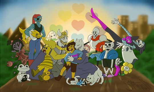
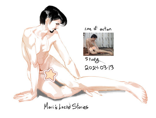
#my first time modelling poses in csp
Explore tagged Tumblr posts
Visit Tumblr Blog
Explore Tumblr blogs with no restrictions, modern design and the best experience.
Last Seen Tumblr Blogs


Fun Fact
Tumblr was the first site to host the blog for President Barack Obama in 2011.
Text
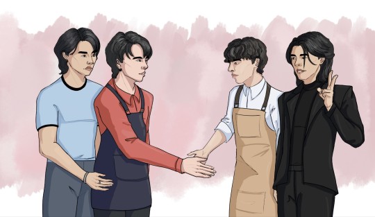
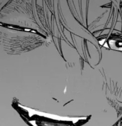
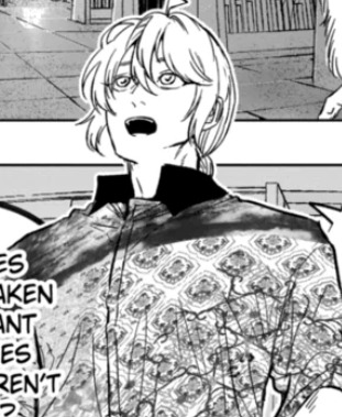
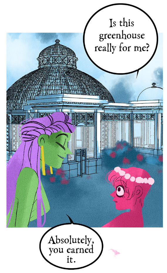
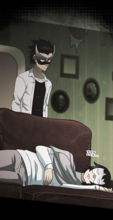
Chef Boyfriend 🤝 Baker Boyfriend
Raon is still figuring out human hand signs
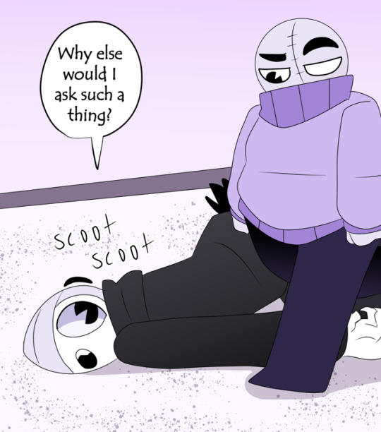
#jeff satur#ingredients#wuju bakery#win ingredients#tops ingredients#ingredients the series#JeffGame#wujuraon#i hate this tbh but at least i finished it so one box ticked off#my first time modelling poses in csp#my art#jeff satur fanart#wintops#topsmarwin#gameplay garnapaphon#barcode tinnasit
20 notes
·
View notes
Text
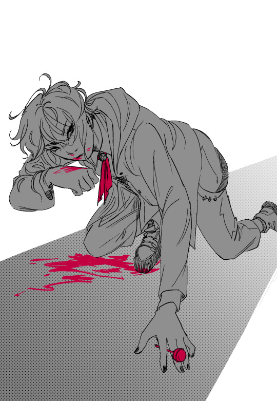
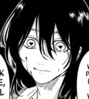
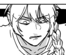
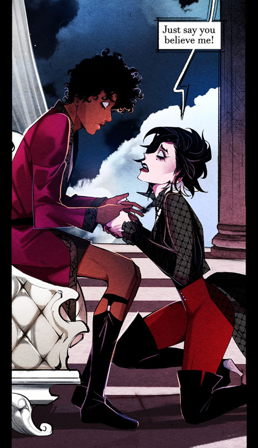
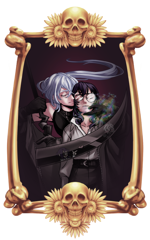
my pretty mouth will frame the phrases that will disprove your faith in man
#ok im going to bed im so tired GFHDLSGFHJDSLGHREG#this is the first time i used a csp model for a pose !!! if it looks wonky then lmk but i think its alright?#i couldnt find a ref good enough so i thought why not lmao#hypnosis mic#hypmic#ramuda amemura#my art
343 notes
·
View notes
Text
Dia's FFXIV Art Reference Notes, A possibly long post
Hello! I made this as a thread on my twitter but I might as well post a version of it here. For the record this will be a thread linking to the resources I use when drawing commissions or fanart, I have not made Any of these and whenever I can I will note the creators and link directly to their resources.
GPose Reference First and foremost, if you're drawing a WOL or ordering a commission of your WOL the most important thing is to take a proper reference GPOSE. I use the method in this post, to make sure I got all the angles. Clean refs are super important when drawing armor/intricate outfits so take care to take simple standing poses like the one in the tweet above. Cool dynamic poses might be fun but they're not really useful for referencing.
Gear/Weapon Reference
If you need good references for a weapon/outfit that you don't have a GPOSE for, I recommend using the attire website
This is a japanese website maintained by @/chiyo_asa on twitter and if you've ever looked up a piece of gear in the lodestone you've almost definitely come across their pictures.
This is a super rough translation in english of the menu of the website. While it is in Japanese it's very easy to navigate and all the pictures in the site are super high quality and very useful for referencing.
This is my number one source for gear references I haven't taken myself

The "mirapuri" button afaik is for glams they made themselves that they want to showcase.
An important note about this site specifically is that I believe it's currently undergoing an overhaul so Some weapons/gearsets might not be completely transferred in yet.
That being said, the majority of sets from dungeons/crafting/alliance raids/job gear sets etc are sorted like so, which makes it super easy to look for.
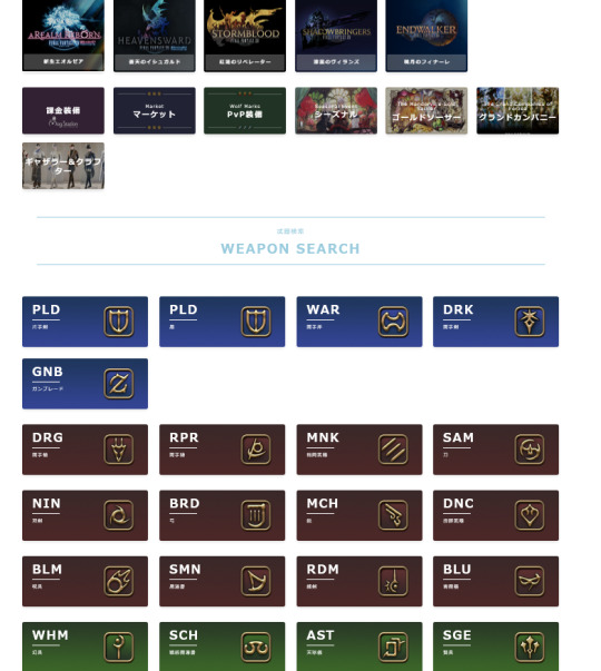
There IS also a search function but I'm pretty sure it works only for japanese input.
NPC reference sheets
@xivrefsheets Offers really detailed resources of npc models. They also occasionally accept requests on their ko-fi (closed at the time of writing this)
These are super useful and really high quality, especially for some of the boss refs they've done. As someone who doesn't use anamnesis I go back to their refs very often
Convocation of the Fourteen refs
Maintained by @/Igeyorhm on twitter this site has a nice list of Ascian refs per character in addition to some lore bits for each of them. Also some very useful closeups of the Ascian clothes.
Even more NPC and Boss Refs
I believe maintained by @/MlNRATHOUS on twitter, this site has a really nice array of major NPC and boss references in various angles and with colourpicks for skintone and hair which is super useful. I use them a Lot
Lalafell centric refs
Norirow Note is a super cute blog that showcases glam items/ weapons/ chocobo barding and more.
It is NOT meant to be an art reference, however if you play a lala like me, I find their showcases useful when drawing gear on lalas.
Even if you don't use it as an art ref it's a super cute blog that's just fun to go through AND fully translated in english so I recommend just having a fun time reading through it anyway.
Bonus- Au Ra Scales.
I literally found out about this today but @/saficchi on twitter has made a super detailed angled ref sheet for both male and female au ra scales and I love them for it
Bonus 2 electric boogaloo- TextTools
I use this to import 3d models of specific weapons into CSP if I'm drawing them.
I don't know how useful this is for other art software but it's saved my ass from freehanding titania weapons so in the thread it goes

That's the full list of refs I personally use, if there's more that people want to add please feel free to do so in the comments. I hope it helps people out in their creative endeavors!
#ffxiv#final fantasy xiv#ff14#final fantasy 14#reference#references#ffxiv reference#art reference#dia rambles
158 notes
·
View notes
Note
I adore your art! I especially love how you do faces and capture the small details in expression/clothing! Do you have any tips about how to go about getting anatomy and facial structures correct? I do drawing as a hobby but I always find it so frustrating. Thanks for sharing your art with us on here :)
Thank you so much! Trust me I totally understand and I don't fully get anatomy myself.
The way I draw faces kinda kicks off from the Loomis method by drawing the circle first and then working around that. I think that's a good place to start, it's really good for face proportions and knowing where to put everything. After you do it so many times you don't need to lay everything out and you'll just know by hand. I can churn out so many faces now just drawing the circle part. I went ahead and looked online and I found a free PDF of one of his books you can take a look at :)
I still struggle with anatomy but whenever I try to figure it out I usually block in what I want on a canvas with a big dark pen and shave it down. I turn down the opacity and then try to sketch over.

I will say, use any resources you have available to you - they are there for you to use. I always use references and If I'm still struggling to get my idea out, I'll pull up a 3d model and sketch over. It saved me a lot of tears and frustration in the end and a lot of options out there are completely free or one-time purchases.
CSP has built-in software for modeling and lots of downloadable poses, Magicposer you can use for free but some stuff is locked behind membership subscriptions. DAZ studio software is free but that one has a bit more of a learning curve to operate. Handy I think is a one-time purchase and there are many options for hand and lighting reference. These are just ones I've tried for anatomy that worked for me but I definitely encourage looking around and doing some testing with other software if you're interested!
Best of luck lovely!
52 notes
·
View notes
Text
TUT (ASKED BY @nuggetz-w-marz on the Identity V oc community ) ON HOW I DREW MARIUS’ “IN-GAME” MODEL SHEET + IN-GAME APPEARANCE


For starters, I used procreate for this! But you can use any other digital art app (ibis, csp, fresco, etc etc). This is not a 3D model but rather a mock-up of one. It’s not perfect, but it’s pretty good for my first time making something like this!
STEPS START NOW!!
#1 - FIND REFERENCES OF IN-GAME MODELS


this part is super important for getting the style right! I used multiple refs to see how the 3D models are shaded as well as regular character skeletons and how angles looked.
this pose would be how they look in the exhibition showroom— if it’s like an actual model turn around, then look at the poses used for new skins
#2- SKETCH TS OUT

i think the main issue would be making the full turnaround, i just mainly use a reflection of the front pose and a reflection of one of the side poses and edit them from there
once you have the sketch solidified, you could do the lineart if you want to— but it would be completely unnecessary in the long run
#3- FLAT COLORS

i just have a layer underneath the sketch (sketch is on multiply) and put out the flat colors for everything
#4- SHADING AND HIGHLIGHTS


these are like the early stages of my rendering process for the model sheet. One with the blending mode on “multiply” and the other on “normal” to see the colors i used.
there was a lot of airbrushing and layers used. i had like three layers EACH for shading and highlighting. the symmetry tool is also your best friend for the opposite side models and the face. I could make a whole rendering tut too if asked bc THAT needs a whole post for itself. the hair takes the longest, but the one that’s hardest to master is the clothing bc of needing to know how wrinkles work (which i don’t…)
for the skin i mainly used purples and pinks for the shading and orange and yellow for lighting. Clothing was the same but also blues, greys, and greens in the shading as well.

for the hair, i recommend shape out the strand first and then shade them like long tubes
#5 FUN PART: END RENDERING
I loved putting on the last details of the drawing and watching it come together. the rendering I did was only his glasses and his satchel…
#6 EXPORT + IN-GAME EDIT
basically export it as a transparent png for the sheet!! And then what you can do is go into the game and screen record a character’s skin animation and for a split sec it’ll be blank and screenshot it…orrrr you can use the one i have right here!! honestly go nuts.

For the shadow is a low resolution silhouette of the character and offset a bit and i used the color #0d0337 on a multiply layer at 55% opacity. For the character itself, lower the saturation until it fits the character and on another layer, put it to add/screen and use #7f774d for any lighting needed to make them fit the background. If you want to, you can even use the same color from the shadow to add more shadows on the character model
AND THATS IT!!!!
This post took way longer than i wanted it to but that’s okay!! I like helping other artists and esp when asked directly it’s pretty banger!!
30 notes
·
View notes
Note
What advice would you give beginner artists?
it's fine to want to do more stylized art, but nothing will help you improve quickly like studying from life. even if you want to draw very stylized figures, life drawing is still going to help you understand how the human body works and then you can build your stylization off of that understanding. I also recommend studying specifically things you're looking to improve--if you feel like your poses aren't dynamic, ask your model to do some quick (1-2 min) dynamic poses and work on getting the gesture down. if you're looking for anatomy, ask for longer, more static poses and really study the contours of the body. this also applies for portraiture and character art--my expressions and facial structure improved like CRAZY when i started doing portrait studies from life! (note: i know live model sessions aren't accessible for everyone. i'm a huge advocate for nude models, if you can find a studio nearby that's affordable to you that offers sessions, that's the best you're gonna get. however, there are sites that will give you photos of nude models to draw from, too, or you can even just ask friends or family to pose for you when they aren't busy, that's what i did before i started getting model sessions from my school!)
materials are not everything but sometimes a good material can make a difference. it's important to know what's worth it and what isn't for your skill level. invest in some decent-quality supplies or a good art program, but understand that you're still going to need to work to understand your materials and use them to their fullest potential. (if you're a digital artist buy csp. trust me on this. get it on sale. it will change your life. also do not fucking use photoshop)
tracing is ok. listen to me. TRACING. IS. OK. tracing is how you learn. don't trace other people's art and pass it off as your own, obviously, but there is literally no problem with tracing real-life reference photos. I routinely trace references for backgrounds and the like. there is no reason for you to kill yourself trying to make complex perspective and shit up from your head when you can very easily just overlay a photo and get what you need.
in that same vein, USE REFERENCE PHOTOS. find pics online or take pics of yourself and USE THEM to see how your poses work. it makes it SO SO SO much easier. the understanding that you need to create a pose out of nowhere will come with time but you're not going to get that skill unless you have a foundation of understanding how the real human body works, and the easiest way to get that understanding is by copying photos of real people.
last but not least, there's generally a sort of 'rulebook' that new artists are expected to go by, especially online, when it comes to digital art. when i was first learning, it was all about lineart and cell shading, two things that I didn't really like. Nowadays it seems to be all about rendering. the single most important thing i can tell you is if it sucks you don't have to do it. if you hate lineart just color your sketches. if you hate shading don't shade, or find a different way to shade that you enjoy more. if rendering is annoying or difficult for you DON'T BOTHER!! art is supposed to be fun. if part of your process is annoying or upsetting to you, cut it the fuck out. don't torture yourself just to do art the "right" way. i guarantee your art will look better when you're having fun making it anyway!
#asks#ALSO don't go in expecting to monetize your social media presence/go viral as an artist. make art for YOU and make what you want to make.#if your art has passion behind it then attention will come naturally!
330 notes
·
View notes
Note
Nudges you
Hi I love your work your colours are so. Colourful. It makes my brain tickle in a good way
Okay onto questions!!!!
one: where the hell did you get the references slash ability to draw iron man mech suits. like. if you just doodled that in a meeting??? what????? you didn’t have a reference???????
second question: what brushes do you use?
third question: how you anatomy (good grammar yes)
ok thank you goodbye have a. Lovely day
lkdfghlkdjfhlgkj hey THANK YOU YOU'RE VERY SWEET i did look at him to see what he looked like first, but mark 1's all rectangles and messy bits he's very nice to draw!!! i highly recommend it. clunky little guy
all other iron man suits i learned to draw by simply drawing iron man 1000 times. i learned to draw in general by drawing iron man i love him very much :) but looking up pictures of hot toys figures/those cool model kits of the suits is super helpful for refs! nice clear shots and fun poses.
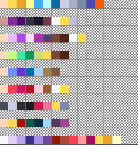
secret: my art is very easy. here are all of the base colours i use

taken from an old timey comics colouring guide palette thing because i love old timey comics and i hate colouring <3 for skin tones/shading i'm usually adding overlays and fiddling with the colour wheel though
for that iron man, i used the "real g-pen" brush that comes with clip studio paint; for most of my other art i use this little dude that i made!
I colour with the default "milli pen" brush that also comes with CSP, and then the speckle shading stuff is with. the tone scraping thing in the airbrush tool that also comes with CSP......tone scraper my beloved how would i get through the day without it......
anatomy is really hard and i am constantly fighting for my life, glad it's looking successful i will tell you when i figure it out lkdfjhgkj i try to do studies breaking bodies down into shapes but gosh people are just shaped so weird. iron man suits are easier. let's just draw iron man suits
have a lovely day!! 💛❤️
#i use like 3 tools i am very tired i make things easy for myself :)#how did i draw him: gazed at him lovingly while my boss was talking until he was scanned into my mind & then drew him :)
34 notes
·
View notes
Text
@i-am-gaaaayyy-heeeyyyy
how did you improve so much in just a couple years? i really admire that! i feel like my art has been stuck a certain way for a while
Sorry if you don't get this @ because Tumblr's being real weird about it, but a few things:
The first iteration of this drawing was done in 2018 in early April. That's seven years--not a "couple" of years, but several years. I think that's important to keep in mind.
I just kept looking shit up. Looking up how to use the tools I have, how to make certain processes faster, different anatomical studies, ectect. I am still learning every day! Right now I'm working on color theory and how to color in a way what I am happy with. Still struggling with that.
I really do think that the improvement was to the composition most of all, as I was not/still struggle with compositioning.
Look up stuff on YT
Get uncomfortable and draw body shapes you're not used to
DRAW WITH YOUR ELBOW AND SHOULDER NOT YOUR WRIST I'M STILL UNLEARNING THIS ONE
Never assume you've mastered anything because you have Not that is just your brain lying to you
Look shit up online!! I cannot reiterate how important it is to just kind of look shit up.
Like:
How I learned to draw better hair Used this video to learn how to draw hands (of all shapes and sizes)
Don't ask me where I learned to draw anatomy/clothes I just kinda absorb information most of the time like a sponge and lose the source--BUT, there are plenty of videos out there to show you how to do stuff.
And if the video you found/chose doesn't work? Try a different video.
Here are a few other videos I'm watching/trying to learn from rn:
youtube
youtube
youtube
youtube
youtube
And when all else fails... You're allowed to cheat. This isn't some kind of competition where you must be the most Skilled Person In the Competition. Using references (or making your own) are perfectly acceptable and even sometimes required.
I am not apologetic or ashamed to admit that I've found 3D models to be a big help when it comes down to posing, perspective, and composition.
Like here is the 3D model I made in CSP and posed for this art that I did:

Now, there is a certain level of skill you need to use tools like 3D models effectively. Like in my drawing, I twisted Kokichi's torso more to our right (his left) to make it overall more dramatic. I also had to correct the anatomy of the wrist in my drawing because 3D models don't always work in the same way human bodies do. I still had to draw the expression and know just how to exaggerate the eyes in a way that was pleasing. I still had to draw the hair and clothes in a dynamic way.
There is also skill needed to pose a 3D model. It's not as easy as one might think!
But, the 3D model helped me with perspective, something that I really struggle with, and posing, something I also struggle with due to having a mild-to-moderate form of aphantasia.
Still--in short, never stop learning, and you'll never stop growing.
7 notes
·
View notes
Text
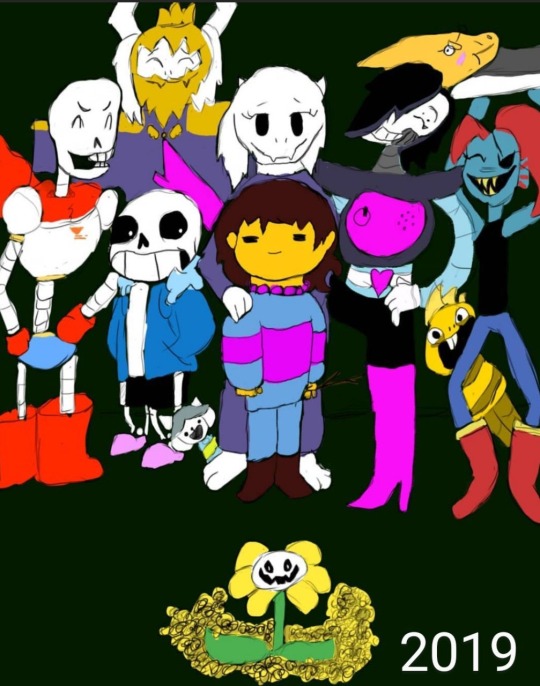
Four years ago, I drew my first ever finished digital art piece, using a Huion 420 tablet off of Amazon, and Krita. I was so proud of it, I showed it off to my friends and family on instagram, and I didn’t think I could get any better than this. Fast forward to the next year, and I drew it again, just to see how much better I could make it.

This time I used a Wacom tablet with Krita. It was one of the cheaper ones, but still an upgrade. I was even more proud of this one, but I wasn’t really that happy with it. I didn’t like how Papyrus turned out, and it seemed so awkwardly spaced and posed. I knew I still had more to learn, and I rushed it, since I didn’t think I could do any better. I then decided to redraw it again the next year.
This time I used Ibis Paint X and a small stylus on my phone. I was ecstatic with how this came out. I thought this was the absolute best I could ever do, but I still had little nitpicks about it. Again, I struggled a lot with drawing Papyrus, but this time I was also unhappy with the colors and shading, and how Sans was drawn (I have no idea why I made him thicc). But again, I redrew it the next year.

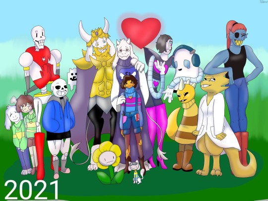
This one was a huge confidence booster for me. I had just gotten a brand new laptop from my parents: A Lenovo Yoga, with a Wacom bamboo ink stylus. It was the best gift I ever received, but on top of that, they got me Clip Studio Paint PRO. So I was ready to make some good ass art. This time I sketched everything out on paper, then finished it in CSP. I even attempted a background, which didn’t come out too bad. Papyrus doesn’t look horribly off model, and the poses and composition overall was just better. I used a clean sketch for the lineart, since that was a big struggle with my previous versions, and I used colors other than black and white for shading. After I made this, I felt like I didn’t need to continue redrawing it, because I thought I was at my peak.
I redrew it this year.
I used my Lenovo Yoga, but this time I had a Wacom bamboo plus, and Clip Studio Paint EX. I added more characters, and took a little bit more inspiration from the original, but I mostly wanted it to feel more alive. I finally perfected how I draw Papyrus, and Toriel, Asgore, and Frisk aren’t statues anymore. I showed off what I’ve learned about lighting and shading, did actually clean lineart, and I even did a full background! I’m so proud of this, and so happy with how far I’ve come as an artist, and I can’t wait to see what my future self draws next year.
#art#digital art#artist#artwork#digital artwork#art progress#art process#undertale#undertale fanart#undertale anniversary#sans undertale#mettaton#napstablook#frisk#toriel#asgore#papyrus#muffet#undyne#alphys#froggit#whimsun#flowey#temmie#annoying dog#toby fox#wd gaster#asriel#chara#monster kid
88 notes
·
View notes
Text
after god art style study --part 1
first off disclaimer I don't really know if there's a supposed professional/appropriate method of studying artist's art styles so please don't expect this to be polished or like a tutorial in any way this is just me spending a lot of time admiring eno sumi's art
thoughts overall
eno's art has a pretty semi-realism leaning anime art style. it's not conventionally cute, the level of detail is what you'd see in a seinen manga. thumbs up it works out just right
because this is manga with what looks like a monthly to biweekly release schedule yeah I too would want to be paid $$$$ as my full time job if I were drawing with that crunch deadline so shortcuts and corner cutting are taken to make the job easier. I particularly want to study some of the shortcuts in addition to the way she stylizes certain things in her art style.
I used to have a very cutesy/baby-faced anime art style and had really wanted to move more away from that to something more mature-looking. studying how an artist stylizes something is a cool way to figure out how you want to depict something in your style too. obviously still do take life studies and all... there is nuance between understanding how an artist builds on top of fundamentals versus copying plainly what is depicted. I know how to draw noses but I couldn't figure out or visualize how it'd best look in my artwork.
I dooooo still have to learn how to draw old people like old-old people aaaaaaaaaaaaaaaaaaaaaaaaaaaaaaaaaaaaaaa
clip studio paint and tools -------
I previously identified in an older post eno most likely works with clip studio paint.. eno has posted here about CELSYS which is the company that owns CSP.
more csp stuff:
background black swirls is 黒うず from ベタ部分に使うブラシ
you guys like the default crack brush? me too the triangle shape is very noticable
some of the other cracks in the scene looks like its from 瓦礫を描くブラシセットおまけ付き
lightning brush from lightning brushes
this is a very good water brush set


3d models -------
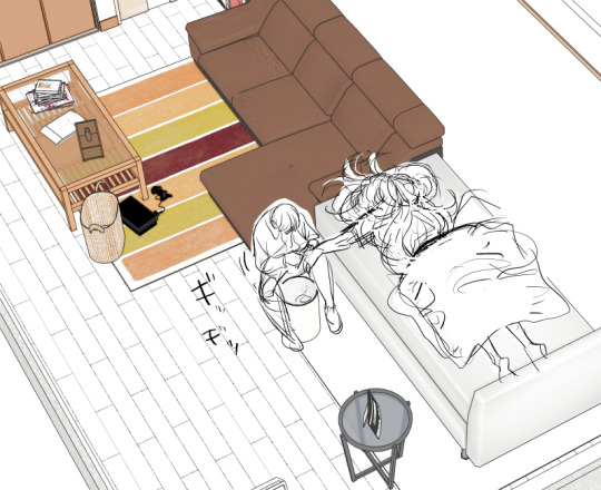
I personally cannot really discern perfectly if 3d models were ever used for posing the characters- if there was use of 3d character models then thank god they weren't directly traced over bc 3d does not translate to 2d well when it's directly traced over and that type of jarring uncanny proportions is what I'm used to seeing when that happens.
however, sometimes it is kinda noticable when the anatomy looks a little bit wonky or rushed. I don't blame it that much for comic making standards
[tokinaga are you okay you look kinda rough]
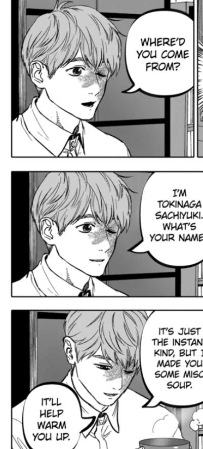
[ch.32 has a bunch of can models]

3d models are most often used for the backgrounds in After God or for smaller, repetitive objects. they're integrated pretty seamlessly in my opinion, but also in my opinion I have to consider my bar is below the ground because I read webtoons time to time and the number of poorly or lazily implemented 3d background assets makes me sad

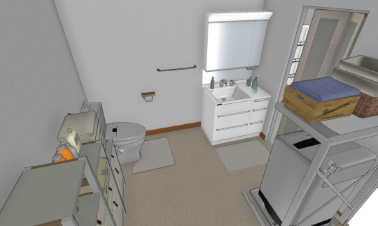

[tokinagas apartment] [2]
I remember in my blog read through I had google translate catch she mentioned she used home design 3d or something something to make the house models. unfortunately I don't know where the exact mention was (i dont speak or read japanese bummer) so take it with a grain of salt
noses -------
nosesss!!
they are more detailed than the typical "single dot/line" anime nose, I really appreciate that. the variety within the main characters isn't very wide, but I digress. if it's easy to draw then it's easy to draw and it's nice to feel no pressure drawing what you want to draw
the most common nose drawn is a line for the bridge and two lines indicating the nostrils. the two nostril lines may vary in direction depending on if you're viewing the face, differing angles from above or face from below
frequently, in addition to that, the tip of the nose is also defined.


sometimes the bridge is given some additional depth with some hatching instead of a singular line.

sometimes, only the nostrils are drawn. shading may be used to define the nose shape instead of using lineart.

sometimes instead of a line for the nose bridge, a "triangle" shine shape is drawn. usually it shows up on smaller images.

very rarely does it ever end up being drawn as a single line (either for the nose bridge OR the bottom of the nose).

the diversity of noses typically shows up the most on the older aged characters. or the non-japanese characters.

chin-up profiles -------
honestly i don't see really actual bottoms of the chins drawn that often and when I do it's rather rare or simplified


---
cont in part two
10 notes
·
View notes
Note
Let me preface this: I'm an architecture major
I used to be a big LO fan but obviously fell out of love of it like a lot of us did, and I know LO uses SketchUp for backgrounds. That is not an issue I have with the comic or any comic, I want artists to have an easier time in any way they can. I was always under the impression Rachel imported the models into Photoshop and drew over them like you can see in the early episodes with the sketchy lines. Well, school just started recently for me and I now have access to SketchUp for my coursework, and I made a few discoveries: 1. Photoshop cannot read SketchUp files, and while you can import them into Clip Studio through some configuring, they can be finicky and will lose parts in the importing process, so they are best used into the original SketchUp program to export as PNGs. 2. Many of the models Rachel uses are incredibly easy to find, especially if you put "modern", "luxury", or "classy" before the main part of the search. Many of the houses and rooms for example are first page results. 3. The biggest discovery: You know how we all assumed Rachel was hand-drawing all the lines over the SketchUp models and how she gave up the longer LO went on? Well, it's actually worse. It turns out SketchUp has a thing called "Styles" in it, which means you can mess with the lines and look of the model, such as making it look more like a blueprint or playing with the colors. Well, they have a lot of styles on SketchUp known as "sketchy lines", which are the exact ones Rachel used early in the comic to fit with her style, and it takes a literal click of a button to do. All she would do is pose the model, click the sketchy line style, and export the PNG. That's it. So, yeah, Rachel is so checked out of the comic that she can't even bother to click a single button to make the models fit into the comic's style anymore. Use that information however you like.
Ouhhh sorry OP, I'm about to like, undo all the work you just put into that ask. We've already known about the 3D background problem for a long while now.
First off, it's more likely LO doesn't use SketchUp but actually Acon3D, which is a website that offers 3D models both for free and at cost, which are actually compatible with software like Clip Studio. As soon as you open it up you'll likely see a lot of very familiar backgrounds that are often used in romances, isekais, and period pieces. It's literally the go-to spot for Webtoon Originals creators. Like, to the point that I wouldn't be surprised if Naver was partnered with them because of how many of their creators use it.
Second, there's plenty of up-to-date evidence to support the fact that Rachel doesn't exclusively stick to one software, sometimes she's drawing in Photoshop, sometimes she's drawing in Clip Studio Paint, sometimes she's drawing in Procreate. She's undoubtedly using Clip Studio for her paneling, speech bubbles, and backgrounds, as there are built in tools to utilize and convert 3D materials into lineart, among other features that are recognizable as coming from CSP because they're not available in PS or Procreate.
Third, yes, she just uses filters to turn her backgrounds into lineart, this has been apparent since S1. The only backgrounds she's ever 'hand drawn' were the ones involving lots of nature and even those are mostly just Photoshop brushes stamped on.
Like I realize I'm probably bursting your bubble here and I apologize for that lmao but these buildings were never hand-drawn, this is not new information ( ̄﹏ ̄;) I appreciate you mentioning your own experiences with it as you're learning it though, I find once you start to learn the process yourself you really start to notice what others are doing. Even I've gone through that over the past couple years as I started to use 3D models and more advanced tools specifically for drawing webtoons.
I will mention btw, there's nothing wrong with using 3D models for your character drawing and backgrounds. The only time it tends to get frustrating is when you're reading a comic that isn't making any attempts to blend the background in with the art style.
Like, The Kiss Bet probably uses 3D models to help with perspective and laying out scenes quickly without second-guessing, but you can tell they still hand-draw over the models because they look natural and like they belong to the comic's stylization. The characters don't look out of place sitting in a living room and the living room doesn't look distracting.
But then you get stuff like Lore Olympus, Let's Play, and Midnight Poppy Land, and it becomes a bit more obvious they're not giving a shit about backgrounds lmao


I get it, WT's deadlines are cutthroat as fuck, but if it's getting to the point that you have an entire team behind you and you're literally just copy pasting video game models from Phantom Hourglass, then it's probably time to re-focus your priorities a bit. There are comics with as few as 1-2 assistants (and even in some cases no assistants at all!!) pulling off backgrounds better than this, even when they're taking shortcuts.
(Nevermore and City of Blank)
But a lot of that does come down to how WT manages its expectations as well as support for their creators. The deadlines and requirements WT puts their creators under are insane and awful in the long-term, and they're not acting with the amount of professionalism they ought to be for a platform that's trying to breakout as a major publisher here in the West. I feel like it comes down to WT loosening the choke chain around their creators, but also creating a standardized level of quality to ensure it's not suffering for the sake of quantity. The traditional literature industry has real editors and stages of quality control for a reason, whereas WT is more interested in just throwing as many series at the wall and dumping all their stock into the ones that stick.
#lore olympus critical#lo critical#webtoons critical#antiloreolympus#anti lore olympus#ama#ask me anything#anon ama#anon ask me anything
90 notes
·
View notes
Text
apropos of aaaabsolutely nothing happy EST wound fucking wednesday. this post is just for that one reader

[ID: rendered robots franchise fanart of oppie and megs (the recent cartoon for kids iteration of them) stradding each other mid-wrestle. they both show wear and tear. megs, scowling, is punching op's grille-abdomen, warping the metal, other hand gripping his shoulder to pull him down into the hit and falling backwards a bit with the momentum himself. oppie, frowning deepy or grimacing, has one hand gripping megs' thigh and the other on one of his shoulder spikes to keep him from being able to maneuver or escape. he reels back with the punch but still rests stably on splayed-out knees, one slid under megs, adding to megs' unbalance and making him kick out his own leg that oppie straddles.]
pre-canon war stuffs........................ that can at least exist in my mind palace of Not Really Knowing Jack Shit
ONE good turn deserves another i would say...... meaning a big trip thru the lb tab collecting a folder of relevant unconscionable violence vibes i didnt even get to use all of*/push as far as i could have. and then a lot of time doing chain-licking meditations on big blocky 3d shapes. and then a lot of time wrestling with that one csp 3d model pose set. WELL. when i saw what u were sketching the other day i lost my fucking mind trying not to say anything kjsdfg so hopefully good sign this will be received well o7 <22
*my dreams of putting tfs in clothes was not an appropriate venture for first times drawing tfs. YET
+ just the lines bc good lord i drew so many details on Those Things. looking at other ppls art styles. i didnt even have to do that i dont even need to feel bad abt the bits that broke my spacial understanding no one is doing 1:1 replicas. but it was kind of nicely meditative to whittle away at actually i enjoyed it

[ID: same pic, colors and shading removed to show oppies lineart was a bright blue and megs' a bright orange]
things i gained a heightened appreciation for in this venture: the way that megs' pelvis design elements look like he has a jacket tied around his waist. CUTE. his BIIIIIG fucking boots i didnt get to show off. his faaaaaaaace chiseling. oppies 1:1 accuracy little windshield wipers. difference in frame between them (most of the robots seem to have narrow waists but i like that i can accurately draw megs still a little Built there. fun!) the joiiiiinnnnntt articulation logic on these guys is so neat kudos to. franchise full of robot designers that are extra incentivized to make them at least somewhat real-world workable.
+ honorable mention: THEYRE SO WIIIIIIIIIIIIIDE. taking up the entire 4:3 frame space in episodes. throwing out half the oversketch notes i took of the csp models bc they simply did not matter and would not be visible underneath both of these guys blocking each other kjghsdf
anyways. to say. HAPPY TO BLOG AT THE SAME TIME AS YOUUUUUUUUUU and heres to another year of getting to know the most delightful wonderful realm of things and ways to get weird with things thru it vicariously and firsthand. dearly beloved blogging bestie who i hope has a nice day ^_^!!!!
#art tag#drafts this post up a couple hours beforehand so i have it ready to post then has to psych myself up into hitting post bwbfb <22;;;
28 notes
·
View notes
Text
Patreon Tier Update
In March I added a bunch of new Tiers so I figured it was time to explain what is currently happening over there :3
Tier1 - $1 - First Served
You get to see the latest pages of my comics and illustrations as soon as I finish them. You won't have to wait for posting day. (This includes the art for the written chapters, and sometimes excerpts of the written part being drawn.)
Examples:
---
Tier2 - $2 - Draftsmen
You get to see the same as tier1, some of the sketch drafts, practice and concept art for my stories I do through out the month -most won't be posted anywhere else. (character outfit sketches, test scenes, etc)
Examples:
---
Tier4 - $5 - Resources
Same as all lower Tiers + The brushes and other resources I make -including test versions. I also make a lot of poses for CSP models but since I can't export them, members in this tier will be able to request 1 pose a month (this will be limited to the first 4 requests I get every month). The final versions of all of the resources will be made available on the CSP store. Most of the brushes and things I make are decorations and effect brushes to make drawing faster. (This will also have demos for using different types of models and other resources)
Examples:
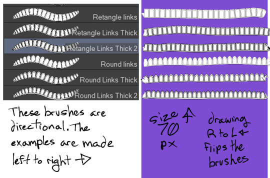
----
NSFW Tiers with censored examples under the cut. Members of those tiers get the uncensored versions
Tier3 - $4 - NSFW Art
Same as lower art Tiers (does not include Resources) + NSFW art -these are nude anatomy studies, as well as spicy character and shipping art. I am into bondage so that will appear periodically.
Examples:
---
Tier5 - &6.90 - NSFW + Resources
Same as all lower Tiers + 3D poses and other assets that are intended for 18+ use
14 notes
·
View notes
Text
one of my regrets for splatoon 3 was i wanted to make a new drawing to use as an icon throughout the game like i did with splatoon 2, where i drew my octoling partway through the game and every time there was a splatfest i recolored the ink and changed the t-shirt (and sometimes added relevant gear). that was fun. but now there's only one fest left so i kind of ran out of time (unless i do it for just this one)


still got almost a month so i'll see if i can finish something though. i've had a vision in my head for almost 2 years of what i want to draw. decided the first step is to put together a reference image--i was thinking about how csp has a built in 3d model for references, i looked into maybe getting splatoon models in there, found out it apparently seems to be possible but could be a bit complicated to set up, then realized that at that point it might just be simpler to pose it in blender. never used blender but ive taken a few classes on maya so it shouldnt be that hard to figure out (and this program likely wont shit itself if you look at it the wrong way)
hunted down the models i'd need, found most of them but couldn't find the reefslider anywhere (models resource has kraken royale but no reefslider? huh?) so i dug around some more and found out how to rip it myself

there it is.... SkewerTackle
3 notes
·
View notes
Text

Once upon a time, I made this animated gif. It was my first real venture into animation, and I'm still pretty proud of it, honestly. Clearly, I did not use the template that are available. I mean, I mean, I did, I just used them as a guide for CSP' 3D poser, and then from there made my own template.


I am, 100% an amateur in every way when it comes to animation, so if you want to animate your own OC to the Caramelldansen, the original template is easier.
But. If you are like me and you can't just let yourself do things the easy way and like... want to customize it a bit more just for your own satisfaction, I have included the 3D pose model and the pose sketches matched to the templates.
Trace them, play with them, however suits your fancy. I have unfortunately lost the CSP files to upload the actual Pose file, but I think the current CSP might be able to scan the poses and at least partially replicate them if you would like.
You don't gotta credit me shit, I'm copying too obviously. I'm just like. Hoping it inspires some art or something.
#caramelldansen#animation template#gif template#i mean i guess don't trace the finished gif i made... but i also guess i can't stop you#i did post this stuff years ago but ive seen some animation sfuff going around lately#and i was looking at some old art and thinking someone might find this useful#if not then like... eh whatever i guess...#i might try and redo it with more characters and now i have this more easily available#whatever floats your goat
4 notes
·
View notes
Note
Sorry for spamming your notifs I was just wondering if you have any lineart/ coloring tips!
Im trying to improve my art and your style is perfect!!!
A joy you'd ask such an extensive question: I recorded a quick timelapse (Sorry I don't control the speed on Clip Studio)
I draw with vector layers for line art, meaning I can erase overlapping lines SUPER easy with a Vector eraser:

To make them not highlighted in orange btw (For CSP specifically) I believe you gotta go into "View" and "turn off vector paths".
I usually have a layer behind the characters that is "Grey" so I know where I've colored until I change it to black with protect Alpha.
In GENREAL advice I'd give: Do "Figure drawings" I think they're called. VERY QUICK rough sketches to get a figure/pose down. I draw like a speed demon because I don't focus on "Getting lines perfect" either. Paper is a less forgiving medium, when I was a kid (And even now) i sketch on paper with Pen. NO MISTAKES. WE DIE LIKE MEN. It makes you think a lot more about "How am I gonna do this right the first time" Basically: Your boy is quick, he likes to do it in 1 go and art style is pretty simple. Affective for making comics FAST. Which is what I care about since my stories/dialogue are kinda the highlight not the pictures, they just take my stuff to THE NEXT LEVEL. :)
Lately I've been trying to "Care less" about getting perfect clean line art (Tbh I think I've always cared a little less because SOME PEOPLE SPEND 8 HOURS ON A DRAWING AND HALF THE TIME THEY SPENT WAS ERASING SHIT. I COULD NOT. O.O)
The need for speed is because I need to make so many pages for all my comics in a timely manor.
Looking at AOT's butt ugly art and Chainsaw man's beautiful scratchy lines made me realize I was being way to uptight about my own shit looking "Perfect". So I've tried to be more fluid with it.
Speaking of: I recommend anyone who likes manga to try to mimic some art styles to learn stuff. "Why'd they do xy or z" "How'd they achieve x" ya know? Here's two of my avatars from my zelda videos (OOT is still in progress)

But it also depends on what you're TRYING to go for:
I don't WANT/NEED a consistent art style. I mostly just do whatever I feel fits whatever I'm working on. "On model" isn't in my vocabulary. X'D
I recommend studying anatomy because it REALLY amped up my abilities to draw the human body better. Full figure drawings, don't run away from things you might be bad at. X'D (Or work with what you do, I am shit at drawing hands, so they'll turn into weird monstrosities but nobody's said anything yet! XD)

People are seemingly willing to forgive a lot of mistakes: If it's funny. X'D I gotta try harder in serious scenes hahaha. Also having weird as fuck/abstract character design like my boys Ball and Bat
You're not gonna question anatomy choices for a thing that looks like THAT.
Simple character design is my passion~
For coloring: Outside of me understanding basic color theory I just do what makes my brain go BRRR so I can't really DESCRIBE why I like what I like? X'D
But here's some of my color palettes! I implore anyone to use them if they like them. They're not some trade secret, they're just colors.
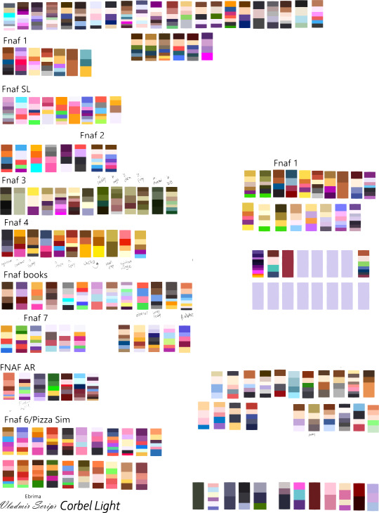
Anyways that's all I got hope it helps. XD
15 notes
·
View notes