#or draw without the lasso tool again
Explore tagged Tumblr posts
Visit Tumblr Blog
Explore Tumblr blogs with no restrictions, modern design and the best experience.
Last Seen Tumblr Blogs


Fun Fact
Tumblr was named as a finalist in Lead411’s New York City Hot 125 in Aug 2010.
Text
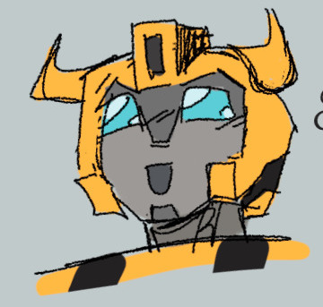
the thing i am most concerned about rn is that the cunts in office have managed to fuck up the country's internet sooo much that Most Stuff refuses to load, and one of that stuff is artfight. so. das great
#if they dont fix this until the end of the month i will be. uhmm. upset lowk#rubs the back of my neck awkwardly#everyday i kinda get closer and closer to just losing my fucking mind but that's fine#but. yeah. now i dont even get to see artfight shitting itself out of its own volition#i rrrrrrrrrrrrrrealllllllly hope it gets better but like i Awesomely doubt that a lot because i dont know why they'd make it better#because they dgaf and want everyone to die#crammerposting#but yeah among other fun things that are not loading: letterboxd. whiteboardfox. picrew. ?? The online japanese dictionary i use#so das great. as well. You truly do love to see it\#shittiest fucking attempt at an isolated internet ever i hope everyone who dies goes to hell n omatter what#i need to stop getting pissed off about it (meditates) Ok im fine#but yeah in good news that letterboxd started loading for me just now#whiteboardfox also managed to load the main page for me. can i make a board? Well.#well it loaded .at least#im kinda cooked because i dont know how to sketch in ibis i sketch all of my things in whiteboard#im grilledddddd#i will never draw a fullbody again at this rate bruh#or draw without the lasso tool again#whatever#walks off screen
9 notes
·
View notes
Note
What kind of brushed and programs do you use to draw?
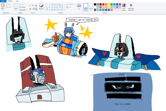
I am nuts and I alternate between Clip Studio Paint and Procreate, the locker Prowl was drawn in MS Paint and I also do a lot of mixed media (traditional art touched up digitally)
I am a brush Fiend so I also alternate a lot between brushes if you're looking for a specific one you'll have to direct me to a specific drawing because I use waaayy too many
CSP brushes, I have two main ones


For Procreate, I am the Brush Final Boss, i hoard brushes like a dragon hoards gold, here are the main ones I use
Been obsessed with the Gombee brush from this brushpack recently ! It has this rough dotty feel, I love it

This one is also one of my favs, I use it a ton ! I customized a Syrup brush to give it a lot of texture
Also been using this one a lot, it's a custom brush made out of my TF oc's head silhouette

You can grab them both here if you so please
And where would I be without my beloved grain brushes ? I use them for all my backgrounds, gradients and highlights + halftone + grit brushes

This is all done with the lasso tool and grain brushes from this set

the dirty specks and details are from True Grit Supply's Procreate Texture Bundle
I do a ton mixed media as well

the lines are all traditionally done with a thin tipped sharpie, colors are done with highlighters and digitally corrected with the multiply layer and then layered on top with a paper texture + more gritty details from True Grit Supply's Procreate texture brushes again
My traditional tools are not as fancy, it's legit just all stuff I found on the ground

I was also recently gifted a ton of arteza watercolor brushes so I've been trying to utilize those as well, they're very fun !!

overall consensus, I do everything and strike fear into the hearts of many with my artistic process
281 notes
·
View notes
Text
*Check watch*
And it's the 26th, cool.
>:]
---

---
I love this so much. The colors, the poses, just :]
You might (possibly) be wondering, "why did I set a specific date for me to post this?" And because.... it's now been a year since I listened to The Mind Electric and The Soul Eclectic!!
Is this some grand spectacle ? Is something amazing going to happen?
No. But it's special to me. Playing these songs on repeat without ANY knowledge of what it was, or even understanding what was going on. I treated it as any other cover of a song I'd listen to.
Could somewhat understand it at points, but I never really knew there was a story to these songs. Just make little animatics in my head with whatever I was interested in before.
And I only listened to the audio versions of them. I didn't know The Heart Acoustic existed, (and kinda not enjoying it at first.) But it grew on me. Then I saw a video talking about similar music people, then discovered there were music videos??? :0 And a story?? Double gasp.
The feeling of listening to these for the first time can never be replicated, the unknown of it all. Just jamming. I've already rambled about trying to find a new interest after the old one died off. Then finding the TME and TSE, and basically finding motivation to do something passionate again. (Between toying with ocs while doing so.)
And drawing these three embodiments of inner workings (cus I can't think of a proper term) kinda helped in some aspects. Not all, but trying to understand how my own inner workings work. What traits I do or whatever. This isn't about that.
But yay! Enough of the backstory! :]
Here's some alternate versions of the drawing, (like without the words and the background). And some doodles. >:]
---
⬇️


I made some random character with the lasso tool (kinda). Fixed some of it sooooo.. mostly the lasso tool. Imma call them Rascal. Idk.
And a scene I wanted to draw of the story thingy I made weeks ago with Soul and Whole.
But that's all! Surprisingly.
Hope you enjoy!
---
#chonny jash#chonny jash fanart#chonnys charming chaos compendium#chonny jash mind#chonny jash soul#chonny jash whole#cj mind#cj soul#cj whole#cccc#cw bright colors#cw eyestrain#oc#original character#original little dude#Moon's rambles#Moon's silly yapping about stuff#Spotify#Moon’s rambunctious artwork
130 notes
·
View notes
Note
Just wanted to ask, please forgive me if you've already answred this, what program do you use? Your art fucks HARD and like. I was looking at your art of the two moths over the city they die in and I was hit with the wave of "oh that looks really fucking fun actually." Like i know my art program can't do some of those effects and like, I'd love to try fucking about with them.
hi there, thank you! all my art is done in procreate and paint tool sai
because you mentioned that drawing in particular i thought it would be fun to break it down and show ppl what exactly went into each part of it so check this out
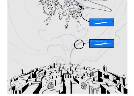
sketch & lineart - the brushes come from georgbrush.club and the urban sketcher is my most commonly used lineart brush, it has a nice irregular shape. the square brush is nice for big blocky sketches.
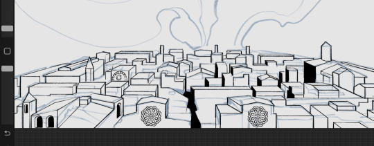
the cityscape was REALLY hard but basically I got a photo of the skyline of florence, traced some basic building shapes, then bullshitted the rest using the vertical symmetry/mirror tool to cut down on the amount of work (so i only had to sketch one half of the city). then for lineart I turned off vertical symmetry, turned on the two-point perspective tool, and got this:
the rose windows were made using the radial symmetry tool.
I didn't like it being so flat, so I used the liquify tool to make a kind of fish-eye effect (limited success tbh). I liked how it looked but the buildings in front needed something to cover them up to make the liquification less obvious...
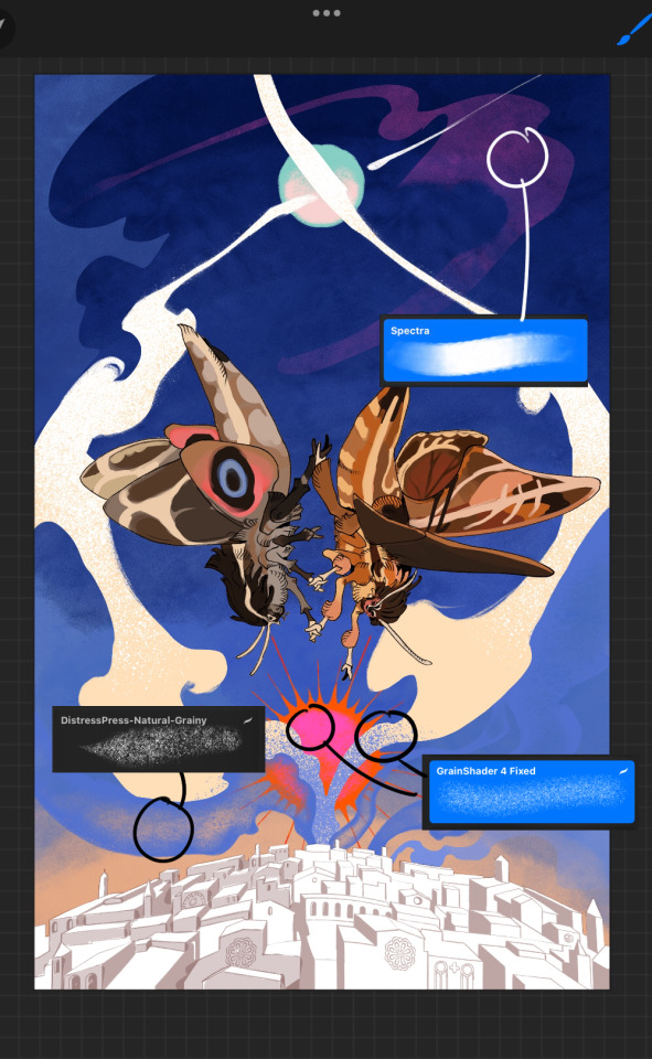
first pass colours. I felt they were very washed out, aside from the sun which i loved. I use the spectra brush (default procreate) for skyscapes a lot, I love the texture. Although the clouds were filled in using the lasso selection tool, I softened the edges using the square pencil again and added texture using true grit sampler grainy brushes. The translucency effect comes from my setting the brush as an eraser. The sun rays come from the radial symmetry tool.
Blocking in the moths' colours was done with the urban sketcher again.
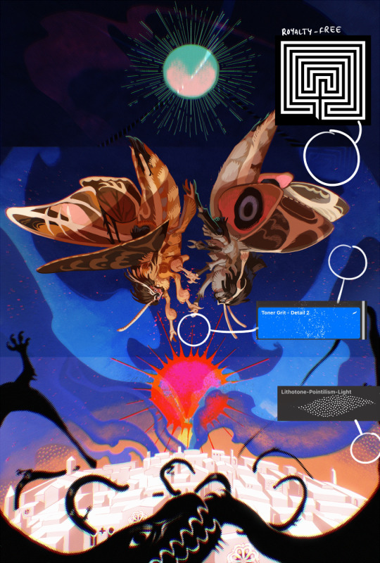
Something people may not have noticed is the labyrinth hidden in the sky! yeah I had a bunch of versions where it was more obvious but I found that it clashed a bit and was too busy, so I made it subtle. But yes. I searched for "royalty free labyrinth" and picked one.
The toner grit brush is one you've seen before if you've looked at any art on tumblr lately (this is such a popular brush) and it's from the true grit fast grit set. The pointillism brush is from the true grit free sampler pack, like my grain brushes.
I added shadows to the moths, increased saturation overall, and changed the clouds to a translucent blue (you can even see in the sun where I forgot to block in the sun itself because the clouds over it used to be opaque lol). Moon rays were drawn using the radial symmetry tool but this time with rotational symmetry off. I also moved the moon down closer to the moths because I felt that it was a bit far away, and this served to visually divide the drawing into three equal parts, so I chose to lean into that and divide the sky colours too, to show passing time, or an endless moment - morning, evening, night, etc.
And then the oroborous, I tried a few different effects on it because I wanted it to be very clearly separate from the main scene - I settled on a dot matrix newsprint texture, using procreate's onboard tool, and some heavy chromatic aberration. This is because the oroborous isn't real, it's purely symbolic and the moths' demise started when they became photographers so I liked the print media aspect there as well. The story itself is about grief without closure, cyclical violence, and sunk cost fallacy, while everyone explores an endless labyrinth, so an oroborous fits I think
what makes art fun to me is thinking up ways I can tell a story using just a single image. and sure a lot of it will be lost to an audience who isn't familiar with the characters or backstory but i want to leave enough in there that even complete strangers to my work will be able to construct a narrative about what's happening here, rather than it just being a cool image. that's my goal.
Finally I exported it to sai on my pc to give it a once-over. this is really important because the retina display on an ipad is oversaturated on purpose, to make everything look amazing and vibrant. but what this means is that on other screens, your work might look washed out. it's especially bad at displaying yellows! so i look at it in sai on my pc and i make minor adjustments, in this case I actually added another multiply layer on the moths and an overlay on their non-shadowed parts to increase the contrast there.
finally if you've read this far, I played a little trick with the caption of the drawing. yeah, THEY die... but only one of those moths is a theythem pronoun haver... the other has to survive. he isn't given a choice in the matter.
#fr you will never catch me trying to mystify my process i will explain literally everything#brushes
475 notes
·
View notes
Text
Day 8
Kirby has a message for you :3

I drew this using the lasso tool, which I tried before but... failed. But I'm happy with how this one came out!
Also here is the drawing again but without the text.

Hope you're having a great day/night! :D
37 notes
·
View notes
Note
hello it's me again! Your biggest fan (LMAO) The one who asked for tips on coloring...
Another question has came up on me while I was coloring (finally aughhh). How do you shade hair? Without it looking unnatural?
Thank you for your help before!!! 😊
Hello and welcome back! I'm glad my previous advice helped! That is a difficult question as I do admit it is a bit challenging to me as well. It is guesswork + studying references, adjusting tid bits until it looks right, my own process relies on a trial and error approach.
Therefore, I suggest you pick some pieces you like where you find the hair gorgeous, and figuring out how the artist does it, or how might they do it, per active learning principles. Try to deduce it. While the following guide can be good for your starting concepts too, it's important to adapt it to your style and preferences. And I even encourage you to go against it, as creativity thrives on experimentation.
That said, I'll guide you through my own thought process, however. (With a quick Ratio sketch, because I really love to shade his hair; fluffy hair is very forgiving.)
Let's start off here (I'll be skipping the black and white part for simplicity's sake from the previous guide. I'll also be using a white environment with a pale overlight):

For highlights, I begin laying down a Glow Dodge layer with a hard brush that doesn't have full opacity, and draw a halo-like shape. After that, I refine the shape by erasing parts of it with a rough eraser to get the desired effect.
Alternative to the Glow Dodge layer, you can use pure white, or other layer types such as Lighten, Screen, Add and Overlay, etc.
In the following pictures, note that I adjust the layer's opacity freely.


Above, I simply blended it a bit to my own liking.
With an airbrush I softly start introducing shadows (Multiply layer, dark purple/blue color).

Then, I start introducing sharper shadows in a separate layer.
You can use a lasso tool for this to map out a jagged like shape which should remind you of mountains. You can blend this out too at certain segments.
(Sidetrack: if you feel like, I suggest reading up on the balance of hard and soft edges in painting, the topic is very interesting and I am still trying to grasp it as well, yet I find it immeasurably useful. This can come in handy upon rendering principles. A very skillful master of it is the artist Yuming Li.)

Furthermore, I add reflections. I've used a Lighten layer with a subtle blue color. As this is subtle, I want to point it out that it appears on the lower parts.

For a final touch, I pick out the skin's color and airbrush, shift the picked color to a more saturated one and apply it near his face/to the bangs, with an airbrush.

For the fundamentals of hair shading I usually wrap it up here and go off to rendering. I use a painterly brush to do this and pay attention to the jagged shape I mentioned earlier. The brush I use is already tilted, so it's easy to manipulate to make such shapes.

Additionally, I experiment with Overlay, Multiply (or any!) layers with either airbrushes or hardbrushes— as I said there isn't a specified way of doing this. Go wild; for such is the nature of hair. Add any shapes or lines you find appealing, introduce new colors from the environment nearby too to make it moredynamic and interesting as well.
EDIT: An addition! On Rendering tips and advice
(apologies on leaving this out initially! I only realized I should include this now )
Including astray curved lines to simulate how hair flows also builds to the hair-like quality. I also prefer to use it closer to the silhouette of my character as it adds further detailing and a fluffier look in the end!
Attempt to render each strand according to this diagram in mind, note the parabole-like(?) shape for the light, and note standard 3d spheric shading for shadows.


#also!! watch speedpaints! slow them down and follow them#do i even tag this with ratio. no i'll spare you ratio fans the art guide#art tips#art guide#thanks for the ask!#asks#art tutorial
106 notes
·
View notes
Text
wip wednesday
tagged by @meggannn @slayerdurge and @wanderingaldecaldo and I'm tagging all y'all back and also @postmortemvp :3
I've been kinda slacking lately since I've been focused on work but I finally picked up some stuff again and am juggling three different kinds of cyberpunk projects:
writing
still picking at the next chapter of tdto and decided to scrap my previous start and try again while moving around some of the scenes I had planned in the fic. slow going but I think a stronger start:
Johnny knew he had to do something. It had been twenty minutes since V had sat down to scrub her interface of anything that might be used to track her, and in all that time she hadn’t done a damn thing except lean back on the ratty old couch and stare at the yellowed stains in the cracked and sagging ceiling. She was in danger of slipping into the tar pit, and if she did it was going to be a real bitch to drag her out. He’d hoped the moment earlier with the gun had just been a fluke– last thing she knew had been Smasher coming to crash the party. Better a bullet in the skull than getting caught in his grip. But V had been rushing from one hopeless disaster to another since she’d gotten back to her feet, and Johnny recognized all too well the heavy blankness that paralyzed her. She needed some sense knocked into her, but the trouble was that she was dangerously close to bursting into tears.
documence
since I was really enjoying getting into obsidian again for work I finally started writing down a lot of the worldbuilding I've been doing for tech in my cyberpunk fics:

visual art
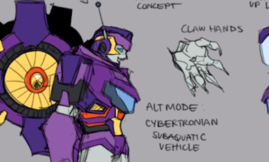
on my quest to get better at drawing so I can portray valentine properly I've been working through some old b&w references and found one that is 100% valentine/abernathy. still learning a lot about angles and posing and it's slow going but lately I've been chuffed that at least I'm getting better at seeing what's wrong so I can fix it, even if I can't do it right the first or second or third time without using the lasso tool to rotate things


#wip wednesday#spent a long time on the documenting phase trying to think of how to structure it#before I was like wait I should just start infodumping and sort it out later#I'm realizing now I have a beta to do as well sorry rat it's the forgor disease
8 notes
·
View notes
Text
I decided to make a post explaining my process of drawing and painting, because it's fun to show it, and be reminded of it from time to time!
This one's from the last iillustration I made, images under the cut:


First I sketch a very rough idea of what I pictured in my mind, or just sketch until something sticks with me. Then, I refine it in new layer (I try not to use more than one, as I know this is only sketch.)


Unce I'm happy with the design, I start doing the lineart.I try to make it fine in case I want to make a lineless illustration.
I usually do folders por each character a dividing the lineart in sections inside the folder. The only thing important about that part of the process, is that close elements don't touch each other while working.
Also, when something about the original sketch is not working, I do new sketches of the parts I didn't like, doing a more detailed research and such.
After I'm satisfied, I use extra time to give depth to the lineart.


When I don't want to paint further, this is usually the point I feel content enough to post, after painting the silhouette gray.
If I feel like painting, I start putting the flat colors. I usually use a wartecolor base brush, which allows me to put some value in the painting without thinking further into it, without using extra layers... But I guess you have to be rather confident in your strokes, and know for a fact the work will look "stained".
Clipping mask + Lasso + Eraser + Watercolor brushes tends to be my way to go.


When I want to keep enhancing, I create a new folder on top of everything, and do rendering details. Litetally painting with thick paint brushes until safisfied.
In my experience, having a good linework usually helps in this process.
Then, I paint a plain background color (It takes me way more time than it should.)
I usually stop here but, If I'm feeling brave... perhaps I'll try to add a background, if it was not planned beforehand. Most of the time, I fail miserably.


After I like the rendering, I start playing with adjustment layers. I usually leave it like the first one, so it looks rather plain.
But when I want to keep working on it and make something much atmospheric, I paint the entire image in a color (usually blue or orange, Color Burn mode at 20% opacity. Sometimes I use both together, like in this example case.)
I start erasing the layer with lasso tool, and use a transparent watercolor brush as an eraser until I like the result. (Be sure to have the layer color selected in case you want to paint again!
Use the real color: Normal mode, 100% opacity.)

You can keep track of you values if you put a black layer on top, using the Color mode at 100% opacity. Then you can decide where to enhance it in a way you like it.
Be sure to follow a light source and direction, that shoud to the trick just fine.
And that's it! Hope it's not too tiresome to read, see you around!
15 notes
·
View notes
Note
I wanna know how you make your animation...like how you timing it and what program did you use to make it.
I just love how choppy but somehow so smooth it is if you dont mind Im asking
-💌
I don't mind!! I'm absolutely down to answer art related questions! Though Im sorry if I'm not the best at explaining things, I'm self taught and raised by the animation memes community during 2016-ish(?)
I use flipaclip! I bought premium around last year, but I've been animating with the free, 3 layer limit version for years (</3) It's definitely not the most comfortable or professional animation application, but if you're a beginner it helps you get a good start!
As for how I animate, I sort of treat it like Vtuber rigging? Where I have a piece (or a messy, slightly cleaned sketch) that have the more important parts separated into different layers so I can move them cleanly with the lasso tool, though sometimes I ignore the "clean" part and just use the lasso tool to manipulate the parts I want because I'm too lazy to separate some parts into different layers sometimes.
You can see the gaps where I'm too lazy to separate my lineart if you look closely! Here's some lmao


Here's a frame by frame recording so you can have a better look at my messy rigging. The way I animate is basically 80% tweening and and 20% drawn frame by frame lmao
The biggest tip I can really give is to remember that you don't need to draw every frame to get your ideas across, or to make something look smooth. The way you transition between one post to another is really important and gives that impression of smoothness without drawing ghibli levels of smooth animation.
Here's a good YouTube guide to help you understand the basic movements that I use! (And by movements I just mean easing bc that's the key to get that smoothness in animation lmao)
youtube
Hope? This helps? Skdjsks sorry, again, I'm self taught, so I don't really know how to explain my process all that well
8 notes
·
View notes
Text
art journal: Bellara
Final image: sweater weather
Notes below the cut!
I’m not a professional artist; whatever I’ve learnt is from books, online tutorials and lots of trial and error. (This is the start of my second year of drawing regularly as a hobbyist and I'm keeping notes to document what I've learnt.)
Using a thick, transparent brush for the sketch, then drawing the clean lineart right over it forced me to be less precious about the initial sketch, and helped me save a lot of time. I think I'm becoming more comfortable with lining on the tablet with this brush as well, rather than defaulting to sketchier charcoals.
New work flow: I'm using a pen tablet (without a display) and Photoshop (my old nemesis) for colouring and shading so I can take advantage of a full size monitor at eye level and avoid craning my neck and wrist.
For the cell shading, I used a combination of the lasso tool, an airbrush and erasing/smudging certain edges to make for softer shadows. (General rule: Where you would put a faint stroke in lineart is where you can draw a hard edge to your shadow.)
I used a masking layer to paint in the yarn texture on the sweater (similar to Lucanis'). The eye is drawn to lighter values, so those should be less busy. More details appear in the shadowed areas.
My reference picture was blown out, but I added two light sources - a warm light behind Bellara and a cool light in front, which mirrors the lighting scheme of her room in the Lighthouse.
I think my colouring still lacks the vibrancy and loose-ness of the lineart step, but I'm much happier with this coloured piece than earlier ones. I used too much soft airbrush on her face because I was worried about the stark shadows under her full cheeks, but now that I'm looking at this again, I could have been more daring.
Total time: about 16 hours over 3 days
7 notes
·
View notes
Text

and other manly lines spoken by kenny mccormick
this was soooo experimental i dont even know what i was doing. i just couldnt seem to get out a sketch?? it was like impossible so i tried the lasso tool drawing thing again and its actually easy when you get used to it. Anyway. i was thinking about kenny mccormick ^_^ (not true, im trying to write about kenny and im struggling so maybe this will help spark something) i just wanna bring some attention to this REAL LINE once again. absolutely INSANE line for a character the fandom treats as a hypermasc cis man
and heres it without the vandalism:

i didnt just forget to give her eyebrows... ok i did but also i was getting very muppet inspired so whatever... muppets dont usually have eyebrows its ok
#south park#kenny mccormick#artists on tumblr#digital art#my art#fanart#trans headcanon#princess kenny#in a way
37 notes
·
View notes
Text
my full process:
canvas is like 4000×2-3000 roughly because it's big enough to have detail clearly without it getting blurry
sketch layers! thumbnails then guidelines for the body parts and shape. LOTS of workshopping through the whole process, even in the lines or colour i might change my mind. lasso tool helps a lot, i usually make changes by using the lasso tool to make it look like a shitty version of what i want, then turn down the opacity and trace over it to make everything connect properly again. second sketch is for clothes details and face expressions usually, the second layer of person if you will. usually in blue over a red base. lineart is interesting, i never used to do it like this but it helps SO MUCH. you know how you're always drawing the same line over and over and it's never perfect? just draw every line as many times as you can. undo NONE of them. by the end it'll look like a weird dark blob. now use the eraser to carve the image back out and define the lines you actually want to keep. this gives line weight and shapes as well, which i love! shading in corners with black can help avoid tangents. for poses always make sure you could tell what they were going if they were just a silhouette. for colouring, i change the background to a colour i probably won't use much so that it doesn't blend in and I'm less likely to leave white gaps. i always colour in properly cus my program has a crappy fill tool but if yours doesn't suck you can use it- but always colour on a layer below the lines- gives you the chance to colour or change the lines if you want to! sometimes i don't but sometimes i do: add a layer on top of colours to add texture and mild shading with a watercolor brush. always shade with a cooler colour and highlight with warmer, not just more black and more white- that's what i do. shading is often a multiply or linear burn layer with round shapes, in darker versions of the colours, or if it's all one colour it'll be peach or purple. highlights are normally pale yellow on a low opacity glow layer. spatter brushes on low opacity help give skin texture. if there's a joint that's not bent, bend it to make poses more interesting. i often can't be assed with backgrounds so it's just shapes and colours or a shadow under their feet plus my signature. that's my whole process!!! hope this helps, it was fun to write
btw- 2 all of the wonderful lovely artists out there. what’s your guys’ workflow for art like? like what’s your setup / what’s your process look like? what works for you + what would you advise against?
looking for advice!!
5 notes
·
View notes
Note
'Scusie, I have a question about digital art. How do you do your coloring? If you have a previous post or resource you talked about already then that'd be appreciated. But if not; I've just started getting back into digital art and can't remember how people did their fancy selection methods to color in their lineart. I managed somewhat myself but what would be a simple sketch irl took like an hour or two of trying to work the tablet/program. I want to enjoy it again and use it to start commissions in the future, and I don't want to be easily burned out because of the complexity. For reference, I'm using Krita.
ok I wasn't really sure how to explain it so I made a timelapse? let's see if this helps
so first of all, I'm predominantly using CSP nowadays (which I love and highly recommend), which has this nifty little feature in the bucket tool:
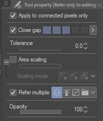
it can close gaps!! Now, I tend to draw pretty loose and my lines have a lot of gaps between them that are too big to close automatically, so I'll manually close them on my color layer with whichever color I'm using. I find this method works best when my pen and bucket tool have anti-aliasing turned off. I think other programs like Medibang and even Aggie.io have some sort of "smart" bucket tool, so I wouldn't be surprised if krita has something similar too.
the second method is simply Not Giving A Fuck and coloring sloppily without caring if the colors stay in the lines. I do this more for stupider comics where looking pretty doesn't matter so much
the third method is the same as the first but using a nice, textured brush so it looks Intentional and Pretty
I also tend to throw gradient maps on everything because they're so fun :)


the fourth method (which I did not demonstrate) is the good ol' polygonal lasso tool. I mostly used it when I used Photoshop. It's a really good and fast way to get all your colors blocked in without requiring so much precision, but it can still be a little tedious.
Bear in mind, I am not the kind of person that has each color on its own layer. A basic drawing like this one is lines, colors, and bg, with maybe a gradient map or adjustment layer. There are tons more ways than this to color (look into CSP's reference layers! pretty neat stuff), but these are just the ways that I like to use because I am very very lazy and am only willing to put in the absolute bare minimum effort
990 notes
·
View notes
Note
Prima you're so talented! The way you do lighting, coloring, shading and even how you draw that helps guide the viewer's eye onto a focus point is just beautiful.
Is there any tips/tricks/advices you could so graciously bestow onto others who are struggling?
If there was advice you could give your past self about drawing, what would it be and why?
Thank you in advance Prima, and as always, keep up the amazing work! :)
~With love <3
Thank you for the ask, and thank you for the compliment, you’re very sweet!
Im not the holder of the universal truth, so what I’m about to say is to take with a grain of salt, but here’s what’s working well with me and what I learnt:
I know this has become a joke among the art community, but I flip my canvas a lot lol. The eye tends to get used to the image it sees, so it’s getting harder to spot mistakes as you keep working on your piece.
Learning values!! From the moment I started working in grayscale, it made me realize how important it is to understand how values works, and how they will define your entire piece. Values are directly linked to the light, which is the most important part of a painting, it’s what will give your artwork « life » and its dynamic. Lighting is my first priority when I start something, I always choose a light source first and then I start the process. Learning how light works allows you to understand how it will affect and interact with its environment, how it reflects on some objects, and it helps a lot to construct an homogeneous piece. There are different types of lighting, with variable degree of intensity, and they will set the mood you chose for your piece.
When I start a sketch, I work with shapes first, I make a very messy line work and exaggerate curves instead of trying to make a perfect lineart first. The goal is to « catch » the dynamic of the pose, and to emphasis where the eye is supposed to focus on. It helps to get the proportions right as well.
Now tools speaking, I use Procreate, and I rely a lot on the liquify tool, to make minor changes on my shapes, the lasso tool is very useful to create sharp/smooth edges and for a lot of things actually, to work on some areas without touching their surroundings, the smudge tool, Gradient maps/color balance/curve/Hue settings are pretty uselful throughout all the process, I have no real advice for that, just tinker with it and see what fits you the most. And for the layer modes I use Multiply/Overlay mainly for the shades or to add colors to my grayscale thumbnail, and color dodge/screen/add for the ambiant light, vfx and rim light.
To my past self, I would tell to learn the theory alongside the practice. It’s a lot easier to understand how things work. To try everything, even if it might fail, even if it might take time to learn it. I think that’s the only real advice I can give, try again and again, do not feel discouraged by failure and if things become too overwhelming and if you start feeling you might never succeed in the task, just take a break, do something you know you’re good at, it will boost your self confidence and you will go back to the previous task with renewed confidence, and more willing to keep trying. Learning is a long process, we learn things throughout our entire life, so be patient, you have your whole existence to succeed. Do things at your own pace and even though it’s a completely human thing to do, try to not compare yourself with the others. They also had their hardships, and they also worked hard. Do not be afraid to get inspiration from them tho, we are all influenced by something or someone, so if you want to recreate something you saw, for your own learning process, there’s nothing wrong with it.
I hope this helped, I’m sorry if some things didn’t really make sense, I suck at explaining and at synthesizing. Have a wonderful day! ❤️
36 notes
·
View notes
Text
Art Block tips that helped me
I’ve recently experienced art block after 3 or so months of overcoming my last one. Thankfully this block only lasted a few days thanks to some things I’ve observed and noted down from the previous time. So I’m sharing these few tips in hopes that it might help someone get unstuck :D!
First and foremost if you’re tired, sad or anxious don’t be surprised that you can’t make art, go and take care of yourself by treating yourself with kindness and patience, the sketchbooks and canvases will wait for you :)
The tips are under here:
Separate art studies from the creative time: When you do art studies you’re there to focus on specific things, learn and understand how things work so you can apply them later in your art. Studies take a lot of energy and focus and are the opposite of the creative "flow” of making your own pieces. If you combine the two the results are either unfocused studies or stiff drawings. When you sit down at your desk ask yourself “Do I want to learn something new or do I want to create something of my own?”
When you have an idea don’t be afraid of being messy: Let’s say you want to make a picture of several cats kolo dancing in the moonlight. How do you go about doing this? Well since you came up with the idea you already have a vague image in your mind, sketch it out with simple shapes, stick figures, circle and spheres etc Don’t worry about cat anatomy, or the dancer’s moves, sketch out the essence of it. This method removes the need to be perfect or accurate.
Ok after the messy sketch then what? Well now that you have sketched out the essence of your idea (and hopefully had fun doing so) now you go on to look for references! You put the creative process on pause and you can do a few brief studies if you need to: anatomy, color schemes, values, poses. Pick out a few of your favorites but don't obsess over them, they are a guide, a tool.
You know much more than you think. You’ve probably been drawing for a few years now. You’ve probably done some studies and drawn more than one type of subject. Then you have already internalized some of that information. I used to be obsessed with capturing the minute detail of the subject, and not be able to draw ANYTHING without reference. Instead of a useful tool, references became another obstacle to my creativity. That’s perfectionism my friend, and that’s no good. Here is an exercise a good friend of mine offered: Draw a few characters, animals and objects from imagination. Make sure that the subjects have no personal value to you (no ocs for example) so that if you make a mistake you won’t feel bad about it. Make the process relaxed and comfortable, pour a nice cup of joe, listen to your favorite music ... You will notice that you do indeed know how to draw some things without reference, and it’ll help with your confidence.
The more you do studies the more you understand This seems evident but the more you understand your subject the freer you can be and the easier it’ll be to draw it from imagination in the future. If you really struggle with something to the point of frustration (as in you can’t get it right even with reference) It means you have to study it. Have a study list, for example: hands, perspective, color theory etc. And one of those days you want to study pick something from the list, and look for videos on youtube or useful sites like line of action etc. Only study one thing at the time. You can go from studying hands to studying arms since they’re more immediately connected, but you can’t study hands and then jump to learning perspective right after. Trust me you can learn perfectly fine with the resources online, and I’m sure you’re clever enough to do it :D
Mistakes don’t mean you “suck” I’ve noticed that the two most common causes for art block are perfectionism and lack of self-confidence. The two can often go in tandem which is worse :’D But let me remind you of something, you can fix your piece along the whole process. Use erasers, lasso tools, liquify , select, paint it all over etc If something looks off to you then you also know deep inside how to fix it. Useful ways to see what clunks: flip canvas horizontally (helps with placement, proportions), turn the image to grayscale (helps to check values and where your eye tends to look), look at your image in thumbnail size and ask yourself if it’s clear, see the pose’s silhouette and ask yourself if you can tell what the character is doing etc. Don’t fret, everything can always be fixed :)
Perfectionism, sometimes it stops you before you begin Perfectionism causes you to overwork a piece, it makes you draw less, it makes art stressful, it brings insecurity. Let’s remove it with a simple exercise. It can be combined with the “draw things from imagination” once you’ve drawn something you like: dont do line art, don’t shade it, keep it as simple and crude as possible and then...post it. Yes, post it. You’re not at your best? You’re only human, this will help you embrace that very human side of you. You make mistakes. So what? The more mistakes you make the more you know what you need to study and the better at art you become. Mistakes are there to show us what we need to learn. See them as another tool and not a sign of failure.
Make the process as enjoyable as possible: You like art. You love drawing. Never forget this. Otherwise why are you drawing if you don’t enjoy it? It’s easy to fall prey to the mentality of those relatable memes that “art= suffering” or “I can’t even draw the other eye”. No no no my friends, these messages are fueling your insecurities instead of overcoming them. Let me tell you what, art is fun. It is. Art is fun, because I decided to make it fun again. And you should decide on that too. Personally I adore lineart but my hand-eye coordination is lacking to do it digitally, so....I just skipped it. Yes. I skipped it. I do the sketch, I clean it up a bit and then jump onto color which I adore. It allowed me to draw more and more freely. When I draw I listen to music, make strokes with the rhythm, I take breaks often and I drink my favorite iced teas. If you don’t like coloring do it in grayscale, if you love lineart then do that etc It doesn’t mean you won’t learn your weak points in the future with studies and practice, but you won’t let your weaknesses prevent you from drawing at all. No no, you won’t let them. You draw because you want to, despite of them.
Don’t wait for inspiration, provoke it Inspiration is not a divine and capricious muse. You make inspiration. It’s easy just collect all the things you like, music, artists, objects, characters, animals, patterns, plants etc Make boards on pinterest or similar sites, combine things you like. You like suits? You like birds? You can draw a bird in a suit, or a bird-inspired suit design, there is frankly a lot of ideas that can spring up from little things like these.
When a project stops being enjoyable either pause it for now or move on to the next thing. Pieces aren’t precious. They’re not “the one time I got x right” they are one of many. This advice goes mainly to hobbyists who can afford the luxury of passing to a new project. I have a WIP of a character who is overly complicated (I enjoy a challenge from time to time) sitting for half a month. I sometimes come back to it and add something... but as soon as it starts to create discomfort and insecurity instead of enjoyment I move onto something else. In the meantime I created 3 or 4 new pieces. If I had waited on finishing that piece I would have been severely creatively and physically exhausted. The art comes from you, not inspiration. The more art you make the better you become.
That’s about it :D I know it’s long but I prefer to be thorough and cover all the possibilities. If you have read of this: Thank you so much I hope this helps you at least a bit, if it helps only 1 other person I’d still be very happy. Have a nice one, and kick art block’s butt!
#art block#art block tips#art block advice#art advice#art help#BloggityDiary#art reference#I hope this will help someone out#This will also help me remember my own advice sksksk
200 notes
·
View notes
Text
i am working on the shading process 😳

feels good to be getting back into art but at the same time im like. bro i used to draw + paint a whole portrait study in a night. who was she. ive been working on the same sketch for over a week now
#love exclusively posting art at ungodly hours of the night so i don't have to be perceived#and also bc it serves the purpose of immediately making me notice all my mistakes#anyway i have no idea how i will finish this one bc im following along one of classes for this#and there are no lessons on rendering yet <3#back when i was taking the course there was no lesson in shading at all tho so like#now there are lessons on it since it's been almost a year since i stopped keeping up with it#and im catching up on the lessons and it's like wow. i got by while not knowing anything and the painting turned out okayish#now with the lessons i Understand so much#i was severely underutilizing the lasso tool too i was just making my life so much harder skdjfh#this is so good tho bc i was anxious to get back to this bc i felt very lost about the painting process itself before#and that was when i was drawing/painting for like 6 hours everyday#so i was like HOW am i gonna figure that shit out again when i haven't done anything in almost a year#but the classes have updated and theres sooo much new info so it's so much easier and i understand things a lot better now#tbh i thought i wasnt gonna want to keep going with the art stuff after such a huge break bc i thought i'd feel discouraged#from losing all my progress#but no im having so much fun again?? i was consciously gonna take it easy and not pressure myself#but im getting so into it i spent all day painting and watching lessons today#and now it's 4am and i still dont feel like stopping#anyway. hyped.#hope i can fully finish this one even without the rendering lessons#so sorry to anyone who got hit with this wall of tags sdjkhf
35 notes
·
View notes