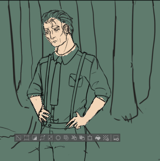
#same thing I do with rendering but shading/lighting is more detailed and is done on a separate layer
Explore tagged Tumblr posts
Visit Tumblr Blog
Explore Tumblr blogs with no restrictions, modern design and the best experience.
Last Seen Tumblr Blogs


Fun Fact
Tumblr was acquired by Yahoo for $1.1B in 2013.
Text
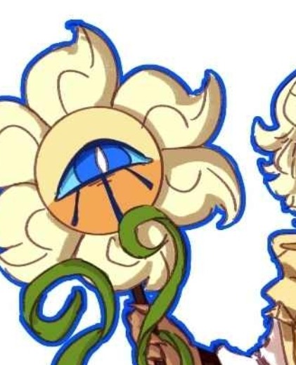
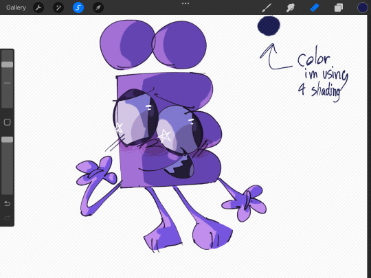
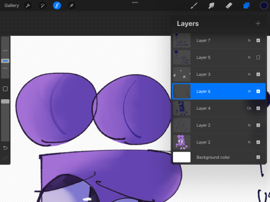
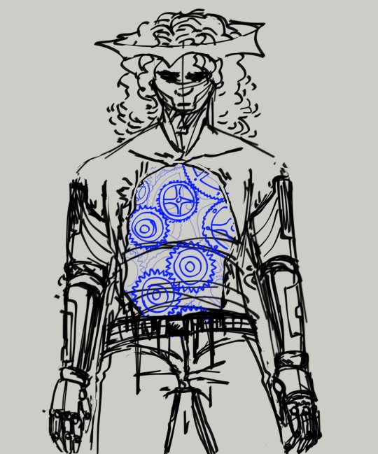
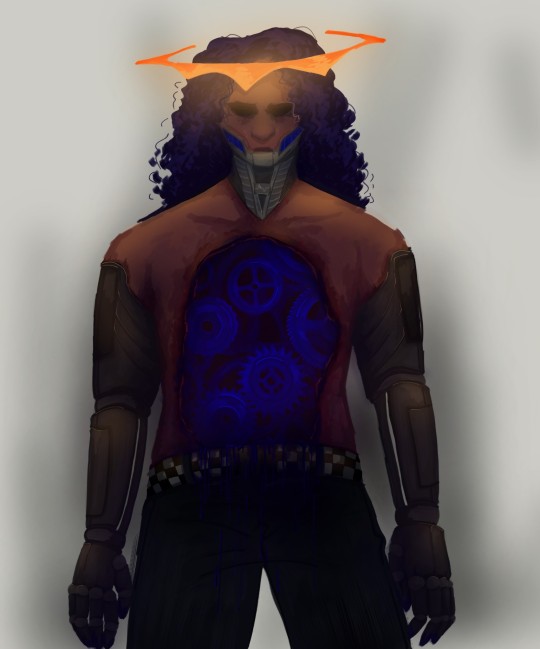
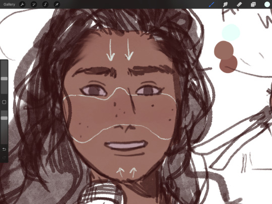
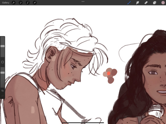
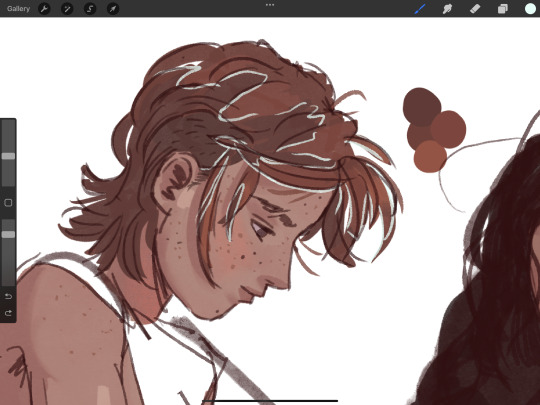
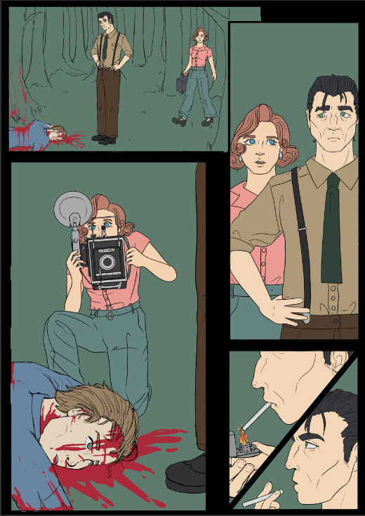
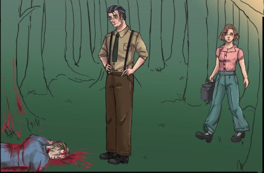
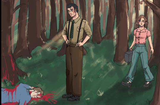
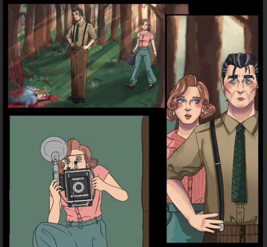
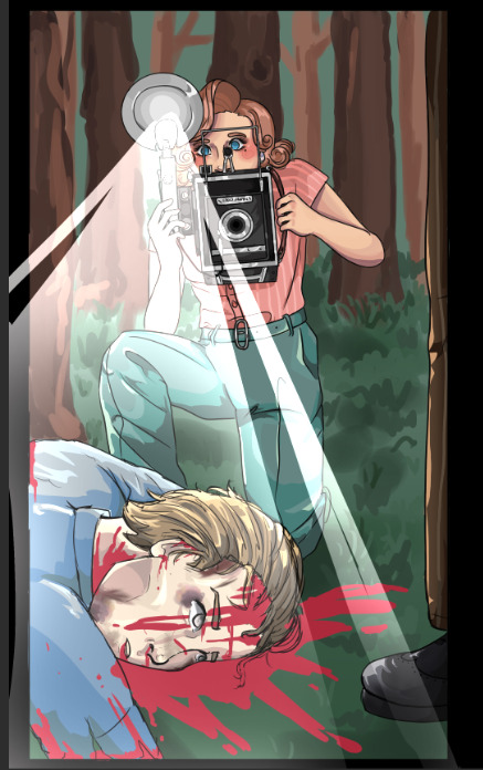
[WIP] Decided to give another try at ref sheets after a while for intertwined opposites

Hey y'all!!!
I figured I should make some proper references for the au yesterday (mostly because I need to make proper character sheets, the old ones are old and it would have been pretty fun!!)
Plus I'm posting doodles from left to right on discord but have been relatively quiet over here. I genuinely love interacting with y'all internet people inside my phone and wanted to give some more updates
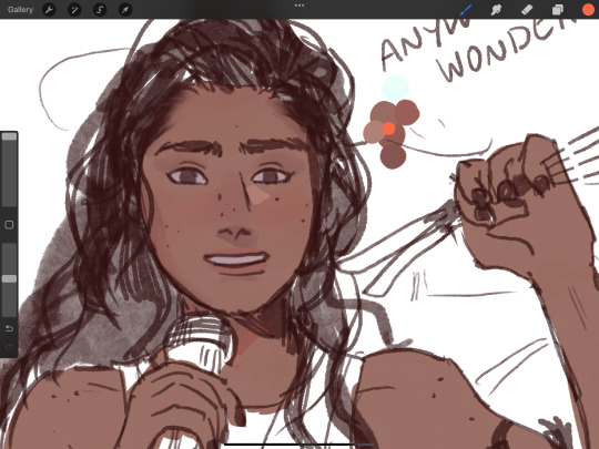
Puttng all of that aside, here's a completely unrelated PV playing animal crossing/silly
#also another sidenote is that I haven't done line art in ages jshdhhd#I prefer polishing up sketches with layer modes on and colouring them more#same thing I do with rendering but shading/lighting is more detailed and is done on a separate layer#love the more “”rough“” messy feel it gives#being messy is fun#beetle's ramblings#cookie run kingdom#pure vanilla cookie#beetle's art#crk au#intertwined opposites au#shadow milk cookie#IO!Pure Vanilla#IO!Shadow Milk
107 notes
·
View notes
Note
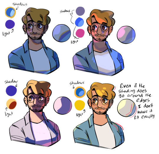
You've probably been asked this a million times, but how do you render? Or I guess a better question is how do you decide where to put colors because it's always so masterfully done!!!
For rendering, firstly: what is the mood I’m going for? For my Hero’s Shade piece, I kept the rendering rough, relying on rough brushstrokes and brushes with color jitter to create colored texture, and then leaving it alone before it becomes too refined. For my Zelda illustration, I kept it clean and dewy. I render based on intent, mood, and characterization.


To master rendering, I would suggest doing in depth texture studies. Below is an example of my student’s work where she’s in the process of doing this:

Mastering how to render different textures by doing exact studies from photographs of things such as: metal, fabrics, rocks, wood, etc will excel your rendering abilities.
BUT AND THIS IS SUPER IMPORTANT: the thing I notice about most artists with like godly rendering skills is that their rendering sometimes excels beyond their drawing abilities. Then they use their rendering as a crutch to carry their poor drawing skills: the drawing is like the bones, the architecture. If you have a poor drawing with excellent rendering, the piece will look good to the average enjoyer, but it will unfortunately fall flat to artistic peers.
In saying all of this: it’s super duper important to note that, when trying to make objectively appealing art, it has hierarchies of importance and I’ll tell you the order:
Perspective placement and proportion are the first part. It’s basically the drawing part! The architecture and bones of the artwork. The anatomy, the form, the silhouette, negative space, and overall design of the sketch, composition, lineart, etc, they all sort of fall under this.
Value is below this, and to master value I suggest master shading the sphere.

Highlight, direct light, core shadow, reflective tone, cast shadow, etc.
Color is below all of this. You can be wrong with color but not wrong with value is what’s usually said.
As for coloring, it’s a lot harder for me to explain other than to refer to how I use grays a lot. Color is a lot less step by step to explain you see, so I’ll try to explain, but I’m sorry if it lacks much sense! The reason why I’m able to get away with using strong/bold saturations without it being overwhelming is that I use the grays to carry the strong saturations. It’s important to remember that the human eye can get tired; it’s why we blink even when our eyes don’t feel dry. It’s a moment of pause, a moment lacking in stimulation. You have to have areas of high stimulation (high saturation, texture in rendering, sharp edges) paired with areas of low stimulation (low saturation, smooth rendering without detail, and lost or fuzzy edges). This is why I argue that art does indeed have rules, but only so much as our own brain and eyes have rules; it’s our brain and eyes that perceives the art, and our brains have a very broad and universal mode of operation. Same with art. That’s why art is objective and yet also subjective! But this is a tangent.
As for color, it’s again with mood, but I usually rely on contrasting colors more than anything: warm or cool for light or shadows, one is super saturated while the other is typically desaturated. Hope that makes sense! It’s all about balance: one element/color must have a foil to counter it. And when you chose your main colors, if you wish to add a few extra colors for dynamism, it’s your best bet to chose the colors right next to the main color you’re using on the color wheel. For instance, if you choose red and green as your color scheme, and you need more details in the green shadows as an example, use a combo of blue-gray variations to add more color and saturation variation. In contrast, for your red lighted areas, maybe I would use a light gray orange to introduce new colors in.
Idk if any of that makes sense, I’m not exactly the most gifted teacher when it comes to trying to break everything down, which is why I’m trying to learn how to teach 🤣 I’ll get the hang of it one day maybe 😆 Hope some of this helps answer how I personally approach it, and mind you it’s important to learn from actual masters who have been doing this for decades!
91 notes
·
View notes
Note
Heyy I love your DA art so much! I just want to ask if you don't mind especially on your family DA piece. Do you render first before putting the lighting/effect or do you do the opposite? I always struggle when drawing illustration like that because I just can't get the lightning right after I put the main shadow
Thank you and no problem!
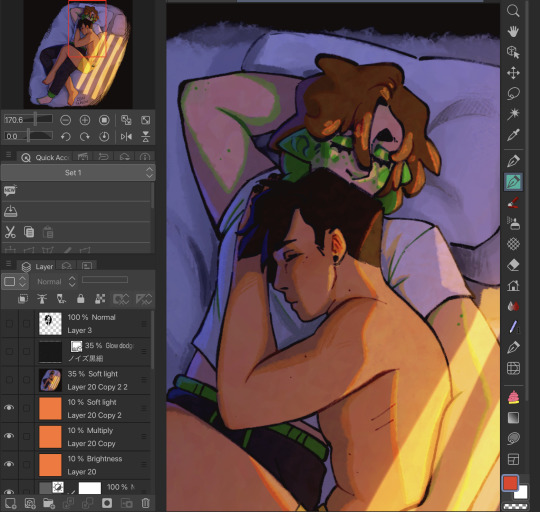
My process was honestly rather sporadic because I'm not used to work on big pieces like this, especially those with warm colors (like browns, oranges, gold, etc) so it was honestly a challenge.
It's gonna be a long answer so im just gonna put the whole process below this cut
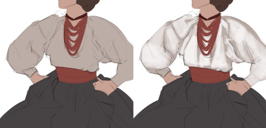
I tried doing everything in base colors first. No shadow no nothin. At this stage im trying to make sure that the base colors are all in the same, warmish tone so nothing felt out of place (left)


I was absolutely stuck on how i should do the shading, so i asked a friend for advice and she painted it over a little to give me an idea (right) (sorry the quality is ass cus its a tiny thumbnailing thing)
then i focus on the main subjects, i dont entirely shade them yet i just give some discoloration and color details like blush, dirt, subtle ones. I colored the lineart too (but i suggest you do this later after your shading)

then the shading, i carve it out from the multiply layer (as my friend suggested, lighting came from top left so i follow that suggestion)

added more contras (multiply & overlay) to add more depth and pop some more color

now that im done with the main subject, I got a good glimpse on what tone I should do for the rest of the artwork. Dark red for areas i need darker, and something of a gold/orange for the brighter spots.
i shade the background manually without using multiply, since im worried itll be muddy (easier for me to control too).

once everything is shaded, check on your artwork using a B/W layer. Everything still feel flat to me so I know i need to add more contras in the light & shadow
At this point im just throwing in Mulitply layer (reddish, green sometimes) to darken some areas outside of the focus and Overlay layer (yellow, orange, whites) to highlight the important parts and to emphasize where the light is coming from.
Check it again in the B/W layer, and it feels way better!


and there it is!
I added a few personal effects at the finishing, copying the lineart and gaussian-blur it, add speckles, add noise, color balance it a little. Poof. We're done :D
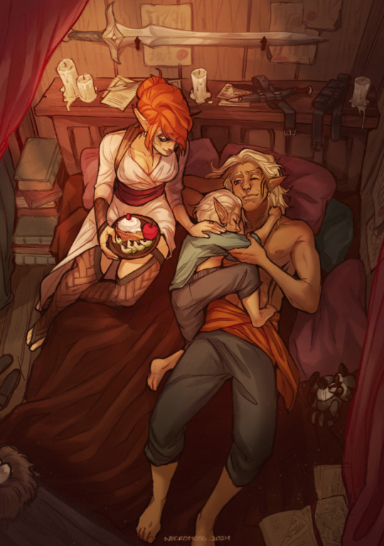
Hope that helps!
78 notes
·
View notes
Note
How do you draw this comic?? I'm realy curious because its just so good!

That might need a little more explaining. It's a long read, so please proceed under the cut.
Basically, since I like to plan things way in advance, these comics follow a strict script (that is already finished). Only on occasion do I add an additional comic inbetween, but only in order to make things a little more clear if I notice there is some confusion going around and stuff. I work in Clip Studio Paint for all my comics and art in general.
Naturally I start out with the sketch. The script is written in such a way that I can easily put together the overall panel layout. This right here is how the sketch of the latest comic looks like:
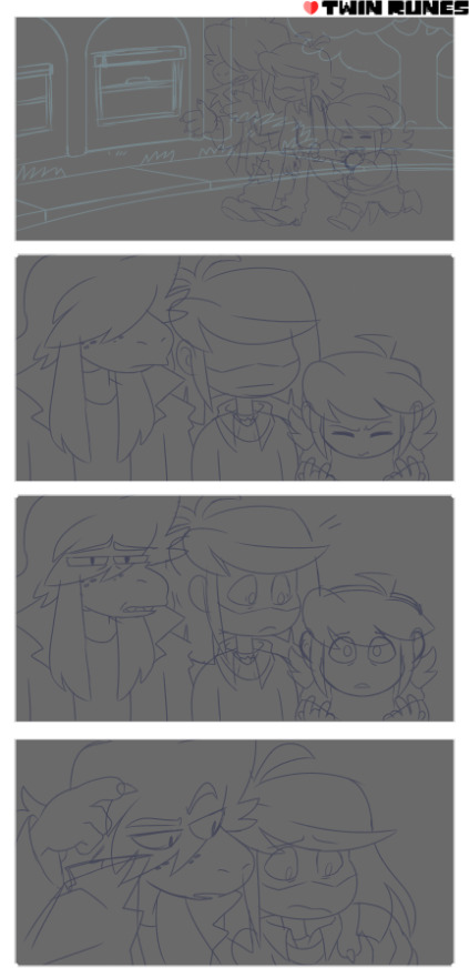
Typically I like to keep my sketches super clean that they almost count as lineart. This one ended up a bit messier than my usual ones. It might've been the second draft, since I always go over my sketches three times. They typically start out looking like this (oh hey a sneak peek!)

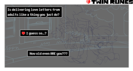
2. I add the dialoge and organize the text boxes in the earliest sketching phase. That way it's easiest to figure out the best text flow.
3. Next is foreground lineart. I like using a pixelated brush for crispy lines and ink the whole characters once using different brush sizes for details and such. And at the end I go over them one final time for the outside lines to make each character pop a little more.

4. The flat colors speak for themself I guess.
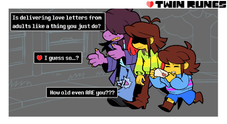
5. Same procedure for the background.
6. Most of the heavy lifting is done by the shading and coloring the inked lines. It adds to the ambiance and makes the foreground characters pop.
7. Last step is the rendering phase. This is basically where I do the shading on the characters, add highlights and color the inside lines. It's what ties everything together.

8. (Optional) I do this for specific lighting to set a certain mood, where I put a gradient mask over the colors for added effect. Notice the difference?
So yeah. That's how I do these comics. Hope this was a comprehensive enough read haha...
398 notes
·
View notes
Text
kind of halfassed rendering tutorial
below cut . just for someone offsite i just wanted to upload images as an example and tumblr would be easier
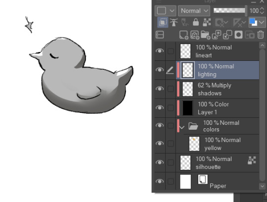
ok so we’ve got our flat colors. drew Yoshka really quick just for this

now we take a dark, saturated color that would either 1. Make sense for the surroundings
or 2. Make sense for the character.
putting 2 here because it’s awesome and whimsical and also sometimes i want to do smth fully rendered but don’t want to do a background.
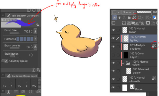
whatever art program youre using, it probably has Blend Modes—not sure if that’s procreate specific language or not. But whatever. if it is, then it’s basically where youll find layer settings like Add and Hard Light and such.
typically for me it doesn’t really matter what blend mode i use, i just go through them and pick whichever one looks best with the color pallet.
now, what i do for the shading is i determine where the light is coming from, and then start working on the shading. its fine for it to be a bit messy at this stage, and you can add and erase details whenever you want really
i refine the shading a bit more here, and add more details. also, i mostly shade the eyes as i would with any other round object, EXCEPT for the pupils, which i shade as a flat object. it just looks better.
now that i’ve done that, i start blending the shading. I don’t know what else to say here really. its just blending.
great! now that im done with that it’s time for one of my. Personal favorite parts about shading. The darker more saturated thin line. Whatever it’s called. Just grab a darker, more saturated version of the color that you were using for the first layer of shading and set it to whatever blend mode you want. For me, i almost always set it to the most saturated one, as I like to work with bright colors a lot
cool. just draw the thin lines. i dont know what to tell you
and blend them. Slight note, but if you use colored shading then it’s always good to put the shading and lighting ABOVE it. Other wise it just looks kinda weird imo
anyway yeah. just do this wherever you want really. Blend them as much or as little as you want
now make a new layer. Again, just set the blend mode to whatever you want really. Also, i would like to note that i lower the transparency of the shading AND lighting layers. you will not get the same effect at maximum opacity.
basically this is just to add. More shading to areas that need it. or just whoever it looks cool really!!!!!!!bro this is object show fanart not art school tje lighting doesnt. Need to make sense.
anyway yea just blend it againnnnnnn obviously
oh yea i also reallh like to add these. Triangle things to the face. yknow the ones. I think the look neat. add more depth.
i also add slight shading and blend it really heavily around/in the eyes, so it looks like theyre actually. Inside the skull.
OKAY COOL time for lighting isnt that awesome. Grab a really saturated But also. Lighter . color that either fits with the environment or the character color pallet. put it on a blend mode that makes it. Lighter. Don’t put it on like Hard Light youre not gonna light anything with that
uhm basically just do the same thing you did with shading minus the little dark lines
also very very optional but this little line on the eyelid looks awesome esp if your art style has it. So that the eyelids are darker than the rest of the body/face. It looks like eyeshadow which is great if that’s what you’re going for
PUT THE LIGHTING. ON THE LITTLE FACW TRIANGLES. it looks great and awesomeeeee trust me
AND LASTLY. MAKE THE LINE ART LIGHTER ON SOME PLACES. IT LOOKS COOL. AND OVERALL IUST INTERESTING. I DO THIS FOR EVERYTHING BUT ITS ESP IMPORTANT HERE IMO. I ALSO USUALLY LIGHTEN IT FOR PLACES WHERE IT MAKES SENSE TO.
ok. that is all hope this helped
7 notes
·
View notes
Note
HEY YOU
Um...
Hi hope you're having a a wonderful day
I just wanted to ask since you're a digital artist... how do you color your art?? Because I'm a traditional artist trying to become a digital artist but I have no clue how to color my work (I made the mistake of using 'fill' on ibis paint before realizing oh wait that's not how digital artists color their work dummy) like I know base color and all that but the layers... how... How color? Line art no fun...
*cries*
I have no idea what I'm doing 😭
Don't feel pressured to answer this or anything, just thought to ask you since your art is so CRUNCHY I LOVE IT
Hello there!! I hope you're having a nice day as well
Sure! I'm very happy you like my art and as I also started as a traditional artist, I'm glad to entail some tips! :]
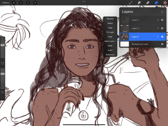
Base colors:
After finishing the lineart (can be sketch too), I use the Magic Wand tool and click it on outside of the lineart. This will give you a silhouette, but in the wrong space. Therefore, we have to go to 'Selection -> Inverse selection', after, you can proceed to use the fill tool on a separate new layer, beneath the lineart.

(Advanced tip: if you use Clip Studio Paint (CSP), there's an asset called 'Erase Along Edge'. Set your lineart layer to a reference layer (light house icon) and you can continue to erase and adjust the silhouette more easily with this eraser!)
Next, make a folder, clip it down to the silhouette, within this folder, add separate layers for each base color. This will help you manage your colors more effectively.
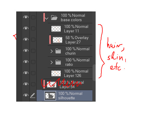
Shading:
This is extremely tricky and I cannot give a standardized process for this, but I'll attempt to do so. There are much better ways to do this I'm sure, the one I entail on forward is a bit time consuming (but it might only be a personal thing as I tend to over-render)
My method:
For a simplified method, skip all the purple colored parts of text.
We are going to continue working here:
I fill a separate layer with all black, and set the layer to color mode. This is to help us see the values better. Should we play around with contrast, brightness, focus points etc.
Then, with a layer, set to multiply mode, I begin shading shadows. Can be grey for now.
After I'm done, I use a layer to block out bright parts, with white. It makes it very dramatic, bless. (You can use different colors for this of course, I just keep this specifically very bright.)
Additionally, make a separate layer, use it for reflection lights with a lightish gray.
Adjust, add, tweak layers to ensure your overall image meets your expectations, including background. Most of the times, I even additionally paint a complete image by blocking out bigger shapes (messy and undefined) to see how the values should match in this stage.
Simplified demonstration:
We'll come back to these layers later.
Hide the previous black color layer. We now have colors again, but it's all so muddy.

Therefore, we alpha lock our previous layers of shading, and fill it over with colors. Unsatisfied by any colors? Use the Hue/Saturation/Brightness sliders or add a new correction layer. Important thing to note that you can use other colors than this purple/blue one in the image below for the multiply layer.
I use correction layers unapologetically. My favourite is Tone Curve + Gradient Map.
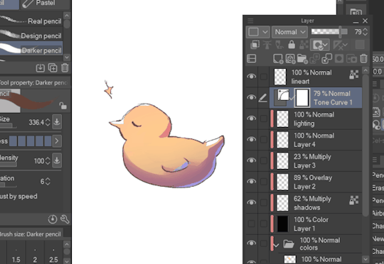
Naturally, I have a lot more layers than this in the demonstrated picture, such as Overlay layers to emphasize focus points or further darkening parts with multiply layers, etc. I do most of the hard work during rendering stage! Excuse me for the low effort rubber duck also hahah. Here's a closer example for what I usually do:
All we got left to do is Rendering (painting over mistakes) and Effects. I cannot give much advice on Rendering, it's pretty much the same as in traditional art.
Effects:
I sometimes leave little speckles/sparkles over my art to make it more detailed.
After, there can be correction layers, simply to adjust the final look.
I usually save the image as png or jpg (or in CSP case, merge all visible layers to a new layer) and add noise.
Sometimes, when I just want to post a sketch I add a 3d effect but in Photoshop. It helps a bit in faking extra details.
That's the end of my process! I hope this proved of help, and I wish you a smooth journey :D In the future, I can post timeline speed paints, if there is interest.
My other related threads are this (on my process) and this (on mindset and learning).
You can see me working in action through gifs here. (The gifs include extra planning stages (mentioned in the previous 'on my process' thread, but they follow the same principles I mentioned.)
----
Another note: it is possible to get a cracked version of CSP, which I won't entail because of account safety reasons, but if you research it, a pointer I can give is that the distributor's name starts with 'o'.
#if there's any related questions feel free to send more#thanks for the ask!#art guide#asks#art tutorial
21 notes
·
View notes
Note
i love your art so much!! would you be alright sharing some info about your process for art? i'm in love with all of it especially your more recent painterly stuff :D if i could eat your art to gain its power i would
Thank you so much!!! :DDD and ofc! I'll try and articulate whatever I do (I truly just See What Looks Good tbh) below the cut :]
I'll use my most recent work as an example :]
So I start off with the sketch of course, for this I'll usually have the general idea of what I'm doing planned out in my mind, but if I can't figure out the pose/layout or whatever I'll usually scour pinterest for references/inspiration

Then COLOUR SHIT. Ok, I couldn't get a version of this without shading bcus I sadly merged the layers already </3 but basically once I have the base colour(s) down I'll mess with the layer's colour settings until it works with the lighting I'm doing and then I'll start shading. I'd say there's a more refined process but tbh I kinda just pick a section (skin, hair, clothes, etc...) and go ham.

After that, rendering! (And small details [the first pic]) tbh I have no idea what rendering is/how to do it? But my definition is 20 layers of airbrushing at low opacity until it looks good 👍 (for this piece that was alot of dark blues, reds and purples. In general I try to use the dreaded Colour Theory to make things look nice and cohesive [complimentary colours and the like]) this section is very much trial and error, I'll also mess with the settings and colours for everything I've done so far ALOT, as well as go back and fix little things I did forever ago

Then the background/any final details! (Usually if I'm doing a more complicated background I'll work on that at the same pace as every thing else [sketch, colour, render] but for pieces like this where it's simple, I'll do that whenever)
But yeah! Hopefully that's helpful (?) In some way. My process is all over the place and I usually break my own order of doing things and start like rendering half way through colouring half the time?? Anyway thank you!!! It feels very awesome to know people like my art and wanna see how I do stuff :DDD
#The Mail#as long as he can hold a pen he is a threat#<- art tag? sure#artists on tumblr#cw body horror
10 notes
·
View notes
Note
ur art is so, so amazing, is there anyway u could do a tutorial bc I wanna draw like u so badly
i can try but idrk how to explain myself or make tutorials lol
i think my style is just a product of my brush and what im trying to get out of my art, which is trying to portray the characters as accurately as possible. i rly just want it to look like it could be a stylized redraw of a deleted scene or something
my process is kinda everywhere bc i just move on to whatever step will probably make me hate the piece less when im done with it. i draw with a more square brush (blurring marker 1 on ibis) which i def recommend. its great for focusing on shapes in ur art and it helps me not overblend/forces me to think of more interesting lines/shapes. my sketch is a thicker size of the same pen, focusing on the major shapes and proportions and i just make as many additional layers overtop of it, lowering the size of the pen and adding details as i go
once im at the lineart i usually use a site that creates color palettes based off images (usually just steal some from old catholic art) and i steal my base colors from that. it doesnt matter how terrible ur base colors look as long as they make sense and r what ur generally going for.

these were my original base, i use colored line art and shade the basic shadows using the line art mixed with the base color, highlights r whatever is the lightest color in the palette. after that i duplicate and throw it through this filter
i play w the colors and use it as a color/hue/luminosity layer on top of the original version, lower opacity and render now that theres more colors on the canvas (the filter creates more contrast between the lame base colors i mix, then i can add bounce shadows and shit).
i use a shit ton of digital cheats. single color overlay layers at the end of a piece, pizza face overlay glow, using vignettes around the border to draw the eye towards the subjects at the center, filters, color palette generators, etc. they make things sm easier so u can worry abt experimenting with other things.
i dont rly know how to explain how i do clothes or hair other than focusing on the shadows and worrying abt lights later. this is honestly the best tutorial i can think of bc in my head im just drawing what i see as best as i can with the pen i use. use a fuck ton of reference, do actor face studies, and try to experiment with ur style everytime u draw. ur never gonna learn how to use ur programs or expand if ur bogged down by trying to achieve a specific look. sometimes that thing u were nervous abt bc thats not how ur style usually works is the best thing on the piece at the end.
actually draw only what u want to draw in that very moment and use that as an opportunity to experiment however u can. i just draw chainshipping and find ways to trick myself into learning 👍🏻 sorry this is so bad if u have any specific questions i can try to answer those better
edit: this is what i mean when i say just draw with whatever base colors and use the lineart to add value. i thoroughly hated this piece at this stage but once i adjusted the pallet it felt much more cohesive and i could continue on with the drawing. the best thing i can say is to have absolutely no process past the same few first steps and resign urself to a cycle of self hatred and throwing random bs at the wall to see what sticks
#sorry this is so bad these dubious ass shroom carts beating my god damn ass HOURS later#i deadass woke up saw this and said Fuck bc i knew id want to answer it but i deadass cant think#sorry this didnt make sense. my style id just however i personally fail at achieving complete realism#also merge ur colors and lineart after the base idk makes it less stiff#ive always thought painting is much more forgiving than lineart and cell shading#theyre scary#most of my art is just how i compensate for being unable to rly fully stylize#i havent been able to since high school so i just stick w realism while i unlearn my old bad habits from having an exaggerated style#GOD ANYWAYS#rambling#larry.txt
24 notes
·
View notes
Note
ok im silly and obsessed with your art so i wanted to ask you about it!
i really love your shading on art, the layering and different colors is very well done! do you have any feedback on how to do rendering and shading? cause i know nothing about it
im also curious about your anatomy, its accurate but also very unique between characters! do you mind doodling like... how your format it? u know what i mean???
NEXT I WANT TO ASK! ABOUT YOUR OUTFIT IDEAS!! where do you get your inspiration for those beautiful fucking designs?
on the drawing you made of shrimp mariana being held by charlie, im curious about how you did the filtering to make it like. fuzzy but still clear???
last but not least, what application do you use for drawing, and which pens do you use?
sorry for all the questions but your art is a very big inspiration for me and i want to be as talented as u ^^💦
this got really fucking long and i don’t even know if it’s particularly helpful but LETS GO
—
OKAY SO. shading, thing i am apparently accidentally really good at. it’s probably the thing i’ve gotten compliments on the most over the years which is funny because it’s probably the thing i’m Least confident that i can do well. therefore i can’t really give a tutorial but i can give a bunch of disjointed notes

(shown above is my Default Shading, further examples of different lighting below)
everything else under the cut or this is gonna be a mile long
i like using blue for shading, yellow/orange for lighting but generally you can just make them opposite/complimentary colours to each other and that’ll work. cool shadows, warm light or warm shadows, cool light. you get it. that’s a general rule there’s probably exceptions. i will say i hate using purple for shadows but that’s a personal preference (as is every colour i use being so saturated lol)
the orange around the edges is supposed to be subsurface scattering on skin but i put it on all the edges because i like how it looks 👍
yes there’s two different bounce lights. idk why i do this. i also just think it looks nice. i guess the one on the shading layer is more for form and the one on the lighting layer is more for the yk. lighting? anyways the first one is just a lighter version of the shading colour the second one is darker and slightly hue shifted (depending on the lighting scenario — it can be brighter if the situation calls for it)
the reason i don’t just shade around the edges is because it can make things look very flat which is the opposite of what you want when shading. sometimes it can just go on the edges in some specific scenarios but i like my shadows Chunky. basically having it go over the form instead of just along it can help show that form more
top left - night time | top right - bisexual? | bottom left - spotlight i guess? | bottom right - default/daylight again, just wanted to show a shape example
something i’ll also do a lot is have a separate multiply layer that’s just one colour and i’ll throw that over the whole thing to get the base colours correct for the lighting scenario. some people do it by eye but i am lazy so i cheat 👍 often it’ll be the same as the more detailed shadow colour but as with the top right example sometimes it’s different
shadows are either on multiply or linear burn, lights are either on add (glow) or glow dodge. depends on what looks best. same with opacity, i don’t have any real rules there
i also LOVE harsh lighting but that’s just a me thing. UMMM i can’t think of anything else to say
—
so next is ANATOMY okay this is also something i’m not super confident with lol but i can give some more disjointed notes by just redlining my own sketches lol

the uuuh “bottom of boobs is 2/3 down the ribs” isn’t technically correct? if ur drawing someone with big boobs and no bra on they’re probably gonna go lower but that’s kinda. where they come out from i guess. i also don’t think the “ribs” i draw are technically accurate but it works for a reference point
arms are a diamond (the shoulder.. muscle.. thing… idk what it’s called) and then some Tapered Tubes idk they’re not super complicated. if you wanna get more into it go google buff people and trace/redline their arms that’s how i learnt orz and uuuh i kinda also have the taking up 2/3 of the ribs but a bit Above. the way i’ve worded that makes no goddamn sense i’m bad at explaining this
ANYWAYS yeah bodies are just shapes if you want ppl to look unique just squash or stretch out the shapes 👍 and also learn actual anatomy stuff that always helps. my final message: learn to draw fat people it is no more difficult than drawing thin people
—
OUTFITS i love outfits. i have a pinterest board where a lot of my inspo comes from and it’s a section within a bigger board so ig i’m just giving you my whole inspo board. here (it’s the one called character fashion) (i do not condone art being reposted on pinterest without artists permission just ignore how much i have saved)
pinterest in general is good for outfit design stuff as long as you know where/how to look. u could also try fashion blogs and stuff
ummm a lot of stuff does just come from my own head tho, like based on clothes i like or vaguely inspired by stuff i’ve seen before. if you look through the board you can also see that like i rarely ever copy stuff directly i kinda just use whatever stuff i find as a base to work from. just find stuff you like and go from there i guess, i sometimes like picking a specific subculture or fashion style for a character and seeing what i can make from that (like missa is emo/scene, slime is like some kinda ravecore thing?? idk)
—
OKAY i’m assuming you mean like the glowy effect? makes everything look Soft?
(idk if u can even see the difference here orz also ignore how many fuckin layers i use i’m a mess) (the top layer is that catboy missa doodle i did ignore that too)
this is something i do on Most drawings to the point i have an auto action set up for it. duplicate the entire drawing (on csp the easiest way is to just merge visible to new layer), gaussian blur to like ? idk i think it’s 40% or something? i don’t remember, set that layer to soft light and lower the opacity
if that’s NOT what you meant feel free to send a follow up question LOL
OH actually if u mean the colour jitter stuff on the . colours. that’s not a filter i was just using a brush with slight hue jitter on i was Experimenting
—
AND FINALLY i use clip studio paint on my ipad and most of the brushes i use on the reg can be found here
favourites are the ones i made (i actually have more of those i need to upload—) and the raz sketch ones 👍 namely raz sketch (thick) with the density turned up a bit from the default, been using that a lot for lineart
#.qna#.jpg#art tips#idk how to tag this#i really hope this is any kind of coherent LOL#where’s that post like ‘don’t ask self taught artists SHIT they don’t know how they did that either’
44 notes
·
View notes
Note
pls talk about technique!! sorry if i’m annoying you but i’m eating this up lmaooo. i appreciate your responses a lot!
i’ve been having trouble with coloring/rendering?? like idek where to start when it comes to that part of a drawing and every time i try it i get frustrated which just sucks
Answering this under the cut because its LONNGGG 😜😜😜 also you are so not annoying me I have been waiting for someone to be as interested in this as I am lolz
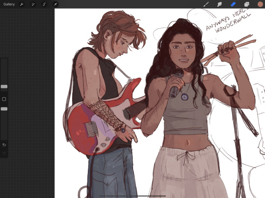
Here is a detailed walk through of how I'm going about coloring something for that band au-- I hope this helps!!!
For skin I start by putting down a base color; this is the color that shadows and highlights should be considered in relation to! I always set the layer to "alpha lock" so that when I start rendering my strokes stay within the silhouette I originally colored
From here I add redness to her skin first in the form of any natural flush her face may have. I pick a color for blush by beginning with her original skin tone and adjusting the hue to a slightly cooler color and increasing its saturation. I use a soft, buildable, and blendable brush to apply this (quoll). In this scenario, I want the flush to be subtle as she's supposed to be in a darker setting.


For shadows, the first thing to consider is where your light source is. In this scenario, the light will be hitting her from the right, so shadows should be most prevalent on the left. I pick a color for shadows the same way I pick a color for flush, only this time I don't saturate the color as much and darken the shade more. The color usually appears purple-ish. I use a more defined brush to apply shadows and blend them around where I imagine the contours of her face are softest.

Finally I color finer details like lips, eyes, scars, and freckles, and add highlights where a light source would likely reflect on her face. I love adding washes of neon oranges and pinks along harsh shadow edges and cheeks as well! I feel like this makes faces feel more alive.
When I use this method on a face in profile, here is my color placement:

For bodies, I use the same colors that I used on the face for the sake of consistency. I start with any natural flushing on the body, typically on joints, tummies, butts, upper backs, and hands and feet. I use the same brush I used for flush on the face.
For shadows on bodies, you really have to use your imagination or a reference to form a 3D image in your head. While face shadows are more straightforward as there's often a formula you can follow, body shadows are more diverse. If you were to break her body down into shapes, where does her body protrude most, and where do you imagine there are crevices? How will light interact with these shapes to form shadows? Again, I'm imagining a light source on the right so the shadows I place will be mostly on the left.
Then I go in and add highlights and other tiny details.
For hair, I start with a base color before putting down highlights closest to the light source and shadows in places that I imagine are hidden from a light source, such as underneath a particularly prominent strand of hair. Finally, I pick a color I feel like encapsulates the "true" color of her hair and scribble it over the base color I chose, making sure to leave some base color peaking through. I feel like hair has a lot of depth, and by doing this you can kind of mimic that complexity in color without sacrificing a simplistic art style. In total, I used four colors for her hair. I separated the darks and lights for a clearer demonstration of how I think her hair would fall.
You can apply these techniques to really anything, especially clothes!
Yayyy done!! I will absolutely answer any other questions you have
#ask#am i a professional? no.#is my favorite color rainbow? yes#i think this makes me extremely qualified
27 notes
·
View notes
Text
Colouring page 1
I started by laying down the flat colours for each character as well as giving the panels the same background colour (for continuity purposes). To make adding in the colours more efficient and less time consuming, I used the lasso and paint bucket tool to quickly select and fill areas with colour. If there were any gaps or the colour went out of the lines I would then go in a fix it/ clean it up by hand. Using this method really did speed up the time it took me to get the base colour down for each character as I wasn't having to fill everything in with a brush by hand.
As for the colour of comic page itself, I was originally going to go for a white/off white background however I when trialed using black, I found that it created more of a contrast between the elements of the page and made the colours way more vibrant.
Now it was time to add dimension to the characters. I experimented with different brushes and textures, with one of my attempts being inspired by how comic artist Greg Smallwood colours his comics with a pencil like texture however I didn't end up liking how it looked. After that failed attempt, I went back in and tried to see if the usual way I colour my art would suite the comic. What I found was the usual style I use lacked definition and was too smooth to work in the comic as there wasn't enough contrast within the shading to make it stand out so everything looked blended together. Now that both of my ideas hadn't worked, I had to find and alternative way of colouring my page. To help, I looked at a some comics to try and gain inspiration. I examined the way elements were coloured/shaded and I found that a lot of comics use a similar style that uses blocky shapes and contrasting colours to shade with. How I ended up shading my characters was with a dark tone, mid tones (to help blend the harshness of the shading) and a highlight to add definition to certain areas (nose, lips, chin, ect...). To place the colour, I used the lasso tool to create shapes that complemented the contours and folds of each aspect of the character.
I was initially going to leave the background till last however, properly establishing the light in the scene and fleshing it out really helped when shading the characters because doing this basically set the benchmark for the amount of detail I could include in this panel. The lighting I went with was supposed to look like it was the early morning so that's why there are sun beams coming through the trees. Colouring the background also helped remind me to shade the character like they belonged in the scene (for example, adding in highlights that correspond with the scenes lighting) as before I had shaded the characters first and then done the background and it made the drawing look weird and disjointed.
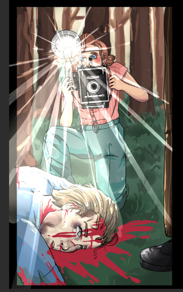
With two out of the four panels completed it was interesting to take a step back and see the difference in how the rendered panels looked compared to just the flat colours.
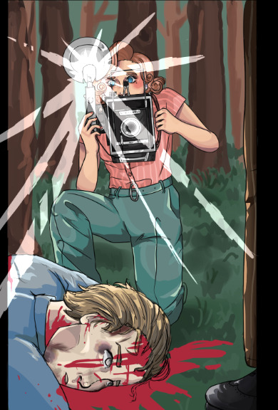
When working on the cameras flash, I went through a bunch of trails of how I wanted it to look. To get the flash effect I took an off white colour and put the layer on a mode called "linear dodge" which is what gave it this glowing quality. The first flash I tired looked more like a beam and I wasn't a fan of how concentrated the light looked. The second version I did looked way more like a flash however it didn't really look all that good so I refined it but though doing so I made it look too similar to the sun beams I had put in the first panel. After asking for some opinions, I got the idea to try and combine the two style of flash together and it actually worked quite well and is what I ended up going with.
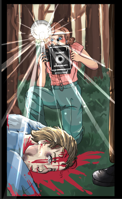
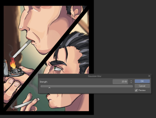
I used the "gaussian blur" filter on the backgrounds of some of the panels just to make them look a bit out of focus. When it came to close up shots I didn't want to add too much details in things like the trees so I made them as simplistic and possible then blurred them.
0 notes
Text
Colour/lighting study :)
Reference (of Victoria De Anglelis)

I really liked this picture and thought it wold be a good challenge to do seeing as the lighting colours are quite unique and something I haven't really done before. For this drawing I hadn't really planed to use my regular drawing style but instead kind of lean more into semi-realism


I started this piece by doing a very rough sketch of the reference just to help me begin to visualize the drawing. I then went in with some base colours and some very messy shading to use as a starting point/ base for the rest of the colouring to go on top of.

I then moved onto bring in more photo actuate colours and structure to the face and skin. For this piece I decided on more of a painterly technique. I did this by layering the colours on top of the sketch and base colours. The main process I was using consisted of using different shades and colours to define and render parts of her body and clothing.


This is the main brush set I used as I knew for past experience they had a good range of hard and soft brushes that helped when creating smooth transitions between colours as I didn't really want to uses a blending brush and potentially over blend certain areas which would make the colours turn muddy. Next to that screen shot of the brushes is the colours history of the drawing.

I carried on using the same technique of painting and building up the colour and shading, being sure to really look and study the reference every now and then just to make sure I hadn't made any major errors in terms of positioning and shadows/highlights and if I had I would go in and fix them to the best of my ability. These errors usually consisted of me having drawn the hands or other objects (like the bass guitar) in the wrong place so I had to move them or change there angle slightly which proved a little annoying sometimes as I would then have to go in and fill all the gaps I had just made from moving that section of the drawing.
Something else I found with this piece is that the method I used isn't that reliable when it comes to proper anatomy which you can kind of see in this drawing as the sketch I used wasn't that detailed and I as only worked on portions of the picture at a time instead of the whole thing.
Final piece:

Some of the finishing touches I added was the background (which I chose to do as a gradient) as well as adding the lights that are behind her in the original image. Despite a colour difference between the original image and my drawing (because I didn't colour drop the exact colours) I think this turned out really well.
0 notes
Text
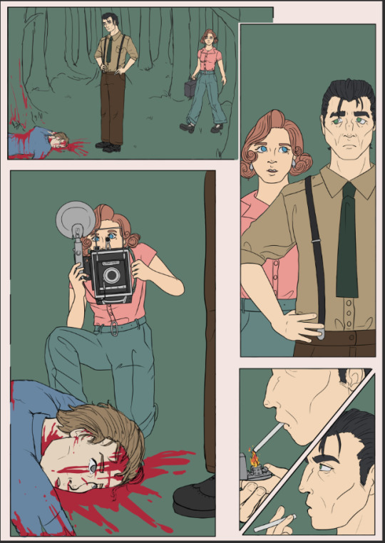
"What's your drawing process? Care to show a tutorial of how you colour, shade and render?"
I don't really have the energy to go into detail (visually at least) but I'm happy to show my general process and explain what I do for each step.

1) I draw the rough page with "prelim" sketches, using a 10px ink tool in red. These are usually just stickfigures with ears, eyes and a few features that differentiate them, in the rough poses I need them to be in. The simplicity means I can move things around easily. I also add prelim text-boxes to get an idea of how much space I need for dialogue.

2) I draw over the prelims with the actual sketch, using a 1px sketch tool in black. When drawing over sketches of any kind, I put the sketch at 9-11% opacity so it's just visible. It's harder to make mistakes that way and forces me to be more careful with my lines. Here I also add the other panel lines and keep the prelim text boxes.
3) I line over the final sketch using the same sketch opacity rule, for the character illustrations. The lines start out rough initially as I use a mouse and thus can't draw with pen pressure, so once the lining is done I erase and add to the lines to simulate line weight and make it look cleaner.
4) I begin colouring by first using the selection tool on the areas outside of the character lineart, then inverting it so it contains all of the character. This is easier than directly selecting each section of the character.

5) The selected section is filled out with the character's base/main colour. I usually do this with accessories turned off, as they are on a different layer (ie Miltei's blade and Ash's necklace). Then I make a hair layer, eye/mouth/scars layer, and 1-2 marking layers, in that order of dominance. These are set as clipping layers to the base colour layer so I don't have to worry too much about going beyond the lineart. I just use the pencil tool at whatever size needed for colouring, and at 5 px for lineart.

6) I finish the accessory layers and colour the inner lineart to simulate depth and connection between certain body parts. Eyes receive "eye lights" (white dots of varying sizes at a low opacity) to simulate eye reflectiveness.

7) I then line the background using the same lineart rules/process established earlier. (Ignore that it's been coloured already idc)
8) The base colours are added for the background. Some sections get rendering before others.
9) Final colouring and extra details added. I usually add some shading or details to suggest depth and texture.

10) Final tweaks; ambience! Skyrays like the ones shown are done by drawing a large beam of yellow light and blurring it a ton. Then I do it again. On the second layer I add thin yellow lines using the spread tool. Then on luminous layers I add little dust particles like in the sunbeams you'd see in real life (though usually you can only see the dust up close).

11) I import the page into CSP and rewrite the dialogue using the prelim text boxes as a guide. I get them in the shape I want, then draw the speech bubbles using CSP's bubble tool. It's set to a sketchy outline to make the bubbles look a bit rough. These are coloured to match the character speaking, as are the text. The text and bubble layers are then reimported to SAI and the watermark is added. And we're done!

extra notes: 1) Eyes are generally drawn on a separate layer to the rest of the lineart, and pupil lines on yet another layer. This makes it easier to edit them and colour them without accidentally interfering with the other lineart.
2) There are rules I follow with how I do eyes and eye lights, but it's hard to explain. If I make an eye tutorial I'll make sure to go into plenty of detail about it.
3) I don't usually merge layers unless I know there's no reason to keep them separate. Those eye lineart layers always stay separate from other lineart.
4) The panel/page outlines are never on the lineart layer. When selecting the lineart so I can colour, I just draw small lines to connect the lineart that goes into the panel outlines. This is in case I need to edit the lineart position or something like that.
5) How I actually approach lineart changes on a case-to-case basis. Sometimes I'll do hair first, or body first, or ears first, sometimes I draw them all on different layers because of a complex pose, etc. I almost always draw eyes and accessories last though.
6) Preferred font is comic sans (thought I use both upper and lowercase as purely uppercase is irritating to me as a writer) for readability. I use a mix of other fonts for varying purposes.
0 notes
Text
my process is loosely as follows:
get a reference and look at the values and colors and get a bunch of markers (i use ohuhu alcohol markers) for the lightest value and ones in between. i usually don't set a darkest value from the get go because a lot of it is layering and experimenting, but i want to at least have some colors to start with and lay down a base. usually i get a bunch of skin tones and two to four cold tones, depending on what the reference seems to call for. the colors don't have to be an exact match because you're never gonna be able to exactly match the tone with a limited palette. keep in mind that this is mostly a face rendering tutorial because portraits are about the only things i've done with markers lol, but i'll try to keep it applicable to other things as well?
(also, something important to keep in mind is wet vs dry - this is less of a thing with alcohol markers - if you're layering over a part that you've just colored on the marker is going to bleed. this is a good thing for blending!! but if you want cleaner shapes i'd wait a bit for the page to dry before coloring to do smaller details or different parts of the drawing like skin bordering hair, etc. the wet/dry divide is more obvious in mediums like watercolor, but it's still a useful thing to take advantage of and be aware of.)
so i generally use a lot of layering for each portrait. the first layer is coloring in some shapes of where the darkest shadows are, using the brush tip of the marker. (keep in mind that i also spend a while sketching out a guideline) then i use the chisel tip to color the entire face in, while it's still "wet". (save the eyes, although you could do that too because this is a light color and eyes are generally in shadow anyway. also to be noted: keep these first strokes brief because layering the same color can darken it.)
now that all the white space has been covered for the subject i go in with either a darker shade of a skin tone or a cold tone. i find that lighter, cold tones (like blue and purple) elevate shading a lot if used right. ("right" being where light might be reflected onto bottom-facing facial planes or where shadows intersect, or just as light shadows.)
then i just layer various colors i've selected, (while selecting more sometimes lol) keeping in mind facial planes and structure and looking at the values of my reference until i'm satisfied. generally then i push myself to darken the shadows a bit more and add details as necessary. the hair is similar - lay down a foundation color, analyse shapes and values and layer.
i usually also outline stuff with a pen (forgot what brand it is but i'm sure any pen works lol) and add highlights with a white acrylic pen! (sometimes i color over the white and or dab at it while it's still drying so it's not as bright) this is. quite lengthy but it's the short and long of it. ^u^
some mechanisms marker drawings ;0;


133 notes
·
View notes
Text

@wradicall i hope to alleviate your stomach hurt! re: this study post
i'll make a new study with you and share my process behind making these and spruce in some tips i keep in mind with each steps, hopefully it'll be helpful! this process is generally one i use across all photo studies i make; (obviously this is what works for me, if you have a different method that works for you then good)
1. first step is sketching out the outline, but before i do it i determine things that will help me keep the proportions of the picture. i think of them as anchors - darker folds, negative space, major planes. i find it easier to do those small parts and align them than just make a single large outline.

2. i lightly sketch out the contours and these points of interest; i am showing you two steps of that process, because i never get the proportions right on the first try, and i think it's unrealistic to expect that of yourself. better to take time and check with the reference, make deliberate and precise lines, rather than create a lot of messy thick lines just for the sake of speed. this isn't a race~

3. i will be working on the shirt. i block in the separate shapes on different layers for ease of later rendering, trying to use a similar colour i'm seeing in the photo reference. the colour differences will come later, but i find this to be also a helpful exercise in simplifying shapes and colours in general. next, with a rather simple brush (one i use is just a square with a subtle chalky finish) i refine the secondary, larger shade - since i start with a medium shade, i will work on the lighter planes. no ultra darks and no ultra lights yet, we are still laying out the basic foundations of the shirt.
4. i add the darker and lighter bits, fleshing out the creases and paying attention to the colour differences in the shirt. elbow on our right has a redder shadow, shoulder are is a bit more yellow. you think this is a fabric study, no, it's an everything study. while the main point is to focus on how this shirt is structured, i wanna break down what makes it realistic - which is why colours and proportions earlier were taken into consideration, not just the form of the fabric. then, on a separate layer, i paint the pattern. i grab stock patterns when i can, but things like embroidery or non-tiling patterns often need to be done by hand to make them look cohesive with the rest of the pic. we are now working on layers above the sketch, since it's done its job and we don't need it for details.

5. i finish embroidery details. while i like rendering with softer, textured brushes, i use a sharp edged brush for the embroidery because it's not a pattern that fades away. even though it's not a 1 to 1 representation of the reference, it looks good enough for me. then, since emrboidery is on the separate layer, i can shade it so it's not all one shade of vibrant red and matches the lighting. then i get to the final darkest shadows, highlights, details. the last step i find the most satisfying and substantial, because adding that sharpness and refinement brings the whole thing together.

6. it looks weird now, but i then applied literally the same methods to the rest of the individual pieces and now it looks more coherent and put together. (sorry about your face, lady.)

some of these steps i don't carry out because i have them in my head, for example i don't draw over the reference to remember those anchor points. but this is my process, i hope it was a tiny bit helpful. if you need to take extra steps or you think you are slow, that's alright! make the process work for you. don't get bogged down by details and making things too refined, while also try to be deliberate and not too careless in your brushstrokes.
i don't usually post such detailed processes, because i share all my process gifs/breakdowns of various pieces with my patrons. i hope this was understandable, and if you'd like more (or just wanna support me, 'tis but a dollar), please take a gander at my patreon.
happy painting!
#long post#i am SORRY i have lots to say about art#let me know if something needs further explaining i shall do me best#wradicall#art
378 notes
·
View notes
Note
Do you have any tips for coloring/shading? I always love how your colors look cause they're really nicely saturated but still well balanced
oh boy do I have some very strong opinions about color lmao
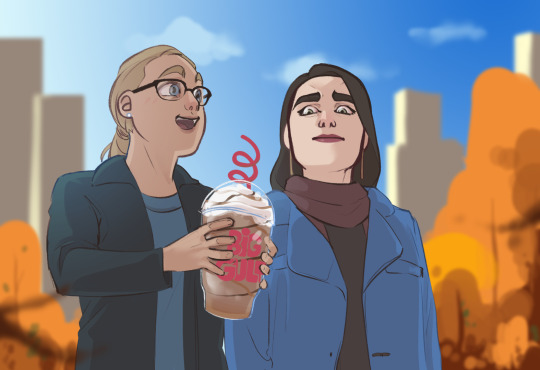
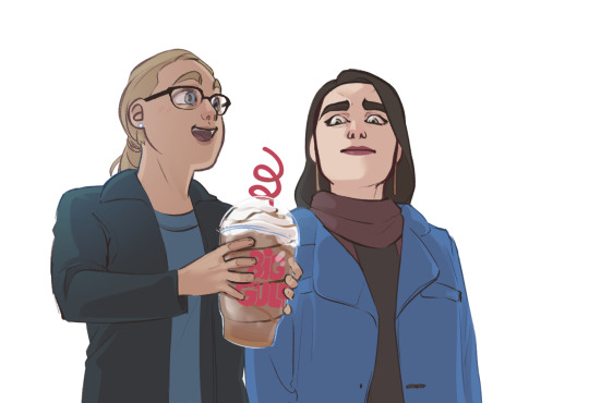
First, I’m morally obligated to mention that there are 8 million ways to approach digital color, so these are really just the Thots going through my head when I’m working on a given thing. For the sake of this rant, I’m gonna use this scribble of Kara and Lena from last fall, because it’s simple enough that I can easily illustrate some key points.
Most of the ideas I’ve outlined are about shorthand techniques that can easily and quickly use color to your advantage when you’re trying to sell the environment your characters are in. I’m not a painter, and painting is absurdly difficult, but we can use digital software to our advantage and consider how a painter would approach when lighting a figure/object/environment. Too many shortcuts are >:( but a few quick and simple habits can go a long way in finishing and posting a quick drawing you don’t want to spend hours rendering.
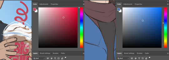
1. Pure black almost never exists in nature, and similarly, you will almost never need it.

Most illustration aims to “sell” a perceivable, believable space. While this is not everyone’s goal, most of what I draw is finished with an at least semiconscious goal of appearing touchable. Pure black is a guaranteed way to take away from that, because we almost never see it in nature. The darkest point in this particular drawing is Lena’s (terrified, dead) eyes, and it is only about 80% black and has some red/orange in it to help unify with the rest of the darks in the piece.
Here, locking my drawing layer and scribbling in some browns, blues, and even whites goes a long way to mesh the figures with their environment, especially because the background is lineless.

Here’s what this same drawing looks like with pure black lines. I would argue that this version does a disservice to the steps I’ve taken to light the figures, and it’s flattening the brightly lit outdoor space I’m trying to imply. There’s a whole additional essay about how lines play into this as well, so that’s a pretentious argument for another day.
2. Local color will rarely reach above 50% saturation.

Here’s the drawing with all the lighting work I’ve done removed (barring a few highlights I’m too lazy to turn off). In illustration, “local color” is referring to the color of a given object at the most neutral lighting possible.
The most heavily saturated element here is the artificial red on Kara’s cup, which makes sense! Printed logos, light up colored signs, things that are generally hard-sided and man-made will be more saturated. The next most saturated object here, and the only other local color exceeding 50% is Lena’s coat.
The rest of the clothing, skin, and hair falls between 10% and 35%. A neutral base gives you a lot of room to work with when you start lighting. It’s easier to go richer in digital than it is to accurately reel your colors in. Like any other kind of contrast, saturation can be used to pop points of interest, and if your entire canvas is TURBO SATURATED, none of it actually is. Also you’re hurting my eyes.
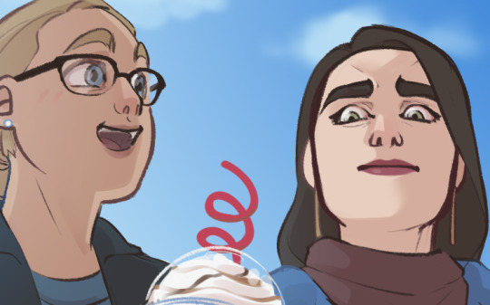
3. Natural light is cool, artificial is warm.
As humans, we spend 99% of our time either seeing the world lit by the sun, or by a lightbulb. Light from the sun is cool and generally diffused because it has passed through our atmosphere. Interior lighting tends to be warm and direct, casting clear shadows that come from a very specific light source.
Even if we remove the background, you would probably assume that Kara and Lena are outside based on the light temperature. Blue and orange are opposites on the color wheel, so an orange-tinted shadow (warm) will by effect make all the lighter colors look blue-ish (cool)! Pretty much all the shadows on these figures are just a faint orange Multiply layer. You’ll also notice a faint blue gradient over Kara’s shoulder to emphasize the approximate point where the sun is in the sky.
In short, cooler light and warmer shadow will imply that the setting is outdoors. Warmer light and cooler shadow will imply that the setting is indoors. It’s a fast and easy way to communicate character location.
4. Skin is weird.
If I’m just slapping some flat colors down and don’t plan to do much painting, facial features and skin have a lot of complex undertones, so if I don’t want to get into too much detail, a splash of red on the nose and around the eyes, a bit of color on the lips, translucent ears, can all go a long way to making flesh look more like flesh and less like barbie plastic.
5. Atmospheric perspective is much more important than grid (1/2/3 point) perspective.
This is relevant to color because color is the best way to easily portray atmosphere and the passage of space. Especially when your setting is outdoors, objects’ colors should become cooler and less saturated as they recede in space. The closer an object is to the camera, the more contrast you’re going to see in hue (position on the rainbow), saturation (richness of the color), and value (light vs dark).
#don't invite me to talk about art because I will wax poetic like an asshole for thousands of words#and there will be nothing you can do to stop me#mine#Anonymous
399 notes
·
View notes