#stevenwilsonstudio
Explore tagged Tumblr posts
Visit Tumblr Blog
Explore Tumblr blogs with no restrictions, modern design and the best experience.
Last Seen Tumblr Blogs


coachfactoryoutletjefferson-blog
Coach factory outlet jefferson high school online is it real - T
1 post

Fun Fact
Tumblr’s website traffic is steadily declining.
Photo

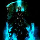
Portrait of Anthony Joshua by Steven Wilson Studio, 2022. - @stevenwilsonstudio #stevenwilson #stevenwilsonstudio #potraitillustration #popartartist #popart #popartcollector #posterdesigner #posterlove #plakat #agigraphic #illustrationoftheday #illustrazione #picame #illustrator #illustration #illustratie #illustrationinspiration #illo #ポスター #グラフィックデザイン https://www.instagram.com/p/CYd4Ca_M5bV/?utm_medium=tumblr
#stevenwilson#stevenwilsonstudio#potraitillustration#popartartist#popart#popartcollector#posterdesigner#posterlove#plakat#agigraphic#illustrationoftheday#illustrazione#picame#illustrator#illustration#illustratie#illustrationinspiration#illo#ポスター#グラフィックデザイン
0 notes
Text
Who am I as an Artist? Moving Forward
There are so many different methods of printmaking, each with their own character and charms. Linocut prints producing patchy and carefree prints, etching specialising in tone and monoprints creating one-of-a-kind pieces each time. I am personally most inspired by screen printing, also known as silkscreen printing. Screen printing is a form of printing using a screen made of stretched fabric and a frame1. The artist creates a stencil by applying glue, film/paper or photoresist to the areas of the screen that they don’t want printed, then smears ink through the untouched parts of the screen to create a print. This method is primarily used on paper and fabric; however, it is possible to print on other materials such as wood and metal if using specific inks. Screen printing is wildly popular due to its ability to print bright and even colours regardless of the surface2. Screen printing works similarly to a reduction print, creating multidimensional art using layers rather than tone and shading. It is also praised for its ability to produce identical prints in little to no time, making it a key method in the mass production for the likes of posters. Screen printing started being used in the 1920’s for advertisements, even though the method dates all the way back to 221 AD China3, and was being used by artists only 10 years later. By the 1950’s, screen printing had become a widely appreciated media amongst artists. During the 1960’s, screen printing boomed in popularity after pop artists such as Andy Warhol and Keith Harring used it for their designs4. Screen printing was the prime medium for the pop art movement because of the ease at which you could create colourful block shapes and patterns, as well its ability to mass produce designs. Screen printing has a long and diverse history, but not one that is going to end anytime soon. The method is still wildly popular today amongst printmakers, with its charming characteristic and accessibility maintaining its popularity as strong as ever.
Ben Rider
Ben Rider is an illustrator and prink maker based in London. Rider is known for his messy neon prints with punk undertones. His work is created using a screen print to bring his illustrations alive, usually in a psychedelic pop art style. One of my favourite pieces of his would be ‘Pleasure Thyself.
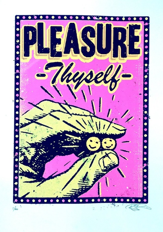
5Print Club London. (n.d.). Pleasure Thyself by Ben Rider. [online] Available at: https://printclublondon.com/shop/pleasure-thyself/ [Accessed 13 Mar. 2021].
This print includes a hand holding to smiley faces, as well as the name of the piece, ‘Pleasure Thyself’. This print is fairly simple; however, I feel as though there's a lot of depth to it. At first glance, it simply seems to be a print about looking after yourself and your mental health. The description of the piece states, ‘In these strange days it's good to be reminded to just be kind to ourselves too!’. I feel as though there could also be a comparison drawn between this piece and drug culture. The hand seems to be holding two smiley faces, which at first reminded me of pills. The slogan of, ‘Pleasure Thyself’ could also relate to the act of getting high or taking an upper. I feel as though the colour pallet helps strengthen this analysis. The piece includes bright pink and yellow, creating a psychedelic feeling. There are also a bunch of lines coming out of the faces, making them the main focus point of the piece. I feel that this also adds emphasis to the pill like shapes. However, some may say that these lines were included to replicate a sun. It could also be argued that this print was inspired by addiction. Many people fall into a dark hole and use drugs as a form of escapism, using the euphoric feeling of being under the influence as a stimulant during hard times. Over all, I feel that this piece was created with this double entendre in mind. It could simply be enjoyed as a print about looking after yourself and staying positive, but on the other hand, could also be viewed as a piece inspired by drug culture. With many of Rider’s pieces having a sense of social commentary to them, I don’t doubt that this was his intentions.
Steven Wilson
Steven Wilson is an artist, designer and animator based in Brighton. Born in London, Wilson currently works for his own self-titled business alongside Pedro Cardoso. The company works in both analogue and digital methods to create unique and colourful pieces of art. Steven Wilson has found a great deal of success since launching his company in 2001, creating work for big names such as: Nike, The Oscars, Virgin and the New York Times, amongst many others.6
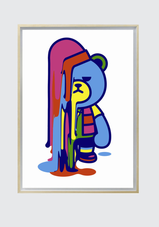
7 STEVENWILSONSTUDIO. (n.d.). Krunk Melt. [online] Available at: https://www.stevenwilsonstudio.com/prints/krunk-melt [Accessed 13 Mar. 2021].
‘Krunk Melts’ is a screen print, made using 3 layers, by Steven Wilson. It includes a bear, with a rather unpleased look on its face, melting away. I really liked this print because of the bright colours and unusual subject matter. Many of Steven Wilson’s work has a huge pop art style to it, and you can definitely see the correlation in this piece. The print uses a lot of bright colours, creating a cartoon style. The bear is outlined with a dark blue rather than a black, softening the piece all together. I feel that this makes the print feel a lot more comforting, compared to creating a stark contrast between the bright colours and a solid black outline. However, this carefree style is contradicted with the expression on the bear’s face. It has a very disapproving look on its face, as opposed to the stereotypical cheery smile cartoons are often given. This changed the feeling of the piece completely. The look on the bear’s face, along with the fact that it is melting, created a more sombre feeling to the print. This is strengthened with the fact that the bear itself is blue, a colour often used to convey sadness. I really liked the contrast this created. The use of bright colours in a piece that feels rather negative confuses the viewer. The art that, at first, seemed so cherry and carefree now has a sense of melancholy that was not initially obvious. I feel that this depth, mixed with the simplicity of the design, created a really interesting and effective print. After closely inspecting the piece, you are almost left not knowing how to feel about it, highlighting how powerful an image it is.
Andy Warhol
Andy Warhol was an American artist who explored a huge selection of media such as: painting, printing and sculpture as well as photography and film. Warhol was best known for his screen prints that explored the relationship between advertisement and celebrity culture. His art boosted him to fame during the 60’s, leading to him being considered a leading artist of the pop art movement with pieces such as, ‘Campbell’s Soup Cans’ and ‘Shot Mrilyns’. 8
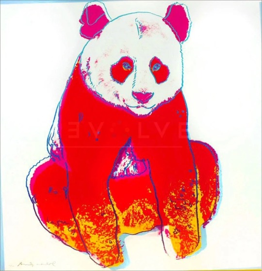
9Revolver Gallery. (n.d.). Giant Panda 295 by Andy Warhol. [online] Available at: https://revolverwarholgallery.com/portfolio/warhol-giant-panda/ [Accessed 13 Mar. 2021].
Giant Panda 295 is a screen print done by Andy Warhol in 1983. The piece was done as a commission by Ron and Freyda Feldman, and was one of ten pieces created inspired by endangered animals. The print included a red panda with a thin blue outline and pink and yellow details. I really liked this piece as I felt it was instantly obvious why it was created. The red and yellow together somewhat mimics a fire, creating a sense of danger and anxiety. The use of a blue outline really helps the piece stand out more, especially against the red. This choice was especially effective in the eyes of the panda. There isn't really much detail, however I feel that this colour choice makes them look a lot more unnatural. The blue against the red really helps the eyes stand out. I feel that this was done to make the view feel like the panda is looking right at them, almost as if the panda is shaming you for not helping. This small detail, along with the intense colour pallet creates a sense of urgency, almost pushing you to help the cause. I think that this was a highly successful piece, managing to capture so much emotion in such a simple print. Even without looking into the background of the piece, you can hazard a good guess as to why it was created. Proving just how powerful a print this is, highlighting Warhol’s talent as a whole.
Screen printing inspires me for many reasons, and I feel that the more artists I research that explore the medium, the more passionate I feel about it. I really love that every artist that uses screen printing does it in their own way, with every artist’s work looking wildly different from each other's. Yet, the use of bright colours and layers ties them all together. I think throughout my journey as a printmaker, I want to experiment with screen printing more, taking into consideration how I can use both colour and layering to enhance my work.
Word count- 1.487
1 Tate (2017). Screenprint – Art Term | Tate. [online] Tate. Available at: https://www.tate.org.uk/art/art-terms/s/screenprint [Accessed 13 Mar. 2021].
2Customplanet.co.uk. (2020). What is Screen Printing? A Step-by-Step Guide to Silk Screen Printing. [online] Available at: https://www.customplanet.co.uk/what-is-screen-printing-step-by-step-i50 [Accessed 13 Mar. 2021].
3www.leicesterprintworkshop.com. (n.d.). A brief history of screenprinting - Leicester Print Workshop. [online] Available at: http://www.leicesterprintworkshop.com/printmaking/screenprinting/a_brief_history_of_screenprinting/#:~:text=A%20brief%20history%20of%20screenprinting.%20Screenprinting%20originated%20in [Accessed 13 Mar. 2021].
4My Modern Met. (2018). 8 Print Artists That Will Inspire You to Try Silk Screen Printing at Home. [online] Available at: https://mymodernmet.com/silk-screen-printing-artists/ [Accessed 13 Mar. 2021].
6STEVENWILSONSTUDIO. (n.d.). About. [online] Available at: https://www.stevenwilsonstudio.com/about [Accessed 13 Mar. 2021].
8Tate (2019). Andy Warhol 1928-1987 | Tate. [online] Tate. Available at: https://www.tate.org.uk/art/artists/andy-warhol-2121 [Accessed 13 Mar. 2021].
2 notes
·
View notes
Video
“Veneno Para Las Hadas” translates as “Poison for the Fairies” which is a Mexican film, and it’s one of the first songs inspired by the time Steven Wilson expend in Mexico City writing and recording for his first solo album Insurgentes. #stevenwilson #stevenwilsonstudio #mexico #venenoparalashadas #insugentes #music #progrock #progressiverock #roadmovie #roadtothealbum #indiemovie #progart #progartist #porcupinetree #gavinharrison #mexicocity (at Nazca) https://www.instagram.com/p/CBEbRH_HHjO/?igshid=ghoaojbs444j
#stevenwilson#stevenwilsonstudio#mexico#venenoparalashadas#insugentes#music#progrock#progressiverock#roadmovie#roadtothealbum#indiemovie#progart#progartist#porcupinetree#gavinharrison#mexicocity
0 notes
Photo

My colourful take on @karllagerfeld ‘s white shirt next to @stevenwilsonstudio ‘s shirt. The exhibition is now on view at Maison Karl Lagerfeld in Paris. #TributetoKarl https://www.instagram.com/p/B24QLrDh6eO/?igshid=s7zg6rmry4gq
0 notes
Photo

"Strike" 🔥 by @stevenwilsonstudio. #StrengthInLetters #Goodtype
10 notes
·
View notes
Photo

Ugly House to Lovely House with @mrgeorgeclarke is back on @Channel4 and we’re excited to see our #unlimitedshop artworks being showcased again in this new series! 👏🏻🥳 In this episode our fab prints by Lucie Sheridan and Steven Wilson are styled in this bold bedroom by @edwinaboase 😍💥 We still have a few of these fab #limitededition prints left in stock if you love them too! 👏🏻 For links online tap on the image or DM us! 😊👍🏻 #uglyhouse @luciesheridan @stevenwilsonstudio @amazingtelly @graemewilliamsonarchitects @landseer_bespokebuild #architecturelovers #designlovers #colourlovers #welovegreatdesign #designforyourhome #channel4 #interiors #interiorstyling #brightboldhome https://ift.tt/2O5HgxM
0 notes
Photo

hello /// 725 aka 168 aka 170617 aka Day 1️⃣ · · · · · Piece by @stevenwilsonstudio via @strutandfibre · #print #pr #🇨🇦 (at Toronto, Ontario)
0 notes
Photo

@runwaymagazines @karllagerfeld Discover Choupette seen by the artist @stevenwilsonstudio for the new exclusive capsule collection. Get yours by clicking the link in the bio👆🏻 #KARLLAGERFELD #runwaymagazineeleonoradegray #runwaymagazines #runwaymagazinenews #eleonoradegray #editorinchief #paris #newyork #losangeles #runwaymagazine
#losangeles#runwaymagazineeleonoradegray#runwaymagazines#eleonoradegray#paris#newyork#runwaymagazine#editorinchief#runwaymagazinenews#karllagerfeld
0 notes
Photo

[ K A R L • L A G E R F E L D ]😎🐱 At tonight's launch of @karllagerfeld 's capsule collection together with @stevenwilsonstudio. Wearing a shirt of the new collection with his cute kitty @choupettesdiary. Thanks for having me @svr.pr and my girl @importantpart.❤ #karllagerfeld #abouttonight #capsulecollection #launch #ootn #outfitofthenight #embroidery #fashionblogger_de #laceciliamunich (hier: Karl Lagerfeld Store)
#capsulecollection#fashionblogger_de#abouttonight#outfitofthenight#karllagerfeld#launch#embroidery#laceciliamunich#ootn
0 notes
Photo

WORDPLAY POSTERS di stevenwilsonstudio A series of posters exploring visual interpretations of 2 word phrases.
0 notes
Photo

'TOTEM' by Steven Wilson Studio, 2020. - @stevenwilsonstudio #stevenwilsonstudio #stevenwilson @breedlondon #breedlondon #totem #typeposter #typedesign #typoster #typetopia #typefacedesign #graphicgang #posterart #grafik #plakate #screenprinted #totempole #typography #showusyourtype #illustrator #illustrationdaily #graphisme #posterunion #vectorart #vectorillustration #bestvector #boldcolors #ukillustrator #illo #graphicindex #postereposter #posterlove (bij Totem) https://www.instagram.com/p/CDZlu1yB2P2/?igshid=1i6alfvgoq9dc
#stevenwilsonstudio#stevenwilson#breedlondon#totem#typeposter#typedesign#typoster#typetopia#typefacedesign#graphicgang#posterart#grafik#plakate#screenprinted#totempole#typography#showusyourtype#illustrator#illustrationdaily#graphisme#posterunion#vectorart#vectorillustration#bestvector#boldcolors#ukillustrator#illo#graphicindex#postereposter#posterlove
0 notes
Photo
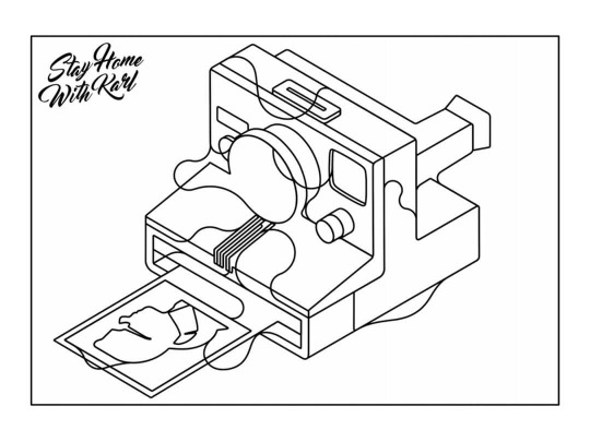
Downloadable drawing by Steve Wilson as part of #STAYHOMEWITHKARL campaign by Karl Lagerfeld, 2020. - @stevenwilsonstudio #stevewilson @karllagerfeld #stayhomewithkarl #karllagerfeld #drawing #karllagerfelddrawing #illustration #illo #illustrationinspiration #illustrazione #illustrator #illustrationoftheday #illustratorsofinstagram #itsnicethat #illustrationdaily #polaroid #stayhome #colourdrawing #polaroidoriginals #polaroids #lineillustration #linedrawing #posterlove #plakat #illustrationhowl #teamkarl #graphicdesign #visualgraphc (bij Karl Lagerfeld) https://www.instagram.com/p/B_CjXPshhXT/?igshid=fwa08j79bmgh
#stayhomewithkarl#stevewilson#karllagerfeld#drawing#karllagerfelddrawing#illustration#illo#illustrationinspiration#illustrazione#illustrator#illustrationoftheday#illustratorsofinstagram#itsnicethat#illustrationdaily#polaroid#stayhome#colourdrawing#polaroidoriginals#polaroids#lineillustration#linedrawing#posterlove#plakat#illustrationhowl#teamkarl#graphicdesign#visualgraphc
0 notes
Video
@runwaymagazines loves 💕 @karllagerfeld The wait is over! #KARLLAGERFELD has teamed up with artist @StevenWilsonstudio for an exclusive and colourful capsule collection. Discover the whole story by clicking the link in the bio👆🏻#runwaymagazinenews #fashiondesigner #communication #eleonoradegray #editorinchief #paris #newyork #losangeles #runwaymagazine
#paris#eleonoradegray#runwaymagazine#losangeles#fashiondesigner#newyork#runwaymagazinenews#communication#editorinchief#karllagerfeld
0 notes