#sticky navigation html css
Explore tagged Tumblr posts
Visit Tumblr Blog
Explore Tumblr blogs with no restrictions, modern design and the best experience.
Last Seen Tumblr Blogs


Fun Fact
The most popular pages on Tumblr are about Minecraft, GIFs, and David J. Peterson.
Text

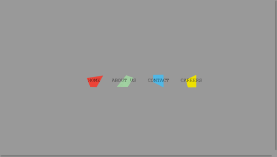
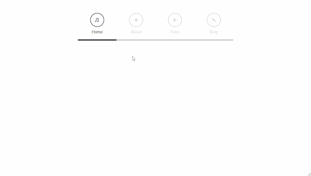
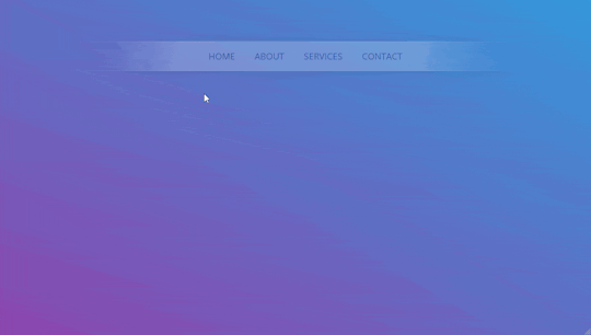
Sticky Navigation Bar on Scroll CSS
#sticky navbar on scroll#sticky navbar#sticky header#sticky navigation html css#sticky menu html css#html css#codingflicks#frontend#learn to code#webdesign#css#html#code#css3#css menu
0 notes
Text

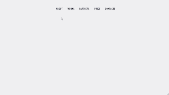
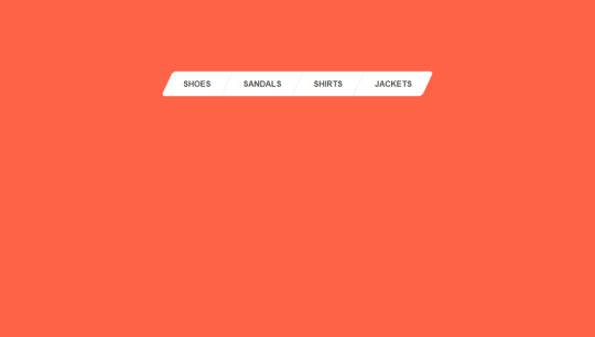
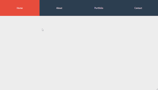
Sticky Navigation Menu
#sticky navigation menu#sticky navbar#codenewbies#html css#html5 css3#css animation examples#webdesign#css#code#html css menu#css menu
5 notes
·
View notes
Note
You're more amazing than lineart
You're more amazing than tag blocking
#fa added tag blocking yesterday!#but only for the modern theme...#which would be fine if the modern theme didn't have a bunch of little annoyances#navigation bars that follow you when you scroll down are the devil#like fuck off! stop following me! if i want to use you then i'll just scroll up it's not that hard#they're called sticky navbars or fixed navbars#i actually messed around with the html and css and found the part that makes it sticky and turned it off#but making a whole browser extension just to make modern theme slightly less bad isn't worth it#other Various Annoyances: the giant raccoon art at the top of every page that pushes the rest of the page down#the submission titles don't turn blue after you've clicked on them so you can't tell which pics you've already clicked#the minigallery on submission pages is awful because they copied deviantart's layout which was not designed for a minigallery#the minigallery thumbnails are cropped more than they need to be which i think might be just straight-up a mistake#also there's a really easy way they could've partially implemented keyword blocking. REALLY easy#the search feature already has a method to exclude results that contain a certain keyword(s)#so just let users make a list of blocked keywords and then alter all their searches to use that method to exclude the keywords#literally just add “-(@keywords blocked_keyword_example)” for each keyword. just take the search string and append that. easy#it'd only work on searches but it would've been so fucking easy but that's irrelevant now#ka asks
1 note
·
View note
Text
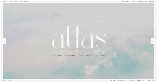
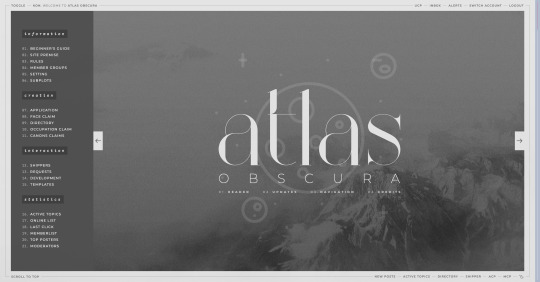
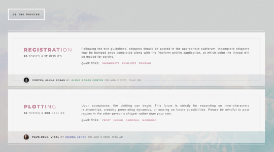
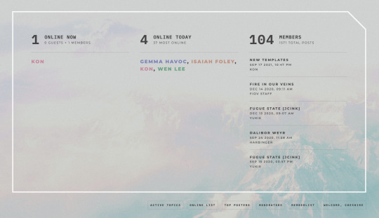
ATLAS OBSCURA (60$)
ATLAS OBSCURA is a fully flex skin optimized for Chrome but has been adjusted for compatibility across Firefox and Safari. A low contrast, dark background is recommended. A live preview can be requested at any time through my support discord. PURCHASE HERE: https://ko-fi[DOT]com/s/740013f3a4 WEBPAGES HERE: https://ko-fi[DOT]com/s/07654e42a0 TEMPLATES: https://ko-fi[DOT]com/s/020489ee5a
Includes:
light/dark toggle sidebar that auto transitions to a module for mobile custom forums, topics, memberlist, posts (optional larger post avatar with sticky) tabbed, popup application profile member group colors set up across the skin css variables set up for images, fonts, and colors for ease of editing guest to member links on login for easy navigation various indicators for messages/alerts customized tooltips tabbed header basic post template with all basic styles (bold, italics, h1 through h7, blockquote, hr, lists, etc)
Files:
full xml file html templates xml file easy to import field set json file general installation guide pdf skin specific instructions with member group prefix/suffix codes and user fields
Policies:
credit must remain intact and unchanged you may not claim my codes as your own at any point, nor may they be used as a base for other projects I offer unlimited support for bugs present at purchase
Please review the rest of my my policies prior to making any purchases: koncodes[DOT]tumblr.com/policies For questions or a live preview, you can contact me through ko-fi or my support discord: discord[DOT]gg/MXD5nDgDzq
153 notes
·
View notes
Text
My Neocities!
I'd like to introduce my Neocities page, which I've been building with HTML/CSS.
The splash page features two doors that open when you hover over them, which lead to my other pages. I animated the doors using the CSS "transform" property.
I recently updated this to make it look more like a 3d building, using box-shadow and transform: skewX :)

Then in the Cat Clubhouse, you will find a drag n drop game in which you position cute kitties into a bedroom! (Let me know if you try it out!!!)
The drag n drop function doesn't work on touch screens, unfortunately. I may have to find a clever alternative for non-desktop use.
Upcoming tasks:
Creating a sticky sidebar for site navigation. I don't know why I've been struggling so much with this, but whether using flexbox or relative/absolute positioning, I've been struggling to position things with the spacing and centering I want, and to also make it responsive to smaller screens.
Adding a guestbook using ayano's neocities comment widget (so excited to try this out!)
Uploading my first tribute page. I've been working on something fun and cheeky, and I'll update here with progress!
An About Me page.
Feel free to add me on Neocities [https://neocities.org/site/clubjessica] and I'll check out your site too!
42 notes
·
View notes
Text
Custom Shopify Theme Development: Building E-Commerce That Matches Your Brand
In today's fast-paced online world, getting out isn't an option; it's essential. It's important to consider that your Shopify store's design isn't only about aesthetics, but also about attracting the attention of customers, building trust, and generating conversions. This is where custom Shopify theme development can be a significant game changer.

Instead of using generic templates that are pre-made, custom theme development provides your store a design that is a reflection of your brand. Pixel by pixel after click.
What is Custom Shopify Theme Development?
The customization process for Shopify theme development is the process of creating and programming a custom-made design for the Shopify store. Instead of using pre-designed themes that are available from Shopify's Theme Store Shopify Theme Store, a custom theme is created from scratch or extensively customized to meet your company's particular needs. Control as well as creativity and conversion.
Control creative thinking, control, and conversion.
Why Go Custom? (Top Benefits)
1. Total Branding Control
With a custom theme, every part of your store—colors, layout, buttons, typography—is designed to reflect your brand identity, not someone else’s.
2. Optimized for Conversions
Standard themes are built for everyone. Custom themes are built for your customers, optimized to guide them smoothly from product discovery to checkout.
3. Blazing Fast Performance
A custom-built theme contains only the code you need, which speeds up loading times, enhances user experience, and boosts SEO rankings.
4. Mobile-First and UX-Centered
Modern custom themes are crafted with a mobile-first approach, ensuring seamless navigation, fast interaction, and high conversions on smartphones and tablets.
5. Flexibility for Scaling
Need to integrate advanced features, unique product pages, or third-party APIs? A custom theme makes that possible without performance bottlenecks.
Key Components of a Custom Shopify Theme
1. Homepage Layout
A fully customized homepage designed to hook visitors, introduce your brand, highlight bestsellers, and drive them deeper into the store.
2. Custom Product Pages
Built with tailored layouts to emphasize features, benefits, social proof (like reviews), and dynamic upselling sections.
3. Collection Filters & Sorting
Smart, user-friendly filtering systems that help customers find what they need in seconds.
4. Optimized Cart & Checkout Flow
A streamlined path from browsing to purchase, minimizing abandoned carts.
5. Advanced Navigation Menus
Mega menus, sticky headers, or mobile accordion menus—built your way to ensure ease of use.
The Custom Theme Development Process (Step-by-Step)
Step 1: Discovery & Strategy
Understand your brand, target audience, and store goals. This phase includes competitor analysis and planning site architecture.
Step 2: Wireframes & Design Mockups
UX/UI designers create mockups of key pages using tools like Figma or Adobe XD.
Step 3: Theme Coding & Development
Developers write clean, responsive Liquid code (Shopify’s templating language), combined with HTML, CSS, JavaScript, and JSON.
Step 4: App & Feature Integration
Add custom functionalities such as wishlists, subscription options, multilingual support, or personalized recommendations.
Step 5: Testing & QA
Extensive testing across devices and browsers for bugs, loading speed, and user experience.
Step 6: Launch & Optimization
Once approved, the theme is published. Post-launch optimization includes SEO tuning, analytics setup, and A/B testing.
Tools & Technologies Used
Shopify Liquid—Shopify’s templating language
HTML5/CSS3—for structure and styling
JavaScript/jQuery—for dynamic elements
JSON—for theme settings
Git—for version control
Figma/Sketch/Adobe—For UI/UX design
Shopify CLI—For local theme development and deployment
Custom vs. Pre-Built Theme: What's Better?
Feature Pre-Built Theme Custom Theme: Low upfront cost Higher, one-time investment Branding Limited customization 100% brand-aligned Performance May include excess code Clean, lightweight code Scalability Less flexible Easily scalable and extendable Support & Maintenance Generic support Tailored to your setup
If your business is growing and you want to leave a lasting impression, custom is the way to go.
Who Should Invest in Custom Shopify Theme Development?
Established brands needing a strong digital presence.
Niche businesses with complex product requirements.
Startups aiming to disrupt with a bold brand identity.
Agencies and designers building Shopify solutions for clients.
SEO & Performance Optimization in Custom Themes
A professionally developed custom theme isn’t just beautiful—it’s also built to rank high and convert visitors.
Fast load speeds
Structured schema markup
Custom meta tags & SEO-friendly URLs
Optimized image formats
Mobile-first responsive layouts
Lightweight code for better Core Web Vitals
Final Thoughts: Is Custom Shopify Theme Development Worth It?
If you're committed to your e-commerce, buying the custom Shopify theme is among the best decisions you could make. It provides you with a distinct advantage in a competitive marketplace, builds brand equity over time, and gives users an experience that converts.
Rather than trying to fit into a cookie-cutter template, custom theme development lets your brand shine in its own unique light exactly the way it should.
0 notes
Text
8 CSS & JavaScript Snippets for Creating Sticky Elements — Speckyboy
New Post has been published on https://thedigitalinsider.com/8-css-javascript-snippets-for-creating-sticky-elements-speckyboy/
8 CSS & JavaScript Snippets for Creating Sticky Elements — Speckyboy
Modern websites often feature extensive scrolling. Long pages are common on desktop devices, but are even more frequent on mobile screens. The practice creates usability challenges for tasks like navigation and referencing important information.
That’s where “sticky” design elements come in handy. They allow users to scroll without losing access to your site’s menu. You can also use them to keep ads in view, attach social media sharing buttons to the viewport, or create fun special effects.
Implementing a sticky element can be simple, as CSS has a dedicated position property for this function. JavaScript can be used for building more robust features. As usual, there are several methods to achieve your goals.
We searched the CodePen archives to find interesting examples of sticky elements in use. Below, you’ll find various options that enhance the user experience. So, get stuck in your easy chair and be inspired by these code snippets!
Pure CSS Header Animation to Sticky Navigation
Created by Amit
Sticky headers are among the most popular use cases. On Chromium browsers, this snippet uses CSS to transform a tall and narrow header into a full-screen bar upon scrolling. Unsupported browsers receive a narrower, taller, sticky header. Keyframe animation is used to create smooth transitions. The feature is useful, lightweight, and attractive.
See the Pen Pure CSS header animation to sticky nav by Amit
Sticky Responsive Sidebar Navigation
Created by Areal Alien
Sidebar navigation can also take advantage of staying put during scrolling. Hovering over the sidebar expands the navigation to include text labels – it works on mobile too. However, you might also reserve this concept for large screens and use the traditional “hamburger” menu for mobile.
See the Pen Sticky responsive sidenav by Areal Alien
CSS Sticky Table Header & Column
Created by Mike Golus
Long HTML tables can be a pain to read. You have to memorize the column headers to understand the context. Sticky headers make even the busiest tables easier to read. Using position:sticky (and a few other tricks) on the first row and column enables scrolling without losing sight of key information. The examples in this Pen demonstrate how it’s done.
See the Pen CSS Sticky Table Header and Column by Mike Golus
Long Scroll Sticky Sections
Created by Burmese Potato
Here’s a unique way to denote the various sections of a long page. Scroll down the page, and the episode number (displayed in the left column) sticks until you reach the end of the section. The snippet combines sticky positioning with the calc() property on the container’s height to keep the number in view. This little bit of CSS adds a nice touch to the user experience.
See the Pen Pretty Sticky by Burmese Potato
Just Another Sticky Section Layout
Created by Misala
Sticky design elements can also be used to show off product features. Scroll down this page and watch as featured text and videos change. The layout occupies the entire screen viewport and is responsive for mobile devices. It’s a high-end feature sure to capture a user’s attention.
See the Pen just another sticky section layout by misala
Multi-Navigation Sticky Bars & Layout
Created by Den
This snippet asks the question: What if you have more than one navigation bar? The first bar is sticky by default. Scroll past a few sections, and a second sub-navigation bar lines up underneath. That second bar also features a neat frosted glass look as content scrolls underneath.
See the Pen Sticky layout + filters #2024 by Den
Sticky Video with CSS @container scroll-state()
Created by Jhey
We’re seeing more websites implement sticky videos, where the presentation sticks to the bottom corner upon scrolling. It allows users to view the rest of your content without losing sight of the video. Here, CSS container queries are used to reposition the video player. Use the included config panel to see how different settings impact the animation effects.
See the Pen CSS @container scroll-state() faux PiP video by Jhey
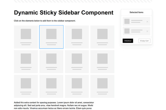
Dynamic Sticky Sidebar Component
Created by Ryan Mulligan
Features like shopping carts are a perfect fit for sticky sidebars. The UI makes it easier for shoppers to keep track of their cart and, most importantly, finish their purchase. This sidebar widget keeps track of cart contents and sticks to the screen while you scroll in the page content area.
See the Pen Dynamic Sticky Sidebar Component by Ryan Mulligan
Stick With What Works in Your Designs
We may think of sticky elements as being used for site headers and navigation. However, the examples above show that they can do much more. There are so many creative possibilities for informing and entertaining users.
What’s more, CSS can do a lot of the heavy lifting for you. Several snippets in this collection don’t require a single line of JavaScript. Still, it’s nice to know you can add some DOM manipulation when needed.
We hope this collection sparked your imagination! Check out our CodePen collection for even more sticky snippets.
Related Topics
Written by Eric Karkovack
Eric Karkovack is a web designer and WordPress expert with over two decades of experience. You can visit his business site here. He recently started a writing service for WordPress products: WP Product Writeup. He also has an opinion on just about every subject. You can follow his rants on Bluesky @karks.com.
Read more articles by Eric Karkovack
#2024#ADD#alien#amp#animation#Articles#attention#Building#Business#buttons#Capture#change#chromium#code#container#content#CSS#CSS Layout Snippets#CSS Snippets#Design#desktop#devices#easy#effects#Featured#Features#Filters#Full#glass#hamburger
0 notes
Text
How To Improve Conversion Rates with Effective Web Design and Development

The Secret Sauce to High Converting Websites
Your website isn’t just a digital placeholder – it’s a powerhouse that can transform visitors into loyal customers. In today’s competitive digital landscape, a well-designed and intelligently developed website can make all the difference between a casual browser and a committed buyer.
So, what’s the secret sauce? Strategic Web Design + Intelligent Development + Data-Driven Digital Marketing. Let’s dive into how these elements combine to amplify your conversions!
1. First Impressions Matter – Design for Impact
A Beautiful Website that Converts, Not Just Impress
Your website has 0.05 seconds to make an impression. That’s right, before your visitor even blinks, they’ve judged your business. A sleek, professional design with a seamless user experience keeps them engaged.
What defines a High Converting Web Design?
Minimalist, Clean Layouts – Cluttered pages confuse users. Keep it sleek, modern, and focused.
Brand Consistency – Your colours, fonts, and visuals should tell your brand story instantly.
Visual Hierarchy – Direct attention to what matters most (CTAs, value propositions, trust signals).
Mobile Responsiveness – 60%+ of traffic comes from mobile. A mobile-friendly site isn’t optional—it’s mandatory.
Fast Load Speeds – A 1-second delay can drop conversions by 7%. Optimize those images, scripts, and servers!
2. User Experience (UX) & Navigation – Make it Effortless
If Users Struggle, They Leave
Your website’s UX isn’t just about looking good, it’s about feeling right. A well-structured, intuitive website makes visitors stay, explore, and act.
Key UX principles to Boost Conversions
Logical Navigation – The fewer clicks, the better. Guide users naturally to their destination.
Sticky CTAs – Keep your calls-to-action (CTAs) visible and irresistible.
Interactive Elements – Engaging micro-interactions, animations, and scroll effects make users linger.
Trust Signals – Add testimonials, client logos, security badges, and trust-building content.
Personalization – Tailor content and recommendations based on user behaviour.
3. Speed & Performance – Faster = More Sales
A Slow Website is a Dead Website
Your visitors have zero patience for a slow-loading site. Google’s research confirms that 53% of users abandon a site that takes longer than 3 seconds to load.
Speed Optimization Hacks
Optimize images (use WebP format for smaller file sizes).
Minify CSS, JavaScript & HTML (less clutter = faster loading).
Use CDNs (Content Delivery Networks) to distribute content efficiently.
Implement lazy loading for images and videos.
Choose a high-performance hosting provider.
4. High Impact Call – To – Actions (CTAs) - Guide Users to Convert
Without a Strong CTA, Your Website is Just a Digital Billboard
If your visitors don’t know what to do next, they’ll leave. Make your Call-to-Actions (CTAs) impossible to ignore.
Characteristics of High Converting CTAs
Clear & Action-Oriented – “Get Started Now” > “Learn More”
Contrasting Colours – Make CTAs pop against the background.
Strategic Placement – Above the fold, within content, and at the bottom.
Urgency & Scarcity – “Limited Spots Left!” or “Offer Ends Soon!” work wonders.
5. Content that Engages & Sells – The Power of Words
A Stunning Design without Compelling Copy is a Lost Opportunity
Your website’s content should resonate with visitors, build trust, and convince them to take action.
Content Strategies to Elevate Conversions
Value-Driven Headlines – Speak directly to your audience’s pain points & desires.
Persuasive Product Descriptions – Focus on benefits, not just features.
SEO-Optimized Content – Blend keywords naturally (Website Development, Digital Marketing Company, Web Design Services) for organic ranking.
Storytelling – People connect with narratives, not robotic text.
Video Content – Boost engagement with explainer videos, testimonials, and product demos.
6. SEO & Digital Marketing – Get Found, Get Clicks, Get Sales
What’s the Use of a Stunning Website if No One See it?
Even the best website needs SEO & digital marketing to drive traffic and conversions.
SEO Essentials:
Keyword optimization (Website Development Company, Digital Marketing, UI/UX Design, etc.)
On-page SEO (meta titles, descriptions, H1-H6 structures, internal linking)
High-quality backlinks & authority building
Local SEO for region-specific businesses
Technical SEO (XML sitemaps, schema markup, mobile optimization)
7. The Psychology of Conversions – Tapping into Buyer Behaviour
Emotions Drive Sales. Leverage Psychology for Higher Conversions
Scarcity & Urgency – “Only 3 Left in Stock” triggers action.
Social Proof – Testimonials, case studies, and reviews boost trust.
Fear of Missing Out (FOMO) – Flash sales & exclusive offers create urgency.
Reciprocity – Free trials, guides, and bonuses encourage conversions.
Whether you’re a small business or a large enterprise, speed optimization should be a priority if you want to stay ahead of competitors. A website development company can help you assess your current site’s speed performance and implement improvements to give your business the advantage it needs.
Conclusion – Your Website is your Best Salesperson
A well-crafted website isn’t just a business expense, it’s an investment in conversions, sales, and brand growth. By combining high-impact web design, seamless development, and strategic digital marketing, you create a conversion machine that works 24/7.
Ready to transform your website into a conversion magnet? Let’s make it happen!
0 notes
Text
Best Practices for Optimizing Your Website for Mobile
Is Your Website Mobile-Ready? Discover the Best Practices to Optimize for Mobile!
In today’s fast-paced digital world, ensuring a smooth mobile experience isn’t just an option—it’s essential. With more users than ever accessing the web via smartphones and tablets, a mobile-optimized website can be the key to higher engagement, improved SEO, and increased conversions. At osumare marketing solutions, we’re dedicated to empowering businesses to thrive online by delivering exceptional digital experiences.
Here are some quick tips to make your site mobile-friendly:
✅ Responsive Design: Ensure your website automatically adapts to various screen sizes. A responsive design not only improves user experience but also streamlines maintenance by eliminating the need for separate mobile sites.
✅ Boost Page Speed: Mobile users demand fast-loading pages. Optimize images (using modern formats like WebP), minify code (HTML, CSS, JavaScript), and utilize browser caching and CDNs to reduce load times.
✅ Enhance Mobile Navigation: Keep menus simple and intuitive. Use touch-friendly buttons, maintain clear call-to-actions, and consider sticky navigation to provide users with quick access to key information.
✅ Optimize Readability: Break up long paragraphs with subheadings and bullet points. Choose fonts that are easy to read on small screens and ensure sufficient contrast between text and background.
✅ Implement Mobile SEO: With Google’s mobile-first indexing, your mobile site should contain all vital content and metadata. Incorporate structured data and local SEO strategies to boost your rankings and attract local customers.
At osumare marketing solutions, we go beyond mobile optimization to offer comprehensive digital strategies that drive real business growth. Whether you’re refining your website’s mobile performance or launching a full-scale digital marketing campaign, our team is here to help.
For those looking to elevate their digital presence, check out our digital marketing agency in Ahmedabad. We’re proud to be recognized as one of the Best digital digital marketing agencies in ahmedabad, one of the Top digital marketing agencies in ahmedabad, and even one of the Top 10 digital marketing agencies in ahmedabad. Our expertise has also earned us the titles of Best digital marketing agency of ahmedabad, Top digital marketing agency of ahmedabad, Best digital marketing agency in ahmedabad, and Top digital marketing agency in ahmedabad.
Ready to boost your mobile performance and digital presence? Visit ahmedabad.osumare.com and connect with us today. Let’s make your digital journey seamless and successful!
#MobileOptimization #DigitalMarketing #SEO #WebDesign #ResponsiveDesign #DigitalStrategy #OsumareMarketingSolutions
0 notes
Text
Tips and Tricks for Designing a Professional-Looking Website

Are you dreaming of a career in web designing? Creating a stunning website is a key skill you'll need to master. Whether you're just starting or looking to improve your skills, these tips and tricks will help you design beautiful, user-friendly websites. Plus, we'll mention some helpful resources for web designing courses in Yamuna Vihar.
Understanding the Basics
Before diving into the tips and tricks, it's important to understand the basics of web designing. This includes knowledge of HTML, CSS, and JavaScript, which are the building blocks of any website. If you're new to these, consider enrolling in web designing classes in Yamuna Vihar or looking for a web designing coaching center in Uttam Nagar. These courses will give you a strong foundation.
Tip 1: Keep It Simple
One of the most important tips for creating a stunning website is to keep it simple. Overloading your website with too many elements can confuse visitors. Focus on a clean, straightforward design that highlights your content. Use plenty of white space to make your site look neat and organized.
Tip 2: Use High-Quality Images
Images can make or break a website. High-quality images can make your site look professional and appealing. Be sure to use images that are relevant to your content and of high resolution. You can find free high-quality images on websites like Unsplash or Pexels.
Tip 3: Make It Mobile-Friendly
With more people accessing websites on their mobile devices, it's crucial to design a site that's mobile-friendly. This means your website should look good and work well on smartphones and tablets. Use responsive design techniques to ensure your site adapts to different screen sizes.
Tip 4: Optimize for Speed
A slow website can frustrate visitors and make them leave. To keep your site fast, optimize images, use efficient coding practices, and choose a reliable hosting provider. Speed is not only important for user experience but also for SEO (Search Engine Optimization).
Tip 5: Focus on Navigation
Good navigation is essential for a positive user experience. Make sure your menu is easy to find and use. Organize your content in a logical manner so visitors can easily find what they're looking for. Consider using a sticky menu that stays at the top of the page as users scroll down.
Tip 6: Pay Attention to Typography
Typography plays a crucial role in web design. Choose fonts that are easy to read and match the overall style of your site. Avoid using too many different fonts, as this can make your site look messy. Stick to a maximum of two or three complementary fonts.
Tip 7: Include Call-to-Actions (CTAs)
Encourage your visitors to take action by including CTAs. Whether it’s signing up for a newsletter, enrolling in web designing classes in Yamuna Vihar , clear CTAs can guide your visitors on what to do next.
Tip 8: Test Your Design
Before launching your website, make sure to test it thoroughly. Check how it looks and functions on different devices and browsers. Ask friends or classmates to give feedback. Testing helps you catch any issues and ensures a smooth user experience.
Final Thoughts
Creating a stunning website takes practice and patience. By following these tips and tricks, you'll be well on your way to becoming a skilled web designer. If you're serious about a career in web designing, consider enrolling web designing training in Uttam Nagar. These classes can provide you with the knowledge and hands-on experience you need to succeed.
Remember, web designing is a dynamic field that's constantly evolving. Stay curious, keep learning, and never be afraid to experiment with new ideas. Good luck on your journey to becoming a web design expert!
0 notes
Text
How to Optimize Webflow Sites for Mobile Users

In today’s digital age, mobile optimization is critical for any website aiming to capture a broad audience. As mobile traffic continues to surpass desktop usage, ensuring your Webflow site is optimized for mobile users is paramount. Here, we delve into comprehensive strategies to enhance the mobile experience on your Webflow site, driving user engagement and improving your search engine rankings.
Understanding Mobile Optimization
Mobile optimization involves tailoring your website to ensure it functions smoothly on mobile devices. This includes adjusting the site's design, layout, content, and features to enhance user experience on smaller screens. With Google prioritizing mobile-first indexing, mobile optimization directly impacts your site’s SEO performance.
Responsive Design: The Foundation of Mobile Optimization
Flexible Grids and Layouts
Webflow's flexible grid system allows for dynamic content adjustment based on screen size. Utilize this feature to ensure your layout seamlessly transitions across different devices. By employing fluid grids, you maintain consistent design aesthetics and functionality, regardless of the device used.
Viewport Meta Tag
Implementing the viewport meta tag in your HTML is crucial. This tag instructs browsers on how to adjust and scale content. The basic meta viewport tag looks like this:
html
Copy code
<meta name="viewport" content="width=device-width, initial-scale=1.0">
This ensures your site scales correctly on all mobile devices, providing a user-friendly experience.
Optimizing Images for Mobile
Use Responsive Images
Large, unoptimized images can drastically slow down your mobile site. Webflow allows you to use responsive images that automatically adjust size based on the user’s device. Ensure your images are:
Compressed: Use tools like TinyPNG or Webflow’s built-in image optimization.
Responsive: Enable Webflow’s responsive image feature to serve appropriately sized images.
Lazy Loading
Implement lazy loading to defer loading off-screen images until the user scrolls to them. This reduces initial page load time, enhancing mobile performance.
Enhancing Mobile Navigation
Simplified Menu Design
Mobile users benefit from a simplified navigation menu. Consider using a hamburger menu to condense navigation options, making it easier for users to explore your site. Ensure that:
Menus are easy to access: The hamburger icon should be clearly visible and accessible.
Links are finger-friendly: Touch targets should be large enough to prevent misclicks.
Sticky Navigation
A sticky navigation bar can improve user experience by keeping essential links accessible as users scroll. Webflow’s interactions feature can help you create a smooth, sticky navigation bar that enhances usability.
Prioritizing Page Speed
Minimize HTTP Requests
You may speed up your website by lowering the amount of HTTP requests.Combine files where possible, minimize redirects, and leverage browser caching to ensure faster loading times.
Enable Compression
Reduce the size of HTML, CSS, and JavaScript files by using Gzip compression.This minimizes the amount of data transferred over the network, speeding up load times for mobile users.
Optimize CSS and JavaScript
Place critical CSS in the head of your HTML document to ensure it loads quickly. Defer non-critical JavaScript until after the main content has loaded to prevent render-blocking.
User Experience and Accessibility
Touch-Friendly Design
Design with touch interaction in mind. Make sure the links and buttons can be readily tapped by being big enough.Avoid elements that are too close together to prevent misclicks.
Readable Text Sizes
Ensure text sizes are legible on smaller screens. Webflow allows you to set relative units like em or rem, which adjust based on screen size, ensuring readability across devices.
Accessible Design
Implement accessible design practices to ensure your site is usable by everyone, including those with disabilities. Use proper HTML tags, ARIA labels, and ensure sufficient color contrast.
Leveraging Webflow’s Features for Mobile Optimization
Mobile Breakpoints
Webflow allows you to customize your design for different screen sizes using mobile breakpoints. This enables you to create unique layouts and styles tailored specifically for mobile devices.
Interactions and Animations
While animations can enhance user experience, they should be used sparingly on mobile devices to avoid performance issues. Optimize Webflow interactions to be lightweight and ensure they do not hinder page load times.
Testing and Monitoring Mobile Performance
Google Mobile-Friendly Test
Regularly use the Google Mobile-Friendly Test to identify and rectify issues. This tool provides insights into your site’s mobile usability, helping you pinpoint areas for improvement.
Analytics and User Feedback
Utilize Google Analytics to track mobile user behavior. Analyze metrics such as bounce rate, session duration, and page views to understand how mobile users interact with your site. Additionally, gather user feedback to identify pain points and areas for enhancement.
Conclusion
Optimizing your Webflow site for mobile users is not just an option; it's a necessity. By focusing on responsive design, optimizing images, enhancing navigation, prioritizing page speed, and ensuring a top-notch user experience, you can create a mobile-friendly site that stands out. Regularly test and refine your site to maintain its performance and keep up with evolving mobile standards.
Website:-
#Webflow#MobileOptimization#ResponsiveDesign#SEOTips#WebDesign#MobileFirst#UserExperience#PageSpeed#ResponsiveImages#WebDevelopment#DigitalMarketing#MobileFriendly#WebsiteOptimization#WebPerformance#MobileNavigation#WebAccessibility#GoogleSEO#WebflowTemplates#MobileUserExperience#WebDesignTrends
0 notes
Text

Sticky Navigation Menu with Scroll Animation
#sticky navbar html css js#sticky navbar on scroll#sticky navbar#html css#codingflicks#learn to code#code#frontend#css#html#css3#frontenddevelopment#sticky menu html css#animated sticky navbar#sticky navigation html css
0 notes
Text
100+ Navigation Bar HTML and CSS (Free Demo +Source Code)
Navigation Bar Using HTML and CSS
Hello Developers! Welcome to Codewithrandom with another informative blog. Today we’ll see how to make a Navigation Bar with Source Code. Here is the Latest Collection of free Navigation Bar codes in HTML and CSS. This is the Updated Collection of April 2023 with 36 New Navbar Source codes added.
What is a navigation bar?
A Navigation bar or a side menu is an integral part of any website, used for quick navigation links, a search bar, login/signup links, company logos, etc. Without a Navbar, any website looks incomplete.
Here we’ll show you how to create a Simple Navigation Bar In HTML and CSS with 100+ examples.
Related article — 100+ HTML, CSS, and JavaScript Projects With Source Code ( Beginners to Advanced)
Restaurant Website Using HTML And CSS With Source Code
Let’s see some cool Navigation bars in HTML and CSS.
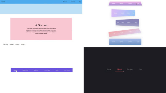
1. Responsive Side Navigation Bar
Let’s start our list with a simple, light-themed left-sided navigation bar. Only navigation bar icons are visible on load but on clicking the hamburger icon side bar expands.
2. Bootstrap Navigation Bar
Simple and responsive navigation bar. This one is on top with several different categories and also a search bar. Additionally, it also has a login and signup button.
How To Build Interest Calculator Using JavaScript
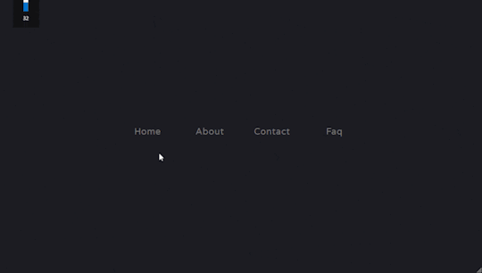
3. Transparent Navigation
This is a very well made Navigation bar by Manas Yadav, when you click a navigation bar button it auto scrolls to its location on the page. Can be used for homepages.
4. Sticky Slider Navigation (Responsive)
Another navigation bar auto-scrolls but this one is even better with more satisfying animations and design.
5. Navigation bar design
A navigation bar with a gradient in its background with a cool gradient and blinking effect on hover.
That’s it, folks. In this article, we shared the Navigation Bar In HTML And CSS Source Code with cool and different designs. We covered everything from simple and minimal Navigation bars to bars with auto scrolls, cool transitions, and even 3D icons. Hope you liked this article. Share this with your fellow developers. Comment down below with your thoughts and suggestions
See our other articles on Codewithrandom and gain knowledge in Front-End Development.
Thank you
read full article and get complete source code
1 note
·
View note
Text
Explore 15+ CSS Horizontal Navigation Menus
Welcome to CSS Monster, your premier destination for exploring 15+ CSS horizontal menus! In this comprehensive article, we've meticulously curated a collection of free HTML and CSS code examples for horizontal menus, meticulously sourced from respected platforms such as CodePen, GitHub, and other reliable resources. Horizontal menus are a favored choice for displaying navigation options prominently across the top of websites or applications. Our collection goes beyond the conventional, showcasing a diverse array of horizontal menu styles, including dropdown menus, mega menus, and more. This variety ensures that you'll discover the perfect design to elevate your project's navigation. With our latest update in August 2023, we're excited to introduce 2 new items to our collection, reflecting the cutting-edge trends in horizontal menu design. Whether you're a seasoned web developer, a designer seeking inspiration, or someone looking to enhance your website's navigation, these customizable code examples stand as a valuable resource. Dive into our hand-picked selection and witness the stunning diversity of horizontal menu designs that can truly enhance your user experience. Feel free to explore the latest trends, experiment with customization, and seamlessly integrate these code examples into your projects. Our collection is designed to cater to your needs, offering a blend of functionality and aesthetics. Embark on this journey to discover and implement captivating horizontal menu designs, and let your coding endeavors bring a new level of sophistication to your projects. Happy coding! Author seto89 March 4, 2019 Just Get The Demo Link How To Download - Article How To Download - Video Author HTML / CSS PURE CSS MAGIC LINE NAVBAR Compatible browsers: Chrome, Edge (partial), Firefox, Opera, Safari Responsive: yes Dependencies: - Author tris timb February 7, 2019 Just Get The Demo Link How To Download - Article How To Download - Video Author HTML / CSS (SCSS) POSITION STICKY SUBNAV Compatible browsers: Chrome, Edge (partial), Firefox, Opera, Safari Responsive: yes Dependencies: - Author Mehmet Burak Erman June 3, 2018 Just Get The Demo Link How To Download - Article How To Download - Video Author HTML (Pug) / CSS (Stylus) PERSPECTIVE MENUS Compatible browsers: Chrome, Edge (partial), Firefox, Opera, Safari Responsive: yes Dependencies: - Author Stas Melnikov March 5, 2018 Just Get The Demo Link How To Download - Article How To Download - Video Author HTML / CSS HOVER EFFECT FOR HORIZONTAL MENU Compatible browsers: Chrome, Edge (partial), Firefox, Opera, Safari Responsive: yes Dependencies: -
Author Mehmet Burak Erman December 18, 2017 Just Get The Demo Link How To Download - Article How To Download - Video Author HTML / CSS (SCSS) MENU HOVER LINE EFFECT Compatible browsers: Chrome, Edge (partial), Firefox, Opera, Safari Responsive: yes Dependencies: -
Author Charlie Marcotte September 5, 2017 Just Get The Demo Link How To Download - Article How To Download - Video Author HTML (Pug) / CSS (Sass) CSS HORIZONTAL MENU Compatible browsers: Chrome, Edge (partial), Firefox, Opera, Safari Responsive: yes Dependencies: -
Author Artyom June 23, 2017 Just Get The Demo Link How To Download - Article How To Download - Video Author HTML / CSS (SCSS) STRIKETHROUGH HOVER EFFECT FOR MENU Compatible browsers: Chrome, Edge (partial), Firefox, Opera, Safari Responsive: yes Dependencies: -
Author Irvine Potok February 22, 2017 Just Get The Demo Link How To Download - Article How To Download - Video Author HTML / CSS LAVALAMP CSS MENU Compatible browsers: Chrome, Edge (partial), Firefox, Opera, Safari Responsive: yes Dependencies: -
Author Marco Biedermann June 16, 2016 Just Get The Demo Link How To Download - Article How To Download - Video Author HTML / CSS (PostCSS) HORIZONTAL ICON NAVIGATION Compatible browsers: Chrome, Edge (partial), Firefox, Opera, Safari Responsive: yes Dependencies: -
Author Aaron Benjamin April 30, 2015 Just Get The Demo Link How To Download - Article How To Download - Video Author HTML / CSS SLIDE HORIZONTAL MENU Compatible browsers: Chrome, Edge (partial), Firefox, Opera, Safari Responsive: yes Dependencies: -
Author Claudio Holanda March 7, 2015 Just Get The Demo Link How To Download - Article How To Download - Video Author HTML / CSS (Less) SKEWED MENU IN HTML AND CSS Compatible browsers: Chrome, Edge (partial), Firefox, Opera, Safari Responsive: yes Dependencies: -
Author Dominik Biedebach January 19, 2015 Just Get The Demo Link How To Download - Article How To Download - Video Author HTML / CSS HORIZONTAL NAVIGATION EFFECTS Compatible browsers: Chrome, Edge (partial), Firefox, Opera, Safari Responsive: yes Dependencies: -
Author Karim Balaa January 6, 2015 Just Get The Demo Link How To Download - Article How To Download - Video Author HTML / CSS SIMPLE MENU NAVIGATION Compatible browsers: Chrome, Edge (partial), Firefox, Opera, Safari Responsive: yes Dependencies: - Author Justin October 8, 2014 Just Get The Demo Link How To Download - Article How To Download - Video Author HTML / CSS ANIMATED UNDERLINE HOVER Compatible browsers: Chrome, Edge (partial), Firefox, Opera, Safari Responsive: yes Dependencies: -

Author Andy Tran September 2, 2014 Just Get The Demo Link How To Download - Article How To Download - Video Author HTML/Haml FLAT HORIZONTAL NAVIGATION Compatible browsers: Chrome, Edge (partial), Firefox, Opera, Safari Responsive: yes Dependencies: -
Author MrPirrera August 23, 2014 Just Get The Demo Link How To Download - Article How To Download - Video Author HTML / CSS TRANSPARENT FADING NAVIGATION BAR Compatible browsers: Chrome, Edge (partial), Firefox, Opera, Safari Responsive: yes Dependencies: -
Author Bogdan Blinnikov April 15, 2014 Just Get The Demo Link How To Download - Article How To Download - Video Author HTML / CSS (Less) RESPONSIVE MENU EFFECT Compatible browsers: Chrome, Edge (partial), Firefox, Opera, Safari Responsive: yes Dependencies: - Author Carl Rosell October 9, 2013 Just Get The Demo Link How To Download - Article How To Download - Video Author HTML / CSS (SCSS) HORIZONTAL MENU Compatible browsers: Chrome, Edge (partial), Firefox, Opera, Safari Responsive: yes Dependencies: -
FAQs
1. What are CSS horizontal menus? CSS horizontal menus are navigation elements displayed horizontally at the top of a website or application. They provide an organized and visually appealing way to present navigation options. 2. Why choose horizontal menus for a website? Horizontal menus are a popular choice as they prominently display navigation options, making it easy for users to access different sections of a website or application. They offer a clean and efficient design. 3. What styles of horizontal menus are included in the collection? Our collection features a diverse range of horizontal menu styles, including dropdown menus, mega menus, and more. This variety ensures that you can find the perfect design to suit your project's needs. 4. How often is the horizontal menu collection updated? We regularly update our collection to stay current with the latest trends in horizontal menu design. The August 2023 update introduces 2 new items, reflecting the cutting-edge developments in this space. 5. Can I customize the CSS horizontal menu code examples? Absolutely! The CSS horizontal menu code examples in our collection are customizable, allowing you to tailor them to match your website's design and aesthetic preferences. 6. Are these horizontal menus suitable for all types of websites? Yes, our collection caters to a variety of needs, making it suitable for different types of websites and applications. Whether you're working on a personal blog or a business website, you'll find relevant designs. 7. How can I integrate these horizontal menu designs into my project? Each horizontal menu design in our collection comes with its HTML and CSS code example, making integration into your projects a straightforward process. Copy and paste the code to enhance your website's navigation.
Conclusion
In conclusion, CSS Monster invites you to explore and implement 15+ CSS horizontal menu designs into your web projects. With diverse styles, including dropdown menus and mega menus, our collection reflects the latest trends in design. Elevate your user experience, streamline navigation, and bring a touch of sophistication to your projects. Happy coding! Read the full article
0 notes
Photo

Responsive Website with Sidebar using HTML CSS Get Code from divinectorweb website
#sidebar navigation menu#sticky sidebar#sticky sidebar navigation css#css menu#responsive web design#responsive layout#html css#divinectorweb#learn to code#code
2 notes
·
View notes
