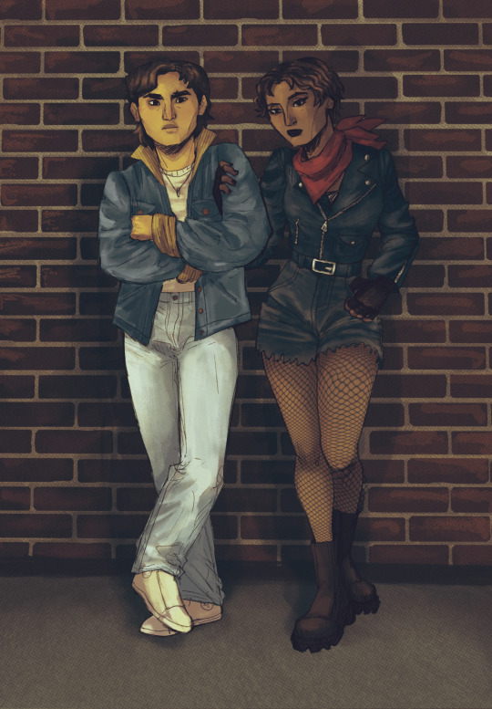
#tbh idk how to shade in that program
Explore tagged Tumblr posts
Visit Tumblr Blog
Explore Tumblr blogs with no restrictions, modern design and the best experience.
Last Seen Tumblr Blogs


Fun Fact
69% of Tumblr users are millennials.
Text

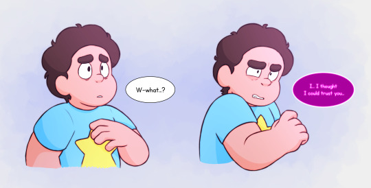
go old man I chose you!!!
I hate him but my gijinka is too fire to NOT draw 🥀🥀
#Steve cobs ii#inanimate insanity#gijinka#art#my art#doodle#doodles#human design#made in magma#tbh idk how to shade in that program#lol#hope he explodes
16 notes
·
View notes
Note
? Transfem Chasing Wind?
actually hold on wait ok yeah Iterators and gender is a whole ‘nother fascinating thing both because ROBOTS and RELIGIOSITY (plus I mean what else are you going to do for 20 thousand cycles OTHER than remake your body over and over again….
I mean this is actually an interesting subject that I should think about deeper but I’m tireeeddd
iterators and gender !!! yesss!! i really love the possibilities of how iterators could express their gender identities. are they just programmed with certain pronouns? do they start as a blank slate and choose as their personality develops? honestly we could go as far as to ask if their creators even had a concept analogous to gender as we understand it considering the magenta shaded citadel pearl mentions how Seventeen Axes, Fifteen Spoked Wheel was a “Mother, Father and Spouse,” (Or maybe they were just a genderfluid fashion legend). BUT for the sake of this analysis I’ll just act like their views on gender are at least somewhat similar to our own.
Okay funnily enough Chasing Wind is literally the most Cis Guy I have out of all of them LMAO. Like if you asked him his pronouns he’d look at you funny and go “he/him, duh??”.
But tbh I feel like it depends on the iterator, much like how I talked about them being attached to their puppet. When they’re being built their creators just use a certain pronoun to reference them (Pebbles’ creators using he/him to differentiate him from Moon, etc), and once the iterator comes into their own they can either choose to keep said identity or use different ones etc. Hell, some might switch them up every couple dynasties just because they get bored. There isn’t really a physical component to their gender, since they all wear featureless cloaks and are. well. yknow. immobile buildings and probably don’t have any stereotypically gendered components. Unless only girl iterators have an abstract convergence manifold or some shit /j. So really it just comes down to personal preference.
One of the main reasons I hc that Sig uses he/she/it is because of the scarf thing, actually. It shows some level of aesthetic decoration being added to his puppet, going out of its way to accessorize and express itself through clothing. Also I feel like Pebbles uses he/him because during the concept/construction process of him, his creators needed a different pronoun to use so they could differentiate him from Moon. However Pebbles is also just SO trans to me idk.
Also side tangent but I also fucking hate the idiotic argument around Suns’ pronouns, people seem to act that nonbinary people can’t use binary pronouns (COUGH LIKE ME COUGH), and that nonbinary people MUST use they/them, like congrats yall just created a third gender binary. Not to mention, I bet that if any other pronoun was being used (like if people were using strictly xe/xem or smth rather than he/him), no one would care because those are “nonbinary” pronouns, everyone knows that nonbinary people never use binary probouns !1!!1 /s. The whole thing just feels so fucking exorsexist and it pisses me off.
Anyways that was a tangent. Ngl I hate theorizing about gender cuz it just eventually devolves into me being like “hey why is any of this fucking real” LMFAO like it’s all so ridiculous. Honestly I barely really consider their genders while designing them, I feel like most of my designs could use any pronouns and still feel right (The cunty eyelashes I give everyone probably helps in that regard).
I’ve kinda lost the plot here so I’m just gonna say trans iterators go crazy hard there should be more of them.
#this ramble made no sense towards the end ngl gender is so annoying to think about for more than like 5 seconds#rw#letters
13 notes
·
View notes
Text
GET TO KNOW YOUR MUTUALS
Tagged by my beloved @wicked-felina <3
What’s the origin of your username?: Idk, I was just dicking around trying to find a name for my new hyperfixation and was honestly SHOCKED that this url wasn't taken before— it felt like such an obvious reference to the books. I honest to god can't even remember what my username was before this, I know I had a different one, but like....I've always been covenofthearticulate LOL.
OTP(s) + ship name: Mostly just here for any ship involving Louis de Pointe du Lac lmao. Loustat, Loumand, Loumandstat...even the elusive Danlou (i think that's what the kids are using nowadays for daniel/louis??)
Favorite color: I go through phases of different colors all the time, but most of my clothes are autumnal shades of maroon and burgundy and olive green, which clashes horrendously with my neon hair LOL
Song stuck in your head: Ohio (Come Back to Texas) by Bowling for Soup LMAO
Weirdest habit/trait: I mean the thing with this question is like!! I don't think any of my habits are weird!! They're weird to other people, probably, but I'm just out here living my life!
Hobbies: writing, painting my jean jacket collection, basketball, and cooking :)
If you work, what’s your profession?: at this point I wear too many damn hats and my title has too many hyphens
If you could have any job you wish, what would it be?: theoretically I am working my dream job lol but I'll always be hungry for more work in publications. I've written articles in all 5 shows at our theatre company this year but I think it would be cool to be like a creative director or something for the program
Something you’re good at: writing
Something you hate: when people ask me absolutely idiotic questions and I have to be nice about it
Something you collect: vinyls, vampire art, concert memorabilia (guitar picks, drumsticks, setlists)
Something you forget: the only certainties in my life are death, taxes, and forgetting to reply to a text message.
What’s your love language?: agreeing with prev: I cook for the people I love. I'm definitely an acts of service girlie. Growing up, my dad would randomly cut up fresh fruit and bring me a bowl for me to eat in bed in my room, and that, to me, is the epitome of love.
Favorite movie/show: asdfgxfhcghvj girl idk all I've been watching lately is Make Some Noise, Game Changer, and just everything on Dropout. But some shows that changed my brain chemistry were Penny Dreadful, The Umbrella Academy (s1 ONLY), Daredevil, Poker Face, and Veep
As far as movies...Sweeney Todd and Interview with the Vampire, of course, and also Moonrise Kingdom and The Shape of Water
Favorite food: any sort of dim sum tbh. also garlic bread my beloved.
Favorite animal: Tortoises
What were you like as a child?: Deeply emotional— the story my mom likes to tell everyone is that she once walked in on me crying in front of the tv while watching Peter Pan because I felt so terrible that Captain Hook had his hand chomped off by a crocodile LMAO for some reason I was always very empathetic to all the Disney villains. I used to play pretend tea parties with Cruella De Ville and Captain Hook and Ursula because I wanted them to have friends and not be mean asdfghsbjdnfsdefv
Favorite subject at school: English
Least favorite subject: ya girl flunked out of math class. twice.
What’s your best character trait?: I hate sounding like one of those empath bitches, but I do carry a lot of empathy and tend to be very thoughtful about how my actions affect other people. also I'm fucking FUNNY!!!! I love love LOVE making my friends laugh
What’s your worst character trait?: I'll do just about anything to avoid confrontation LMAO. I'll chew my own leg off before inconveniencing anyone else.
If you could travel in time, who would you like to meet?: asdfghdbfc I'm always terrible with these questions bc like, I really don't have much interest in meeting anyone famous or anyone from the past LOL I mean I can give a generic answer like David Bowie or Stephen Sondheim or even Anne Rice, or give a depressing answer like I'd love to get 5 more minutes with my Dad before he had his stroke, but neither of those seem right. I don't think I'd be a good time traveler lmfao
Tagging: @headfrst4halos @cup-of-lixx @sam-reid @aunteat @uncivilcivilservice
14 notes
·
View notes
Note
hi broski ummmm what programs do you use for art and what brushes
I use procreate! For lineart/sketching I usually use a slightly modified version of the Shale brush in the default procreate “calligraphy” section- just w/ the streamline feature turned down to zero and more like…size variation? (Idk I modified it a year and a half ago I don’t completely remember what I did lol)
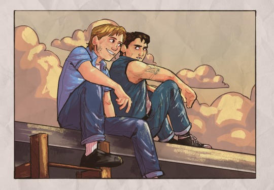
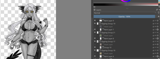
Then for my grayscale comics, like these,

I use this Copic marker brush w/ just straight up black and varying levels of opacity. Usually I don’t use blending brushes in these, but in my most recent one I did.
For my colored stuff tho I use a lotta this pencil brush for everything (shadows, highlights, base flats, etc) and then depending on whether I want something more painterly (like the ocs on the left) or more cell shaded (like stevepop on the right), I either use soft texture brushes or a chalk brush (I cannot for the LIFE of me find where this chalk brush came from?? I’ve been digging but idk I can’t find it outside of my duplicate??) for highlights
Some other brushes/brush sets I use (all of them are free as of rn ‘cuz I’m broke):
Habook Brushpack (specifically the rectangle one- it puts down flat colors nice and fast but also doesn’t annoy me the way most “ink” brushes do!)
Laurenillusrated Brushpack- I use these mainly for skin, they’re really nice. (Also, @laurenillustrated is on tumblr- her art is so pretty, it’s like a storybook istg. Check it out if you haven’t it’s AMAZING)
I’ve recently started using @loish’s brushpack too, and I ADORE these brushes. I used them a TON on the Christine poster. You can get them by signing up for Loish's Digital Art School, which is a great collection of art resources as a whole, and it’s totally free. Would absolutely recommend
And finally, for the halftone texture I like to put on everything, I use the Halftone Hospital Basic Tone Kit. All of their brushes are fantastic, definitely check them out if you like the look of traditional art but also like the lower supply cost of digital art lol. Or just in general, ‘cause they’re great
(Then for the paper texture overlays I love so much, I usually use stock photos tbh.)
Anyhow, these are some of my favorites. But I do use others too, and this all came from years of playing around and finding what I like! I had this phase about…1 1/2-2ish years ago where I hated my art style and nothing was coming out right. It pushed me to try a bunch of different brushes- in retrospect I don’t think the brushes were what made it better, I just improved over time, but I had a lot of fun trying out different brushes. So definitely try ‘em out and experiment, because it really is a fun time :))
(As for my workflow, I talk about that here if you wanna know more about how I draw!)
28 notes
·
View notes
Text
question from my YT I wanted to give a more in depth answer to with visuals!
Why I like CSP animation better than photoshop: mostly just more organized/easier workflow! because:
Video groups can be clipping masks
Groups can be frames + CSP remembers previous frame's settings
also tl;dr go watch finchwing's photoshop and then clip studio paint animation tutorials if you want to compare the two programs for animation!!
youtube
Photoshop can have INDIVIDUAL layers or regular non-video groups clipped onto video groups. But CSP can have video groups clipped onto other video groups, so for me the workflow in CSP is much simpler/cleaner. (+The visual clutter of photoshop animation can kinda get overwhelming for me lol but that’s personal pref).
Finchwing has an Amazing video tutorial on photoshop animation including a video on colouring+shading animation in photoshop; it’s where I first learned how to animate on photoshop and I highly recommend taking a look. But even just to compare what their photoshop timeline has to look like for shading compared to CSP, CSP looks much more organized while photoshop is a “giant staircase of frames” (as Finch describes) just because photoshop has to use individual layers to maintain their clipping mask functionality (turning it into a video group makes it unable to be clipping masks, which Finchwing mentions at 10:50).
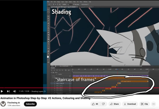
Actually speaking of Finchwing, they made another animation tutorial with CSP if you want a more in depth comparison I’d really recommend just watching both their photoshop + CSP tutorial to compare the two programs!!
2. Groups can be frames in CSP. Again this makes for easier cleaner organization, and CSP does this cool thing where if I insert a new frame, it will REMEMBER the settings of the previous frame. So my previous frame was 1 group, with two layers in it (one for line one for colour). When I insert a frame it automatically creates 1 group with two empty layers in it. Very convenient. Photoshop can’t have groups within Video Groups, If you try it just puts the layers you’re trying to group together side-by-side like two separate frames. (which tbh i was fine with having separate video groups for line and colour in photoshop lol i can see benefits to just keeping them separate even in CSP as well)
IN CONCLUSION:
It really is more of an organization/quality of life thing. photoshop served me well for many years! Animation is so totally doable in photoshop (just look at finchwings photoshop animation work as evidence that you can POP off in there), but now that I won’t have access to adobe as I’m graduating and preferred a 1-time purchase over a subscription, I went and got CSP.
I admit after photoshop the learning curve was a little tough (CSP's distinction between 'frames' vs 'cels' confused me for a bit + I really missed how visual the ‘cutting’ of frames looks in photoshop lol?), but it only took me about 3-4 small test/practice projects, some googling, and a few custom keyboard shortcuts to get me preferring CSP over photoshop animation now C:
(also bonus gripe with photoshop: idk if there is a way to do this and i just never figured it out, but. i couldn't find a way to use arrowkeys/other keyboard shortcuts to scrub to frame to frame?? I had to use my mouse to drag the header along lol. CSP i set a keyboard shortcut for going to previous/next frame and bam that was that)
#tutorial#clip studio paint#animation#photoshop#adobe photoshop#art programs#ppmpost#if you or anyone else has any qs about comparing csp n photoshop feel free to ask while i still have photoshop until end of May lol#that way i can show more direct visual comparisons while i still have both programs
15 notes
·
View notes
Text

Great question.... hmmmMMM I've got a few things i think.... maybe more than a few.
...
Okay this will be a long one, I hit the image limit. buckle in boys
So, generally the art I'm the most proud of can be split into a few types: Stuff I like because the technical skill or work put into it, stuff I like because I captured a specific mood or energy very well, and stuff I like because of how the characters are drawn aesthetically, like if I could manage it, I would draw them that way consistently
ANYWAY.
Category one, which is prolly what this asker wanted from this ask lmao:
So. First I have this sort of painterly done art of Zach, one of my Pokémon OCs I barely touch. I dont do this style often cause it's a pain in the ass to do and tbh i feel like peaked here and cant really manage it again

Then I have his OC that I haven't touched in a bajillion years and prolly never will touch again. This is ANCIENT but i still like it a lot, and ironically I dont think I could pull this off again 'cause my art style has shifted to be too cartoonish and I couldnt manage realism of this kind without a few months to practice first.

There's this art of Hopeless (AU by @gaudess-schmoddess) that is not at all canon but I dont care because they look great and the mood is immaculate and I will NEVER draw them this good again *dies*


I could draw these three better now, but I still like them as-is.
The one of Sven looking up into Multiverse Pompeii still holds up to me and it's so fucking huge it lagged the shit out of FireAlpaca (the program I was using at the time). And the one guy actually in focus is from the back so it covers up the shittyness of my old style up lol
The other two are very emotional pieces to me and call it a placebo, but I genuinely think i draw better when I'm in the Feelings Sauce. I think about Druid covered in flowers and surrounded by rot more often than I'd like to admit


I'm just proud of the shading on Ponyx here ngl. I complained the whole time but I did have fun doing it! :3
Leo's cover is objectively one of the best things I've done recently, I actually got what I wanted out of it and that's a rarity these days. It was a no-brainer pick for my 2024 Art Summary. The mood, the characters, the background, all of it I feel came out really good
Category two! V I B E S


Art I'm filing under "super simple looking but captures a particular feeling or atmosphere in a way where less is more"
I don't have much of Druid where I feel like I get what i really want out of him (even though i draw him the most)... but this one of him half corrupted, half in light and half in shadow... where the beast is in the light, unobstructed and his humanity is in the dark... This one managed to do it a little.
The second is a character from an AU that I think is dead now but it was... fractured or framed or something with an F idk. Very happy that I visualized a Vibe that I do not actually have words for lol
Then there's Karma and even though the art is based on this post instead of being entirely original i got what i needed out of it. something unholy inside you wants to get out but you can’t let it. Peak Karmacore

SPEAKING OF KARMAAAA
Yeah there's a Feeling here alright. couldnt tell you what but man this image sure is that feeling. Yeah. yeah...

I love the art of the Askbox cover, too bad I fucked up and forgot Leo's whisker markings and didn't know until today FUCK ME I GUESS
Anyway I can't take credit for this composition since it's from some Welcome Home fanart, though the mood in that was slightly different than what I'm going for here, I just knew I wanted a sort of general sleepy vibe. The focus is really supposed to be on Sven here, secretly tired, stressed and over worked while everyone else rests peacefully, oblivious to how much this poor boy is being eaten up from the inside out
Keeping up with Sven being the guy I can Project on the hardest and get the Vibes of the best; The other image has nudity, but that's not the point, the point is the unwilling vulnerability of it, the exposure. Hands all over you, around you, in you, hands that in some way are your own but under the control of something else, a part of you that you buried so deep that you didnt even know it was there until it got dragged out of you
This is a screenshot redraw so prolly not the best example but. This is such a sinister moment and with Sven's cooler-toned lighting it's even more soulless and deadpan. Which works great thematically given his whole logic schtick. This is Sven at his weakest and his worst
Section Threeeee!! AKA I think I drew that guy Well


First things first, gotta put respect on my battle cuts banner. Im glad other people liked this one because the Pokémon version doesn't get nearly as much love whenever I share it haha


Sven seems to be the Guy I'm the best at drawing (surely there isn't any reason for that....) as far as like, what his general Shape is and even though all these are just little colored doodle dumps they're pleasing enough to me that I still use parts of them as icons on various websites. Also the Gaybo hours have arrived lol. I still adore the idea of the shine in Sven's eyes forming a heart when he looks at Sonny and feels something achingly familiar he cant name...

Not much to say about this. I hate my 'real' art style a lot when it comes to trying to draw people but... I dont hate it here. and the butterfly soup I drew on this I havent been able to replicate, but that's what Sven's butterflies look like in my mind.

For some reason FOM keeps eluding me lol i make stuff (written and visual) and like it at the time then hate it a few months later, repeat forever until the heat death of the universe. For now I think this is the best art I've made of them, but that may change in a month. Who knows. Still, they love each other your honor <3


This collection of young Heartbreak doodles were made when i was getting back into SU after the Year of Hell. I tried going back to the drawing board with everything, start from scratch and branch out. i still miss this era in my art, but I havent been able to recapture this look so... fuck me

This comic [link to full thing] is here for a similar reason. I dont usually like how I draw HB (can't seem to get the fucker right no matter what...) but in this comic I like most of what I did. This was made around the same time as the images above so it's hugging the canon SU style very closely and hey, maybe that's what the bastard needs to look his best.
CW for these last two as it gets a bit ~Spicy~.
This is Matriarch AU stuff (owned by @novantinuum). Nothing explicit is shown but i'll at least be transparent with you all about the nature of the AU as a whole even if most of it now is just... Emotional situationship turmoil and pages long character studies pfft
Anyway CW for partial nudity

I dunno what it is but I like this Druid. This is a good looking Druid. Just an old fart cleaning up. Slightly younger, de-aged old fart cause of the AU Lore but still an old fart lol

This image is peak autistic cringe and way more embarrassing than anything else I've ever made. it's got Witherbloom and Astrid stuff and I'll always be a little insecure about it (more so the Dryad/Druid than anything else) LOL but in a way that's why I like it so much
This image is the culmination of several months of deprogramming my brain from online purity culture bullshit and that's why Im proud of it, I'm proud of growing as a person enough to draw things that make me happy. It's dumb and cringe and selfish but I dont care anymore. I make art for myself when it comes down to it. I dont owe anyone shit, especially control over what I make. That's what creation is really about, bringing joy to yourself.
#ask#anon#it's so late dawg you just gotta deal with typos#There IS some partial nudity on this post if everything being exposed except the Junk itself is too much for you begone
8 notes
·
View notes
Note
if you have the time/energy to elaborate, what's your process like for coloring stuff you ink traditionally? i've figured out a few different methods over the years, but i generally stick to fully digital or traditional for a piece, so i'm curious to see how you do it! :0
This is such a fun question for me because I get to both ramble about my art process and have an excuse to throw some colors on this Breloom I drew ages ago.
I use Clip Studio Paint and an Ipad for my digital stuff so I'll be referring to the processes on that but I'm sure there is a work around for other programs as well :^)
I scan my traditional art at 400dpi because it's always easier to work bigger with digital stuff and resize it smaller then the other way around :^)

So here's our raw scan, which already looks very decent but when I want to color something I like for everything to be much cleaner/sharper/more contrast-y and to get rid of the noise from the paper texture lmao. A well lit photo will also do the job because that's what I did for many years before getting my scanner but tbh if you're a traditional -> digital artist like myself a scanner is like a best friend you can buy HAHA
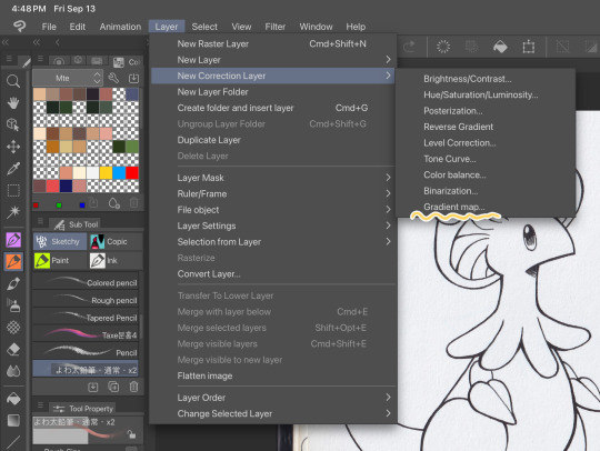
First things first, I apply a Gradient Map Layer > New Correction Layer > Gradient Map
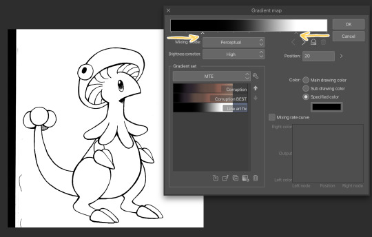
Clip has a really nice black and white map preinstalled but I made myself a custom map just by pushing the black and white a little closer, it completely clears up all the noise and makes everything really crisp! Make sure you check on your lines when adjusting things because super fine feather lines can sometimes be lost if you make the contrast too high. Extra tip! If you want to make Graphite Pencil or Ball Point Pen really nice looking as well, just add a dark grey point in the gradient map closer to the black then middle...works perfectly :^)!!
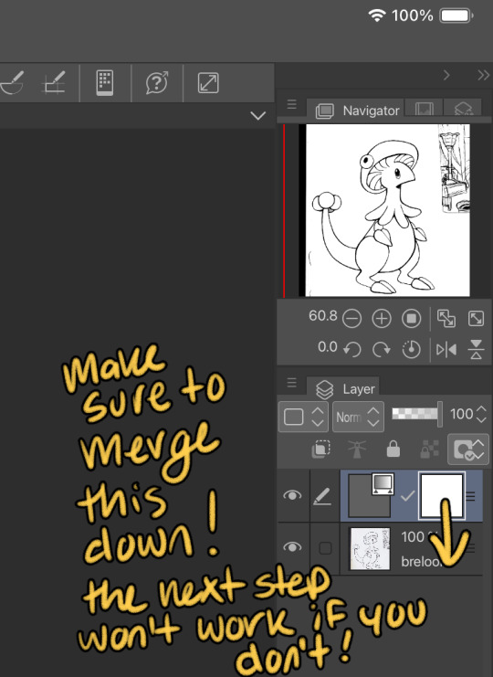
This is the point I look for stray pixels, cat hairs, ect and make sure to erase any surrounding doodles or sketches I don't want included.

GOD DAMN Those lines are CRISP-Y!!!
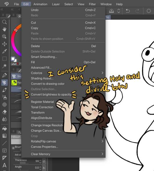
Next up we're going to want to go Edit > Convert brightness to opacity
Tbh If I didn't have this method idk what I would do with myself.... I've tried the whole "Lineart on top layer set to multiply" Method and ...ehh....
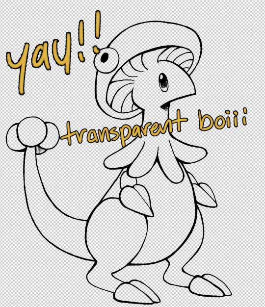
Now that I have a nice transparent line art I'll stick a new white layer down below it because the checker pattern hurts my eyes LOL
I'm going to add a read more here since this post is getting lengthy haha
I'm going to quickly go over the style I use for MTE! It has been refined to be quicker and easier to do since you know...I have a week time limit per page ... 😭 I have a completely different way I do colors for other things I want to spend more time on but I might explain that one in the future...I'm running out of steam tonight LOL

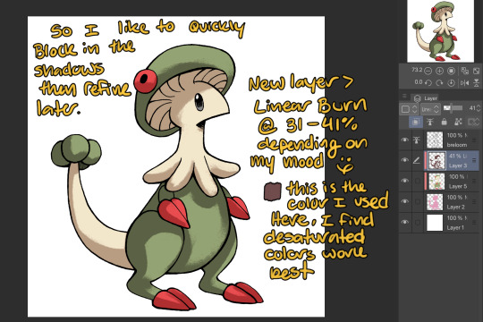
I use this really awesome brush pack that has a pencil like texture and I love it to bits...here's a link to it if your interested!
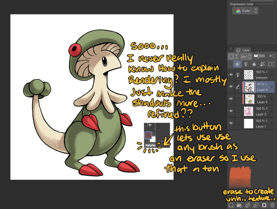
At this point I might add some overlay layers or play around with an airbrush but I think this guys done for now :^) I tend to stay away from highlights with my shading for MTE..My biggest goal is to make sure everything is clear and readable! That being said I break my own rules all the time for special panels that need the extra 'oomf!'

Slap a lazy square background and yay!! He's done!
Hope this was interesting aaaa Thank you again for the ask!!
#art#traditional art#digital art#digital colors#breloom#pokemon#ask#tutorial#art process#coloring tutorial
10 notes
·
View notes
Note
Love the new JFO card. I still don’t understand how you make such gorgeous art in PowerPoint, but it always looks amazing.
❤️❤️❤️🥰 thank you!!
It's like sculpting, I think. I take a shape, and I add and subtract what I need until I get what I want. A circle combined with 2 ovals makes a tear drop (cant use the actual tear drop shape bc you can only manipulate it so much), whoops gotta make a crescent moon to carve off this extra bump (you can't use the provided moon shape, they're *too* moon shaped and the empty space is a lie they cut more than you want), and now to do the rest. A lot of it is careful layering. You can't actually layer slides like you would an art program so one shape can turn into a dozen shapes. I try to combine what I can into one shape so PowerPoint doesn't crash on me (once I get decently far into a piece, pp starts acting weird for copy-paste) but shading and what not doesn't lend itself to that so multiple shapes we go! Gradients are nice, but don't always what you need shape wise, so that's *more* shapes.
I've got some examples (maybe. Idk how well they work for examples tbh)

The full body was a practice for a future full body piece . And the cat is permanently incomplete.


The hands are what I started with for the heart upper body picture - the lines at the base of the fingers get hidden by line-less skin colored shapes.

The heart upper body is a permanent wip bc I've given up in the face and hair. I've got an example of how many shapes something like that takes.


And then a few more jfo things - the floor design of Cal's meditation space in Survivor (with some artistic license on my part) and the bogling card in white from Fallen order. The bogling itself is 1 single piece.


8 notes
·
View notes
Note
Long rant/post: I just let out a little sigh reading this im sorry. it may be a hot take but, for me it's like when you can't even put out a thank you post to the school that spent so much time developing you, recruiting you, free housing, PLAYING TIME as a freshman on this stacked of a roster i don't feel sympathy for this kind of stuff. we know our staff too and how caring they are. you literally got free education and were extremely valued at the #1 public school in the nation academically and athletically
transfers going around on these ucla comments with slight shade is lowkey annoying but the part ab them lit not acknowledging anything for everything ucla provided for them, and posting your transfer post RIGHT AWAY is kind of yuck to me. Londynn at very least made the goodbye post
also, when you transfer why would you still be able to use the facilities?!?? so we're training other athletes that we're gonna compete against next season now?? absolutely not sweetheart. i sort of get what she's trying to say but not even close of an analogy tbh 😭
https://x.com/japreece24/status/1915139027772092538
its okay!! i literally love long asks cuz im lowkey a yapper too LMAO���but fr i was literally JUST talking about kendalls mom saying that lmaoo also like its such basic courtesy to express gratitude for a program that welcomed you in, trained you, gave you a scholarship, gave you housing, million dollar facilities etc ESPECIALLY if youre leaving for more opportunities? like is it rlly just hit it and quit it? idk its just so weird to me how you can build a family somewhere and just up and leave without releasing a statement. obv im sure the transfers had a personal meeting with all the girls following their announcement but it really doesn’t hurt to post something thanking the team that just got to the final four.
and YES theres been slight shade all over the place which makes me so sad bc this was a beautiful year and beautiful season. that doesnt deserve to be tainted by bitter comments just bc youre moving on to a different school!!!
and tbh, im not saying anything but i truly wonder if the only reason londynn released that statement was bc she knew transferring to usc would be a very shocking decision
AND BROOOOO IS IT NOT COMMON SENSE TO NOT HAVE RIVAL ATHLETES TRAINING IN YOUR FACILITY WITH ACCESS TO OUR GAME PLANS LIKE HELLO???? man if yall dont sign up for la fitness and keep it pushing LMAOOO
in conclusion everybody just stfu and appreciate how amazing this season was bc u never know if youre gonna get this far at ur new school trust 🙂↕️
3 notes
·
View notes
Note
Sorry if you’ve answered this already, but what brushes do you normally use for your lineart and/or colouring/shading?
Hey! Thanks so much for the ask :D Disclaimers: - So I use an old version of Clip Studio (which I don't recommend ever since they became a subscription service... use Krita instead!) so the brushes may vary from program to program - I have never taken a digital art class in my life and have no idea how to do things the 'professional' way; so are there better options? probably! I just don't care :D

I really only use the top four for most of my art, but I also provided the bottom four as honorable mentions. To be completely honest I've never even tried half the brushes that are available to me because creature of habit and laziness xD Maybe I'll make a project out of trying them... anyway List n Explanations under the cut because idk how to stfu:

Textured Pen: I use this for most of my lineart and base coloring.

Darker pencil: This is sketching brush, but I also like how lineart looks with this... my brain just wont let me post art I make with it 90% of the time because it looks unfinished/lazy and sketchy- even though my style is very sketchy anyway?? what the heck brain

Marker Pen: I use this for base coloring, since it doesn't texture or overlap/shade itself at all

Watercolor brush: My entire rendering process is 99% JUST this brush. Hair, Leather (cloth in general), Blending, Shading, Highlights, Lighting, Blending, Reflections... you name it, and I probably this one brush, love this thing xD When I hard reset my laptop a few years ago I reinstalled the newest version of Clip and it had NONE of these brushes so rather than scouring the shop for downloadable versions or- god forbid- learning how to use new brushes, I just reinstalled the old version lmao
Honorable mentions:

G-pen: This was my lineart brush before I discovered the glory of the Textured pen. I still use this one sometimes if I want smooth lines, but it's also good for coloring smaller spaces since it has pressure sensitivity and the marker pen doesn't.

Mechanical pencil: This was my original sketch brush, and also my original line brush if I'm remembering correctly. It's slightly different to the darker pen but I have no idea why I prefer that one over this one tbh. Maybe this one doesn't taper as much on the end...?

Milli Pen: I like how this one is stupid. I think it makes my doodles more like 'real' doodles- but for everything else its kinda bad imo. You CAN use it to do color, but the pressure sensitivity is strange on it and I just prefer using it to write instead

Running color edge watercolor: First of all why is it's name so long and second I only really use this one to show glowy effects. It's pressure sensitivity is so low you gotta draw over yourself like ninety times (I'm sure theres a setting to change that somewhere, but am I gonna look for it? nope) so you're better off using the normal watercolor brush
oh yeah, and my eraser:

#hope this helps!#Ive noticed a good handful of people are super surprised to find out I only use four brushes#I do use more when its a more 'professional' peice like the covers#but really only for backgrounds and effects and such#Im very boring haha#thanks for the ask :D#stylus answers#nic stylus#art
6 notes
·
View notes
Note
Do you have any tips on how to get better at picking colors? :)
I am having a hard time mixing colors that work well together so usually when I find some that I like, I want to stick to those 2-3 colors forever and ever and ever...
Hmm tbh i have this problem too and what has helped me break out of that is two things:
gradient maps (idk if this is available on every drawing program but i use CSP)
super high contrast color palettes using only complimentary colors
Typically gradient maps can give you a lot of color variation and lightening them as an overlay over your drawings give nice cohesion.
My most recent dnf drawing is a good example of high-contrast use of complementary colors (orange) over a blue/purple-only drawing: it can be a good way to diversify your art and also get more comfortable using different tones of colors you typically don't use or if you only usually use one shade of that color.
A site I used to use a lot just to get out of my color comfort zone was coolors.com, its a color palette generator but you can also add in colors you want to include and it will make a palette around those colors! Its a good way to train your eye to recognize colors/tones that can go well together
9 notes
·
View notes
Text
random questions <3
tagged by @elizabeth-mitchells 😊 thank you so much for tagging me 🫶🏾
: ̗̀➛ what’s ur fav color: it's changed over time tbh. for a long time, it's been orange, but i guess that, as i got older, i'm fluctuating between red -- particularly wine red -- and blue, sometimes purple bc it's a blend of both.
also, darker shades of green, bc they remind me of trees and that calms my anxiety 😅😊
oh, and light pink like my blog at the moment, which is fun bc i used to be one of those "i hate pink" tomboys lol
still a tomboy for the most part, but light pink has grown on me 😅😊
: ̗̀➛ how long have u been on tumblr for: oh, idk how much, but i guess i made my first blog around 2014, so, more or less 10 years
: ̗̀➛ wheres a place u always wanted to travel to: wow, that's a hard one 😅 i always dreamed of traveling the world as a kid, but idk if i ever had one placed as a main goal, you know???
i guess maybe Greece, bc of my long-time passion for Ancient Greece, or maybe Mexico, bc some Mexican tv shows, like telenovelas or el chavo del ocho, are very popular here in Brazil and i grew up watching Brazilian variety shows making specials about traveling there
: ̗̀➛ what’s ur fav clothing brand(s): clothing brands are a bit expensive here in Brazil, so, i don't have any, i usually go for retail 😅
: ̗̀➛ what’s ur fav singer/band(s): paramore, most definetely.
been this way for around 16 or 17 years and counting lol
to complete the top 5, florence + the machine, of monsters and men, chvrches, and the beatles.
i do love much more stuff tho, it was very hard to pick this top 5 lmao
: ̗̀➛ what’s ur current phone lockscreen: a pic of jinx and isha from arcane (those two now have my heart...something something isha being the opportunity for jinx to give another kid the protection, love and acceptance she herself never received etc etc)
: ̗̀➛ most recent/current hyperfixation: probably yellowjackets, if my blog is any indication lol
: ̗̀➛ what’s ur relationship status: single
: ̗̀➛ what’s ur dream job: when i was a teen, i dreamt of being a musician, but, since i only had the opportunity to study music at 21, it's got a bit hard 😅😐
right now, i wish i could use my degree for something in public policies ig.
like, not as a politician, but, working in an NGO or any civil society organization that works for important causes.
tho that is a bit hard to achieve at the moment, especially even management roles even in this area seems to require ppl to know statistics and programming these days 😭
: ̗̀➛ outside of tumblr, fav social app: ummmm...
yk, after we spent here in Brazil more or less 1 month with twitter blocked, i started to enjoy bluesky a lot.
it's very chill and has great moderation features, so, probably the best place to curate your experience outside of tumblr at the moment
: ̗̀➛ do u have pets (if u do have pets, what kind/how many):
yes :) 1 very cute elderly dog
: ̗̀➛ do u prefer tea or coffee: tea. i love tea. drinking a cup of tea before going to sleep = inner peace
: ̗̀➛ whats ur fav ice cream flavor: chocolate.
i do love other flavors tho, like chocolate chip, or malted chocolate.
ohhh, some flavors that we have here in Brazil that i love are pineapple with coconut and corn.
YES, corn. i can vouch for it, it's amazing. i <3 corn ice cream
: ̗̀➛ tag at least three other tumblr accounts:
@monstrousgourmandizingcats @invisible-pink-toast @frog4278 @periwinklekryptonite @brightpuffinstuff @suprecorp @lovestrucklovesickslut @meganonmain
3 notes
·
View notes
Note
If you don't mind, could you give us a tutorial or brief explanation on how you render hair? /nf
YES!! unfortunately i got. very tired after making this so this is only one hair type :( was gonna go into all the different types of hair textures but. i will just have to do that later. also keep in mind i drew this in like. 7 minutes its just a simple guide to get out the basic steps
^i didn't put music in this so. listen to whatever u want while ur watching this (its 6 minutes 40 seconds). also its slightly sped up this isn't real speed
elaboration of each step under read more:
step 0: look at other hair tutorials/pictures of real hair to figure out how light reflects off of them. then completely disregard that and just make things up (this is the best artistic process trust me i do it every day)
step 1: just get out that basic shape. it doesnt have to be anything fancy,
step 2: just fill it in and adjust the shape as needed
step 3: figure out how the hair moves and flows, which parts go out more (highlights), which parts are closer to the head (shadows/base), etc. i highly recommend just looking at pictures of hair online, or taking pictures of your own hair. for coily/curly hair, you just kind of have to do this for each curl/coil. one thing to keep in mind the highlight is in the middle of the curl/coil and the shadows are on the edges (usually). i'll elaborate more on that once i have an actual video for it
step 4: just make it so the edges of the highlights transition a bit more smoothly into the base color. it just helps for later steps tbh. try not to over do it, don't want to completely get rid of the highlight, just soften it
step 5: add more highlights with thinner brush. this should be where the light would bounce off the hair the MOST. i think i forgot to say in the video uhhh add in some base value too. maybe a few shadows. mostly this step is for highlights tho.
step 6: idk what else to put here sorry. ngl just get silly with it
step 7: it is very important to do one stroke per area in this one. do not lift your pen off the screen/tablet/whatever until the little area youre working on is one smooth transparent shade, then move on to the next. idk if i'm explaining this right hopefully this makes sense.
step 8: complete opposite as step seven. make as many strokes as you feel it needs. not TOO many, just enough to get some texture and then some yk? i recommend making a copy of the layer youre working on before doing this so that if you mess something up you can always go back to square one.
also a lot of these steps apply to pretty much any hair type just. in a completely different shape with completely different rules. which is to say its exactly like this but it actually isn't like this at all. which is why i plan on making other videos some day (hopefully) also look up "hair texture chart" it will help you find the words you need to look up good refs
remember: always get silly with it. the only rule to to make things up and change your mind 400 times. bring a 'fuck it, we ball' mentality to your art program that the haters (your brain) really won't like. practice makes perfect and all that, do NOT expect to get something good first try, sometimes i still struggle with drawing hair in a way that i like and just scrap the whole thing. also i'm not kidding about those real hair reference pictures it helps so so much
hope this helped at least a little bit bc i am not good at explaining things 👍
#foster's art tag#asks#someday i will make refs for how i draw long/med length and straight/curly/coily hair but. todays not that day rip#edit: just realized a bit of text pops up in the middle of step 3 that is. not supposed to be there so i editted it out👍
21 notes
·
View notes
Note
Hello!
I’m curious- how long does it take to draw a sketch versus a rendered drawing?
I really love your art! It always amazes me with how detailed it turns out to be.
I hope you have a great week!
it really, really depends
a doodle like the ones i often do for the asks can take up from literally 5 min to i'd say 30 min? depends if i want to shade it in any way tbh
as for full rendered pieces - hours, usually days i can do one in one day (hard to call it a day when i start at like 12pm end up 4am but ykwim) but it can also take like 3 or 5 depending on how many breaks i take
honestly comes down to how many characters and the environment cuz the thing that takes up the most time, i'd say is coloring and shading i can sketch up pretty quickly and i don't go for super clean, smooth line art anyway i like the messy, free style (also saves a lot of time) so filling in the colors takes a bit and i honestly don't enjoy it all that much (that's why most doodles r just shaded and not colored)
and then it just comes down to what the bg is and how it affects the char cuz then it's just shading both to fit in, to look natural and blend tgt nicely (or not at all cuz i like funky, neon and eyestrain lol)
2 pieces i can think of rn that took me the longest (that i still consider fresh enough to take up for consideration) r the SAMS anniversary art and first piece for my Calamari Lunar i did both took me like a week from what i can remember
the former bc of the amount of characters on it, each one had to be done fully and separately so it just took a bit the latter cuz it's a really detailed, lineless, heavily shaded (also cuz it was me designing a char, so it always takes a bit back and forth until it just feels right)
i'd love to give u actual numbers, but i don't keep track of it that much and my program doesn't say it either (at least idk abt it) so i'm just going off of my memory, how long i feel like it took and mayhaps looking at dates of when i send a friend a sketch, when i first started talking abt it, the file info vs the posting date but usually idc enough to do so, and often it just simply isn't possible
TL;DR a doodle can take like 5-30 min and rendered shit a few days most often cuz i'm slow af; it all comes down to what the piece is
also tysm! so glad u enjoy my little hellhole wonderland of mental instability and mostly just thirst traps! :D
yall have no idea how actually happy it makes me when ppl notice small details i put into my work there's just smth in my brain that says it needs to have so many lil details and things and be so well done even if it's gonna get blurred out, shaded til binary and covered by 8 diff layers of shit
das the talk.
#lol sorry#just learn atp that if u ask me smth personal i will go on a whole essay abt it lmao#shout out to all the ppl that actually read those things i love u sm#if there r mistakes or just spitting nonsense i am tired and in pain#Hashtag excuses#ask#long ramble
5 notes
·
View notes
Note
That Vritra drawing looks really good tbh!! I just wanna tell you that (oh I love women...)
Also, I'm curious as well about how you would do greyscale painting. Do you have any tips/advises about it? As I'm thinking I want to practice painting with that method, too
so idk if im the BEST person to ask given this is the first time i've used greyscale in like...idk 5 years? but basically the gist of it is to paint the image in monochrome black and white so your values stay clear. the program i used is krita so i'll explain how to do it there but theres actually more guides for procreate, clip studio, photo shop etc
for this, in order to make sure coloring later was easier, i made each color group (skin, hair, tail+bra, tie and underskirt, gold) a different layer. i dont usually label mine because i hate myself but you may fine doing so more useful. once you've colored each layer in the correct grey value just shade it normally.
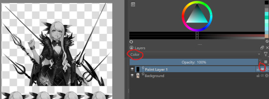
i also wanted to make sure i got the values for her skin right so i tried this trick i saw the other day on a reference image i have of her, which is to make a second layer, alpha lock it and switch the layer setting to color instead of normal. this sets the image to monochrome with very little fuss so you can easily color pick values without much issue (although you'll notice i actually lightened her hair a bit bc og vritra's is pretty close in value to her skin)
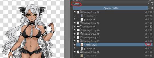
once you've colored in the values you're bascially done. just make a clipping group and set the clipping layer to 'color' and it will fill in the layer to the color you picked. you may need to adjust the layer below a bit-i ended up having to darken the tie because the green wasnt coming out the right color. the other thing is that i actually set the gold to color dodge on a dark brown because i felt that made a better gold color. realistically, you would also further tweak the image but it was pretty late last night so i called it a day
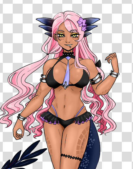
this also gives you the ability to play with the color palettes a bit although you wont be able to go beyond the base values- like in this case, i cant really make her hair or skin darker than how i already set it, so keep that in mind unless you're good with other filter settings
7 notes
·
View notes
Note
dear covey!!!
i love this shade of blue its so pretty ☹️
anyways! hows your day going?? any plans this week?
classes started for me last week and ive been exhausteddddd (the school year starts in april for me)
i require 10 hours of sleep but the world makes me live on 6 or 7 😞
now that im in my last year of high school ive got to study for college entrance exams and whatnot!!
i had a question for u!!! im in the process of choosing which unis to apply for and i have a list of like. 30 universities but it takes so long to go through them all and im honestly procrastinating it.. so i was wondering if u had any advice!! no need to like get into it but idk im a little lost (i cant tell the difference between each university’s programs.. i feel like theyre basically all the same???)
oh! i had a bagel for breakfast today!! blueberry 😋 whats ur fav bagel flavor??
this is the longest letter ive sent.. i hope u enjoyed reading it 🫶
wishing u lots of love,
🪼
dearest darling jellyfish anon,
plans for this week??? sURVIVE LMAO- actually, i've got to go try on prom dresses today but tbh...i dont wannaaaaaaa but i have to soooooo yeahhhhh. also, it's so weird to me that classes are starting for you BUT they're about to end for me lmao-
also im ya girl for colleges as i just did all that junk!! okay okay, so as far as programs go, they're gonna be relatively the same bc like....same major, same degree, there are standards you're gonna have to meet, ya know?? so, for me, it came down to location. i wanted a school in boston so i didn't care too much about whether or not it was the best for my personal field. but, it could also come down to campus life. do you want a school that's really into sports?? maybe clubs??? maybe you want a school that has a big campus or a small campus??? me personally i wanted a school with an unconventional campus, so basically they is NO campus, as the city is the campus!! i just prefer it like that!! i would try to narrow that list down bc, at least in america, it is EXPENSIVE to even just apply. i applied to like i wanna say 7 schools and had to pay 270 totally. i know a guy who paid well over 500 bucks just to apply. kinda crazy but he also got into an ivy sooooooo. ANYWAYS, all this to say, try looking not so much at the degree courses but also at the school itself!! maybe go tour a few and see which vibes are better!!! that's how i found out i wanted an unconventional campus!!
blueberry is a pretty good pick when it comes to bagels but im a plain loyalist simply bc you can do so so much with it!!!
this was fun and the whole reason i started this blog.
YAPPERS UNITE
all my love,
covey 𐙚⊹ ࣪ ˖
2 notes
·
View notes