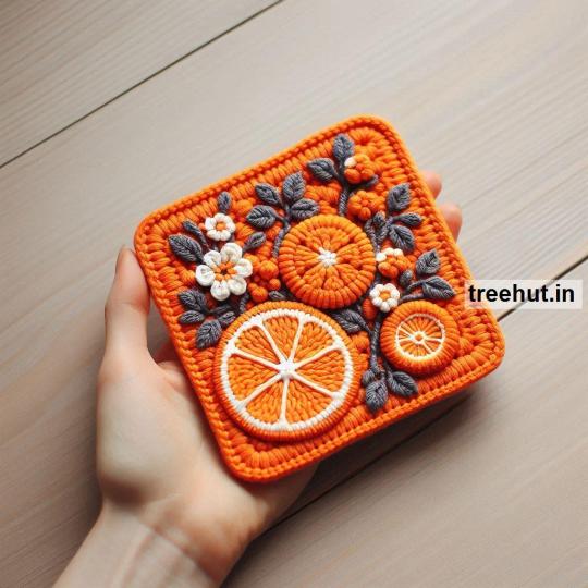
#the art and the colors are very inconsistent. that’s on purpose
Explore tagged Tumblr posts
Visit Tumblr Blog
Explore Tumblr blogs with no restrictions, modern design and the best experience.
Last Seen Tumblr Blogs


Fun Fact
There were a total of 171.5 billion posts on Tumblr in 2019.
Text


dream visit (distant stars)
(happy birthday, forgotten land! here’s to the game that changed my life 💙🩷)
#wybs art#kirby#kirby and the forgotten land#katfl#katfl spoilers#elfilin#elfilis#fecto elfilis#tried something weirder with this one!!#the art and the colors are very inconsistent. that’s on purpose#since it’s a dream I thought it’d make sense to have everything kinda inconsistent#very much inspired by courtesycalling’s artwork also#also like to point out that i used a more pixelly brush for the dream bits#but not at the end#i have lots of thoughts but there’s not space for that here. lemme know if u wanna hear :)
429 notes
·
View notes
Text

First | Previous | Next
#fear and hunger#fear and hunger termina#art#fanart#comic#fancomic#everyone lives au#katya’s text should be read in Pav’s voice btw#since he realistically wouldn’t know what she sounds like#this might not be noticable but that’s also why I change her colors very slightly in each panel#just one of the many purposeful inconsistencies#(dw there are many that are not on purpose as well djdjjvjejjfj)
12 notes
·
View notes
Text
Ashwini Venus ♡
Since I started this blog, I’ve been getting an unusual number of requests about Ashwini placements. What’s wild is that Ashwini is the 10th house in my own chart (a Kendra house of career), and my Ketu sits there. So the very questions you all keep sending are literally activating my karmic career house. There’s something poetic about that, and I just had to start this post by naming it. Let's talk about Ashwini Venus today.
Ashwini is the first nakshatra. It opens the zodiac with speed, purity, and instinct. Ruled by the Ashwini Kumaras, the twin horse-headed physicians of the gods, it brings forward themes of healing, newness, and sudden action. In many ways, Ashwini is the soul’s first breath. It doesn’t wait. It doesn’t overthink. It just moves.
When Venus, the planet of love, beauty, connection, and pleasure, lands here… it gets filtered through this fast, fiery, and healing lens. This is not the slow, romantic Venus of Taurus or Libra.
Ashwini Venus acts on feeling. It loves instantly. It detaches instantly. And it heals in ways that seem almost impossible to explain.
Love Style
Ashwini Venus loves with intensity and immediacy. There’s no waiting around or strategizing. When it feels right, they move. This placement can attract love quickly and dramatically, and while the romance may ignite fast, it often needs emotional maturity to sustain. These natives love with their whole body and spirit, but they may struggle to slow down enough to integrate or ground their feelings.
They value independence and dislike feeling restricted in love. If they sense control, their instinct is to bolt. But they are also generous, playful lovers, who bring laughter and vitality into relationships.
Aesthetic and Creative Expression
Venus in Ashwini often manifests as a bold and original sense of beauty. These people can be fashion-forward, drawn to statement pieces or signature styles. There's often something pioneering or trend-setting about their aesthetic, whether they realize it or not. They have a natural flair for color, movement, and form.
Creatively, Ashwini Venus thrives in mediums that involve speed, physicality, or intuitive expression. Dance, rapid sketching, impulsive music-making, or even healing arts can come alive for them. There’s often an electric quality to what they create.
Challenges
Ashwini Venus can struggle with inconsistency in relationships. The desire for excitement and newness might make it hard to commit long-term unless the connection allows for freedom and evolution. There may also be a deep karmic wound around feeling misunderstood or emotionally scattered.
The path of growth for Ashwini Venus involves learning how to move from pure instinct into conscious connection. They are here to show others how love can be healing, immediate, and soul-level but they must also learn the value of staying, deepening, and allowing vulnerability over time.
Karmic Notes
Because Ashwini is a Ketu-ruled nakshatra, Venus here can feel otherworldly. These natives may carry love karma from past lives that needs quick resolution or healing. There’s often a karmic sense of: “I’ve known you before, and now we’re here to finish something fast.”
They are not always destined for traditional relationship arcs. Instead, they may find fulfillment through soul contracts, short-term unions with deep purpose, or creative partnerships that help them move energy, not necessarily build permanence.
Final Thoughts
Ashwini Venus is a beautiful placement that embodies the courage to love first, the instinct to heal, and the ability to start anew again and again. It’s a placement that reminds us that love isn’t always a slow burn, sometimes it’s a spark that lights the way forward.
Ashwini Venus placements: May you keep loving boldly.
37 notes
·
View notes
Text
I think AI Art exploits and degrades not just artists, but every single person who looks at it in some ways because 'how we look at art' is part of art itself.
This principle is super easy to experience as an artist. All you have to do is practice and reach a plateau where things you did before seem worse to you, that felt great at the time you made them. Your ability to see art changes as you make art, and as you view art.
It's not snobby to say that there is a low average level of 'seeing' art. There's also a low average level of seeing technical design, or seeing weather patterns, or seeing copy editing mistakes and that's why we have architects and engineers, meteorologists, and professional editors. I think a lot about this bit by Scott McCloud in Understanding Comics:
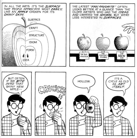
Like the point here is not that 'most people are superficial', but that the surface of art is what most people are familiar with. And it is this basic familiarity that I believe AI Art exploits to fake integrity, something that even the most well-known laughably 'bad art' still technically has.
Like, laugh all you want but effort went into the surface of this art such that it appeared 'okay' to the one who made it, and to those who maybe aren't paying attention or see that its colored and shaded first, the anatomy last. It relies sort of on your familiarity with 'what art looks like' to accept it, but not completely. Someone did work to try and earn your acceptance even if, uh, it's not very good in some ways.
But AI Art relies fully on how unfamiliar you are with art. Let's call this principle 'glamour'.
At first 'the glamour' is unconvincing: this is during the AI's training. But the first 'pass' is the threshold where information builds up about how to reproduce a minimally acceptable image. This is where the glamour is set: the minimum accuracy to convince a human being to fill in its gaps. To basically capture their imagination. From there, front-end use of the machine learning model is released for general users, and it is those users who then select out of many outputs which glamour fools them most. As the other half of this system, the hidden decision-maker, humans are also 'learning' familiarity with the glamour: comparing it to not just our surface knowledge but to itself. We have left reality.
A good example of this can be seen in AI-generated pictures of fiber crafts. It's possible that traditional or digital artist might not be perfect with their drawing or perspective or coloring etc. or may stylistically push the boundaries of perspective or form on purpose. But for a knit, crocheted, or sewn piece a final product often can't exist without its craft having physical integrity:
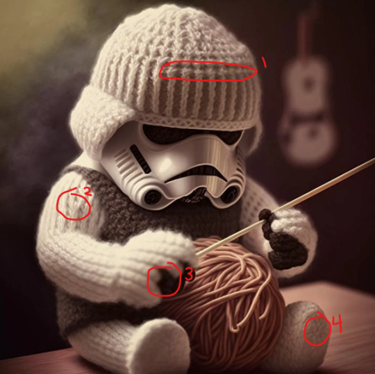
Aside from the issues that are obvious (fake tilt shift photography with no consistent field of blur, a spaghetti yarn ball, unknown stitch on the vest, no comprehensible seam between the arm and the body, etc.) here are some things that stick out to me to knowing even a little about knitting,
The fake stockinette on the helmet is confused about whether it is completed horizontally or vertically: vertical on the headband (many hats terminate this way, so there are plenty of images to sample) but indecisive when it has to become a round hat shape.
The number of rows on the arms is inconsistent, decreasing strangely where a k2tog would never be.
There is no consistent way the hands make sense, if they are 'mittens' or if the stockinette ridges become 'fingers'.
We can't see how the bottom of the foot was finished: the left foot either began or was decreased to meet at a central point but it doesn't match the right foot and it's not clear how either foot keeps it shape.
Beyond the plagiarism of the images that went into generating AI outputs, your diminishing time to learn about/be exposed to 'things' (beyond just 'art,' anything that isn't essential to your survival) will become increasingly exploited in the future. If left unchecked, images like these will represent not only novelties or etsy scams but a large amount of people's exposure to 'things' in general. Which then leads to something like AI inbreeding (AI generating based on AI), except like... with you.
When people are more familiar with a glamour than 'the real thing', even superficially.
Exploitation of this type isn't even a new thing. It's just that AI can speed it up or extend it to new spheres. Anyone can see a physical table and think 'this table is crap' if it's poor quality because of how much we use tables and our knowledge of what tables are and should do. But I think the blog McMansion Hell actually illustrates a real, practical situation where the familiarity level with a craft (architecture) is low and standards lower to meet it. These hulks were certainly built to invoke 'glamour', but when closely inspected, they have the design equivalent of 12 fingers or bra straps bleeding into someone's skin.
Another easy example might be the excessive 'glamour' that surrounds selling cars in the USA. Very few people will buy enough cars to become more than superficially familiar with them and the amount of people who are car-related professionals is negligible next to the number of people who require a car.
Both cars and houses are expensive purchases that are made relatively infrequently, which is why their brokers and dealers can bet against a customer's average level of knowledge. But soon, many more things may become like buying houses or cars: obscured by glamour.
AI Art relies on you to be a sucker, just like how a sketchy sales rep depends on you to be a sucker. Except even worse than the sales rep, your brain is expected to not just be dumb and inexperienced, but also to get actively dumber over time from doing all the work too.
#AI art#Machine Un-Learning?#non-magical concept of 'a glamor'?#someone who has actually read books probably has a real term for this#long post
68 notes
·
View notes
Text
Picture You

| You visit a local art show in Hobie's universe, not knowing he contributed. Not knowing you contributed; [Webhead reader; Friends to ??; Feelings realization] Hobie Brown
This work belongs to me, luckypunklemonade (Minte_Condition on AO3). I do not give anyone permission to distribute or share my work without consent.
Hobie’s house always smelled vaguely different. For a few weeks there, it smelled of incense. Incense he had stolen, of course. When he ran out of that, it smelled like cigarette smoke because he’d let his friend crash there, trying to break the habit and get back on his feet. Various good and bad smells. Cookies after a baking hyper-fixation. Detergent from a “freak laundry accident” that Hobie swore was the downstairs neighbors conspiring against him. All of these mixed with a lethargic scent of cologne which seemed to blend well with everything. Once, it had even smelled like citrus and lavender. It didn't take long for me to squeeze out the fact Hobie had developed a crush, and he had deep cleaned his apartment to impress her.
Today, though, it smelled like coffee. Hobie didn’t drink coffee, though. I drink coffee. I show up at his door with those little cups to put in the busted up Keurig his temporary roommate left behind. Everything in Hobie’s house was stolen, discovered, or borrowed. The coffee table (that he calls “Just Table” because he doesn’t drink coffee). The armchair he got from a friend’s sister’s ex boyfriend. His shitty vintage boombox and the tapes he plays.
It was often I showed up outside of his window, backpack full of treats or gifts in tow. I sit on his couch and drink from a chipped mug with “World’s Best Grandpa” painted on the side in colorful letters. He walks behind me, pacing and scrolling through his phone. I ignore the slow, inconsistent footsteps behind me and click through the various shows I've had in rotation.
“Have you ever seen The Princess Bride ?”
I don’t really expect an answer, and I don't get one. He’s busy, he usually is. Not usually on his phone, though, but who am I to step between a guy and his Candy Crush addiction? I sigh and put the remote down, deciding to head back to my universe for the night.
Hobie was part of the group that took interest in me via the Spider Society. I didn’t go to HQ very often, no reason to. Until I had a run-in with a multi-dimensional creature that I had to report to Miguel. That’s when I met Pavitr. He was an incredibly bright force that inevitably offered an invitation to lunch with his friends. His friends I came to know well. Gwen was, by definition, a rebel. She did everything on purpose, usually with the intent to piss off her dad. Gwen was the epitome of teenage rebellion that was most times ill-advised. Miles was talented, he was always wondering. He was constantly thinking and creating new ideas. It was inspiring to hear his thoughts. Pavitr was a soothing presence, not audibly but he had the perfect vibes. A chance to listen to him was a chance to tune everything out because Pav’s existence required the utmost attention.
Hobie, when first approached, was intimidating. His demeanor remains nonchalant and tuned-out. He was covered in spikes and leather and patterns. He looked incredibly threatening, too cool. When he spoke, it almost sounded out of character. He was kind and welcoming, funny. All traits many Spider-Men had. This was the justification I had for how interested I was in him, his energy. He was just as attractive and charming as Pav or that one guy who I always saw in the lobby.
I’ve been to their houses, I crash often. Gwen let me stay with her for almost a month once. In return, I help with Spider work and house chores to show my gratitude. I know what everyone’s room looks like, a main theme of band posters and scattered clothing. I don't visit Miles too often, he's got a lot of stress already. I stay above a convenient store owned by a family friend of Pav’s when I go to see him. Hobie has always let me stay at his place, though. I have made myself particularly comfortable in his shared flat that his roommate never seems to be in. I don’t ask questions, I just sleep on his couch.
I reflect on everything as I fold his blanket and set it on his couch. I pick up my bag and stuff my jacket into it. It’s warm enough , I think. I sit on the floor to lace up my shoes. Hobie acknowledges me before walking into his room, I nod back and finish tying my shoes. I walk to the sink with my cup of water to wash it. Sitting on the counter, slightly ripped and damp, is a flier.
A seemingly homemade advertisement for a local art showing, raising money for the food bank. The food bank I remember Hobie telling me about. He had been protective of it ever since he discovered there was a prominent political figure who was more than adamant to take down the business. I remember Hobie being mad. I remember bringing him brownies and stopping by with a hefty donation to the food bank without Hobie knowing. I remember doing this often. I remember how kind the owners were, how I developed the same protective nature towards them.
I read the flier more closely. An art show with an admission fee, local artists, local music, good cause. I was immediately interested. I walk to Hobie’s room, leaving the flier behind on the counter.
“Hey, I’m gonna head out.”
“Yeah, be safe.” He smiles and nods. “If you need anything, call.”
I smile back and wave goodbye, exiting the room and grabbing my belongings. I tuck myself out of the window and swing through the city. Food bank. I think to myself. I eventually found it. A brick building with a single, cramped entrance. I enter and inquire about the art show. It’s supposed to be held at a church nearby. Should’ve read the rest of the flier . I note the time and address, thanking them for their help.
★★★
The church was made up entirely of coarse, yellowed brick. Everything was incredibly old and classy. The windows were stained glass, geometric shapes lined with brassy gold. Cars lined up in the parking lot of the church. I walk to the broken-up sidewalk and feel how warm the evening is in the direct line of the sunset. The event was set to begin at six-thirty. People were scattered outside, talking in groups. The environment was friendly, warm. I walk up the seven steps that lead to the two glass doors. Once inside, I smell old paper and floral perfume. A classic church smell , I think to myself with a smirk.
The church foyer was wide and open, a few tables set out in front with a donation jar, papers, and chairs holding people with large smiles and kind eyes. I can tell this church has been made into a sort of community center, the people needing somewhere to gather. I approach the table, becoming aware of the makeshift stage boosting up a band. The music had already begun, soft yet upbeat, setting a chill tone. I greet the older woman sitting at the table, recognizing her from the food bank. I smile and make the admission fee, and then some. These people have created a more meaningful community with their own presence than a local politician ever could with bulldozers and contractors. The idea that they had to hold fundraisers in local churches because they only have personal connections to work with made me strongly displeased.
After being told to enjoy myself, I walk through one of the doors. From what I could tell, all the extra furniture had been moved into closed off rooms to clear space for the “galleries.” Completely barren rooms are now decorated with various artwork. I take my time and shove my hands into my pockets, wandering around the first room. The first few rooms have impressive work. From notebook paper sketches to large canvases painted with bright colors. About a minute into browsing the second room, a woman walks past me.
“Hello.” Her voice is upbeat, breathy.
I raise my eyebrows, “Oh- Hi.” I smile.
She stares at me, studies me. I furrow my brows as she watches my every move. After a few more awkward seconds, she smiles widely and walks out. Okay? I brush it off.
A few more rooms in, I see a canvas about the size of a piece of printer paper. It’s labeled “Black Treacle” by a bo y younger than me. I study the details. A can of black treacle is painted, highlighted and shapely. A few more paintings.
A dark, swirling painting depicting earthly objects drawn toward the center: “Supermassive Black Hole.”
An orange, fiery background contrasting four black silhouettes: “Daphne Blue”
Label after label, my head tilts and my eyes study. I smile in confusion and inspiration.
“Purple haze”, a portrait of Jimi Hendrix.
“Holy Calamity”, a charcoal sketch inspired by the war on drugs, tacked with a lengthy and tragic origin.
After stepping back from the wall, I notice two people staring at me. I subtly look over myself. I don’t have anything on my shirt. I touch my face. I’m pretty sure there’s nothing on my face… I quickly walk to the next room.
While overthinking the stares, my train of thought is derailed when I see a canvas, just a little bigger than the rest. It shows a sunset with a city skyline. The angles and edges were lined with gold foil, white highlights darting the painting. The image looks so familiar. I walk towards it, getting closer than I should’ve. The card below makes me grin. “2/14” by H. Brown. I knew he was creative, but wow.
I remember the setting. It was Valentine’s Day, the friend group had planned a big day together so none of us would be alone. Movies, chocolate, soda, friends. A result of Gwen’s chronic loneliness. Pav couldn’t come as he had already planned an extravagant date for Gayatri. Miles was grounded indefinitely. Gwen canceled at the last minute, never telling us why. I stared at the group chat message, standing in line to buy chocolates. I texted the group, a little pissed and put the chocolates back. Hobie had messaged me separately.
“i guess we’re both free then?”
“Looks like.”
“I wish she wouldn’t plan stuff if she's always this uncertain.”
“thats what I like about her”
“shes inconsistent.”
“Yeah, well now I have to return a shit ton of candy. “
“bring it by my place.”
“we can still hang out”
“right?"
“Okay.”“Give me twenty.”
I knocked on his window 30 minutes later, apologizing for the time. He grabbed the bags of candy and led me right back out the window. I followed him, down the rickety stairs and to the sidewalk. I asked him why we weren’t swinging. He told me to just look around, enjoy the noise. When we got deeper into the city, we climbed our way up to the roof of a building. Not the tallest building, one of regular size. We situated ourselves next to the edge, resting our elbows on the ledge. I had realized why he picked this site as we got up there. It faced a wide expanse of clear land. It faced the sunset. It wasn't as pink as it usually is, something I took as a direct middle finger to Valentine’s stereotypes. It was orange and purple. I told Hobie how the sky is probably the only thing that can blend those colors as beautifully without making a gross, muddy brown. I opened the bag of chocolates, said the sunset and sunrise were like crazy, natural RGBs, and adjusted the earbuds that fit loosely in my ears. He scoffed and we talked. We talked about how much Pav talks about Gayatri, about how moody it makes Gwen. How much Miles is going through. How nice it is to have other ‘webheads’ to confide in. We watched the sunset in silence, the window of time we devoted to staring at the colors darken.
This was that sunset. And I was wrong. The colors were strikingly accurate to my memory. A stylistic choice of gold foil and white highlights were so Hobie. It always seemed he added a little extra to everything in his mind. I grinned and took out my phone to take a picture. Once I was finished, I moved a bit quicker while browsing. I was hunting for something else Hobie had created. Something I could find about him that he hadn’t told me himself.
★★★
“Hobie, man! Amazing job!”
I felt a pair of hands clamp onto my back. I shook my head and smiled. I’ve been thanking a lot of people today. This has been something I signed up for to help out a friend. The food bank has done incredible things for this community, I’d do anything to keep the family upright. Seeing all these people show up and donate to the cause is reassuring. I took a tour myself after I helped set up. We hold a lot of potential here.
“They’re gonna love this, D.”
I tell Diana, the co-owner of the food bank as I stare around one of the rooms. She smiles, lines forming around her eyes. D is an older woman that had always checked in on me. She has patched up countless cuts on my face, made me innumerable bowls of soup, given me way too many pep talks and even more reprimands. She walks up to me and hugs me, wordlessly.
Now, as I stand in the lobby once I’ve checked in with everyone out back, I stay behind Diana, sitting in her chair and greeting more visitors. I keep to myself and hover to the side. A few people came by to exit, they had finished the walkthrough. They smiled at me.
“You made that sunset painting, right?” I cringe. D had been very liberal bragging about my art. I had been staring at my shoes for at least 20 minutes while she talked about how she’s known me since I was “a little monster.” Now, people recognized my name to my face.
“Yeah.” I answer shortly.
“It’s amazing. I love the story you tell. Good job.” The man says.
I smile, “Hey, thanks, man.” And wave goodbye as they walk through the door.
“Hobie!” D’s voice calls from a few meters away.
I turn towards her. She was now alone at the table. I walk over to her, “What’s up?”
“That painting. The one you insisted I hide in the back room. I still don’t know why you’d hide the most beautiful work you’ve-”
“What about it, D?” I roll my eyes.
“The person from the painting, I saw 'em.” Diana smiles. I furrow my brows and tilt my head.
“Huh?” Diana’s voice reverberates through my ribcage.
“They're here .” She grins, softly. If it were anyone else, it'd sound mocking. “They're a kind soul, I approve.”
My eyes slightly widen and my chest heaves in sudden panic.
“ What ? ”
★★★
I stare at the second Hobie painting I’ve found.
A box of chocolates is spilled out onto a concrete ledge.
“Bad Habit” by H. Brown.
A pocket knife sits next to a few crumbs of a chocolate bar, coated in caramel. The knife assumedly had cut the candy bar in half. Not in half, in like three quarters. That was my pocket knife and I remember everything. That night, I had opened the bag as we talked constantly, back and forth. I had opened a Twix and set it on the ledge.
“We go half?” He looked at me, reaching for the candy. I pulled out my pocket knife and flicked it open.
“Jesus, dude. You can have it. ”
I laughed loudly, I covered my mouth. “No! I’m gonna cut it in half. Sorry, I should stop pulling knives on people.”
He laughed, “That’s a habit of yours?”
I sighed dramatically, “A bad one.” Before cutting the Twix, it was completely disproportionate.
Remembering this made me smirk. I wondered why these moments had been memorialized. I continue looking back, wondering what else could be so special. I felt too bad to skip every other piece. I could tell time had been dedicated to the abstract oil pastel labeled “Tio.” I felt connected to the color pencil drawing of the Iris flowers. I couldn’t just walk past them selfishly. My eyes quickly scanned them, hastily coming up with my opinions on them and shuffling to the next. I read the labels and artists’ names and ages. I wander the rooms, they are small and large and the paint on the walls are all different colors of neutral. I admire the windows in the short hallways between rooms. The stained glass being a fitting, constant palette cleanser. I walk through what I believe to be the last room. This room stands surrounded by two other rooms to the left and right. The room is dimmer, I see a brighter light within.
When I walk into the room, the majority of the paintings are lit dimly by the main light at the opposite of the room. I stare at the canvas. It was a sizable canvas compared to every other that had been displayed. Slightly bigger. The one light used in this room was shined directly onto it. I walk towards it.
The painting was me. Literally, I was in the painting . It was a view of me from the side, my head only slightly turned towards the point of view. The darkening sunset before me, casting an orange glow on my face. The art style was choppy, no straight lines, everything lightly blended together. My face was clear, though. It was obviously me. I had cheap earbuds in, listening to music I refused to show him in fear of getting made fun of. The sunset had almost changed my eye color, it emphasized my eyelashes, highlighted my arms as they pushed my body up from the ledge. I was looking out past the roof and towards the sky. People below were blurred squares, a hundred feet below us. So ignorant, yet so important in this painting. I remember this. My breath was audible in the dead silent room. I breathed in and out, the exhale interrupted by a quick “Heh.” I looked at the card underneath.
“Dayplayer” by Hobie Brown
It was impossible to stop thinking about how this painting struck me. I saw how I was seen at that moment, watching the sunset with him. This was how he saw me on a random Valentine’s Day, on a random rooftop, with random street lights in the background. I hadn’t even noticed where his attention was, I was focused on the sky, on how my music would fit the moment. I was feeling the warm, humid air and was pissed that it wasn’t getting cooler faster.
I had no idea .
I couldn’t bring myself to see the other paintings until I could feel my fingers again. They were cold and almost numb, I had no idea how long I’d been sitting there staring. I turned to face the adjacent walls to find that every painting in this room was made by Hobie.
A painting of a mug of coffee on an unidentified table sitting next to a remote was labeled “Peak.”
A messy charcoal sketch of a pair of shoes: “Great Race.”
A pencil drawing of several objects, practice maybe. “Goodie bag.”
I go from paper to canvas, reviewing the details, recognizing themes. I am getting to understand how he sees the world. As vivid colors intrude black and white backgrounds, I hear a word behind me.
“Hi.”
★★★

#wrote this a while ago#hobie brown#hobie brown x reader#atsv#spiderman atsv#spider punk#atsv hobie#hobie x reader#gn reader#fanfic#across the spiderverse#x reader#hobie spiderverse#astv hobie#✰lucky writes
30 notes
·
View notes
Note
Hello! I'm here to cheer you up. Your vent caught my eye, and while emotionally I get it (we artists generally fear stagnation), I want to help you dispel the assertion that you haven't improved. I have both visual proof (your own art + a timeline) and the credentials to back up my claims (digital art commissions from 2014-present, digital art from 2012-present, watercolor/pencil/ink since at least 2004-2015, attended formal classes and workshops in visual arts from 2006-2010.)
As an illustration (lmao) of my argument, I'm going to compare your art posts from June 1 2025, May 29 2025, May 27 2025, and October 4 2024. I've chosen these pieces for my argument because they feature the same character (Kon), largely similar overall composition (bust with 1 hand visible), similar technique (colored digital art), and are within the time frame you're concerned about.
If you've forgotten the posts in question (mood, I've been there), I've also provided links below.
Fig. 1: June 1 2025 image Fig. 2: May 29 2025 image Fig. 3: May 27 2025 image Fig. 4: October 4 2024 image
I understand that art is subjective, so I'm going to break down my thoughts on some objective criteria, and then add some thoughts at the end about more subjective criteria. Objectively speaking, I'm going to discuss the consistency of linework, application of color contrast, accuracy of proportion/anatomy, and representation of volume and texture. I'll start from figure 4 and work my way up the timeline.
OBJECTIVE ARGUMENTS:
Fig. 4: October 4 2024 - good understanding of the material, but hampered by an overall lack of conviction.

The lineart makes use of very short, sharp, inconsistent strokes using what appears to be two brushes with no taper and a large disparity in size. While not a bad technique if applied with purpose for an intended effect, there are a number of erasure marks on the hand and sleeve that suggest there was considerable conflict between vision and final result.
Putting the image in greyscale shows that the colors are very close in level of contrast, which makes it harder to understand the details even while shaded and suggests a lack of confidence in placement of shadow and light.
Proportion is ok; the ratio of hand to head size is fairly accurate, eyes and base of the ears are lined up properly, and while his face is long and thin (foxlike) it is within appropriate ratios. Ratio of hand to arm is skewed, however, as is ratio of head to body.
Anatomy shows an interesting focus on small details; there's bounce light within his eyes, his fingers have visible knuckle joints, and there's a shadow reaching up from his elbow that shows the line between the muscles. Larger areas, however, are more loosely defined.
Finally, although shaded, the image shows little variation in depth and texture; head, hair, and arm are clearly defined, and the hair has a visible softness compared to everything else, but the body is very loosely suggested.
Fig. 3: May 27 2025 - VAST improvement in pretty much every aspect.

The lines are more fluid and confident. There's tapering and weight, the unbroken lines are longer, and there's more variety in the style of the strokes (curved vs straight). Even within the lines that don't taper, or with the lines that are short and sharp, there's a clarity of purpose and vision.
Color contrast and balance is much clearer; there's more variety in the colors used, yes, but more importantly they divide the image into easily-readable figures. His hair, hand, body, and face are immediately discernible even in a small thumbnail view, and he is immediately recognizable as Kon.
Proportions haven't changed much, but they have improved anyway; the ratio of head to body is more realistic, as is the placement of the lines connecting his neck and jaw. Anatomy has improved too; he now has eyelashes and visible eyelids, his ear is more detailed, and the articulation of his hand is more defined.
Finally, although there is NO shading, the sense of volume and texture are much clearer. His hair and clothes puff outwards from the denser areas of his body, and have a very noticeable softness conveyed by the clusters of curved lines.
Fig. 2: May 29 2025 - How did you do that in two days??????

Not only are the lines more visibly fluid, you managed to convey more information with less of them overall, and improved upon the earlier technique of using differently sized brushes; while Fig. 4 showed the disparity in a way that suggested a lack of confidence, Fig. 2 show the disparity used as a purposeful tool to create variety in visual effect, and even the "broken" lines have the sense of being used to create a specific visual balance. The lines don't taper as much as in Fig. 3, but now the areas where they DO taper convey more meaning.
Color contrast is still sharp as in Fig. 3, but has softened very slightly to create a sense of overall harmony instead of opposition, and the areas of high contrast convey more accurate information about the character, such as his bright eyes and red highlights, both of which were muddied in Fig. 4. His makeup is also more accurately conveyed.
Proportion and anatomy have also shown marked improvement. Eyelids and lashes now follow the shape of the eye and face, ear placement is back in the right place, and while his eyes are bigger, they are very clearly drawn that way on purpose. Even the less defined areas such as his neck and hand are drawn with an underlying comprehension; you know what a hand looks like in that pose, and you managed to convey that in such a way that it immediately reads as a hand posed in 🤞 even when the details aren't fully drawn, to the point that my brain fills in the gaps.
You might think that texture isn't going to be touched on because of the overlay, but you actually did clear it up using the aforementioned line weights. His hair looks fluffy and dense through the use of long, narrow curves with thick lineart, and his clothes convey the silkiness of the fabric with the same narrow curves but in tapering lines. Again, like the hand, you only suggested the shapes, but you did it in such a convincing way that every visible aspect is clearly understood. Volume too has improved; his hair is clearly a different material from his skin, clothes, and even eyelashes, and his clothes are shaped in such a way that we understand he not only has a body beneath them, but more layers of clothing not shown.
Fig. 1: June 1 2025 - YOU KEEP GETTING BETTER????

The style of the lineart is largely the same as Fig. 2 but with a more consistent placement of tapering and less breaks between lines overall. There's also less disparity in the size of the brushes, which makes the whole thing feel more coherent overall, and the figures are more cleanly divided; most evident in the lines of the hand and the rope over his shoulder. You also completely eliminated the areas where elements overlap when they shouldn't!
Clothing contrast has softened again but that actually works even better for it because all the colors are now more vivid but still harmonized. Of particular note to me is the shade of purple and green you use for his kimono and the teal of the background; they're very saturated, but you balanced them in such a way that doesn't cause eye-strain. Additionally, his hair and skin are very clearly different even while close in contrast, which makes his makeup and highlights more noticeable. His upper lip is also better defined than in the three previous images; he is more recognizeable as himself.
Proportion is slightly less realistic compared to Fig 3, but in a way that emphasizes certain aspects of his design; his eyes really capture the viewer's attention now, especially with the very subtle line of his nose, and the way his hair hides his mouth. Anatomically, his eyelids and lashes are more naturally placed, and his hand is much clearer than in Fig. 2 without losing that stylized softness, and even the size of his fingers in relation to his palm is more convincing.
Finally, texture and volume. Of particular note to me, you already nailed them by the time of Fig. 2, but now you've added the dynamics of weight and movement. His hair isn't just fluffy, it's also being carried on a wind. His clothes aren't just wrapped around him, they drape over his arms and shoulders, and stand at his collar, and droop over his forehead. His hair is even affected by how tightly his bandana is tied!
You also nailed perspective, as it's very clear his hand is in front of him, his hair is in front of his face, and even his kimono and bandana occupy a 3d space.
SUBJECTIVE ARGUMENTS:
This part is mostly just because I'm familiar with Mononoke and I love Kon, so I have to say that your understanding of his character has also visibly evolved and improved through your art. Fig. 4 isn't bad, but feels a bit like a pose study; by Fig. 3 you have a sense of life and purpose in his eyes and gestures, by Fig. 2 you convey a more unique mischief, and by Fig. 1 you've nailed the mysterious sensuality and faintly forbidding seriousness that makes him Kon, especially in the lines of his mouth and eyes, and the slightly off-center composition.
Also the colors, as you've gone on, have felt more and more in-line with Mononoke: Bright, vivid, sometimes even garish, but in a way that makes a coherent, beautiful whole.
CONCLUSION:
I think in the end only you can decide whether or not a factual argument for your improvement is worth anything. You control your artistic journey! You are absolutely free to ignore this long-winded rant from a stranger on the internet.
But I also think you're doing yourself a disservice if you look down at your own hard work. You've earned the right to say you've improved, and you've earned it in your own blood, sweat, and tears.
omg thank you for taking the time to write everything (o;TωT)o if im being honest i wasnt really worried about my art not improving as i dont really take it seriously, but recently someone pointed out to me that i havnt improved at all and that made me feel really bad abt it for whatever reason which made me write the vent lol ;; it means a lot to me and im so grateful for this\(@;◇;@)/
2 notes
·
View notes
Note
hey just wondering, how do you draw daroach? i wanna figure him out for myself but dont feel like i get down how he looks well enough. thanks for the help if you have any, if not then thanks for just answering
Thank you for the question! And, yeah, I totally get it - that rat can be a nightmare to draw sometimes, haha. I definitely struggled with him a lot at first (you can kinda tell if you compare my earlier works to my recent ones). I think it’s because so much of him is obscured by his outfit in official art? The way the brim of his hat dips over his face or how his cape likes to defy physics - all in service of a cooler silhouette, sure, but taking away a lot of readability and foundation to work from in the process. I’ll try to offer some tips that work for me (though I’m hardly an expert on this, and teaching's not exactly my strong suit, so please bear with me if things get muddled, haha).
The main piece of advice I can give is gather and study as much reference as you can. Official art, concept art, promotional stuff, sprite sheets - whatever you can find, just grab ‘em and put ‘em somewhere you can easily pull up when you’re drawing. I get most of mine from Wikirby, Spriter’s Resource, and official sites like the Kirby JP Twitter, as well as screenshots taken directly from the games (a great way to get in-motion poses and back views, I’ve found). Here’s what my ref sheet for Daroach looks like (I also have a separate one for color swatches):

Kind of a mess, yeah, but very worth it, I assure you. The more visuals you have to work off of, the easier it will be to detect consistencies in design. Which brings me to my next point: shapes!
Most Kirby characters are, at their core, just a buncha simple shapes. It can be hard to tell sometimes when they wear clothes (like with our rat buddy here), but they still have similar foundations of circles and other rounded features. A way I've found that helps with this is to try redlining (that is, take a piece of reference and trace over it for the purpose of study, learning where lines connect, how silhouettes look, how different parts overlap, what shapes are used, etc.). Here’s an example:

This is a great way to find those design consistencies I mentioned before. I did these a bit messy for a better sense of movement (and ‘cause I’m practiced enough to sketch a little quicker), but you can always start slower and cleaner if it helps you see the shapes and layers more clearly. You can even do them multiple times to familiarize yourself with the design and eventually try copying them without tracing, like doing gesture drawings or life studies.
In Daroach, I’ve found that his head isn’t a perfect circle shape, but more like a rounded diamond, with his ears connecting at or just above the “points” on the sides. His body is a bit smaller than his head, and his snout smaller still, each having sort of a teardrop-like shape. His eyes are bigger than I expected them to be, half circles tilted down slightly, often cut off by his snout and hat to create a shaper angle (meant to make him look more intimidating perhaps?). His ears are taller than his hat, though they can tilt back to look shorter. There are also a lot of arcs and triangles present in his design, especially in his cape when it sits across his form or flares out, and the brim of his hat pointing down from just past his ears to right over his snout. Also, unlike many Kirby characters, he does in fact have a neck - it's just hidden behind his collar and bell most of the time (don't ask me why I spent so long verifying this, no I don't have ulterior motives, don't look at me).
Of course, these observations aren’t set in stone. Kirby characters rarely stay perfectly on-model (see Dedede for proof of that), and Daroach is clearly no exception. I mean, just look at these official pieces (all collected from Wikirby):

Even the folks at HAL Labs are not immune to style inconsistency. And that’s not a bad thing! We love a little personal flair in this house. There’s nothing wrong with altering the design a bit to fit your own style - in fact, it’ll probably happen naturally the more you practice, especially once you’re comfortable enough to work without a guide. Here’s some studies I did recently, no tracing, just observation (with different colors used to help me figure out layering):

I’ve seen other folks take their own designs even further than this, adding more fur or sharper shapes or even realistic rat features to our favorite thief. Nothing like stretching those creative muscles once you’ve got the basics down! On that note, don’t be afraid to be inspired by unofficial sources as well. If an artist you like draws Daroach (or any character) in a way you find appealing, ask yourself what it is you like about it, study it as you study official works, and find ways to incorporate elements of that into your own art - “steal like an artist” as the saying goes.
Another thing I recommend for Daroach specifically is studying how real top hats and capes look, especially from various angles and poses in motion. I find it helps to see exactly how fabric sits on a figure or what sides show at different positions. It might seem weird to use human reference for a cartoon rat, and it might take some finagling to get proportions right, but it’s surprisingly effective. I do this with fighting and athletic poses all the time to help figure out weight distribution and line of action. Don’t be afraid to expand your art repertoire into other fields - you never know when it might come in handy!
And, of course, the key thing to hammer home here is practice, practice, practice! Do studies, do gestures, draw with and without references, build muscle memory, do sketches you show to no one, draw memes, draw angst, take your time, fill pages with messy doodles or just drop one in a corner and call it a day. The more you draw this smarmy rat, the better you’ll get. That’s the long and short of it with any skill, creative or otherwise. You gotta try in order to get good, you gotta make mistakes in order to improve, you gotta be kind to yourself in order to do what you love.
Anyway, I think that’s all I got for now. Forgive me if this got a bit rambly or incoherent - I have trouble putting my thought process in words sometimes, haha. I sincerely hope this helps, and I wish you the best of luck with your own future rat-creating endeavors!

Sketch started and finished 06/14/24.
#veins answers#veins in dream land#veins art#veins sketches#veins fanart#kirby series#kirby#daroach#art thoughts#art advice#art tips#asks#anonymous#description in alt text#veinsfullofstars#thanks for the ask!
14 notes
·
View notes
Text
Eclipse X.4
group dynamics both Ashley's and others, after Ashley's tribunal, fighting Blastgerm, and the celebration after
The villain with the wooden armor continued to gather branches, stopping to pick up a dandelion, placing it in the pile.
lol. this guy's just living his life
“Not everyone and everything has an angle,” Angel said. Naive girl. Still, naivety was something Damsel could live with, if Angel remained competent elsewhere.
she sounds so much like a cartoon villain it's great
J spoke up, “They’re weirdly popular, I think it’s the style. There are galleries of art online with them surrounded by their colorful plague clouds.” The idea nettled Ashley. It made her want to go right after the Four.
i don't know enough about Ashley to guess why it nettles her. maybe them being popular? or them having a style makes the territory thing less serious, which implies Ashley's goal for the same thing less serious and she doesn't like that?
“I’m not going to run,” Angel said. She rubbed the back of her neck. “I’m not good at anything except punching people and being punched. I heard we can hang around the beach or the fighting pit at the south end, and sometimes people will round up helping hands for work. I’ll put on a stupid costume and be a henchman if it pays.” ... Angel shrugged. “I’ll do this, ‘cuz I don’t lose anything. I can learn stuff, seeing how they operate. You need me for a job later, I’ll do that too.”
new fav minor character
She wielded annihilation and chaos. If that was so, then she would do the equivalent of the pyrokinetic setting fire to the building they were in.
:)
Not a concern. Everything has been preparation for this. Even the fact that I’ve been completely alone for three years.
:(
Ashley didn’t think it was fair either, but she kept it to herself. Going down that line of thinking was the kind of thing that set herself off.
and it should!
“Then they have no taste,” Kenzie said. “I think Tristan and Byron have very nice faces.” “I’m really not sure how to take that,” Tristan said.
an awkward twelve you old giving a compliment. come on Tristan, don't be an ass
scratch that, it's funnier to think Tristan just doesn't think Byron has a nice face
“Is there a process, if this tribunal doesn’t handle things appropriately?” Sveta asked. “Higher court we can go to?” “No,” Victoria said. “The purpose of this is to handle stuff without getting tied up in more complicated procedures. Weeding out the obvious cases before it gets put in front of the proper court.” “There should be some process. Some emergency go-to,” Sveta said.
again, so funny. y'all. maybe do something about this. don't just shrug your shoulders. i know it'd be a lot and it shouldn't be their responsibility, but if the group is actively taking part in putting people in this system it should be more than an uncomfortable feeling in their guts
“That actually sounds awesome,” Chris said. “Kenzie is awesome,” Ashley said. “It’s about time you caught up with the rest of us, Chris.” Kenzie looked up to her, then tipped over, head smacking into Ashley’s shoulder. She put her arm behind Ashley’s back in a one-armed hug.
<3<3<3
“Yeah. Every tinker is different so it’s not every tinker that does it, but it’s most, I think.
can you imagine being a tinker and not having the most bullshit ability every other tinker has?
It was a picture of Presley, hair dyed an inconsistent color that was more gray-white than pure white. The freckles reminded her of Amy, which would have been a tricky topic to raise.
why is Ashley thinking this? it makes sense for Victoria, trauma and all
random thought: does Marquis have freckles too?
On this floor, she could smell the drugs. She followed the smell and found a conference room turned to nefarious purpose. Packaging, plastic bags, and mounds of green leaves were set out.
"nefarious purpose" lol
Blastgerm’s large roster of villains from this online ad they’d put out. They weren’t real people.
ooooo, interesting. ngl, i really thought there was just a bunch of environmental capes that vibed with Blasto
Damsel smiled, looking at it all. They’d cheated. ... Ashley extended a hand out toward a vat. The intention was to threat, but her power sparked out. It cut into thick glass, into water, and into the figure on the other side. She flinched back, holding her arm against her chest as she stumbled away. She stood up straight, forcing a smile she didn’t feel.
so great how her power flaring up can get rid of her good mood
“Or,” Damsel said. “You could give me a share of that room for the money, along with a pledge that you won’t take Deathchester, and I’ll keep silent about what you’re doing with these legions of false capes that are joining you.”
she got a win! a big one :)
“Armsmaster has discipline,” Ashley said. “He has more tools.”
rip he's gonna kill you one day
It felt like every thing she could do was the wrong thing. She had spent three years alone and now she finally had allies. They were people who understood her, and as she rode the emotional high, she retreated to her room to be alone again.
everything about this section and surrounding it is amazing. i want to quote the whole thing
The freckles reminded her of Amy, which would have been a tricky topic to raise. It reminded her of J, a memory from a past life. Trickier still to bring up or raise. ... She’d been right. He’d lied- it hadn’t been the money that had motivated him.
Uh Oh! especially with the Amy mention above it
End notes:
fun seeing Fume Hood again. i wonder if she and the Four have any beef, since the Four were noted to poison a crowd of people kind of like her
2 notes
·
View notes
Text
I feel the need to update everyone on the lore. Does everyone remember my oc artemiy this artemiy


Here’s him happy here’s him depressed ignore how his hair texture is wildly inconsistent. Anyway
I changed. So much. About his lore. Like. So much. Most of the tumblr posts abt him are still accurate but thats only because they’re mostly shitposts but whatever. New lore under the cut if you care
new lore is kinda balls to the wall please trust me when I say I mostly read and write magical realism and mostly watch surrealist films this is the real deal. I know it sounds crazy but I promise you this is a serious work of art I’m pivoting to after a lot of thought okay I’m a #seriousartist
With that out of the way: Artemiy now has the ability to walk in other people’s dreams. Basically he’s always fully conscious because even when he goes to sleep he’s fully aware within the dreamscapes he’s in. His body rests but Art himself as a consciousness has never actually gotten a day of rest in his 26 (or 27? I can’t remember how old he is) years of life except when he got his wisdom teeth out. He craves anesthesia.
When art isn’t in other people’s dreams while asleep he’s fully lucid in a dreamscape called the Blue Room, which is… a blue room. It has two doors: once which art can make open to anywhere (more on that in a second) and one that is always locked. The paintings on the walls of the Blue Room also work as ‘portals’ to other dreams. Someone somewhere is always dreaming so if Art isn’t pulled into someone else’s dream immediately upon falling asleep then he’ll probably see a dream through the paintings and go there.
The door that’s always locked originally led to his twin sister’s dreamscape, but she died when they were fifteen and now there is literally nothing behind the door. Originally Art and Nina (his sister) shared a dreamscape and they were only able to go into other people’s dreams if they chose to do so (the origin of the Blue Room) but after Nina’s death Art has had very little control over where he can go, and when he can do there.
Except! He can always make himself go to the Blue Room. He has the same degree of control over other people’s dreams as a lucid dreamer and can just sort of. Make the doorway to the Blue Room appear if he needs to get out of there.
Art appears differently depending on whose dream he’s walking in— for instance the three main characters all have different outfits they default Art as having:
Maya (my favorite of the narrators) always imagines Art in a suit, probably because she sees him as a responsible adult figure who can save her from danger. She has heavy duty daddy issues and Art is one of the only men she trusts because she’s still not entirely sure he isn’t a figment of her imagination, so he always looks sort of like a lawyer or a detective who could in theory save her from… everything that’s wrong in her life.
Henry always imagines Art in a black turtleneck and slacks because he’s extremely aware that Art is NOT a figment of his imagination and is lowkey obsessed with the mysterious intruder in his dreams. Also he’s attracted to Art and tends to put him in flattering clothes subconsciously. This also means that Henry is one of the few people who will lead to Artception moments (the person spends so much time thinking about their mysterious dream visitor that they start having dreams about the visitor, so if Art ever pops up in Henry’s dream while Henry is already dreaming about Art… yeah. This is where it gets confusing and also why I was posting about selfcest the other day because the idea of Henry making Art and DreamArt have a challengers moment together in his dreamscape is very funny to me)
When Art gets a chance to be himself he dresses himself in a blue button up and black pants. Because he likes the color blue. It’s pretty simple. Or he’s naked for Symbolic purposes
Anyway a lot of the plot comes from the fact that Henry and Maya are estranged uncle and niece and Art keeps showing up in their dreams more than anyone else’s for reasons I… still need to flesh out more fully I’m sorry. What’s important there is that Maya is in a different time zone than Henry and Art and Art keeps falling into her dreams while he’s awake and she’s asleep, causing a lot of inception or paprika like moments of ‘dream or not a dream’ for all three of them.
Henry and Art are still gay DW but it’s secondary to Maya being depressed because I’m a feminist who loves weird teenage girl characters
2 notes
·
View notes
Text
About me & this blog
Heya :> I'm T3, Birb, or Borb, whichever you prefer.
I've made this silly corner of the internet because I have an unhealthy obsession with a fictional character and want to contribute to the fandom, be it feeding the algorithms with likes n stuff n shit or my own produce :P
Unique tags found on this blog:
Borb's Scribbles (art)
Borb's Rambles (thoughts, theories, etc)
Borb's Garbage Dump (works in progress, may or may not get finished)
Borb Answers (ask responses. May sometimes also feature scribbles and rambles, depending on the ask)
Not mine (obvious lol)
Unholy Abomination - universal mature tag, may contain either adultery or robot guts. Used liberally just in case, even if the art is technically sfw
Other noteworthy things:
English isn't my native language, my apologies if my words are hard to read or understand
This blog is hyperfocused on Ramram. Probably a stupid idea in the long run but this account is a semi-throwaway anyway
I don't reblog much as I lowkey don't see the point. I don't pull the numbers to help others get eyes on their work, and this is a place primarily for my produce. That said reblogs do show up on the rare occasion. I do my best to make up for this by leaving likes and comments on other's posts for encouragement and to show support :)
I'm here to have a good time, not cause or experience discourse, so please don't be a jerk, just block me and ignore me if my existence bothers you
I'm very chill when it comes to shipping. I don't have a singular favourite, or any that I can't stand. All of them fall into some flavour of "I see the vision, and respect it." So you might see me all over the place :P
I primarily move in the reader-insert side of fandom, though honest to god, I don't ship myself with him. Reader inserts appears to be the largest "flavour" of Ram's fandom when it comes to shipping, so that's where I vibe the most often.
To address the "problematic ship" elephant in the room, I'm neutral on Ramyatta, slightly leaning towards the don't like it territory, but for reasons other than the whole pseudo-incest thing (it's not incest in my eyes because robots don't have genes and monastery titles, but I can see how Ram and Zen calling each other "brother" is offputting)
I also don't have the energy or desire to learn to draw the other over-detailed OW characters when I don't care that much about the rest of the cast, and Ram is already time consuming asf to draw. So while I respect and enjoy all ships, you'll going to see him either solo or with a faceless anonymous character in the vast majority of my work :P
I generally don't take requests, but if I happen to vibe a lot with a certain concept, I might just draw it
I'm open to talking, but I'm shy and perfectionistic. So please don't take it personally if I don't respond for a while ;-; I'll try to do my best.
I am a-okay with naughty topics, just know that I'll probably be embarrassed about it
About my art:
Krita 5.2 + Huion Kamvas Pro 16
My "style" is inconsistent as fuck as I'm going to be experimenting a lot for improvement purposes
If you wish to use my art, I am fine with the following:
Profile pictures, profile backgrounds, device wallpapers (with credit provided somewhere easily accessible, if it's shown publicly)
Coloring uncolored lineart
Side Note 1: I would like to know about you using my work, but telling me isn't mandatory (provided you follow these rules)
Side Note 2: Almost all art posted has been heavily downscaled from the originals (about 3 times smaller), so they may look terrible in certain use cases. If you want the full res, reach out to me privately, I'll send it over if I'm confident that you won't misuse it
I am NOT fine with the following:
Commercial use of any kind
Feeding into AI generators
NFT nonsense
Modifications of any kind EXCEPT coloring plain lineart
Reposting anywhere, especially Tumblr. If you REALLY want to share my stuff, I'm flattered, but please use links instead...
Sooo... Yeah, that's all I wanted to say as an introduction :P thanks if you've made it this far :> hope you enjoy your stay at my internet place 👋
1 note
·
View note
Text
here's what interesting to me. the notes are, as per usual, a shitshow, but they're an interesting shitshow, because they are proof that this piece of art is doing what it's supposed to do, what all art is supposed to do IMO, and that is to comment on the society that produced it and get a response from people.
(yes I know there are other purposes to art, but this is legit one of them, don't come for me)
people are talking about this painting and analyzing it and throwing opinions around and agreeing with some people and disagreeing with others. they're talking about the artist's intentions vs. what different people may get out of the painting when they look at. (there's some fantastic commentary and analysis on this in the reblog chain above, so I won't repeat it -- minor factual inconsistencies aside, I especially appreciate @bliss-bliss-bliss-bliss contextualizing this portrait by comparing it to some of Yeo's other work. I do happen to agree that Yeo is making a statement about the monarchy generally and Charles specifically with this portrait, and the statement is not complimentary to either, but you don't have to agree with me!)
most critically, IMO, there are some people who are so close to understanding something very crucial, which is: there is a difference between the subject of the art and the art itself.
let us examine some of the reactions:
"I hate the monarchy but I like this painting and it's making me itchy" good! this is a great first step in critical thinking! now take it a step further: why does hating the subject while liking the aesthetic choices the artist made make you uncomfortable? do you find it uncomfortable to like the way something looks when you know the subject is terrible? do you think it says something about your personal morality to have this experience? why or why not?
"I hate this painting because it looks like Charles is soaking in viscera and I find it disturbing" interesting! what do you think your reaction would have been if the artist had made a less confrontational choice in terms of color? a cool, soothing blue, for example? do you think the painting would have been more comfortable to look at? less emotionally disturbing to experience? more or less powerful as an art piece? why?
and my personal favorite: "I hate the monarchy and therefore this painting is bad" is it? is the painting itself bad? what are you defining as "bad"? is it the subject depicted? does portraying a terrible person or a terrible event make a painting "bad"? is the artist "bad" for portraying the terrible person or event? let's get into this for a minute.

this is "Guernica". Pablo Picasso painted this in 1937 as a political statement on the Nazis destroying the Basque town of Guernica for bombing practice. (x) "Guernica" is considered one of the most powerful anti-war pieces of art ever produced. there are reams of analysis about this painting, and with good reason. it is powerful, disturbing, and important. standing at 3.5 meters (11 ft) tall and 7.8 meters (25.6 ft) wide, it depicts the stark realities of war in a way that few other pieces have managed to capture.
my question for you: is this a bad painting?
it shows us war and its toll on innocents, undeniably a bad thing -- does this make the painting itself bad? is Picasso bad for painting it? (Picasso was an asshole, but for unrelated reasons to this painting, so let's continue.) "Guernica" helped bring global attention to the Spanish Civil War. is this painting bad for showing us the horrors of war? or is it good for directing our attention to the realities of war in a way we can't escape? is a piece of art bad when it makes us uncomfortable? or is the discomfort an emotion the artist was trying to evoke? should art provoke uncomfortable emotions? should it not? does whether a piece of art count as "good" or "bad" depend on the artist's intentions? the subject matter? the viewer's reaction? which viewer? can this change? should it change?
is it even possible to answer these questions?
this is what I love most about art and what I think is most important about making and experiencing art: the fact that you cannot ever fully answer these questions and that the most important thing is to ask them anyway. art, among other things, is meant to be a commentary, to engage the viewer, to have them think about the piece, to ask questions, to reflect on what they know, or think they know. art is a conversation between the artist and the viewer, or maybe just the art piece itself and the viewer.
art is not meant to be an answer; art is the question. only you can provide the answer. your answer may be different from everyone else's, and that is not only okay, it's actually vital! art should piss you off. it should make you cry. it should make you laugh, it should disturb you, it should make you gasp in wonder, it should make you say, "whoa, I never thought about it like that". but above all, art should be engaging.
my favorite kinds of art are the pieces that shake me up, that won't fit within my preconceived framework of the world. this portrait is that, for a lot of people in the notes. they're grappling with what it means to appreciate a well-executed portrait of a man who is arguably a terrible fucking person, and on top of that realizing that the context of the piece and the artist's other works makes this portrait have multiple layers of meaning. and this is blowing their minds and I love it! like, yes!! this is what art is supposed to do! you get it!
I will be honest guys, the Red portrait of king Charles is gorgeous asdfghjkl
it's a bad portrait. Like. Objectively. It does the opposite of what's intended. It looks like the painter is insulting him. If it was in a contemporary gallery with no context you would see it immediately as the ambivalent criticism of Charles's reign, how he fades into the overwhelming red background as a tiny little figure, small and insignificant, insufficient for the clothes he's wearing. It reminds my of Goya's portraits, how they were so 'realistic' that they ended up making these great figures look pathetic to the viewer. So these are our rulers?
the sheer novelty. the surprise and shock, the kinda cunt it's serving for no reason. I. I love it. It's an incredible portrait by Jonathan Yeo. By the sheer fact that Charles, the man, is impossible to portray as greater than man because he's just such a nothingburger of a dude. So a portrait made to make him look huge and interesting made him be swallowed in red brushstrokes. The butterfly, that reminded me immediately of " we will all laugh at guilded butterflies", draws more attention than him. It looks like an omen. It looks like a warning in all this red. Something is not right here.
This is the best royal portrait ever 10/10
#congrats on awaking my special interest lol#art commentary#art analysis#king charles#jonathan yeo#royal portraits#paintings#make art goddammit
93K notes
·
View notes
Text
The Substance
The primary purpose of watching a film is to evoke feelings, and this movie delivers plenty of it. If I had to sum it up in a single word, it would be : Bonkers!
One of this film's forte is its stunning visual presentation. From the first act, the colors choices and compositions are (very) aesthetically pleasing (However, I do think the intense close-ups of Margaret Qualley could be toned down, I worried the film might veer into soft-core territory at some point). The third act, in particular, is my favorite. It feels like the director revels in visual experimentation, giving the audience a cheeky challenge that might leave some feeling overwhelmed. But trust me, it’s all part of the fun. I left the theater with a smile from ear to ear, dazzled by the absurdity of the visuals that exceeded my expectations.
A note for viewers in Indonesia: some scenes have been blurred rather than cut. While I understand the decision regarding nudity, I question the necessity of blurring the violence, especially since the film is rated 21+. This choice somewhat diminishes the excitement.
Another strong aspect of the film is the performances by Demi Moore and Margaret Qualley, who are perfectly cast. Both deliver commendable performances, but I must say I lean towards Demi Moore for her standout role.
Despite its visual and casting strengths, the film does have minor storytelling issues. Some plot points could use further explanation, and character inconsistencies arise from time to time. However, these are minor concerns when viewed as a visual extravaganza rather than a conventional narrative. The visuals themselves are equivalent to art—on par with paintings and sculptures—yet they remain firmly rooted in the realm of motion picture.
If you're a fan of body horror and visual absurdity, You’ll love The Substance. Surrender yourself and allow the Director to guide you wherever the story (and bonkers visual) leads.
My rate : 4.5 / 5
1 note
·
View note
Text
(This post contains AI generated content, which I did not generate, for the purpose of criticism and review. It will be labeled accordingly.)
Janelle Shane is my favorite person to turn to for anything to do with AI because her focus has always been on "AI Weirdness" (literally the name of her website) rather than some rose-colored image of AI as a lifesaver. She focuses on where it's failing—which I think is important, given we are made to interact with it so often.
Several years ago, before ChatGPT and DALL-E, she trained neural networks that generated knitting and crochet patterns—not images, just text—with and for a Ravelry pattern testing forum called LSG. Many of the people involved provided their own patterns as training data for the project.
The patterns generated were abstract, bizarre, and barely workable. Apparently one crochet pattern as written would have required "enough yarn to wrap the known universe in a ball of yarn about a billion light years thick."

"Mystery lace" as knitted by datasock. Another user, Michaela112358, described this pattern as "a bit of a head melter."

"Brim Hat Pattern #1708" as crocheted by Persipan (pictured). Quote: "It EATS yarn."
Because these patterns were so broken, they often needed fixing. Of the LSG knitters, Shane said:
"...debugging is such a regular part of knitting that the complicated math becomes second nature. Notation is not always consistent, some patterns need to be adjusted for size, and some simply have mistakes. The knitters were used to taking these problems in stride. ... Each pattern required a different debugging approach, and sometimes knitters would each produce their own very different-looking versions."
So these pieces, although AI-assisted, are truly human work. Their instructions were bashed into shape and executed by skilled human labor. (It's worth noting that machine knitting abilities are highly limited, and no machine yet exists which can crochet without human assistance, so this could not be automated.)
And I think that's part of why I dislike this kind of post sludge so much.
This image is AI generated. (If it wasn't obvious.)
You see this with fiber art, but also model sets like Lego, furniture design, etc.: "# aesthetic"–looking patterns that aren't followable in real life. They get to fudge the details because they don't have to make sense. But I think part of the point of handicrafts is to be real, tactile. You can make appliqués of all of that. You can hold it in a real hand.

(Pattern by Tetiana Saienko, available here)
One of the common failure modes in the knitting patterns was that "[making most of its patterns] exactly as written would result in the pattern immediately unraveling." And I see an echo of that conceptually in the AI sludge. Stitches don't connect properly. Shapes don't fully resolve. It's a sketch at best. It would need to be troubleshot to exist beyond that single image.
Because of that, honestly, I'd be much less upset at someone who generated images for pattern inspiration and then reverse-engineered what would be required to make it, fixing the errors and inconsistencies along the way. Making it real and better.
Because what is that if not human labor?
1 note
·
View note
Text
Here's the thing about the Witcher, as a fantasy fan with no prior knowledge of the series outside of the show...
It is not designed for people who don't already know the story and the universe. The world building within the show is quick and vague. The show does not adequately use costume design, art direction, music, etc to explain setting and plot, even as the story telling bounces all around.
Look at GoT and LotR - each location has A LOOK that is distinct. The design of a castle, a hut, a crown, a robe, all tell you instantly if you're in The Shire or Rivendell or Gondor, The North or Kings Landing or Dorne. When there's a cut from one location to the next, the camera goes to a wide angle that CLEARLY establishes location - a shot of the Wall and the frozen north, of the rolling hills of Rohan and the medieval towns of the horse people, of a crowded city or the wasteland of a recent battle. THEN, the camera perspective moves in to a more personal shot, of the main character of the scene or a character that again establishes exactly where you are - a knight with the sigil of the king on his chest, a peasant in the local garb, a previously established servant of the lord of this castle. And everything is designed to help you understand the transition. Color choices, hairstyles, flags waiving over parapets. It's like fantasy for dummies - but it helps you subconsciously keep track of the story. A person's style changes along with their allegiance, there's a shot of the old sigil being removed from a tower and the flag of the new ruler going up, the music changes to the distinct theme of the character you're about to see.
The Witcher doesn't really do this. Or it certainly doesn't do it enough. The costumes, while individually all very cool, are so inconsistent with their style, across the world of the story and even within individual locations or for individual characters. Yennefer's clothes are always cool, but they seem to be chosen because they look cool and not to tell you about where she's at in her journey. There's not a consistent look for all the sorceresses, or a distinct difference between those who support Cintra vs those who support Nilfgaard. The costuming seems to be influenced by several different real world centuries, for unclear story purposes. In the first season, the time jumps were not marked by changes in clothing or cities growing in size or honestly, anything that the casual viewer would pick up on.
The story of the Witcher involves complex political maneuvering, time jumps, changing allegiances. And its very hard to keep track of it all without those genre-established markers to help guide the viewer's understanding.
I enjoy the series, really. But I spend far more of it confused about what's happening than is necessary.
#the witcher#lotr#got#witcher netflix#lord of the rings#game of thrones#witcher s2#fantasy#costume design#art direction#art design#mise en scene
618 notes
·
View notes
Text
Ok, so this bothered me and I wanted to say something.
This is ai generated. Please don't attack this person for lying about that. (especially since she's a minor)
I just wanted to give some tips on how to spot ai art, when it's not labled as such and I found this to be a good example.
1. Ai generated art will often have lines that are abandoned or seemingly flowing into eachother at random. Remember that, when a human is making art they are making decisions based on the real world (to some extent). Ai doesn't have this frame of reference so it ends up making some mistakes. It'll create squiggles that don't serve any purpose or parts that transition into others when they shouldn't, and other incomprehensible shapes. Look out for any mistakes that a human would not think to make!
2. If you still aren't sure, look at the other posts on the blog and try finding more of the same mistakes there.
Another thing you'll find is that the artstyle is vastly inconsistent in terms of lineweight, coloring/shading style, anatomy and shape preferences (so basically everything).
And especially that last one is difficult for an artist to change on the spot, as these preferences are very subconscious. This can be difficult to spot for someone who isn't an artist themselves, but try to compare the eyes in different images. Again it's quite difficult for an artist to draw eyes in multiple distinctly different yet detailed ways.
Even if not ai generated, this is a sign that the art is stolen.
3. They only post seemingly finished pictures - fully rendered and shaded.
Never a simple sketch/doodle nor any progress on their larger pieces.
While there are some artists that do this, it's relatively rare, and in combination with the other points, again, clear sign that it's either ai generated or at least stolen.
That's all the tips I have - if you have anything to add to this please do!
And again, don't attack this person, or anyone else, if you find them lying about their pictures being ai!!!

Fluttershy.
Need I say more?
75 notes
·
View notes
Text
Saw a few other people do it so here's my take on an
✨Arthur Morgan playlist ✨
feat. my terribly inconsistent taste in music.
It's gonna be a long one because I'm about to ramble about each and every song, so I'm adding a cut.
If you just want to listen to it, HERE is the link :)
Behind Blue Eyes by Limp Bizkit
"No one knows what its like; To be the bad man; To be the sad man; Behind blue eyes" Come on.
She Burns by Fov Vance
This is the obligatory Mary song. Like the entirety of it. Just listen.
Their Truth by Tyto Grey
Not only is it the ultimate wanderlust song, but also "They’ll pull the shade over your eyes; And convince you to sacrifice; All of your life" Lord have mercy.
Colors by Halsey
Listen, I know this is a love song. But the theme of betrayal and abandonment feels very appropriate for Arthur's relationship with Dutch and the way it progresses throughout the game. Just keep that in mind when listening and you'll understand what I mean.
Youth by Daughter
The whole song. Literally. I have no idea why this is not considered The Arthur Morgan Song™ "And if you're still breathing, you're the lucky ones; 'Cause most of us are heaving through corrupted lungs" Or the entire "We are the reckless, we are the wild youth; Chasing visions of our futures; One day, we'll reveal the truth; That one will die before he gets there" verse. Bro.
Blonde Hair, Black Lungs by Sorority Noise
I'll admit I mainly put this one in because of the title lmao, but also works nicely as another Mary song? Just a way more sad and less lovesick one.
I'll Be Good by James Young
I'd have to paste the entire song here. It fits that well.
It's Alright by Mother Mother
The whole song again. I really wish he could listen to this one on repeat.
Little Dark Age by MGMT
"Forgiving who you are for what you stand to gain; Just know that if you hide, it doesn't go away" :)
Wires by The Neighborhood
This one is probably more Dutch than Arthur in parts, but fits them both as a duo just as well. I'm not gonna paste the entire second verse, but it's very Arthur at the end of it all there.
Art School Wannabe by Sorority Noise
"Maybe I'm my own greatest fear Maybe I'm just scared to admit that I might not be as dark as I think Maybe I am not the person That I never wanted to be" Yeah.
Run by AWOLNATION
Well I'd say "I am a human being capable of doing terrible things" works well and the song is fire so.
Me and My Friends Are Lonely by Matt Maeson
"I was looking for a purpose, what a chance, you had some with you" gave me baby Arthur vibes. Idk what more to tell ya. ("I always figured that I'd be the one to die alone" hurts good too so...)
Oh My God by Ida Maria
"Arthur's inability to leave the gang" the song, basically.
No Roots by Alice Merton
"I build a home and wait for someone to tear it down Then pack it up in boxes, head for the next town running" no more thoughts than that. Song works well for an outlaw.
Renegades by X Ambassadors
Same thing. Outlaw song :)
Born To Die by Lana Del Rey
I saw a John & Arthur edit on TikTok so good I couldn't not add this one. Lyrics work for them so well.
Trouble by Cage The Elephant
"Trouble on my left, trouble on my right I've been facing trouble almost all my life My sweet love, won't you pull me through? Everywhere I look, I catch a glimpse of you I said it was love and I did it for life, didn't do it for you" *shrugs*
And here's a few last ones that I've added purely because The Vibes felt right:
We Might Be Dead By Tomorrow by Soko
Scar Tissue by Red Hot Chili Peppers
Alien Blues by Vundabar
Father by The Front Bottoms
East by Sleeping At Last
#rdr2#red dead redemption 2#arthur morgan#arthur morgan playlist#i went a bit feral with this one#i just like making very in depth stuff like this 🤷♂️
8 notes
·
View notes