#this was a bit of an experiment in Shapes and colour blocking
Explore tagged Tumblr posts
Visit Tumblr Blog
Explore Tumblr blogs with no restrictions, modern design and the best experience.
Last Seen Tumblr Blogs


Fun Fact
In Q3 of 2020, 31% of US users access the Tumblr app daily.
Text

tiger lily
#my art#jujutsu kaisen#jjk#jjk fanart#jujutsu kaisen fanart#yuji itadori#itadori yuuji#sukuna#ryomen sukuna#jjk sukuna#sorry for disappearing for a week this was why#tbh if i ever disappear Ever it usually means one of 2 things#either im having a mental breakdown and will not be back for like 3+ months (unlikely but Has Happened)#or (more likely) i started a painting and i'm in rendering hell#this was a bit of an experiment in Shapes and colour blocking#id kind of been dabbling in harsh lines and layered block shapes but i wanted to find a way to combine tht look with my usual oil paint#and i figured a piece tht focused on ??? dappled light ??? foliage??? idk??? would b a good test subject#i benched my rake brush for this and everything :'> she's on break after months of carrying every1 say thank u#anyway i had the vision of sukuna/yuuji and tigers but then i rly rly didnt want to draw tigers#so i thought aha! tiger LILY!!!!!! checkmate#turned th colours real Tropical real jungle-y i am a big fan of the divide layer on the lily i thought tht looked very neat#dont come fr me abt the accuracy of their traditional wear i was referecing cosplays and prsk cards ok we r not after authenticity here#vibes only <3 thank u for your time <3
3K notes
·
View notes
Note
hey!! i Love the way you draw cats!! i've been trying to get into digital art myself and trying to capture all the colours a cat can have can be so difficult without making it look kinda sloppy and patchworky. Do you have any tips and tricks how you manage to portray to actually look like fur or do you have a good point to start to find info on that so I can practice drawing my little menace without her looking like patches of colour rather than fur?
Hmm, a lot of it is an unconscious collective of my years of digital painting experience, so it's a bit difficult to put into words but if I had to say,
1.) Get a good reference image. I do all of my paintings from photo reference so I don't usually invent light sources, just reinterpret what's already in the photo. I find the most effective ones to be pictures with strong directional lighting with distinct shadow shapes
2.) Learn the underlying anatomy of cats. Understanding the actual shapes that make up a cat allows you to recognize the how and why the shadows and highlights in the reference image work the way they do. 3.) The way I do fur is I get all of my colors and shading down and as final step go over certain areas with a textured blending brush, following the contour of the fur. (I use my own custom brushes in Rebelle 7 but I believe other programs have similar 'mixer brush'-like tools)


I also recommend petting your cat to get a tactile feeling of the planes of her face, what direction the fur goes in where. What kind of movements would disrupt the direction?
As for color-picking I usually go into photoshop and mess with the lighting and color adjustments until I get something similar that I'd like in the final painting. Then I filter > noise > median to get rid of a lot of the details so I'm left with mostly blocks of color and color pick from there. idk if other programs have this specific blur type, but your standard gaussian blur works just as well

In my experience, when you do a lot of painting you eventually are able to see colors in areas of photos that aren't technically captured by the camera but could be perceived by the eye in real life. For starters you can focus on adding more saturated colors in areas of shadow or plane changes.
If you add a color in one part of the fur try and have it, or a similar color, in at least another part of the fur so it looks like more of a cohesive image.
As for other resources I never really did any specific studying for drawing cats in-particular, it was just something I started for fun and honestly haven't really been able to find many resources on it I found super useful.
This video on reflected light did completely rewire my brain when it came to coloring though
If you (or anyone!) has any pieces they'd like me to look over and give direct feedback on I'd be happy to help! Might be a bit more useful then trying to verbalize the specific painting neurons that possess me whenever I'm working on a piece. :)
43 notes
·
View notes
Text
PHENOLOGY WHEEL
March

Decided upon flowers for March and decided to try and capture a totally different flower for each day. A struggle initially to believe variety would spring forth quickly enough I looked around me for new plants indoors, the street, on any day trips whether in towns, parks or garden centres (fringe flower, you couldn't not be painted). It also made me look more closely at the details of "weeds" which thankfully my plant app can figure out. Trying to stay with natural growth and avoid anything I thought was a bit too "forced" and out of season - though if I happened upon it in a real world scenario and she was thriving? Get her in the wheel!
All gardening is a manipulation of nature to some extent so it's probably only appropriate to represent that part of nature and flowers at this time of year is people chomping at the bit to get juicy colours on the go through intervention, as well as nature's (autocorrected to Marie's) own guerrilla growth habits.
The first wheel I feel I did some real planning with as once I noticed white, pink, yellow and blue were the main colours of flowers around me I wanted to continue to have those colours gently spread out in the wheel. Took photos and if needed, every few days decided an order for the flowers to keep this colour spread, never painting anything on a day if I thought it would no longer be in bloom.
First time certain plant's shape don't fit the wheel and so experimented with having them float (eg primrose) and grounded (eg daisy where the green of the grass around it fades to the top so the label remains clear). Also attempted a more painterly style to get the vibe right without driving me details mad (hyacinth was the first go at that) and simplifying shapes and tones particularly for the greenery.
Some that seemed complicated or daunting turned out way better than expected (fritilaria, I think I did you proud) and other simple looking flowers I couldn't get a handle on (dandelion and my other yellow on yellow friends, I'll keep trying).
OH, and had to figure out how I wanted to represent the hour "lost" when the clocks went forward - upon suggestion settled on an hour of lines so it wasn't solid block but could still work from the official sunset/sunrise times.
Significantly more time consuming than skies or new growth flowers (especially trying to capture totally different ones for each day!) required a different approach to get it done - one which will be developed if not refined for April...


#art#painting#phenology#flowers#march#nature#my art#time#my edit#gouache#circadian rhythm#phenology wheel
11 notes
·
View notes
Note
Whats your art process??? Its so lovely and appealing and the colors are so perfect im really curious how you do all of it. Ik its kinda hard for most people to describe their process and thinking and stuff but itd be awesome to see just a speed paint if description is hard!! i love ur stuffs its so nice…
thank you! to be honest i have a completely insane process that involves a lot of trial and error. unless you are a potential employer looking to hire - in which case disregard the previous, my process is 100% intentional, consistent, and i definitely know what i'm doing at all times.
i will try my best to explain!
i usually have a good sense of what i want the final piece to communicate, so my initial scribble is just to get the rhythm down.

readability > accuracy here. i'll usually sketch a few thumbnails because redraws cost basically nothing at this stage.
then i'll follow it up with a colour sketch, to crack down on palette and composition. sometimes it's quick, but other times i can spend a while experimenting lol. this is easily the part that can take longest just because of how much i redraw and move things around.

i like bold colours and restricting my palette for a graphic look (like maybe 4 main colours) - i pretty much just choose colours on instinct (unless, again, you are an employer reading this, in which case that was a lie and my choices are definitely informed by robust colour theory).
when i'm happy with that, i'll redraw the whole thing properly. this is just blocking shapes over my sketch at 10% opacity, and painting details on top. i like drawing whole silhouettes on a single layer, to help keep my shapes strong and legible.

sometimes i'll split things into a few parts for ease of editing, but will keep them in large chunks for the above reason (it also helps because i dislike having to switch layers all the time).
then it's just a matter of finessing! this is my favourite part because i get to switch my brain off and watch panel shows in the background.

that's it, really! sometimes i might add a bit of texture at the end. if you like, this is a really lovely resource: link
hopefully this answered your question, or at least was somewhat interesting! thank you for the kind words <3 i'm always flattered when people are curious about my process, even though i feel just as clueless about it sometimes (employers - you didn't hear that)
#ask#anonymous#it actually doesn't seem too mad when i lay it out like this but it definitely feels mad during
45 notes
·
View notes
Text
A GUIDE : HOW TO CONSTANTLY IMPROVE IN ART
A little guide! I tried observing why I was improving so quickly in the span of just a few months, and at the age of fourteen no less, and I wanted to share them! Of course, I've been drawing since I was 3, and practiced seriously and listened to industry professionals since I was 10, but even those who are just starting can take this guide! So, lets start.
GENERAL TIPS
A lot of people have overheard this, but practice whenever you can, and take it seriously.
Try learning from industry professionals/Art school graduates (I recommend Ethan Becker , Jackie Droujko, and Lemoncholy)
In contrast to the first tip, learn how and when to take breaks-- Listen to your body! I stepped away from drawing for a week, and it ended up giving me a splurge of new animatics and ideas. Get another hobby, learn something else. (don't give urself carpal tunnel my guy)
Get out of your comfort zone. Draw poses you never have before, draw expressions if you're not good at them, or backgrounds if you struggle! If not now, then when?
Experiment with different programs and settings and find out what works for you, because every artist is different. (I'm someone who prefers no stabilizers and thick lines. Someone else might like it differently.)
Copy art styles. Mix them to find your own! You can even trace as long as you don't rely on it a bit too much, and you use it to practice.
Practice gestures and structures (balance your knowledge of anatomy and posing/flow)
LITTLE ART TIPS
Add more contrast to make things really POP! in your drawings.
In designing characters, make big shapes or shapes that can really help with your characters'' silhouette
Same tip applies for posing, make it big and clear and expressive. One side will have more action, the other will be a bit more calm.
In shading skin, for shadows, don't go darker. Instead, go slightly diagonally towards the saturated color.
Remember where the light source is!
In side profiles and 3/4 views, remember that the eye doesn't go to the edge of the face.
for anatomy, separate the body parts into simpler shapes.
if you're planning on drawing a few characters repeatedly, make sure the character design is easy to follow. As much as possible, make them easy to draw without a reference. AKA, make them memorable
give the character you're designing a defining feature (in example, my character Amaryllis has his missing eye, his infamous burn mark, his tall stature, his green and black colour motifs, and his crazy hair.)
Characters/things going up/posing upwards and forward shows confidence, wishfulness, arrogance, or basically any high and/or positive emotions/characters.
Character/things going down/posing downwards show more timidity, sadness, and more negative or mellow emotions/characters.
For expressions, every single facial feature matters. Observe yourself and others, learn the different names of emotions. Exaggerate!
Try out different angles and perspectives
If you're facing art block, try out a new pens!
Most important of all, take care of yourself. Your best work comes from your best self!
13 notes
·
View notes
Note
I think I'm brave enough to go off-anon!!
Anyway.... I wanna see the notes 👁️👁️ (if you want to ofc)
Okay these are a mix of notes on how I draw them, what I think they're like, and just a liiittle bit of lore
It's long so I'm putting it under a readmore
Firstly, general notes
texture becomes more aggressive with high energy emotions (so when angry or flustered) and fizzle when feeling low energy emotions (depression, reproach, hurt)
they do all experience emotions, but at like 10% strength compared to average grunts (except Analyst, who feels emotions more with every playtest)
can all go visit the machine. Doesn't mean they all want or like to
Are they siblings? Coworkers? Worse? Depends whom you ask
Auditor
"burns" things to store them
reverse burns them to get them out
For example, he doesn't shape flames into weapons. He's actually just summoning swords from the other place
if those swords get left in Nevada for too long they dissolve, kinda like S3LFs dissolve in purgatory. That's littering! Pollution!!
Pointy but flow-y. Hands look like claws because of this
Eyes like agent glasses. The glasses are actually like that to imitate his eyes
textured like itchy sweater
Deliberator
tentacles are ribbons/crash logs/instructions from machine (1 of those probably, not sure yet)
can grab floating glitches from around his head or break off tentacle end to turn into a floating screen. To check his emails
Rounded rectangle eyes
Very square design. Like blocks almost
textured like smooth paper [might change with Analyst]
Stygian
mmmmm water. You can put paper boats on his head/back. Silly. Analyst loves to do this because his whole job is "fuck around"
transports things by thanos snapping (read: touches) them into cold steam (vapour? Condensation?? You know how when you have a cold drink it "steams"? That. Alternatively, liquid nitrogen)
to bring things back, "pours" vapour to fill the shape
Bullet shaped eyes. Because I wanted to make them rounded, but oval would be too similar to Deliberator squinting
Generally rounded and wavy. Soft shapes
smoke texture feels like cool air. Wavy texture feels like if you have latex gloves on and put your hands in a cool pool
Conductor
glitches frequently get in the way. Sometimes form into bugs maybe? Little messengers
can and will grab a stick of glitch (because his glitches are horizontal, like lines) and beat you with it. Just as likely to turn it into balloon animals though
transports things by turning them in the 4th dimension and turning them into glitches. If this makes any sense
returns things to Nevada by turning them in the 4th dimension again
wire hands wire hands. Can use them to plug into devices
Squished hexagon eyes. Because. Hex codes for colours. There's the hexadecimal system. Idk I just associate computers with the number 6
Texture feels like holding arm near those old box-y TVs
Analyst
can grab floating rhombi and make them into sticky notes/notepads. Writes (or scratches them, more like) notes to self this way. Can never find the correct rhombus when it's needed/j
Youngest child /j. Treats others as family
only employer to really truly experience emotions. Except maybe it was all simulated, because is the Analyst really still the analyst during playtesting? Is what happens during playtesting really "real"? Angst potential
all employers have emotions. Hers are just stronger because of how many times he was a grunt and experienced "real" emotions
textured like if a broken mirror wasn't sharp. Smooth glass like [might change with Deliberator]
There's also a few things two employers share. For example Audi and Analyst have pointy hands
#asks#admin's rambles#analyst#i came up with over half of this in the span of 10 minutes yesterday so it's all subject to change
8 notes
·
View notes
Text


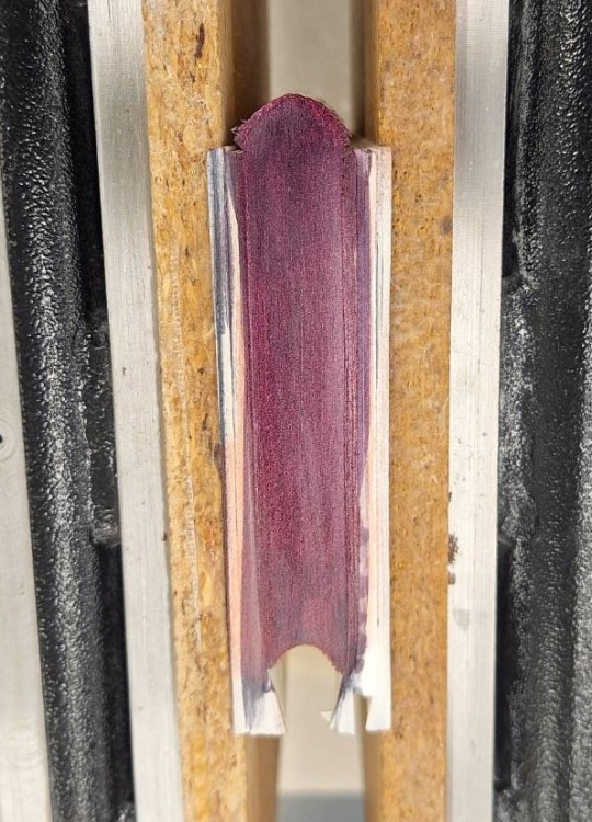
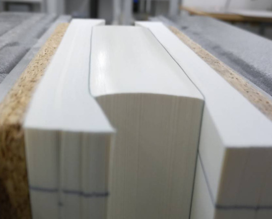
Edge colouring with acrylic paint
I was asked to go over my process for painting edges and I wanted to do a new one so I could take good pictures of the process. Alas, I don't have the time to do that at the moment so a quick write up with already existing pictures it is
These pictures only show the colouring of the top edge. Traditionally it's either the top edge or all edges that get coloured/decorated. Colouring the front edge of a rounded book comes with another set of challenges that I will not address here. (On the upside, colouring a straight front edge is just the same.)
The basic procedure is always the same though.
First up the book is set in a press. Trimming helps to get a more even surface and will help reducing the time one spends on sanding.
Prepping the bookblock I prep the bookblock and use some sturdy and not voluminous paper to cushion the bookblock between boards. A bonus on this is, the cushioning can adapt to the shape of the bookblock. As visible the pictures, these are from colouring the edge of book with shoulders (which means it has not only been rounded but also backed). By cushioning the bookblock I can protect the shoulders from being squashed by the boards when I apply pressure. The cushioning paper should also be larger than the book itself. Otherwise the pressure from clamping the edge tight can cause a smaller cushioning to leave marks on the bookblock. (btw paper from high gloss magazines is perfect, because it's very dense and will not be compressed/ reduce pressure on the bookblock)
Putting the book in the press For this you need a press that allows to have one side of the book (the one you're working on) point upwards. The paper is level with the edge, but the boards are a bit recessed (no more than 5mm). This is done to keep pressure on the bookblock without having to sand the boards at the same time. Also thinner bookblocks can quickly get sanded at an angle which is a) an aesthetic issue and b) causes trouble when taking the measurements for the case.
When the book sits tightly in the press (here the go to is, give it as much as you have! you want those pages so tight no water is seeping in and causes bleed! Sometimes paper quality is lacking though and it can't be avoided.)
Sanding the edge Sanding is, in my experience, the one of the crucial parts of edge colouring. A smooth edge will lead to an even result and removes one possible cause for flaking (there are more though). Even my trimmed books usually have a mark from the blade when trimming and to get an even looking result those need to go. I sand in different grits, starting with a 120 sandpaper wrapped around a block of cork or another tool for holding the paper. I go no lower than than to avoid getting even deeper groves than there still are. Then I follow up with 180, 240 and 320 paper. Usually that's enough to get a glossy sheen on the edge. (different book but you can see that gloss and the part I still had to go over in the pictures below)

Once they have that sheen...
DO NOT TOUCH THE EDGE!
I know it's hard. The temptation to just run the fingers over them great. They look so smooth and shiny. Almost silken to the touch... and they are... but I repeat YOU MUST NOT TOUCH!
The oils on your skin can interfere with a good result. Especially water based colours may not stick as well to the areas touched as others, glues and foils do not adhere as well, stuff like that. Applying colour When the book is in the press it's not removed or pressure reduced before the edge decoration is done. For the colour shift acrylic paints it's essential to get a dark foundation. Otherwise the colour will not show! I've done this with ink.
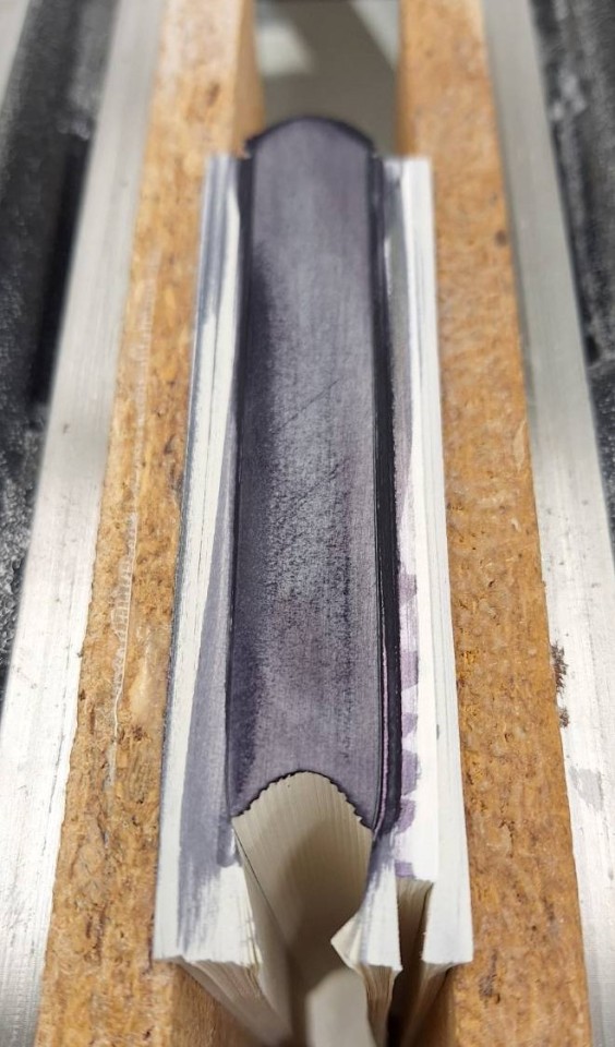
(This was really rushed and not neat at all, don't aim for a look like that! All the darker parts show where I did not have a smooth surface yet. Even the cutting marks from trimming are till visible.)
In my experience working with acrylic paints is more forgiving to laziness when sanding than inks. At least when it comes to even coverage in the end, possible flaking is a different matter.
The colourshift acrylic paint was way more liquid than the ones I'm familiar with, still they needed diluting (a first go with undiluted colour resulted in severe flaking). For the ratio on how to dilute I can't give measurements. I think I ended up with a rather thin colour and did several passes until I was satisfied with the colourshift effect.
No matter what coat is applied I use a soft brush that is wider than the bookblock to cover all at once and avoid to obvious streaks. The direction of brushing is from spine area to the front. I try to get the whole edge covered in 1 motion. To avoid colour seeping down the front edge I lift the brush towards the end so there's less pressure pushing a bit of colour ahead of the brush and spilling down the front edge. (I'm still working on that part, different paints behave differently, but that's the ideal to aim for.)

Now all to do is wait until the colour is completely dry. Which is rather fast with acrylics but takes a bit longer with ink. That step can be speed up a bit with a hairdryer on low heat and from a distance to allow the colour to dry evenly and then the book can be taken out of the press.
I've seen different approaches to separate the edges. Mine is a gentle wave motion. Holding on to the books spine and front and just twisting it and pushing the pages so they move against each other.

If all went well there's a rewarding crackle and no colour flakes off. If colour flakes off, it's back to square one, sanding until all is clean and smooth, colouring, drying and separating (and hoping this time all goes well).
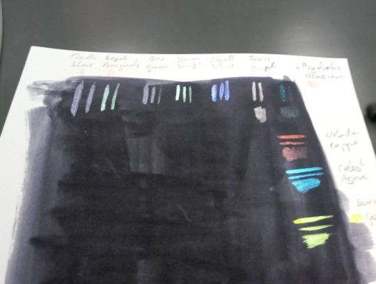
As a reference for the colourshift paints I used, I did a test sheet for the chameleon colours. So here's a dot of the same colour on white paper as the stripes under or next to it on the black and also slightly different angles to show the colourshift (sadly it photographs really bad on flat surfaces)

#bookbinding#colouring edges#colourshift acrylic paints#edge decoration#I should write about my experiences with different types of colours when colouring edges some time#don't trust me when I say 'quick write up'#apparently I lie XD
31 notes
·
View notes
Text

don't touch that dial ! you're watching . . .
#mayonakako: independent, selective, sporadic activity rp blog for a headcanon based female protagonist of atlus's persona 4 / golden ! answers to madoka yoshinaga. ♡ not spoiler free, may contain ( tagged ) triggering & mature content! reboot of #investigationshoujo, guided by peppermint.
personal blogs, do not interact! you will be blocked on sight.

a study in... all loving heroine. a broken ace. big sister instinct. desperately craving affection. parental abandonment. plucky girl. overcoming the awful truth. blossoming into one's true self. picking up the pieces.

01. dossier. 02. verses. 03. headcanons. 04. study. 05. archived blog. 06. tv graphic. 07. icon source. 08. psd.
mobile rules!
i will not interact with muns under 18 or personal blogs. if your rp blog is a sideblog please give me a heads up, and include the url in asks!
mutuals only. i’ve had some rough experiences in the rpc over the years, so i might be a bit more selective about who i follow. it’s nothing personal! on that note, if anon gets abused it is being turned off and staying off.
duplicate friendly! i don’t practice exclusives, but i do practice mains.
i will not interact with people who use generative ai on their blogs in any way, shape, or form.
i will not interact with the undertale/deltarune, genshin impact, kingdom hearts, homestuck ( *close friends excepted ), or final fantasy rpcs.
friends from the fire emblem rpc, please tag your byleth/student, robin/second gen, corrin/royals, and corrin/second gen. it’s gross. please at minimum tag dimileth, i will unfollow instantly if i see it.
ooc bigotry is not acceptable. if your character is a jerk, you’re free to write them as such. but i won’t tolerate it ooc.
don’t godmod.
while i’m not fussy about how people format their posts, i do ask that if you are using coloured text, you avoid making it overly bright and saturated in threads with me. i don’t know why it hurts my eyes so much on the dash, but it does.
while i’m totally fine with writing darker themes & content, i will not be touching smut. madoka is a minor. i also will not be writing the accomplice route.
please reblog memes from the source if you do not plan on sending anything in.
feel free to ask me about the status of a thread/ask/what have you, but do not pester. i work a full time job that is incredibly draining, so my activity may be sporadic.
i do believe drama should be handled in private, but also support calling out bad behaviour when private discussions aren’t working. alerting the community to toxic, harmful, or predatory behaviour is not bullying.
3 notes
·
View notes
Text
Redesigning Jester
I've been working on trying to pull my story about Kings Court into something coherent and presentable, and as I've been going through that process I've been realising that I need to redesign some of the characters!
The first character I've been reworking is my beloved Jester! Here is their original design:
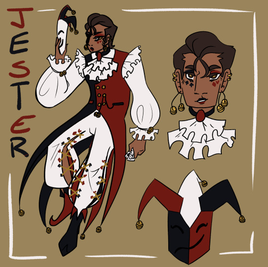
I did really enjoy this design! But as time has gone on there have become certain pain points, and as the story has developed there are things I want to incorporate more strongly into the design. You can see a detailed breakdown of the re-design goals and process below the cut!
The mask - it needs to be a feature, not an afterthought.
As much skin as possible should be hidden, I want to play into the Jester as an anonymous and mysterious entity.
Simplify - the four tail coats are far too unweildy, and the pants proved annoyingly intricate with repeated drawing.
Ensure that the design is fun and exciting to draw in motion! Jester flops around a lot.
Incorporate an additional motif to reflect role in the court.
I began the process by looking for inspiration and reference material, particularly for the mask. I collected a variety of reference images onto a pinterest board to use for inspiration and then got to sketching! Here are some of the initial exploratory sketches.
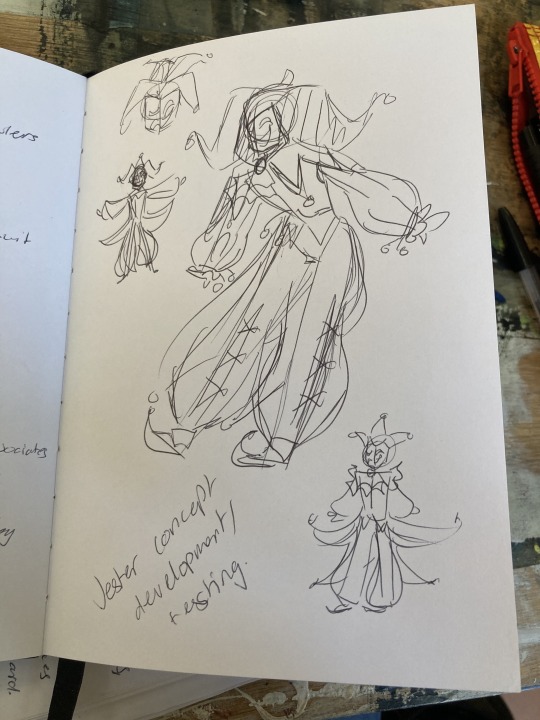
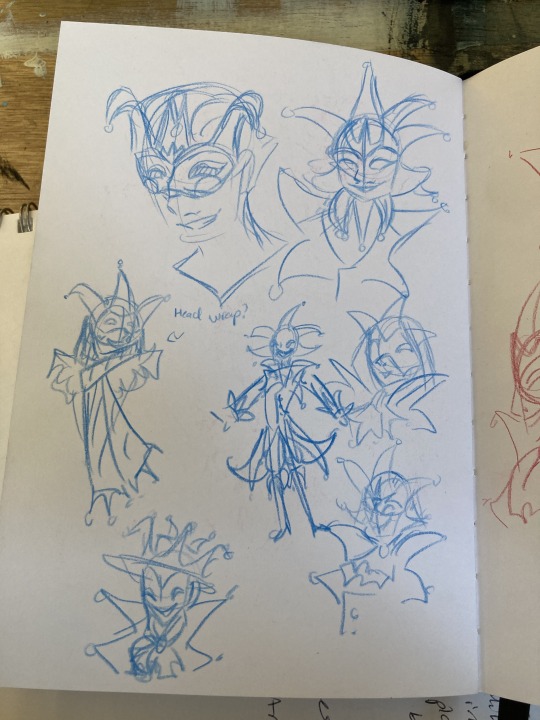

After the sketching process, I started working on some more finalised concepts taking what I had explored in the sketches, exploring the ways to combine shape and colour, and also getting feedback from friends.

I then did a set of concepts all next to each other taking some of the ideas I had liked from these concepts as well as trying to add in some new things.
Silhouette was a major consideration throughout these concepts - as well as experimenting with the mask design. The first and second designs proved the most popular, and also worked as my favourites. And so moving forward I decided to combine elements from them both. Namely:
Collar shape from design 1 - it's dynamic, fun, and interesting!
Hood based design from 2 - I like the framing of the hood.
Two pronged vs Three Pronged design from 1 - Easier to draw repeatedly and manipulate in dynamic ways, I think it gives a more dynamic flow to the design as opposed to the triple prong potentially being a bit more static.
Thigh high boots from 2 - my friends like them and I like the way they make the legs look long.
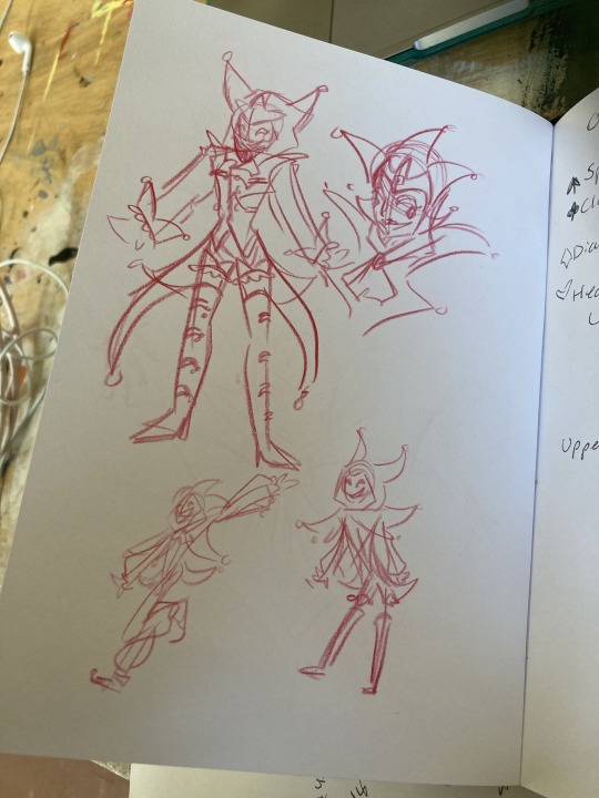
I also knew that I wanted to make sure that the design I came up with fit with the design of another character - Jack, and also play with poses to see it in motion, so for the next tests, I decided to work on them both simultaneously and have some fun drawing them interacting!
As you can see, I had settles fairly well on the overall shape of the design, but still made some minor tweaks between images - mostly to do with the placement of the colour blocking. I also changed the mask design here from the previous iterations as they felt too cluttered and overpowered, and I also really enjoyed the design from the makeup Jester had in his original design, and realised it could transfer effectively to the mask design! Another thing that changed is I removed the crown motif I had started to develop, and tried to focus more strongly on incorporating an eye motif. This was a change made as I sat and considered the lore and symbolic implications, and I ultimately decided it worked best if Jester had the eyes and Jack had the crowns. King and Queen will likely have both when I get around to redesigning them! I still have some more playing around to do to settle into the final design before I make a proper reference sheet, as I'm definitley finding drawing the design in context helpful to get a sense of how it operates in practice and streamlining. I'm currently working on a mini PMV project featuring Jester which will hopefully help me solidify the design! But I'm feeling pretty happy with it so far.
I want to do more discussions of my design/redesign process in future as I find it really helpful and interesting to organise my thoughts like this. It's also exciting to see the progression all laid out, I'll probably do a similar thing for Jack soon!
#oc art#art#character design#character design rambles#redesign#pandemonium#jester#a long extended exploration of my process in redesigning my beloved jester#i just wanted to ramble about all the things going through my brain i hope someone finds it interesting#i like reading about peoples processes and considering my own its interesting!!#creative process
10 notes
·
View notes
Text
Project: Movement. Week 4. Thursday, 1/02/24.
Painting: Studio Time.


I did a bit of thumbnailing for what I had in mind and even shot some reference pics in my bathrooms doing different actions/ different positions to help decided with what direction I wanted to take this painting. My initial idea was to create a portrait of my past self looking into the mirror at my current self, reflecting my theme of the movement of time and how much I've changed since cutting my hair for the first time.
I decided to further emphasise the change between my past and future self with colours, duller colours for the past and highly saturated eye catching colours for the future. I had to do some thumbnails for how to balance out the colours, and look at some older works of mine to see how I did it in the past. I settled on using primarily red, yellow, blue, green, and orange as my colour pallet. However, I've never used them in the way I intended to here, so it was certainly a new experience.

I started off by choosing a reference picture and doing a rough under drawing to figure out proportions. When doing my rough sketch I actually taped my phone to the wall and tried to draw from a distance so I could calculate the shapes and proportions as accurately as possible.

I decided that since the interior and exterior of the mirror are very different in colour schemes, I would work on one at a time, I chose to focus on inside the mirror to start off with. Once that was done I began blocking out my main base colours and went about adding shadows. the light shadows helped start the process of shaping the face. It was a very "trust the process" sort of situation.

I knew with the approach I took I wouldn't be able to get away with solid blocks of colour for the hair and shirt, so I experimented with layering different colours to gain different textures. For the hair I tried building shapes with different layers of blues and greens before going in with a dark blue for the darker areas and shadows, I then went in with some red and light green highlights. It was certainly an improvement.

As for the shirt, It was very trial and error, I actually had to repaint over certain areas. I settled with using my light blue for the main shadows on the shirt to add a sense of dept, the translucence of the blue paint on top of the orange worked in my favour. Since blue and orange are on opposite ends of the colour wheel they tend to cancel each other out a bit, resulting in a duller hue of blue which was perfect for the shadows. I went in with greens to blend out the blue at the edges and yellow for highlights, I used bits of red and dark green for creases and wrinkles in the shirt. When I was doing the blue areas, I actually covered large areas at a time and then would drag the back of my hand through it removing a lot of the paint and leaving an interesting texture, similar to a wedge tool shown to us during the tool workshop.
That's all the progress I made for Thursday
7 notes
·
View notes
Text

YOUR FAV IS SCHIZOSPEC↭!!
Hey folks!! I'm Sol (he/it), and imma be the one running this blog!! I noticed that the previous "your fav is psychotic" blogs seemed to be either inactive or deactivated, so I thought why not add another sideblog to the collection, you know? (EDIT: XANDER HE/HYM/IT IS ALSO HELPING WITH THE BLOG NOW)
The ask box is open, so feel free to request any characters! Format it something along the lines of...
"[Insert Character] from [Insert Media] is psychotic!!"
Or maybe, "psychotic and autistic," "a psychotic pwAVPD," "schizospec," or even "a schizo" if you really want. Feel free to go into details too like, "[Insert Character] from [Insert Media] is psychotic, and has [Insert Symptoms]!!" ..or you can just chat to me and share posts, that's chill!! Elaboration on submissions here...!
This place is safe for neurodivergents of all kinds, including disabled pplz btw!!
I'll say outright that pwPDs are welcome here, so if you think "narcissistic abuse" is a valid descriptor of any abuse then go away!! It's also not my place to question other people's experiences, so if you're the kind of person who goes around fake claiming others.. You're not welcome!! I don't care how "cringey" or "obviously fake" someone is, because in my experience that's usually just repackaged sanism!! Any plural/system/what have you is welcome, I'm not interested in syscourse so try not to bring it up. But anywayz, if you get on my nervez I'll justz block u k?


Here is my own version of the psychosis/schizospec flag, with the symbol, primary colours and moon motif pulled from actuallyschizophrenic, while otherwise being unabashedly inspired by charb's flag. The explanation/description is pretty long so I'll tuck it underneath the read more (along with other ids). Feel free to use thesez!! Just tag me if u do anythingz cool w/ them cause I wanna see!!
The flag centers the symbol of the schizospec/psychotic community: an arrow pointing either way, left and right, (symbolizing the vastness, scope, and diversity of the community) with a wave in the middle (symbolising positive and negative symptoms). It's coloured purple, one of our representing colours, featuring a pink outline to help with the cohesion of the flag.
Behind it are two overlapping circles: one a light grey like silver (our other representing colour), and one a dark purple. White and black can often be seen as ethereal colours (embodying light or the abyss), so I knew I wanted to include them for their otherworldly properties, and so the overlapping is like the inbetweens or overlapping of what we perceive and experience if that makes sense. The overlapping circles also create a crescent moon, another symbol claimed by the community because psychotics are a bunch of "lunatics". It's outlined in grey to help with the cohesion of the flag.
The impression of a pink arrow's point continues to either edge of the flag (also outlined in grey), emphasising the centered symbol while also seperating the top and bottom's colours. Shapes come off the top and bottom of the pink, imitating a wave. The waves on the top half are a lighter purple with a purple background, the bottom a lighter red with a red background (outlined in pink). These are akin to lines on a typical flag.
To pull from charb's description of the colours:
Purple; the good side of schizospec disorders/being proud of being schizospec despite everything. Red; the reclaimation and/or the hatred of harmful tropes of us in media. Grey & Black; the unfortunate bad side of schizospec disorders and the strength it takes to deal with it. Pink; acceptance and the hope for better treatment from others.
And next to that is its geometric counterpart, which should be a BIT easier to reproduce.. But I think it's pretty obvious I made the flag to be more artistic than practical.
The symbol is the same, but the circles have been changed to verticle lines. About a quarter of the flag the silver line, a quarter the dark purple line, the overlapping colour a small slither. This block of lines is outlined by grey. To the left and right are horizontal lines, alternating between large and small lines. Top to bottom, starting with a large line: purple, (pink), light purple, (grey), pink, (grey), light red, (pink), red.
Blog header is my version of the psychosis/schizospec flag. Pfp is Ame-Chan (Needy Streamer Overload), with the purple, light purple, pink, light red, and red stripes as a background.
First image of pinned is the purple, light purple, pink, light red, and red stripes.
Next image is purple, light purple stripes. Followed by the psychosis/schizospec flag, and its geometric counterpart. Next image is light red, red stripes.
Under the cut is the purple stripes again, followed by the red stripes. This text is followed by the first pinned image, repeated.
#pinned#your fav is schizo#your fav is schizospec#your fav is psychotic#psychosis#psychotic#schizospec#schizophrenia#actually psychotic#actually schizospec#actually schizophrenic
10 notes
·
View notes
Text
Puyo Puyo Sun 64


JP release: 31st October 1997
NA release: N/A
JP release: N/A
Developer: Compile
Publisher: Compile
N64 Magazine Score: 80%

My main experience with Puyo Puyo is Dr Robotnik’s Mean Bean Machine – a game I couldn’t enjoy because of colourblind issues, so I was dreading playing this one. However, in the options, you can adjust the colours of the different Puyo, even going as far as completely greyscale and relying on the (a bit too minor when the game goes fast) different shapes completely.

With the options set to how I like them…I actually really enjoy Puyo Puyo. It’s geared towards a 1v1 setup, as creating sets of four will send bad beans to the opponent’s screen – but if you score combos, you’ll send a load at once. This creates a risk factor as you can try to set up elaborate combos (something I’m not good at) but wait too long, and your opponents will scupper your plans with some bad blocks.

The story mode has you battling lots of colourful characters as you get amusing little snippets before each match, with some nice animation. It’s all very silly, but also quite entertaining, with lots of unfortunate events happening to absolutely everyone. Of course, every problem in life can be solved by a Puyo Puyo battle.

There’s also a good amount of different modes. Puzzle Puyo is essentially a training mode, giving you a guide to help you set up combos, and you can then test out these skills in a mission mode, which gives you tasks but you have to figure it out yourself. There are also endless, tournament and versus modes, giving you plenty to deal with.

I have not played any later Puyo Puyo games so I don’t know how this compares, but I found this to be genuinely entertaining and it was a blast to play.
It’s Puyo Puyo, still one of the finest competitive puzzlers to ever come between friends and have them growling under their breath at each other.
- Zy Nicholson, N64 Magazine #10
Remake or remaster?
A collection and official localisation of the earlier Puyo Puyo games would be nice.
Official ways to get the game.
While there are newer Puyo Puyo games, this particular version is not available anywhere.
2 notes
·
View notes
Text
Hello, it is I again, and I kinda know (part of) the answer to this one. Sorry this got so long. Any neurophsychs etc. who see this, blease feel free to jump in and clarify or correct everything I've got wrong.
tl;dr: Memory is not One Thing. There's several different types of memory and one of the things with ADHD is that some forms are supercharged and others are uh, hot garbage. They work different ways and use different parts of the brain and may be recalled through different processes. Read on at your own peril.
E.g. working memory, the memory that's a bit like computer RAM, where you hold current information you're using. I'm not a neuroscientist, and the gist I've got from neuroscientists is that brains are "nightmarishly complicated", buuuut: a lot of the stuff with working memory function is based on dopamine receptors in the prefrontal cortex...y'know, that area of the ADHD brain where dopamine regulation is absolutely fucked?
And I suspect that's why ADHDers all know the thing of "I need to do A, then B, then leave the house". So you do A and then leave the house like, job done! B? Never heard of her. Long term memory will review this in about 10 minutes and make you go "Oh fuck! B!".
Short-term memory is different to working memory and long-term memory; generally speaking it's stored "acoustically". As in, if someone says a string of words to me I remember them short term as the actual sounds. It fades quickly and it's also why when I don't parse what someone says I say "what?" and then immediately reply because actually I can just replay the noises I heard. Fun fact: some of the evidence for this comes from the fact that people can remember a sequence like "A B Q F" for longer in short-term memory than "E B P D" because the letters sound different.
Long-term memory is conceptual rather than acoustic; it's abstracted rather than a recording. And I think this is why my memory can be both amazing and utter dogshite. It's made up of like declarative and procedural memory. Declarative is things from personal life experiences, procedural is more like tasks you've learned. Declarative is further split into episodic and semantic memory. Procedural is how to ride a bike, semantic is knowing what a bike is and episodic is that one time you crashed a bike into a fence.
Fugue states are an interesting example of how these are kinda separate, being like a block on episodic memory but with access to semantic and procedural. So a person may not know who they are or have any memory of their life...but they still know what things are and how to do stuff.
Anyway, recalling memories is the tricky bit, because pulling all the details relies on linkages. ADHD folk seem to be very good at like, conceptual linkages, and we can often pull semantic memory with ease because we create wider links between more distantly related bits of information. Episodic memory though is often tied to time cues, and uh, yeah. Sense of time is totally borked in ADHD folk.
So, "do X at time Y": yeah I'm not getting that link to trigger X.
"Remember what you were doing at time Y?": I do not, for you see, I have no idea what a "time" is, let alone which specific one was "Y".
I see the shape of a leaf and the colour of a flower: "Caltha palustris" says my brain as it pulls on the thread linking these semantic memories. And from that I can remember the time I saw one, but it's not linked to time.
And I think that's part of why I struggle to remember dates. Because they don't have a neat conceptual meaning other than time. Which I fucking suck at.
movies where someone hears an important message only once and retains all the details….
girl if that were me, we’d be fucked. I have to reread emails like 4 times.
#adhd#actually adhd#again I'm not a neurologist or neurophsych and I'm sure I've got some bits here wrong#but the fundamental point still stands that it's more about the types of memory and recall functions#anyone who knows more about this please please fix it#but yeah my episodic memory is not like good but my semantic memory is class
171K notes
·
View notes
Text
Home Colour Design Trends of 2025
Summary Discover the hottest home colour design trends of 2025 in this C Valley Paints blog. Find out the most sought-after paint colours, award-winning colour pairings, and new interior trends, all handpicked to assist you in selecting the perfect paint for home interiors. Whether you’re painting one room or overhauling your whole home, these trends will assist you with ideas and useful tips.
As we venture further into 2025, home colour design is moving towards a more deliberate, expressive path. Individuals are no longer merely painting walls—they’re crafting moods. At C Valley Paints, we’re witnessing strong statements, grounding earth tones, and subtle combinations of texture and color come to the forefront. If you’re looking to update your space this year, here’s what’s trending in home colour paint today.
1. Earthy Neutrals Are the New Classics
Bid adieu to antiseptic whites and hello to earthy, warm neutrals. Beige shades that have warmth, browns with a soft sheen, clay colorations, and greige (half-beige-half-grey) are ruling the roost among interior paints. They seem to have an earthy feel, come naturally, and are adaptable enough to complement living rooms, bedrooms, and even kitchens.
The C Valley Paints top favorites:
Desert Clay
Warm Taupe
Silken Almond
These colors create a calming backdrop that allows you to experiment with bolder furniture or accent items. They’re perfect if you desire a clean, contemporary room without it being chilly.
2. Jewel Tones Are Back—with a Twist
Imagine emerald green, sapphire blue, and rich plum—but relaxed. In 2025, jewel tones are becoming a bit dustier or more matte, making them easier to live with and more sophisticated.
Used as accent walls or for spaces like dining rooms and libraries, these hues create an elegant statement. Experiment by pairing them with metallic furniture or velvet textures for a classy appearance.
Experiment with this combination:
Emerald Velvet (accent wall) + Muted Gold (mouldings)
Midnight Sapphire + Ash Grey accessories
Combined with the best paint for home finish (such as velvet touch or silk matte of C Valley Paints), these hues sparkle—without being overpowering.
3. Nature-Inspired Green Is Everywhere
Biophilic design is affecting everything from residential architecture to wall paint colour. Green, in all its tones, is driving this trend. From sage to olive, to mossy greens, these hues bring the outdoors in.
Why it’s trending:
Encourages relaxation and mental health
Complements wood and natural fabrics
Feels classic, not trendy
Our home colour design specialists suggest colours such as Soft Sage, Olive Breeze, and Forest Touch. These greens are especially in vogue for bedrooms and work-from-home areas.
4. Moody Monochromes for Drama
Dramatic doesn’t have to be crazy. 2025 is all about rich, moody monochromes that make sleek, modern looks. Think charcoal grays, smoke-blue navy, and even dark brown.
Used best in:
Bedrooms
Study rooms
TV lounge areas
When executed well with proper lighting and contrasting décor, these shades can create an intimate, cozy, and modern atmosphere in a room.
Tip: Apply our low-sheen or matte finishes interior paints for a smoother effect.
5. Playful Colour Blocking
Homeowners are more receptive to creativity—and colour blocking is a massive comeback. Geometric shape painting, arch effect, or two-tone walls give a modern art look to even the most basic rooms.
Top combinations:
Terracotta + Cream
Powder Blue + Mustard
Coral + Blush Pink
These combinations look fantastic in kids’ rooms, reading nooks, or corridors. Employ painter’s tape and C Valley’s superior-quality emulsions for sharp edges and bright paint shades delivery.
6. Warm Whites & Buttery Creams
If you’re still drawn to light tones, ditch stark white in favour of warm whites, ivory, and buttercream. These hues reflect more warmth and go beautifully with wood, cane, or linen textures.
They also enhance natural light, making them great for small spaces or rooms with minimal sunlight.
Our favourites:
Vanilla Mist
Cotton Bloom
Ivory Haze
These make ideal base shades for layering textures, materials, and accent decor.
How to Select the Proper Paint Color for Your House
Selecting the proper wall paint colour isn’t all about what’s popular. It’s about how you feel in your home. Here are fast tips:
Mood Matching: Need peace? Use greens and soft blues. Need energy? Use warm yellows and corals.
Lighting Matters: Natural light brings out cool colors. Warm artificial lighting goes better with earthy and warm colors.
Size and Space: Smaller areas can be made to appear open by using lighter shades. Larger spaces become cozy with darker colors.
Here at C Valley Paints, we provide one-on-one consultations to assist you in choosing the best paint for home interior, depending on your specific space and lifestyle.
The Final Word
The 2025 home colour design trends are daring yet livable, outspoken yet earthy. Whether you love earthy tones, playful juxtapositions, or moody colors, the message is to select colors that resonate with you—and enrich how you live.
With our carefully cultivated palette of interior paints, intuitive finishes, and expert advice, C Valley Paints is committed to assisting you in bringing these trends to life.
0 notes
Text
Shot 9 modelling
This is where I last got up to modelling shot 9. I had begun modelling the interior with some basic blocking and tried smoothing out the landscape. At this point I think the glass is to transparent, which means I'll have to put more detail into the interior, taking more time.

Building up the surrounding environment
Revisit of pre-production research- looking at what objects to put in the lookout tower.


Objects modelled
I've been able to keep all these objects simple in shape, so that they are clear what they are but not having to worry about the detail. I had seen a lot of the lookout towers have things hanging down from shelves, so I added some hanging pans which should fill the space nicely. I think for these objects, I won't need to paint them as the glass blurs them slightly, so would be a waste of time. I've tested this by colouring a few objects and they look fine through the glass.

Glass
I've had a bit of trouble working out how to texture the glass. I need to work this out now, so I know what needs modelling in the background. I think the Maya textures will work well enough for the glass. I've experimented with different levels of reflection and transparency. I want the reflection of the landscape but also the interior to be seen. I'm trying to find the right balance.


shot 15
Shot 15 all I needed to do was import the model from shot 9 and line it up. In this image the light the of lamp looks weird but I haven't lit that properly yet. I will do all the lighting after the texturing is complete. I think potentially the transparency needs to come down.

Render test
Happy with how this shot is looking now. I think the animation is much better than it was before. You can tell more that he's not fully there, almost drunk in his movement as he wobbles slightly. It still needs to slowly down in parts, where he's noticing the smoke, but that is some I can fix in post.
Shot 10
Another simple shot to model. I already had the objects made. Again I just needed to import the fire tower model in.

After looking at some real fire lookout towers, quite a few you can see the tops of trees close up. I think it would improve the landscape if I included this. It will help get a better sense of his surroundings. I've found with importing transparent png images into the scene, the arnold render view cannot show it, so I'm going to have to find a different way of doing it.


0 notes
Text
‧͙⁺˚・༓☾ POSTER IDEAS ☽༓・˚⁺‧͙
I came up with some ideas for posters, focusing on some of the most important features of Displate.

The first, third and last poster focus on its durability, while the 2nd poster focuses on its affordability and potential to make a collection out of Displate's posters.
I think the last 2 posters are humorous, but the last one might be a little too intense, as it shows a poster being sat in an activated electric chair. I will draw the poster with the alien since it will appeal to a larger audience, as well as Displate's audience. Displate has lots of Star Wars posters, meaning the customers enjoy Sci-Fi. Aliens are Sci-fi too.
‧͙⁺˚・༓☾ Process
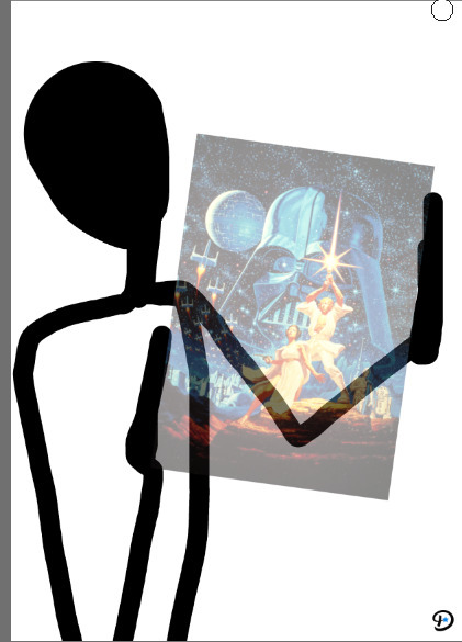

I used the most simple and quick method of drawing, by blocking the main shapes out first, and filling in with colour. I tried sketching more poses, but I went back to the original pose I sketched. I thought it looked cuter and more dignified.


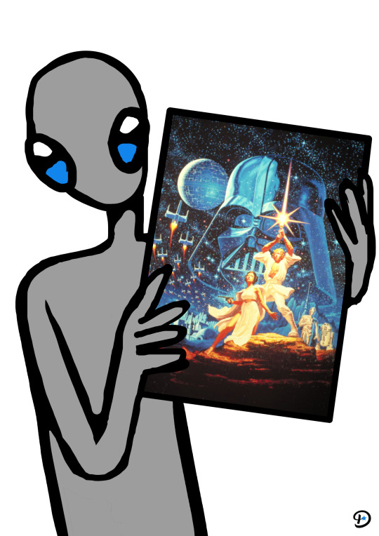
‧͙⁺˚・༓☾ Variation

The final versions had the lines around their heads and eyes cleaned up. Aliens of different colours are believed to come from different planets, so I will keep that in mind when adding typography. Red aliens are said to come from Mars, while blue aliens are from Venus. I browsed fiction forums to discover where green and grey aliens are from, and the results were complicated names of different star systems, like Zeta Reticuli. Green aliens are also Martians, but I wanted them all to be different "races", so to speak. I discovered Star Trek has a green alien species named " Orion ". Even if I'm not a fan of Star Trek/Wars, I will use that species name for the green aliens. For grey aliens I will use a general term like... extra terrestrials.
‧͙⁺˚・༓☾ Finals

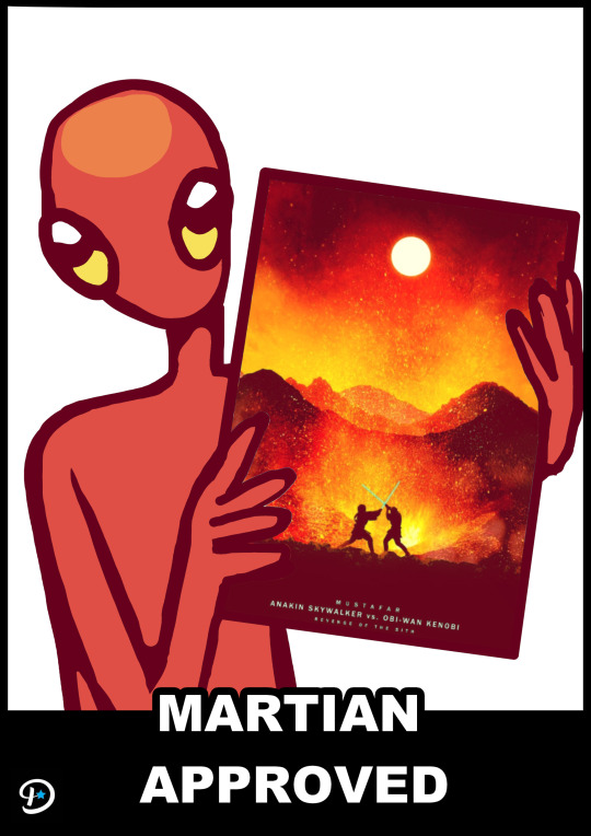

I coloured the lines to make the illustrations cuter and added text as I said I would. They look a bit like internet "Memes", something Displate likes to use in it's advertising.
‧͙⁺˚・༓☾PHOTO MANIPULATION ☽༓・˚⁺‧͙

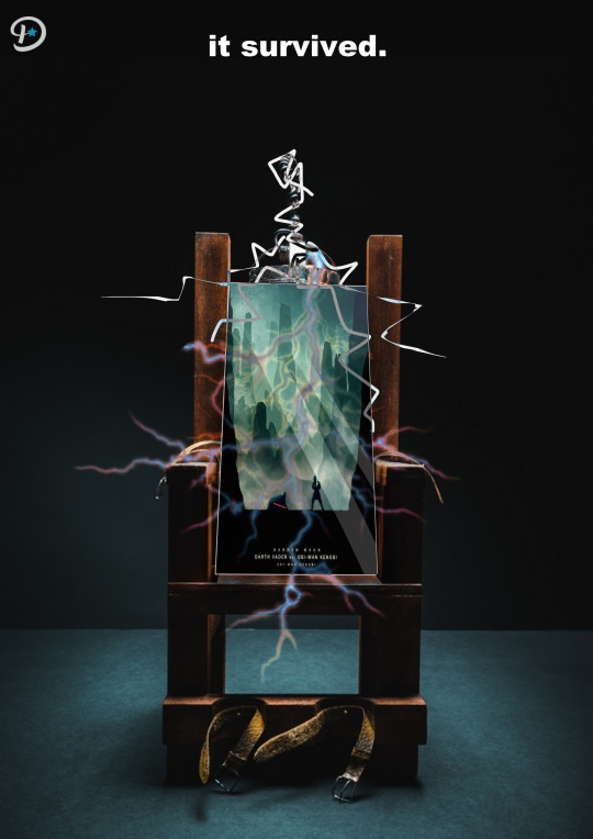
I also tried doing a poster with the electric chair idea I suggested because I knew I make it using photo-manipulation, a technique I haven't used yet. It's a little ridiculous and the poster isn't very easy to see. This experiment was just to try photo manipulation, as I said. I took the electricity graphics from google images and also drew a few lines myself. It's not very obvious due to the electric current, but I edited the poster in a way that would suggest tilting and being lit from above. I also attempted to make it look 3 dimensional with the white outline, suggesting the edge curvature of the poster.

After uploading this image I realised a big mistake. I forgot about perspective and foreshortening. Here is a version more accurate to the real world physics:

⠁⠂⠄⠄⠂⠁⠁⠂⠄⠄⠂⠁⠁⠂⠄⠄⠂⠁⠁⠂⠄⠄⠂⠁⠁⠂⠄⠄⠂⠁⠁⠂⠄⠄⠄⠂⠁⠁⠂⠄⠄
0 notes