#tips tricks & tutorials
Explore tagged Tumblr posts
Visit Tumblr Blog
Explore Tumblr blogs with no restrictions, modern design and the best experience.
Last Seen Tumblr Blogs


Fun Fact
Tumblr has 4 main sources of revenue.
Text
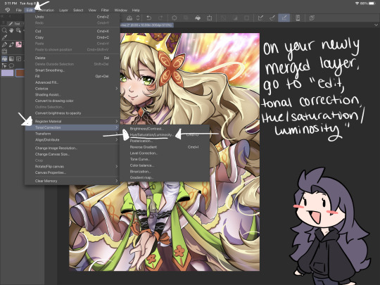
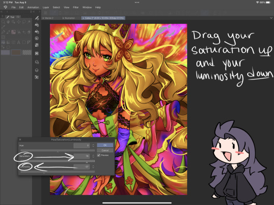
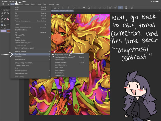
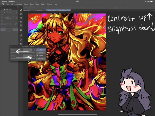
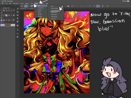
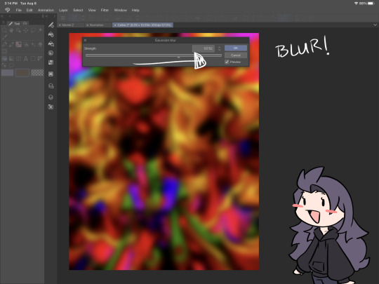
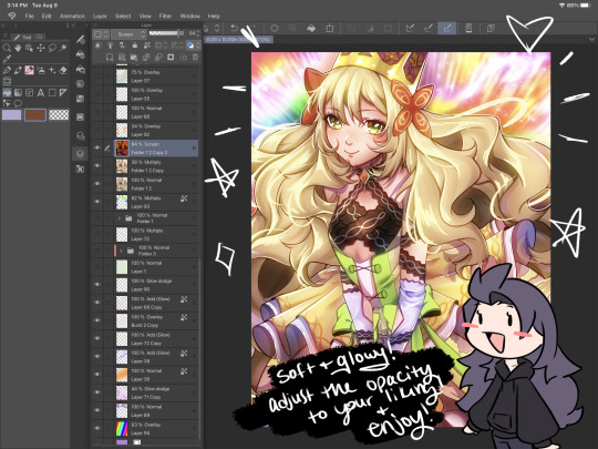
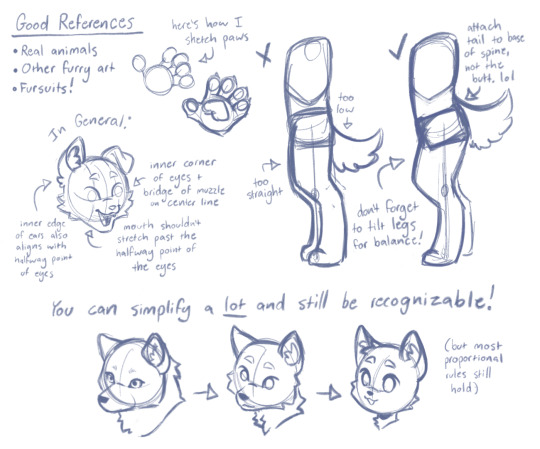
Very messy and bad lineart tutorial I made a couple days back. I hope this is helpful to someone even if it’s a bit incoherent LMAO
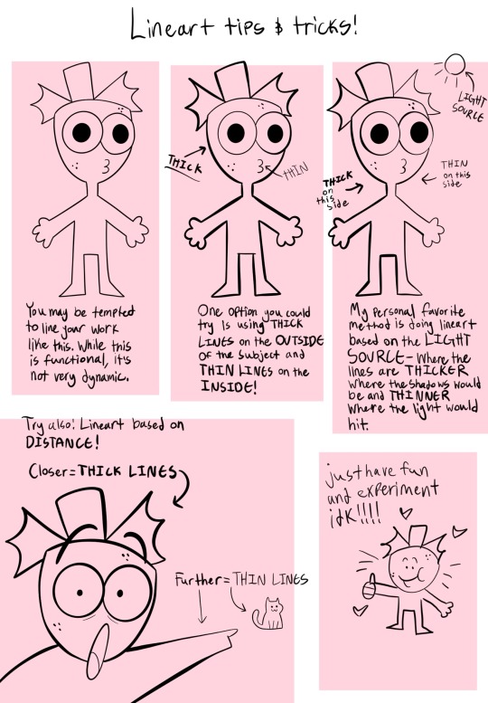
Take my advice with a grain of salt, of course. I wouldn’t want anyone to think that my way of doing art is the only “right way”. There is no right way to do art! Just make art!!! Dingus!!!!! /lovingly
#digital art#commisions open#procreate art#cartoonist#artist#oc stuff#art advice#advice#art tips#begginerartist#begginer artist advice#art style#lineart#lineart advice#art tutorial#tutorial#tips and tricks#tips and advice
2K notes
·
View notes
Text

welcome to "how to accurately write about disability" ft. viktor from arcane (by a dude with the same conditions/aids as viktor) !

pt 1. viktor’s mobility aids & assistive technologies
in the pre-timeskip of season 1, viktor solely uses a cane without any visible bracing; the way he holds his cane is indicative of whether he’s using it as support (handle facing forward) or to help walk (handle facing backwards)


in season 1 after the timeskip, his condition progresses and he upgrades to an unique, arcane-specific mobility aid; it’s a mesh of two types of crutches (forearm crutch & under-arm crutch)


therefore it’s more accurate to refer to viktor’s mobility aid after the timeskip in season 1 as a crutch
given the angles & mirroring, the leg impacted is the left leg (just like me fr) and actually features two different braces but due to the animation of it, sometimes it looks like their combined
viktor has a knee brace & an ankle-foot orthosis, which provides assistance to his knee/ankle/foot
the ankle-foot brace is likely made of metal to stabilize them for walking while the knee brace has some flexibility to it to allow the joint to bend while walking
now onto something very unique about viktor’s condition, his back; what he has on his back (in my opinion) is a blend of a spinal fusion (a surgery in which rods & other metal is inserted into the spine to stabilize the vertebrae) and a traditional back brace
i say it’s a blend of a visible spinal fusion & traditional back brace because of circular scars we can on viktor’s upper back, the aid’s design featuring an almost steampunk visual of the spine and its vertebrae; in addition, the other components of the aid match with ordinary back braces (supportive shoulder strap, full coverage of the spine, etc.)


when someone has a spinal fusion, their physical abilities become limited; they cannot lift over a certain weight, bend, twist, or do any movements that can compromise the spinal fusion
as for the back brace and its structure, i’m sure that it’s very uncomfortable to wear (picture being trapped in a metal corset) but viktor likely has to wear it 24/7 (unless for bathing, i presume? because it’s metal, but idk it’s a fantasy setting so anything comes)
pt 2. what to do before you write
for accuracy, determine what version of viktor you’re writing about; is it act 1 season 1 viktor with a cane? it is act 2-3 season 1 viktor with braces & a crutch? etc. this is important because viktor uses different assistive technology/devices depending on the act or season of the show. once you have that determined, you’re ready to write.
beyond viktor's mobility aids and braces, it's key to incorporate his chronic pain. as someone with his condition (spine disorder), chronic pain is a given. it's something that many writers fail to include when writing viktor or other physically disabled characters like him.
pt. 3 suggestions of what to write
cane & crutch
sounds (i.e. rubber tip thumping against the floor while viktor walks, sudden bang or crash sound effect if viktor drops his aid, etc.)
textures (i.e. feeling the refined wood of the cane, the smooth metal of the crutch, the plush foam of the handles)
visuals (i.e. describe the aid's design, the colors, the engravings, etc.)
complications (i.e. viktor not being able to reach the cane or crutch sometimes when it falls to the floor, the pain in his hand and underarm from constant use)
knee brace & ankle-foot orthosis
sounds (i.e. metal rods grinding against other metal components when viktor walks, the sound of metal hitting the ground with the AFO, creaking/whining of metal)
texture (i.e. how cold the metal is, how stiff the rods that hold the braces together are)
visuals (i.e. describe the details and design of the braces, include things like the color of the metal and the engravings)
complications (i.e. broken rods in the braces, metal cutting viktor when they takes them off)
spinal fusion brace
sounds (i.e. grinding metal against skin, the clicking of the brace's rods, etc.)
textures (i.e. the cold metal, the rigid notches of the vertebrae, etc.)
visuals (i.e. mention the circular scars above the brace, describe the brace's design with mentions of its color and structure, etc.)
misc. additions
try including viktor's thoughts and feelings towards his disabilities and aids; it's not all oh fuck i'm in hell 24/7 when it comes to be disabled. there's an unique humor in disability
viktor can poke people with his cane/crutch, trip people, use it as a pointer, etc.
viktor can make silly or dark jokes/jabs about his disabilities (i.e. jayce, i may be a cripple, but i'm no idiot. or this meeting is more agonizing than the time i fell down the stairwell by the lab- you fell down the stairs?!- i lived.)
include viktor's chronic pain, some areas likely impacted by his disabilities are: legs, back, hands, and underarms
an easy way to show this is through the mention of chronic pain relief tools (i.e. tiger's balm, pain medication (muscle relaxants, opioids), kinesiology tape)
remember that viktor is more than a disabled character; he's an inventor, a scientist, a good-hearted person. he's expressive and has lots of empathy for those like him and the people of zaun. his disabilities influence the path he's on and his experiences, but they are not the sole defining component of viktor's identity.

pt. 4 conclusion & final notes
thank you for taking the time to read this through! if you're able to, please share this with your fellow writers. i hope this post can help folks better represent disabled characters in their writing. if you have any specific questions, message me on tumblr! thanks <3
#hexb0nes writes#arcane#arcane viktor#league of legends#disabled#disability#disabled characters#disabilities#how to#guide#tutorial#tips and tricks
115 notes
·
View notes
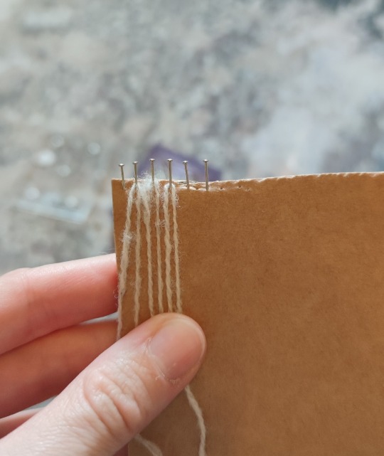
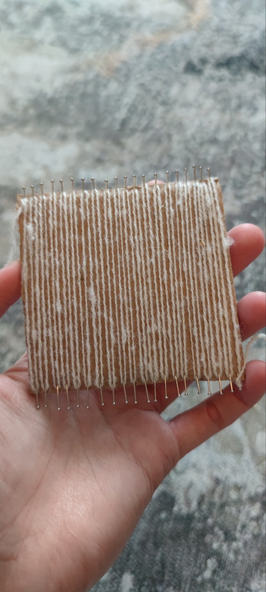
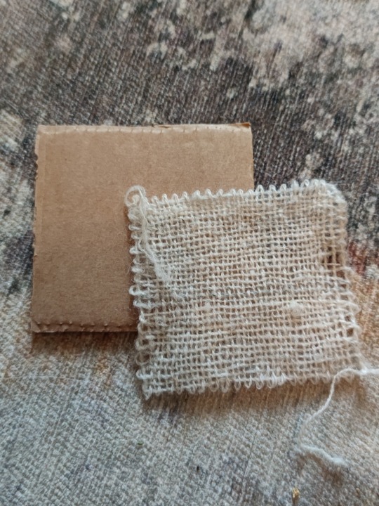
Text
How I make myself a minx loom form test weaves
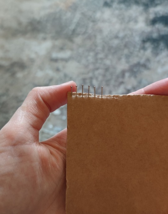
Take some cardboard box and stick some pins on both sides with desired distance
Like this for example
To test if you like the distance, just wrap.sime yarn around
Now fill opposite sides of the cardboard with the pins
Tadaa make Shure you have the same amount of pins on both sides, stick them into the side of the "waves" so it doesn't binge when you warp it.
Each pin should have one on the opposite. Don't pin them offset
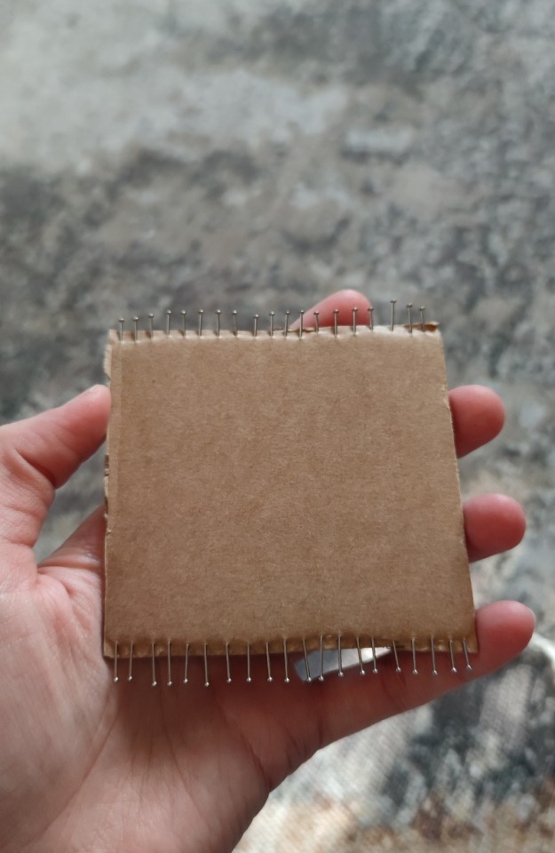
Also make Shure the pointy ends stay in the cardboard, so you don't hurt yourself
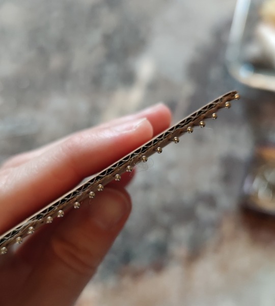
Fix your warp yarn and warp :D
Then tread your weave yarn, and weave! (I have some needle tatting needles that make it much more easy)
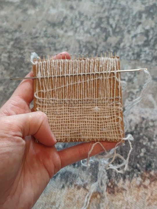
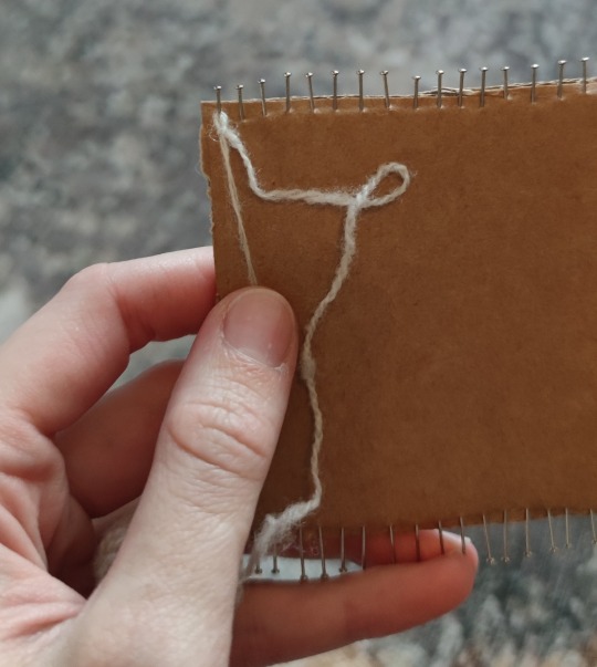
If done, remove pins and finish as you want the future project to be finished
If you want a fringe elongate the cardboard :D
And now you can make yourself a mini loom for tests :3
238 notes
·
View notes
Text
Background lighting and shading composition tutorial
request a drawing here

#artwork#clip studio paint#csp art#drawing#sketch#csp#fanart#artists on tumblr#art tutorial#digital artist#art#art commisions#commisions open#taking commisions#commission#art tips#art tricks#art tip#drawing tutorial#drawing tips
31 notes
·
View notes
Text
How to "square up" a quilt block
I use square ruler for this. Mine is a Tula Pink ruler by Creative Grids. The fabric is these pics us Dreadful Delights by Robert Kaufman. The things on my fingers are ring splints. I have hEDS and these prevent my fingers from bending backwards while I work.
First, you need to line up the seam. This helps keep things nice and tidy.
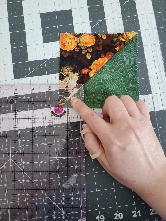
Now, set it up so there's a little excess on all four sides.
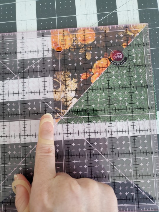
It may be a little wonky, but that's the point of trimming them. You get ride of the wonky.
Now trim those two outside edges without moving the ruler. Look! Straight edges!
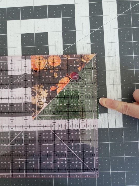
For this next step, line up the fresh edges with the final measurement. In this case, the 4.5 inch mark. The only excess should be outside the ruler. Make sure the seam is lined up too!
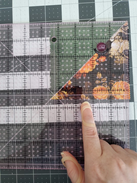
Look! Now it's properly sized!
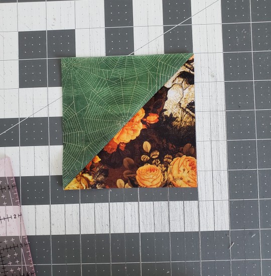
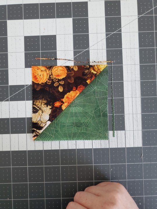
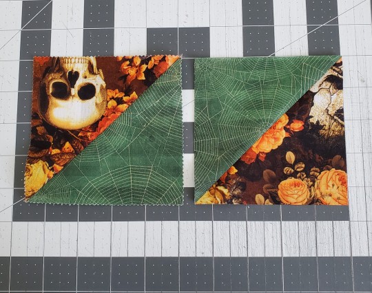
Here's what an untrimmed block vs a trimmed block looks like. See the difference? Trimming everything to the correct size and shape make it all fit together properly. Those corners and seams are gonna look sooooo nice.
#tips and tricks#quilt tutorial#free quilt tutorial#quiltblr#i do this to all layer cakes before the first stitch because they are never 10x10 inches
20 notes
·
View notes
Text

you read it, this is how *I* draw flug. generally just saving this here so if i have trouble later i can look back on it, but maybe it helps someone too.


maybe its a little helpful to someone. im not the best at tutorials or whatever lol im still learning anyways
#dr flug#villainous#sketch#doodle#tutorial#maybe#tips and tricks#dr flug fanart#how to#whiteboardfox
20 notes
·
View notes
Text


66 notes
·
View notes
Note
Hi hi!! Just saw your doctor who bookmarks, they're adorable. Ever since I started seeing your art on my feed, I've been so admiring of how good the body proportions are.
I love drawing as well, but when it comes to body proportions, i don't know where to start... I was wondering if you had some advice regarding that? Maybe some advice you learnt as a beginner that helped you throughout the years? Or some general tips?
Thanks in advance, i hope I'm not bothering you!
Anyways. I love your art a whole lot <3 xoxo
Hello!
First of all, thank you very much for your kind words asdkhfgakhebd 😍
Second! No, you are absolutely not bothering me, thanks for your question, it’s a very interesting one! And a bit tough :D
I’m a self-taught artist with little experience of art lessons from college, so I’ll do my best to explain! To be completely honest, I don’t use 98% of academic tips I learnt at college, the only stuff I picked there is that when you build a pose, you can understand where the elbow goes, because it’s the length of ribcage, and that in relaxed position hand stands on the spot approximately in the middle between hip and knee :D

Pic 1. When I start to build a character, I usually go for a thick brush and start to draw from head. Sometimes I draw legs literally as sticks and only then add the shape, but more often I just draw by blocks. Head, neck, torso, hips. Talking about limbs, I cut them in three parts - arm from shoulder to elbow, elbow to wrist, hand. Leg - hip to knee, knee to ankle, foot itself :D Somehow it feels easier to control the proportions by breaking the figure such way!
In most of cases as I’m already too used, after the first stage I draw character’s features and clothes in sketchy style, but if the pose is too complicated, first I do “a naked version”. Simply talking - drawing body itself :D

Pic 2. If you hesitate and feel that something feels off, try to measure the length of body parts. You don’t need any ruler for this, ahah, it’s enough to just place your pencil/stylus flat along the part you measure - for example it’s a leg. You put the pencil parallel to it such way that its tip is where the hip is and put your thumb on the level where foot is. Keeping your thumb like that you can move the pencil to torso or any other body parts to see the length difference and correct accordingly. Important to keep your hand the same distance from the eye, otherwise you will confuse yourself ;)

Pic 3. When you are happy with your proportions - dressing time!

Here’s the practical example of my process with bookmark Ten. As you can see, here the thick line base was enough to start right away with character and clothes. And here’s a little timelapse, which practically shows how my process starts and goes
I hope it was clear and interesting enough! Again, thank you for your question and don’t be afraid to ask, if something is unclear or you have other questions! Enjoy your drawing :3
22 notes
·
View notes
Text

2025 Eye Drawing Tutorial
I have made an updated eye drawing tutorial!
This is how I personally draw my eyes!
Feel free to use if you'd like! No credit needed if you use this, but it's always appreciated! 💜💙
#art#digital art#artwork#drawing#artist#artists on tumblr#art tumblr#art tips#art tutorial#drawing tips#drawing tutorial#art guide#drawing guide#tutorial#how to draw#eye tutorial#eyes tutorial#digital artist#ipad artist#digitalart#digital drawing#illustration#creator#clip studio paint#procreate#medibang#paint tool sai#photoshop#firealpaca#tips and tricks
21 notes
·
View notes
Text
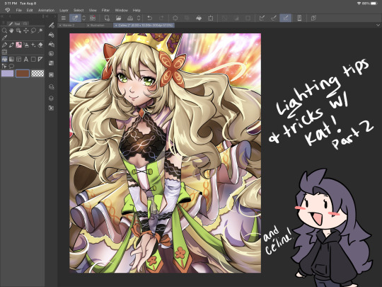
I’ve got 2 more lighting tips today: first one is something I call “soft rendering.” It gives that fuzzy, 90’s anime feel! I hope you all enjoy it! I’ll post the second lighting tip tonight!


#smkittykat#smkittykat art tips and tricks#digital art#art ref#art reference#art tips#artists on instagram#artists on tumblr#artists on twitter#digital art tutorial#art tutorial
521 notes
·
View notes
Note
You gave me some writing advice a while back, and I published my first fic!! :D I knew writing was difficult, but I didn't really expect myself to struggle with something that wasn't even 5k words. I truly gained more respect for fanfic authors, and I really want to focus now I'm developing my writing skills since I'm still pretty mediocre. Also I didn't expect to be so confused when it came to publishing on AO3 lol but I'm learning everyday. Tagging is hard...

that's awesome !!! but don't put yourself down - i think there's an important distinction in thinking to yourself "my work is mediocre" vs "i'd personally like to develop my work in X ways" - in my own experience, framing things in the later way helps keep motivation and joy in what i do.
EITHER WAY THOUGH CONGRATS !!! i hope you enjoyed it and that it can be a fulfilling hobby for you :>
#ao3 has lots of cool tips and tricks#for tagging and also formatting and etc#lots of tutorials out there if you ever want to know more!!#anyway thank you for coming back to let me know you reached the finish line - that's awesome!!#nyoomerr ask
31 notes
·
View notes
Text
rough art tips to learn and then break at your leisure.
the distance between your eyes is roughly one eye. the corners of your mouth dont extend past the middle of each eye. ears are roughly in the middle of the tip of the nose and the eyebrow. the eyes are in the very centre of the head. the neck is just a Little slimmer than the width of the head (varies with fat distribution, but fat tends to build up under the chin). hair is easier to draw when you plot out the hairline and then where it parts. leaving appropriate distance on the side of the face (cheekbone area and back to ear) contributes to making characters look more realistic/hot as hell. i dont know specific tips for that so use reference. an amazing reference/study site is lineofaction.com . if you think of the face in planes it makes it easier to construct (look up tutorials). if you draw a spiral like a tornado it can help you figure out awkward perspective for extended limbs (look up foreshortening coil technique). tangent lines are when two lines intersect and cause visual confusion (when it looks like a line that defines an arm is part of the line that defines a building, for example) and avoiding them makes your art way easier to comprehend. quick trick to good composition: choose a focal point (where you want your viewer to focus), detail that area the most, and make sure various elements of the piece are pointing to that focal point. you can use colours to contrast hue, saturation, and brightness and make certain elements of your drawing stand out. drawing in greyscale can help you figure out values. using black in a piece isn't illegal but you should know what you're doing when you do use it- it desaturates a piece and if used as a shading colour can desaturate and dull whatever youre shading too. if you use almost-black lineart and then add black to darken the very darkest areas it will do a lot to add some nice depth. the tip of your thumb ends just above the start of your index finger- your thumb also has two knuckles and all your other fingers have three. if you see an artist doing something you like (the way they draw noses or eyes or hair or anything else) you can try to copy that and see if you want to incorporate it in your style <- this is ENCOURAGED and how a lot of us learned and developed our styles. there are ways to add wrinkles to faces and bodies without making the character look a million years old, you just have to keep experimenting with it. The smile wrinkles around your muzzle dont connect to your mouth or to your nose; there should be a small space in between smile or nose and the wrinkle line. eyes when viewed in profile are like < aka a little triangle shape. think of the pupil like a disk and apply foreshortening to it (it looks like a line when seen from the side instead of a full round dot). subtle gradients can add a LOT to a piece. texture can also add a LOT. look up Tommy Arnold's work (his murderbot pieces are some of my FAVOURITE) and zoom in. find those random little circles he added and try to figure out why he added them there. light bounces. there's lots of way light bounces. sometimes it even spreads through the skin. i do not know these light tricks yet but i want you to know that they exist. draw a circle to indicate hand placement, draw a straight line between that circle and the shoulder, and then (normally at a right angle) draw a straight line on top of that line to find the placement of the elbow. elbows are normally placed Just above the hip when standing and your arm is at rest. there are no bad colour combos if you're brave enough about it, just fuck with the saturation and brightness until it works. keep playing. try new things. add your own tips to this post if you want or even expand on some ive mentioned here. good luck go ham etc
#look at this post#the sum of almost all of my art knowledge#all that i can remember rn anyway lmaooo#shit i didn't mention the tips for backgrounds that i know#eh that's environment most of this deals with character work anyway#i learned most of this from tutorials and kind artists who like to talk about their work#i would not know NEARLY as much about creative shit as i do if it weren't for the people who were willing to talk about their skills#and their tricks and their observations. id be nothing without them i dont remember most of them but i am so so grateful for that kindness#so ig here ill spread that a little further#if you have any questions go ahead and ask i am a NERD about art okay i do not know everything but i am always willing to talk about what i#do know#art tips#one of the most important things for you to do as an experienced or beginner artist tho#is to PLAY#experiment#figure out what's fun and what looks nice and what looks nice faster and just. whatever the fuck you want to learn#it is SUCH a joy
289 notes
·
View notes
Text
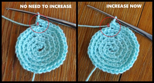
Tips and tricks corner. How to know when to increase if you are working in the round and aiming for flat.
78 notes
·
View notes
Note
haiii moth! do you have any tips on how to draw dogs/wolves for like werewolf aus or fursonas?? ik you’ve drawn furries before and im trying to make a fursona rn :3 just wanted to know if you had anything that you think makes it easier

i have another little post about drawing wolves here, but i tried to jot down some notes more specific to furries? i’m not sure if they’re helpful, or if they even make a ton of sense, but i Do think my biggest hack is to reference actual fursuits to start!
since furry anatomy isn’t. like. Real. looking at the underlying foam structures of a suit can help visualize how it works a little better! you can even start by drawing a person and then just draw fursuit padding on top of them if that helps, sometimes i do that to help me with the legs. and of course looking at other furry art that you like is great too!! there’s so much variation in suits and art, you can almost definitely find references for whatever style suits you :]
#hopefully this helps i’m sorry i’m super bad at tutorials ToT#i’m still learning how to draw furries too haha so we are in this together#tips n tricks
34 notes
·
View notes
Text
(instagram)
Tutorial in After Effects under the cut.
• Create a new composition and call it Split.
• Write your text, pre-comp it, call it Text or whatever you want.
• Create a mask from the center to one side (top/bottom), change anchor point to the top.
• Bring down Scale property and unlink it, keyframe the text to go from 100% to 0% in 1s towards the anchor point.
• Cut the layer at the end.
• Duplicate pre-comp.
• Select the bottom one, click M to bring down mask properties, invert the mask and move anchor point to the bottom (so the text scales to the bottom).
• Duplicate Text pre-comp one more time. Select it, press M and delete the mask, move anchor point to the center. Create new keyframes to scale it from 0 to 100 in 1s (properties unlinked). Select both keyframes and delay it by 1 frame. It makes the text look like it’s scaling from the center.
• Change bottom and top text color by adding Fill effect to the pre-comp.
• Easy ease all keyframes.
• Select all pre-comps and duplicate them, put them at the top and put them at the back to extend your animation (or arrange in your preferred order if you’re doing a phrase like me). So far it should look something like this:
• Create new comp Wave of 10s, add your Split comp.
• Create new Solid layer, call it Map, add Gradient Ramp effect, make white at the left, black at the right and hide the layer.
• Select Split pre-comp, Right-click → Time → Enable Time Remapping and extend the layer to the end.
• Add loopOut() expression to Time Remap.
• On Split pre-comp add the effect Time Displacement, on Time Displacement Layer select your Solid layer (Map), and on Source select Effects & Mask.
• Change Time Resolution (fps) to 250-300.
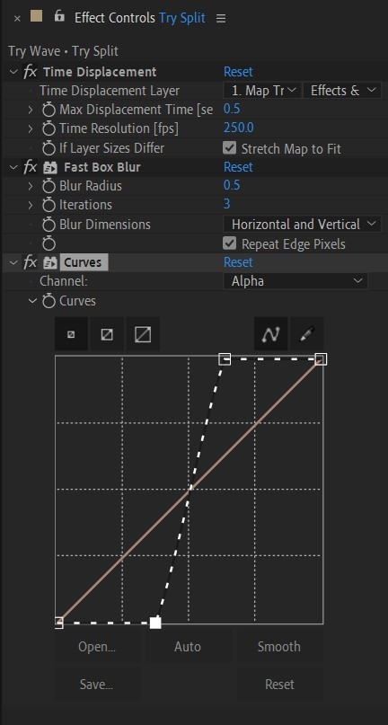
• Add Fast Box Blur effect, change Blur Radius to 0.5.
• To bring back the sharpness add Curves effect, change the Channel to Alpha and change values (see screenshot).
• Play around with Max Displacement Time [sec] on Time Displacement effect depending on the look you’re going for. I set it to 0.5.
• Now this whole animation is driven by our Solid layer (Map) we created. So if you make any changes to it, the animation changes too. For example, you can change Ramp Shape to Radial on Gradient Ramp effect, and see how it changes your animation.
• I additionally added some texture on the text, used Track Matte and added wiggle(5,500) expression to the Rotation property so texture would be constantly moving. Also added some additional effects to the new Adjustment Layer on top such as Roughen edges, Turbulent Displace, Posterize Time and Noise. Let your freak flag fly - it’s a matter of taste and creativity of what you do with it. Your animation should look something like this:
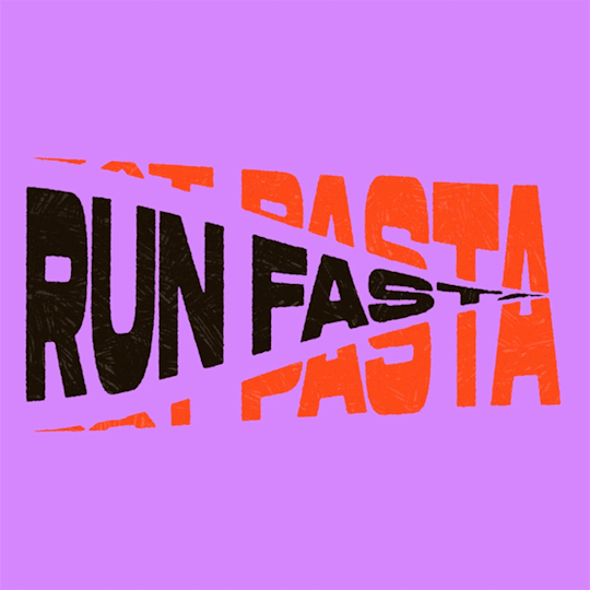
#artists on tumblr#animation#artwork#2d animation#after effects#gif tutorial#art tutorial#art tips and tricks#after effects tutorial#tutorial#art#motion design#tips and tricks#tips#digital art#gif#visual art#loop#learn after effects#illustration#infinite loop#pasta#funny#pasta humor
64 notes
·
View notes
Text
instagram
Additionally some tip on details in perspectives:

15 notes
·
View notes