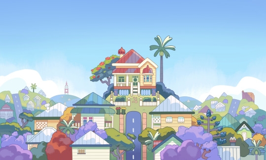
#trying to draw backgrounds with colours on procreate
Explore tagged Tumblr posts
Visit Tumblr Blog
Explore Tumblr blogs with no restrictions, modern design and the best experience.
Last Seen Tumblr Blogs


Fun Fact
Tumblr was attacked by a cross-site scripting worm deployed by the Internet troll group GNAA on Dec 3, 2012.
Text
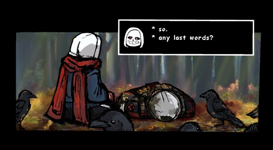
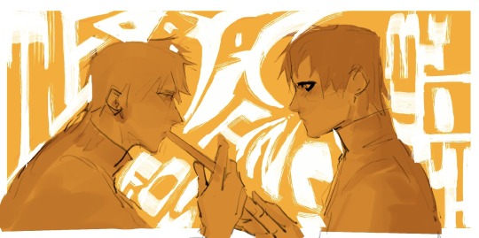
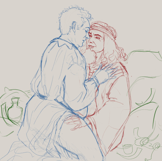
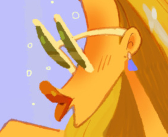
Dust finds a dying human soldier.
Scene from chapter 1 of the fanfic “The Lone Defender” on ao3 by @sophtopus
#a group of crows is called a murder#the lone defender#alternate timeline#the golden quiche#dust sans#sans#variant of dusttale where flowey wiped out ebotts entire population overnight#fanart#dusttale#1/2 of a soldier#yes you read that correctly#illustration#art#artists on tumblr#undertale#undertale au#takes place on the surface#utmv#doodle#trying to draw backgrounds with colours on procreate#experimenting art styles right now#Featuring Ebott’s very own local murder hermit.#everyone is ded :D except sans in the undertale cast the timeline is cooked#well flowey is alive#gaster is somewhere eating melon#necromancy#mothdraws
107 notes
·
View notes
Text

[id. Digital drawing of Sugiko and Paako chatting in the street. Paako is sitting on her moped, chewing gum; Sugiko stands next to her holding a plastic bag. end id]
#gintama#gintama fanart#my art#sakata gintoki#paako#takasugi shinsuke#sugiko#is that time of the year i try a drawing with a little more attention to detail and rendering#and after like 7 hours of working on this i went lazy on the background#lineart on procreate colours on csp was a good ish idea ngl but the texture was a pain in the ass#what's in that plastic bag sugiko? (we all know it's yakult)#takagin
12 notes
·
View notes
Text
*randomly watch some youtube video about drawing*
*get inspiration to draw*
*open drawing app*
*remembers I can’t draw*
*:/*
#okay look#I can draw one thing#girls with neutral expressions from the chest up facing either forward or 2/3 or 3/4#(not sideways though :/)#I will admit that I’ve gotten pretty damn good at that even if the proportions still tend to be wonky#but drawing literally anything else?#usually I just shamelessly trace over a reference picture. not even try to copy it by eye bc I’m awful at replication#straight up trace over and mess around with the details in some places#AND BEFORE ANYONE COMES AT ME I MEAN POSE WISE I DON’T TRACE ANYTHING ELSE#I’m also not too bad at colouring but my shading needs a ton of work#so.. yeah. by all standards I can’t really draw#I also can’t draw facial expressions or poses or backgrounds or objects or interactions#or anything really#is it any wonder 90% of my procreate gallery is stuff I never finished..#I know this is all my fault because I never practice what I want to get good at#I never do studies or draw smth over and over again to get better or anything#if I can’t draw something I delete the canvas and give up. end of story#ughhhhhhh. why am I like this#why am I physically incapable of putting in any effort whatsoever#and I dare call myself an artist#I don’t deserve that title
0 notes
Text

Hello! After having some time to get over my loss for the Pokemon TCG Illustration contest, I decided to write up a small blog entry about the process and include some WIP pictures. Feel free to look below if you want to read my ramblings on the process.
Idea Generarion-
So coming into this contest, I knew I wanted to make a mixed media piece. In terms of theming I chose something that not only reflected a “magical moment” for a Pokemon (in this case meeting a legendary Pokemon), but also a moment when playing the games myself. In fact this piece was inspired by my awe when I first encountered a box legendary in game, as before I thought my teacher was lying to me when he said you can catch the legendary on the box!
This is the concept sketch that started it all! At the time my main concern was getting ideas down and seeing how they looked. Thinking about things like how would the composition would look, how would the colours look. So on and so forth.
I didn’t want to focus too much on the sketch and wanted to start making the physical object, so out of some cheap paper I started making a set up testing out size, scale, composition. I didn’t want to get too attached to the original sketches only to realise I couldn’t make it in real life… I went though a few drafts trying to get things right, slowly adding in aspects such as background objects and higher quality drawings.
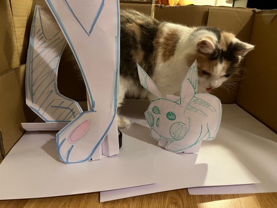
After completing the draft I bought the images back into procreate to experiment with colours. This is the point where I made the mistake of thinking I had plenty of colours to choose from, not realising I would be limited by what I could buy from various yarn shops. That or hope I could find the right colour online, but that was always a gamble. If I don’t stop talking about this now I’ll get sidetracked talking about how much I miss yarn shops…

Anyways, I cut out the individual pieces that I would make within the background and used them as a guide for crochet assets. For this part I wanted to use different stitches to create textures such as the ripple stitch, bobble stich and some cable stitches, I feel bad as I never took any work in progress photo so of them. Let’s pretend you’re looking at a photo of a half finished crochet abstract shape.
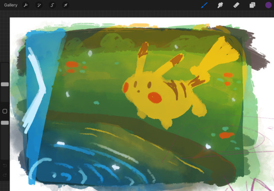
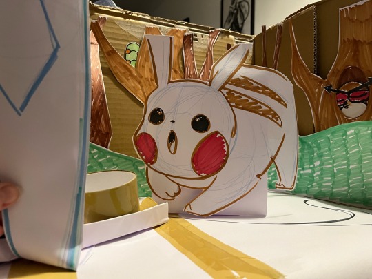
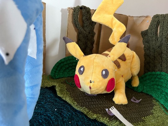
Finally onto the main event, the Pikachu (and Suicune). The decision to make Pikachu a plush was based on what I would have liked to make for the 2022 illustration contest (if I wasn’t geographically challenged!!) Despite being British I decided it would be fun to make anyways, so I could experiment. I never got around to that but decided it would be fun to try for this edition.
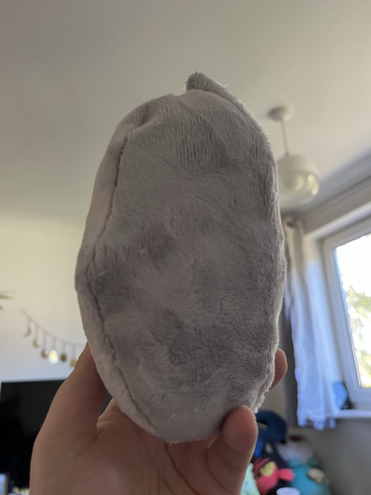
Making the pattern was HARD! As I wanted Pikachu to have a unique pose, I had to work out different methods to plush i’ve made in the past which have been somewhat relaxed in their posing. I ultimately ended up making each part individually, pinning it together and then making adjustments as needed. It didn’t start out great however I ended up with this weird Pikachu shaped thing that did the job. Throughout this process I would regularly photograph it in the background to try and catch any issues early on. For example if the ground needed to be a different shape.
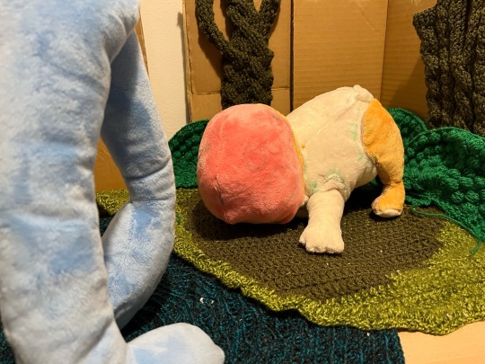
Photographing the final price was interesting. I felt bad for my partner as I essentially turned my dining table into a mini photography studio! I spent several days waiting for different lighting opportunities and experimenting with different light. Marking down different camera angles to ensure I have all of my bases covered. I easily took over 100 photos to get the perfect shot! In the below photo you can see washi tape being used to rest out different positions for the sculptures.
And that leads me to the peice! Even though i’m sad I didn’t make the top 300, I am pleased with the work I did for this piece (and my flygon entry too!). I’m glad I decided to experiment with ts peice and look forward to refining my methods in the near future!
#pikachu#ptcgic2024#ptcg contest#Plush#Pokemon#pokemon plushie#pokemon plush#pokemon illustration#crochet#electric type#Gen 1#creative#pokemon art#katart#katblog#katplush
228 notes
·
View notes
Note
The way you color is absolutely phenomenal! Looking at your latest Naruto piece I’m just absolutely astonished by how the colors all work together. If you could give any recommendations for tutorials for a fellow artist I’d so appreciate it!
Keep up the amazing work 💕
~pudding 🍮
Wow, thank you so much!!! That’s so kind! I’m very happy you like it! To be entirely honest I’m still learning how to colour—a lot of what my process is right now for colouring is just… vibes. I play around with it until my brain is like ‘I like this’, and I haven’t really watched many tutorials for colouring (I should…) so my best point of reference is to see how an artist you likes does colour and experiment on your own canvas to see how they achieve that. Studying and experimenting is a huge part of the learning process, and finding what works for you specifically.
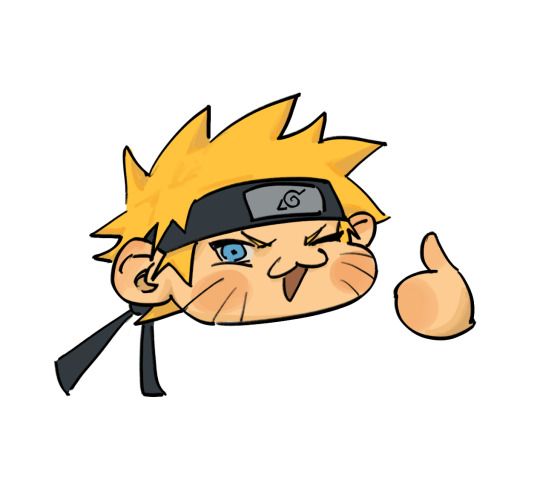
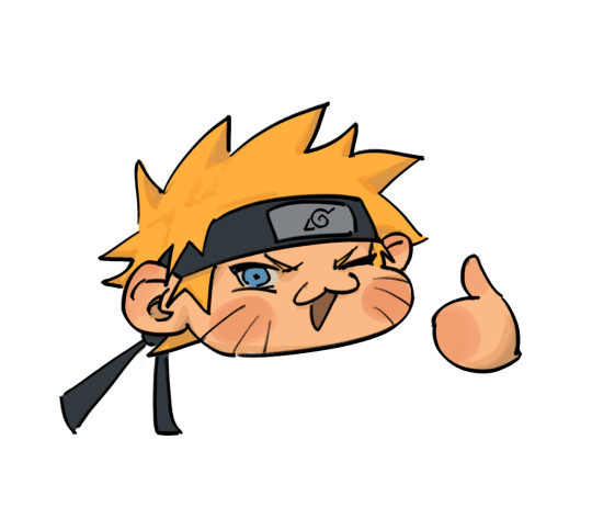
The simplified version of my process is that I paint with colours that act as the general idea of what the base colours are, and then play with curves to lower contrast + darken. I did a very quick example of what that looks like with this Naruto chibi:
This is what curve setting I use on procreate (it’ll look a little different when I do it on clip studio or photoshop, but the points remain the same. First dot is brought down a little, second dot is brought down a little, lol):
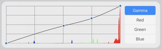
(usually I play around with curve settings a lot depending on the piece, but again the variation is based purely on what itches my brain. I just try to maintain that the curves, for me, lower contrast and darken the colours.)
For shading I will often desaturate+darken the flat colour, but I 1000% go in with a more saturated tone in between the shading and the flat colour, and over the course of painting and colour picking, it just ends up being this amalgamation of colours that work together since they are MOSTLY within an analogous range. Does that make sense?! I’m a terrible teacher, LOL!
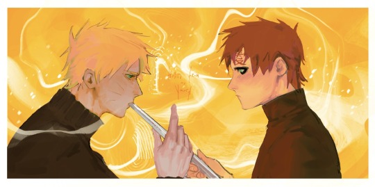
If you’re interested in slightly more details of my process, I will say that when I do have a background, that colour is usually the first thing I put down onto my canvas. I will fill in the lineart with a darker version of that colour and then start getting a basic idea of shading down before doing any colouring and rendering just to see how the general composition will feel. With the narugaa piece you mentioned, it looked like this (ignore all the white around them, this was going to be more type-heavy before I realised I hate doing text LOL):
It’s not quite just shading, but the goal is to find the values that I would be happy with seeing throughout the piece and on this hue+value of background. Also, at this point, I’m drawing with the assumption that if I were to do this completely monochromatic, the values would look like this, ya know. And then afterwards, like I depicted in the simplified version way above, I lay down flat colours. In this case, my colours were laid down on a layer that was on the “hard light” blend mode, but I think you should just do whatever blend mode gives you the colours you like best. From here, if you combine layers so that it’s a normal layer, then just playing with the curves should get you the effect that I usually work with, but this is what those base colours looked like in my case:
You can skip this part if you feel you’re good enough at colour picking, but it helped me personally with laying down colours. I did curve adjustments + new blend mode (pin light) so that I could play with complimentary colours in a way that would add some “flavour” to the drawing later. In this case it was this greenish+reddish colour for Gaara and yellowish+purple/bluish colour for Naruto (I know his skin looks more pink/red than anything but it’s significantly more cool toned, which is what I was considering for colour harmony/relationship):
I did most of the painting over these colours before using a lasso tool to pick out specific areas and change the curves to be the Actual colours of the characters, but you can mostly tell what sort of colours I maintained from the previous version vs which ones I changed. I really do think this made for more interesting visuals, but I also think it’s sort of a convoluted process that you can just do from the get go if you have a better grasp of colour theory than I do. Unfortunately I’m not knowledgeable enough about colour to get colour harmony just by picking out the colour from a wheel. This is why I love curves so much!!! Anyway, this is what it came out to:
And then I duplicate the canvas so I can merge all the layers into a single one, and then do the final curve adjustment to make everything feel cohesive. I mostly used the curve adjustments that I showed in the very beginning of this post, but because so many of the colours in this piece felt analogous, I actually valued slightly more contrast in this piece than I would want for most other pieces. Posting the final piece here for convenience:
And that’s it!!! I’m super mega sorry for how long and convoluted this probably is LOL but this is my process……. I’m certain other artists have better tutorials and I will always recommend Sinix Design on YouTube for ANY art tutorial that you might need, but if I’m being entirely honest, anything I know of colour is entirely just me consuming a lot of art over the years and going ‘oh, I like that’ or ‘oh, this is a pattern between these two artists, so it must be right’ or ‘oh, this random artist posted a tutorial and it looked good, let me glance at this and hope it somehow subconsciously sticks’ LOL. There are definitely fundamental rules that would help to know (shadows will usually be less saturated, deciding between high key vs low key composition as far as your value scale goes, what sort of emotion each colour combination/scheme evokes, the power of tints and shades) but a simple google search on basic colour theory will already explain most of this to you. Passively implementing these practices into your drawings, in my experience, helps make a lot of these rules second nature when you’re drawing. Above all though I think you should just do whatever itches your brain LOL. I have a huge reference library that I often refer to—I recommend any artist to do the same :3
#nc111 tutorials and studies#thanks again for the kind words#to be complimented on my colouring… I am floating in heaven
46 notes
·
View notes
Note
I am in love with your art style. I love all your jjk art, it’s like stitching back the pieces of my shattered heart. Your art is so soothing and has such a warm feel, I love it. Also if you don’t mind me asking what program do you use for your art, and do you have any tips? I strive to someday create art that gives the same feeling of comfort as yours. Thank you <3
Thank you so much for the kind message! I'm actually in the middle of making another jjk piece but it's been a while so I've been trying to remember and consolidate my process. This ask came at a great time hehe
I use photoshop for most of my art pieces but I think there are a lot of cheaper alternatives (procreate on Ipad, clipstudio paint, medibang etc) that would work just as well. As for tips, I have a technical and an emotional one:
My technical tip would be to use references!! Especially if you're just starting out, it's SO IMPORTANT imo for catching mistakes especially with anatomy, lighting and perspective. And by reference I mean real life photos. I think you can be inspired by other artists' work, but there is the danger of picking up their bad habits if you only use their work for reference. I would recommend sticking mainly to real life and looking to other artists only for resolving specific stylistic details once you have a solid grasp of your fundamentals.


I would start with a rough sketch first of whatever you want to draw and then look for refs that match the mood and tone you want to go for. Get the idea down first and draw from the heart. Then the refs come in to help with the specifics (ex. what a window looks like, how someone would hold a cigarette) The jump from the rough to the clean line version is an amalgamation of all the little things you learn along the way. For example, on one day, I learned that clothing folds usually start at one point and spread out. Then another day, I learned how to do 1 point perspective and so on and so forth. Then all those tidbits slowly add up to help you get better and better.
2. My second tip would be to understand what you want to convey with your artwork. If it's fanart, what about the media that you're interacting with draws you in? It doesn't always need to be a complex answer, sometimes you just want to draw a character because you think they're hot and that's totally valid imo.
I occasionally tutor very young artists and oftentimes, they will tell me that they want to draw like X artist or X painting/piece of media. I always try to encourage them to go deeper. What about that drawing resonates with them and what specifics are occurring in the picture to make them feel that way? For example, I recently realized I love environment heavy drawings not for the background itself but because they ground the characters and seeing them do mundane things makes them feel more real to me.
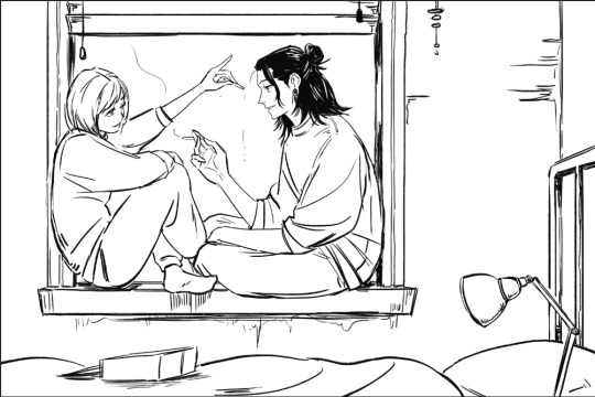
For the example below, the whole set was to explore friendship and mental health. Sometimes just having someone there who listens and is willing to talk with you can make a huge difference.


Once you know the purpose of your art, then I think it makes the decision making for the rest of the process much easier. What type of lighting scenario conveys support and comfort? I went with dusk. Then I started searching up references for dusk lighting. Couldn't find the ref I actually used for colour but a quick google will show you lots of similar options.
What kind of poses feel in character for Shoko vs Geto? What is the focus of the picture? As much as I love details, I think sometimes they can actually take away from the main message. For example, if I had rendered the lamp on the right a lot more, it would've distracted from the main point of the picture so I tried to keep that and the background in general simple (still something I need to improve on haha).
Then those extra technical things (value structure, cool vs warm light, reflective lighting, connotations behind colours) you pick up along the way are all there to help you better communicate what you want to convey with your art.
Okay I lied one more tip, be patient and learn to appreciate the process. Like with any skill, there are a lot of technical aspects that you have to study and practice. I think because the end result is so visual and easily accessible in comparison to other hobbies/jobs, it really cripples beginners. Even with writing, you won't realize a book is good until you learn how to read. With art, you can resonate with a painting without having drawn a single line yourself.
I think beginners and even professionals see a lot of beautiful finished artwork and get enticed by that only to be discouraged when they find their process/finished work didn't end up the way they wanted it to look. Treat it like you would learning how to write. The fundamentals can be tedious and do take time to drill into your head, but learning them will help you SO MUCH with the creative fun parts. You can't write a poem without first taking the time to learn the alphabet, spelling and grammar. You're also probably going to write a bunch of shitty poems before you write that one good one, but that's okay because each piece lets you experiment and exercise your voice. Art is the same thing, don't rush it! Enjoy the process and celebrate your improvements.
#omg i typed way too much but i have a lot to say!!#thank you for the ask this was actually so therapeutic lmao#ask#my last advice...is to be selective about who you take advice from#so you can just ignore all this or cherry pick what resonates with you and your process
113 notes
·
View notes
Note
how do you go about picking colours for your drawings? do you use any blending layers or do you just rawdog it?? the colours in your art are always so lovely and i was wondering how you do it, since i always struggle with achieving the colour palettes i want without using 1 million billion blending layers
somewhat longer answer below, tldr make it pink
color picking is hard to advise on because it's up to individual taste. ive been coloring for a long time and i also started out coloring on lots of individual layers. with any aspect of art it helps to find artists whose color schemes inspire you, maybe study them / eyedrop them to learn, i used to do that (and ofc i'm still inspired by other artists!)
but as for technique i personally just get sloppy with it. and limitations can be freeing -- these days i color on one layer (lit. every picture, cuz procreate limits how many layers i can make and i fit as much as possible into one canvas) like here's an older canvas of rocko fanart. i love simple toony characters, esp colorful ones, because they're a fun excuse to play around with colors.

lately with pnf i'm getting even messier and smushing everything together, sometimes i steal one drawing's colors and use it as the base for another drawing


now i have a very messy/sketchy style, my art isn't clean/professional, im just trying to make art as easy and fun as it can be! so over the years that makes colorpicking intuitive - i like picking a lot of neutral tones and contrasting them, like if i'm drawing orange and i want a blue/green i'll instead pick a desaturated orange and see how that looks, and leave all my random picks on the canvas for future inspo.
background -> fill in main shapes with colors that seem fun -> color over those with more specific picks


then i put it in photoshop and autotone/autocontrast my way to success
77 notes
·
View notes
Note
Hey there, i love your art very much!! Especially the recent BG3 portraits. As someone who's switching to digital art and works with colour for the first time, could i ask: how do you figure out the right colours for your drawings? Do you premake a pallete, or pick one colour and then work from there or something else? Any tips would be welcome, keep drawing ❤️
Hey! Ah, thank you so much, I really appreciate it!
That’s a tough question to be honest. I find myself struggling with colors almost every time.
As I start an illustration I mostly have a rough idea what I want it to look like colorwise. Basically there’re two ways for me when it comes to coloring.
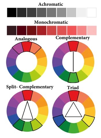
1. If it’s something more simple like a portrait or a character design, I tend to pick one base color and paint the whole object. From there I adjust each separate part such as hair, clothes, etc by moving slightly along the color wheel and changing the darkness and saturation depending on whether for example hair should be darker or lighter. For me personally in that case I prefer using analogous (picture below) colors and maybe add some complimentary (on the opposite side of the wheel) colors for highlights or backgrounds.
2. If I get too lost in the color choices, I scroll through illustrations of other artists I like and choose some that would suit the general mood best. Procreate and, I believe, CSP have a function where you can create a color pallet from a picture. I’m sure you could find some similar web or app, if your software doesn’t have the feature. Then I just use the colors from the pallet and build up on them, adjust according to what seems to work best for me.
Although if I had to give some basic tips based on personal preferences:
1. Never use black, avoid using white. I prefer using dark and saturated blue, purple, red instead of black. Light and less saturated base color instead of white.
2. In general I prefer working with more saturated colors, but got to be careful, not to overdo it, not to create crazy colorful mess. But again that’s my personal preference.
3. Avoid using too much different colors. I mostly try to stick to three, max four colors in one illustration and just use their adjusted versions (darker/lighter, more/less saturated) for shadows and highlights.
4. Contrast is more important than colors.
Guess, that’s what comes to mind first, hope it makes sense at least a little. In general I’m really chaotic when it comes to colors, so I’m probably not the best person to give advices. However, if you have any questions, I’ll be happy to try and help as much as I can.
Good luck on your creative journey!
109 notes
·
View notes
Note
I love your art! Would love to know about your process if that’s something you’re interested in talking about!
hello! i am so sorry it took so long to respond to this 🩷
(...i suppose this means the first step in my art process is to faff about and procrastinate and dither for ages 🤭 oops)
i am so flattered that you are interested! 🥺🩷
i wish i had a truly substantial answer for you - unfortunately i don't know if i would consider myself as having a standard "process", per se. i tend to play around with something new each time, as i am still very much getting back into my art and still learning.
i will put my current "process" under the cut for those who may be curious? 🩷
so i guess my first step is to gather inspiration & references! i have a bunch of boards on pinterest for poses clothing inspo, things that are just 'vibes'... there are a few life drawing sites i like, as well as (of course) the Good Omens Reference Library discord, which is a genuinely brilliant community-built resource (praise be to @orayart & @patibuart 🩷) once i have my references and a few ideas of how i want to work them together, i start with the sketch - i usually work on a square canvas in procreate with a neutral toned bg (white hurts my eyyyyes) and normally i'll throw a paper texture over it (there are a lot of great resources like that on gumroad to download both for free and in paid packs)
i am clearly attached to sketching aziraphale in blue and crowley in red to begin with hehe (background is usually in green), using the procreate HB pencil or the cube brush, as it lets me visually see which lines are which - my sketching is very very messy in the early stages! and i don't usually like to do proper linework - instead i just duplicate the layer, lowering the opacity on one and then refine the sketch down in stages... then colouring the sketch to a more neutral dark grey or brown
i am aware this isn't necessarily good practice, since it can make some of my work seem stiff and flat - but even when i try and leave the lines messy i just can't seem to leave well enough alone
at this point, the 'process' really just becomes a game of 'what am i in the mood to do, what suits the piece, am i painting this or am i done, etc'
for the most part, i will use a solid cube brush to lay down the flat colours, then use ink wash brushes, spatter brushes or watercolour brushes to add texture and shading or colour - experimenting along the way for the most part! then some different layer modes to play with lighting etc if needed!
i have NO idea if any of this is interesting... i am hardly an artist with a refined style or process as of yet, but i am getting there. i've been making art since i was small, but before GO i hadn't drawn seriously for years and years beyond doing D&D character art for me and my friends!
anyway! thank you for getting this far if you managed it! so grateful for you all 🩷
22 notes
·
View notes
Note
YOUR ART IS LITERALLY ENCHANTING HELLO??? I feel like I'll get sucked into it Narnia style... Would you mind talking about your art process 👀
thank you so much?!! i dont mind if you dont mind me taking this chance to yap
my art process has changed a bit since i last posted a step by step... i would say my ideation phase is still
seeing something that really makes me want to draw (ie alien stage round 6 or a really good gacha card (sorry) ) or forcing out thumbnails
go on my pinterest board of poses/colours from other artists i like for the general vibe (i reference a lot from my own photos as well, usually pics i take around my city/a lot of selfies taken from 0.5x angle LOL)
and then start the drawing. usually not a lot of thumbnailing..i would like to get better at that to explore more interesting compositions >_< also trying to flatten my art style a bit but i still go overboard with rendering extraneously oops
these days im also switching back to paint tool sai/csp on my pen tablet rather than procreate..i really dont like the blending engine sometimes and it makes it really difficult for me to motivate myself to paint there. i guess walking through a recent painting i like:
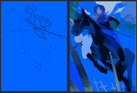
sketch on a colour bg ( usually this kind of decides the colour palette for the rest of the painting, building off of this main bg colour) (i erased some of it bc i was using it in the final painting ^^;;; it gets redrawn on top a little)
blocking the main foreground - sword, horse - just going from dark foreground > middle > background lightest as a frame of reference, having the least amount of detail at the right since i want the horse's hind legs to fade out in perspective

3. layer at a light opacity using a big brush to just suggest light/shadows (yellow at bottom right and around her face to complement and contrast the blue/purple)
4. render details (this is what gets me and i am very lazy and typically give up on a piece once we get here. working on it..)
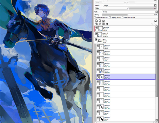
5. yeah. done! outline some desaturated areas (horse hind legs) with a saturated colour found elsewhere in the painting (lighter colour of the bg) and then add final touchups on top of everything. my layers dont make sense. also i love using the fringe effect on sai to fake edges/lines (every layer has it. yay)
#my art#asks#process#thank u op for letting me be yapatron 300000#idk if this is what u wanted but its what i can give
37 notes
·
View notes
Text

SH – :More Every Minute: (FTH #3 for @totallysilvergirl) Procreate on iPad Pro
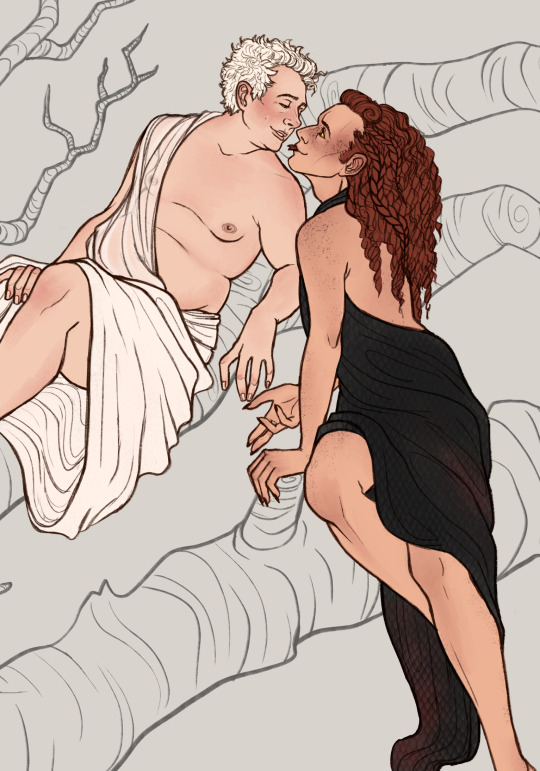
[...] In Ch. 4 [of my fic Both Sides Now], John unexpectedly announces that after the night they’ve spent TOGETHER together, he has to break up with Mary. Sherlock didn’t see that coming, didn’t dare to hope for it, and flings himself to his knees and embraces John around the waist (John’s sitting in a hotel armchair). They’ve both still got their dyed hair etc. and are wearing white hotel bathrobes.
FINALLY, at zero hour with 2 days to spare, here's pic three of three for my @fandomtrumpshate pieces for 2023! The AMAZING @totallysilvergirl gave me a selection of scenes I could try to draw from their BEAUTIFUL fanfic, Both Sides Now, Of course I chose the HARDEST one to draw because I SUCK at background elements, but I was determined to give them something that would do their story some justice, because it is VERY sweet (the other options probably would have been easier to draw, but this scene specifically made me melt) and I love it!
So yes, this is John and Sherlock, after spending a night together... they're undercover hence why their hairs are different colours, and in the story John has brown contacts as well, but I really wanted to MAKE this John, so decided he took them out LOL (I genuinely don't remember if Silver wrote that he took them out, but they didn't mind I made this creative choice).
As I mentioned, I have a hard time with scenery and such, so I lately try to do things a bit more complex for other people so I can get comfy with doing it. Silver seemed to really like the piece though, despite my reservations about it, so I'm happy that they're happy.
AND I am shocked I got this done on time... I was SO nitpicky with the colours on this one, so I am glad I got it done within deadline of December 31, LOL.
Title is from this beautiful line in the scene being depicted:
John’s moral compass isn’t blind, no, it’s as pragmatic as it is honourable, and Sherlock loves him more every minute, more than he knew he could love anyone, even John.
Everyone please go give Silver's fic Both Sides Now a read, it's really lovely and can be done in one sitting!! It's just a bit over 14K w. <3
Thank you everyone for letting me draw your scenes for you, and I hope you guys like my final art piece being posted for 2023 <3
🖼 I’M ON INSTAGRAM at stephdrawsfanart 🎨 @stephratte is my Primary Fanart Blog! Art © to S.G.M. Ratté. Do not repost or sell.
(Tags below cut, dm to be added/removed)
@totallysilvergirl
@queerbeess
@ayryn-art
@antisocial-otaku
@havetardiswilltimetravel
@yorkiepug
@tea-and-gingernuts
@quantum-sparrow
@chinike
@chained-to-the-mirror
@almosttomorocco
@loveismyrevolution
#johnlock fanart#johnlock#sherlock fanart#sherlock#fandom trumps hate 2023#fandom trumps hate#fth 2023#sdjl myart#sdjl johnlock#sdjl sherlock#fanart#my art
78 notes
·
View notes
Note
What program do you use for your art??? I don’t have a tablet, well I do but it’s not Apple so I don’t have procreate unfortunately, but I use Krita on my desktop sometimes. Any tips on digital art for beginners? Especially with dealing with what to do with layers, what brushes to use, line art, sketching, sketching side profiles (cause I hate doing side profiles), coloring etc. I’m more traditional but I’m trying to get better at digital. Also I love your The Outsiders art—especially the musical Outsiders art you do. And especially your Curtis Brothers art. The Curtis Brothers make my autism go crazy.
Oh shoot that's a lot haha
I use Photoshop now but I've used Krita and IbisPaint before! Tbh I don't have many specific tips for drawing in digital, it's all about learning the possibilities of the program and what works the best for your style <3 Try to check all the brushes you have and if none work for you then download some more :D For layers I mostly make different ones for lineart, skin, hair, clothes and background :) It makes working on the drawing easier! Colouring for me is basically searching for references and using the colour palette from them :D
I struggle with side profiles too :'(( I mostly learned how the shape of the forehead, nose and lips look like and I drew it over and over again until I was able to draw it in one stroke :'))
Thank u sm! Oh yeah I get the hyperfixation on Curtis bros <3 I hope this helps somehow!!!
12 notes
·
View notes
Text
Visuals for the Animatic

So art, colour palette, possibly the animatic- all that. Still ongoing as I'm teaching myself how to animate and sample colour palettes. Y'all I was a painter what am I doing here
More below the cut!!
Colour Palette for my reference:

Art Study and Character Sheet:

Yaelokre's OCs:
Currently, I am trying to learn how to make good backgrounds with Procreate. Keath also uses it so I know that would be fine. As for that, I have been teaching myself how to draw. I have a whole new level of respect for digital artists that use procreate like its the way of god.
While all this is going on, I've also been trying to animate. I have not seen my bed in two days. But in other words, it's just practice in all honesty. Not my actual animatic but I am building up to it.
Also I recommend this YT channel for Procreate art. He's an art teacher too so he knows how to explain well :,)

#long post#animation#Yaelokre's Story - Art Edition#I have been working on these and will be for days#art school#Sleep? what's that#jk I be sleeping at like... 3 am#We still are being respectful- I'm just fulfilling the brief :
2 notes
·
View notes
Note
Ellie, you know I ADORE your art. Do you have any art tips in the digital part? Cause I mostly do traditional and I'm super confused with digital ahshaja
YAAA TYSMMMMMM OFC!!!!!! sorry this took me so long to reply to😭
start simple and stick to 1 or 2 brushes to keep your drawing looking consistent, maybe add more towards the end if u want to add more textures if u want (idk what u use to draw but if its ibis paint or procreate i can tell u my faves on there)
have a minimum of 4 layers for your sketch, lineart , base colouring and shading
idk if you do this already but i always find it easier to draw traditionally on paper and then take a photo and trace over it digitally, bc im the same as u,, i find traditional a lot easier, specially with sketching (also if u could get a mechanical pencil for traditional art theyre so helpful bc you can make your pencil lines thin and detailed with them)
this seems obvious but i didnt do this for years for some reason,, WATCH ART TUTORIALS!!!!!! my fave is sinix design, his art is so much better than mine so i like to use his tips to improve!!! also i have a youtube playlist with a few art videos ive saved hehehe
look at other peoples art and figure out what elements of their work you like, and try to bring it into your own art!!!! make a pinterest board or section for the art styles you like and practice using their type of shading etc etc until you figure out what your style is (for example heres mine)
use a soft and hard brush combo (i always forget to do this LMAOO) but if u use a hard brush to define edges and details and a soft brush help blend shadows and transitions,, u can get a more dimensional look overall
theres this one photo i found thats so helpful with skin shading over hereeeee, and if u use this chart and put these colours very faintly in the areas it says to (over the base skin tone) ur drawing will look more dimensional
watch other peoples speedpaints to see what their art process is
i would love to give a tip on backgrounds but idk how to do that yet 💔🙏🏽 backgrounds and animals are my WEAKNESS fr
i keep talking about pinterest but its actually the best resource for art its so goooddd like if u made a board with sections for : pose references, face references, art tips, style inspo, pallettes, animal references then it'll make the art process so much easierrrrr
thats all i got off the top of my head,, hope its helpful diva <33333 !!!!!!!!!
5 notes
·
View notes
Text
Catriona Drummond (aka goodsniff)

one of my favourite cartoonists working right now is Catriona Drummond (@goodsniff)

the 2 things that really stand out to me in her work are her character designs and backgrounds

catriona's one of the only artists i've found that captures the inherent goofiness of modern day fashion and people in a fun, cartoony style.


we've all seen people like this in real life

so many drawing principles done well in one picture. line of action, clear silhouettes, contrasts, colour choices, shading & rendering etc. to me, this paints a picture of how utterly ridiculous superficial, try-hard people attempt to appear 'cool'
the work is titled "Lip Fillers & Frosé pt.1 // Beautiful creatures seen at Burleigh Pavilion on the Gold Coast". even the choice of words are very intentional. for anyone familiar with Australian culture, the Gold Coast is essentially the Miami of Australia. they share similar stereotypes, and the Burleigh Pavilion is the epicenter of these types of people
I like the dr. bunsen honeydew approach to just having the glasses as the eyes. it's very funny.
some of the drawings you'll see a date and location. i'd love to know what the process is for making these. was it all from memory? was there photo reference?
look at how a couple of lines can represent cottage cheese thighs!!! catriona really has a knack for drawing short, chubby women
as an australian, another thing i adore is the australian caricatures and references. this is the first time i've seen a cartoon depiction of state of origin fans (if you're outside Australia: state of origin's one of the biggest sporting events in the country)
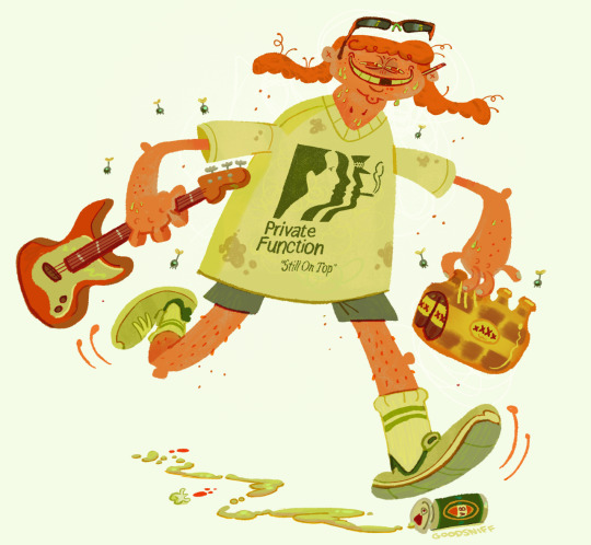
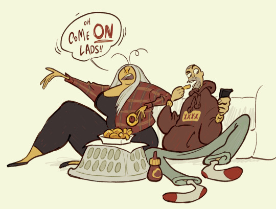
here's a caricature of eamon sandwith, lead singer of the chats. one of the most aggressively australian sounding bands right now
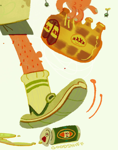
look at the attention to detail. i love how the brown is rendered on the beer pack to make it look like plastic. the lines on the inside of the sock is in a slightly different colour to show stitching. there's over a dozen colours on the VB can. you keep discovering more and more details. (note: every australian state has a beer brand that's uniquely theirs and XXXX is the beer of queensland. VB is the beer of victoria. if you drink it, you'll quickly understand why australians call beer 'piss')
the other aspect of catriona's art that really stands out to me are the backgrounds
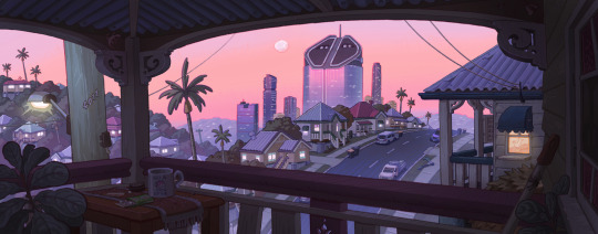
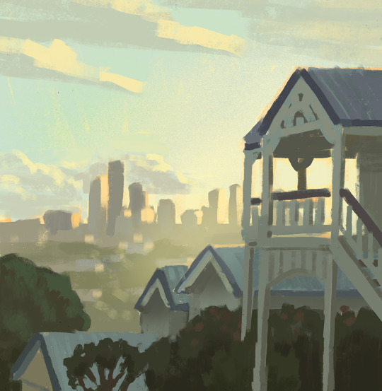
she achieves something i thought was nearly impossible, make Brisbane look like a nice place to live
she's also worked on animated tv shows like bluey and smiling friends
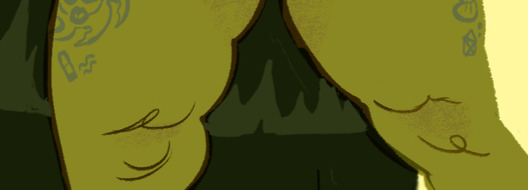
all of this careful study of colour and light is reflected in how she renders her drawings of people
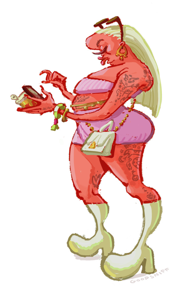
as someone who's trying to develop my digital art skills more, i tried recreating the thighs in Procreate to try and reverse-engineer how she did it, and i still can't quite figure it out. with the left thigh i tried using the eyedropper, picking out the exact colour and painting with a hard brush, but the colour looks wrong if you do it that way.

i tried a different approach on the right thigh. my guess is you have the base red colour, create another layer, use the clipping mask, lower the transparency a bit, and use a lighter colour. the difficulty is what type of brush to use. i went for the flat brush because you get that pressure sensitivity. who knows? i could be totally wrong with this. it's hard to see, but there's also a slightly darker scribbly line that goes down the middle of the thigh.
anyway i highly recommend you check out her work on tumblr, and she's also made a substack detailing her time working at bluey
5 notes
·
View notes
Text
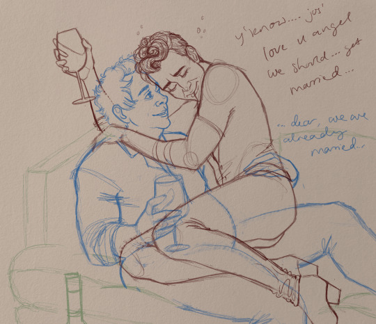
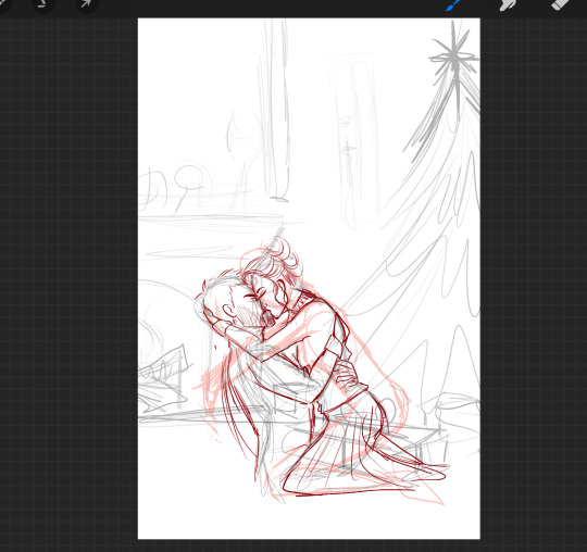
Process of my HEX Gift
I finally remembered to take a few screenshots of my progress stages and I always wanted to do a walkthrough post so here we are!!
I did not have a specific prompt from my giftee, except for the ship which was Silrah so I decided I wanted to draw a cozy romantic Christmas scene.
Which totally showed in my first sketch...definitely... My first sketches mostly look unrecognizable and there is no real system for them because it's just lines for my brain to visualize where I want everything to be. Sometimes they look like this, sometimes they are more light/shadow inclusive. The next step was to work out the poses for Farah and Saul and as you can see, I was struggling. 🤣

When I finally found the pose I was looking for and fleshed out some elements in the background it was time for one of my absolute favorite parts.....that I forgot to screenshot....THE VALUES Which is me trying to figure out the lighting by blocking in light and dark areas with various shades of grey. But because I forgot to take a screenshot (and the value layer that I normally keep until the end for reference disappeared into the void of procreate) we will skip straight to the colour! I very roughly block in the areas with the colours I have in mind to see if everything fits and change what I don't like yet. When that is done I now have a finished concept which I need to refine and then paint!
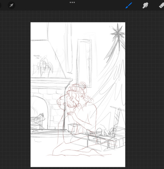
And now I reached the point of actual background design which was HARD. I looked at many pics of Farah's headmistress' office to try and get a feel for what items might be in her private suite. The mantle of the fireplace looked very empty even after I added the little astrology magic thing and the flowers so I decided to add a circle just like the ones in her office as @septemberrie deducted. I also played around with the design of the fire guard because I wanted it to have that elegant whimsical fairy vibe. I added a lamp inspired by one from Sims 4 and a book in the foreground to hide the awkward angle they are sitting at. For the frame on the wall, I wanted a moon-themed design but it took me a while to figure it out, which is why I left the frame empty for now. Then it was time for lineart and actually sketching in the elements I wanted to be in the background. I usually set my colour or value layer and the sketch layer to 20% and draw over it.

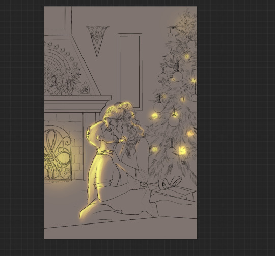
You might also notice that the wrapped sword disappeared...which I regret to this day because I simply forgot to paint it into the rough lineart and only remembered when Skye asked what's supposed to be in the remaining present. Maybe I will add it at some point because now Saul has no present...except for Farah. But the square box present was meant to be Saul's present to Farah and originally I wanted a jewelry box but it was too small to see so I just....put a bigger box. Creativity *sparkles*
Another thing is that from the rough line-art to the nice line-art (yes I always draw my line-art two or three times.....even though line-art is my least favorite stage probably) the Christmas tree is losing a lot of ornaments. Originally I wanted to put in way more stuff like small straw stars or figurines but after painting a million tiny branches I started regretting every life decision that brought me to this point so I simplified the tree. A lot. In the end, I don't regret that because I think it fits them even better. Silrah don't strike me as people who go all out on Christmas and rather just decorate small and tastefully (given they would even celebrate because Otherworld= different culture, but we ignore that piece of worldbuilding for this Christmas-themed drawing)
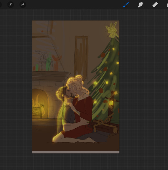
Next I block in every area on a separate layer so I can alpha-lock them for the painting process. At this point I was getting too annoyed with the tree because painting it was a pain in the ass so I started shading and painting in textures and finishing everything else before even continuing to block in the tree.
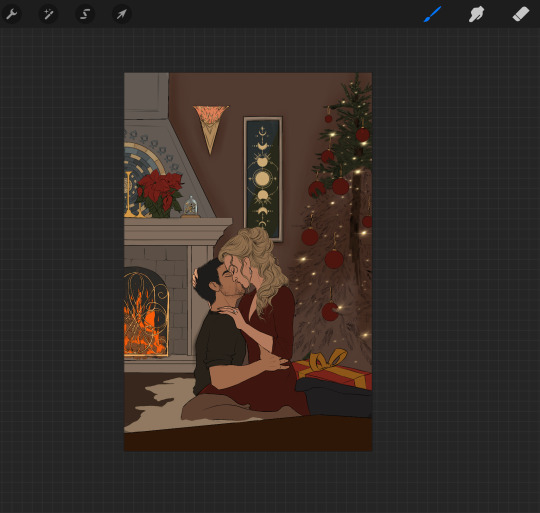
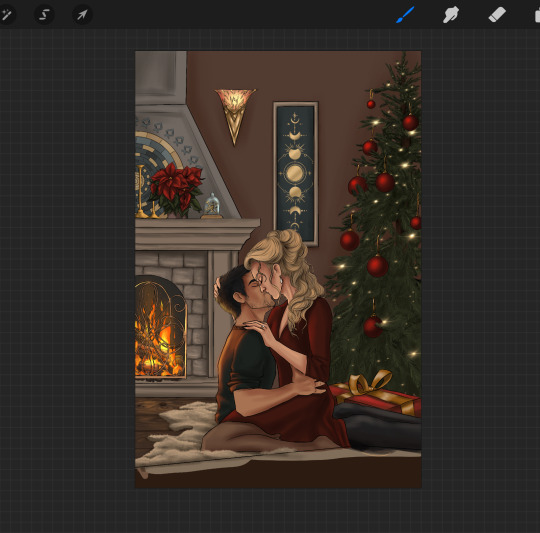
The whole image was still too cold at this point so I went in with one of my favorite parts: atmosphere and then lighting bringing it all together and making the painting shine! Painting light is so much fun and I definitely want to learn more about lighting and structure to get better at it but I really love it when someone compliments the light in my art!!


I also finally added the title of the book in the front. I wanted it to be something about magic that Farah would read and looked at various old book covers with pretty lettering. I decided on "The Story of Magic" because I found a very pretty-looking reference cover with exactly the letters that I needed to spell.
And then....something was still missing......THE TREE. (I didn't take a progress picture at that stage that's why it's already in the pics up there but in the end I still had to draw the light on the branches and after doing about four or five of them I decided the effort was not worth the result and did the light reflection very very roughly. But I don't think anyone except me really notices.
And tada the finished Christmas drawing!
#my drawing process#fay draws#was this coherent? I hope it was coherent#I actually love sharing my process#it's so much fun to talk about all the work you did after you already finished lmao
24 notes
·
View notes