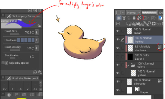
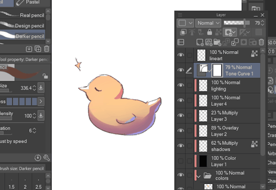
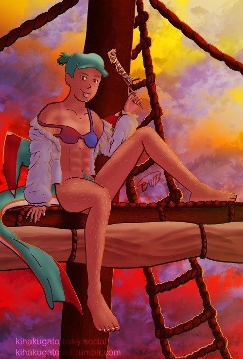
#tweaked a bit using csp
Explore tagged Tumblr posts
Visit Tumblr Blog
Explore Tumblr blogs with no restrictions, modern design and the best experience.
Last Seen Tumblr Blogs


Fun Fact
Tumblr was the first site to host the blog for President Barack Obama in 2011.
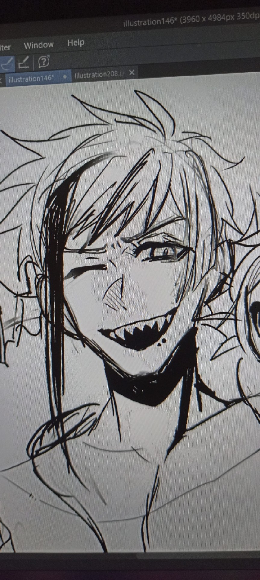
Text

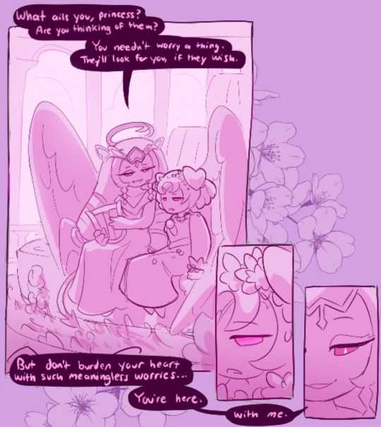
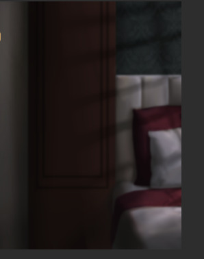
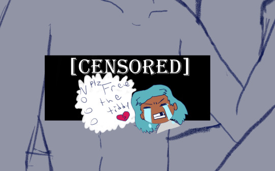
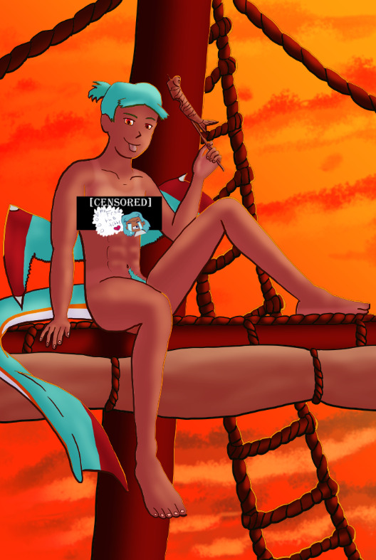
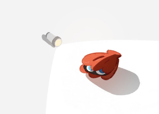
BAAU Sugarposting from the magma!
Happening later in the timeline, the stress of saving her kingdom weighs too heavily on Princess to bear. Thankfully, someone is there to take it all away, with plans of her own…
#tweaked a bit using csp#beast ancients au#ngl its been really easy to share lore through the magma idk why!!#but welcome baau sugar!#i’ve had this idea in my mind of a hot minute and i just needed crk to help validate it for me lmao#also whoopeee! more timeskip baau art!#maybe i should tag these#crk au#cookie run kingdom au#crk#cookie run kingdom#eternal sugar cookie#princess cookie#dragonberry cookie#hollyberry cookie#knight cookie#pitaya dragon cookie#tiger lily cookie#cjj arts
2K notes
·
View notes
Text

three of them
#draws#warrior cats#jayfeather#lionblaze#hollyleaf#mainly drew this so i could get used to csp. also tweaked the designs a little bit
294 notes
·
View notes
Note
How do you get your siffrins to look adult? I keep accidentally giving them a baby face but I WANT THEM TO LOOK GROWN AND EXHAUSTED LIKE HE DESERVES
okay so i legit think i fail at making siffrin look adequately adult like half the time but here's a general breakdown of my like. thought process when im actually um. thinking .
So first of all heres my general tips for proportioning a face, and how i attempt to keep the roundness of sif's in-game proportions while also like... drawing them more realistically? i had to practically reinvent a Human Style for drawing isat fanart since im a furry artist so a lot of this is fresh in my mind, luckily(?) for you i suppose.

This newness also means you can like, watch me fight and struggle against how the hell to do this in my earlier fanart. so feel free to try and see what changed as i pieced it together.
Another note is body proportion. You note giving him a baby face specifically, but some of it MIGHT be that you're drawing the head too big for your style? Try and figure out how many "heads tall" your figures are and tweak the numbers until you find what looks "adult"

Here I cracked open one of the comics I used CSP Model refrences for (albeit feat Loop, who i envision to be the exact same height as siffrin. i am NOT a tall loop truther i think its funnier when that bitch is five foot NOTHING!!!!!)
drawing sif with adult proportions can be deceptively difficult though on account of their Being A Tiny Motherfucker. Mostly here though, I find that the best way to do this is to drop like 1/3rd of the length of an average drawing figure's legs. Short people tend to have short legs. I know this on account of a lot of my ocs being 5'3" and below (... for... reasons...... unrelated to my own... height.... 100%.... ) so once again I think a lot of this can come down to trying to fiddle with numbers and noting down what works.
OKAY NOW ONTO SOME MORE SIFFRIN-SPECIFIC DRAWING TIPS. like these are what i find myself doing to make them look older if i accidentally baby face them myself

The above kind of chibi-er doodle style im still not sure has Siffrin looking adult enough for my liking (someone who considers them minimum 28) but considering they're presumably genuinely a deceptively baby faced guy at least by game's start (even if they should probably look. unhealthy.) it's like... forgivable.

the bald spot is basically fucking cheating in terms of "making them look older" lbr but i am so fucking insistent on it and i punch the air in celebration every time i see anyone else do it. winner is ME!!!!
Anyway. the body hair thing is funny considering we basically have Word Of God that siffrin is not the kind of person who ever likes being naked/even having their feet out in a casual setting. but like. hi its me the weird fucked up miserable nudity guy. of course im drawing every pockmark and texture on their body.
Another note here is, on their naked form, I avoid overly smooth lines for outlines of the limbs and torso. This avoids making them look "sexy twink thin" (not my bag at all) and instead gives the impression of loose skin from fluctuating weight, uneven fat distribution, skin becoming baggier with age. I also let joints jut out and look sharp wherever I can. This is because im an asexual pervert who likes the human form the mostest when i can see 'imperfections' This adds to the haggard nature of it all, by being reasonably honest about what the kind of persistent decade-long neglect of self care and implied malnutrition would do to a guy

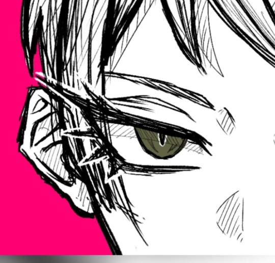
Last note: eyes. i find i end up drawing a vague glassy black smear with a hint of white for the sclera for siffrin like. a Lot. Eyebags to show weariness is not my preferred method as I find it, to be rude, a bit of an overused shorthand. Plus, while sif in game does get eyebags, they're usually more on pushed expressions where they're forcing their face. So I put more emphasis on drawing the folds of the upper lid (which the game does not do) to make them look weary.
I dont think i can elaborate on my opinions on How To Draw Eyes without it becoming a way the fuck too long essay because "drawing emotions good" is like. my number 1 goal in every drawing so even if everything else is scuffed to hell I HAVE TOOO get the eyes right because theyre the most emotive part of the face. if i cant capture an emotion correctly the drawing isnt getting fucking finished is the thing, so....
Luckily for me, drawing over eyes and continously tweaking them by painting over and over and over and redoing them can have the side effect of making them look over-detailed and thus worn/tired/agonised. yes this is why i draw loop's face so scrunched all the time. All I can say for this though is to do a lot of studies of both real life faces & the most emotive cartoon faces you personally have experienced. So like. steven universe is great for this because rebecca sugar is so scary at drawing eyes. theyre so fucking scary at it. or sometimes i just go stare at rebecca's old comics because jesus christ. anyway.
??? but yeah hope this helps. its something i feel like i have a genuine hard time with too, especially since im so intent on keeping their face round & my artstyle is genuinely very cutesy even when i am being weird soo ...?
tl;dr:
draw the eyes smaller, give them a chin, the canon nose helps a lot & dont forget the bald spot. everyone draw the bald spot. for me.
#???? HOPE THIS HELPS IVE NO IDEA WHAT IM DOING BESTIEEEE. imo ppl like dragonymango draw way better adult-looking sifs than me LOL#lucabytetalks#long post#isat spoilers#isat siffrin#two hats spoilers#doodlebyte#soz for the wait time i kinda had to draw pictures to explain anything in a coherent manner. not that this is coherent at all
143 notes
·
View notes
Note
Hi Sleepy ( ╹▽╹ )
I was wondering what brushes would you recommend in Clip Studio Paint? (If you're willing to share/say ofc! ( ◜‿◝ )♡)
Your art looks amazing aaa and I am trying to figure out which brushes are good, because I am having a hard time achieving the look I envisioned for my art (╥﹏╥) especially the linework
Thank u and I wish you lots of potats (/¯◡ ‿ ◡)/¯ ~ 🥔🍟🍠
Hello!
For brushes, I can't say much because I usually just use regular round brushes and blur/blend it!
For lineart though, I'm currently liking my line work with Milli Pen! It's literally one of the default brush in CSP so you should be able to find it in the pen subtool. I tweaked the settings a bit so here's my setting with the Milli Pen!
I particularly play with the weight/width of the pen across the artwork, making sure it looks dynamic and doesn't look too flat.

For coloring I don't really use any weird brushes, just a round brush and play with the colors!
Thank you! 🥔🥔
170 notes
·
View notes
Text
As promised, here's the process video for my YGO Rare Pairs Mini Bang piece. I feel like this event always gets me to push myself beyond my limits (or maybe it's Tealshipping ;-P). A lot of attention and care went into this piece, so I want to talk about it a bit.
(Extensive yapping under cut)
As with many of my works, it started with a song. Pretty much the entire aesthetic direction of this piece was inspired by it, specifically this lyrics video.
youtube
I started with a thumbnail with pencil on paper because I'm astonishingly near-sighted and can only determine a good composition at a very specific size.
Fun fact: This thumbnail was very likely jotted down on company time :D
Then I traced it onto CSP and started with the values sketch. Since the song/lyrics video provided a very clear vision, I worked out the light sources pretty quickly. Some things I kept in mind:
The elements in this piece should suggest that we are looking at this scene through Johan's eyes. That's why Ryo's eyes are closed, and Johan's seeing a different version of "himself" in the mirror.
Because of this, the lighting scenarios for the outside world and the mirror world are completely different: the outside world is hazy, sensual, the mirror world is stark and eerie. "Yami" Johan has sharper features than "normal" Johan, and he's cast in colder light. The "real" world, on the other hand, would have warmer tones. (I feel like I didn't push this enough tbh).
The main light source comes from windows off-screen. I was very particular about the way it hits Johan's face and cast most of it in shadow. In contrast, l wanted most of Ryo to be in the light. It's kinda unrealistic, but ¯\_(ツ)_/¯
The light from the windows also helps illuminate the background. Specifically it reveals the one piece of furniture necessary to deduce the rest of the story ( ͈ര ̫ര ͈) ⊹`𓈒
There is a rim light from a lamp hidden behind Ryo. This helps sets the characters apart from the dark background and suggest more depth, especially in the areas of darkest shadow.
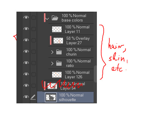
The process I currently use is one I adapted from kuroshiro's, with a few tweaks. First, I separated the piece into parts, and coloured them on separate layers with their base colours. Then, I added new clipped layers to each part, set to Multiply or Overlay as necessary, and rendered on those layers. This workflow helps me think clearly about what I need to do next, and easily come back to fix mistakes later on. It also allows me to pause at certain points and play with different lighting/colour schemes, just to make sure I like the direction I'm going in. It's a labour-intensive way of working, with a lot of cognitive power expended on pre-planning and layer management, but it's very effective if you like to problem-solve on the fly.
This scar on Johan's neck has a lot of symbolic significance in the story of this piece (read the accompanying fic to find out why), and so does Ryo kissing it. I wanted to make sure the way I posed the characters + arranged the lighting would give it that prominence in the composition. I based it on ref photos of real electrocution wounds. (And that makes the second time I've put marks on Johan's skin for this event lol).
Occasionally, I'd screencap the image and save it on Discord, so that I could look back at it the next day and immediately notice anything major I needed to fix.
Fun fact: In my vision, the light-cast-from-window thing was mandatory, but I'd never drawn anything like that before. Reference photos were helpful for inspo, but I needed to observe how it works directly. So (after much procrastination) I decided to turn off the lights in my room and stood for a good half an hour watching the way the light hit my wall in the dark, brainstorming how to recreate this on CSP.
(The most painful part of this piece might be looking up hotel room interior refs and trying to design a bg that looks legit but not with the muted color schemes that seem to dominate luxury hotels use nowadays).
The mirror frame was one of the last pieces to be added, and then I exported the image and imported it onto a different CSP canvas. I added a layer on top the image to paint over any remaining mistakes . I also added some special effects (such as air-brushing Johan's breath). Lastly, I signed the piece.
Fun fact: The "pressed against the mirror" thing was another big challenge, for which ref photos weren't gonna be enough help because I had such a specific idea with the pose + lighting. One day, while I was wandering in a new bookstore and about to leave, the employee told me "We also have a secret room, would you like to discover it?" and she DEADASS pulled open a bookshelf to reveal a hidden chamber??? And inside were obvs more bookshelves but most importantly there was a large mirror on the wall EXACTLY like I needed. So I spent a good while in there taking reference photos using myself as a model hehehe. Thinking back on this experience now, I become more firmly convinced that the universe arranged things so that I could bring this Tealshipping image to the world. *^w^b
Overall, this piece took me literal months to complete (most of which was spent agonizing over whether I could pull off all of the aforementioned goals). I'm noticing some pretty big mistakes now that I'm looking back at it lol but it felt pretty rewarding to finish it at last. Do you think I managed to achieve my intentions?
#i forgot i said i was gonna do this lol#art by neeko#art process#yugioh gx#yugioh#jesse anderson#tealshipping#johan andersen#ryo marufuji#zane truesdale#yubel johan#work in process#fanart#ygo gx#yugioh fanart
10 notes
·
View notes
Note
HEY YOU
Um...
Hi hope you're having a a wonderful day
I just wanted to ask since you're a digital artist... how do you color your art?? Because I'm a traditional artist trying to become a digital artist but I have no clue how to color my work (I made the mistake of using 'fill' on ibis paint before realizing oh wait that's not how digital artists color their work dummy) like I know base color and all that but the layers... how... How color? Line art no fun...
*cries*
I have no idea what I'm doing 😭
Don't feel pressured to answer this or anything, just thought to ask you since your art is so CRUNCHY I LOVE IT
Hello there!! I hope you're having a nice day as well
Sure! I'm very happy you like my art and as I also started as a traditional artist, I'm glad to entail some tips! :]
Base colors:
After finishing the lineart (can be sketch too), I use the Magic Wand tool and click it on outside of the lineart. This will give you a silhouette, but in the wrong space. Therefore, we have to go to 'Selection -> Inverse selection', after, you can proceed to use the fill tool on a separate new layer, beneath the lineart.

(Advanced tip: if you use Clip Studio Paint (CSP), there's an asset called 'Erase Along Edge'. Set your lineart layer to a reference layer (light house icon) and you can continue to erase and adjust the silhouette more easily with this eraser!)
Next, make a folder, clip it down to the silhouette, within this folder, add separate layers for each base color. This will help you manage your colors more effectively.
Shading:
This is extremely tricky and I cannot give a standardized process for this, but I'll attempt to do so. There are much better ways to do this I'm sure, the one I entail on forward is a bit time consuming (but it might only be a personal thing as I tend to over-render)
My method:
For a simplified method, skip all the purple colored parts of text.
We are going to continue working here:
I fill a separate layer with all black, and set the layer to color mode. This is to help us see the values better. Should we play around with contrast, brightness, focus points etc.
Then, with a layer, set to multiply mode, I begin shading shadows. Can be grey for now.
After I'm done, I use a layer to block out bright parts, with white. It makes it very dramatic, bless. (You can use different colors for this of course, I just keep this specifically very bright.)
Additionally, make a separate layer, use it for reflection lights with a lightish gray.
Adjust, add, tweak layers to ensure your overall image meets your expectations, including background. Most of the times, I even additionally paint a complete image by blocking out bigger shapes (messy and undefined) to see how the values should match in this stage.
Simplified demonstration:
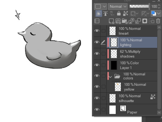
We'll come back to these layers later.
Hide the previous black color layer. We now have colors again, but it's all so muddy.

Therefore, we alpha lock our previous layers of shading, and fill it over with colors. Unsatisfied by any colors? Use the Hue/Saturation/Brightness sliders or add a new correction layer. Important thing to note that you can use other colors than this purple/blue one in the image below for the multiply layer.
I use correction layers unapologetically. My favourite is Tone Curve + Gradient Map.
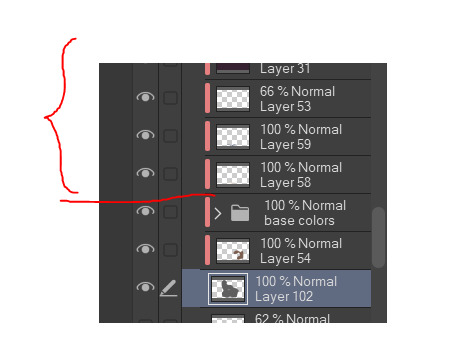
Naturally, I have a lot more layers than this in the demonstrated picture, such as Overlay layers to emphasize focus points or further darkening parts with multiply layers, etc. I do most of the hard work during rendering stage! Excuse me for the low effort rubber duck also hahah. Here's a closer example for what I usually do:
All we got left to do is Rendering (painting over mistakes) and Effects. I cannot give much advice on Rendering, it's pretty much the same as in traditional art.
Effects:
I sometimes leave little speckles/sparkles over my art to make it more detailed.
After, there can be correction layers, simply to adjust the final look.
I usually save the image as png or jpg (or in CSP case, merge all visible layers to a new layer) and add noise.
Sometimes, when I just want to post a sketch I add a 3d effect but in Photoshop. It helps a bit in faking extra details.
That's the end of my process! I hope this proved of help, and I wish you a smooth journey :D In the future, I can post timeline speed paints, if there is interest.
My other related threads are this (on my process) and this (on mindset and learning).
You can see me working in action through gifs here. (The gifs include extra planning stages (mentioned in the previous 'on my process' thread, but they follow the same principles I mentioned.)
----
Another note: it is possible to get a cracked version of CSP, which I won't entail because of account safety reasons, but if you research it, a pointer I can give is that the distributor's name starts with 'o'.
#if there's any related questions feel free to send more#thanks for the ask!#art guide#asks#art tutorial
21 notes
·
View notes
Text


Chrisawa weekend Day 3 : Free
More Chrisawa art hehe
I used a free to use pose by vpivov on the former bird app, but tweaked it a bit. So, excuse the perspective of the random background I added 😆
I had fun making use of a bit mark brush from csp again 😊
#cswweekend2024#chrisawa#daiya no ace#ace of diamond#diamond no ace#sawamura eijun#takigawa chris yuu#my art#chrissawa#love that bite brush
26 notes
·
View notes
Note
Hey Rontra, I'm properly digging through the archives, but I will forever love this animatic you did for Offal Hunt: https://www.tumblr.com/actualbampot/190639258301/rontra-cinder-voice-im-so-stressed-that?source=share
I really want to try making an animatic, but I have no idea what the workflow for this is. Was it a million still images fed into video editing software, or is there anything I'm missing/do you have any helpful tips?
Thanks so much.
ah, thank you, i'm glad you like it!
now i dont Usually really make animatics specifically, i just "make videos", so most of my experience is in PMVs (and adjacent fields) and that shows. but the act of Assembling them can be similar so the experience is relevant :p
there's lots of ways to do it and ultimately depends on what you find easiest for your idea. drawing images in your art software and then assembling them in a video editor is probably the simplest way, especially if it's a longer video (more numerous (or elaborate) "shots" = probably easier to organize in a video editing timeline)
if your preferred drawing software doesn't have audio import, you're probably better off arranging them in a video editor as well... especially if you have parts with animation in them! clip studio paint for example didn't always have audio importing, so before then you had to just kinda guess at the timing and keep tweaking your animation until it worked--or, more conveniently (though it doesn't feel like it), save each frame individually and time them in a separate program
and if youre using a non-linear video editor you can easily add/replace placeholders too which is convenient. i often put text placeholders that describe what i need to draw for the missing part, so i don't forget xD
religion of loneliness was made this way because it's elaborate and long and has a lot of parts and effects i wanted to do. a video editing software is usually more comfortable for that kind of thing (depending on which softwares are available to you ofc)... even the small bits of animation it has are individual pngs i assembled in the video editor
but for no particular reason, so was therefore you and me -- this video's super simple! i just felt like taking it into the video editor because i'm more comfortable there. the characters were drawn in clip studio and the text/bg/whatever was done in the video editor, even though it could've easily all just been baked into the same pngs bdfhjgfdjk
in this workflow you can also use finished animation cuts as separate gifs/mp4s/whatever where needed ofc, depending. i sometimes mix and match
on the other hand, your link in particular ("what's gonna happen") was made entirely in one clip studio paint file, after csp added the ability to import audio into its animation timeline. this video is a very simple mix of animation and tweening, which are both doable from inside clip studio now, so i said fuck it and crammed everything into one file
it looks like this in clip studio paint*
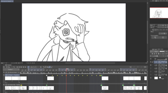
that kind of thing works for me because im a little messy and i like being able to redraw or adjust stuff inside the same software instead of switching back and forth. but for more elaborate project it will probably start wearing on your sanity to have everything crammed into one file (not to mention the file size might become unwieldy depending on what you're working with)
not all drawing programs will have animation features or audio import as part of their kit, which can make things troublesome. but if you're using animation software or an art software with animation features, it's possible to just do it all inside that program with relative ease like that (though some of them can be quirky to Learn)
as an aside, the original black eyes was made entirely in photoshop of all things because csp didn't have as many tools back then, and you can tell because . that is not a brush ive ever used and the pans/crossfades are Occasionally Very Weird JHBHSJK i could've just used a video editor but noooo. photoshop timeline tools ONLY No Assists
and that video is All still images so it could've easily been handled either way. important part is it worked out and i had fun messing around in there
i'm sure there's some other workflows out there someone finds super useful but i think the Main Branches are definitely
drawing software + video software (tag team)
drawing/animation software with audio import capability (solo job)
the first one tends to be more accessible i think? not only like Generally Speaking because there are more free drawing programs and more free video editors than there are free programs with drawing + animating + timeline editing all together (which . is true) BUT ALSO because even when we already have our programs ready the learning curve is usually sharper for the all-in-one and can be challenging to figure out, depending
but for me when im just playing around in there i find working all in the same program gives me a lot of flexibility. since i don't have to keep taking an image back and forth between the drawing room and the video editing room if i have to change something. yknow
it depends on the project. just try stuff out idk :)
my advice is definitely to start smaller and don't jump into making like a 3-minute video right away until you're more comfortable with your developing workflow. but that's about it. i think beyond that its Fuck Around And Find Out HAHAH i dunno
if theres anything specific i missed im sorryyy but you can ask and i can try 😂 good luuuuck!!
*to compare i guess, RoL looks like this -- behold the filenames of a genius

17 notes
·
View notes
Text
The Harriet Pinup Art Project
Session 2- Process till completion? But where're the other sessions?? Well that escalated both quickly and slowly
The last report was Early September 2024…. Dear god it’s been almost 7 months since last report. I would’ve like to have split what comes next into 2 more sessions but- it is what it is. This is gonna go all over the place so apologies.

Finding some dissatisfaction with my end result in last-session I tweaked the fish-holding arm and the dangling leg a little bit more to my liking and sketched again.
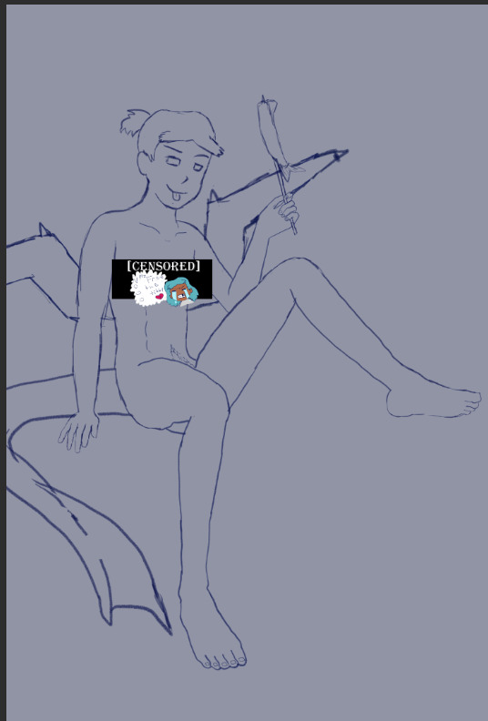
The nips got finally drawn and with it- the censor will now have to drop to keep tumblr-compliant and also to keep this blog sfw, hope you enjoy the humor (Harriet doesn’t).

The wings kept feeling wrong (looking more stretched and unnaturally tacked on vs being naturally relaxing from her backside) so between struggling wing csp assets to reference (not super great when there are no flipper-esque wings) and some more direct input from a friend I ended up landing on a more natural look.
Linearting
Now for my nemesis- linearting.
Despite my disdain for the process I did not want to half ass it by just cleaning up the sketchwork like I normally do. While I struggle to grasp its use, I really wanted to implement lineweight in my lineart. From what I’ve seen lineweight can be used in a lot of different ways; purely randomly, to emphasize mass, or to emphasize the light source of the piece. Of all the choices I tried to stick to the last option since I felt I could best understand it enough to attempt it.
I also decided to try a feature I’ve never used before; linearting with vector lines instead of rasterized ones. For those who don’t know what the difference is I’ll do the extremely dumbed down explanation; rasterized lineart is more common (I think) and is less memory intensive, vector lines are more common in graphic design (since they can be resized w/o the pixel distortion you can encounter with raster lines). I wanted to try this method in an attempt to make the process of linearting a little less painful; with vectors I can adjust the lineart without having to redraw said line if it’s a small tweak, and changing colours is a lot quicker too.
Sadly during this phase my tablet pen's nib broke in a way that was unfixable (leaving the broken part of the nib DEEP in the pen), and due to pricing (tldr- the pen was more expensive than just replacing the entire tablet, in which case it's better to upgrade altogether if possible) had to wait for a new tablet after researching my best choice for a replacement; definitely was a great upgrade but GOD I did not like that happening when it did. Upon a friend’s suggestion I adjusted pen sensitivity so I could try to avoid putting so much force on the pen when doing the thicker lines.

I think I’ve grown a little more confidence on linearting, but it’s still far from my favourite step. I both enjoyed and hated the process of using vectors for the lineart. I felt like there’s probably a lot more I could’ve done with the vectors than what I was doing, but in my opinion it is not that bad for someone jumping in with very minimal knowledge/understanding.
Colouring/Shading

Being colouring is one of my favourite steps I couldn’t resist I rushed right into it. Though I actually ended up doing the shading before the colouring this time. I did the method I’ve heard/seen for digital artists where you block the subject with just black/dark, and then erase it off where the lighting/highlights would be. I’ll say I definitely found this method put more strength into my shading from usual.
Then I rushed to colouring Harriet herself. Just did the ol-colour picker from her refsheet to throw her colours on, then did some adjustments to colour her nipples and tanlines (cause I WANTED DEM TANLINES!!!!!) though I tried to not make the latter too bold of a contrast since she imo has darker skin and not just tanned.
Then from there there was colouring the background and mast and just wrestling the colour balance and blends, there was a lot of it so I’m just gonna share one of the ones I went through.
At one point I even took a sunset from google and maxed its size on the background (and crashed CSP as a consequence due to the large image resolution- which lead to me shrinking the canvas/image during this process) to try to help me get an idea of what I MIGHT want to do for the background.
Clouds 💢
After a point I started trying to make my own clouds- the first attempt wasn’t too bad save for the tiny little problem that was the brush made the clouds look wayyy too sharp and grainy on closer inspection so had to scrap them and try again, even going as far as looking at irl clouds to try to get an idea of how to emulate them.

I ended up using a generic soft brush and tried my best to do clouds again. It was okay, but not great and kept getting adjusted between other steps. fortunately we’ll better revisit/redux on these clouds far later in the chain-of-events.
Like the clouds I has having problems getting the nice folds look for the sails, grabbed some refs and kept trying to get it right. The results are far from perfection but they are sufficient. Folds on this sort gonna be a pain in general.
Clothes roughs
I did some rough draw-ups of different alternative outfits for her to wear. After a lot of wrestling I settled on her just wearing an opened poet’s shirt and the other two ideas got discarded.
Added a bi-colour bra to make it that I don't have there's a variant that I can share in sfw spaces, and then I lined and coloured the rest of it up, only to stumble into an unfortunate realization-
Ew that went wrong for clothes- reference and redo

[image source 1, 2, and sadly 3 only leads to a pinterest result or a malicious site so 🤷]
With extreme dissatisfaction I ended up trying to tackle them again; I learned the term for the kind of shirt I was after (poet’s shirt, that way it also reduced the amount of AI messing with my results), got several reference photos then tried again while trying to mimic what I was seeing.
MUCH better.
Clouds redo
With that, let’s get the clouds looking better. I checked this tutorial to try to get a better idea, and found some cloud brushes that are in Official CSP but weren’t downloaded thanks to another tutorial and used them, used them then used the tutorial to help further elevate them a little bit. To further elevate said clouds I hilariously used my previous crummy clouds as a overlay to help the new clouds pop. Much better, and with that it’s done, slap dat signature and watermarks! Ready to throw onto the internets
Personal Evaluation on this project
This project ended up taking much longer than I wanted; Some of it was due to real life kicking my butt, and some of it was from clumsy planning and impulsiveness to get to certain steps quicker.
I liked it taking longer cause it gave me more time to think about certain steps and chisel away at parts when I had time, like working on a super large puzzle. On the opposite end it ended up making me much more intimate with the flaws with the piece/project than I’d like to be during the process, since most artists nowadays including myself tend to hit that stage after they’ve completed and posted a work online.
This lead to a lot of times asking “am I gonna shrug off this flaw or go through the time/trouble to redo a part to make it better?” For the case of the clouds and clothes, yes I felt the redo was necessary and it helped strengthen the overall piece, but there were many other flaws I chose to ignore cause I was too far into it to be worth the backtrack.
The biggest example flaw is ironically the anatomy/perspective when sketching Harriet’s body; while using the 3D tool was very helpful, I feel I should’ve did more perspective exaggeration for certain parts of her body (the biggest case being her hands; they imo would’ve looked much better if I made them and her fingers a little bit bigger and chonkier). Another case were the folded sails of the ship that I feel could’ve been better shaped and the folds could’ve been more sensible, ironic for me to say considering I had done several references and do-overs for that part of the piece. Conversely there are probably still various flaws in the lineart itself; despite the convenience of being able to edit the lineart via the vector points it is still a lot of nitpicking if you don’t decide that it’d be better to just move on so long as the idea is brought across via the art, flaws be damned.
When it came to the clothes stage, in my opinion I should’ve done that LONG before colouring/shading Harriet’s body and back when I had just finished the lineart, as it would’ve lead to less visual confusion for my eyes when I had to sketch the clothes out. Some ofher steps were out of order enough to cause confusion to myself, but I won’t bash myself about it since this is probably the first piece I’ve worked on that’s taken this long, plus this winter alone has been very mentally taxing so dumb decisions are bound to happen thanks to that.
That being said, I’m glad I did this project. I got to experiment and test out strategies and tools I’ve never even considered delving into before, and I may even end up using some of them again. There were even some points in this project where said tools I just thought “well this could be handy for [this group of drawing ideas]”. It’s also lead to beautiful results and is probably my biggest high effort piece I’ve done in a long time, probably rivaling if not outclassing some of my bigger pieces that I still admire today from back in my highschool days.
Hearing from one friend talk about the flow of the piece made me happy since, despite never mentioning it during the journaling of this project, that it was something in the back of my mind on/off while working on this piece; the flow of the ladder and clouds all intentionally despite to try to point the eyes of the audience towards Harriet who’s meant to be the main feature of the piece. It really proves that considering flow is a vital element when you want to make a piece work.
I may actually try to print one of the several variants as a print to put on my wall. Not that I will hold my breath on the results as my track record of digital-to-print for my artworks has always been a hard hit/miss for results.
Thank you for those who decided to follow along on the journaling of this art project.
[Session 0] [Session 1]
#The Harriet Pinup Project#artists of tumblr#artists on tumblr#art process journal#wip art#wall of text#long post
6 notes
·
View notes
Note
can i ask what software and brushes u use for ur art?? ur work is so inspiring, sorry if you've answered this before!
Hii, i use CSP Pro, and these r some of the brushes i use for lineart


you can find "wiggle brush" on the CSP asset store for free x) Dry Ink and Textured Pen are just default brushes that come with the program, i just tweak them a lil bit but yeah, thats all.
For coloring i just use these ones, if not the good ol' color bucket

12 notes
·
View notes
Text

Decided to try a new watercolor coloring style as an experiment when drawing a new character of mine! I like how the colors bleed into each other, though making the character's markings clear was a bit difficult. I'll definitely draw this character again in my usual style, I made two small tweaks to her design that I really like but sadly isn't very visible here, so I'll have to make a more normally colored drawing to show those markings.
Anyone have characters they'd like to see drawn in this style? I want to make some ArtFight attacks in this watercolor style this year and I'd like to practice!
character link: https://toyhou.se/9234139.blossom
CSP's painting styled brushes are so much fun to use, especially the watercolor ones! I'll definitely be making more art in this style soon :D
#artists on tumblr#original character#clip studio paint#digital art#watercolor#digital watercolor#oc#furry oc#furry art
3 notes
·
View notes
Note
What art program and brushes do you use? tips on lighting? your illustrations radiate warmth 🌻💛
Thank you!! 🌻💛
This post got a little long, but I've answered each question so if you're curious, it's under here!
Art program?
I use Clip Studio Paint EX and Procreate! I mostly use CSP for my animations and Procreate for my illustrations lately, but I've used CSP for a lot of my illustrations too.
Brushes?
For CSP: I mostly use variations of the default "Design Pencil", each tweaked to fit different needs. Sometimes I use brushes I made myself, but these three are my main ones.
For Procreate: I use the HB Pencil for my lines and Tinderbox for my colors (both are default brushes).

Lighting tips?
This is a pretty big question! I could spend hours talking about this, but I tried to put together some very basic tips.
Figuring out where shadows go:
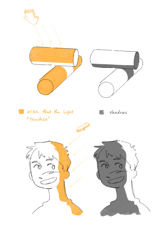
Light generally comes in a straight line from the light source, and everything it hits or touches is the illuminated area.
Everything it doesn't touch, either because it's an area at an angle it can't reach, or because something is in the way, is the shadows!
Thinking about where the light source is, and where it can't reach or what obstacles are in its way are helpful things to think about when figuring out shadows.
Reflected light:
This is a little more specific, but once you figured out basic lights and shadows, reflected light is another element that's useful to know.
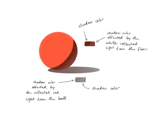
Every object reflects a bit of the light it receives, which affects the colors of the other surrounding objects. The reflected light is of the color of the object it's reflected from.
Rendering details in light and shadow:
You'd be surprised at how much you can get away with not rendering the details that are in the shadow, as long as you render the ones that are in the light.

In this Trigun fanart piece I've skipped most of the details that are hidden in the harsh shadows, but kept a lot of the details on Vash's boots for example.
Unless the focus of the piece is on something in the shadows specifically, you can simplify a lot of the stuff that's not in the light!
🌻
If all of this confuses you, that's alright! Learning takes time, and small steps are still steps forward!
Rules are also there to be broken depending on your goal for your art, so you don't even have to follow them if you don't need them. I break these all the time too.
I hope these tips can be helpful in any way! Happy fun lighting!
21 notes
·
View notes
Note
May I ask what plataform and brushes you use?? :0
Also your art is so cute omgg!! 💜✨✨
thank you so much aaaa!!!
i use clip studio paint ex and pro (i have pro on my pc, ex on my ipad) :- ) i use a handful of brushes from the CSP asset store! they're all free
for lineart, shading and rendering, i use the SU cream pencil by yuriki! it's my go-to brush for basically everything, it has a little texture around it and if you press softer with a bigger size it's great for rendering!! i don't like my paintings super smooth so it's nice for that crunch
i also like to use clip studio's paint and apply brush to soften my hard edges when i'm shading! this one's a default, i've just tweaked the setting a little bit so it's less soft

this one's a more recent find that was recommended to me, but for more sketchy stuff i use the crunchy pen by moonimews ! it's become my go-to as well for the sketching phase, it has a subtle line texture around it, it's also become my brush for laying down flat colors :-) for furry characters specially i like using it when laying down markings, makes it look more organic and fur-like
for background rendering and texturing, i use this set, 厚塗りブラシセット by ×ェ× (roughly translates to thick paint brush set, i think) it has SOOO many good texture brushes that really helped spice up my backgrounds and also painting in general
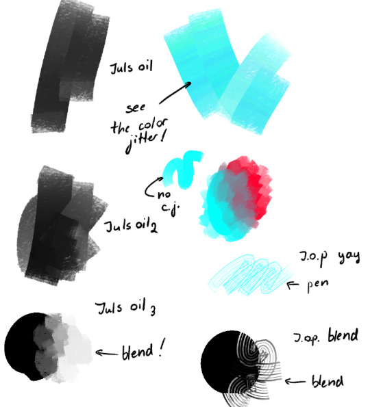
lastly, i also use juls oil brushes by júlia maslová! i use these both for laying down rough colors and rendering backgrounds, i think it's my favourite brush set because it also has a rake brush (swatch taken from the brush page!)

43 notes
·
View notes
Text
If you struggle with colors and choosing colors, may I recommend to switch from a hue wheel to a RGB slider situation??
Because HONESTLY I'm seeing a difference already and I've only been using it for a few minutes.
I'll use my redraw as an example, because I did most of the rough colors with the hue wheel.

Then I switched to a RGB slider (it looks like this in CSP)

Normally, once I had the above drawing, I would have used a mixture of layer effects to get what I want without really considering the colors. And then by the end I would be complaining that the colors either feel flat or that they aren't mixing together.
But below is what I have at the moment after using the RGB slider (or honestly a mix of all the sliders, especially if I wanted something a little bit more desaturated)

Honestly, I had an easier time of playing around with colors and seeing which colors matched well enough. I'll probably still end up using an adjustment layer just to tweak everything, but it absolutely feels different to just fumbling around and trying to blindly pick colors.
So here's to hoping that this will help me in the long run!! I'll gladly add it to my tools next to gradient maps.
5 notes
·
View notes
Text
Part one of analysing @dadofdisappointment 's art style
Basing my analysis on these drawings in particular because they were what I liked.


First things first, I've noticed that they use a very scratchy, quick and sometimes straight line technique, I find that very interesting and I like it a lot.
Secondly, their brushes. Since they use both ibis paint and CSP to draw, the brushes are naturally different.so while I don't know what brush they use and if it's a free one or not, my closest guess would be the "genius pen" or "rough layout pen", but both of them aren't free brushes so I improvised using the "hard dip pen (smooth)" and tweaking it a bit, like this.

But since I'm mostly traditional, been looking for a way to make the same effect, I only have two different ink pens, gel pens and dry feathered tip ones. In this style, I believe a wet feathered tip on like that of the micron brand would be the physical closest. I will be using the dry ink pen which normally draws like this

Link to part two
32 notes
·
View notes
Note
if its okay with you, would you share the brushes you use?
sure thing!! i should note that i mess with the settings of the brushes i use pretty frequently and im always jumping between them, so you might need to tweak the pressure + anti-aliasing of some of these to get the results youre looking for @__@ most recently ive been using this set of free brushes by @/fearoffun, especially the flatbrush and LAUV pens! but theyre all very good :-) aside from that, some other favorites of mine are this G-Pen, as well as this brush set. they're the main two pens i use for my large drawings [i.e the jyushimura pic and the fake manga cover]
also, i don't think i've used it in anything i've posted here, but i really like the intoxicate pencil set as well!
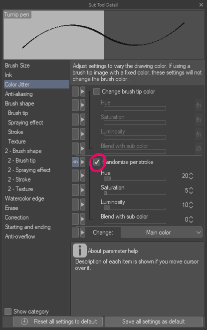
somewhat related, i know in some of my older drawings i use a pen that changes color; this is actually just one of the default csp pens with an extra option turned on! if you click on this little box that i circled, you should be able to adjust the settings to get the same color jitter effect you'll see used there :-) though since the brush itself is just a default one [albeit one ive absolutely Demolished the pressure settings of] i figure it'd be a bit silly to share that😅
#larry time#answers#if there's any specific drawing where you'd like to know what pens i used please feel free to ask!!#i personally REALLY hate the trend of artists getting super cagey over the pens and brushes they use#so dont worry! i wont bite :-) i love sharing tools
9 notes
·
View notes