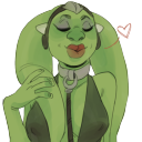
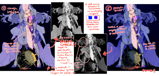
#wanted to try gradient maps here
Explore tagged Tumblr posts
Visit Tumblr Blog
Explore Tumblr blogs with no restrictions, modern design and the best experience.
Last Seen Tumblr Blogs


Fun Fact
Tumblr has 4 main sources of revenue.
Text

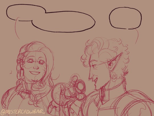
Young Arafinwë and his brother let the day come to a peaceful close outdoors for @morweneledhwen
Well, it's been a hot minute since I last drew Finarfin! And I don't think he ever left the WIP stage, so this is a first. What a shame! Thank god Morwen reminded me to give him some love again. Also, I've really grown to love Finarfin ever since I read Morwen's take on him. "All his sons" is basically canon to me at this point.
Thinking about these two spending a day or two out and about together really sparked my inspiration. Now that I think about it, I love imagining Nolofinwë as a closet adrenaline junkie. Climbing is such a mental game, of course Nolo would love it! And it just so happens to align perfectly with his brother's request to go searching for rare herbs and flowers.
The requested trope for this was transferring qi, so I imagined Arafinwë having the ability to channel light to some extent, using it to form a connection with another person for healing or relaxation like easing his brother's fatigue after an exhausting climb.
#Finarfin#Fingolfin#silmarillion#the silmarillion#the silm#be careful not to drown in unnecessary details in here#also contemplating composition beforehand is another kind of game#I need a mentor#i wanted to try my hands on gradient maps but boy i'm not brave enough...#if anyone is wondering - that's a swiss stone pine and tufts of wild thyme 8'D
135 notes
·
View notes
Text
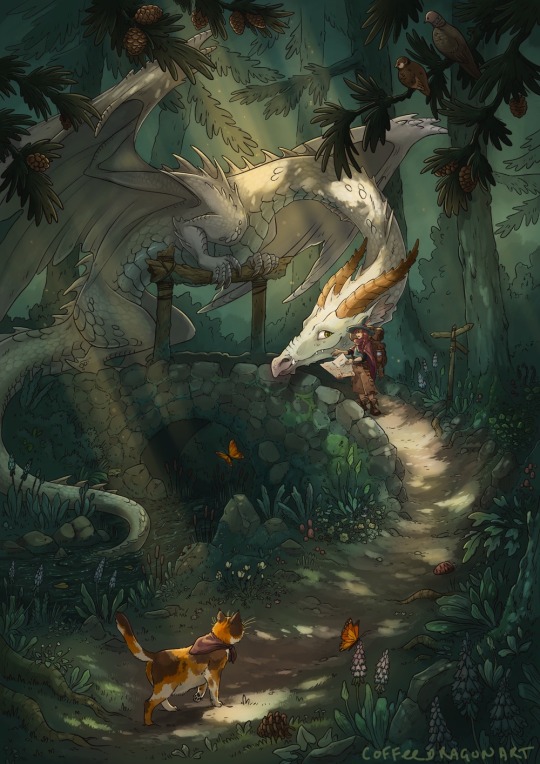
🧭
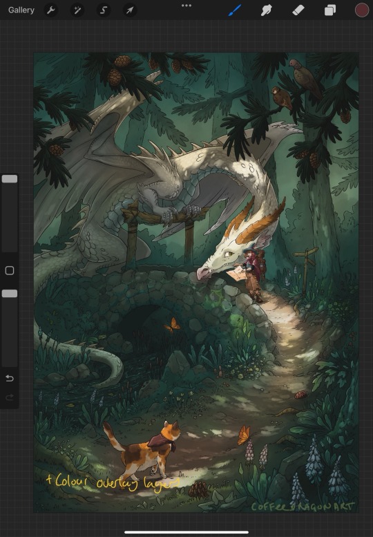
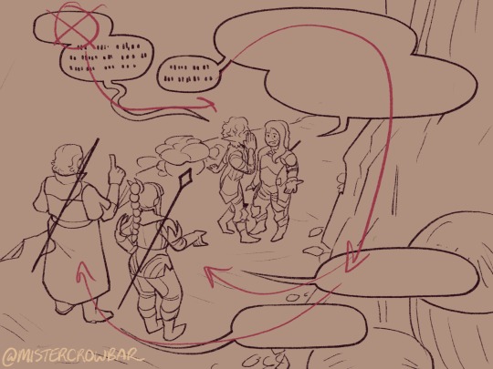
As she looked at the map and back at the forest, Callidora groaned. The path was supposed to branch somewhere around here, but it didn’t.
‘I am NOT lost.’ She muttered, re-tracing the path on the map. The cat didn’t believe her, chirping as it rubbed against her boots.
She looked around. There wasn’t supposed to be a bridge there. The path must have looped back on itself somewhere. The map must be outdated. Maybe some more light would help, there was slightly less overhead foliage near the bridge. While she angled the map this way and that to make the most of the dappled forest light, the birdsong had faded. From the corner of her eye, something moving in the trees was making the light move and bounce.
Callidora didn’t have time for this. She growled into the gloom. ‘If you’re going to lurk, you may as well come down here and help!’
She tried not to flinch as the dragon slid into view, positioning itself on the bridge. It was at least polite enough not to emerge right in her face, or go right for the pounce, but she had felt a little braver before she noticed the cat had hung back several steps, watching butterflies.
‘Are you lost, witchling?’ Its eyes flashed as it leaned closer, claws digging into the old wooden posts. Callidora took half a step back, then pulled herself together.
‘I’m trying to get to Stony Creek’, she said, holding up the map. ‘I was directed to follow the path here, cross here and take the turn by the tree, but I’ve been turned around,’ jabbing at each mark on the map for emphasis.
The dragon squinted at the tiny map, sharp gaze following the witch’s finger.
‘See, you’ve gone a little bit wrong right there. You should have taken the path by the TWISTY tree, not the BENT tree.’ The dragon said, carefully pointing at two places on the map with a clawtip. ‘If you cross this bridge, it does loop back to the main path and you can start over. It’ll take you less time than going back the way to you came, and you should get there before nightfall. But,’ The dragon settled back on its haunches, blocking the path. It showed too many teeth as it grinned down at her.
‘You’ll have to pay the bridge toll.’
————
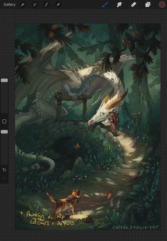
Aiming for a bit of a storybook feel.
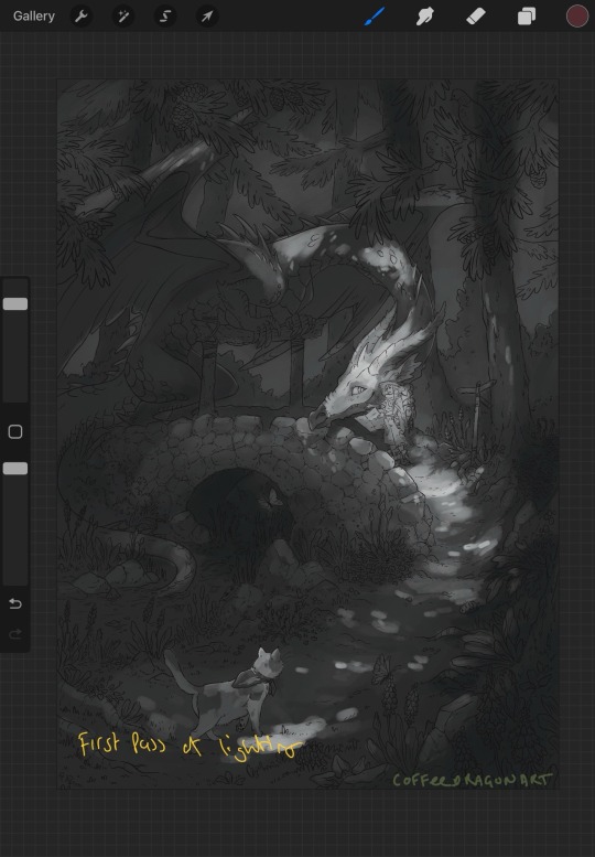
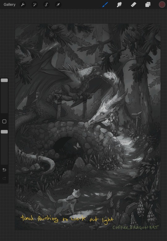
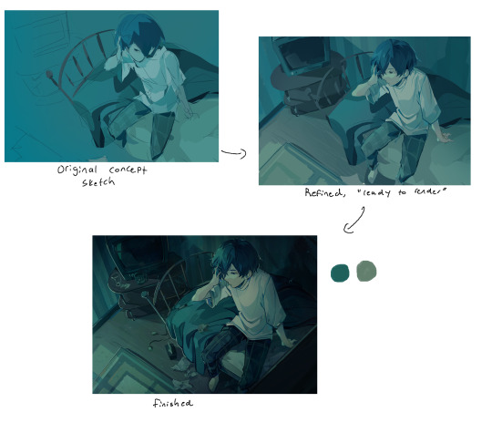
Had fun with this one, even in the sketch phase I knew I wanted to paint that splotchy lighting coming through the trees, and it was nice getting into the fiddly bits of the lines. Tried something different starting with the greyscale, initially tried painting normally but I was getting stuck between finding colours I liked and getting the ‘non-standard’ lighting to look how I wanted.
Ended up using a bunch of overlay layers,but only after trying to learn how to use gradient maps in procreate made me want to pull my hair out. This one had an extended ugly phase while I figured it out.
WIP snaps under the cut.


537 notes
·
View notes
Note
hi there!! this is more of an art question but i wanted to know how you go about gradient mapping? and if you find it easier than flat colouring a piece or if you gradient map to colour how you approach that ^^ !!
can't remember if i put together notes on gradient maps before so here's a quick process diagram using a pic from last year! i think gradient maps are super useful for quickly changing the tone of an image or a crutch if you're like me and really struggle with coloring lol
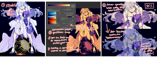
(this is in CSP so you can add a gradient map via correction layer; in procreate iirc you'd have to flatten you image, dupe the layer and then apply the map)
i don't use this method for every draw - sometimes i stop at #3 without changing the blend mode bc i just want the colors to harmonize a bit. or if i'm trying to be more intentional with the color palette i don't bother using a map at all. conversely, you can also create really beautiful effects using maps with more varied tones!!
it's also important to have a variety of values for a gmap to do anything useful, though... i almost always flat color and then map, but i frequently check values the entire time i'm working on a draw, so you could try that ORRRR rough your values in grayscale first before toying with maps
#ASK EVER#if you look through all my xv art its so clear that was the era i relied extremely heavily on gradient maps for just about everything. lol#ever art questions
427 notes
·
View notes
Text
okay i'm back from the movies let's talk about screen and multiply layers

you can read part 1 of this series of tutorial posts where i mostly talk about gradient maps here.
now we're going to talk about the other layer effects. i feel like these ones are already pretty commonly known, but i've also been using them for like 15 years so it's very easy to assume everyone knows everything but actually i'm just old. anyway.
the panel up top is where we're starting from. i've got a nice blue color gradient applied, and everything looks a bit more harmonious. but...... those inks are pretty harsh, especially in contrast to the background, where there's no black inks at all. i'd like everything to come together a little more.
you can do this with a gradient map, if the darkest value is set higher than black. but since we're not using the gradient map at 100% (it's just 30%) the black isn't really affected by it. so it just stays black.
what a screen layer will do--and this is in practice, i don't know what it's actually mathematically doing--is turn your darkest value into whatever color is on the screen layer. so this is what a screen layer set to 100% would do to this panel. (NOTE: all the layers applied in this post are clipped to a folder containing just the characters. they are not affecting the backgrounds, they'll just affect the characters. the gradient map does affect everything)
That's Pretty Blue! the color that neeta's hair currently appears is the color of the layer. everything else is lightened up and also made a little more blue. and this doesn't look terrible, but screen layers will pretty much always make your art a bit lighter, because it's trying to make its color the darkest color. tbh it's great for fog effects and making your blacks light enough that a texture can show up in them. but let's turn it down a bit, to 40%.

hey nice. everything is still a bit lighter, but neeta and emery's hair isn't as sharp against the background. still enough that they stand out as the most important things in the panel, but not so much that they feel pasted overtop. it's a bit like putting some atmospheric perspective between you, the reader, and the characters. there's air in the image. (and why it's good for fog!)
but i want it just a little darker to make up for the lightening up that happened. i don't think i actually need to explain multiply layers, because everyone has definitely used those for shading at one point or another. but here i'm using a very very light blue over the entire characters. i'm not using it for shadows, but to make everything a bit blue.
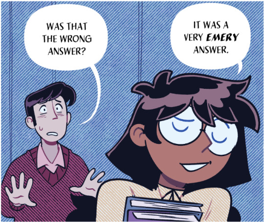
now it really feels like they're in a room. the only pure white is the speech bubble and gutters. their eyes/teeth/glasses will still read as white, but they are not white. everything is at least a Little blue, so everything is unified.
and that panel above is what the final looks like! let's look at it side by side with just the gradient map.

neat! it would be perfectly acceptable to stop with just the gradient map, if you value high contrast black inks and characters popping off the page. i... don't! i like the air that's generated by going a little bit lighter overall. it has a nice matte effect, which is why i'm very glad my book was printed on matte paper.
and that's why hunger's bite looks so good. you should buy it and read it
344 notes
·
View notes
Note
What advice would you give to someone who wants to start draw comics?
Read comics. Try to absorb the layouts and lettering - there’s so many ways to tackle it! Also even in published comics you’ll see that the art is messy and scrungly and you can take that as permission to be messy and scrungly too.
Comics are about efficiency and Good Enough. If you try to make each panel a masterpiece you’ll be there forever. Reasons why I mostly do simple pencil comics.
Start small. Do a scene or gag comic at a time. Get a feel for the medium and all the steps you have. If there’s a step you hate, find a way to emphasize the steps you love. EG I hate laying down flat colours but love shading, so I make my page form comics painterly greyscale with a gradient map to spruce them up.
Thumbnail!!!!! Figure out your page or panel layout before you start pencils. It can just be chicken scratch and sticken figures but it will help make sure there’s a clean line of action carrying the viewer from panel to panel and that your lettering fits.
don’t skimp on lettering. you can have beautiful artwork but if your dialogue is time new roman on half transparent ellipses or somehow unreadable it’s gonna drag everything else down. Blambot is a great source for free and affordable comic fonts and even has guides from an industry pro.
There are a huge bajillion elements to making comics but once you’ve made like, literally 100 pages you’ll start just intrinsically knowing things like the 180 rule, how to place a speech bubble when the first speaker is on the right, and that you can draw one nice background and then have gradient colour blocks carry you through most of the page/scene. And then you’ll still keep learning. Always learning!
LOTS of example stuff under the cut, mostly for lettering and layouts:
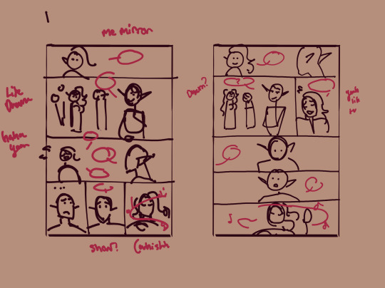
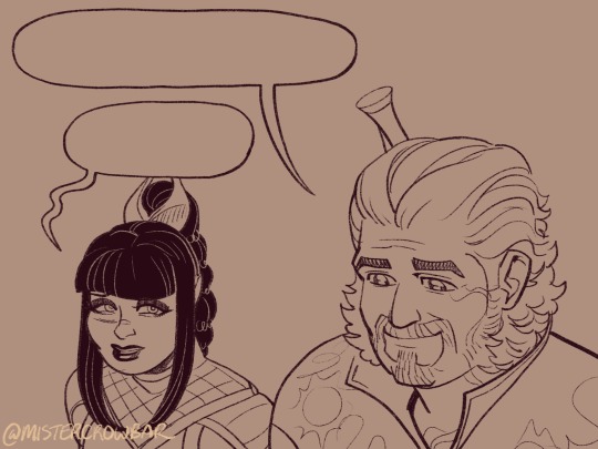
thumbnails vs finished page. The detail is just enough to remind me who goes where. You can see I mostly played with the last part of the scene, going from three panels in one row to making each panel an entire row across three rows. Panels on the same row have less “time” between them as the eyes skips from one to the other faster, whereas there’s a little more gap skipping back to a new row (think resetting a line on a typewriter). Here, the first thumbnail may have fit the artwork more neatly, but I wanted to give Astarion more time to deliberate his decision.
You can also see that I changed the top panel from a close up on Aldiirn to a wider shot showing both. This sets the scene, and the rest of it uses simple/abstract backgrounds until the final panel, which makes a nice bookend while making the overall load easier. One good environment panel will carry you for a while, but don't leave your characters in the void for too long.
Make a script before you start layouts but don’t be shocked if you need to cut things out to have them fit a page. Less is more, generally. This also goes for visual elements - what's most important to the scene? What's just extraneous detail you find fun but is creating clutter?
For the 4-panel comics I don’t put time into thumbnails unless it’s a difficult panel, but I always put the lettering and speech bubbles down first so they have enough room and nothing important gets covered. If you do this much you’re a step ahead imo.
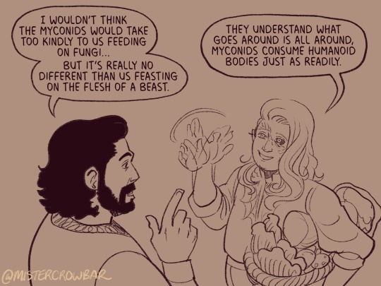
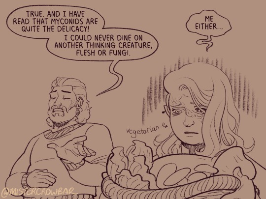
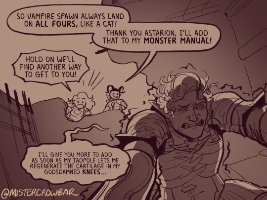
This one I’m working on now and there’s a lot going on with four characters speaking to each other! It’s important to keep a clear line going for the dialogue. Astarion’s first line has the top left corner and clearly starts the conversation. The tail of the bubble carries over to where he whispers to Aldiirn, and we pick up Aldiirn’s lines. The rock wall on the right then draws the eye down to Shadowheart and Gale’s bubble at the bottom. I don’t think the tails on the bottom bubbles are 100% ideal, but it’s Good Enough.
There’s also slightly different points in time going on in this panel, because the art is static but it’s a long convo going on. Gale’s signature finger isn’t in response to Astarion whispering, but to his answer to Aldiirn that comes after. Think of how time works in your panels, especially when you got a big one because size = time.

You can use all sorts of things to direct the eye across a comic page, but I find the strongest things are the bubbles & tails and where characters are looking. Here, Gale’s “stop by” line breaks the panel line to help draw the viewer to him in the last panel, since otherwise the eye was likely to end up at Aldiirn.
I generally like bubbles to be tucked into their panels, either fully inside or up at the edges like “my condolences.” It looks neater than when bubbles are willy nilly over the edges which I see as a sign of poor planning. And! it means when you do break panel lines it can be more meaningful.
the 180 rule is a film/stage thing for composition to avoid confusing the audience, but the simplest way to put it is: if a character is on the left side of the scene, they should stay there until the action or whatever moves them. You can see here that Aldiirn is always on the right facing left, even when the camera is a bit behind him or a bit behind Gale. the 180 line is the front of Aldiirn’s tent, and the camera never crosses it in a way that would put Gale on the right.
I find it distracting when a conversation is happening in comic and a character breaks the 180 for no particular reason, though are times I’ve done it because a panel worked much better that way. The book Framed Ink has some great guides on composition and how to change the 180 line.
You can also see in the above comic that it’s arranged so that Gale’s always the first speaker in the panels he appears so there’s no criss cross bubble tails. Buuuut what if the first speaker is unavoidably on the right?
Stack the speech bubbles. You want the first speech bubble CLEARLY and undeniably the closest to the top left corner and then other speakers can go below.
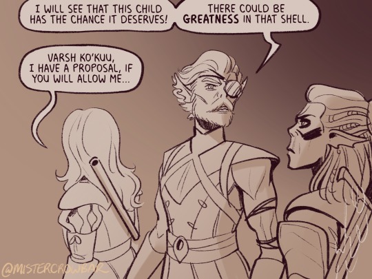
the middle example above also has some examples of playing with the speech bubbles. Wyll’s “square-y round-y” bubble is the standard, the boxy ellipse. The tail has a slight, lanquid curve. He;s comfortable teasing the poor vampire. Aldiirn’s bubble is pointy! the tail straight! with urgency! And Astarion’s bubble and tail are burbling and grumbling through gritted teeth and pain. Varsh Ko’kuu, even though he’s speaking with a standard shaped bubble, has a sharp point in the tail that speaks to his assertiveness in protecting the egg. And Shadowheart has some hesitation with that wiggly tail.
Either hand drawing or using vector shapes for bubbles is fine, but I recommend staying away from true ellipses because they look static. Square-y round-y is where it’s at. Just make sure there’s enough space between text and edge of the bubble, usually enough to fit a capital H or W, but you can play with that spacing too.
The second panel here breaks the “first bubble goes top-left corner” rule, so it’s ambiguous if Gale or Aldiirn speaks first. However! In this case everyone is giving their responses in a jumble to Rath, so order matters less. I’m pretty sure every rule I’ve mentioned has a time and place to break it, but it’s still important to learn the basics first.
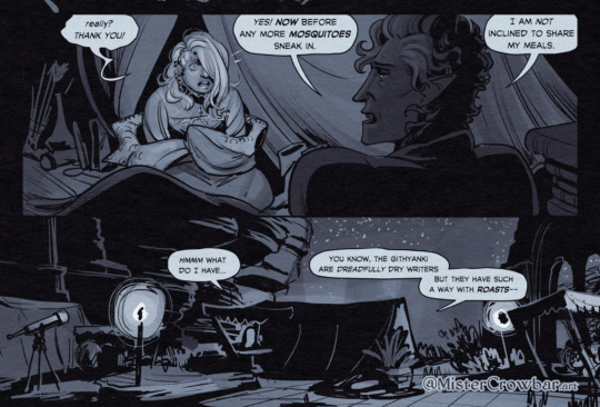
Key thing about comics typefaces: the capital I will have bars and the lower case will not. The barred I is used for I, as in, “I am not inclined to share” where the unbarred is used everywhere else.
When choosing a font, I recommend grabbing one that has Regular, Italic, and Bold/Bold Italic typefaces. I use Milk Moustache for my 4-panel comics because it’s very casual and similar weight to my own handwriting, but it doesn’t have an italic typeface and that drives me nuts sometimes. For the most flexibility, choose a font that has lower case AND uppercase type faces. I stick to upper case 90% of the time but lower case adds more options, like Aldiirn’s “really?” being so small due to his stressed state.
There are some official guides on what should be bold or italic in dialogues but they don’t matter as much unless you’re working for a big publisher with a style standard. Italics for thinking and whispering are common. I go with my gut, like Astarion’s speech is so dramatic I use italics and bold liberally, whereas for most others I may or may not just choose a key word to bold.
I think some programs will let you make text to fit a bubble instead of a square box, but tbh I just spend a lot of time manually making the text fit nicely in that bubble shape.
267 notes
·
View notes
Note
sorry if this has been asked before but how do you make your gradients look so good?
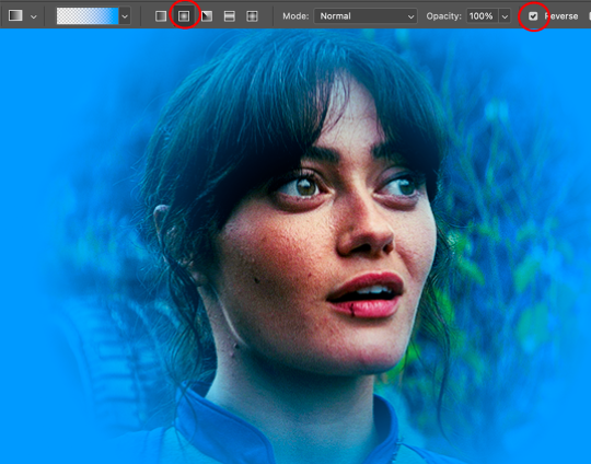
Hi Anon! First of all thank you so much 🫶
I like to use gradient maps (which I've explained here) or gradient fills + gradient tool. I'll drop a little tutorial under the cut:
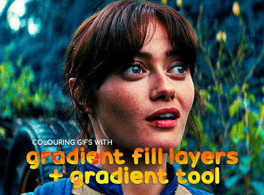
GRADIENT FILL
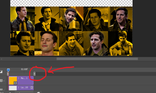
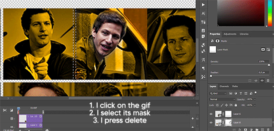
I'll be using this gif which I've already sharpened and coloured:

First of all let's make the background pop so I'm going to add a gradient fill (Layer -> New fill layer -> Gradient) with these settings (I'm using this colour #0099ff):

Now it's the time to play with the blending settings! Depending on your scene some will look better than others but I usually switch between Soft Light, Overlay, Color or Hue. 90% of the time I use soft light but this scene looked much better using overlay:

As you can see the background looks more blue and vibrant but it's not too much you know.
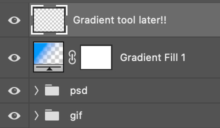
GRADIENT TOOL
Now it's time to use the gradient tool to give this gif a hazy look. I haven't seen many gifmakers talk about this tool but it's soooo useful and it takes gradients to a whole new level.
Before using this tool we'll need to add a new layer above the gradient fill, like this:
(HELP I just realised I typed “later” instead of “layer” 🤡 but let’s ignore that)
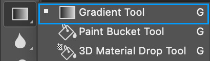
You can choose the gradient tool by pressing 'G' and then clicking here:
Make sure your gradient goes from any colour to a transparent background.

Okay so next to this gradient settings we have five different styles and each one will create a different shape. Depending on the scene I'll use the first, second or fourth one. Here are how they look:
1. Linear gradient
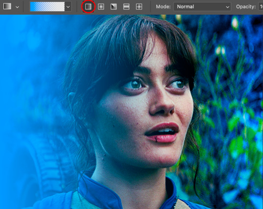
2. Radial gradient + Reverse (if you don't click this you'll end up with a blue circle above your gif)
3. Reflected gradient + Reverse
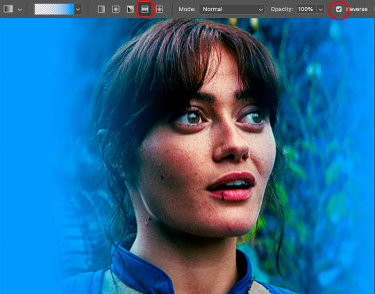
This time I'm going to use the radial gradient so to draw it start by clicking on the centre of the gif and drag the line (the farther you drag it the less intense the gradient looks):
And this is the gradient:
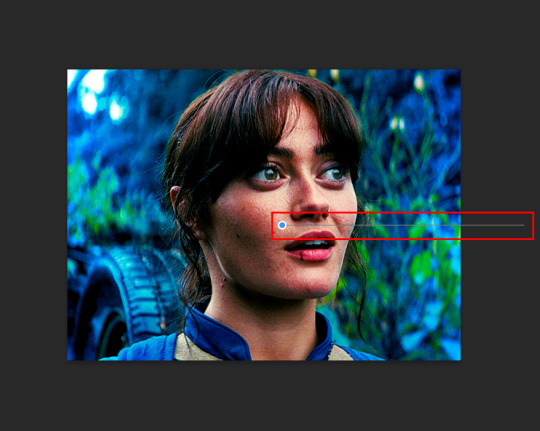
And here comes the fun part again, playing with the blending setting and the opacity! Before doing anything I duplicate my gradient layer because I always use more than one so this is how your layers should look like:

Let's go to the first gradient tool layer and again try different blending modes: soft light, overlay, hue... Most of the time I'll use 'Soft layer' and I'll leave the opacity at 100%.
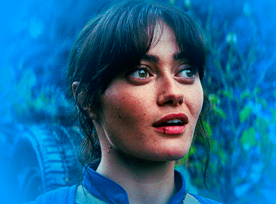
For the second layer choose 'Screen' and don't worry if your gif looks too bright because we're going to fix this by decreasing the opacity. Anything between 20-60% should look good but it depends if you want a more vibrant or more natural effect. I ended up using 40% and this is the result:

And we're done!!! As you can see the result looks much different from our first gif and it only takes a couple of layers!
Honestly the best advice I can give you is to play with the opacity and blending mode of the different gradient layers because depending on the scene some will look better than others!
#ask#Anonymous#ps tag#tutorial#usernolan#userrin#useraljoscha#uservalentina#userbunneis#userlockescoles#usernik
563 notes
·
View notes
Note
if you ever have time/feel so inclined, i would love to see a tutorial or some tips from you about how to do color isolation sets!! they are absolutely incredible and I love them so much! <3
absolutely! thank you so much 💙
here are a few examples of my color isolation sets:
the substance (yellow) || beetlejuice (red) || us (red) || conclave (blue) || sleeping beauty (cyan/blue) || crimson peak (yellow) || smosh (purple) || conclave (red)
beneath the cut, i'll walk you through my coloring process!
notes: tutorial assumes basic gifmaking knowledge & i'm using adobe photoshop 2023 (though afaik, your version shouldn't matter much)
i don't color my gifs until they're sharpened and i'll give you a quick overview of my process: file -> import -> video frames to layers -> trim any extra frames -> crop to desired dimensions -> run sharpening action (i used this tutorial and just made it into an action) which also converts to timeline
once i'm in timeline, i go through my normal coloring process. unless i'm giffing similarly colored scenes that i've already colored and saved a psd for, i usually color from scratch every time. obviously, some adjustment layers vary depending on the source material, but these are almost always my main adjustments, just with differing values
a brightness/contrast layer set to screen - this is a gamechanger for especially dark scenes. note: i do not adjust the values, i leave them both at 0 and just change the blending mode
a curves layer utilizing the black & white eyedropper tools. first, i select the black eyedropper and then click on the blackest area of the gif. i do the same with the white one, using it to select the brightest/whitest spot. this can help a lot if you're dealing with heavily tinted scenes!
a selective color layer (set to absolute, not relative) where i adjust the blacks usually anywhere from 1-5 notches higher and the neutrals either up or down the same amount depending on the scene. be careful with the neutrals when giffing poc as lightening them can result in whitewashing. if need be, i will also adjust the whites, making them slightly whiter with the black slider. selective color is by far my fave adjustment layer and i use it in every single coloring.
after this, i sometimes add a black & white gradient map adjustment layer set to soft light. i'll play around with the opacity, leaving it anywhere between 5-100% depending on the scene. i think this adds depth to your colors and adds some contrast, but i don't use it in every psd.
occasionally, i'll mess around with vibrance/saturation, and that'll be my final layer, but oftentimes i won't actually add this layer until i've finished the rest of the coloring. this is just where the layer will go.
these are the main 5 layers i almost always start every single coloring with and they act mostly as a base and to color-correct any weirdly tinted or exceptionally dark scenes.
now, let's talk about scene selection. i try to set myself up for success by choosing scenes that either already have a very noticeable pop of color or have a color i know can easily be manipulated. you'll want to pick scenes that aren't drenched with the color you want to isolate though, or you won't have the contrast of the black & white.
here are a few examples of good scenes:

the only red here is the covered bridge and it will be easy to adjust only that and not the blue, green, or yellow.

same as above, apart from ralph fiennes's face, which obviously contains red undertones. i'll go more in-depth on this in a bit, but because this scene doesn't have a lot of movement, this will be able to be fixed with layer masks.

again, here we have one bright occurrence of yellow surrounded by blue that we'll easily be able to neutralize.
and a few of bad/less than ideal scenes:

while this scene is an absolute dream for making super vibrant sets or color palettes, it's no good for color isolation. this yellow covers basically everything, leaving no other colors to cancel out.

while i definitely did try this one out, the scene is ultimately too dark and too cyan-tinted to properly isolate the red of the blood or the cyan in her eyes and on the walls.

just like the first one, this scene is fully just. color drenched. would make a great base for a vibrant or color palette set but not useful for color isolation.

bad and wrong!! coloring this movie, however beloved, was a test of my sanity. you have this yellow/green filter over everything and so much of it that isolating or changing one or the other is pretty much impossible.
with all that being said, play around! the best way to learn what does what is to try it out yourself. selective color, though there are other ways of getting the same or similar effects, will be your best friend. it's how i'm able to make sets like this & this!
let's look at this adjustment layer using a scene from conclave:

truthfully, you could either isolate the orange of the wall or the blue of her outfit. i'm going for the latter at the moment.
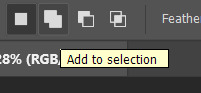
add a selective color layer by clicking this button:

i like to really emphasize the color i'm going to isolate, make sure it's as consistent with the other scenes i'm using and that it pops. from the dropdown in the layer properties, i select blue.

each color from the dropdown will look like this. you have adjustable sliders for cyan, magenta, yellow, and black. the more to the right, the more you're emphasizing that color in any blues in your image. the further to the left, the more of that color's opposite you'll adjust. each opposite pairing is as follows:
cyan + red magenta + green yellow + blue black + white
if you're struggling with this (i did at first), visualize it. pull up one of those "bad" examples. say we take the yellow scene from the gorge. add a selective color layer to it and select yellow from the dropdown. play with the sliders to see how AND how much each adjustment changes the coloring. decreasing the yellow slider all the way to -100% is adding blue to anything ps identifies as yellow. because yellow and blue are opposites, it pretty much neutralizes the scene. instead, if you use the magenta slider and push it all the way to the left, you make any yellows become green. if you move the magenta slider all the way to the right, you'll add magenta to any yellows, making the scene orange. it's all about knowing the color wheel and experimenting!
back to the conclave gif! i want to bring out the blue as much as possible, under the blue dropdown, i crank the cyan slider all the way up and bring the yellow all the way down.

is it a massive difference? no, but you can definitely see the difference between the left (with the adjustment) and the right (without).
depending on the scene and color i'm working with, i'll play around with other layers from the dropdown. but i prefer to do each color in a different layer and i right-click on the box with the eye in the layers panel and change it to the applicable color. that way, it's easier to adjust something later on. you can also rename your layers, but this is quicker and easier imo.

with this particular scene, this is the only adjustment i want to make to the blue for the time being. now, it's all about getting rid of any other colors. to do this, add a hue/saturation layer and select every color, one at a time, EXCEPT the color(s) you're isolating and bring the saturation all the way down to -100. in this case, it's everything but the cyans & blues.

and this is what i'm left with:

from here, you can leave it, but a lot of the time, i'll add a vibrance layer or even another blue/cyan selective color layer and crank that shit up.

this is after adding a vibrance layer (increasing both vibrance & saturation to 100) AND a selective color layer (decreasing the yellows to -100 in the blues).
i would consider this finished, but this can also be super fun to mess around with, again, using selective color:


and if the way her hair changed colors is bugging you, toggle your layers on and off until you find which one(s) changed it and add a layer mask, coloring over her hair with a soft black brush:

once you're happy with everything, save your gif in your preferred way. these are my save settings just for shiggles:


et voilà!
overall, the best advice i can give is to try. experiment! if you're not sure a scene will work, give it a shot. even if it doesn't, you've still learned something. i know it can seem confusing at first, especially if you're not super familiar with these layers or the color wheel, but please feel free to ask any questions. also, let me know if anyone wants another tutorial(s) where i go more in-depth on other colors. i'm happy to do it!
#answered#daynascullys#my tutorials#gif tutorial#gifmakerresource#completeresources#dailyresources#emilyblr#usercats#userholloway#tuseruta#usertina#userrobin#uservivaldi#userchibi#userbunneis#userbambie#useraljoscha#tusermira#userelio#userscourt#userishh#angelblr#heymaur#elwintersoldado#tuserhol#usermaguire#useraashna
109 notes
·
View notes
Text
Gamma Knife - painting process
I had so much fun painting this piece and I want to share some behind-the-scenes stuff on how it was made.
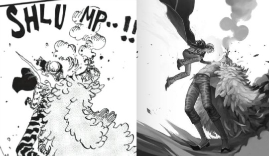

I would like to thank MagicPoser for making it possible to try poses, scale, angles and lighting and saving my ass so many times. I use the app on my iPad but there's a free browser version too.
So I wrangled these 3D dudes into the poses I wanted and then I cut them to pieces and stretched them out to make them as leggy as they're supposed to be. Before I did that though I spent forever trying to pick the angle I wanted to paint. Including two other screenshots I considered using before settling, because it's fun. (nevermind Doffy's weird arm angle, it wasn't going to show anyway. The smoke-placeholder makes it looks like he's in The Sims though which is cute. That thing's about to go so red.)
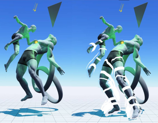

Then I started sketching. I quickly moved Law higher up and changed his pose to make him more curled up, elbow-to-knee, legs bent etc for more intensity. MagicPoser is great as a reference but the end result gets pretty stiff and boring if you follow the 3D models too closely, and I wanted swoosh. So I painted some swooshy shapes to figure out the movement I wanted for the whole painting. Purple swooshes for the curve of Law and the direction of his jump. Pinker purple for Doflamingo's leg and spine arcs.
The b/w image below also shows the rough base for the feather coat. It's painted with a flat, tapering oil brush that created nice curves that I could refine later.


Skipping lots and lots of work to get to the next step. It's all rendering and detailing, mostly done with the HB pencil brush.
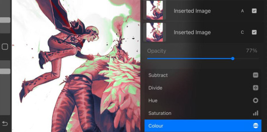
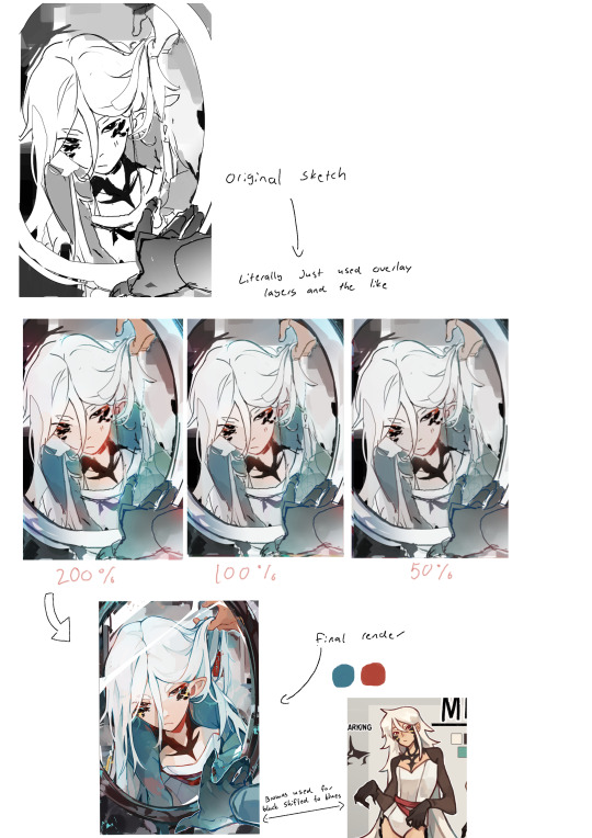
Coloring! I started by creating a gradient map bit lots of color steps. I kind of knew what I wanted but there's a lot of trial and error involved while picking colors and dragging sliders. In Photoshop I'd do this on an adjustment layer but in Procreate I do it by copying all visible layers (three finger slide, copy all visible) and making a new layer out of them where everything's merged (three finger slide, paste)

I then put that layer in Color-mode on 77% over the grayscale image after playing around and testing lots of things. I rarely know what I want before I see it. I copied that layer again and put it in Add-mode on a very low opacity because it looked neat. Every image is a new adventure when it comes to layer blending modes, there is no right or wrong here, you just have to test things until you find an effect that you like. Huge potential for happy accidents in this step.
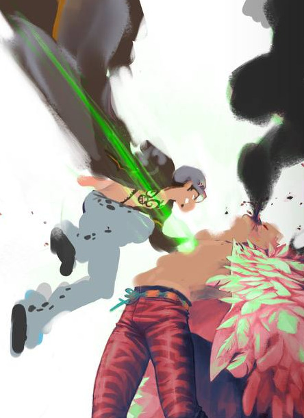

I didn't want everything to be pink so I created a new Color-layer to paint skin, clothes and radiation. Lowered opacity to let the pink base shine through slightly, for a cohesive and more natural look. Color-mode on full opacity often looks a bit flat and washed out unless combined with something else.
There's a lot more that happened after that but it's all detail stuff, effects, lots of layers with soft airbrushed gradients on various blending modes. Also directional perspective blur where I masked out some feathers to still be sharp against the blurry ones in the back, a quick and easy way to create a sense of movement and depth.
Again, thanks MagicPoser, I would have cried so much and probably given up over the angle of Doflamingo's head without your help 🙏
110 notes
·
View notes
Text

GRID + TORN PAPER + RAINBOW LAYOUT TUTORIAL (yeah, i'm sorry, but that is the title i came up with)
Hi everyone! This tutorial was requested by an anon, and we're going to make a gifset like this. You need, as usual, basic gifmaking skills and basic photoshop knowledge, but i'll try to explain this as easily as possible!
You'll also need a torn paper brush, which you can download here.
And here are the links to download the fonts used in my gifset: x, x
Okay let's start!
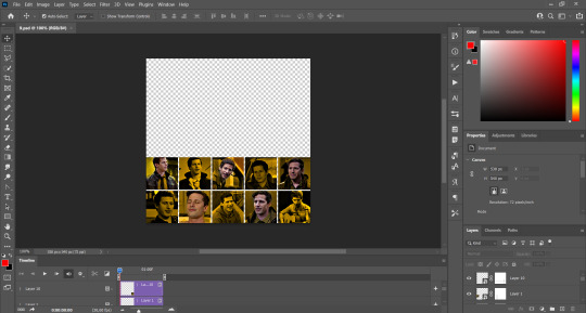
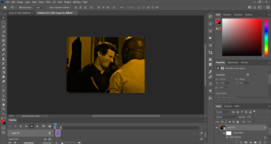
→ First you're going to create a new canvas, and it will be 540x540 px. Make sure to click on create video timeline (if you dont have a timeline, go to window > timeline. We'll leave this canvas there waiting for us :)

Then, onto our first gif. We're going to make the small square gifs first. All i do is resize the image and make it 120 px high, and you'll see why in a moment.
Make sure to remember the number of frames of this gif!! All the gifs we're going to put in the same canvas should have the same amount of frames.
Okay, so we have our first small gif:
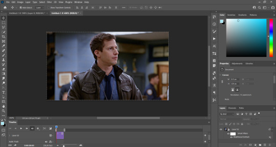
As you can see it's a smart object, and I added some brightness, but so far that's all. You can sharpen it, but i like to sharpen until i've colored it. Now onto the important part:
Most of the gifs i worked with were mostly blue (aside from the skin color), which is recommendable, because you can create lots of colors starting from blue, using the hue/saturation adjustment, or camera raw filter. I also recommend you to use a gif that doesn't move a lot, so it'll be easier to color the background:
For the tutorial, we have our predominantly blue gif, but we are going to make it yellow, which is the opposite color, so it's the hardest to get. I hope you can see how i manipulate colors, and do it yourself :)
Here, you can use camera raw filter (filter > camera raw filter) to turn the blues and purples greener, like this:
And click ok to exit the camera raw filter. Then, we're going to use hue/saturation (image > adjustments > hue/saturation) to turn it yellow:

Since it was cyan, i changed the cyans, but if you got a much greener result you'll have to use green (duh, right? i dont know i just dont want anyone to get confused akjsdhs)
And you can also add a selective color adjustment to make those yellows more yellow:

The reason i don't directly use hue/saturation is cause it might look ugly and lose quality, or it wont pick up all the colors i want it to but they're also very small gifs so if you wanna do that, do it :)
I sharpen it until this point, but if you already have that's okay.
Now we're going to color the background! For that, you just add a new layer, and set the blending mode to color.
Then you'll use your brush, set it to 20px and 0% hardness, and pick the color you're using for this gif, you can use the eyedropper tool. This is why it's important that the gif doesn't move a lot, so you can color the bg like this:
I colored carefully around the edges, and that's the result. In some gifs from my gif set I colored Jake's jacket too because i was too lazy, but this looks cleaner :)
You might want to select the color layer and the gif layer to convert them both to a smart object, just to make everything easier. So, be careful, because after that you won't be able to change anything!
But let's say you have a scene that you want to include, and it moves too much and has no blue and it's going to be a nightmare to color it.
Well, don't worry, you can! Simply, instead of manually coloring everything, you can just choose to add a gradient map to it (image > adjustments > gradient map), like this:
And this is the result:

Just remember, it has to be the same amount of frames as the other ones!
You repeat the process, until you have 10 small gifs. I made around 5 manually colored gifs, and 5 gifs with gradient for each gif. That's a confusing sentence but i hope you get it.
We are going to start pasting the small gifs on our first canvas.
(You can paste them one by one but i did this so you can see my 10 gifs)
You're going to create a square that has to be 108x108 px, using the rectangle tool. You can remove the default white background.

And you may be wondering, why did we not just crop the small gifs into those dimensions? Well, you can do that, but to me it's much easier this way, because sometimes cropping isn't accurate, or it's tedious.
Place the small square on top the gif you're going to crop, right where the face of the character is (or whatever objects you're giffing), and while holding ctrl, click on the square. It will select it:

You're going to create a layer mask:

And then drag that layer mask to the gif:

And voila! It's now the same size as the small square. Once that's done, right click on the layer and convert it to a smart object, because we have to remove that mask. Make the square layer invisible, and start placing your gifs where you want them:
You're going to repeat that process with the rest of the gifs, and then place them all together. Don't forget that if you're making the first gif, they will all be at the bottom of the canvas, if it's one of the middle gifs, one row should be at the top and the other one at the bottom, and when you're making the last gif, they should all be at the top. Here we're making the first one, so they will all be at the bottom:
If you forgot to check that all the gifs had the same amount of frames, you can fix it here, just make sure no gif is past this little guy:
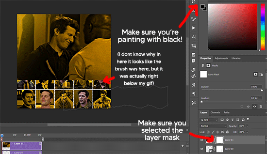
Okay! Now, to create the gutter, we're going to add a layer mask to each small gif, so that we can cut some of it.
The gutter has to be 4 pixels, (i recommend you to REALLY zoom in). What i do is make sure the width of the gutter takes 2 pixels from the edges of the gifs, since they are all together. As you can see in the image above, there's no a single empty pixel between the gifs.

This is a close-up of what i'm talking about. I select two pixels from each gif, and go all the way down to create the gutter:
(I hope I'm not over or underexplaining)
I usually use this tool when i have to make so many selections:
But that was just an example :)
(Another way you can do this, is by changing the size of the small square from the beginning and make it be 104x104 px, but i don't know why that seems more complicated to me ajsdks)
Anyway, this is what we have so far:
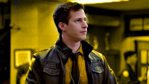
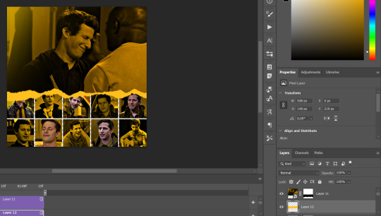
Now we're going to create the big gif. Its normal dimensions are usually around 1920x1080, unless you have different dimensions and have to crop it, but whatever it is, we're going to resize it and crop it to be around 550 px wide, and 400 px high:

We'll do the same thing of adding an adjustment of gradient to it to make it the color we're using. For this, i usually add a brightness layer before, because sometimes the gradient is a bit dark.
And using a 600px brush with 0% hardness, you can add some "light" on a new layer, like this:

Selecting all the layers, right-click on them and convert them to a smart object. Again, be careful, because once its a smart object, you wont be able to change any of it!
Then we paste our big gif on the canvas with small gifs, and add a layer mask to it. Using the torn paper brush at 600px, remove some of the gif to shape it like the torn paper. Make sure you're using black, otherwise it won't work correctly:
To make the effect better, add a layer UNDER the big gif, and using the torn paper brush, with the same size, you can paint under it:
Yeah, I covered some of jake's face, but that's how it supposed to look so the effect works!
And finally for the text! I used Granesta, at 150 px, and at -10.00º to make it a bit askew.
We're going to double click on it and give it a color overlay, set to normal, and give it a solid shadow if you want, then place it right here on the corner:
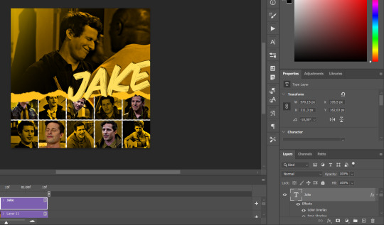
But as you can see, it's too big for the gif. So we're going to add a layer mask to it, and again, shape it the same way that we did with the gif. Make sure they're exactly the same shape, like this:

And that's it! This is our final result:

As always I'm sure there are easier ways to do many of these things, this is just how i do it but if you know an easier way to do it, go ahead. I hope this was at least understandable enough so you can apply the logic of it any way you want :)
If you have any questions you can send me an ask and i'll clarify!
If you found this helpful i'd really appreciate it if you left a tip on my ko-fi!
Happy giffing!
#will i ever learn how to properly explain things 😭#tutorials#uservivaldi#userraffa#userbuckleys#userhallie#tuserheidi#usertina#userfern#usersole#usercera#userzaynab#userisaiah#usernik#userpriyas#usertj
405 notes
·
View notes
Note
hello i love ur art <3 may i ask how you shade/render? or if you can share any helpful tutorials you learned from ^^


Unhinged Art Tutorial
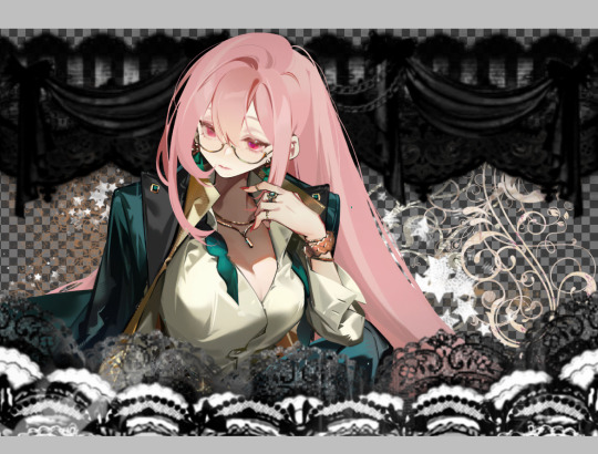
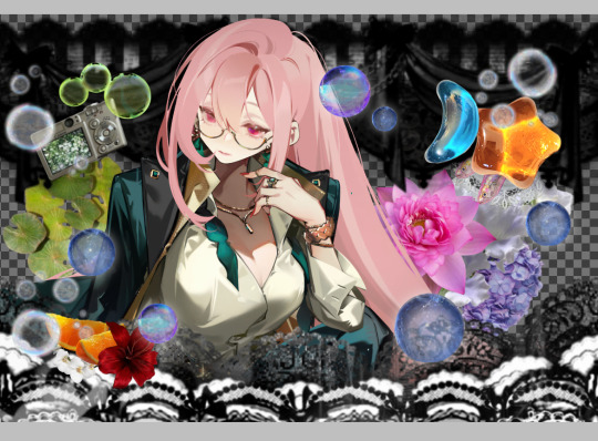
Well, anon and @merlucide! I'm not sure if I'm the best person to learn from (I'll attach some video links at the end to people who I personally look to for art advice) but I happen to have a series of screenshots for how i render with a strawpage drawing I did recently(at the time I drafted most of this a month+ ago), so I'll go over what I do, at least in this case.
Warning: A bit rambly. Not sure if intelligible.
Tutorial..? Explanation? under the cut.
I have a few different shading styles based on ease of program usage and effort level, but in this case i had to individually streak the shadows. I'll be focusing on hair and skin for the most part here.
My sketches are pretty poor, because I'm hasty:


Honestly I find the better the initial sketch, the easier the final profuct will come. So take your time, use layers when sketching to be clean. The airbrush layering shows vaguely how I tend to shade hair.

Backlighting *Applicable mostly when there is a bright background, light behind the subject, or in neutral lighting.
The 'underside'/inside I tend to use a peachier, brighter tone closer to the skin color (for tanned skinned characters I'd use a shade closer to a rosy orange, since that's just a more saturated peach. For darker skinned characters, I'd recommend a slightly redder & brighter version of their skin tone. This works pretty well with dark hair+dark skin, but in the case that your character's hair color is a lot lighter compared to their skin tone [also in the case of a fair skinned character with WHITE hair] it's totally fine to ignore the natural undertone of the character and shade it with a pinkish white.) This works for any hair texture but can be more time consuming for coily hair textures. (2c-4c)

Lineart when I take my time / Old rendering video


It looks more stable if you start off with a solid lineart base because you won't struggle with big-picture placement issues.
"Lineart" when I just try to pump out a drawing

I first did a rough sketch, kept it as an overlay layer and drew over it.

(Chickenscratching is valid though, honestly. I think it has a look to it!) I usually block out base colors, and vaguely where I want the shading to go, unless I need a special type of lighting, which then I'd do the base colors and either choose to wait until I'm finished rendering or do light processing* (*will discuss this later in this post) with different blending modes and layers.
For example if I'm doing the colors mostly FIRST (Choosing a grayed out palette) and then rendering, it'd look a little something like this: Left (Trackpad, on FireAlpaca) / Right (iPad, on Clip Studio & Procreate)


Sometimes, I'll shade with a dark, grayed out tone and then fill it in with something slightly more vibrant. This kind of gives it a bounce-light feel? Also with a lot of pieces I do recently I try to block out entire parts as white because lighting especially on white background pieces looks better if you pretend that it's white behind the character due to an intense sunlight.

Also, I use gradient layers to tweak with the colors. It's pretty useful and looks nice!!!! Gradient maps are available in every software I use: Procreate, FireAlpaca and Clip Studio Paint.

I find that the more intense the light (but not scattered, as in the source is either very bright or it's very close) the darker the shadows usually look? And if there's a brightness coming from behind the figure and the hair is splayed out in some way, it will appear semi translucent because it's just a bunch of strands made of keratin and collagen, something like that....


Anyway this is all very messy but I hope it helped

Here's a process photo for how I shade if that helps too.


More examples..

I broke down my thought process in my lighting so here's a close up of that.
i totally forgot about the video links so here's my idol the one and only:
And I think this guy makes quick but concise tip videos:
Finally I really like the in depth professional explanations from a long time illustrator:
I've personally taken advice from all three's videos and used them to improve my own art, so take a peek!!!!
81 notes
·
View notes
Note
this a gorgeous gifset for wicked 💗
https://www.tumblr.com/tidescaller/781106467228073984/glinda-in-wicked-part-i-happy-birthday?source=share
I would appreciate a tutorial for the first gif blending and colouring

Hi anon! thank youuu, i'll leave the tutorial under the cut ૮(˶˃ᆺ˂˶)
As always, basic knowledge on making gifs is required to do this type of edits. I linked some useful guides on my previous tutorial here.
PART I: BLENDING
STEP 1, BASE GIF
I recommend getting ready the gifs you're going to use before any try on blending them. And which ones are right to blend? That's just depends on the scenes you're working on. On this gifset, I made two previous blends that didn't make it to the final version cause I didn't like how it turned out. It's all about trial and error.
For this specific blending, as I'm working with only 2 gifs, I'll start editing first the base and then the one "blended". Adjust your BASE GIF in your canvas as you want.

I sized mine like this cause I imagined the second scene of Glinda behind this one.
STEP 2: BACKGROUND
i followed becca's coloring tutorial for this part, except I didn't add any adjustments yet. only coloring the background for a later gradient blending.

STEP 3: BLENDING
Duplicate your other gif into the canvas and change its blending to screen

Now add a layer mask (the button marked with red in the picture) and, with a soft brush at 200px/300px, start erasing whatever you don't want. Remember black is 0% opacity and white is 100%.


STEP 4: THE BLENDED GIF
The problem I noticed by this point is that my background coloring on the BASE GIF was kinda irrelevant cause now the BLENDED GIF completely covered it (。•́︿•̀。) and I also wanted this one to be pink. In order to do this, I created a gradient map layer and made it as a clipping mask so it wouldn't affect my main gif.


PART II: COLORING
STEP 5: BASE
For the base coloring, I always follow this tutorial cause it's literally how I learned how to do it. Honestly, check all maziekeen's tutorials (she made A TON) cause they are so good and your learn a lot. However, I tend to give my personal touches like adding another vibrance layer if i feel like it, cause I like the colors to pop; or skipping steps if I don't think they fit my gif/style. Anyways, this is the result for now:

and these are my settings


i tried to translate as much as possible (,,>﹏<,,)
STEP 6: SMALL TOUCHES
Could leave the gif as it is, but when I was working on it, I felt like something was missing. So the last step is to apply/paint some small touches of pink (or whichever color you're working on). This trick I learned it from this beautiful and very detailed tutorial from dani (she is awesome!! and her tutorials and gifs are flawless!!)
Create a new layer, use the soft brush tool at 1000px, zoom out your gif and start painting out of the canvas (you can totally paint inside if you feel like it) Play with different opacities and blending modes of the layer, this is literally how I created all these gifs. I know it sounds stupid ajskjas but it's true!! Try what best fits the structure of the gif. The first one I made is with multiply at 60% and you can see how much the gif changed already.

The second being color at 100% and the third one hard light at 30%
STEP 7: THE CHERRY ON TOP
Finally I added an animated overlay from this post. Changed the blend mode to screen and erased a bit of it on glinda's face creating a layer mask and with a soft brush. Added my texts... and that's a wrap! :D

I used the same process on gifs 3 and 5 ⸜(。˃ ᵕ ˂ )⸝♡
#*tutorial#gif tutorial#photoshop tutorial#blending#coloring#allresources#completeresources#dreamcreations#dailyresources#gifmakerresource
77 notes
·
View notes
Text
Castle Estate Mini Add-On
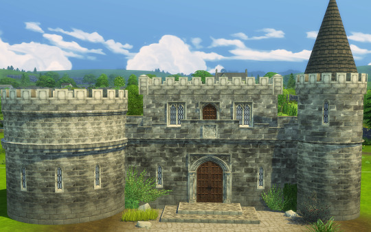
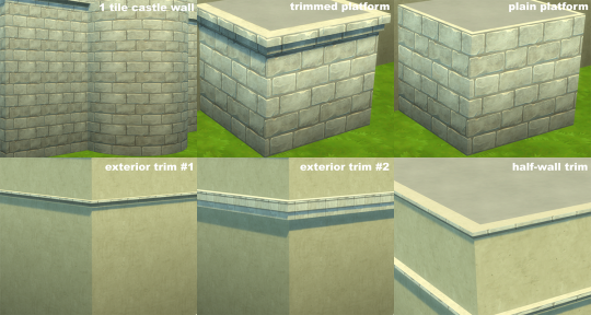
I needed a few little things to add up to my castle building experience, so here we are:
A one tile castle wall. Somehow the original gets very stretched out on round rooms, and since it's a multi panel wall it's not always seamless. So, 18 swatches, I tried to match the gradient walls as much as possible and the "fairytale" swatch was a pain in the *ss, I did my best.
Two platforms, one trimmed and one plain, basically to be able to make towers a bit higher, but possibilities are endless. 13 swatches (all the originals minus the gradients).
Two exterior trims, the one in the kit is lovely, but I wanted something more plain for more variety, also 13 swatches.
Aaand a half-wall trim, sorry I had to make 13 separate trims instead of swatches, but that's how half-wall trims are (and man they're weirdly mapped!).
(Actually I’m thinking there’s maybe a way to put all the half-wall trims in one file, hmm, I’ll try and if yes will update)
All base game compatible.
DOWNLOAD
You can find my pre-made round rooms here so come on let's build a castle!
483 notes
·
View notes
Text
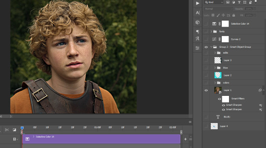
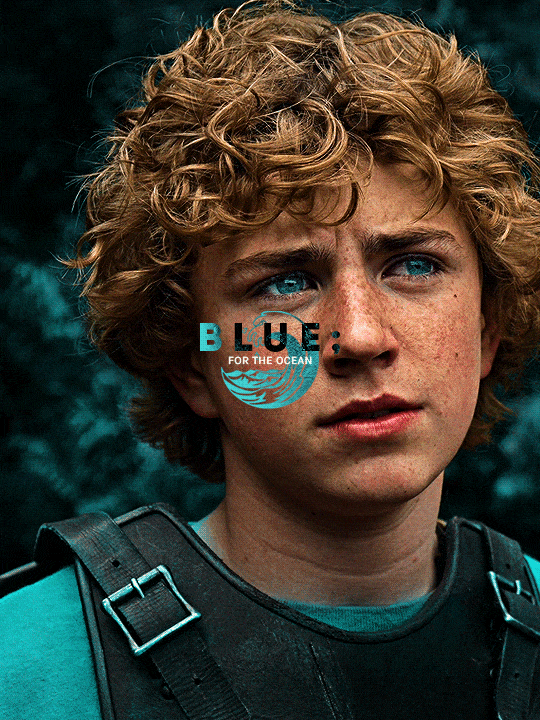
The silent art of gif making
The gif above has 32 layers plus 6 that aren't shown because this is part of a larger edit. I wanted to share it to give everyone a glimpse of the art of gif making and how long it usually takes for me to make something like this. This one took me about an hour and a half but only because I couldn't get the shade of blue right.
I use Adobe Photoshop 2021 and my computer doesn't have a large memory space (I don't know what to call it) so usually most of psds get deleted because I'm too lazy to get a hard drive. It doesn't really bother me that much because I like the art so when it's done, it's done. Off to somewhere else it goes.
Here are the layers:

Everything is neat and organized in folders because I like it that way. I prefer to edit it in timeline but others edit each frame. There's a layer not shown (Layer 4 is not visible) and it's the vector art. Here it is:
Now it is visible. I don't plan to make this a tutorial, but if you're interested I'd love to share a few tricks about it. I'm pretty new to the colors in gifmaking but the rest is simple to understand. Here, I just want to show how much work it takes to make it.
I opened Group 2 and here's the base gif. I already sharpened and sized it correctly but that's about it. Let's open the base coloring next.
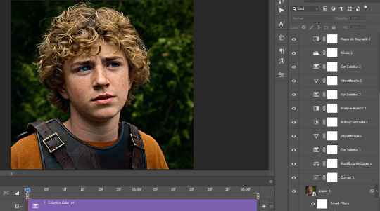
Yay! Now it looks pretty! The edits are in Portuguese but it doesn't matter. There's a silent art of adding layers depending on how you want the gif to look but you get used to it. The order matters and you can add multiple layers of the same thing (for eg. multiple layers of levels or curves or exposure).
This was pretty much my first experiment with coloring so I don't know what I'm doing (this happens a lot with any art form but gifmaking exceeds in DIYing your way to the finished product) but I didn't want to mess up his hair, that's why the blue color is like that. Blue is easy to work with because there's little on the skin (different from red and yellow but that's color theory). I painted the layers like that and put it on screen, now let's correct how the rest looks.
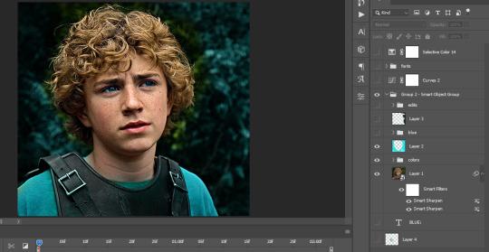
I was stuck trying to get the right teal shade of blue so yes, those are 10 layers of selective color mostly on cyan blue. We fixed his hair (yay!) we could've probably fixed the blue on his neck too but I was lazy. This is close to what I wanted so let's roll with that.
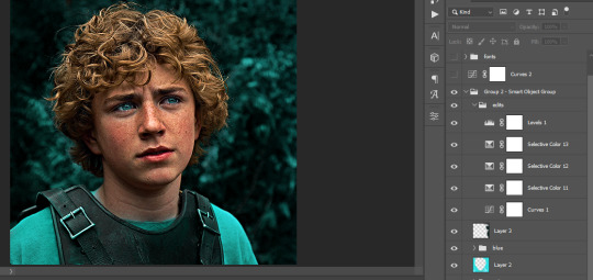
BUT I wanted his freckles to show, so let's edit a little bit more. Now his hair is more vibrant and his skin has red tones, which accentuates the blues and his eyes (exactly what I wanted!). That lost Layer 2 was me trying to fix some shadows in the background but in the end, it didn't make such a difference.
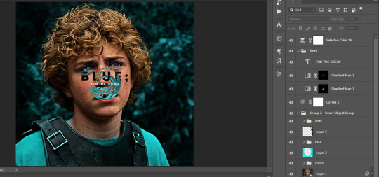
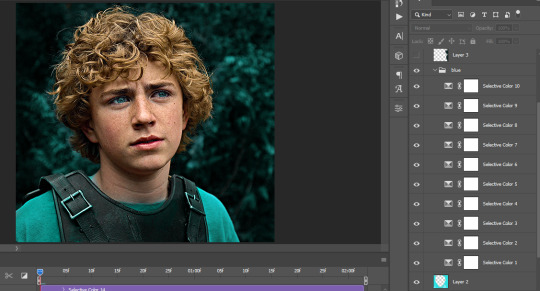
This was part of an edit, so let's add the graphics and also edit them so they're the right shade of blue and the correct size. A few gradient maps and a dozen font tests later, it appears to be done! Here it is:
Please reblog gifsets on tumblr. We gifmakers really enjoy doing what we do (otherwise we wouldn't be here) but it takes so long, you wouldn't imagine. Tumblr is the main website used for gif making and honestly, we have nowhere to go but share our art here. This was only to show how long it takes but if you're new and want to get into the art of gif making, there are a lot of really cool resource blogs in here. And my ask box is always open! Sending gifmakers all my love.
#gif making#gif tutorial#resources#completeresources#y'know what that post yesterday got me into this#i love creativity so i send all my love to gifmakers#this is HARD#my tutorials#tutorials
915 notes
·
View notes
Text
Graphics Tutorial
I've gotten asked a few times on discord how I make graphics (since I primarily share my works there), so this is a lil' tutorial post :p
╳ This is the way I make graphics. Others might do it differently and thats okay.
Images provided!!!
Here's what we'll make for the tutorial:
Okay so, I use ibisPaint X, and my canvas size is usually 1960x1340.
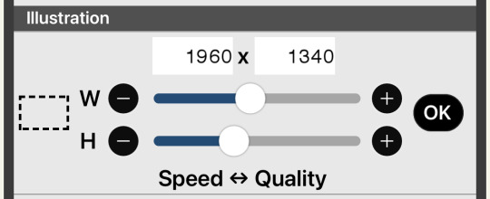
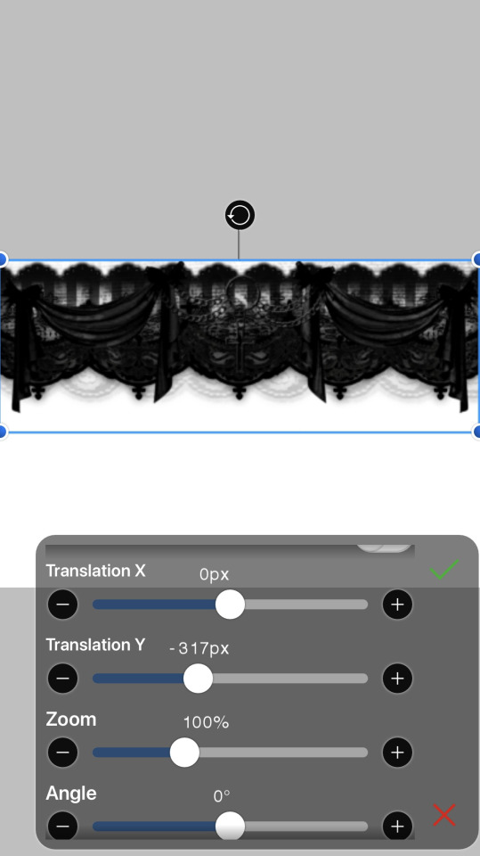
Theres many different ways you can "frame" your graphics (see my [The Herta] and [Acheron] graphics) but I usually use a divider on the top and bottom.
╳ You can find dividers under various tags on tumblr, and there are many Rentrys/Carrds with resources that have dividers (I LOVE the blogs [lavendergalactic], [selysie], [laylaplush], and [lucentmaiden], and the rentries [lavender-resources] and [border]).

Then, get your character render - Theres tumblr blogs and other social media accounts that do primarily make and post renders of characters (Like [hoyo-transparents] I LOVE THEM SO MUCH they are also where I got the Yanagi render from for this example), you can even look around online for renders by search, but sometimes you WILL have to erase and cut renders out yourself (I usually use the background removal tool, then I go in and erase the closer parts myself)).
╳ If your character has any accessories on their head that make it hard to fit them on the canvas, you can change the height or width dimensions of the canvas to have them pop out of it more (See my [Miku] and [Nicole Demara] graphics).
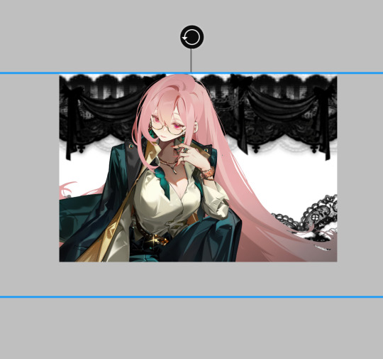
Now, duplicate the render and put the dupe under the dividers.

(Optional in some cases) - Hide the top render, and erase parts of the bottom render that are showing underneath the renders.

Go back to the top render and erase the lower part so the bottom divider appears to be in front of the render (As if it was a 3d space).
╳ If the render has (a) body part(s) going over the dividers that you'd like to keep, you can erase around it (See my [Agaela] and [Yae Miko] graphics).

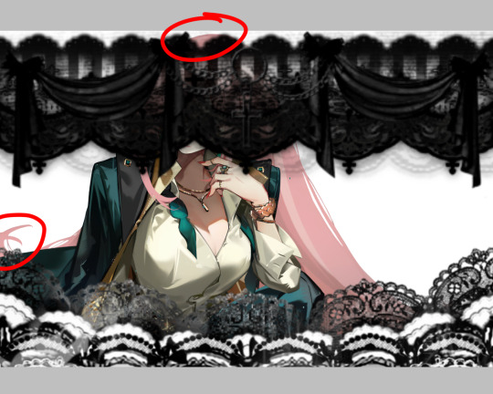
Time to add background elements (if you want)!!! I usually add patterns(?) in the background (I also usually merge them and make them all the same color but you can do whatever you wish).
OR you can add pngs! Its the same way to find dividers I mentioned earlier, I love the ones [adjpngs], [suturical], and [pngblog] post, but I usually search up keywords like "flower png" on tumblr to find some.
╳ You can also get pngs off of Pinterest and remove the backgrounds either manually, through ibisPaint X's "Clear White" functions (Three dots on the lower right when in Layers tab), or through background remover websites (of which there are MANY).
╳ You can also put pngs over the render or on the dividers, they don't just have to be background elements.
OOOR you can mash them together (And thats what we'll be doing with our example graphic)!

Now… COLORING!!!!!! Move EVERY part of the graphic into the folder (make sure to keep every layer in the same place).


╳ You do not have to do this step, but I usually press "Add layer from folder", which mashes everything in the folder together in a NEW layer- so you have everything on one layer, but still have all your other layers in the folder. then, I hide the folder. I do this to keep things clean AND in case I want to change anything.
╳ This is also an optional step, but I usually use the "Grayscale" filter on our "almost-finished-product". Some colors might clash or not work with the filters and colors I'm trying to use, so I grayscale it all so I dont have to deal with that. BUT, you can absolutely keep things in color and still be able to work with it (See my [Mulani] graphic)!

Now, we want COLOR! there are many ways to do this, but I usually use the Overlay/Lighten/Screen blending modes.
╳ There is a Gradient Map filter in ibisPaint X but I don't use it since I don't have premium. I've heard of a few websites (Including Photopea) having gradient maps and whatever else, but they're confusing for me to use so I don't know how to use them- theres probably tutorials out there for those programs though. Photoshop probably also has a gradient map but I don't actually know I don't have it.
╳ Theres also some users out there who make color combos for ibisPaint X that you can use (I don't have any recommendations though)!
You'll definitely want to explore and mess with colors to see what you want.
I chose this:

Now, textures. OOO DO I LOVE TEXTURES. Usually I use textures through overlays, but ibisPaint X has an ENTIRE PAGE dedicated to patterns, textures, and presets. I CANNOT EXPRESS HOW MUCH I LOVE THIS FUNCTION!!!

I usually use the paper/old paper textures when I use ibisPaint X's materials, but you can scroll around and use what you find!
╳ An optional step I do is duplicate the grayscaled layer, blur it, and make it a clipping layer- then adjust the opacity to my liking. It makes the graphic look a little fuzzy and I love it.
I ended up with this:


(I also realized midway at this point that I did not color the background patterns so I went and did that)
Last step is to add your watermark. I HIGHLY. HIIIIGHLY recommend watermarking your works, because there are snatchers everywhere on the internet. Too many times I have seen people steal other peoples stuff. You do not have to watermark your stuff, but its probably recommended by every version of artist there is on our Earth. Plus, people will probably want to know who made the work! I add my watermark by putting the grayscaled layer in a folder, making a new layer IN the folder, and putting my watermark in there- somewhere on the graphic. This makes it so both the watermark and the graphic are affected by the clipping layers (But you can always merge the watermark and graphic together. I usually don't incase I want to move the watermark elsewhere).

Then, we have our finished product!
(Remember to enable "Transparent" when you download it!)
62 notes
·
View notes
Note
Hi!! I really like your art but ESPECIALLY your coloring!! I was wondering if you make a tutorial on how you color your art :3 only if you want to though!
oh my god I literally don't know how I missed this, it's like a two month old ask by now I am so sorry! Thank you for the ask, I'm very honoured ueueu
I've been bumbling around trying to figure out how to explain how I do colours but I will be so honest, a lot of my process is quite literally just trial and error until something feels right. But I tried to compile and open up some of my thoughts so here goes:
Firstly, I don't ever really do "flat colours" so I figure out shading as I colour. Sometimes I already incorporate colours into my earliest rough sketch of a piece, sometimes I make a sketch in black and white and sometimes I make a whole clean sketch without any colours and figure it out from there. I also don't really like using any layer modes, so a lot of my beginning phases are literally me just throwing random colours at the canvas.
In terms of colour palette I mostly just go based off of the atmosphere of the drawing, but I really like to saturate certain colours in my drawings and they tend to usually be complementary with greens/blues and then oranges/reds. I also tend to exaggerate "real" colours this way, for example making objects that are supposed to be black really blue.
Because I colour just kind of from intuition, my initial colours are often....not very good. I struggle a lot with keeping my values in check, especially with making midtones too dark and saturated (you can see it pretty well in action in the drawing above this). To fix this I utilise clip studio's tone curve tool A LOT by shifting values that are too strong to either direction more towards midtones. Kind of like, flattening the values I guess and making the differences less intense?
I would also like to talk about gradient maps here, because they're incredibly useful and I utilise them a lot as well. I have a really brightly coloured gradient map set downloaded from the asset store that I use a lot to get colour variation between hues. I never really use gradient maps as is, but instead I layer a bunch of them and erase most of the area they're covering to push and pull colours within the drawing to have interesting transitions and stuff like that (very vague I know, I don't know how to explain it)

My colours also shift throughout the rendering process a lot again as I push and pull values (everything is always a value game!!) and saturation.
I don't know if this helps! Like at all! Again, I don't really have a specific process I can explain for colouring, I mostly just trial and error through options until something sticks. Sorry for the long wait as well!
59 notes
·
View notes
Text
how i make color palettes of my ocs before i pick one, an art tutorial?
hello, whenever i made a new design for myself i found a way to make lots of color palettes and pick one! i see this method more in paintings and rendering but not much on character designs? here are some examples i used that on.
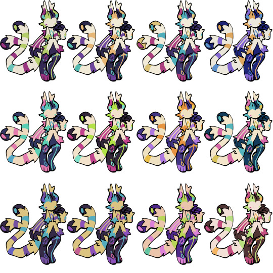
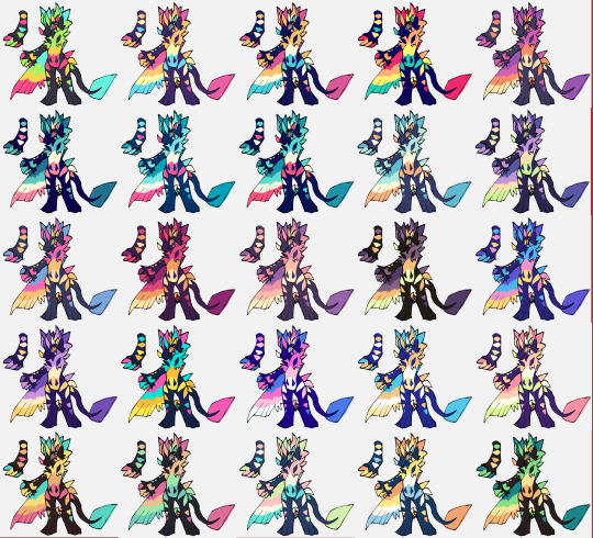
it helps me so much when i feel experimental with colors. here are what you need
a wip character design. sketchy or pixel art works better since the colors can have some anti aliasing issues
a program with gradient maps. i'm using clip studio paint but ik photoshop also has it. like i said this is used more on photos or paintings
and here's what you do!
draw your character. i'm making a new fursona for myself but anything should work.
2. decide on their markings/color placement in grayscale. i recommend doing grayscale so you can easily see the values. split your grays into however colors you want. i like doing 5-6 the most. i reccomend duplicating the color layer if you wanna try multiple palettes.
3. this part is program dependent but in csp's case go to edit > tonal correction > gradient map.
4. i made a few default 5 color gradient maps but if don't use gradients like me i reccomend making the graph like this so they become solid color. split the map into however many colors you used. i'll add a color to the red-orange one bc my character has 6 grays.
5. replace the colors by clicking below specified color. it all depends on your creativity and what you want. experiment til you like it.
6. fuck around, try stuff, put them together to see if you like any of em. i made 9 to see if i can focus on one of them and i actually ended up loving the bottom right. it really makes them shiny
7. (optional) if you like a palette you can further and play with colors while keeping the palette. you can use color balance (in the same menu as gradient map in csp) or layers to mess around, have fun!
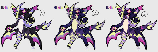
also a color tip because people seem to compliment that a lot in my art: digital art has millions of colors! don't be afraid of using wacky tones unless you're going pantone. if you want to get something physical i recommend being open to alternative colors as they tend to be more limited. i know whoever is doing it will try their best to keep the colors close.
color theory is something i don't...care much about mostly because this is something i'm doing for fun. i'll consider it in professional work.
#artists on tumblr#digital art#ika's showtime#ikarnival#art tutorial#art tips#drawing tips#art resources#clip studio paint
420 notes
·
View notes