#web design and web development
Explore tagged Tumblr posts
Visit Tumblr Blog
Explore Tumblr blogs with no restrictions, modern design and the best experience.
Last Seen Tumblr Blogs


Fun Fact
25% of US internet users with an annual income of $80-100K use Tumblr.
Text


RANDOM BUTTONS FOUND ON THE REMNANTS OF THE EARLY WEB DURING A SURFING SESH FROM EARLIER TODAY.... ENJOY?
(ko-fi)
#webcore#old web graphics#carrd graphics#web graphics#carrd resources#neocities#rentry decor#rentry graphics#carrd moodboard#carrd inspo#web resources#early web#old web#web design#web decor#web development#web stamps#web weaving#webdesign#webdevelopment#website#page decor#header#early internet#old internet#rentry inspo#inspiration#88x31 buttons#buttons#frames
7K notes
·
View notes
Text
Web Design and Web Development In Bangalore
In Bangalore, several web design and development companies are renowned for their exceptional quality and reliability. These companies are recognized for their ability to deliver innovative designs, robust development solutions, and excellent customer service. They ensure websites are not only visually appealing but also functional and user-friendly, catering to diverse business needs. Among these, VK Academy stands out for its commitment to excellence in web design and development. With a focus on tailored solutions and client satisfaction, VK Academy combines technical expertise with creative flair to create websites that drive results. Choosing VK Academy ensures you partner with a team dedicated to realizing your online vision with precision and reliability.
Working Process at VK Academy:
At VK Academy, our approach to web design and development is structured to ensure high-quality outcomes and client satisfaction. Here’s how we work:
Discovery and Planning: We begin by understanding your business goals, target audience, and project requirements through thorough discussions and research.
Design Phase: Our talented designers create mockups and prototypes that align with your brand identity and user experience expectations. We prioritize intuitive navigation and visually appealing designs.
Development: Our experienced developers bring the designs to life using the latest technologies and coding standards. We focus on creating responsive, scalable, and SEO-friendly websites.
Testing and Quality Assurance: Before launch, we conduct rigorous testing to identify and resolve any issues. We ensure your website performs flawlessly across different devices and browsers.
Deployment and Support: Once the website is launched, we provide ongoing support and maintenance to ensure it remains secure, updated, and optimized for performance.

Choosing VK Academy ensures you partner with a company that combines expertise, creativity, and a client-centric approach to deliver websites that exceed expectations in quality and reliability.
0 notes
Text
Crafting Digital Masterpieces: Your Premier Website Design Company in Delhi
Welcome to the forefront of digital innovation with our esteemed website design company based in Delhi. With a passion for creativity and a commitment to excellence, we specialize in crafting bespoke websites that captivate audiences and drive results. Our team of seasoned designers and developers works tirelessly to bring your vision to life, combining cutting-edge technology with stunning aesthetics to deliver websites that not only impress but also perform. Whether you're a small business looking to establish your online presence or a large corporation aiming to revamp your website, we tailor our solutions to meet your unique needs and objectives. Partner with us and experience the difference that exceptional design can make in elevating your brand and achieving your online goals. Let's embark on a journey of digital transformation together.
Contact Us: [email protected]
919953690896
Click Here: https://makebrands.in/website-design-development
0 notes
Text

The Art and Science of Web Design and Web Development
Enhance your digital footprint with skilled Web Design and Development services, meticulously crafted to blend aesthetics with superior functionality.
#Web Design and Web Development#Web Development#Web Design#web development company#web development firm
0 notes
Text
Web Development Services in Singapore - Unlocking Your Online Potential

Welcome to our cutting-edge web development services in Singapore! In this digital era, having a strong online presence is crucial for business success. Our expert team of web developers is here to craft innovative, user-friendly, and responsive websites tailored to your unique needs. From eye-catching designs to seamless functionality, we ensure your site captivates visitors and converts them into loyal customers.
With our extensive experience in HTML, CSS, JavaScript, and other technologies, we deliver high-performance websites that load quickly and rank well on search engines. Whether you need an e-commerce platform, a corporate website, or a custom web application, our Singapore-based company has got you covered.
Let's collaborate and take your business to new heights in the digital landscape. Contact us now to discuss your project and leverage our expertise in web development services!
1 note
·
View note
Text
I think the real reason most websites are janky as hell to use these days is because web developers have become so specialised that nobody really understands how anything works anymore. The other day I had to explain why hosting critical Javascript libraries on a third-party CDN is a bad idea to a "lead developer" who genuinely didn't know the difference between server-side versus client-side scripting.
2K notes
·
View notes
Text
“My Dream Is Still Alive Despite the Rubble”


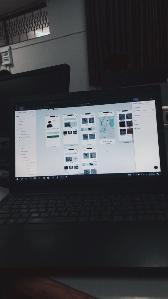
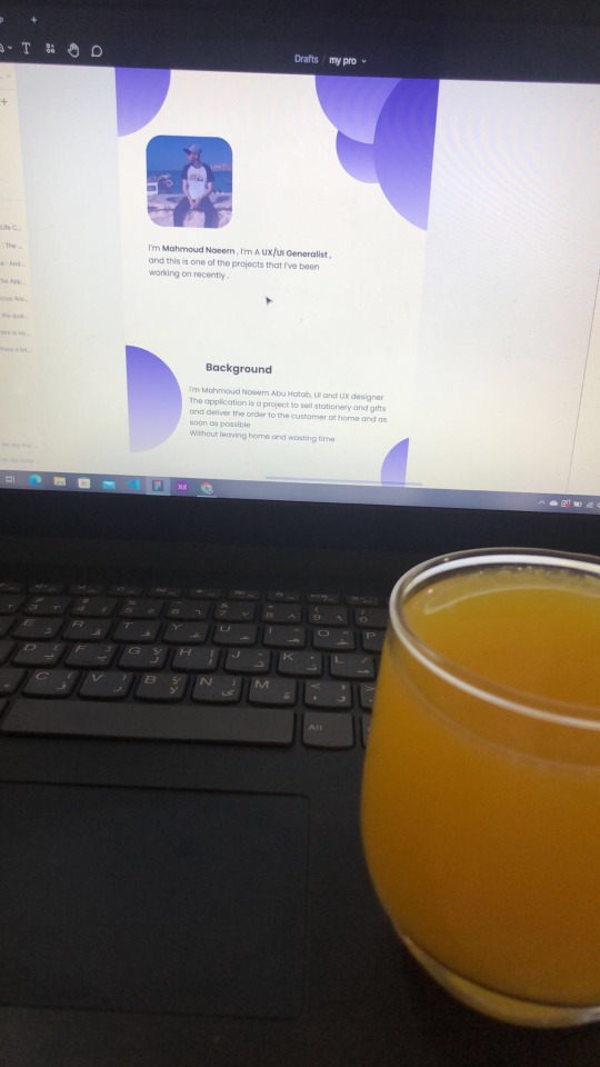
My dream has always been to become a UX/UI designer and a web developer. This dream has been my compass toward a better future for me and my family, giving my life meaning and hope despite the challenges.

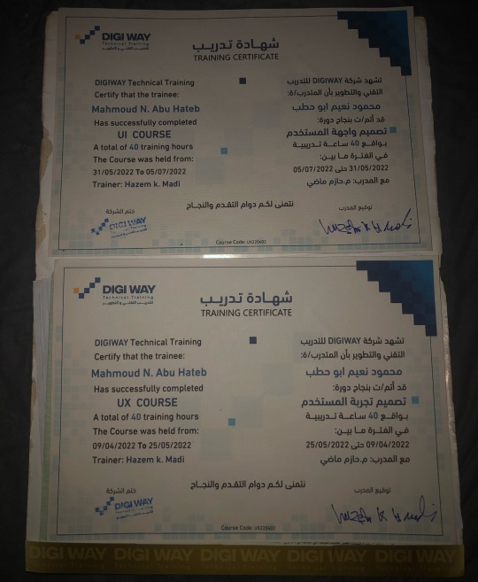
But the war in Gaza turned our lives upside down. We lost our home, my university, and even the laptop I relied on for learning and work. We were displaced to the southern part of Gaza, where we suffer daily from power outages and limited internet access. Despite these circumstances, my heart still clings to hope, and I refuse to give up on my dream.
I am not just asking for support to acquire equipment; I am asking for a chance to rebuild my future—not just for myself, but for my family as well. I believe that every challenge holds an opportunity, and I am determined to turn this hardship into a story of success.
Why Do I Need Your Support?
To continue my education and pursue my dream, I need some essential tools to help me learn and work under these harsh conditions:
• Laptop: $2,000
• Solar Panel: $2,000
• Power Inverter: $1,000
• 100Ah Battery: $1,000
Total Cost: $6,000.
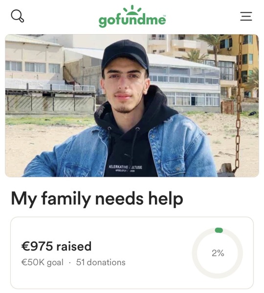
So far, I’ve managed to raise €975 through my GoFundMe campaign, but I need to reach €7,000 to cover all costs.
My Vision for the Future:
My ambition is not just to complete my studies but also to use my skills to support my community in Gaza. I aim to train young people in programming and design so we can contribute to building a better future despite the challenges we face.
Why Your Contribution Matters:
Your donation is not just helping me personally but is an investment in a young man determined to empower his community. I aspire to become a role model for Palestinian youth, showing that resilience and creativity can overcome any obstacle.
A Heartfelt Thank You:
I live under difficult conditions, but I believe that goodness exists everywhere. Every person who contributes to my dream brings hope back into my life and gives me the strength to keep going.
How You Can Help:
1. Donate to the campaign:
GoFundMe
OR USDT
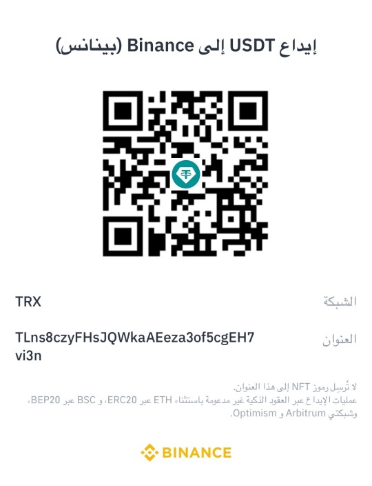
TLns8czyFHsJQWkaAEeza3of5cgEH7vi3n
2. Share my story with your friends and family. It might reach someone who can help.
3. Offer advice or opportunities that could help me develop my skills and achieve my dream.
Finally:
I promise to share every step of my journey with you—from acquiring the equipment to completing my education and realizing my dream. You are part of this story, and your support is the light I need right now.
“In the darkest times, there is always a ray of light. That light is you and your support, which gives me the strength to carry on.”
Special Thanks:
I would like to extend my heartfelt gratitude to everyone who has supported me so far. A special thanks to:
@gaza-evacuation-funds @gaza-relief-fund @wellwaterhysteria @ayeshjourney @nabulsi @catnapdreams @vetted-gaza-funds @vetted
#gaza#free gaza#save gaza#palestine#free palatine#save palestine#help my family#ui ux design#programming#web development#web design#vetted fundraiser#vetted#university#figma#design#gaza gofundme#palestine gofundme#gofundme#gfm#palestine gfm#gaza gfm#vetted gfm#gaza fundraiser#palestine fundraiser#fundraiser#help gaza#help#please help#christmas
318 notes
·
View notes
Text
Essentials You Need to Become a Web Developer
HTML, CSS, and JavaScript Mastery
Text Editor/Integrated Development Environment (IDE): Popular choices include Visual Studio Code, Sublime Text.
Version Control/Git: Platforms like GitHub, GitLab, and Bitbucket allow you to track changes, collaborate with others, and contribute to open-source projects.
Responsive Web Design Skills: Learn CSS frameworks like Bootstrap or Flexbox and master media queries
Understanding of Web Browsers: Familiarize yourself with browser developer tools for debugging and testing your code.
Front-End Frameworks: for example : React, Angular, or Vue.js are powerful tools for building dynamic and interactive web applications.
Back-End Development Skills: Understanding server-side programming languages (e.g., Node.js, Python, Ruby , php) and databases (e.g., MySQL, MongoDB)
Web Hosting and Deployment Knowledge: Platforms like Heroku, Vercel , Netlify, or AWS can help simplify this process.
Basic DevOps and CI/CD Understanding
Soft Skills and Problem-Solving: Effective communication, teamwork, and problem-solving skills
Confidence in Yourself: Confidence is a powerful asset. Believe in your abilities, and don't be afraid to take on challenging projects. The more you trust yourself, the more you'll be able to tackle complex coding tasks and overcome obstacles with determination.
#code#codeblr#css#html#javascript#java development company#python#studyblr#progblr#programming#comp sci#web design#web developers#web development#website design#webdev#website#tech#html css#learn to code
2K notes
·
View notes
Text
Introduction To HTML
[Note: You need a text editor to do this. You can use Notepad or Text Edit. But it's so much better to download VS Code / Visual Studio Code. Save it with an extension of .html]
HTML stands for Hyper Text Markup Language
It is used to create webpages/websites.
It has a bunch of tags within angular brackets <....>
There are opening and closing tags for every element.
Opening tags look like this <......>
Closing tags look like this
The HTML code is within HTML tags. ( // code)
Here's the basic HTML code:
<!DOCTYPE html> <html> <head> <title> My First Webpage </title> </head> <body> <h1> Hello World </h1> <p> Sometimes even I have no idea <br> what in the world I am doing </p> </body> </html>
Line By Line Explanation :
<!DOCTYPE html> : Tells the browser it's an HTML document.
<html> </html> : All code resides inside these brackets.
<head> </head> : The tags within these don't appear on the webpage. It provides the information about the webpage.
<title> </title> : The title of webpage (It's not seen on the webpage. It will be seen on the address bar)
<body> </body> : Everything that appears on the webpage lies within these tags.
<h1> </h1> : It's basically a heading tag. It's the biggest heading.
Heading Tags are from <h1> to <h6>. H1 are the biggest. H6 are the smallest.
<p> </p> : This is the paragraph tag and everything that you want to write goes between this.
<br> : This is used for line breaks. There is no closing tag for this.
-------
Now, we'll cover some <Meta> tags.
Meta tags = Notes to the browser and search engines.
They don’t appear on the page.
They reside within the head tag
<head> <meta charset="UTF-8"> <meta name="viewport" content="width=device-width, initial-scale=1.0"> <meta name="description" content="Website Description"> <meta name="Author" content="Your Name"> <meta name="keywords" content="Websites Keywords"> </head>
Line By Line Explanation:
<meta charset="UTF-8"> : Makes sure all letters, symbols, and emojis show correctly.
<meta name="viewport" content="width=device-width, initial-scale=1.0"> : Makes your site look good on phones and tablets.
<meta name="description" content="Website Description"> : Describes your page to Google and helps people find it.
<meta name="author" content="Your Name"> : Says who created the page.
<meta name="keywords" content="Website's Keywords"> : Adds a few words to help search engines understand your topic.
_____
This is my first post in this topic. I'll be focusing on the practical side more than the actual theory, really. You will just have some short bullet points for most of these posts. The first 10 posts would be fully HTML. I'll continue with CSS later. And by 20th post, we'll build the first website. So, I hope it will be helpful :)
If I keep a coding post spree for like 2 weeks, would anyone be interested? o-o
#code#codeblr#css#html#javascript#python#studyblr#progblr#programming#comp sci#web design#web developers#web development#website design#webdev#website#tech#html css#learn to code#school#study motivation#study aesthetic#study blog#student#high school#studying#study tips#studyspo#website development#coding
118 notes
·
View notes
Text
How to Make Your Website Mobile Friendly: A Step-by-Step Tutorial

In today’s digital age, a mobile friendly website is no longer optional; it is compulsory. Since mobile users comprise more than half of global internet traffic, it is critical to have a website that is optimized for mobile devices, not only for user experience but also for business success. A mobile friendly website boosts user engagement and significantly contributes to SEO for website rankings.
If you want to make your website more responsive on all devices, but especially mobile, this guide will walk you through making your website mobile-friendly. Be it a business owner trying to build an eCommerce website, or a professional with involvement in web design and web development, you will find everything you need in this guide to succeed.
Why is a Mobile-Friendly Website Important?
Before we proceed to the technical steps, let’s first briefly talk about why a mobile-friendly website is essential.
More Mobile Traffic: As mobile traffic accounts for more than 50% of all web traffic in the world, your site must be able to accommodate those visitors. If your site isn’t mobile-friendly, you could lose potential customers.
Better User Experience: A mobile-friendly website makes navigation easy for your visitors on all types of screen sizes. Smooth navigation experiences make them spend more time and become highly interactive with the content on your website.
SEO advantage: The search engines Google ranking algorithms have favorably ranked the mobile-friendly websites. An optimized website on a mobile device increases your user experience, also making it better visible to users on the search engine.
Increased Conversion Rates: A mobile-friendly website will result in a more user-friendly experience, which may lead to increased conversions, whether it is making a purchase, submitting a contact form, or subscribing to your newsletter.
Competitive Advantage: As the digital landscape continues to change, companies with the best user interface websites will surpass those that are not adapting to mobile. Mobile optimization is a significant factor in customer retention and competitiveness.
Step 1: Conduct a Mobile-Friendliness Test
Before starting any modifications, it’s important to assess the current state of your website. Google offers a Mobile-Friendly Test tool that provides insights into how your website performs on mobile devices.
How to Test Your Website:
Visit Google’s [Mobile-Friendly Test] (https://search.google.com/test/mobile-friendly).
Enter your website’s URL and hit “Test URL.”
Review the results in order to find any possible problems preventing your website from becoming mobile-friendly.
This will show you where improvements have to be made and therefore is the foundation of the subsequent optimization steps.
Step 2: Responsive Design
A responsive web design forms the core of a mobile-friendly website. A responsive web design is something that allows the layout of your site to adjust automatically, depending upon the screen size, thus being accessible across desktops to smartphones.
Responsive design uses flexible grids, media queries, and fluid images to ensure that the website looks great and functions well, regardless of the screen size. This approach eliminates the need for a separate mobile site and guarantees a consistent user experience across all platforms.
Why Responsive Design is Important:
– SEO-Optimized Page: Google likes responsive designs because they eradicate duplicate content, which harms your SEO. A single responsive website is easier to crawl and index for Google, making your site rank higher.
– Smooth User Experience: A responsive design will make it smoother for the user. It has a lesser bounce rate, and more time spent on your website.
Implementing Responsive Design
Fluid Grid Layouts: In fluid grids, the content scales with the screen size. Use relative units such as percentages instead of fixed units like pixels.
Example:
“`css
.container {
width: 100%;
}
Add Media Queries: These are used to apply different styles based on the width of the screen. You can change the font size or even alter the layout for better readability on smaller screens.
Example:
“`css
@media screen and (max-width: 768px) {
body {
font-size: 16px;
}
.menu {
display: block;
}
}
“`
Optimize Images: Make sure images resize according to the screen size. You can use src set in HTML to load images of different sizes depending on the device’s resolution.
Step 3: Speed Up Your Website for Mobile Devices
Mobile users expect fast loading websites, especially when on the go and using mobile networks. A slow website is likely to have high bounce rates and negatively impact your SEO for website rankings.
Here’s how you can optimize your website’s speed for mobile:
Compress Images: Big images bog down your site, most noticeably on mobile. Using services like TinyPNG or ImageOptim will reduce image sizes without compromising quality.
Minify CSS and JavaScript: Excessive, bloated CSS and JavaScript files slow sites. Tools like UglifyJS are useful for minifying JS and CSSNano will do the same to the CSS.
Browser Caching: Allow caching on your site so that certain parts of your website such as images and scripts may be cached locally in their browsers. This will improve speed for repeat visitors.
Use a CDN: A CDN is a way that distributes your website’s content from multiple servers around the globe, which reduces the speed of loading for visitors at any location.
Step 4: Simplify Navigation and UI/UX Design
On mobile devices, space is limited, so it’s important to ensure that your website’s navigation is easy to use and intuitive. A cluttered or difficult-to-navigate site can frustrate users and drive them away.
Tips for Mobile Navigation:
– Hamburger Menu: Use a hamburger menu (three horizontal lines) to condense your site’s navigation. This allows mobile users to access the menu without taking up much screen space.
– Increase Touch Targets: The size of all clickable items such as buttons and links must be large enough for a touch without errors. Google suggests a minimum touch target size of 48 pixels by 48 pixels.
– Vertical Scrolling Optimization: As most people hold their phones in vertical orientation, design your site to be more user-friendly for vertical scrolling. Ensure users do not have to zoom in or out to use the content of your site.
Why UI/UX Design Matters?
Incorporating UI/UX designing into your website ensures that it’s user-friendly and visually appealing. The design should focus on clear navigation, readability, and simplicity. A well-designed interface enhances the overall user experience, improving both engagement and conversions.
Step 5: Optimize Forms for Mobile Users
Mobile users need a smooth, hassle-free experience when filling out forms. Forms that are difficult to navigate can frustrate users and lead to abandoned sign-ups or purchases.
Best Practices for Mobile-Friendly Forms
– Use big input fields: For any text field, it needs to be large enough that a user can tap comfortably even on a smaller screen.
– Break up long forms: If your form is very long, break it up into parts to avoid overwhelming users. Auto-fill and input types: use input types, such as email, number or date, which will trigger the proper keyboard on mobile devices to hasten the filling process.
Step 6: Test Your Site on Various Devices
Only after you have performed the above optimizations, is there a need to check if your site works fine when tried on various devices. Using real devices (hand-held phones, tablets) instead of using emulators gives a true test of the user’s view.
Testing Tools:
– Google’s Mobile-Friendly Test: Does thorough analysis of how your site stands to perform on mobile.
– Browser DevTools: Chrome and Firefox both come with developer tools. With these tools, you can simulate various devices to check how responsive your website will be.
– Real Device Testing: Test on real devices so that the performance of your website does not suffer at all.
Step 7: Monitor and Update Regularly
The digital landscape is always changing, and so is mobile technology. Regular updates and monitoring are important to maintain a mobile-friendly website. You should keep an eye on the following:
Google Search Console: This tool provides important insights into your website’s performance, including mobile usability issues.
User Feedback: Pay attention to user feedback to identify potential areas of improvement.
Performance Tracking: Track how users interact with your mobile site using Google Analytics and adjust strategy.
Step 8: Work with an Expert SEO Agency
In case you have no clue or want to be sure to get the best, opt for Innovate Digital Media a leading SEO agency in Mumbai or any digital marketing company that can assist you with your web design and web development so that you would surely have a fully optimized website in terms of mobile and search engines.
An SEO consultant expert can lead you through SEO optimized pages for better visibility and ranking in mobile search.
Creating a responsive website isn’t a luxury anymore; it’s a necessity. With more users experiencing mobile devices than ever, making your site responsive, fast, and easy to navigate is key to attracting and retaining customers. With these steps, one can build a website, not only great on its mobile experience but also amplifying SEO for a website thus helping you generate more revenue for your company in this mobile-first globe. Be it building an e-commerce website, UI/UX improvements, or a boost towards mobile SEO strategy optimization leads to long-term success for your website
#mobile friendly website#web design and web development#SEO for website#SEO agency in Mumbai#digital marketing company
0 notes
Text


depression stamps,,,? um.... yeah... dont @ me.....
#old web graphics#carrd graphics#rentry decor#neocities#webcore#web graphics#carrd resources#carrd moodboard#carrd inspo#rentry graphics#user stamps#stamps#web stamps#da stamps#graphic design#carrd decor#design#page decor#web decor#decome#web development#lana del rey#love and deepspace#delete later#lana del ray aka lizzy grant
4K notes
·
View notes
Text

hyperfixated on this game so hard i tried to recreate ac syndicate's animus database using html css and js👍
i will make this responsive though, i've only started doing the frontend but i'll also start doing the backend as soon as i finish this
basically this is gonna be a website that will allow you to create a database of your assassin's creed OCs (btw this was inspired by @gwen-the-assassin's idea <33) and help you with worldbuilding and making AUs (i know the ac fanon wiki already exists for that but i wanted to make the experience of keeping a database more immersive u know....)
this might take a while to be completed, but I'll try to post updates on it as much as possible! if there are any programmers/web developers in the ac fandom that want to contribute to this project plsplspls DM me!!
actual pic of the database for comparison:

ik it's not entirely accurate but this is the simplest database in the game that i could recreate lmao
also code snippets just cuz (+ me crashing out)


#u know what#i might just pass this for my database systems class#assassin's creed#assassin's creed syndicate#ac syndicate#animus#video games#gaming#programming#coding#codeblr#web development#ui ux design#html css#javascript
162 notes
·
View notes
Text
Professional Website Design & Development Services
Elevate your online presence with our comprehensive Website Design & Development Services. Our team of skilled professionals specializes in creating custom digital solutions tailored to your unique needs and objectives. From captivating designs to seamless functionality, we prioritize user experience and innovation to ensure your website stands out in the digital landscape. Whether you're a small business looking to establish your online presence or a large corporation aiming to enhance user engagement, we're here to bring your vision to life. Partner with us to unlock the full potential of your online platform and leave a lasting impression on your audience. Let's build something extraordinary together!
Contact Us: [email protected]
919953690896
0 notes
Text


HOLLOW BLISS - TUMBLR THEME interactive and highly custom theme for your blog

FEATURES: - tabbed content with interactive visuals - high customizability - ethereal 3d sidebar widget in three.js - vibes
DOWNLOAD HERE
[i took a poll on ko-fi asking which types of themes you guys would be interested in from me and it was an overwhelming vote for tumblr, so i decided to start focusing more on tumblr themes rather than neocities. i hope you guys enjoy the next few tumblr themes as much as i enjoy this one! purple is my thing.. ha, thanks for following<3]
#old web graphics#css#cybercore#html#htmlcoding#html css#web graphics#web resources#tumblr themes#artists on tumblr#on tumblr#tumblr theme#tumblr html theme#blog theme#theme#themes#blog resources#purple#web development#early web#old web#web decor#web design#web weaving#webcore#webdesign#webdevelopment#website#nhela#template
141 notes
·
View notes
Text


season blinkies! requested by @space-hoards
f2u, made by me. creds and reblogs appreciated
#blinkies#eyestrain#old web#web graphics#f2u#stamps#2000s internet#internetcore#old internet#webcore#web decor#web development#web design
64 notes
·
View notes