#well. it is my art. but its just a cropped version. make of that what you will
Explore tagged Tumblr posts
Text
Been getting into writing passively when I don't feel like drawing, and in the process have written a whole little short story for Florid. Now I can just translate it to comic format and he will be Complete
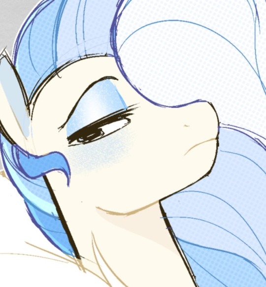
#most of my other characters are very nice to eachother so its refreshing to have one thats just the fucking worst#excited to share more of him#my art attention is divided between developing 3 entire stories rn lol. been radio silent but boy i been fuckin working#not art#well. it is my art. but its just a cropped version. make of that what you will
330 notes
·
View notes
Text
HERE COMES THE WLW!!! This was a request from Ao3 for Wembley Greasedinah headcanons so i hope i can feed yall! these headcanons are based off of lilianna and lara’s version because look at the cuties, no look at them, YOU AREN’T LOOKING! ALSO loads of these headcanons are gross and weird because i want them to be, i just love making horrendous headcanons for my favourite characters, the more i love them the grosser the headcanons! ALSO ALSO big thanks to @dove-bunny-love for inspiring some of these!

GREASEDINAH:
- Greaseball and Dinah both fight with their bangs every fucking day like i’m talking WW3 type shit, they will both be in the bathroom crashing out as they try making the perfect bang ratio, its the most stressful bonding experience you can imagine as they try to convince eachother their bangs look perfect.
- Also while they are working together if there’s the slightest hint of wind and their bangs lift up, Greaseball will start cussing out the sky, just verbally assaulting the clouds and all the other coaches have to listen in awkwardness as Dinah comforts GB.
- GB is the prime suspect for stinking out the sheds with body spray, you can always tell where she’s been because she sweats Lynx body spray, SPECIFICALLY the Africa scent. Tassita and Belle will go to the Coaches Shed after a long day at work and just get absolutely gassed by the GreaseMonster sitting on their sofa. GB always has a full stock as-well since the trains at the yard never know what to buy her for Christmas so she gets 50 million Africa Lynx sets.
- Dinah on the other hand smells gorgeous either imagine sugar cookings with a hint of vanilla OR bubblegum by Moschino. Also when Dinah first went for a ‘sleepover’ ;) in GB’s shed she found her 5 in 1 gel and the Lynx bottle army. Dinah was horrified, since then she forced GB to buy separate products for hair and body but GB still doesn’t grasp the problem with her 5 in 1.
- I’m sorry not sorry GB lovers (I swear I do like GB I just give them the nastiest head canons because they are the nasty) BUT GB has the stinkiest, eye watering, gag evoking farts known to man. It’s sulphuric hell, just straight up toilet stench and she DGAF! GB is a straight up villain as-well because unless Dinah is behind her she will crop dust like no tomorrow. ‘This is my back view and it’s all you’ll see?’ no buddy it’s what we can all smell; Dinahs farts literally smell like roses and world peace because she is PERFECT and you LEAVE HER ALONE!
- When it’s root cover up season, GB and Dinah both have to take a weekend off work because it’s a hands on affair. GB can mostly get away with being less precise with dying her hair but Dinah’s has to be PERFECT, like she will spend 12 hours just perfectly separating her hair before she can even use a hint of dye.
- Not only that but the will shed turns into a modern art project with multicoloured splats everywhere which Dinah has tried everything to get it out of the walls and furniture but to no avail so she leaves it up to interpretation for guests.
- The moment Dinah breaches her and GB’s shed, Dinah’s makeup, hair and clothes get shredded off. There’s a humongous pile of bobby pins and elastics on Dinah’s vanity as she meticulously pulls out each one, if GB comes back in time she will skate up behind Dinah and do it for her with so much care, that Dinah can’t help the tears that wet her eyes.
- When GB finally undoes Dinah’s buns and can successfully run her calloused fingers through Dinah’s hair without any snags, she gives Dinah the best head massage you could imagine. She hits all the right spots and the ache of the day just melts away.
- GB is really bad at communication, as in she can’t articulate her feelings properly which is why she’s so rash and reckless because that’s how she feels heard. This means that instead of telling Dinah how she feels she will avoid the question and start talking about something else so it’s like a riddle for Dinah to get the bottom of a problem with GB.
-Also sometimes GB just responds to Dinah verbally with emojis instead of having a conversation. For example Dinah will say “I’m thinking of baking something, maybe some cookies?” and GB will respond with “Thumbs up, Smiley face, Heart” So Dinah is stood there like wtf are you saying���ALSO GB is the most nonchalant texter ever like she will respond with ‘k’ and ‘sure’ constantly which drives Dinah CRAZY.
- GB chews everything, like straws so whenever her and Dinah try to romantically share drinks it gets ruined because the straw has been chewed so much you can barely suck anything out of it. And GB scrans paper. That’s it. No but seriously when GB is bored and reading something (which is rare) she will just start eating the corners of the paper or rolling them into mini toothpicks. So when Dinah picks up sticky notes or letters around the house all the corners will be missing and suspiciously wet.
- Although GB acts tough in the yard she is the fattest snugglebug in the world! The moment it hits 10pm Dinah gets dragged into the bedroom, undressed for skin to skin, then forced onto the bed so GB can entangle their bodies together. Not even for sexual reasons, she just loves being close to her. Many mornings, Dinah will wake up to a mullet in her face as GB’s face is smooshed into her boobs.
- Dinah loves bath time and her personal space! Turns out GB loves these things too! If GB actually realises she’s made Dinah upset, GB will make her a hot bubbly bath with a couple candles (that totally didn’t go wrong while lighting them…) Dinah can’t help but giggle and swoon as she soaks and GB will sit on the toilet nattering with her. I think these two are suckers for the simple domestics.
- There’s always lipstick marks on them! Even a simple kiss on the cheek means a big smudge of either yellow or hot pink/red. Currently GB and Dinah haven’t found a solution or compromise for this, so they just suck it up and go with the flow meaning when they have their rendezvous it’s very, very obvious.
- Whilst Dinahs baking, GB makes it her personal challenge to eat as much of the batter as possible before it gets cooked. This means that if Dinah goes for a two second toilet break she will come to half the batter gone and GB smacking her lips together like a dog with peanut butter as she tries to swallow the evidence. Dinah has warned her about the effects of salmonella but come on this is GB we are talking about she dgaf!
- This is a really silly one but the thought of it made me giggle so hard, you know that video of the Pizza Hut worker who cinched their apron really tight while doing the K. Howard trend from SIX? Yeah Dinah does that every time with her apron and GB still can’t figure out how.
- Cunty eyelashes to the max. You heard me, GB and Dinah have a huge drawer just dedicated to lashes and there is every lash imaginable (even glitter, or multicoloured ones!)
- Sometimes GB will just forget she’s a woman, she will start scratching her ‘balls’ and Dinah will look at her disgusted. In response GB goes “What my balls itch?” And Dinah will have to awkwardly remind her she doesn’t have any.
- Guys I promise I don’t hate GB I just want to squeeze her so tight her head falls off her shoulders. I actually love her sm I want to crush her and Dinah and then use them as play doh.
#starlight express#stex#greaseball#greaseball the diesel#greasedinah#dinah the dining car#greaseball x dinah#dinah#stex wembley#starlight express wembley#stex revival#headcanons
43 notes
·
View notes
Text
An In-Depth Look at Shin Lupin III's Various Editions

Hi! So I'm insane and I buy the same multiple books in languages that I can't understand.
The Lupin manga has had a lot of editions published over the years, all with various differences. The most obvious difference is the cover art, but did you know that chapter ordering, as well as printing quality, and whether two parters are merged into one chapter are all different throughout the editions?
My hobby for scanning has exposed to me this rather obscure topic and I've learned a lot throughout the years, so I want to make a post about this for those who wish to know more and see what edition is the best to buy as a collector/reader.
I'll sadly only talk about Shin Lupin since it is the series I actually own and know the most about, but if you want to know about Lupin III, go ahead and check out my spreadsheet to get a basic idea of the differences. It also lists stuff about Shin Lupin III as well.
POWER COMICS


The Power Comics edition was published by Futabasha from 1978 through 1981, marking it as the only edition from any Lupin manga to be published alongside the serialization of the series itself. The Power Comics edition for Lupin III was published in 1974, a solid 5 years after serialization.
The only reason I pointed this out is that the cover for this edition was made as the series went on. You can notice it by the way the artwork has a slightly inconsistent styling compared to others.
There is still a theme for the cover for PC however! Each book, up until Volume 16, tells a story using two images. The front art being the start, and the back art being the ending which is typically a punchline.

Each book contains 7-9 chapters, which isn't much, until you realize that this edition has a whopping 21 volumes to compensate for this.
Another interesting quirk about this edition is that it is the only edition to strictly follow the ordering of the chapters in the magazine. Chapter 9, 10, and 11 were Kill Better: Work Union, Bikini Pirates, and Full Release, respectively. This is unlike every subsequent edition in the future which swaps the chapters to Bikini Pirates, Full Release, and Kill Better: Work Union. That is pretty much the only chapter switch up you will ever see in Shin Lupin.
Special chapters like Welcome to Adultland!! and オレにもあったジャリ時代 are included in this edition, with the first being Chapter 97 in Volume 12, and the latter being in Volume 6 labelled as an Extra Chapter, with no number.

The cover under the jacket is just a grayscaled version of the jacket, nothing interesting there, but in Volume 1, you can see various MP artwork on the first page. They're flipped to use for iron printing. The ink is so strong that every single listing of this edition I've seen have had the ink bleed over the other pages in some shape or form.
A true look inside the book now. Since this is the oldest edition of Shin Lupin, you can expect a lot of page browning. It's not a feature it came with when it was first printed obviously, but it comes with age. If you want something better quality, best you buy a newer edition.
That aside, I think the page quality is pretty good for how old the book is! There is a good amount of space so that none of the drawings would get cropped out (you might be wondering why this is something you would be worried about, WE WILL GET TO IT.) and the grayscaled pages are still brimming with beautiful detail.
This quality may not be consistent throughout every book due to its age, so keep what I say with a grain of salt. I am just one owner of this book out of many.

Aside from color, not much seems to get lost or sacrificed when it was transferred to book format, which is not something I can sadly say for later editions- Like I said, I'll get to them later 💦
Is the Power Comics edition worth buying?
Definitely! It's a great edition that retains a decent amount of integrity for the work. The print quality is great and it has both special chapters. If you enjoy collecting older stuff, this is also a great purchase for you!
The quality of the book itself can vary greatly however depending on the listing due to the age of the book, you can either find a book that is well-maintained like mine... or something like this.

Something this insanely low-quality is rare to find in my experience, so try not to worry about it LMAO
Speaking of rarity, this edition also isn't that rare! A search in Mercari or Yahoo Auctions can give you at least 2-3 of these listed somewhere. This might change in the future though, since it IS in limited quantity due to the fact it's out of print.
Most listings I've seen are around the $50-150 price range, but try not to get one that is over $100. I did that because I was impatient and didn't know as much as I do today, please do not make my mistake.
Power Comics isn't the only good edition however, with the next one being pretty much on par with almost everything!
ACTION COMICS


The Action Comics edition was published by Futabasha in 1985 and is the second oldest edition. It has only 16 volumes this time, with around 11 chapters per volume. Welcome to Adultland! and オレにもあったジャリ時代 are all at the 16th volume, both labelled as extra.
The cover artworks for the edition, as you can see, is a lot more cohesive given that Monkey Punch drew all of these for the purpose of being used for Action Comics' cover. The theming of these are hidden women... ooo....
You may only see Lupin in the covers above, but in the flaps of each cover is an extension of the artwork featuring a woman interacting with Lupin. In a way, it also tells a story just like Power Comics!

The back cover sadly doesn't have a lot going on. There are two of them, one for Volume 1-8 and this one for Volume 9-16, you can find the other one in the Monkey Punch Art Archive, which is where you can find the rest of the covers for the other manga editions!
In my opinion, this edition is pretty great in the cover department. I'm not sure which I prefer between PC and AC, but I like how much bigger the characters are as opposed to the smaller scaled artworks for Power Comics.
Physically, it is also slightly bigger than Power Comics. I'm not sure if it is the biggest one since the Aizouban version could take the cake there, but I don't have that edition physically. And oh yeah here's the cover without the jacket.
+ Style points, it has fancy text.
- Engagement points, it is just fancy text.

Volume 11 is kind of the only book I own of the AC label. I actually never intended to buy this but it ended up being in my possession due to the seller mixing up the editions. I wanted Vol 11 of Futaba Bunko but got this instead. Maybe I got scammed, but at least I have something pretty valuable now.
COMPARISON TIME!!
Now that we've reviewed Power Comics, it's gonna be used a lot as a jumping off point to compare the print quality of other editions.
There is honestly not much difference at a first glance, but a big thing that I noticed in Action Comics' pages is that its a bit brighter, allowing for more obscure details to be seen.


It's pretty noticeable when you compare Power Comics to Action Comics side by side. The darker areas don't seem to be as bright in AC which allows for the lines in Goemon's pants to be seen even in the shaded areas. I quite like this since it provides a bit more clarity in the page, which benefits AC overall due to the bigger page size.
Some may argue that PC's browner page is the reason why the ink looks dark, but it is really not that brown to the point that it would make the ink look darker. When you look side by side at the cross-hatched areas, the lineart looks a bit bolder compared to AC's regardless of brownness.
With this, and the fact that overall the quality remains on par with the original Power Comics, I'd say this is a slight improvement! It's a great edition for those who would like a bigger book and prefer the cover art more than the others.
Sadly, this edition is rarer than Power Comics, I don't often see it in the wild, and they usually cost around $60-80. Good luck finding it!
AIZOUBAN


This edition was published by Chuokoron-Shinsha under the Aizouban label in 1990. This is one of the most popular edition given the fact that it was published for the purpose of being a collector's item.
Unlike all of the other editions in this post, Aizouban only has 4 volumes, with an astounding number of around 40 chapters per volume. If the gorgeously iconic cover wasn't already a dead giveaway that it is an Aizouban book, the thickness of it sure will!

This edition was also used for digital scanning of both Lupin III and Shin Lupin III for a long time. If you browse around the Lupin III Collection Drive, you will see that the Japanese RAWs scans are of those editions. (The Lupin III scan is fine, but please do not use the Shin Lupin III one, the AI upscaling makes it very bad.)
Sadly, this edition has left out Welcome to Adultland! from its list of chapters, but it still includes オレにもあったジャリ時代 in Volume 4.
This edition is great for those who just want to own the manga in Japanese and want to buy it at a cheap price. Most listings of it I've seen only go for around $10-40, and the beautiful cover is a plus! A lot of people own it, so it's very common to find.
Sadly, due to the evocation of Welcome to Adultland, and their slightly subpar print quality, I can't really recommend this edition to anyone who is a diehard fan of the manga. Most double spreads leave out a considerable chunk in the middle which has been a HUGE grievance of mine when it comes to the editions from Chuokoron-Shinsha. No other edition from Futabasha does this as badly.

At least the grayscaling is nice. I really can't say much more about this edition since I don't own it physically. It's just mid.
CHUOKORON-SHINSHA


uuuuugh.... HERE WE GO.
Chuokoron-Shinsha re-released another edition during 1995 which follows the more traditional format of past editions. It has 13 volumes with around 12 chapters contained in each one.
and let me tell you...
THIS EDITION... SUCKS!!!
If you thought the Aizouban edition was sketchy, you are not ready to hear the crimes that CS did with this one. First of all, the cover is a huge letdown compared to what came before it. It reuses art from old editions but shrinks it to only be on the top half, while the bottom is just.. text!! It's so boring and uninspired.
And for the print quality, I'm sad to say that it is worse than Aizouban. I've had the misfortune of buying this entire edition to scan Shin Lupin, and I've encountered a LOT of issues along the way with the print quality.
Firstly, I'll say one good thing about it: I like that the paper is laminated. It is higher quality than the rest of the editions which I find neat.
Now for ALL the bad things. THE CROPPING GOT WORSE. It retains the issue Aizouban had with cropping the middle of the double spread, but now it also crops ALL SIDES OF THE PAGES.

Here's a side-by-side comparison of this page from the first chapter to perfectly illustrate what I mean.
Goemon's dialogue on the right was ALMOST cut off from the page. Previously, editions of this chapter had considerable space for the dialogue but the CS edition didn't even bother to scale the page properly to account for the smaller size!! It's unacceptable!
I'm almost regretting my choice of buying this edition to scan Shin Lupin in because of all the issues. It doesn't matter what good it has, the negatives outweigh it tenfold. It is exactly like the Aizouban release but worse.
Please do not buy this edition, you don't deserve it.
...But if you're hearing all of this and are still interested for some reason, here's some info about this edition. It is also decently cheap and common but not as much as the Aizouban release, going about $30-60 dollars typically. It also has a box, but it's pretty rare to come across a listing that has it. tbh the box is also pretty ugly.

talk about a low budget book! no adultland or good prints, i'm outta here!
FUTABA BUNKO


Now that we're out of the trenches of the Chuokoron release, we are back to something slightly better!
Futaba Bunko was released by Futabasha from 1998 to 1999. This, to my knowledge, is the latest release of Shin Lupin III and it has 12 volumes, containing about 13 chapters per book.
One interesting thing about this book is that given that it's the latest release, an online version is available for purchase under the Futabasha site! It's Japan only though so I kind of have no idea how you would buy it if you're outside the country lmao. Because of this, it's a pretty accessible book that you can find anywhere for a pretty good price.
In addition, I think the cover is pretty freaking sick. I know that this edition also reuses art, this time straight from the manga, but the usage of it is really creative and has an interesting abstract sort of style. It evokes the vibe of the manga really well, so I'm not particularly upset at this one for reusing artwork.
One thing I'm not particularly fond of however is how the print of this edition handles grayscaling. I'm not sure why they did this, possibly to cut costs, but they heavily updated the grayscaled pages to have more contrast. As a result, the lineart on certain pages look really washed off.

This same page that I showed before in the Aizouban section is EXTREMELY different in the Futaba Bunko version. One plus is that there is almost zero cropping- but as you can see, the art is way uglier without the gray previously seen in the Aizouban version + previous versions.
It's really sketchy which makes me hesitant to recommend even casuals to buy this, but it is really the only problem I have with this edition. It has the laminated paper like CB, has zero cropping despite being small (this is why CB had NO EXCUSE to crop the artwork) and it also has Welcome to Adultland! The printing of the linework is also great.
I really wish we got a "perfect" version of Shin Lupin III as the latest version, but it is what it is.
Before we go, there's also another edition I briefly want to share...
CONVENIENCE STORE EDITION

YEEEP. there were lupin manga sold in the konbini. apparently.
This will be a very small segment because there really isn't a lot known about this edition aside from the fact that Lupin III, Shin Lupin III, and even Lupin Jr. were sold in this format.
Shin Lupin didn't get a special logo, and all of the books were just labelled "Lupin III". Thus, I'm not even completely sure which book is Shin Lupin and which isn't! Nobody ever bothers to document this version, which I can completely understand. Looking at these covers already gives me flashbacks to CB.
-----
Anyways, that's it! I could talk way more about this topic but Tumblr has a pretty strict image limit, so I might make a little continuation of this as a reblog, where I'll just do simple comparisons and share fun facts. I hope you learned something out of this post!
Now, if you excuse me, I'm going to prepare to sell my CB book.
16 notes
·
View notes
Text
Bestiaryposting Results -- Hreksong
Slightly awkward timing on this one: the animal in question happened to come up on a recent episode of our podcast (We literally quoted a line from the Bodley MS 764 entry, because it was relevant to the story we were reading). So any of the artists who listen may have gotten spoilers. (I say "may", but I've already seen one art post that references the episode.) Sorry about that, artists. Kind of a bizarre coincidence, actually -- it's pretty rare that we happen across bestiary material in a narrative text, and the fact that we did so shortly before the relevant entry came up in the rotation... well, the odds are against it.
Anyway, anyone who doesn't know what this is about should check out https://maniculum.tumblr.com/bestiaryposting. You can also check the "maniculum bestiaryposting" tag to see what beast is the current prompt. The entry for this week's drawings can be found here:
Art below the cut, roughly chronological, as always.
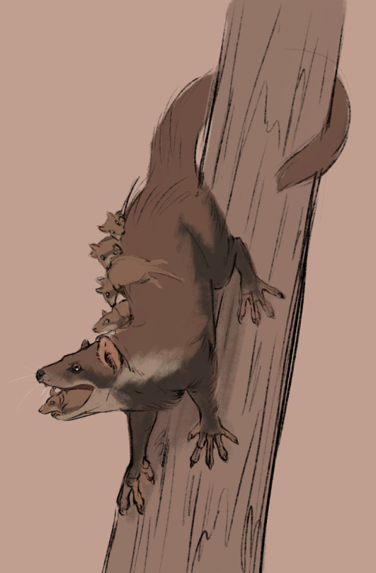
@silverhart-makes-art (link to post here) decided that the best interpretation of the information given was that this was a sort of arboreal mongoose that practiced mouthbrooding. If you want to know what the reasoning was there, you should read the linked post -- it all makes sense there. I absolutely love that the one in the picture is opening its mouth to show the baby riding inside. Silverhart indicates that this is a quicker sketch than usual, but frankly their animal-drawing skills are so good that even a quick sketch is impressive from my perspective.
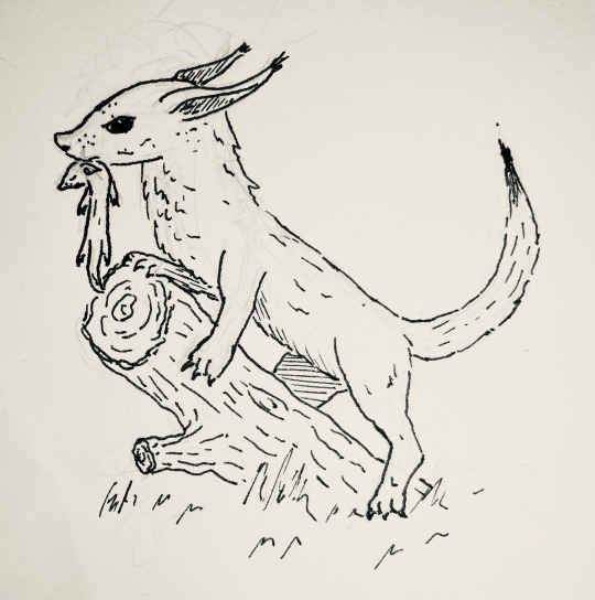
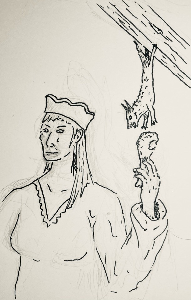
@cheapsweets (link to post here) did separate drawings for the large outdoor version (upper image, carrying its young) and the small indoor version (lower image, stealing someone's food). The linked post, which explains the design in some detail, indicates that CheapSweets was thinking along similar lines as Silverhart -- i.e., what kind of animal is known for hunting snakes? I like the pose in the first image, and I really like the scene depicted in the second one. On one hand, I'm sure having little creatures live in your roof and steal food literally out of your hands is quite frustrating, but on the other hand, it's very funny. Look at that little guy just brazenly stealing some chicken (or whatever type of bird). The idea of them using their back legs to grip rafters for exactly this purpose is excellent.

@strixcattus (link to post here) decided these could be birds, and has drawn these owl-like creatures for us. They look a bit surly, but that could just be the feather pattern on their faces. As always, I strongly recommend checking out that linked post, as Strixcattus writes brilliant interpretations of these entries in the register of a modern naturalist to accompany the illustrations.
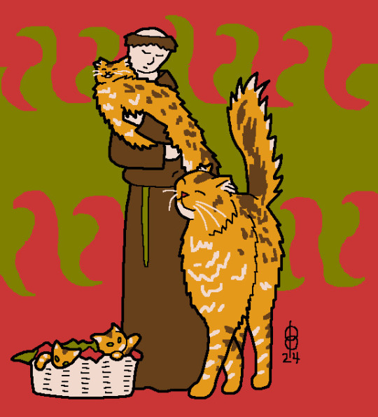
@pomrania (link to post here) has noted that cats live in houses and eat mice, and given us this charming domestic scene. They also note the issues with this interpretation in the linked post, which of course you should read. I think the poses of the cats are very well done here; one of those kittens looks like it wants to paw at the monk's belt but can very much not reach.
And now for the Aberdeen Bestiary:

I'm not sure about the head proportions -- I'd suggest that the flattened snout is because the artist ran out of space, if it weren't for the fact that they were fine letting the back foot extend into the border -- but that is recognizably a weasel.
A few things to note from this:
1. Medieval people apparently had not only mice in their homes, but weasels, which I'd never really thought about. I'm not sure what the distinction they're drawing between the type you find in your home and the type you find in the woods is about, though.
2. The weasel's healing magic crops up in multiple texts, including the Lais of Marie de France and Volsungasaga. It's less common than you might think to find overlap between bestiary-weirdness and narrative-weirdness, so that's pretty notable.
3. I have no friggin' idea why anyone thought they gave birth through their ears. Baffling.
45 notes
·
View notes
Note
I take back my previous threats of violence as my foolish self had not scampered through your art book in all its glory.
Chapter 8 has the reference that is to be used in general, correct?
No worries, I actually chuckled a bit reading that lmao - I didn't expect a reference for SIkuna being in high enough demand for me to be threatened at watergun-point 😂
(the previous Ask with the 'threats of violence' in question for context purposes;

😂)
I'll probably try to draw something of an actual approximation of a 'reference sheet' with the little differences (I was actually planning to do that for the Ask but uh that'd take much longer than this), but to explain it quickly (well, for me quickly which isn't at all);
Chapter 8 of Visuals has actually moreso to do with a perhaps-hypothetical scenario in which later down the timeline SIkuna gets Somehow separated from Yuji and gains a body of his own
- and that allows him to switch between Normal Form
which is basically how he looked whilst possessing Yuji, except probably quite a bit taller (it's already a bit stifling in comparison to the Big Form so he wouldn't make himself even shorter just to keep to Yuji's height lol), a bit older
(he looks a bit older whilst possessing Yuji anyway but yeah),
with some (usually) black earrings and two slits in his left eyebrow to connect it to the Big Form visually
The version with the earrings and slitted eyebrow can f.e. be seen in Chapter 11 lol, just with pink hair for that last one
And Big Form/True Form
which is about 9~feet / 3~ meters tall (I based it off of that one short manga flashback moment rather than some other seemingly smaller depictions?), has four arms and such + mostly wears the outfit from Chapter 8/14 but would also wear different things just like he would in Normal Form
- and I follow the logic of the clothes Somehow changing to fit whenever he suddenly shrinks or grows rather than having to have specifics outfits, but the four-arms thing still kinda demands a different wardrobe anyway for most cases lol
(+ he does have the stomach mouth in the Big Form, and sometimes he'll prefer to leave it uncovered so another outfit difference then,
like maybe an open robe in place of a shirt, something cropped, or occasionally just forgoing a shirt altogether lol)
I think a better reference for the height comparison between him and other characters in that form is moreso Chapter 11 and 14, but it doesn't matter That much
But like, in terms of outfit it doesn't have to be exactly what I've drawn before lol
- he's more of a comfy/casual guy but I'm 1000% certain that Nobara + perhaps other kids would take him shopping sometimes (she or they can't let this particular Older Familial Figure go unfashionable constantly!) and he'd probably want to occasionally wear something more Wowowo so he'd likely have something other than a dozen sweatshirts (and robes and comfy pants and such) somewhere in his wardrobe too 😂
(some Hello Kitty™ merch is also a must, For The Meme!!!)
And I've mentioned it a few times before but, especially if separate from Yuji unless he'd also agree to painted nails which he just might, he's likely to have painted claws/nails sometimes lol - they're a nice big canvas for Nobara to practice her skills on y'know, and he definitely wouldn't mind
.
In terms of how he looks inside the Domain, it's mostly just Canon-kuna's look lol
The kimono/kosode(? I have yet to understand what the exact difference is but heard it may be the second) is the same, the scarf and blue(?) accents on the sides of the main robe and stuff
with the anime-only addition bow to the back of the sash/idk material belt because yes, and because it's something to fiddle with whenever SIkuna gets ungodly bored lmao (the equivalent of fiddling with a sweatshirt's zipper or hoodie string lol)
I've interpreted whatever Canon-kuna wears on his legs as some sort of simple black pants that run down until a bit after the socks beneath the sandals(?) start or something like that??
I don't think he wears anything under the upper part of the kimono(?) but maybe there is some sorta ancient Japanese equivalent of a t-shirt I dunno about lol, besides that it's the same with the wide sleeves and everything
The sandals(?) are the same as in Canon, I've seen somewhere that they could have a small false heel (like a cut underneath that doesn't actually raise the heel of the foot idk how to explain it better) but it's an utter detail lol
As aforementioned, the scarf-thing around his neck is the same too, it's definitely an addition SIkuna appreciates heh - it's comfy 👍
(the Inner/Innate Domain examples I've drawn in Chapters 1, 4, 5, most of 10, 1st bonus drawing in 11, a cropped out glimpse in 13 and second drawing of 14 is ok lol - I just forgot about some things earlier/got better at it with time maybe)
.
In terms of physical differences, in or outside the Domain, the biggest one is probably the eyes
His usual/regular look involves the pupil/most inner part of the eye being white, then having a ring of darker red, then much lighter/brighter red
Meanwhile, whenever he's feeling particularly murderous/spooky/overall more OG-kuna-like (f.e. in Part 4 after a bit of 'experimenting' on the Special Grade), the sequence becomes [very light/bright red, much darker red, a bit lighter/brighter red]
(I mostly draw the eyes in a more oval shape, but that's just my stylistic choice lol - I don't mind it being the same but don't mind otherwise ofc
Same with the colours, they don't have to be Exactly those)
Like this;


And the fact that he actually has a whole Four eyes be eyes and usually all open - the secondary eyes are smaller, but are full eyes with colour and stuff rather than the sometimes barely-there look they had with Canon-kuna
(I'm not yet 100% certain if the difference in colouring is seen in-universe, though 🤔 - but for drawings yeah)
Another thing that isn't usually consistent in the manga/anime (from what I can remember) is the way Canon-kuna sometimes has moreso claws Or fingernails - SIkuna basically always has claws (they sharp!)
I'm kinda contemplating including slightly pointed at the tips ears to the list but it's not an 'official' characteristic lol
.
I've... Uh. Gone off on a tangent?? As per usual lmfAO-
But hope you get at least a little useful info from this?? 😂
(I don't mind clarifying questions lmfao (though my apologies if I take some time to respond))
Also, I'm not that much of a stickler for detail just fyi - even if the interpretation were to differ in some way from this rambly excuse for a guide I'd still love and adore any and all art created for my story because hOLY MAC A R O N I- *implodes from pure joy*
(Assuming, of course, that that's what 'for scientific purposes' meant 😂)
#Thinkings™#Ask#jjk#jjk fic#jjk fix it#jjk fix it fic#jujutsu kaisen#there's not much of it here but#my art#SIkuna#(deliberate misspell)#syuuya#jjk sukuna#ryomen sukuna#ryoumen sukuna#This is only very minimally edited and stuff so I hope it'll be readable anyway heh 😂#I am; in fact; actually very Overly Verbose even when I try not to be lmfao-#Edit; oh shoot I've been just informed by Tumblr that this is my 100th post wtf when did that happen lmfao-
20 notes
·
View notes
Text
A lot of this is spot on, but I think the choice of tools has skewed the data here, however, and may give an incorrect impression of how AI art tools on the whole work, because Dall-E 3 isn't representative of the options at large.
Dall-E 3 is pretty (if you make it be) and has good coherency and works with more naturally written prompts, but it is wholly uncooperative and has almost zero workflow accommodations for artistic applications, heck, It can't even do non-square aspect ratios (at least through Bing).
Playground AI beats it out on those fronts, and Midjourney and Stable Diffusion piledrive it into the concrete.
The only reason to ever use Dall-E 3's chat GPT interface is if you want to run up to three jobs simultaneously on a free bing account. It routinely misinterprets input, even direct "replace this word in the prompt with this other word" requests. It's essentially playing whisper-telephone with two hallucinating robots instead of one.
Here's how the process would go down in Midjourney:
Gonna be making a 90s fighting game version of my DeinoSteve character. Goal is to keep him largely on-model, minus changes that work for the style change from 70s comic/80s cartoon to 90s fighting game.
Prompt: fullbody character design, a velociraptor-anthro fighting game character, in the style of 1996 Capcom (Darkstalkers 3/Street Fighter Alpha 3) promotional art, fullbody on white background. Red scales, yellow shirt, black leather jacket, long tail, clawed feet, long tail, retrosaur asthetics, vector art inks with flat anime shading
Aspect ratio 3:4, Niji model v6, style 50:


Some pretty good stables at DeinoSteve (left image), but nobody's quite right. I've got several ways to get him kitted out right, but we'll use the same techniques CGPT was trying to use: inpainting and variations.
Upper right is closer to the character concept, but I like upper left's pose better, so we'll start by doing some variations on the subtle setting (right image)
You'll notice the variation problem from Dall-E 3 isn't there. Using Chat-GPT to change the prompt means you're at the mercy of two hallucinating robots instead of one, and it's probably been altering the prompt wildly with each revision, thus the slow degradation of mural-jesus.

Now, I'm just demonstrating in-system tools here, but on a piece that I was doing for finalization, I'd be upscaling all the ones that had features I liked, for later composition.
Steve looks... okay here, but he's off model in several major ways. Pants wrong color, no full-t-shirt, the spines on the tail, etc.

So here we'll do some inpainting. Unlike the GPT setup, I'm laying out what areas I specifically want changed at each go. Starting with the pants, I forgot to mention in the first prompt he wears blue jeans, so I add that to the prompt as well. If you're out to do your own post-editing, you can hit more parts at once and just composite from fewer gens.


I like #4 (left)'s swagger, so we'll repeat the process to get him full sleeves on his jacket, and to remove the spiked wrist cuffs. #4, again, is my winner. Now, I can keep varying individual bits, but I can also return to doing general variations, and the influence from the current version will carry over.


Now, it will me re-doing some bits, but #2 is pretty sweet, so he'll be where I tinker next. Note how a bit of his tail and claws are cropped out. I can fix that with outpainting.
If I were instead going for an edit in post, I'd probably have taken the best 5-6 chunks, merged, dropped to line art, then recolored by this point.

Now, I can keep tinkering on him bit by bit, put part of using the AI system is knowing when you're going to have to go manual. I know from experience that my chance of getting him to have his raptor-foot claws is going to require me to go in and do 'em manually.
If its not the horns and claws on dinosaurs, its hairstyles and clothing details on humans, the nature of using a randomized system is that you're going to get random hiccups.

But there are ways to mitigate that, depending on your toolset. Stable Diffusion has controlnet, different versions of which let you control things like poses, character details, and composition more directly, (as I understand it. I haven't messed with it myself, don't have that kind of beastly graphics card)
MJ's answer is presently in alpha: character reference. It's an extension of their image-prompting system (which isn't the same as image-to-image), wherein an image is examined by the AI's image-identification/checking processes and the results are used as part of the prompt. For Character reference, it tries to drop everything that isn't connected to character design.
A quickie iteration using a handful of previous DeinoSteve pics made the image on the left, while re-running the prompt with the semi-final DeinoSteve above as a character prompt produced the images on the right.


Of course, even with the additional workflow tools you get with non-DallE generators, doing anything with long-term consistency is going to require manual editing.
Anything with narrative? Well, this panel has over 20 individual gens in it, from across two generators (MJ and Dall-E 3)

The AI systems will get better over time, but there's an inherent paradox that I don't think they'll escape. To get to complex results you need complex control, and to gain complex control you need, well, complex controls
The more stuff an AI generator can do, the more literal and figurative buttons and/or menus you need to use those features. The more complex the features, the more knowledge and practice it takes to utilize them. Essentially: Any tool capable of (heavy air quotes) "replacing" an artist will wind up requiring an artist to operate it at that level.
As with other force-multipliers for art (photography, digital image manipulation, automated image touchup/filtering, etc) the skill gradient never goes away.
Among the many downsides of AI-generated art: it's bad at revising. You know, the biggest part of the process when working on commissioned art.
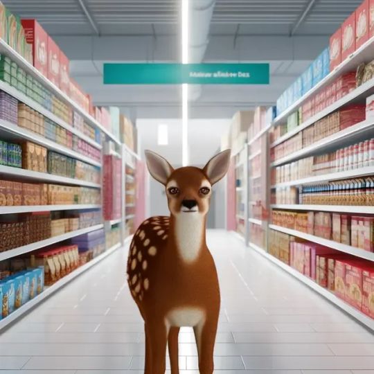
Original "deer in a grocery store" request from chatgpt (which calls on dalle3 for image generation):
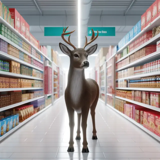
revision 5 (trying to give the fawn spots, trying to fix the shadows that were making it appear to hover):
I had it restore its own Jesus fresco.
Original:
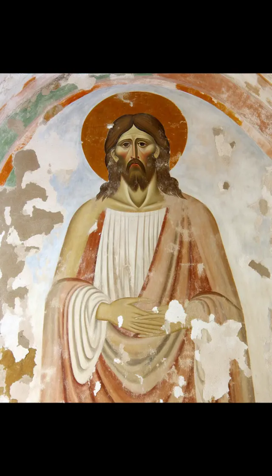
Erased the face, asked it to restore the image to as good as when it was first painted:
Wait tumblr makes the image really low-res, let me zoom in on Jesus's face.
Original:
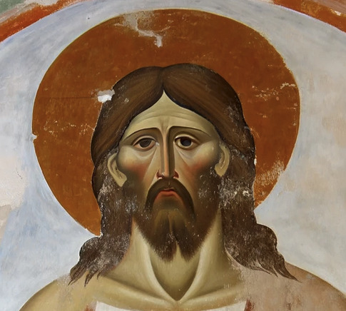
Restored:
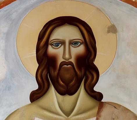
One revision later:
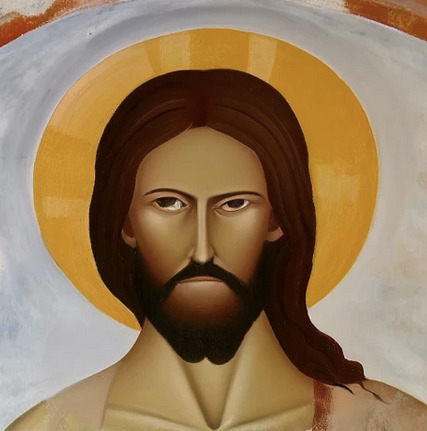
Here's the full "restored" face in context:
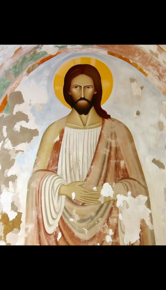
Every time AI is asked to revise an image, it either wipes it and starts over or makes it more and more of a disaster. People who work with AI-generated imagery have to adapt their creative vision to what comes out of the system - or go in with a mentality that anything that fits the brief is good enough.
I'm not surprised that there are some places looking for cheap filler images that don't mind the problems with AI-generated imagery. But for everyone else I think it's quickly becoming clear that you need a real artist, not a knockoff.
more
3K notes
·
View notes
Text
Story of seasons friends of Mineral town: The Powertrip
I would like you to come back to a simpler time with me, dear reader. Do you remember Kanye's Power? Do you remember the mlp version? Around that time, I shared on this exact blog some cringey art reveling in exploiting the ruby spice farming trick to for the first time properly fun my wonderful life farm. Now and again, a bokumono game gives its players some way to break the game, but the friends of mineral town took it to a new level.
Okay, let's rewind. Amidst playing ANB, I became frazzled from the sheer amount of mechanics I had to keep track of. I have moved Yuri into town, but now I was struggling to complete restoration project 3. At some point, I messed up a day and took a step back. Now I have not kept track of switch games on my backlog, but this past winter, I was gifted fomt but had not touched it. Fomt was my first HM game and something I knew intimately since it was so straightforward. I decided to take a quick shot at it. Oh, how novel it was at the start.
Within one night's worth of work, I had basically become the kingpin of quaint Mineral Town.
I did not intend it, in fact I barely read anything major. Just some basic costs and a crop guide. However, during the first horse race, I was saving money for a new rucksack but now was unable to buy it. I take a look at the medal information and figure I'd try my luck at getting the power berry seeing as save scumming was much less tedious now. However instead, I ended up with a good number of broaches. That was when I made my first 50k.
Now you can ship the broaches just fine but I had learned of selling to Huang and figured I should befriend him for next time. Pretty much a day later I ended up with van's favorite (VF from here out) to which I believe is a new addition that you can sell to Huang for ~50k each.
Apparently, you get this every time your transaction count lands on a 10 in its count. Heavily exploitable, but you don't even need to try. So far I have received 3 without even trying and it's been more than enough money to basically complete the game.
By mid summer I had enough to pay for one of every animal, upgrade the house fully and furnish it fully, upgrade all weapons to max, and upgrade the barn and coop one level up AND buy the materials for that rather than slowly accrue it.
The thing is, I also had completed most of this by late spring. All the animals I needed and plenty of seeds, it was time to call upon the sprites. As one should know, sprites love flour, the easiest bribery ever. Had all seven won over in time to plant 90, yes 90, pineapples. And even more plants with that, about 10 of everything I could have at the moment. The money every couple of days was ludicrous. I was making thousands without some cheat. I was even smart enough to not hire all of them at once so there was always coverage. It was basically great assistance while I built up my skill with the watering can. Sadly not mythril yet but gold works fine.
So I'm living large, what now?
Well child me was not as good at patience with this game and would do dumb shit like make myself pass out and only talk with Karen. I guess it's time to befriend the town.
Now this time as I had remarked previously, I intended to marry Elli. Though as a divergence back up, I also confessed to the harvest goddess my interest and was giving some stuff to karen too. Oh, but there is romancable gift options? Darn, and the new guy has a boyfriend gift for you too. Oh wait, the game ENCOURAGES YOU to date all the singles. Yes. Bokumono outprogressed stardew valley in the same game that it first let you date same sex (not as a conditional feature). I mean, how can I say no to that? Why shouldn't I date the whole town before settling down? I WANT FREE HOUSE DECOR DAMMIT.
And boy have I achieved that. Guess what. Most singles have a really simple to get thing in their likes category. Most people in fact like store bought flour too as I've learned.
So now I am in early Fall, collecting various foliage and woeing some people to let me into their rooms and give me recipes. I am mostly waiting around to repeat my sudden wealth gain at the fall races but now with tens of thousands instead of the previous 3k I had at the time. It would take roughly 5000 broaches to buy that cabin from Gotz, although that doesn't factor material or if they'll let me keep that many broaches. Moreover I'm holding out for the free beach house at 150 gifts to which should come in fall of next year if I am pious.
But what's most on my mind is buying my first dog and learning cooking so I can spend the winter lake mining for kappa jewels, some of each gem, and the power berry. If I get the cursed tools as well is up in the air since I still need to upgrade 5 of 6 tools to mythril which takes quite a lot of time especially since not every one is full exp yet. Likely I will try to upgrade the hoe and hammer before winter, the watering can at the start of it, and get the axe and pole done in time to trek the depths one last time.
Sadly what has truly stopped the glory of this progression is simply my real time availability to play it. I started at the end of my free time week and have been busy since. Maybe one day i'll finally be able to gain those mythical houses that were so unattainable in the og.
#harvest moon#story of seasons#bokumono#story of seasons friends of mineral town#tomyo says shit#backlog
0 notes
Text
bugs and socials
just some of my thoughts, scroll past
>>> Tumblr tags bugged?
About a month ago, I noticed that posts I initially posts private then changed to public the next day doesn't show under in-blog tags. And a couple of days I go, I mentioned that the email support I get from Tumblr support was kinda disappointing.
I think on my second email to them, I asked if the posts were bugged and if its a known issue. But of course, it could be an internal thing and I didn't address that inquiry.
And just today, I received another email basically acknowledging my report, which I'm relieved they finally understood the issue. There were a couple of names that would answer my emails, so I guess some of them didn't understand what I was saying. I might have been too detailed or flowery with my emails... or you know, I've worked on contact support as well, maybe they just want to go home? I get chu tho but maybe don't do that? lol
Anyways, if you are new to Tumblr, you can organize your posts using tags and feature them somewhere on your blog page. You can check out this article from the Tumblr Help Center. Organizing with Tags
>>> Twitter
Honestly, I'm just waiting for HoloPlus to be released outside Japan cause that is the only reason why I go to Twitter (I refuse to call it X). But earlier today, I read a Tweet from a fanbase, the actor they like is leaving Twitter. They understood why but, this is the point that I agree on, the community that they built is on Twitter. And its not exactly easy to use Threads with the same comforts as Twitter. You can't suddenly tell a whole community to move to a new social media, especially Threads.
If there is something I will miss on Twitter, that is the bookmarks. I like post heavily. I use bookmarks to easily find posts that I want to silently follow or images that I want to use as reference or for memes.
I also like to use lists. This would sound like I'm stalking but there are certain individuals that I follow privately and I added them to a private list cause I'm a little shy to follow them openly.
But what I would miss the most are basically people that I follow there. I don't use Twitter just for Holostars, I do follow other vtubers outside HoloPro. I also follow some celebrities like Mark Hamill (I'm not sure if he manages his Instagram but he has one). There are also artist there that mainly uses Twitter promote their art. And there are artist that I follow who specializes in sexually explicit art (usually BL).
>>> Instagram
But I wanted to try Instagram and Threads, I used to use Instagram a lot with especially when I used to experiment with facepainting and special effects make-up. But I put a hold on to that cause I got unmotivated when an uncle told me it was ugly. I mean tell me is it? Also when uncle said that, it was summer and I wasn't doing much make-up stuff anyway due to the heat in my room. I basically just fell off since then. But I kinda wanna use it again but to post my drawings. I do use Tumblr and deviantArt. Though, I am thinking of dropping deviantArt because of recent policies.
I do have Instagram on mobile and I actually hate using it. I know it is intended to be used on mobile but I usually use my computer more. The thing I don't like with the browser version of Instagram is that I can't control how I would like to crop my photo. It starts on the middle always. Unlike on mobile there is more freedom to choose. I guess I can just crop them before post but seriously though, why not have the same option?
>>> Threads
I really shouldn't have made an account. Honestly, I did that just so I can keep the username I usually use. After making an account, I discovered that I didn't have to worry about it since it uses the same login as Instagram. I also discovered right away that I can't delete the account unless I also want to delete my Instagram... that part sucked!
Sure there are room for improvements but its been about 3 months and the only change I've seen is that they added a following section. Which is great and all but I think one of the feature Twitter users like, that they decided to remove, is circles. Having a public account but keep some posts private and only visible to friends is a great feature. Sure, you can limit who can respond but that little security that only select people can see your posts, is a great feature.
Seriously Threads, Twitter is removing Circles. I think you can add that feature, users love that feature.
>>> final thoughts
I actually hate having many accounts. Currently right now the one I use the most is Tumblr. At some point in the past, I also considered deleting Instagram and deviantArt. But for now, I'm going to keep them.
links: Instagram || Threads || Twitter || deviantArt || Tumblr (secondary blog for art)
0 notes
Text

what's great is if you do waste... 30 minutes oof of time recreating garbage AI shit you do end up realising a bunch of weird nonsense about AI, like there's a bunch of sort of weird oranges and I think it's tried to make a sliced orange that is heart shaped and some mountains and a weird expressionistic face in the background and the only thing that can be said about the AI doing that is just, it's clearly pulling from soviet stamps for what it's categorised as communist and some of the stamps have like a wheel or a sliced regional fruit on them so that the stamps could sort of promote and boast about how well their fruit or wheel production, plus pictures of mountains because russia has cool mountains plus communist statues would often adopt abstractions of faces and the human form to de-individualise memorial statues - and now notice how to describe the AI's art I've had to spend more time talking about the intent and meaning behind the human art it's pulling from than the AI itself, because if a person had done it we could talk about what spattering those things around might mean, or we could look into what the artist said or talked about and come away with "the author hated oranges and they wanted to convey their dislike for communism, and the mountains represent the siberian steppes where the gulags were, and that's actually the ghostly image of che guvara who died fighting guerilla wars in south american mountain regions", but it's just "guess the machine was fed some stamps" instead.
meanwhile what can I say about my parody of it? the orange slices without transparent backgrounds mock the incoherency of the weird things the AI scattered around. the literally haphazard blurring of the words to emulate that way AI render language blurry and indistinct, a corporate management level of hestitancy even as its being told to be declarative. the melting nazi speaks for itself. the way I had to slice angular chunks out of churchill's shoulders to emulate the AI, but which also sped up the cropping process and aren't as noticeable as they should be because the human eye really doesn't care that much. Or how when looking for pictures of churchill the pictures that made his jowls sag like the AI's version has were from after his severe stroke caused him to lose control of a lot of his facial muscles, but the sort of toxic wellness and masculinity cult of most AI users fear aging and the human physical process so much that it still makes churchill's hair a lot darker than it was long before that stroke, because its users are most anxious about their hair's natural progression as they age
Even within the machine slop the only thing interesting is the human aspects it's pulling from, which mold it, the anxieties of its users that it mirrors and regurgitates in a way that its users don't realise and if they did would terrify them.
obviously not an exercise I would recommend people waste their time on in general, but fun to do once.

Only the lowest IQs support communism. That's why the insist idiots are just as good as geniuses. They are idiots who believe no one is better than them.
595 notes
·
View notes
Note
Sirius black with a busty reader
𝐒𝐢𝐫𝐢𝐮𝐬 𝐰𝐢𝐭𝐡 𝐚 𝐛𝐮𝐬𝐭𝐲!𝐫𝐞𝐚𝐝𝐞𝐫
Masterlist<3
MINORS STAY AWAY I'LL BLOCK EVERY SINGLE ONE OF YOU, THIS IS +18!!! See also… All marauders versions in my marauders masterlist<3
I want you all to picture me giggling and kicking my feet while writing this 'cause this is my main hoe 🤭💗
-BUYS. YOU. NECKLACES.
-I'll die on this hill dear god
-Pretty silver chains, golden necklaces with expensive charms, you name it! HE SPOILS YOU SM BECAUSE THOSE ARE EXPENSIVE ASF TOO?????
-Yk that good house of Black money n shit hehe
-Loves seeing how it sometimes gets in the middle of your tits and pulls it out himself, definitely touching you more than necessary
-"Wait, I'm almost there doll" "Do you need to bury your face in my boobs to get that crow charm out?” you deadpan with a smile, looking down at the pretty boy, feeling his nose dig in like he’s on a treasure hunt
-“Helps my visibility” yeah visibility my ass he loves your pretty tits
-He’s the “Wear what you want, I can fight” type of guy <3 (all of them are!!!)
-Will and has gotten into fights if someone’s staring and making you uncomfortable. No one disrespects his girl like that:)
-L E A T H E R T O P S
-You both wear leather tops that show your belly and chests, matching ones ofc!!!
-Remus loves sweaters, James loves crop tops
-Sirius lives for seeing you in lacy bras AND his leather jacket:(
-Boy gets heart eyes, jaw to the floor, drooling, screaming (ofc the boys mock him for it<3)
-“You’ll catch flies with that mouth, Pads” Remus smirks, watching Sirius watch you having a conversation with some Ravenclaw girl as you pour more fire whiskey on your glass “Shut it Moons” he replies, dreamy voice too entranced to even comprehend the chaos the party around him was causing
-Speaking of parties, he loves doing vodka shots from your boobs.
-Ogles them sm and compliments them all the fucking time!!!!!
-He’s shameless about it as well
-"Your tits look amazing" with a lovesick expression on his face like he genuinely loves them so so so much
-He knows his friends stare and he doesn’t mind as long as you don’t either. Boosts his ego quite a lot tbh!!
-If you feel uncomfortable, he’ll definitely do something about it! The boys would never make you uneasy, of course. They look away to be respectful, but those small glances have Sirius all cocky
-Having said THAT…
-Marks u up <3
-I’m talking love bites, scratches, hickeys
-Makes sure to make them on a regular basis so they don’t fade out with time
-Yes the boys have walked in on him marking you many times
-“Fucking hell Padfoot just lock the bloody door” James groans while covering his eyes since he knew damn well his best friend wasn’t stopping. “Hey Prongs” you giggle “Hi darling” he says, still not looking at you guys
-“Could you tell your pig boyfriend to lock the door next time?” “ITS AN ART YOU WOULDNT GET IT!!!” he yells, but the sound comes out muffled and barely understandable. “We’ll try” you muse, giggling slightly as the other boy left the room
-Won’t do any of these if he knows it bothers you!! Respectful legend <3
-So, summing it up
-He absolutely adores your boobs, is very much shameless about it and will not tolerate bullshit from anyone <3
#sirius black imagine#sirius black x reader#sirius x reader#sirius black fic#sirius black fanfiction#sirius black smut#sirius smut#sirius fluff#sirius x you#sirius black and reader#sirius black x female reader#sirius black x y/n#harry potter marauders#maraurders#the marauders era#marauders smut#marauders fic#marauders x reader
1K notes
·
View notes
Note
are you cuban? or not white in anyway? otherwise its really really weird for you to racebend white characters lol. it comes across performative (and a but fetish-y). why not draw the canon characters of colour? (also making the canonical drug dealer character latino is a bad look)
So, there are many things I want to say about this. I want to give an answer that isn't my instinctive response of "fuck you and i hope you shit your pants in your sleep", so I will attempt to address these questions and concerns.
I do find it funny that you sent another anonymous ask pretty much saying the same thing, because apparently, I didn't reply to your ask fast enough. For context, it is; "there are white cubans so do you enjoy cuban culture and think steve would fit in well with that? in that case you don't need to brownface a white character. or do you just want to fetishize hispanic cubans? also its really weird to make the only drug dealer character latino i mean come on......".
So first things first. No, I am not Cuban, but I am part Native American and was raised around primarily Hispanic people my entire life due to where I lived.
Second. I find it grossly performative for you to send this ask telling me not to headcanon a character a different race. I think this type of activism is extremist and unfounded in actual ideas or beliefs other than your need to feel 'better than' or superior to others.
In regard to fetishism, I would like to mention first to people that are not you, that fetishism of people of color is rampant and highly uncomfortable. It is seen recently with the new character of Miguel in the animated movie "Across The Spiderverse".
But back to the subject at hand, which happens to be my art of Steve Harrington, I want to ask where in all of my art is there fetish content? Are there multiple drawings or comments focusing on his looks? How hot I think he is? Personally, I don't see that.
I notice that in today's culture, people tend to throw around new words they learned to use as an end-all-be-all. Their winning card up their sleeve. But it's not, because you don't even use the word correctly. To make note of what fetishism is, I'll put the definitions below.
: an object or bodily part whose real or fantasied presence is psychologically necessary for sexual gratification and that is an object of fixation to the extent that it may interfere with complete sexual expression
or: an object of irrational reverence or obsessive devotion
To take these definitions we find that first, it is a topic for sexual gratification. And in my art, I'm personally not seeing anything sexual come into play. Sure, I put him in crop tops and short shorts. But I do that because I feel it fits his character regardless of race because of his personality and the time they were living in. I personally wear crop tops and don't set out to be sexualized, so if you see it in that way, I fear we may be encroaching on what I consider a "you problem".
Third, on you speculating on why I can't just keep Steve Harrington white as he is in canon. In multiple places, I do in fact mention that I am not drawing canon. I'm drawing headcanons. Headcanons, described by the dictionary, is "something that a fan imagines to be true about a character even though no information supporting that belief is spelled out in the text." So, this ask isn't quite viable seeing that I have never said I was drawing the canon version of Steve Harrington.
Fourth, you mention that I "brownface". I fear that you may also be the person that had a dry broom handle fucked up their ass when the new Ariel movie came out.
Fifth, you say that my half-Latino Eddie Munson is "a bad look". To this, I find it interesting that your first connection was drug dealing alongside a Latino character. Personally, I didn't take drug dealing into consideration. And rather a funny headcanon I saw of someone saying Latino Wayne Munson would cook peppers to "smoke" Eddie and his friends out of the house. And again, as someone who was raised primarily by Hispanic influence, my mother did the exact same thing. If you decide that every Latino character is based on stereotypes, then live your life that way, but don't tell me what is and isn't a bad look, seeing that you are the only person who has a problem with it.
Sixth, you ask why I don't just draw the canon characters of color. I will. I have sketches of them. But since you obviously have looked through my art, you might notice that I only really draw the older teens. They are my favorite to talk about and draw.
On that, Isn't it interesting that there are only three people of color in the show? Two are siblings, and one is a side character introduced in the last published season. This is why I add people of color into my headcanons. I find, that if I can do whatever I want with a personal interpretation of a character, I am going to add diversity where I can.
I think it's important as a culture of fans that produce new content over a piece of media, to fix, change, and do what the original writers didn't. We see this commonly in sexuality headcanons because there aren't that many canon lgbtq+ characters. Typically, fan-given content adds minority or oppressed groups that the original creators did not give. Because frankly, people of color deserve to see themselves in the media. Lgbtq+ people deserve to see themselves in the media. If we continue to stay true to canon exactly with all of our fan spaces, we would be found boring, repetitive, and stale. The idea of fan spaces is to take canon and expand it. To have fun with it and to add ideas and quirks to the characters that other people can relate to where they once could not.
I will not apologize for getting bored of every character being white. I will not change what I am doing either. Because I am not doing anything wrong, moral, or unjust in any way. I think the main problem comes with you finding so much hate with a silly drawing of Steve Harrington simply because he isn't white. So I wonder why you find him and Eddie not being white so concerning.
I hope this helps.
67 notes
·
View notes
Note
On the topic of fem fortress, I agree and disagree. For the record I fall under the trans umbrella myself as well and I used the have the same opinion. You are entitled to your opinion of course but calling gender swapped art transphobic is a little too much. My problem with gender swapped art is if they make the female version without wrinkles or without the same body type. If you want to draw the mercs as trans that is totally fine and awesome but again calling people transphobic for drawing vid versions of characters sounds like a little bit of projection no offence. If someone were to draw me as a gender swapped version of me as cis personally I wouldn’t care. And again I’m only talking for me here but calling someone transphobic over something as small as this is taking away from actually transphobia that us real living people have to deal with. I don’t think I’ll change your mind and that’s ok with me. I hope you’ll at least consider this point of view. Love your blog and I hope you have a nice day.
Anon I genuinely do not want to be mean but like. do you know how to read? Nowhere in that post do I say "all genderbent art is transphobic" and I specifically disclaim that I do NOT think that because I KNEW this was the kind of reaction I would get. I can't help but feel like you are either intentionally or unintentionally misrepresenting what I said in order to make my critique sound more outlandish and unreasonable and craaaaaazy and thus easier to disagree with than it is, which is something that Always fucking happens to me whenever I talk about transphobia as a trans person, biphobia as a bi person, racism as a Latino person, etc, someone misrepresenting my argument to make me look like an oversensitive "triggered" idiot for even daring to see bigotry in something "small". I understand that YOU might feel comfortable with people whose genderbent art is like "the thing that makes this character a man is that he was born with a penis and ascribes to all cis standards of 'masculinity' and the thing that makes my new genderbend a woman is that she was born with a vagina and ascribes to all cis standards of 'femininity'" but I don't! I would not want someone to "genderbend" me and make me cis! I do not think it "takes away from 'REAL' transphobia" (whatever that means, transphobia in media and fiction is still transphobia and still affects people in real life) to say that "associating the gender of a character with the 'biological sex' of that character is cissexist" and/or "showing that you have 'genderbent' a 'male' character by making them ascribe more heavily to 'female' beauty standards is not just transphobic but misogynistic" (MASSIVE FUCKING PROBLEM with "fem fortress" designs, since when is Medic tf2 thin and petite or since when does Sniper tf2 wear makeup and a crop top and since when do either of them not have any wrinkles), that's like. completely normal media critique. I know that a lot of my followers enjoy "fem fortress" and I have tried to be as nice as I can about my critiques of SOME VERSIONS of it because of this, but like you need to be able to take critique of things that you enjoy. Nowhere do I say "all genderbend art is transphobic" but it seems like people are rejecting that for "no genderbend art is transphobic" which is just objectively untrue. I enjoy tf2 and I am able to make and take critiques of it, especially things like its portrayal of women characters (or lack thereof), but not everyone can. I would like to be able to talk about misogyny, biphobia, racism, or transphobia within this game and/or its fandom just once without someone inevitably coming to tell me "it's not that bad and you're just overreacting". I guess I'm not saying you have to agree with me but maybe try actually listening to what I say and not knee-jerk react like this bc I lightly criticized something you enjoy (which I have even praised in other posts, wouldn't you know! I think fem fortress is fun!)
#again i'm not trying to be mean but like. no ur not going to change my mind i don't think you understood what i said at all#sorry if i sound really mad i just woke up. i'm glad u like my posts and i hope u stick around <3#ask#anon#someone post 'did op really stop you from having fun or did they make a personal post on their own blog'#fem fortress
29 notes
·
View notes
Note
Hi, happy WBW! (As usual, I am @writeblr-of-my-own, this is my main and apparently I can't switch them).
I am hungry and it's almost lunchtime for me, so for today's question let's talk food! If someone were to come in your world, what would be the best places to eat food there? What does a typical dish look like? Are there differences between cities?
I wanted to follow this with art and lots of details, but my body isn't allowing that, so I'll just answer with what I got.
Flatlanders' diets are mostly made up by vegetables and legumes. They might add fruit and insects – insects are any living being that can fit in their mouth entirely.
Any typical Flatlander dish, from their view, doesn't really look like anything, even to the most intellectual and well-practiced sighted Circles. From above, many different dishes may look near identical.
Flatlanders mostly tell them apart by texture, telling apart different vegetables by the angles or number of bumps in their perimeters. [cooking is too low for any self-respecting Polygon to do, only Isosceles and Women do it, so Feeling the ingredients is fine.] There is also the more delicate recognition by smell [and by extension and quite obviously, taste]
Leafy vegetables, their flowers and their seeds are a staple of Flatlander cuisine because they don't make much of a mess. Some fruit and all animals become a mess when killed, as instead of flesh they only have juices inside, which spill and are a hassle to deal with. Small animals make less of a/no mess or can be eaten in one bite. Big animals aren't worth the time and effort, and are dangerous to keep, so beyond beasts of burden they don't see much use.
The favorite animals for Flatland consumption are bees! They're small enough, and soft enough thanks to their nearly circular bodies. They also keep a unique taste related to the plants they fed on, usually being sweet. They also produce other foods like eggs, honey, larvae, and pollinize crops. They're awesome.
[Fun fact, some of the queens of the species of bees that are commonly kept by 2D beekeepers feed off of the body juices of other animals instead of nectar/etc like their workers. Many Irregulars are fed to the bees...]
They likely have a domesticated cow-like animal exclusively for milk and related products. [And food for the b e e s. and bones. Maybe scrap off the little amount of skin on their perimeters for food.]
Seasoning is usually done through sauces/salsas - you mix whatever specific stuff you want, and add in a special ingredient. You can either wrap the food inside of a string of solidified sesson-sauce like a weird taco or drop it in liquid form into the dish, coating it with the sauce that will quickly semi-solidify on the food. Yes they can be sweet too!
Some of the most common dishes include..
A mix of several different vegetables, flower petals, seeds and legumes. Usually the seeds/etc will be wrapped in a leaf of the vegetable. A dry version is just this, but a juicy version may add dead bees or small fruit. Like a salad. The name translated might be "flowerbed". Like tacos, eggs or toast, a basic nice meal.
Two different types of bread. Flat bread [known as dimbread] and fluffy bread [brightbread].
Flat bread is simple, easy, straightforward. It does not rise like our bread, but its relatively soft.
Fluffy bread is more like ours, filled with little pockets of air that give it the fluff. To make it this way, they put the liquid batter in a closed box at high heat, where it will turn to gas, expanding to all the space inside. When it is gas it must be cooled down extremely quickly.
Theres prob more but its 432 am

13 notes
·
View notes
Note
Can u talk about ur requiem rohan au. If you want
YESSSS YES YES YES i literally switched to desktop so i can type easier
i'll try and keep this short so i don't kill everyone's dash
ok so the whole premise of this AU hinges on the fact that akira is also in possession of the requiem arrow (still haven't figured out a reason how tho) and rohan gets his hands on it through there
a little bit of explanation for how i think the requiem arrow works: whatever the stand turns into depends on the user's greatest desire in that moment. polnareff really wanted to protect the arrow, so SCR's power was all about keeping it safe. giorno really REALLY wanted to kill diavolo + override king crimson's ability, which is why GER resets everything to zero (can't predict the future when it never happens). ok explanation over
rohan gets the arrow right after he gets his stand, but he doesn't end up using it (it doesn't end up choosing him) until he figures out how HD works. this is before he meets koichi and gets beat up by josuke, so he's still in his whole weird detached/clinical/up on his high horse phase. this combined with an incredibly powerful stand turns him into the worst version of himself (he stays stagnant in his ways and never grows out of this childish mindset)


art of The Guy. second image is a screenshot of a crop since the original is just too fucking big for tumblr also heaven's door requiem reveal
HDR, to put it simply, can rewrite reality. it's like a super buffed up version of HD in the TSRK series (think of when rohan used his stand to look at the chicken leg's expiration date expect now he's doing it to space-time). looking at its face causes the victim to fall into a trance-like state. rohan is a little scared of it not gonna lie like what would you do if the manifestation of your soul (that looks like the main character of your series + is a child to reflect on the traumatic moment in your childhood that defined your entire life) suddenly turns into some fucked up angel creature. despite all of this, rohan doesn't really use it much in the beginning bc he still holds onto the whole "doesn't like tampering with things bc that makes them less real" ideal AT FIRST...because what's the point of upholding reality when you're the one creating it?
anyways this is still long and i cut out some stuff lol. this is basically an experiment where i go "how can i make my fucked up little man even more insane". also him and canon rohan meet and it goes about as well as you'd expect but that's somethign else...
#THANK YOU FPR LETTING ME RANT i love this au#✒️#ask#not putting this in any tags this is somethign that only makes sense to me sorry#requiem au
19 notes
·
View notes
Text
Depixellation? Or hallucination?
There’s an application for neural nets called “photo upsampling” which is designed to turn a very low-resolution photo into a higher-res one.
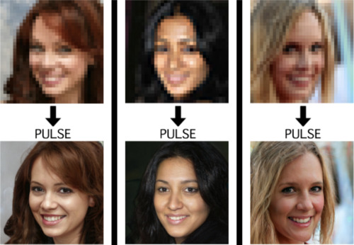
This is an image from a recent paper demonstrating one of these algorithms, called “PULSE: Self-Supervised Photo Upsampling via Latent Space Exploration of Generative Models”
It’s the neural net equivalent of shouting “enhance!” at a computer in a movie - the resulting photo is MUCH higher resolution than the original.
Could this be a privacy concern? Could someone use an algorithm like this to identify someone who’s been blurred out? Fortunately, no. The neural net can’t recover detail that doesn’t exist - all it can do is invent detail.
This becomes more obvious when you downscale a photo, give it to the neural net, and compare its upscaled version to the original.
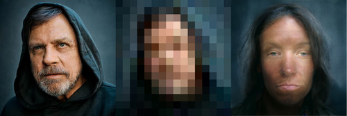
As it turns out, there are lots of different faces that can be downscaled into that single low-res image, and the neural net’s goal is just to find one of them. Here it has found a match - why are you not satisfied?
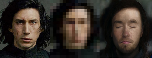
And it’s very sensitive to the exact position of the face, as I found out in this horrifying moment below. I verified that yes, if you downscale the upscaled image on the right, you’ll get something that looks very much like the picture in the center. Stand way back from the screen and blur your eyes (basically, make your own eyes produce a lower-resolution image) and the three images below will look more and more alike. So technically the neural net did an accurate job at its task.
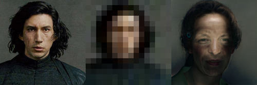
A tighter crop improves the image somewhat. Somewhat.
The neural net reconstructs what it’s been rewarded to see, and since it’s been trained to produce human faces, that’s what it will reconstruct. So if I were to feed it an image of a plush giraffe, for example…
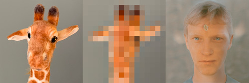
Given a pixellated image of anything, it’ll invent a human face to go with it, like some kind of dystopian computer system that sees a suspect’s image everywhere. (Building an algorithm that upscales low-res images to match faces in a police database would be both a horrifying misuse of this technology and not out of character with how law enforcement currently manipulates photos to generate matches.)
However, speaking of what the neural net’s been rewarded to see - shortly after this particular neural net was released, twitter user chicken3gg posted this reconstruction:
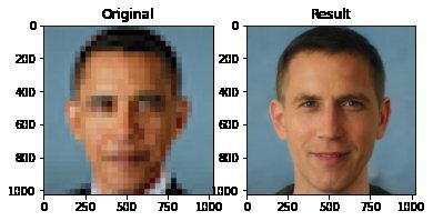
Others then did experiments of their own, and many of them, including the authors of the original paper on the algorithm, found that the PULSE algorithm had a noticeable tendency to produce white faces, even if the input image hadn’t been of a white person. As James Vincent wrote in The Verge, “It’s a startling image that illustrates the deep-rooted biases of AI research.”
Biased AIs are a well-documented phenomenon. When its task is to copy human behavior, AI will copy everything it sees, not knowing what parts it would be better not to copy. Or it can learn a skewed version of reality from its training data. Or its task might be set up in a way that rewards - or at the least doesn’t penalize - a biased outcome. Or the very existence of the task itself (like predicting “criminality”) might be the product of bias.
In this case, the AI might have been inadvertently rewarded for reconstructing white faces if its training data (Flickr-Faces-HQ) had a large enough skew toward white faces. Or, as the authors of the PULSE paper pointed out (in response to the conversation around bias), the standard benchmark that AI researchers use for comparing their accuracy at upscaling faces is based on the CelebA HQ dataset, which is 90% white. So even if an AI did a terrible job at upscaling other faces, but an excellent job at upscaling white faces, it could still technically qualify as state-of-the-art. This is definitely a problem.
A related problem is the huge lack of diversity in the field of artificial intelligence. Even an academic project with art as its main application should not have gone all the way to publication before someone noticed that it was hugely biased. Several factors are contributing to the lack of diversity in AI, including anti-Black bias. The repercussions of this striking example of bias, and of the conversations it has sparked, are still being strongly felt in a field that’s long overdue for a reckoning.
Subscribers get bonus content: an ongoing experiment that’s making me question not only what madlibs are, but what even are sentences.
My book on AI is out, and, you can now get it any of these several ways! Amazon - Barnes & Noble - Indiebound - Tattered Cover - Powell’s - Boulder Bookstore
15K notes
·
View notes
Note
hello! I love your art and im wondering what app you use and what pens do you use on that app? :dD
hi! first of all, thank you :) i'm glad you enjoy my art. sorry it took me so long to answer, but here it is, as detailed as i could make it
what program:
i've been using autodesk sketchbook (for drawing) & paint tool sai 2 (for filters, cropping, etc) for several years. i'm very very fond of sketchbook and i believe it to be the best entry program for beginners (and especially people who are moving from traditional to digital art, since the majority of the brushes available for AS are imitations of traditional tools. it even has a library of copic colors!) due to its simple and intuitive interface. this is both its biggest advantage and flaw: while the brush catalog is quite big and you can play with the settings a lot, there aren't that many features you can use as opposed to something like clip studio paint or even sai; it’s a very bare bones type of art program.
some things i personally find irritating (but have learned to work around) are the lack of image flipping function (instead i have to mirror the entire layer or canvas, which becomes troublesome on canvases with a lot of layers (although i assume it’s mostly due to my laptop being pretty old)), inability to have multiple canvases open at once, lack of clipping mask, somewhat clunky process of creating custom shaped brushes (nigh impossible to make an unbreaking string of a shape, e.g embroidery or lingerie), lack of water fringe function, clunky text & color adjustment editors, etc etc.
if you’ve previously used a more complex art program you might find sketchbook lacking in a lot of ways, but personally after years of usage i can safely say that it’s my favorite program i’ve ever worked with. i really love the overall simplicity of the interface (i’ve tried to switch to csp several times throughout the years but ended up being overwhelmed by the number of features), and i’m a big fan of AS’s selection tool. if you’ve never heard of sketchbook before, i urge you to give it a try! they provide a helpful manual on their site.
now, AS used to be free for all platforms (both pc and mobile), but iirc a couple years ago the program changed owners and the new company decided to remake the pc version as “autodesk pro” & charge $20 for it (although mobile is still free). which is fine i suppose since i hear that it’s being updated again (previous owners made it free in the first place because they essentially abandoned its development & stopped releasing updates). but i’m also a huge fan of piracy so here’s a .zip file of the version i downloaded when it was still available (it might be outdated, but at least its free! and if you decide that you like the program, you can always one-time-purchise it later from their official website). the archive contains the setup.exe as well as a folder containing all of the brushes i use in my art process (i’ll talk about them further below). if you ever find the link not working anymore feel free to send an ask or message me for a new one.
what brushes:
here are all of the brushes i use as seen on my toolbar. the majority of them are brushes that i made myself, which is why a lot of them have weird names; the ones that have numbers in the title are just me writing down previous value settings (usually for roundness, rotation & edge) so that i dont forget them after i inevitably tweak the settings again. don’t pay them much attention.
left column is basically decorative brushes. here they are from top to bottom:

right column is brushes that i actually draw with:
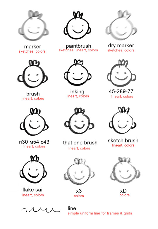
i specified what each one is used for just so you get the basic idea but in reality i pretty much use them interchangeably for literally anything i feel like at the time. i also tweak the settings a lot so the overall look fluctates pretty often.
the folder in the zip file i provided has the .skbrushes (sketchbook’s custom brush format) file for the entire set. here is a guide on how to upload custom brushes.
i think that’s all! if you have any more questions, feel free to ask. i promise i will reply faster this time, lol
44 notes
·
View notes