
Statistics
We looked inside some of the posts by visualcorner and here's what we found interesting.
Average Info
Notes Per Post
26
Likes Per Post
25
Reblog Per Post
0
Reply Per Post
1
Time Between Posts
5 days
Number of Posts By Type
Text
16
Photo
1
Last Seen Tumblr Blogs


Fun Fact
When “GIF” was named word of the year in 2012, Oxford Dictionaries U.S.A. credited Tumblr for pushing the word.
Text
Art work

Designer: I. N. Ochuba ( myself)
Comment :An attempt at art. I like paintings and I love warm colors because It brightens my mood. The use of color is a compositional tool. These colors complements each other and it is visually striking. Blue and yellow color schemes creates eye catching adverts. A tint of brown color highlights around the lip. The white symbolizes the incisors.
1 note
·
View note
Text
An image

Comment: The designer made use of negative space ,sense of depth, fonts and typography. I like the way the designer applied different color for the typography.
2 notes
·
View notes
Text

Marvel / Disney Plus
Comment: The picture above shows two actors from the newly released television show title “Wanda and Vision”. I really like the CGI work on the male character and how the colour grading and composition matches seamlessly with the female character.
1 note
·
View note
Text
An image

Andrew Hoyle/CNET
Comment: I like the color combination and the rule of thirds applied by the designer.
1 note
·
View note
Text
3D building
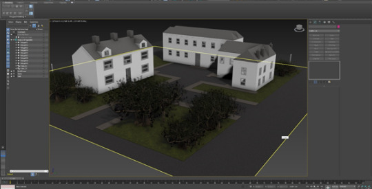
Comment: The building above was created by me as a final building from the 3D assignment. I added some textures to improve the overall appearance of the scene.
1 note
·
View note
Text
3D building
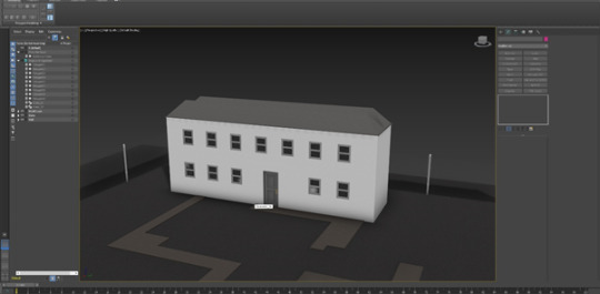
Comment: An image of a building from my 3D assignment
1 note
·
View note
Text
3D building
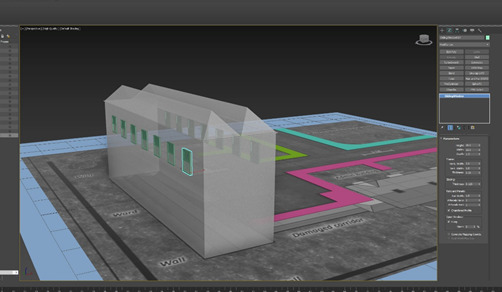
Comment: Part of the building I created as part of 3D assignment using 3D max.
1 note
·
View note
Text
A design

Comment: I like the simplicity and minimalistic of the design, the typography, different fonts, color combination , composition and metaphor applied by the designer.
2 notes
·
View notes
Text
An image

Comment: I like the way the designer fused the two objects together The designer combined the product with what it is being compared to form a single visual element. This is so common in the world of advertising because it shows product benefit through the visuals.
1 note
·
View note
Text
ALTRA Auto Moto

Comment: This is an example of fusion metaphor, where two images are fused together. This is the logo of an automobile company that symbolizes restoration and confidence.
0 notes
Text
Google pay
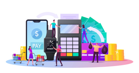
Comment: The use of color scheme and different shapes creates an eye catching advert from Google pay. I like the way the designer made use of symbols and arrows.
https://www.searchenginejournal.com/google-pay-google-plex/391328/#close
1 note
·
View note
Text
Retro music poster

Designer: I.N. Ochuba ( myself)
Comment: The above image was the final poster I designed for a music poster assignment. I implemented several design principles and typography. I ensured that the fonts and elements were carefully aligned and used a hierarchal system of size to represent the information on the poster in order of their importance.
5 notes
·
View notes
Text

The above image was a practice for an upcoming musical poster design assignment. The outcome of my learning was knowing how to use basic photoshop tools to create designs. Here I made use of rectangular tool and color combinations.
1 note
·
View note
Text
Design
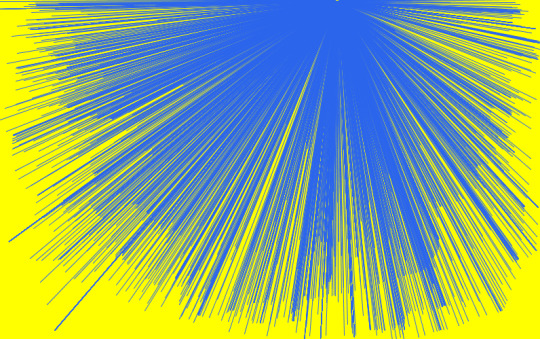
Comment: My first code. I tried to design random lines and match two warm colors to define my mood.
Designed by me: Ijeoma Ochuba
1 note
·
View note
Text
Button Bird
Beautiful and colorful button bird. The artist applied rule of thirds on the first image and used symmetry and centered composition . It works well on a square frame. He placed the image at the center of the frame.

Artist: Rajendra Vahadane
1 note
·
View note
Text
The artist used warm colors to highlight the figures in the foreground and cool colors to give depth of the image.

Artist: Rajendra Vahadane
4 notes
·
View notes
Photo

Shape Worksheet_03
Comment: This combination of shapes depicts a Nintendo Gameboy handheld console. It was made using different shapes ranging from rectangles to squares and circles, all arranged on different layers to give the result shown above.
2 notes
·
View notes