
Don't wanna be here? Send us removal request.
Statistics
We looked inside some of the posts by 23739606 and here's what we found interesting.
Average Info
Notes Per Post
1
Likes Per Post
1
Reblog Per Post
0
Reply Per Post
0
Time Between Posts
2 days
Number of Posts By Type
Text
9
Last Seen Tumblr Blogs


Fun Fact
There were a total of 171.5 billion posts on Tumblr in 2019.
Text
Todayyyy
Today I did not get much done on my project, but I learned a ton and feel like this has been one of my most productive days in terms on networking and engagement.
I ran into Nic and Hope while working at the library and had another brief chat with them about the new Oxford Road temporary library setup! I can't wait to see how they transform the space and see how students actually use it. I can't imagine trying to build an academic library from a building of classrooms rather than from scratch... and to design it in a way that students can use the same way as before seems so confusing to me. But I'm so glad I can help out!
I had a meeting with Jen, Stella, and Matthew to chat more about the Open Research team. Jen gave us a ton of tips and recommendations for finding a job during the stressful season--both Matthew and I can only work 20 hours a week, and we both have library experience, customer service experience, and are working on our LIS MA certification, so it seems like we fit a lot of the boxes needed for library work. I just have to be really diligent about checking job boards and seeing what new posts are open.
I learned more about how Jen's role is the strategy part of Open Research at MMU. She decides how to make our uni's plans and aims work for the LCS and specifically the OR team, directing the team to work in those ways that support the overall strategy of the university, now being a dual focus uni. There is emphasis on teaching as well as research which can make it difficult to decide whether OR moneys should support researchers or students...
After a quick lunch, I shadowed the help desk and booksorter team. Basically, they showed me what their daily tasks look like, and I asked questions and related it to my own experience working in libraries. The library here deals with the collection in a different way than my previous uni (SPU), but it makes so much more sense given that MMU is probably five times the size of SPU. Differences like: holds are only placed on books already checked out, the booksorter manually returns items, and the staff are very chill on quiet days like today.
I'm honestly loving this placement so much -- I'm learning so much about working in an academic library and just desiring more and more to be back in one in an official role!
Then, I went to the Manchester Central Library for an orientation session because I will be volunteering at the Embassy of Utopia event next week! There was one other woman from my course that was there, so it was nice to see a friendly face. I'm hoping I can get some good networking done at this event, and the Information desk person I was talking to suggested talking to as many people as I can because he knows some staff are near retiring age and are looking for replacements. Fingers crossed!
Tomorrow I have a meeting with Stella after some more shadowing at the front desk, and I'm hoping to get my presentation mostly finished by then. If not, I'll be working from home on Thursday, and I'll definitely be able to bang it out then.
0 notes
Text
Start of week 3
Today was off to a slow start, but I learned a lot and got a lot done!
But first -- last week, Beth, Matthew, and I went to the Fab Cafe Bar in town for a celebratory drink as they have finished their placements! I'm counting this as part of my placement because we talked about personal, fun things as well as subjects related to the library, our course, and our placement. Matthew reminded me that we briefly talked about e-space during our course, but we agree that there should be a much bigger focus on our university's institutional repository, especially in the Library and Information Management MA course. Beth said she would give me her thoughts on e-space as a visually impaired individual, or as she puts it, "just f*ing blind." Hopefully (most definitely) she can praise or criticise some elements of the site that I had not considered as a mostly able-bodied person.
I started making my Powerpoint for my presentation next week. I've got all my slides laid out and organised, and now I am filling them in with content. I'm honestly so excited to do this presentation because it will be about something I'm passionate about and not just something for a grade. I've definitely developed a passion for Open Research and an eye for spotting accessibility issues with help from my WAVE evaluation tool. I know I will be helping the library and possibly make a difference to e-space users that have found difficulty with the site in the ways I have previously mentioned.
I want to provide the OR team with realistic suggestions for changing the site in small ways that will make the research outputs of MMU truly available to everyone. I am going to split up my suggestions by what I think are the most critically necessary updates, then what changes I think would be easy to implement, then additional changes that might be more difficult to put into place but would still greatly improve the site's accessibility.
I'm also going to highlight aspects of the site that improve its accessibility that I've noticed some other IRs are lacking. I will also outline how the OR team supports the research lifecycle and research data lifecycle using links from the Uni of Southampton.
I also went to Georgina and Andrew's Open Access presentation on Teams and learned more about the repository from a researcher point of view, which was very interesting. I just think it's wonderful that the uni and so many other institutions are working on making all this publicly-funded research available to everyone, truly, because that's how it should have always been! I got some good links to other IRs that I might check out when I am doing my literature review for my dissertation. I also learned about the different types of Creative Commons license, which I never knew about. This meeting also gave me more to talk about for my presentation when I go over all the ways the OR team supports researchers.
That's all for now. I've got a busy week up ahead, but I don't think my presentation will take that much longer, so I can really enjoy the shadowing and tours and conversations with people from different departments.
0 notes
Text
Middle of week 2
Today I read some more articles on the importance of Open Access and the difference between availability and accessibility.
One statement that I read today that I hadn't seen on any of the uni websites is the fact that plagiarism almost becomes a non-issue when publishing articles Open Access. Because the work is easily searchable with the original authors being directly credited, plagiarism is easily spotted. Publishing Open Access also demonstrates the quality and impact of research outputs from a particular institution, so when other researchers see the outputs from MMU researchers, it draws more attention to the uni and potentially attracts researchers and librarians to become a part of the impact.
Also, I know this is mentioned in the YT video on https://www.mmu.ac.uk/library/research-support/open-research , it is still incredible to me that it is not widely known that Open Access articles are cited more than traditionally published research outputs. When a work is discovered easier and readily available for free online, no matter the quality, it will be cited more.
I think MMU should make a point of sharing this with researchers within the university to further encourage them to embrace OR publishing with the uni. Increasing your citation metrics gives researchers an advantage, and this just shows how the MMU OR team at the library supports researchers at every stage of the research lifecycle.
The barriers to accessing materials in the physical library space and virtual repository are similar--the mere presence of these materials does not guarantee their accessibility. Resources are unavailable if they lack physicality or readiness for use--if a book is on a high shelf of a library or checked out by another user, it's clearly not available for use. If users can identify and use available resources, that's what makes them accessible.
A repository is useless if it has no content, content from a singular author, or no visitors. I was not aware of MMU's e-space until I started on my placement. I think that's wild, that as a graduate student, I didn't know about how to access the research outputs of my own university. I wonder if undergrads know about it, or if only post-grad students actually carrying out research are aware of this. You would also think, that as a Library and Information Management student, I would be informed of the databases I have access to. I can see that e-space is on the Library's list of databases, but it's definitely well-hidden and not highlighted as something important, which I believe it is.
The direct link to e-space is hidden under the tab for Staff and Researchers, but I think all students, as well as the general public, would benefit from direct access to our institutional repository. The whole point of OR is to disseminate publicly funded research to the public for free, but using the definition of accessibility from before, if users aren't aware of what's out there, it won't get used: it's not available or accessible.
Now, I'm not sure how much of this issue of e-space seeming hidden on the Library's website is actually solvable in the way that I'm imagining it, but I think there's an aspect of e-space being lost in the background that should be considered.
On the Publish with Power ManMet Podcast, Nick says, "as an institution, we’ve got a moral obligation to make sure the research that we do is available to the widest possible audience." (I also think this transcript could benefit from speaker tags, as I had to watch the video to figure out who was speaking this line from the transcript.) As I've mentioned before, I really believe that there is a moral obligation from anyone who provides a service to make that service accessible to all, not just a target audience. If you say your target audience for your institutional repository is the public, but you make a website that isn't compatible for screen-readers or for users that don't use a mouse, you've failed at the first step.
And again, if you prove that research outputs of your university are high-quality, readily available, and accessible to all, it's easier to attract students, researchers, and staff who want to join this excellent community that benefits everyone.
0 notes
Text
Hump Day Wednesday
I had a chat with Stella this morning about potential issues I've noticed on the site that aren't necessary accessibility issues. The first one is the difference between the drop-down Browse menu and the actual Browse page.

First off, the Subjects category doesn't appear in the drop-down menu. Stella said that this category should probably be removed, as it only links to one research output when clicking through the categories in it. It should either be in both places or neither. Since researchers have it as an option when depositing works but it's not required, and the Library doesn't manage or edit that field, it's probably best to remove it entirely.
Stella also noticed the inconsistency with naming, as the user can navigate to Faculties or Division via the drop-down menu or the Browse page; I think it should be altered on the drop-down menu to divisions, as there are some outputs that are outside of the Faculty division. There are some MMU Psychology Journal dissertations and Library Services articles that aren't part of the Faculties category.

Above are the categories when navigating to Division via the Browse page.

Above is the page the user is presented with when navigating to Faculties via the drop-down Browse menu.
This is inconsistent and confusing.
Another inconsistency I noticed after my chat with Stella is the order of the drop-down menu versus the Browse page. Collections and Datasets are switched. This seems like an easy fix to me.
Another weird thing is this empty text with a link attached.

Under the ?... heading, it says there are 4 authors with a blank name.

I'm not really sure what's going on here, but it looks like there's just no text for the <a ref>; so there's a link (which doesn't even look like anything to me? I don't know what "=3A=3A=3A.html" is.), but no clickable text for the link. So it's a hidden link, or as WAVE calls it, a link with no text.

Here, on the same page, you can see the same setup, but there's text representing the link.
I told Stella about this, so it should be handed off the the suppliers to fix.
On the Advanced Search page, users have to tab through 15 elements before being able to begin a search. This seems like a lot for people that don't use their mouse.

UKC's KAR has more elements to tab through, but there is a "Skip to content" hidden button after two tabs (number 3).

The Skip function jumps the user to simple search link which is more reasonable. I'm not sure if I like the order of the search fields on this repository, but I'm sure the library team has a solid justification.
SPU's Digital Commons site has a hidden "Skip to main content" button that a user who tabs through the page will encounter first! I want to do some more research on that function, because I wonder if having it being hidden and the first option is always best? But I am still learning, so learning is what I need to do!

You can't even see the link on the page with WAVE's accessibility evaluation tool, but it brings the user right to the Help with Search link, number 4. This page is a lot more simple but potentially confusing to use for those that use screen-readers or can't view the entire screen. It may not be intuitive that for each category of a search has to be manually selected from the combobox and added via the green plus icon on the right. The alt value for the icon is "add row" which I think is quite helpful. I wonder what user testing SPU's library did for creating this site! I know they had a rebrand around 2017-2018, so I bet all of the webpages got updated and redesigned then to match the new style guide.
Just taking note of what other institutional repositories offer and how their site is set up...

The MMU Library website has a "Skip to main content" button which is the first link available on the page! Yay! So it should be something reasonable that e-space can adopt.
It's also important to note that the Skip buttons should say "Skip to content" or similar, as calling them "Skip navigation" or "Navigate to main content" could be confusing to users. Using plain basic language is best. Not only does having a "Skip to main content" button enable faster browsing for keyboard users, it helps them avoid frustration by making the site easier to use.
The link should be hidden from view but activated on the user's first keyboard tab. When the user hits enter, the first heading* of the main content of the page should be highlighted, or in this case, I think the first search bar should be activated or the first combobox for a search, whichever comes first.
After looking at random university webpages, I came across North Carolina State University. They have several Skip navigation buttons: you can "Skip to main navigation", "Skip to main content", "Skip to footer", and the final tab is "Accessibility feedback" and links to a form for feedback about accessibility. This is a handy option, and I wonder if it's something to consider for e-space. Perhaps having "Skip to main content" and "Skip to abstract" options on a webpage for a particular article.

On e-space, the user has to tab through 20 elements before a screen-reader will start reading the main text of the page. Stella and I also talked earlier about how the screen-reader goes through the title of an article twice, before and after the authors. Is that the best way to layout this page? Perhaps I will design a better layout... I'm having more ideas on how to stretch out this project and provide helpful feedback for the OR team at the library.
Imagine if you had to tab through 5-10+ buttons before getting to the main content on every new page you visited that was part of the same site. Now imagine you're a uni student doing a literature review--coming back to this same page when searching for internally produced research for hours would be mind-numbing, I can't even imagine.
There is the option to hold down the Tab button and skip through all of the navigation buttons, but I think Making Things Accessible.com has a good list of users that browse the web in ways I haven't considered before:

So holding Tab isn't always a good option. A better idea is to provide a Skip link.
*Also! Speaking of headers!

WAVE flags this header as an alert because it used the h5 heading, which is weird for being one of the top headings of the page as well as one of the most important headings. I know this isn't on e-space, but my screen-reader completely skips over this paragraph and goes right into the OR Conversations and the video captions. This page is not navigable in the same way for sighted users and visually impaired users and does not provide an equitable experience for all users.
0 notes
Text
Start of week 2
Today, I finally downloaded a screen-reader to see how it is to navigate e-space only hearing it. Here are some brief notes from today--tomorrow I will post a more detailed summary of my findings so far.

First off, I found this on the Civil Service Communications gov.uk site which again just highlights how important it is to make e-space accessible to all. I would like to point out the statement that 7/10 disabled users will click away from a site when they encounter issues. How disheartening to be attempting to access research from your own uni but the formatting or layout of the site prevents you from doing so!
This site also suggests making content not for screen-readers, but make content to be accessible by everyone. Those that use screen-readers are used to common mistakes.

I found this description on the Southampton repository site--since we also have a link to EThOS that doesn't lead anywhere, we should amend the page to have this statement.
One university, the University of Kent, has a repository called KAR. When you zoom in on their page, you have to scroll horizontally; on e-space, that is not an issue!
It is incredibly difficult to use e-space with a screen-reader--but I have also never used one before. It is such a pain to listen to the header and menu bar every time the page reloads, and I still don't know how to go back a step using the keyboard without cycling through all links and elements on the page.
0 notes
Text
End of week 1!
Today, I read several studies about how visually impaired people navigate websites using screen-readers--I really think I need to download a screen-reader to use myself or chat with someone that does use them in order to properly evaluate the e-space website.
Stella suggested talking to Gopal about potentially recruiting students for an informal conversation about how accessible the site in. I might also chat with Beth about what she thinks of the site since I know she is visually impaired.
I showed Stella some issues I've noticed, accessibility-related and not, and it was refreshing to hear that a lot of these issues had already been raised and the team is actively working to solve those problems--it also helped them that I noticed the issues as well, as a novice user and not a developer.
I talked with Stella today about the importance of making our Open Research site actually accessible to everyone, and she agreed that the site's accessibility statement and the statement on Open Research should be linked somehow; the aim of Open Access is, obviously, open access, and accessibility directly relates to them: and our accessibility statement is inspired partially by the goal of OR.
We should also update all uni websites and link to be accessible because it's the morally right thing to do! Improving accessibility makes the site easier to use for all users.
Steve Krug (2013) writes that the first law of usability is "Don't make me think!" This makes so much sense. Having an intuitive interface is crucial for open access, as using more brain power and having questions as you use the site can make you lose train of thought and potentially restrict you from accessing the materials you need.
More suggestions for improvements that I've noticed:
site map
"skip to content" button
pull-down menu issues
content vs structure
1
Having a sitemap link in the footer of every page of e-space would increase usability if drop-down menus are confusing to navigate. This could also be in the menu bar at the top of every page. Then users can navigate directly to the page they are looking for rather than tabbing through the menu bar or searching with pages for links.
2
Having a skip to content button or link at the top of each page allows users to avoid having a screen-reader read every piece of info on a page before getting to the content that the user expects to be there. This would also help when navigating the website without a keyboard--you have to tab through the MMU main website link, the home e-space link, every item in the menu bar, all three search links, and more before you even get to the content that someone with sight can jump to instantly.
3
The pull-down menus can be confusing, especially when you have to carefully maneuver your mouse to the right page. Having these menus be activated by clicks might be easier, and then they will also stay open if the mouse moves from the menu bar. This may not be possible on the library's general site, but it something we should definitely consider for e-space.
4
Having content be separate from the structure of the site could allow for a version of the sites without styles to be available for screen-readers or visually-impaired individuals. Having an accessible version of the site separate from the stylized one could be useful for more than one type of disability.
Above all, we want e-space to provide experience equity, where all users are able to confidently search, browse, discover, and upload research on the site. We tend to design for ourselves, and having conversations with representatives of our target audience in the best way to create an inclusive site that doesn't exclude based on ability.
Next week, I will attempt to do more testing, whether with using a screen-reader myself or conversing with my differently-abled peers.
0 notes
Text
Day 4!
Today, I spent a lot of time looking at the root of making Web content accessible--HTML coding. I have some experience with coding, but nothing like making an interactive website. Here are some of my thoughts about that:
Everything I read about accessibility highlights the fact that tables can be confusing for accessibility tools like screen-readers, and e-space has a lot of tables to make the website visually appealing, but I don't think they are necessary. Surely there are other ways to create a similar layout, right?
I know when you code, it's important to add comments about what certain functions or lines do. It seems the same in HTML--you need to add a label or attribute to most elements to explain what they do. And this is helpful for screen-readers to explain to visually impaired users what this selected element does. It seems like there's some issues with that on e-space, like some interactive elements or icons are missing an attribute label. Descriptive link labels also boost SEO.
Brody and Craven (1999) highlight the importance of using tables carefully. The headings should accurately and appropriately describe the contents of the table. There are some tables on e-space that my WAVE plugin alerts as a potential accessibility issue.
Now, onto an issue I've been thinking about for a few days that I'm still putting the right words together on.
The whole point of MMU's e-space is to make research outputs open access and available for the public to freely browse--but if the content isn't accessible, it's not really open access, is it? Anderson and Leachman (2020)
https://doi.org/10.7710/2162-3309.2383
write that we "need to reconceive accessibility as a natural extension of Open Access," and that some institutional repositories prioitise the speed of output and quantity of research over access. Inaccessibility equals exclusion, and even accidental gatekeeping can cause early search termination because of frustration.
I think that this understanding that the purpose of the repository is the democratic spread of research and new information should be reflected in our accessibility statement perhaps. Informing users about our mission to include everyone and provide open access obviously includes accessibility, and the library staff behind the website design it for everyone in mind.
The library research support page says that open research "is about extending the principles of openness to the whole research cycle," and that can't happen if a portion of the population is unable to view the research outputs! WHO states that one in six people on the planet are visually impaired, so imagination if 16% of students couldn't access online articles on the uni's own website.
I've also found some research and web accessibility recommendations that mention the problems with PDFs. I was not able to find many articles with alternative download formats on e-space in some brief searching. I wonder if having researchers, when depositing their data into e-space, should be required to provide an accessible format, whether as an EPUB file or HTML versions of their research. Perhaps that could be a role for the librarian staff, remediating archived articles and updating them with accessible viewing options.
Another issue is spelling errors. If the user makes a spelling mistake when searching, not only will they find no results, but there are no suggestions for what part of their input is causing issues. I think implementing a spelling suggestion when there are similar spellings that lead to research or when there are no results after a search should be implemented--and this isn't even an accessibility issue, just a language issue I think!
0 notes
Text
Day 3
Today, I really focused on analysing the content of MMU's repository of all research outputs from within the uni, e-space. I used WAVE, an online accessibility tool for evaluating the features of websites, to inspect the contents of e-space from an accessibility standpoint. I took notes of the errors and alerts I noticed, then compared what I noticed to Seattle Pacific University's Digital Commons, a repository of SPU's research outputs.
Important! I am still learning the correct terminology for all of this! I have never coded a website, so I am unsure if my suggestions will be impossible or not realistic solutions. This is also my first time looking at any website with accessibility in mind--I am fortunate that my disability does not impact my ability to browse the Web or interact with digital formats. I should look into screen readers and see if how it is to actually use them to browse the Web.
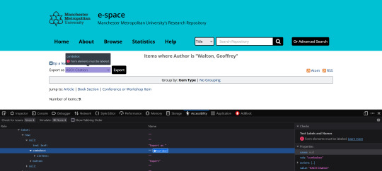
I want to highlight the differences in how these two library-mediated archives implement drop-down menus on the sites. WAVE alerts on the <select> element of this page of the website--it says there is not a label attached to it. There should be descriptive text about the interactive function of that element. Using Firefox's inspect element key (Q) to view the accessibility properties also flags this as an error. You can see in the image below where this occurs. The combobox element is blank and has no description of what the element does. I would say the text "Export as " should be present in the combobox instead of just in the text leaf next to the drop-down menu.
SPU's website is correctly labeled. You can see below how if you were tabbing through the page, when you highlight the drop-down menu, a screen reader would inform you what the element does.
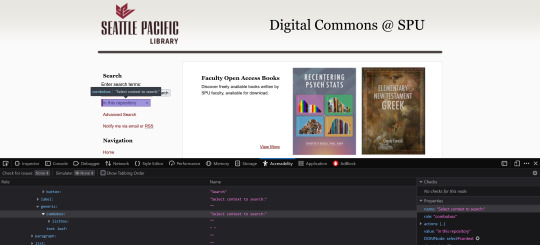
Here is another place where the drop-down menu (or combobox I think is the correct term?) has a text label informing the user of what the element does.

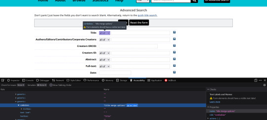
What I am still confused about is this below on e-space. It seems like this combobox has a text label? I can't see what this is flagging as an error. I don't know why this combobox is different from the one on the other page. The only issue on this page WAVE flags is the underlined text of "quick title search" when it doesn't flag other underlined text on the About page which has a bunch of hyperlinks.
I'm going to ask Stella or Andrew about these later this week when I am back in the office. I also want to check out some other websites like other repositories or MMU library sites through this lens of accessibility.
I also attended a library workshop on Teams today, Uncovering hidden connections: exploring cited reference searching and research influence by Dave and Alex. I am so excited by what I learned because I've been looking for a way to do this! Basically, you can use Scopus or Web of Science (and some other databases that don't focus on my area of research) to look for indexed articles, then you can search for other research that cites that particular article. I will definitely use this skill when performing my literature review in my dissertation this summer. (I could also use Google Scholar, but it might not have access to full texts, and sometimes the citations may be inaccurate.) But--these databases don't search institutional repositories or Open Access works not indexed on the site, so it doesn't find everything. It will be a good tool for seeing what research or response has been generated by one article though.
0 notes
Text
First post!

This will be my blog to document my activities and what I have learned during my placement at the MMU campus library. I will evaluate the accessibility of the Open Research service available to researchers and provide recommendations on ways to improve the service. Looking at the repositories and services other universities offer can provide a benchmark to base MMU's e-space against, as comparing examples can provide a better idea of what services and impacts are possible.

So far, I've had tours of the Manchester Poetry Library, the North West Film Archive, and the Special Collections museum at the campus library. I was also introduced to all of the teams at the library, got an overview of the accessibility services the library provides, and learned from a Graduate Trainee in a library role about her position. It was interesting to see how the Poetry Library is laid out and how the traditional library service has been altered to allow a space for all kinds of poetry. The Film Archive tour was incredible -- I love seeing history recorded, especially personal history that's not "official" record but more every day life. It was really disappointing to hear about the Special Collections being shut down soon because of the renovation at All Saints that's coming up -- for the next few weeks, items will be on display, but after June, they are not sure when the public will be able to view materials in the collection.

I am had meetings with Georgina, Stella, and Andrew in the Open Research team at the MMU library. I learned so much! I had really only considered one small aspect of research -- when students look for articles for information for a paper! I had not considered how access to those journals is possible or how all the hoops researchers need to jump through in order to be published and have their work recognised. I learned about the repository of research outputs that MMU maintains and all of the services that researchers can utilise. Currently, I am exploring e-space and the library's Open Research webpages with the intention of analysing their accessibility, and then I will look at what other universities have to offer.
1 note
·
View note