
Don't wanna be here? Send us removal request.
Statistics
We looked inside some of the posts by 2dplatformerimogengausden and here's what we found interesting.
Average Info
Notes Per Post
0
Likes Per Post
0
Reblog Per Post
0
Reply Per Post
0
Time Between Posts
2 days
Number of Posts By Type
Text
17
Last Seen Tumblr Blogs


Fun Fact
Tumblr has a 66 index score for customer satisfaction in the US.
Text
Researching win and lose screens and making my win screen.
After making my lose screen I struggled on what to make for my win screen but ended up with a simple one that matches the colour pallet I was already using.

I then put the text in the middle of a simple message saying 'You win!'.

I then looked into more win and lose screens as a general whole for inspiration for future ideas on my games. The first game I looked into was FNAF 1 (Five nights at Freddy's). I chose this game to look into first as the win and lose screens are very important in the game as you are a security guard in a pizzeria with haunted animatronics trying to kill you from 12am-6am, and you win when it gets to 6am.


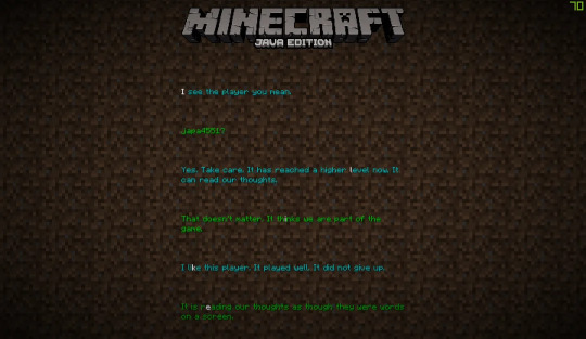
Next I looked at Minecraft. Minecraft's 'win' screen is more of a joint credit scene but it still theoretically counts as a win screen. It's lose/death screen only plays when the character dies, giving you an option to respawn back into the game or to go back to the title screen, exiting the world.

I then finally looked into Mario kart 7's win and lose screens on the wii. I played this game as a kid a lot so the screens are very nostalgic alongside the general look of how the win and lose screens were made.


I personally really like the win and lose screens for the game as they were made really well and still has a fun feel to them even if you lose as they put encouraging words in the lose screen, and the use of the podium for the win screen looks really good too with its overall design and feel for the game.
0 notes
Text
Looking at other pixel games similar to mine
I then looked into different games and how they use colour palletes for their games atmosphere alongside how they made their levels with their ideas.
Videos I used for research:
youtube
youtube
youtube


youtube
For research I looked into more pixel art games that have a similar feel to my game in aspects of character design/ level design.
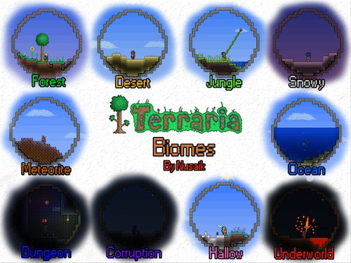
I firstly looked at Terraria. I’ve looked into Terraria its caves before but I decided to look at the overall game this time.
When making my game I took inspiration from a number of games like Terraria for its nature themes and then looked into games like Omori for colour palettes and character design, but I’d say I used Terraria more for inspiration on level making.
Continuing looking at Terraria, I began to look at its biomes and how they have different atmospheres and how they use a different/similar colour pallet each biome in each different biome to create different feel.


youtube
Next I looked into Omori. I’ve also researched Omori a lot but it was a big inspiration for my game as it uses bright colours and has faces on almost everything in the game which is what I wanted to imitate in my own game. Omori’s art style is one of my most favorite styles of pixel art as it’s so aesthetically pleasing to see with it's theme of overdetailing with it's childlike look it uses is why I used the game for reference many times. I like how the world is set out aswell alongside the game mechanics.

youtube
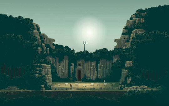
Looking into Sword & Sorcery I noticed how they used a colour pallet of quite dark colours for their game but it really builds how the game feels with a dark atmosphere. I really like how the levels set out as it reminds me of 'Planet of Lana' with how the game is laid out on its side scroller forest theme. Colour pallets really impact how the game feels with it's general look alongside atmosphere too, so a bright game like Omori has a more happy feel to it but then turns dark as the colours in the real world dull down as the atmosphere changes with the feel of it as it's no longer pastel bright colours and has reverted to pretty much the opposite of it's original look.


youtube
Next I looked into Dave the Diver and how it uses underwater exploration. I personally haven't played the game so I don't know how the gameplay is but looking at it's design its a very aesthetically pleasing game to look at with it colour pallet and design overall as it has a sort of Subnautica vibe to it with how it looks underwater.


youtube
Then I researched and looked at Eternal Castle. It's colour pallet is very limited as it seemed to use a very bright colour pallet for its game with pitch black complexations which make makes a really cool atmosphere on how the game feels.


youtube
Finally I looked at Subnautica as after looking at Dave the Diver I wanted to look at another underwater themed game. In Subnautia there's a variety of different biomes that they use where some are half lit up such as the safe shallows, but then you then can venture into biomes such as the crash zone which is dark and dull with its colours with a dark atmosphere it creates for the biome.
0 notes
Text
Researching game HUDS
After making my Hud I looked at other games HUDS to see how other games designed theirs and how simplistic and minimal they can be to chaotic and over detailed they can be depending on how they're made.
youtube
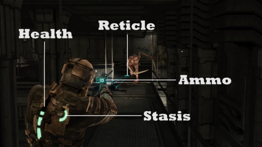
I firstly looked at Dead Spaces HUD design as it's really unique as it was one of the first of it's kind. With games when you'd go into your inventory or whatnot it takes you to another screen outside the game, but with Dead Space they incorporated the HUD into the actual game as it's like a hologram screen in game rather than just another screen out of game. I really like how Dead Space used the in game digital screen for their game as it's a really unique look for their game as it's different than just a normal HUD. I like how the game stats of the player are on the actual character too as it's more unique and has a different and more realistic feel to it.


Next I looked into Persona 5 Royal. Persona's HUD is really unique as they use a main limited colour pallete of red, white and black alongside using fonts/randomness to their advantage. I really like how they layer and use different fonts in their HUD alongside the usage of them making the words and boxes at an angle as that's hard to do normally but they made it work really well with their final look.

I then looked into Mirrors Edge with its lack/minimal HUD. I like the simplicity of it onscreen as it feels aesthetic to look at as some can become quite overbearing and have too much onscreen at once, but I feel like it's a little too empty.


I next looked into Cris Tales and how their HUD looks. I like how it has a simple feel to it but it shows everything detailed at the same time. I also really like how at the top of the screen it shows whos turn it is alongside whos up next/who played last as it then gives the player time to prepare their attacks better and it looks better overall.


I then finally I looked into Dead Cells which uses a very complicated HUD as it's very over detailed. I personally am not a big fan of HUDS that have a lot of things on screen as I feel like then you're missing out on seeing more of the game as it's covered by all these different things on screen.
0 notes
Text
Continuing to work on my game

After making a rough idea of my lose screen I decided to draw a photo and then add the text over so its not just a black empty background with text in the middle as I felt that was a bit of a basic design.


I then added all the spikes into the pits so if the player falls down them it'll kill them instead of just standing there.

I then went in and added my coins into the game. I added five overall as my maps a bit small so I added fewer coins but spread them out over the map better.
0 notes
Text
Adding a font for my HUD

I then went onto DaFont where I chose a pixel font that matched my game.


I then changed the score to the coin icon so the player then knows what to collect

0 notes
Text
Designing a projectile and researching designs
With my projectile made and working I now needed to design how it looks as having a 3D grey sphere in a 2D pixel game looked really out of place and isn't consistent with my games theme.
I looked into different games and how they use projectiles/ how they're designed for each games theme. I started on looking at Cuphead and how the game uses projectiles shot from the character and enemy. I really like the animation of how Cuphead shoots his projectiles with his finger in a gun position as it fits the cartoony rubber hose art style the game themed itself off of.

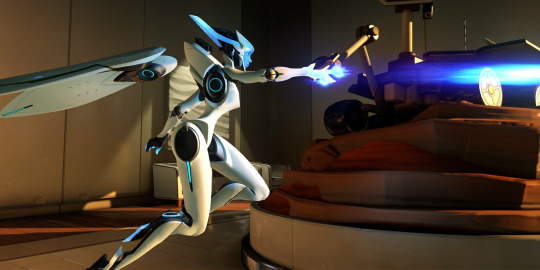

I then looked at Overwatch 2, specifically Echo's projectiles as how they work are quite unique. With Echo being a robot Blizzard use two different types of projectiles, a quick burst projectile that covers the enemy players screen really quickly with exploding balls, and the other projectile being a long beam projectile that shoots for a moderate amount of time for more precise attacks.


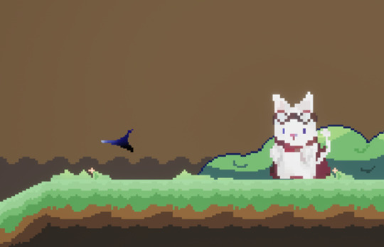
I then looked at game projectiles all together as an overall look. After looking at different projectiles I made my own design that fits in my game. I tried to make it look like a shard of one of the gems that can be collected in the map so it fits my games theme and overall look.


I then imported it and turned it into a sprite and added it in where I then turned off the spheres visibility. I tested it shooting it and using it on the enemy and it worked.
0 notes
Text
Making a projectile
Now I'd made my enemy I need something to destroy it so I began to work on making a projectile to get rid of the enemy. I made a blueprint class where I then used a sphere with a scale of 0.25 for my projectile as a temporary base as I'll draw a pixel art projectile.


I then went onto my character and added in an arrow and positioned it outside enough so it works as the arrow is where the projectile shoots from so if it was too close inside the character it could potentially overlap and cause later issues. I went onto the projectile and coded it so when the enemy gets shot they get destroyed and so does the projectile. I also coded it so that after three seconds the projectile gets destroyed so there isn't a possibility of infinite projectiles which would lag the game as they would carry on forever no many how many.

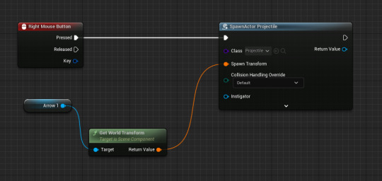
Next I went back onto the players event graph and coded it so when you right click in game it shoots out.
0 notes
Text
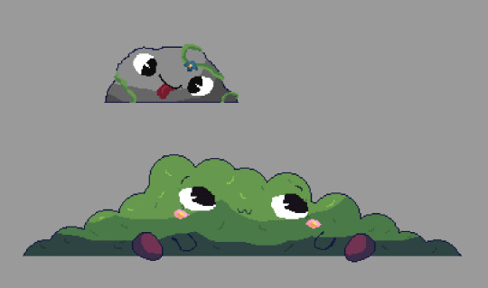
Making an enemy for my game

I'm using my previous design of my enemy that I'd made for my game.
I then moved my enemy onto a sprite sheet to import it to Unreal Engine. I then imported them and applied 2D paper effects before then extracting them and turning them into a flipbook where I then set the speed to be 1.5.


I then inserted into the game where I made a new blueprint class. I added the flipbook insert and then put it as the idle animation.


I made two patrol points so the enemy doesn't exit them and only moves within that area. I then coded it so it's constantly moving and then turns around once it reaches the patrol point on each end so it's constantly on the move.
With the patrol points I also used a blueprint class and used a sphere for where it hits but I made them invisible and that the player can walk through but the enemy can't.
0 notes
Text
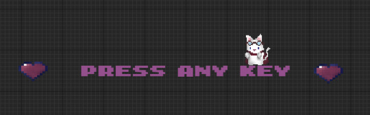
Making a start screen
I then made three new levels, Start, Win and Lose.

I then opened the start level where I then made a blueprint class gamemode base.

I then opened it and cleared the pawn so the player doesn't spawn in when pressing start.


I then pressed settings and selected the world settings where I then changed the GameMode Override to the GameMode base I'd made beforehand.
I then began to design my start screen and designing how it looks as I also then coded it so when any key is pressed it instantly takes you to the level.

I next made my lose screen. I repeated the same process I did with the start screen of making a canvas and then placing text and images over it. I added a four second delay so the player isn't instantly respawned.


0 notes
Text
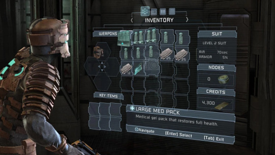
Making a widget
I then went onto Unreal Engine and right clicked the content drawer where I then right clicked it and went into the User interface tab and then clicked the Widget Blueprint tab.

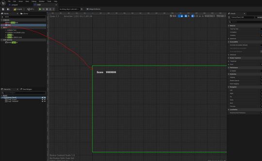
I then dragged in a canvas and put in two texts where I named one as 'Score' and the other as '9999999'.

I then added a HP section on the top right where I scaled it and changed its colour to a light pink.


I then made a binding to the HP and score where I then casted it to my game instance and coded it to what my HP is.
0 notes
Text
Researching into tile maps and tile map sheets

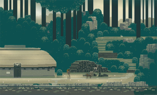
I looked into more side scrollers and their tile maps next as part of my research next so I could look at how other maps were made for inspiration for my own. I also decided to look more at tile map sheets as I want to add more to my game so I looked into tile map sheets to see what other games added as background objects/ how they overall just mapped out things for games. As my games set in a cave I looked into Terraria. I looked into Terraria before for my game as inspiration but I looked more at how the caves are set more and how they're generated. I used how the caves are structured to build my cave better as I used parts of how they mapped it out for ideas on how to make mine.


I then looked at Omori's tile sheets and how they used them for their background items. With my game having a similar colour palette on some bits I looked a lot more into their tile sheets for inspiration on what to make more for my background items as I feel like it's a bit empty and spaced out at the moment.


0 notes
Text
Fixing errors and improving my map

I firstly had an issue where my character was falling through the jumps I originally had as they were on the wrong layer but I fixed after play testing. I decided to change them into three large jumps instead of tons of small ones. I also felt like my character was too big for my map so I scaled it up more so it felt more like how I wanted it to look.

I also decided to change the colour of my dirt background as I still didn't like it as I felt it was too neon brown than a more grey colour that I was going for.
0 notes
Text
Continuing my tile map in Unreal Engine
After I added the collisions to the blocks I wanted, I began to build my first level of my game.
I decided to draw a few more things for my map, such as two floating islands connected by a broken bridge which I then also added collisions for so the player can still stand on the parts that aren't broken.


I then decided to add some big vines that'll hang lower for more detail as I only had small vines beforehand.


I changed my dirt background colour too as I had originally left it as the same overall dirt colour I used for my blocks which clashed as then it was harder to see where to jump, so I made the background dirt a bit more vibrant so there was a clear difference as the background after now is more visible.


0 notes
Text
Doing more drawings/building my level

I then began to draw more pixel art for my tile map. I drew a second flower and then began to build my level as I decided to change it to a cave as making a forest didn't really fit the whole idea I had going with the more I drew.

I decided to go for a more cartoony look in my work as it then all matches.

I made a background leaves layer but I didn't like how it looked so I decided to stay with my dirt theme.
0 notes
Text
Importing my tilemap to Unreal Engine
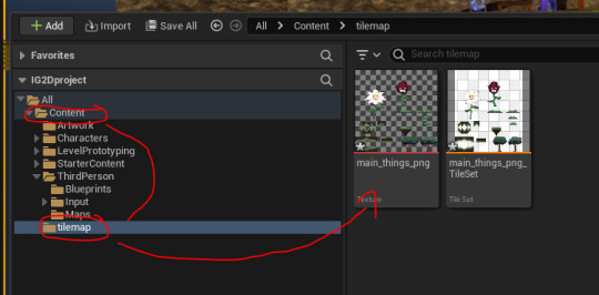


I then exported my tile map from photoshop to Unreal Engine where I then imported it in and gave it Paper2D texture settings and then made it into a tile set.

The tile sizes are wrong when I imported it so I went back into photoshop to move them around which fixed it as they were all just slightly out.

I then began to map the boxes to the pixel tile map as I altered the shape so it fitted more so the character wouldn't hit an invisible corner.
0 notes
Text
Making more of my tile map
I then began to make more of my tile map floor alongside the background assets too.

With my tile map being a forest I began to make bushes for my background and to sit in front. I originally made one bush (bottom right) but I decided to make more variants for a better look which worked well as I really like how they look.

Next I aimed to make a floating island which worked out really well as it connects over three pieces that can loop which is what I was going for.

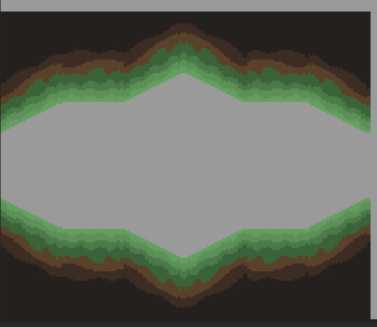
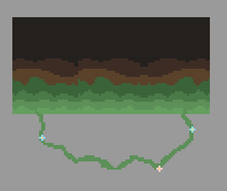
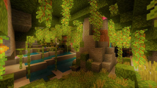
I then worked on making my grass block with different angles with a variety of slope scales so there's more gradual slopes and then quite harsh ones. I also made a variant for where it has vines too so I can add more uniqueness to my tile map. I made the different slopes because then I can make underground segments of the map where the character can go into a cave type structure. I wanted to keep the grass on the top as it then is like a form of lush cave like in Minecraft.
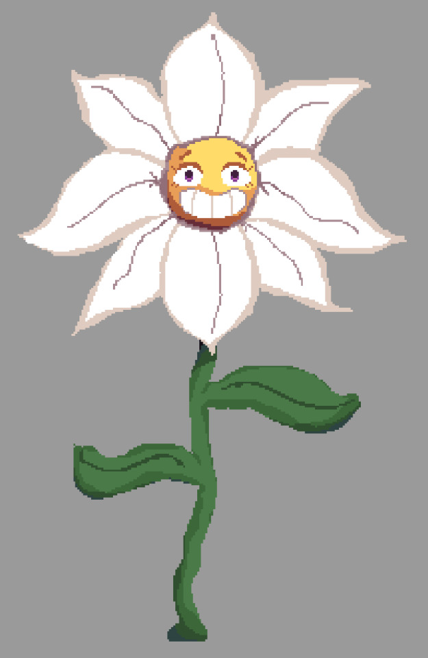
I then worked on what to make for the jump segment of my tile map. I was originally aiming for a form of stone ruins or tall trees but I decided to change my idea to using flowers as I felt like it fitted my theme of using nature and the forest more alongside the fantasy/magical theme I want my game to have.

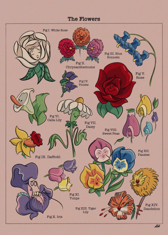
I looked at the giant flowers from Alice in Wonderland as I used inspiration from the character design of the general idea of the flowers where I then made my own flower where the character will stand on the leaves to jump between them. I really like how my flower character design turned out as I turned it a bit more cartoony as I added the big grin on its face and wide eyes.
0 notes
Text
Beginning to make tile map blocks
I then started to make my tile map floor and a tree that'll go in my map.

I made a tree with 32* by 32* grid background.

0 notes