
Statistics
We looked inside some of the posts by 30thtimesthecharm and here's what we found interesting.
Average Info
Notes Per Post
0
Likes Per Post
0
Reblog Per Post
0
Reply Per Post
0
Time Between Posts
1 day
Number of Posts By Type
Video
7
Photo
10
Last Seen Tumblr Blogs


Fun Fact
Tumblr has been banned in Indonesia for providing people with access to pornographic content.


Photo


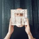
I do not see myself as a good drawer, or anything that comes with a marker, paintbrush, etc, but I was very excited to challenge myself with this assignment. From the get-go, I knew that I wanted to do something abstract. I was thinking about how I was going to make sure that my message would come across.
My childhood memories are like a big blob to me, due to the loss of my mother and the aftermath. I still look back on my childhood with a smile, but I find it hard to remember it very vividly. That is why I chose of doing something abstract. I was visiting Søstrene Grene to buy some yarn. When I was there, I saw some cheap acrylic paint and a nice canvas. That's when I decided to use paint to describe my memory. When back home, I played around with the paint. Deciding that the best way to approach this is to make the center filled with lots of nice colors and as the circle widens, the colors become more dull and mixed. The vivid colors refer to my fond childhood memories while the mixed, dull colors refer to the struggle to still remember them. I also remembered that I kept the dried flowers from my childhood photo and decided to use them on my painting, to refer to that work.
While taking pictures of my painting, I decided to take them in the garden. My mom used to love our garden, so that made sense to me. I wanted to do some minimal changes in photoshop, like making the colors a bit brighter. I couldn't help myself to go a bit further than to only brighten them and I enhanced them in a way for them to pop more.
I love what I made and it's actually a much more emotional work than I expected it to become.
0 notes
Photo
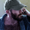
At first, I thought of combining Thuisbezorgd and Tinder. I was coincidently talking about how addicting swiping can be on Tinder to Yara and Slava. After thinking about that conversation, why not combine two weak spots of me? Being a hopeless romantic and having a huge affinity with food. The thing that I was worried about, is that I think Tinder will be a popular choice among the other students, so I decided to think of a different app to pair it with.
While scrolling through my apps, Twitch caught my eye. I was thinking about how inaccurate the food tracker is on Thuisbezorgd and that it always annoys me not knowing when my food will arrive. With Twitch in mind, I thought how fun it would be if restaurants would broadcast their kitchen with a livestream, that becomes accessible to the consumer that just ordered a meal. Personally, I would love to check in once in a while to see what the cooks are doing in the kitchen while waiting for my meal. After this brainstorm, I started by designing a fitting logo for my newly founded app.
For the name, I searched the web for food puns until I found something fitting. Eventually, I settled on the name Couch Potato, because it fits with the identity of the app: lazy, broadcasting something, and relates with food.
0 notes
Photo


Lately, I’ve been feeling very nostalgic about my internship last year at Boijmans. To the point that it’s feeling like some kind of homesickness. I was excited to go to my internship every day and I couldn't wait to see my mentor, who I was very close to. As the projects I've worked on come to an end and I see the end results without me being able to help, for instance the launch of the depot x Susan Bijl shopping bag, makes me a bit sad.
When thinking of protests, I instantly think of the time my mentor and colleagues suggested to me to take the day off to go to the climate change protest together, somewhere last year in the Hague. I try to be conscious about my carbon footprint, like not eating meat, buying second-hand clothing, and not using the radiator for instance. To see that my colleagues were also passionate about this subject was very exciting. Walking the protest with them made me feel having some quality time with them and doing something good of the world as well. I hold this memory dear to my heart and I will never forget how kind they all were to me.
For the visual, I wanted to represent the picture with a bright green aesthetic, to represent climate change. I used a black and white filter with a washed-out effect, to give it the feeling like it's in the past. (which it is) After making it, I decided that I didn't like the look of it and changed it up. After playing around with colors and my dear liquify tool, I came to the end result. I'm very happy with how my end result looks and with the meaning behind it. I changed the main color to blue to represent a bit of my melancholic feeling looking at the picture. It isn't all sad of course, so the rays of color show that it's also mixed with a fond feeling.
0 notes


Photo


At first I wanted to take a life-sized wooden chair into the forest, but we only had wooden stools. This inspired me to make a wooden chair myself. Making a life-sized one would be impossible because of my technical limitations, I figured a small one would be nice as well. This also gave me the opportunity to fantasize about who would use this chair and I instantly thought about fairy like creatures. That is when I decided to decorate the chair with twigs and leaves, to make it look like it was made by a creature of the forest.
0 notes

