
Statistics
We looked inside some of the posts by a-nhtml and here's what we found interesting.
Average Info
Notes Per Post
2
Likes Per Post
2
Reblog Per Post
0
Reply Per Post
0
Time Between Posts
2 months
Number of Posts By Type
Link
1
Photo
1
Text
9
Last Seen Tumblr Blogs


Fun Fact
69% of Tumblr users are millennials.
Photo


Jiří Kolář, Gersaints Aushängeschild, Prague, 1966 — concrete poems
1 note
·
View note
Text
Concept
Concept 1
My first concept in response to the brief is inspired by Alexander Calder’s love for toys. Specifically, throughout the semester, I want to focus on experimenting with the mechanics of mobile/moving toys. What I aim to achieve is a coding ‘invention’ of an useless toy/game that seems legitimate but totally ridiculous in motif. I’m also interested in tackling on internet and post-digital culture so it can be incorporated in the concept as well.
The specific item I am making is still in development. Some ideas that I’ve thought of but not totally convinced are: sentient adult toys with child-like and playful look, impossible fishing game,
In terms of aesthetic, at this early stage, I will start drawing inspiration from old drawings of inventions that explain their designs and mechanics such as:


This book is great for this purpose.
And of course Calder’s toys will be a source of reference as well.


Colour is another ingredient I want to play around with. However, I don’t want it to overshadow the main idea of uncanny mechanics. I will still integrate Calder’s favourite colour red as one of the dominant hues somehow.
Concept 2
Another idea for this assignment will look into Alexander Calder’s interest in the absurd and sublime, inspired by how Calder was impressed by the instantaneous being of the moon and the sun on the horizon at sea. I want to explore the duality of the seemingly impossible, challenging our perception of mundane visuals or ideas. This deals with breaking down the relationship and formulating a narrative for the dichotomy of things i.e. heaven/hell, life/death, lightness/heaviness (The Unbearable Lightness of Being has interesting takes on this), fluid/solid, or simply reconstructs/interprets Calder’s observation of the moon/sun.

Translating the complexity of the matter to a concrete creative coding project is another task I need to work on in the following weeks, but at the moment I’m drawing inspiration from Étienne-Jules Marey’s motion study photographs—where he dealt with the static/mobile state of objects—as a starting visual guide.


In terms of technicality, since I want to convey a narrative in some sense, I’m thinking about integrating audio to the final work. Another thing I will consider is using typography to help communicate my idea better.
0 notes
Text
Alexander Calder
Forms/Scopes
Alexander Calder was first trained as a mechanical engineer in his early twenties. This, combined with his excellence at mathematics, had some influence over his art practices later on. He was most known for his sculptures but he had also done a wide range of paintings and illustrations here and there. When he was a kid, he used to make toys and wire jewelry for his sister’s dolls. Calder later invented several toys that can move in the form of animal action figures.

Calder had a soft spot for the color red, according to himself: ‘I love red so much that I almost want to paint everything red.’ He claimed to ‘think best in wire,’ to the point he always had wire and pliers with him to ‘sketch’ in space. In fact, the term ‘drawing in space’ was coined by Julio González in 1932 to refer to Calder’s wire sculptures. His three-dimensional ‘drawings’ of wire was an exploration based on his talent for continuous line drawing—drawing with one single, unbroken line. Besides wire, Calder had also worked with wood and metal as materials for his sculptures.

Calder’s favourite colour is red.

His sculptures included the stabiles—stationary ones—and mobiles—kinetic ones. In French, mobile refers to both motion and motive. Those stabiles and mobiles were usually made by Calder in massive scale.
Content/Interests
According to John Canaday in 1927, Alexander Calder often found pleasure in the absurd. When Calder was a fireman in a ship’s boiler room, one time he awoke on the deck to the view of both a sunset and a full moon appeared on opposite horizons, which left an abiding sentiment in him that he would refer to it on numerous occasions. I find this both absurd and poetic, all in all an interesting bit about himself as an artist and a person.
The circus had an uncanny appeal to Calder thanks to two weeks sketching circus scenes for an illustration job, which became the subject matter of his performative assemblage Cirque Calder, predating performance art by forty years.

Calder’s circus sketch

Alexander Calder, Cirque Calder (1931)
Calder’s experimentation with kinetic sculptures was an attempt to approach abstraction, which was deeply inspired by a trip to Mondrian’s studio. He ‘felt the urge to make living paintings, shapes in motion’ in response to Mondrian’s abstract paintings.
The underlying charm of his motorized sculptures were governed by his interest in space, chance and surprise, movement, toy and engineering. Calder once described his mobiles as dancing pieces of poetry.
Quotes (my personal favourite)
‘Abstractions that are like nothing in life except in their manner of reacting.’
Alexander Calder, “Comment réaliser l’art?” Abstraction-Création, Art Non Figuratif, no. 1 (1932), 6. Translation courtesy Calder Foundation, New York.
‘As truly serious art must follow the greater laws, and not only appearances, I try to put all the elements in motion in my mobile sculptures.
It is a matter of harmonizing these movements, thus arriving at a new possibility of beauty.’
Alexander Calder, “Que Ça bouge–à propos des sculptures mobiles,” manuscript, Calder Foundation archives, 1932. Translation courtesy Calder Foundation, New York.
‘The esthetic value of these objects cannot be arrived at by reasoning. Familiarization is necessary.’
Alexander Calder, Modern Painting and Sculpture, exh. cat. (Pittsfield, Mass.: Berkshire Museum, 1933), 2–3.
References
http://calder.org/life/biography
http://www.artnews.com/2015/12/19/retrospective-calder-1973/
https://www.tate.org.uk/art/artists/alexander-calder-848/who-is-alexander-calder
https://www.nga.gov/content/dam/ngaweb/Education/learning-resources/an-eye-for-art/AnEyeforArt-AlexanderCalder.pdf
https://artmuseum.arizona.edu/artwrite/alexander-calder
https://www.christies.com/features/10-things-to-know-about-Alexander-Calder-9496-3.aspx
https://www.christies.com/features/10-things-to-know-about-Alexander-Calder-9496-3.aspx
http://calder.org/system/downloads/1932_How_Can_Art.pdf
http://calder.org/system/downloads/1932_Que_ça_bouge.pdf
http://calder.org/system/downloads/1933_Statement.P0303.pdf
1 note
·
View note
Text
Week 9, 10, 11: A3 Work Record
Some brainstorming notes and idea generation:

four postcards from melbourne to hanoi, saigon, dalat, baltimore
Concept
In this experiment, I virtually send out postcards to my friends in Hanoi, Saigon, Dalat, and Baltimore. The postcards’ imageries are taken by me in Melbourne. However, instead of landmarks and tourist attraction sceneries, these are photos of mundane objects in rather unusual settings I found in Melbourne. This resembles a more interpersonal connection of me with the space/environment I’m living in and strikes a more private conversation with the receivers of these postcards.
Execution
Design inspiration & solution
Email miles is one of my inspirations. The creator measures actual distance between the sender and receiver and embeds it in the email. I’m interested in this exchange of context and recontextualization of communication medium.

Indirect flight is another inspo. I like the depth created by moving through different planes of this work and want to channel this aesthetic in my work.

To create the postcards I overlay my handwriting of messages to my friends on top of my photos. They will pop up in the info window on the map.

With the map style, I go with a dark theme because it resembles the ground seen from night flights, which you’ll have to take when travelling long distance.
I set up a close zoomed-in interface to where I live to bring attention to the enormous distance between me and my friends. The process of zooming out to see the postcards amplifies this anxiety of distance.
I also incorporate this idea of long distances in the typography with the work’s title positioned far away from each other in the browser.
Process
I use Google Styling Wizard to create the map.

Create marker on 5 positions & 4 flight paths.

After making the flight path and the info windows work I start working on the typography.

I want it to have the vibe of handwritten letters as well by using collages but it doesn’t work so well so I exclude it in the end.

The final outcome:


---
waves crashing
Concept
This makes use of p5 library to experiment with different connotations of the word “wave”. It plays with the literal meanings of words and puts them together to render various possibilities and visualizations of one single word.
Execution
Design inspiration & solution
The inspiration for this work comes from pointerpointer where the creator tracks the mouse position and displays an image of a finger pointing to that position. I think this is a simple and clever interactive idea.

I visualize “wave” in three situations: beach waves, people waving and sound waves. To achieve a more instant and interactive effect, with the sound wave visualization, I decide to incorporate the frequency spectrum of white noise recorded live instead.
Also, I feel that this has potentials of being an artefact of internet culture/meme culture so I want to use gif to relate it to my desired context.


Process
The coding process for my initial idea of how the web looks and behaves is quite a challenge. My desired function is that each time the mouse is pressed a gif will pop up and bounce off 4 corners. I toggle around with p5 library sources but have trouble making it work with gif/images instead of basic shapes.


So I have to change the plan and use only images to reduce loading time. The images are loaded differently depending on horizontal mouse position.

I tried changing to % in mouseX position but I guess it just doesn’t work...

---
write a poem
Concept
This experiment employs the user’s data input to generate a custom poem. It plays with the idea of context manipulation and combines existing data with new data to render an interactive, responsive experience.
Execution
Design inspiration & solution
Google Fonts sample texts are one of my inspirations. They sound fairly poetic and have a narrative quality when put together. So I take those sample texts as materials for my “poem machine”.

I also use the typewriter as the key visual because I notice that both typewriter and programming use monospace fonts. I find it quite interesting, especially that this is a shared characteristic between something iconically analogue and something resembling digital technology. Together with my work’s function, this juxtaposition backs up and communicates the concept well.

Process
The HTML for data input is pretty straightforward. I create 5 questions to get user’s data to complete the poem.
I actually add a typewriter soundtrack as well but sometimes it plays sometimes it doesn’t...?

I create 5 arrays, each has 3 options to randomize and add the data received at the end of the sentences.

The final outcome:


0 notes
Text
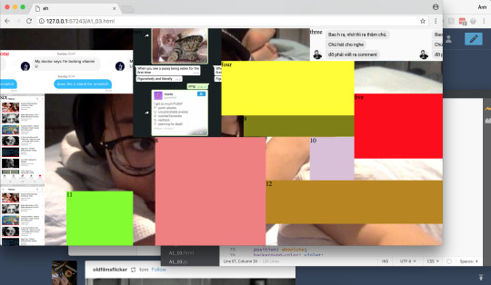
Week 6, 7, 8: A2 Work Record
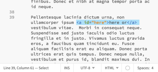
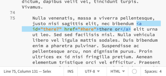
here or there or here or there or
youtube
Concept
This is the response to the sense of space with respect to the world wide web. Lev Manovich, a new media theorist, points out in his book ‘The Language of New Media’ that the new code of new media cultural interfaces is made up of familiar elements. A web page shares the same idea with cinema with the rectangular frame as a window to a larger space, larger data. Most importantly, there is a shared perception among the spectaculars that there is as much life in the offscreen space as what is visible onscreen. However, new media has a more interactive bonus to it as the audience can actively navigate through the digital space.
Execution
Design inspiration & solution


I used dummy text generator to generate body text for my piece, which is also a take on the cluster of nonsense we are trapped into every day in the virtual space.
Integrated with the infinite scrolling feature popularly used across various social network platforms (Facebook, Tumblr, Twitter, etc.), I want to expand the perception of how a web page exists—the landscape orientation is not always the default framing we look at.
Petra Cortright also plays with the idea of infinite scrolling as an experiment for her new media website, prompting the call to attention to the web feature itself.
Just a bonus: Here… or there? is a film by Siu Pham talking about modernism and the discontinuity of reality and sense of time/space. I think the phrase is still relevant for my work in terms of being in an endless virtual possibility with or without the pre-existing knowledge of the film.
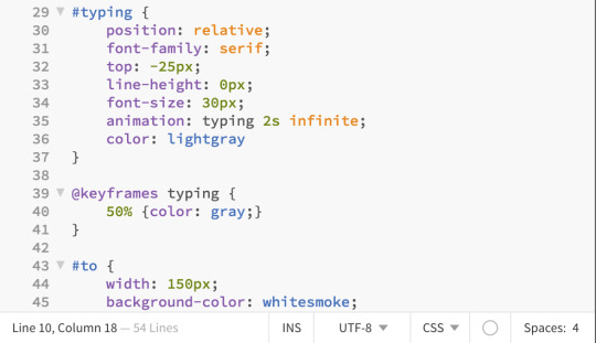
Subtle animation is added for the audience to pick up the cue more easily.
Coding
HTML
JS

CSS

Smooth scroll script
I got this script from w3schoolse as we haven’t cover jQuery yet but I think this feature will strengthen my concept.
—
fix my bugs
youtube
Concept
This work is a take on an equivalence of computer terminologies/syntax in real life. I want to create a ‘digital landscape’ with this reflection on the literal meaning of ‘bugs’. Also, as the term suggests, I’m inspired by ‘naive mistakes’ made by the computer system e.g. anti-virus program detects itself as a virus; unnecessary warning, etc. Overall, this is my response to the concept of glitch perceived as an absence of expected functionality.
Execution
Design inspiration & solution


Design elements & resources


I got some free bug png on Google.

And bought my background soundscape on Soundsnap.
Coding
HTML


CSS


—
ya fken dog
youtube
Concept
Take curse words literally and make them cute to spread positive energy. This also illustrates how it is getting easier manipulating the content to achieve the desired effect.
Execution
Design inspiration & solution
The 100 Rudest Fucking Things Australian Say

Noob/NOOB STUFF

Artworks from a Vietnamese artist. She has cute takes on obscure ideas.
Design elements
I decided to use crayons in bright colours for the illustration to juxtapose with the offensive content.

—cuntstruck

—fuckstick

—dickhead

—dead shit
Coding
HTML

I decided to go with a minimal user interface for messaging and limiting the design elements to the bare essential because of how quick people are getting in picking up digital clues.
CSS
JS

—
have you seen me?
youtube
Concept
The main idea behind this piece is how limited digital software and working in a virtual space can be sometimes. It dwells on the rigid, non-human way of working of digital mechanism, all revolving numbers and letters and syntax and algorithm. I want to reflect this anxiety of losing trace of data on the physical world and how frustrating it can be sometimes dealing with this.
Execution
Design inspiration & solution


… but what does it look like?

I looked into some missing person announcement to pick up some conventional phrase when dealing with the matter.
Design elements


Coding
HTML

JS

0 notes
Text
Week 5: A2 Brainstorming
Initial design response
With this second set of web experiments, I want to touch on the literal sense of being in a digital space and reflect on the digital/analogue relationship.
---
Some reading notes

---
Brain dump

0 notes
Text
Week 4: Peer Review
Chaeyeong Kim (1)
Chaeyeong’s works are creative and truly engaging. They all put the audience in the centre of the web experience where the piece evolves and transforms according to the audience’s interaction with the interface. Her “boiling egg” one is my favourite. The viewer is introduced to an egg put in a background evoking water being boiled, and a timer. The egg in the centre of the web page with generous negative space can trigger the user to click without having to say anything.
The onclick event stops the timer and allows us to peek inside the egg to see its state. I find this really interesting because I am terrible at cooking and this is indeed an informative and interactive instruction on how long should I boil my eggs.
Chaeyeong Kim (2)
I was also impressed by Chaeyeong’s Korean food acapella. With the mouse listener event, she assigned each elements a small piece of audio and let the audience mix them together. Its simplicity proves to work well and fits into the digital space. With the decreasing attention span of millennials, her straightforward method does not confuse the audience or frustrate them. The audiences know exactly what to do and can even customise their musical experience. The high level of engagement in Chaeyeong works is impressive and I wish to translate playful concepts into effective simplicity in my next assignments too.
Alex
His “I’m here” piece is interesting, in terms of both ideology and execution. He has a strong point on how machines are becoming more “human-like” through the way they function and response to the users. It sets a really strong ground on what he develops his concept. The final outcome is pretty simple but enough effective. This (perhaps) technophobic school of thoughts also reminds me of a particular digital cue that today machines ask humans to prove that... we are human.

His typography also supports the overall piece by triggering different vibes through sans-serif (robotic) and serif (humanized) typeface. Everything comes together well and relates to each other on a conceptual level.
Still, I think that he can do more with this idea though. I would have slightly altered the text each time the onclick event is triggered and even misspelt it at some lines. In my opinion, this would manipulate the machine as having human capacity more genuinely by having certain flaws and instant responsiveness. And it would be more unexpected for the users to interact with the piece too.
For example:
I’m here. I’m still here. I’m righth here!!
But effective concept and execution otherwise.
0 notes
Text
Week 3: A1 Work Record
consumerism cures depression

In this one, I want to explore the idea of how my depression *encourages* consumerism when my “retail therapy” gets out of hand. The phrase “consumerism cures depression” should be interpreted in an ironic sense (obviously). However, instead of actual physical products, my shop will offer some “mental food”—what I think I lack: self-esteem; socialization; productivity. Also at first, I intended to assign each item the price of ****** serotonins and the alert appears to say “not enough serotonin” or something like that, to highlight the irony of the situation. But I ended up with an “out of stock” alert when you want to buy these items.


youtube
Also, this video helps me with my coding process.
Final work:


fill ur void

I asked two friends to read me two poems of their choices with the idea of yearning for interaction and communication.


The browser will display randomized lines from the poems when the users click on the page.
youtube

I go through this tutorial and the course material to complete this piece.
Final work:


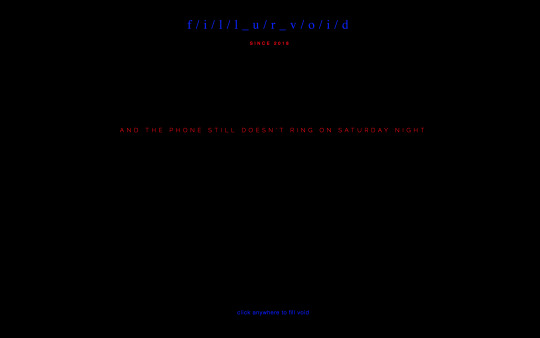
I also integrated a little animation to make it more interactive and interesting to look at.
i need to tell you something

My first idea is to generate some fake advertisement banners based on my Google search to vaguely imply what kind of digital persona I have. When the viewer hides all the ads, they can see a webcam video of me looking at the computer screen. This explores my fear of privacy violation.
However, through iteration, I make it more personal with my own personal screenshots of some conversation with friends and my sharings. When your mouse hovers over each fragment/artefact, it will reveal part of the video but you can never see the whole one.
youtube
This helps me with displaying the video as the background.


Final work:


0 notes
Text
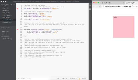
Week 2: JavaScript
I go through JavaScript tutorial on w3schools and review the course materials to prepare for the coding process. These are some useful stuff.
I also started doing the illustrations and sketched the layouts for my ideas but they will be updated in the next entry.


0 notes
Text
Week 1
Net Art Critique
Shredder
This piece of net art ‘shreds’ a webpage provided by the visitor.
○ Intention and concept: This work tries to re-contextualize the web page interface, where it is forced into functioning like a physical piece of document. It brings into the electronic space a non-digital activity.
○ Design elements and principles: Its aesthetic input is the physical material and interaction one can engage during the shredding process. Brought into the digital landscape, these senses are turned into minimal events, enabled by the action of copying, pasting, and clicking.
○ Use of medium: This can only work within the web space. — It imitates a real-life activity, therefore the surprise comes from the medium itself, an unexpected digital interface. — It revolves around shredding a website, making reproducing in another medium unreasonable.
Reading Log
These are some of the excerpts from the reading provided in the course materials that I find interesting or helpful for my thinking development for this course.
What is net art?

For assignment 1, I want to challenge the identity aspect in the digital age because I myself am migrating my life to the electronic space: I own more and more data. Cloud storage, applications, music, e-books, social media, etc. All of these activities and all of my time consumed on the computer/Internet significantly define me who I am as a person.
New Media Art and the Gallery in the Digital Age


These are some interesting notes on net art as well.
Assignment 1 Progress
My initial response to the brief is crafting/ constructing/ defining/ redefining/ my digital persona.
It will translate some aspects of my life to the electronic space. Therefore, by interacting with the web experiments, the audience can at least have a (vague) sense of who I am. With each of the viewer’s action my digital persona adjusts and responses to as well.
0 notes